Hi Everyone. I’ve been super busy with client-work and my new (but temporary) occupation of pinning gorgeous pins and inspiration to My Vicente Wolf pinterest board. It’s been so much fun and it’s something that I can keep, to refer back to for much inspiration.
So, even from that standpoint, it’s been a wonderful exercise. It’s funny, but I had just been talking about how looking at fine art is a wonderful way to gather inspiration for your color schemes. Nature is too. One of my very fave color schemes is shades of blue-gray with touches of chartreuse. It’s just like the first buds of spring on a cloudy April day!
Now, for the subject at hand– the best interior color schemes.
What are the best interior color schemes? If you want to read about color schemes, there’s a link below. Okay. The answer? There is no best, because like many things, color is subjective. Sorry, I wish I could give you some magic formula.
However, for most rooms, I believe that there should be:
- one primary color. And not only that one color, but
- subtle variations of the one color.
- then if you like, you can add other colors but in far lesser quantity.
- don’t forget about white and black. Most rooms need some of each.
- brown is good too.
- white IS a color!
Most of Vicente Wolf’s rooms are either monochromatic or analogous. For more info on those, you can click on those links. And most are a muted version of that color. Bright colors are saved for accents like flowers or accessories.
Here is an example of one of my favorite Vicente Wolf rooms.
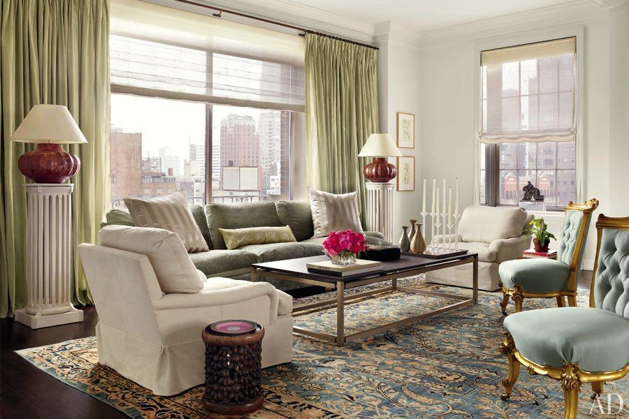
Here, he has chosen an analogous scheme based on tones in the magnificent rug, but it doesn’t all quite match–EXACTLY. and that’s what makes his use of color such genius and so rich and appealing. He has accented the scheme with magenta flowers which give a note of added punch. His signature look is PLENTY OF WHITE. He uses Benjamin Moore’s Bright White for almost all of his interiors.
Important note: The most successful rooms have light, medium and dark tones. Always. One note rooms suck. Always.
Vicente derives his color inspiration from nature, great art and from the many places he has traveled to. Great color schemes are everywhere!
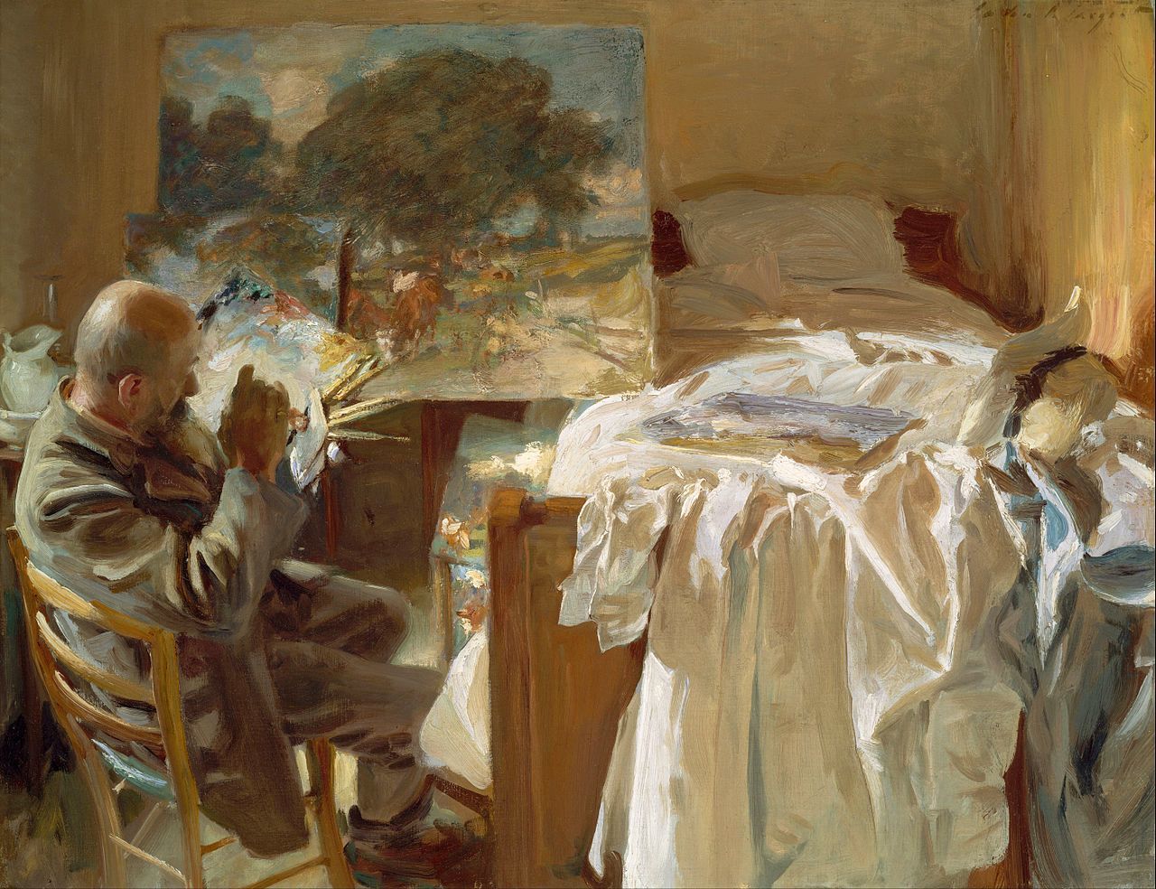
Artists such as JS Sargent and Edgar Degas amongst others are great sources for inspiration!
What other color schemes are successful? While I find that complimentary color schemes are too harsh, (colors directly opposite on the color wheel), especially if they are very bright, often moving one shade over is an interesting combination such as this striking room by Vicente Wolf that’s teal and burgundy.
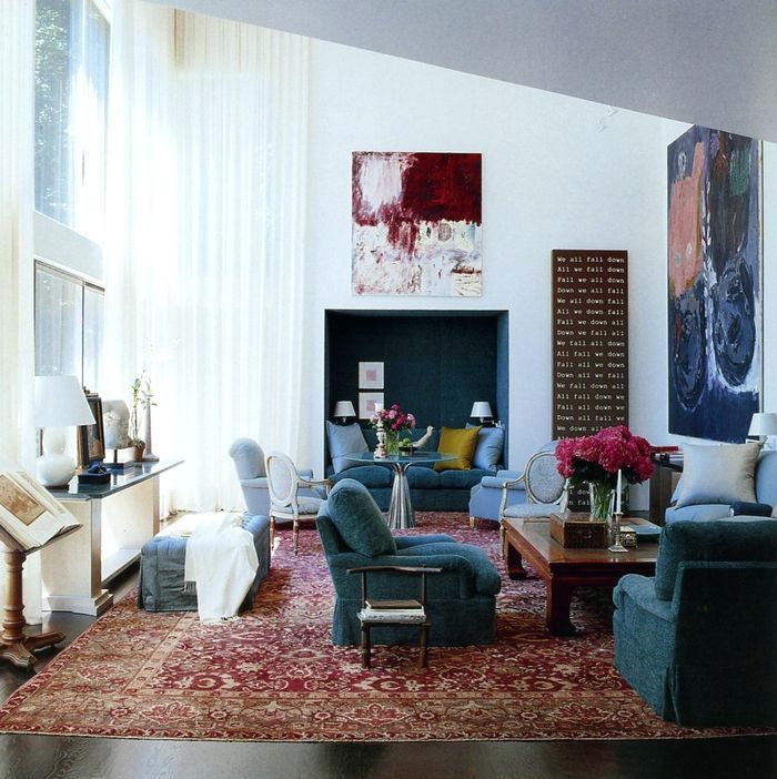
What makes this room work? There is a lot of white, different shades of blue and burgundy, rich dark brown and warm woods, gray, gold, silver. Put your finger over the chartreuse pillow in the back. See how just removing one tiny accent color changes everything? It’s almost scary.

John Singer-Sargent
Another great scheme is taking two colors such as red and blue
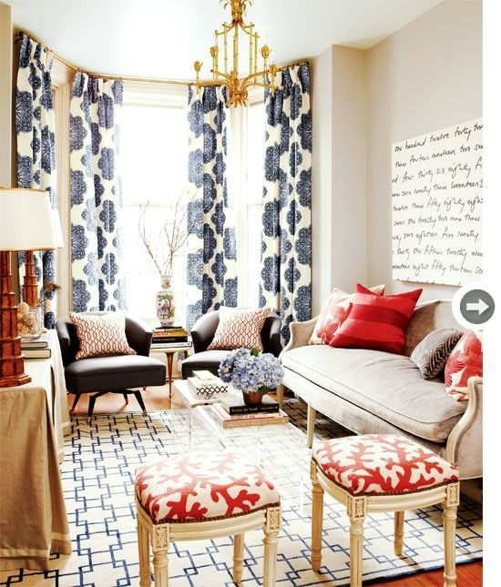
Adding in lots of white, neutrals and gold keeps it fresh. (I realize that I recently posted this room, but felt it was worthy of another look)
or blue and pink.
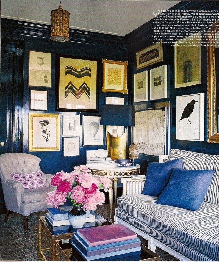
Or yellow and green. I have used this scheme in my home and added in smaller amounts of teal.
For a client, we took yellow and green, and added in bits of red-orange. You can see these on my portfolio. I didn’t add them here because the colors on the page looked pretty horrible. green-yellow-orange-pink and navy don’t make good bedfellows!
Are there any universal colors? Colors that go with EVERYTHING!
The Best Interior Color Schemes.
Yes! Colors that go with everything are any earth tone, gold, gray, khaki, taupe, navy, black and white. A room that’s predominantly gray can handle just about anything.
What is the most difficult color to work with? Well, any color that you don’t like is difficult to work with, IMO.
What other schemes are especially lovely?
I think that schemes such as pale gray-blue and brown is a winner.
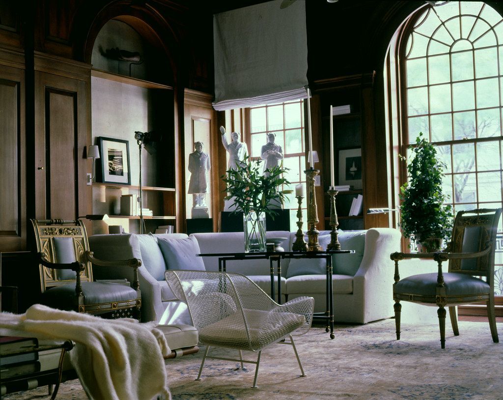
Kips Bay Decorator’s Showhouse.
Amazing room!
What other ways can you figure out the colors? Sometimes we start with a great fabric or wallpaper. Or, a great rug!
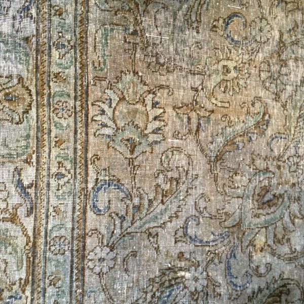
found on Lynn Byrne’s blog. Love this post!
And sometimes, a wonderful painting.
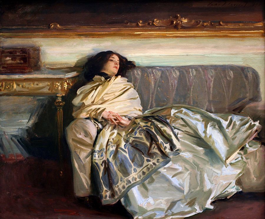
John Singer-Sargent
Although, I caution you to not get too crazy with the too matchy-matchy “painting over the couch.” That’s a no-no. In fact, sometimes, it helps to throw something in that clashes ever so-slightly.
And there’s another scheme that I have never used, but have seen it done… and I am going to post about that next…
Happy Mother’s Day to all of you who are mothers!
xo,
![]()
Related Posts
 A High-Low Ben Pentreath Living Room – Can It Be Done?
 Furniture Trends That Need to Go Bye Bye | Market Preview Fall 2015
 Three Decorating Trends You Need To Be Warned About
 How To Mix Dining Room Chairs Like A Pro
 Gustavian Swedish Colors That Might Surprise You
 Reno Rant # One – You Won’t Believe What’s Going On!
 Window Panels Have Her Stumped, But It’s Actually The Least Of Her Problems


