Hi Everyone,
Coincidentally, two readers in Florida sent me their homes this week. Both feature some bad Florida architecture. Between the two, they hit all of the cliches I’m not a fan of. We’ll get to those shortly.
Now, you lovely Floridians, please do not think I’m picking on your state alone when I’m talking about bad Florida Architecture.
Photo by Luiz Cent on Unsplash
No, I am not. However, in the last several decades, Florida has grown in population by staggering numbers. And that means a lot of new homes are being built.
Did you know that there are only three builders in Florida? ;]
- Bad builder.
- Frightening Bad Builder.
- Hideously Beyond Belief Bad Builder.
Okay, sure. There are undoubtedly some fantastic builders in Florida. I’m sure. Lots of ’em. However, it appears that 80% of the builders are building 2% of the homes.
What makes for bad Florida architecture?
Again, this isn’t only Florida. It’s widespread, unfortunately. But, here goes:
- Bad proportions. Like, really bad. Remember McMansion hell?
- Cheap or just plain ugly finishes. Or there’s way too much marble.
- Bad colors on the permanent finishes.
- A preponderance of bastardized architectural themes, such as arches, all over the place or columns.
- Doors and windows at varying heights and sizes.
- Fancy Arches, but then no door or window casings. However, there might be a crown. Odd.
- Too many doorways.
- Poor layout
- Poor flow
- And waaaaaay too open.
I’m sure I’ve missed some. But, those are the ones that quickly popped into my head when thinking about bad architecture.
Okay, here’s my problem. One of the homes presented to me is a tremendous challenge, and the other is pretty easy for me.
The challenging Florida home’s lousy architecture also features very large, hollow-feeling rooms.
That’s Flo-1. Alas, I am determined to get this out at a reasonable hour. So, this is what I’m going to do.
Today, I’m doing Flo-1, the more challenging home. My first version includes some possible architectural changes. I will also indicate possible floor plans, layout, and space planning.
Then, Wednesday, I will add Flo-2 to the same post.
By the way, that will be the first post with the new theme!
Before I begin, these lovely ladies have asked for help, not bashing. Neither home is hideous. Both have tremendous potential. Some of you might even love the houses just as they are. I would say that both fall under 1. Bad Florida Architecture. But not frightening and not hideous.
Some errors are also a function of the finishes, furnishings, and lighting.
Okay, let’s begin with Flo-1’s first email sent to me from my website.
Dear Laurel
I only stumbled across your fantastic blog recently, but I have binge-read so much of it! I especially love your space planning tips since that is currently holding me back.
I’d love to suggest a post about planning a large great room or what to do when your living spaces are TOO BIG!
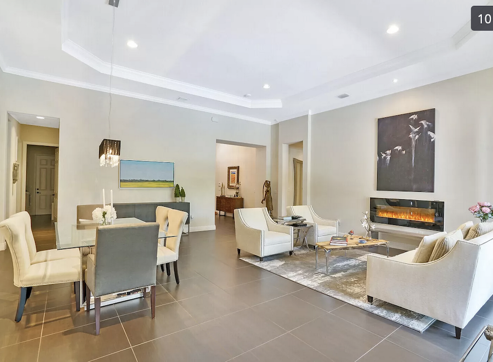
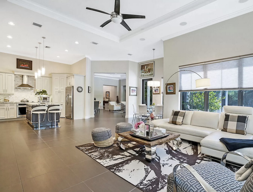
We recently moved into a new house in Florida; I desperately want to hide the dark tile that’s everywhere, AND I’m starting from scratch with furniture in the so-called “great room” that is 24′ x 22′.
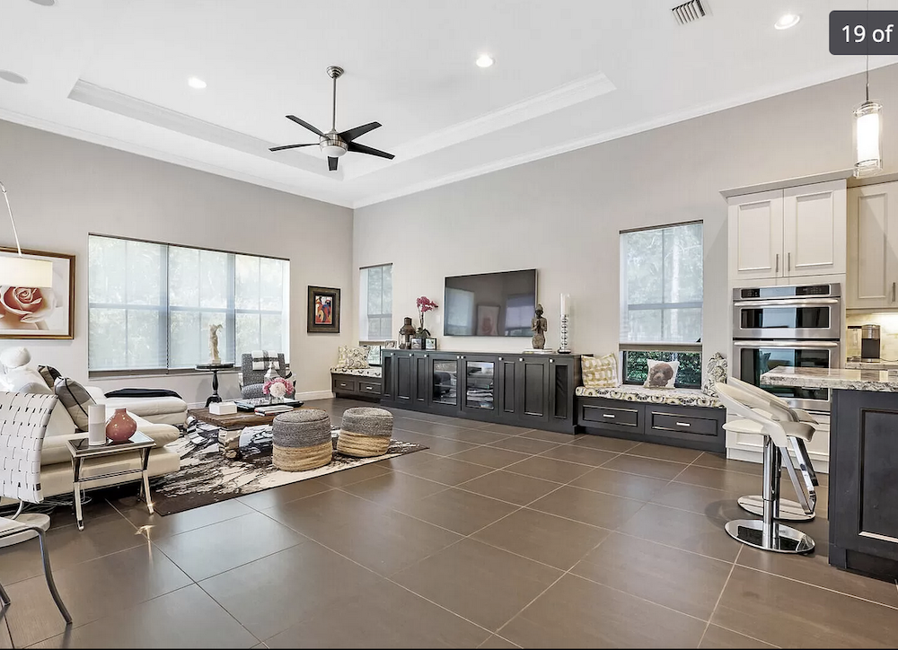
There’s also a 20′ x 18′ “family room” where we’ve put our couches and TV.
I put the names of these rooms in quotes because that’s what they’re called on the builder’s floor plan, which you can see here.
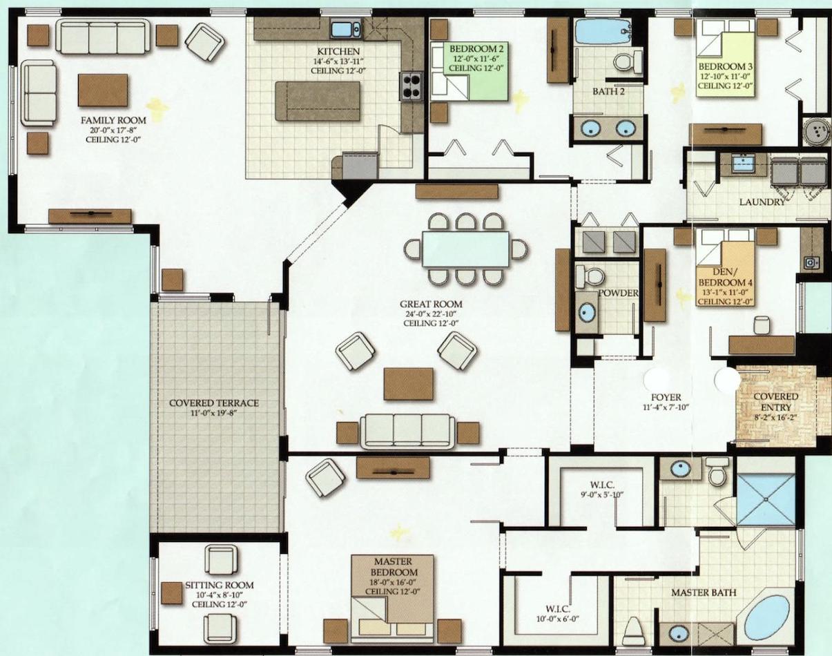
The square shape of the great room, plus its FIVE doorways, make it hard to position both a couch/sitting area PLUS a dining area. (We also have a breakfast nook open to the family room.)
I’m almost considering turning the “family room” where we currently have our living furniture into a big dining room and making the “great room” solely for sitting space (no dining).
That’s a great idea!
The current family room off of the kitchen has the best lighting and three exterior walls! However, both rooms are so huge! If we changed spaces, the dining room would be right next to the breakfast nook! Is that weird?
Ugh! I think the architect was drunk when they (HE, I’m sure) designed this floorplan.
I hope you can write a post about this because I’m SO totally lost! Thank you!!! 🙂
Flo-1
***
Oh, Flo, I feel for you. However, please know that this is by far NOT the worst I have seen. The worst I have seen needs to be leveled by a backhoe. After this first email, I asked Flo-1 if she could send some pics and maybe the real estate listing.
She did, and another lovely note. Here’s what Flo-1 said about her Florida home.
Hi Laurel, thank you for the quick response! I read your “large living room” post a few times for ideas… those were lovely, primarily symmetrical, rectangular spaces, and I was still stumped, unfortunately.
Here is the real estate listing for our house, with photos.
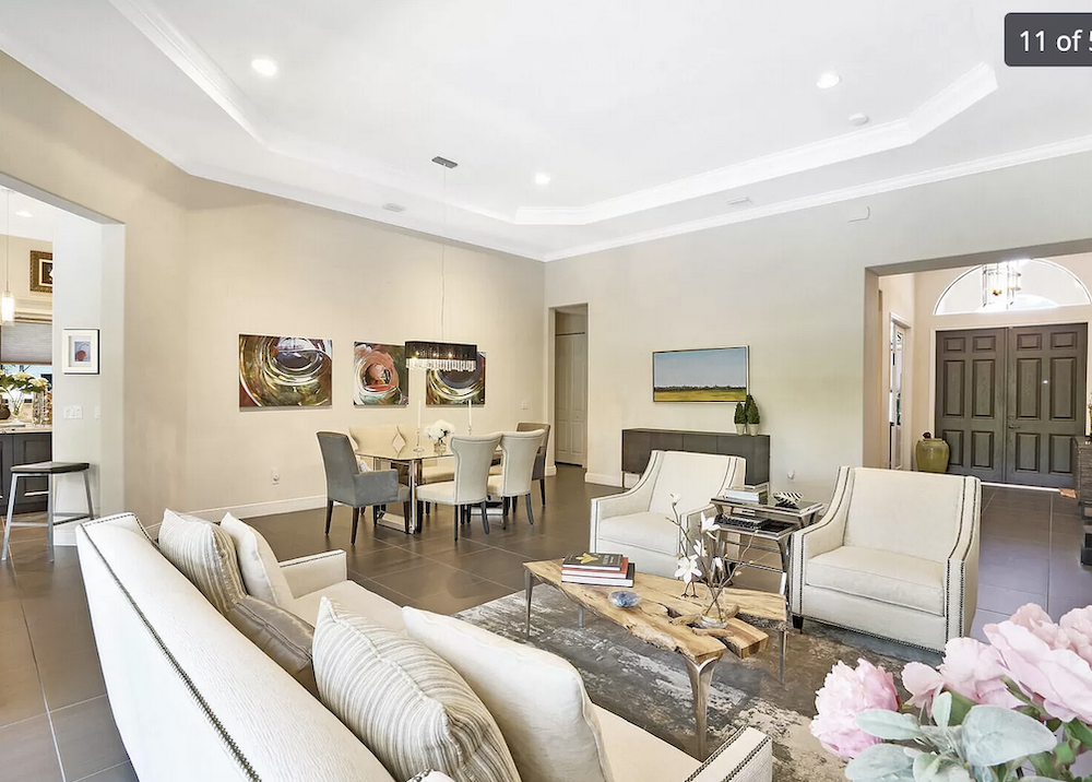
Interestingly, tonight I did find a house in our development with the same floor plan as ours that DID turn the “family room” into the “dining room!”
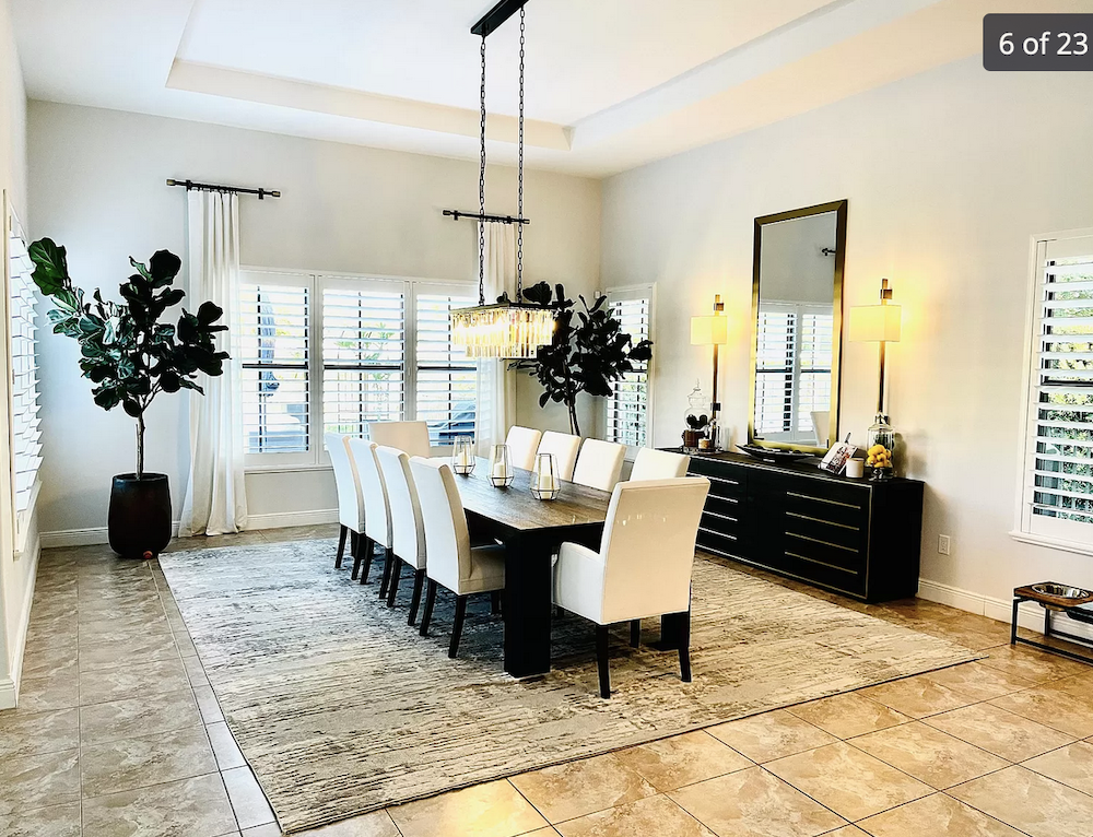
[Ahhh… the amputated curtain rods!]
I’ll have to search your blog to see if you have something about husband-recliner-alternatives!)
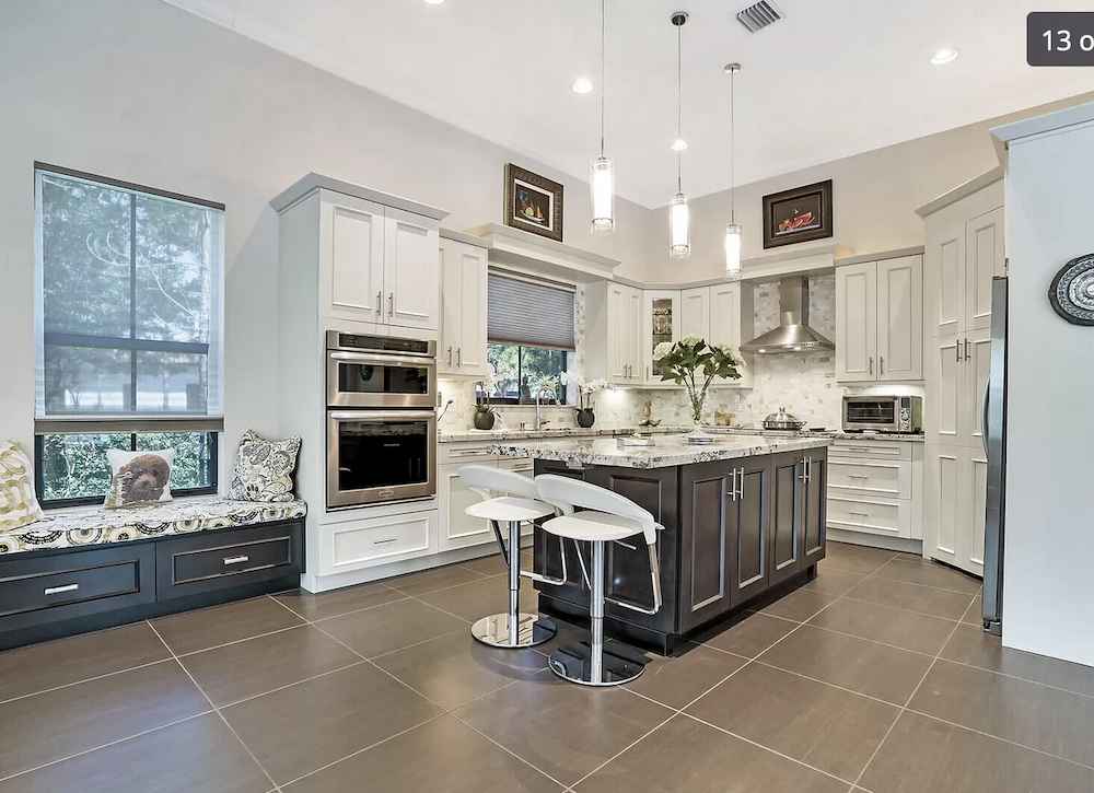
FYI, we’ll be replacing the broken window coverings and the glam light fixtures at some point (we’re going for more of a Spanish colonial/California mission style to align more with the exterior architecture.
That’s going to be difficult as that style is more rustic.
And we’ll also be removing the little fake fireplace on the great room wall (that rectangular black box that sticks out a few inches). Perhaps also painting the built-ins in the “family room” below our TV.
Yes, to that, if you keep them.
I’d love to get a custom-cut seagrass or carpet rug to cover that whole great room space for better acoustics and to try to lighten up that north-facing room. I think the breakfast nook area could be nice with an L-shaped bench and a simple little pedestal table… but I wasn’t sure if that would be weird next to a dining room. Maybe that area is something else entirely.
Yes, a little weird, but I have an idea.
Thank you so much for anything you end up doing with this!!!
Best,
Flo-1
***
As you can see, Flo-1 has the all-too-common bad Florida architecture.
However, darling Flo, I doubt that an architect was involved with this design. That’s right. You CAN build a home without an architect. I wouldn’t, but builders think they can do it. And, this is the result.
Okay, let’s look at the floor plan again, this time with no furniture in the rooms.
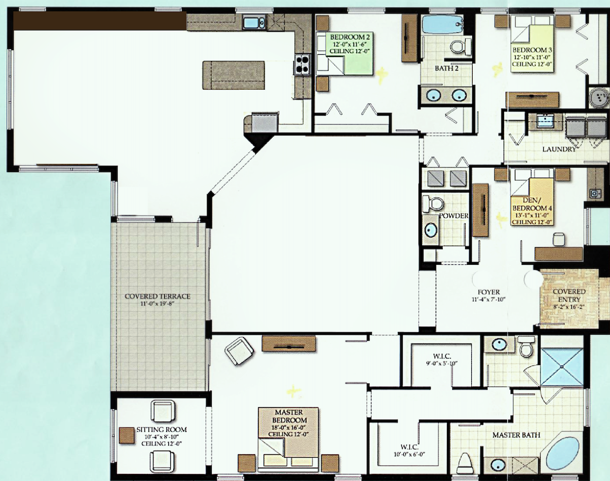
Flo and her family live in a place that requires a car. Therefore, most of the time, the family enters the home through the garage. Unfortunately, that means traipsing quite a distance to the kitchen, but that we can’t change.
As Flo said, there are a lot of entrances into the great room.
The sliding door to the outside is not necessary as there’s already a door from the breakfast nook. But, we’ll ignore that for now.
What strikes me as odd is that there’s no way to block the sound.
We will be addressing this very soon!
Okay, the next big problem is that thing sticking out and the doorway on an angle going into the family room kitchen. It provides even more empty space in one room and more unusable space in the other. I don’t see the point.
Let’s bring down the floor plan once again, and then I’ll show my changes so you can see them close together.
I left the furniture out of these changes. But, did leave in the attached lighting fixtures. Also included in this floor plan are the bookcases in the library.
Library, Laurel??????????
Please calm down. Thank you. :]
I added the BROWN tile floor. There’s a lot of it.
Let’s walk in the front door.
First, we come to the living room. There could be a TV here or not.
Yes, I did add a wall about 12 and a half feet back to make another room.
I envision a more masculine space with a hunky COLOR on the wall. I think this will help achieve more coziness and depth. Plus, it’s also going to help enormously with the sound issue. To further impact the sound, I added three pocket doors with glass-divided lights.
And, I added a freakin coat closet in the living room.
Considering this is a pretty sizeable home, there is a lack of storage space except for the huge master bedroom suite. Please notice that there is nowhere to hang one’s coat. Ummm… raincoat, of course. :]
In fact, there isn’t even a closet in the den/”bedroom.” But, to be a legal bedroom, at least in NY and Mass, there must be a closet. However, there IS a small sink and a bar.
Coming up is my favorite part; getting rid of that weird angle.
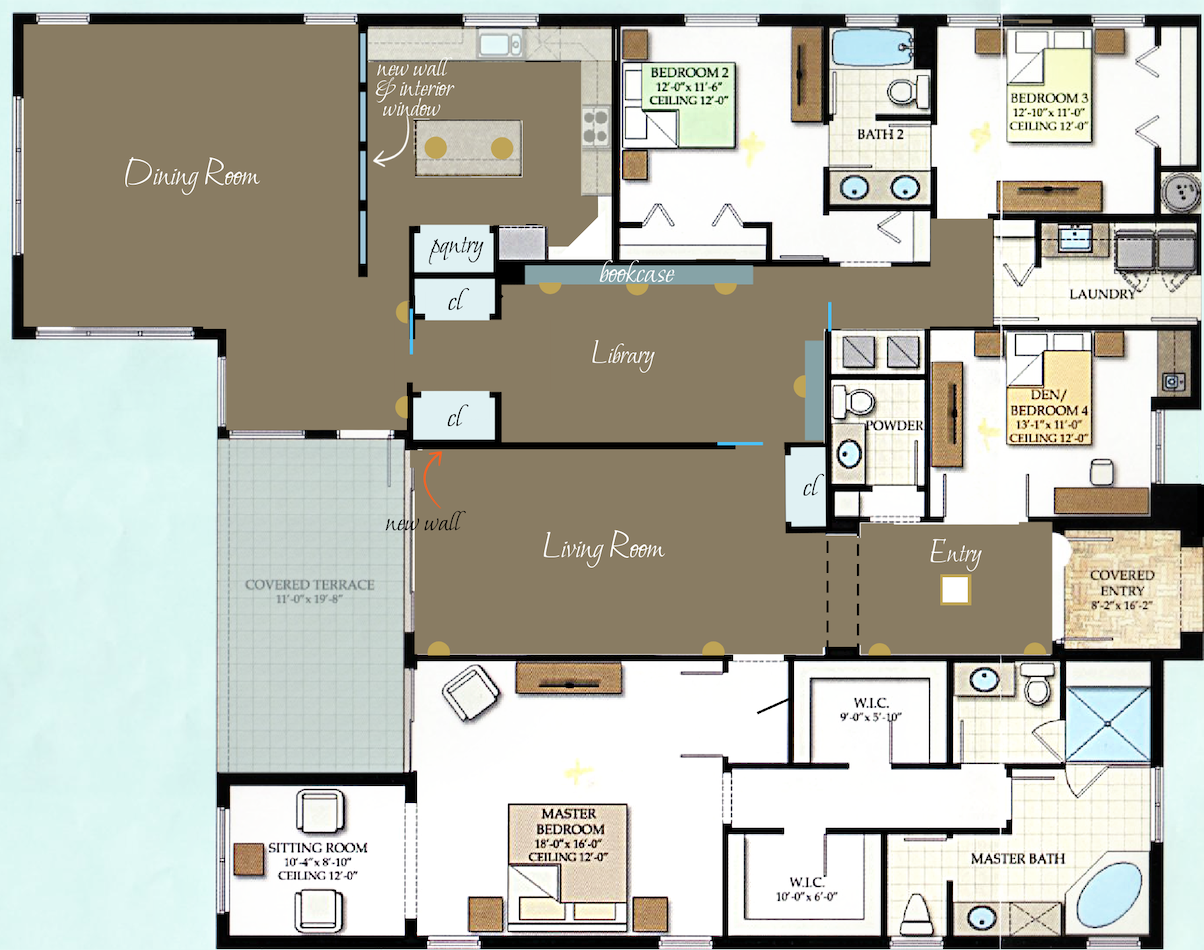
If there is a structural need, there is ample space to provide for that. Plus, I created a new support in roughly the exact location. And then, two more lovely closets.
Finally, we enter the dining area and kitchen. In the kitchen, I added a pantry next to the fridge. I chopped off the end of the island. They can go on the side and one on the end if they want stools.
Then my other favorite part is separating the kitchen from the dining room.
The glass window allows for a good view. The windows could open. They need to start above the height of the buffet, so at about 36″ from the floor.
Laurel, are those walls going to work with the tray ceilings?
No, not as they are. I’m fine if some of them are filled in or adjusted. Of course, most of the structural changes are not essential.
Okay, let’s see the spaces with some furniture.
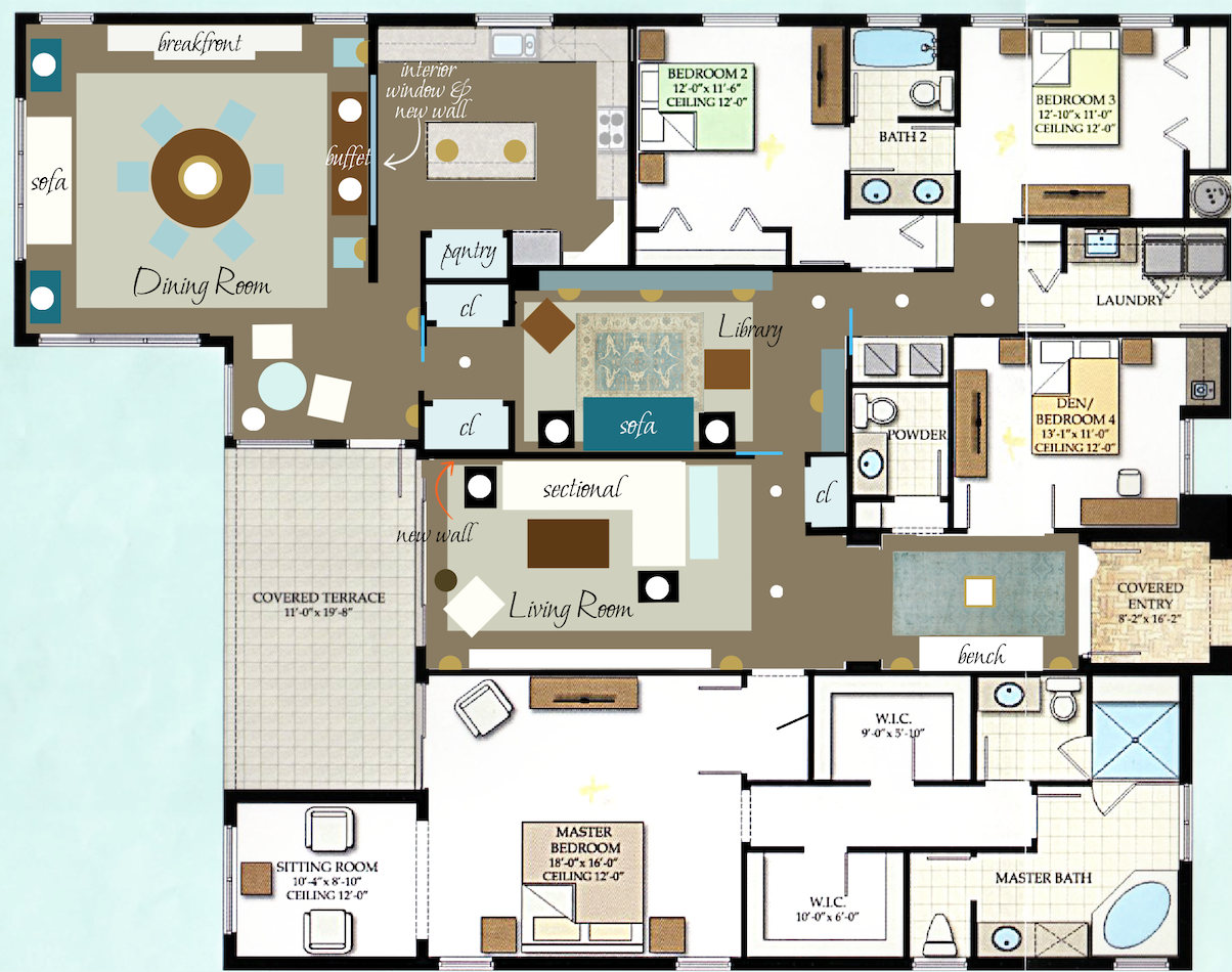
Above and below are almost the same, except there are more windows on the window wall dividing the kitchen and dining room.
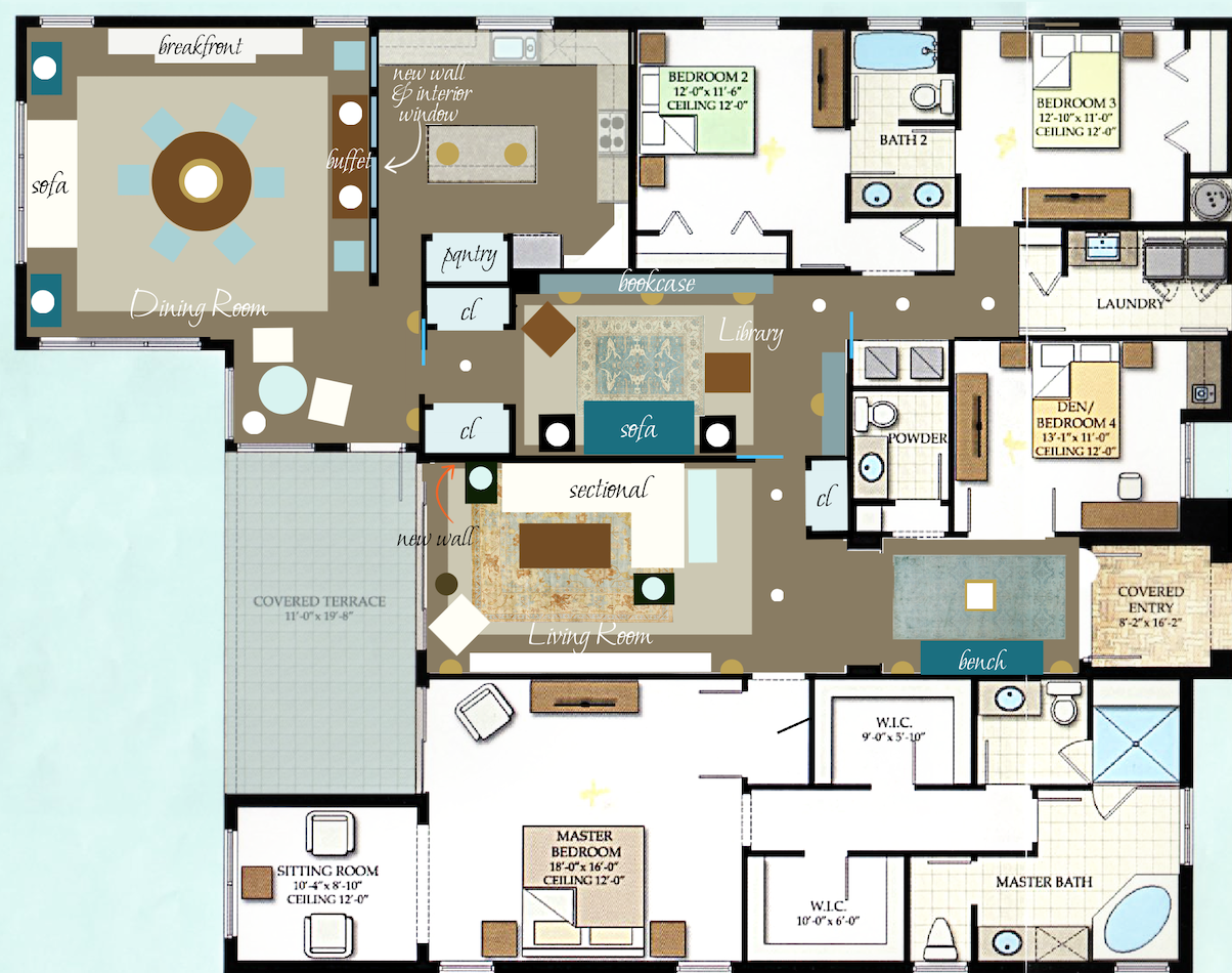
And, I added another beautiful rug. in the living room.
The breakfast nook is now an occasional table 30″-36″ and two chairs which could become host chairs if the 72″ round table opens up with a leaf. Yes, the table could be a rectangle. There’s nothing wrong with that.
The seagrass in the dining room could also be installed wall-to-wall. However, it does have to be glued down in this case.
Lighting
I added a lot of lamps. And, yes, there are some stylish downlights. Recessed downlights have gotten a LOT sexier in recent years. That’s another post! But, please, a lot of the coldness is stemming from those bright WHITE LED lights. 2500 Kelvins is a good number to go for.
Laurel, what if no walls are added?
You took the words right out of my hand! ;]
Okay, we cannot have a separate library without the first wall. But, we could put the dining room in this spot, with or without bookcases. There’s plenty of room.
The wall in the kitchen could be eliminated. If the buffet has a finished back or storage on both sides, it could act as a room divider.
The one area I’m very much hoping Flo can change is the area where the closets and pantry are.
And, I also recommend adding the doors, for sanity’s sake.
Those two things, I think, will help make this (not that) bad Florida architecture become a lovely home
I haven’t gotten into specifics for window treatments and furniture. However, there should be many upholstered pieces, linen curtains with Roman shades, and area rugs.
Also, if necessary, there could be some other acoustical enhancements. That is also another post.
I hope you enjoyed this installment of bad Florida architecture; not optimal, but not hopeless!
Please stay tuned for Part II on Wednesday.
xo,
PPS: Hi Everyone – This is an update and yes, from the new theme, on Monday evening!
You may find a few things that are off, like the wonky home page on mobile. And, maybe some things are missing. All will be fixed. The biggest changes are on mobile, and for the better, I think. There are also some cosmetic tweaks I’d like to make. But overall, I’m very pleased and relieved!
Thank you for all of your great comments and suggestions for this home.
While I think the basic idea I had was good, there are some issues:
A. The living room is a tad too small
B. And worse, there’s no access to the kitchen from the living room without walking around through the library. Oops!
So, I fixed that. I was going to save it for Wednesday, but here it is.
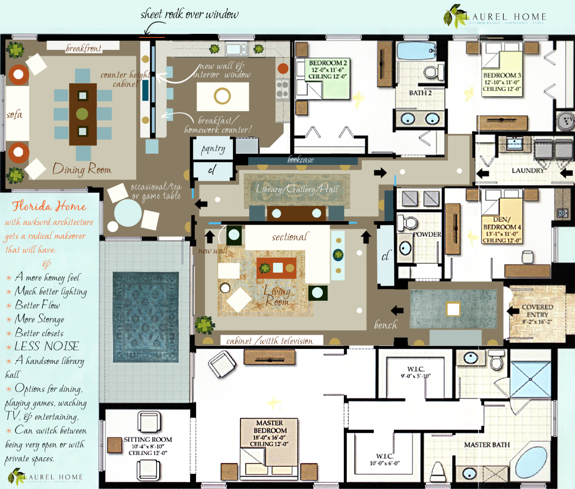
Yes, the one window is covered up. It was in my way, and it was not necessary. I indicated the location with a thin red line. From the exterior, everything will look the same. Covering up windows from the inside is a legit practice. We did it for a couple of jobs years ago, and it allowed us to regain use of the wall. No one would ever know.
More about that on Wednesday as it ties into Flo-2.
And, about a week after this was posted Flo-1 sent me some graphics she had made. She calls it “Laurel – light.” Please enjoy Flo’s beautiful work!
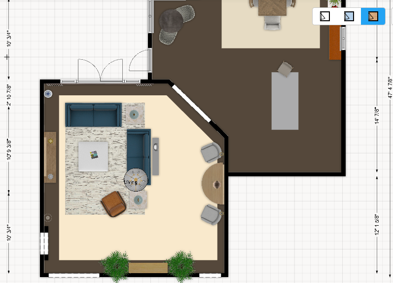
The floor plan
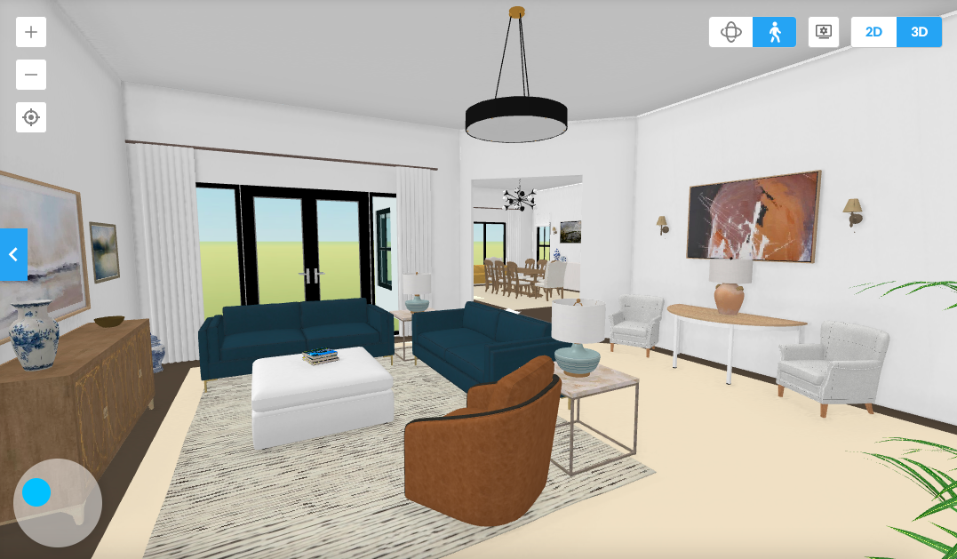
Looking into the living room from the entry
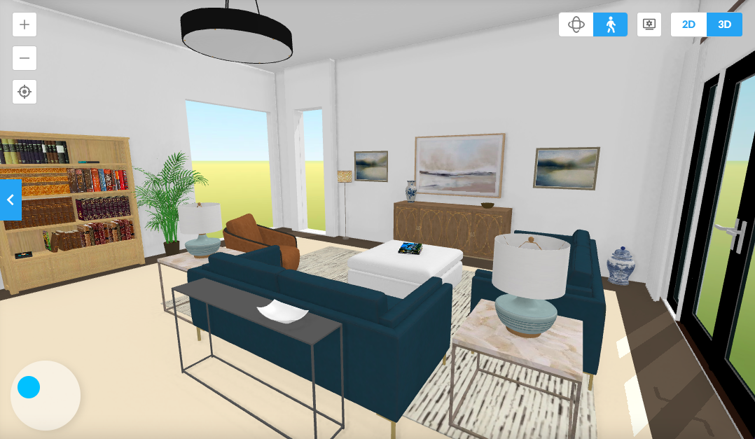
Looking back towards the entry
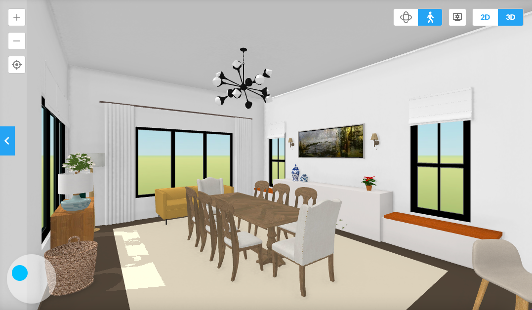
I think the new dining room looks fantastic! Flo loved the sofa in her favorite room. My favorite part is how she whited out the TV stand.
Related Posts
- He Wants Dark, Rustic Decor But She Really Doesn’t

- 50 Cool, Casual Dining Tables That Can Go Anywhere!
- Don’t Be Seduced By Chintz! A Personal Story
- The British Are Coming! Superb Interior Design from the UK

- Don’t Take Away Our Ceiling Fans – We Need Them!

- My 20 All-Time Favorite Benjamin Moore Paint Colors

- 20 Favorite Exterior Paint Colors + Doors and Trim
58 Responses
Ooh, I love the updated version too Laurel, except that I was partial to the look of the square dining room with the big round table. That being said, a rectangular table is easier for visiting, so socially, your updated plan works better!
The combining of architectural styles in Florida actually began very early on, during the initial development of Coral Gables. That’s covered in an autobiography of the man who founded it. The book is George Merrick: Son of the South Wind. The book is very interesting. I never would have thought that phenomenom would have had such an interesting beginning.
We just bought our home in Florida which I call a redirect castle. It had a band around the outside with an arch. The faux arch had a light right in the middle!
The band and arch are now gone but haven’t removed the light yet. Getting to it soon! It also have six different floorings!
So we feel the pain of those living thought the nightmare.
Hi CJ,
Do you mean a band, like a moat? That’s hilarious. I’m assuming it was a waterless moat.
It’s a 12 inch band that ran the middle of the house. Like a ribbon then went into an arch. Wish I could post a pic it’s was someone’s idea of a grandiose red neck castle as it’s only 1900 sq ft.
It should have said a redneck castle.
I finally have read through all the interesting comments. I would only add several ideas. Could a hall, coat closet be “taken” out of the master bedroom closet, then making that closet into a long, “regular” closet, rather than a walk-in? I live in So Cal and have a nice coat closet, even though our coats are rather jackets and sweaters—LOL!
This may seem strange, but could they remove the diagonal pantry in the kitchen and make a new opening so the garage to kitchen distance could be shortened. Then the new pantry next to the refrigerator would be useful.
I also think they need a really good cleaning closet, what with all those floors! The tiny one in the laundry would hardly be big enough for vacuums and cleaning supplies.
Best wishes on your new undertaking.
Laurel,
I like the new design much more! Wondering about how dark the long Library hall would be though with no windows. My guess is that it would be used much more as a hallway than a “room”? If that is the case, would it make sense to install a couple of skylights to bring in some natural light?
Oh yes! I love the latest version with the library/gallery/hall! You (and your readers) are brilliant 🙂
Laurel, your changes are great, but to my mind the worst design problem with this house is that almost one-third of the footprint is given to an owner’s suite. This is not uncommon in new construction, but always puzzles me.
Hi Mary,
I know! They could’ve easily given back a foot or two to the living room. If used as intended as a LR/DR, another foot would’ve been helpful so there could be a decent path to the FR/Kitchen area.
I’m loving the re-done design! The Library being a gallery gives more space for the living room, and creates a cosy place to perch rather than just another big, imposing room. If Flo-1 doesn’t have a lot of books, the same space could be used instead as a rather grand Butler’s Pantry, displaying beautiful dishes, wine racks and maybe even a bar, instead of books.
Thanks so much, Kirsten. You have some wonderful ideas. It could even be a separate TV room for the kids if the parents are doing something else. It’s a flexible space that I see being painted in a deep color with gorgeous lighting.
Laurel, great post, thank you for the walls! When we built 25 years ago, I wanted a house with hallways and a plan where I did not have to go from one room to get to another, so I got that and laundry chute, guest closet, broom closet, swinging door to dinning room, powder room away from the kitchen, thank you for trying to bring these things back. Without walls, where does the art hang, and where are the cozy nooks that make a home ?
Shelley and Kim addressed a concern that I also had regarding closing off the kitchen (albeit with a wall with upper windows) and replacing the adjoining family room for the dining room.
I don’t like being stuck in a smallish kitchen. People who like to entertain do not want to be cut off from their guests while they are attending to necessary meal preparations in the kitchen. A big kitchen island with seating, running parallel to where the wall would be, and/or an adjoining family room allows the host/hostess to remain in the party. The same is true even if it is just your family lounging in the family room watching TV. The new island would also provide an ample casual eating location.
This is a big house that would attract people with kids. Mothers want an adjoining space for younger children to play where they can easily keep an eye on them while busy in the kitchen.
But I don’t know if Flo-1 cares about these points and whether re-sale trends matter to her (my limited real estate background is showing). Laura is planning Flo-1’s home, not mine. The other issues are more complex, and beyond my scope to add input. I know Laura will figure it all out.
Hi Mary Lynne,
Unfortunately, there are no elevations, and time prevented me from explaining things in great detail. The wall is only three feet high. Above that are windows that can open or close. Real windows. Nobody is at all closed off. But, there is some separation, yes. Flo can still see the kids, her guests the pool. Everything.
The idea is that there is versatility. A lot of people would also rather their guests not gather in the kitchen, nor do they want to dine in the kitchen. Window walls are wonderful and a growing trend that I believe has real legs. They are also super beautiful and will add a lot of necessary architectural interest. You can see some here.
Hello Laurel,
I am a Designer and Native Floridian (however I did live in NYC years ago when I flew for wonderful Pan American Airlines! You forgot one very hideous feature in tons of new Florida Home builds…the dreaded plant shelf in all sorts of high places, and with high ceilings, plenty of room above kitchen cabinets to display 100’s of ‘accessories’! 🙂 You are right on point with your observations and new housing builds have increased unbelievably. Please continue to make us laugh at your funny anecdotes…they make my day!
My only concern would be the flow from the living room and library to the dining room when entertaining. Let’s lose the closet on the wall common with the living room and create a door there. There should still be enough room on both the living room and library walls for a sofa. Perhaps not a large one, like a sectional, but it would offer a more direct route to the dining room and kitchen area rather than being closed off from the formal living space. Just a thought.
Done! I redid the entire layout and can’t wait to share it. The library is a wonderful generously wide hall that would be a pleasure to walk through.
First comment on my new website! There are a few things to iron out, like the wonky home page, but I’m very excited and relieved!
I also have a very open concept home. It was lovely when we looked at it with the real estate agent. But unfortunately it is not lovely to live in. Not cosy at all…..Your idea of the library is wonderful. It puts the cosy right back into this home
I always love the puzzles! My fav is to ask myself first what I’d do and then see how you solve it. My first thought was “This place needs a library area.” But I was thinking more of an oversized bookcase with open cubbies as a room divider, instead of a wall.
.
I love your creative window/wall solution! I don’t think I would have thought of that.
.
I also didn’t think about adding closets, so that wasa masterful move too.
.
For my two cents, if they leave the ceiling pans, I think they look pretty with the inside ceiling area painted an interesting color, like a soft blue or a creamy beige (nothing too garish).
.
Thanks for the brain twister!
Great post! We had the hardest time finding a house we were willing to live in once we decided to move to Florida. I’ve seen that exact floor plan in all sizes from very small to huge and it doesn’t work at any size! At least there is a window in the kitchen. So often there isn’t and it drove me crazy. I really prefer natural light in a kitchen. I think that with your suggestions tweaked to suit the homeowner that it could be very nice. I think I would leave the kitchen mostly open to a less formal dining area if it were me and enlarge the kitchen a bit. The walls at the kitchen entry would help a lot with the noise and make more sense than the odd angled entry.
Laurel, I think your changes to this house are fantastic!
Love the window wall in the kitchen/DR area.
Love the idea of the cozy library with a wall of books.
It’s all just great!
It certainly is a bad layout, and Diane Hammer is right: We have lots of them here in CA too. I guess this is what happens when developers come in, design a group of houses, and are only interested in how much they will get back on their investment, without taking into consideration how livable each home will be.
I am certainly no architect or space planner, but the first thing that stuck out to me is that this house has no hallways – just a series of rooms tacked on to each other.
I, too, bought a condo in Florida about 4 years ago. Yes, the architecture here can be hideous. A friend of mine is struggling with trying to figure out how to deal with her house! My complex was built in 1980, and the design is what I’ve heard referenced as “contemporary”, and has oogly brown siding. The unit had “builder’s grade” cabinets, beige carpet, beige tile, popcorn ceilings, sparse lighting, and some truly awful faux stucco textured walls. The room layouts are fine. There is lots of natural lighting everywhere (allowing me to embrace the sunshine state’s natural asset) and the private spaces are clearly separated from public spaces. I stumbled my way through a complete renovation, discovering your blog after halfway through the work, but I am happy with how it turned out. By dumb luck, I did start with a layout, having hired an interior designer for some ideas. It was all I could afford, and it turned out to be money well spent! I love your blog and all the advice and inspiration you provide, but felt that “classic” look was not going to work with the architecture in this unit. Instead, I took my inspiration from the Florida Keys and Palm Beach Prep (i.e. Dana Gibson, Lilly Pulitzer). My place is small, nowhere near as grand as most houses, and the rooms are modest. (If you recall, at the time these units were built, the nation was experiencing double digit inflation, and the goal of builders was to keep investment capital small, and thus housing was built on a smaller scale.) In short, I think Florida architecture (and probably California and Arizona, too) is challenging to deal with, but you were still a beacon that helped me navigate my way through my renovation. Thank you!
What a fun post! Laurel, your description of bad Florida architecture is perfectly descriptive of Colorado architecture, especially the excessive use of arches, columns and tray ceilings without the basics, like window and door trim. I like your new design, but I’m trying to imagine entertaining there. I’d welcome guests in the foyer, and then where do we go? The living room feels too small and confining to really entertain a group. And then I’d have to lead them through a narrow doorway and through the library to the dining room. Hmmm. Maybe put a large opening in the middle of the wall between the living room and library. Then you’d have two distinctly different living areas that flow together. It’s always fun to imagine the possibilities with you, Laurel. Can’t wait to see Flo.2.
I would have a very hard time not using that lovely light space off the kitchen as a place to spend most of my time! So I say, for me, eliminate the angled wall (we did just that in our remodel on a 60’s rancher in CA) add the closets/pantry and the long wall and use the Library space as a dining room, which really is mostly used with artificial light (or possibly add a skylight?) and works fine as a passage way of uncluttered space. The Living Room now is a gracious space to get away from the busier kitchen hub and the DR is still close to the kitchen. I’d be tempted to add back a small table and chairs in the breakfast niche corner or place one somewhere in the larger space if I didn’t intend to use the DR for casual meals.
Hi Marji,
Great ideas, thank you!
Laurel, always love your posts, they are as varied as they are good! I especially loved this one and you taking us through your thought process to amend this bad plan.
As much as I agree people have gone to the far extreme with open spaces, in my personal home I have an L-shaped space where I have the kitchen, a casual eating table, and what would be considered the den. It is lovely when someone’s cooking and you might want to also be watching a show, or if there are other people that you can talk to from the kitchen to the den.
Knowing how well that works for my lifestyle, I like looking at your plan and thinking that possibly the long space that you designate as a library could be made into a formal dining room, and the original open kitchen/den space could be kept like that- more open plan. With the kitchen on one end, then a casual place to eat, and then a seating area on the opposite wall from the kitchen, I think that would be a really cozy family area. That allows you to have the Formal dining room next to the kitchen and the formal living room in view when you walk through the front doors.
But again, how fun to follow your amendments of this floor plan, I enjoy the process and imagining how I would like to live in the space, as well.
Wow Laurel! When I saw the original “bad” layout I immediately thought of my cousin’s house in Miami. It is almost the exact same layout. They have since moved to the Chapel Hill area of NC. Love your ideas – especially the library. Funny thing – my cousin loved their big “Florida tile” floors so in their NC house (contemporary on a golf course) they took out the hardwood and put down large marble tile. Have to say on a hot day it is very cooling on bare feet. 😉
Obviously bad architecture is not limited to one state. California has the same crazy hollow layouts in new builds.
Laurel, your solution is fantastic for turning a bad layout into a cozy functional home.
It’s just so sad that after paying the price if a new home, one has to go back in and do a remodel fix.
I haven’t seen a new home on Zillow yet that I would want to purchase.
It’s really dreadful as a plan. My first thought on seeing the plan was that the kitchen island seems expressly designed to turn cooking into an obstacle course. So the first thing I’d do would be to turn that island round and place it as an “extension” of the units to the left of the kitchen window (but with a wide passage, of course). Then I would eliminate the bit of wall coming up from the covered terrace, and add to the wall where the fridge is. That would get rid of the diagonal line.
Yes to making the family room the dining room, with a round table. I think that would be suitable for all eating purposes, with the possibility of a small table and two armchairs in the little area next to the terrace door (for 2 people, like the Patina Farm set-up).
I don’t think I’d divide the great room, I’d be a bit worried about light levels. But I immediately thought a huge bookcase along the back wall would be the thing to do. With a built-in, the TV could go there where it would be less obtrusive, and that’s the best position for it not to get reflections on the screen. And orientate the furniture in the seating zone to look at the covered terrace, since that fire-hole is going to go — there could be another bookcase on that wall.
What really strikes me in the photos is the profusion of recessed ceiling lights, the tray ceilings, and the frequent refusal to allow right-angles — look at the master bath, the pantry in the kitchen (I assume that’s what the diagonal doors lead to).
The plan is badly thought-out for normal living: the garage entrance without access to the kitchen, the lack of a place for people to leave coats in the entrance, the double-access bathroom, the vast space for the master bedroom — but presumably that little sitting room is where you go for a bit of peace and quiet!
Love the kitchen and dinning rooms. I personally do not care for the library / living room wall added. Makes going to the kitchen maze like. But that is just my feeling.
Hi Laurel,
Between your wonderful suggestions & the suggestions your readers have come up with, I think Flo1 will have no trouble making her home more livable & beautiful.
Her biggest problem will be what to do first. So many great ideas!
The nice wider hall idea is great. You do need a closet for your jackets, all those flip flops, kids stuff, and dog leash. For year I lived in a large apartment that had a hall with a long desk and bookshelves along one wall. I thought it was odd when I moved in but it was very useful. I loved it by the time I moved out.
Angled walls are horrible and eat up space.
Great idea moving the dining room, I have been doing that with most floor plans that have living and family rooms.
Dividing the large living room is another great idea but the passage from the front door to the dining room seems very disconnected. Maybe if the doorway to the dining was where you have the closets in the library? You would then have a site line into the dining from the now family/living room. Also, I think I would move the entry of bedroom 4 to the hall by the laundry room unless this is going to be used as an office.
I love space planning.
Love it
You are amazing!!
I love the gallery wall, wide hallway idea!
Great ideas for making the space more usable, Laurel. I don’t understand floor plans where you have to hike so far across the house to get from garage to kitchen. To me it would have made much better sense for the builder to flipflop the locations of the two bedrooms with the kitchen and family rooms. Why not have the hall from the laundry room lead into the kitchen, which would then flow into the family room, instead of bedrooms? Clearly the person who designed this plan doesn’t buy their own groceries.
I love looking at floor plans and so enjoy when you have one of these posts!!!
I think the one change I would make is to have the opening between the LR and Library in the center with 2 large pocket doors. That way the rooms would be open to each other most of the time but the doors could be closed if you wanted a little privacy for watching TV or work phone calls.
One thing I think is odd is how small the kitchen looks compared to all the other rooms. I think I would make the island bigger and the dining room smaller.
I hope the homeowner will let us follow along if they make the changes!!
A word of caution to blog readers regarding bad architecture: We recently built a new house. Initially, we hired a builder who sent us to his “designer” to design our house plan. Beware of builder’s designers! After we were committed to paying this “designer”, we learned that he didn’t have any design training. He was a draftsman who knew building codes. He was incapable of designing the house we asked for.
Ultimately, we fired the builder, scrapped the “designer’s” plan, and started from scratch – using a REAL architect!
Yes TSIPPi’s idea is what was in my head but she actually said it – don’t fight that this is a hallway between the garage and the kitchen and just make it a great hallway. If this is a one story house, possibly install skylights so that it has natural light flooding it.
Walls and doors are good. I wish developers (and HGTV) would stop trying to convince people otherwise. I was thinking another option on your great plan would be to make the new living room a little deeper (three feet deeper or so) and make the area now designated “library” more of a gallery-style hallway with closets, bookcases, a couple chairs, etc. It could be a nice place to showcase art, photographs, and trophies.
Hi Tsippi,
I really love this idea! Back to the virtual drawing board for me. It’s actually a lot of fun, but time-consuming.
I just love this new idea….i feel better already!
Love some of the concepts – I would float the wall between the Loving Room and Library, leaving an opening at both ends of the wall so you could get to the Dining Room from either end of the space. Same at kitchen – would it extend the wall all the way to the exterior – I would let it float so you could add a bit. Ore space in the kitchen. The corridor near the island feels tight.
Thank you for the great ideas, Terri!
fun post once again, lots of thought and experience put into the changes. do not like dividing the living room into a library and living room, very awkward, I would use furniture and not a wall in the kitchen dining area. but fun to read and see.
Hi Jeanne,
If I had more time, I would’ve put up some examples of window walls which do live in the blog. But, as happens very often, I hit a wall where I just need to finish and rest. I also love the idea of casement windows which would open. I’m going to explore this idea further. Ideally, that first window on the right over the useless window seat should’ve been placed maybe a foot to the left and the same, of course, on the other side.
I really love creating the library. Genius!
Hi Karin,
Thank you, I love the idea, too, but based on other comments, I see now that it does need some tweaking, as access to the kitchen is awkward from the living room.
Eliminating the angled opening and extending the kitchen wall (adding kitchen storage) is a great improvement for both the living room and the kitchen.
Love the dining room location and the sofa in the dining room.
Dividing the living room is problematic–the two rooms become out of scale with the dining room and primary suite. Also, living room becomes isolated and traffic flow becomes maze-like.
Library becomes, essentially, a hallway and traffic cuts between sofa and TV on opposite wall (if there is a TV there).
Instead, one large living room allows for more than one seating area and becomes a welcoming center-of-the-house space.
A large indoor palm in the breakfast area instead of furniture would provide a lovely airiness to this transition space.
The window wall between the dining room and kitchen is a personal choice. I would not add the window wall but instead invest in a flexible lighting plan so kitchen lights could be dimmed after cooking and while dining.
Hi Mac,
I agree that the master bedroom suite is incredibly large. It’s a third of the entire home, which would make it over 1,000 square feet, as the home is roughly 3,100 square feet.
However, I’m liking your ideas, but I do love the sofa in the dining room. That space has the best natural light in the entire home. And, I can see it as a relaxing spot to read, or gaze out at the lovely pool.
Laurel – I love it when you do these types of posts. Definitely good food for thought for those of us in open floor plans. I like what you’ve done squaring things off and adding closets. I would find the layout a problem in 3 ways though: 1) getting from the garage to the kitchen – the library essentially becomes a thoroughfare. I would want a straight shot. 2) It doesn’t feel like there is any everyday place to eat anymore – the dining room feels too formal and there is hardly any space at the island. and 3) even with the glass wall (which I love), I feel kind of trapped in the kitchen. This isn’t an easy one but I think my preference would be not to dividing Living and library, to keep an entrance to the kitchen where you have the bookcase, and possibly move the glass wall so that the kitchen is bigger and the DR is smaller (although I am not sure this would work!). interesting conundrum!
Great suggestions, Kim! Thank you.
My latest pastime is trying to figure out what to do with Florida house floor plans. Your design is brilliant. I’m a big fan of using a both window wall and eliminating of the bizarro diagonal opening that is a mainstay of nouveau Florida building.
I imagine the laundry room is the gateway from the garage. If so, there is quite a circuitous route to haul groceries to the kitchen. Also, without a hallway, a person in the living room must go through the library to get to the kitchen.
Yes, that is the only route from the garage. From the living room, that is true. Good catch!
I guess one could go outside and back in through the other door. haha! Originally, I tried two openings. This is why these posts are so difficult. It takes time to come up with a great plan. I figured you guys would see things, as well. It would be possible to remove the one closet and put in a doorway at that end of the room. I can shift the seating to make it work.