Hi Everyone,
Many of you may have read that the Laurel Home website is getting a much-needed facelift.
What does a facelift mean in terms of a website?
Haha.
Well, I don’t want to bore you to tears or make your eyes glaze over.
Oh, I know that feeling.
I was a computerphobe 20 years ago. I know; how is that possible? It was new, and I was busy raising my kids and helping my interior design clients. I was resistant, is all.
However, in 2001, my wasband, a computer geek, made me a beautiful website. In those days, very few designers had a website. And if they did, they were primarily utilitarian with uninteresting fonts and color schemes better suited for plumbing parts.
Of course, we can’t have a maroon and charcoal gray with bold block letters. Those colors didn’t represent “me” or my aesthetic.
I loved that first website and have looked for a while trying to find a photo of the home page, but it came up dry.

I did find a pic of Cale, however, circa 2004. He would’ve been 14. :]
Anyway, the website had a white background and pretty much the same colors and types of furniture I’m still sharing. The problem was that the website hardly ever changed.
Years would go by, and nada.
Back then, we were pretty clueless; however, by 2010, I knew that a stagnant website in Google’s eyes was a dead website. Dead websites are the kiss of death. A poorly ranked website might be on page 50 in local searches. That will not bring in much business if one depends on the internet.
By 2011, and working harder than ever, I was feeling the frustration of not getting more business inquiries. It was surprising because the stats my server shared with me were the best I ever had.
And then, the unthinkable happened.
One night, in the summer of 2011, way too late, I looked at my website’s source code, looking for what, I’m not sure. Maybe it was intuition. The source code is the computer language that lets us see what we see.
Wanna see a little piece of my website’s code?
Sure, Laurel.
Okay, heads down. Please prepare for impact. ;]

Adorable, isn’t it?
Well, what happened, Laurel?
Oh sorry. When I opened up the source code, right at the top, I saw three URLs for athletic gear. Yes, what happened in plain English is my freaking site had been HACKED, and I had lost possession of it.
This is WHY my phone wasn’t ringing. Even though everything looked perfectly normal, from the front end, it was anything but. I did a google search for interior designers in Westchester County, going through at least 20 pages and nothing.
I felt sick to my stomach and, at 2:30 AM, started sobbing.
My wasband, asleep upstairs, heard me and inquired what was wrong.
I told him, and he rushed to his computer to take a look. He contacted the server, and within a day or two, we had gotten rid of the interlopers, and I was back in control of the site. However, the damage would take months to correct itself.
The HTML was on the wall. I desperately needed a new website. I knew through the grapevine that I needed a website on which I could make changes. It’s called a content management system.
I dabbled in the fall of 2011 with Blogger (A Google product) and Shopify, but I knew it wasn’t right, so I began to ask around. The one person who answered my query said:
“Well, I could charge you in order to help you, but I don’t really have the time. Besides, why should I teach you what you already know?”
I thanked her and said goodbye, but what I wanted to say was, “Well, bitch, I DON’T ALREADY KNOW, otherwise, I wouldn’t be inquiring.” Ironically, I found out years later that she had worked with my dear mentor, Eileen Lonergan. All she needed to say was, “Call Eileen.” But no. 2.5 years later, I found Eileen without this woman’s help.
But, I wanted to get going, and not knowing what to do, I looked at a website I loved, and in the footer, like my current site, it said ProPhoto with a link, so I clicked on it.
Once on the site, I watched a promotional video. Of course, they make it look effortless to make your DIY website. No developer or coding whatsoever. In fact, they give strict warnings not to muck with the code.
As the name implies, ProPhoto is designed primarily for photographers.
Of course, anyone can use the theme. You purchase Prophoto and upload it. Then you upload one of their add-on themes if you want to add more customizations. You have to connect with a server. They recommended Bluehost. Then, you acquire a wordpress.org website.
There are numerous options, but those in the know said that a self-hosted WordPress account was definitely the way to go.
Why not just do wordpress.com?
That is a great question. wordpress.com is not self-hosted. WordPress hosts your website/blog, and they also own it. You’re just renting space. But, they can evict you if they don’t like something you’re doing. And, if you strike it big perchance, it would not be a good move to have WordPress owning one’s website.
Anyway, I suffered through all of the uploading and did everything I was told to do. It wasn’t easy, but it was not impossible, either.
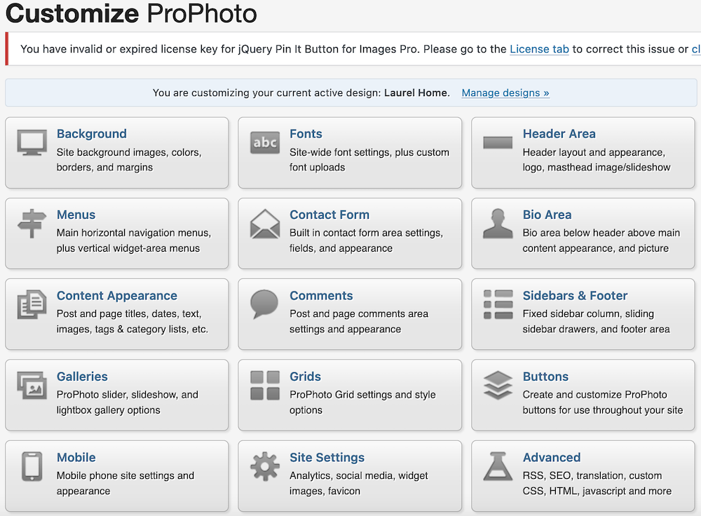
On my WordPress dashboard, I can access the ProPhoto customizer.
It is not very intuitive. For instance, “fonts” doesn’t control the fonts you see. That happens in Content Appearance. Luckily, most of this is set it and forget it.
I worked on the customizations for an entire weekend, and by Monday, I launched the Laurel Home website and wrote my first blog post.

In fact, the logo on your email is what the original site logo looked like for you subscribers.
This is why when I see someone with a “website coming soon!” message for months and months, I kind of roll my eyes. You can have a website up and running in a day or two.
And, that is how it all began in April 2012. Aww… I remember that raggedy font.
Over the years, I’ve been through a tremendous number of ups and countless downs with the Laurel Home website.
- The site has crashed dozens of times
- Images weren’t showing up.
- Caching issues.
- Mobile issues.
- That required a second theme… ProPhoto’s mobile-friendly version was not user-friendly.
Uh oh… I see several people in the back with their heads in their laps.
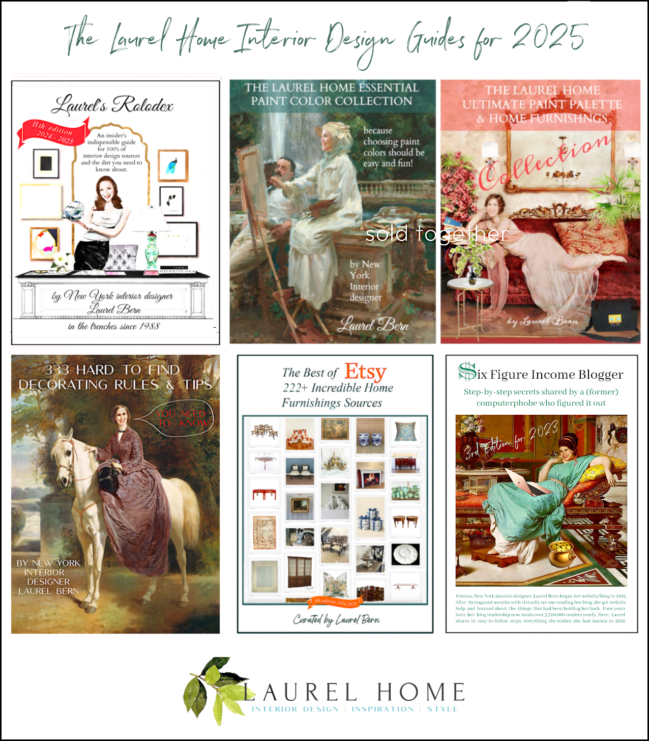
Please forgive me. I could write a novel about my little website and what we have been through. However, if you’re interested in learning how I got to where I am, please consider purchasing my guide I named Six Figure Income Blogger.
By 2017, I knew I needed a new theme. But, between Tim and me, there were illnesses, deaths, other projects, vacations, and something called Covid-19. All of that deterred that from happening.
Couldn’t I just hire someone to do EVERYTHING?
Yes, but then it would’ve gotten too complicated. It’s not enough to have only a pretty site. It has to function super well.
So, I’ve just made do. Before Eileen passed away late in 2018, her guy would patch things up, or I’d call Prophoto. In 2018, I began working with Tim. He took over when Eileen could no longer work.
However, in the last couple of years, numerous conflicts have arisen because of the antiquated theme, the separate, sometimes finicky mobile theme, and on and on… The handwriting was no longer on the wall; it was slapping me in the face!
I told Tim earlier this year, “I don’t care what it takes, we.are.doing.this!!! And, it needs to be done before the end of summer. He said, okay.
Tim is the most chill, cool dude on the planet and an amazing developer. However, he’s not a designer; most developers aren’t. Some people have super pretty sites, but they aren’t well coded, or they splinter off into another website. That’s a big No-no.
So, first came my part. I needed to give Tim a logo, the fonts, sizes, and colors.
 I have no idea where I found the Laurel leaf. It was a photo that I turned into a watercolor. The logo font is Forum, and the tag line in teal is my sans serif font. You’ll see it in a sec.
Knowing myself and knowing that I could easily drive Tim or any developer to the brink, he told me he could make a clone of my ProPhoto site for me to experiment on.
I couldn’t do everything, but I could spend enough time obsessing so that Tim would be able to do his thing beginning last month.
However, finding the perfect font isn’t easy. (for me)
In addition, I am not about to pay thousands of dollars a year for a font that requires a license. There are hundreds of free or nearly free fonts, and I only need two. A serif font with embellishments and a sans serif font that is plainer.
The most reliable source of free fonts is Google Fonts. There I found my new sans serif font that I love.
TENOR SANS.

I love that some letters do have a small embellishment, and I adore the combination of line weights in some of the letters. Of course, it’s also highly legible.
Still, I was struggling trying to find the right serif font.
And the serif font is the bulk of what you see on the Laurel Home Website.
Some fonts look great in regular text, but the italic version is awful. Actually, Times has one of the best fonts in italics, in my opinion. However, I’m sick of Times New Roman. I mean, it certainly gets the job done. It’s the peanut butter and jelly of typefaces.
But, I also wanted a better ampersand.
I know. Like who freaking cares?
No one but me. True. But, this website is my digital home. And since I only redo my website once every ten years, I think it’s okay to spend the time finding the best free or low-cost font.
Once I had exhausted every Google serif font, I found out on Font Squirrel that all Adobe fonts with a nominal monthly subscription are free to use any way one wants. I think it’s about 10 dollars a month for an Adobe Creative Cloud; I believe it’s called. Adobe was formerly known as Typekit.
There, I found my serif font.
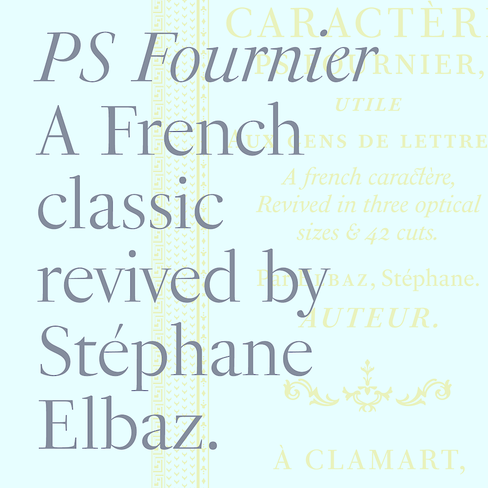
PS Fournier
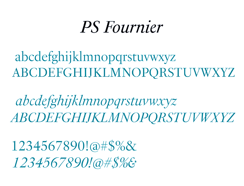
PS Fournier is legible and looks great in all sizes. It also has a beautiful italic font and a cool ampersand. I think it feels both modern and classical. In fact, there’s a story around the original font which you can read here.

I didn’t know that PF Fournier was named after the originator, Pierre Simon Fournier, an 18th-century French typographer. It has been reissued and updated by Stephane Albez for TypoFondarie.
Below is the alphabet and numbers, along with my beautiful ampersand.
So, when are we going to see the new Laurel Home website?
Everything is about 98% finished on desktop, but we’re having a couple of struggles with mobile. Tim’s working them out. I expect the new site to launch around the 29th of August, the third anniversary of my mommy’s passing.
However, I am going to give you a little preview right now.
The basic structure of the site is going to be identical. That part ain’t broken, and I love it.
So, without further noise from me, here is part of a blog page.
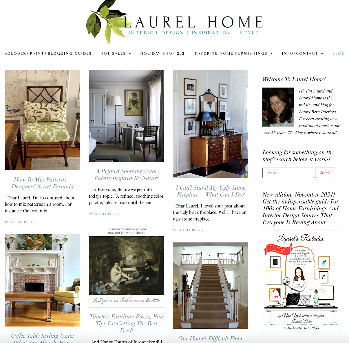
Okay, Laurel, if you’re not using the Prophoto theme, what theme are you using?
Tim is using the Astra Pro Theme augmented by Elementor, a page builder, to allow for further customizations.
Back in 2017, I was going to use the Genesis but was underwhelmed with the limited choices. However, Genesis themes are lovely.
Thanks, Laurel; now what the hell is CACHING?
Gosh, you guys ask the best questions!
Okay, the best way to explain it is, let’s say there are 30,000 pages on this site. Yes, you heard right. Every image has its own page. Caching works to hold the 29,963 pages in a virtual binder. (The cache) Therefore, the site only has to download what’s new and everything else in the cache.
Then it, too, gets added to the cache. That way, the site loads way faster than if it had to retrieve all 30,000 pages every time someone jumped onto the site.
When it comes to websites, speed is imperative. And, other things like being mobile-friendly and font size.
I know that some of you may want Tim’s contact info. Please get in touch with me if you like– in October.
Tim’s going on vacay in about a month. That’s why we’re going live with this ASAP. We want to be able to iron out anything serious before he goes away. Of course, copious amounts of testing is going on this week before the site goes live.
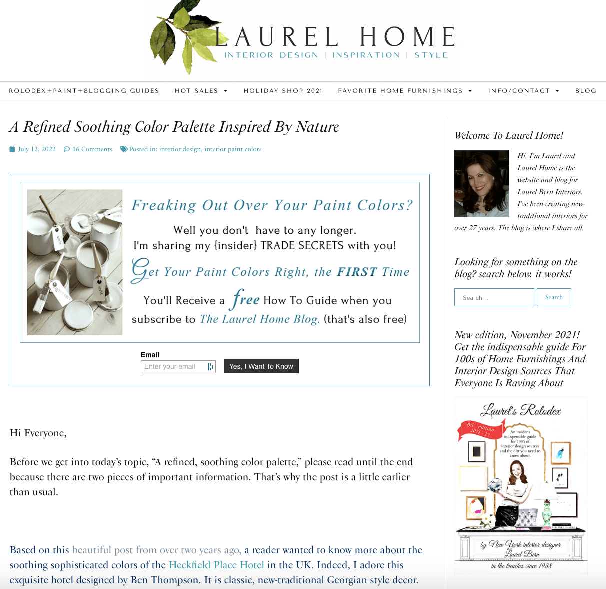
The links are in the same gray color, but most, when hovered, as you can see above, will turn into the teal color.
What about Square Space, Laurel? I hear that it’s very easy to use and inexpensive.
I don’t recommend it, or Wix or Weebly. These platforms have a lot of limitations, and if you decide you need to migrate it to WordPress is going to be a major hassle. That translates to beaucoup bucks you’re going to have to shell out.
What about an updated ProPhoto website, Laurel?
Sure, please look into it. I do know there are some developers that specialize in using their themes which are beautiful. Or, you could learn to do it yourself. The new system is completely different. It’s now a drag & drop system.
If there are any other questions, please ask in the comments.
Thank you so much for your ongoing support. As you can see, the Laurel Home website is still “me.” Just me with a facelift, tummy tuck, and a new brain! haha!
xo,

PS: Please check out the newly updated HOT SALES. There are a lot of new items on the vintage page.
Related Posts
 company coming – best sleeper sofas and alternatives
 A Common Renovation Mess – Can it be Fixed?
 Affordable Home Decor – 18 Ideas You’re Gonna Love
 54 Iconic Designer Fabrics To Make Your Room Look Rich
 Reddish Laminate Floors? What Wall Color Will Work?
 The Best Kitchen Backsplash and My Favorite Options
 Contemporary Interiors – Are They Trendy or Timeless?





32 Responses
Hello! So happy to hear about incoming increased mobile accessibility. Sometimes when I’m out of the house, I just suffer the miserable mobile layout for the sake of your excellent content. Something else, though, is the site search function. That’s probably when I noticed the new site changes—instead of searching your site for keywords, I just get the latest blog posts.
Hi Laurel- A huge thank you for sharing! First I love your new logo and the website looks fabulous. I’m excited to see more.
My thank you is because my own website designer has my website in his own proprietary program. I asked (no demanded) that he takes it out and puts it on a non-proprietary platform- said what happens if he’s hit by a bus! Well, his first suggestion back to me was word press!! If I hadn’t read your blog I might have relied on his knowledge and said yes. Instead it was a hard NO! So thank you!!
Oh, Laurel! How fresh your new site will look and feel. How satisfying for you.
Despite lots of graphic art experience (I know what kerning is and why it’s used), and despite my “designer eye” for beautiful fonts, I decided to go with “web-friendly” fonts so that I could be assured of consistency among browsers and devices.
There is a very short short list of web-friendly fonts so it “helped” me from spending weeks on the hunt. Lol.
I love the one’s you picked, by the way. And I love your choice of teal along with the greens. It’s so pretty. Can’t wait to see your new photo too.
I’ll be one of those asking for Tim’s info when he gets back. The tech stuff has been heeeelariously challenging for me.
Thank you for your amazing site. I am so very glad that I found you. You always have such beautiful designs, and great pithiness with words. I LOVE your new font. It is classic like you. I am looking forward to the 29th
The best thing of all is you have two handsome sons.
Just a follow-up – the only way to professionally kern your name would be to make your entire header into a jpeg in photoshop and adjust the spacing there. It cannot be done by just typing no matter the font. Still happy to do it if you want. Piece of cake for me.
Laurel, just wondering if you have tried Starbucks lemon pound cake? It is surprisingly delicious IMO. Velvety and buttery and moist and very lemony.
I’m in Oklahoma, but I would assume it would be the same there in Boston?
If they don’t have it there I will mail you a piece.
Yes, yes & yes. Love the laurel leaves, the fonts, and the very important ampersand! Beautifully done, Laurel.
Beautiful fonts and header, Laurel! I too have spent days and days agonizing over a font. I get it. And yes, it’s worth it! Congratulations!
Congrats, Laurel – everything is beautiful.
agree about the spacing of the A and the U in the title.
However, the font is so perfect and a clear design aesthetic as to how you expect your new kitchen to be.
Amazing work – you’re an inspiration…!
I have always enjoyed your website. The updated version is very very nice. Your obsessing over fonts, etc makes it special. When things are done so well, it looks effortless – hah!
Congrats, Laurel, on your updated website. I love your new fonts and your watercolor laurel leaf, and I’m glad your layout is unchanged. Your website has always felt very easy to navigate.
oh I thought the new kitchen staircase was going to start.
It takes me forever to read your posts and I need two devices, I can’t imagine the research and the time it takes to write them up. I am so grateful you don’t post more often.
Congratulations! You’ve obviously been ceaselessly toiling away while we viewers have seamlessly enjoyed the benefit of your work. I love the fresh look and the laurel leaf (and wreath) have always been favorites of mine. So perfectly suited for you, both for your name and as a design element!
Hi Pamela,
I love the Laurel wreaths, too; however, so do a lot of other people whose name isn’t Laurel. Since the laurel wreath has become a bit over-saturated, I don’t think I’ll ever have one.
Laurel, I love the fonts you chose. I don’t have a website, but I am very picky about fonts, and yours are gorgeous. I also love the laurel leaves. Very subtle, you have to know what laurel looks like to appreciate it, but a beautiful touch.
Re: kerning. To me it looks like the LAU matches the HOME in the kerning, and it’s the REL that isn’t quite the same.
And I’ve been there done that with you, Laurel. I also had a website in 2001 and it was the hardest and awfullest site but nobody else was doing them then and it was by the seat of my pants. I worked with dreamweaver, and at the time nobody was doing drop-down menus! I had to work with my geeky husband and code our own.
Hi Laurel. The first thing I hope to see when sidling up to a new website, is what a website is ABOUT. Without this heading, I feel lost from the get go, as if everyone else is so hip to the scene, an introduction isn’t necessary. Would you consider an ABOUT/CONTACT tab rather than INFO/CONTACT? IM(VERY)HO, the former is more clear than the latter, even though the word INFO is there. Love the blog. Thank you.
Hi Kay,
Thank you, I’m trying to conserve space in the menu because I already have some long menu headings. However, while we’re on the topic, it drives me beserk when I land on a website that’s providing a service and I have NO idea where they are located. The address of the business should at least be on the home page, but ideally, it should be on every page if one is interested in coming up in local search results.
Yes, even IF one’s business is in their home. You don’t have to say. 114 Commonwealth Ave. (Yeah, I live here) lol And, one doesn’t have to put an apartment number in. I hear a lot of people want to retain their “privacy.” There’s no such thing whether one has a website, or not.
Give me a phone number, or an email address, and I can access the entire life history of the person who owns that number or email, in 30 minutes, or less.
However, Google requires a physical address (not a PO Box) in order to rank people in local search results.
All of these things and a lot more are in my blogging guide. They are small things that if not done right can really hurt a person, internet-wise.
Like Jo, I also feel the kerning is off between the a and the u. The shape of the A adds to this perception.
I love your new fonts: elegantly representative of your work!
Thanks for the sneak peek, giving the ability to compare the new with the old. The old is nice, but the new is really, really nice. It’s like when you see a beautifully styled room, but are not really aware of all the special little things that make you love it. Also, your post shows the importance of all the nuts and bolts necessary for a successful product – whether it’s a website or a home design project. Your talent, attention to detail and persistence pay off in both endeavors, to the benefit of all your readers. Visiting your site is educational, inspirational – and fun! Thanks!!
Hi Laurel,
I love the new design and your description of your journey. (Yes I’ve been through it all as well) But one thing I must point out as I was a graphic designer and typesetter for 30 years (yes I am old) is that the kerning of your title is a bit off. Too much space between the a and the u. It’s like if your curtains were hanging one inch askew. If nobody can kern on your end I will be happy to do it (FREE) because you just make my day sometimes.
Hi Jo,
Thank you for the offer. I had to look up kerning. I see what you’re talking about. However, it’s a function of the font. I redid the LAUREL HOME in both PicMonkey and Google Fonts, both with one space between each letter and again, with no spaces. The space between the A and U is consistently slightly greater all four times. I also tried the capital A next to every other capital letter. In some cases, it’s practically touching like AZ and in others like AQ, for example, there’s a larger distance.
Oh well. I’ve been looking at this logo for five years as that is when I made the first version of it. You’ll see it on a lot of my graphics. I never noticed until you pointed it out. I could fix it myself by manually inserting each letter that is off, however, I guess I figure that this is what the original typesetter intended? I chose this font because of its minimal serif, the round O, and the fact that the letters, themselves have different widths, like the disproportionately thin E.
I think it suits my slightly quirky personality.
You’re amazing. I have been following you for a number of years and to me your website has always been easy to read and find things.
Most of what you talked about today is Greek to me!! You really do know what you are doing and are quite knowledgeable about websites and how to do all this. And you are a great designer also.
Good luck with your new launch. Looking forward to seeing it!
The technical explanations were very informative and you seem to have a grasp of the language. I got a degree in graphic design decades ago and have never stopped appreciating how visuals and texts are put together. You and Tim have done a great job and the styles you’ve chosen are serene and pleasing to the eye. Can’t wait until the launch!
I’m super impressed with how hard you have worked to get where you are. I wish you much success.
Love the water color laurel leaf.
I second Leslie’s comment!! To be redoing your website and working on redesigning your apartment is quite amazing!! I can understand why you need a new brain 🙂
Good morning Laurel, So happy for you to achieve this satisfying accomplishment. The website will definitely reflect your dedication to detail and continued growth. I’ve been enjoying your blog since 2015 and continue to refer to the Rolodex and the two Paint guides as well as the treasure trove of topics you have written about. I am in awe of what you have accomplished both personally and professionally. You are quite the inspiration!
Love the new fonts. Congratulations on this accomplishment while renovating your home no less. You are a Viking!
Treat yourself to a new professional headshot too for the website! Revamping a website is grueling – great job!
Hi Doe Ti,
Yes, there will be a new headshot. I forgot to mention that.
Beautiful work Laurel! ( As always!!)
I haven’t viewed your site on my laptop for a long time, so I’ll be excited to see your new mobile. I notice some website designs lack depth … they seem very flat. For that reason, I’m using a drag-and-drop beta direct booking web builder from my favorite software for Airbnb called Hospitable ( AKA Smartbnb). Hoping to launch in the fall.
Thanks for the tip about Adobe subscriptions and fonts…cool! I had a student who worked for me that taught me to change headings into allcaps for a pro look, and back then, I fell in love with Garmond and still use it. Ariel when I need sans-serif ( Can you believe that as a French student, I just recently discovered what the “sans” in san-serif means??!! “Sans” is French for without or not included) Took my husband who is always downloading ancient manuscripts to explain it to me!
Congratulations, Laurel, on weathering a tough 10 years! I think 9 out 10 new businesses fail within 1-2 years, and of the successes, only a small amount survive 10. You go, girl…here’s to another 10!!!