Color of the year. It’s become a lot like the Oscars.
And the Oscar goes to…
And then the Golden Globe goes to…
The Screen Actor’s Guild Award…
The People’s Choice Award…
On and on… one fashion show after another and a chance for advertisers to cash in.
Well… the same holds true in the home furnishings and decorating industry when it comes to the almighty “color of the year.” Or I should say, colorS of the year!
Someone mentioned to me the other day that they don’t remember this being such a big deal a few years ago.
It wasn’t.
So, what changed?
Social media, I guess…
And, so what we end up with is much buzz about not really anything that important, but that’s okay. I love color and I like paint.
So far, the top two paint companies in the US have announced their “color of the year.”
Benjamin Moore and its courageous choice of “Simply White”
And close on the heels of that, Sherwin Williams choice of Alabaster.
Another White Paint Color!
As a designer, I’m absolutely thrilled that both paint companies had the courage to choose two beautiful shades of white paint. For other great shades of white paint, click here.
In a few weeks time, we are going to hear from our Academy Award equivalent…
PANTONE
Remember last year’s disastrous (well, IMO) choice of the barftastic Marsala? Yes, the color of dried blood. A color so not in-tune with what is going on in the design industry, it’s as if they went about their business and ignored everyone else. Is that a good idea?
One of the hottest tickets in the industry and a stop on the Design Blogger’s Tour is Taylor Burke Home. Julianne Taylor, founder and owner treated us to a fresh, Neo-traditional collection at Wesley Hall of her home accents.
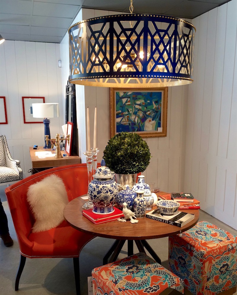
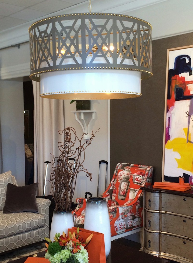
Above is a vignette at Wesley Hall featuring Taylor-Burke’s fabulous fretwork chandelier, aptly named “Don’t Fret.” It is just cooler than cool in person.
There’s another version which includes a piece called “You’re Riveting.” So clever. For you designers out there, both Taylor Burke Home and Wesley Hall are designer friendly.
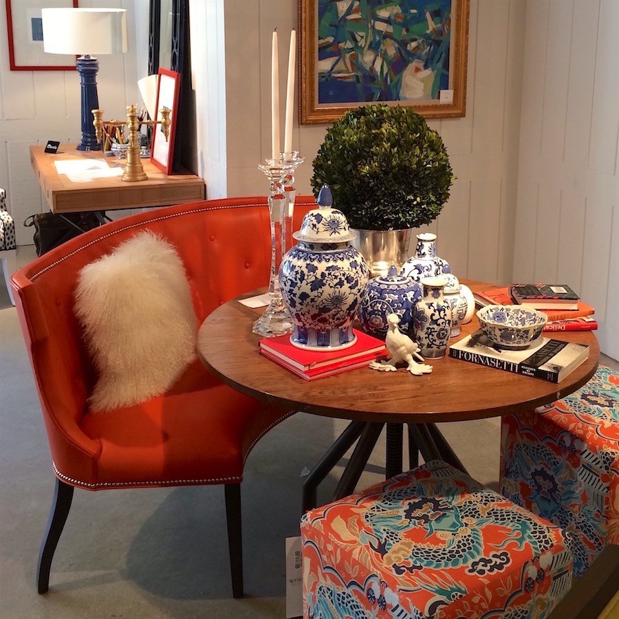
Another shot of this cool Chinoiserie inspired vignette.
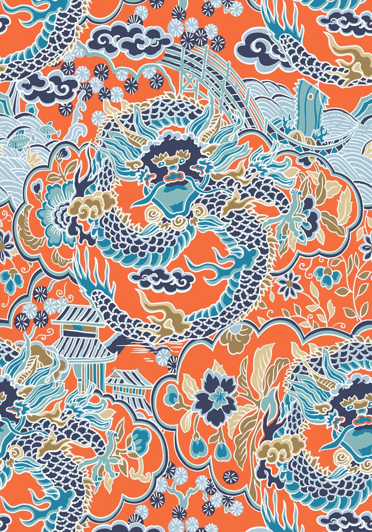
Imperial Dragon Fabric by another Highpoint darling–Thibaut.
Pantone Folks? Paying attention? I think that your color needs to reflect this combination inherent in these hot home furnishings; that is designs that couple tradition–with FUN.
Not desiccated liver.
Oh, dear… someone’s going to call me a bitch. (forgive me, but if you call someone a bitch doesn’t that also make you a bitch?)
Oh well… I’m sure I’ve been called worse. lol
Laurel, would you stop krechitzing already and just tell us what your prediction is for Pantone’s Color of the Year?
Oh, sorry… Was I talking too much?
What do you think it should be? Please just hold that thought in your head and don’t scroll any further until you’ve formed an opinion if you have one. :]
Then, tell me if we’re on the same wave-length in the comments. I’ll put in a pretty pic here (love this vignette!) which won’t give it away while you’re thinking.
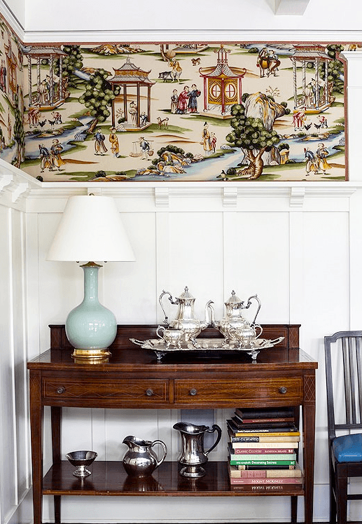
I’m thinking that the most logical choice is a rich deep………..
I mean, with all of that white, isn’t blue an obvious choice?
Oh please, please… pretty please? I promise that I’ll only say nice things unless they do a 180 and decide to render us blind.

ouch.
In recent years, I’ve come to adore blue… But it wasn’t always so.
In fact, if you had asked me 30 years ago, I’m sure that I would’ve said that I pretty much disdained blue.
And I think I know the reason why…
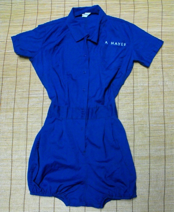
I don’t know what year they stopped making people wear these abominations, but all I remember is by the time I got to high school, the most exercise I got in “gym” as we called it, was getting into and out of one of these hideous things.
Fortunately, I got past it.
Now, I’m in love with blue.
And @Pantone, you’ve never chosen a deep rich blue, so I hope that you’re listening!
In the meantime, Please enjoy some beautiful interiors by some of the hottest designers and design teams as well as some of my favorite shades of deep rich Blue
The first three images are from the shop of one of the hottest design teams, Lance Jackson and David Ecton, who founded only four years ago the wonderful lifestyle brand, Parker Kennedy Living
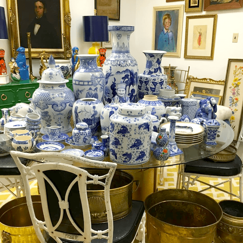
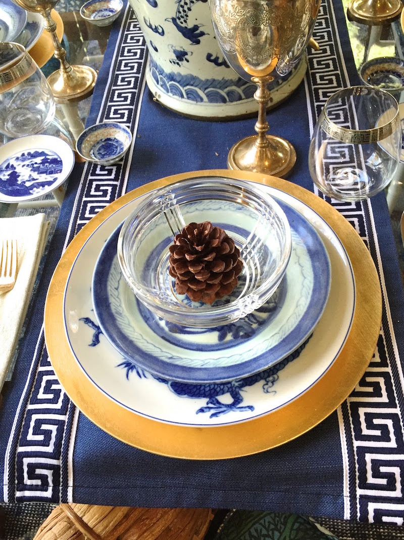
Here’s an idea for your Thanksgiving blue and white table. Or else, you can just use an orange Hallmark Tablecloth like I did last year.
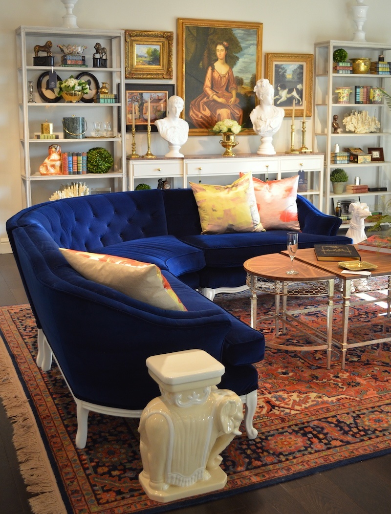
Their Hollywood Regency inspired designs always look amazingly fresh. They always incorporate white and often blue in their work. Is that sectional sick or what!
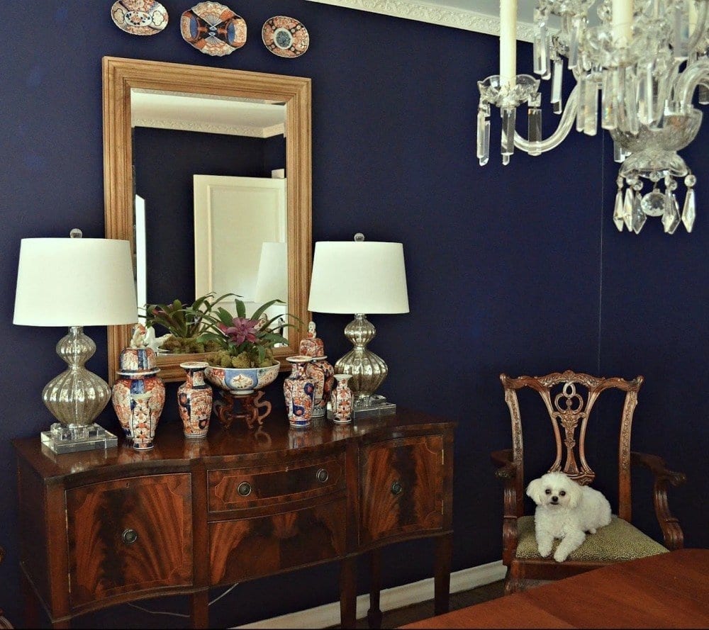 Wonderful dining room featuring navy walls by Tartan Terrace
Benjamin Moore HALE NAVY HC- 154 is a good one.
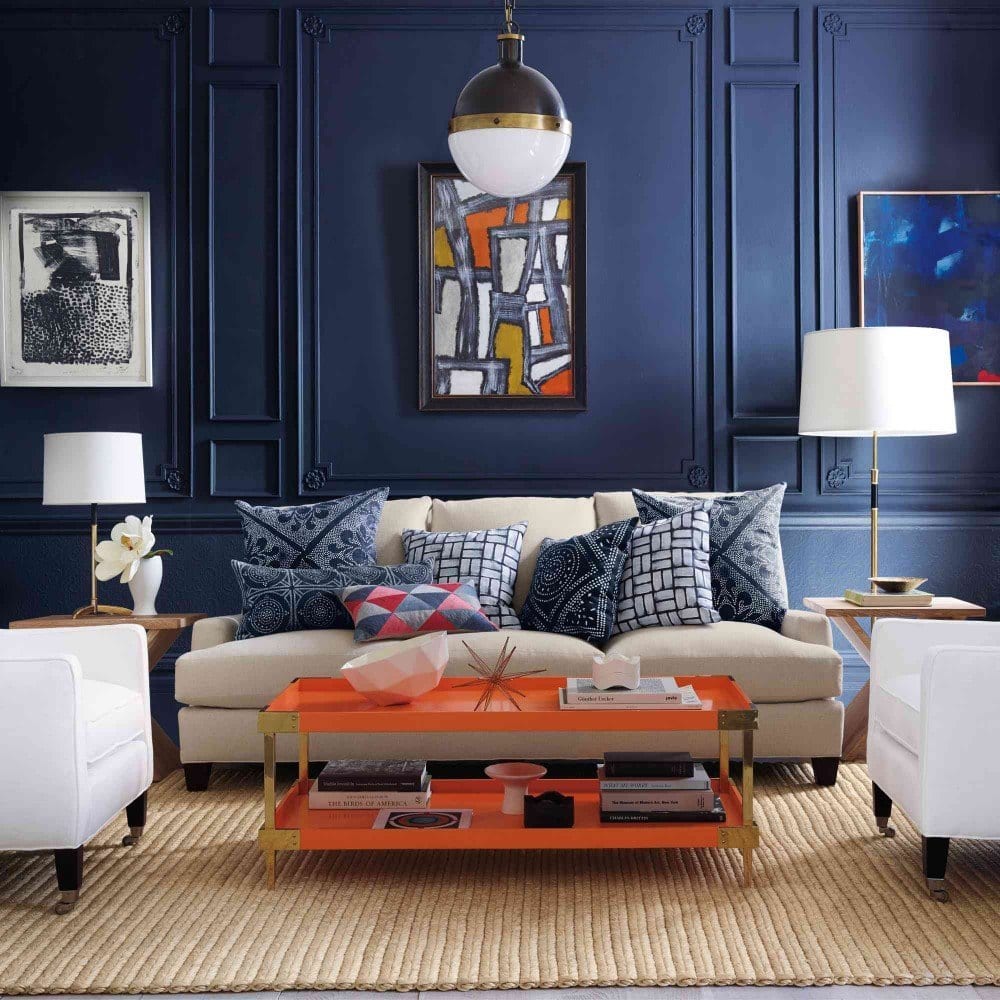
I posted this image from Serena and Lily before in another blue post which combined blues with oranges and white. Great combo. Love the wall and especially because of the gorgeous mouldings!
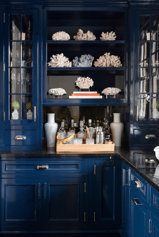
There was a collective OMG! when this astonishingly gorge butler’s pantry was revealed earlier this year. It belongs to that beautiful blogger Sue de Chiara aka: The Zhush
Another fabulous deep rich blue is Benjamin Moore BAINBRIDGE BLUE 749
But dark shiny blues often photograph much lighter so this could be the wonderful rich HAGUE BLUE by Farrow and Ball. I also love their new color, STIFFKEY BLUE.
For the closest Benjamin Moore equivalents please click here.
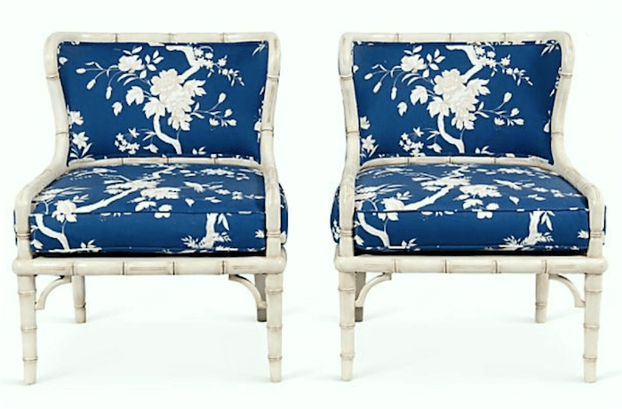
Sold. Sorry, but these fabulous faux bamboo chairs were offered by the Parker Kennedy Boys.
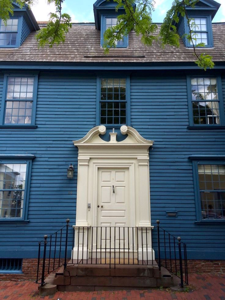
A Home in Newport, Rhode Island. It’s a fun place to visit if you’ve never been there.
This reminds me of Benjamin Moore BUCKLAND BLUE HC-146
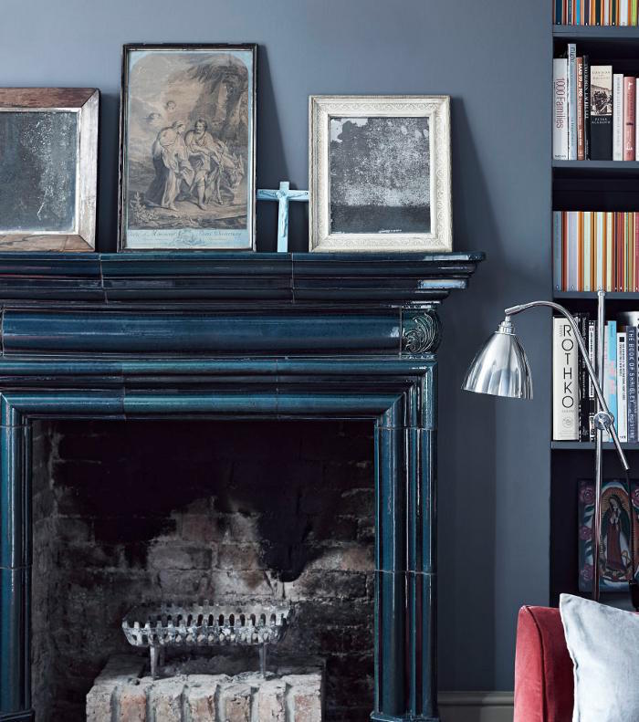
Mantels don’t always have to be white. I absolutely adore the antique blue finish on this one. My friend Lisa Mende did a fabulous round-up post the other day about peacock-blue colors.
Another wonderful designer-friend, Robin Seigerman of Renovation Bootcamp recommended Benjamin Moore TWILIGHT 2058-10. She said that it’s not as dark as it looks on the chip and is very beautiful.
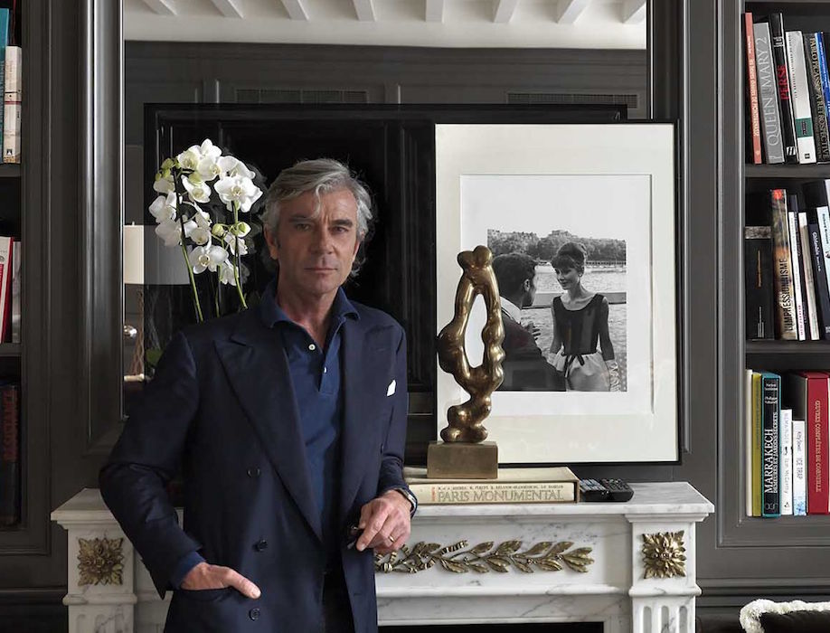
Here’s Michele looking tres dapper in his blues and standing in front of that astonishing fireplace mantel. This is a new hotel he designed in Paris.

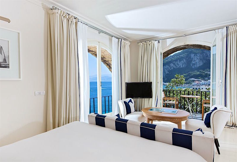
And here’s the view outside my room at the JK Place. lol
What do you think of my choice for color of the year? Do you have a different idea?
Oh my… Can you believe, it’s going to be Thanksgiving next week?! I won’t be posting until a week from today. I have a special treat for you, so please stay tuned! In the meantime, here’s wishing everyone in the US a healthy, happy Thanksgiving.
xo,

Related Posts
 Our Unique Home, Stunning View, But Difficult To Furnish!
 Farrow and Ball Colors Update – 2018 + Matching
 A Hollywood Regency Style Inspired Media Room
 Discover the new black in interior design!
 Benjamin Moore Color of The Year 2016 – Anything But Simple
 Here’s Why Buying Furniture Online Is A Bad Idea
 16 Tiny Kitchens That Prove Bigger Isn’t Always Better


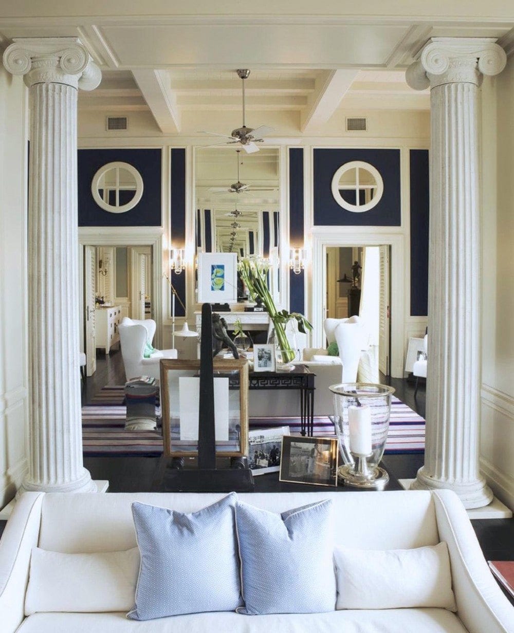 There can be no post about blue which doesn’t include my favorite hotel in the entire world– The JK Place Capri designed by Michel Bonan
