Hey Guys,
I’m in San Francisco for the Design Influencer’s Conference.
Today, I went out with my good friend, interior designer Deborah Von Donop of DVD Interior Design, and we had the best time traipsing up and down the hills. Of course, Deb being a relative “homey” is someone I get to see in New York. You may recall a beautiful garden show in Greenwich, CT we attended last June.
However, while beautifully balmy when I arrived yesterday, today was a different story.
It was quite chilly and WINDY. But, that’s San Francisco. It’s not our bitterly cold winter of the northeast. But, we needed our heavy coats and a hat.

This is a photo I took near Fisherman’s Wharf in San Francisco with the Golden Gate Bridge in the background.
And yes, we climbed up to the top of Telegraph Hill and winded our way down Lombard St. So, get ready later on for more images of this stunning city. It’s changed a lot since I lived in Palo Alto in the mid-1970s.
This post is a continuation of Syd’s open floor plan, where all of her walls are currently gray. On Wednesday, we looked at some ideas I had, but I came up with those ideas before I knew the layout. So, let’s see if any of that works.
But, mostly, I want to share with you an easy renovation idea that I’ve done many times for clients.
And, what is the easy renovation idea?
It’s creating some small wall additions to create some separation of space. But, not so much that it compromises the open feeling. We’ve already touched on this idea in this post about open concept floor plans.
Sometimes, in our simple renovation, we’ll also move doorways a foot or two. I always loved designing these kinds of improvements. I found making these small tweaks would make an incredible difference to the overall plan.
Fortunately, Syd had a scale drawing the first floor of her home.
However, it is only a photo. So, I made the image to appear at 1/8th scale on my laptop. I did that by already knowing that the kitchen counters are about two feet deep. Plus, some of the room measurements. Then, I used my scale ruler to measure out the rest of the walls and furniture.
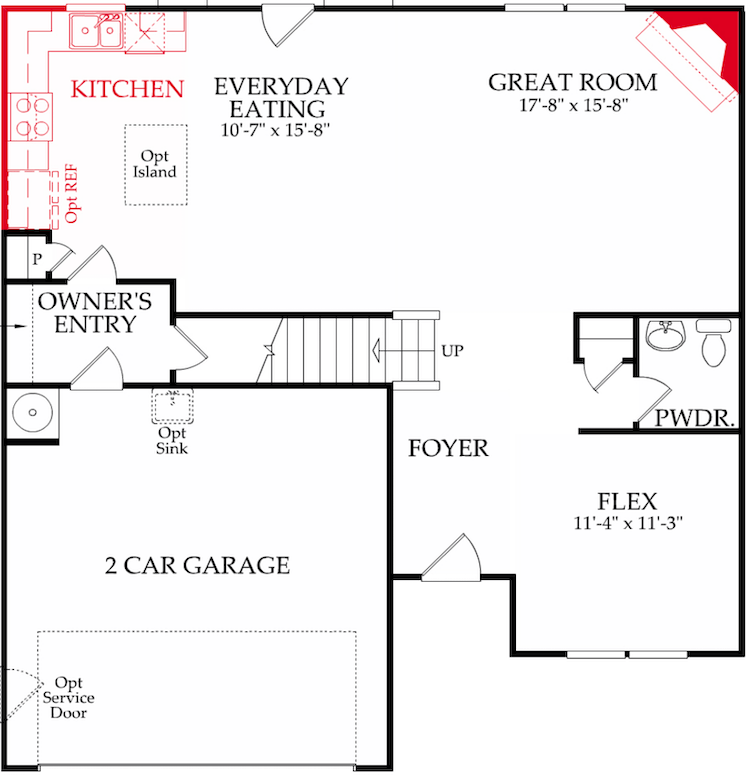
Above is the floor plan that Syd sent me.
Just one problem.
It’s the reverse of her home.
So, I took a screenshot of it. And from there, I was able to reverse the image.
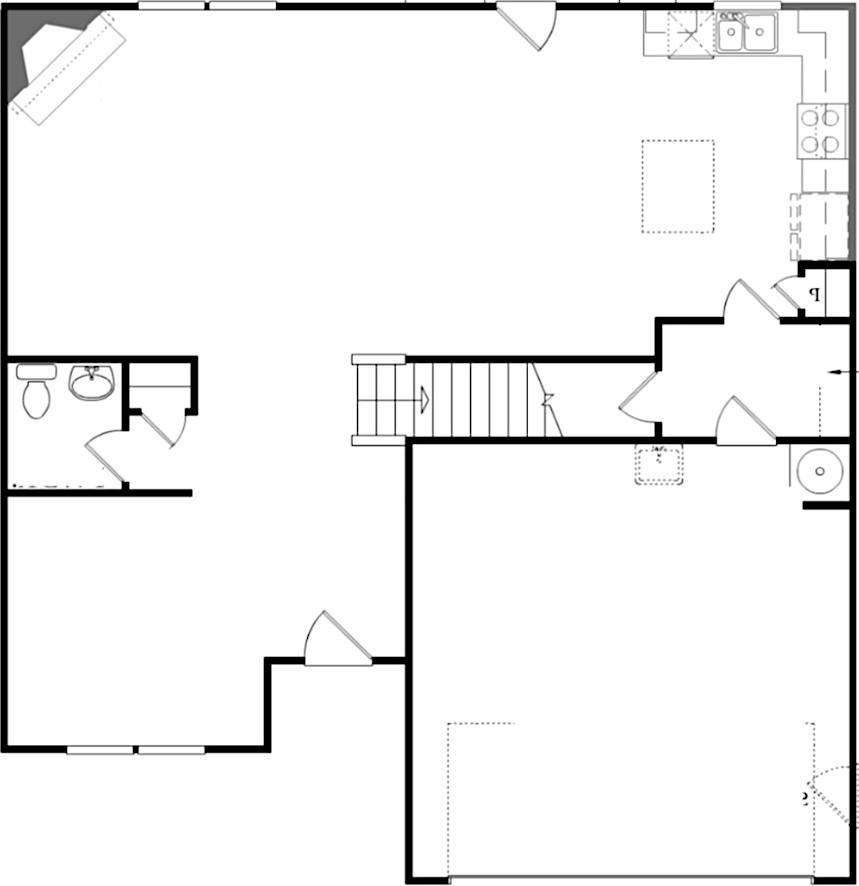
There, that’s better.
In the next image, is where you will see my easy renovation idea.
The new small walls are in the medium blue color. The existing walls are in black.
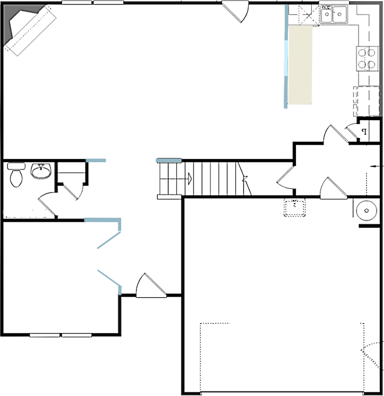
You walk through the entrance, and immediately to one’s left, I created a completely enclosed room. Right now, it’s an office. And, there are some other things in that space, as well.
In my renovation plan, I created two small walls, one longer extension, and a French door.
I think having the ability to enclose this room adds value because a prospective buyer could see this as a great getaway space. Or, it could also serve as a guest room.
Moving on. We come to a staircase. Right now, there are two half-walls used as railings. The first one, I would replace it with a wooden railing and newel post.
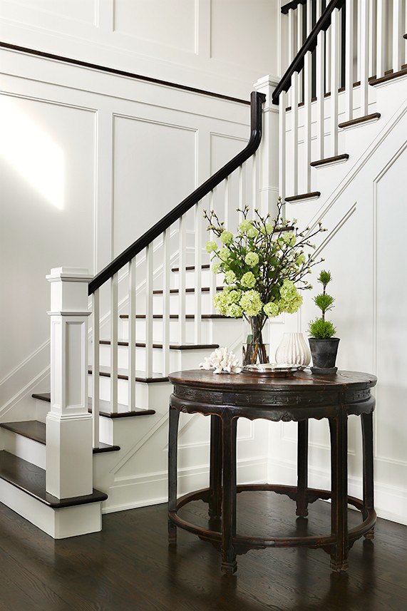
Maybe something like the one above. It will only go up a few stairs, and then the spindles will disappear into the wall.
On the dining room side, I would turn that side into a full wall. For more great staircase ideas, please check out this post.
I extended the wall entering into the living room by about two feet.
For the living room, there are no architectural changes. The only one is the fireplace moulding.
The most significant change is the kitchen area. There, I put up a wall; with a pass-through. But, there could also be an interior window in that opening.
And then, I yanked out that island. Instead, I put in a long counter.
Of course, Syd will most likely not do even half of this.
But, let’s say that she was just moving into this home or wanted to do a renovation increase its value for resale.
I do believe that these changes will do that. And, if nothing else, make the home more appealing.
Now, for the furniture layout.
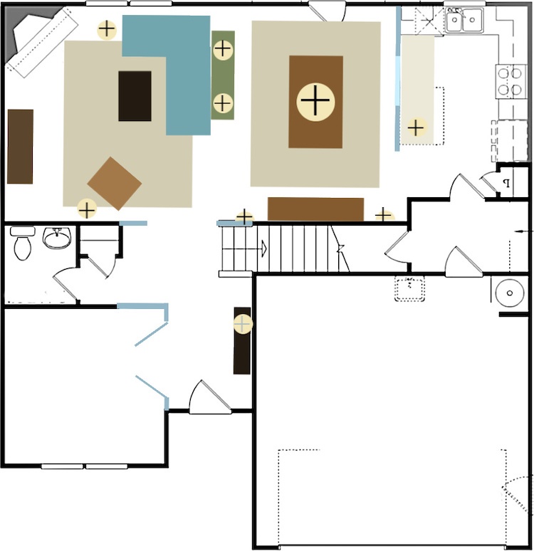
When we come in, there is a small console table on the right with a table lamp.
The living room layout is pretty much the same. However, the sectional is smaller.

The Serena and Lily Barton Sectional is one of many smaller sectionals that might work. It is currently on sale, as is all of their upholstered custom furniture. (this is the right-facing sectional)
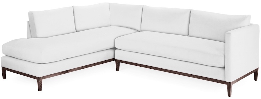 Syd would need the Serena & Lily left facing Barton sectional.
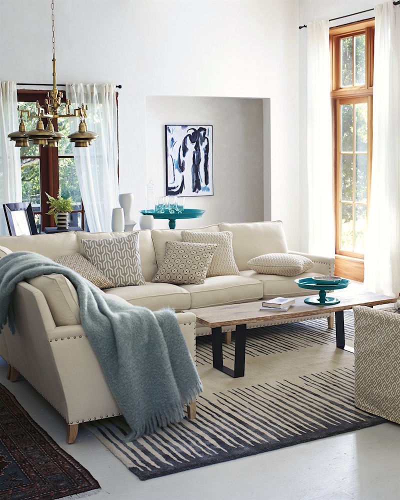
The Serena and Lily Spruce Street Sectional Sofa is another favorite of mine.
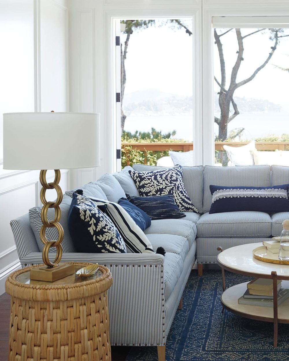 All of Serena and Lily’s sectionals come in both right arm and left arm facing. This version is right facing. It’s called that because the shorter piece is on the right side when facing the long side.
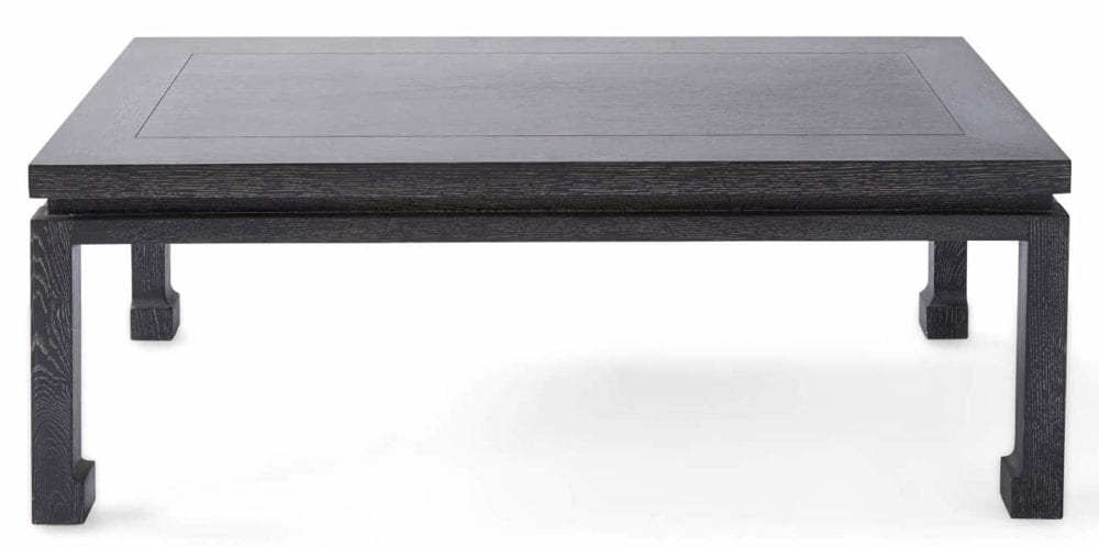
The small Reese coffee table would look fantastic in this scheme.
You can also the small Reese Coffee table on the Hot Sales page in the second widget. Yes, it’s on sale, and it’s over 40% off! It also comes in a lighter cerused oak finish.
I did add a sofa table behind the sectional with two table lamps. That way, I could forgo an end table. But, I did put a small floor lamp on the fireplace end.
And, I added a task lamp next to the leather chair.
Of course, Syd will most likely not do even half of this.
But, let’s say that she was just moving into this home or wanted to do a renovation increase its value for resale.
I do believe that these changes will do that. And, if nothing else, make the home more appealing.
Initially, as I was planning this out, I did have two small walls separating the dining area and living room. But, I found it challenging to make it all work and flow nicely. Therefore, in the end, I left it out.
However, I love the idea now, of the two sconces with the china cabinet on that wall.
Of course, there would be chairs around the table. And, we could put two extra chairs flanking the doorway.
Could we do the demi-lune tables, like we did in the mood board from Wednesday?
There might be room flanking the pass-through. But, right now, I left the tables out.
My motto is: When in doubt, leave it out.

Valley Wallpaper Serena & Lily
What about the wallpaper, Laurel? Can you still do it? I don’t see a natural place to end it now.
Well, yes, you are right about that. But, I think if Syd did the dark green walls, in this case, it might be interesting to do the wallpaper on the pass-through wall. And, maybe also do it on the china cabinet wall.
Or, she could just do it on the pass-through wall, only as a cool accent.
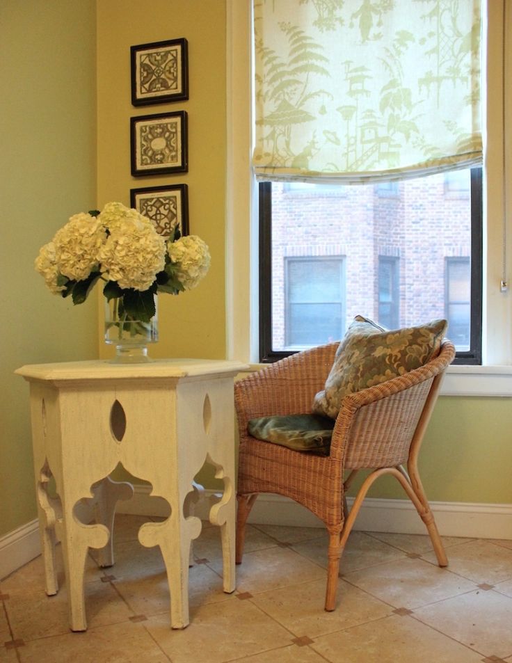
I am seeing painting the kitchen in Pale Avocado from Benjamin Moore. It is the same color I have in my kitchen (above). And, it is one of the Laurel Home Essential Paint Color Collection colors.
And, it is included as one of 16 of my favorite Benjamin Moore paint colors.
On the back wall between the living and dining areas, I would do a stunning art gallery wall.
For some free art wall templates, please go here.
Also, please check out a fabulous art gallery wall for cheap.
And, the ultimate art gallery wall hack.
Well, I think these ideas will make this home more cohesive.
I think one of my favorite parts is creating a real room by the front door. But, I also love enclosing the kitchen. How do you feel about that? Do you prefer your kitchen, dining, and living/family room to be all one room? Or, do you prefer having some separation from your kitchen?
I will see you most likely on Wednesday this week, due to the conference.
In the meantime, please check out the newly updated HOT SALES!
xo,

Related Posts
 My North Facing Room Paint Color Is Driving Me Bonkers!
 50 Interior Design Trends for 2020 – In or Out?
 Small Living Room Decor -Should It Be Pale or Dark?
 22 Living Room Lighting Rules You Need To Know
 20 Stunning Lifestyle Instagram Feeds You Must Follow
 Dining Chair and Table Combinations That Rock!
 80+ Timeless & Classic Home Furnishings You Will Love!


