Yellow Walls – Why Do You Hate Them So Much?

Hi Everyone,

Thank you so much for your kind notes and comments. My back is still sometimes sore, especially after I went shopping today. However, after icing it and one Advil, it feels okay now.


Today, we’re going to talk about the color yellow and yellow walls.


Wait, Laurel, I thought you said you like to talk about cool colors in the summer.


Well, summer’s over. haha, It’s almost time to put up your tree. ;] Anyway, please try to listen. I know most of you hate yellow walls. Or, at least don’t want to see a big drink of it.

I understand. But, here’s the thing. A big drink isn’t good, but yellow walls are a fantastic background for art.


However, I’ve read more than once that it’s the worst color to paint your home if you want to sell it.


But, in reality, is it?

Maybe I was fortunate; however, as most of you know, I had yellow walls in my living room in Bronxville, NY. I put it on the market two days before Thanksgiving, 2020. Two days after Thanksgiving, I had a full asking price offer from a lovely young woman with a handsome income and perfect credit.
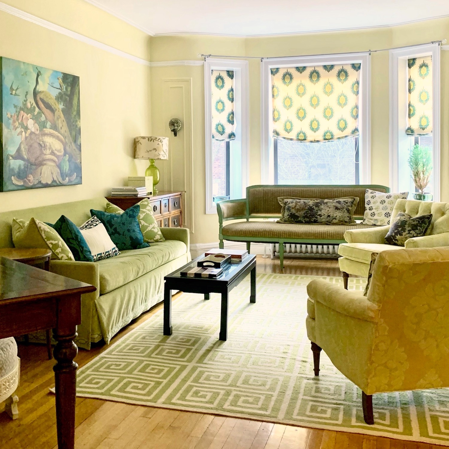
 

31 Pondfield Rd Bronxville, NY apartment for sale - living room - Benjamin Moore America's Heartland wall color

Awww… there’s Joe. I miss him.

While this color may not be your favorite, it’s definitely not the worst color you can paint your living room. In fact, all of the warm shades of yellow, gold, and even orange look absolutely amazing in the evening. That’s with warm lighting from lamps and sconces primarily.


This living room glowed at night. Truth be told, the original color was a tad deeper, Hawthorne Yellow.


This shade of yellow looks the same at night but is a touch paler during the day. It is Benjamin Moore, America’s Heartland. Both of them are in the Laurel Home Essential Paint Color Collection. It comes with a coordinating guide using all the paint colors in 40 palettes; you can mix up according to palette families. At least three of those palettes are in the yellow family. And, I have to say that one of them is my favorite board.
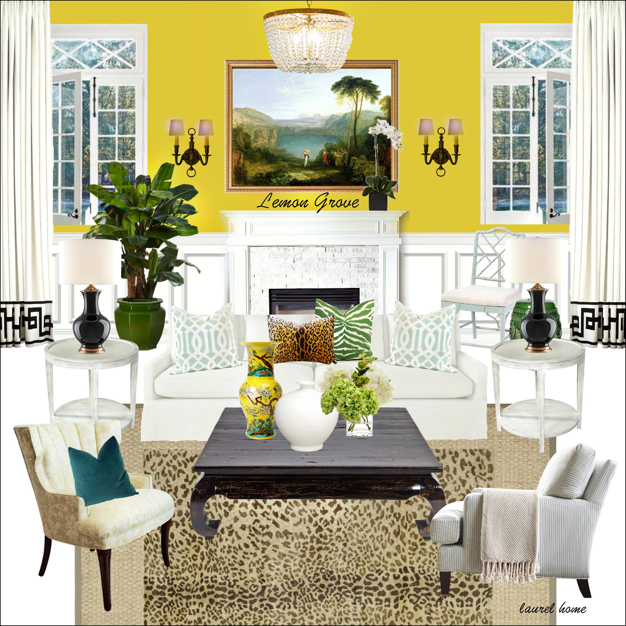
 

Benjamin Moore lemon grove living room

I love it because that shot of saturated lemon yellow walls makes a fantastic backdrop for art. And, it looks fresh with all of the shades of white.
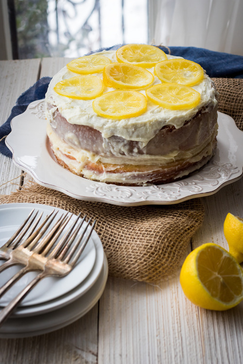
 

via aloveaffair blog lemon cake

OMG! That looks incredibly delicious.

The lemon cake recipe is here via A Love Affair blog.
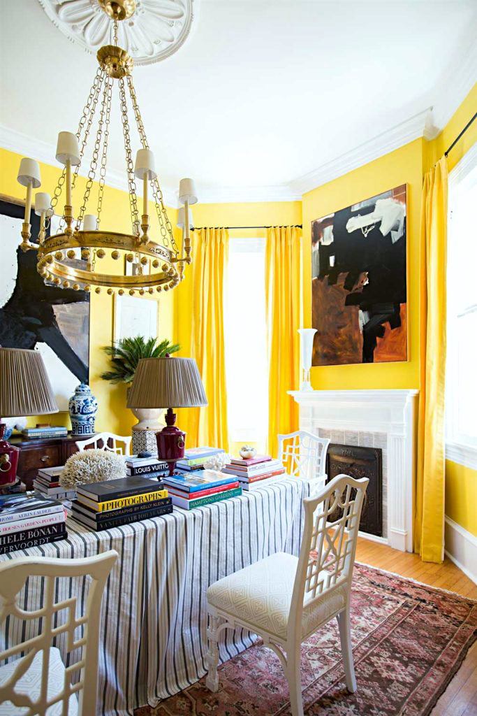
 

William McLure beautiful yellow fining room

Via Draper James


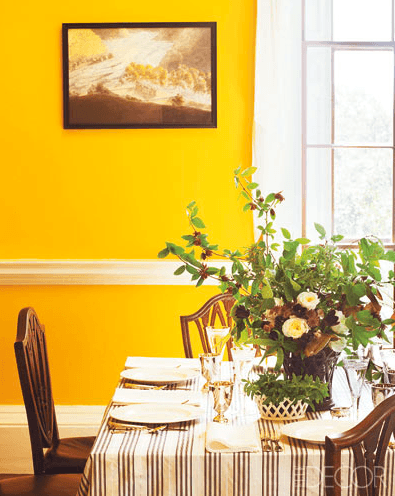
Remember William McLure’s gorgeous dining room with the bright yellow walls? I could eat this yummy room too!


Of course, like any color, intense yellow walls would be a nightmare of a paint color.


Yeah, this is why you hate yellow. And, I can’t say I blame you.
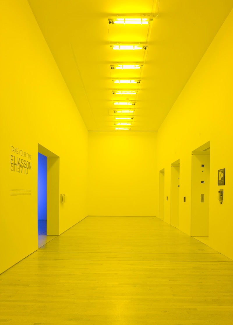
 

via

Yellow wall hell is where they take prisoners of war to get them to talk.


But, here’s the thing, I bet a lot of you don’t know.


Yellow is actually a historical color. And, I don’t mean cream, gold, or some pale shade.


Let’s go back in time about 250 years ago when the US was severing ties with England.

 

Remember this handsome guy?  He was an architect, a lawyer, and an esteemed statesman in the infancy of the United States. Of course, he penned, along with a bunch of others, the Declaration of Independence. He was also the third president of the USA. Yes, Thomas Jefferson.


Thomas Jefferson was a true Renaissance man, a classicist who was enamored with the work of architect Andrea Palladio who has been talked about numerous times.
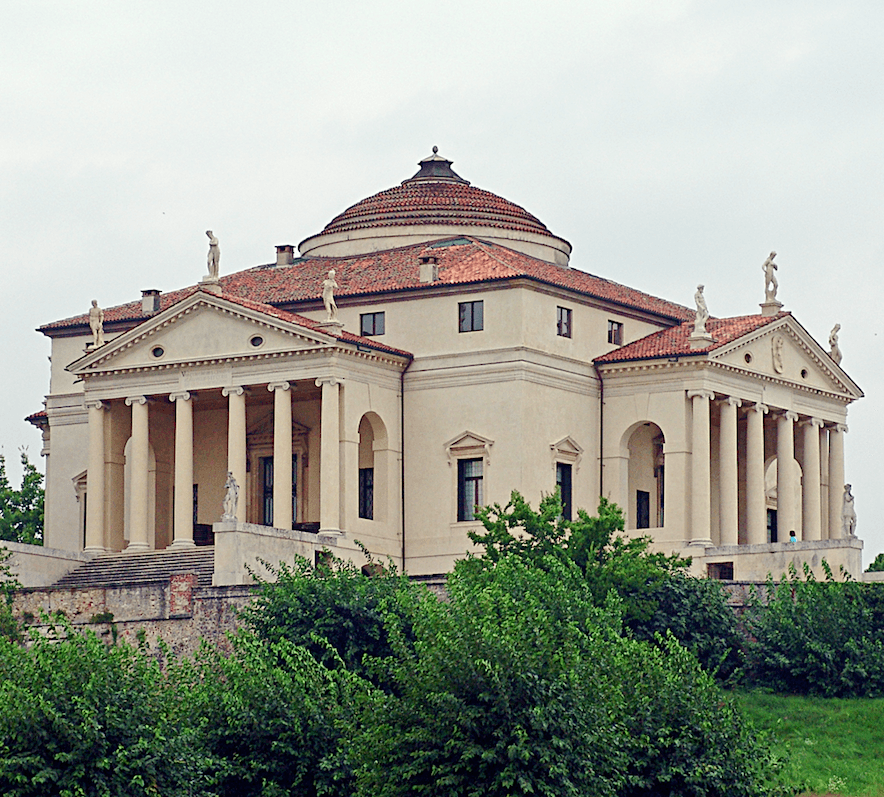
 

La_Rotonda - Villa Rotonda designed by Andrea Palladio


Jefferson was so in love with Palladio’s masterpiece, the Villa Rotonda, that he did one of my favorite design tricks.
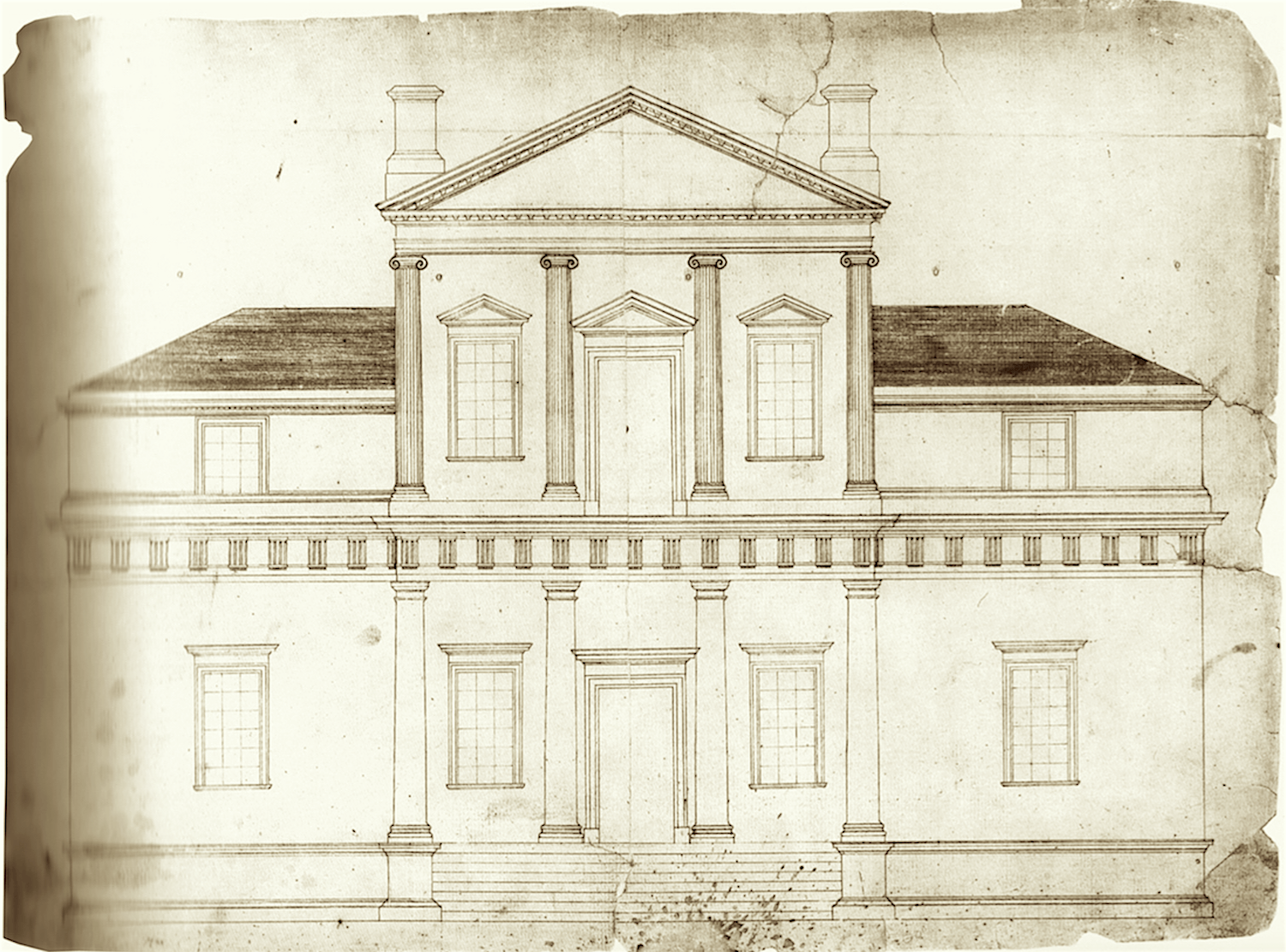
 

via the Clio


He stole it. Well, not all of it, but much of it. However, Jefferson also added many of his own touches.

Above is a drawing Jefferson did back in the 18th century of his Monticello. Yes, it’s a “modern” pared-down version of Palladio’s La Rotonda built about 250 years before Monticello. Both buildings have entrances in the middle of each of the four sides. Of course, there are many more differences, but one can see the influence Palladio had on Jefferson’s design of Monticello.

Well, it was at that time that someone developed a color called “Chrome Yellow.” It was all the rage, but only the well-heeled could afford it. However, artists figured out a way to make this super-saturated yellow with synthetic pigments that cost a lot less.
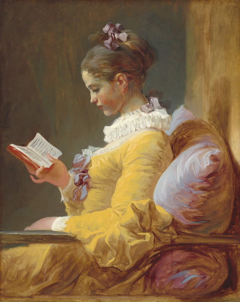


Jean-Honoré Fragonard (French, 1732 – 1806 ), Young Girl Reading, c. 1770, oil on canvas


Fragonard was one of the first artists to use the synthetic pigments in the gorgeous painting above.

Jefferson caught onto this new trend and embraced it for his Monticello.

However, over the years, the old saturated yellow walls had been painted over.


Several years ago, the main dining room at Monticello looked like this.
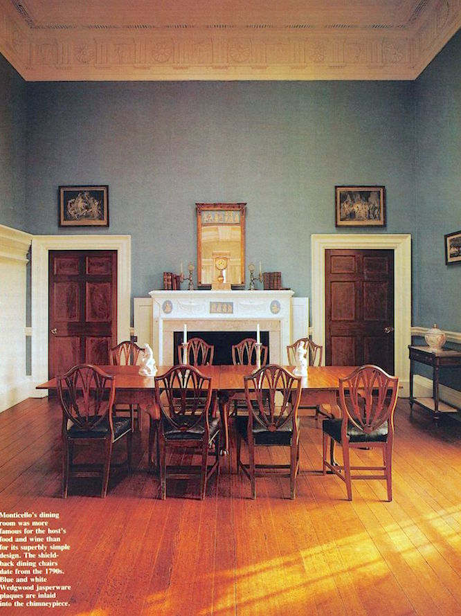
 

Yawn. We really should’ve stayed united with England. While this color is nothing objectionable, it’s nothing special, and looks tired. Of course, the architecture is so gorgeous that almost anything would look okay.

However, a few years ago, they decided it was time to repaint, but this time, they decided to restore the dining room color to the original deeply saturated yellow walls. In a brilliant PR move, Ralph Lauren got involved, donated the paint, and then put it in his line.


Clever guy.
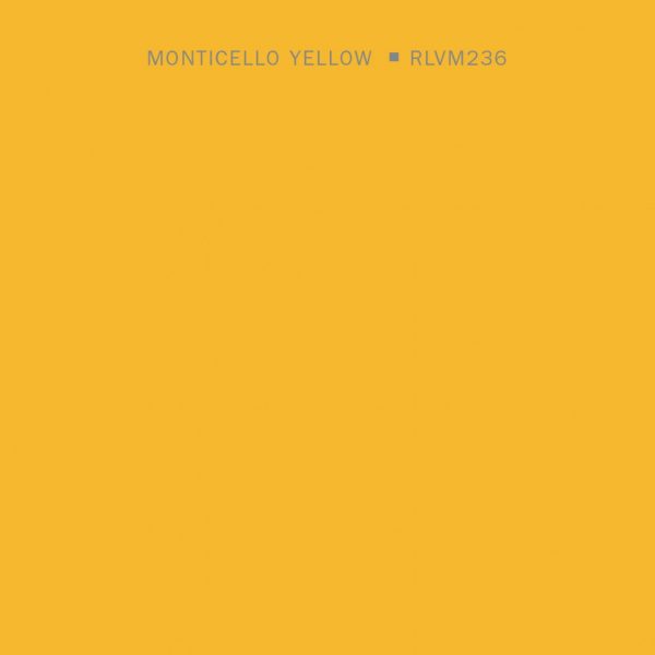
 

Naturally, it is called Monticello Yellow.
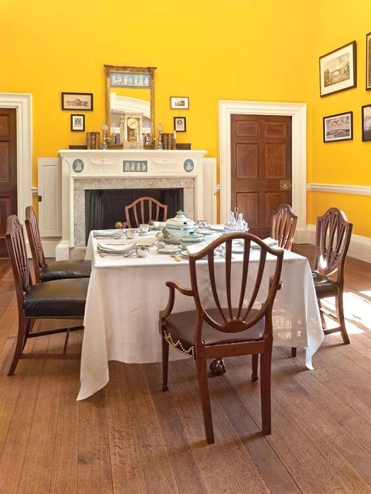
 

And below is the beautifully restored dining room.
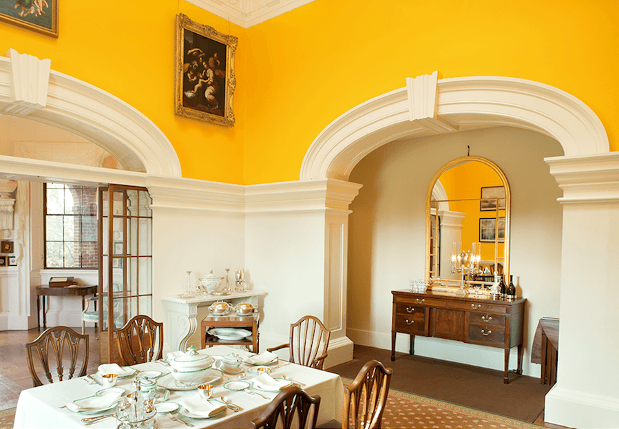
 

It makes my day when they put back stuff the way it was initially intended.
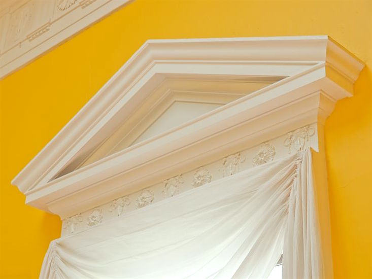
 

monticello yellow architrave dining room - yellow paint color

Love the plain white swag. Excellent choice.
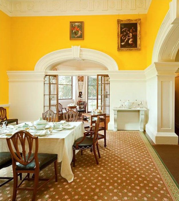


This room with the jaw-dropping yellow walls is now stunning.

BTW, if you are looking for a Benjamin Moore equivalent of the Ralph Lauren color, please check out these two colors.

SUNRAYS 343

SUN VALLEY 350

Also, please have a look at Pratt and Lambert  ALE. My fan deck is almost as old as Thomas Jefferson, so that the number might have changed. Mine says 1723.

And Farrow and Ball BABOUCHE is very nice too.

It’s not easy to find rooms in this color.


But, this saturated yellow is actually a very classic color.


However, would I have the nerve to use this color in my home? It’s one thing to visit a place with this stunning color than it would be seeing it every day for years.

These saturated yellow paint colors were a favorite of the 18th-century classical architect, Sir John Soanes.

During my trip to England in the fall of 2017, we visited the University of Cambridge in a Soanes-designed building.
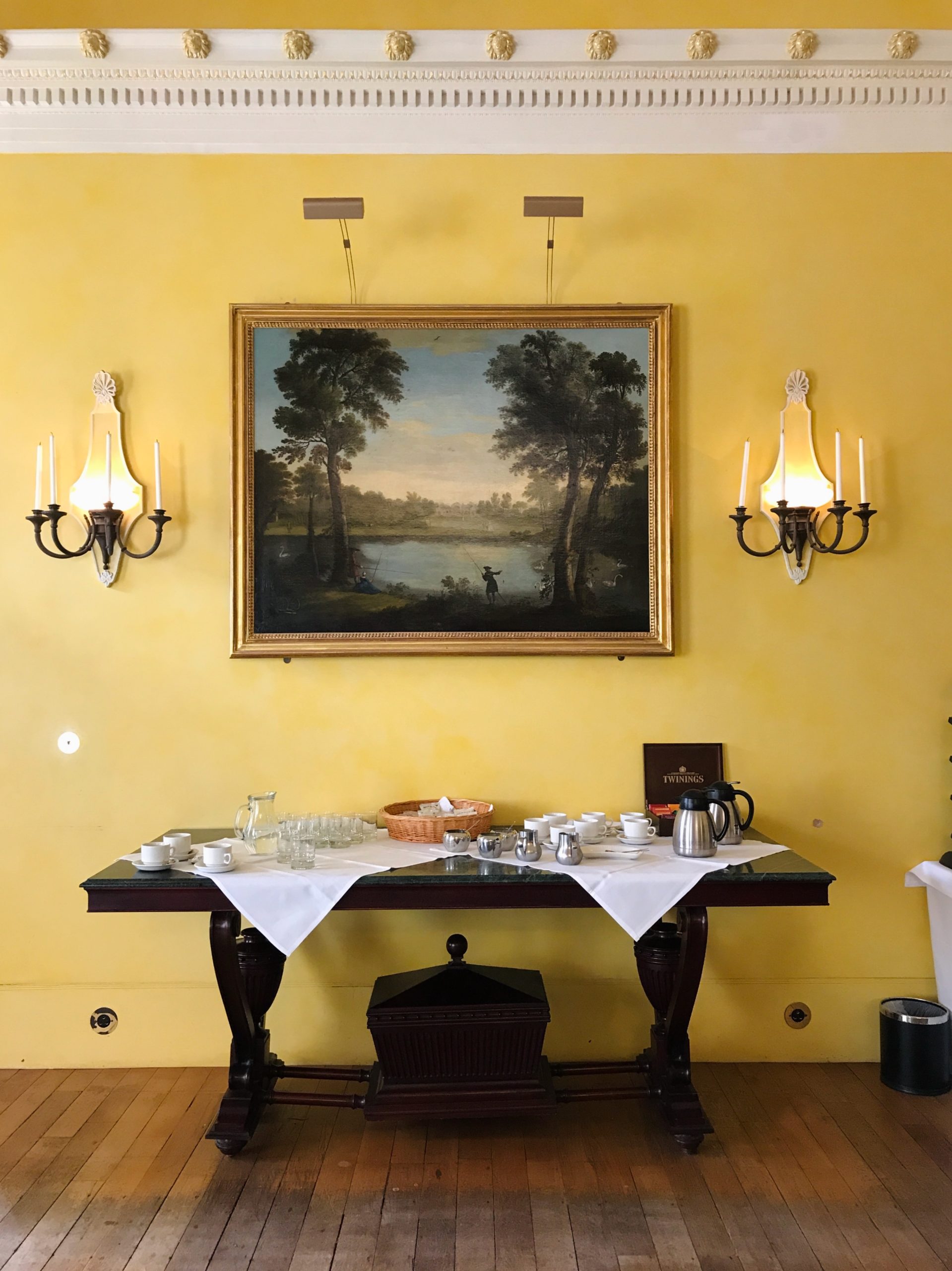
 

Sir John Soanes - University of Cambridge - beautiful yellow walls

The tea and coffee station was laid out for our group.
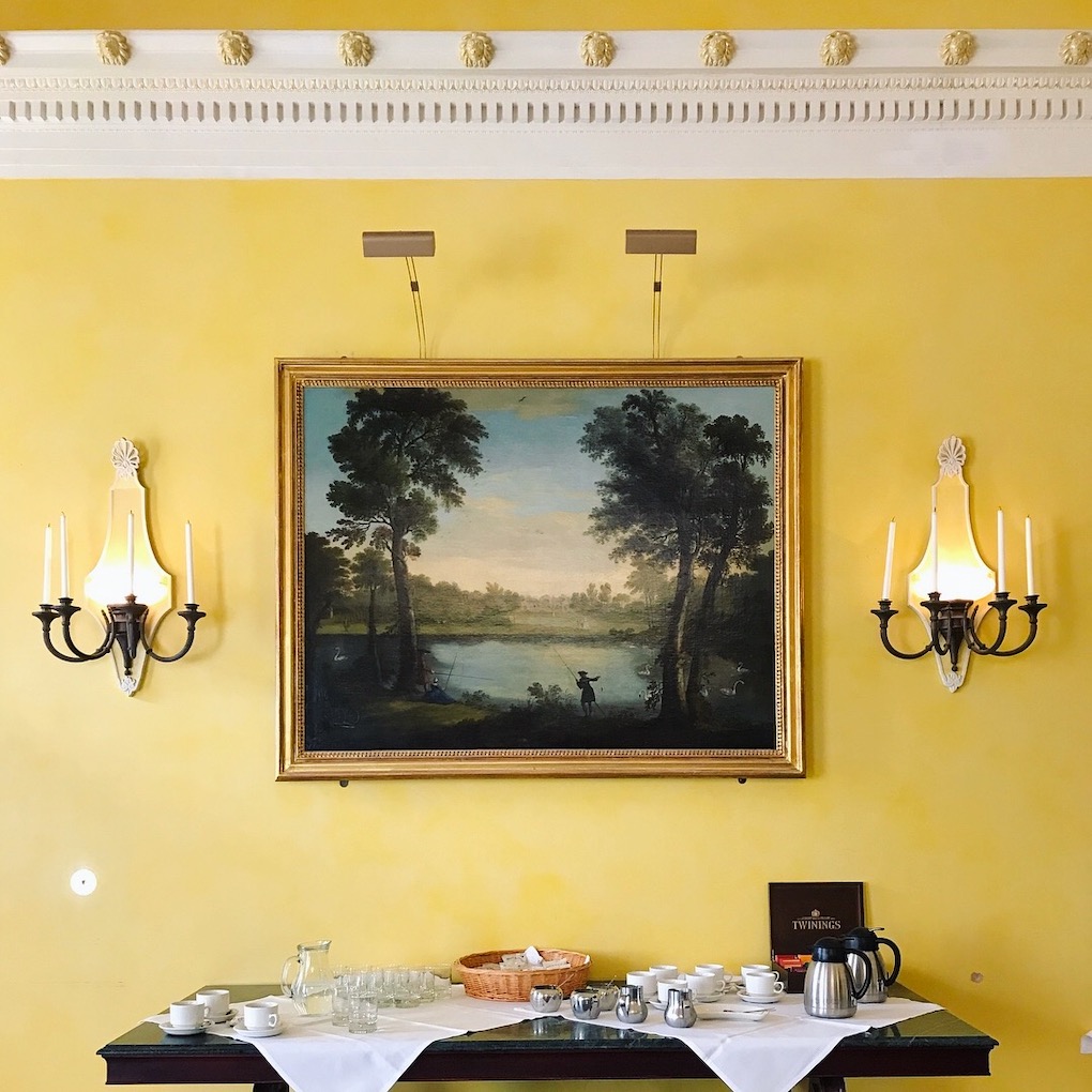
 

Sir John Soanes - University of Cambridge - beautiful yellow walls detail - photo LBI
See what I mean about how fantastic the art looks against the yellow walls?

But, that reminded me of another home in late 18th century Boston, featuring yellow walls.
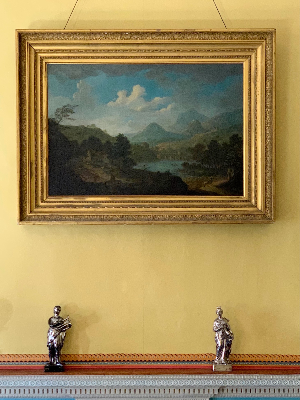
 

Otis House - dining room - exquisite art

Yes! Architect Charles Bulfinch designed the fantastic first home for Harrison Gray Otis and his growing young family in Boston’s most fashionable West End. You can read here and see much more of the lovely Otis House and gorgeous art.
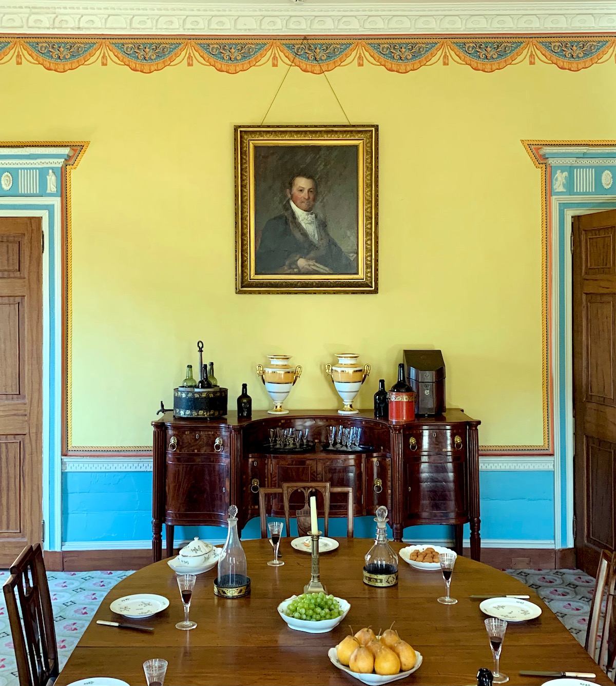
 

portrait Harrison Gray Otis - dining room

Above is a portrait of Harrison Gray Otis on the yellow walls of the Otis House dining room. Incidentally, this home is only a stone’s throw away from where I had my accident last Tuesday on Cambridge Street.

But, getting back to Sir John Soane. He painted his own home in that saturated color.
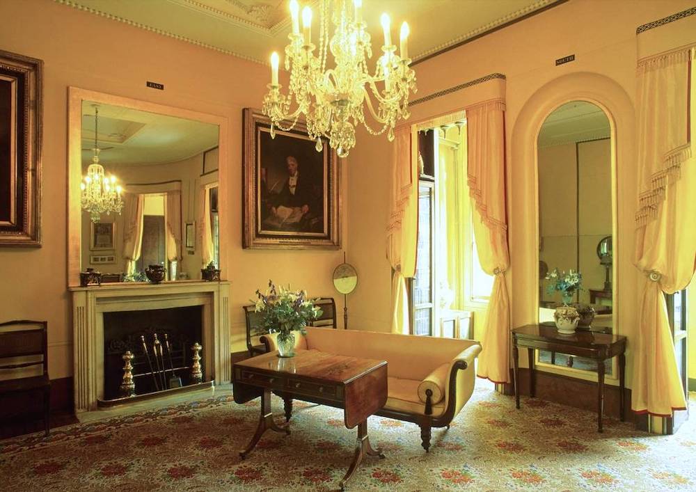


What I love about this image is the yellow furnishings with yellow walls. This room looks like it could’ve been done today.
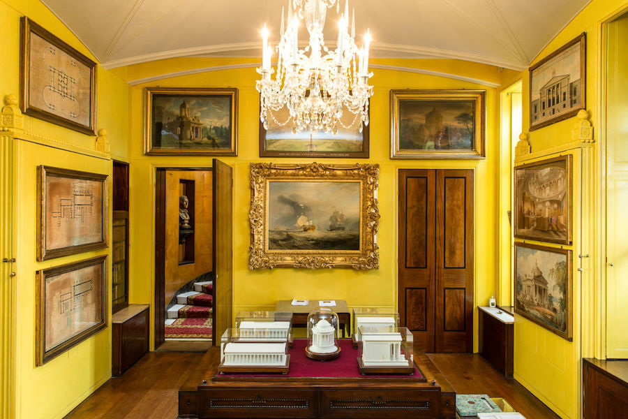
 

Sir John Soane's Museum - art - yellow walls

Above is another room in the Sir John Soane Museum.


However, yellow is not only used for walls.


Aristocrats of the 18th – 20th century also embraced the color yellow for clothing and decor.
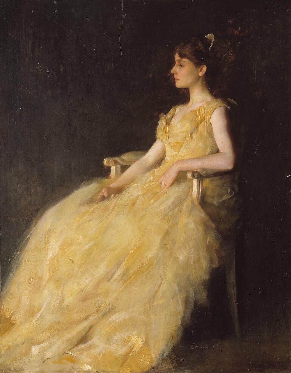
 

THOMAS WILMER DEWING (BOSTON, 1851 - 1938, NEW YORK) LADY IN YELLOW, 1888 Oil on panel-Lady in Yellow Gardner Museum

80 years after Monticello was built,  Thomas Wilmer Dewing (1851 – 1938) painted this lovely portrait – 1888 Oil on panel-Lady in Yellow. It is part of the exquisite collection of art at the Isabella Stewart Gardner Museum.


If you’re in Bahstahn, you must say, “The Gahdnuh.”


I’ve been to the Gardner museum twice, but I don’t recall this lovely painting. So, I went to see if I had taken a pic when I visited last September. Well, yes, I found an image! However, there’s a good reason why I didn’t notice it.
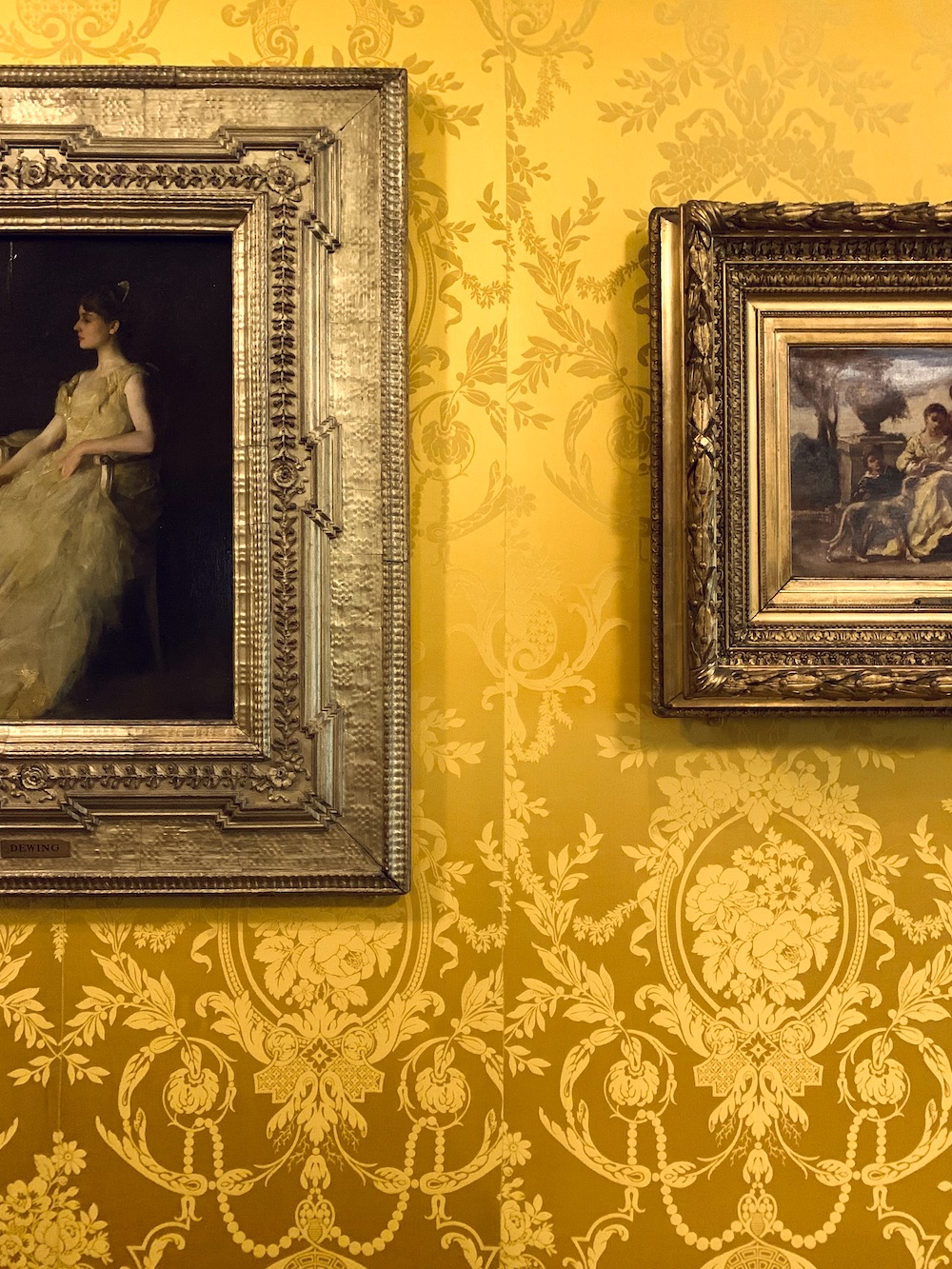
 

mismatched wallcovering Isabella Stewart Gardner Museum

I was too busy noticing the mismatched silk damask wall covering. Is this original? It’s in pristine condition if so. However, I don’t think Mrs. Gardner would’ve approved of this. I can only conclude that someone didn’t order enough fabric, and then Tim Gunn showed up and said, “Make It Work.”  haha.


But, here’s what’s also funny. I DID take a photo of this beauty the first time at the Gardner in the spring of 2017.
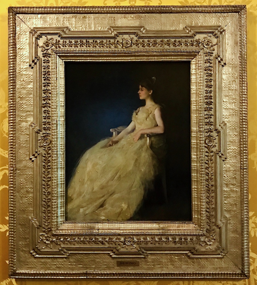
 

photo -LBI - THOMAS WILMER DEWING (BOSTON, 1851 - 1938, NEW YORK) LADY IN YELLOW, 1888 Oil on panel-Lady in Yellow Gardner Museum

Today I came across it in my photos while looking for something else.


In addition, I also found some other gorgeous old art pieces with women in gorgeous yellow dresses.
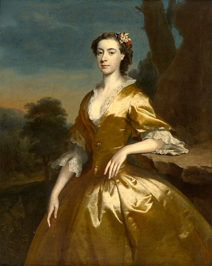
 

portrait-of-mrs-joshua-iremonger-joseph-highmore

I can’t resist sharing this incredible portrait of Mrs.Joshua Iremonger, painted by Joseph Highmore. The colors are incredibly sublime. It was painted in 1792. Tragically, she died in 1744, soon after the birth of their son, Joshua, Jr.
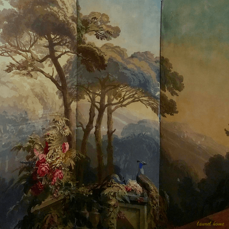
 

my antique zuber screen

The colors remind me of my Zuber screen.
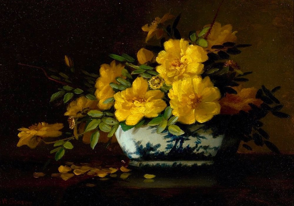
 

still-life-of-yellow-roses-in-an-oriental-vase - Artist -George W. Seavey (American, 1841-1916)
still-life-of-yellow-roses-in-an-oriental-vase – Artist -George W. Seavey (American, 1841-1916)


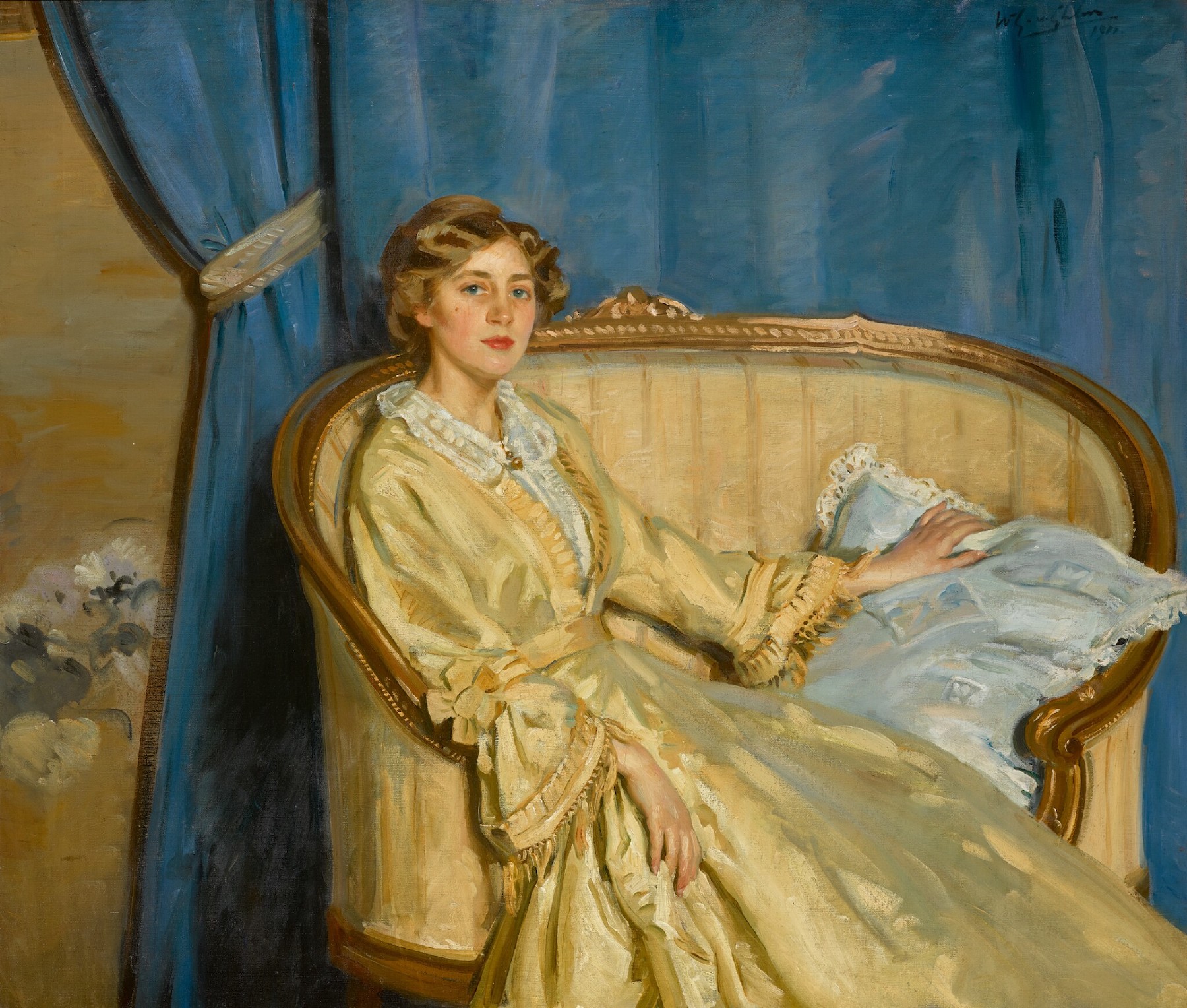
Sotheby’s – Wilfrid Gabriel De Glen – “Blue and Gold” 1911 oil on Canvas 42″ x 52″
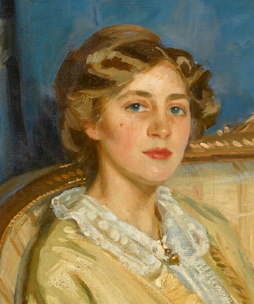
 

sothebys--WILFRID GABRIEL DE GLEHN, R.A. 1870-1951 Blue and Gold signed and dated u.r.- W.G. von Glehn - 1911 oil on canvas - detail

The original image is pretty hi-res, so I’m able to include a detail of the masterfully painted face. Again, gorgeous colors and magnificent painterly technique.


Speaking of technique, (I’m doing my version of Thomas Jefferson. haha.)


But, I found this young pianist on Instagram yesterday. Giuseppe DeMaglie


He’s amazing!

This is his composition. It is NOT Bach.
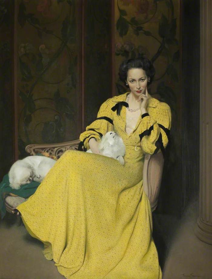
 

Gunn, Herbert James, 1893-1964; Pauline in the Yellow Dress

Gunn, Herbert James; Pauline in the Yellow Dress; Harris Museum & Art Gallery – 1944

(not related to Tim Gunn, I don’t think. haha)

Herbert James Gunn (1893-1964, British), 1944, detail- Pauline in the Yellow Dress, Oil on canvas, Harris Museum & Art Gallery

And, an incredible detail view of Pauline, the artist’s wife. What an elegant woman!


Now that we’ve arrived in the 20th century, many other designers have embraced these strong, saturated yellow walls.
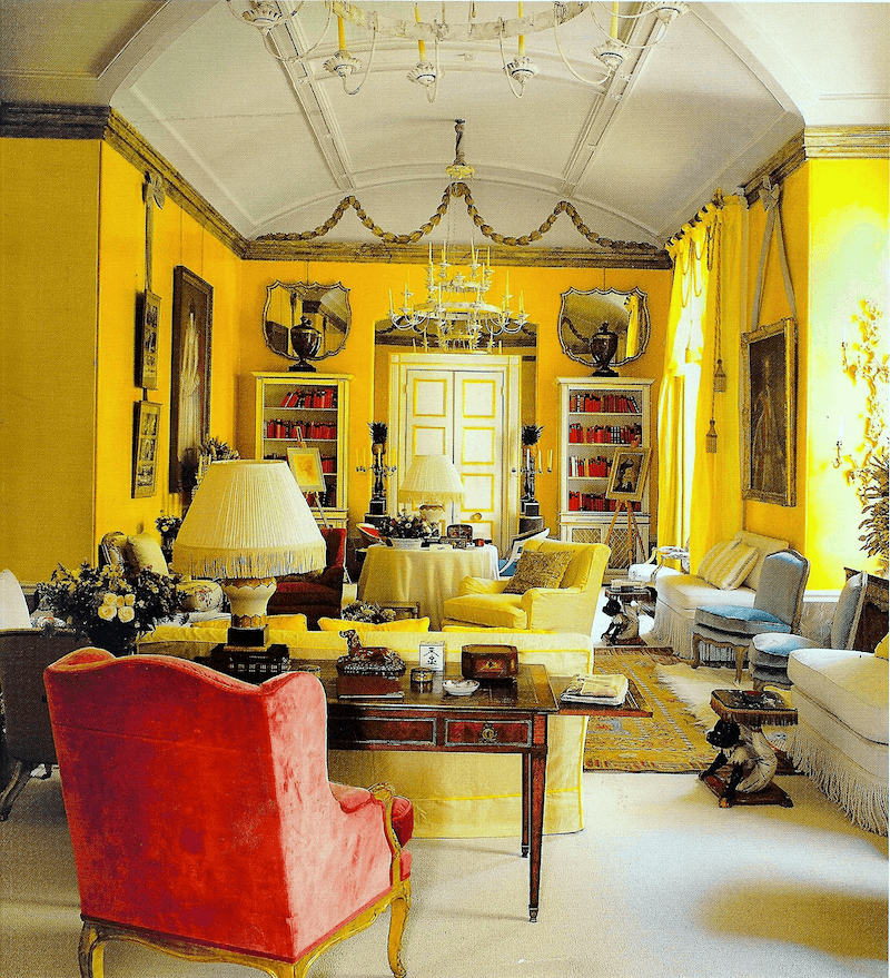
 

I’m sure many of you recognize Nancy Lancaster’s iconic room for the Colefax and Fowler showroom in London, decorated circa 1950.
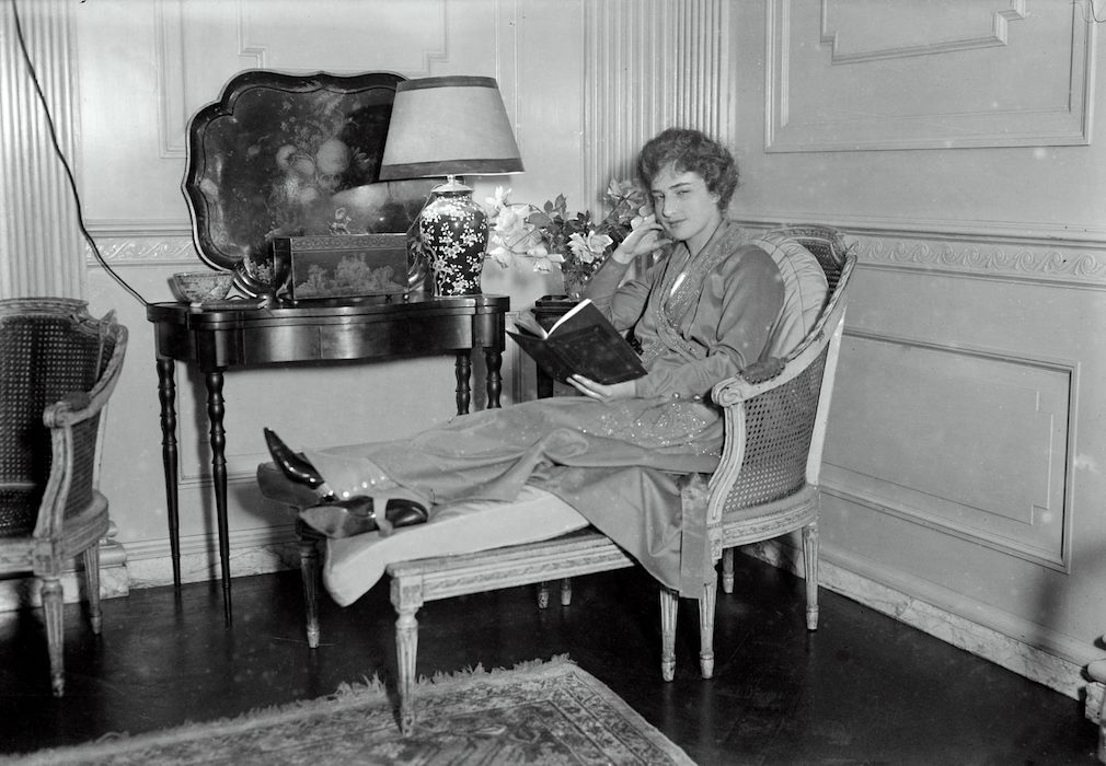
 

Nancy Lancaster 1916

Above is a very young Nancy Lancaster in 1916. Whoa, look at the furniture and the mouldings. The wall moulding is the same as what I’d like to see on my range hood. (If we ever got this project going). And that lamp!


However, Nancy isn’t the only decorator in love with these intense yellow walls.


The legendary English team of Sybil Colefax and John Fowler used it in their beautiful London showroom.
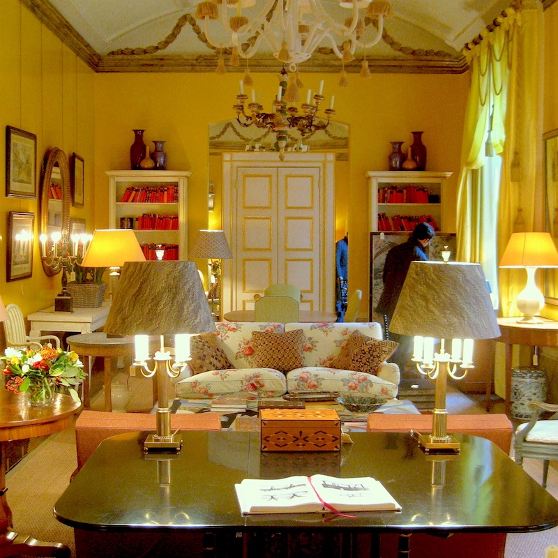
 

Ruby Lane


Above and below are two recent images of the Colefax and Fowler showroom in London. They recently moved after many years at this address.
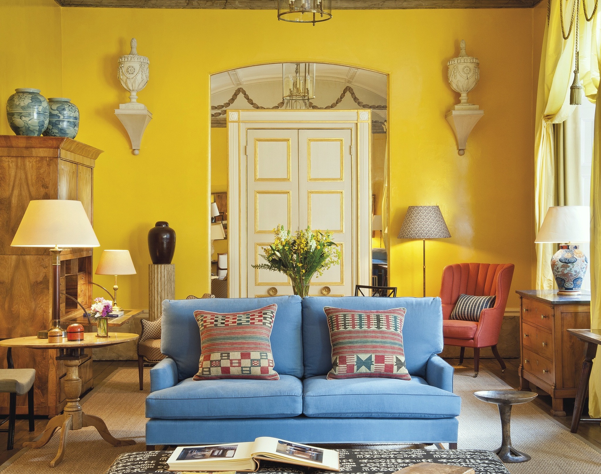
 

Tim Forrest’s Blog


In fact, Colefax & Fowler have created their own shade of yellow paint.
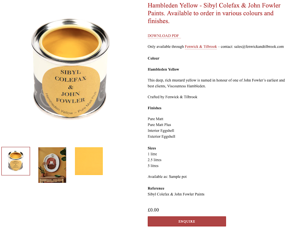
 

Sybil Colefax & John Fowler Hambledon Yellow


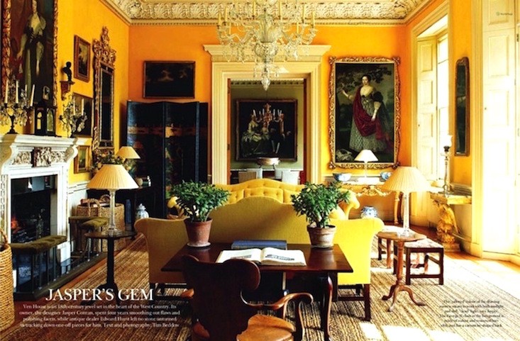
Another iconic English designer, Jasper Conran. Ironically, he’s associated with contemporary designs, but his taste runs otherwise. I could definitely live here!


At the end of the 20th century, there was still a mystique about a woman in a “yellow dress.”


Did you see this show? Contact. I was incredibly fortunate to see it in late August 2001 with my mom. It was weeks before the show closed due to the World Trade Center attacks. It’s my favorite Broadway musical.


Below are some more favorite places with beautiful yellow walls.
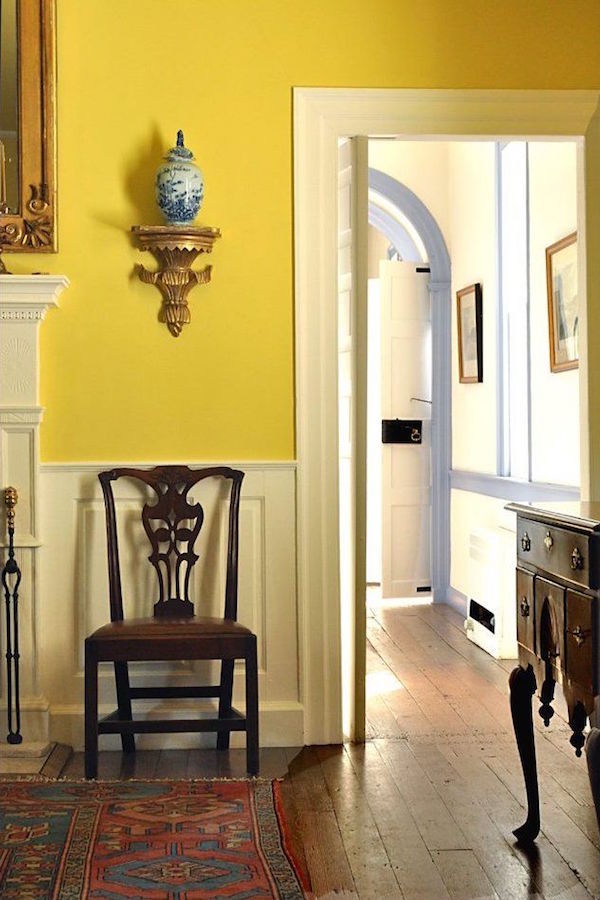
 

Another historic room with yellow walls. I so wish I could see more and also know the original source. If someone knows, please let me know.
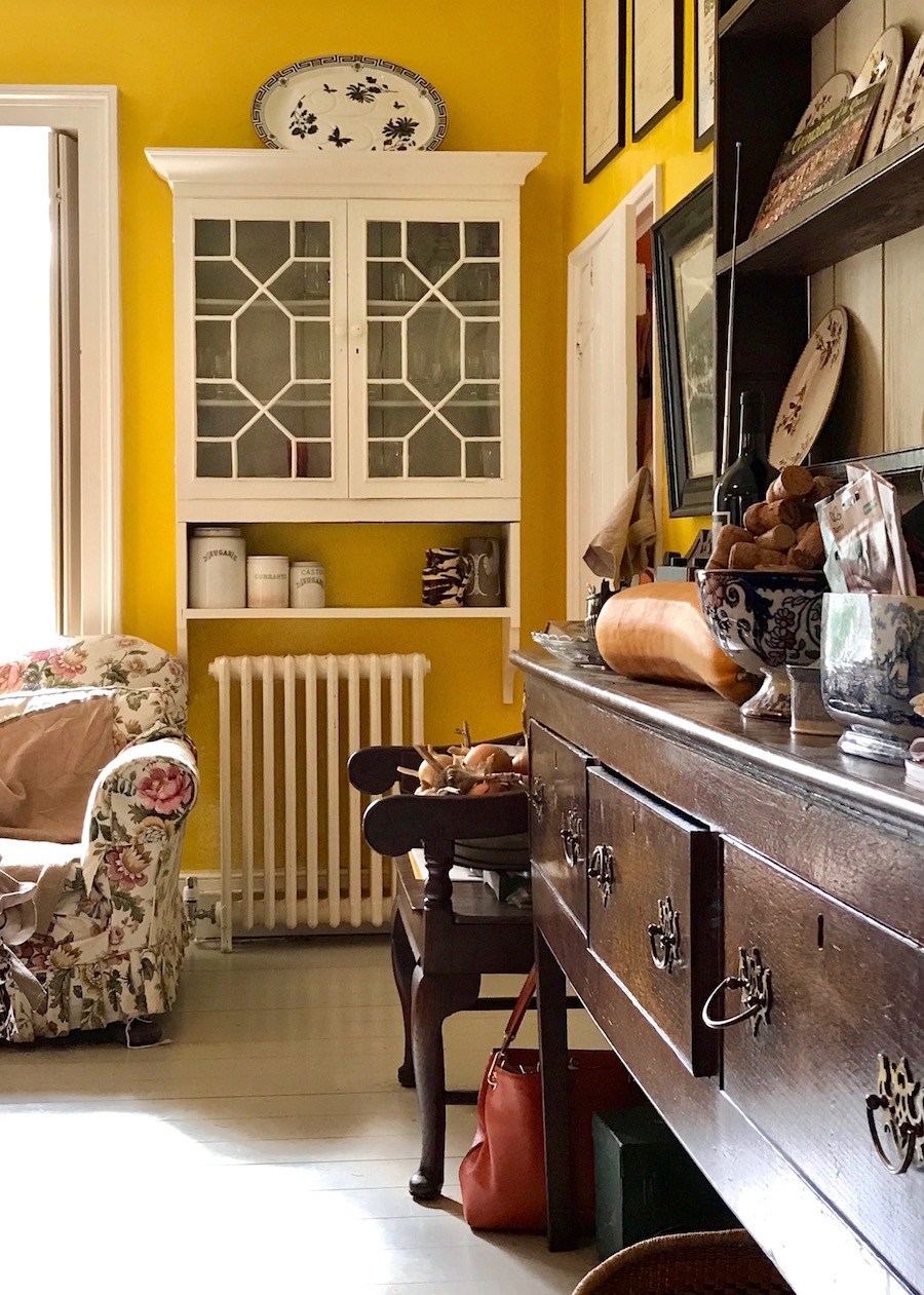
Ben Pentreath - Charlie McCormick - old parsonage timeless kitchen yellow walls - cabinet

I took an image of Ben Pentreath’s fantastic kitchen when I visited his home in Dorchester, UK.
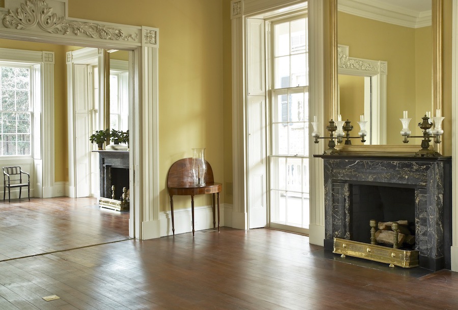
 

Historic Charleston Greek Revival double parlor renovated by Gil Schafer
Historic Charleston Greek Revival double parlor renovated by Gil Schafer


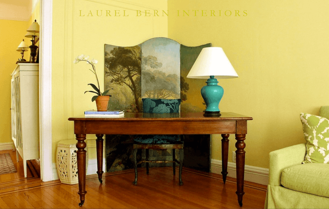
desk_bronxville_benjamin_more_paint_colors_hc-4_hawthorne_yellow

And here are the Benjamin Moore Hawthorne Yellow walls in my old New York apartment. The Zuber screen is behind my desk.

For those of you, who are warming up to yellow (no pun intended) but are still weary of the more saturated shades,


Below are some beautifully saturated yellows for the brave.
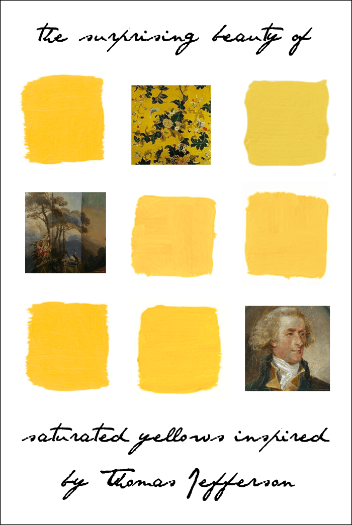


SUNRAYS 343 – Benjamin Moore

LEMON GROVE 363 – Benjamin Moore

SUN VALLEY 350 – Benjamin Moore

BABOUCHE Farrow and Ball

MONTICELLO YELLOW – Ralph Lauren

Pratt and Lambert ALE 1723 – Benjamin Moore


How do you feel about these saturated yellow paint colors?


I have to be honest. I love the yellow walls in the photos, but I’m not sure if I have the courage.

xo,


PS: Please check out the newly updated HOT SALES!


74 Responses

  1. You just convinced me to move forward with painting my dining room Lemon Yellow ceiling and walls with white baseboards and door/window trims. While doing the little hallway Bright Summer Sky Blue ceiling and walls with again white doors, baseboards and door trim – no windows in there hence the sky blue choice.
    The one room off the dining room is already bright turquoise with white doors and window trim and white popcorn ceiling (previous owner did that to me). The second room off the dining room is my kitchen that I bright white walls and cabinets with slate grey picket tile backsplashes on two walls.

    My only ugh with regards to dining room is the brand shiney new 20 x 20 inch hvac vent in the ceiling is gonna pop from the soon to be yellow ceiling. hmmmm????

  2. Hello!

    Wonderful post! I am about to paint the living room in my UES brownstone apartment, and I am looking for a lovely, light-filled yellow. The first picture in this post–I believe it was from your Bronxville home? What color is that gorgeous paint? I can’t tell if you are saying if it’s America’s Heartland or Hawthorne Yellow or a mix. It’s exactly what I’m looking for–filled with LIGHT. Please do let me know if you have time. And thank you!

    1. Hi Dana,

      The first image was right before my home went on the market in 2020. That color is Americas Heartland by Benjamin Moore. The later pic of the desk was taken in 2013 and that is Hawthorne Yellow. Both are beautiful, but the Hawthorne is a bit deeper. However, they look the same at night which was amazing.

  3. I think the mystery historic room with yellow walls is the dining room at Eyre Hall near Cheriton on the Eastern Shore of Virginia. The house is open every year for Historic Garden week and the Colonial Williamsburg Foundation recently published a book, The Material World of Eyre Hall: Four Centuries of Chesapeake History.

  4. When our son was 4 he wanted a big boy room and insisted that the color should be “Pokeylon Lellow,” his name for Pikachu. After some careful comparisons I selected Yellow Highlighter by Benjamin Moore. With changes in art and accessories, it held up well through the Toy Story and the baseball years. The only downside was that we needed two vigorous coats of Yosemite Sand (a color I’ll admit that I chose in large part for the wonderful name) for complete coverage when it came time to move onto something more grown-up and sophisticated.

    We still have yellow in our home, though! A lovely, soft, warm yellow with the unfortunate name of Mushroom Cap adorns our kitchen and plays nicely with our royal blue glassware and pottery from Mexico. Love that yellow!!

  5. I am an interior designer who got into making period reproduction garments as a hobby. In the 18th and 19th century matching repeats was not a thing in fabrics. They cut and sewed the patterned fabrics as if they were solid colors. The cost was a factor. Perhaps they did the same with wallpapers?

  6. Well, I guess all the yellow fans came out of the woodwork, and everybody else held their tongues, except me. Sorry, a warm, pale yellow kitchen would be tolerable. Not my first choice, but I might come to like it if I had to compromise. But walls the color of lemon curd, I couldn’t stand that! I would be running for the exits. Very interesting about Thomas Jefferson, though- Thanks for an interesting blog.

  7. Laurel, do you know when/why everyone turned against yellow? It was all the rage in the 90s and now everyone hates it. What happened?

    1. Hi Nadya,

      I think it went out with what some consider the “excessive” 80s style. (now called maximalist) Think Mario Buatta, chintz, lots of bright, cheerful colors, and mahogany furniture.

      Then, came the word “transitional,” which I equate with neither here nor there. But, what I would call contemporary. And, soon followed was the color GRAY.

      Gray, is a beautiful, classical color, but it needs black and white, and lots of warm tones, including gold. Add classic architectural features, and then it’s gorgeous.

  8. The walls of my home are painted Philadelphia Cream by BM. A GORGEOUS yellow that is easy on the eyes–not bright, but definitely yellow. Don’t let the “cream” in the name fool you. I highly recommend this color—it’s in the BM Historical Colors collection.

  9. Check out the Mayflower Inn in Litchfield CT. Decorated by Celerie Kemble, lots of yellow inspiration! Considering painting a small guest room that has one north facing window in yellow to cheer it up a bit.

  10. Long-time lurker, first time commenting.

    I adore yellow walls. 20 years ago I painted our bedroom and library in a butter-yellow (custom mixed at Walmart) with white mouldings. A few years later when I painted all my 1980s oak-stained kitchen cabinets white and added white beadboard wainscoting, I painted the upper half of the walls a bright lemon yellow.

  11. My favorite yellow, while not so saturated, is BM Windham Cream. It is gorgeous with lots of white trim and seems to work with the colors of every season while lifting my mood.I think it’s a personality thing whether yellows work for someone or not. Personally, I can’t deal with most grays. Love looking at them but can’t live with them.

  12. We once lived in a large Victorian home with 5 fireplaces and very high ceilings. It was always cold! The kitchen had lovely old white cabinets, trim and countertops.
    We painted the walls a buttery yellow and the ceiling red ( to visually lower it).
    What sounds horrible as I type was the most amazing and welcoming room, very warm and definitely the heart of the home!

  13. Oh, I didn’t know I wasn’t supposed to like yellow walls when I painted mine “Compatible Cream,” a buttery yellow. I like it with my white woodwork and blue-and-white accents. But to each her own…that’s why they make chocolate, vanilla and strawberry!

  14. I agree with one of the other posts: BM Pale Straw is a lovely pale golden yellow beige. I’ve gotten so many compliments from friends. I’ve repainted our foyer a second time with it.
    Glad you’re feeling better Lauren!

  15. LUV the yellows! My kitchen/dining room is yellow with a mango glaze sponged over top (sounds delish) and gets compliments from everyone that stops over.

  16. Hi Laurel,
    Greetings from beautiful historic Lunenburg, Nova Scotia, Canada. I’ve loved your posts for years. Thank you for your sense of humour. I think the unidentified room could possibly be one in Gerald Blands house. E.

  17. Please consider that those vivid yellow walls in Monticello’s dining room were lit only by candlelight in the evenings. I suspect that paint would have glowed a gorgeous golden color.

  18. For Laurel & Gabrielle: I forgot to point out the typo in the comment on the Highmore painting: he died in 1780, so the date for the painting is wrong (should be 1742). But if you’re admiring the dress, it was probably painted by Van Aken, who was employed by Highmore as a drapery painter for his portraits!

  19. Hi Laurel! Coming late to the party…so sorry to read about your accident! I’m glad you’re fine and that nothing really major happened! I thought I hated yellow having lived with a yellow LR for over 10 years (it eventually got repainted white) until I saw Bunny Williams’s yellow LR in her country home in leafy Litchfield county, CT. I’m pasting the link, but feel free to remove it if we are not supposed to post links. I fell in love with the gold, cream and black on yellow scheme, and it’s been a dream of mine to sort of replicate that in a future project. I believe yellow interiors are bright and happy and lift the spirit, too sad yellow has fallen out of favor in the recent decade(s).

    https://www.theglampad.com/2017/10/an-affair-with-bunny-williams-house.html

  20. Glad you are recovering well, Laurel. Crazy story.
    Like Kim above said, I read that someone with way more experience than me at designing said that her yellow room made her smile everyday, so I tried it in a guest room. It just ended up feeling juvenile and unsophisticated to me.
    15 years later a realtor told me that my greyish khaki was the most unpopular color when selling a house. Now you can’t find a new house not painted greyish. Just shows how the perception of color is so personal and subject to trends.
    BTW, I so enjoyed the pictures of Furlow Gatewood’s home.

  21. Oh my goodness, your aunt’s house sounds divine.
    When we lived in Seattle, I painted our dreary basement BM Lemon Chiffon with BM Breath of Fresh Air blue ceiling. My husband thought
    I was overboard to spend so much time on the basement but it turned out so pleasant.

  22. I painted my open-plan kitchen and dining room Marsh Marigold by Behr. Sometimes it more yellow and in other light it’s slightly orange. I enjoy it and intend to plant marsh marigolds in the damp area at the end of my yard.

  23. Oh what a happy happy post! And from a woman who has been injured by a barbaric male driver who didn’t bother to get out of his vehicle (which had knocked her down but not senseless) to offer help. Oh that she had been a personal injuries attorney, instead of an interior designer! But I digress. I love yellows in home interiors—a speck or a wall. The master bedroom of my home is very calm–White walls,blues, greys, mahogany. Wood floors. But you open the door into the master bath and you are alive with a bold yellow botanic wallpaper above white tile. Hard to be unhappy in that room. One of the favorite rooms I’ve known was a “den” with a wall of windows and pale yellow walls, glorious yellow floral chintz curtains with the same print used in the cushy sofa. The rest fades in my mind, but it was a very balanced room. It was meant for good talk, bright ideas, laughter, and comfort. At night, lighted by lamps, it felt cozy. I also have admired the carpet designed to suit the Monticello renewed dining room. (P.S. as you know, cars do not move backwards when started!)

  24. Here is the person who still doesn’t like yellow rooms! My mother painted her kitchen yellow once and it made me happy when she repainted after only 2 years. However,my husband and I did have a home with (I think) SW Antique White walls that showed up very yellow at times but only in one room. It was like sitting in a room painted with sunshine; it just glowed in there.The rest of the house always the standard off white but that one room at certain times: magnificent!

  25. Hi, Laurel,

    I love yellow! Buttery colors are my favorite for walls, but any yellow in a room, as a prior commentator mentioned, is my favorite thing.

    I’ve been chuckling about poor Mrs. Iremonger…she must be some time traveller, to die 48 years before the painting was finished! My boys would love that super-power 🤣

    And that cake…yummy! I’m off to make some lemon poppyseed muffins for dinner.

    Glad you’re feeling better!

  26. Laurel, is this year a typo; do you mean 1916? “Above is a very young Nancy Lancaster in 2016. Whoa, look at the furniture and the mouldings. The wall moulding is the same as what I’d like to see on my range hood. (If we ever got this project going). And that lamp!”

    Also, while I like yellow I have none in my home. But if I did I would choose the yellow you had in your old home. That is fantastic!

  27. Hi Laurel,
    I am so happy to hear you are on the mend. May the Lord heal you completely.
    I love yellow but know I could not live with it on my walls. I have painted my in several homes the right shade of gold. It is a happy color. My Mother painted our clap board home in 1949ish a beautiful yellow and everyday walking home from school I loved it. I could see my home from the high school. My Mom was a beautiful artist and really knew her colors. Thank you for this article, I really enjoyed it. Take and get better real soon.

  28. Thank you for this post! we just painted our guest bedroom and our primary bedroom in yellow almost like the light yellow that you did in your NY apartment. I was scared at first but the more I look at it the more I love it- my husband loves it. The art on the walls really pop up much more. Anyways thank you so much.

  29. So here’s the thing: I think the yellows in the exquisite paintings are just that – exquisite. But the yellow paints seem to lack subtlety by comparison. Perhaps it is because the artists mixed their yellows in such a way that they became less “saturated?” But I have never seen a yellow wall anywhere that is as beautiful as the colors in any one of the paintings in this post. Those are yellows I could surround myself with and feel at peace.

  30. Wonderful to hear you are on the mend with your approach of rest combined with icing and Advil as needed.

    I used to believe I abhorred the color yellow (in my 20’s and 30’s). Then I was looking for new living room furniture for our 1930’s home in Northern New Jersey. While looking at fabric samples the in store designer was showing me, I was drawn to a yellow damask and it was “the” one. I asked for her thoughts on paint color and she pulled up the F&B color card and suggested Dorset Cream. At the time F&B paint was less available, so we had it color matched with Benjamin Moore paint. We loved that room and didn’t change it for 20 years. BTW, we sold the house at the end of 2020 (before it was officially listed and for substantially over list price (a benefit of being sellers during the COVID era), so the yellow walls were not a detriment to sale in this case!

    I like the saturated yellows very much, but probably not what I would choose for my living spaces.

  31. The exterior of our traditional house is a soft yellow, and it just grew from there: BM Creme Brulee in the kitchen; BM Featherbed in the small powder room; and BM Citronee in the living room. Different yellows for different light situations. All these pale yellows coordinate nicely with the other pastel rooms in my home.

    And, Laurel, so glad to hear you’re on the mend. My gosh, you’ve had quite the year for mishaps! Be well.

  32. I had a saturated yellow dining room with creamy white wainscoting, baseboards and crown molding in my 1930s bungalow from 2007-2021. It was beautiful and did make my artwork pop. However, during the pandemic, I went monocromatic and painted it all in SW Alabaster and it feels so calm and serene now. While I loved the yellow while I had it, I don’t really miss it at all!!

  33. I love your first photo in this post of your living room. However, just as you were distracted by the mismatched silk damask wall covering in a later photo, I would like to straighten your lamp shade and pull it or your table away from the wall. The lamp shade doesn’t look right crooked and touching the wall. Of course, I may have a little OCD that has me continually straightening lamp shades and picture frames. What is the general rule on lamp shade size for a table the size of yours? BTW, I’ve always loved that green glass lamp.

  34. Hi Laurel,

    I loved your post. It made me think of the Nathaniel Russell house in Charleston, which is filled with saturated colors, including the deep orange-yellow walls that provide a backdrop to its stunning flying staircase.

  35. I’m glad to hear you are doing a bit better, Laurel.

    I know someone who painted her dining room a sort of “Van Gogh” yellow, and it was stunning. Another friend who painted her living room walls a rather bold shade of yellow – also gorgeous. Neither of them were trained interior designers or worked as interior designers. Some people are just naturals.

  36. Waaaay back in 1971 I designed my first home at age 20. For some reason I thought my kitchen should have lemon yellow floors (sheet vinyl) with matching Formica countertops…white cabinets trimmed in yellow, and yellow and lime green pop art daisy wallpaper (very 70’s). Naturally this carried into the breakfast room and laundry room, and the painted walls of the adjacent great room!!! After 2 years of this, I hated yellow so much that I ripped it all out and redid it in shades of blue. To this day, I have never used yellow again!!! I won’t even have yellow flowers in a floral arrangement. And that was 50 years ago!

  37. I formerly had no reaction regarding yellow; pro or con. Then we bought a house that was mostly yellow. The soft yellows (they appear to be almost beige on the fan deck) have been great, as they enhance everything I use and unite all the wood tones without resorting to beige, beige, brown like so many houses here were. Another plus is that we’re in the treetops and the green in summer can cast a rather sickly glow on many wall colors in various parts of the house, but not these. In winter when trees are bare, the northern light does the same except where the walls are this yellow.
    My friend painted her laundry room a strong yellow and said it gave all the workers a near coronary. I liked it, but I like colorful rooms. I know the misters Property Brothers have long advised against yellow. So clearly, some really do have strong feelings on the subject. I hope your great post has won some over.

  38. I had a soft yellow bedroom growing up—BM Lemon Chiffon, iirc—that I loved. My aunt has a beautiful pale buttery yellow throughout her home that is gorgeous with greens and pinks. Don’t know if I’m brave enough to do more saturated yellows and golds!

  39. I’m a Mom in AZ. I’ve followed you for several years. I think this is my favorite post you’ve done. I love yellow. Of course, not all shades are appropriate on walls and in decor as you’ve wonderfully illustrated for us. But when it’s done well, there’s literally nothing finer. I so enjoyed this and am glad you’re on the mend. Keep doing what you do!

  40. Great post Laurel! Like many of your followers, I have used yellow in two previous homes and always loved the warmth, happiness, and vibrance it brought to a space. And I learned a valuable lesson about yellow – the wrong one can look absolutely awful in the wrong light – particularly in an east-facing room. I had my bedroom painted yellow, only to awaken the next morning to what looked like a canary. It was hideous! I don’t recall which yellow that was, but I then found “Shantung” by Pratt & Lambert, which was soft and beautiful in the same room. I also used it in the bedroom of another home; it was great there as well. If anyone wants to try a yellow without going bold, I highly recommend Shantung!

    P.S. It works perfectly with blues, greens, and reds!

  41. We have loved your Hawthorne Yellow recommendation in our bedroom since you recommended it years ago. It is wonderful to wake up in a sunlit room, no matter the time of year. And yes , it frames artwork so well. Thanks!

  42. I also love the color yellow. I have a yellow LR and DR. However, to keep from being overpowered by one tone of yellow, I did 2 walls in the LR bright yellow and the longer wall paler yellow; DR one wall bright yellow (I thought same as the LR….but am now thinking it might be slightly different) and 3 walls paler yellow. When I finish a room in the back of the house, I believe those walls will also be yellow.

  43. A standard “staging rule” when selling a house is to make the place look as large as possible. Buyers are buying the “square feet” of the home, so things like removing clutter,throw rugs, and extra furniture as well as painting the walls a light color all make a room look larger.

    Generally paint colors that a lot of people don’t like (yellow, red or purple) are not as good for selling a home because there are people that won’t buy a house if they don’t like the paint colors (yes really!!).

    However, historic houses have different rules–strong colors or even wallpaper are fine in a historic home because the people buying those homes have different expectations.

  44. I loved my sunny yellow dining room in my old 1913 house. I used the same yellow I had used in my son’s nursery. It looked happy. I thought beautiful with painted white trim and a dark soapstone fireplace.

  45. I love this post about yellow. I purchased a 1926 home two years ago with a grasscloth dark yellow dining room and soft yellow bedroom. The grasscloth adds more texture that paint. I originally planned to replace both rooms with blue walls but the yellow makes me happy.

  46. Oh how did you know I needed yellows?!? We’re in the middle of a remodel. Kitchen first, which you’re probably going to find stalkerishly familiar… the soapstone-look quartz countertops went in this week and the checkerboard floor is in progress haha!

    Part of that remodel meant putting back a wall between the kitchen and the dining room that was supposed to be there but bad flip job meant part of it came down. And yes, it was load-bearing, of course!

    So the dining room needs to be painted, eventually. It has lovely dentil crown molding like your photo of the dining room above. And gets southwest light. And I have wanted to paint a chinoiserie mural in there forever… but what color background?? Dear dear. I keep thinking about yellow and orange and my dear husband thinks I’m crazy but he’s liking the checkerboard after all! The mural will tone down the yellow, right?

  47. I loved seeing this post!

    Yellow is not a color that I gravitate to at all! But, I’m reminded of a beautiful dining room in one of my homes (this one in Concord, MA) that I absolutely fell in love with: BM Pale Straw.

    This room was an ever-changing delight! Over the course of the day (and the seasons), the room could be any number of “colors.” The ambiance was unreal in the evening, with the chandelier turned down and some candles lit. In the bright morning sun, the room was cheerful but never too bright! This room looked different (in a wonderful way) every time you passed by and peered through the doorway.

    Pale Straw made everything near it look better! The art was enhanced. The upholstered furniture worked as well: deep reds, dark blues, hunter greens. It all worked! I deliberately moved items in and out of this room to play with it.

    I developed a serious love affair with this color! Why haven’t I used it again?? Every home is different and I enjoy making each home I’ve lived in unique to “that” time in my life. But I highly recommend this color!!

  48. When I was just starting out in adulthood, everyone was reading Alexandra Stoddard’s books, including me. One of her decorating rules, borrowed from her early mentor, was to have a at least little yellow in every room. For 40 years, I’ve followed that excellent advice, sometimes with just a yellow orchid or yellow in my art. Even just a touch of yellow makes a room sing!

  49. Hi Laurel,
    I’m happy to know you’re feeling better. That was quite the accident you had.
    I’ve had bedroom with pale yellow walls before. One was a pale yellow & white striped wallpaper. I loved it.
    But a room with saturated yellow walls? I couldn’t do it.

  50. Laurel
    Thank you for the lovely post. My master bedroom is yellow, and my favorite decorator chose the color. He was attempting to match the previous buttery yellow. SOMEONE made a mistake, and when I returned from work, I found a yellow with green tones. Definitely does not suit. My accessories are in the blue family. My ceilings are 9-12 feet, and a stairwell, so a DIY is out of the question. Just a warning to other readers. Check, check, and live with a wall before you paint.

  51. At one point in our lives we relocated to the PNW from California, the house we bought was gray inside just like the sky was outside for 9 months out of the year. We saw an Ethan Allen ad with deep lemon yellow walls and British Colonial furniture. So that’s what we did and loved it. Outside it was constant drizzle but inside it was “Welcome to the Caribbean “. Not sure if I would have survived the gray both inside one out otherwise. On a different note, I completely see Disney’s inspiration for Belle and Jane Porter (Tarzan cartoon) in two of the paintings you shared. Guess Thomas Jefferson isn’t the only one that steals/copies other people’s work.

  52. My mom told me ” If you can’t say anything nice, don’t say anything at all”. Stunning artwork. Only YOU could make a montage of yellow walls look beautiful. Hope you are feeling better! 😁

  53. Hi Laurel…

    I always loved yellow. I think I always would paint any living room in any apartment I had yellow – because I wanted to feel happy and cheerful. I remember visiting Monet’s house in Giverny – and falling in love with the yellow he had in his dining room and kitchen – and so I painted my kitchen that color in a house I had before I moved in with my husband here on Long Island. (PS…my house sold in 1 day for over asking!).

    Today, my dining room is a butter yellow Venetian Plaster and my mud room is Hawthorne Yellow. Still a fan!

  54. I have yellow (a warm golden yellow) walls! And I love them!! Feels warm and sunny in daytime and cozy, glowing in the evening – never regretted my decision. I am a potter who collects art and the yellow enhances all of my my collection. Love following your blog mostly for the beautiful art!

  55. I painted our 1855 house’s kitchen (with abundant white trim) saturated yellow. At first I thought it was off, decided to live with it a few days, and it endured! jarred most people when they walked in….me, it woke me up in the morning! better than caffiene!

  56. I’ve always been drawn to yellow for rooms. My sunroom is humble gold by SW. It is a perfect backdrop to art…I have a large pastoral oil painting with a gorgeous blue sky. As you know blue and yellow are a wonderful combination. So while the world goes with neutrals and gray, I’ve had this same color since 2004 and never tire of it. Makes me happy

  57. Hope you’re feeling much better Laurel! I love yellow rooms, and agree that art looks fabulous against yellow walls. Many years ago, I had a lovely yellow dining room, and I just had a tiny east facing sitting room painted BM Goldfinch. Such a happy color and looks fabulous in both daylight and evening lamplight.

  58. Glad that you’re feeling better, Laurel. Yes, I love yellow walls too, and again not sure I could live with them all the time. Your Bronxville living room was lovely, though, time to rethink? I think they work best (but doesn’t everything?) in a large room with plenty of white and some Old Masters (I don’t think modern art works as well).
    The place in England that convinced me is Sudbury Hall, where the Baroque staircase is painted F&B Sudbury Yellow. The NT has just restored the staircase so there are a few photos on the Sudbury website. Another place is Uppark, where the walls of the print room are yellow (which was the usual colour), and they set off the black and white prints and frames pasted to the walls beautifully.
    The other place to try saturated yellow walls is in a hallway where you’re going to be thrilled as you go through but where you don’t linger. So my staircase hall is sponged and dragged with F&B’s brighter yellows and orange. It brings a bit of sunshine into a dark area.

  59. I had the exterior of my house painted yellow about 14 years ago. It’s the perfect shade of yellow…..Sherwin Williams Convivial Yellow with white trim. It still makes me smile. I use light touches of yellow through out my house as accents……

  60. I’ve always loved yellow but am currently only brave enough to have a yellow front door – it’s a start 🙂 and thanks for incorporating so many beautiful art pieces in your posts! There’s definitely a few prints around my house that I was introduced to through your blog, and quite a few decorating books as well. You’re a continual influence! Thanks and happy to know your on the mend as well.

  61. Since I first saw Sir John Soane’s parlor in person some 30 odd years ago, and the late Don Didier’s antique shop in New Orleans about the same time, saturated yellow walls have been my favorite. No other color shows off early 19th century furniture or artwork as well. Nothing is even close (except maybe equally saturated orange). Hard for me to believe there are yellow room haters.

Leave a Reply

Your email address will not be published. Required fields are marked *

This site uses Akismet to reduce spam. Learn how your comment data is processed.

Welcome To Laurel Home!

laurel-aarons-18th-e1456449963926

Hi, I’m Laurel, and Laurel Home is the website and blog for Laurel Bern Interiors.
I’ve been creating new-traditional interiors since 1988. The blog is where I share all.

New Edition, November 2023! Get The Indispensable Guide For 100s of Home Furnishings And Interior Design Sources That Everyone Is Raving About

laurels-rolodex-final-book-cover-master 10th edition 23-24

laurel home archives

Categories:

Please click the image below for more info about my rockin’ Interior Design Guides for 2024!

Laurel Home Interior Design Guides 2024
Amazon ad

please click below to check out my favorite decorating & design books

Laurel Bern's Favorite Interior Design and Decorating Books