Hi Everyone,
I hope you’re having a great week! Apologies for making you slog through the wallpaper nightmare post. Well, I didn’t make you. ;] But, it was a big gulp of words. Still, if you missed it, you might want to take a gander over there to check it out.
So, today, to make up for that, this is a pretty and hopefully inspiring paint color post.
The idea here is “little-known” paint colors that designers are obsessed with.
What’s difficult for me, in some cases, is knowing if the color is genuinely little-known. Just because I know and see it always doesn’t mean that most of you have. But, you might have. had a tremendous amount of press with magazines and interior design bloggers.
In addition, five of the nine colors I’m featuring are in the Laurel Home Paint and Palette Collection. And, I think I’ve written about each of them before, as well.
So, let’s begin with the first of the little-known paint colors. (These aren’t in any particular order)

Benjamin Moore Marilyn’s Dress
My guest room bathroom is painted this color. It came that way!
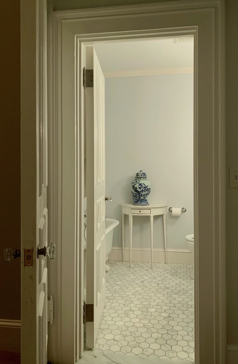
And it is so incredibly soothing and ethereal in this windowless bathroom. Coincidentally, it is also part of the Laurel Home Paint and Palette Collection. I knew it was a terrific color. It looks terrific paired with Benjamin Moore Super White.

Benjamin Moore Salamander
It is the darkest green ever, I think. However, a semi-gloss finish will attract the light, and the green will come out.
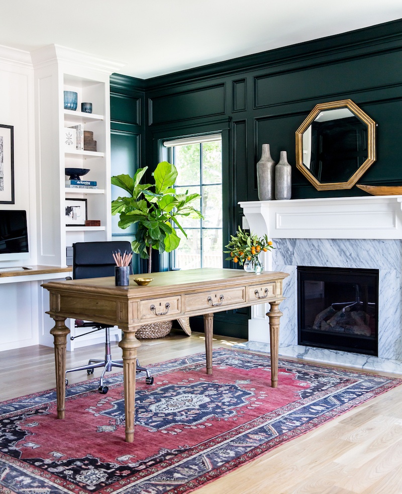 This is another favorite by Studio McGee and looks so handsome in this library. @lindsay_salazar_photography
Picking little-known paint colors that designers are obsessed with is not an easy feat. Most of us love the usual suspects such as White Dove. However, there’s one shade of white that I always hear, “Oh, I’m so happy that you included______! It’s my favorite white!”

Benjamin Moore Swiss Coffee oc-45
It’s this one, above; swiss coffee. It’s a creamy, soft off-white that is warm but most often won’t read as yellow. It might read ever so slightly gold, but not in an obnoxious way.
Swiss coffee is a paint color frequently used by the now prolific interior design firm, Studio McGee. And, it is also part of the Laurel Home Paint and Palette Collection.
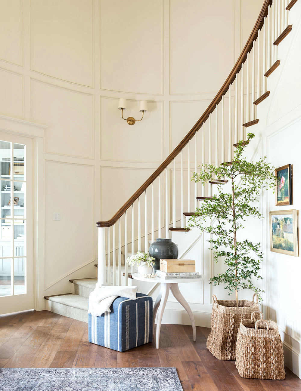
You can see more of this lovely project here by Studio McGee.

Benjamin Moore Silver Lake 1598
Silver Lake is one of the five paint colors included here that is also in the Laurel Home Paint collection. It is under the cool grays, and this one does have a lot of blue in it and is quite lovely.
I chose Silver Lake because Suzanne Kasler loves a similar color. That color is called Limoges Blue by Glidden. However, I could not find that color on the Glidden website.
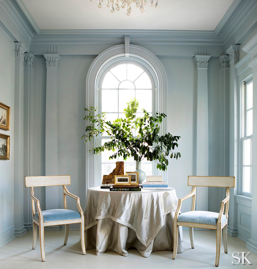
I’m not sure if this Limoges or not. However, it does look to be close to Silver Lake.

Farrow & Ball Pantalon
This is definitely a little-known paint color. However, we did look at it not too long ago in a post about “drab” paint colors. It is a color currently in F&B’s archive collection. However, I’ve heard wonderful things about it from a couple of sources.
I love these dark, handsome colors.
For more beautiful, dark colors, please go here.
Pantalon definitely has a green undertone but in a rich, bronze-y way. I’d love to be able to try it out sometime.
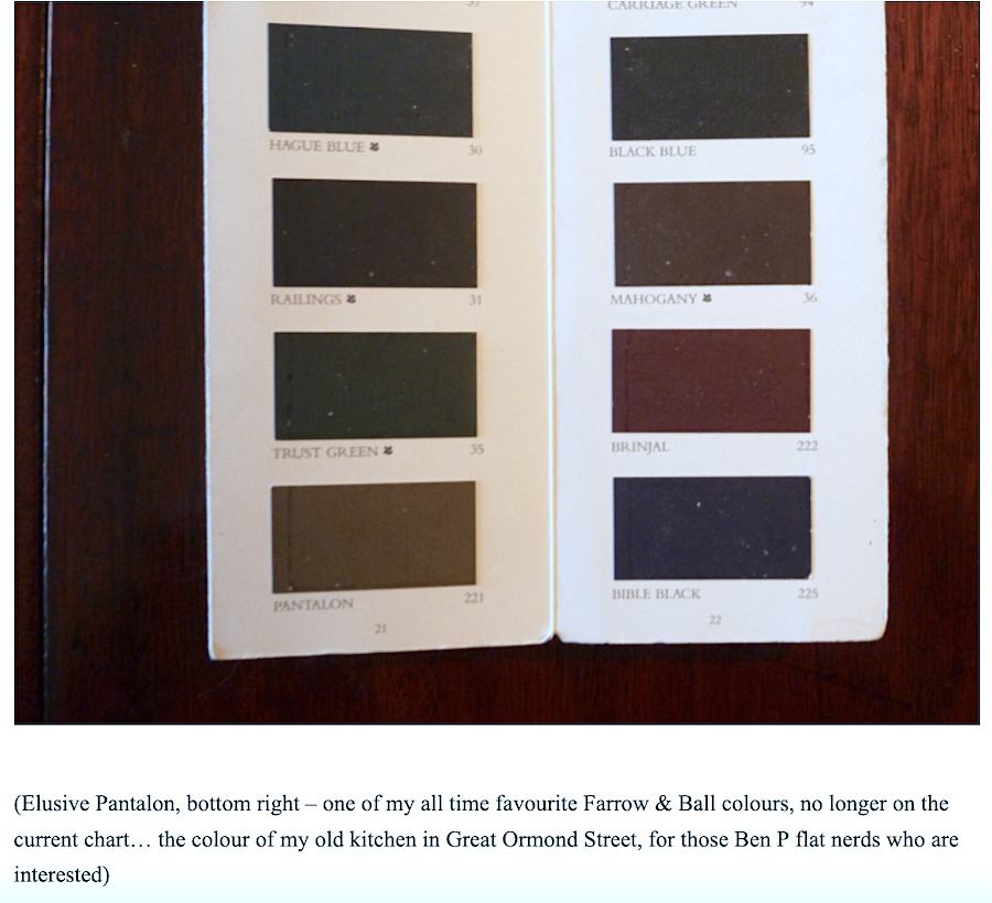 But, get this. Just today, I found out that Ben Pentreath loves this color, too! In fact, as you can see from his 2013 post, he used it in a previous home. What’s funny is that it’s almost the fourth anniversary since I met him in England and got to have lunch at his incredibly charming home in Dorset, UK!
It was like my Instagram account had come to life!

Farrow & Ball Tallow
This is a beautiful, vibrant cream. I can’t attribute to any designer, in particular; however, most designers love working with cream like this. It’s very flattering and glows at night. This is also an excellent color for a darker room. It’s a cream with a very slight pink undertone, so it’s terrific for a bedroom.
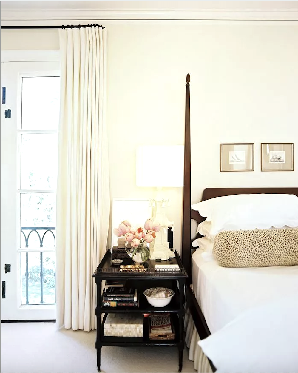
Via: Domaine – Farrow & Ball Tallow – photo: Patrick Cline – Design – Betsy Burnham
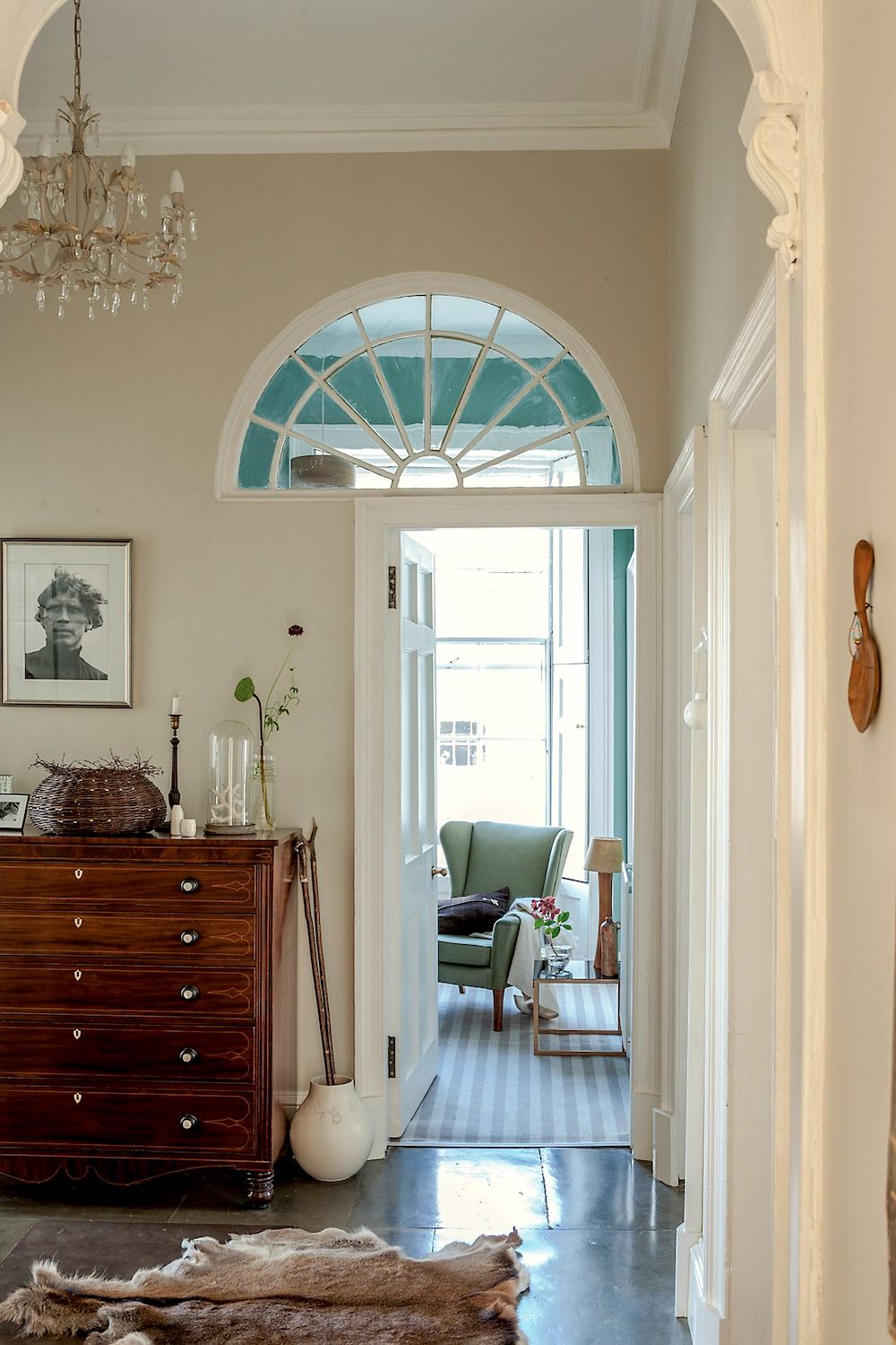
Tallow – via Anthropologie. They sell Farrow and Ball at Anthro. But, you can also purchase samples and larger amounts online at the Farrow & Ball Website.

Farrow & Ball Bancha
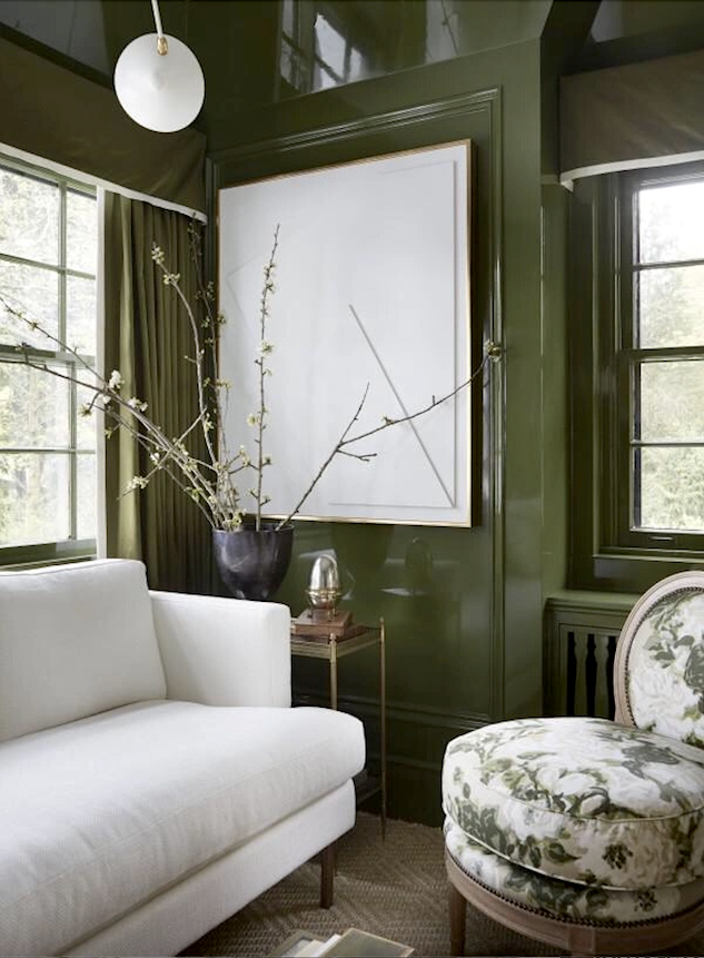
Bancha was introduced at Farrow and Ball in 2018. But, it was right after this beautiful room was done. (above) as it was custom-colored. So, I wonder if it is the same color and F&B put it in their line after creating it for Wendy.
It looks fantastic in the high-gloss finish.
Bancha is such a beautiful, rich, warm green, and I think it’s classic and a fantastic neutral shade without being boring. You can purchase samples and gallons of Bancha here.
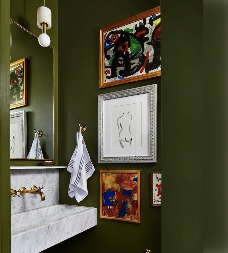
Fabulous bathroom with Bancha walls. I think this little-known paint color is going to be around for a while. Well, at least I hope so!
That reminds me. Remember Mrs. F’s bathroom that I’ve been working on? She has decided to go with the dark green bathroom. Great choice! It’s my favorite, too.

Benjamin Moore Dolphin’s Cove
This is a color I’ve featured a few times. But, I don’t believe it’s terribly mainstream. Although, I might be wrong about that. It is the color of the Grace Home Furnishings store walls, a small chain in California. Apparently, 100s of customers have become obsessed fans of the color.
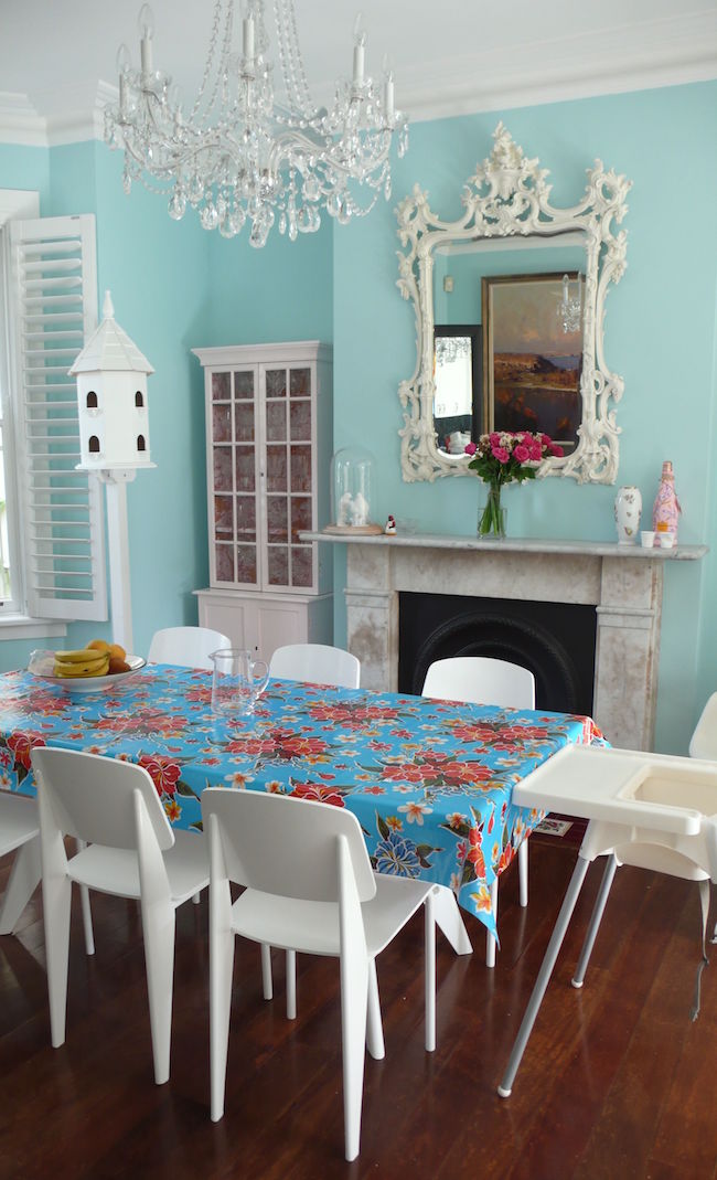
I can see why.
One of the things I love about Dolphin’s Cove is that it’s actually a fantastic Universal Color. My definition is a color that goes with every other color. And, that is why they chose it for the color of the store walls. It’s cheery and colorful but doesn’t take over the space. And, everything looks good against it.
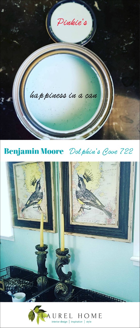
Via my friend, Pinkie Crabtree.

Benjamin Moore Kendall Charcoal
Okay, I realize that this color isn’t obscure. And, I have written about it numerous times. In fact, it’s part of a small no-fail paint color palette I created several years ago. The updated version has been going on for three years.
Kendall Charcoal is a deep, excellent charcoal gray with the barest hint of a green undertone. But, it will not read as green, just a bit of warmth which is very nice and handsome.
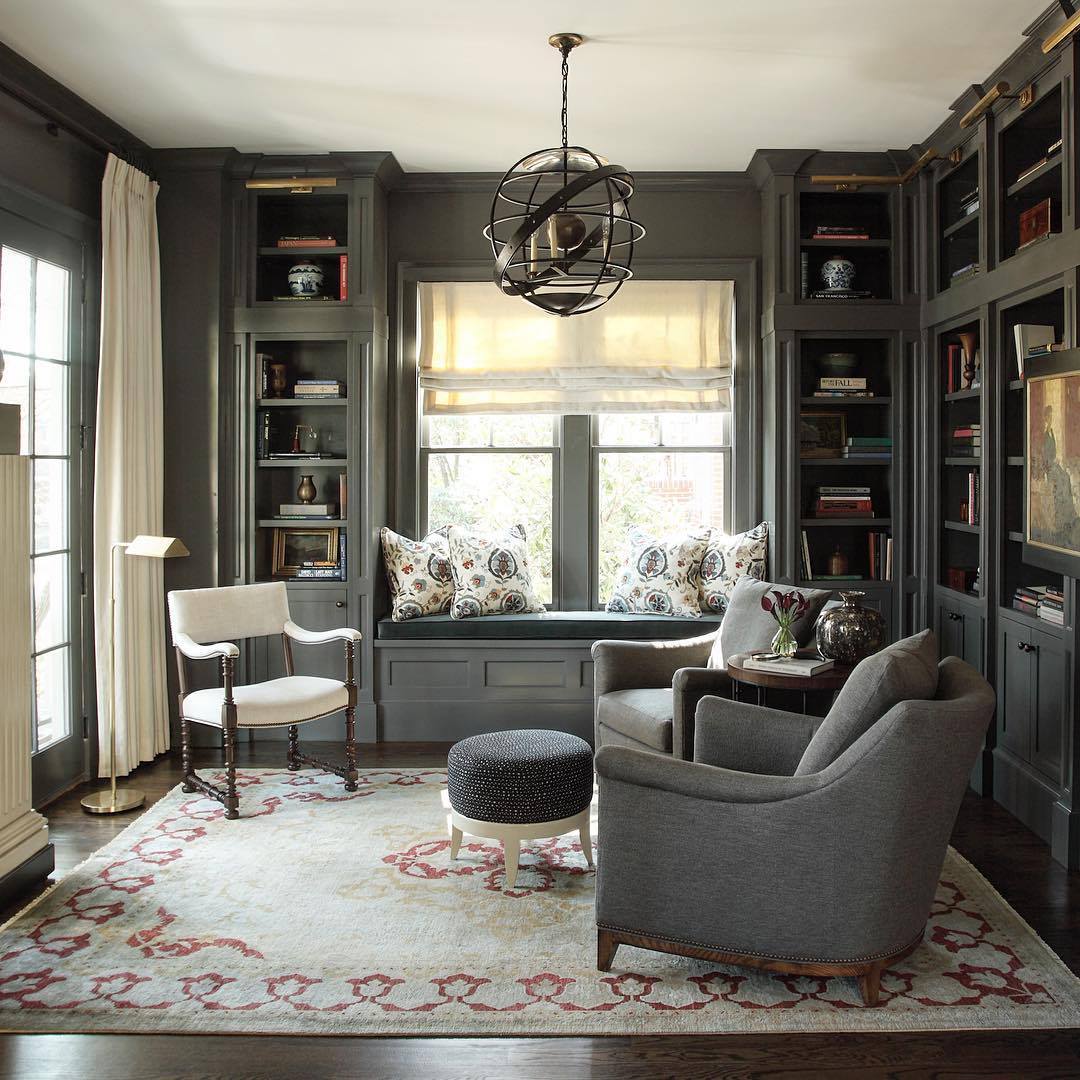
Beautiful library-office by Nina Marie Nash. Oh, you must check out her Instagram. It is sooooo pretty! I want her dining room!
Okay, that is it for the little-known but fantastic paint colors used by designers and enthusiasts alike.
How many of the colors did you know? If you’ve used any of them, please also let us know in the comments.
xo,

Related Posts
 How To Select The Perfect Color Scheme For Your Home
 Painted Brick-How to Easily Change It Back After Painting It
 Nine Fabulous Benjamin Moore Blue Paint Colors
 20 Favorite Exterior Paint Colors + Doors and Trim
 21 Best Hidden Storage Ideas, Stairs, Kitchens, Bathrooms
 Best Proportions For Interior Trim – Why You’re Confused
 5 Classic Kitchen Combos, Cabinets, Hardware, Lighting…





38 Responses
Sherwin Williams Woodsmoke and Valspar’s Thunderstorm are two moody green-toned colors that I have recently become *obsessed* with! I’m surprised more designers don’t use these! Thunderstorm can be a bit unpredictable in how green it looks depending on the light, but Woodsmoke is just … wow!
I still love my Dolphin’s Cove bathroom so much that I am going to paint my guest room the same color. It is such a beautiful clean color.
I loved it, too! I came here to ask the same question. And to say that I fell in love with Swiss Coffee and will likely be using it in my bedroom. If it looks as good on my walls as it does in the photo.
I’m so thrilled that F&B Tallow made it on to the list! I think it’s one of the most intriguing F&B colors. There even was an article once in WSJ/NYT where the author went on a hunt for the perfect Parisian creme color, the kind they use in those ‘bourgeois’ apartments with creaky wood floors and marble fire places, and in Tallow she had found the perfect Parisian creme! I once even ordered a few cans of it to put in a dark room with no windows. The color is very intense, very glowing, it almost has an orange hue to it. I chickened out seeing it in the cans, sent the cans back (luckily the store let me exchange) and switched to White Tie which is similar but more subtle. I like White Tie, but in looking back, Tallow would have been gorgeous. It is at the top of my list of colors to use somewhere at some point.
Installing the biggest transom window they could find was brilliant: Here comes the sun!
Marilyns Dress is surprisingly fresh. A completely new color for me. I’d use it!
Hey, whats with that oversized transom window in the Tallow-via Anthropologie room? I stared at it for 10 minutes coming up with a solution that didn’t require moving the door (I wouldn’t want to deal with a floor repair, of course). I’m happy with my idea and loved the puzzle….thanks for the brain tease! Sorry, I’m completely off topic. Lol.
We lacquered my husband’s office in Card Room Green (we actually used Fine Paints of Europe color-matched). It is a small sort of pass-through library off the foyer of our house with built-in bookshelves and wainscoting. We get the most compliments on that room—you will not be disappointed!!!
Love them all Laurel, thank you!! I have been reading your blog for some time but I’m not certain I have ever commented. I am a “retired” lawyer (have 3 young children so not exactly relaxing!) and self-taught interior decorator. (Needless to say, Caroline Gidiere is my role model.) One thing we lawyers know how to do is “go deep” and research, research, research!! One of my favorite sources is your blog, so I thank you immensely.
I would say all of these are lesser-known colors! I used Tallow by F&B on my powder room ceiling—BUT only because I found it was the precise match for the cream accents in the wallpaper (Quadrille/China Seas Lyford Trellis in the chocolate brown colorway…forgetting what the color is called!). Interestingly, F&B Peignoir was the perfect match for the mauvey-taupe color in that paper and I used that on the trim and door in the powder room. Anyway, I didn’t know about Tallow prior to choosing it, but it looks fantastic.
I live in a 1950s whitewashed colonial revival house in NW Washington DC. We moved in the week the world shut down, and luckily we were able to do some of the decorating work prior to that. Now with the long lead times it’s very slow going, but I am enjoying the process so much. My dream is to build an addition on the back of our house with a large “unkitchen”…and I think Pantalon would be the PERFECT cabinet color with everything else I’ve got going in the house. (Ranging from leopard print Prestige Mills—ahem, “Stark”—carpet with F&B Pink Ground walls in the large dining room that’s central to the house…to my late MIL’s vintage chesterfield reupholstered in Jasper’s Ondine Salmon in the living room, which used to be a screened porch with a big cathedral ceiling, newly repainted by us in … the ever-popular BM White Dove!)
So again, thank you, as always, for the helpful and enjoyable post! Clearly I needed a break from my children tonight, since this comment is the length of a doctoral thesis.
I want to thank you for all of the times you mentioned Benjamin Moore’s, Cotton Balls. I increased it by ten percent. I have painted my entire house with different sheens. I love it. My husband has Alzheimer’s and he loves it too. It’s so refreshing for my new country ranch house. It’s located on a small mountain in a small acreage in South Carolina.
Oh my! simply gorgeous…Marilyn’s dress
May i ask a question? Hurricane Ida destroyed my roof and im getting a new one… i live in a white cottage… any roof color ideas? Amelia
Thank you for this wonderful post.
It’s not on this list, but I found BM Gray Sky on another one of your posts and I love it. The softest blue.
I chose BM Crystal Springs from your Paint & Palette Collection for our bedroom and still love it. I’ve yet to meet anyone who’s familiar with it. I chose BM’s Iceberg for my daughter’s home and it’s a great color too.
Oh, that’s interesting, Susan, because that color is not in my collection.
My color is called Crystal Blue 2051-70. However, there is a color called Crystal Springs 764 which is in the classic fan deck. I just checked and they are similar, but Crystal Blue is a tad deeper and is a little bluer. I’m curious which one you used and how you like it.
I will admit I’m in love with the color Marilyn’s Dress! Obviously! Now to decide which room to paint.
That’s so funny Marilyn!
I love C2 paint color A Cappella C2 717 . I live in a lovely lakeside cottage 32 miles from Boston. The windows in the living room face south,west and north and this great color looks wonderful in all lights and times. It is a happy color but it has a certain complexity. It is more on the teal side of Dolphins Cove. Looks great near water and trees for that matter with almost all colors. Thanks for your wonderful blog. I have learned so much and I like your sense of humor.
Amazed how the Benjamin Moore silver lake actually looked on the wall compared to the sample . I was quickly not interested with the sample ,but on the walls it’s very beautiful with that slight blue undertone coming through. It
sparked joy.
The only other one that caught my attention was
Benjamin Moore Dolphin’s Cove . Normally I wouldn’t pick such a cheery color cause I tend to very much lean towards the moody spectrum , but this is a good example of how the rest of the decor plays into the final look . It was also cheery but in a good way cause the offset of the table cloth really played its part well into the picture . I definitely could see myself walking into that room every morning for breakfast & not wanting to leave.
I’ve been in process for yes , several years trying to put together a palate for my small 2 bedroom home , so appreciate samples such as this to either add on my possible likes & also to X out my dislikes . Coming up with basically a 3 color pallet can b daunting but one beauty of it is using options with different shades & undertones . I only want to paint it once & get it right the first time . Along the way I’m also discovering options I would have never thought.
I’m a creative individual & I really want to show in my end results. I m always about that WOW
Factor . I want to walk into any room & never want to leave . My house must spark a ton of JOY . Moody colors for me do that . They are comforting to me plus a tad bit daring & think takes a bit of a more creative soul to love them such as I. Thank u for your hard efforts on choosing your favorites, I always find it fascinating how ones own prescriptive shows off ones personality .
Hi J.G. Great comment and I just want to add that the beauty of my paint collection is that it gives a great starting point. For example, you could get a sample and realize that you need a color a little more or less what it is. Then, from there, it’s a lot easier to find the color you need. Or, the one in the collection might be perfect. Either way, it’s designed to simplify the process.
What is the beautiful blue in the room in back in the Tallow- Anthropologie picture? I love it!!
Hi Joann,
Ohhh, I don’t know. But, it’s probably another Farrow & Ball color. Maybe Blue Ground, but impossible to say for sure.
Awhile ago you had a post about paint colors and you mentioned Rolling Hills (Benjamin Moore). You described it as a mossy green/grey. I was quite taken with it in the photograph you posted. I thought it could be used as a neutral. I’ve been trying to decide whether I want to use it in my home. It seems very naturalistic and it would complement my terrazzo floors. I haven’t seen you mention it again.
Hi Pat,
Rolling Hills is a wonderful neutral. I first saw it in a shop and discussed it with the shop owner who loved it so much he painted his living room the same color.
I’m loving F&B’s Tallow! I’m looking for just that color for my bedroom and bathroom, so I will have to check it out.
My favorite for cabinets is Card Room Green (Farrow and Ball). Ordered it for bathroom vanity from cabinet maker!!
Hello Laurel, I have noticed that many of the darker colors seem to look good in spaces that are very “architectural”, with lots of woodwork and so forth. My current apartment is not quite open plan, but has a large contiguous living-dining room, so a special color might be overwhelming, besides I’ve mentioned before why I would not paint a dark color in a tropical climate. But I keep thinking of the future, and your ideas and examples are definitely molding my opinions.
–Jim
Well, I think everything looks better in architectural spaces as you probably already realize since I’m always harping about that. But, I concur with your ideas.
Laura, the S&L blue/white print on the couch with your recent blog, do you know if that fabric can be purchased?
Hi Dianne,
It took me a minute. Actually that image is not in a blog post, but in the HOT SALES page and it also showed up in a recent email to announce either a blog post or the hot sales. But, yes, that fabric is available by the yard at Serena & Lily, which you can find here.
Hi Laurel,
I want to write to you with a question regarding the use of mural wallpaper in panels for our bedroom. I don’t know how to get my letter to you. Do I just respond via email to your blog post or is there another way? Thanks, Nancy
Hi Nancy,
Yes, that’s what you do. However, I’m sorry, but I am not able to answer individual decorating problems, unless it’s for a blog post. And then it gets answered in the post. I don’t want to sound mean or ungrateful, but it’s not possible if I wish to preserve my health.
However, there are nearly 800 blog posts here. It’s quite likely your question is answered in one of them already.
I also love Dolphin’s Cove. Such a beautiful blue that warms up a north facing bedroom.
Marilyn’s Dress for my Master Bedroom Suite. White trim. It’s gorgeous. So calming and fresh. Love it. if I were starting a new build, I would consider it as whole house color.
Interesting how a lot of these dark painted rooms have the woodwork painted the same color. I would be terrified to do this even though I like the way it looks!
I know there’s at least one post about that. It’s a great look, and I love it too! It’s also authentic to 18th-century decor. They frequently painted everything one color.
Salamander must only be wonderful in a full gloss. I bought a quart in pearl finish two weeks ago and it was awful!!! Reminded me of new baby poop.
lol – Thanks for the review, Robi. Some of those colors don’t look good until it’s up on the entire wall. The problem is that it takes a big leap of faith and nerves of steel to go ahead with it.
Marilyn’s Dress!! My gorgeous main bathroom is this color, with Chantilly Lace trim. I’m definitely obsessed! I started following your blog during this project, so thank you