Hi Everyone,
I think it finally stopped raining in Boston. But, it rained something fierce when I was in Bronxville last week. In fact, I had dinner with one of my best buds, Deborah Von Donop, under a tent in a raging thunderstorm. Pretty wild.
That was fun.
I stayed with a woman who started as a client in 2015 and has become a very good friend, Mary HC. She lives a half-mile from my old apartment in a beautiful section of Westchester County called Cedar Knolls.
Originally, Mary found me from a google search.
(As an aside, I realize it still says “Westchester Interior Designer” all over the place. My developer and I are in the process of doing another refresh of my website. It’s long overdue. Like five years overdue. haha)
In fact, Mary was the second to the last new client I took on before deciding to focus solely on my blog and website.
You can see some photos of Mary’s home in these posts:
Throw pillow post. Hers needed to be cut down as the workroom did not do standard measurements.
And, this post shows most of the fabrics and furnishings used in her living and dining room.
Here’s Mary’s pretty mantel at Christmastime. (The one that says, David and Mary).
You can also see Mary’s lovely entry painted Classic Gray – and Stella, her black cat! I love decorating to coordinate with people’s pets. haha.
Oh, and of course, the post that features her home’s beautiful draperies in How to Get Window Treatments As You See in Magazines.
Before I left New York for Boston, Mary made me promise to come and visit, and so I did and will do so again.
Her home is old and large and very homey and comfortable.
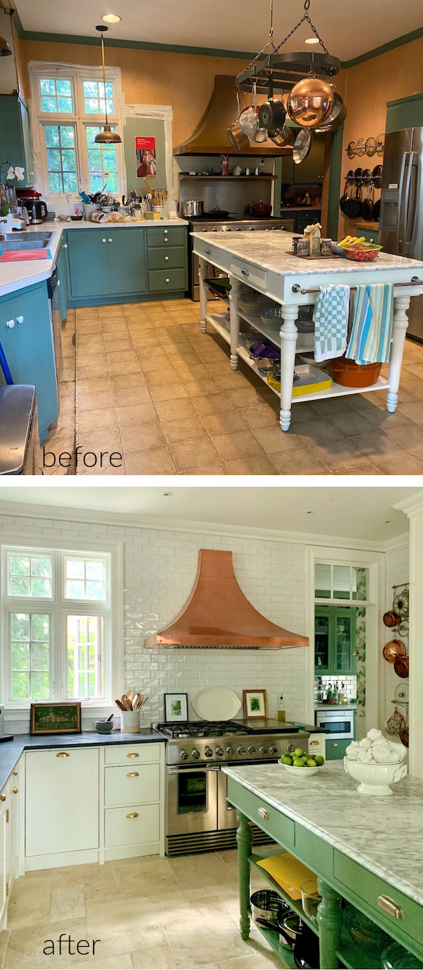
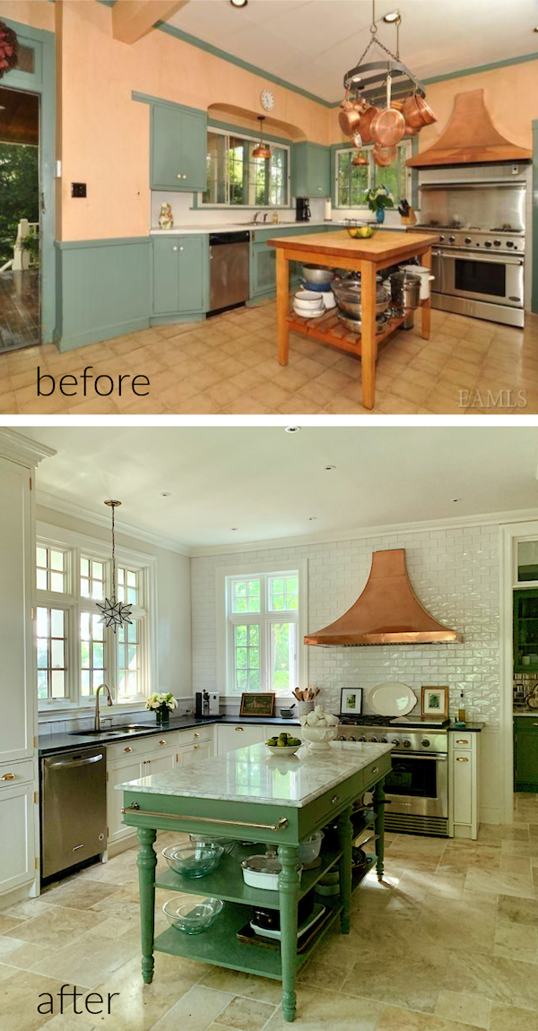
Besides, Mary just completed a kitchen renovation. I know—another kitchen.
However, this one is a turn-of-the-century, historic home. And, while it also followed the same footprint as Dottie did with her kitchen, this one was a complete gut renovation.
The other difference is that this was a very old and funky kitchen. It wasn’t as old as the house, but still very old.
But, here’s the thing. Mary’s young adult kids loved the original kitchen. And, would’ve been perfectly happy to keep it as is.
And, truth be told, it did have a certain bohemian-ish charm. However, the cabinets were falling apart, and it was FREEZING in the winter. The cabinets had no backs nor insulation. The heat loss in New York’s long, harsh winters cost a lot of money as it affected the entire first floor.
Plus, the floor itself totally sucked.
No, there was no way around this one. It was time for a complete overhaul.
There was no saving anything, except for one thing, which we’ll get to later. Can you guess what we kept? Please tell us later if you guessed it right.
Mary and I planned the kitchen last spring into summer. We had our own Covid pod, as the kids say.
She told me that she wanted an English Kitchen, “you know, like the DeVOL kitchens. And, I want to do some wallpaper.”
Really, I acted more as a sounding board. This is Mary’s design in terms of cabinetry, appliances, and many other things, which is a big deal.
Mary told me she was definitely planning on putting in a radiant heat floor.
Yes, please.
However, before we get into the wallpaper and paint colors featuring Farrow & Ball Calke Green, let’s look at the original kitchen. Then, we’ll look at some changes made a few years ago before the big reno.
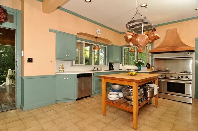
This is how the kitchen looked in 2014 when the HCs purchased the house. This photo is from the real estate listing. That is an older Fisher & Paykel range. And, that is the crappy linoleum, ugh, faux stone (?) floor. In real life, the kitchen felt nicer than this image makes it look.
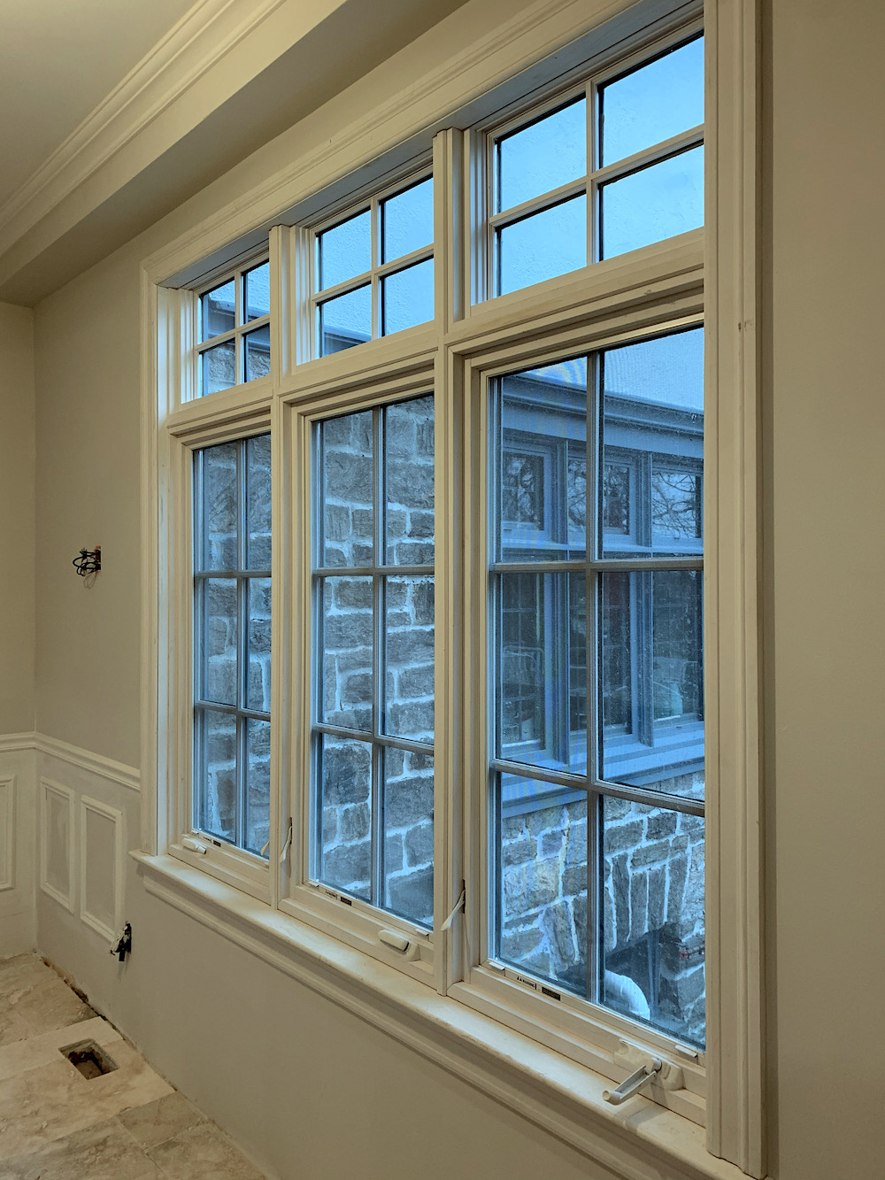
About four years ago, they changed the windows. The reason wasn’t only aesthetic. There was a tremendous amount of heat being lost through them, as well.
Below is what the kitchen looked like just before renovations began last October.
Above is the new kitchen island from Williams Sonoma Home
You can also see one of the new windows. They already made a huge difference.
One thing Mary was sure to do is to move the window over to allow the hood to be moved over so that the stove wasn’t singeing people as they walked by! I mean, as you can see, the range was only four inches away from the door casing. Horrible.
Above is the island from the Williams-Sonoma website
This, addition helped the kitchen along quite a bit, as well.
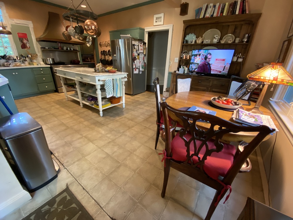
Another view including the eating area. This is quite distorted, but you get the idea.
But, notice that big honking fridge. And, it’s much bigger than it looks here.
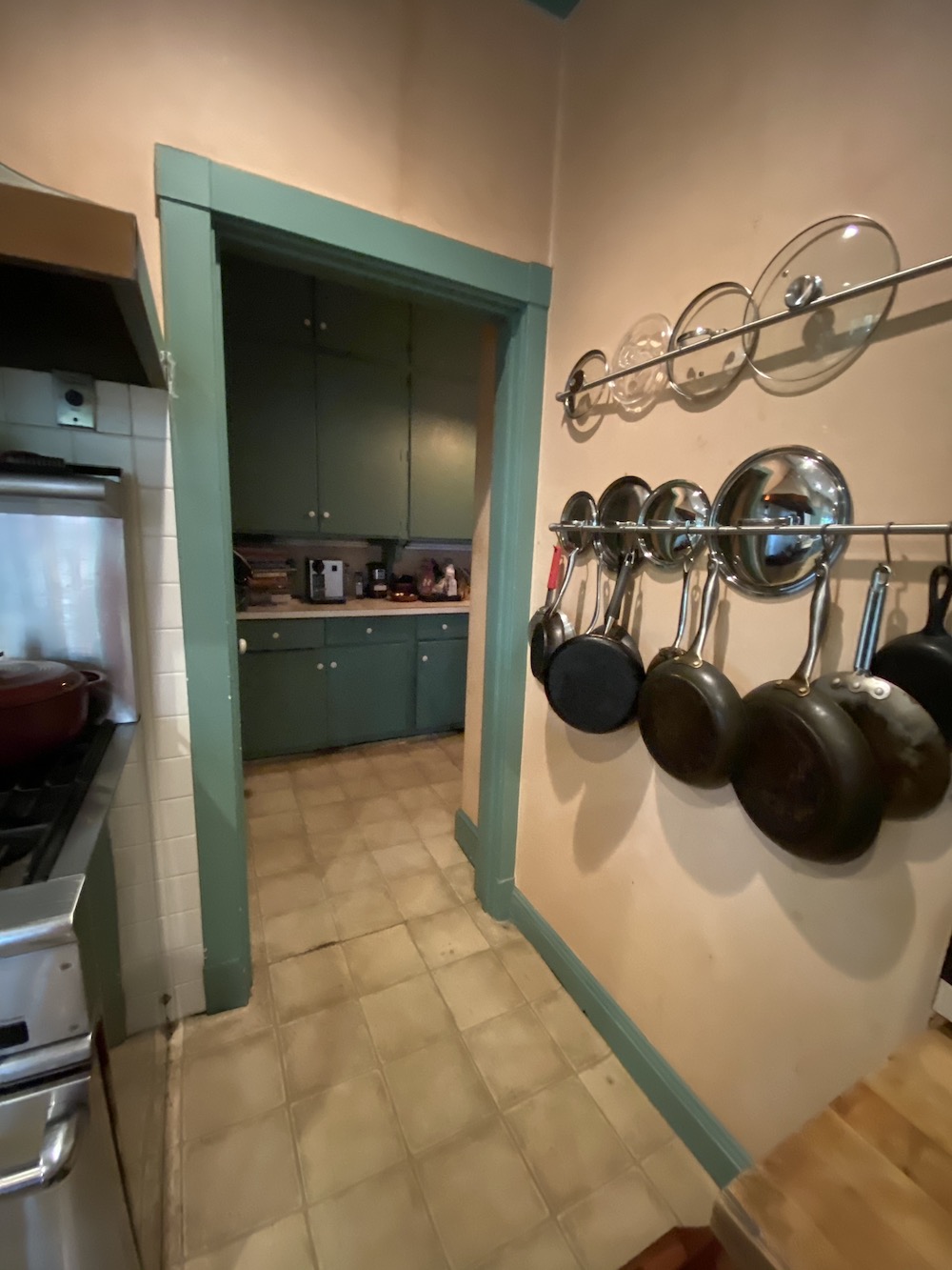 A view into the scary, dark pantry.
I knew this space had tremendous potential.
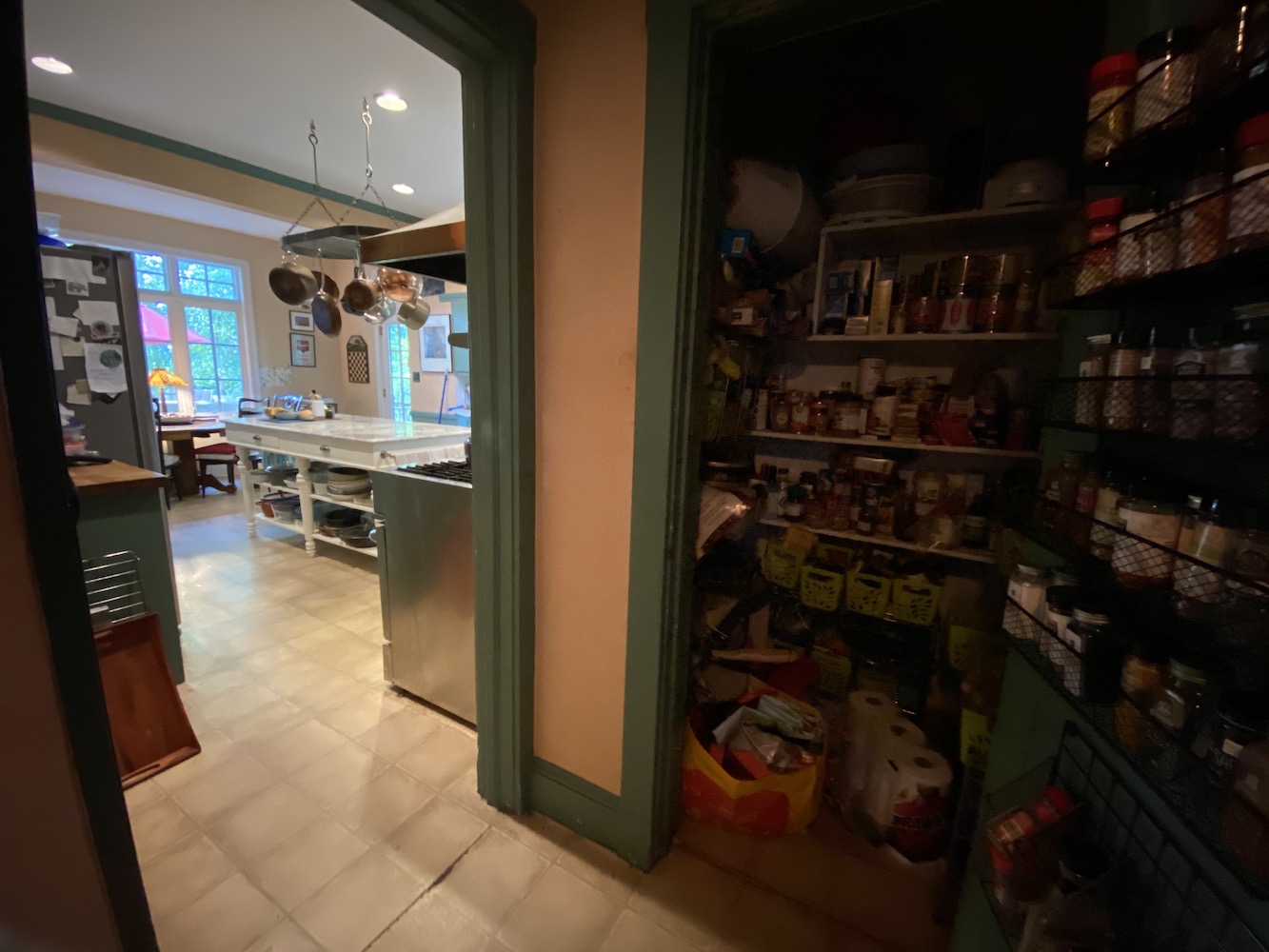 The view from the pantry looking back into the kitchen. In the distance, you can see the new and much larger windows in the eating area.
And now, it’s time to get the sledgehammer!
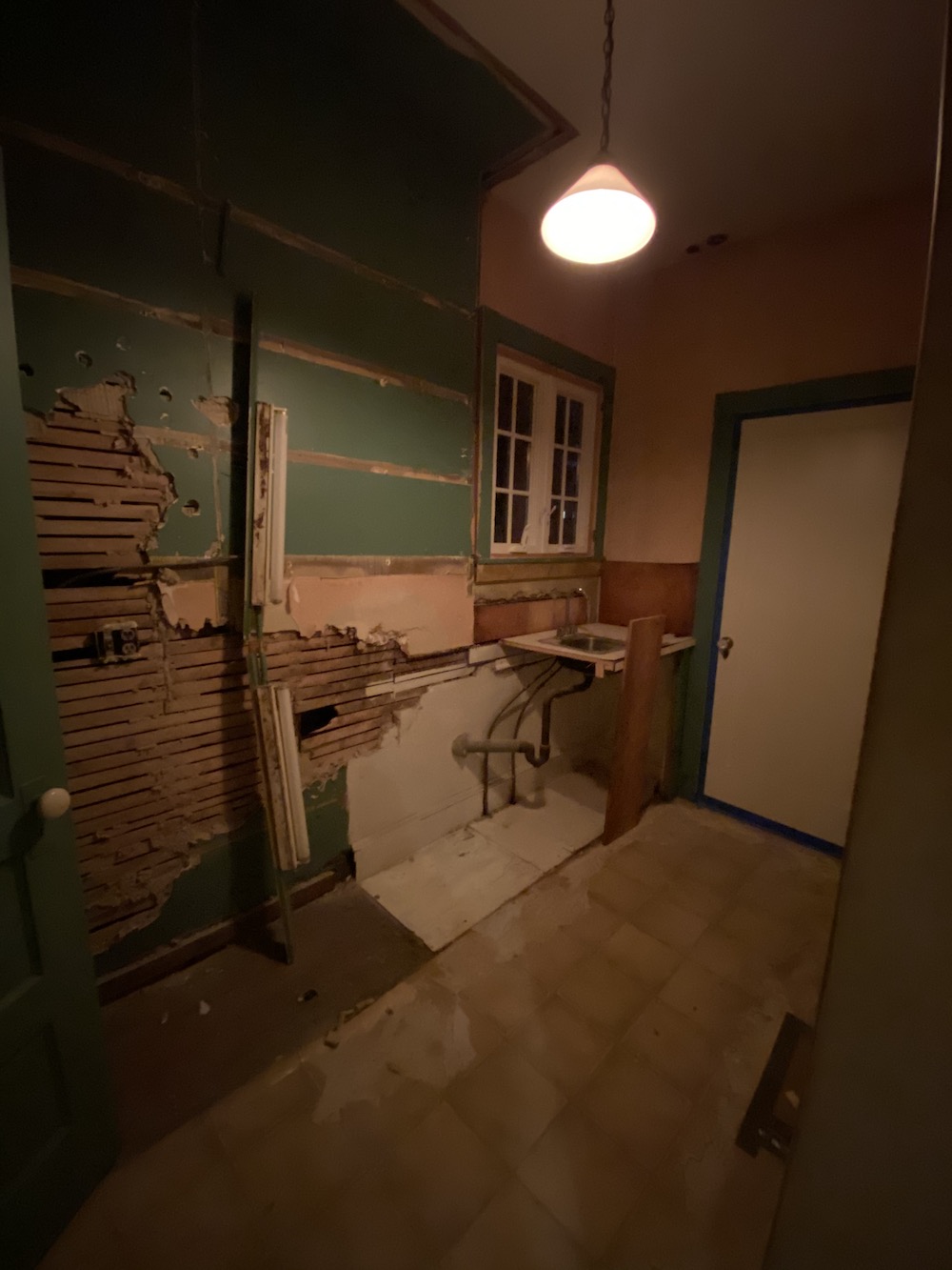
pantry partially gutted
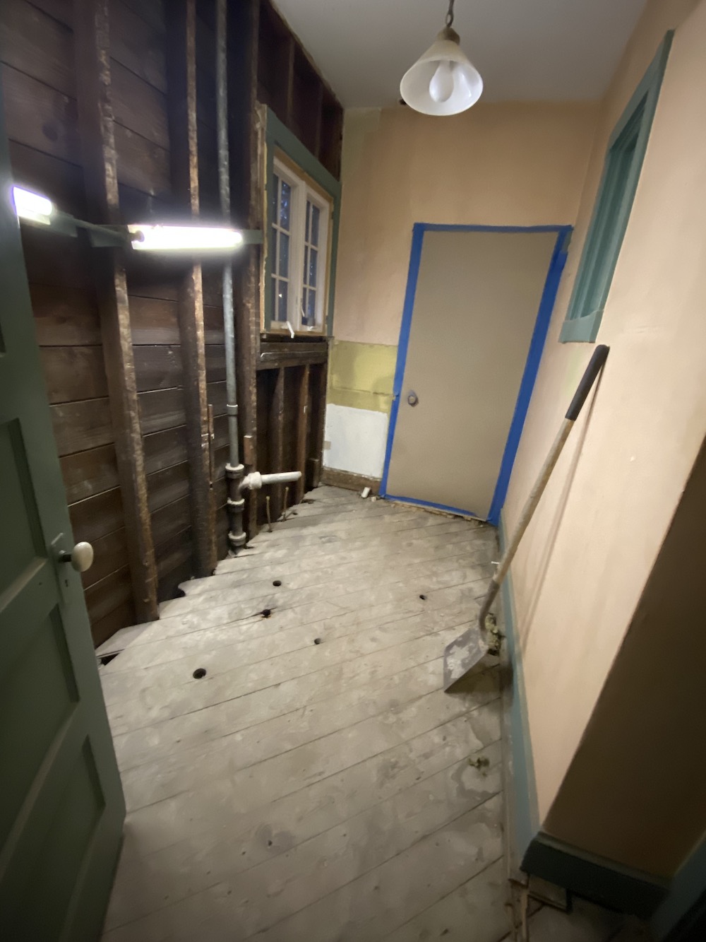
Pantry fully gutted. That is the door to the dining room closed off, of course.
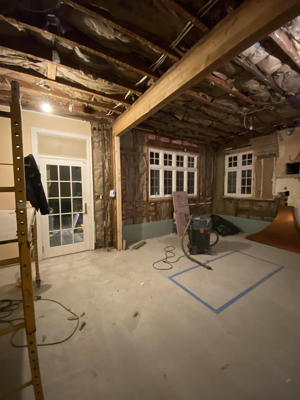
kitchen gutted and insulated
The support beam was previously covered with the salmon wallpaper. Yes, that’s wallpaper. And, Mary thought it would be cool to make it look like a wood beam. That is what it would’ve been 120 years ago, most likely. Kitchens were not for show in those days.
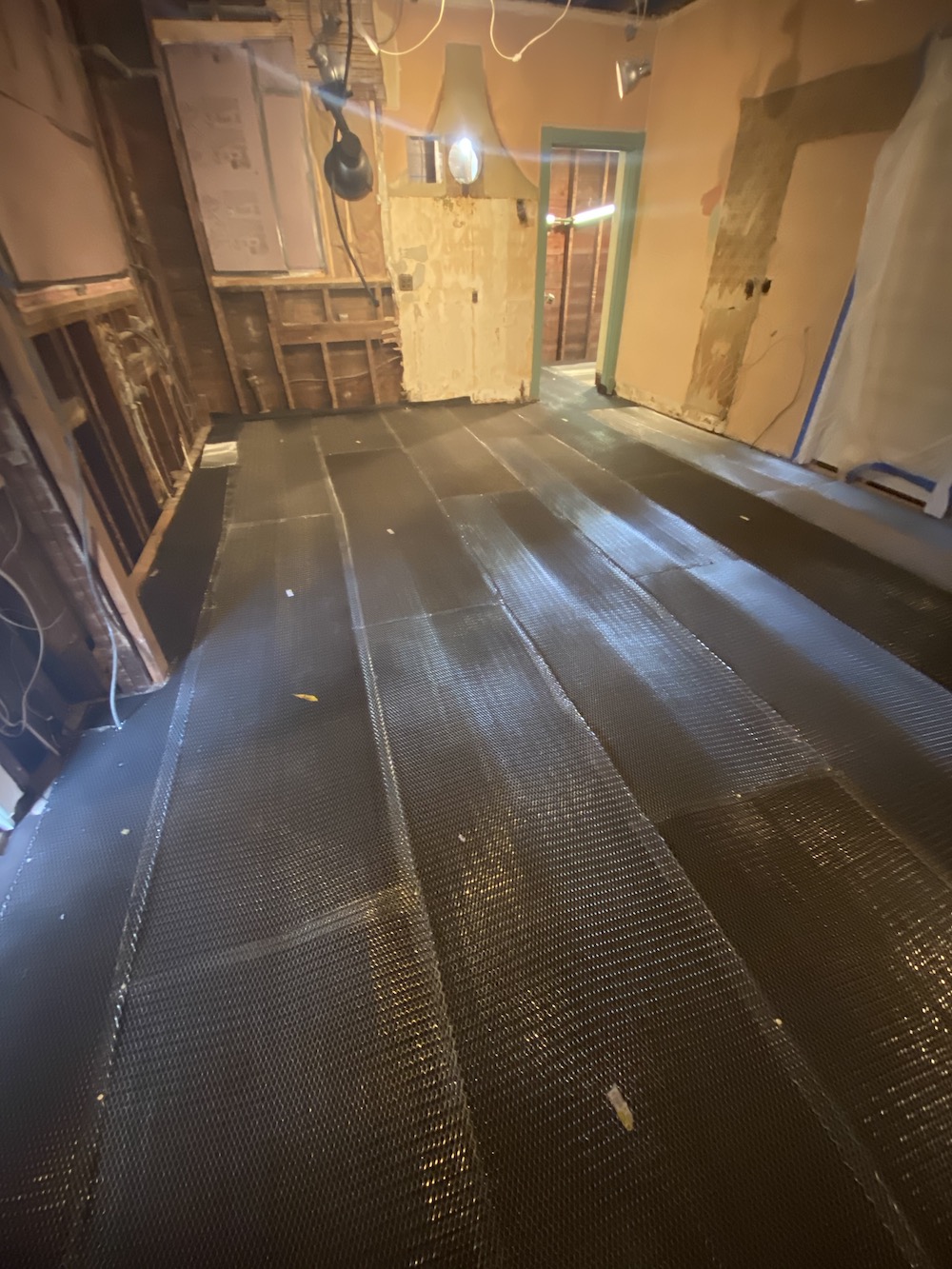
The new radiant heat floor. It’s always darkest before the dawn. haha
Mary had a makeshift kitchen upstairs, and we would get takeout and visit, which was fun.
The last time I came over was actually supposed to be my original moving day, December 16th. I came over just before it began to snow and snapped some pics of the progress.
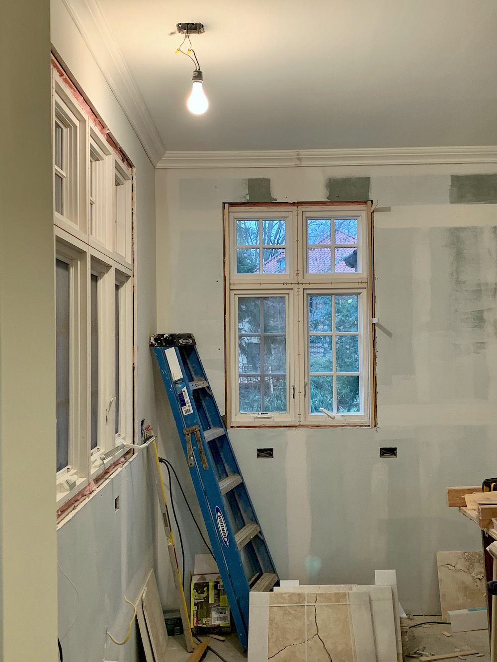 Above and below, you can get a better look at the beautiful new windows.
Above is the new stone floor going in and the new wainscoting.
I don’t remember where Mary found the stone, but it was online. They sent some samples, and we selected one that we both liked.
Here is the last look into the new pantry with the beginnings of the new transom over the door. That was completely Mary’s idea which she didn’t run past me, but I love it!
Mary and I had many discussions about the kitchen.
Important to her, and I concur, is keeping the charm of the kitchen. She did not want it screaming, NEW KITCHEN.
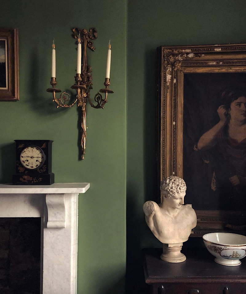
Farrow & Ball Calke Green walls via Tradchap on Instagram
And, Mary loved the green but wanted to tone it down a notch. I wasn’t thinking about Farrow & Ball Calke Green at that point. Although it is one of their best colors and makes a guest appearance in this post featuring some of the best Farrow & Ball paint colors.
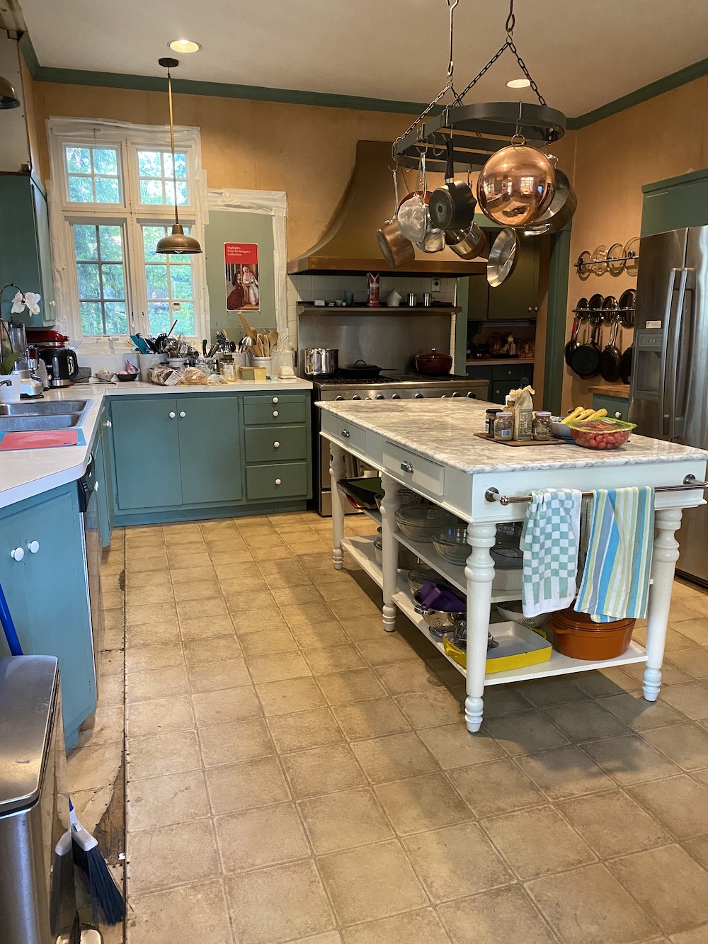
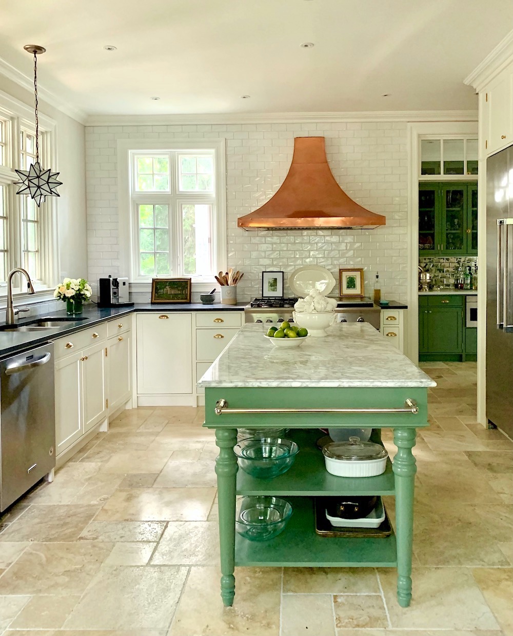
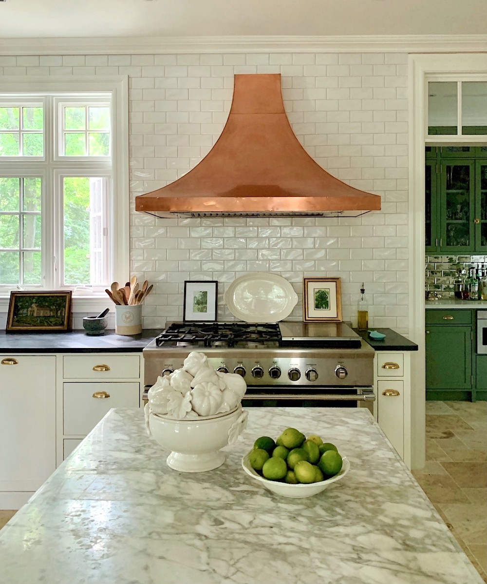
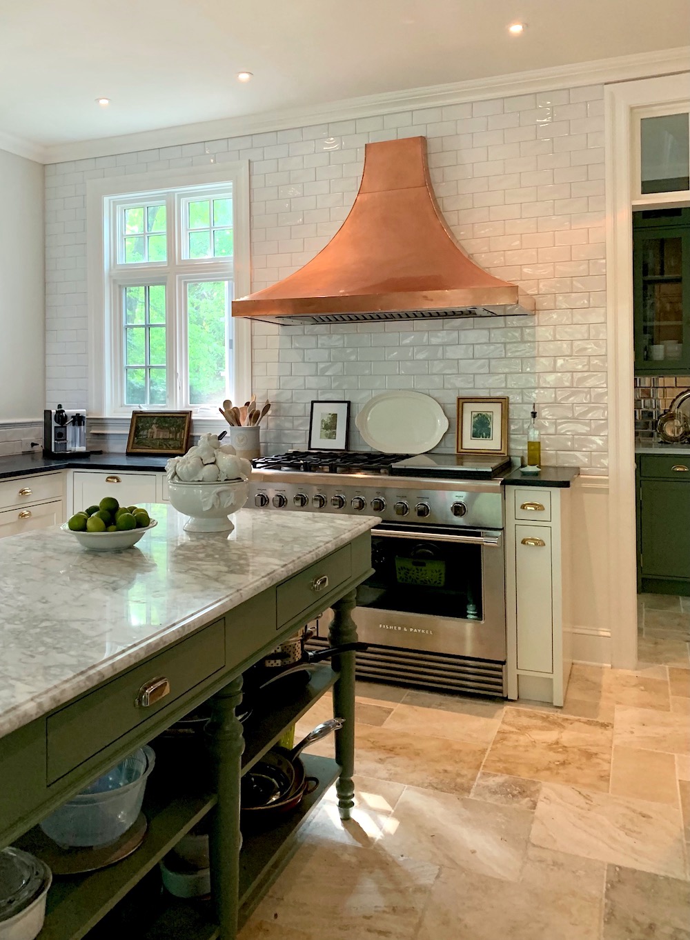
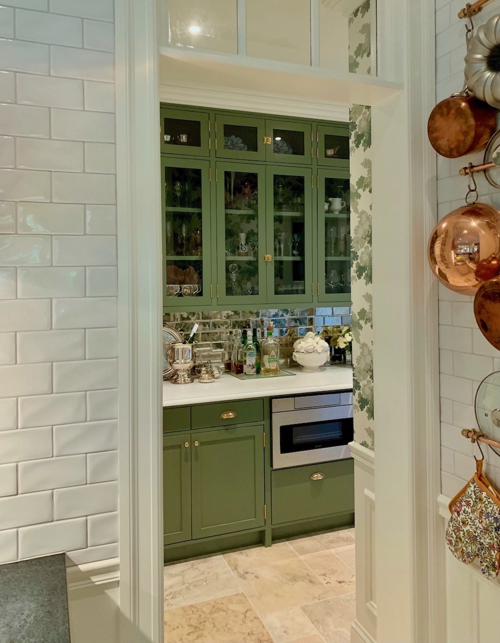
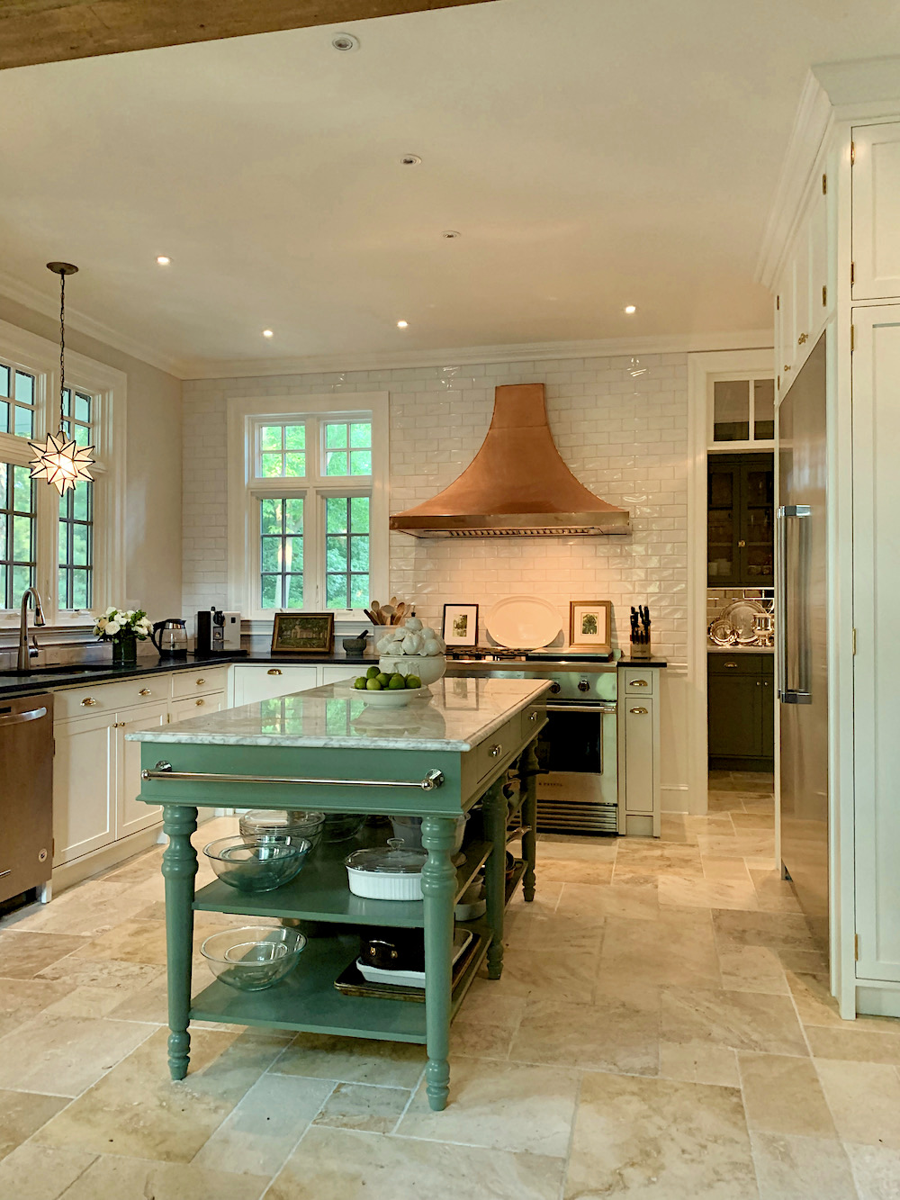
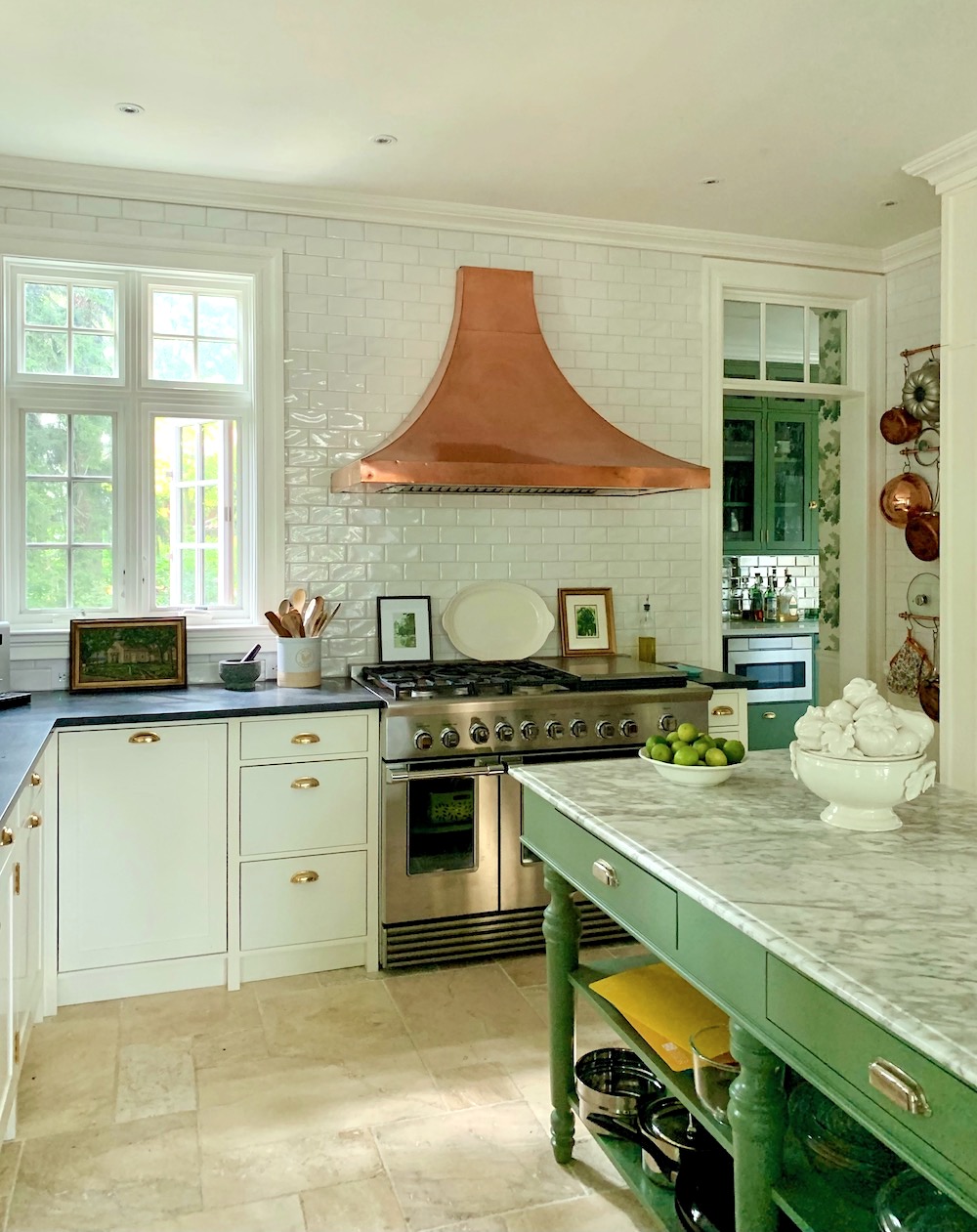
She also wanted to keep the copper hood.
How many of you guessed it, right?
I agreed with that because it looks terrific in there and already had that old patina. Mary’s contractor disagreed. hmmm… Nobody asked him. I’m not too fond of it when they do that. Just say, “yes, ma’am.” But that’s okay. We got our way!
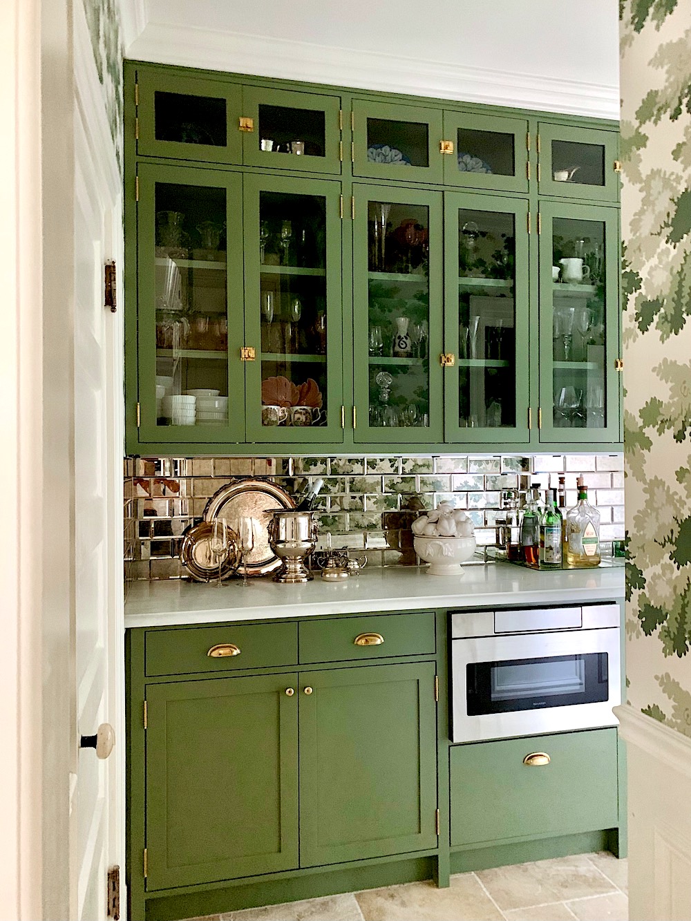
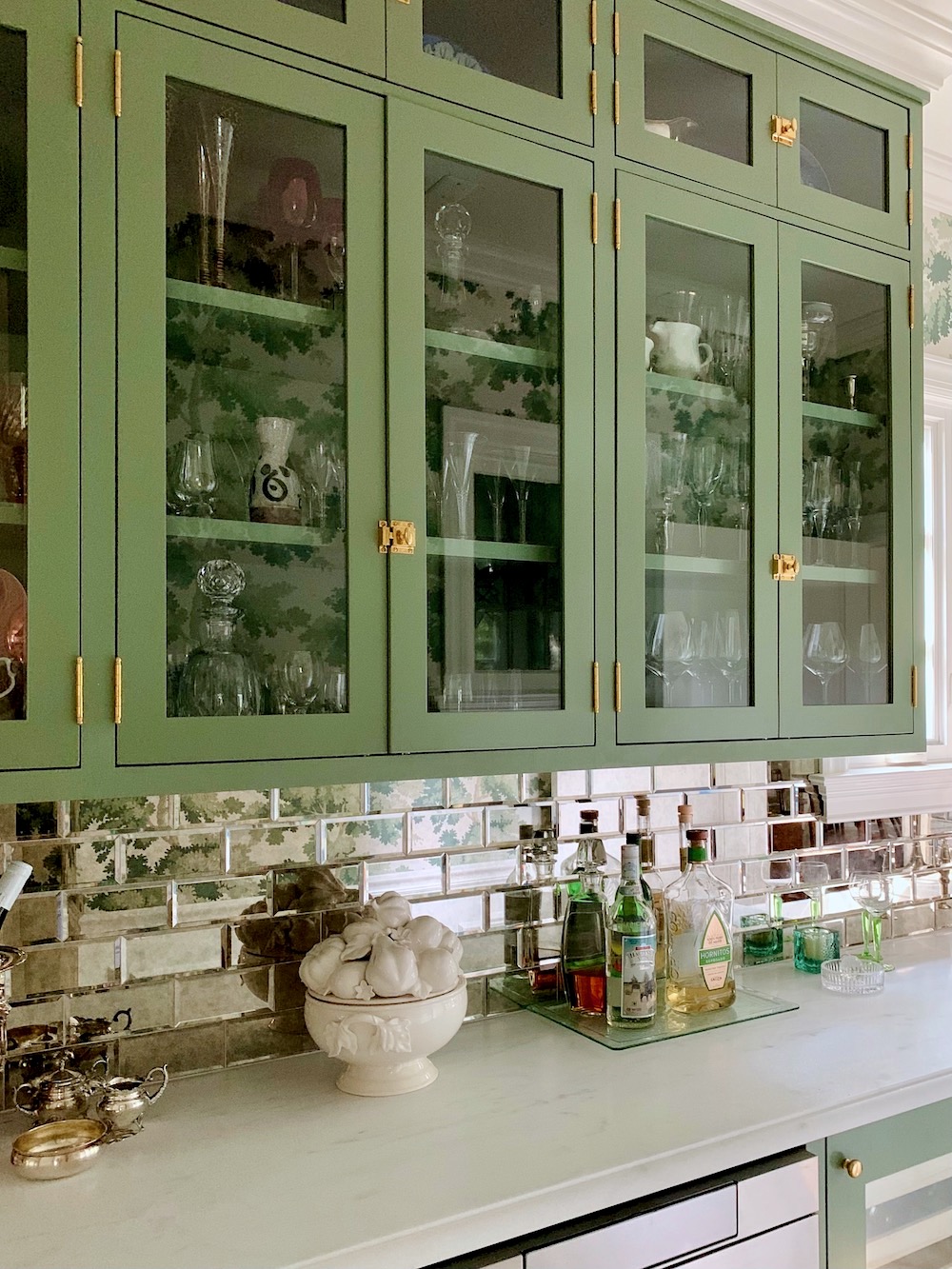
Mary said she wanted to retain green in some of the cabinetry. However, she had already decided to paint the main kitchen cabinets Benjamin Moore Cotton Balls. She had it on the walls and trim in her living and dining room and loved it.
That reminds me. That contractor told her it would look like the inside of a refrigerator. Seriously?
We decided on white subway tile as this is authentic to the period of the house.
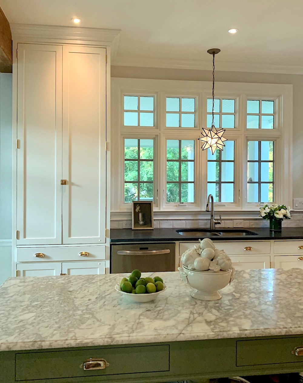
Mary wanted soapstone for the main kitchen counters. And, she wanted a white marble for the pantry.
So, how did we select Farrow & Ball Calke green?
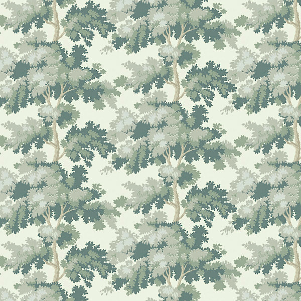
I showed Mary one of my favorite wallpapers, the iconic Raphael by Sandberg. (you can purchase it here)
She said, “that’s it!”
Then, Mary got many samples from Farrow & Ball, and we knew right away that Calke green was the one for the wallpaper. It matches perfectly with the second to darkest green in the paper.
Incidentally, you can get samples and paint (and wallpaper) from Farrow & Ball online now!
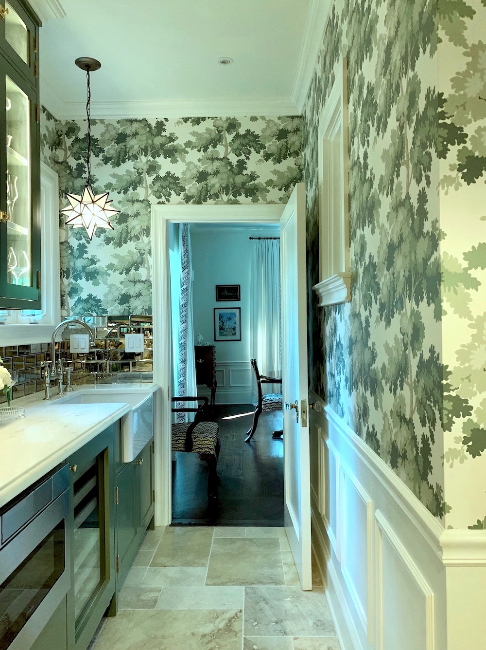
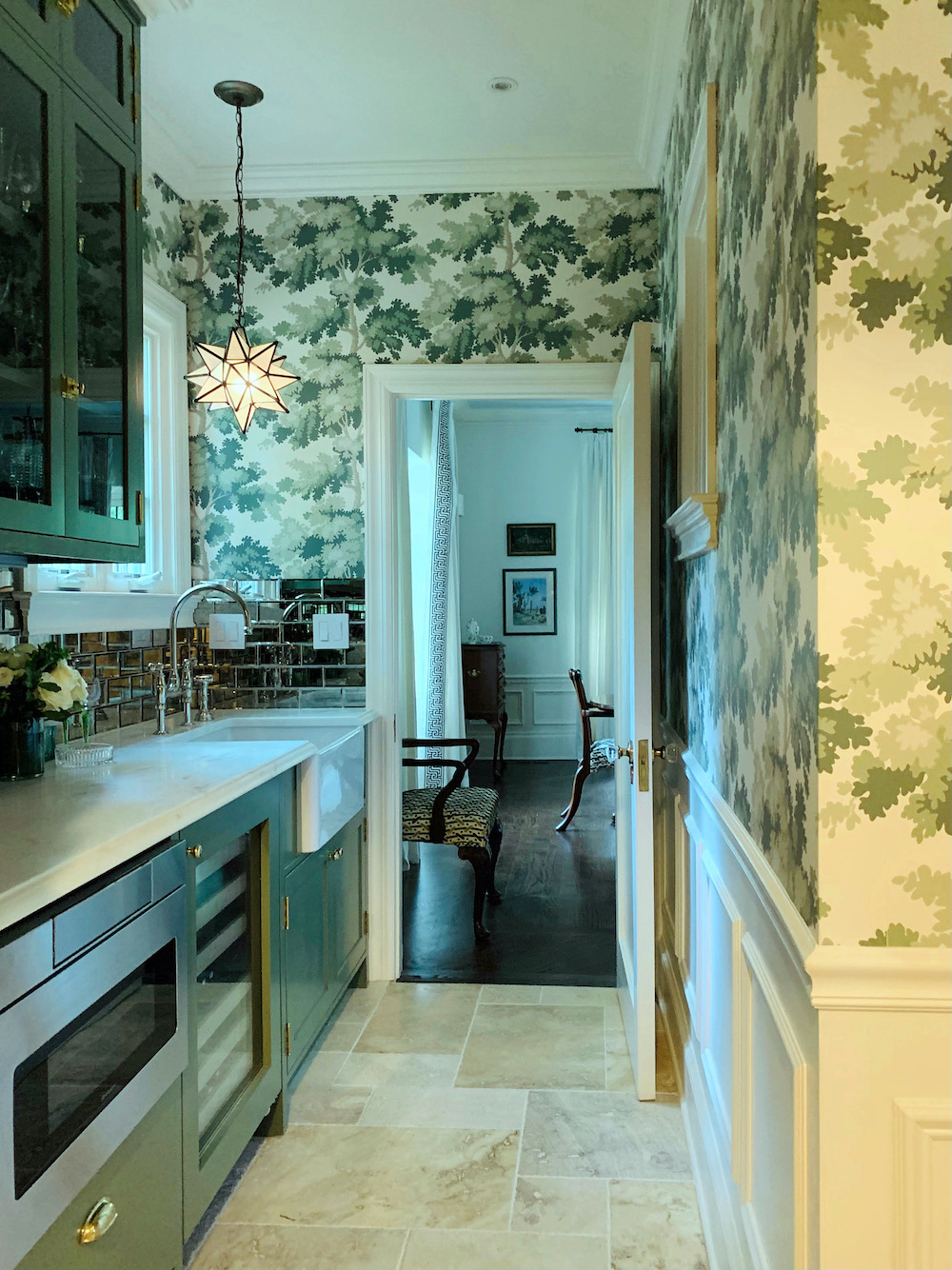
I thought it would be fun to do a mirrored backsplash in the pantry. This would also help brighten it up. Mary went shopping and found a beautiful beveled mirror tile. We chose one with minimal antiquing, which looks just right.
So, let’s take a look at the before one last time.
And, now, the after.

Yes, that is the same island, but we decided to paint it Farrow & Ball Calke Green to tie the kitchen and pantry together.
Mary and I had a lot of fun styling the kitchen for the photos.
By the way, Mary is an art historian with a PH.D. So, there’s no shortage of cool art in her home.
Let’s keep going with more photos, and I’ll explain things as I go along.
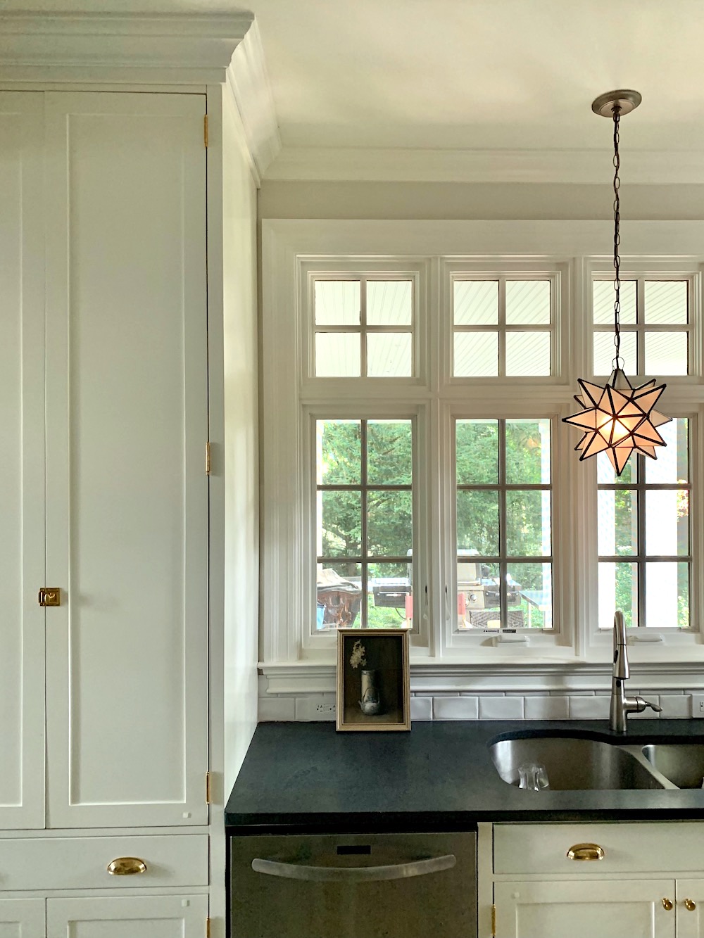
I thought that a Moravian star pendant would be fun. I forgot where it came from, however. There’s another one in the pantry. Wayfair has them, for sure.
Oh, wait. I’m pretty sure it’s this one from World’s Away.
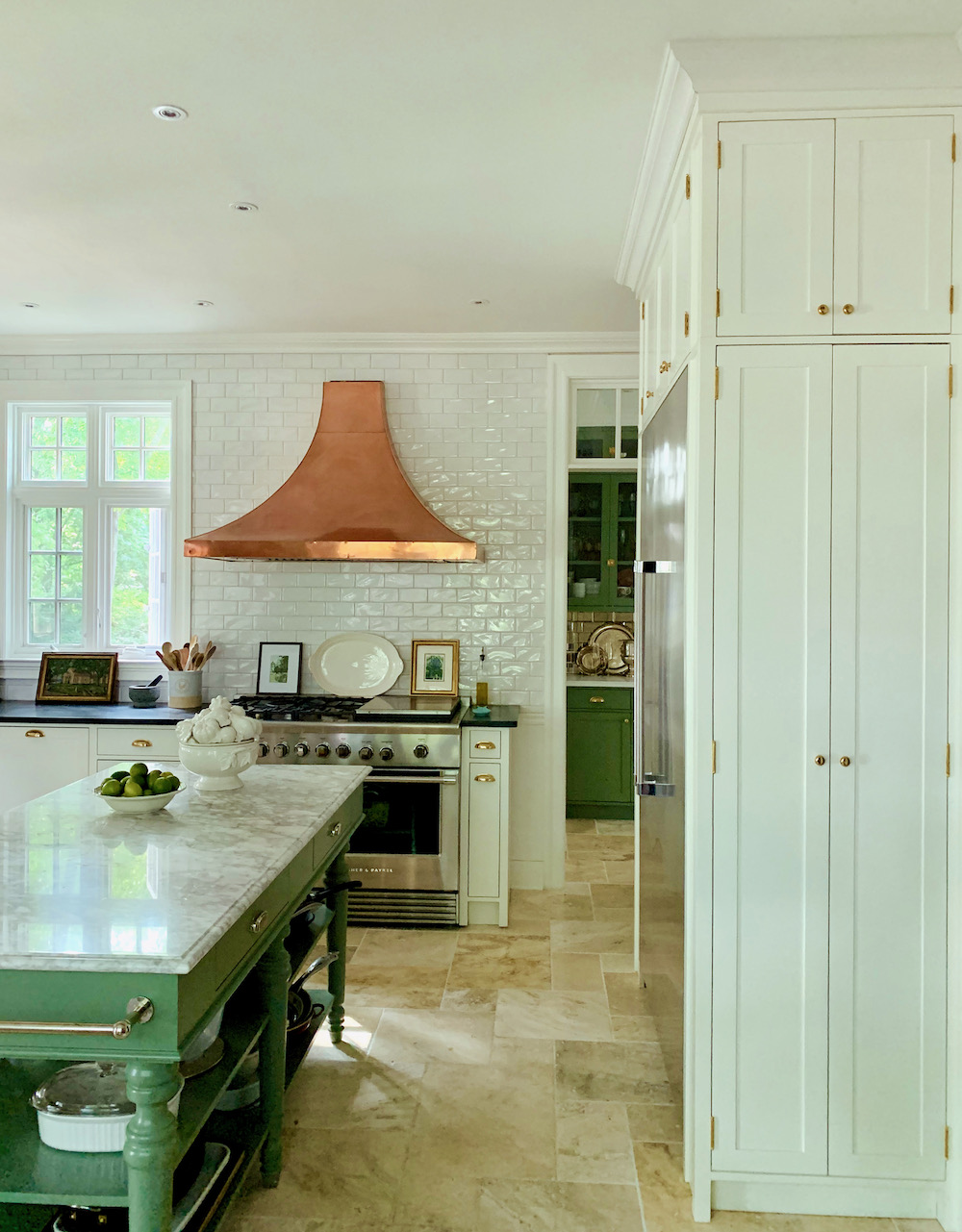 One surprise that is so cool that Mary designed is the cabinet for the Fisher & Paykel counter-depth fridge. On either side is a shallow cabinet, one for brooms and the other houses a ladder and some other utilitarian items.
On the opposite side of the kitchen is a tall pantry. This is the quintessential “unkitchen” I’m always yapping about.
I love these pics I took on Thursday morning. The sun was softly filtered through the millions of leaves on their beautiful property.
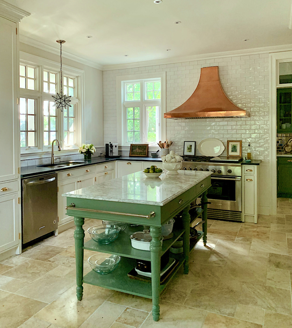
Another point is the mix of metals. Brass, gold, in a beautiful chandelier you can’t see, copper, chrome, brushed nickel, stainless and a touch of bronze on the star pendant, and stainless steel. It ALL goes just fine.
Mary and I concurred that the new kitchen feels much more “at home” in this lovely center hall Tudor-style home.
Plus four different kinds of stone. There is enough that matches that make the unmatched elements part of the charm. This is something that’s taken me a while to really sink in. (no pun intended). However, I feel it’s the secret to that evolved look many of us are striving for.
The photo above was taken Thursday morning, but with different lights on, and then I turned them all off.
In case anyone is interested. Mary IS a fantastic chef and really uses her kitchen.
Okay, I know you’re dying to see the pantry.
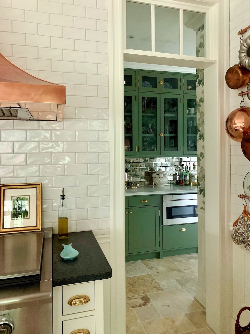
I’ll take you in this way. :]
This one was taken the day before, later in the day, with more lights on. I adore how you can see a little sliver of the paper from the kitchen.
And, I like the styling better the next day.
That drawer microwave is fantastic!
That cabinet does close. I don’t know why it wasn’t closed all of the way here, and I didn’t notice it until I was back home.
I love the view into the dining room. Yes, that too is Benjamin Moore Cotton Balls.
This is a similar image but with the cabinet light out.
The cabinet is gorgeous lit up, but the photos didn’t turn out so well.
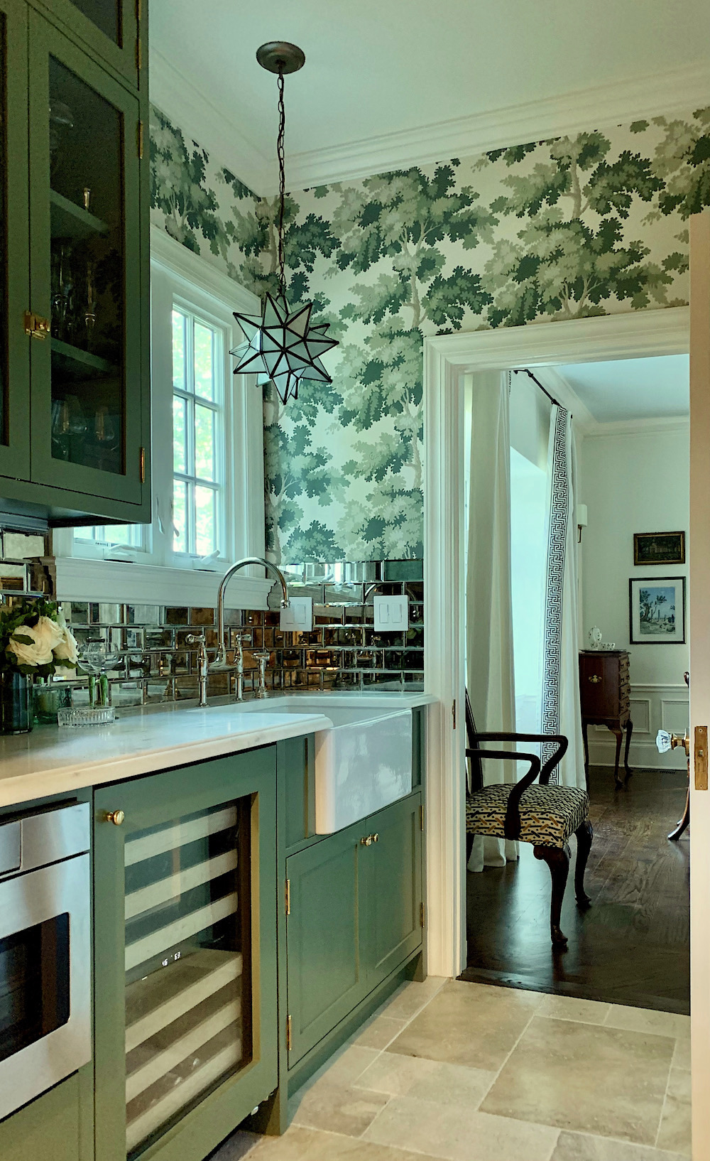
I love this image because it feels trad, but with a lot of personality! Every opportunity, I used this entrance to go into the kitchen. It feels amazing being in this little jewel box of a room.
And, yeah. That’s my fave Perrin & Rowe Bridge Faucet in polished nickel. Yummy!
If you missed that link earlier, you can purchase this wallpaper here. And, you can also purchase the other colorways. If you click on any of the images, you’ll be taken to the source.
Important note: This is a European size roll which is almost a double American roll but not quite.
Please consult your professional installer for a precise quote for how much wallpaper you’ll need.
Back into the main kitchen taken Wednesday afternoon with more lights on. The kitchen looks amazing at night. I did take a few images, but they are more difficult to take at night and don’t give the right impression.
I forgot to add that the walls of which there aren’t many are Benjamin Moore Classic Gray. It’s such a chameleon color. Remember how yellow it looks in my living room?
One last point before I hit send is the cabinet color.
It is color-matched to Cotton Balls. It is not actually Benjamin Moore’s Cotton Balls.
 You can see it clearly here. The trim is cotton balls, and the cabinet looks darker. In-person, the cabinets look either a lovely cream or the palest khaki with a slight green undertone. It’s a beautiful color and actually, a happy accident. I think it really suits the space beautifully.
However, if a precise color is important, then please get a strike-off (sample of what they are using)
Above and below, please pin to Pinterest for reference.
I hope you enjoyed this post, but if you didn’t or found something, not to your liking, please keep it to yourself. 99% of you are beyond lovely. This is for the 1% who seem to forget that this is someone’s home and we are invited, guests. Please be respectful. I’m only saying this because I had to delete a couple of comments last weekend.
For the complete source list, go here!
Thanks, guys!
xo,

Related Posts
 Subway Tile Alternative Everyone Knows About But Me
 The Granny Decor Mistakes You Might Be Making
 Stunning Photos of San Francisco While Attending the DIC
 I May Have Found “The One” in Boston!
 Is He Right? Are White-Painted Walls Boring?
 Two Doctors Try To Save Man’s Eye After Dining Room Lighting Accident
 The Ultimate Guide To Fireplace Mantel Decorating