Dear Laurel,
I love your website and the inspiration and wisdom you have so generously imparted.
Question: I was hoping if you could share your creative thoughts on decorating with two sofas. I want to deviate from the norm by using two different sofas; mismatched sofas.
Should the fabrics match, or is it okay to choose fabrics that coordinate and complement each other? I am trying to avoid a furniture store look. Yuck! I’d love to hear your thoughts, and I’m sure others would too.
Your new home is positively gorgeous! Boston is one of my favorite cities- lucky you!
Warmly,
Julie
Below is my response regarding mismatched sofas
Hi Julie,
The advisability of doing mismatched sofas is an excellent topic for a blog post. But, I’ll tell you right now, it’s a slippery slope and a hard look to pull off.
Not impossible, however. Can you give me the reason you’d like to do mismatched sofas aside from avoiding a “furniture store look?”
BTW, it depends on the furniture store! But, yes, most of them suck in terms of how they put their vignettes together.
Best,
Laurel
Below is the response from Julie
In response to your question and reflection, this is my underlying thought process regarding doing mismatched sofas.
I’ve recently downsized, and the main living room is smaller than my old one. I like the simplicity of 2 sofas across from each other. It seems elegant yet conversational and cozy.
Since I have two very nice sofas (one larger than the other- not a love seat), I thought I could reupholster them, but I wondered if It would look too eclectic if the upholstery is in two complementary fabrics. Are there any design rules for this? I’ve looked around on the internet, and I’m not finding many examples. And maybe that’s because it seems mismatched or thrown together.
I’m beginning to wonder if perhaps I should scrap them both and start over with identical sofas.
I received an upholstery quote- buying new sofas probably wouldn’t cost much more.
At any rate, I thought I would reach out to get your perspective. I adore your style!!
Have a lovely evening!
Julie
Okay. There’s a very good reason that Julie is struggling to find many images with mismatched sofas in one seating area, as I said in my note to her. Mismatched sofas are difficult to pull off.
Story Time
Many years ago, in 1992, to be exact, I was a new hire by a decorator who had a small shop in Bedford Village, NY. I worked for her for nearly four years before going out on my own in 1996.
Anyway, she was fond of taking me along to client visits which was always a treat for me. This visit was only about a quarter-mile from the shop on Bedford Green in the small historic district. However, since there were no sidewalks, we drove.
Hang on a sec. Let me see if I can find the house. I’ll be right back. ;]

There ya go, an 1841 Greek Revival architectural gem, if ever there was one.
I don’t recall the exact reason for the visit, but I think it had something to do with the library’s window treatments.
Now, I did find an old listing from 2011, the last time it was sold. You can see those details here.
As an aside,(I think this interesting, but if you don’t, please skip ahead to here*)
This is for those of you who warned me about “high taxes” in “Taxachusetts,” please note that the annual taxes on this baby in 2019 were $170,600.00! (please note that a kind reader informed me that this is the assessed tax rate. The taxes would actually be about $43,000.00 a year. Still, a big number compared to what most of the country pays)
Why so expensive?
- relatively little commercial activity
- sparsely populated area – all of northern Westchester County
- this is where God lives. That’s just how gorgeous it is!
- a relatively large proportion of whiney and entitled parents willing and able to spend a fortune educating their kids in seedy, greedy school districts.
I realize that’s a harsh thing to say. Remember about ten years ago when they were giving the ax to teachers left and right? That’s when I got involved, and I learned a lot.
It is not only the Bedford Public School district. Believe me; we can add others to the mix who have phenomenally outrageous budgets for public schools.
Oh, you don’t believe me?
Fine, make me work. I’m just teasing. Actually, I’m curious, too. So, I took the liberty of tracking down the most current budget proposal for our old school district, The Katonah-Lewisboro Union Free School District. BTW, “union-free” is a misnomer. It is not free of any unions whatsoever. However, it does butt up against the Bedford School District.

Here you can see in this graphic I made recently comparing our old school district in size to the city of Boston. Below that, you can see the equally humongous Bedford Free School District.
None of them are free of anything, except for, never mind.
But, are you guys ready to see the annual budget?
The annual school budget for the Katonah-Lewisboro school district for 2020-2021 – is: $141,863,980.00 – And, how many students are there?
$2,975.
Yes, that’s right. That’s $47,685.00 a year to educate ONE CHILD. Yes, again. This is a PUBLIC SCHOOL. Do they NEED that much money?
Of course not.
*********
*Okay, I will stop now and return to our regularly scheduled program: “As the Mismatched Sofas Turns My Stomach.”
Sometimes.
You see, when I went into this house, fresh out of design school and with a toddler in daycare, we were ushered into the library of this historic beauty.
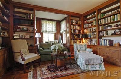
Yep. This is it. Only this wasn’t the furniture in the room. However, it gives you an idea of the size of the room. I would estimate that it is about 12′ x 14′, not including the bookcases. So, not a large room.
My boss was super proud of the work she had done, and this is where I was incredibly grateful for all of the acting lessons I had taken 10 years earlier.
I mean, you know what’s coming.
For indeed, in this small library were two mismatched sofas, each the standard seven feet. And, neither sat inside the alcove as seen above. I believe there was a desk in that area.
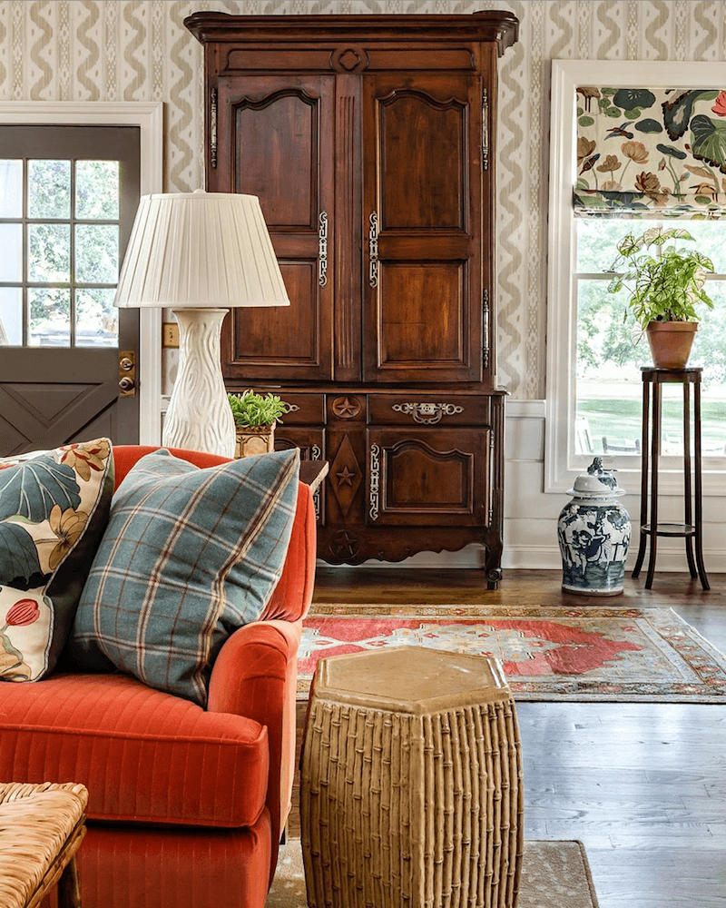
One had an English Roll arm like you see above in this exquisite room by James T Farmer.
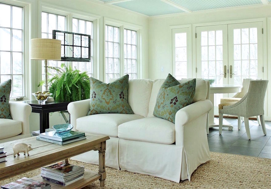
The other sofa had a Lawson Arm similar or a little larger than the one you see above. (here is an entire page of Lawson arms)
Also, the fabrics were different. One was a chintz with a ruffled skirt. The other was a beige chenille with exposed legs. The two sofas were perpendicular to each other. There were also mismatched throw pillows.
Guys, it didn’t look eclectic and cool. No. It looked like a big bloody, very expensive MISTAKE as these were both custom high-end sofas. However, I needed the job, so I just kept my trap shut and kept smiling sweetly.
What would I have done instead in this library?
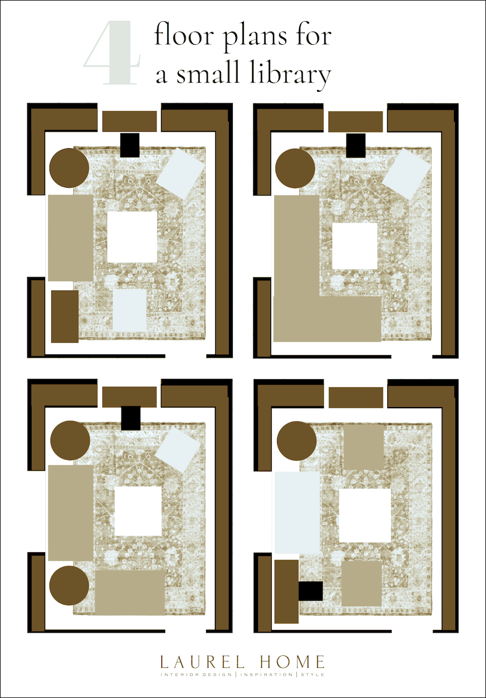
Good question. For starters, I would’ve done only one sofa and a smaller apartment size sofa, no more than 75″ long.
Below are some schematics I created to show four possible layouts for a small library.
Are there any situations where mismatched sofas look good?
Yes, but within certain parameters.
One way is with more than one seating area.
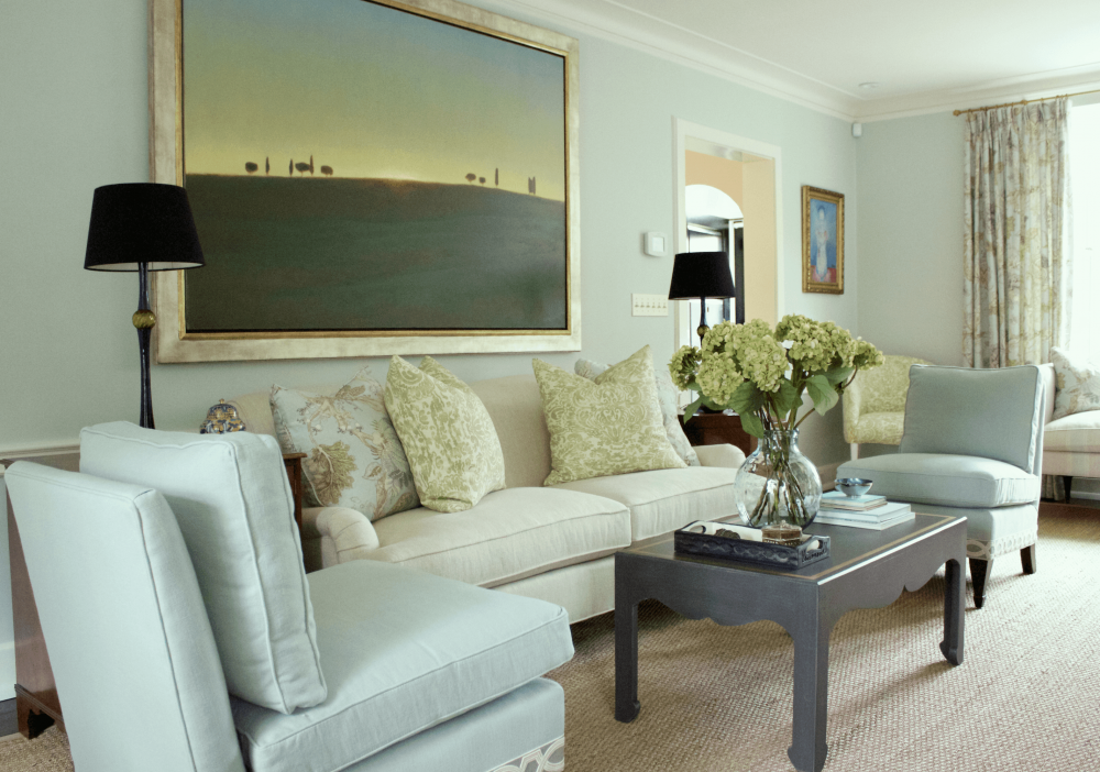
Above is a living room I did a few years ago. There’s a sofa in the main seating area and a settee in front of the bay window.
You can also see one living room layout with numerous seating arrangements here.
Another way that mismatched sofas look good is with a style that Studio McGee has perfected in their large, airy great rooms.
Let’s take a look at some of them.
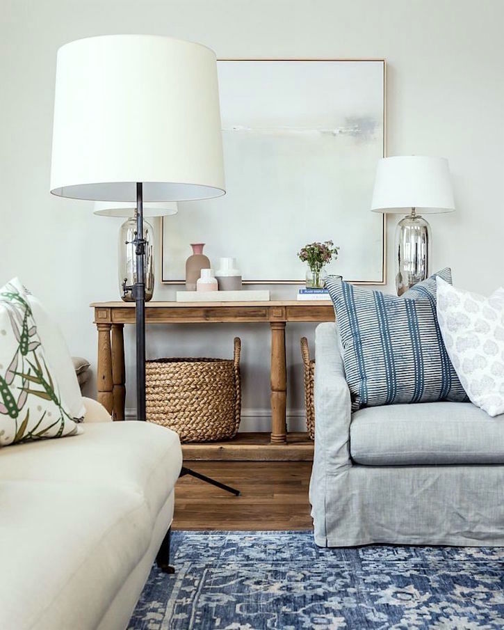
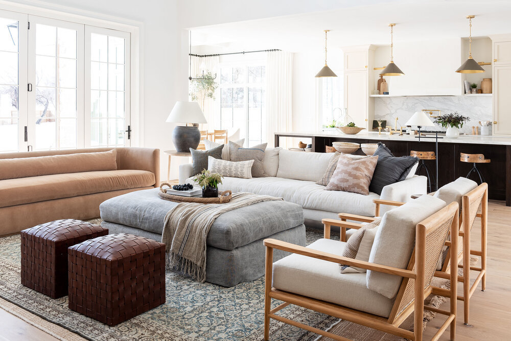
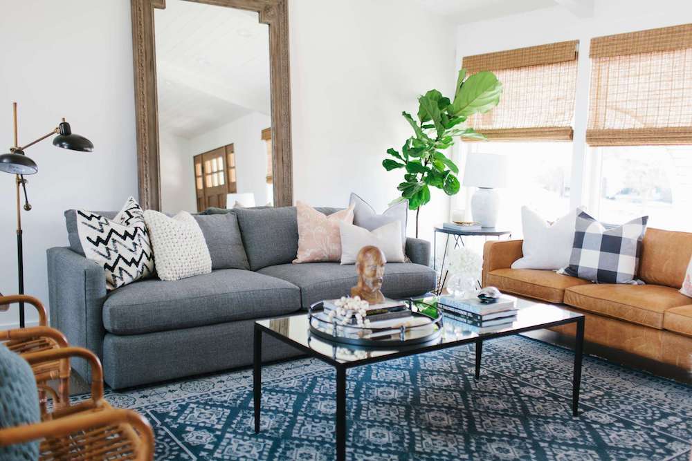
Above is the McGee look, but it is a room by House of Jade with mismatched sofas – Photo: Becky Kimball.
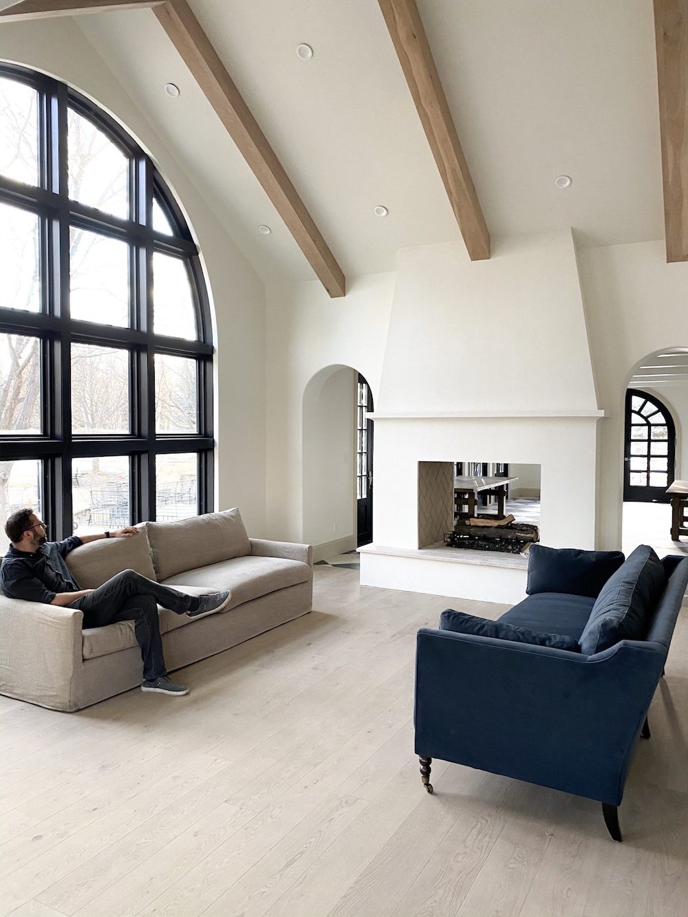
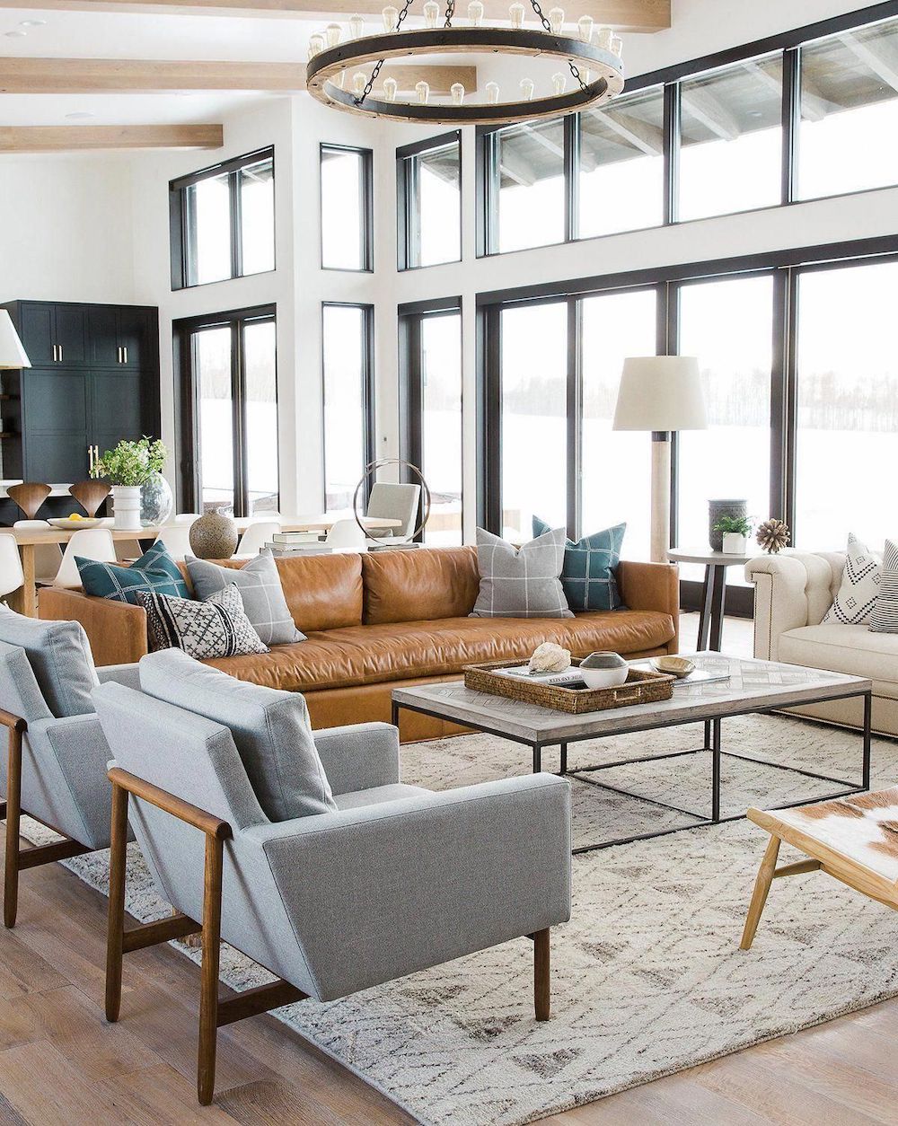
Above and below from Chris Loves Julia
I love these Mismatched Sofas – I think it gives the room a less formal feel.
And, these are complementary sofas with similar lines. I think they look great together.
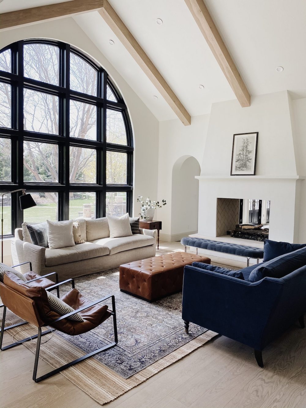
Would it have worked if the sofas matched? Yes, of course. However, I think the dark blue velvet sofa makes a good counterpoint to the heavy dark-framed window.
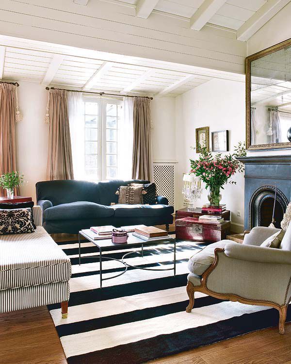
Carminabaygual. interior on Instagram
Another situation where mismatched sofas make a lot of sense is when one sofa doesn’t have arms. Or, at least typical arms.
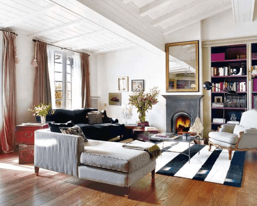
The chaise or daybed works because it is almost a bench, actually.
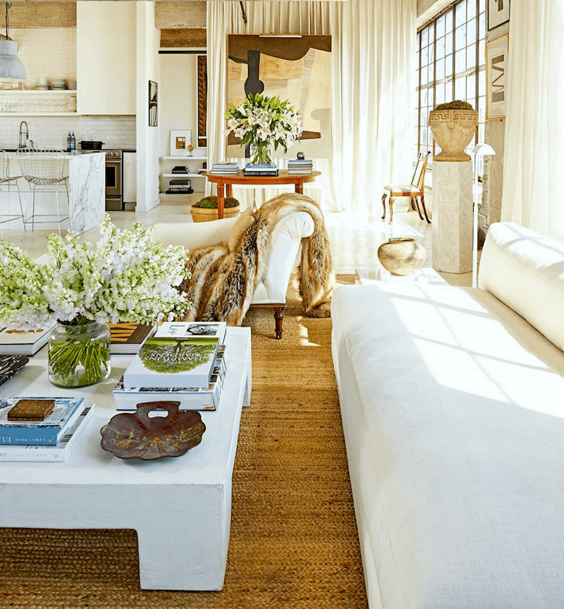
This one is another variation of the same idea by William McLure.
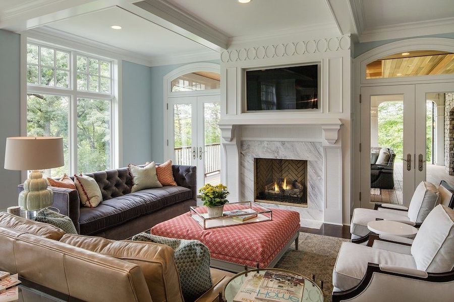 This room has a cozy feel with mismatched sofas. So, another idea is that the seating group looks best with three sides. Well, usually. (source unknown. If anyone knows it, please tell me, and I’ll make the change)
Another way that mismatched sofas look good with the boho style.
Boho, if you don’t know, is short for Bohemian. This is an offshoot; I think of Granny Chic or Grand Millennial style.
Below are three iterations of the same room, but some of the elements have changed.
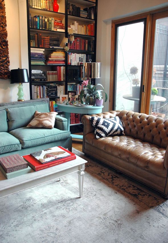
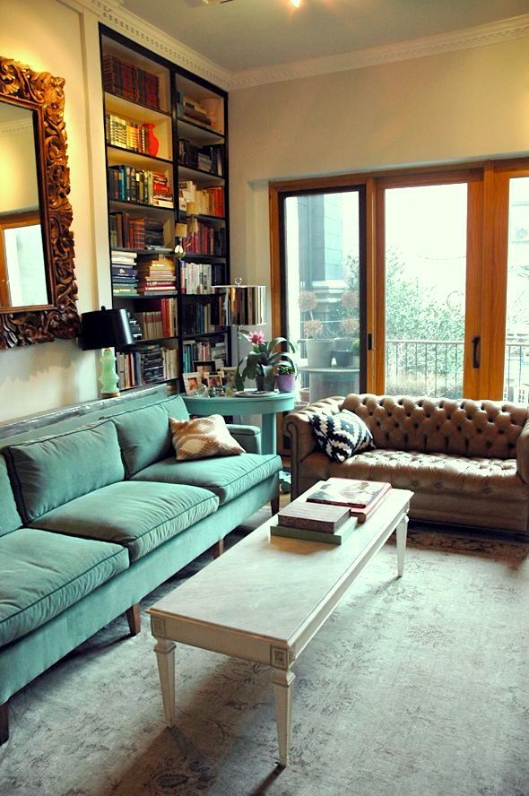
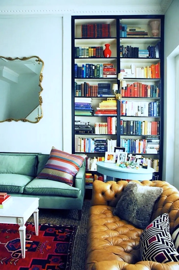 I believe the source is Little Green Notebook. (now Juniper Home)
One thing about this style is that it can quickly look like one picked up some stuff at the Salvation Army. Not that there’s anything wrong with that. But, it would be if one has spent tens of thousands creating the look with new furniture.
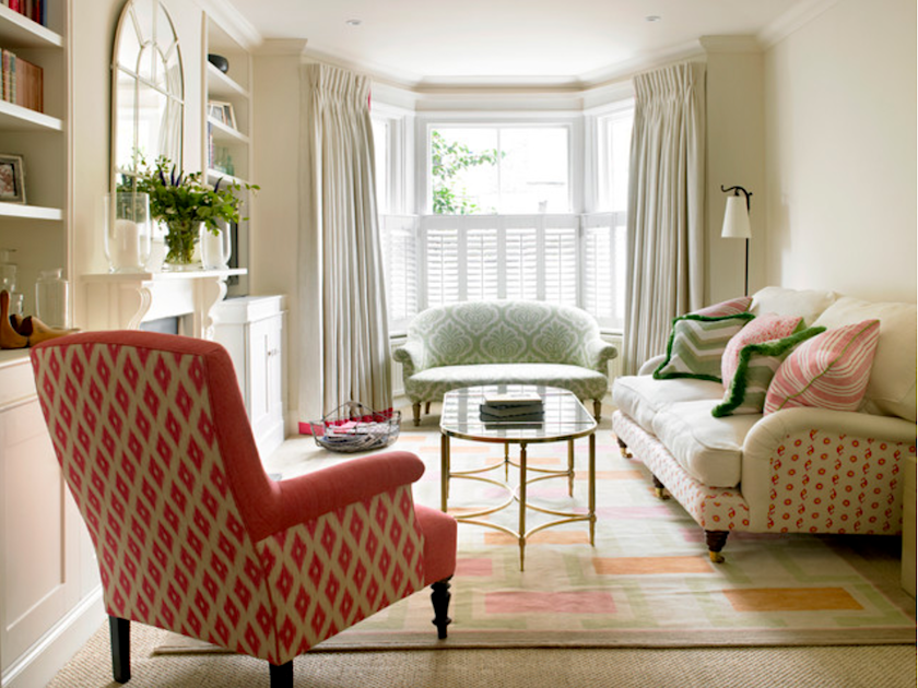
amorybrown.co.uk – mismatched sofas
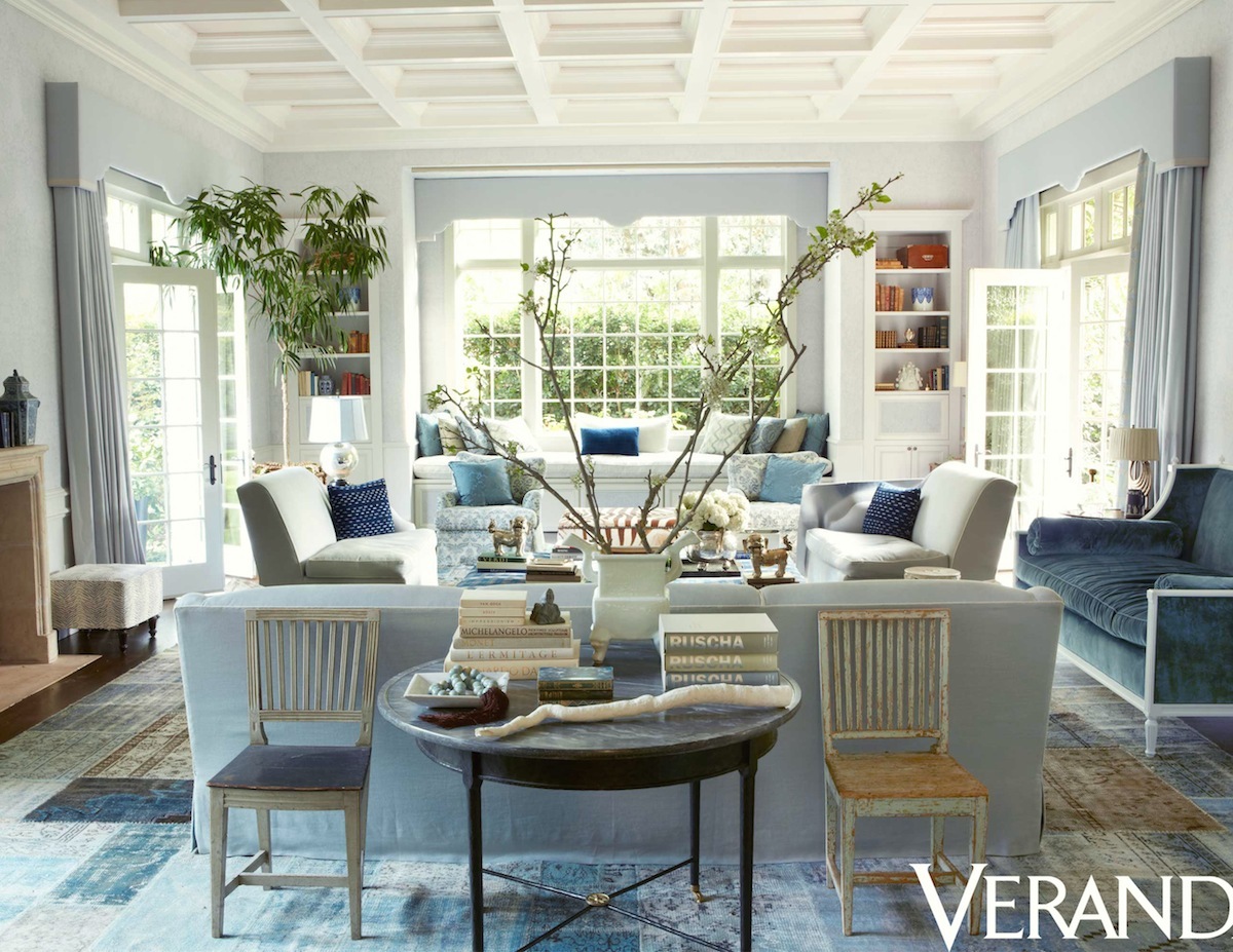
Above is one of my favorite rooms by Windsor Smith. It is a sophisticated, new trad Boho style. And yes, a mismatched sofa, but it just works in this case as the room is large and there is a lot of other furniture.
What about mismatched sofas that face each other?
While I do Love the Chris Loves Julia mismatched sofas facing each other, I think this is generally the toughest look to pull off successfully.
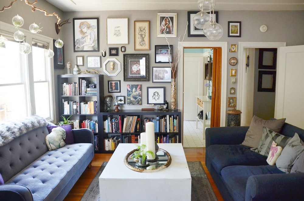
Again, this is the Boho look. And, I think probably a little funky for most people; certainly most Americans over the age of 40. I almost expect to see white Christmas lights strung around the perimeter of the room. haha (source unknown)
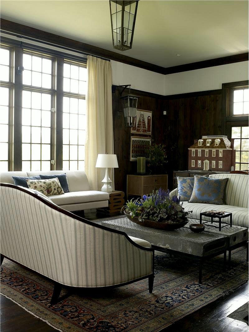
An elegant living room with two matching sofas and one mismatched sofa in front of the window. That works!
In the end, Julie, it appears, did answer some of her own questions.
I think it’s a more polished look to have two matching sofas, as you see above. And YES! Reupholstery is quite expensive. It is not much less costly than a new piece of furniture. So, unless it’s an heirloom or an expensive, well-made piece, to begin with, it makes sense to start over the majority of the time.
Although in the 20 years I took on clients, I had reupholstered dozens of pieces of furniture. It was always very gratifying to see the furniture afterward.
Below, are rare before and after photos, I took a few years ago.
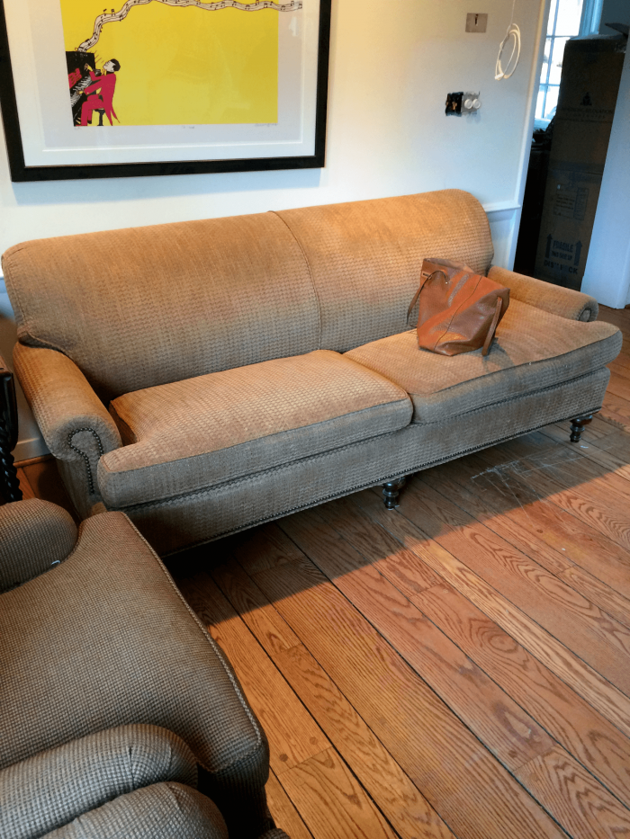
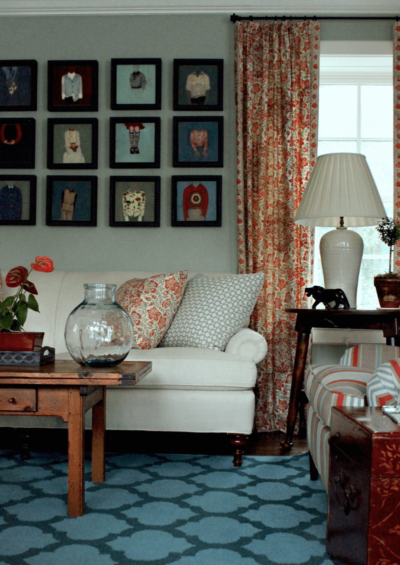
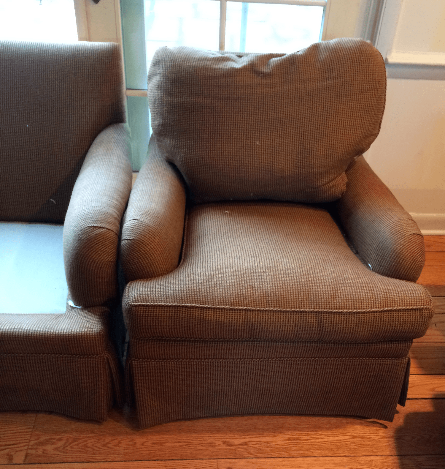
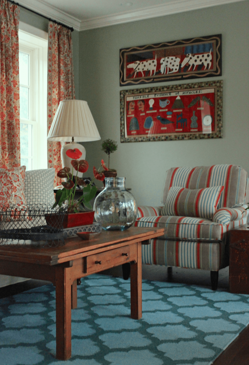
This chair makeover is just the best!
By the way, this is another Lawson arm (sofa) and English roll arm pairing.
The difference is that it’s a chair and sofa, not two sofas.
The bottom line is that I think it’s possible to do mismatched sofas in certain situations. However, for the majority of us, it’s safer to have matching frames and fabrics.
See 15 Favorite and Classic Sofas
What about you? Do you have mismatched sofas? Or, do you think it’s a bad idea?
xo,

PS: Please check out the newly updated HOT SALES!
Related Posts
 The Most Durable Painted Kitchen Cabinet Finish-13 Pros Weigh In
 Best Windows – Size, Type + Is It OK To Do Black Frames?
 Does A Non-Barf-Worthy Recliner Chair Exist?
 How to Figure Out Room Colors with a Colorful Sofa
 Dated Tuscan Home Transforms With Blue and White Decor
 A Beautiful Home Renovation Makes Big Bucks For The Sellers
 Help! I Hired The Decorator From Hell









47 Responses
After deliberating whether to match or mismatch sofas facing each other, I pulled the trigger and ordred two identical sofas. As I looked around the living room, I realized the identical sofas provide some quiet space to let the other elements in the room shine. I scoured the internet for photos of mismatched sofas because I was convinced this was the way to go, and in the end it may be the way to go, but not for the space I am living in. Great to see that there are no wrong answers! Best explanation I have seen yet on the advantages and disadvantages and cautionary tales. thank you.
Hi,
I have a similar question about mismatched sofas. The thing with me is I am trying to see if two pieces of furniture of the same material, same design but different color will work together. I have a grey (granite) sofa chase and a chair (same everything) and I am thinking to buy a love seat (or two chairs) of the same design and material but different color. This color would be off white (cream). Do you think it will be ok?
I’m happy to get your approval (with some cautionary notes) for mismatched sofas. There are so many awful sofas; when you find two that you love; it’s worth seeing if you can work with them.
Laurel,
Not a fan of mismatched sofas, however I did really like Amory Brown and the Windsor Smith rooms very much. The rest, I liked the sofas but just didn’t like them together.
The recovered sofa and chair turned out beautifully!
I have purchased a sofa and coffee table on your sales page from OKL and love them! I learn so much from your blog – thanks for all the help!
I rebuilt an older home and added a large great room, where the kitchen and dining and sitting area used to be. I had a large Lee curved, white twill slipcovered sofa that I bought years ago and STILL love. It has a combo of down and feather cushions and the shape is so wonderful (It is a C shape)n. . When I designed this room I knew I would either have to get rid of my beloved sofa and get a L shaped sectional or get another sofa to go along the side, in an L shape configuration. I picked a Pottery Barn York slope arm sofa, with one bench cushion slipcovered in a navy twill. I love it. In fact I never even questioned my design to do it in another color fabric, until I read your post…..But then I realized, I am trusting my own design judgement. My homes have been in 3 magazines for decorating. Im going to say its an eclectic design choice, but I still love it. I have a navy blue spool chair on the opposite side of the navy couch, so I feel like it balances the room. Sometime, you just have to love your own style and break the rules!!!
I did not realize I was being a trend-setter making do with mismatched furniture. My tastes are rather bohemian/traditional eclectic, and we have never had much of a budget for decorating.
We bought a house with a rather large 16 x 20’living room that came with brass lamps, matching end tables and coffee table, a muted floral sofa, oatmeal pinch pleats, and gold plush carpeting and walls and ceiling painted butter yellow. The whole house was remodeled in 1962, and it was a real time capsule. I got outvoted in ripping out the carpeting since it was soft and good shape.
So rather than fight it, I went with an mid-60s color scheme of brown, butter yellow/gold, sage green and turquoise/teal accents, with a dash of chartreuse. My modern brown couch actually looked pretty good adjacent to the traditional skirted couch in a muted Jacobean floral fabric, and I later found a large rug in similar tones to layer over the carpet. The artwork by my mother and son were in browns as well, and although brown is my least favorite color, it all worked quite well, even with some rather mismatched inherited chairs, making the best out of an imperfect starting point.
I suppose it worked because the space is large and well lit, it was grounded with two walls of bookcases and a wall of windows, and it fit the mid-century traditional style and colors that were already in the house.
Great post Lauren! I love mismatched sofas and you have some fab examples here including the boho one toward the end and I’m in my 60’s lol! Many of the British designers and homes we see have mismatched sofas I’ve noticed too.
I’m witcha on the sofas. But let me also say YES to your digression: I spent my entire career in education, first in state university English Dept, then developing program for academically gifted learners at a private independent school, where I had contact with a number of similar schools. And I learned this: our tax dollars for education are ill spent. And yes I know the area you are talking about. I wish parents would ask to see budgets and then the relationship between investment and outcome. I’ve seen rooms filled with dated (but law says you can’t throw it away!) machinery. And oh the workshops devoted to everything but academics. Yet teacher salary seldom increases markedly, and despite all the money spent on “different ways of learning,” all students are too often crammed in one-track-serves all. I think the folks who run education (well, they folks at the top) have forgotten what it’s purpose is. Bless you for getting involved.
my condo is so small I have zero sofas. However I do like contrasting piping when upholstering.
I do NOT like fringe at the bottom of a piece of furniture.
Huh.
After I posted, I was able to read other people’s comments. Wonder why.
Strange. Once again, I can’t read anyone elses comments. Bummerooo!
Love love love the fabrics in your last few photos. Masterful.
To answer your question. I have one sofa and it’s definitely mismatched. 😉
At first glance at the title of this post, I got a sinking feeling, as I am considering doing this exact thing. However, as I scrolled through the pictures, several of the examples of where this works are some of the exact pictures I had pinned from Pinterest – I feel much better now, just hoping I can pull it off and make it work!! Love your blog!
I have the mate to the coffee table in your “before and after” photos at the bottom of this post.
I know it’s old but not much else. My husband had it when I met him, and it opens up into a large table perfect for entertaining in the living room.
Laurel,
I have two mismatching sofas in my family room. My husband insisted on a brown leather sofa and I wanted a white upholstered sofa. I found two sofas that are similar in shape with arms that are both rounded. To balance it out, I went with two club chairs in a black and white damask. I’m so happy I went with the two different sofas.
First, thank you for pointing up the insane tax rates here in the north east. In my small town the per student rates is now over $30,000 a year. Twice th3 national average and not twice as good — by a long shot.
As for mis matched couches, I guess the same rules would apply as for coordinating chairs and couches?
I don’t think that cost or sentimental attachment or that they’re expensive pieces alone should dictate whether one reupholsters or orders new. I would have to factor in whether I liked the shape of the pieces and whether my conscience could stand adding more stuff to the local landfill.
Edit: to Garden Maven—
The Architectural Digest issue with the folding screen was May 2018. I got the month right 🙂 it’s Cara Delevinge’s home in London.
Is it me or is the comment widget wonky? I’ve lost two comments in two days. (It happened as I scrolled above to read something prior to hitting “Post Comment.”). Anyhoo…
Firstly, I think it’s very classic design and definitely not “furniture store showroom” to use matching sofas – in the right setting.
To Garden Maven:
I’ve seen the misuse of too big/ too tall dining chairs, for ex, in a 50’s 8’ plate height ranch and it does not achieve balance or privacy. Better to employ drapes or blinds/shades, an architectural screen (set on an angle), and some tall (faux or real) trees or plants. See AD cover with gothic window and folding screen w floral sofa in May 2019 issue, I think.
Life After Divorce:
Your large LR overseas sounds magical. I’m sure you will create another beautiful room in your new home.
GL:
I agree with you 100%. The first more spare image looks far better.
XO,
Tara
I think the mismatched sofa look works quite well in rooms where there are two distinct seating areas. In those situations, identical sofas would be a bore. In those cases, I favor a wooden legged sofa and a more traditional skirted sofa. I note that almost every photo shared in this post features a large, very dramatic room with gorgeous details. I find myself thinking that these rooms work in spite of the mismatched sofas, not because of the mismatched sofas. I have seen rooms where mismatched sofas work well but they are almost always those English or Irish country house looking rooms where everything is that sort of slightly studied tatty sort of look. Not an easy effect to achieve.
In one of the Downton Abbey rooms, there is a Victorian sofa (with fringe) across from a kind of weird classical sofa. Bot are covered in identical red velvet. I love those sofas so much! The room, of course, is larger than most people’s homes, so it might not work in normal rooms, but it sure looks cool there.
Hi Laurel! Great post, as always. For me, biting the bullet and purchasing the “just right” sofa with performance crypton makes me smile each time I enter that room. It wasn’t any more than reupholstering.
Best Regards,
Pam
Yes, the School taxes are $24,417 and the Town Taxes are $12,530, for an annual total of $36,948 (or $3,079 per month)…wow, that is quite a bite…
Yes I do have two rooms with two sofas, identical in my husband’s den/office, and mismatched in the LR. In the LR the larger one is a Lawson and the smaller is a camelback, although not a loveseat, but a little shorter than the other. They are not placed together. I think it works.
As an avid vintage shopper, I’m a fan of making mismatched sofas work in coordinating, analogous fabrics/colors – a la English cottage. Mark Sikes does it beautifully without it being too boho.
This was so interesting to read! I’m a definite boho in my 60s and currently have 2 leather couches facing each other (20 feet apart). One side is for TV watching, the other for reading, or for visitors. One is a hand me down in cream, the other I bought in a dark brown leather (I so wanted that to be purple, but I needed to find something that my 6′ 6″ honey could sit in and be comfortable, and I couldn’t find that in purple.). I like how easy leather is to keep clean. The whole room works for me because while they are rather plain in my very colorful house, I have Mexican serape blankets in coordinating colors on each as well as black + white pillows (combo of MacKenzie-Childs and IKEA).
I have mismatched sofas. I am over 40 years old, They are facing one another and look great! Sofas are far more comfortable than chairs for lounging and watching TV. My room is a Great Room. Buying two of the same sofa is boring to me.
Thanks so much for this post, Laurel. I look forward to these posts every week. I’m wondering if you could break down the reasons why the studio magee mismatched sofas work. Is it because one is leather? I see Lauren Liess does this as well and one of them is usually her signature leather sofa.
I generally only like mismatched sofas! As long as they are complimentary and the scale matches it looks so much more interesting and less like a hotel lobby.
This is the post I’ve been waiting for. Thank you.
Didn’t your old place have mismatched sofas? That room was lovely.
THe taxes on that property are no where near 170,000. THe 170k is the tax assessment, the value of the house that the city will apply tax rate to. The taxes are likely closer to 30-40k a year. Still really high but people are paying to be in the district of some of the top public schools in the state and the cost of private school is around 40-50k a year per student.
Disliked 90% of these images.In my opinion something looked jarring and purposeless in the rest. Yours, Laurel and that of Mr Windsor (the Veranda image) were pretty. The rest reminded me of what happens in the early part of one’s marriage when a totalitarian mother in law forces a piece of furniture on you and you accept it rather than keep arguing. Ultimately you find a way to destroy it.
Hi Laurel,
When I got married we combined our furniture. Fortunately my living room was large enough to accommodate 2 sofas. Naturally they didn’t match but I lived with it for a while. When I couldn’t take it anymore I had 2 slipcovers made for them. Once they were covered in matching slipcovers you didn’t notice their differences as much.
Took me a minute to figure out what bothered me about the mismatched sofas in the Amory Brown photo, because otherwise it’s such a lovely room ….. the scale of the sofas are different, and the seat heights aren’t the same. Seems like that could be important in making a mismatch work.
Hi Laurel – could you tell me about the beautiful painting you showed in the very first photo of this blog? The room was one you did years ago. The painting is of a sun rise (set??) over a hillside. Is it an original or something that could be purchase? It truly took my breath away.
Thank you,
Sandie
Emily Clark has mismatching sofas right now as well, a OKL patterned beauty and an ikea Lawson arm style with a slipcover. I’m definitely not an expert, or even proficient at design really, but I like that the contrast keeps the room from looking too formal. One sofa is really tailored but in a fun pattern, and the other is more casual with the slipcover. She has a great collection of blue and white porcelains too.
Hi Laurel,
I pretty much love whatever William McClure does, and his is the only room I really like.
A sofa and a settee mismatched yes, a sofa and a récamier mismatched yes,
But unless your style is bohemian, I feel it’s a little difficult to pull off two sofas so mismatched. It feels almost like you just left home with your mothers hand me downs.
Great post, Laurel! As soon as I saw the headline I thought “Studio McGee”. Great minds…So glad to be sharing my mind with you lol.
Laurel, first just love your blog — you have been so very helpful to me as I move from a quite delicious 1747 historic farmhouse to a modern home with huge windows and not too many walls. I ramble sorry. My question is this: is it a good idea to try to screen the house next door’s comings and goings, by placing large pieces of furniture against the windows? I’ve scoured all your archives and looked at other designers’ work, and Houzz, but none seem to address this question. I can send you photos of the windows in question if you want. Hope you can give me some advice. Ps couches against the windows wouldn’t help as they aren’t high enough.
Hi Laurel,
I like the boho style so I definitely have mismatched sofas but they work great together because there is a lot of colour in the room. One sofa is a coral pink so I definitely would not want two of the same. Perpendicular to it is a burgundy ultra suede. Then two beautiful dragon print arm chairs, a dark blue rocker and painted furniture and lots of art. I can send photos if you like. I think it works – always get loads of compliments.
I have two different sofa styles in my small rectangular living room and it’s awful!!! One is English roll arm in white cotton/linen and the other is tuxedo style in white velvet. I love each of their looks individually but together is an eye-sore. I bought the tuxedo because it was a great price and I figured I will use it differently in the future. Which I am now, moving into a new house next month where they each can live in their glory in separate rooms! I personally would purchase new matching sofa if I were you. Laurel’s post about sofa ideas is a terrific resource and One Kings Lane has great options on sale. Good luck!
Hi Laurel, I have a roll armed couch facing the fireplace flanked by two slipper chairs on one side and a wood framed love seat on the other. A designer helped me select them 20 years ago, and I think they look great together. I reupholstered them about 7 years ago and moved houses and they still look really good. Not sure i could have done it without expert help though.
In our previous home we had a massive living room (42’ x 20’).. My extraordinary designer handled the space beautifully by creating two “living rooms” One of the spaces had a pair of mismatched sofas. A very long rolled arm style and the other with a lovely exposed wood frame The fact that the room was so large and that each was so entirely distinct from the other made all the difference.
Hi, Laurel! I once had mismatched sofas in a very large rectangular living room, in which I had two seating groups. I used the same long, unskirted sofas, but with different upholstery.
At one end of the room, I had a cornflower blue sofa flanked by armchairs upholstered in fabric with a cream background and a very subtle blue print. I also had two cream chairs facing the grouping, angled, and one large walnut coffee table in the middle that had a slightly oriental cut. There were also a few side tables.
At the opposite end of the room was an avocado green sofa with the same arrangement, but the chairs that flanked that sofa were a subtle avocado-colored print over a cream background.
Both sofas were upholstered in matte fabrics (though the textures differed) with satiny silk (to add light to the room) toss pillows in shades of solid blues, greens, and yellows.
One long side of the room looked out onto a courtyard with a very long pool and garden, which was the focal point, and the raw, undyed matte, loosely woven silk curtains had green and blue ties (there were six sets of French doors as windows, but only four were centered in the layout). The other long side of the room had four square pillars that separated the room from a long corridor. On each pillar hung an identical antique, long and narrow Chinese mirror incorpateing carved details (the carvings did not match, though the shapes did), with the wood frame painted in a pale yellow.
There was overhead lighting, as well as table lamps on the sofa tables behind each sofa, with large complimentary paintings above those tables. The sofa tables were there not only to add twin lamps for lighting I’m the daytime, but also to help fill in the large room with more furniture, as the room was so large that it seemed to swallow furniture.
The walls were a creamy white, and the ceiling was beamed with dark wood. The floors were large, natural-colored terracotta tile from Spain. The rug I’d hoped to find was intended to incorporate the colors of cream, blues, greens, and yellows– but I couldn’t find a rug large enough that wouldn’t have cost a true fortune (it would have had to be custom), so instead of one rug shared by the two sofa arrangements, the decorator brought in two identical textured cream rugs. There was approximately 20 feet of empty floor space between the two groupings. I wasn’t so happy with those rugs, but they did add to the intended atmosphere of tranquility. In retrospect, it was probably a better, if colder choice– but we were living in a hot country anyway. Also, the colors in the rug I’d hoped for would probably have seemed like too much for the room, as well as seeming too repetitive of the color scheme.
The color scheme was my own, with my decorator’s approval. My intent was to create a very simple room with peaceful colors. I think it was a success. I wonder if you would have agreed.
Unfortunately, unhappy family incidents followed, and we never used that room, as a family break-up sadly occurred (until we left that house, we used smaller sitting rooms and generally did not sit together).
I have now moved from a very large house to something less than 4000 sq ft., which is much cozier, and where it is easier to be in closer proximity to my teen and young adult children (yay, smaller houses!). I’m in a vulnerable health category, so am waiting until after the pandemic to decorate, as I don’t want people in the house.
This time my challenge is to decorate on a budget using furniture from an old summer house, as the large house was abroad and the furniture would have been too big for this house anyway. The good thing about having to wait to decorate is that ideas can evolve over time as I become more accustomed to the home and its unique characteristics and challenges.
I can no longer afford a decorator, so I’m nervous about making mistakes and am very happy to find websites like yours to teach me and give me ideas. My aim now is to create a happy looking, eclectic atmosphere (because I have to, haha). I hope to achieve a timeless look that I won’t tire of and that will not appear dated quickly, because my budget won’t permit me to redecorate for many years to come, and as I’m not far from “retirement age,” I might be downsizing further by then.
Please wish me luck! I enjoy your blog and am always happy to see it in my inbox. Your humor and the little details you share from your life make me feel almost that it’s a newsy letter from an old friend. I wish you and you son the best, and I hope you’re very happy living in your new digs. Hugs 🙂
Yes, I agree that two sofas opposite each other should match. When the sofas are at right angles to each other a mismatch is much easier to pull off. Also easier when it’s a large room with several seating areas.
But then the Chris loves Julia pic shows that two opposite contrasting sofas do work — here because of the architecture of the room. And am I alone in thinking that the first pic is much better than the second?
I think if the sofas are two different styles it is great to have them in complementary fabrics, rather than matchy matchy. However if the sofas are identical, even if one is shorter than the other they look better in the same fabric.
I sucked in my breath when I saw this. This has been my pandemic distraction for months. I have mismatched couches at my beach cabin. One is smaller sofa in cotton navy velvet and the other is full size white with a great beach blue stripes. I bought them used but in both cases, they were well-made expensive pieces in superb shape. Fast forward four years — they need reupholstering, and I’ve been tormenting over this. It’s incredibly expensive but everything new and custom is out six months. And I want Crypton fabric bc it’s a beach house we lend to ppl and I don’t want to hate them for eating on my couches. Anyway. I pulled the trigger on matching fabrics for both couches. Even tho they aren’t exactly the same couches , they are really similar (I have a type). But the other two mismatched looked really sweet together. I think it can work but when I tried to recreate the magic, and I tried for months, in the end, it felt too risky.
Laurel, I love the image of the two matching sofas and one mismatching sofa at the end. That is what I am going to do with my new home because the living room is a substantial rectangle with an kind of extra corner where the old owners had an awful built-in buffet and dining table (on carpet; both are now gone). And I loved how you softened the look of the back of the sofa in an earlier image with a table and two chairs. I have been struggling to figure out what to do if one of my sofas has to have its back to the front door. (No separate entry.) Now I have some great ideas to play around with. Thank you.