Celestial wrote a comment the other day wanting clarification as to the elements that go into making BAD ARCHITECTURE.
Dear Laurel,
I love your blog because I learn so much about the totally foreign (to me) world of design and decor.
It would be really helpful for me (and maybe many others) if you could post about BAD architecture and design and why it is so.
I know that I can “feel” awful interior work when I visit the homes of many newly built (and very expensive) houses, but I don’t know WHY.
I live in a 100 year old farmhouse and it seems manageable in scope, while the mega mansions do not. You wouldn’t have to depict your readers’ homes, but those that just don’t “work” and why. That would clarify the points immensely.
Sincerely,
Celestial
**********
You know, I could devote an ENTIRE website/blog to this one topic, alone. In fact, one amazing blogger has done so.
And, I have her permission to share a couple of her images. We’ll be getting to that in a bit.
But first, let’s just talk for a bit about what makes for BAD ARCHITECTURE. And, by that, I’m talking both outside and inside.
What are the elements that go into bad architecture?
Well, let’s begin with size. While size alone does not necessarily mean that the architecture is bad, it’s how the large home is designed.
For instance, below are two images taken of the beautifully restored Easton Neston estate that I took during my trip to England.
It is a magical, beyond magnificent home and grounds exquisitely decorated by Lady Henrietta Spencer Churchill who I also got to meet during our tour.
I have not published these before, because there was some question as to whether or not it was okay to do so? But, there are already thousands of images of this magnificent home on the internet, so I’d prefer to use images that belong to me, if possible.

photo: me
The front facade of Easton Neston, originally built in the Baroque style circa 1700.
 photo: me
While the home is grand and very large, it is classically proportioned and in perfect scale. The grounds are also incredible.
There are some images of the interior in this post.
Okay, yes. It is in England. They don’t have a lot of snow there, so they can get away with a flat roof.
But, in bad architecture, it appears that anything goes.
And, I’m talking about the ubiquitous bastion of bad architecture
The MCMANSION
McMansions are known for having:
- horrendous proportions and scale, both inside and out. And that could mean that something is either too big OR too small.
- crazy rooflines
- giant porticos
- ersatz, fake, weird styling both inside and out
- wacko windows
- tacky landscaping
The most common theme is the arched window, door, portico on and on and on…
But, these are not the richly detailed Palladian arches, nosirree…
These are of the wimpy eyebrow variety.
There is no historical reference that I can find that presents such an arch. And yet, they are prevalent in bad architecture.
So, now, I need to share with you the blog I was talking about earlier. And, I know that some of you follow this blog, because I am positive that somebody mentioned it a while ago.
It is aptly named
The author, Kate Wagner, is SCREAMINGLY FUNNY! What she does is combs the internet for the best, no the tackiest monstrosities she can find. And then, she creates graphics with her own saucy brand of commentary.
Here are two wonderfully Kaaaaarazy examples from this recent post. Kate went to Waukesha, Wisconsin for these gems. Well, she didn’t go there. She found them.
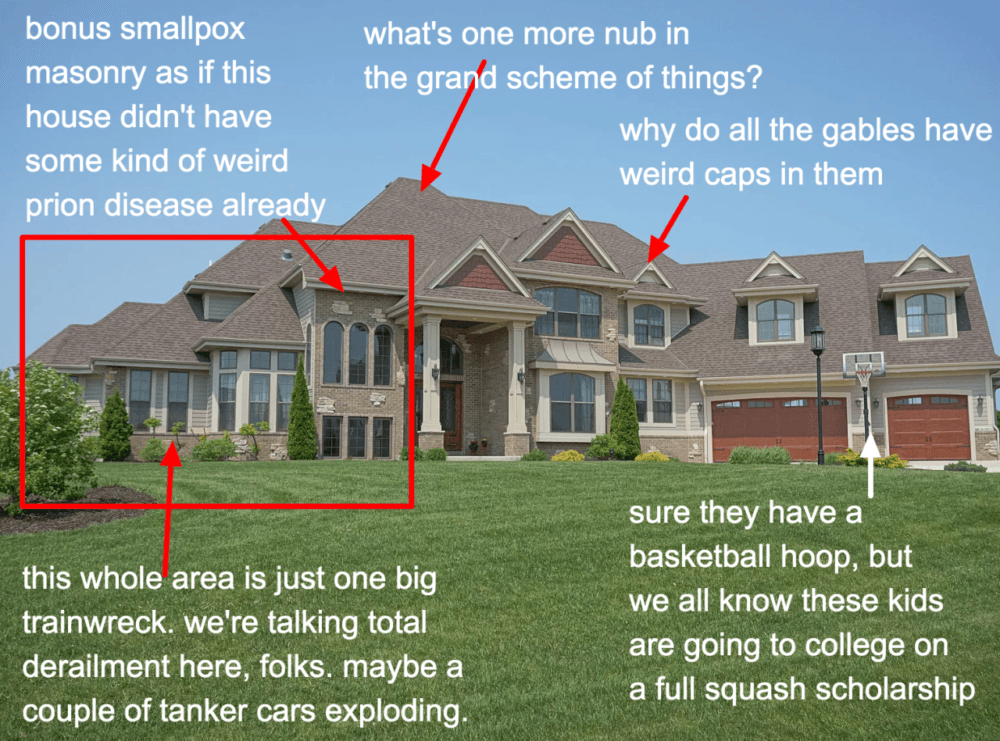
Oh, my, of course, I concur with everything Kate is saying. But, if I may add, I am counting TEN different windows in terms of size and shape. No wait. It’s 11, including the garage doors. It’s beyond insane!
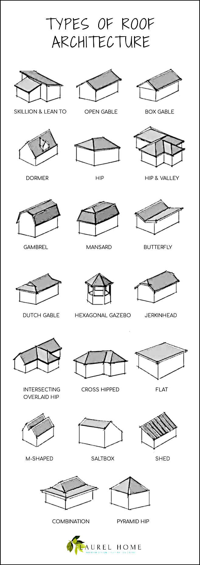
The undulating roofline, filled with both hip and gable roof styles.
A Gable roof has a flat triangle with two slanted sides.
And, a hip roof all sides are on an angle and meet at a ridge on the top.
Below is a graphic of 18 different roof styles that I made from another graphic I found here.
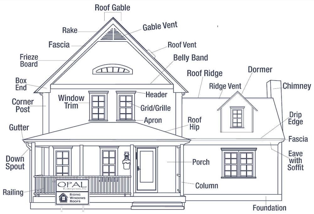
Above is a great example of a normal house that shows both a hip and gable roof. Note, please that there’s nothing over-scale OR underscale. Sure, this is a much smaller home. But, let’s widen the center by two and then add another side piece on the left side. We’ve now doubled the size of this home and it would still be aesthetically pleasing.
However, we need to get back to what’s wrong. The BAD architecture.
One more below from Kate from the same post as above.
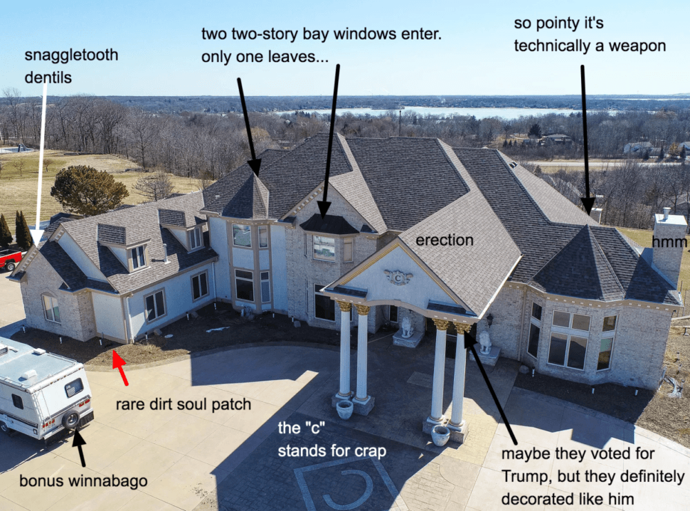
Oh my stars! Please click on the link above for more commentary and more images. Of course, she has an immense volume of behemoths. And, the appropriate level of snark.
However, I have also found some un-gems (aka: bad architecture) of my own.
Yes, of course, because the economy is doing so well and the nouveau-uninformed are trying to impress, who-I-have-no-idea, (not me, that’s for sure) there is a preponderance of new and newly on the market, architectural dreck.
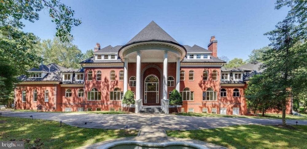
Exhibit A is a 20,000 square foot living quarters for a family of four in Reston, VA. Sorry, guys. It’s not for sale. It was built in 1996 and sold in 2015. However, in every old listing, they are calling it a “colonial.”
Generally, “colonial” refers to the 13 original colonies that formed the original United States back in the mid to late 1700s. Colonial style in the US is synonymous with Georgian style in the UK.
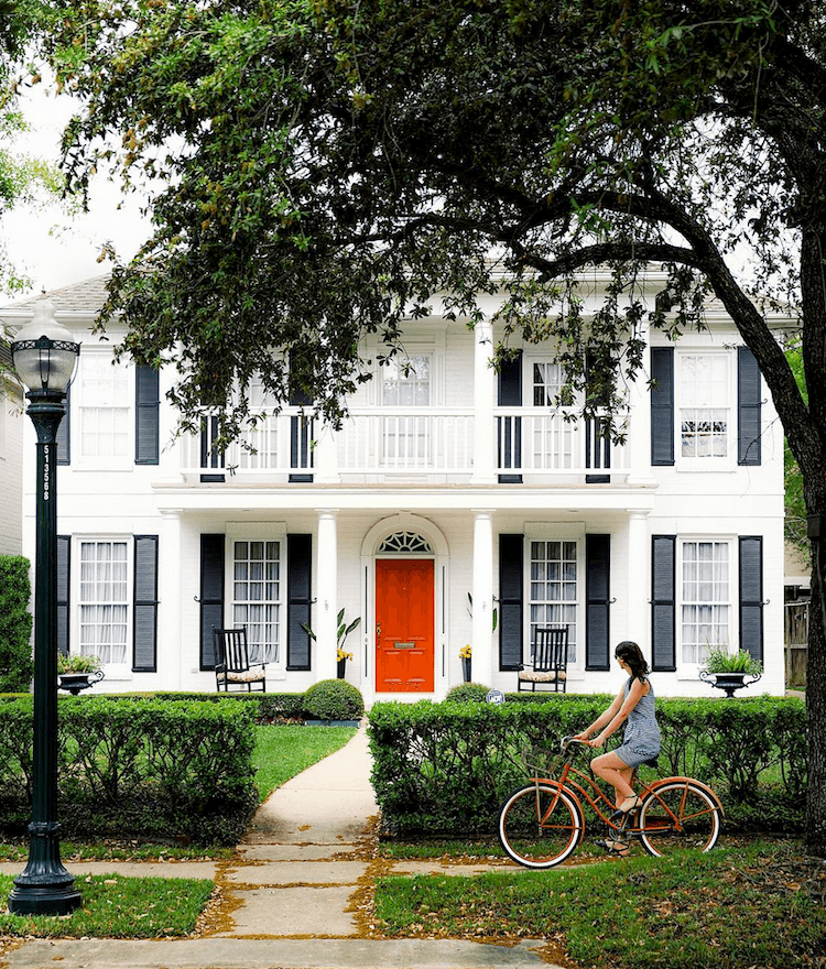
Above is a colonial. It is a traditional southern colonial white house with red door and black shutters. Do you see any resemblance whatsoever?
Yes, our mcmansion is symmetrically balanced, so we can give one point for that. But the sheer volume of windows with from what I can see, 22 arches, of various sizes and then, even more rectangular or square windows, and it’s just a huge bloody mess!
Of course, it doesn’t take a trained eye of any kind to see the ridiculousness of that absurdly OVERSCALE portico, complete with its very own ginormous dunce cap.
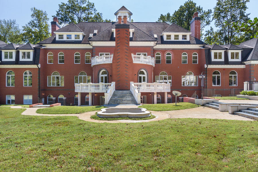
And, the rear facade. Not a tree in sight. And nary a bush, either.
But, what IS that chimney monstrosity, we have here? I’ll tell you what it is. You know, some families have a family mausoleum. Well, these folks have a family crematorium, attached to their family mausoleum.
One stop shopping.
Yes, I know. I’m as tacky and tasteless as this house! So, why are you laughing?
But, folks, it gets even better. I promise you.
Let’s go inside.
Are you ready?
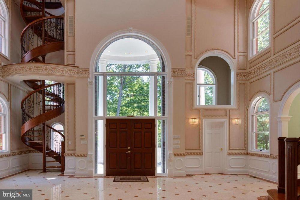
It’s difficult to know where to begin. Yes, the wall color known as Projectile Vomitus Beige hits you right between the eyes, doesn’t it?
But, let’s go from left to right.
The spiraling out of control staircase. It is complete with an absolutely adorable curlie-cue wrought iron railing. Very dainty and appropriate for this mammoth entry. :/
I am positive that vertigo-enducing-death-trap goes directly up to the mother-in-law suite.
Poor dear. Oh, I do hope that she’s not afraid of heights!
But, if she does attempt the climb, by the time, granny gets up there, lugging her suitcase behind her, she’s going to be so dizzy and exhausted; she will need to take to her bed until dinner.
hehehe. You know, I think that it’s time wordpress added some emojis so that you will know when I’m rolling my eyes. ;]
And, yes. I know that your mother-in-law is a doll. You’re very lucky.
Moving along, we come to the front door which is nearly eclipsed by that HUUUUUUGGGE arch of glass threatening to behead it.
But, the window IS in scale with the albatross portico. and the triple height entry. Good job! Apparently, the owners are ten feet tall.
To the right of the front door is another door. I am presuming that’s a closet? But what is going on above it? There’s an interior window which appears to maybe not have glass in it? In any case, it’s quite disconcerting. That’s because there’s another window going to the outside.
I don’t know where they got these mouldings.
You guys certainly can see that these mouldings are anything but classical.
My last comment is in regard to the sash Palladian windows.
[No comment.]
Please forgive them Signore Palladio. “They know not what they do.” No disrespect was meant, I’m sure. Well, I’m pretty sure. Actually, I doubt they’ve ever even heard of you. They most likely think that these windows are so-named because of the Palladium.
I shouldn’t even write that word! I do know that It’s “Palladian”— named after you, dear Signore, one of the great interpreters of the classical style.
So, please accept my profound apologies Signore, on behalf of those who don’t know any better. For more about this, (and more bad architecture) please click here.
But, we’re not finished with this entry, because the best worst is yet to come.
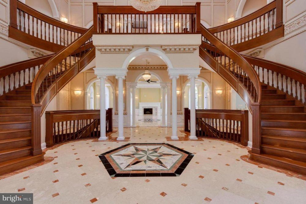
Forgive me if you have one of these. And perhaps, it is possible to have one that is classically proportioned and square. But, I find these double staircases to be the height of ostentatiousness. And, this one in particular is so heavy, so unbalanced. The over-sized railing, and then spindles of three different sizes and some peculiarly short.
Ack!
So, why oh why is there a spiraling out of control staircase when all granny has to do is walk 20 feet to go up one of two more normal ones?
Me thinks it’s because the spiral staircase takes gran up to the THIRD floor. Yes, much quieter for her to recover from her dizzying “trip.”
Yes, yes, I know. I’m going straight to hell. Fine, I’m already there, so this is good therapy for me today. (and hopefully you too!)
I really don’t want to go into it, but it’s related to the subplot in this post.
But, speaking of shitshows, let’s go into the center of this befuddlement with the columns, etc.
Isn’t that like the Greek stuff you just showed us, Laurel?
Well, in theory, yes, but not in form. There’s a sort of cornice with some bizarre dentil moulding; then, a heavy frieze being supported (but we know, not really) by itty bitty ionic columns that look like tooth pics in this space.
I am sure that they are actually normal size. But, juxtaposed against the rest, look diminutive in comparison.
This is reminding me. A wonderful reader, M was in Seattle recently in a hotel. She was lying in bed, probably trying to get some rest.
Here’s what she said:
Here are pics of the moulding in my room. This isn’t right? Is it? Should it stop like this?! Please assure me I’m not crazy and this isn’t how this should look. Or maybe it is? Otherwise it’s a nice hotel.
Thanks!
M
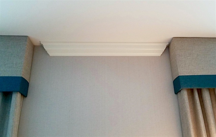 Gosh, the crown moulding is not even centered between the two windows!
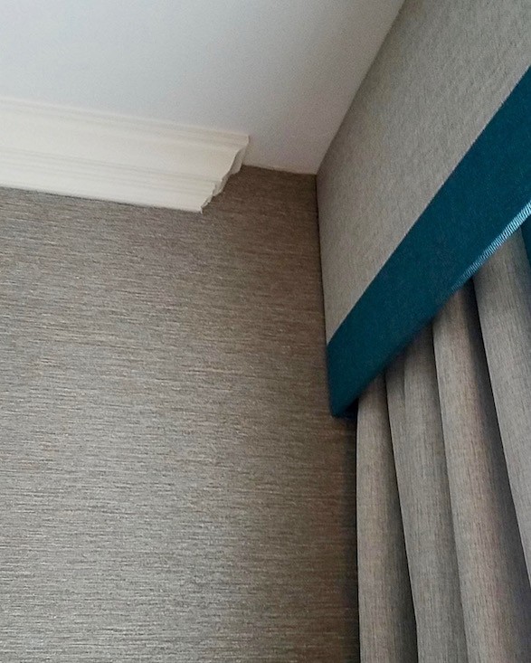
so bad
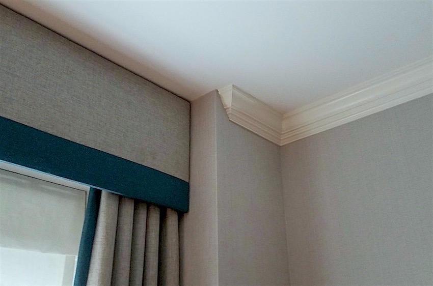 Occasionally, a crown moulding will have to stop here because the wall ends. But this one turns back towards the window.
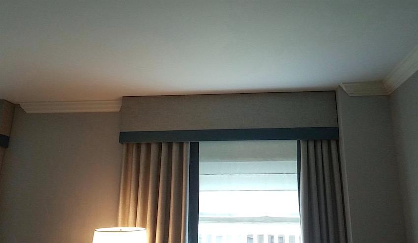
My answer was:
“No, you are not crazy.”
If there is crown moulding, it should be going all the way around the room.
In this case, the crown moulding would act as a soffit over the window and the drapery would go behind it. There would be no need for the valance. That, I think would look strange to have the valance behind the moulding, but that would be preferable to the way it is right now.
You can see an example of the crown moulding going in front of a window in this recent post. Scroll down to the pale gray-blue bedroom by Darryl Carter. One of my favorite bedrooms!
The only other way is to hang the window treatment under the crown moulding.
Do you know, I was going to tackle another house with bad architecture? Haha. That’s not happening.
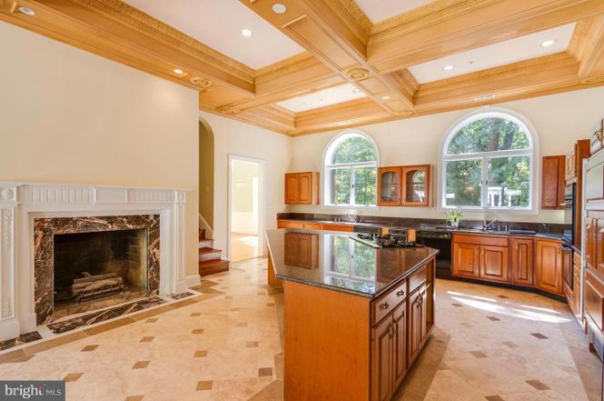
The kitchen. Okay. I don’t mind the fireplace. But, that granite is too much. The rest is problematic
The coffered ceiling hangs down at least four inches too far. It’s just too heavy and why is it stained a lighter color than the cabinets. It shouldn’t be stained at all! It should be white like the rest of the moulding.
And, the builder’s cheap cabinetry is inexcusable.
There’s another post on here some where that featured that. It’s so awful.
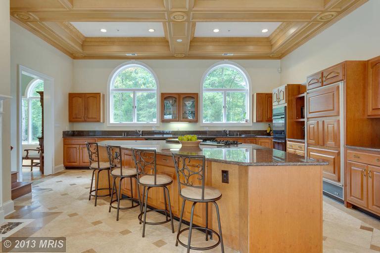
And why is the island a trapezoid? There is nothing classical about that.
However, compared to the entry, this is a gem.
Here are 20 timeless kitchens you’ll love forever.
If you guys would like, I’ll be happy to continue with the other bastions of bad architecture and hideous decorating. There’s one that’s 26,000 square feet of it. Please let me know.
In closing, I want to thank Kate Wagner of McMansion Hell for the use of her images. Please, check out her wonderful blog.
And, I’m going to leave you with one lasting impression of bad architecture run amok.
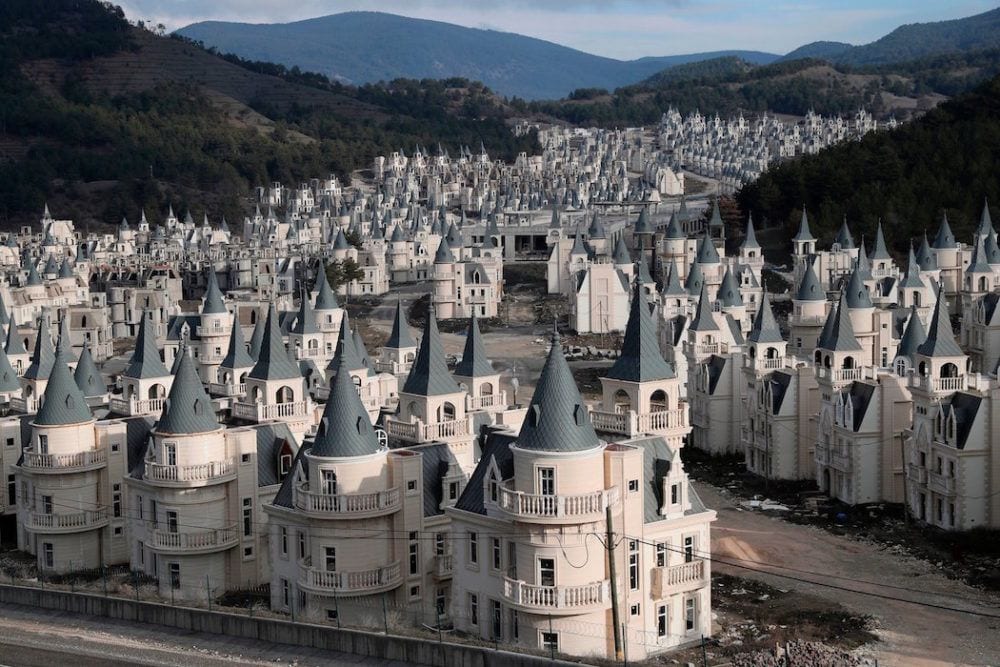
Adem Altan/AFP/Getty Images
These are known as the WTF??? Villas in Mudurnu, Turkey
WTF??? Indeed! There are several more images in the link. You’ve got to see them. This truly goes under the category of “What on earth were they thinking, smoking, drinking?” But, there are 750 of these “villas” and very few, if any of them have actually sold. They are blaming it on the Turkish economy.
Denial is a powerful defense when something is too painful to bear.
Please let me know if you’re interested in more of these architectural missteps. If you’re not, that’s okay, but please no rude comments.* Thank you.
The part that disturbs me the most is the huge sums of money spent on dreckitude that could be put to far better use, IMO.
xo,

PS: Please check out the newly updated Hot Sales and the Nordstrom Anniversary Sale Widgets.
PPS:
It is Wednesday at 6:45 PM. Thank you all for the wonderful comments. 95% of them are!
*However, three of them, (so far) despite the above warning, ARE rude and thus have been deleted. So, this is for the 5% who can’t control themselves. The rest of you, as you were.
I am only up to about 11:00 AM in moderating, so don’t worry if you don’t see your comment yet and think I deleted it. I didn’t. I’m just a little slow today.
The ones who’ve been deleted know who you are. As I have to say, too frequently, like the teacher of a small group of unruly 15-year-olds, you do not have to agree with me or like how I express myself; and, you are always free to unsubscribe. However, I am not going to have my right to freedom of speech censored!
Look, I don’t like everything I read, either. Just shake your head in disgust and move on… But, shaming people and on their own blog, no less, is really not cool! So, here’s what you need to look for.
If you are feeling in any way perturbed, annoyed or angry and then you go to write a note or an email, to me, chances are it’s not going to be appropriate and will therefore get deleted on my end. So, instead, if shaking your head in disgust isn’t enough, maybe call a friend, instead? Tell THEM what a horrid, bullying bitch you think I am. At least you’ll get some sympathy. If you send it my way, you are running the risk of getting permanently banned.
I have a zero tolerance policy for trolls, haters and bullies. Fine, if that’s how you want to be. Please take it elsewhere.
There is never any disparagement of people allowed on this blog; by me or anyone else.
Houses are things; inanimate objects. So, they are fair game. Therefore, please stop taking personally, that which has absolutely nothing to do with you!
Said always with love!!!
Related Posts
 Can This Boring Bland Living Room Be Saved?
 Beige Decor — How To Make It Go From Boring To Sensational!
 15 Hideous Decorating Mistakes With Fabric
 How To Work With the Color Pink – It’s Not Just For Millenials!
 I Don’t Care What You Say. I NEED MY CEILING FANS!
 How To Select The Perfect Color Scheme For Your Home
 Are the 15k Window Shutters A Good Idea?












140 Responses
It’s red brick so it must be a Colonial (eyeroll). All I can say is bloody hell. Outside is bad, inside much worse. And you’re right – they spent a small fortune on it. What a shame. I’ve seen some McMansions done well, but more often than not, they’re ostentatious. There’s a home in Gaither Farm in Ellicott City, MD that was built by lottery winners. No Bueno! They went bust and some acquaintances bought that house. The new owner said she needs to wear sunglasses during breakfast because the ceiling over the kitchen area is all windows. Now I LOVE natural light, but I want my coffee to wake me up, preferably while not having my corneas seared by that giant ball of fire in the sky. Keep on rockin’, Laurel 🙂
haha! Thanks again Dmiko!
The roof architecture images are terrific. Excellent pins! I had this post saved in my tabs to read before bed, and honestly I didn’t expect it was going to be a long read, but it was 100% worth it! I bet some folks were laughing away until they saw their ugly cabinets included, lol. And you got not only McMansion Hell, which I worship, but to my great delight and surprise…the Burj Al Babas Villas! The poor locals there–so proud of their Turkish architectural tradition and then that idiotic development must just add insult to injury not only by being so freakin’ hideous AND abandoned, but also by having been built primarily for rich foreigners from, let’s say, a couple of countries down south of Turkey that mayyyyyybe are famous for wicked cheesy interpretations of fine European style? Well anyway, that’s what I heard! Yes, please do more Bad Architecture posts from time to time. They’re very fun!
Thanks so much Jen.
Hi Mary,
I have a coffee table and side table in matchy-matchy ersatz French something-or-other that I bought 20 years ago. I am going to sell them and get something that Laurel would approve of! They are nice, but I don’t expect to get much for them.
Hi Laurel,
The town I live in has a very large newish hospital. It seems all the doctors from that hospital are building these McMansion type homes. My husband thinks it’s for investment purposes. Who knows.
But I would think that if you were a high paid doctor, you would use your disposable income as charity donations. Cancer research, St Jude, March of Dimes.
You became a doctor to help people. How does your big house help anyone?
Ok…stepping down from my soap box.
haha
Those of you who want to know how to do it right might like Jonathan Hale’s book The Old Way of Seeing. He describes how most houses in the US used to be built from shared plans based on good proportions, how and when and why that stopped, and how we can recover some of the old patterns.
Thanks so much for the recommendation Anne-Marie. This is a link to The Old Way of Seeing
Hi Laurel,
I love these posts re bad architecture! They are funny and very educational.
And I support your right to Free Speech too! The haters need to move on as it’s not a good look.
Keep it up!
XO, Ellie
Thanks so much Ellie! I very much appreciate the support!
I love McMansion Hell, and one of the best parts of the blog is the series that explains what makes a McMansion a McMansion, with great examples. It really helped train my eye to what, specifically, was causing the nausea I experience when I walk through neighborhoods full of these homes.
Also loved her history of townhomes posts (possibly a few were by a guest poster?), and those about sound.
So glad I discovered it too, RH!
Dear Laurel,
OMG!! As I have said before you are hilarious only more so this time. I laughed so hard at your words or made up words. “Vomitus” Beige. lol, I still don’t know at which I laughed harder, the C house decorated like our Cheeto in charge (Trump) or the portico with the dunce cap, or the last pic of the Town in Turkey!!! Yikes Good Lord!!! Can you imagine bringing your new in laws over to meet your parents and they drive up to one of these catastrophes??hahha, I live in a city, Charlotte, NC and like I am sure many other cities the young that can afford it buy a home in a great neighborhood and put up their McMansion. Wow, some are so hideous and out of scale.
Thank you so much!! I don’t get to read you as much as I like but when I do you never disappoint.
Please NEVER stop!!!
ps. I hope you are still feeling well!!
Pattiann
Hi Pattiann,
Thank you so much! And yes, I’m feeling quite well these days. The acid test is the heat and so far, so good.
I thought everything built after the 1980s was bad architecture, but this is truly terrible. I would like to hear more blogs on this and also address the ersatz french provincial furniture, because I have that in my house and was wondering should I sell it.
Hi Mary, Thank you. Can’t say what you should do about the furniture.
I enjoy McMansion Hell. I enjoy feeling superior watching people with more money then taste on HGTV. I am also scared other people look at my home with equal amounts of snark.
I doubt that Amyll. Most homes are normal. They may not make the cover of House Beautiful, but few do. For me, it’s the idea that with the amount of money they spent, they could have ANYTHING. And yet, ended up with something that in Kate’s words (and I concur) is a total train wreck. It doesn’t have to be that way.
reference to comment on #5 of McMansion Hell 😉
spoken w a fake French accent
— I found it incredibly funny
It reminded me of the ersatz French provincial, which is a large part of the problem.
Yeah… big part of the problem.
Since I live in the mountains where we don’t have typical tract home suburbs with limited choice, every house here involved an owner choosing a house plan or architect.
Many people choose good plans. When I see a house that doesn’t work, all I can think about is all the great plans that were available, and wonder why the person picked a bad plan without even being coerced into it!
I hate to see money wasted like that.
I have that same thought. I just saw a house like that going up in a particularly wealthy part of Westchester County. It boggles the mind.
‘Le Chateau du Car’
pretty much sums it up 😉
Okay, forgive my ignorance, but I’m not familiar with that reference. If you or someone else sees this, please enlighten me. Good night. :]
Basically, Laurel, I giggle all the way through each of your blog posts, so it doesn’t matter if you do another post soon on horrid architecture. Your comments are right on, and I will be laughing one way or another.
Thanks so much Diane!
While I do agree they are an eyesore, I can understand the appeal. I live in a tiny 1950s colonial. It’s very charming on the outside, but our ceilings are 7 1/2 feet with small windows. A neighbor of ours on the other hand has a new build. All 9 foot ceilings, huge windows, full walk up attic. It’s so bright and spacious for the same lot size as mine. But it does look enormous compared to the other older homes in the neighborhood.
Other than modern architecture, can you get a classic look with high ceilings and large windows in a new build? Do you have examples of any new builds of normal sized houses that aren’t modern?
Hi Karen,
I wish it wasn’t so late and me so tired, but YES!!! You can have a classically proportioned home with 16 foot ceilings! Please go and look at Thomas Jefferson’s Monticello. It is not the height of the ceiling or the size of the windows, it is the proportions that are so off.
It’s like if a person had a head the size of a beach ball it would be very disconcerting. While there is some variation, in actuality, the variations are fairly minimal. Well, architecture is the same way.
Great piece. Well done as usual. The sad part of this kind of so-called architecture is that it is wasteful on a massive scale. A classically designed house can be home to many different interior decorating and color schemes. One of these monstrosities cannot accommodate much in the way of stylish furnishings. The rooms are too overbearing and so when this look falls out of favor, it has to be scraped.
Thanks so much Abby!
Thank you Therese! I will check it out. Lucky for me my house isn’t quite the awful examples of those Laurel described in her post, but it has some of those elements that are soooo…. difficult to work with. For example: a two story living room and entryway. At only 5’5″ tall it makes me feel quite small. Unless you have the eye or the experience of living in a space that is just not quite right, it is sometimes hard to identify until it is too late.
I read an interview with Kate Wagner of McMansion Hell. She said that sometime in the early 20th Century, architects abandoned middle class houses in pursuit of larger projects.
I also read an article by an architect who lamented that only 2 percent of houses in America are designed by architects. He said that they had become a luxury for the rich.
There is a builder of middle-class houses in my area who offers a larger amount of options to choose from than most builders, plus an interior designer on staff to help with choices. I would call his houses semi-custom. They can alter the floor plans quite a bit too.
If you look at his portfolio, you can tell that he’s at the mercy of the owner’s taste. He has photo galleries where you might see the same house built three times, but the results are astonishingly different. Some people will take a plan and make it as elegant as possible, and others build the same plan as ugly as possible. Often, you think you are looking at completely different plans!
That’s so interesting Lorri, especially about the 2% issue. On occasion, I look at pre-made house plans. Some of them are quite good. And some, not-so-great.
Well, Laurel, your examples are truly revolting. It made for an entertaining post. But I don’t really want more, once is quite enough. By the way, I think the thing to do with the glassed area opposite the spiral staircase is a transparent paternoster: doubles your chances of knocking off the undesirable relative/guest!
Fortunately, in my part of the world, nobody has enough money to build one of these monstrosities. There are a lot of smaller monstrosities, though, but the modest scale makes them less repulsive. Worse are the bad renovations which turn a simple, dignified house into a mish-mash of styles, with cement joints on stonework (thus creating a structural problem later) and PVC windows.
For people wondering whether it’s in good taste or not: stick to these words: simple, restrained, appropriate (to location and period). If it doesn’t tick all three boxes, forget it.
Very wise advice as always Gilly!
Dear Laurel,
My side hurts from laughter. I truly love this post! I noticed that you’re super nice and polite. It’s not your fault that people are smoking or drinking before building a house. That’s just not healthy! Seriously, how can anyone be offended by a post like this? The only way someone can be offended is if, say, I were to knock on their door and tell them straight to their face something like “hey, wtf?!”. In that case, yes, no one asked for an opinion. But in any other case, houses like these are great examples of bad architecture! And bad architecture is very educational. I’d love to read more blog posts about it.
Thanks, Val. Well, I think the negativity is usually about something inside themselves. And, also people are very quick to make judgments based on limited information and skewed perceptions. And, sometimes they just like to bring other people down to their low level.
Hello Laurel, The rule for present-day builders of “luxury” homes seems to be “give them enough rope, and they’ll hang themselves.”
I was recently driving though the village of Aurora, Ohio, and old town with many charming buildings. Right in front of the sign announcing the Historic District was the most egregiously ugly McMansion I have ever seen. It seemed to be a deliberate affront to the charm and history of Aurora, and to the possessors of the many dignified houses. (If I drive by again, I’ll try to get a picture for you.)
–Jim
p.s. While it is fun to occasionally lambaste these atrocities, I think that overall it is more profitable and even entertaining to focus on the designers who get it right, and manage to be original at the same time.
Thanks Jim. I may do one more post, but if so, I’ll try to give it a different angle.
This is exactly why we didn’t build a McMansion when we built our home in 1996. We are surrounded by them. I’ve been in similar homes. All I can do is shake my head. Thank you for showing what not to do.
Thank you too, Diane!
Interesting and painful post, Laurel. Renae’s request for a remedy reminded me of a website I learned a lot from. Slow Home Studio was a site run by Calgary architect, John Brown. It doesn’t have remedies for moving those awful windows and roof configurations, but it teaches about making your house work for you. There are lots of videos on the site–you used to be able to take classes from John and his business partner, Matthew. I don’t recall them ever fixing a McMansion, but I remember them taking out a lot of those odd, angular kitchen islands.
That sounds quite interesting Therese. Thank you for sharing!
No more, please. We like lovely things, and kindness, and kitties and bunnies, and unkitchens, and would prefer not even to know that ugliness exists.
Yours sincerely,
Rebecca of Sunnybrook Farm
Glenda the Good Witch
Dorothy of Kansas or Oz, I can’t quite remember
Haha Diana! Basically, I’m with you. I could easily live in a world of my own design– in every aspect. But, the reality is, it doesn’t work that way. And, maybe by pointing out that which is not optimal in the classical sense, we can bring about more beauty instead.
I live in Long Beach, CA, a suburb of Los Angeles. I am therefore often subjected to buildings where I wonder “What the heck is that”? I appreciate that from now on, I have a category for them, which is ugly architecture. The new-built house across the street from me has a large oval window overthe front door that dwarfs it. I find it irritating every time I look at it. Now I know I’m not alone. Thank you.
Hi Pamela,
You are not alone at all!
WTF indeed! Oh dear. I have only one word, “Why?” I don’t know if I can take any more LOL. More Quinlan Terry I say old chap!
haha! Thanks Gail. I will probably do more because more people have said yes more than no, but I’ll be sure to pepper it with some beauty, as well.
Hi, I’d like to hear more about bad architecture especially modern designs. Thank you. We enjoy your blog.
Hi Ellen,
Well, it depends on what you mean by modern. And, I don’t mean that in a challenging way. But, modern technically is a design term referring to the mid 1940s-60s maybe 70s. However, a lot of people really mean contemporary when using the term modern. And, I’ve been known to say modern too when I really mean contemporary.
Oh my! This, among many other reasons, is why I hope our public education system can return to a classical model of schooling our citizens.
Hi JF,
Don’t get me started.
Yes Laurel, please continue on with this subject. I learn so much! Unfortunately, our home has one of the tacky features that was mentioned… the random patchy areas of stone mixed among the brick (red brick may I add). It always bothered me and this post confirmed my feelings! We’re considering painting all of it white. I noticed you suggested that for the McMansion as well. Are you a big fan of painted brick? I’ve been seeing it a lot lately.
Hi Charlene,
I LOVE painted brick. AAMOF, please check out this post where a guy intentionally refaced his home with brick because he wanted painted brick.
I love your bluntness and sense of humor. I’ve learned a lot from you. One thing I’ve been pleased to learn is that I already have a sense of style and what is right and wrong. For several years my husband and I would cruise a country road outside our town to “visit” a beautiful old stone house with a small orchard in the front yard. I don’t know the style but it was plain, two story, with two windows on each side of the front door on both stories. There were stone lintels over the windows and door. She was elegant and we dreamed of buying her. I can’t believe in all those years I never took a picture. Then the last time we cruised by, she was gone. All the trees were gone. A horrible, ugly, completely out-of-place McMansion had been built in her place. I cried and cried and still feel a huge sense of loss that this magnificent old lady was destroyed. She had a soul!! Thank you for this post. Maybe it will prevent some people from committing such a crime in the future.
Oh Emily,
I would’ve cried too! That is such a sad story. May the old stone soul rest in peace.
OMG. What everyone else said plus I bet NO ONE EVER uses those staircases. I bet that monstrosity has a couple of elevators. At 20,000 square feet it should have people mover sidewalks as well!
hahaha! you mean like in an airport? I love it!
Dear Laurel,
I have to say that I thought Kate was the queen of this dreck until I saw your Exhibit A. The mind boggles that any builder wanted that one credited to him or her. What a frightful sight.
Congratulations!
Yes, mind-boggling is the word.
Got a kick out of this post. I too live among a lot of McMansions in So Cal. Funny hardly ever see the humans that occupy them lol
That is an interesting observation Carol!
Oh Laurel, this was so funny! I read it at work this morning and I guess my co-workers wondered why they heard so much laughing as I caught up on my “e-mail”. Every once in a while I like to go to open houses to see what the builders are putting in new construction. I’ve pretty much given up on going recently though because so much is just ugly. Now I have a better idea why I hate what I’m seeing. Please give us more!
Thanks so much Sherry!
I love McMansion Hell! I feel like I’ve learned alot from her series, McMansions 101, which she clearly put a lot of time and effort in it. I highly recommend the series to your interested readers…https://mcmansionhell.com/101
Thanks so much Monica. I’m going to look at that in a bit.
I’m trying to be charitable and thinking maybe the “architects” of that development in Turkey were inspired by Cappadocia? But that’s a disservice to Cappadocia.
This development is kind of like Loire Valley chateau meets Levittown.
Haha on your last line, Elizabeth. I had to look up Cappadocia. I’m surprised that I’m not familiar with it. Now, I will probably dome across it all the time.
Oh my I loved this post!! ( I live in a classic brick Georgian style). I sent some of the links to my husband! We cannot understand such bad architecture and it does sell!! I am a classic girl all the way, no matter how small or big!! We often wonder if the architects that come up with these abominations were in the bottom of their class!!
Hi Mary Anne,
It’s possible that there wasn’t an architect, only a buider. And, some builders are very good. Some do a particular thing and so folks might go to them because they know what they will get. But some builders really should be working with an architect. However, not all architects are talented at design. I found a good article about the comparison of the two.
A builder is not the same as an architect.
Hilarious, retched. And most of all, SO REVEALING about the owner’s insecurity/ ignorance but need to impress.
Yikes. These places depress me.
Hi Shauna,
You said it all so succinctly!
I love some McMansion Hell.
Just from observation, I think these monsters get built because the owners are visually insensitive and unsophisticated. I think someone (was it Kate?) said a McMansion is a poor person’s idea of wealth . . . or something like that.
I don’t think it’s necessarily about being a poor person. I think some people are just not sensitive to their surroundings. Poor people who notice visual details will know something is wrong even if they can’t say why.
I remember even when I was young, noticing that some furniture was “ersatz” as you call it, without having that word for it. I noticed some furniture looked ungraceful, badly proportioned, and inauthentic.
But whenever I’m tempted to think such things are obvious, there’s always people online congratulating someone on their terrible taste and telling them, “It looks like something out of a magazine!”
And then I think, “Who am I to talk them out of something they think looks great?” So I don’t of course.
Hi Lorri,
That is wise. lol And, true, it has nothing to do with one’s financial situation. But, I think it’s frequently the American view that “bigger is better.” And then there’s the tiny house movement. I did a post about that a while back.
Hi Laurel,
Who is the amazing blogger you refer to in the beginning of your post, that blogs about architecture?
Hi Lisa,
I’m sorry if I wasn’t clear about that. It is Kate Wagner of McMansion Hell.
huge sums of money spent on dreckitude – Yes! I’m howling, this is all so funny & I love McMansion Hell the most. — When I saw that photo of the little Turkish palaces, oh my! SO many windows just staring into the neighbors’ wall!!! Just silly. — Have you read the article recently about house size & satisfaction? “an unfulfilling cycle of one-upmanship, in which the owners of the biggest homes are most satisfied if their home remains among the biggest,” So much nonsense! — Hope the sun returns for you soon, don’t let those men get you down. I like the rain, but these last few days have been something else.
Hi Megan,
Well, just substitute the word “penis” for the words “house”, “home” and “homes” and then I think it begins to make a lot more sense!
yes, rothflmao!!!
Hi Laurel, I’ve seen some really strange decorating in hotel rooms. I always think of you and how you would cringe! hahaha And that picture of the “villas” in Turkey just freaks me out. When I saw it, I thought, does this really exist?? I can just see little gnomes living there. Seriously, that is nightmare material! Take care and hope your week gets better! Diane
Thanks so much Diane. My son is coming to visit me on Saturday, so things are definitely looking up!
Want to see more “Bad Architecture”. Love your column
Thanks so much Mary Charlotte!
I should know better than to read your blog at work, Laurel as I find myself laughing out loud.
Last week I was visiting friends in an overbuilt suburb of Portland, OR. I kept my opinions to myself but I thought the homes were hideous. I’m certainly no expert on architecture but found myself trying to classify the homes in a particular style and failing. After reading this post, I now know why. Everything was out of proportion, especially the entryways. Our friend’s house had an arts and crafts front door flanked by these two story columns. “Palladian” windows everywhere. Some houses seemed to be trying to look Mediterranean. It was just all so odd.
Thanks for the education and the chuckle.
Hi Sue,
Laughter truly is the best medicine. At least it is for me. Have you ever tried being angry and laughing your head off at the same time? It’s not possible. Of course, I don’t expect everyone will react the same way, but if you’re enjoying it, it makes my day!
Yes, please to more posts like this! I can spend hours perusing McMansion Hell and never grow weary of her content. Thank you.
Hi JP,
I agree and am looking forward to spending more time there. I had limited time yesterday, but her commentary is so, so good!
To those looking for more knowledge about good and bad architecture, I recommend the book Get Your House Right: Architectural Elements to Use and Avoid by Marianne Cusato and Ben Pentreath. It includes lots of drawings illustrating the principles of scale, proportion, symmetry, and depth and is easy to understand. A friend who is an architecture professor kindly gave my husband and me this book when we were considering building a house. The book saved us from hiring a builder who does his own design and dislikes working with architects. We’re grateful every time we drive by the neighborhood he’s building in that we did not build. We bought a 1928 neoclassical house instead.
Hi SB,
Thank you, so much; someone did mention this book on Sunday, but this is another link to Ben Pentreath’s book.
Thank you, Laurel, for this post. I would love to see more posts like this focusing on more “normal” homes vs McMansions. Examples of what is bad (or dealing with what is there), and how to fix it… things like half walls, interior columns, changing height ceilings in open concept, etc. The example given in this article about the crown over the window is a great one.
Hi Amy,
That’s a great idea. Although, some of that is already here, there’s always more.
I could not agree more about McMansions!
So sad to see our lovely AMERICA the Beautiful
So insanely abused.
Laurel, I love your site. Thanks so much for the time and talent you give us all.
Laura
Thank you too, Laura!
Thank you thank you thank you, Laurel Bern! The recommended blog site is fantastic and will laughter AND knowledge. I really appreciate it so much.
Aside; that kitchen really hurts to look at, doesn’t it?
Yes, it hurts.
This is my favorite post of all time, anywhere. I think I will have it laminated.
We met at the Shutze Awards dinner in May when my friends Rick Spitzmiller and Bob Norris won in their category for an inspired residential project on Rivers Road in Buckhead.
Thanks for sharing, Laurel
Keep up the good work!
Made my day!
Frank
Thanks so much Thomas!
But Dear Laurel, consider you purchased the McMansion because it was on the perfect lot in the perfect place and it was the best available to suit your needs (ie bedrooms, porch, main floor master, golf course access…). It would be most helpful to tell your readers how to REMEDY the McMansion, aside from selling it to some poor soul who doesn’t realize yet what they are getting!
Hi Renae,
Yes, it would be helpful, but to really do it right, I’d need to have a computer program that creates a 3-D design. In addition, it would be dozens of hours of work. That’s a lot for one blog post. And, one more thing. We would also need the services of an architect. So, it would take a team of people to make changes for the better. There would be meetings to discuss options, what’s possible, what isn’t possible and how much it’s going to cost.
The purpose of this is to show what not to do. There are lots of posts where I share what to do.
If someone has one of these places because as you say, everything but the house is ideal and there are no other viable options, then they would need to hire a team of professionals that they trusted to come up with a viable plan to make the home much more of a classic beauty.
I think it’s possible to do almost anything if there’s the budget to support it. But, I’m not qualified to say exactly what that would be.
I have a confession to make: I rather like those Turkish villas. Although perhaps they could knock down every other one and put in some trees?
Hi Faith,
Well, some of them aren’t even finished and may never be. But, the site of all of those giant gray upside down ice cream cones is doing me in. Didn’t someone do a model of this development? As a kind of a fantasy, as they say Disney-esque village, it’s kinda cool and the scenery is beautiful. Certainly half as many of them and landscaping would help a lot. I like some parts of them before we get to the roof area, but the faux castle motif feels over-the-top to me.
There was an article in the home section of the Milwaukee Journal a while ago about just this thing: McMansions going up in the suburbs with all sorts of tacky architectural elements. A lot of new lake houses here have the same issues. What is up with those villas? Future civilizations will do digs wondering “what the hell went on here?”
Hi Susie,
You know that I used to live in Milwaukee, right? I used to admire the beautiful old homes on Lake Drive. And, I would try to imagine what it would be like to live in one of them.
Well, I need an adult beverage after that post and I don’t drink. It is 8:45 a.m. where I am too and that would not be good. Yes, the mega mansions are awful and you posted some real gems. I am glad you mentioned all those roof lines. I am no interior designer but even I see these are not pleasing to the eye. One terrific post!
Thanks so much Barbara!
Yes! Please do more! In addition to being entertaining, I find these posts on what NOT to do to be extremely helpful. I live in an older larger house and have been doing quite a few major updates and, even though I’ve hired professionals, the final decisions are often left to me. I feel like Kramer in the movie phone episode – “why don’t you just TELL me what it should look like?!” I definitely trust the people helping me, but I don’t always understand why one thing or another would make the most sense. Case in point, we need a roof cover for one (there are two! With a wrap around balcony like a motel!) of our terraces because they are hell on earth when the sun beats down on them, which is often since we live in Houston, and we’ve debated putting a copper clerestory along the roof line for visual interest and to add more light. I have no idea if this is a good idea OR if it even goes with the rest of the house, but it sounds nice??!! So yes, please keep them coming, and the pics are immensely helpful.
Hi Jennifer,
I presume that you are being given a rendering or elevation so that you can see what this will look like? Otherwise, I would ask your pro to show you another home that either he’s done or someone else has done so that you can see what he’s talking about.
I discovered your blog (or, according to you, was lured in by your superior blog skills…:p) after purchasing a house that was in serious need of redecorating. I have been devouring it ever since!
Your posts are fantastically educational (and funny!), and actually useful. While I love looking at pretty pictures, your commentary helps me understand /why/ it is pretty and how to attain that in my own house.
So this post was right up my ally! I loved seeing how a discerning eye would deconstruct this. I would definitely love to see more of these posts.
And if you ever have the urge, perhaps a post on how to work with a sliding glass door? One day, they’ll be replaced with french doors, but in the mean time, what can be done to make them less blah? I can’t be the only one trying to decorate around them, right?
TL; DR you’re awesome, more of these please, and wtf is with sliding glass doors!
Thanks so much Alinonymous.
Oh my!!! Those are some seriously ghastly monstrosities! Talk about excess for the sake of excess. Thanks for a fun post, Laurel.
You’re welcome Mary!
Yes. Some of the examples are terrible, but I also believe people build what they love because we are here a very short time before we return to the earth.
Relax. Enjoy. Don’t get too much in a twist.
Hi Julie,
No twisting required. Unfortunately, as someone who’s been in this business for over three decades, this is what I’ve learned.
People don’t always build what they love. Sometimes they build what they think other people love. And, often, as a designer, the reality is that most people have no idea what they love. A lot of it is a matter of education.
If all one has ever known is life in a cage, then how is one supposed to learn how to fly?
Something you need to know about houses here in the D.C. area. No matter how grand they look on the outside, it’s a lot like a movie set–don’t look too closely because a whole lot of stuff isn’t real. My house is one of these. The front porch columns are PVC, the little plinths they sit upon are styrofoam. The shutters are plastic. And no matter how nice or pricey the house is, if the owners don’t have good taste and reasonably deep pockets, the cabinets in every kitchen and bath are junk. The fact that they are junk doesn’t alter the exalted price–the original owners of my house shelled out 725K.
My house has four different kinds of windows, the tile in the baths are held together by the grout between them–no mortar bed, no underlay, the tiles sit directly on the plywood subfloor, while the border tiles are adhered with construction adhesive. There are cold spots in the house, like my office, because the bay window wasn’t insulated, and on and on.
If someone with taste bought the horror in Reston, they’d spend upwards of 1.5 to 2 million dollars renovating it. It’d cost a fortune just to have the moldings, stairs, portico, flooring and other hideousness removed.
It is fortunate for us that we’ll be selling in a couple of years at a tidy profit, and we’ve very expensively dealt with some of the issues this house poses. We also own a small house in Mississippi, built in the 1920s and solid as a rock with its original heart pine floors. For me, every house gives off a vibe, and I don’t care for new architecture or most newer homes–they lack a feeling of substance and gravitas that older homes usually retain. But, try explaining that to a realtor.
Hi again Madonna,
Around here, $725,000 doesn’t get one much of a house. Yes, of course, it’s the area. If I had a computer program and knew how to use it which I’m sure I could easily learn, (but probably won’t, lol) it would be a fun exercise to turn this home into a beauty. Annihilating that grotesque portico, painting the brick white and adding some gorgeous landscaping would go a LONG way. I’d also need to blow out the entire entry. And gosh, it just keeps going and going… However, some of the rooms wouldn’t be bad if the mouldings were changed.
But, you are right. We’re talking about a chunk o’ change to make this place what it should’ve been to begin with.
Haha this is great! I LOVE Kate’s Blog 🙂 It is both educational and hilarious. And that monstrosity you found? OMG! I do not understand how anyone INTENTIONALLY builds these things! I mean someone actually made decisions that resulted in that mess. Great commentary…favorite phrase? “projectile vomitus beige” LOL. Thanks for a fun morning read!
Thanks so much Janet. I’m with you 100%!
Hahahaha! I love this so much! Not telling my son-in-law about that spiral staircase feature!
haha! Thank you Janice!
More! We live outside Atlanta Georgia. The proliferation of horrid McMansions in the 3500-8000 sq ft size is unbelievable! Even my young son said one day “mommy that house has too many triangles”. I’d love to send you some pics of homes to Get your opinion.
Hi Kristin,
Sure, if you’re a subscriber you can send pics by answering any email I send you to announce a new blog post.
Hi Laurel,
I just loved this. I’m happy to say that I don’t live in a McMansion, nor is my home ostentatious. If I had this to do all over again, I’d live in an old established neighborhood with beautiful, proportionally correct old homes and sidewalks. Maybe in my next life.
Keep ’em coming–I’m dying to see the 26,000 square foot beauty!
Hi Connie,
Whenever I think of the perfect house, I think of Gerald Bland’s place in upstate New York.
Haha. That post was published exactly one year ago, today!
What in the world are architects thinking? I know what architects do and all they have to know to be architects, and it’s one of the most intellectually demanding fields in the world, so I can only imagine the home owners and maybe the contractors had appalling taste and made a whole lot of changes.
Otherwise, I have to say that when I went looking for a home I failed to get my realtor to understand what I wanted and why I rejected so many houses. This clears things up for me. I wasn’t able to express why I find most modern houses quite dreadful monstrosities. I live in northern Virginia, and basically, unless the home is quite clearly mid-century modern (and there are precious few of those) every house up here is described as “Colonial” even if it’s a beautiful example of a Craftsman. So annoying.
Thanks for this episode. I loved it! I thought the house in Reston looked like a reform school. But, hey, we’re just outside D.C. where size matters a lot more than style. And, as I’ve said before, a great deal having to do with style is about restraint.
Hi Madonna,
Restraint is a wonderful word! So true!
I find all of your posts interesting and down to earth honest! Thank you for providing so much useful information
Thank you Arleen!
Hi Laurel,
I always enjoy your posts and have learned a lot about decorating.
My daughter is building her first home and it is farmhouse style. There is a trend of black windows and white siding. Is that a style with legs? My daughter is thinking of a gray exterior with white windows. What is best for a timeless classic style?
Hi Nancy,
Well, I like the look, but would I actually do it for myself? No. There is no historical basis for it. Or rather, I see it as a blend of true farmhouse and an urbane/industrial style with 21st century roofing material. But, I don’t think that these homes are monstrosities either. It’s just that in most likelihood, they are going to look dated in 20-30 years.
Finally, someone posts photos and is completely honest about the bad architecture dotted across our American landscape…I think the most irritating factor is the AWFUL scale of most of these homes…They are built for EGO and they are terrible…We have a new one just down the street from us and it took two years to build and oh my, what a mess…sad really as it had to cost millions…
Hi Barbara,
Yes, I would say that they are 100% new money-folks. Old money is on-the-whole, vastly different, I’ve come to realize. They’re not trying to impress anyone and since it’s all they’ve ever known, don’t have the need to flaunt it. In fact, sometimes it’s quite the opposite. Very interesting.
What a funny post. I would love to see some more examples of bad architecture.
Thank you Heike!
Great post, Laurel! Hilarious, if it weren’t so sad.
I think Architecture schools need to add residential design to the curriculum.
And I hope Harvard Graduate School of Design, et al, invites you and Kate to be the guest Critics.
Hi Tara,
I would love to meet Kate! We are definitely birds of a feather.
Yes please, continue on with this lesson
Miss. Laurel. With your help we will be able to articulate why that new house is just awful. And as a side note I might just make better choice when the inevitable redo at my house occurs. Thanks for the lesson. We need it.
Thank you Carolyn. It’s a good exercise for me too. I think that the majority of people can see the issues but just don’t trust themselves that what they are seeing is wrong? But, there are two issues. There’s one that simply doesn’t understand what constitutes good design. And, there’s the other one that is flagrantly attempting to display to the world that they are wealthy beyond all measure.
The 26,000 square foot – uhhh… Tuscan (NOT) home I didn’t post (yet) is in MICHIGAN!!! Can you imagine their heating/electric bill, — alone?
Some of these pictures make me want to cry, though your comments made me chuckle. I agree with you about how painful it is that people waste so much money on these things. I remember the first time I saw a McMansion as a teen in the 1990’s. My tiny town of 8,000 people was filled with 100+ year old houses, generally Victorian, Craftsman, or newer houses that were simple and small ramblers. Then a new development was built (1st time seeing a “development”) with McMansions on tiny lots. Every time I’d go by the houses, I was so confused!!! Who needed a house that big? What were those huge columns for? Why did they make the house so big that they had no green space anywhere? If they had that much money, why didn’t they buy a nice house that made sense?! Seriously scarred my teenage years.
Hi JW,
So, if you felt scarred looking at this tasteless excess what happens to the children growing up in them? Please, I’m not judging. And, I daresay, someone is going to come forth who either lives in one of these or lived. Sometimes there isn’t a lot of choice in the matter! And, it could go the other way, too. I grew up in a modest 50s ranch in Evansville, IN. My mom’s taste was 60s contemporary/modern which was of the Dick Van Dyke Show aesthetic. lol It was almost cool, but not quite.
Fast-forward to the late nineties. I had a client once who scoffed at a couple of the developments in our town that were constructed in the late 80s-90s. I actually worked in at least a dozen of these houses. And while they were all large homes, 3,500 – 4,500 sq feet plus large basement, with paper-thin walls, compared to these, were the epitome of tastefulness.
But, this was northern Westchester County. Actually, I’ve never seen anything like what’s in this post in all of Westchester or Fairfield County, CT. Not that the interiors are a bastion of great taste. There’s a lot of what I call “Country Club Style.” It’s the kind of traditional that gives trad a bad name, because it’s tired and cloying with typical color schemes of green, pink, blue and yellow.
Well, you wouldn’t think that I have another 25 comments waiting for me. haha! I’m looking forward to reading what you guys have to say!