Simply White is the Benjamin Moore Color of the Year 2016.
It’s a fine color. It’s a lovely white. In fact it’s one of my 20 favorite white paint colors and it’s on the short list of white paint colors too, narrowed down to the only six shades you’ll need.
I’m not surprised in the slightest that Benjamin Moore chose this color. White has been lobbying quite vigorously for the last couple of years for that esteemed spot.
But, white is actually the most difficult color to get right because…
it can feel…
- boring (blah)
- sterile
- like a cop-out
And that’s also why people fear it. Many people don’t understand white. They don’t know when to use it or how to use it.
First, let’s begin with two white living rooms that got it right.
Here’s what makes a white room successful, IMO
- White loves more white
- White loves black (but there needs to be a good balance, not big blobs of black)
- White loves gold
- White loves texture
- White loves layering, accessories, mirrors, flowers
- White loves architecture and mouldings
- White loves color.
- White loves LIGHT.
The walls are one part of an over-all room composition.
I love to think of rooms as works of art, or even a great piece of theater. There are stars of the show and supporting players, moments of respite and enough plot twists to keep it all interesting.
There needs to be a balance in the room and that can be accomplished with color, texture and a mix of light, medium and dark. But when there is an imbalance, that is when rooms begin to fall apart.
The balance is off with that big sea of white.
That’s better! Now, it all works beautifully.
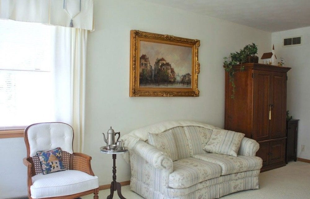
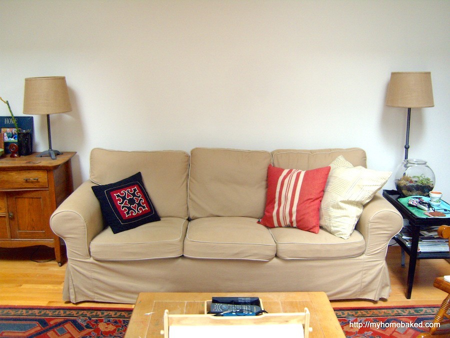
Oh dear. First of all, one of the worst interior design mistakes is to line the furniture up against the wall like this. The loveseat is screaming grandma. The painting is hung too high. Wall to wall carpet is icky poo for a living room.
The chair has some odd upholstery going on. But… Did you know? If you have a weird chair like this, you can take it to an upholsterer who can fully upholster this occasional chair if you like and it’ll be wonderful.
You just know that the previous owner put up that fussy, dated valance. Right? And then the next owners lived with it for ten years before they decided to put the house on the market. After a while, they stopped seeing it.
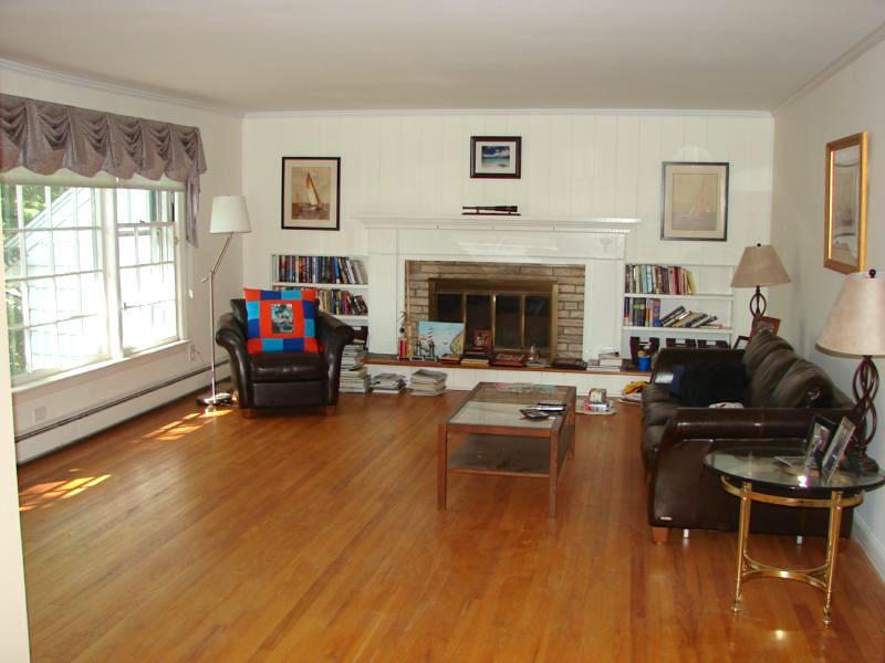
Please paint the ugly brick. The black sofas are the aforementioned big globs of black which stick out too much. There should be a rug to tie things together better. This room has a lot of potential I think.
***
About 23 years ago, when I had my first interior design job working for someone else, we had a young client who had just purchased a new home. It was a traditional/post-modern style center hall colonial. High ceilings, inlaid wood on the floors, nice mouldings and windows.
The walls were white. I thought they were beautiful. The client couldn’t stand the white. Her mantra was…
I WANT TO SEE COLOR!
And that’s what we gave her.
And that brings us to the next debate.
If you have a dark room, can you paint the walls white?
Well, I always say that all rooms are south-facing bright rooms at night.
And even in a south/west room, there will be times when the light is dim and cold. Every rainy day renders a room to be “north facing.”
In answer to the question, can you paint a room with darker cooler light, white?
I think you can, but I also think that darker rooms absolutely need some jolts of color and the white on the wall should definitely have warmer undertones. For more information about paint colors for north facing rooms, click here.
Other tricks for intensifying the light are to use mirrors and of course, artificial lights if necessary.
Next, I’d like to highlight a young interior design firm that uses white perfectly
Studio McGee. It is the husband and wife duo, Syd and Shea McGee who have set the world of interior design on fire in the last few years. I’m terribly impressed with their work! They are the perfect embodiment of the new-traditional, young-trad, neo-traditional. Whatever you want to call it. It’s a mix of clean-lined but traditional features, some modernity, largely against a canvas of pure white.
They have THE most beautiful website and an exquisite portfolio. Most of their rooms have white walls. But not a one of them is boring, cold or uninteresting in any way.
The frequently use Benjamin Moore’s Color of the Year 2016 Simply White and sometimes Chantilly Lace.
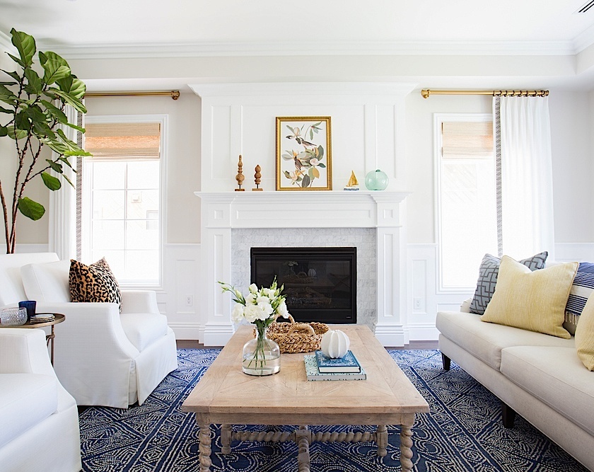
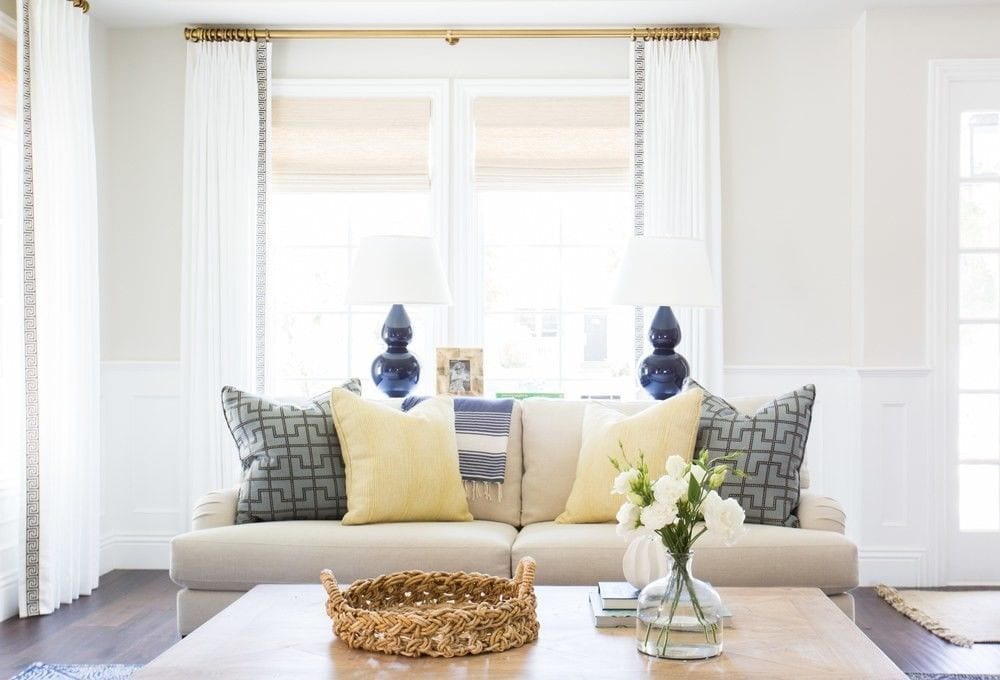
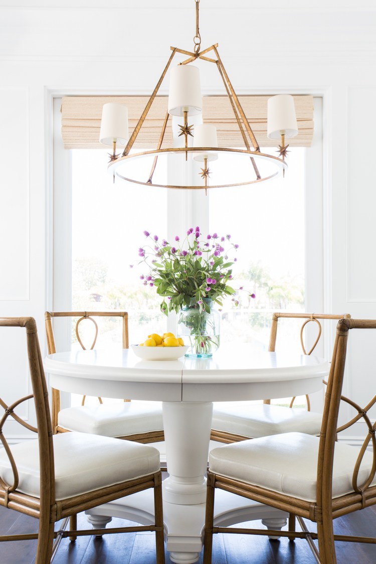
Please enjoy (with their permission which I always do when I use this many photos from one source) some fabulous rooms featuring beautiful white walls!
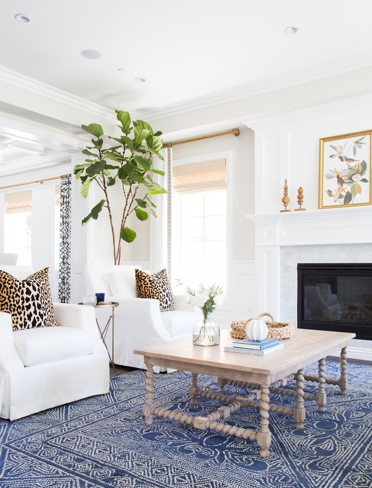
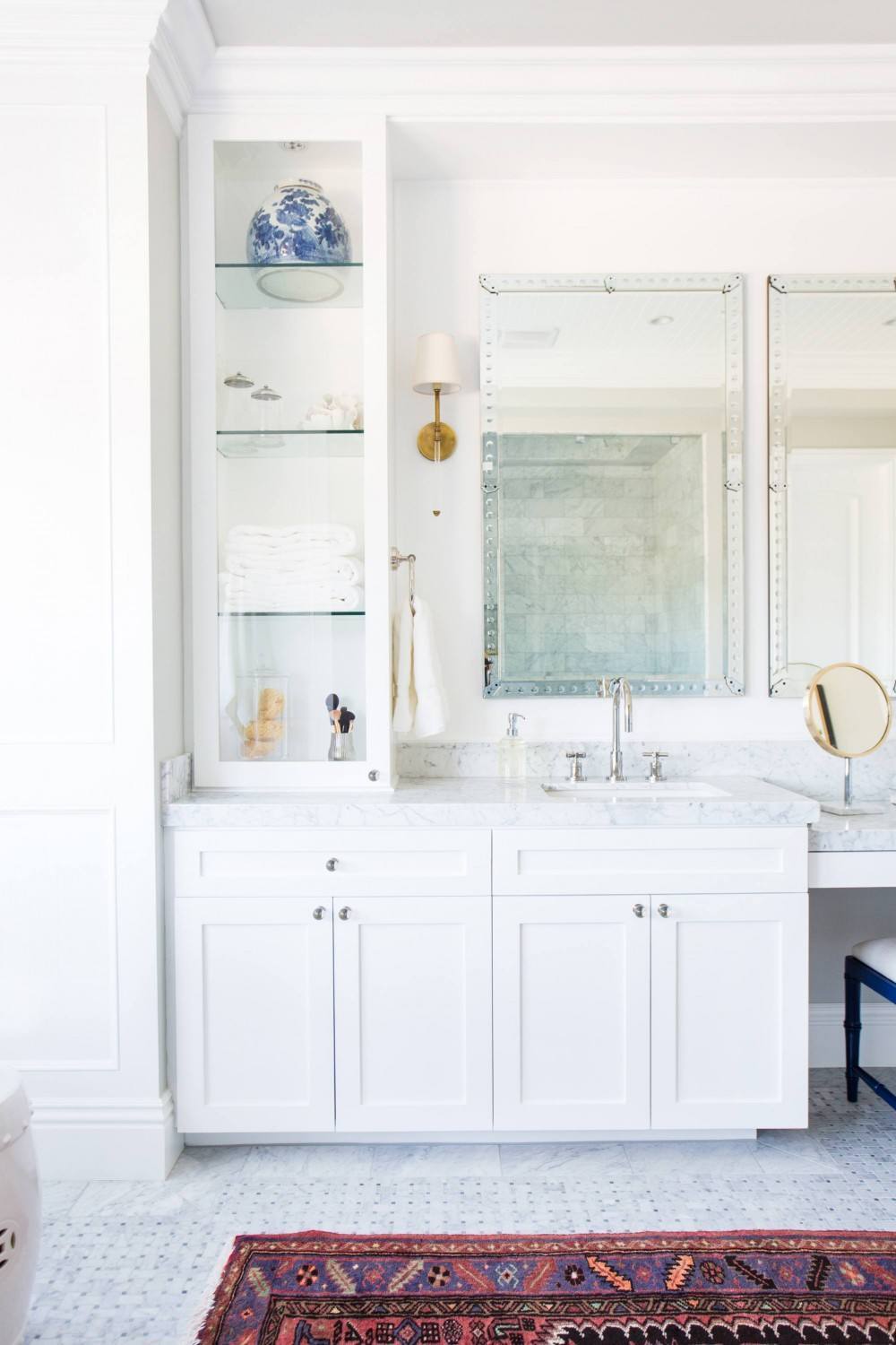
Love the Mirabelle rug from Serena and Lily!
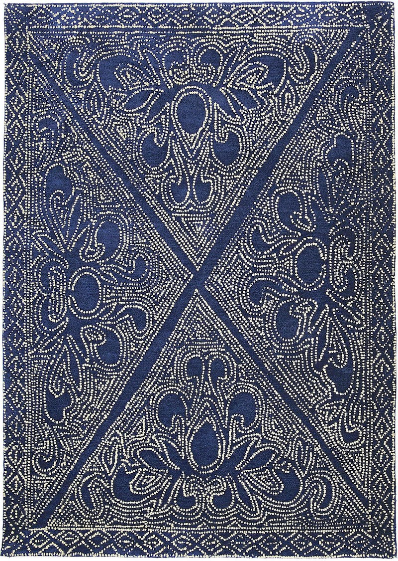 Mirabelle Rug from Serena and Lily in Indigo
Those fig plants always look so fab in photos!
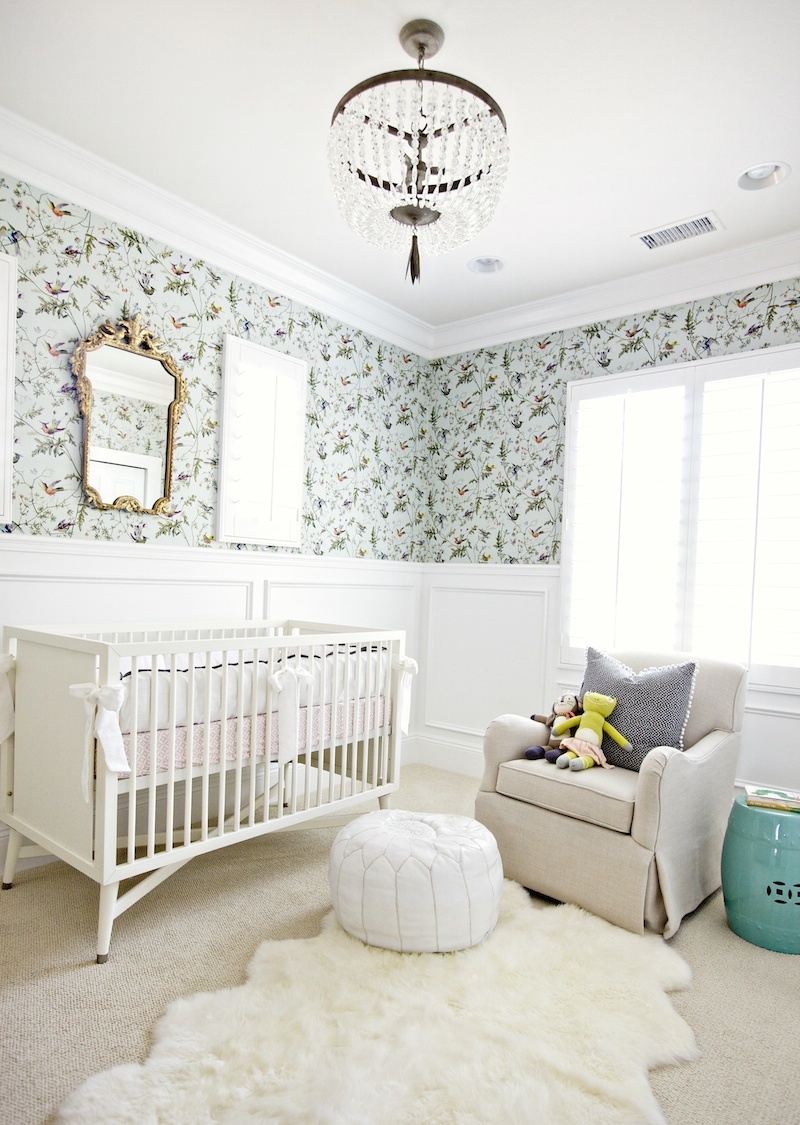
Just slap me silly! This has to be the most gorgeous nursery on the planet! One wonderful thing about Studio McGee (amongst many) is that they list a lot of their sources. The wallpaper is said to be from Anthropologie and that might be true, but it is also Cole and Son’s Hummingbird pattern.
Here’s a larger image. So pretty!
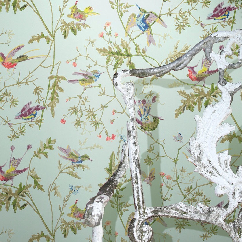
Vanuatu Wallpaper from Anthropologie
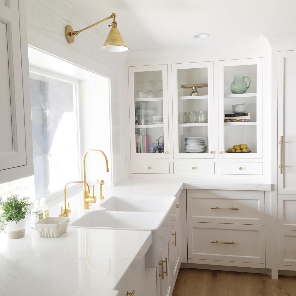
The brass touches add warmth to an all-white kitchen. Is this look here to stay? I know… we have been through this before. This is way different than the 80’s brass which was so much glitzier. I think the look has legs. The Belmont Sconce is available through Serena and Lily.
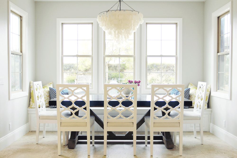
Love the capiz shell chandelier and how it plays off the design of the fretwork on the chairs.
Interesting choice to use a different fabric for the shade from the drapery, but I think it adds a welcome note of warmth. This bedroom definitely makes my heart beat faster!
Insanely stunning.
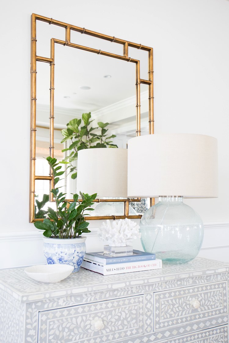
perfect vignette! The gorgeous bone inlay chest is available through Kathy Kuo.
*********


I am writing this from my hotel in High Point, North Carolina. Can’t believe I’m here, at the market! Having a great time. Everyone on the blogger’s tour is incredibly lovely!The vendors are warm and welcoming. I’m learning a lot. I have so much to share with y’all in the coming days and weeks.
Please follow me on instagram if you have nothing better to do want to get current updates.
xo,

Related Posts
 Warning! 3 Interior Design Trends You’ll Regret!
 The Trick to Choosing Color Schemes|Analogous Colors
 20 {Great} Shades of Orange Wall Paint {and Coral, Apricot, Kumquat…}
 We Live Like Squatters | We don’t Even Have Anywhere To Sit!
 Benjamin Moore Paint Colors Matched to Farrow and Ball 2015!
 Famous Interior Designers Who Got Arrested
- What is the Best Palette for No Fail Paint Colors?


36 Responses
I am so pulling my hair out and ready to give up. My husband and I just bought our first house together. It’s in a town with a population of 377. And it’s on an acre in the country
And it’s very country inside. With blonde wood paneling everywhere. Please I’m on nearly a zero budget but can’t live with all this wood and not do something. Please help me!?!?!
Hi Kendra,
I feel your pain but unfortunately I’m no longer doing consultations. I can tell you that there’s a ton of advice on this blog and it’s free!
If you’re still not finding enough help, I created a curated paint color collection of 144 colors, the trim colors, the best whites, best cabinet colors, and a universal color palette of about 60 of those colors. PLUS, there’s a companion guide that puts those colors into palettes and palette families where those colors all look great together. And that is conveyed with 40 design boards of furnished rooms that show the wall color. And it also comes with great furniture sources with links both to the trade and retail (via the internet). It’s nearly 500 pages full of advice and everyone who’s gotten it loves it!
https://laurelberninteriors.com/rolodex-paint-collections/
You can read more about it here and also read what others have said about it.
What a great post about Simply White!! I used to in my old house as a wall color to highlight oak Mission-style built-ins in a room with a lot of light..and it was so pretty..and very creamy in that setting. It really does pick up what ever is around it.
Hi Eleanor, Thanks for that! Always good to know when someone had success with a color! I understand that the folks at BM took great pains in their selection. They kept narrowing down the field without knowing the name of the color. Repeatedly, SW was selected. So, there it is!
Great post Laurel, and wonderful blog. I took great pleasure reading through your very informative and oh so funny posts. And this even tho my style is more let’s say industrial and definitely minimalist !
Thanks.
Hi Sam, Thank you so much! Someone thought that many of these rooms were too minimal. I like a lot of different things too.
Catherine, of InThe Fields blog had a lovely home which was completely “Simply White.” So, some rooms were obviously facing North. And then, as you said, sometimes it’s night. Why do you think it worked so well? Warm woods?
hi Debbie, Well, it could be lots of factors. And just because a room faces north, doesn’t mean that it’s a dark room. I think white works best when there are lots of mouldings and all of the other things in the post.
I am loving your Blog! I am in the process of painting the walls and the trim of several rooms in my home. In an effort to “lighten up” I chose Simply White for the trim and Ballet White for the walls. I am so happy with the results. Thanks for your great blog about white paint colors, it really helped me!
Hi Jeanne, I had a client do a similar combo in a guest bedroom and it was lovely. I think she used white dove for the trim, but simply would look nice too.
Gorgeous pictures! Your comment about the fig tree looking good in pictures, well no plant looks good for long in real life in my house. And I loved that nursery! But PLEASE move that gorgeous mirror before the baby learns how to stand in her crib.
Haha! about the mirror. Seriously. I’ve seen many a photo of a nursery where my kids would’ve been dead if they lived in that room. I need to do a post about chic nurseries one day.
And yes on the plants. I bought an orchid (not an expensive one) And was dusting and realized I hadn’t watered it in 2 weeks!
I just want to hang on to the visual of you dusting your plants…please photoshop a pic of you doing it in 50’s pearls wearing an apron and heels?
Ok just read that and it sounds really creepy—sorry!! Just meant to say that dusting is kind of a lost art and something that’s been relegated in pop culture to that 50’s mom stereotype…
I only wished,BUTTAHYELLOW 🙂 I have to dust if I wanted to see the wood grain of the furniture and not just a white haze. With three standard poodles in the house, I’ve often wished for a ‘dust fairy’ to help me out, but it’s still just me with the dust rag making the weekly rounds; luckily, microfiber rags work great.
Hi Dolores, Yes, I’ve noticed that without Peaches, the dust is negligible compared to when he was here. I still miss him terribly despite that and the fact that he was wrecking my beautiful new chairs. My sister has a new doggie who threw himself all over me and showered me with passionate kisses!
Buttah, Haha! I didn’t read it as creepy at all! I think it’s a great idea. A creepy comment goes like this:
“Your blog could do without the four letter words. In my opinion, it is unprofessional and tacky.”
Darling, ain’t she?
Interesting, that the word “four” is a 4-letter-word. :]
The mirror over the crib is the first thing
I noticed too!!
I look forward to all of your blogs. This is another informative winner.
Thank you so much Jean! And thank you Benjamin Moore for providing the inspiration!
Hi Larel, I love your blog and your wonderful tips! I’m contemplating having my current Butterscotch Cherry kitchen cabinets painted white. Currently my whole house is painted BM Jackson Tan which I still like after 13 years with all the trim BM Linen White which I also really like. I’m thinking I should also use the Linen White on the cabinetry. What are your thoughts? I have tons of windows and natural light throughout….my kitchen faces south and west. Thanks!
Hi Carol,
When the cabinets are in the white family and the trim is in the white family, I usually make them the same shade of white. I’ve done linen white in a kitchen before and it’s very pretty. Hold on. I did a post when the kitchen was almost finished. But at least you can see the linen white. Let me dig it up for you. https://laurelberninteriors.com/a-kitchen-renovation/
You’ve nailed why I have an absolute aversion to white walls! They are too difficult to pull off successfully by most people and wind up looking like a dirty,shadowy backdrop to nondescript furniture..You need a good eye, a plan and money to make it all work 🙂
Thanks Dolores. I agree. Good photography helps too! I forgot to say that the photos are all a little overexposed which adds to the freshness.
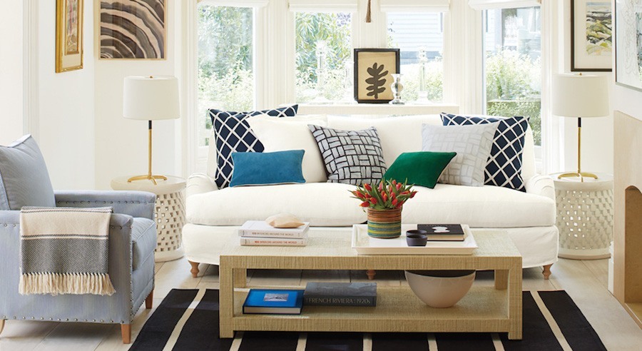
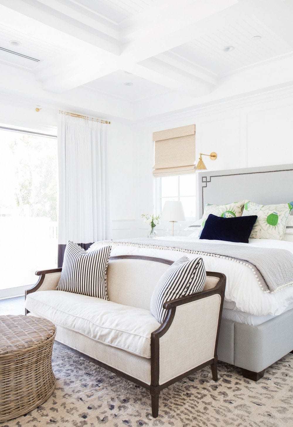
The room with the animal print pillows and blue & white rug is the most beautiful room I ever saw.
WHERE did the rug come from? It is wonderful.
Hi Publius,
Yes, I love the room too!
I tracked the rug down. It’s from Serena and Lily! http://www.serenaandlily.com/mirabelle-rug/m10234.html?cgid=decor-all-rugs#start=1
Gorgeous post, and very timely for me – i am 90% through painting a tired greige guest bedroom white (cotton balls based on your prior post), and it looks amazing. Am now brainstorming all the ways to bring it to life, and this post was perfect.
Any comments/advice on painting stained oak cabinets? Have you done it, would you do it again? Some kitchen cabinets, other family room cabinetry, and other oak entry doors. Everything is currently honey oak.
You comment on the carpeted living room being icky poo. My husband and I just bought a house and w/kitchen remodeling mounting up we are inclined to keep carpet in the living and dining rooms opposed to putting in hardfloors like the rest of the first floor even though our first thought was yes, we are doing that. Is this a mistake? Should we stretch for this? The house is loaded w/80’s honey oak so our first priority is to wash that out w/new cabinet fronts, painting and staining. The floors are the narrow red oak which we’d sand and put a new finish (anything you recommend in particular?)
Thank you for your opinion on this matter.
Hi Avice, I’d spring for the hardwood floors for a multitude of reasons. As for recommendations, please check out this post. https://laurelberninteriors.com/all-about-hardwood-flooring-the-common-cleaner-thatll-ruin-them/
Hi Lauren Another wonderful blog, it has become a regular event on a Sunday morning in my home…however, can you please explaine your aversion to the ‘weird grandmas chair’ and how you would have it reupholstered? To me, it seems the least offensive piece of furniture in the room? Have I missed something in translation? Regards. X
Hi Liz, I find the ditzy pattern on the love seat as well as the piece itself to be very dated and not in a good way.
I’ve had clients who’ve had sentimental pieces that were handed down. One time we did a wing chair in a plain linen. In the family room, we took the 60’s curved sofa and reupholstered it in a nubby woven. We took the skirt off to expose the legs. Another time, we did a client’s grandmother’s Victorian settee in a modern velvet stripe from Bergamo. I left off the welting and it gave a contemporary edge to the piece which made it quite interesting, I think.
Hi Laurel – I think I may be at cross purposes with you – are we talking about the upholstered cane chair, or the stripey flowerie sofa? If the latter, I totally agree with you…. (Sorry for the confusion)
Hi Liz. Worry not. It’s the sofa or loveseat I’m calling it with the stripey grandma fabric that I’m talking about. The chair fabric is fine. I’m not fond of the style of upholstery, however. I would take that chair and have it fully upholstered except for the apron and legs. I love caned backs. But prefer that it’s either all caned or all upholstered. The only except might be a vintage barrel chair. I’ve seen a combo there and it looks nice.
I think some of the shown spaces are more successful than others. The living room, to me, is the nicest. All their lighting choices are nice, but some the spaces seem like they need a little more. Not sure I love bedroom with different shade and curtain. I am contemplating doing a white room but realize how important layering as well as silhouette of the furniture itself can be. Thanks for giving me food for thought.
Hi BJ, I admit that I’ve never done a different shade and curtain. My rule has always been the window treatments can be different if the windows are radically different from each other, but the fabric is the same. But the more I thought about it, the beige felt like a welcome respite in this case.