Monochromatic Interiors – A Misunderstood Color Scheme

Today, I’d like to focus on MONOCHROMATIC interiors and moonochromatic color schemes.

But first of all, the common misconception is that a monochromatic color scheme is limited to shades of gray or greige.

And sure, those rooms done in those colors are monochromatic, however, the word monochromatic means ONE COLOR, so in reality, a monochromatic color scheme is any one color used predominantly in a space.


Some things to keep in mind:


Chroma is the saturation or brightness of a color. If we say it has a high chroma, it means that it’s an intense color. Usually, we use these more sparingly. (unless you live in South Florida or some place like that or you just like really bright colors!) A color lacking in chroma has a lot of gray or brown in it. We usually say it’s a muted color.

Hue refers to the colors of the spectrum.

A Tint has white added in.

A Shade has black added in.

Actually, for a really great primer on color which explains it more precisely, please look here.


Sometimes the colors are very close together on the color wheel.


For instance, we could have a room with various shades of blue and blue-green, teal, aqua. Strictly speaking, that is an analogous color scheme. But, for our purposes, we’re going to focus on rooms that focus on one color or slight variations from it.


Can a monochromatic color scheme have other colors in it?


Sure. I always feel that there should be some black and usually, some white.  White and black go with everything and I feel in most cases, add a lot of depth depending on the mood and feel one is going for.

And, of course, there can be wood tones and some accent colors. We’re going to see many examples which show this.


So let’s dive in to explore these monochromatic color schemes further.


I’m going to share some of my favorite interior designers who are pros at all things design and frequently work with monochromatic color schemes.

We’ll begin with the more traditional monochromatic interiors featuring neutrals and work our way through the spectrum.
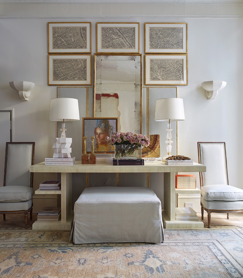
 

KipsBay2016_image KD Hamptons - SuzanneKasler_photo - Phillip Ennis -beautiful vignette with soft colors

Suzanne Kasler

Above and below are two gorgeous examples by Suzanne. She’s known for her pale monochromatic color schemes.
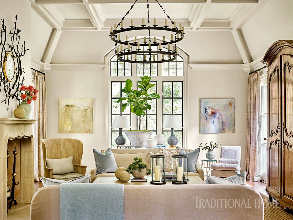
 

Monochromatic-interiors-Suzanne-Kasler_photo-Emily-Followill

Traditional Home

Suzanne is one of my favorite interior designers and her work has been featured on here many times.


However, there’s one designer who I associate with neutral monochromatic interiors more than any other.


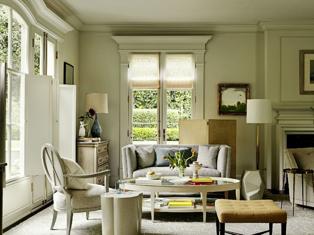
And, that’s South African designer, John Jacob. All of his rooms are gorgeous, IMO. The next three rooms are some of his beautiful work.
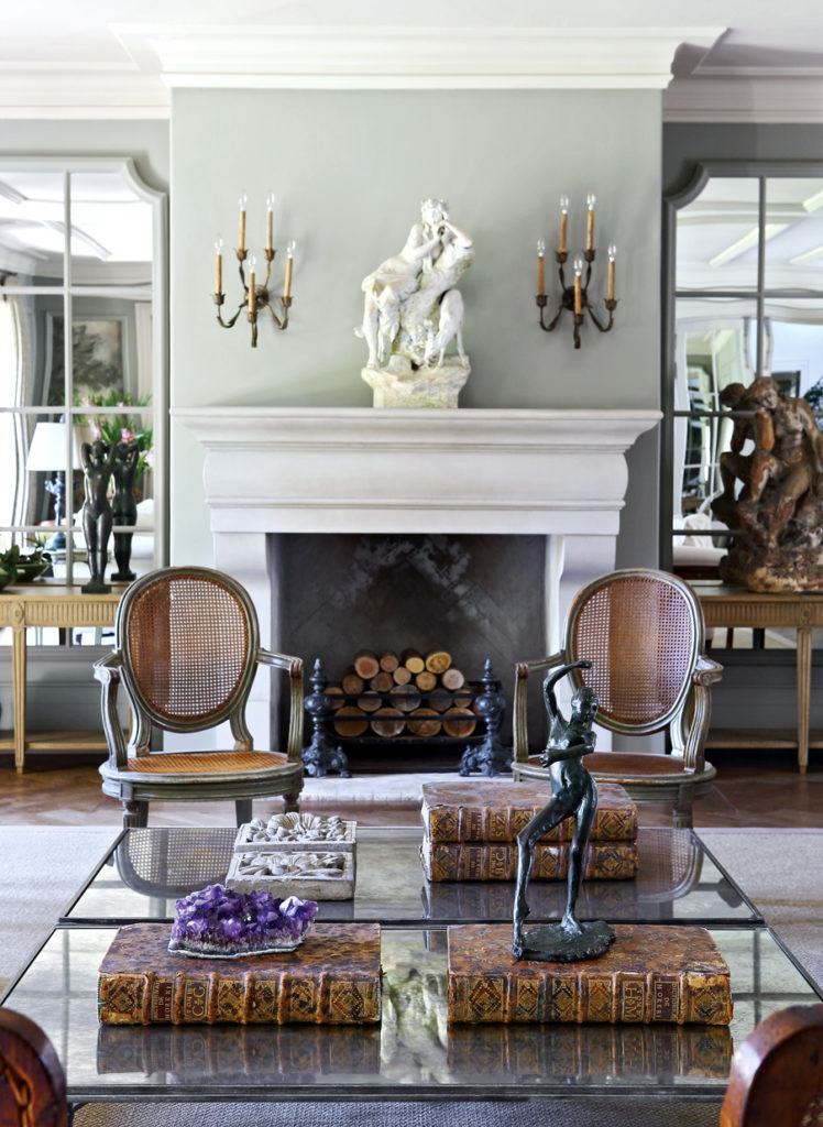
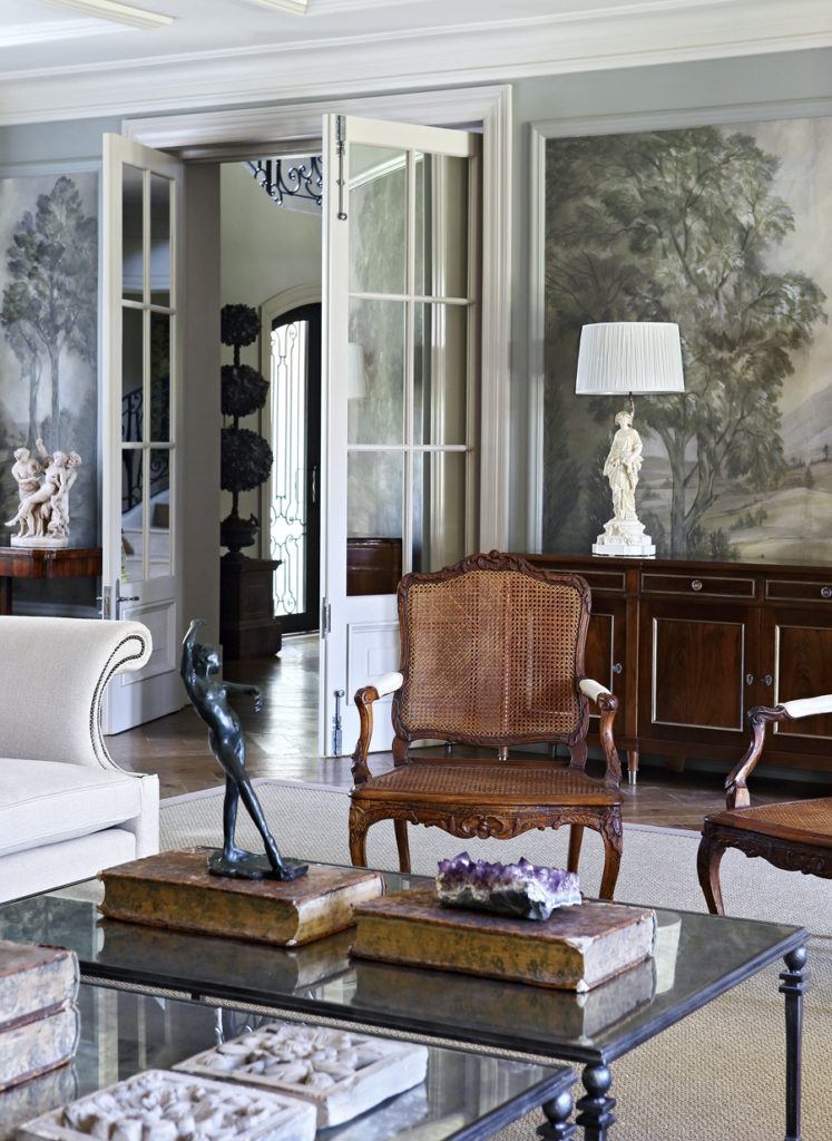
 

John Jacob - enduring gray trend - gorgeous living room


John Jacob - not boring gray trend living room - gorgeous grisaille wallpaperLove the Grisaille mural.


Beautiful eclectic living dining room - John Jacob - Benjamin Moore - Revere Pewter - No Fail Paint Colors


david-meredith-barbara-barry-2

Another favorite designer known for both monochromatic and analogous color schemes is Barbara Barry.

You can see more of her gorgeous interiors here.

and here’s part II about Barbara Barry


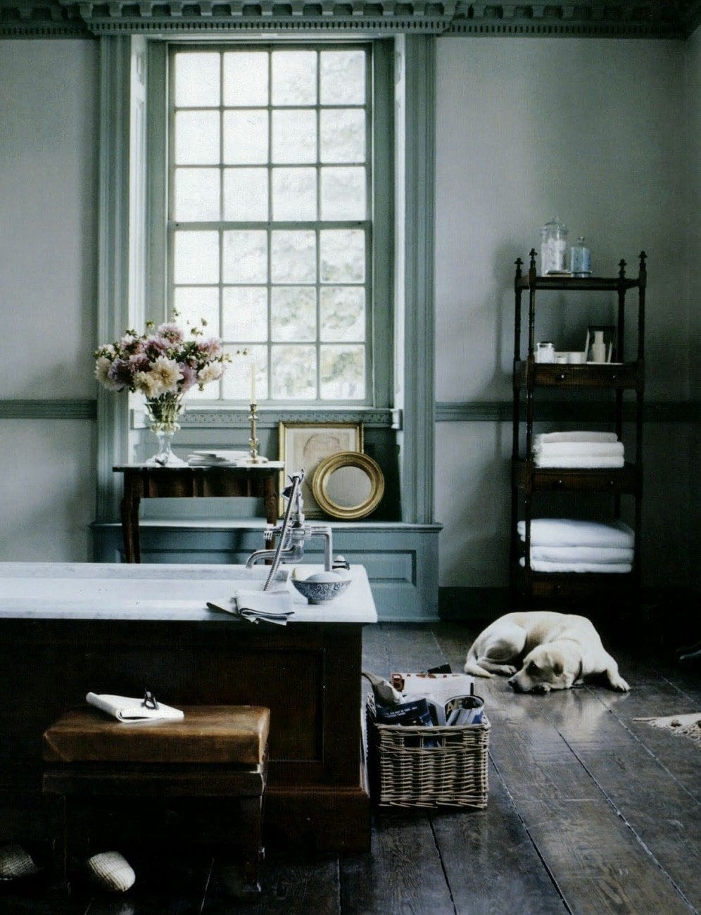
Then two other favorite interior designers who feature monochromatic interiors are Michael S Smith and Steven Gambrel.
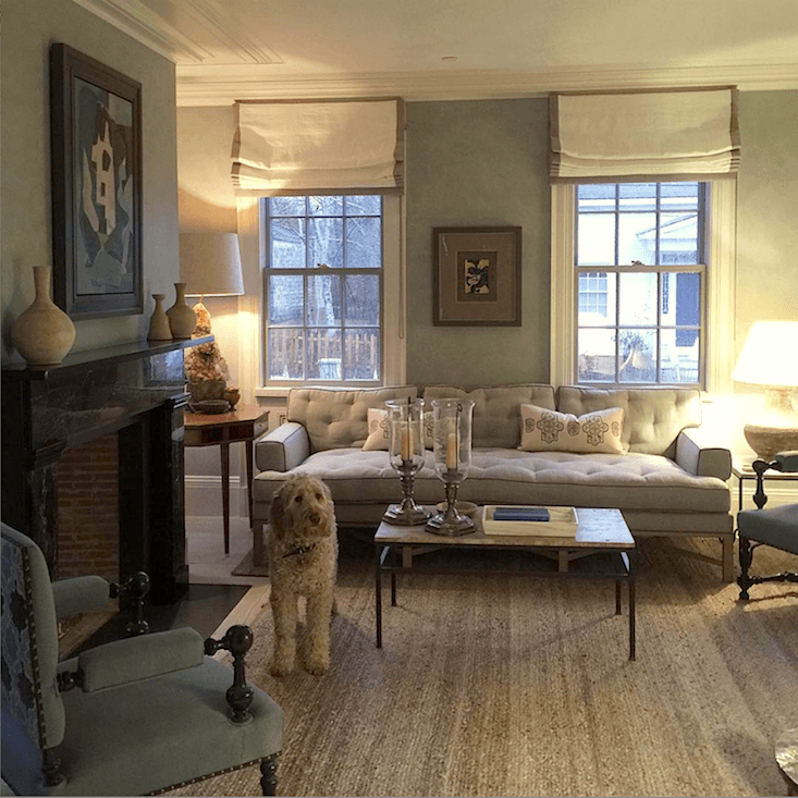
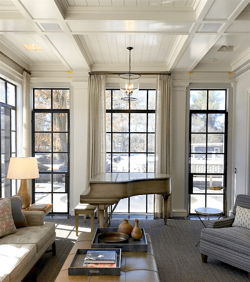
 

Steven Gambrel - instagram - summer home -Sag Harbor living room - monochromatic interiors

Steven Gambrel


Steven Gambrel - monochromatic interiors - gray on gray

Steven Gambrel


Michael S. Smith - bathroom - monochromatic interiors

Michael Smith


Michael-S Smith-Madrid - Photo - Ricardo Labougle - antique Chinoiserie panels

Michael S. Smith

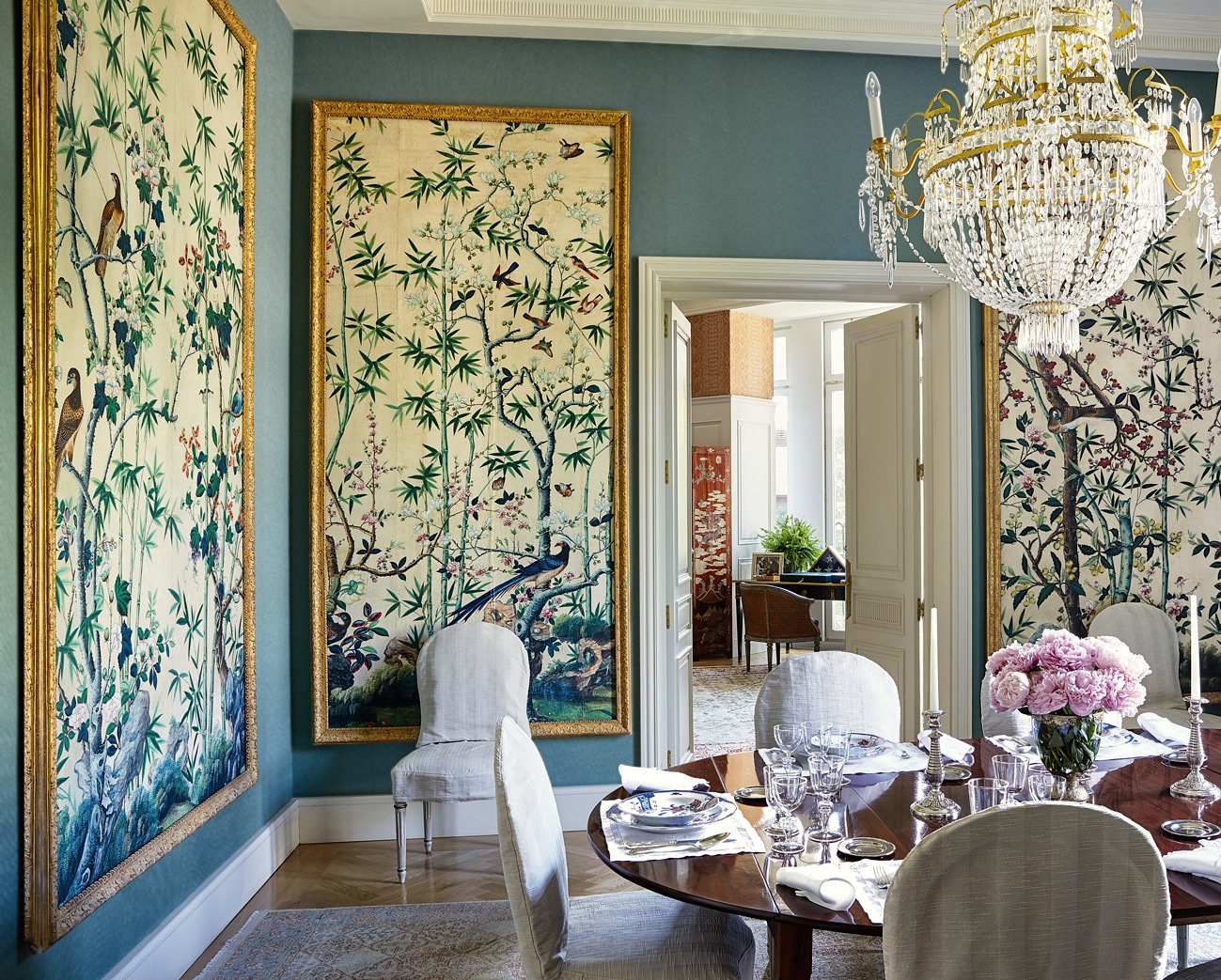
I suppose this is technically more analogous, but I love this dining room with the Chinoiserie panels!
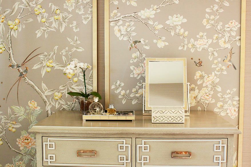
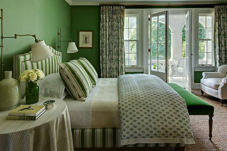
 

Laura Tutun - Rye, NY interior designer - monochromatic interiors

Laura Tutun


interior color schemes

Mark Cunningham


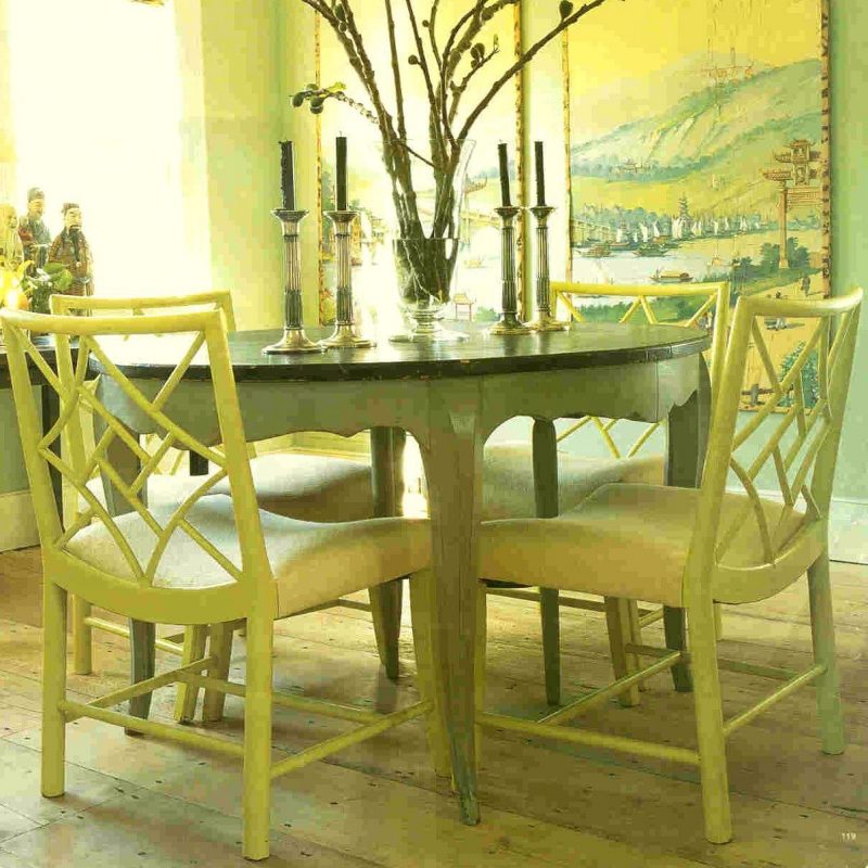
Steven Gambrel chartreuse dining room - monochromatic interiors

This is a dining room I clipped out of a magazine at least 18 years ago by Steven Gambrel. One of my all-time favorites! It’s veering to an analogous scheme because there are various shades of chartreuse and green in it.


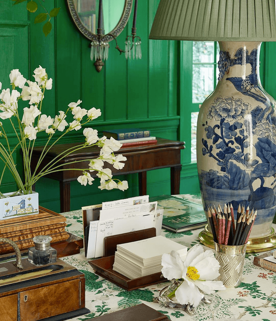
Miles Redd - monochromatic color scheme - @PeterMurdoch photography instagram emerald green walls

This is a detail shot I found on Miles Redd’s instagram. You may recognize it from the stunning dining room he did for his Mom a while back. It doubled as a library/home office.
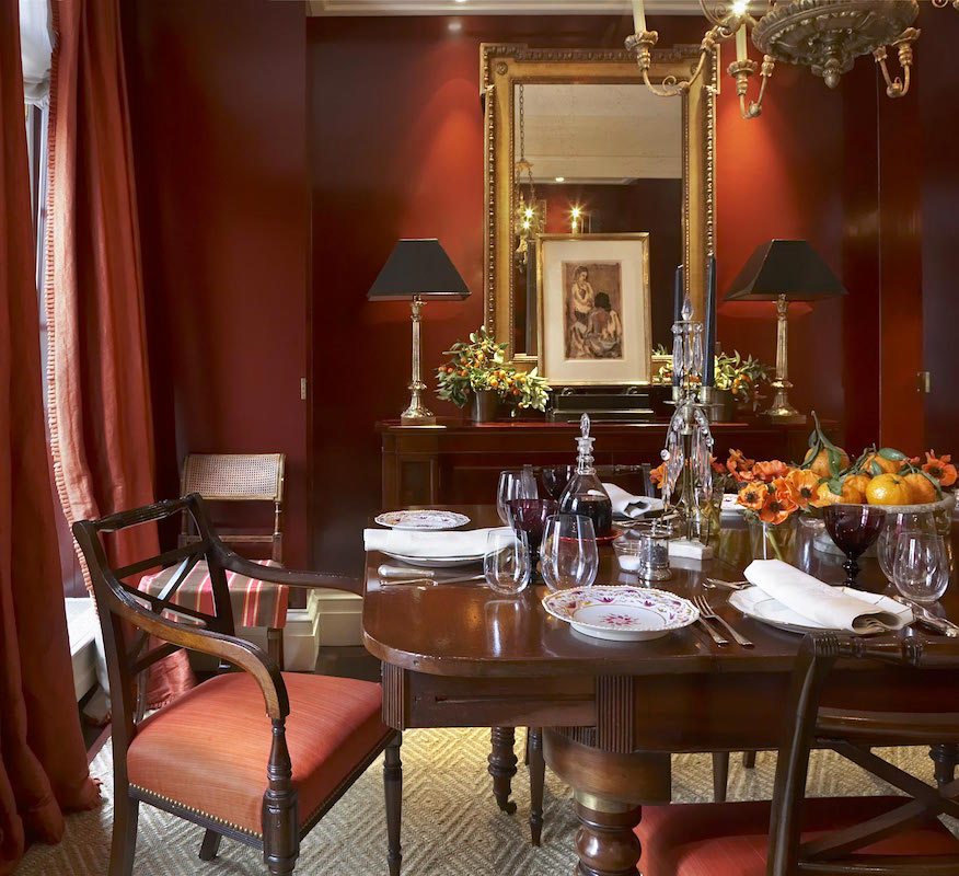
 

Gil Schafer dining room with warm rusty red walls - monochromatic interiors

More from Miles Redd and Gil Schafer with a lovely monochromatic dining room in shades of rusty-red.
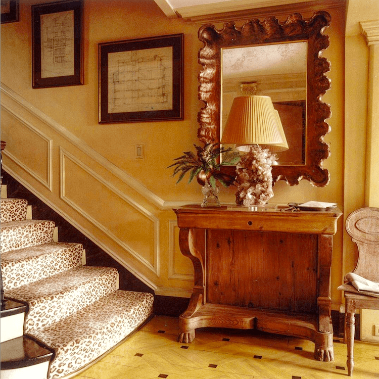
 

monochromatic interiors @milesredd @gilschafer on instagram - monochromatic interiors - staircase - gold walls

Another from Miles Redd and Gil Schafer Above and below.
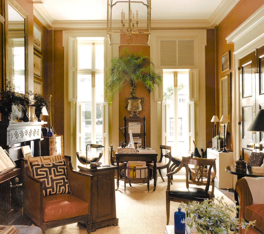
 

Gil Schafer and Miles Redd Collab rusty orange red walls warm color scheme Greenwich village townhouse

You can see more of Gil’s stunning home here.
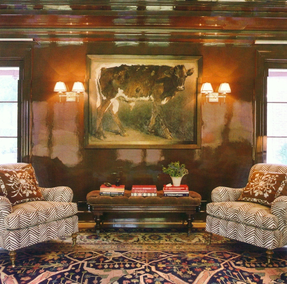
 

Miles Redd


And for more beautiful pale golds, oranges, and rusty red rooms, click here.


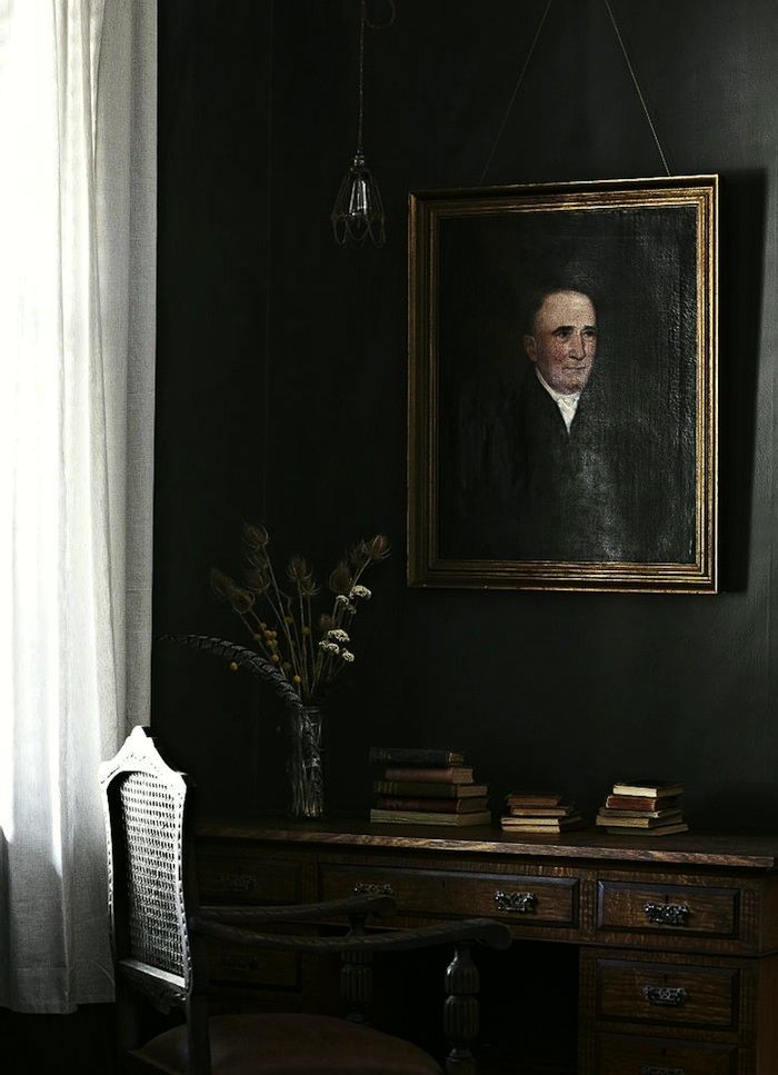
And, below I’m closing with some darker monochromatic interiors
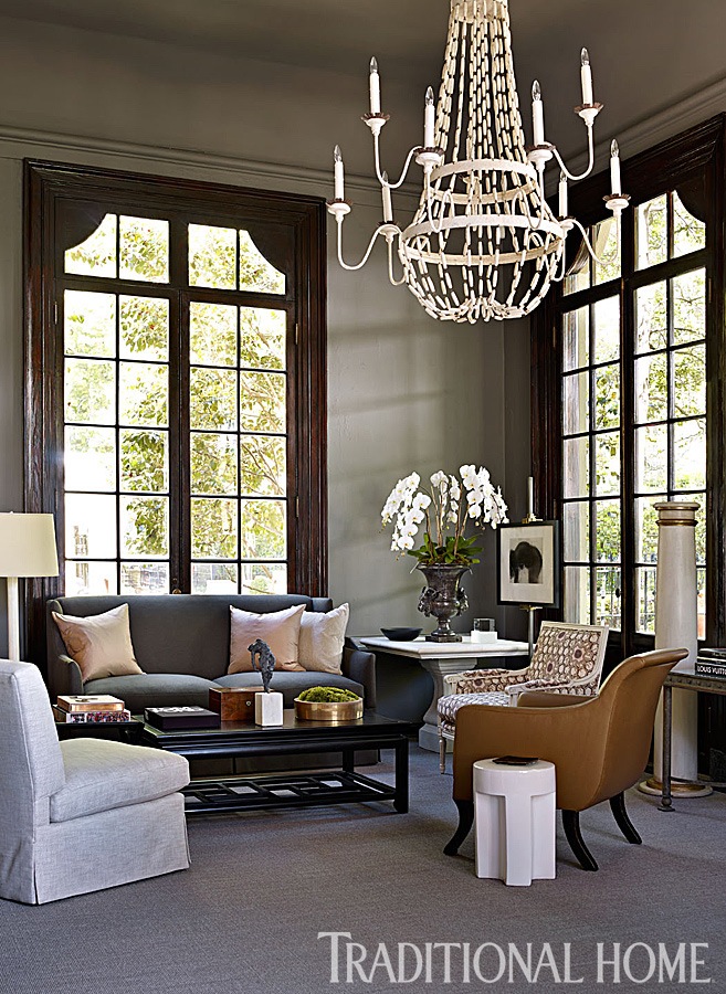
 

monochromatic interiors - robert-brown-atlanta-symphony-showhouse-2014-photo-emily-jenkins-followill

Robert Brown from the Atlanta Symphony Showhouse photo-emily-jenkins-followill


Tracie-Ellis-House-Kyneton-Australia-01

Tracie Ellis House


Of course, there are dozens of other terrific examples of monochromatic interiors throughout this blog.


I find these sophisticated color schemes are great for both large and small rooms. But, especially for small rooms; as they are more restful and give a more expansive feeling, in general.

Hope you found these rooms inspiring.

For more help with your paint colors, if you’re struggling, you might consider purchasing my two volume Laurel Home Essential Paint and Palette Collection.


In the meantime, here’s one of my favorite posts for a palette of nine no-fail neutral paint colors.

And, you may also enjoy this post about analogous color schemes.

xo,


Please also check out the newly updated hot sales.


45 Responses

  1. Dear Laurel
    Where can you get a Comfortable sofa like the 2 Steve Gambrel pictures featuring the deep, tufted oatmeal colored sofas. I ordered a sofa from Wisteria and it was like sitting on a rock. Who has comfy soft sofas that are not super pricey?
    Thanks Jackie
    ps I like the English roll arms sofas a lot

  2. Hi Laurel! If you ever have time I’m sure many of your readers would love a post on how to create a monochromatic look. I’m very interested in how to coordinate different types of fabrics for upholstery, draperies, pillows… that add texture and layers to a room even thought they are the same color scheme.

  3. I am using a Mac with
    Safari as the browser. I have no problem with any other site and have used the “Not robot” thingie often.

  4. Hi Laurel –
    Love your blog! I voted earlier today, number 1225. Your killing it as well you should!

    You made my day reading your blogs so much more enjoyable as I was recovering from surgery

  5. Altho the link connects to the site, it doesn’t show anything to click through to.
    Tried several times…
    I really really want you to enjoy Milan …!

    1. I’ve written to them and sent a screenshot as I’m still getting the error message too. If you see this, Susan, could you tell me what device and browser you’re using? Thanks so much.

  6. Darned “I’m not a robot” thingie won’t let me authenticate that I am indeed not a robot! I’ll keep trying.

    1. Please try refreshing the page. I’ve had the same problem as have a lot of other people. I’m going to contact Modenus to let them know. Thank you so much for your support, Susan!

  7. Voted! (Though the damn “prove you’re not a robot” tests caused me to burn my sandwich…). I’ll try to vote again when I’m not cooking 😉 Your posts are always enjoyed, and I have now shared your site with my daughter.

  8. Hi Laurel
    You’ve got my vote. You are my favorite designer blog the one and only !! Thank you for all that you inspire me to try!

  9. Morning friend!

    Of course I’ve voted for you friend- and I hope I’m able to stay in the top 5-10 with you- maybe even #2 right behind you! I know you will be visiting Italy- and I can’t wait to see all the gorgeous photos and inspo you will gather while you are there!!
    Are you going to be at KBIS week after next? When will I see you again?
    xo
    E

  10. Happy New Year Laurel. Renos are done to the degree that I could host Christmas and get out the good china. Wonderful after 5 years! Glad you had someone special to spend the season with.
    I’ve cast my vote and hope you get to andare in Italia bella. Thanks for the eye candy. Of course, Loi Thai is also a master of monochromatic.

  11. Hello Laurel, These monochromatic rooms can be very soothing in effect, while also having a well-put-together appearance. I also notice that these examples have enough contrast and accent colors to avoid looking faded out.

    Of course I voted for you. From your photo alone, you are the designer I would pick to do my own home. I will leave the contest tab open to remind me to vote again!
    –Jim

    1. Thanks so much Jim. You’re the best! That photo was taken last October when I was in Austin, TX for a conference. But, I stayed with one of my bestie designer friends and we were having dinner with another. Great evening!

  12. I agree with you, Susie–this is one of my pet peeves. Sometimes I understand that stylists will do this for a little extra layering for the photo-shoot, but this one looks quite extensive and deliberate!
    –Jim

  13. They’re all just beautiful. I especially loved the pale blue Gustavian looking bathroom by Michael Smith, and the sexy and sophisticated red dining room, and entry hall in shades of yellows and browns by Miles Redd and Gil Schafer, but when I clicked on the first link to get to “a really great primer on color”, I got to an error page, Laurel.

    (Crossing my fingers that you go to Italy!)

    1. Oh thanks so much for all, Lisa. This was a reworking of a verrrrrry old post. 3/4 of it is entirely new. But, I forgot to check that link. I’ll go and find another one. The link was good except there was an extra http:// in front of the other one. Have no idea how that happened.

  14. Hi Laurel,
    After making all of my decorating mistakes I’ve discovered I prefer monochromatic design. Lots of contrast doesn’t sit well with me.
    I got my vote in. I’d love to see you win.

  15. I am going to vote as often as I can :-))) I’m wondering If Miles Redd did all interior architecture moldings or Gil? Who is responsible for what?

    1. Hi Lils,

      That’s a very good question. I think that Gil does the mouldings. But, they’ve done so many jobs together that I imagine they have meetings to decide these things. And, thanks so much for your vote(s)!

  16. Monochromatic is my eye candy for sure. Thanks for the visual banquet. BTW: Voted and shared. Prepare to pack your bags for Milano and ciao bella…

  17. Voted. Thank you for being an educator and sharing your clear opinions with sass. Your work is unmatched.

  18. In stating you can’t influence a fly, you are either being quite modest, or don’t appreciate your worth. Luckily for you, we do. Enjoy Milan.
    Hope you take the hot boyfriend!

  19. Wow. This really taught me a lot. I did not know the correct terminology for my favorite color scheme. I used to call it high color, monochromatic.

    So, if I am right, high chroma, monochromatic is the term I should use?

    I like almost all of these rooms, a lot. I have a red study right now with white, black and touches of purple.

    I like my bedrooms to be blue violet, my bathrooms to be pale green watercolor and my main spaces to have pale butter yellow walls with white and blue violet.

    But that was just for this house which was the first one I got a chance to choose colors for. I’ve only had two houses and there wasn’t time, money, energy for painting the first house which was painted a very stark white. That was way too harsh on the eyes.

    I’m thinking about my retirement home — in theory because everything will depend on what I wind up affording.

    I find the deep orangey red in my study gives me a womb like experience. I can be calm and concentrate in that room.

    I will never, ever do without blue/purple again although I will surely move it to different rooms in my final home.

    Thank you so very much for this enlightening post. I do like the light/pale monochromatic looks too.

    I do wish this post had a blue/purple room. My couch is white so that I can play around with blue/purple, but I am imagining the next living/dining room will either have pale white walls or take a deep dive into those blue/purples on the walls.

    I need these colors in my life.

Leave a Reply

Your email address will not be published. Required fields are marked *

This site uses Akismet to reduce spam. Learn how your comment data is processed.

Welcome To Laurel Home!

laurel-aarons-18th-e1456449963926

Hi, I’m Laurel, and Laurel Home is the website and blog for Laurel Bern Interiors.
I’ve been creating new-traditional interiors since 1988. The blog is where I share all.

New Edition, November 2023! Get The Indispensable Guide For 100s of Home Furnishings And Interior Design Sources That Everyone Is Raving About

laurels-rolodex-final-book-cover-master 10th edition 23-24

laurel home archives

Categories:

Please click the image below for more info about my rockin’ Interior Design Guides for 2024!

Laurel Home Interior Design Guides 2024
Amazon ad

please click below to check out my favorite decorating & design books

Laurel Bern's Favorite Interior Design and Decorating Books
Subscribe To The Laurel Home Blog And You Will Receive A FREE Guide Where I Share How To Get Your Paint Colors Right, The First Time.