

Hi Everyone,
Oh, I know. The post is soooo late. But, at least it’s out.
Very early on, I did a post, “How to Style a Bookcase.” I took it down because it didn’t really give any helpful advice. So, this time, I hope I do a better job.
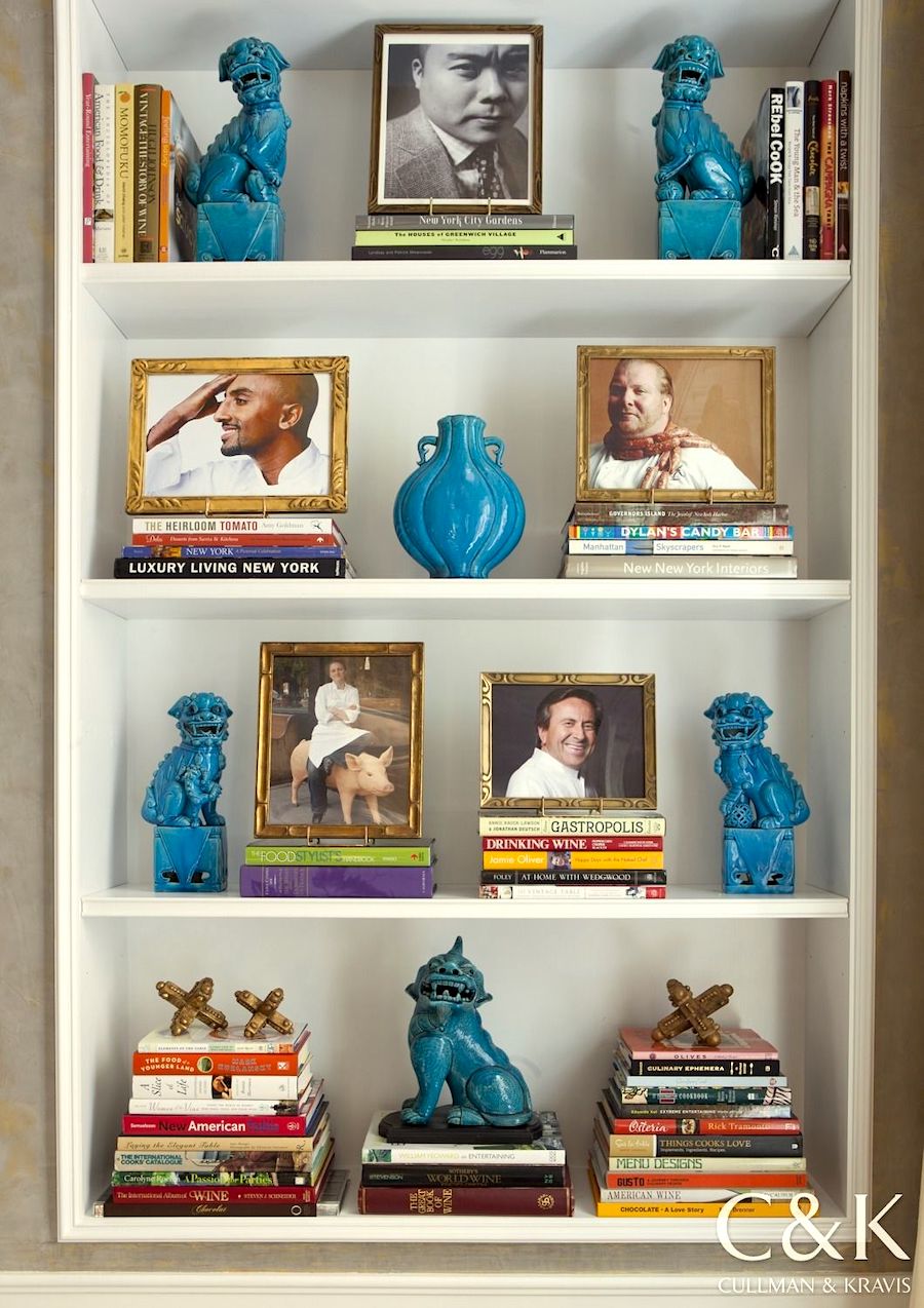
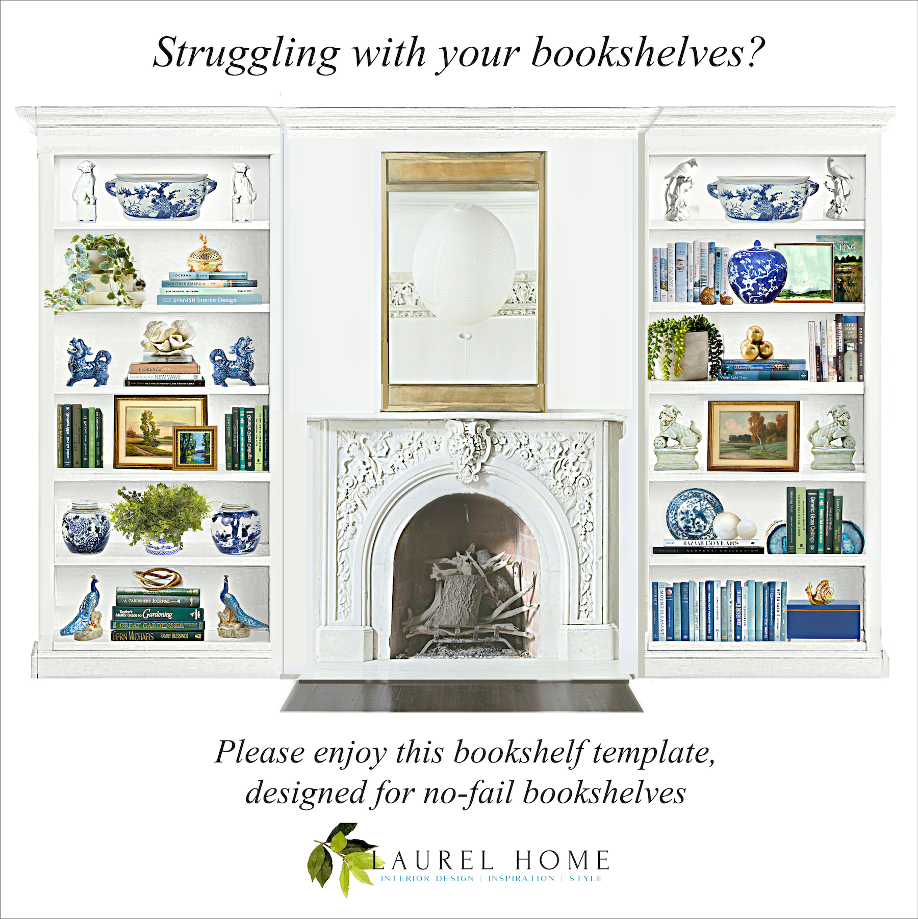
Gorgeous bookcase by Cullman & Kravis
I’m going to create a template for bookshelf styling!
These stylings, like the Laurel Home Paint and Palette Collection, will give you a jumping-off point. Thus, training your eye as to what looks good.
And, what doesn’t look so good.
However, there’s yet another problem.
The bookcase itself. There aren’t trillions of configurations and sizes, but there are dozens.
So, for this exercise, I’m going to stick to floor-to-ceiling bookcases.
I mean, if you have fewer shelves, then you can eliminate some. In addition, I think it’s possible to mix and match the shelves. Nothing is written in stone. Ever.
The other thing is that in the interest of sanity, I’m sticking to one basic theme. However, I’ll go over how to switch to another theme and color scheme.
(please note. I was barking mad when I wrote that last sentence. Therefore, please ignore what I said.)
Now, when I say “theme,” I’m using that word loosely because it’s a word that makes me nervous; however, I can’t think of another word at this point.
An example of something TOO theme-y would be a coastal (themed) bookcase filled with seashells, coral, glass jars filled with sand and beach glass, starfish, driftwood, lanterns, miniature buoys, and lighthouses. That would be a bit much, no doubt.
The word I believe one needs to learn when doing bookshelf styling is EDITING.
The problem with a lot of our bookshelves is they’re filled with disparate items like the picture frame your aunt gave you as a wedding gift with plastic flowers all over it. That’s juxtaposed next to a lovely antique silver pitcher you inherited from your great-grandmother. And, near that is artwork your third grader created in the manner of Matisse.
Believe me; I’ve been just as guilty of doing that kind of decorating as the next.
Well, Laurel, isn’t using a “template” going to have a kind of “paint by numbers” contrived look?
I don’t know. I haven’t done it yet. ;] Or rather, I’m in the middle of the first two bookcases. (and only two!!!) So, yes, I will address how to keep a template from looking contrived while still pulled together.
In fact, let’s just jump in discuss this point right off the bat.
Ideally, your bookshelf styling should reflect the rest of the room. Pretty simple.
Therefore, let’s begin with color. This is a great place to establish all of the colors used in the space. Or, perhaps there’s no color at all.
Like all interior spaces, I like to see both white and black and also gold accents in bookshelf styling.
So, what should one put in a bookcase?
Well, these days, not everyone has books. I know, some of you purists hate hearing that. And, that’s fine. It’s also fine not to color-code your books. You don’t have to do anything.
This is for people who want to have a coordinated bookshelf styling and don’t have a clue where to begin.
So, let’s begin with the books.
You don’t need to have books on every shelf. But, I like to have some going both vertically and also horizontally. And, yes, with the spines out, for God’s sake!
I know. Whoever started the trend of turning the spines inward is seriously disturbed. The same goes for books in plain wrappers. Obviously, we aren’t even pretending to be reading these books as they are purely decorative. And, of course, I’m being facetious. Well, it’s all fine.
If our shelves are from about 10″ – 13″ apart, then we can’t have anything taller than that. However, it’s okay to have some shelves that have more space to allow for taller things.
I didn’t do that this go around, but I could for the future.
There is a rule that it’s best to use uneven numbers for bookshelf styling.
In other words, groupings of either one or three. However, if you have a lot of shelves, I think it’s actually more interesting to make one or two, not exactly three elements.
Speaking of elements, how many can one have?
Well, if sticking with a strict color scheme, here is what I’m thinking.
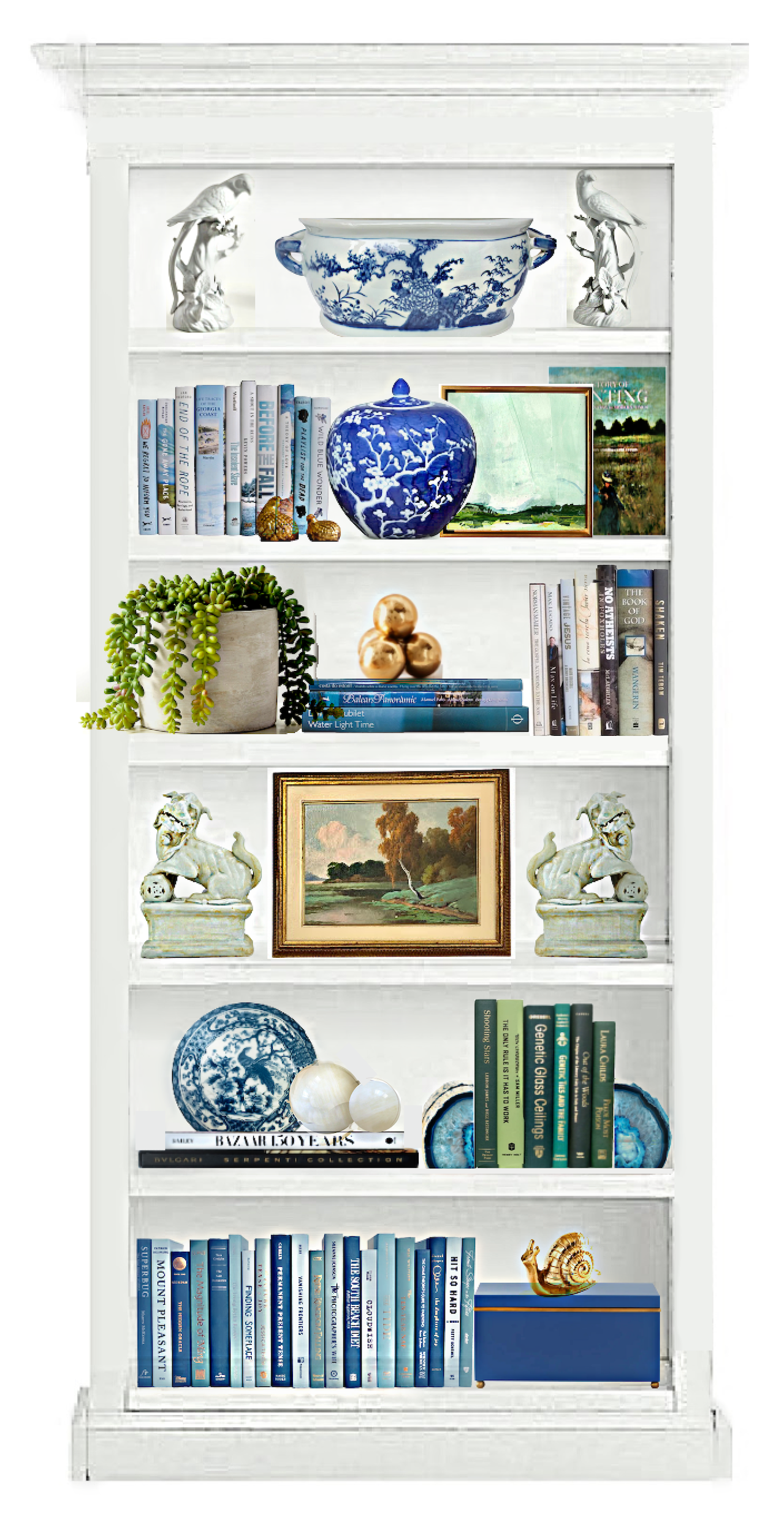
For my bookcases, I chose my favorite analogous color scheme of greens, blue-greens, and blue.
In addition to books, and in this case, they are in our color scheme; I love art. Here, we can introduce other coordinating colors into the scheme.
I also love greenery. However, if your bookshelves aren’t close to the light, and you don’t want faux, then you’ll need plants that don’t require a lot of light.
It’s natural since blue is one of our colors to introduce some blue and white Chinoiserie porcelains.
Porcelain figurines were added in the form of foo dogs and parrots. There are more small animal figurines in gold and a gold incense burner. And, I also included a small modern piece for a little visual interest.
I also love adding a box or two to the scheme.
Another thing to consider is form.
It’s a design element we did learn about in design school, but I don’t hear much mentioned about it today.
What do I mean by form?
Basically, it means shape.
In my bookcase, intuitively (because I really have no idea what I’m doing), everything that’s not books or art is of an organic form.
That is the unifying factor.
Curves and living things. And, these curves are juxtaposed against the straight lines of the books and bookcase itself.
So, now it’s time to stop yakking and looking at what I’ve created that I hope explains all of my points.
Don’t worry; there will be more explanation after the pretty pictures I created in Picmonkey. Here’s a tutorial for picmonkey, if you’re interested.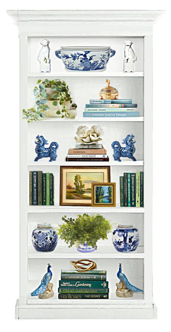 Initially, I had all sorts of grandiose plans to create an entire wall of bookshelf styling.
Haha.
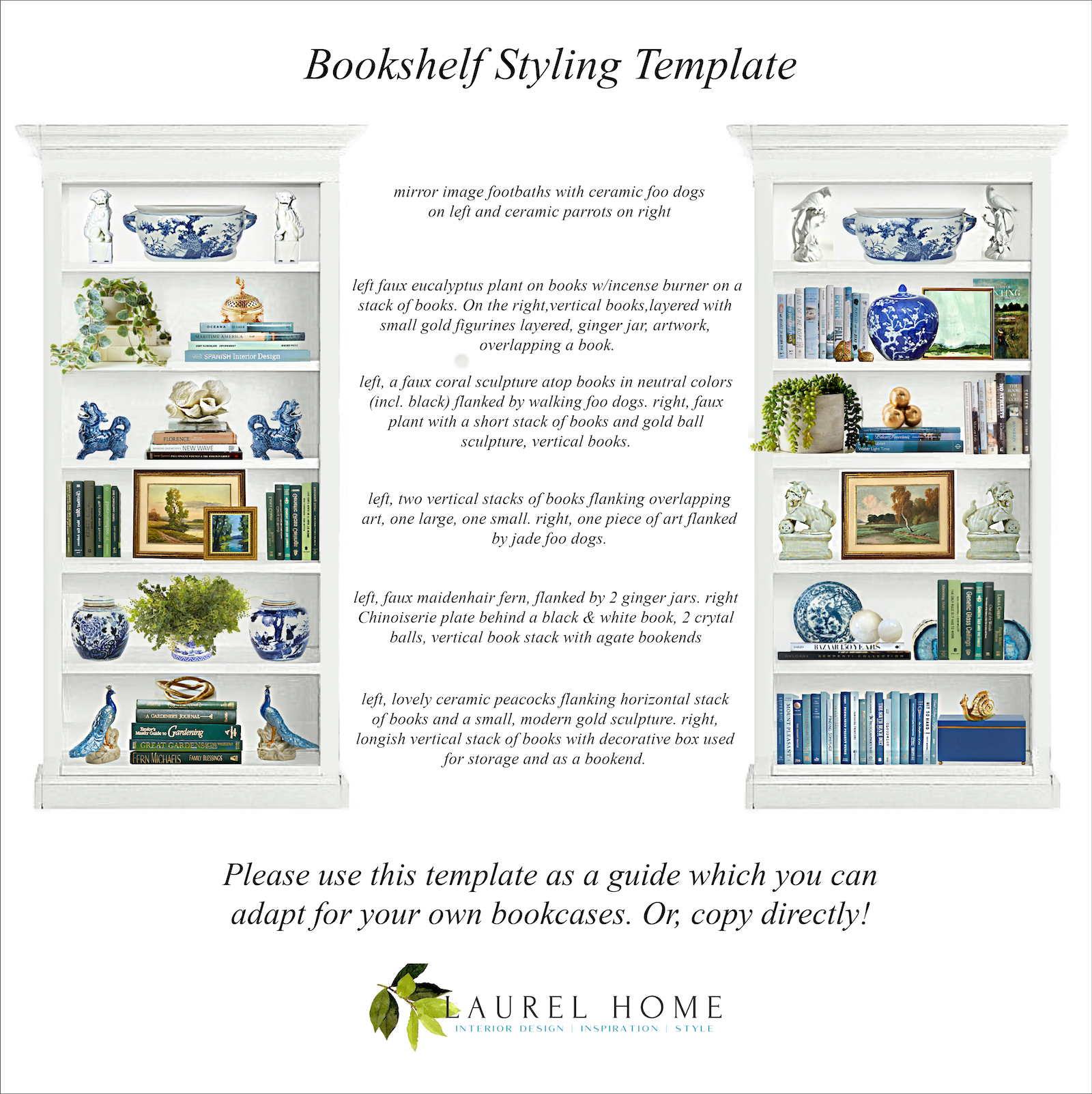
please pin to Pinterest for reference
Above is a graphic that explains the template.
Of course, your bookshelf might be larger or smaller. But, this gives a good starting point.
What if your bookcases are more narrow?
That’s an excellent question. In that case, you might only have one or two items in your composition.
Coming up will be a widget where I got everything for the bookshelf styling.
But, about the books. There are over 2,500 listings of these color-coded books on Wayfair at Booth & Williams.
And, some of the listings have quite a large number of books in them. However, they also sell books as singles. Some of them are pretty camp.
Okay. Most of you are probably not going to go out and buy everything.
I tried to keep prices low, but I know. It’s expensive, and you decorated your bookshelves by going to tag sales, etc.
Sorry, I have to make that bright, so hopefully, I won’t get a comment that says. “I get all of my home furnishings at tag sales.”
I don’t have a problem with that, but sometimes it feels a tad smug, is all. I’ve had times in my life when I couldn’t have afforded even a tag sale price. Hey, you can find some pretty great stuff for free, left on the street, too. But, that might take a while.
However, if you’re one who prefers thrifting, maybe you can find some of these things or similar at your tag sales.
But, here’s one thing I’d like to caution.
I realize the Homegoods is pretty terrific. I’ve gotten some home accents there and love them. However, if possible, I would not get everything from there. It IS a good thing to have some vintage or hand-made items, as well.
Also, you do NOT have to use artificial plants, and I have to admit that I’m in two minds about them.
And, yes, if your third grader’s art is super-special, perhaps it can be incorporated with the art.
My philosophy is pretty much “less is more.” But, still with some layering, as you can see above.
The idea is coordinated, not totally matched.
One of the worst things I see sometimes is when people do exact mirror images of their bookshelves.
It’s not that it’s bad; just a tad boring, in my opinion. So, I would try to avoid doing that.
And, definitely, this template is to be used as a guide. You can always add or take away. Or switch the order of the shelves. For example, if you have little ones, of course, you wouldn’t want anything breakable on the first couple of shelves from the floor. That is unless it’s my now 6′-3″ firstborn.
And then, it would be the first four shelves, at age two. lol, He was born TALL!

He was here a couple of weeks ago for a wedding gig.
 Some of you were asking about my younger son, Aaron. Here he is during that sweltering heatwave in Seattle at the end of June, and Cale was visiting him.
For fun and context, I added a fireplace I found in my photo library.
 please pin to Pinterest for reference
And, now for the shopping widget. Some of these items are one-of-a-kind, but most are not. A few things might not be in stock, but I tried not to include anything that’s only going to be in stock next March. :]
I also added several items that aren’t in the bookshelf template. Please click on any image to learn more.

Well, I hope you enjoyed these bookshelf styling templates.
If you do like this idea, would any of you be interested in, say, my doing this as a seasonal thing? Obviously, this one should’ve been fall.
I could also do a more contemporary and earthy bookshelf styling with neutral colors. Or, it would be fun to do a stylish coastal bookshelf styling that feels appropriate. And, without being obnoxious, as talked about earlier.
I could also do an entire wall of bookshelf styling. Say, like four or five separate bookcases.
Now that I’ve done this one, others won’t be as difficult. I don’t think, anyway. But, maybe I’m still deluding myself!
I hope you’re enjoying the beautiful day!
xo,

PS: Please check out the newly updated HOT SALES!
Related Posts
 Enchanting Garden Tour in Greenwich Connecticut
 Eegads! My No-Fail Paint Color Failed. What Went Wrong?
 Bathroom Design Inspiration – Revisiting an Old Project
 20 Stunning Lifestyle Instagram Feeds You Must Follow
 Classical Interior Architecture, The Most Important Element
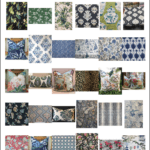 77 Budget Fabrics That Look Rich + Sources!
 F&B Calke Green + An Iconic Wallpaper = Kitchen Heaven!


55 Responses
Hi Laurel – love this post! And yes, styling for Fall the same shelves with more neutral colors would be interesting. I live in Texas and of course everything here is huge. 😉 The style here in newer homes is to have a large living room fireplace flanked by enormous bookshelves. So they are the size of at least two of your examples put together on both sides of the fireplace. Any thoughts to style and fill them out without getting too cluttered? Would also love a post for coffee table styling if you haven’t already written one. Love love your blog! Thank you!
Just got around to reading this post. I love the templates. The shelves you designed are beautiful. Now if I could make mine look so good….
Hi Laurel,
I love this post! Styling shelves is a skill I keep trying but have never mastered. The same skill is required for styling surfaces. Coffee tables, nightstands.
And I certainly wouldn’t be mad if you posted templates for seasonal shelves. I’m excited to see more!
Lisa, come on we know no one ever read or reads those decoratively placed coordinated stacked books 😜😜
Books that got read have bent warped spines and pages 😉☺️. Always, always.
FWIW, my dream is to have artfully arranged shelves and it’s taken me 20 years to still not be done. The thought of having to redo seasonally makes me want…. Cabinets… with doors…😂😂
Oh how I love books, and I have some beautiful ones! But in my new (very old) home, aside from my husband’s office, there just isn’t a place for a traditional book shelf :-(. So, how do you feel about casually stacking books here and there? I’m not opposed to an artist-y, boho kind of feel. Right now though, I’m drowning in messy chaos – papers, folders and books, oh my!, and my brain can’t handle it ;). Thanks for any insights Laurel ♥
I already commented but btw I was so glad to hear you say what you did about turning book spines inward… if books are so objectionable to you in appearance, you should skip them – you are not fooling anyone that you are a reader if you make it so that the titles are not visible! And I am a massive fan of white interiors, but books are books and they have colors.
Thank you for your thoughtful post. It will be a big help when I fix my book shelves. By the way, I know who started turning book spines inward, but, then, I think you also know 😉.
This is yet another fantastic post I’ve saved to Pinterest. I love your explanations, details and illustrations. Please do more of these. Thank you for the inspiration!
Great stuff, Laurel – thanks!
Unfortunately I have way too many books for the shelves I have… and I need them for my work. So no downsizing there!
But, of course, your template could be used in another room – if I just want a nicely styled bookcase, cupboard or such?
Shipping to Norway (not to mention import duties, VAT and such) is prohibitely expensive, unfortunately. Will have to keep an eye out for anything resembling blue & white chinoiserie at our local thrift stores :).
Have a great week to you all!
So helpful, thank you! I had just pulled everything off my built ins and your template worked very well to help me put them together. Still a work in progress but a great start!
I love this. So helpful. Thank you!
Love these templates Laurel, and would love to see more. And yes on the seasonal – I’d love to add seasonal touches to my bookshelves without them looking to “themey”! (Is that even a word?) But also agree with Lisa – I need help with my etagere, which is really sort of a 4-sided bookcase, right? Your son is cute, and what a head of hair!!!
This is my absolute favorite thing to do in decorating. In my former house (recently moved from) I tweaked my bookshelves all the time possibly because I have an obsession with buying antique books on Ebay! I’ve gotten so many deals there…even if the seller doesn’t have the make me an offer box, it doesn’t hurt to try! I have found many beautifully styled bookshelves on other blogs and made a Pinterest board that I sometimes use. We are building a new house that house more bookshelves than the NY Public Library, so I’ve got quite a job ahead of me. I like using white coral on my shelves too (they were all painted dark on the inside, so the white pops out), and really like your use of white in your templates, especially the spheres! Will copy that from you! I wish I could share the last pic I took of my shelves in the den…it was my favorite, and I’ll be using those pics to style by in the new house. Love this post! Thank you!
A seasonal post would be wonderful with your eye for detail, balance and color combinations. A careful curated approach vs. displaying every decoration ever owned is a great lesson in less is more. I so look forward to each of your posts and all the great advice, tips and your uplifting & humorous approach to life. Thanks for being YOU!
Absolutely fantastic post! I love your green/blue color palette.
Your son is adorable, I’ll bet he’s quite popular with the ladies!
Ya, I don’t see the buying widget either on my iPhone or iPad. I have to open on my desktop. Not sure about a laptop as I don’t have one.
Hello Laurel, Recently I was looking up some searches about shelf design. Most of the photos were not too spectacular, but when I found a picture that I really admired, it turned out to be from your blog! I keep hearing about the rule of threes, but I have a cabinet with only two largish statues on top of it, and it seems ok to me, but perhaps my sense of proportion is off. I have tried adding a third element, sometimes taller or more colorful, but everything makes it look worse. For bookshelves, I prefer having the tallest shelf in the middle, then you don’t have to bend over to lift the tallest and heaviest books.
–Jim
Please🙏💝🥰😉 what can we do with your’s,and mine, favorite etagerie in gold? The link for the narrower shelf isn’t working ?!?
And my new condo MUST HAVE THAT ETAGERIÉ…
PLEASE HELP, I LIVE AND SLEEP BY YOUR MORE THAN ENJOYABLE POSTS💕😇❤️
Thank you for your post….perfect timing for fall. We have two 6.5 ft. bookcases flanking a triple window. Both loaded with books and a few treasures. I would like to put something different on top of each. Sloping ceiling with heat/cool register is directly above in the ceiling. Objective is to draw eye away from register…or not. Your thoughts?
Hi Laurel,
This is my first time commenting. I’ve learned a lot from your posts & appreciate your tips. I would love for you to do a template of an entire wall of bookshelves with a fireplace as well as a contemporary and earthy style. Thanks again!
Mondria
Another great post!! Laurel I don’t know how you keep thinking up great new topics week after week…but you do!!
The beauty of this template is that you could mix and match or subtract as needed!!
I am kind of a minimalist and struggled with my bookshelves in my new build for several years as everything seemed too busy. I was beginning to think we made a mistake building them. I finally haven’t touched them since 2019. This post would have helped a lot as I love how you use larger and fewer items.. I would look forward to your take on adding seasonal touches and tweaks for different decorating styles. Thank you for sharing!
For people with a lot of books (guilty) you can have a deeper bookcase made and place most of your books at the back of the shelves, then “merchandise” in front of the books. I do this in a wall unit I had made 30 years ago and it looks great. The shelves also provide enough depth for my vintage receiver, my turntable, and my albums. (This is not a focal point wall unit, but rather one placed on a secondary wall.) In my den/office, I left a couple shelves open for display, but filled the rest with books. In my bedroom, it’s two shelves for books, four for displaying stuff. And yeah, my Kindle is full too. What can I say. (I do refer to all these books from time to time, so I’m keeping them; lighter reads are donated to thrift stores.)
Laurel, I always look forward to your blogs and reading them with my morning coffee. I’d love to see a color scheme of brown and white. I have collected pieces of brown & white Chinoiserie and with Fall approaching it may be fun to see?
First, I must tell you that your blog is my “go to” each morning with my large mug of tea.
Secondly, I cannot thank you enough for all the information I have obtained from your blog. I have archived many of your articles.
Thank you so much for your expertise and experience in the design areas (pretty much all the design areas) I get confused with.
I, and my home, Thank you!
Laurel, I really enjoyed this post and you have such a good eye. I know that you love symmetry, and I’m just the opposite. I must have balance but I don’t like everything symmetrical. I’d love to see you style a bookshelf with less symmetry in a way that you feel looks good.
I also am an avid reader, but over the past few years have been lightening my load and letting go of things like too many books that I’m never going to look at ever again. I realized that that doesn’t bring me joy, only dust.
And I’m going to reiterate a question that another commenter had: why do all designers seem to love using the blue and white chinoiserie? I’m just not a fan.
And I probably spelled that wrong, LOL.
Would LURV to see more templates, including contemporary looks – bring ’em! I adore your styling and timeless advice, and enjoy applying what you teach us to my mid-century style home. Seasonal would be very fun!
Very nice. I love the balance. My issue, or I should say my husband’s and my issue is that we are readers – big readers. While it is wonderful to have a town library – both of us like to own our books. I have a wall of built-ins in the family room, a wall to wall bookcase in my study, same in my husband’s, not to mention a lovely huge floor to ceiling antique case i n the living room. All are filled with our books. I have to admit that in the antique case I have displayed some silver and porcelain pieces we inherited from my husband’s family along with our books. So what would be great Laurel is if you could post an add-on piece as to how to handle large collections of books – when you do not have one large room to dedicate to a library. That is the plan for our next home. Oh – I do cull the books and donate in order to keep the volume from overwhelming our home.
Laurel add one more to no widget.
Lovely Laurel,
So pretty as usual
But I have too many books and no room for all those
Tchatchkas
Is there a way to style just the books. I have mine by subject. Actually could use more bookshelves too.
Maybe suggestions for so many books😉
I really appreciate how specific you are about styling. I’ve been following for a while and I have so much more confidence in the choices I make.
I think I remember you doing a post on quality faux plants but I just can’t go there.
Of course, real plants can’t live indefinitely on a book shelf but for the cost of a small bouquet one could use real plants on their shelves. Just add the purchase to your grocery list…you won’t be replacing a potted plant as often as cut flowers.
This is such a fabulous post. Everything on your bookshelves is perfect and I would love to see other themes and colors. Yes, please do this again, it’s been so helpful and enjoyable.
Love this Laurel! Thank you so much for sharing this!
Would love more of these!
If you remember I have unfinished bookcases in my home.Thanks to your template, it’s time to finish them up.
Love this post! Styling my bookcases every season is a favorite of mine and what you styled are my colors exactly! I just decorated for fall and already thinking about the holidays because I know shipping delays of last year will only continue. I’d love to see what you would do for Christmas. I love navy and red and plaids. Also, the widgets did not show on your post for me. I’d like to look at the art work you posted do you have another link?
Very helpful!! Would you consider offering a few tips for open kitchen shelves? I prefer not to store dishes there and would like to incorporate small art, pottery etc.
Thanks so much for enjoyable and instructive blog!
Beautiful post! I know it must have taken forever to put together but your faithful fans really appreciate it. Timely, too, as we just had built-ins put in flanking our fireplace; with 12′ ceilings they are a bit daunting. I am pinning this post and will refer to it liberally.
Your oldest is handsome, reminds me of John Krasinski in that photo!
Thank you, thank you! I struggle with this always. And yes, I would love to have more.
Would also love seasonal styling of a fireplace mantel
Agreed on the above: that seasonal styling would always be welcome! Also glad to see both your handsome sons. Thanks for all that you do, Laurel!
Of course we’d be interestedn in seasonal bookshelf styling! Thank you Laurel. 🙂
Laurel, thank you so much for the photos of your two handsome sons. I have been reading the blog for probably 5 or 6 years and since you mention Cale often, I had wondered about the “other son”. I am happy that he has contact with his brother. You really honor your readers by sharing yourself with us. Laurel the person is as much a reason I look forward to the posts as is the valuable interior design content.
Sherry
The widgets never work for me anymore. Using an iPhone 11. Any suggestions?
Laurel, very nice post and very helpful. I have a wall of 3 floor to ceiling sections, which I am going to study with these principles in mind. I painted the back of the book cases a lovely blue which works really well in my space, but was wondering if you have any advice on how to style against a colored background? And yes, I am very interested in further posts on styling bookcases! Thanks!
Your blog is wonderful. I already had a board in Pinterest titled bookshelves, and I have loved them forever. I am of the more is more family, and your post has caused me to rethink what I have. Poor book lovers, we are obsessed, and there is no hope for us. I cannot throw a book of any kind in the garbage.
Thank you
Beverly
I would love more shelf styling posts. I can do table tops but shelves can be tough. Mine are very wide (twice as wide as your example at least) on each side of my fireplace. I wish there was a divider in between but there is not.
Dear Laurel,
First, I want to be supportive of your story about Aaron. I feel your heartache. My mother had a lot of heartache regarding my sister. These are forever wounds. Anyone giving you negative feedback is just wrong. As one of my mentor’s used to say: Everyone is walking wounded. At least you know he is connected to the rest of your family and you get reliable news on his situation.
Next, my bookshelves are crammed with books although I try to make some space for accents. Could you do something for those of us who have a serious book collection which is always threatening to run out of room? I have some beautiful accents I have collected and had more room in the house I just sold but am downsizing one whole wall of built-in shelves.
Finally, my offer on a 1987 no style California ranch (actually I don’t even think it is a ranch really, just single story) has been accepted and I am freaking out about everything from price (as in did I overpay?) to crime in the area. Beggars can’t be choosers situation.
It has cathedral ceilings with three windows you will hate (I know from reading the blog). It has those silly half circle windows over rectangles. Most of the cathedral ceilings are fine, but the second bedroom (my future office) has weird angles in the raised ceiling.
Anyway, as I said, beggars can’t be choosers and I was willing to sacrifice a lot to be back in Northern California.
I’m not asking for help right now, but I might if the sale actually goes through. The good things about the home are:
lots of trees on the small lot, including two very mature redwoods
a private garden accessible from living and master bathroom, wonderful fencing all around creating privacy, four separate and distinct gardening areas (many of the plants I would have chosen myself), no barriers for me as I have some walking disabilities, a double sided gas fireplace — dining room and living room, upgrades which I would not have chosen but can live with, lots of light partially because . . . those ridiculous windows, generally cheerful aspect to the house.
Anyway, I had to share.
I’d be very interested in seeing more posts on bookcase styling.
I live in earthquake country so when I moved to my own home in March of this year I chose ones that are around three to four feet tall. Those are far more comforting to me than taller ones. One is a custom-made high-gloss white one with a 30-inch depth that has items I love: my nonfiction books (by category), a silly lobster, small architectural models of famous homes, and more. I can’t think of a theme other than “these mean a lot to me.” And there is a lot of white space.
Laurel, I have to ask why you, and so many designers, seem so crazy over those blue-and-white Chinese vases.
PLEASE do MORE bookshelf stylings…..in various decor styles and colors. This was a fabulous post!! Kudos on a job well done!
Thanks so much, Mardi!
A very basic practical question: how do you prop up the artwork on your bookshelves so it’s at the appropriate depth and angle relative to the other things?
A less basic question: what if you have more books than you can shelve with this ratio of books to objets d’art? Do you recommend some shelves of just books, or trying to make the beautiful displays you’ve given us here book-denser?
Thank you so much for a lovely post! I’m going to try rearranging my shelves tomorrow.
Hi NKW,
Great questions. I would put the extra books on the two bottom shelves. Or, you could also create more book-heavy shelves.
Museum putty is helpful to keep things in place. Otherwise, sometimes it requires a little playing around with. And, also it’s fine to vary the distance between shelves, if they’re adjustable.
I love it. And I love books with the covers turned backwards so they’re all white too. Don’t hate me 🙂 But Mario Batali’s got to go. The horrific things he’s done to female employees – ugh!
Hi Sandra,
How could I hate you? If the books are purely decorative, then it matters not.
Late or not, Laurel, I always enjoy reading your posts. The bookshelf styling is beautiful and makes me aware that I need to purge my bookshelves. Something book owners should be aware of though, is that stacking books on top of each other can be hard on their spines. Of course it depends upon the weight of the books and how long they are left that way.
Oh, I didn’t know that. I guess it’s best not to pile them too high, then.