Dear Laurel,
I’ve been reading your blog for several years as we’ve been working towards restoring our 125+ year old brick Victorian. Your paint color posts- especially those about dark color choices– and “unkitchen” ideas are some of my favorites.
I think I’ve read every post you’ve done on curtains and feel pretty comfortable on how high, interior/exterior mount etc.
- How to get window treatments like you see in magazines
- Window treatments for difficult windows
- Some favorite window treatments
- Roman Shades
- Woven Wood Blinds
- Window treatments are the least of her problems.
- Bay Windows
But, where I’m paralyzed with fear is picking out the type of window treatment.
There are so many window treatment styles. And then there are all of the details! There is so much to pick from and I’m afraid I’ll make a choice I’ll regret.
When considering window treatment styles, how do you know if you should do a pattern, a solid, a trim, a valance, etc.?
We love our 11 ft. tall ceilings but it means every panel needs to be custom-made. We’ve been living with too-short leftovers from the old house. Or, cheap roller blinds in nearly every room for the past five years. I’m ready to do something but have no idea where to start. Could you do a post on how to discern curtain style?
Thanks for considering the topic!
Gloria
Oh wow! Thank you Gloria! It’s a topic for sure, but it’s HUUUUUUUGGGE!!!
There are so many window treatment styles, but over the years, I fell into a groove, because I realized that most of them are not for me.
And here’s the other thing when considering the plethora of window treatment styles.
A lot of them are not historically accurate. And sometimes even when they should be!
You mean, window treatments are ersatz, sometimes, too, Laurel? You mean all of those traditional draperies we see that cost a bloody fortune are fakes too?
Okay, before I get myself in some serious hot lava, one of the biggest issues is not the window treatment styles, but the… yeah, you already know.
THE WINDOWS.
Poor Gloria and her 11-foot ceilings. Life is so rough. ;] You know, I’m just joking you and really am insanely jealous!!! I’m sure that your home is beyond magnificent!
We talked last Sunday about the short and squat, so it’s only fair that we devote a few lines to you lucky dogs out there with soaring ceilings.
Alas… you’re going to have to pay to have full length custom draperies made most likely if your drapes are to go right underneath the crown moulding. However, Wayfair has hundreds of curtains that are 120″ which might be just fine. (that link takes you to them)
And also Williams Sonoma Home has ready-made curtains that are 127″. The thing is, with a panel that tall, I would probably do a panel and a half. But, if your windows aren’t more than 40″ wide with the moulding, the single panels will probably be okay.
But, one other trick that I did a couple of times for clients who had draperies that were too short, was to have my workroom add a deep hem in a contrasting fabric to their old drapes.
However, I’m talking about the glut of hideous windows that are out there. And I can’t go into all of them. But, even a bank of windows butting up against each other, is not historically accurate in terms of 18th and most 19th century architecture.
So, in all fairness, it presents an extra challenge.
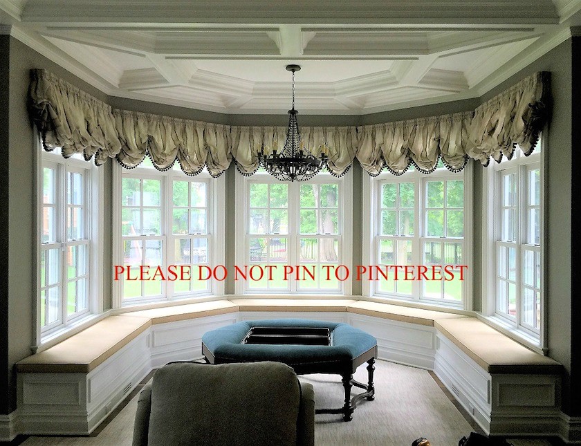
Like, when we’re presented with some monstrosity like this.
I don’t know how I came upon it. It’s actually for a company that made the window seat. The window seat is fine.
So, what is wrong with this window treatment?
Besides everything? lol
First of all, this style simply did not exist until modern times; nor, should it. And, that continuous string of loops is bad design. At least not to the best of my knowledge and we’ll be getting to that in a sec. But, even if it did, putting this huge horizontal thing is taking these lovely windows and making them look awful. It’s like a really tacky prom dress. And, especially with the polyester sheer, but lined (it looks like) fabric.
What’s really making me crazy is that this treatment is merely decorative.
If one can call it that. I call it an eyesore.
There is no reason to have it there. Yes, it does provide a little light control, but it does nothing for privacy issues if there are any.
However, please know that when you do a window seat, you are limiting your window treatment options. I would most likely do five inside mount Roman Shades, in this case. For more about Roman shades, click here. Or, I might do some woven wood blinds which you can read about here.
Could you do curtains here?
Well, yes, you could do short curtains, but most of the time, except for a boy’s room, I don’t think I ever did them. And, you could also do individual cafe curtains.
But, when talking about window treatment styles, how do we know what IS historically accurate?
Well, let’s see if we can come to our own conclusion.
I have done my research, although, I pretty much already had the answers.
But, first let’s go back to see the best evidence we have of the time before photographs.
Fine art work.
Sadly, there are not millions of paintings that show windows and window treatments. And too funny, but I kept running across images in my google search related to one of my favorite posts about transom windows.
My google search centered around 18th century oil paintings window treatments, or curtains or draperies.
But, one image goes back to the 17th century and the rest are 18th through mid-19th century.
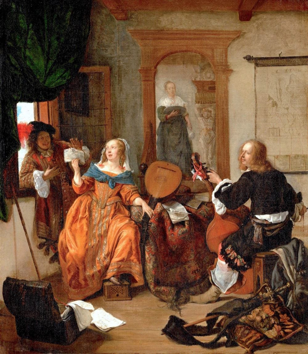
A Dutch painting
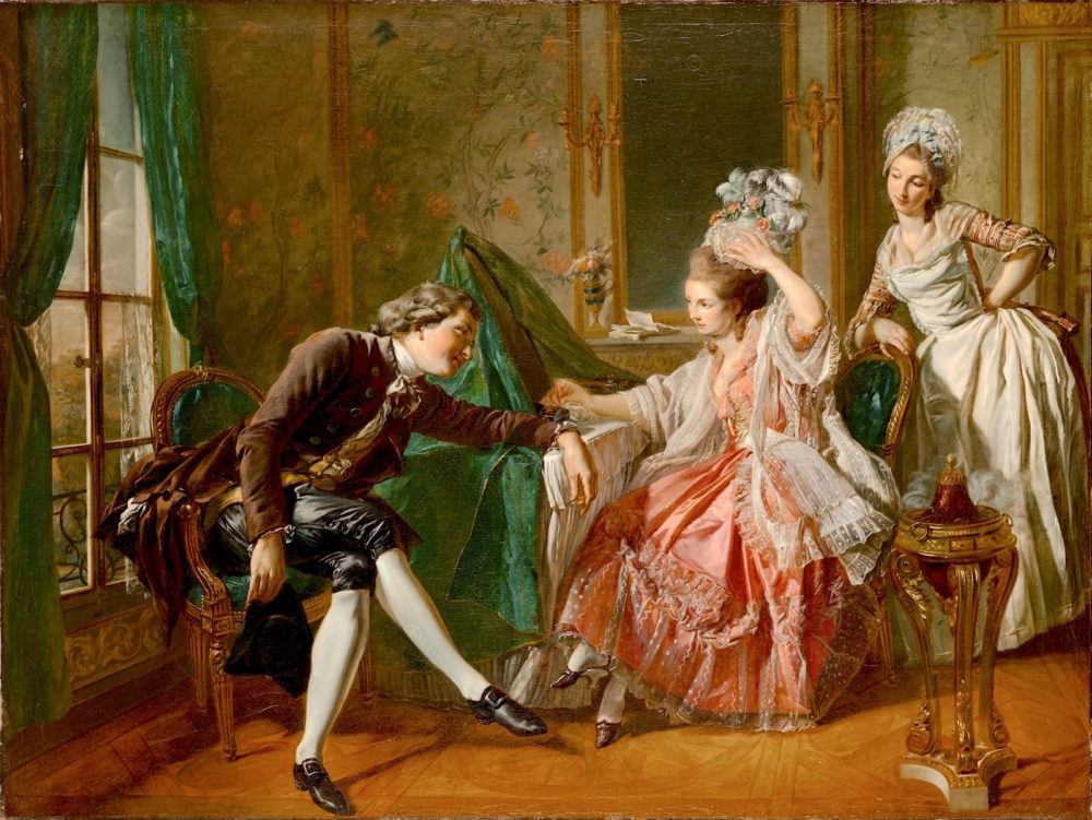
Louis Rolland Trinquesse, An Interior with a Lady, her Maid, and a Gentleman, 1776, oil on canvas
Don’t fall for it honey! He’s messing with your pretty head!
But, look, more green. Very simple green drapery with tie backs.
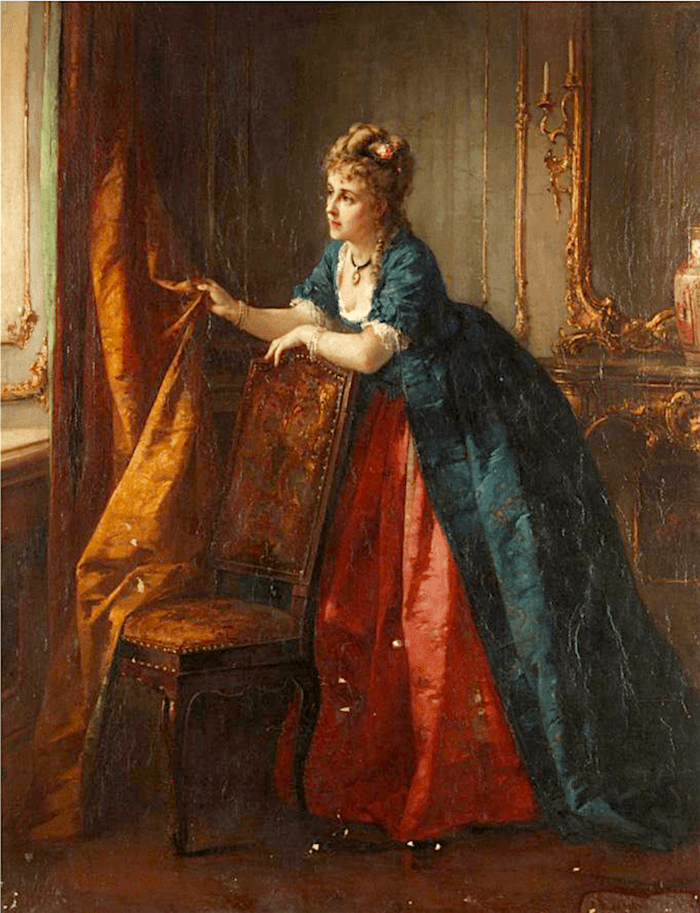
By The Window – Otto Erdmann – oil on canvas
Amazing colors, I think. This painting obviously needs some restoration.

mieris, willem van the poult – genre scene – sotheby’s
That’s crazy pants!
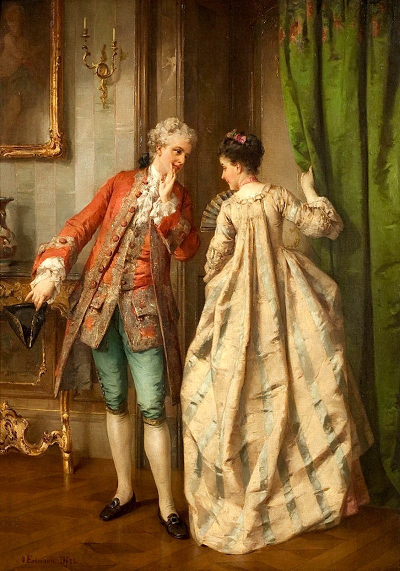
Otto Erdmann – The Appointment
Appointment. Indeed! I think it’s more like, “Hey baby, wanna split this joint and go hang for a bit at my place? Your husband doesn’t have to know and besides, his doctor’s appointment should last all afternoon. hehe…”
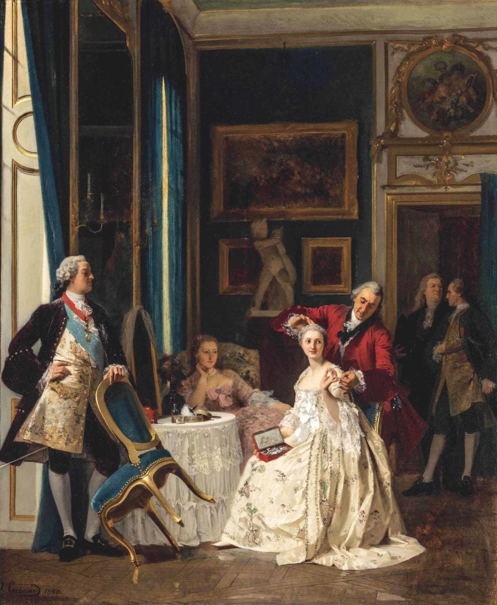
Don’t you love it. These people have nothing better to do than to watch a woman getting her hair coifed. It looks like her husband is about to throw that exquisite Louis XV-style chair at someone, however. Jealous, much?
But look at that shutter style. It’s like the door style I love so much at Metrie!
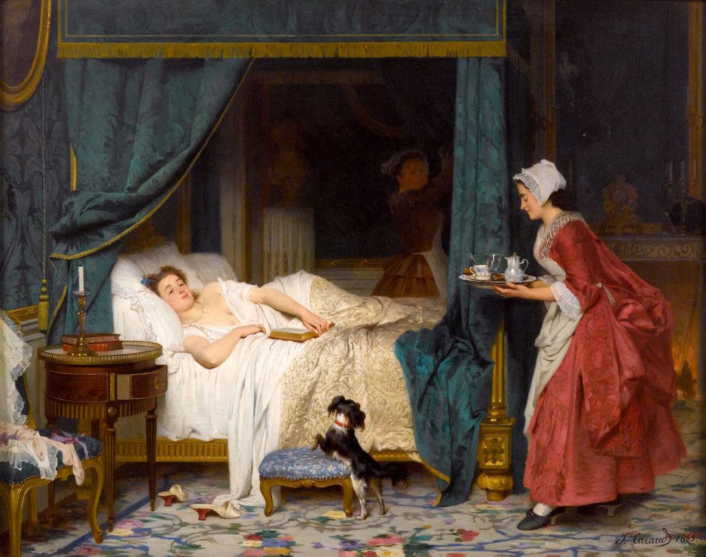
No, this is not a window treatment, obviously. But, I just adore this painting. Love this artist’s work and the way he captures expressions so well. And, also, his technique, the colors…
Oh, and, the maid dutifully bringing tea to the young woman who is upset because her boyfriend has apparently ghosted her.
Coward.
But, I imagine when she gets rid of the sad punim, that she’s actually quite cute. So, I’m sure that better days lay ahead for her.
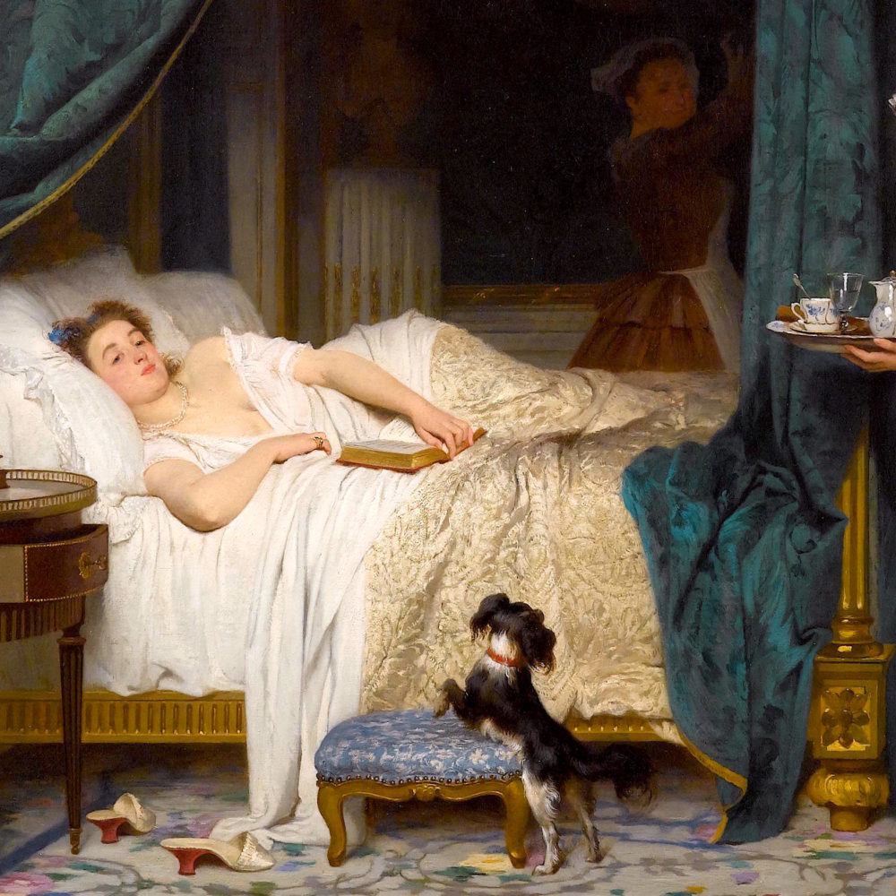
Zooming in… This is exactly how I was this morning; except no dog, no maid, (actually maidS) and no sumptuous gold-plated four poster bed with silk damask bed hangings. Poor dear.
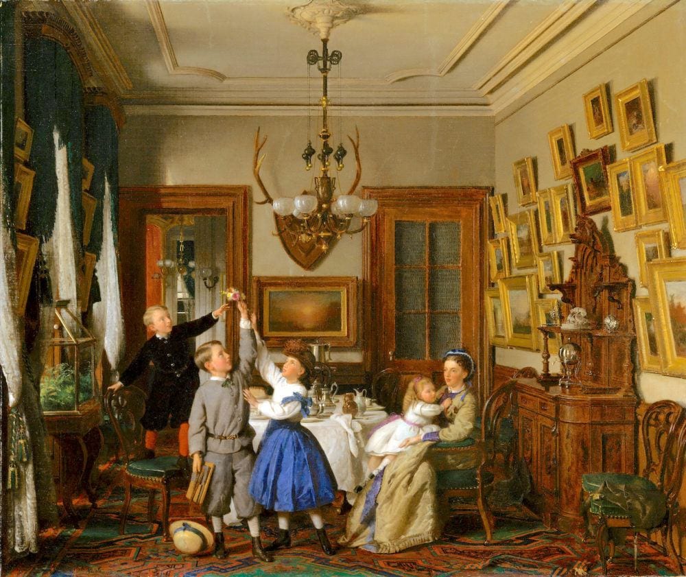
Family-of-Robert-Gordon-in-Their-New-York-Dining-Room-Artist-Seymour-Joseph-Guy-1824–1910
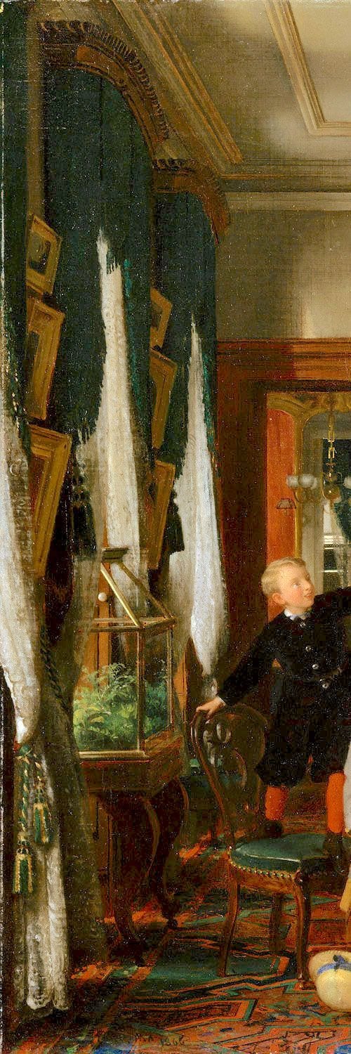
Here’s a detail shot. This is the most modern one, possibly. This is decidedly Victorian and a heavier window treatment.
But, let’s look at some current day examples of window treatment styles from a historical standpoint.
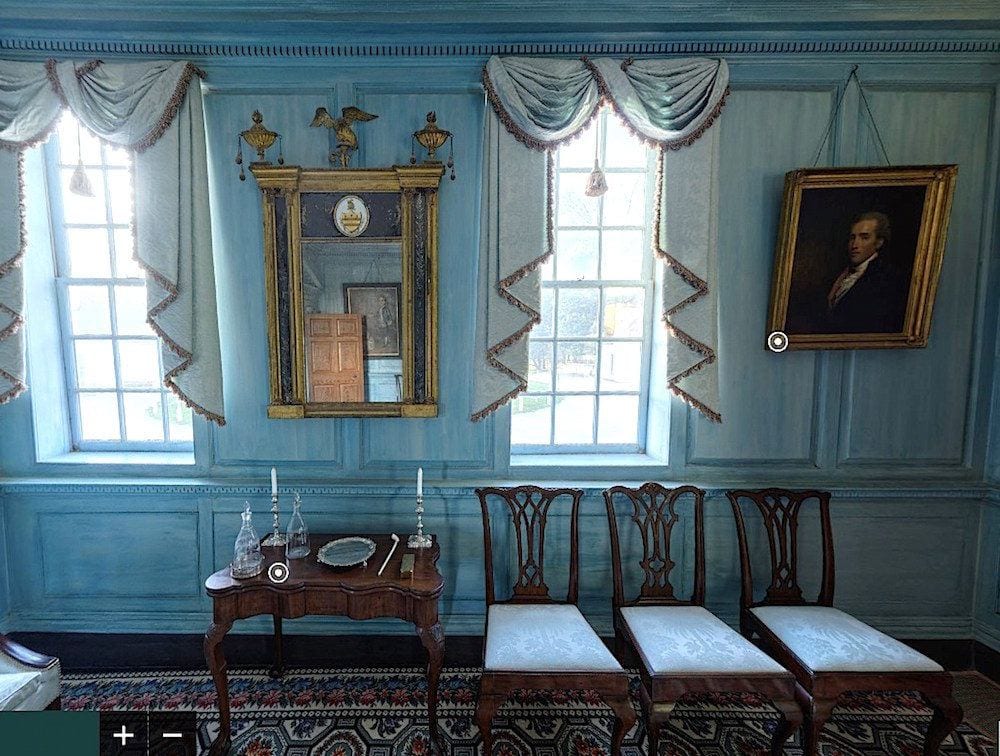
I found this image on my friend and colleague, Linda Merrill’s beautiful blog. It is of George Washington’s Mount Vernon. I think that the swag and jabot look terrific and appropriate for this home. But, really. This is about as formal as they were back then. Gorgeous restoration of this historic home!
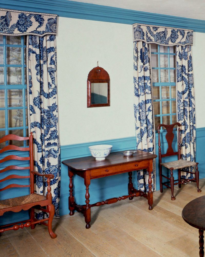
John Hewlett House blue and white period room Met Museum
The small cornice is lovely and I like the blue and white print. Please note the “clashing” blues. But, I like that a lot.
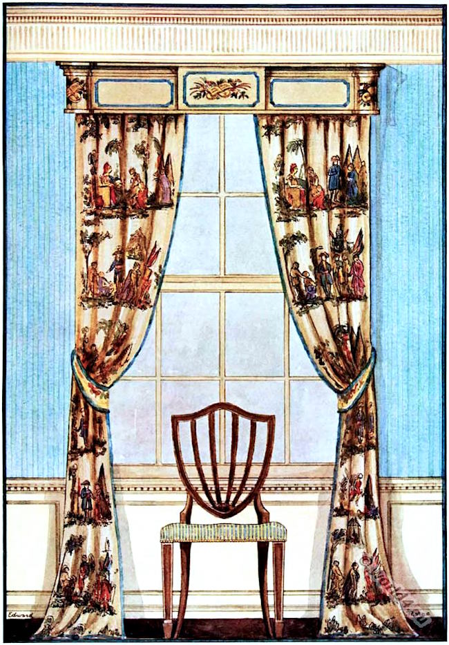
window treatment – cornice – late 18th century American Colonial
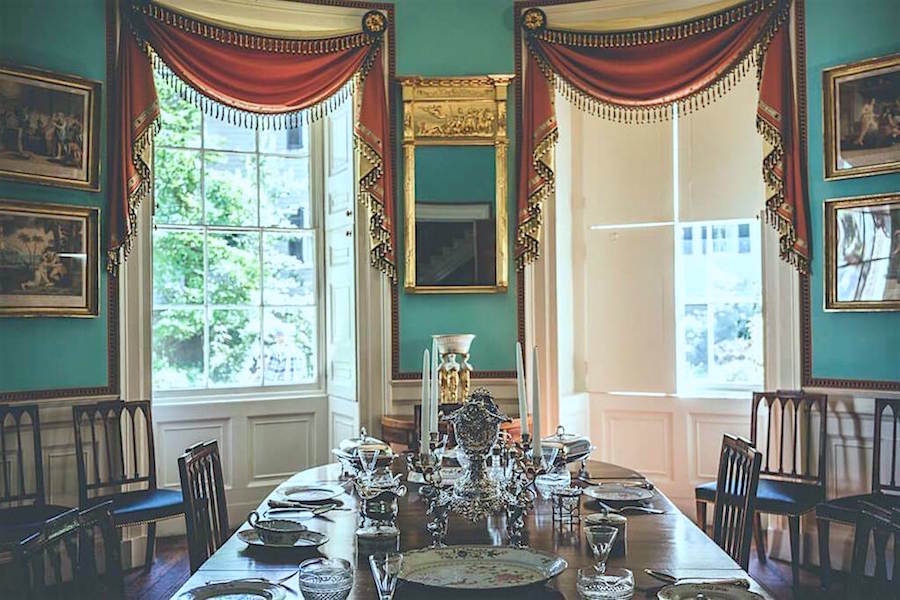
nathaniel-russell-house-via-yrofthemonkey
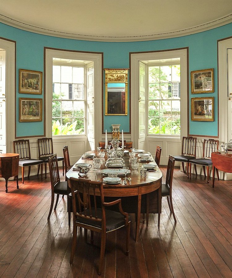
The-Nathaniel-Russell-House-Museum_2018_Dining-Room.Credit-Rick-McKee
In this more recent image, there is no window treatment at all!
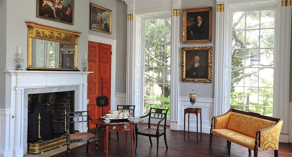
And, one more final beauty from the Nathaniel Russell house museum – Charleston, SC
Of course, the window treatments are the shutters. It’s let the light in or closes it down altogether, along with the hurricanes should they dare to strike.
And, in Thomas Jefferson’s Monticello which you can read more about here, the window treatments are light and serve to lightly filter the light and soften the window. But, are they even necessary?
Not really.
Okay, what are the conclusions here?
Well, it looks like we’ve come full circle. Because in recent years, window treatment styles have gone lighter and lighter. And frequently people go without them altogether more and more. And, that was also the case 250 years ago!
So, now I will address Gloria’s other questions.
Some of this is also probably included in the other posts about window treatments. (see above in her letter) So, don’t forget to take a look over there, as well for info and ideas.
In my design process, the LAST thing I figure out along with the paint color (usually) are the window treatments. And, that’s because the window treatments are right there in your face and if your room has a lot of windows, it is vital that you get that one right.
And, you can’t get the window treatments right until you know what else you’re doing.
Honestly, I think I did a swag for someone exactly twice. And, it was because they insisted.
Even 22 years ago, I did not feel they were usually appropriate. And if I did do them, the jabots (side pieces were loose.
If you want to see a lot of horrible swaggy draperies, check out the granny decor post. I don’t need to put any others here. Although there is such a thing as an elegant swag such seen above at Mount Vernon, but all of the other elements, horns, rouching, and gobs of fabric, to me, is just not my cup of anything. However, I know that some people do still like all of that.
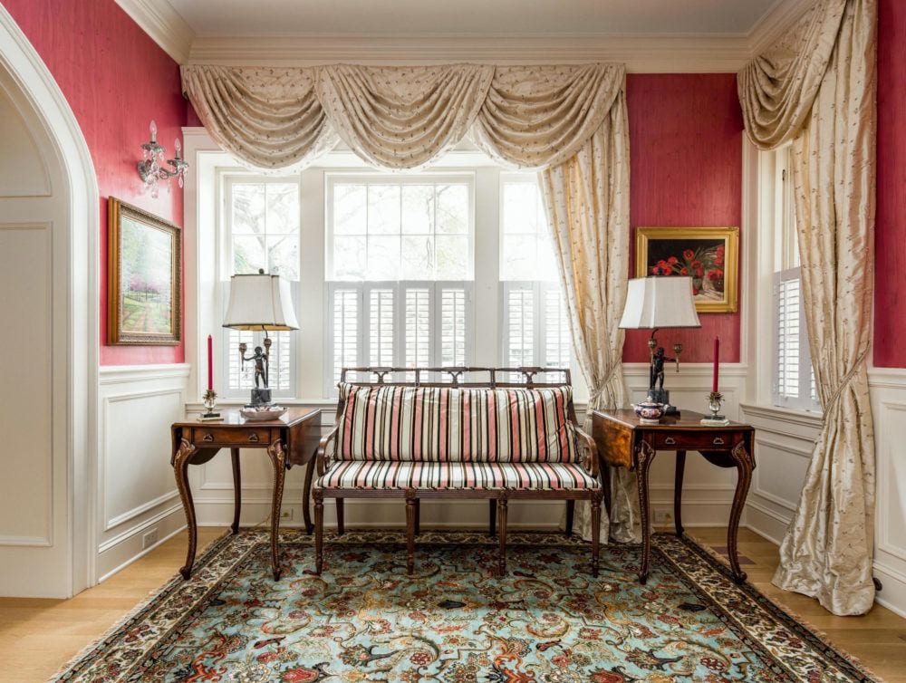
This is not terrible but is terribly common and according to what we’ve seen, not right. It’s too contrived. That’s the word I’m looking for. Plus, I would have a panel going down on the other side. And those end tables are too large, I feel for the settee. Then again, the entire composition is not good because of the asymmetry.
Therefore, if you’re one to do as I say, then forget about all of those elements. No need to crowd precious brain space with that which is of no use. haha Otherwise, of course, you can do what you feel is best for you and your home.
And, while I did valances on occasion without any draperies underneath, the last time I did that was about 20 years ago. And, they were always very tailored. In those cases, the client was working with a quite tight budget.
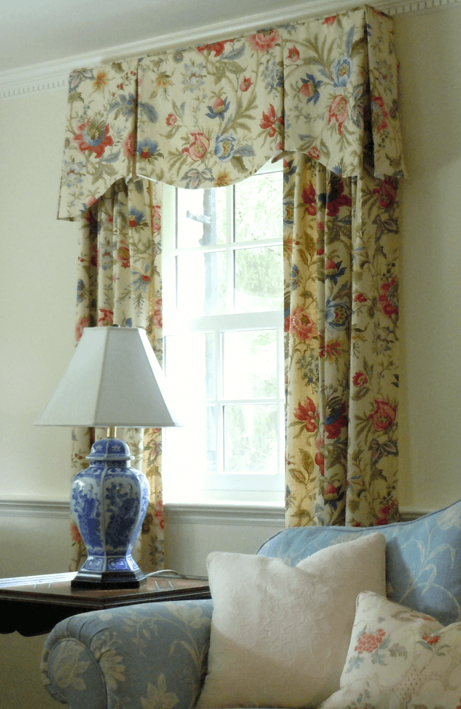
The fanciest valance and drapery combination was in 2012 for this lovely couple in Larchmont. I actually made templates for each window. I had never done a valance like that before, so was a little scared, but it turned out very nice and the clients were super happy. The sofa, I had reupholstered for them a few years earlier. That was when they were in a different home.
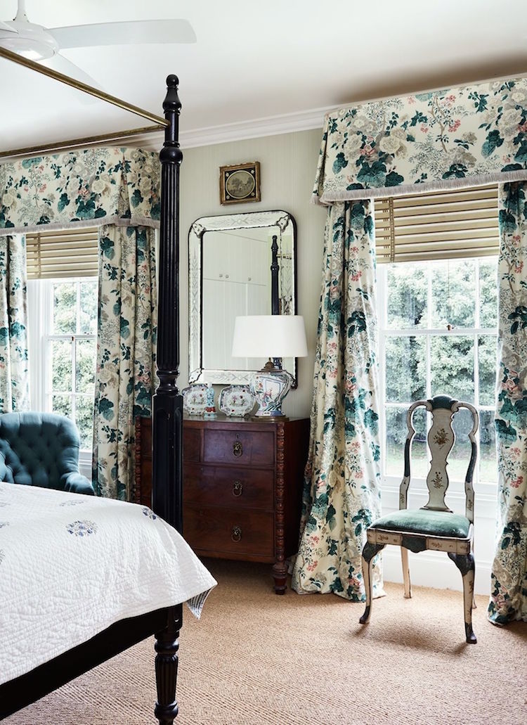
However, many times I have done this style of valance with drapes underneath. That valance looks a couple inches short for this height ceiling, but I think better too short than too long. Generally, I did valances from 14″-18″ long.
Let’s talk about how I go about choosing the fabric.
Because, I think that’s where a lot of people get hung up. But, also you must read about all of the mistakes I made with fabrics that cost ME big bucks!
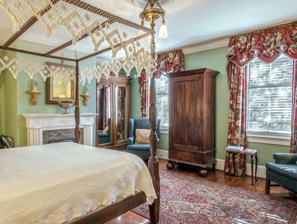
Let’s begin here. For reference, this is a B&B, but that’s not a lot different than a regular bedroom.
What do you think?
I’ll tell you what I think. ;] I think that it’s not working and I’m going to tell you why.
Well, first of all, I’m not too crazy about the wall color. I think we could find a much better green in the Laurel Home Paint and Palette Collection
And, while we’re talking about that, you know there are 40 boards and most of them have windows with window treatments, so you can get a lot of ideas there about how the window treatments integrate with the wall colors and furniture. Mostly, I put in only one panel because it looked cleaner for the board.
But, getting back to the wall color; it is a key point because always, always, always, the window treatments need to coordinate with the wall color.
AND, 90% of the time, I picked out the predominant color in the fabric (if it was a pattern) and that was my wall color. If the fabric is solid, I often did the same color or a coordinating color. There are so many ways to go. And it is also fine to contrast the fabric, so navy or black drapes with white walls. But, it has to make sense in the entire scheme.
They did not do that here. The balance is off. If they had painted the walls a raspberry red, those draperies would look a lot better. But right now, they are making too strong a statement.
I would also get rid of the Door Store looking armoire and put in a pretty chest with a mirror and a lamp. And, I’d put a painting over the fireplace.
The bed is nice, but that canopy is wrong. Total granny, IMO. And the matelasse coverlet is okay, but there should be a beautiful duvet folded at the end of the bed.
And finally, I’d have slip covers made for the wing chairs to give them style. I’m thinking of the JK Place in Capri when I think of white cotton duck slipcovers. Mentioned in 12 posts all in the link.
So, how do you know when to do a solid and when to do a pattern?
Well, this is the art of planning out the room. I would always look at everything together.
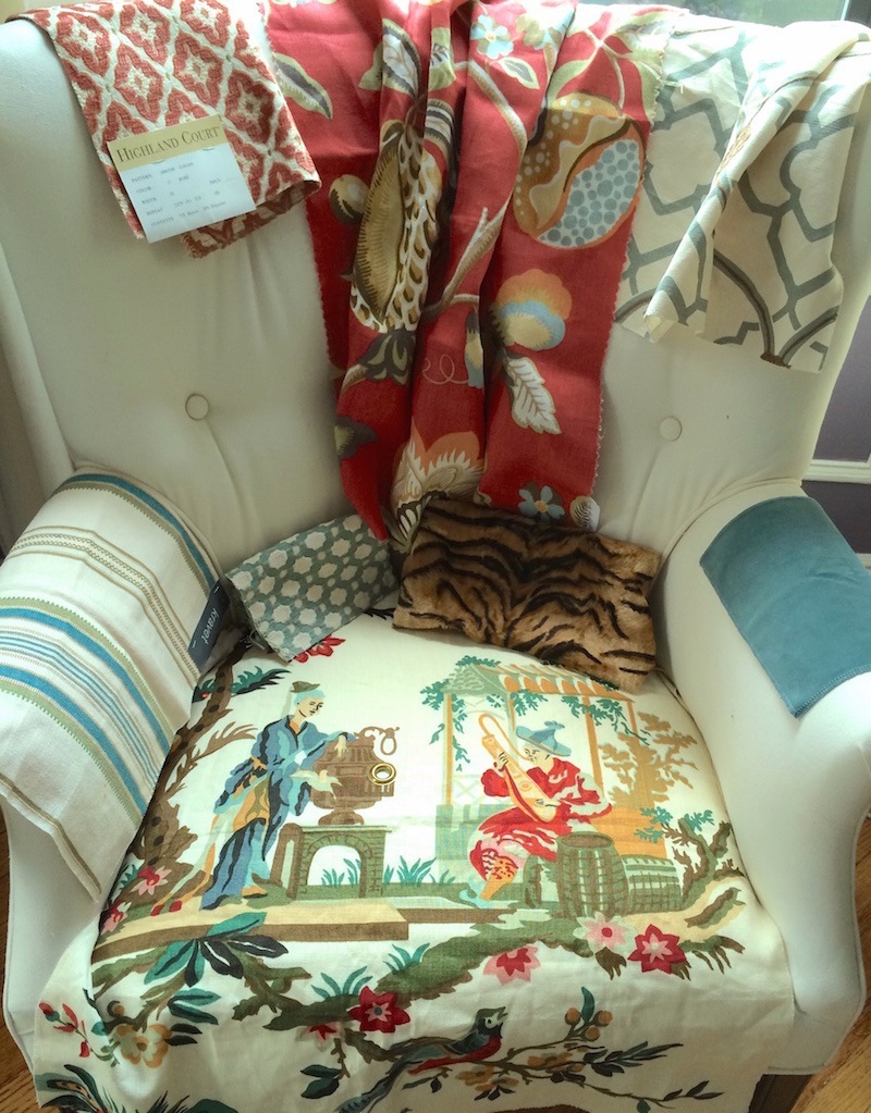
Like this, for instance, for this job.
So, to recap, and a few other things as well.
- the main styles of window treatments are curtains, drapes or draperies if you insist. Or, Roman shades or some type of blinds.
- Often, deciding on what type is a function of budget. Custom draperies with rods, rings, etc. are quite costly. It is far less expensive to do custom Roman shades. But, not every room and/or window lends themselves to one or the other.
- The fabric should be of good quality but it does not need to be super-expensive, especially if doing a solid.
- Trims are a great way to add interest to a plain curtain, but some of my clients didn’t want that.
- The color of the fabric needs to coordinate with the walls and of course the furniture in the room. Please notice that I said “coordinate,” not match.
- Deciding on solid vs. pattern needs to make sense in the entire scheme of the room. I rarely made these decisions quickly and I always valued input from my clients.
- If you’re stuck look for inspiration on mine and other blogs or on pinterest.
I hope that has clarified some, the process for selecting window treatments and discerning which window treatment styles will work best for you.
xo,

PS: Please check out the newly updated Hot Sales!!!
Related Posts
 Decorating Details – And Why It’s So Difficult To Get It Right
 Isn’t There Some Way To Get Less Expensive Curtains That Still Look Great?
 The 50 Best Etsy Shops For Home Furnishings
 The Stained Wood Trim Stays – 16 Wall Colors To Make It Sing
 Are ALL The Home Builders Con-Artists And Criminals?
 20 Timeless Kitchens You’ll Love FOREVER!
 All About Wainscoting + The One Thing You Must Never Do!


