Hi Everyone,
First of all, it’s Monday night, and I am feeling night and day different from 48 hours ago. All I can think is it was the flu, but because I had my flu shot in September, I was able to fight it off quickly.
Thank goodness, because being sick is not something I have time for.
Second of all, and this is super important if you are a subscriber. (And if you’re not, why aren’t you? We have a lot of fun here!)
If you’re not a subscriber, you may skip ahead to here.* Or, here,** if you like.
Okay, My lovelies. Do you see the new graphic at the top of the post? Yes, it is new! After seven years, I finally changed my freebie. However, guys, if you’re already subscribed, PLEASE DO NOT CLICK ON IT TO GET THE FREE REPORT. This is for people who are NOT yet subscribers.
Of course, current subscribers can have this report for free too.
I sent it to you last night, November 14, 2022, at approximately 5:52 PM ET. If you can’t find it, I’m terribly sorry. I will send it out again, but not right now because there have already been two extra emails this week.
* BTW, I am also in the process of updating my blogging guide. No matter when you purchase it, you will get the update. Speaking of other updates. The latest version of Laurel’s Rolodex is due to come out after Thanksgiving, on November 29. The Etsy Guide is coming out then, as well.
Please note: I will always fetch your download link.
However, please try to find it in your email first. Any download link you have from Sendowl (my shopping cart) for any of my products will work, as your links never change. When you download your guide(s), you will always get the latest version. After I update, I am only sending out an announcement with a new link for convenience. However, it is the same link you received when you made your purchase. All changes are on my end.
And, because I am trying to remain sane and healthy, the blogging guide update will probably be ready on December 6. 90% of it is the same. The parts that are changing are technical, plus a few things I’ve picked up since the last update in 2019.
**Okay, let’s move on to Redend Point. I promised you I’d work with and try my best to make this challenging AKA horrible wall color look good.
Let’s see if I succeeded.
WAIT, just a red hot minute! Excuse me? What the hell do you think you’re doing? ;] ;] ;] You are not allowed to scroll ahead. ;] Please be patient!
Yes, thank you, I’m feeling much better!
I’m so glad many of you are enjoying this mini-series inspired by Benjamin Moore’s and Sherwin Williams’ colors of the year. If you missed post number one introducing the two colors, you can see it here. And, if you missed Sunday’s post that focused on Benjamin Moore’s COTY, you can see it here.
Today, we are going to focus on Sherwin Williams’, in my opinion, bizarre selection, with an equally odd name– Redend Point.

At this redend point in the process, I began looking at various print fabrics from Schumacher. They have some of the most beautiful with wonderful colors of all kinds. I was hoping that doing so would give me some inspiration and further insight into what will work and what doesn’t work with my horrible wall color.
Basically, I found that a lot of the fabrics either looked blah or dreary; especially cool-toned fabrics.

What does look good is Redend Point’s complementary color, which is some shade of yellow-toned green, like Timson Green above. Dark greens look good too.
And, with this horrible wall color, reds from light to dark and eggplant look good.
Any white colors paired with Redend Point should be warm and a little dirty, like Benjamin Moore’s White Dove, for example. The dirty (slightly grayed down) is because Redend Point is pure dirt.
A dirty wet hot dog.
However, Redend Point, I would classify as a shade of mauve.
But, wait! Didn’t whoever decide on this COTY over at Sherwin Williams learn anything from the 1980s?
Well, apparently not, and my guess is because they weren’t yet alive to remember the ghastly mauve and gray trend. And, mauve and gray paired with shiny cheap brass.
Yet, here we are again.
Mauve is a dirty pinkish purple. However, this dirty purple has a lot more red than blue. It’s a warm red. Most mauve shades have more blue in them. I have several dirty purples in the Laurel Home Collection, and none are near this color. That’s because RedendPoint also has a lot of brown or tan.

Above is Redend Point and below are two of my dirty purple shades from the Laurel Home Paint and Palette Collection.


I have used both Elephant Gray and Smoked Oyster (both are in the Laurel Home Paint and Palette Collection.) Both are beautiful and easy on the eyes. Yes, they are much more gray, but I can assure you that the purple under-tone comes out. But, it’s not PURPLE.
After working with Redpoint End for two days, I’ve come to realize that it is more in the dirty pink family.
Okay, it is now Tuesday night, and I’m virtually ALL better from my achy fever on Saturday and Sunday.
I mean, that’s so weird. I could barely get up the stairs Sunday morning. (Note: I love my stairs and am glad they are there because the exercise is good for me.)
Soooooooo, I have been having fun.
Too much fun, actually.
I have made three boards using Redend Point,
But first, I wanted to see what the two dining room boards from Sunday would look like with Redend Point.
You could go back and read Sunday’s post if you missed it.
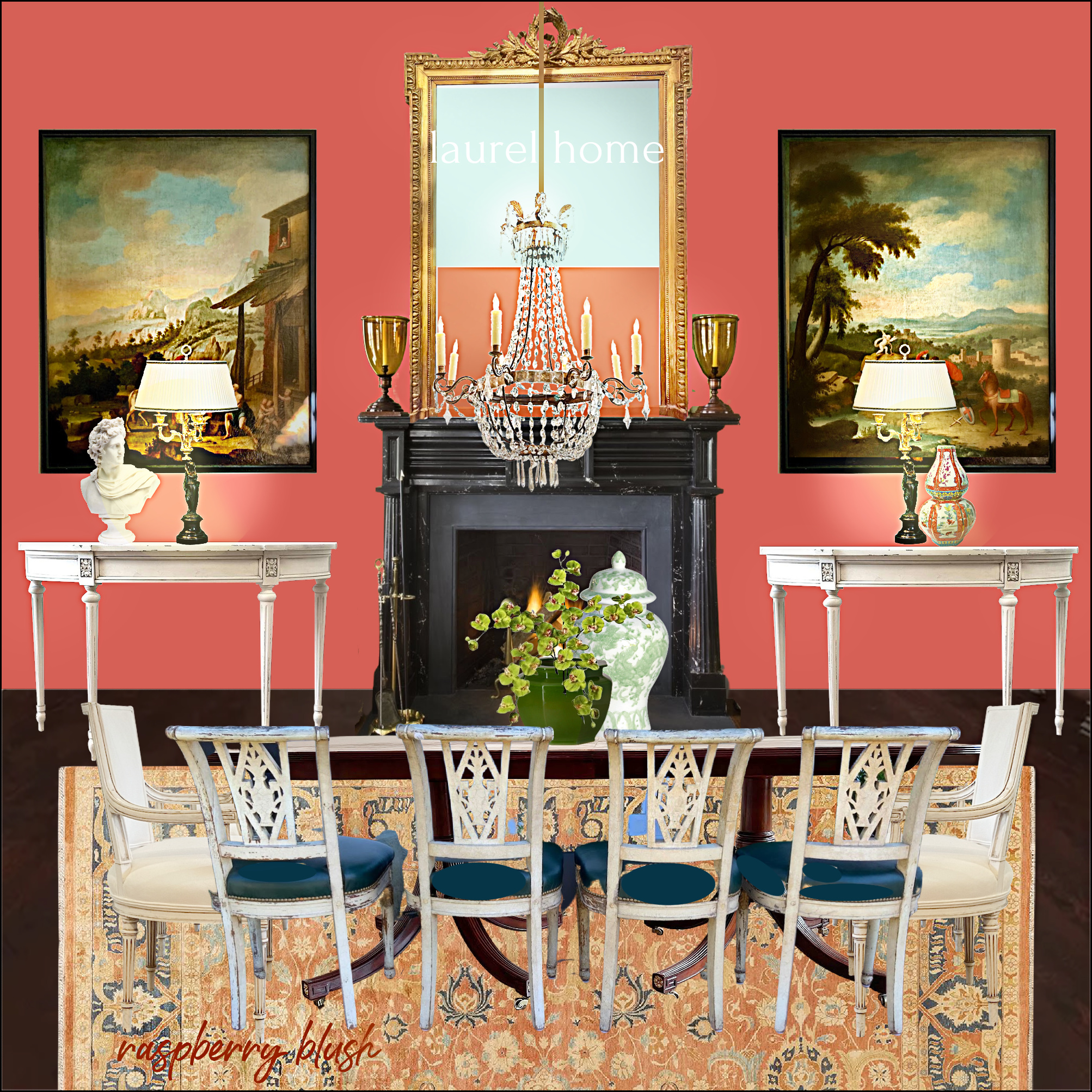
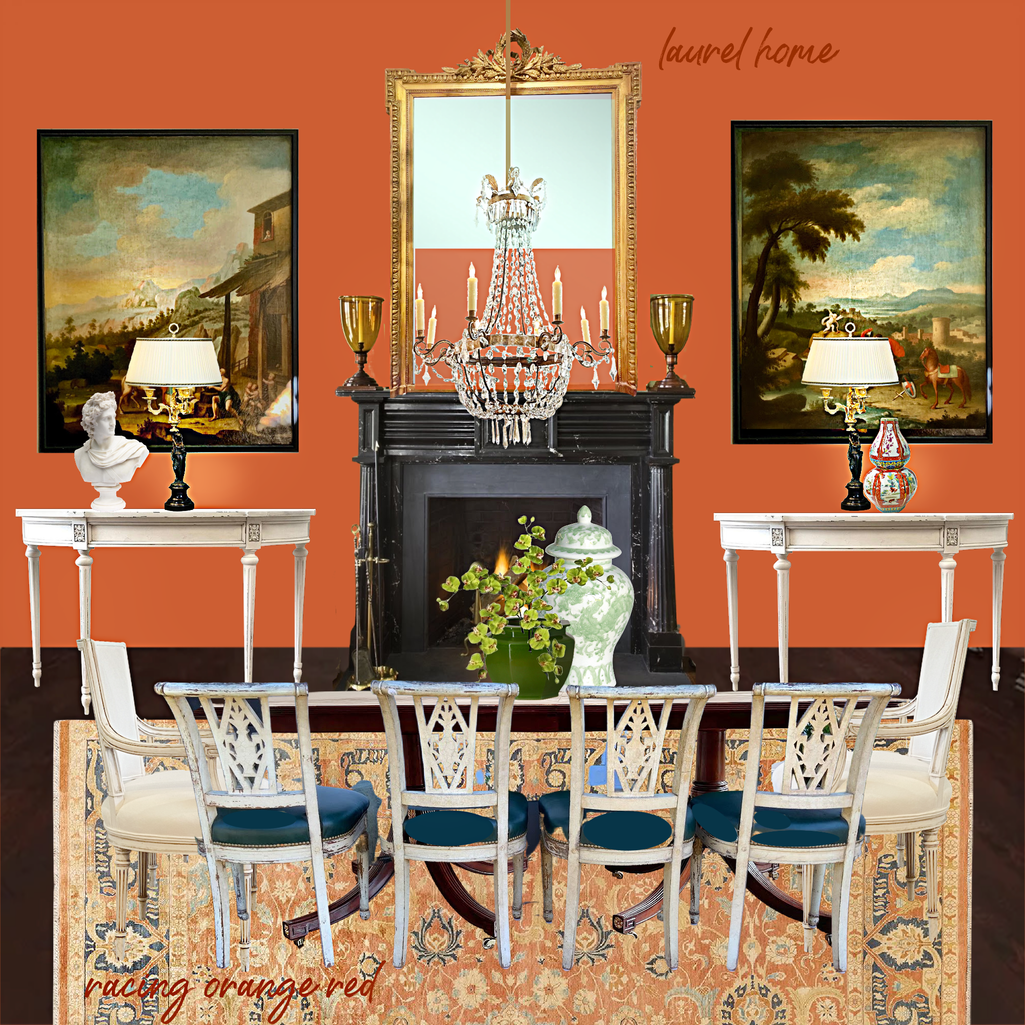
I also tried this scheme with one of my Laurel Home Paint Collection colors, Racing Orange Red. There are a couple of others that are a little lighter that I think would go well too. If I had more time, I would work on this one more.
Okay, please get ready. I am going to post the horrid wall color, Red End Point, in this same dining room.
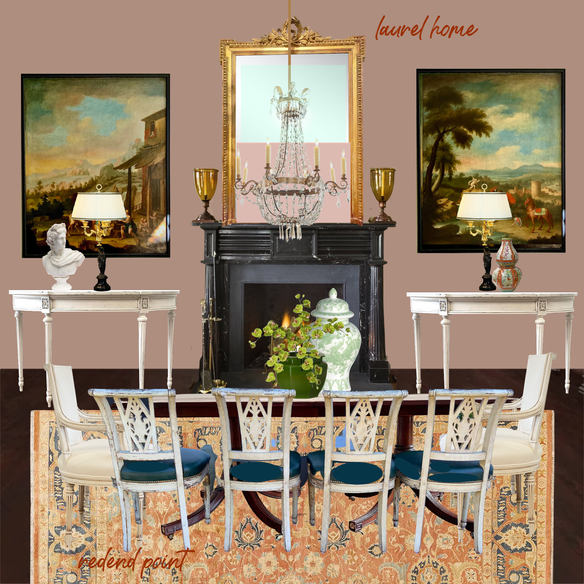
Would it work better with different art and a different rug?
Perhaps. But, why on earth would you subject your guests to a paint color reminiscent of the early stages of *necrotizing fasciitis? And, while they’re eating, mind you. That is unless you’d rather not see them again.
* Yes, yes, I know. That is a sick, highly inappropriate joke. Please forgive me.
Okay, I promised I would do my damnedest to make this horrible wall color look good.
Then it won’t be such a horrible wall color, after all.
And since I can’t stomach this color for a dining room, let’s do a living room.
PLEASE NOTE:
YOU WILL SEE A SOFA FACING AWAY FROM THE FIREPLACE. THIS IS A MOOD BOARD, NOT AN ACTUAL ROOM. THE FURNITURE IS LAID OUT THIS WAY SO WE CAN SEE MORE, NOT TO INDICATE AN ACTUAL ROOM LAYOUT.
SORRY. I mean, sorry for shouting. It’s just that the last time, or one of the previous times I shared a mood board of a living room, several people criticized me for showing the sofa facing away from the fireplace.
Horrible Wall Color Board # One
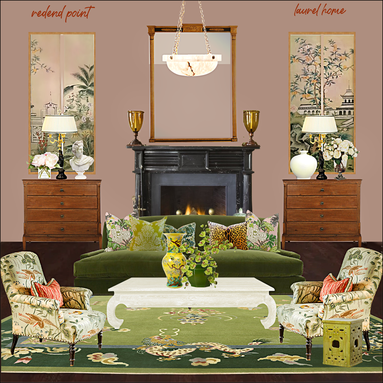
I created a color scheme featuring numerous shades of green, yellow, a touch of coral, pink, gold, black and brown, and creamy, warm white.
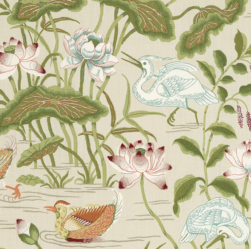

I found a fabric, Lotus Garden by Schumacher, that I think looks great with Redend Point.
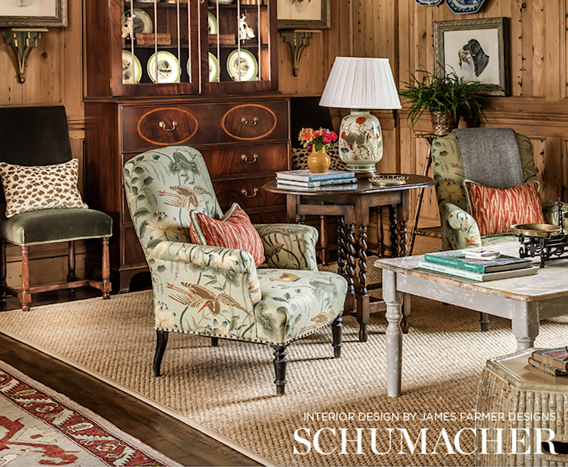
And, yes, I stole James’ gorgeous chair and put it in my virtual room. I hope he doesn’t mind.
In case you’re wondering, while fun, yes, it’s pretty tedious making these boards. I make all of them on Picmonkey. I find it’s a superb tool for helping visualize color schemes; plus, the boards help show how colors and furnishings will look together.
Horrible Wall Color Board # two
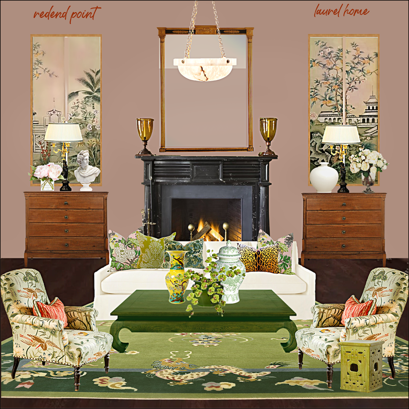
I kept everything pretty much the same for this one, except I made the sofa a creamy white linen and did the coffee table in a rich, warm green. I suppose this version is better for summer and the one on top for winter. Of course, you don’t have to have two coffee tables. ;]
Please know that I could sit here and make boards for weeks. Yes, even with a horrible wall color.
How does that work, Laurel?
Well, I decided the best way to work with a muddy, weird, unappetizing color is to use the British Method of decorating. Please listen very carefully. Here’s the secret.
The method is not giving a bloody damn.
In other words, our friends across the pond are far less concerned about such matters as a horrible wall color, and here is why.
“What horrible wall color? You can’t even see the bloody walls because every square inch is covered with the art I’ve been collecting for the last 46 years. You Americans are all hung up on everything “coordinating” and your bloody color schemes. Nobody freaking cares, and all colors go together just fine. So, please stop giving a bloody damn, and you’ll find life is so much easier.”
Okaaaaay… Let’s do it.
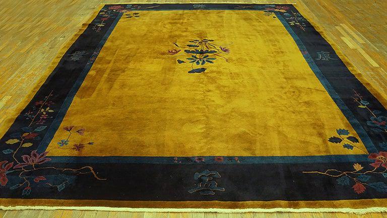

Hehe. Pretty, ain’t it? Acid gold with our horrible wall color. It’s fine. I don’t give a bloody damn.
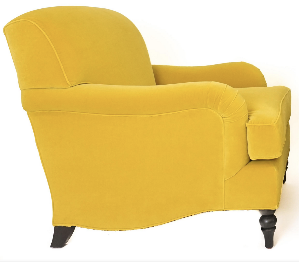
Yes, I could leave the chairs this color, but I love my yellow greens, like Timson Green above and chartreuse too! So, I changed the color of the chair. By not giving a bloody damn, it doesn’t mean you have to use colors you don’t like. Well, except for the wall that you can’t see, anyway.
And, below is horrible wall color board #three.
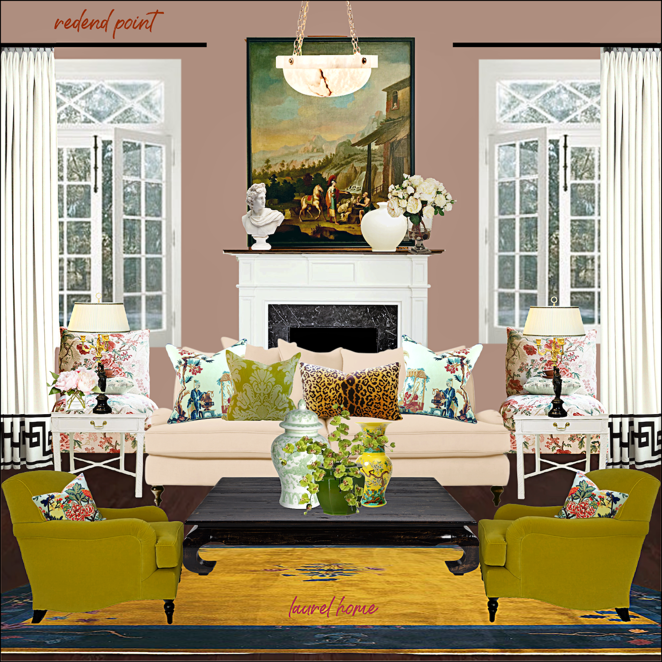
Yes, that is the trim I broke the code for that Kelly Wearstler designed. You can find the pattern here in the ultimate window treatment guide (blog post.)
You know, in a quirky, I don’t give a bloody damn kind of way; I rather like this room.
Would I do it for myself? Parts of it, I definitely would. This board reminds me of one of Ben Pentreath’s rooms where the colors are usually kind of I don’t give a bloody damn. But, the decor is laced with plenty of “pretty,” so it always works in an interesting, off-beat way.
Okay, please be kind. It is fine not to like any of them. However, for both Redend lovers and dislikers, what do you think now about this color? Is it just as barfy as ever? Or, could you see it used successfully in certain situations?
Someone mentioned something about a brown sofa. I was going to do that, but time is not on my side. There is always more to share.
However, I promise this is the redend of this series. I hope it was a good exercise in expanding minds (It sure did mine!) and that you had a few chuckles along the way.
xo,

PS: Please check out the newly updated HOT SALES!
And the recently opened HOLIDAY SHOP!
Related Posts
 The Secret For A Cheap, Chic Kitchen Refresh
 F&B Calke Green + An Iconic Wallpaper = Kitchen Heaven!
 The Guaranteed Way To A Beautiful Room (It’s Not The Wall Color)
 Small Living Room Decor -Should It Be Pale or Dark?
 How To Hang Art – Little Known Ways + Mistakes to Avoid
 Can This Boring Bland Living Room Be Saved?
 A Fabulous and Rare Upholstery Sale by One Of my Favorite Vendors





73 Responses
As soon as I saw that paint, I thought, “British aristocracy, 50 priceless paintings, a once-glorious but now dusty sofa with bullion fringe, a walk-in fireplace, and a couple of Corgis chewing the corner of an antique rug.” Glad you saw that, too!
The last board was the best! As some of my students used to say, “You done good”
“A dirty wet hot dog” … My dog and cat both jumped when I laughed out loud on that one.
Well, you’re a magician. Like them all, but I like “don’t give a damn room” best.
Thank you so much, Stephanie. I think just about every room can use a shot of Chartreuse. It’s the first color seen when the earth comes back to life in April. I find it intoxicating.
I couldn’t believe my eyes, Lauren, when I saw the photo you posted of James Farmer’s design with the Schumacher fabric. The table lamp in that photo is the Frederick Cooper lamp my parents gave us in 1985 as a wedding gift! It has had a place of honour in our house ever since, and I’ll never get rid of it. It totally shocked me to see it in your photo! Now I think I need some of the Lotus fabric since it goes so beautifully with it!
It’s also a very similar color to Setting Plaster by Farrow and Ball, which is gorgeous and sophisticated.
Hello Laurel,
I love the green rug you are showing in the first few slides…with the chartreuse center design. Would you have a source for this? Thanks so much!
Thanks for the laughs! You outdid yourself with your boards, but it just goes to show that some things are beyond help. Time to shut off life support, so to speak. I wondered what it was about this ghastly color that looked familiar: then it hit me. A girl I knew years ago in the early 80s, LOVED this color. She bought clothes in this color, expensive ones at that. She wore no makeup ever, had mousy hair, and seriously thought this color was fabulous! There was no convincing her that it was not flattering or maybe a scarf around her neck or some makeup might help. So — maybe someone somewhere might actually buy it. Maybe the old rods and cones are genetically defective for some. Who knows.
I think you spent a lot of time showcasing the most horrible colors I have ever seen.
You did your best.
Still awful.
While I was gleefully reading your post, laughing out loud, and feeling a little bit fancy because I managed to have two pillows made from Schumacher Lotus Garden for my current living room, I was suddenly struck with an embarrassing flashback to 1988. At the ripe old age of 29 my “wasband” and I built our first house. I actually chose mauve wall-to-wall carpet for the study and the master bedroom, and even had the master bath CARPETED in the same. And we had a faux marble gray tile in the foyer. All I can say is that now I know better, and so should Sherwin Williams!
You make everything beautiful. Sometimes paint color cannot be changed and we have to work with it. You even gave us choices! Bravo!
I Am with you. I like the last room also with the green chairs. Not sure why , but it is put together more . Whatever else is in the room seems to blend in with the muddy color.
I so love reading your blog . I like your style and all your advice. Your humor . Enjoy your weekend!
I like what you did with the color, especially the last mood board. But then, there isn’t a color I don’t like, used in the right context with the right supporting actors. When asked my favorite color, I respond, rainbow. I love the way that the British approach color. I’ve even seen some of my favorite designer’s say they intentionally introduce an “ugly” color. It give a room a settled, grew over time, kind of look. Great job, I think you’ve very successfully proven that any color can work with the right support.
Aw, it’s not that bad. Personally i find raspberry blush much more offensive than redend point!
Give it up. It’s horrible, no matter how you look at it. Good try, though. If anyone could have done it, You’re Fab!!
it would have been you
I’ve heard many descriptions of Redend Point, from bandaids to barf, but your “necrotizing fasciitis” and “dirty wet hot dog” rules the day! I absolutely abhor this color, and am appalled that SW came up with it as COTY.
I will say, I don’t mind your first board, as I really love the fabric on those chairs, and there is a hint of Redend Point in there, BUT… I could only be satisfied if the print was also on the curtains, and every square inch of the walls was covered with art. I am very much the don’t give a bloody damn sort of decorator, and the British way is my way, all the way.
I’m so glad you’re feeling better!
I still don’t love the color, but d*mn, you did a mighty fine job of making it…better. I loved your greens and yellows. A LOT more art would have (maybe) made it livable for me. Thanks for the Brit’s insight, that made me smile!
Glad you’re feeling better!
I actually love all of these rooms, including the wall color. I would have never thought the ugly Redend swatch could look so sophisticated and moody. If I was looking to decorate a room at the moment, I would legitimately consider this color, now that I’ve seen what can be done with them.
I’m not sure the only choice when it comes to wall color is something you love. I think if one has an ordinary or average person’s design abilities, one should probably always stick with a great wall color that is easy to decorate around. In the hands of an expert, a more difficult, unusual color might provide some tension between the colors and the decor. I’m decidedly on the average scale, so I tend to pick pretty colors that I know how to work with.
You did a great job figuring out how to use Redend and make it look like a deliberate, very high-end choice. Like another person wrote, I think this is one of those colors that only very talented professionals could use and make it look good, but I’m trying to picture the conversation between the designer and the homeowners when the designer says, “Oh, I know this color (Redend) looks like a six-day-old bruise, but it’ll look lovely in the living room!” I’d love to know how much Redend Sherwin Williams manages to sell in a year. I’ll bet we could count the gallons on one hand.
You did it
You did it
You said that you’d do it
And indeed you did!
Tapping bottomless reserves of wit and creativity, you managed to create a palatable appetizer out of a sandy weiner-end the family pup left under a fold of his dog blanket in the kitchen corner. I can hardly wait for next year when you tackle Katz Gromit Redux.
I still think it’s an unappealing color and I actually quite like mauve. Mood board #1 I didn’t notice the walls because of the green sofa and rug. Mood board #2 just went past me, I can’t even remember what it looked like less than 5 minutes later. In Mood board #3, the pink sofa turned the walls more brown (muddy) and more bearable. Add in the large windows and there is even less wall space for ugly paint. (As Bonnie Hunter says in quilting, “if you have ugly fabric, cut it smaller.”) I’m living with ugly gray blue paint that came with the house when we bought it. My husband likes it and refuses to even hear of painting. So I just decorate in the manner that I like and it doesn’t go with the paint at all but I don’t give a BLOODY DAMN!!! My thanks for giving a name to my decorating style.
The color reminds me of a Band Aid. No matter what colors you put with it, I still see an old Band Aid. I would get the painters to come back and paint the room a different color. It would be worth every penny!
Maybe the color of the year isn’t about picking a winning color, but warning us about what’s to come. Yeeps!
As recent arrivals to Alabama, I never want to see that color again. For the past couple of months, I have tried and tried to wash it out of our clothes, and I think of that color as “Bama Dirt”. You can even buy a shirt on Etsy this exact color that says something about being the color of Alabama dirt.
Too funny, Laurel! I was chuckling so much that my husband asked me to let him in on the joke. My great grandmother used to say that a good laugh was worth five dollars, and that was when five dollars meant something.
So glad you’re feeling better, and thanks for the five dollar laugh!
Wow! I learned a lot from this post. Like you, I dislike the wall color. But as you worked your way through the possibilities, I somehow saw them in a new way. The 3rd room (but with the goldy rug and greeny chairs deleted) is getting gorgeous. The white trim and pale pink sofa, plus the gorgeous floral patterns, turn that muddy wall into a very attractive pinkish color that looks fresh and inviting. So what I learned was that any wall color, or perhaps any color on a sofa or any large surface, can play happily when it has the right friends. The rug and chairs I virtually deleted are fine themselves, except why not make them some of the deeper blue-ier greens in the floral pattersn? And swap the leopard pillows for a stripe? But that’s just me. The point is, you made your point and I appreciate it!
Enjoyed this post and glad you are feeling better. Your comments on Redend Point reminded me of a Farrow and Ball color with a name that says it all….Dead Salmon. It’s not too far from this color! Don’t think I could ever use either color but what a memorable F&B paint name!
Amazing. I like most above like #3 the best. But I would put the chartreuse on the slipper chairs and the pattern on the club chairs. Of course, the windows in #3 make the room spectacular no matter what color the walls are. Your choices are spectacular.
This is truly a special post. Do more like this. I am stuck with an 80s modern house which I am very grateful for because it is a niche back in California and has a wonderful garden and great light in the kitchen/living/dining room. But the hideous angles inside are something that I just have to not give a bloody damn about. I am proceeding with filling it with my style and hoping that everyone, including especially me, will be distracted by my choices.
The house is almost to stage one transformation which is with new bathroom, floor and appliances. The redwoods and other trees outside will just have to make up for the ridiculous angles inside. I think, but am not sure, that they could be eliminated but the retirement budget just doesn’t include redoing sheetrock in every room. Also the double sided fireplace (a plus for sure) has the weirdest non mantel ever and there is no way to fix that. I am playing the game of distraction you have illustrated here.
I will never paint a wall this color, but I quite like the “don’t give a bloody damn” room – even moreso than I like the first two. Perhaps it’s the beautiful windows, but the third option has a cheery, quirky charm, and the pink-hued couch really pops. The walls read as more intentional, while the first two, to me, feel more “look at the magnificent furniture and pay no attention to the cat gromitz behind them…” Really nice work!
I wish I had seen your post. I did a color close to this in my bedroom, thinking it was a muted pink. It picks up on colors in my Chinese rug. But I hate, hate hate it. It does not read pink, although it did as a 2ft swatch.
Can you tell us where to find the bowl shaped ceiling fixture in the room with the green sofa? Is there a version for non-billionaires?
Hi Alex,
That is expensive and from Circa Lighting,here
but they do have an inexpensive version linked here.
PS: I don’t like to encourage links in the comments because I have to moderate them. However, people can list sources or the title of something.
I love the boards! It is so helpful to see the whole picture. I once used taupe in my bedroom but it is not my favorite and no longer fits in my house.
So happy you are feeling better.
Still hate the wall color, but your boards do the best anyone is going to do with them Chartreuse is one of my favorite colors, and it hurts my heart to see it with Redend.
We had a similar dilemma when we bought our 1992 Suburban Sold-Off-Farmland Contractor’s Special a few years ago, though it wasn’t with the wall color. Our family room is fairly large (16.5 by 23.5 feet), with high cathedral ceiling, and a huge brick fireplace on the wall opposite the doorway wall. Wide and tall, brick all the way up. Did I mention that the brick is yellow?? Talk about barf. Husband didn’t want to mess with painting or staining the brick, so, like a bad wall color one has to live with, we had to work around it. The next step was to figure out what color wall paint would minimize the awful yellow brick. Unfortunately, everything we tried looked like a rundown hospital ward, circa 1953. Finally I said, “I think we just need to embrace the suck, go big, and make it look like a deliberate choice rather than an apology.” So we painted the room BM’s Wolf Gray — a saturated, mid-tone gray-blue that, in our west-facing room, reads more blue. And it was perfect. The color feels bold, but also makes the big room feel more snug. The contrast with the fireplace pops. And, interestingly enough, there are some blue-gray undertones in the brick that we didn’t really notice before, but the paint brings the overtones out, which makes the hideous yellow much more bearable. Would I still prefer classic red brick? Yes. Do I nonetheless have a beautiful room (well, beautiful in progress…)? Yes. But then again, we didn’t have to contend with Redend
Only you Laurel, could actually make Redend Point look good. Before I committed I would have to see the color sample & fabric swatches in my space. But I would do that with any color.
You are amazing. And happy you’re feeling better.
Only you, Laurel

 … a dirty wet hot dog. LOL.. I LOVE your sense of humor! Oh yeah… and your design, too! I look forward to clicking on your blog always! Thanks for the entertaining way you “critique” and educate.
Laurel, I read your blog simply for the humor! The fun interiors are an added benefit. The British are definitely on to something– particularly if we can expand the “not giving a bloody damn” to things other than horrible paint colors. BTW, the large dose of white paint in the doors on #3 makes that color a bit more tolerable.
I like Redend Point as an accent color. I have a recliner in this color in my family room along with floral sheers with a pale gray background that also repeat this mauve color. The rest of the room has neutral colors and I think it works well.
Hi Laurel: Definitely like the last board. Wow, I know what you mean. That is a hard color to work with!
I would have suggested pink with coral to distract from the color. Also maybe a lavender in fabric on sofa, but I do love unexpected combinations!
#3 is lovely. The colour becomes a neutral background for the other colours, architectural details and furniture to take center stage. Bravo!
You are a genius! You made all 3 rooms look great with that ugly wall color. I love all 3 rooms but I think the first one is my favorite. I love the green sofa with those pillows.
The only good thing that has come from that heinous SW ‘color’ is your last 2 posts. SO MUCH FUN and we all can use a good laugh!!! Your boards were wonderful, if you ignored the wall color… Anyone too cheap to repaint will also be too cheap to spend money on a decent piece of furniture, a nice rug, or art. But such fun to actually give it a try anyway!!!
Loving #3. Nice work. the wall color seems intentional in #3. really pretty. love the contrast of the white millwork and then the tone on tone lighter flesh colored sofa. gorgeous.
Love the chartreuse chairs and pillow with this hideous paint color! Bravo Laurel!
Hi Laurel,
I was taught that there were no bad colors, just bad color usage and I believed it until Redend Point. It is just plain upsettingly ugly. BUT in the last room it almost isn’t noticeable, almost. The gorgeous chartreuse chairs and the Chinese deco draw your eye away from it and the room is beautiful. Why not though start out with a pretty color and then add those beautiful pieces and accessories? Have I told you lately that I have been collecting Chinese Decos for more than 30 years? XO
I’m with the Brits. In the pretty rooms you designed, I could forget about the walls. The Schumacher (sp?) print goes beautifully, as do the lovely greens you chose.
I would like to see that Redend color with blue. I think blue and dirty pink go well together. Not that I would ever choose a dirty pink!
Love the hotdog simile. Very apt.
Wow! Looking at your work, it is very clear to me that only an expert could make this color look reasonably decent. Really showcases how mood boards make a huge difference in choosing color schemes! Kudos. I find the color depressing and could never live with it.
The third board I actually kind of like. The white seems to brighten up the color. Don’t think I would use that color in a room, but you made it look not as horrible.
I am a resounding “NO!” To Redend Point. To me, you could use any of your gorgeous room boards or a million bucks’ worth of fine furniture and accessories and the room would still look, well, ugly. (Please notice I said “to me.”) And if one could try to minimize the wall color impact with exquisite decor, why on earth wouldn’t one just paint? Unless, one just bought a brand new house and the entire home is painted in a color that just doesn’t get it and one has to use items from a previous home.
I think the only room that color would look good is the ancient “vomitorium” of Roman lore. I haven’t recovered from the 80’s mauve wave yet when people actually put in mauve spirea (the ugliest shrub ever) and couldn’t find anything to go with it in the garden either.
Keep up the excellent posts that educate AND entertain us.
Laurel, I’m glad you are feeling better!!
I couldn’t believe that even you could make this barfy color look good!! I could be happy in #3. I think the pink sofa (and the smaller amount of wall space) look wonderful!
I love seeing what the COTY is because at least one is just awful -good for a laugh!
Thanks, Laurel, lovely blog, As a Brit living in Canada I have always liked the North American style of decorating, however, you hit the nail on the head when you described the British style, so bloody funny, but to be fair it did pertain to the upper echelons of society. Ordinary folks without family heirlooms are more like North Americans.
Laurel, I love your blog! I would love it if you would do a post or several posts around this question: Do the LR chairs have to match? Also if you would do one about “star” or maybe diva pieces that dominate the room and then you have to figure out what to do.
Hello Laurel. Happy you’re feeling better. So, I guess of the three boards you made I prefer the last one. I think because there’s less wall showing! Those windows are glorious! I love the way Brits decorate. I’m not a minimalist decorator in the slightest. I enjoy lots of art, and interesting items, and antique/vintage furniture in my home. Still, I don’t think Redend Point would be my choice of wall color…no matter how much stuff I put up my walls! .
.
I think Redend Point would actually look great in a room with wood trim, as I prefer the wood cabinet board to the white window trim one. Personally, I would embrace its more dirty vibe and go rich dark colors as opposed to trying to force it with whites and neutrals, which makes me gravitate towards the first mood board. As I look at it more, it actually reminds me of the color on the walls in the deVol St. Johns Square Showroom, even though the deVol color is FAR less sludgy. deVol layers on a ever so slightly yellow-green with a blue-green, which one could pull the same type of palette from the Asian hanging panels in the first board. Speaking of across the pond, I also get a distinct William Morris vibe from the Redend Point, something along the lines of the mulberry/charcoal/saffron colorways found in Snakeshead, Bamble, Lodden etc. Perhaps it could also be successfully used as a slightly more feminine backdrop to a moody broody masculine room!
It still looks like a band-aid but the last room with the white fireplace and big French doors is almost pleasant. The Schumacher fabric does work well too. Now, personally, I wouldn’t use it but you did a great job illustrating how to make the best of an otherwise yucky color.
Love all three rooms but the first thing I would do is change the wall color. Still do not care for it. The rest is beautiful as always.
Laurel,
I’m so glad you’re feeling better. Get well soon!
I absolutely loved this post! We all enjoy someone putting together a gorgeous room, but for you to take on a horrible color and go through the exercise of trying to use it was so fun!
I think we have all been in a position of trying to incorporate something that we didn’t really like into decor. ( maybe an inherited piece or something that could tide us over until we could find, or afford, what we really wanted) But the base wall color is so important in a room and I love how you approached just the exercise of trying to make it work
I think I agree with Lydia above. Sometimes trying to work with something we don’t like ends up being costly and never redeems the thing that we didn’t like, so it’s better to change it from the start. But your post was wonderful and different, and I thank you!
The olive is genius, but I really hate the wall color against the lovely wood dressers. I want those to be black, too.
Glad you are feeling better, Laurel. I happen to love your sense of humor and LOL’d a couple of times reading this post. I think Board 3 was the best attempt for making Redend Point tolerable. I like the addition of windows, white window treatments, and fireplace mantle very much! I think lots of white helps to clear some of the mud out of the color. The greens seem to accentuate the mud. I think the fabric featuring a color similar to Redend Point and green works well because it has a creamy background, which helps to clean some of the mud away.
Btw, I’m in the midst of a remodel at my home and my plan for the fireplace mantle will be similar to what Board 3 shows. I plan to use white woodwork with the mantle shelf stained cherry.
I love your creativity in trying to use that awful color.
You showed two grays above, and I would LOVE to see some examples of using those grays. I think it would totally change the look to something maybe more calm and sophisticated??? And use some of your wonderful green for accent?
I love your creativity in trying to use that awful color.
You showed two grays above, and I would LOVE to see some examples of using that gray. I think it would totally change the look to something maybe more calm and sophisticated??? And use some of your wonderful green for accent?
At least one good thing came out of this color — your redend puns. HA!
In the past, usually due to budget constraints, I’ve tried to work around things I disliked. Unfortunately, I ended up spending more money than if I’d fixed it to begin with and never really loved the outcome. I say wait till you can do what you love if at all possible. Sometimes, like a great soup, things turn out better if they have time to simmer. Also, paint (and pillows ) are one of the least expensive things to change and make a significant difference. Good luck fellow adventurer!
Hi Laurel,
Thank you as always for the humor! I don’t like the color at all in the dining room, but I do like it in your board #3. It seemed to grow on me as I looked at it in the different rooms. It has a very fleshy look to it. Please take care of yourself and get lots of rest in between your duties.
Hi Laurel, love all the rooms. Except the wall color! The only way that color would look good would be if you painted the mud room floor and then walked over it for 5 years with muddy boots and never washed it. jd
It’s just a terrible color for walls. You made it passable with each of your boards, as I knew you could. In looking at my dreary living room bleeker beige walls now, I’m not as desperate for an immediate change
I LOVE my Bleeker Beige walls! Best shade ever IMO. I have it in my kitchen, dining room, bedroom, with black accents, mahogany furniture, white dove trim, and quiet moments on ceilings.
Thank you so much Laurel.
Sometimes, such as a guy who has no potential, you just have to let them go or accept them as they are. This color matches “the guy”.
You really tried, but the guy is the guy. No potential.
Love your blog and stay healthy.
Laurel you’re absolutely right! The wall color doesn’t hugely impact the overall effect of the room. ( again, a lesson on choosing a “husband” Love that Schumacher fabric! I think I like the second one best because I’m partial to white sofas.. But the third one is pretty, in that English country home way. Great post!
OMG that alabaster chandelier!!! Is that in one of your guides, Laurel? I think I need to find it. (And I like the “don’t give a damn” room the best. It’s proof that if you surround yourself with things that make you happy and that resonate with your sense of style, you’ll find a way to make them all work together.)
Laurel:
I enjoy your blog but will pass on the color. My takeaway is the following:
I’m hungry as a hog; So I get brown rice, seaweed; And a dirty hot dog. – Bob Dylan
I think you are amazing because you actually used that color successfully. My favorite is the first one with the gorgeous green sofa! Kudos again.