Hey Guys,
I promise that there is more coming about kitchen issues, but first I got a real email from someone who did say in the subject “I’M DESPERATE.”
(Slightly edited only to protect identity.)
Hi Laurel,
I am a Home Stager in a northeastern suburban area. I have little formal training in Interior Design (I’m actually trained in graphic design) but I have learned a lot after 4 years of staging. Anyway…. the following pics are of my own home, a family area where my teens hang-out. A place where they do homework and entertain friends.
I don’t usually decorate with such loud patterned window treatments and colors but I was trying to get away from the “EVERYTHING MUST BE GREIGE”, which is how we stage every home these days!! I felt I needed a little color and pattern in my life especially in an area for kids/teens; it didn’t need to be sophisticated!
So I ordered these Roman window shades with a busy floral pattern, working with my blue and white theme. But I was afraid that a whole row of this loud fabric was going to be too much pattern, so I ordered the wovens for the french doors in-between the windows, to break it up.
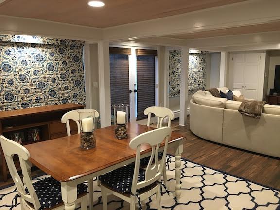
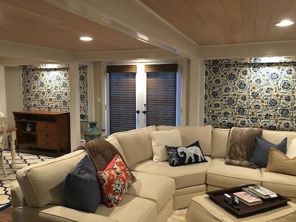
Now I think it was a big mistake! I think the door treatments should have been in the fabric too, right? Or better yet, probably all the windows should have been in the wovens (I already have too many wovens in my house though!!)
I can’t even tell you how much money I have already spent, but regardless, I need to make this right. I guess my question is – does the use of these two different treatments in a row look strange to you? And what would you do to remedy this situation? You can be brutally honest, I have a thick skin….
Thank you, Thank you, Thank you so much! And please keep those emails coming! I always look forward to the weekly read!!
Ima House-Stajer
**********
Hmmm… Ima told me to be brutally honest.
Okay.
All in all, it’s a pretty room.
And yes, the window shades look strange.
But…
But…
But…
It isn’t her fault. This is a difficult and awkward situation. But, I think her instincts were correct to break it up. However, Ima can see and I can see that it’s not quite coming together.
The problem begins with a pair of two double windows and then a pair of French doors in between.
And the ceiling is low.
Double Windows Are Not Historically Accurate– At least not until Victorian Times.
(Yes, there may be exceptions, but for the most part no.)
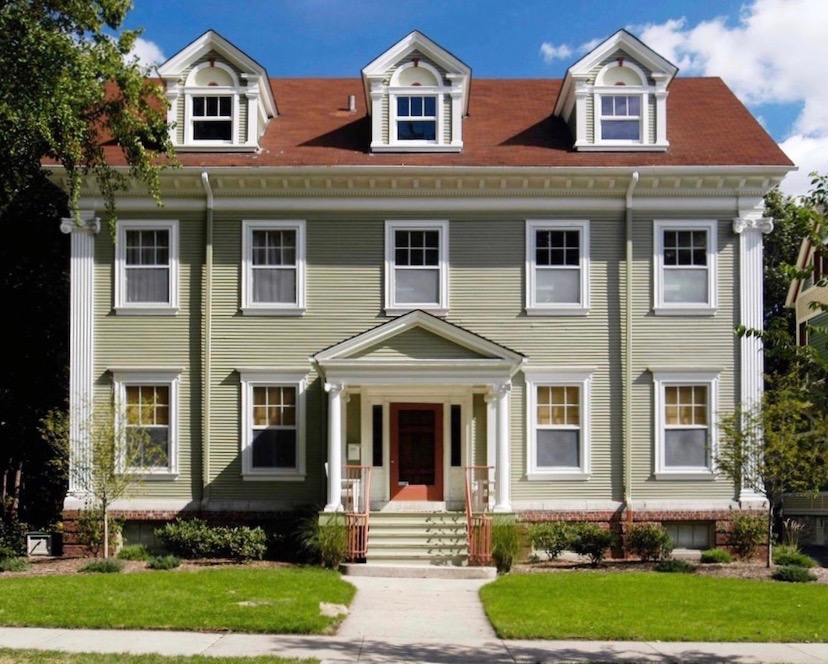
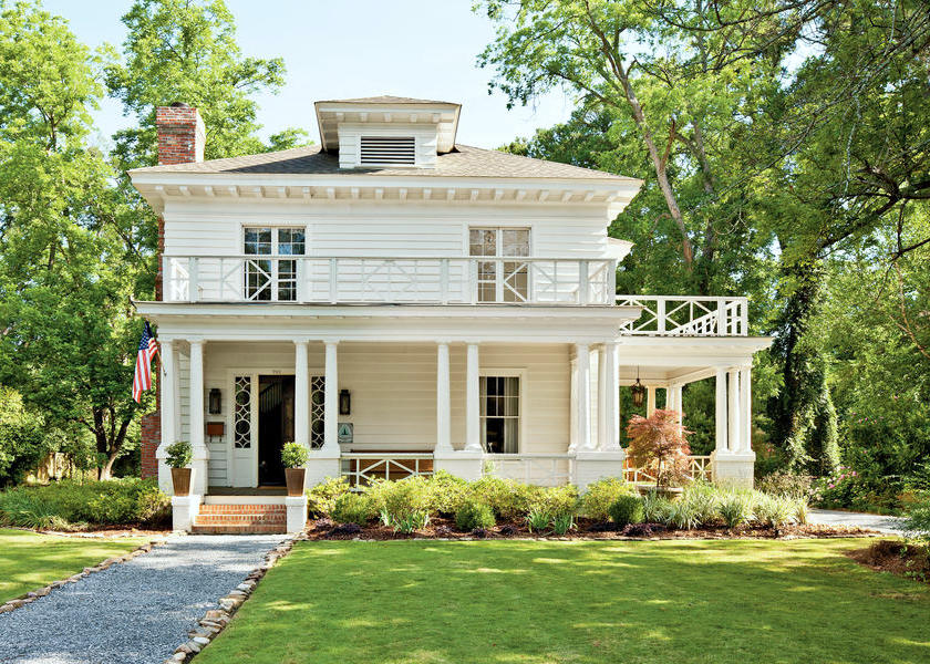
Southern Living Craftsmen Beauty
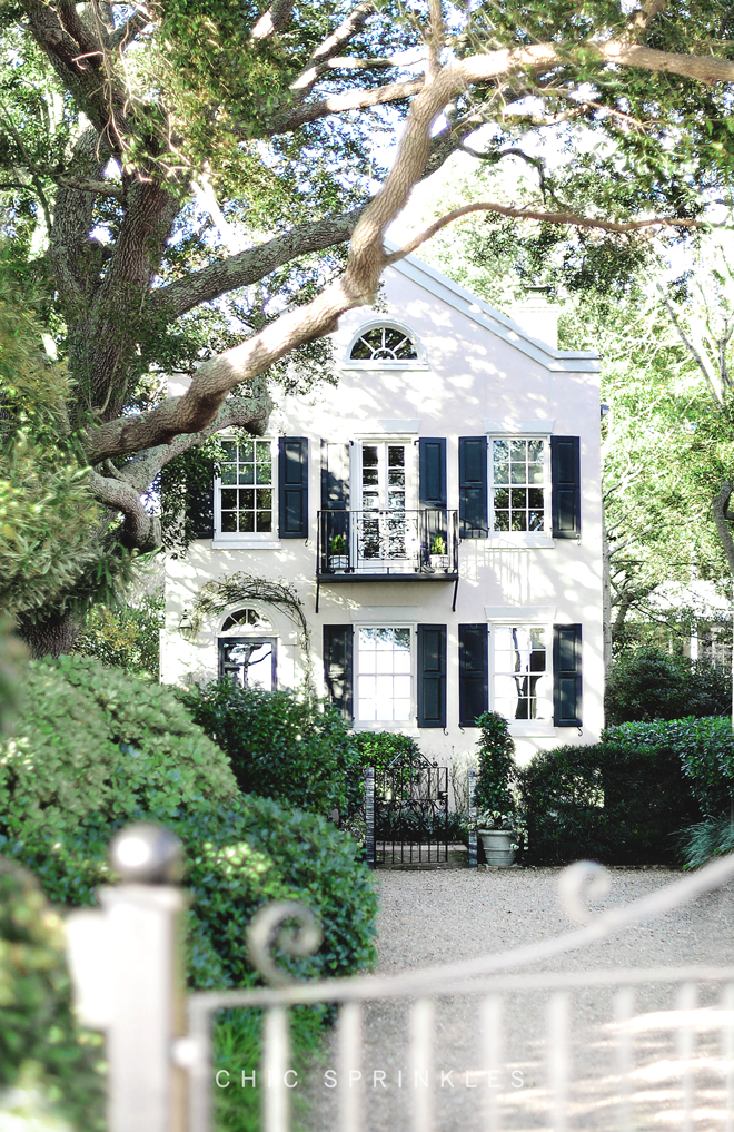
Chic Sprinkles Charleston Charmer

Greek Revival Farmhouse in Greenwich, CT

But all too often in new construction, I have this situation below.
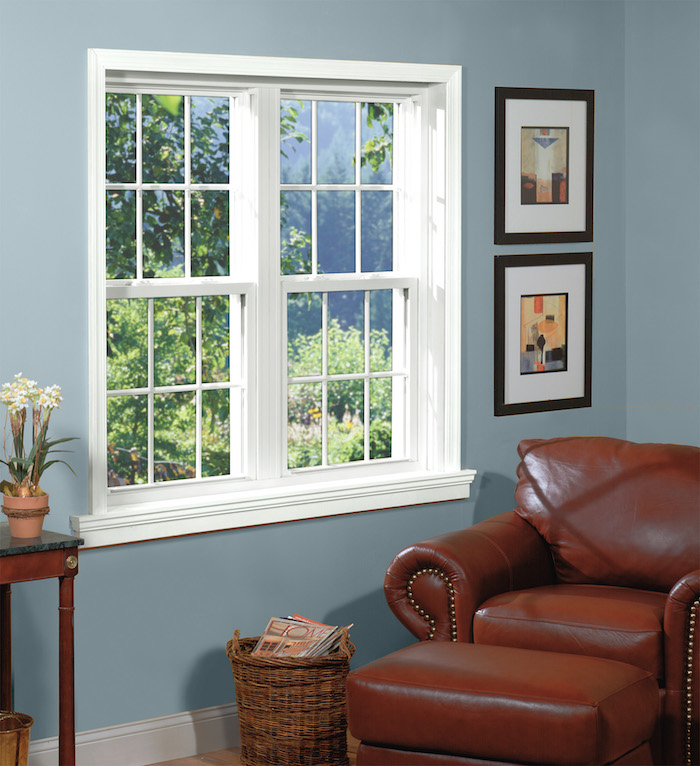
a side-by-side window configuration
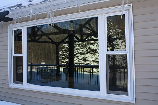
Or, my worst which is the humongous picture window flanked by two itty bitty windows.
Well, one of my worst.
There is worse.
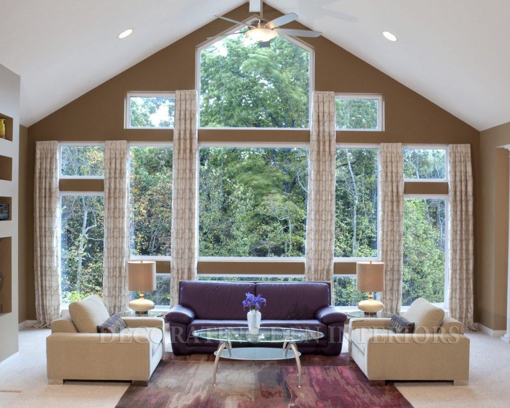
(Thank you decorating den for providing us with that example.)
I know what you are thinking… and no, I’m not saying that windows should not be put together, but there’s a right way and a wrong way.
Quite frequently, there is no inset whatsoever if one wants to hang inside mount window shades. And when that happens, life really sucks.
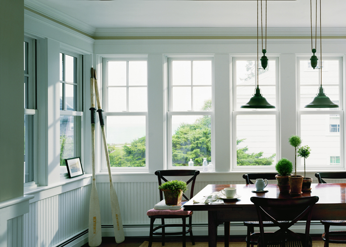
The right way to have a series of windows.
Ideally, there should be nice thick mullions separating them as shown in this Anderson Window ad.
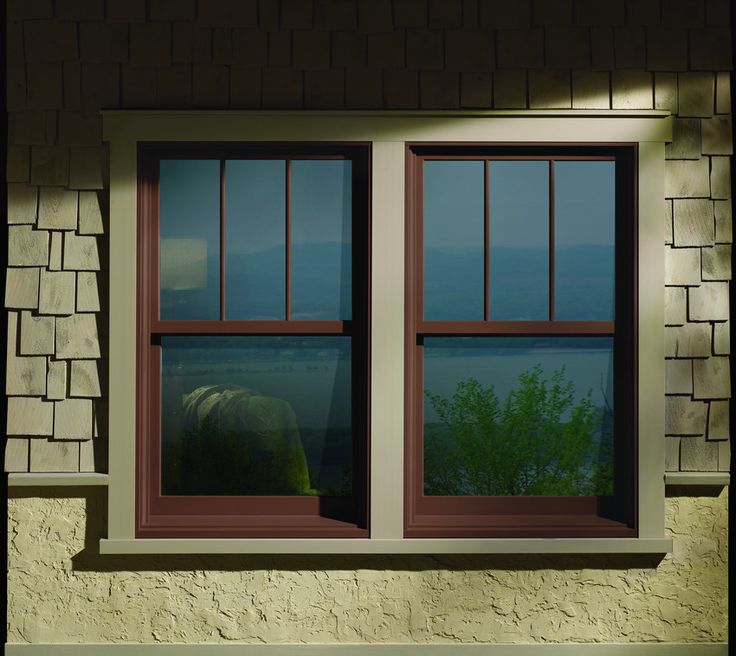
It is typical for Craftsmen style homes to have windows sitting side by side.
But Getting Back To Our Window Shades Issue.
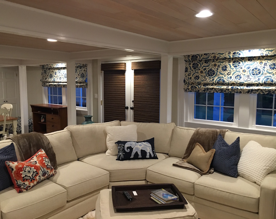
Ima sent me some more images. The room is really lovely. And I love the fabric! Ima’s windows do have a thick mullion. It looks like there’s enough inset space, to do two separate shades–inside mount. I always have the shades made this way whenever possible.
The other thing I do is have my workroom make the shades a little longer than the window so that there’s one extra pleat. It looks not-so-great if the window shades are let all the way down, and there’s just a straight piece of fabric flapping in the breeze.
I tell my clients that it’s better to have a little glass showing even when let all the way down. Unless you must absolutely have every single inch of the window covered, they do look better this way.
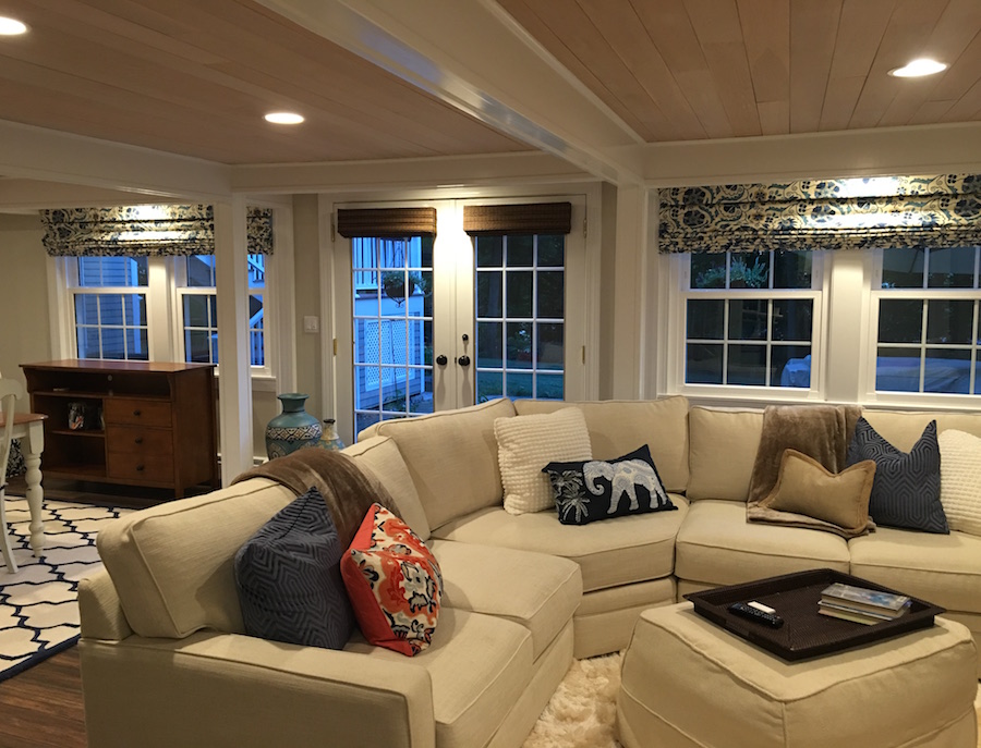
Already, with the shades pulled up things are starting to improve– a lot!
But we need to make it so that they look great all the time.
My first recommendation is to have the shades remade into two shades which will be an inside mount installation. It is not necessary to have the little valance flap. It’s fine to have it as long as there’s enough inset room.
There needs to be a minimum ONE-HALF INCH inset space to mount the shade inside the window frame.
Please know however that commercial vendors/brands who make these kinds of shades will say NO, but baaalieve me, I have done dozens of Roman Shades with a very shallow inset, including my old home and it works out just fine.
here’s the trick.
The board that the shade is mounted on is generally 1″ x 2″ and it usually runs with the two inches being set in the window horizontally. But, if it’s a very slim inset, then the board can be run the other way. The installer will use longer screws to install. The shade will stick out about 1/2″ from the frame, but that’s okay.
Now, for the door window shades
My first idea was to take the shades off and create a frosted glass window. That would be the cheapest way to handle this for sure. But… it is rather nice to be able to see out the window.
Frosted glass is a great option for any area when one wants a glass door but doesn’t want to see what’s behind it.
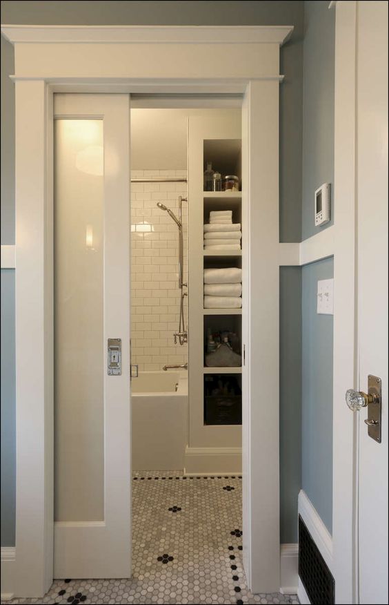
A sliding frosted glass door separates two parts of a bathroom. This way light can come in the bathing area, but there’s still privacy.
You won’t need to replace the glass. There’s a spray that’s available at most home renovation and hardware stores.
But then I got to thinking that Ima wasn’t going to like this solution and I better rethink this.
hmmmm…
Another idea popped into my head for the French Door Window Shades
There’s a rule if the windows are all the same the window treatments need to be the same.
Since we have a different window which of course is actually a door, we don’t need to do the same treatment. But the treatment needs to coordinate.
Usually, I would do the same fabric, and that is an option, but I also think it might make the door extra special to do something else that coordinates.
So, I decided to choose a cream-colored linen to match the background of the Roman Shades and then trim it with the dark blue color of the Suzani pattern floral shade fabric.
And with a little computer magic, I am ready to reveal the after.
DRUM ROLL ~~~~~~~~~~~~~~~~~~~~~~~~~~
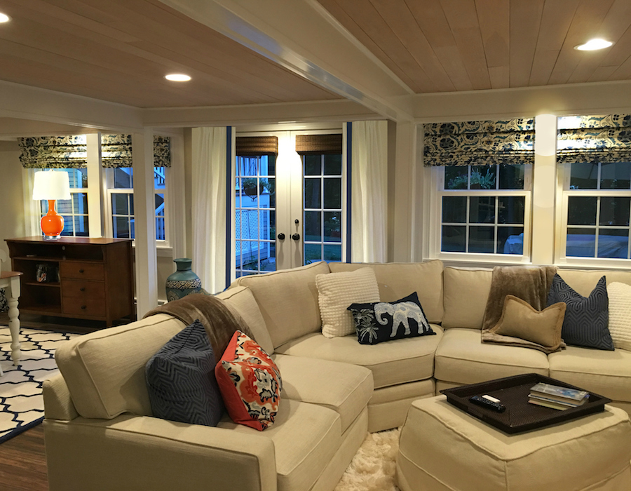
Ta Duuuuuh!
I think I rather love it!
There is a rod for the drapes, but it is hiding behind the beam.
But I love how the drapes soften the room and provide greater balance on the window/door wall. And I think that the four inside mount Romans look a lot better than the big long one, IMO. They are easier to put up and down too.
I had a lot of fun recreating the mullions and adding in the lamp with the light on…
And please notice the inside mount Roman Shades!
The woven wood shades looks terrific now.
I do like the dark accent, but it would look better left mostly up and then close the drapes when privacy is necessary.
The drapes should be two widths wide each in order to close properly.
And yes, you could use the same fabric, but since the room is primarily a no-pattern contemporary/transitional room, I think it would be better to do a plain linen and allow both the door and the side windows to be special. But it wouldn’t be wrong to do everything out of the same fabric.
Rooms are about composition and balance. So, as long as we’re mindful of that, it should be okay. Sometimes the situation won’t be perfect. This is one where the architect/builder didn’t help us out too much.
And there it is…
Do you like this? Can you think of another solution? Please discuss in the comments if you wish.
One last thing– A gentle reminder.
I LOVE hearing from you guys. I really do.
And I’m starting to get a LOT of requests for help which would be great if there were five of me.
I hope this doesn’t sound nasty, but I’m not doing consultations– even paid consults. And I am not giving out free advice unless it’s for the benefit of everyone. I’m hoping that some of you will see these messages, because I don’t want to embarrass or make anyone feel badly.
Of course, you may ask, and if I think it’ll be helpful to others, there might be a blog post about it. No guarantees because I’m getting several notes a day! Every day!
But, YES! Please continue to comment here after the posts. Your comments are so wonderful and add so much!
Thanks again for all!
xo,

Related Posts
 Here it is! A Palette For No-Fail Paint Colors
 The Best Bedroom Paint Colors You’re Probably Not Using
 My No-Fail Paint Color Failed – What Went Wrong?
 How To Get Window Treatments Like You See In Magazines
 What is the Hottest Decorating Trend 2015 That Is Never Going to Go Away?
 Transom Windows – Everything You Need To Know!
 The Guaranteed Way To A Beautiful Room (It’s Not The Wall Color)


