Hi Everyone,
My son Cale is visiting today, and we went for a lovely walk over to Beacon Hill and the exquisite new book store on Charles Street designed by Kathy Kincaid.
More soon. I’d post a pic, but I’ve had massive internet issues that have set me back about three hours.
Alas, the signs of fall are in full swing. And that always makes me think of the color orange.
Poor orange. While there are some who love it, the majority don’t.
Well, they think they don’t love orange.
You know, most colors are magnificent if used correctly.
Look, I fully understand an aversion to the color orange. I am a child of the sixties and early seventies. Indeed, I was force-fed orange.
Howard Johnson’s and
American cheese that came in a big block. Um, that is NOT cheese. It is softened fermented plastic, dyed orange. I have no idea how any of us in the TV dinner generation are still alive.
But, I miss those days.
We were more innocent.
People were kinder.
However, except for a few geniuses like artist Cy Twombly and Albert Hadley, etc., the world of design was largely a bastion of really bad taste.
Take, for instance, the ubiquitous so-called EARLY AMERICAN style, bathed in the color orange and gold.
You might want to go and grab a pair of shades for a spell.
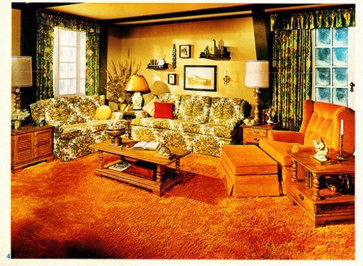
Please forgive them, Thomas Jefferson. They have forgotten about your exquisite attention to classical symmetry. But fortunately, your amazing Monticello is looking pretty spiffy these days.
Please see what building from the Renaissance inspired Jefferson’s Monticello.
However, there is nothing early or American about this space above. Ahhh, we are so fond of the bastardized styles of anything from before we were born. Right? Remember this “Phony French Kitchen” post?
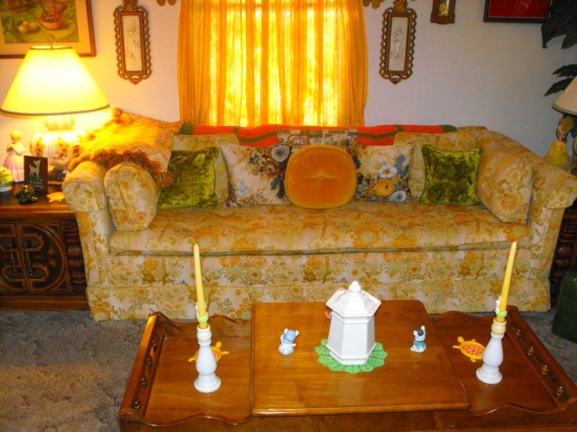
We had a sofa like that in the early 70s. I’m not kidding.
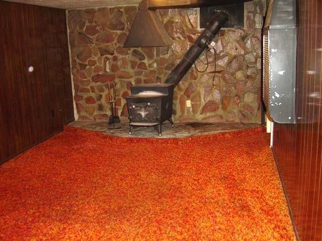
No wonder we reel when we think of the color orange.
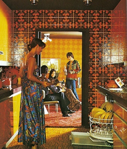
Groovy!
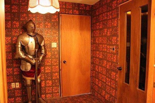
Obviously, the use of LSD was a lot more prevalent than we realized.
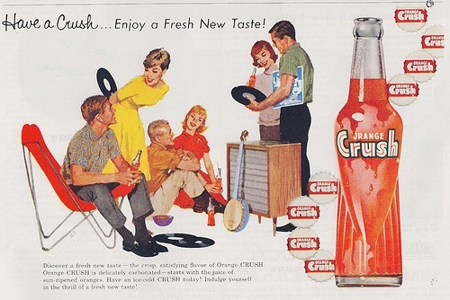
I used to love that stuff! This must’ve been taken shortly before they all got neked and smoked pot. ;]
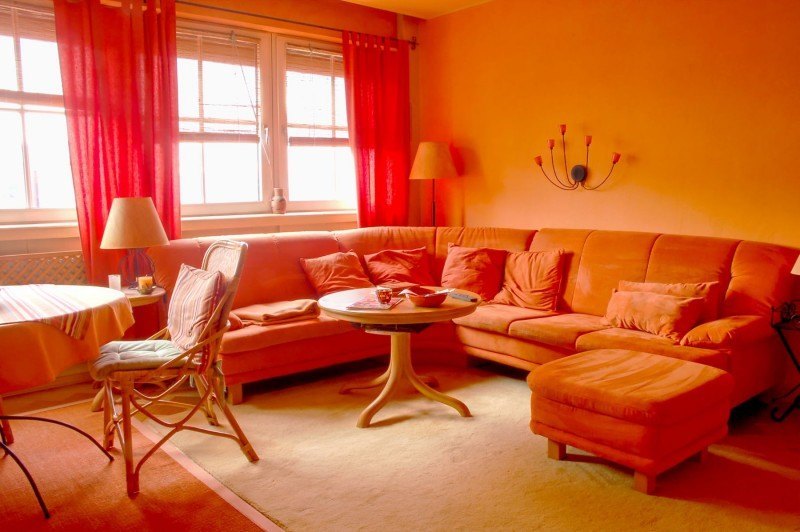
Monochromatic orange decor hell. I am positive this is where they stash prisoners of war to get them to tell their secrets. Monochromatic color schemes can be beautiful, but this is too much!
Okay, it is clear that those of us who were alive back then, why we have an aversion to decorating with orange.
However, orange is actually one of the most classic colors.
And, orange decor is everywhere.
It’s abundant in nature.
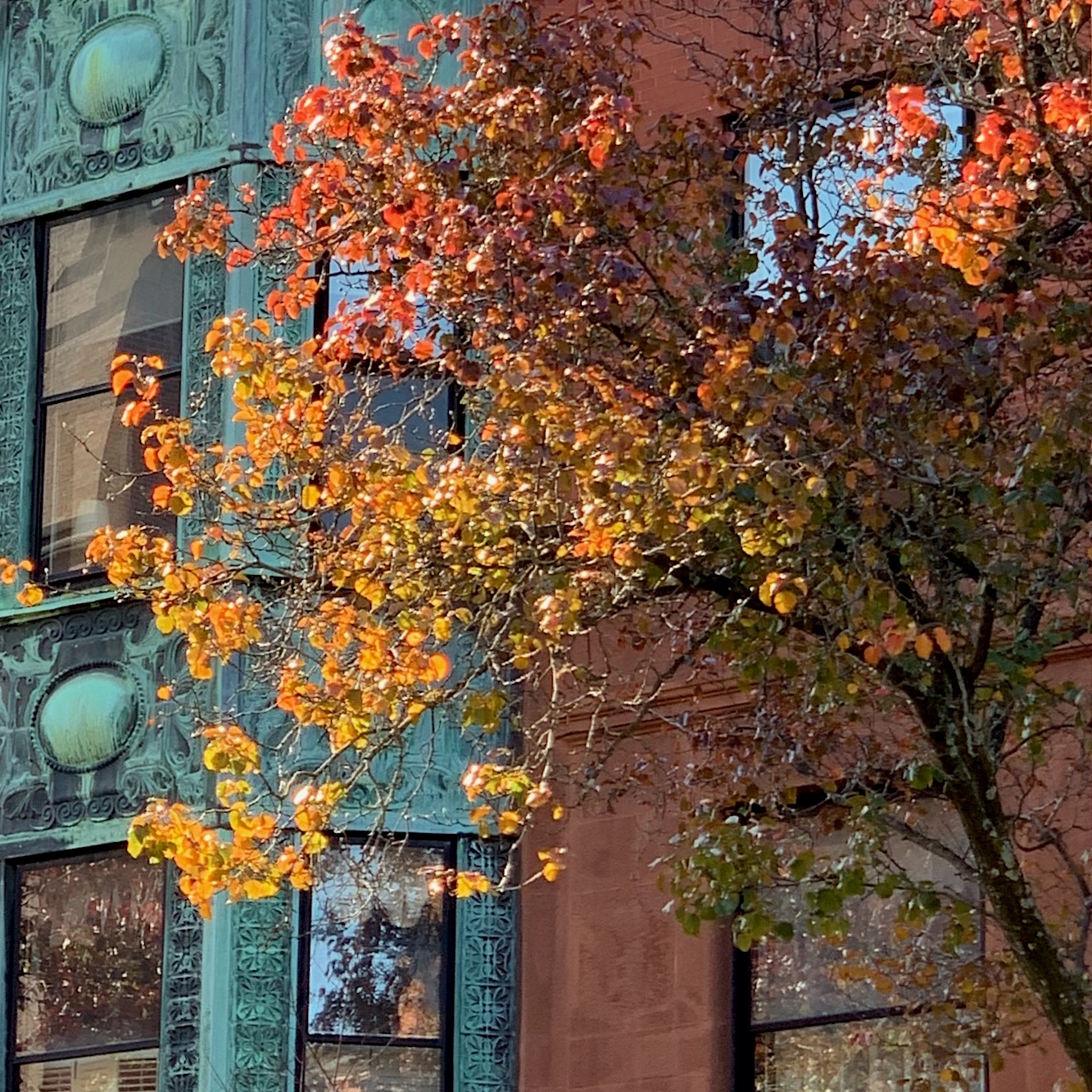
I mean, who hates these beautiful colors? I took this photo two years ago when I closed on my apartment in Boston.

Above from a steamy summer evening on the Charles River last July.
the sun setting.

And, there are many other colors in the orange family, from pale peach, gold, coral, and so forth.
One of my favorite posts is this one about 20 Fabulous Shades of Orange Paint and Furnishings with beautiful examples of how those colors can be used.
Of course, there is lots of the color orange in art.
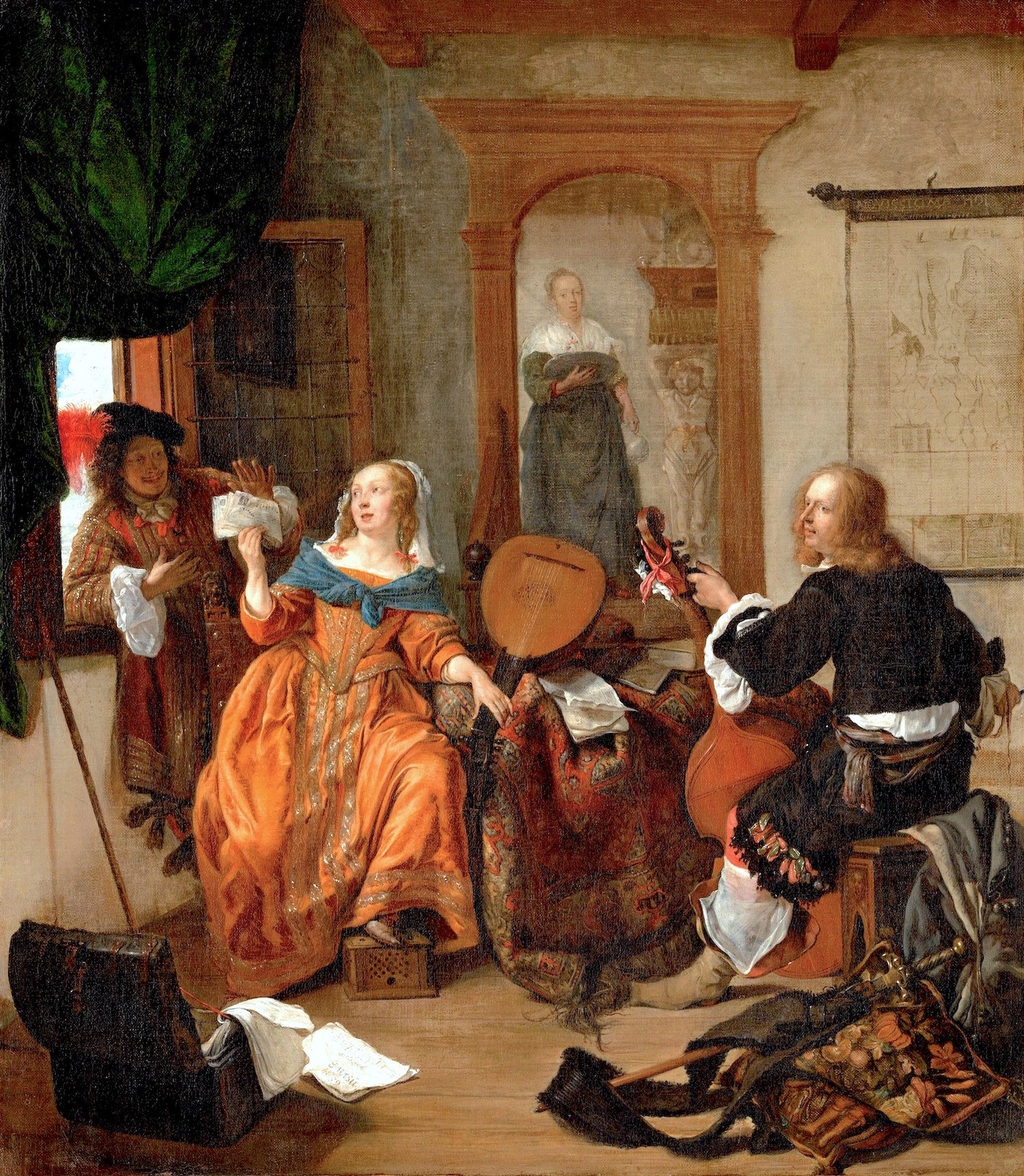
Via Metropolitan Museum of Art
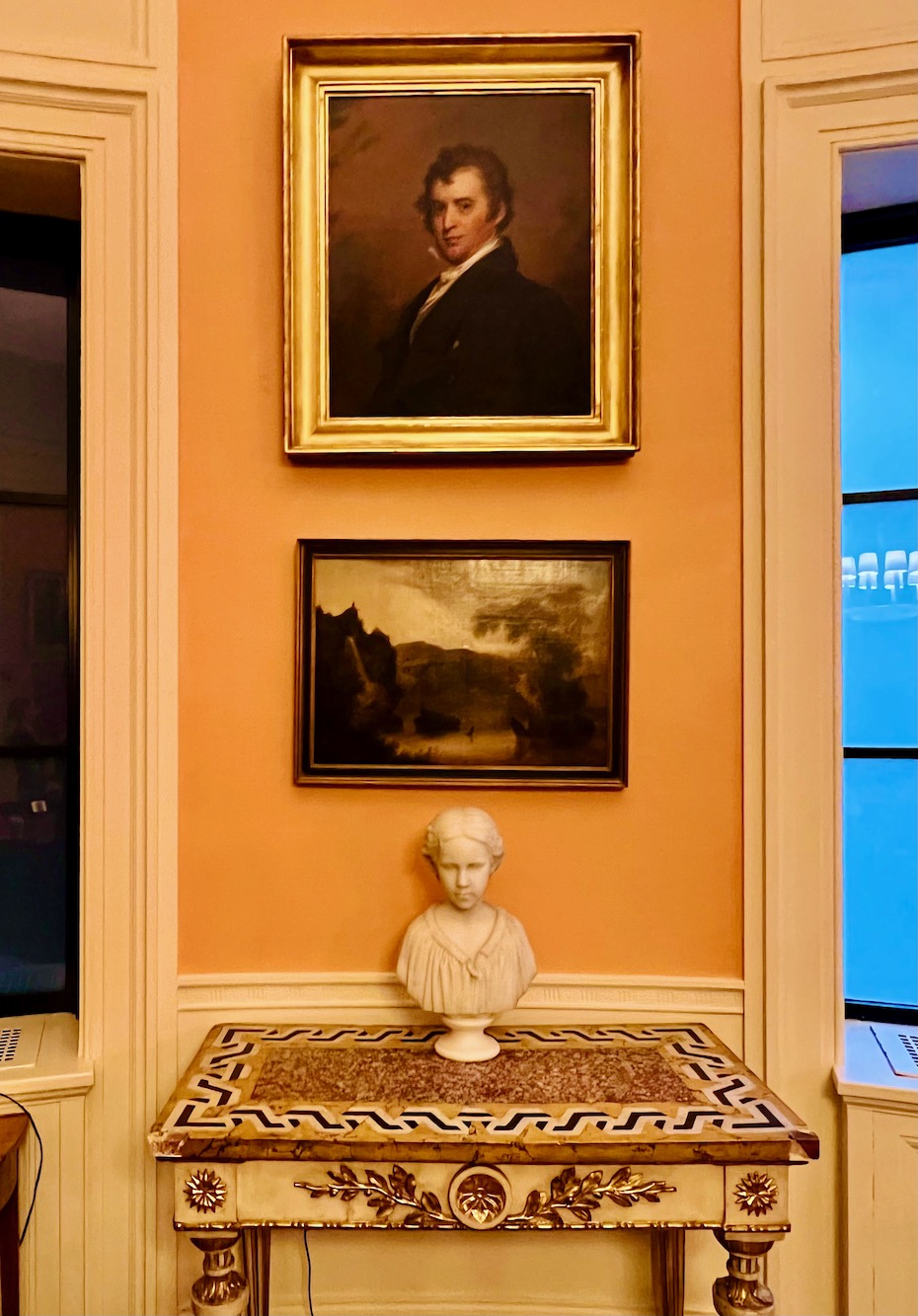
Art Trustee’s room Boston Athenaeum, taken by me – for more of this gorgeous library and art gallery, please go here.
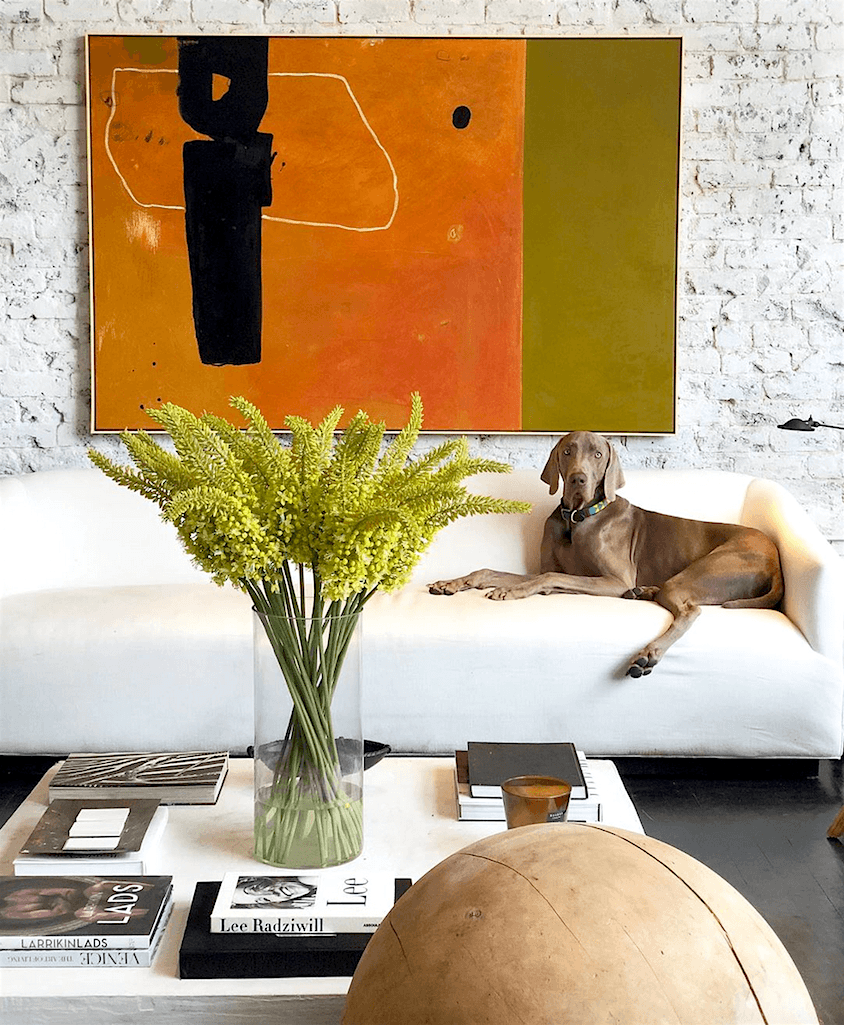
via @william_mclure on instagram
And even if you don’t want to paint your entire home orange, some carefully chosen accents can totally make a room.
So, let’s look at how some fabulous designers have incorporated the color orange, beautifully into their interiors.
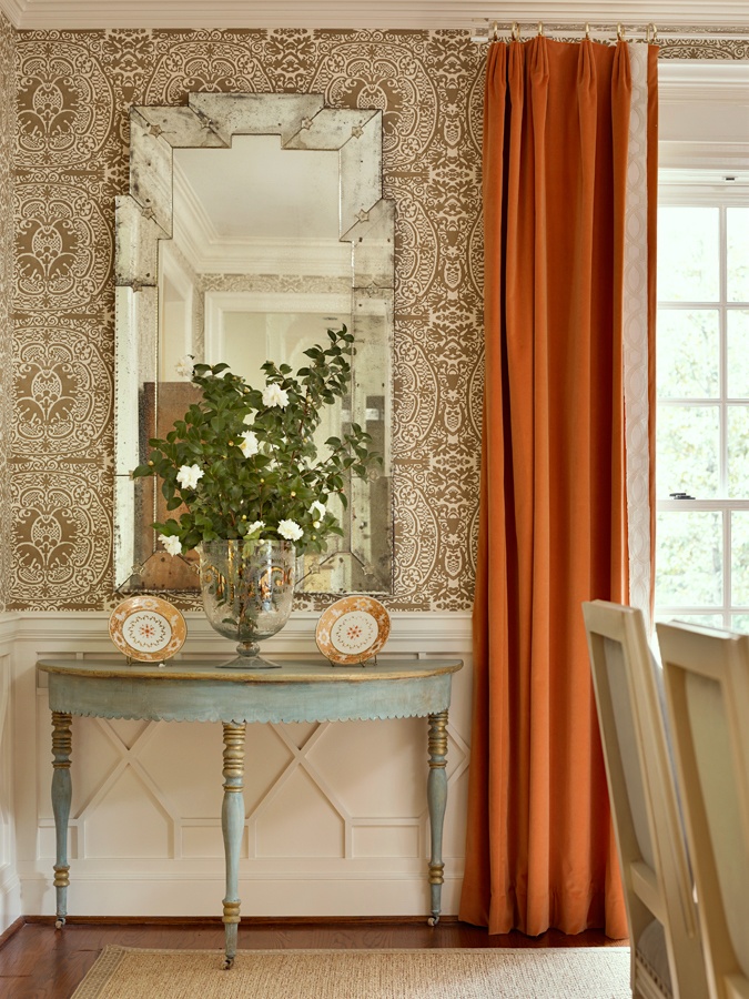
For instance, these orange drapes look pretty smashing in this beautiful new-trad dining room.
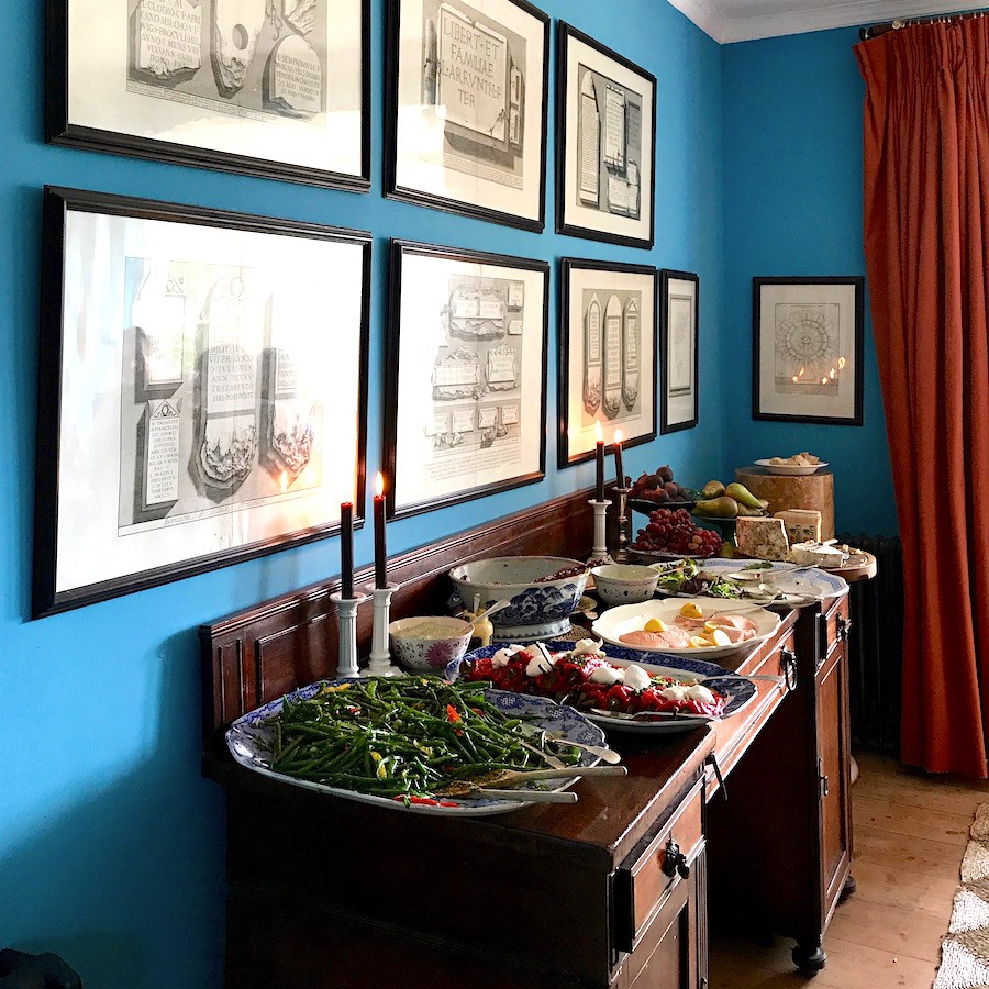
This reminded me of Ben Pentreath’s fabulous orange drapes with his vivid blue dining room. This image, you may recall was taken from my recent visit to England and his gorgeous home and garden.
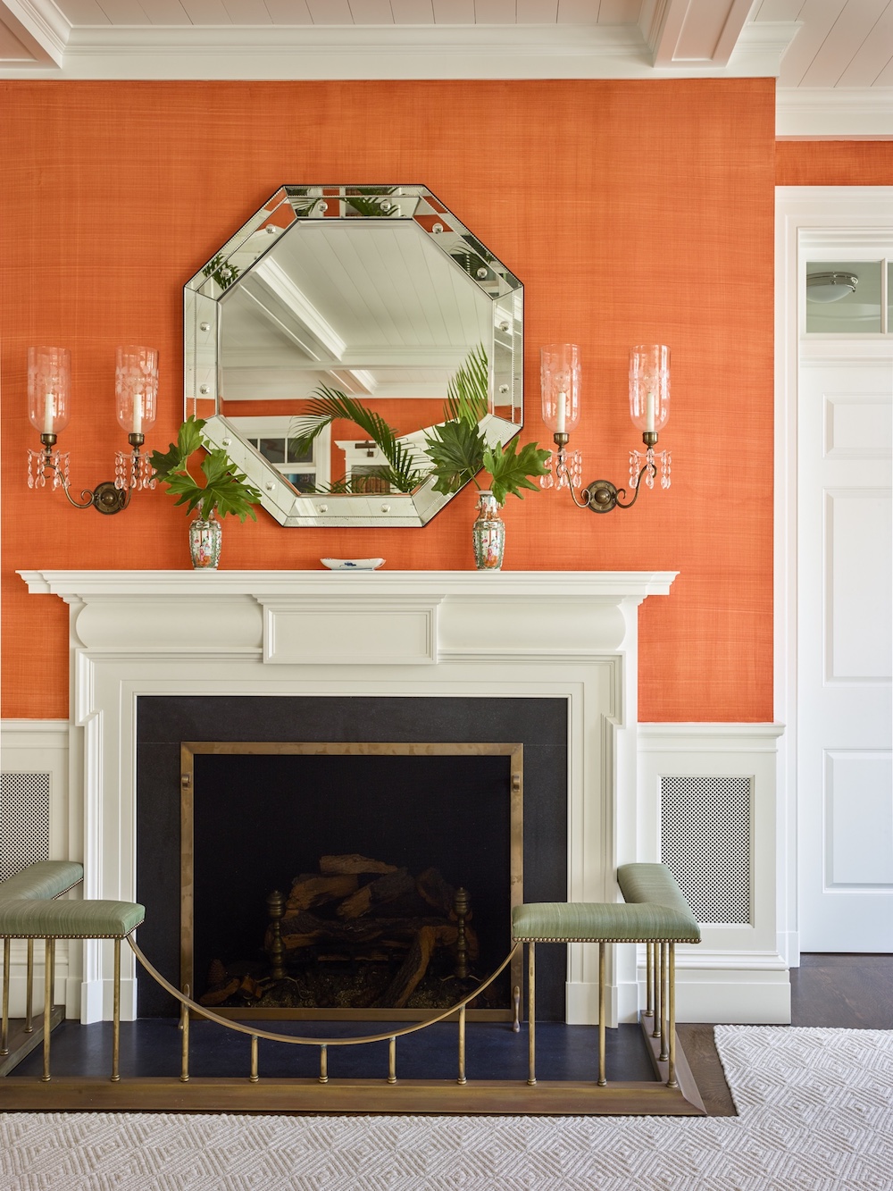
One of my favorite vignettes by architect, Gil Schafer
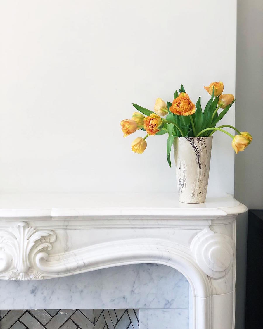
Erin Hiemstra | Apartment 34
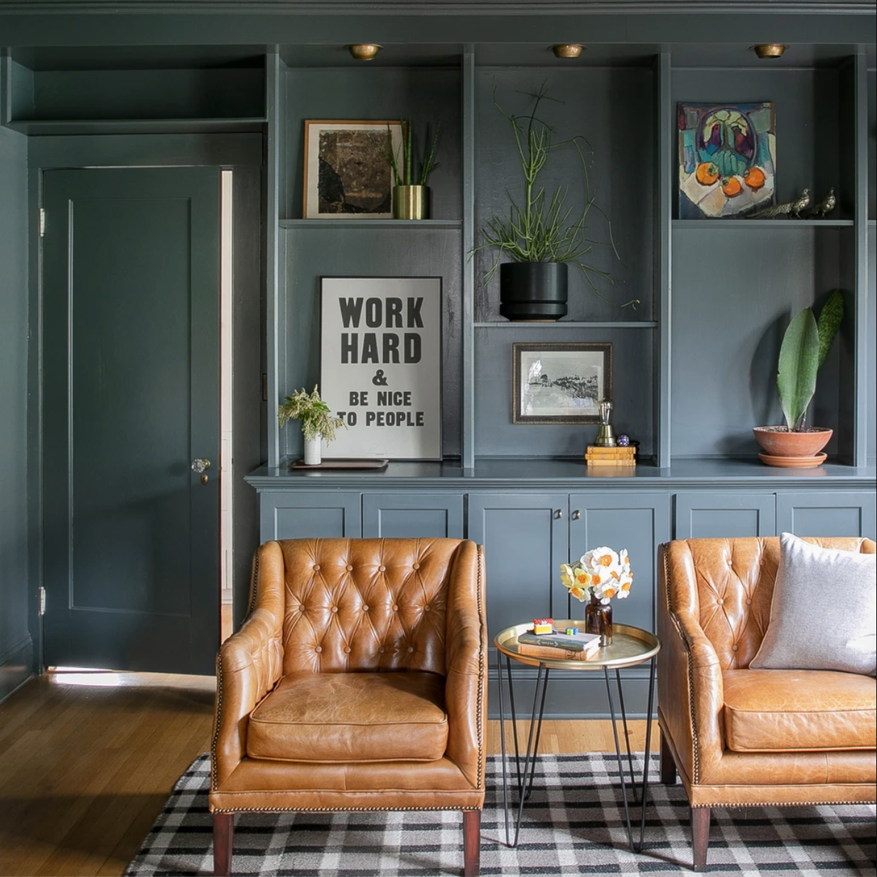
Vignette by Schoolhouse Electric.
You know, stained wood is often a shade of orange. And, so is leather. No, they aren’t a bright orange, but still in the family of the color orange.
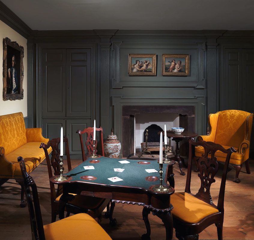
A Room from the Colden House
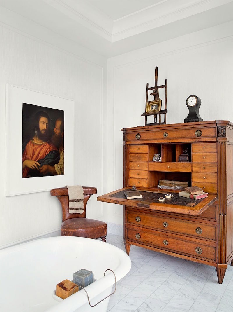
Darryl often uses orange accents in his beautiful rooms.
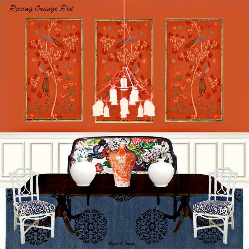
Benjamin Moore Racing Orange Red
Above, one of the 40 boards from the Laurel Home Paint Palette Collection.
This guide is part of the Laurel Home Paint Color Collection of 144 curated Benjamin Moore Colors. Racing orange red is the reddest shade of orange in the collection. It makes a beautiful backdrop for art and antiques. And, it looks fabulous with blues and greens.
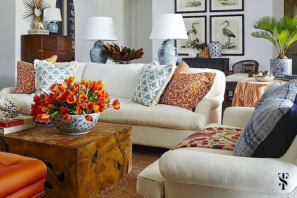
Summer Thornton uses a lot of orange in her decorating.
We saw more of this fantastic home in this post.
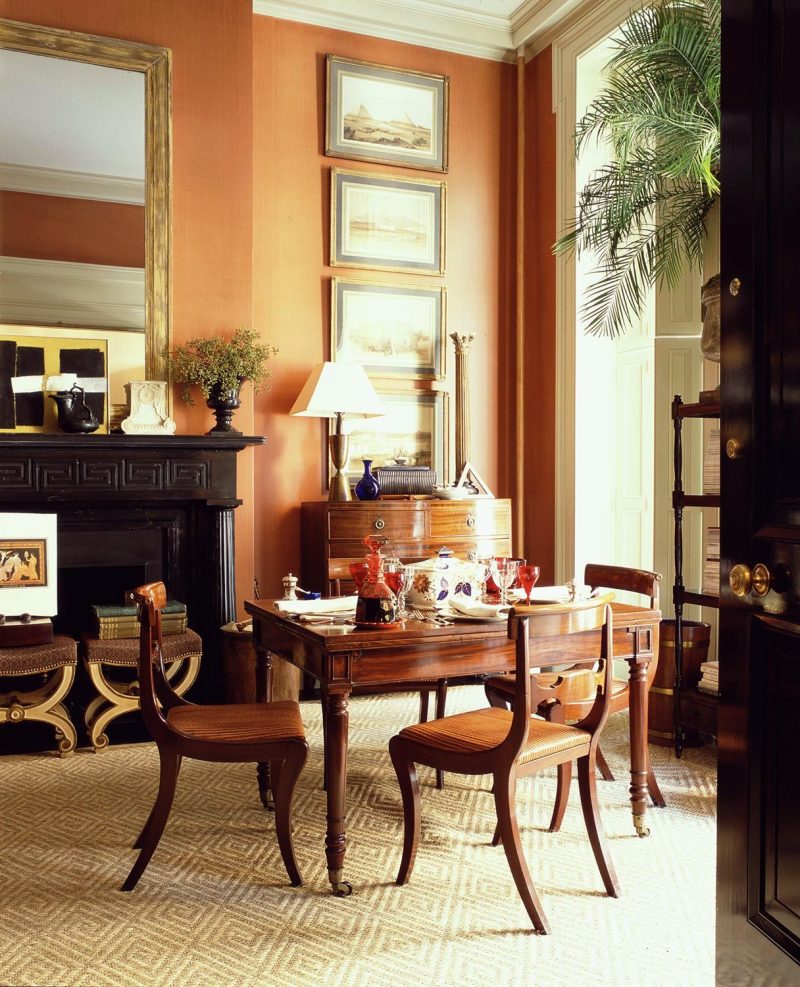
Gil Schafer’s former Greenwich village townhouse. He recently changed the wall color and some other things which you can see here.
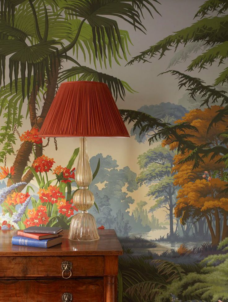
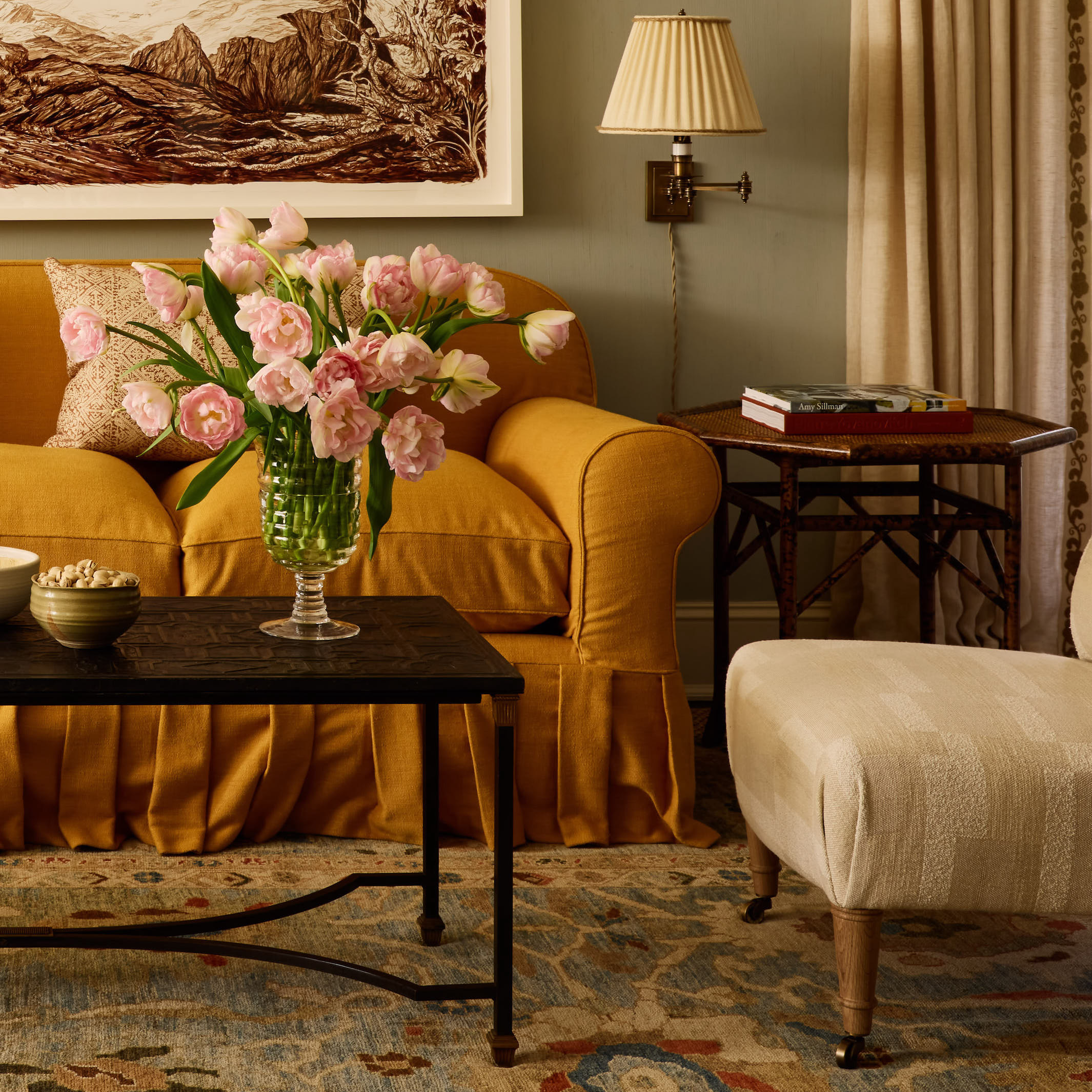
McGrath II
Oh, how I adore the work of this incredibly talented mother-daughter interior design team McGrath II
The colors in this room are incredible!
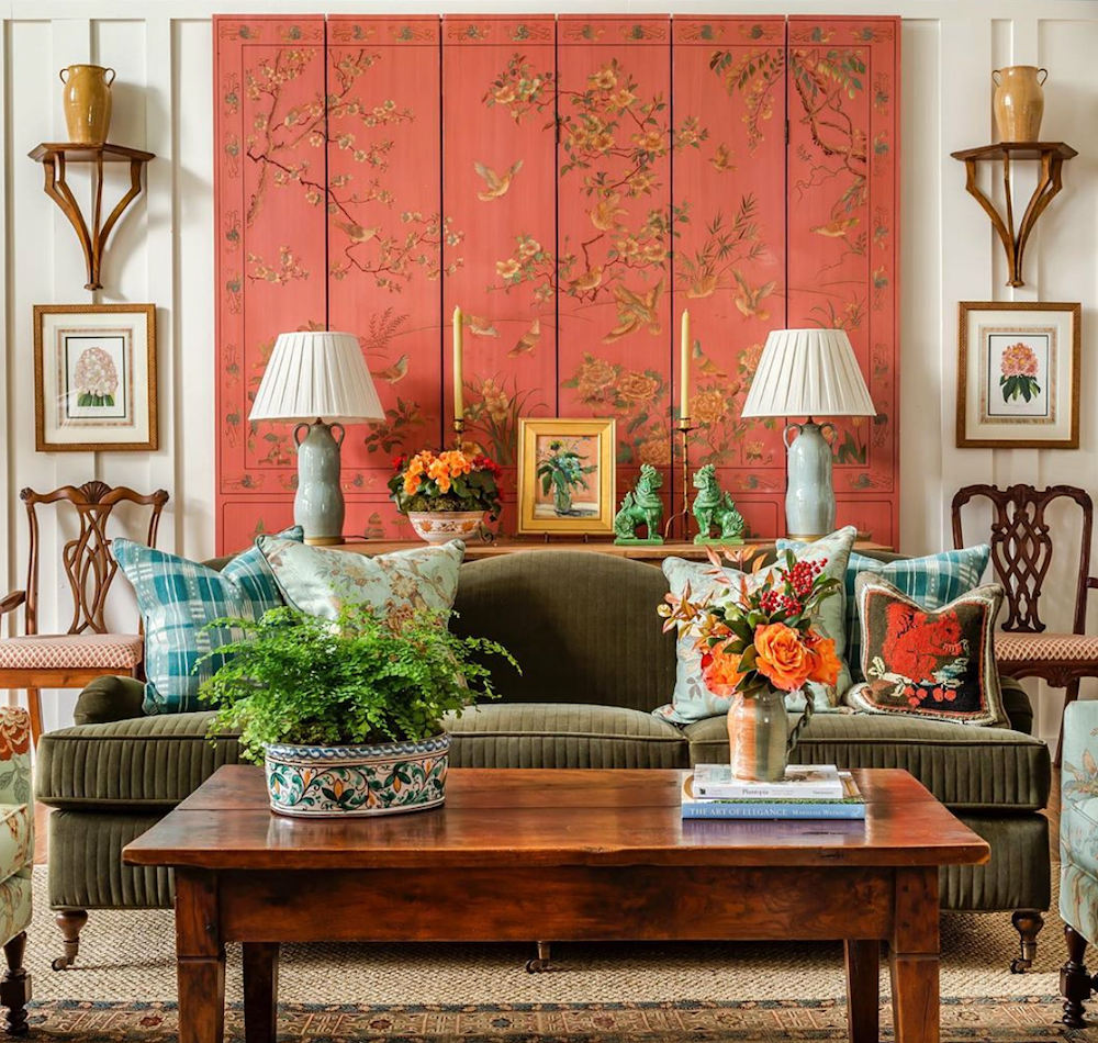
@jamestfarmer on instagram – James is a huge fan of orange decor and uses all its shades in his fantastic rooms.
For more of my favorite James T Farmer rooms please go here.
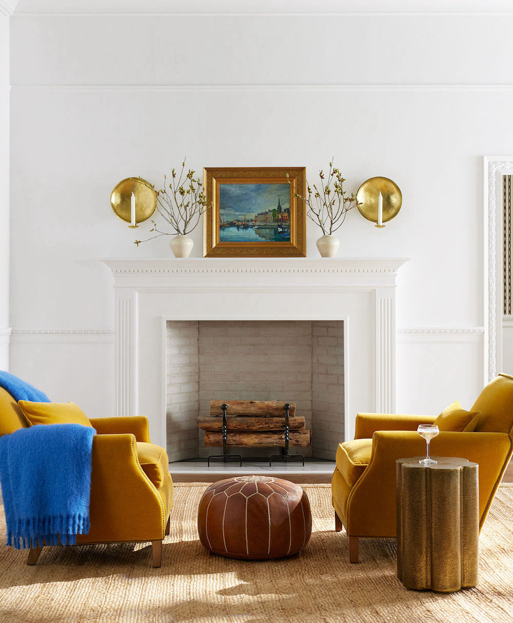
Above are the Serena & Lily Canyon Chairs in ochre velvet
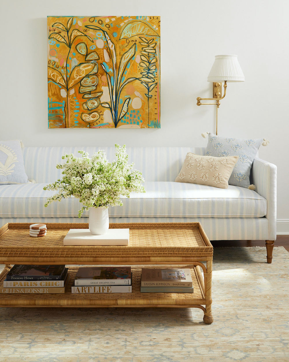
Serena & Lily Eastgate sofa with colorful orange art hanging above it.
Above is another James T Farmer beauty featuring a red-orange. photo: Jeff Herr
Below is a beautiful widget full of the color orange home furnishings.

How do you feel about the color orange now? You might enjoy these other orange color posts
Do You Know What Is The Most Classic Color?
Here’s The Problem With Halloween Decor
20 Great Shades of Orange Paint
My 16 Favorite Benjamin Moore Paint Colors (includes my favorite shade of orange)
There are so many beautiful ways to incorporate orange decor whether it’s in the walls or the furniture.
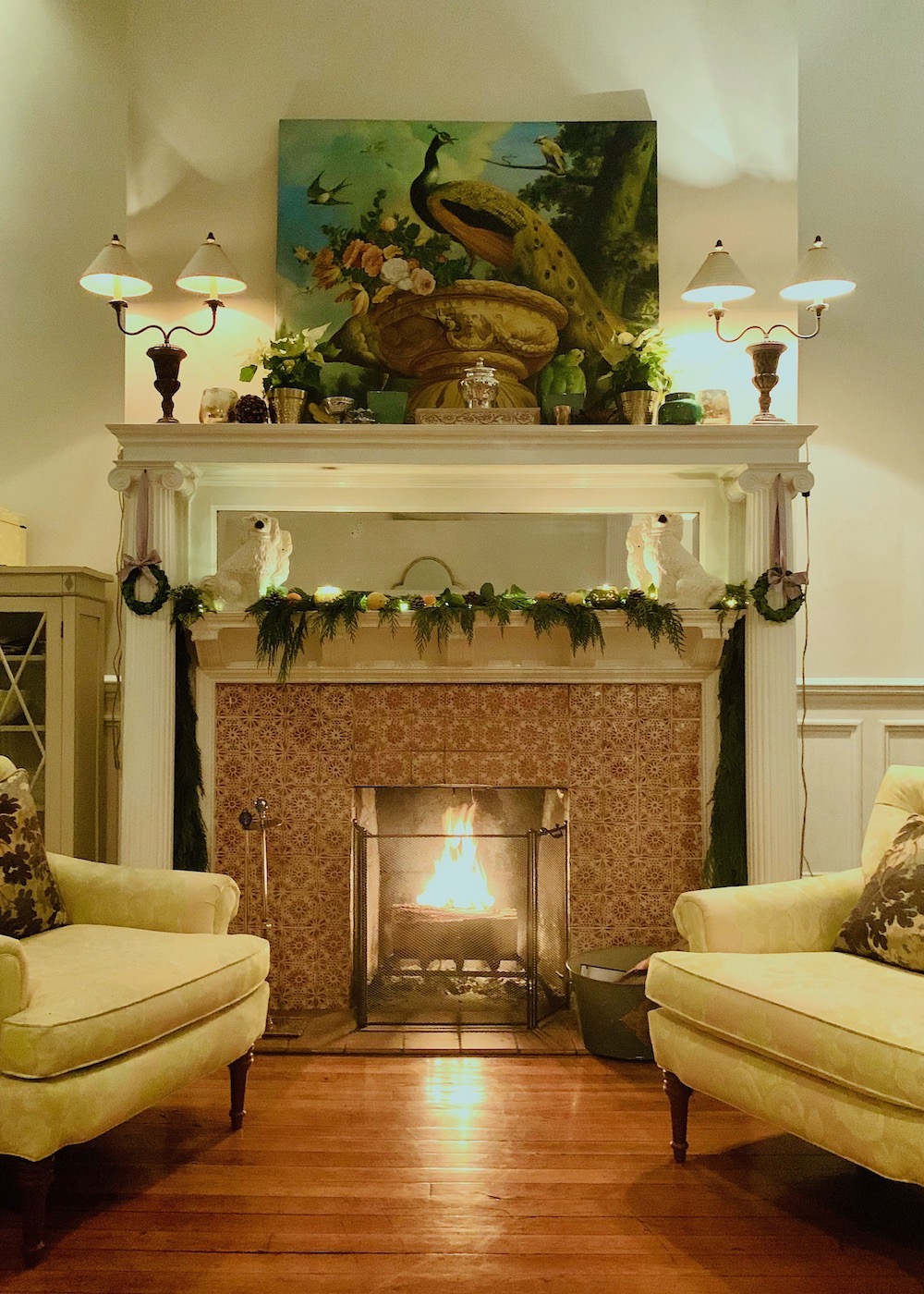
My holiday mantel last year.
I hope that you enjoyed this post about decorating with orange and got some ideas for how to incorporate orange into your rooms to add beauty, and warmth.
xo,

PS: Please check out the newly updated HOT SALES
Please also check out Amazon to take advantage of Prime Day which is ending today, the 12th.
Related Posts
 Coffee Table Styling Using What You Already Have
 How To Build A Unified Interior Color Palette
 An Attainable Kitchen Makeover You’re Going To Love
 21 Best Hidden Storage Ideas, Stairs, Kitchens, Bathrooms
 Original Old Home Details – Is it OK to change them?
 High-Low Furnishings + Sources and Secrets Revealed
 8 Guest Bathroom Designs – My Secret Process





38 Responses
Fifteen years ago when we moved into a little Arts & Craft bungalow, my husband and I chose a shade of orange for the darkest room in the house, to try to warm it up. (Also, after working in corporate environments for years, we didn’t want bland.) Recently, my father’s 85 year old cousin gave me two portraits of what I call “alleged ancestors,” and a glass-fronted bookcase that actually belonged to my grandfather’s grandfather. I was amazed at how good those dark oil portraits from the 1830s, matted in black and framed in a shade of gold, look against the orange walls.
That sounds beautiful, Elizabeth. “Alleged ancestors” made me laugh!
I never comment on things I read online, but I really enjoy this blog and this post in particular. We had a lot of soft blue in our living room, along with oak floors, a big custom oak bookcase and a big wall of windows on green woods. A pair of custom storage ottomans with bun feet and mud cloth upholstery (in orangy golds) really woke things up in there. Nice to see all the large and small doses of orange in these photos. Thank you, Laurel.
I’m honored that you replied to my post, Tamara. Thank you so much!
For incredible oranges, please don’t forget the stunning Torvaldsen Museum in Copenhagen…
Hi Laurel,
I loved this article! Made me smile all the way through. Having been in my childhood home as well as my current home, ( now with some of my mother and fathers beautiful furnishings) I know you will understand my Iove of “orange”. There is orange and there is orange-ish as I call all the different shades … incorporated into pieces and fabrics – the rusts in Imari and Staffordshire, the brick reds in the oriental rugs, – all seamlessly blend with so many colors- blues, greens, golds, rose and of course a “splash” of black . I suppose so many colors might make some cringe, but for me, colors ( including orange) can be beautiful ! Thank you for this great article😍- Robin
I love orange and declared it my favorite color as a child. My younger sister and I even had matching bright orange jumpers lovingly made by our mother. I keep wishing for orange in my home, but have committed to reds, blues and creams (driven largely by Persian rugs) and various wood tones, which do bring in a bit of deep orange. Orange is an emotional color for me and represents energy, youth, and joy.
I love orange. My spare bedroom was painted a soft orange and I preferred sleeping in the spare room versus the primary one. It had such a warm glow waking up no matter the weather. Later I changed the color, because it no longer coordinated with my new furniture. Today, I’m still using a combination of orange, blue and hot pink for accessories, but my walls have been repainted a warm white.
Last year we bought a house, a 1970s gold electric stove was left in the basement. I don’t even know if it worked. We put it on Facebook Marketplace for free and people were fighting over it.
Mother Nature can do orange so I don’t have to.
Love orange/coral and James Farmer’s work…everything he does is gorgeous. Not coincidentally, Fall is my favorite season…give me all the autumnal colors against a bright blue sky. In our last home I had a mostly aqua/green color scheme. I missed the warm tones so have brought them back in our new house in rugs and patterned pillows.
I also use cool colors because that’s what I wear as a blue eyed blonde. But I loved this, it makes me want to use it in the future in some way! I do love corals. And I also really love my Tennessee Vols, Go Big Orange!!
Orange is such a divider of the people! Amazing.
I love it. I love it for interiors and flowers and clothing. My favorite parings are orange with pink and orange with red, but I also like orange with blue. I just love orange I guess.
Thanks for the eye candy!
Something I learned in 25 years of teaching adolescents: folks who are color blind can often distinguish the color orange from other colors. I was surprised to find out a young man whom I had taught graduated, and his parents bought him an orange couch! His poor future wife!
Love orange! Prefer some shades, though, more than others.
I have an all-weather jacket, Ralph Lauren, in burnt orange. Really nice color!
Am seriously considering painting my bedroom walls the orange color in one of your examples (Gil Schafer’s former Greenwich village townhouse).
My trim is same color as that room, and my furniture same color.
Shaking in my boots as it “seems” outlandish. But Schaefer’s room looks so warm, inviting, cozy – all the feels I’m looking for…
I adore orange, especially when used with blue! Those first pics you shared (along with your clever captions) had me laughing! What were “they” thinking? The Summer Thornton room has me swooning, and I love James T Farmer. And can we talk about your fireplace vignette? It’s gorgeous!
One of the most gorgeous rooms is a library Cathy Kincaid did with all of the mill work lacquered in what I would describe as a cantaloupe color. Exquisite! The room is shown in her first design book.
Orange makes me puke.
-The Boz
I will not wear that gaudy orange.
-The Blind Side
I agree.
I’ve always used warm colors for my decor but never called any of them orange. After reading your post, I guess I love orange. Although, all my walls are in yellow tones from cream to pale watered down mustard, throughout most rooms in my house a shade of orange can be found from chipotle red and paprika to apricot and peach in fabrics, art, dishes and other decor. I quite often keep gorgeous orange roses in my entry in a vase of my grandmothers on a vintage low chest with tole painting in shades of guess what, ORANGE.
I love fall colors and am enjoying a beautiful day here in west Texas. Hope you all are having a beautiful day as well.
One of my favorite spaces by mother and daughter McGrath is the elder McGrath’s entry hall featuring Hermes orange, banded by dark brown and plenty of crisp white millwork!! Absolutely gorgeous…
Beautiful in nature, but only in small doses in the home. However, my original red oak floors are orangy and I do like them.
Confession. I once owned an orange car. I called it my orange lemon as it never worked.
That was a lifetime ago.
I like some orange and many of the rooms above call to me, but I think it is best as an accent with red.
My former study was an orangy red with lots of white woodwork and dusty purple touches. It really helped me concentrate. I felt like I was back in the womb.
Next time, only include the beautiful rooms. We need our eyes trained. How did all those color mavens of the 60s/70s get into influential positions? I’d like some insider history on all that!!
Just think of those many landscape paintings by Vincent Van Gogh that combine shades of orange with blue. Perfect combination!
My bedroom has dim, cool natural light coming in from one side and a west/southish facing window on the other side and some morning light from the doorway. Years ago I painted the walls a warm apricot and the high ceiling a pale periwinkle blue, white trim, and I’ve loved it ever since. It glows in the morning & late afternoon! I love seeing color on the ceiling– white is just plain boring IMHO.
I like orange for other people, lol. I actually think that people love the colors that look best on them. Remember the 1990’s thing of figuring out whether you are a winter, spring, summer or fall? I found it to be surprisingly accurate. I’m a “winter”, with blue eyes, very fair skin, and while blonde as a child, now have dark ash-brown hair shot with silver. So I love black, reds with blue undertones, and all colors on the “cool” spectrum, especially jewel tones. The oranges, olives, mustards, browns, etc. make me look like a corpse! Having said that, I really do appreciate coral tones. If anybody gets to Rochester NY, there is a room in the Memorial Art gallery that has walls upholstered in a gorgeous orangey/coral/copper silk damask that is devastatingly beautiful. I nearly fainted from the beauty when I first walked in. So, in the right place, orange can be gorgeous.
Hi Laurel,the room you identified as from the Coldan House is actually the Verplanck Room in the American Wing of the Metropolitan Museum. The architecture is indeed from the Colden House from the Hudson Valley, but all the furnishings were from the Verplanck family’s home at #3 Wall Street in Manhattan. When the furnishings were donated there were no NYC parlors intact so the Museum chose the relatively simple but fine example of mid eighteenth century American woodwork to show museum visitors how a pre-revolutionary family lived in NYC. The pumpkin upholstery is a reproduction of what the Verplanks would have had in their home. I am a longtime guide at the museum, and the room is close to my heart, I am also a big fan of your blog!
Orange in nature is beautiful. But orange of any shade on walls or furniture makes me shudder. We’ve been house hunting in a desultory fashion for quite a while, and way too many houses are doused in orange paint. I can take it in very small doses, period. Part of my aversion may be emotional, as it’s a very stimulating color, and I like calm. And part may be my own coloring, which is cool: any shade of orange or yellow makes me look perfectly awful.
Also, I do not consider orange a good backdrop for paintings. They look marvelous against gold, but orange is too dominating to set them off.
I love orange.
It’s luscious, warm, and inviting. As long as it isn’t “faux early American “
No no no. Had plenty of that as a kid, ick
Like most people I have a love hate relationship with orange. We recently traveled to Natchez MS and while antiquing in neighboring Vicksburg I came across some pieces of orange and green crewel that had been stripped off a piece of furniture. Well it was last fall and I was in an orange mood that day. I bought some of those old stained pieces of crewel because well, I’m a sucker for crewel. A couple of weeks agoI hauled the pieces out and threw them in the washing machine with Woolite on delicate and they came out beautifully. Shock to my system! I had a piece of old vintage actual cotton velveteen in perfect green and whipped up pillows for my living room. Absolutely love them. Sometimes just that spark can liven things up.
My husband grew up near Tell City, Indiana. In his community, if you owned Early American furniture from the Tell City Furniture Company, it meant that you were successful. Of course, when we got married and purchased furniture, it was important to my husband that we purchase Tell City furniture. So all of my married life, I have been trying to work around furniture that has orange undertones. When we moved to New Orleans in the 1980s, coral walls were very popular, so I painted our west-facing great room coral. When the sun came through the windows in the late afternoon, our walls looked like they were on fire. I repainted the walls, using a camel-ish color above the chair rail and a shade of blue below – that worked a lot better. I painted the living room and dining room of our next house a shade of soft pink. It never looked quite right with the furniture. Neither did the pink floral dishes that I had at the time. When we remodeled, I found a sandy-colored paint for the walls and I got rid of the pink dishes. Everything looked much better. By the time we were preparing to move to our new home, and with the assistance of all of the wonderful guidance I have gotten over the years from your blog, I decided to edit and replace some furniture. The obviously Early American style dining chairs have been replaced with white estate-sale find chairs. I got rid of the obviously Early American hutch top, but kept the buffet. I kept one maple occasional table that doesn’t scream “Early American”, but got rid of two others. I have filled in with a combination of new furniture and estate sale finds. As a result I have succeeded in toning the down the “Early American” look. I chose blue-gray walls with white woodwork, and my orange undertoned furniture pops against this backdrop. The pink dishes have been replaced by a set of blue and white transferware. I am using mostly greens and blues for my decorating choices. Our wood floors are an ash-brown color. I have learned a lot about working with orange undertoned furniture over the years, sometimes as a result of making the wrong color choices. We are still in the process of getting the new house set up – everything happens so much slower since the Covid shutdowns. But I have to say, I am really happy with the way my old furniture is working into the decorating plan for our new house.
Laurel, when I see that much orange in a room, my mouth starts to water. No, not because it looks so luscious but because I’m getting ready to vomit. Orange is the only color I react so strongly against. But yellowish green is close.
I’m with you, Margaret…I could hardly get through the seasickness feeling of those first pictures, but the leaves of fall and peach roses are my favorite floral colors.
Tiger orange is out in full force right now in Alabama…all those Auburn football fans!
I lean more towards gold than orange, but I must any shiny copper or rose gold catches my eye, so I appreciate the orange post, in spite of those first garish pictures…thanks, Laurel!
Hello Laurel, Don’t hate me, but I kinda want that Lazy Susan dishwasher!!! and I believe that might be a Siematic kitchen, which I’ve always crushed on. I also ( am Dutch) have some orange pillows on sofas in my north facing surrounded by trees LR. It does the trick 😉. Also tones in really well with my mid century modern Danish credenza wood.
Fantastic post! You gave me many ideas about how orange in all its variations can be used. Great widget too. Love the James Farmer and Summer Thornton rooms. And leaning toward buying one of the items in your widget for a blue room. Thank you.
Hi Laurel,
Now that you made me think about it, I guess I’m decorating my new home with a shade of orange. But the orange I’m going with is similar to the color of McGrath 11’s sofa. I have that color in my wood countertop & in the wallpaper for my kitchen that I can’t wait to get up. That color then flows into my living room with my ginger colored velvet sofa.
Enjoy your visit with your son.
I’m in the “no orange need apply” camp, but I have deliberately added orange accents at times – mainly to get out of my color comfort zone and add some pop. I picked an area rug specifically because it had some reddish orange bits, and used a flower arrangement in that with the same color. Orange wasn’t predominant, but it added a little extra.
Good post Laurel! I think orange is much maligned. I love it in the home when well done. Orange to me says warm and welcoming and a colour of gentler times of days gone by. I’m thinking of those kitchens of the 50s and 60s when life was simpler and there was always cake in the house. I’ve used apricot in one of my houses but not orange as too warm a colour for northern Australia. That said I did own a lovely burnt orange lamp. After the pandemic perhaps we all need a little colour in our life.
Laurel, wonderful post. I believe that first photo of the “colonial style” living room was from my parents house – not sure how you got a hold of it 😉. Growing up with avocado green and orange everywhere in my parent’s home, I developed an aversion to these mid-century colors – double yuck! However as I matured and learned to love vegetables, I also began to appreciate these colors. I own a couple of pieces of tiger maple and love the pop of color it brings into the room. I especially like how the orange of the tiger maple wood plays off my navy blue sofa. By the way those few shots of Boston are gorgeous.
Hi Laurel, I wish I could send you a photo of my boston condo. Moody blue walls and ORANGE fabrics all over the room! AND, I just changed my business logo to include orange. After reading the comment above, maybe it is my former Dutch relatives whispering their choices!! Love this post. Thank you for sharing!!
Good morning, Laurel! Being Dutch, of course I had to sneak in some generous doses of it in our living room. We live on a farm in Norway. Our living room is large, but it’s facing north. And there are many months where we have little daylight as it is. All good excuses for orange :)!