

Happy Valentines Day!
In honor of the day of love, I am again revisiting Downton Abbey to reveal some of the most beautiful and romantic paint palettes ever!
As we saw in last week’s birthday post, a color or paint palette can be found anywhere.
- Nature
- Fine Art
- Crappy Art
- Film and TV
Awww…
I have a confession to make.
Here goes.
For more years than I care to admit, I was addicted to the soap opera All My Children. (Sure, go ahead and roll your eyes. I’ll roll along with you.)
I really don’t know exactly when or why I stopped watching it either. I don’t recall ever saying to myself. “Okay, Laurel. Enough is enough, You are done with All My Children.” But, (fortunately) I just didn’t need it any longer. It was long before the series ended.
The reason I’m mentioning this is that I used to love the sets! And many of them inspired some of my real-life jobs in terms of color and even some of the furnishings!
Color and paint palettes are everywhere. Inspiration is everywhere. And today, nowhere better than in the upscale Edwardian soap opera, Downton Abbey.
We love the show because it transports us into another realm. It’s an era where some privileged people never had to cook, clean, dress themselves or even blow their own noses without help. Of course, privilege, title, great wealth and all the servants in the world can’t protect one from the inevitable misfortunes and tragedies that befall all of us. That’s what draws us in, I think.
We don’t want them to suffer but perhaps a tiny part of us is relieved to know that indeed, the “other half” (more like .1%) have the same issues we all have.
Adding to all of that is the genius mastery of the set and costume designers of Downton Abbey. And then there’s a brilliant script, directing, cinematography, music and a fantastically talented group of actors.
We’re going to miss the show for sure.
You may recall in last week’s birthday post that I said something in a deranged moment about a six-part Downton Abbey tribute. I certainly could but think that might be a bit much. I think it’ll probably be three parts. The third will coincide with the end of the series. How does that sound?
Today’s post is going to focus on the many gorgeous color palettes that evoke romance and images where it is often portrayed.
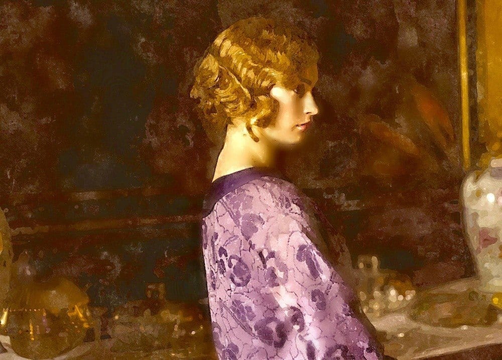
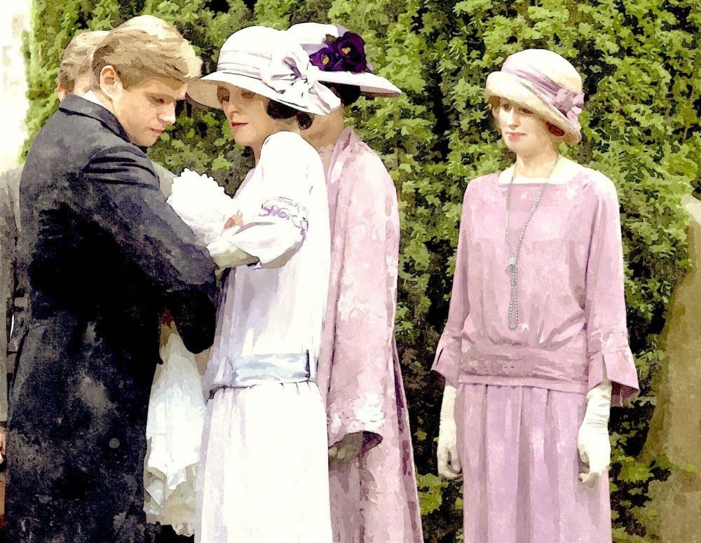
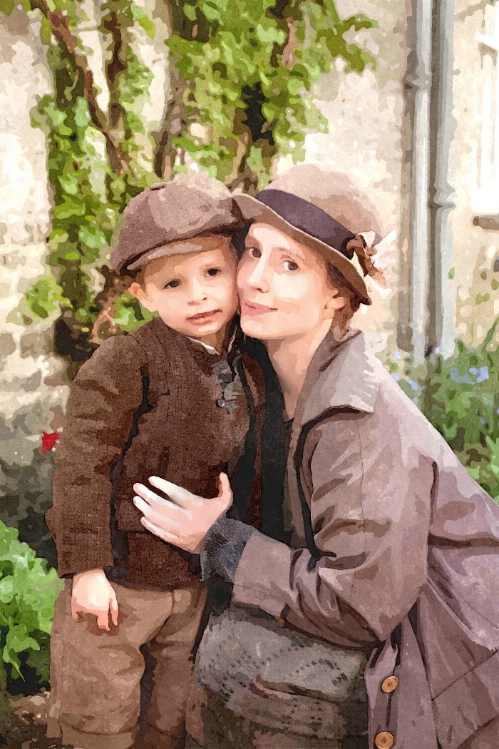
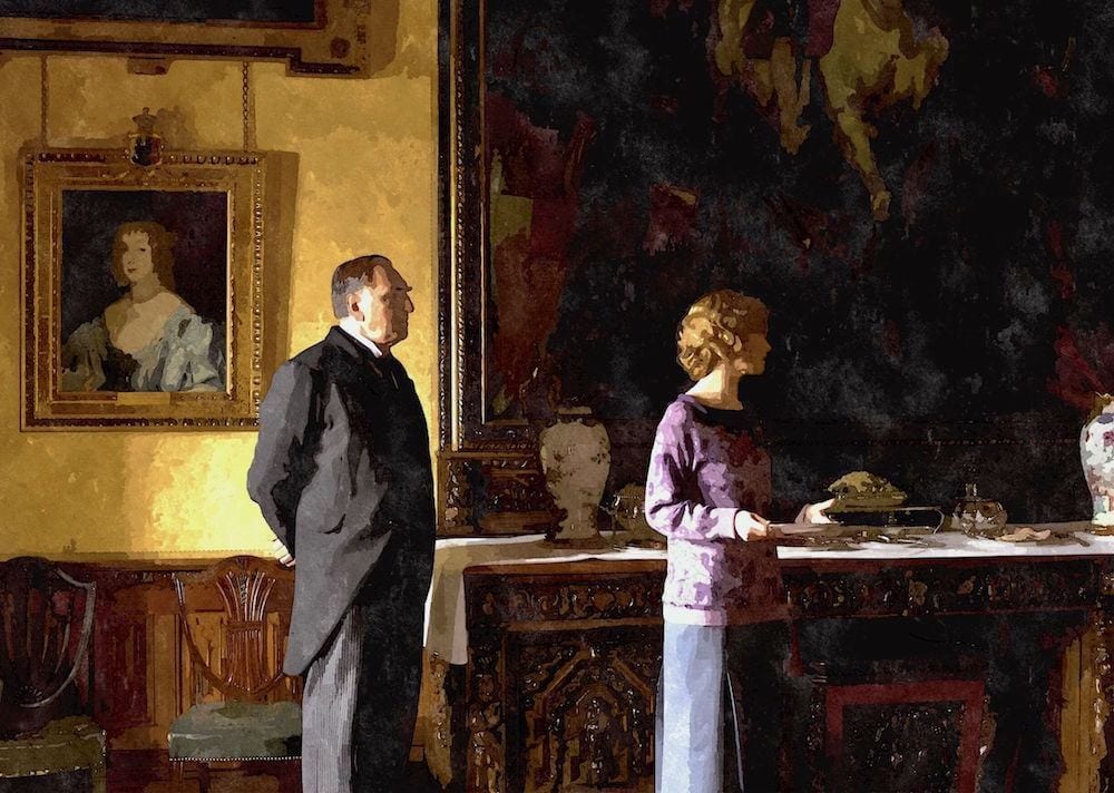
Have you noticed? Downton Abbey is heavy, heavy on the color purple and all of its neighbors, lilac, lavender, mauve, maroon, plum, aubergine— and then into scarlet and other reds. There is also a lot of gold and of course, many shades of green.
The colors range from exceedingly muted–drab even, to vibrant saturated colors and a lot in between.
Again, I put the photos through a water-color app and this week I got really crazy and went a step further. I hope you’ll enjoy the results.
Last week was only Season 1 (maybe one or two snuck in from later on). This post is from seasons 2-5 and they aren’t necessarily in order but hopefully close. I also tried to match up the color names with the order of the colors this time!
Three of the palettes are from last week, but three of them are new.
Please enjoy these romantic paint palettes.

PELT, BRINJAL, LONDON CLAY, DEAD SALMON, DIMITY, MOUSES BACK,
YEABRIDGE GREEN, CALLUNA, BLACK BLUE
The above colors are all from Farrow and Ball

Some of this palette belongs below as well.
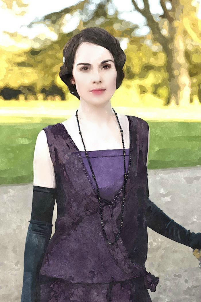
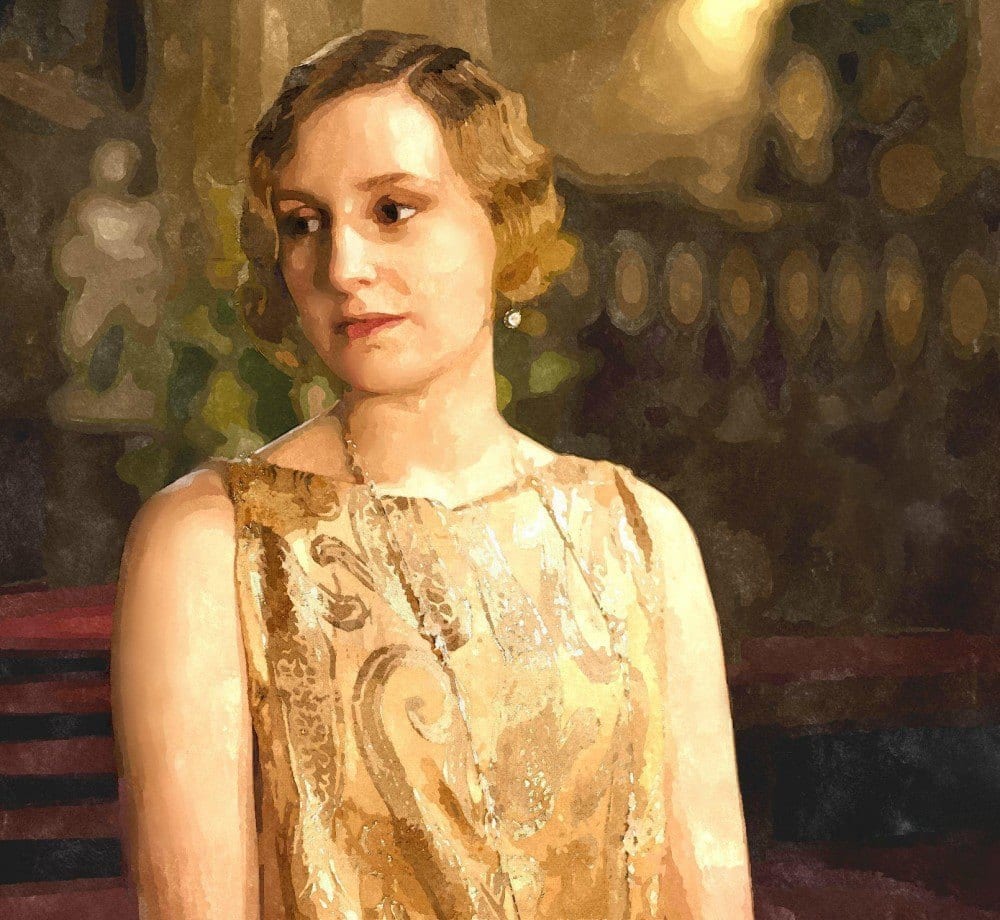
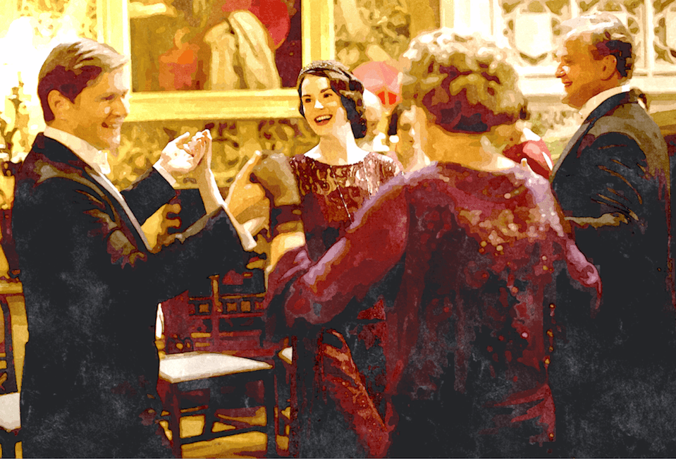
One of the things I’ve always loved about Michelle Dockery is that she has the face of delicate angel and the most mellifluous voice bordering on a baritone range. Great Actress!

PELT, WIMBORNE WHITE, NEW WHITE, MATCHSTICK, ARCHIVE, ELEPHANTS BREATH, LONDON CLAY, BRINJAL

Calke Green was used in this lovely kitchen renovation.
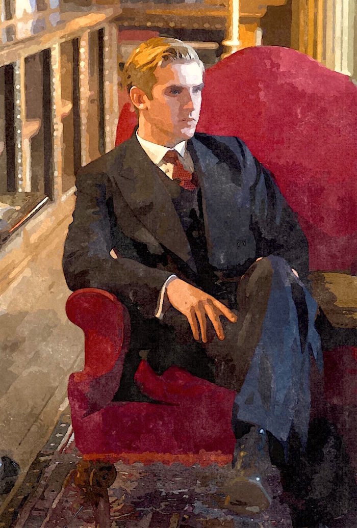
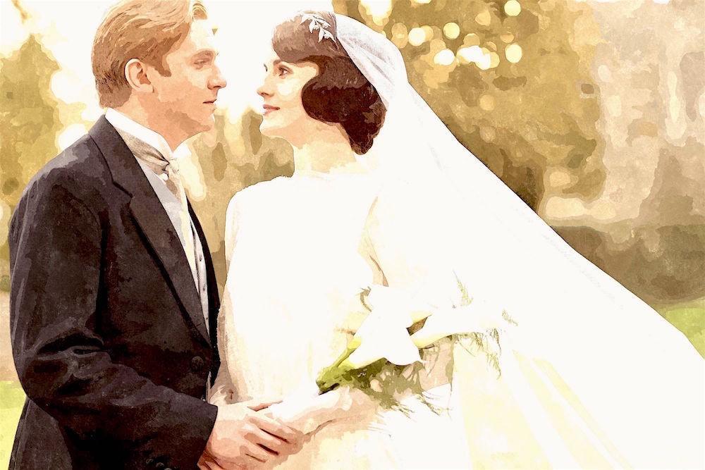
The dashing Matthew–may he rest in peace.

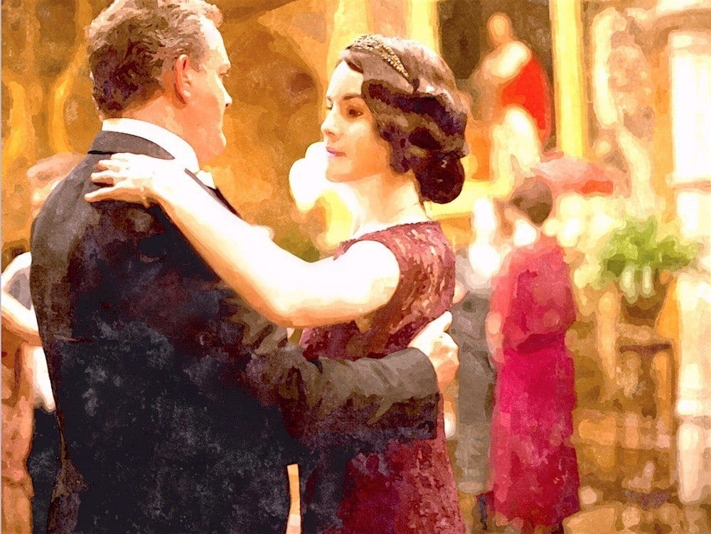
How gorgeous is the warm analogous color scheme! A couple of the colors are in other images in the vicinity.
I love how the Crowleys accepted Branson as one of their own. I daresay that didn’t always happen in these situations.
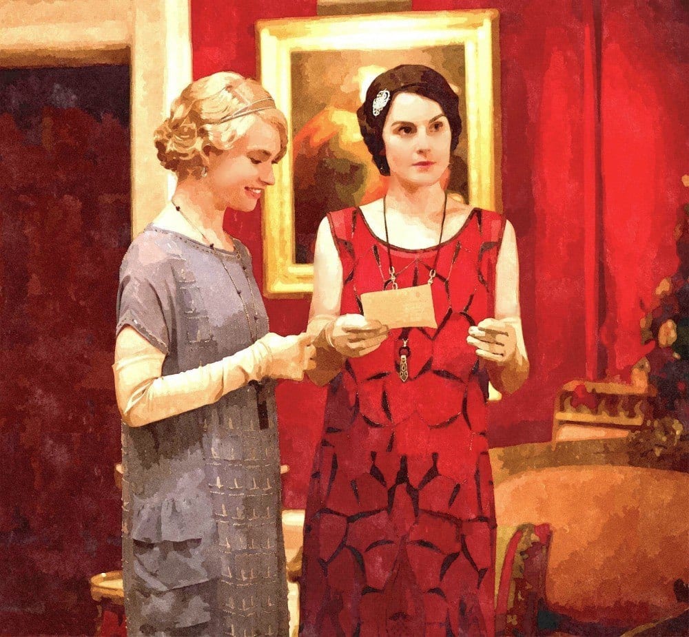
I don’t know who this character is, but doesn’t she look absolutely mahhhvelous in that divine frock!

HENDERSON BUFF HC-15, CHIC LIME, PRINCETON GOLD hc-14, RICHMOND GOLD HC-41, WENGE AF-180
***PEIGNOIR*** ELEPHANTS BREATH, DEAD SALMON, LIME WHITE, CORD
(these don’t line up because there are two different brands)
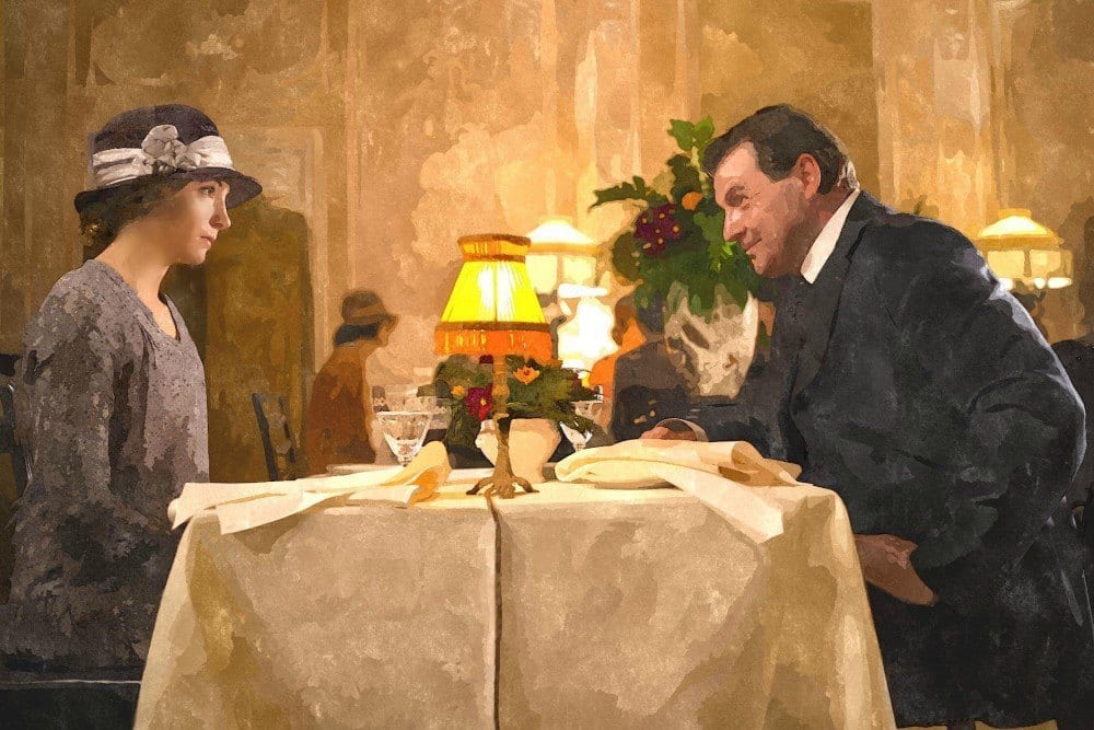
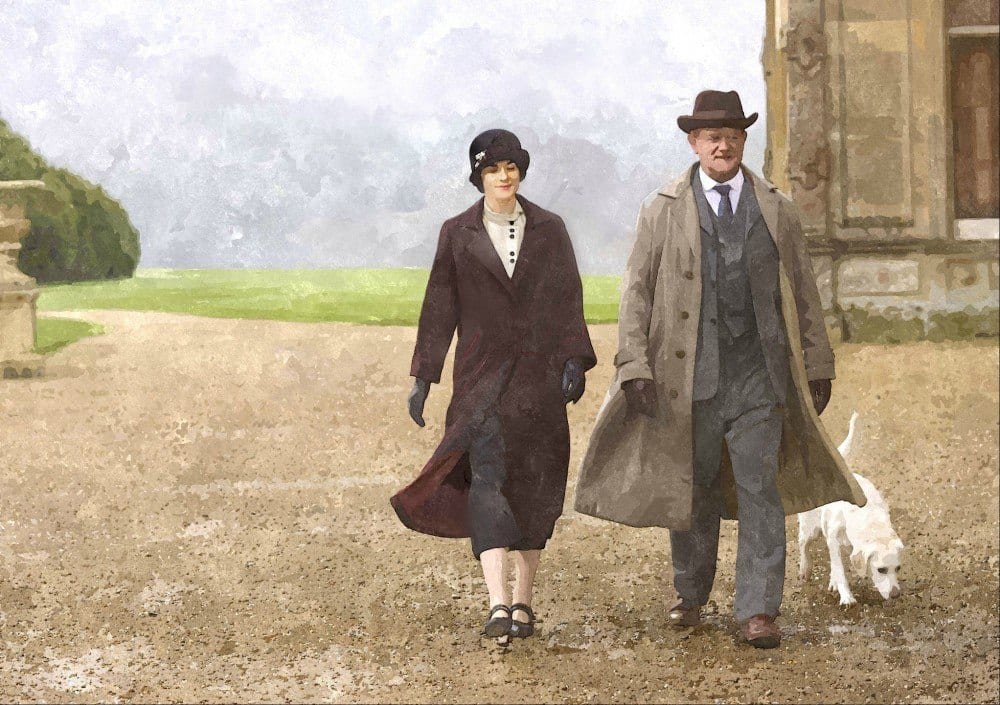
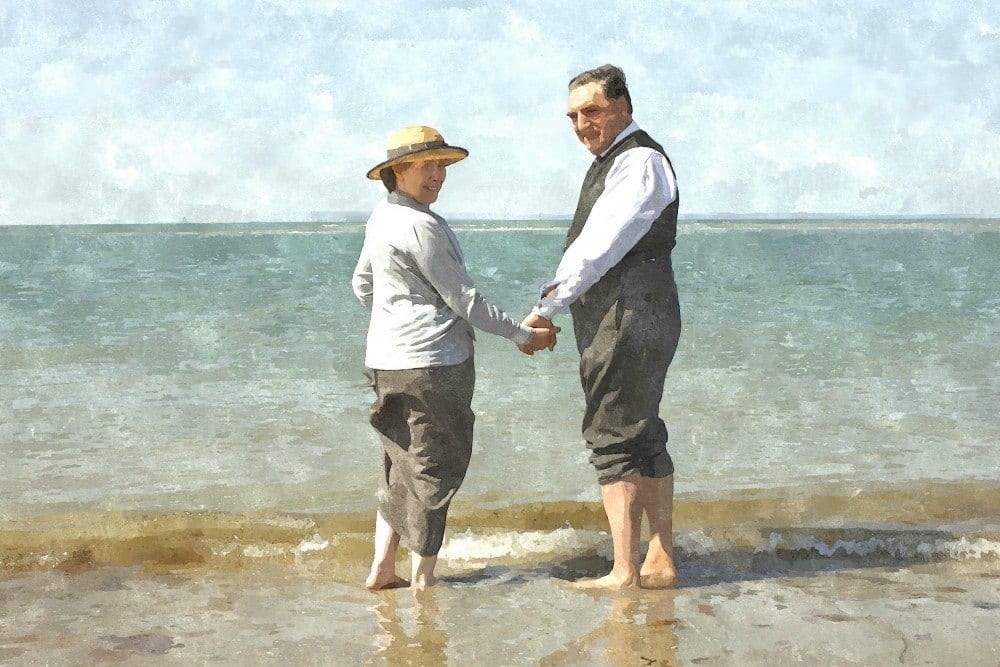
The Bates on a rare night out on the town.
I recall that Lady Grantham picked up the tab. Total class act, she is.
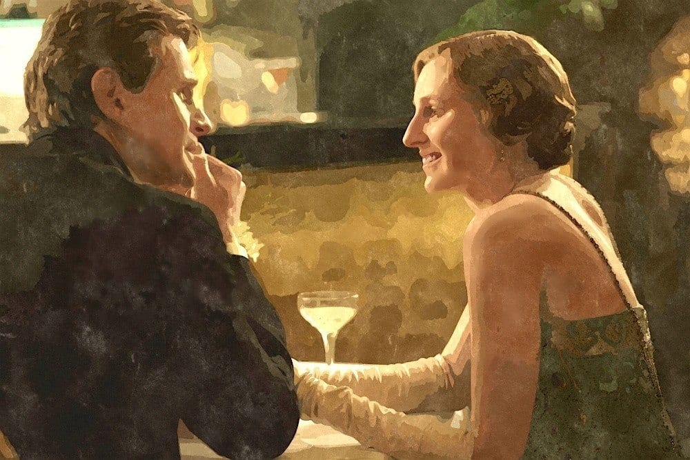
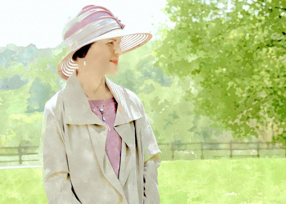
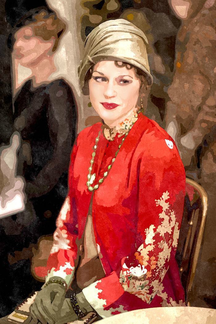
Edith being wooed by Marigold’s father, Michael Gregson. Thank heavens she rebounded nicely after that horrid man, Sir Anthony Sans-Balls-Strallan left her standing at the altar.
Despite their losses, they gather strength from each other. They really are just ordinary people underneath the M’lords and M’ladies.
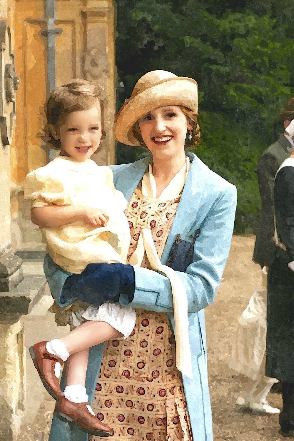
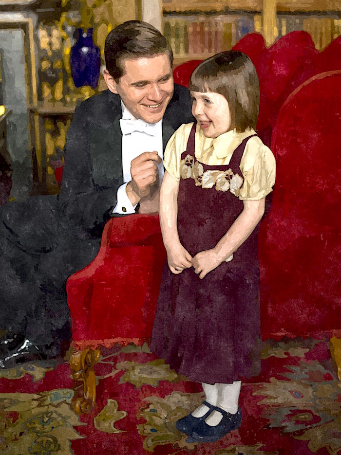
A smiling Edith reveling in the love she has for her little girl. I do believe things are finally looking up for Lady Edith.
Happy Valentines Day
And thank you all for the wonderful birthday wishes! I had a very lovely birthday and a lot of that was because of you!
xo,
 PS: If you enjoyed this post, please share wherever you like. Or pin the images to your pinterest boards. There are sharing buttons below, underneath the related posts.
Related Posts
 Your #One Interior Decorating Problem And The Solution
 The 10 Best Sofas | What you Need to Know Before Buying
 How To Hide The TV 20 Elegant and Clever Solutions
 Designers 12 Favorite Shades of Red Paint {and a gift!}
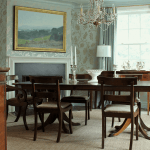 Seagrass Rugs and Carpeting – Good Idea or a Nightmare?
 Throw Pillows – Everything You Need to Know
 The Exceptional Interior Designer You’ve Never Heard Of


36 Responses
Do you have a wonderful gold to recommend, the colour of candlelight?
Thanks,
susan
Susan, I’m sorry but I cannot recommend colors in the comments. I’m not trying to be mean, but I am asked dozens of times a week and it’s all I can do to tell folks that I can’t help them. thank you for your understanding.
AMC, I used to watch this during summer vacation from Grammer School while my Mom ironed. LOL I remember Erica when she was just a self centered kid of 15, maybe it’s true some things never change.
I believe movies and books influence our tastes for furnishings, colors, etc. And our color choices by their name. I am guilty of this Brown Horse, Vintage Wine, Hunter Green need I comment any further – I am a fan of the “riding set” colors, deep rich saturated colors, yet currently I am suffering from color paralysis in my 100+ yr old Shotgun style house that has a living room 30×15, just placing furniture to try and not have a bowling alley effect is trying enough… I even went as far as having a BM color consultant come to my house to help with a color choice because you can see each room from the other so they must flow. She left me with some “gold” swatches which when the sun floods the room look pumpkin – yuk. Back to the drawing board.
Hi Betty,
It really is not as easy as it looks sometimes. There are so many factors. Sounds like a room that could have two seating areas, perhaps.
Lovely post. Please do a color palate for the last image with all those lovely blue and gold tones!!!
Did you see War and Peace recently on Lifetime (a BBC production, I believe)? There was many a time I lost the storyline because I was caught up in the mouldings and colors in the rooms/set. And the light…
That’s a great idea Beth. I didn’t see that show. I’m sure that it’s gorgeous!
The watercolors are fabulous. Thank you so much for these images. Your observation about the shades of purple was spot on. It turned out that we saw at least two scenes that featured main characters in lavender in Sunday’s episode. Gorgeous highly detailed day clothes worn by Violet and Mary. The color was very flattering, too.
I have fallen in love with certain interiors in films and tv shows, too. Some made huge impressions on me as a child, too.
Hi Libby,
I had to miss last Sunday because my son was in town, but I think they show it before the new episode so I can catch it next Sunday. The costumes seem to get better and better!
Thanks for the laugh !!! I totally agree that Edith’s fleeting
groom deserved the addition to his name. You were very polite
in your description – very English. But I think we would agree
he would deserve some good old American adjectives.
Love your posts and websites and look forward every weekend.
Gotta go — painting bath in new apartment “white”……
Cotton Balls – (really,honest, speaking of balls.)
Thanks again,
Hi Joan,
LOL!!! Them Cotton are the good balls!
Another gorgeous post Laura, thank you! I love the App you’re using and how you can make it like a painting. Have you ever tried Colorado by Amy Wax?. It’s a great app….but not sure it allows you to make photograph into a painting. Love all the rich royal colors, and the muted pastels. And love the photo you chose for your final one of the new Mr and Mrs….it’s like a Dutch painting. Happy Valentines Day ♡
Hi Deborah,
Thanks for stopping by! No, I haven’t tried Amy’s app but I have her other app. Happy VD to you too!
I’m so enjoying these posts! Thank you for doing them.
Okay, you have a fellow AMC lover here–I watched it from the summers off from school in the early 70’s until it ended a few years ago. Even scheduled my college courses around it when I could and there was always a group of us (male and female) who met in one the Student Union TV rooms at University of Texas to watch the show. My old, long-gone dogs were named Phoebe and Opal and two of my current dogs are named Dixie and Myrtle. I was going to name my mini-donkeys Langley and Palmer but my husband put his foot down on that one!
Bambi
Lauren, You are spoiling us!!! Another absolutely gorgeous post! Thank you for all the work and time you took for another lovely addition of Downton Abbey color pallets!
Happy Valentines Day! XOXO
Hi Megan,
Really, the fun is all mine! Thank you so much and happy VD to you too!
Hi Laurel, can you recommend d a blue paint in the shade of blue coat worn by Lady Edith in the photo with Marigold?
Thanks!
Hi Maureen,
Well, that would be Heaven On Earth 1661 by Benjamin Moore. Please test it first!
I looked at 1661 on line and this might be the perfect shade above the chair rail in our dining room. Thanks!
I’ve never used it but it looks to be a lovely Robin’s Egg shade. Please test it first!
Laurel – you are just amazing putting this beautiful, colorful post together for our enjoyment. I know this was such a lot of work and I thank you so very much for all the time and energy you put into wowing us! I love painting and paint – but like everyone often need a professional such as you to steer me towards the perfect color – you are the best I know at this and you do it with a fabulous sense of humor.
Being English, I obviously am a huge aficionado of Downton Abbey and any and all period pieces brought to the screen. Biased perhaps, but I doubt anyone would disagree that the sets and acting are always of such a high quality and so enjoyable. Several of the actual rooms at Highclere Castle are used for interior filming and of course are already decorated – but other sets are built and lucky for us, whomever is the lucky person to pick colors does a glorious job.
I must just say how very generous you are to share your edited photos – your postscript just warms the heart in these days where so many are very selfish in sharing anything they do online – it brought a smile and really nice feelings to me this morning. Any chance you would share which ‘watercolor app’ you are using please – it’s a really good one and makes these pix so engaging .
Thank you Laurel – you are one of the very best design bloggers out there.
Happy Valentine’s Day –
Mary
Hi Mary,
Is it Lady Mary or just Mary? Just kidding. Thank you for all of that and no dispute here, us Yankees adore this show just as much if not more than you guys! I have a friend who’s a fervant Anglophile, has been to Highclere Castle more than once I believe. She has some sort of reciprocal arrangement where she stays.
I’m happy to share what I know because it’s more fun and helps me to achieve my business goals. https://laurelberninteriors.com/your-home-office-could-be-dangerous-for-your-health/
haha!
As for the app I use, I am using Sketcher for Mac. There is also Sketcher for PC. It is a lot of fun but it has a mind of it’s own. You can control the intensity and the amount of detail- supposedly, but every time you hit the button, it renders the image differently. Sometimes, it’ll do wonky things like pick up a color nearby and render a leaf coming out of someone’s mouth. Or the effect is too “color by numbers.” To fix that, there is another app that I use all the time called Picmonkey. I talk about it all the time. There you can go in an edit the photo. I discovered only yesterday that under the makeup section is something called a wrinkle remover. It’s really an airbrush which is far better than their regular airbrush. There, you can smooth out some of that delineation. That’s how I got the luminous texture of Lady Mary’s perfect complexion.
There are other apps but I couldn’t find another one for macbook. That surprised me because macs are famous for their photo editing. Of course, there’s photoshop which would do all of this I’m sure but I don’t have that app.
I do have paid versions for both but the fee is nominal.
Another beautiful post! It truly transforms me to another time. As an aside though, just one little correction which has no bearing on this post…it was Sir Anthony Strallan that left Edith at the altar, not Michael Gregson (Marigold’s father).
Happy Valentine’s Day!
Oh dear. Thank you for pointing that out Susan! I did know that but I can see how my sentence would’ve indicated that I was referring to Michael Gregson. I didn’t remember the name of the guy that I tagged in my photo as “louse” lol. I wanted to punch him for doing that to her.
Oh wait. I didn’t even post that photo! It would’ve been more clear then. I took it out in the final edit because it seemed redundant.
I’m going to go back and change the wording so it’s clear who we’re talking about.
nice save, you are too funny!
I so enjoyed this stunning collection of photos after you put them through the water color process. They are just beautiful! This palette is my personal favorite for my home, gardens and wardrobe. Thank you for this lovely Valentine. -Debbie
Hi Debbie,
Thank you so much! I always try to do a little something for holidays. It’s a challenge coming up with something that hasn’t been done a 1,000 times before!
I’ve never watched “Downton Abbey” past the first season, because it disappeared from Netflix then, and we don’t have cable service for years..but you definitely make me want to watch more.
The thing is: I’m also very heavy on purple…)) I wonder..
I always loved purple,to me it is the most magical, mysterious,transporting color.
But it took me years to start using it.
Maybe it’s like listening to a fairy-tale-and suddenly having an opportunity to step inside the very same fairy-tale, for real. You’ll think twice..))
Beautiful post as ever, Laurel. Happy Valentine’s Day!
Hi Jenny,
Barney wrecked purple for those who love purple! And even the name purple sounds so much better if you say plum or violet or something like that.
My bedroom is purple. It’s called Tropical Dusk from Benjamin Moore. It’s a deep,(but not too dark) dirty purple with a lot of gray and brown in it. It changes considerably with the light from a color that reads more taupey gray-brown to a color that is definitely purple! The reason I chose it was because when I moved here the walls were an annoying indigo that had gone a little fugitive and not in a good way. However, I really liked it at night. That’s why I decided not to veer too far away. Being that my 13 x 13 bedroom has three large windows and two doors, plus one wall with a dresser and large mirror, the color is really an accent.
Wow. I think I might have a similar color. In my daughter’s new room. It’s very similar to how you describe yours. It’s Dunn Edwards’ Twilight Taupe..and it’s very sophisticated and ever-changing color, having this gray and brown and violet in it..
I love it so much I used it for our master closet-saying it flatters my complexion, and I contemplate stealing it for master bath too, giving the same complexion excuse..))
Now, I really want to thank you.
I loved your advice to strive to choose a color which one will love most of the time. I really listened to it. It helped me tremendously. It kept things in perspective and let me take some risks at the same time. It was truly a great advice.
(Barney was especially awful I agree. But that is Marie character from “Breaking Bad” who really reminds me not to go overboard))
Ah, and “Aubergine” sounds cool too!
Hi Jenny,
Thank you for the sweet comment. I’m glad that my advice helped you. I fully understand because sometimes it’s difficult to commit to just one color!
This is so absolutely amazing! These beautiful colors! The work involved! The value to your readers! Awesome! One could take any one of these color strips and make a gorgeous room or anything like a wardrobe, a painting, photography, garden…any thing and it would come out beautiful. I will certainly be saving this…Thank you Laurel!
Hi Chris,
I so appreciate this… because somewhere around 5:00 on Saturday after spending more time than I care to admit, I’m thinking to myself to use an English expression.
ARE YOU BARKING MAD LAUREL?
Yes, ‘fraid so. lol
Truth be told, I could sit her ‘painting’ away on my puter for hours and hours. I think there are some people who think that I ACTUALLY did the watercolors for real!
Great posts! I hope you might give us equivalent paint colors for some of the blue rooms I’ve been admiring this season. I always thought I hated blue… but I can’t stop staring at Robert and Cora’s bedroom walls, for example. Please show us some of the cozier interiors (I love Violet’s house more than anything!) and tell us what colors you think they are!
Hi APB,
Thanks for the feedback! I will definitely be doing that! It’s a great idea. I will research this one carefully to give out as close as I can to the color. Of course, we are seeing the color after it’s been lit for the cameras and through a TV screen, but probably what we love is the entire ambiance– the exquisite architectural detailing, furnishings, lighting. And the way that the colors are combined! It’s all so warm and inviting!
I am pretty sure the paints used for Downton are from Mylands.. a wonderful, London company who for years have been the paint company of choice for film sets, (James Bond!) architects, Designers & British Royalty. (they have the Royal warrant).
They are getting better known in England now, by the public, but are still under the radar in comparison to F&B.
Now I have discovered them, selfishly, i want it to stay that way-so why am I telling you ?-their colours are scrumptious & High quality. Their marble matt emulsion can be scrubbed !
Check them out .
Hi Joanna,
Thank you for that! Yes, I have heard of them and I want to get their sample card. Being that 90% of my readers are in the US, I’m gearing towards what’s readily accessible here. I’ve no doubt that it’s wonderful paint!
Benjamin Moore also claims that their matte paint can be scrubbed. I have it in my bedroom but haven’t tried it. I will say that the color has a lot of depth. It was painted nearly three years ago and has had held up super well. Not having little kids around really helps! lol