20 Breathtakingly Gorgeous Ceiling Paint Colors and One That Isn’t

Dear Laurel,

I’m so upset. I’ve been working with a designer and love everything she’s presented. We picked out all of the colors, fabrics, furnishings. Very happy.

I’m using a painter my neighbor recommended. Seemed to be a nice guy, but here’s what happened.

My husband’s role in all of this is to schedule all of the workers since he works from home and I don’t. Terrific. Glad he’s here to answer questions, etc. But then he gets an email from the painting contractor.

Are you ready?

Painter dude is balking at the paint selections of the woman I hired to help me select them! So, hubs gets on the band wagon and starts questioning and making me doubt myself.

Painter: You should only paint the ceiling white. Never saw it done any other way.

Painter: If you paint the ceiling that dark blue it’s going to make the ceiling look lower

Painter: You need to paint the ceiling, wall and trim a different color

Right now, Laurel, I’m the most upset about the ceiling paint colors.

Is the painter right? I told my designer and I think I saw smoke blowing out of her ears.

Thanks for listening even if you don’t have time to respond. Love your blog, Laurel!

Celine Peynter

 ****

Dear Celine,

Is murder still illegal?

I am going to tell you something and anyone else who’d like to listen. With the exception of maybe one in a hundred, do not listen to a word your painter is saying about the colors. Is your designer telling him how to paint? I wonder how that would go over!

Furthermore, it’s none of his business and exceedingly unprofessional to contradict what your designer has specified. Like, duh!

I can relate; it’s happened to me a few times and yes, it’s infuriating because it instills fear and doubt in our mutual client.

The painter only knows what he knows and in most cases, it’s extremely limited when it comes to selecting colors.

However, I am not saying to never paint a ceiling plain white. I do specify it under certain situations.

The one color I need to caution you and everyone else about with the ceiling is the good old standby

DECORATOR’S WHITE

Why?

You must never paint it in a low-light north facing room.

Why?

It will almost definitely go purple.

If you want a purple ceiling, then it will be fine, if not, then stay away.

Otherwise, these whites are all excellent choices for a white or off-white ceiling.

My best advice to you in the meantime is to ignore the painter and and maybe your husband. Or, have him read this post, please.

Painting the ceiling a dark color will make it appear HIGHER, not lower. Dark colors recede and light colors advance. Bright colors also advance more than cool colors.

[tweet_box design=”default”]If you paint a ceiling a pale ethereal blue it will float above your head.[/tweet_box]

Your note has inspired me to share some gorgeous painted ceilings. Most of them are not white. Some of the rooms that aren’t mine, I am making an educated guess at the color. As always, please test your colors first! All paint colors by Benjamin Moore.

In addition, there are 100s of rooms all over this blog that have ceilings that aren’t painted white. However, there is another post devoted to beautiful ceilings. It features paint, wallpaper and other ceiling treatments.

benjamin moore palladian blue ceiling, linen white walls | Ceiling Paint Colors

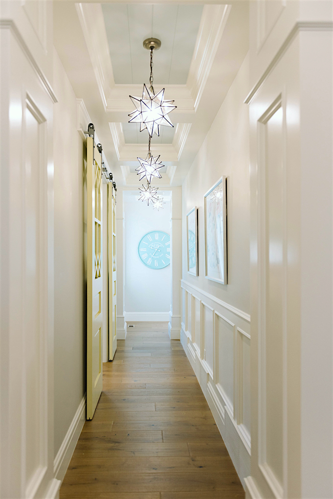
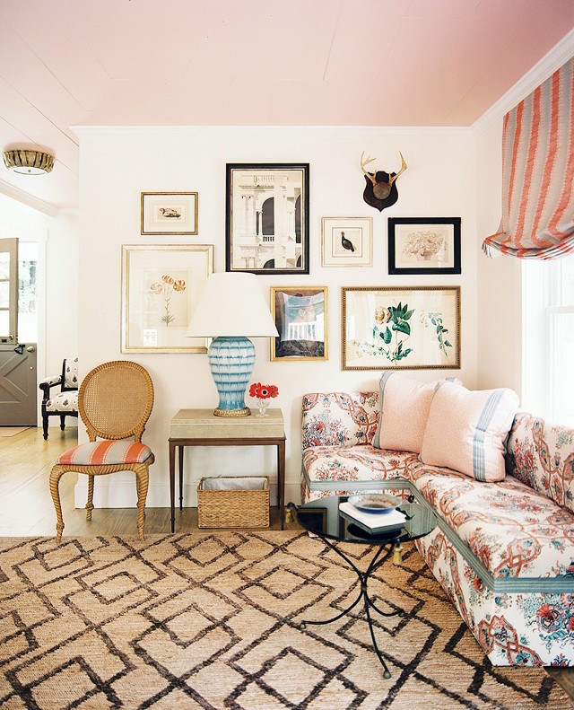
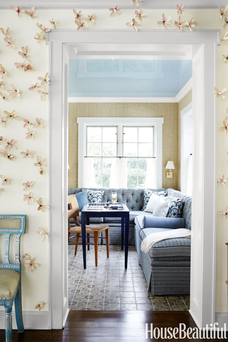
This is a room we did a few years ago. The ceiling is  PALLADIAN BLUE HC-144 and the walls are LINEN WHITE. Linen White is a great color for trim with golds, browns and other warm neutrals. Or for walls where there’s a good amount of light. For more dim rooms, I prefer Ivory White 925.


benjamin-moore-opal-essence-680-ceiling-paint-colors

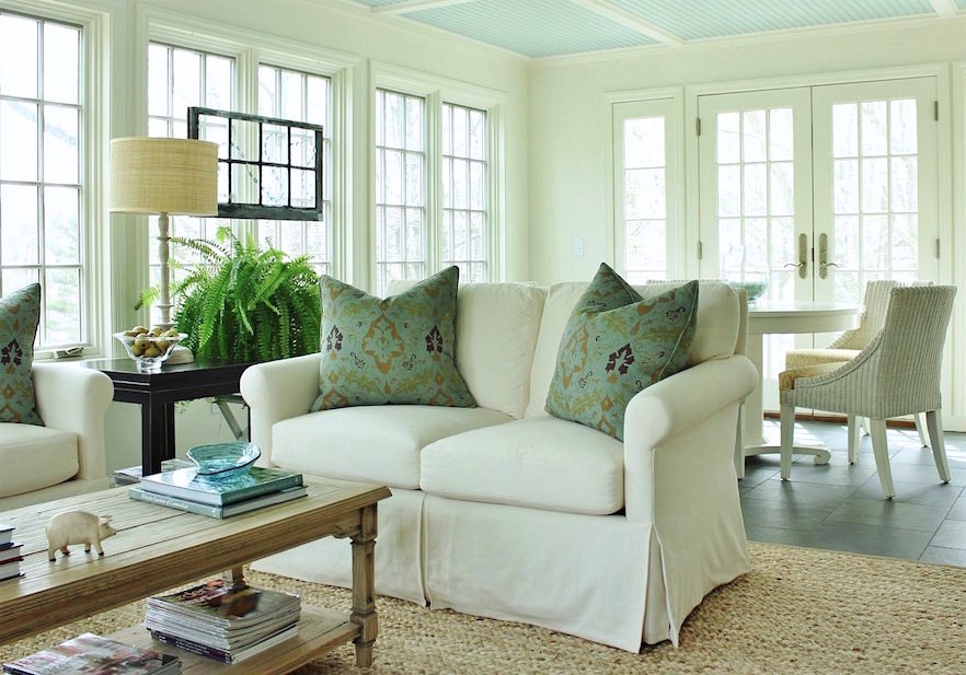
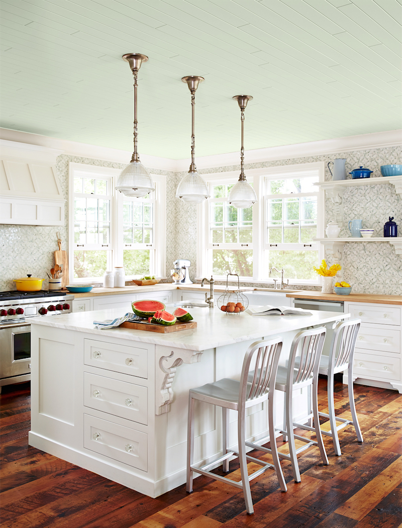
This is a room that’s almost finished now. The ceiling paint color is OPAL ESSENCE 680 and let me tell you it is THE most beautiful ethereal blue-green for a ceiling I’ve ever seen. The walls and trim are the aforementioned IVORY WHITE 925.

Notice how even though the trim and walls are the same color, the different finish and the way the light hits each one renders the color a little differently. This is a little sun room that’s very common in older homes in Westchester County. The furniture is coming in about 12 days!


benjamin-moore-cool-breeze-csp-665-design-lindy-allen-photo-Jessie Alexis Photography-painted-ceilings-hall

Designer: Lindey Allen Photo: Jesse Alexis via: House of Turquoise

ceiling paint color: COOL BREEZE CSP 665

benjamin-moore-serene-breeze-449-sarah-richardson-country-home-endless-summer-kitchen-0615

Sarah Richardson – Country Living

ceiling paint color: SERENE BREEZE 449

benjamin-moore-sea-green-csp-515-Painted-green-ceiling-The-green-ceiling-paint-color-is-Benjamin-Moore’s-Parsley-Jenny-Wolf-Interiors

Jenny Wolf

PARSLEY SNIPS CSP 635 (actual color)

benjamin-moore-baltic-sea-csp-680-ceiling-white-dove-trim-design-lindy-allen-photo-Jessie Alexis Photography-office ceiling

Design: Lindy Allen photo: Jessie Alexis Photography via: House of Turquoise

BALTIC SEA CSP 680 withe WHITE DOVE trim (actual colors)

benjamin-moore-narragansett-green-hc-157-lonny-lowes-regency-hotel-photo-nate-berkus-teal-walls-ceiling-paint-colors

Nate Berkus  photo: Lowes Regency Hotel

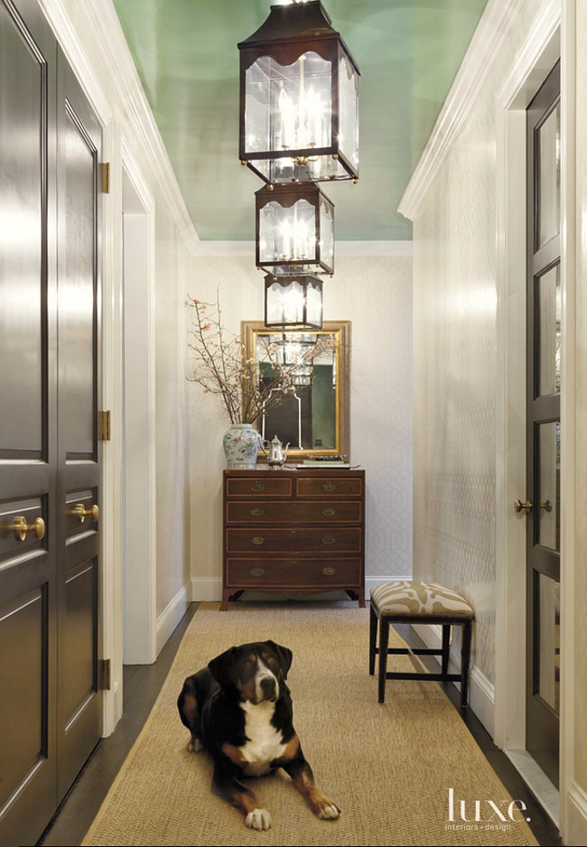
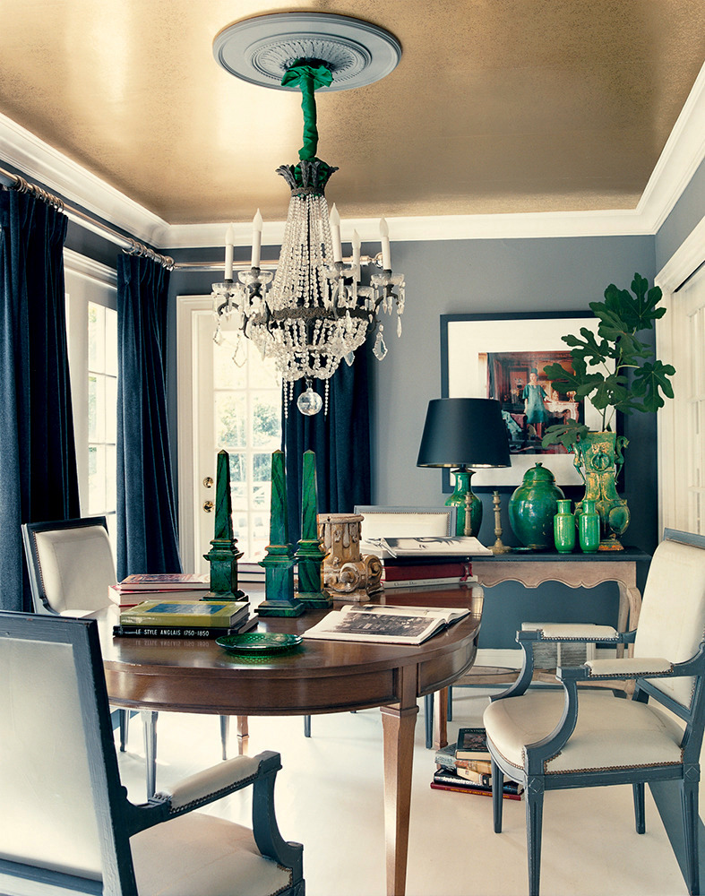
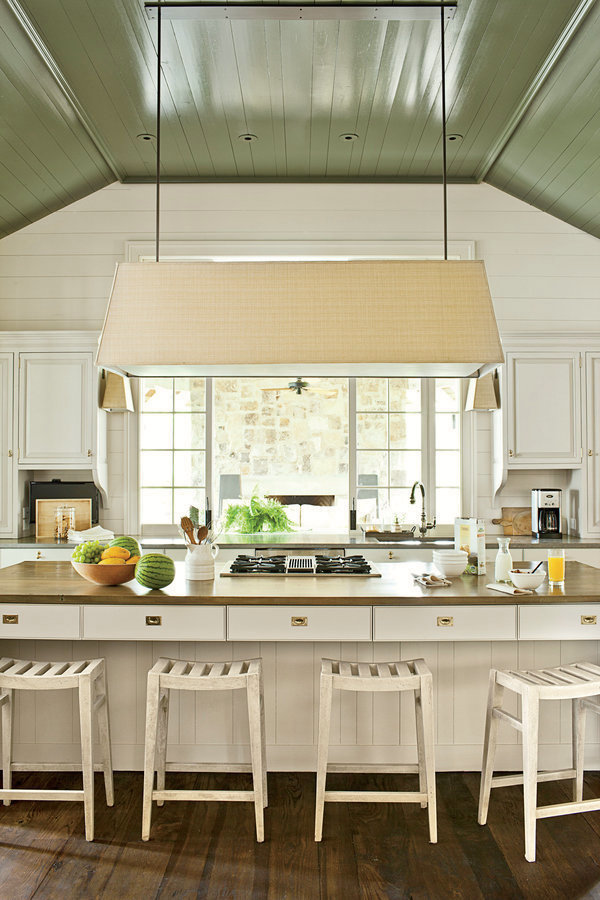
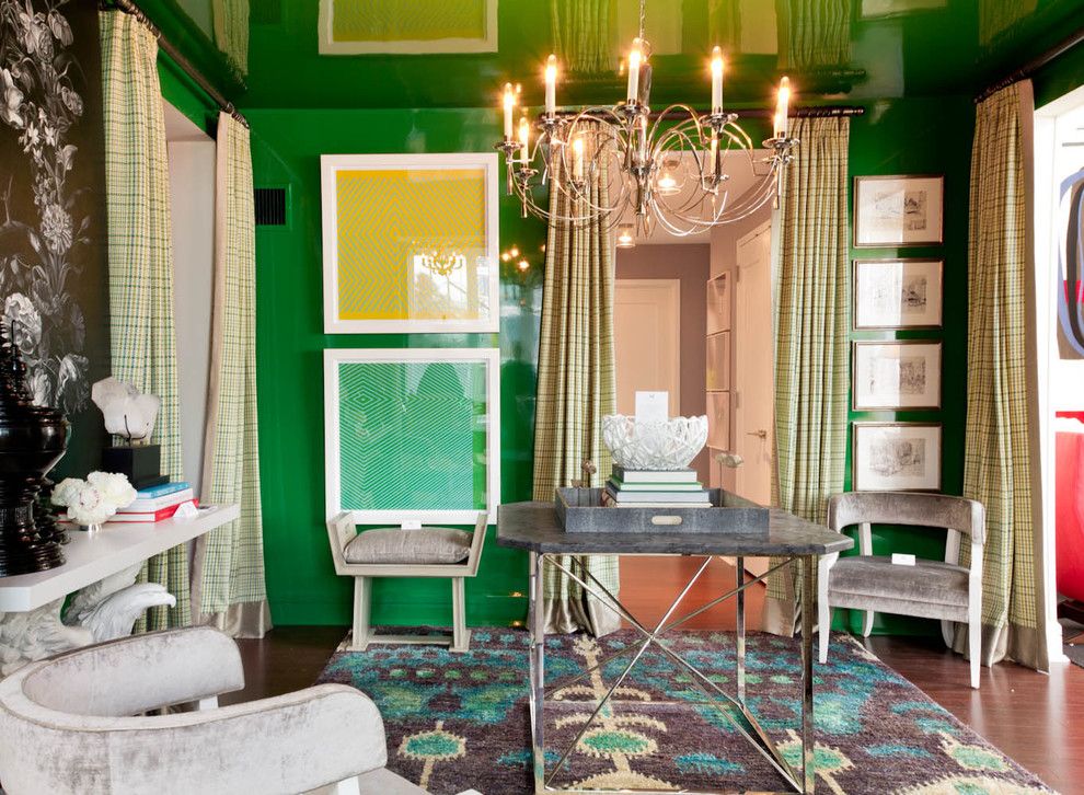
NARRAGANSETT GREEN HC-157

I love the look that this deep,  rich saturated color gives when wrapped completely around the room.

mary-mcdonald-domino-gold-painted-ceiling

Mary McDonald

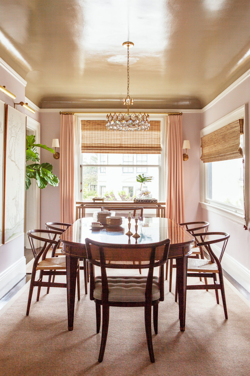
This looks to be a metallic specialty finish. There are several on the market. Benjamin Moore makes metallic glazes which you can read about here.


chloe-warner-lonny-painted-ceilings

Chloe Warner via: Lonny

Fabulous luminous finish and wonderful analogous color scheme. I can’t quite tell what it is. It is a little pearly-metallic and little bit of a slightly rustic lacquer look. More about lacquer in a bit.
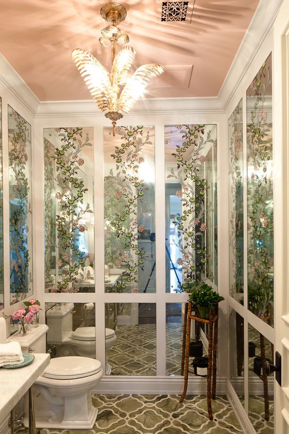
ruthie-sommers-ceiling-paint-colors-pink-bathroom-ceiling

Ruthie Sommers

CONCH SHELL 052

Ruthie is always so inventive. At first I thought that was clear glass but then realized it’s a mirror. Please notice the tripod reflected!


tilton-fenwick-pink-ceiling-benjamin-moore-fruit-shake-2088-60-pink

Tilton Fenwick

FRUIT SHAKE 2088-60


benjamin-moore-sandy-hook-gray-hc-108-emily-gilbert-photo-painted-ceiling-Small-Kitchens_JennyWolf_IMAGE

Designer: Jenny Wolf Photo: Emily Gilbert

SANDY HOOK GRAY HC-108


benjamin-moore-galapagos-green-ceiling-paint-high-gloss-architect-bill-ingram-Laurey W. Glenn-photo

Architect: Bill Ingram  Photo: Laurey Glenn

GALAPAGOS GREEN 475 in a high gloss finish. (actual color)

I’ve had clients wanting to get a lacquer-like look with high-gloss paint. They are two different things. The old lacquer was a noxious substance thinned with alcohol. Today’s lacquers are actually a varnish that goes over the glossy paint. However, to get an amazing glass-like finish requires first an immaculately anal-retentive-OCD-beyond-perfect surface.

Then, it’s numerous coats of paint, sanding, paint, sanding, varnish, sanding, varnish, sanding… Did I mention that the paint is sprayed on? It is better to use an oil-based paint as well because it levels out better.


(This is why if you don’t want to do all of that, if you paint the ceiling flat you won’t notice the small imperfections.)


Yes, there’s a more rustic version of lacquer, but this is for the glass-like finish.

jeffrey-bilhuber-chic-lime-chartreuse-ceiling

Jeffrey Bilhuber

MARTINI OLIVE CSP-890


More like this! Generally, a lacquered finish is going to appear lighter than the color looks on the chip. Of course, if you decide to go this route, please make samples!


apartment-therapy-liz-john-1926-bungalow.540_s.fit_

Apartment Therapy

BLACK 2132-10


benjamin-moore-amazon-moss-37

Thom Filicia

AMAZON MOSS 2037-10

Thom’s lacquer finish is especially glass-like. This was for a show house, so of course, he pulled out all the stops!

benjamin-moore-jasper-opal-387-ceiling-inside-a-bright-and-colorful-parisian-apartment-photo-inside-closet

Apartment Therapy

JASPER OPAL 387

southern-living-dark-blue-ceiling-paint-original

Southern Living

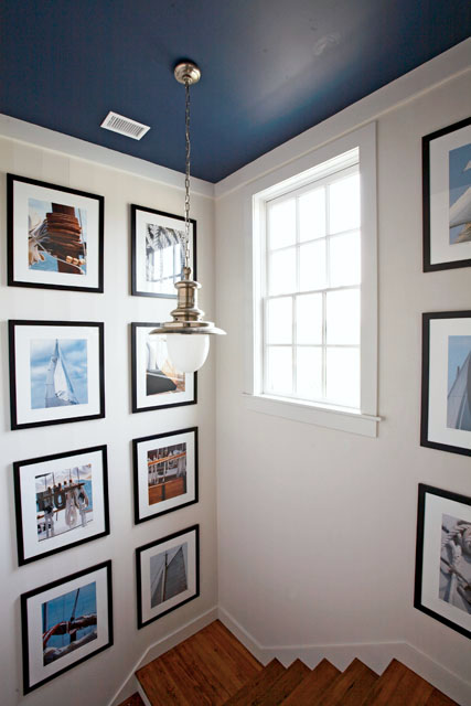
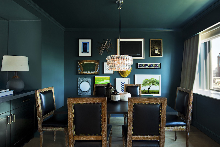
VAN DEUSEN BLUE HC-166

I love how the dark blue sets off the art and actually makes the space warmer, IMO.


benjamin-moore-intuition-csp-610-sarah-richardson-country-living-stacey-brandford-photo-endless-summer-colorful-bedroom-0615

Sarah Richardson – Country Living

INTUITION CSP 610

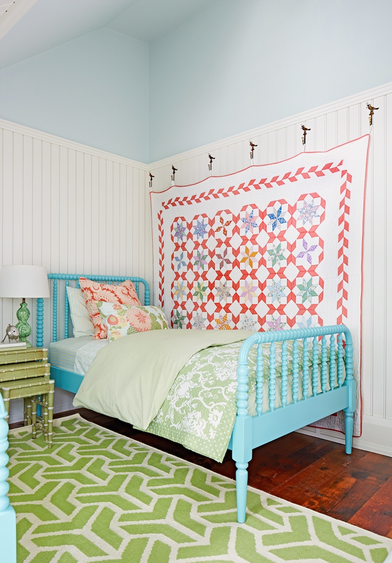
How charming is this girl’s room. Whenever you have lots of angles, it’s always better to paint them all one color.
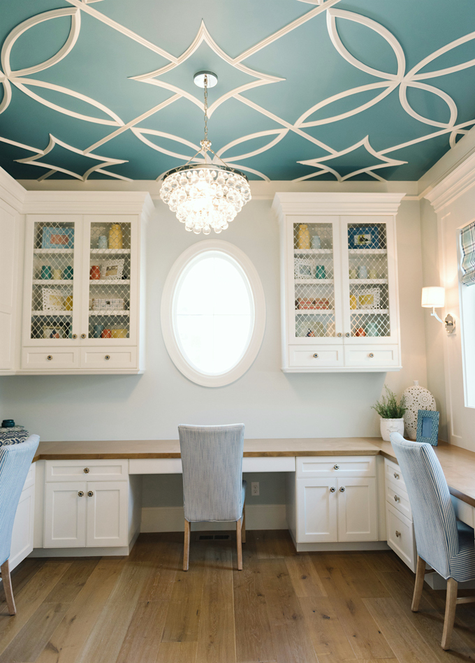
 

benjamin-moore-sapphire-ice-sara-gilbane-spring-decor

Sara Gilbane

SAPPHIRE ICE 808

Another ethereal-blue and a lacquered ceiling. Will the shiny ceiling look higher? Not really sure about that, but the pale blue does lift it up.

It’s like the sky!


sara-gilbane-pale-blue-lacquered-ceiling

What about you? Are there any special colors you’ve used for ceilings that you love? OR one you tried and it was not so great? I’d love to hear in the comments!

xo,

PS: Please check out the newly updated HOT SALES!

95 Responses

  1. You are absolutely right about ceiling colors. There is one caveat – if you are painting walls with a deeply saturated color (usually the darkest chip on color card) a white* ceiling is fine. It helps to reflect and hold natural light, preserving the wall color without distortion. A white such as BM ‘Chantilly Lace’, which is close to a pure titanium white (with a hint of soft grey rather than beige or blue or yellow) does an excellent job – it maintains its whiteness and doesn’t reflect wall color.

  2. Our last house in Southern Michigan had a 14′ x 30′ living room with 13′ cathedral ceiling. Very large, tall windows on long western wall with a great view, plus standard large windows on north & south; the ceiling had track lighting alongside the center ridge beam. The existing broadloom carpet & tile flooring were a very pale taupe and needed to remain. Rather than ignore mother nature outside the windows, we painted 3 of the walls a moderately dark taupe (echoing the many tree trunks in view) and the since the remaining long wall with 2 archways was mostly occupied by a large dressed stone fireplace with floor-to-ceiling white oak surround, the 2 small end wall sections were covered in grasscloth–a brilliant textural addition behind a piano & a chest with a dark Japanese coat displayed over each. But the defining gesture was adding a little black to Benj. Moore’s darkest blue-black for that high ceiling. The primer made the room feel like Sea World so the painter kept checking that I hadn’t chickened out; but fortunately the general contractor & I were watching as the finish coat was applied. When a large enough section went dark the most amazing thing happened and we, literally, gasped in shock. The ceiling appeared to reach down, grab the walls, and then shoot up higher than ever! (That motion was over in an instant, but we both saw it.)
    This was always a restful and very appealing room at any time of day for us and all visitors. (Having to put the dining table at the north end, we had an artist paint a few whispy clouds there to blend in 2 eyeball recessed lights. A pair of delicate chandeliers would have been a lovely addition to the room but force the furniture to remain in one place through the year, which couldn’t happen given the variety of gatherings we hosted.)
    The rest of the main floor appeared from the front door to have pale taupey-grey walls and White Dove woodwork, but there was a touch of dark blue somewhere in each room. At the north end was a breakfast & den area of mostly curtain-less windows which could have seemed very cold in winter, so we painted the wall only seen from inside the room a dark aubergine and used a playful fabric there on furniture. We came to think of this color palette as “Men’s Wear Daily”: taupe trousers, grey shirt, white collar, navy jacket, and little dark silk purple pocket square. Since the traffic pattern was a figure-8 through the public rooms, no guests were ever trapped in a corner during a party. A sophisticated but comfortable environment, especially after a hard day at work.
    From that house I learned that one way to warm a room is with warm colors and lush fabrics, but the other way is with deeper cool tones. Also that a high contrast between walls & ceiling can make a room feel awkwardly boxey, especially if the floor & ceiling colors are similarly strong or pale but all the walls are the opposite.

  3. Sure wish I’d seen your warning for Decorator’s white turning purple! I painted a ceiling with a south facing low exposure and it looks absolutely purple. 🙁 Thank goodness my Benjamin Moore guy will take the other 2 gallons back.

    1. Hi Mona,

      The only way I know this is because I saw it once at a consultation. I’ve never used it on a ceiling. In fact, it’s not one of my go-to colors. It does have it’s place, but usually not on the ceiling unless it’s a bright room.

  4. Your post here had me lusting for fruit-shake ceilings – after a few days of googling and pinning stuff I bumped into other posts about the home featured in the photo (it is in rhinebeck) and have learned that ceiling is actually Coral Buff not Fruit Shake. Wanted to let you know! (love both colors!!)

    1. Hi Jessica,

      Thanks, I appreciate that, but here’s the deal with all paint colors you see here.

      At least half of the time and probably more, I have no idea what the color of a room is, if it’s not my room. It’s only meant to be a suggestion and here’s why.

      It’s a photo of a room with who knows what lighting/filter/editing and then on top of that filtered through my editor and then your computer.

  5. So Laurel, is it OK to paint the walls, trim and ceiling all the same color? I guess it depends on the color, but I plan on doing Cotton Balls matte on walls and ceiling and CB semi gloss on trim. I have no ceiling trim at all (ranch style house). I feel like I need to make the ceiling lighter than the walls but that’s because I’ve always done that in the past.

  6. Thank you for sharing all you do! I’m moving into a new apartment and my daughter’s room is north facing, with a balcony that cuts even more light. She’s 13 and wants “everything just white”. Your comment about decorator’s white on the ceiling has me feeling like her simple request is now a daunting affair. I’d like to stay away from a white with too much yellow, as it’s a bedroom. I love the idea of a slight blue for ceiling. Can you recommend a tried and true BM colour or combo?

    1. I’m sorry Melissa,

      I wish I could help everyone and am asked these types of questions several times each and every day. There are lots of posts here about paint colors and there’s my paint guide for sale. You can find the info in the side bar. Thanks for your understanding.

  7. Hi Laurel,

    I think we are going to do Simply White on ceilings, window trims, and doors and BM Mannequin Cream on walls, and then we were thinking a lighter shade of “creamy” color would look beautiful on crown moldings? Thoughts? Color suggestion for moldings? Now if we did decide to go with a diff color on moldings, would we do the baseboards in that color too or do baseboards in Simply White?

    1. Hi Nick,

      My rule of thumb is that anything in the room that’s trim- crown, base, wainscoting, doors and built-ins are painted the same color.

      No color suggestions, however because that requires a home visit and I’m not doing that any longer and if I were, there’s a hefty fee.

  8. I have a kitchen with 8’2″ ceilings. Around 500 square feet in size. Currently gutted. White cabinetry. Black island, I think. Stainless appliances. Antique oak dining table. Probable unlacquered brass fixtures. Want to consider painting ceiling a color. Blue-gray that is deep intensity?

    1. Good luck with that Jennifer. I’m not there, so impossible to help you. And if I was there, I would be charging a hefty fee! There’s a lot of information about great colors all throughout this blog. Or, you might consider purchasing my paint collection/palettes. It’s nearly 500 pages of color information. To access information, please click the help for your home link in the top menu.

  9. Dear Laurel,

    Need help please! Blog about painted ceilings, gorgeous hallway with BM Cool Breeze ceiling, what color white are walls?

    Wrote long, funny reply, but couldn’t get it to post. Hope this one works!

    Thank you!

    Holly

  10. Dear Laurel,

    LOVE, LOVE your blog. Live in a very small boring town, and you give me a connection to the real world!

    My question is this, please. In your blog about painted ceilings which-I-frequently-lust-over-when-I’m-alone, there is the most beautiful hallway with the ceiling painted BM Cool Breeze 665. But, the wall color is not listed. I’m guessing Cotton Ball, but bet I’m wrong! Can you tell me what color white are the walls?

    The lacquered ceilings make me want to wet my pants they are so beautiful . . .

    Somewhere you had asked about our favorite color of blue. Mine is . . . I don’t know, buy my entire first floor is painted that color. I bought one of those wonderful rubber replacement lids with the spout for pouring. But, along with the old lid, my paint sticker with the color code was also thrown away! It’s OK; still have half a gallon. But, am going to send a picture of how many samples I brought home before deciding. It’s a hoot!

    1. Hi Holly,

      I’m so sorry. I really don’t know and I don’t know for sure if that is the real color of that ceiling. It looks a lot like it but it also could be about 100 other colors!

      1. Can you guess on the walls?😺🐶🐕🐈🐺🐱🐶🐶🐾 (Can you resist kitties and puppies?) Cotton balls? Ivory white?

        (Thank you, kiddo . . .)

  11. This is unrelated to ceilings, but would you recommend Opal Essence for a bedroom wall color? I am considering it because I love a classy mint color, but I want to be sure it won’t turn out too sweet or too bright. (I came across another post of yours where you warned against this section of the BM color deck for that reason.) My bathroom is painted Silver Crest 1583 (and I love it!), but I’m worried that might be a little too gloomy in the bedroom. (I live in gray-skied Portland, Oregon, and our bedroom is darker than the bathroom since the blinds are most often closed and the lighting is dimmer.) In other words, I was looking for something a little cheerier than Silver Crest and found that in Opal Essence but, even with painted samples, am not sure if it will be TOO MUCH MINT once it’s on all four walls! Do you have any advice?

  12. I have Opal 891 on my bedroom ceiling with creamy wallpaper with birds and vines. Sometimes it reads as invisible/white and sometimes as the softest pink.

  13. Love your blog posts, Laurel!

    Inspired by the kitchen with the yellow ceiling shown above, I asked our painter to do our kitchen ceiling Benjamin Moore Jasper Opal 387. It didn’t turn out nearly as bright and sunny, but a very pale, almost limey color (regardless of the light). Any suggestions for a BM color that might give an effect closer to what’s pictured?

    Now I’m off to pick a turquoise for another ceiling!
    Thanks!

    1. Hi Meredith,

      Thanks so much!

      But this is one reason why I don’t give paint consults in comments. I have no idea what the color you are seeing looks like. On my monitor,(a macbook pro) the color is a clear-lemon yellow. Not green, but definitely a cool, clear yellow.

      However, I can give you some ideas that will benefit everyone. One, I agree. It’s difficult to see the green when one first looks at jasper opal. However, a clue is to look further down the line and by the time we get to sweet pear, the green is obvious.

      The other thing is that ceilings, usually look a little grayer or cooler than the wall color even if they are the same color. So, that means that the green will often pop out even more. The other thing is that you most likely have recessed lights and that can also do weird things to the color as the light bounces down and then back up.

      The good news is that you know what you don’t want. The precise color, I can’t tell you, but what I would do is go several pages back to the yellows that don’t have the green in them. Many possibilities from 317 – 360. These yellows have no or far less green and the ones lower down are veering very slightly towards orange, but perhaps in your light that is what you need to counteract the green. Here’s what I would do. Go to the store and take out the sheets and then maybe get one test quart of 333 pineapple grove. Make a big sheet of it and tape it up to the ceiling (flat as you can) and see how it looks. If it’s still not quite right, take out your little samples and say if pineapple is the right tone but you want it a little darker, then maybe you want the next one down. If it’s two orange or green, then go to a different sheet. That should help you narrow down the choices considerably. Don’t forget to move the sample to a couple different spots– for instance, near and away from the window(s).

      I am mentioning this because it’s a good way for everyone to figure out a color when the one you have is not quite right—without buying a gazillion different test samples.

  14. Hi Laurel – Love your blog and paint color choices. I live in Southern California in a large home with tons of bright light. I painted all of the ceilings Ralph Lauren Whisper. It works with my light colored walls and bedrooms in Restoration Hardware Silver Sage. Two of my friends followed my lead and their Whisper ceilings look great with dark walls and beiges. I found it accidentally when we were trying it out for a bathroom wall (too cold) and my painter mixed the ceiling and wall colors up. Not so happy with the 4000 square feet of Dover White instead of White Dove mistake another painter did.

    1. Thank you so much Jennifer! That’s a lot of Dover white! Not sure if your furniture is back in or not, but if not, maybe it’ll be better when it’s in.

  15. Hi Laurel,
    I just love this post! I painted my daughter’s ceiling enamelware by Martha Stewart, which is a soft aqua blue, and the walls are a soft , light taupe. It gets northern and eastern light and looks great. One thing I noticed is that almost all the painted ceiling pics have cove/crown moldings. I’m thinking this is pretty necessary to kind of seperate the wall color from the celing color. What do you think?
    Also, color is so different depending on the placement. I learned the hard way. I painted my upstairs fairly long hallway the same color (enamelware) and the color bounces off the opposite wall and intensifies it like crazy. It looks way too bright and clownish. So I guess i have a big job ahead of me one of these days. Grrr…

    1. Hi Lora,
      That is a very good point about the paint bouncing off the wall. That is why the color intensifies in the corners and why overhead lights are fine for halls but not so great for larger rooms. It’s the bouncing thing.

      I’m a huge fan of crown mouldings and all mouldings in general. The crown just finishes off the room so beautiful and lifts the ceiling higher.

  16. Btw, I think it’s just great that you attempt to respond to most every reader comment! The interactive nature of your blog makes it so much more effective, educational and personal. So thanks. I always look forward to your Sunday post. Plus I think you’re so funny. May I be so bold as to invite you to meet me in NYC sometime for a drink or coffee. I live in Huntington Long Island.

  17. Laurel….
    Love ALL your blogs–And this one is eye-opening! I might just get brave and try it!
    One question….did I miss something? I read your blog two times–“20 breathtakingly gorgeous ceiling colors and the one that isn’t.” I can’t seem to find “the one that isn’t.” I really need to know…..before I make the mistake of painting my ceiling “the one that isn’t”!!!!

    june

    1. Hi June,Here is the quote from the post:

      The one color I need to caution you and everyone else about with the ceiling is the good old standby

      DECORATOR’S WHITE

      It’s one of those colors that sounds so much better than it is. It needs a LOT of light!

  18. Hi Laurel,

    First of all, I love your blog and your advice is always spot on. Thank you!

    Recently, I had a designer work with me on paint colors for my dining room. We chose SW Alabaster for the walls, Trim SW Panda White and SW Sealskin (which is a bronze/brown) color for the ceiling. The ceiling also has a medallion which we kept white and a crystal chandelier. I would never have chosen this ceiling color on my own in a million years, but took a chance. It is so GORGEOUS! I walk in that room every day and just smile. The bronze ceiling just makes it!

    A note to the finish. The painter showed me how nail pops and general ceiling flaws show up more with a glossier finish. His advice was to go flatter unless you had a perfect ceiling (and who does?).

  19. Oh, I forgot to add my fave ceiling colors other than Ocean Air and Palladian Blue. Check out Pale Smoke and BM Crystal Blue. I’ve also discovered a few more BM repeats in the AF/Aura deck and one CSP: AF 565 Mysterious = Newburyport Blue, AF Storm= Timber Wolf and CSP COOL BREEZE= PALE SMOKE. The latter color is featured in one Of your photos.

  20. So funny; you write the “Dear Laurel” letters! Perfect idea. I too have been a member of the colored ceiling camp!! I just love an off white/ neutral wall with a green blue ceiling!! My previous bathroom was white sand walls w BM OCEAN AIR ceiling: a lovely grayed turquoise blue.

    When I purchased my home back in ’84 I worked on Wall Street (ugh, I know lol) and new precious little about color/ design… But I figured that I could make my small BR appear larger if I wrapped the ceiling in the pink wall color. That worked well I think but the problem was, yes you guessed it; I was going for dusty pink and it was way too bright……my first lesson in 1″ chip of warm color= 10x brighter on wall!
    Ok there’s two schools of thought regarding dark ceilings: do they recede and make the ceiling appear higher or does the heavy contrast lower the ceiling?? I still don’t know. Light blue is one thing but navy blue??? I’ve also read two opposing opinions as to whether color on a ceiling goes lighter or darker than the same color on the wall. Maria Killam claims a ceiling goes darker and I tend to agree. In fact she recommends doing a 1/2 formula of the wall color if you want them to look the same. The Decorologist woman says the ceiling color will go lighter. In my experience that only occurs in vaulted ceilings, rooms with tons of natural light, high gloss finishes which reflect light and at night if ceiling lighting fixtures point up at the ceiling….it’s tricky I guess……

    1. Hi Betsy O,

      I’m just eyeballs deep in website issues. Everything looks the same to you guys but I’m trying to develop a new theme and it’s all because of mobile issues.

      They are both right about ceilings looking darker or lighter. Lighter by the windows and darker away from the windows. Over-all, ceiling does tend to go a little grayer.

      And yes, a dark ceiling recedes but it also looks heavy. So, to lift a ceiling up, as long as it’s darker than the walls, should work. But crown moulding really helps too.

      I think I would like a very dark ceiling on a wall nine feet or higher. Frankly, have never painted a ceiling very dark. My clientele is pretty conservative on the whole.

  21. When I had to repaint a bedroom and living room last year I debated the white ceiling and then took the plunge painting the bedroom walls BM Breath of Fresh Air (I’d call it a medium soft blue) and the ceiling BM Milky Way (a clean soft yellow without any green undertones). For the living room I reversed the colors. Added crown moulding in both rooms and painted the woodwork BM Chantilly White. Love, love, love the rooms. They are cheerful and just the right amount of playful. When people walk in and see the ceilings, invariably they go “hmmm, wow they do look great. I would never have thought to paint the ceilings a color”. The orientation is southwest.

  22. I am unable to read your blog-missing a lot of pictures and the writing goes off the page. I use Google Chrome, so I was wondering if this is your blog growing pains or the new server doesn’t like google? I don’t see any other comments about having problems.

  23. I have this conversation every time I specify a color on the ceiling or some other “unusual” suggestion: “No matter if your painter says you shouldn’t, trust me and do this anyway.”

    I have a favorite painters I often refer to clients, and they’ve learned to not question my paint specification – I’ve had clients tell me the painters say to them, “It sounds crazy, but if Ms. Kristie said so, I’ll turn out great!”

    And it typically does 😉

    1. Hi Kristie,

      I missed some comments. I’m working on a new website theme because my mobile is not so great.

      Good idea about the preemptive strike! Often, my clients already have their painters for one reason or another.

  24. Laurel, another excellent post! I want to find a room in my house as we speak to paint the ceiling a gorgeous pale blue! I was telling my hubby about your post and he reminded me that our first house had a painted ceiling. It was a beautiful 1920’s house, except the living room had pepto bismol pink ceiling (and walls!) It was claustrophobic!!! We did end up putting dove white on the ceiling, as we were young and my only experience with a painted ceiling was the aforementioned “digestive remedy” color.

    Our current home has stamped ceilings, and I am not sure if you should paint them a color. I wonder if a warm, pale gray would be one way to approach it.

  25. Ohmy … LOVED your response, especially the snarky bit about murder still being illegal. Contractors are the WORST, not all obviously but certainly most, the most infuriating part of it all is that it largely comes from such a misogyny and sexism. Men do not value a woman’s knowledge/talents/education/experience/etc. and think that not only is it appropriate to question or disparage, but it some how is their duty. Have dealt with this on projects where my Clients have elected not to use my Painter. Sadly, it is not just Painters but all of the trades. That and their incessant shilling for Sherwin Williams, have the hardest time with Painters telling clients that Farrow & Ball + Benjamin Moore are sub par to SW when that is the farthest from the truth. Fact is, Sherwin Williams offers better trade pricing and I believe have tiered pricing based on annual totals. I mean, really, SHUT UP AND PAINT.
    By-the-way, for your the person who sent you the question … a painted or papered ceiling WAS THE NORM, think about it … historically a white ceiling was not the look. Also, for a project I did a bit ago (childs room) with 8ft. ceilings the ceiling and the shorter walls (1 with a built-in bookcase on bottom 1/3 of the wall painted BM Simply White, the other with 2 closets with the doors removed and built out to be a library reading nook + desk/work space) in the rectangular room were painted BM Washington Blue, the longer walls were painted BM Nelson Blue and window/door trim painted BM Simply White (no crown mouldings.) Had the same issue where the Painter tried to play Designer and tried to convince the Husband that it was “not done” and would “make the ceiling feel low” … luckily I had done a 3D rendering and the Client’s held firm. When everything was finished, the Client was THRILLED and the Painter was pleasantly surprised. People forget that a Design is not one part, but a whole. It worked for this space because the space was too long and by painting the ceiling + short walls the same hue it helped to visually bring the room more into square and help made the lower ceilings recede.

    1. SHUT UP AND PAINT!!!

      lolololololol!!! You sure hit that nail on the head Nicole!

      And that should be a designers chant

      DESIGN IS NOT ONE PART BUT A WHOLE!

      Loving these stories!

  26. HI Laurel, A few years ago when we were having our new kitchen painted I was 90% sure I wanted to paint the window muntins black. My contractor suggested putting black electrical tape on them to get the effect. It was a wonderful idea. In comes the painter and says “I don’t think that will look right”…I didn’t respond until we went into the powder room and I told him I wanted the walls black but thought I was going to paint the ceiling white, but might change my mind and paint the ceiling black, too. He said “YOU CAN’T DO THAT!”. I raised an eyebrow and asked if he was a decorator…Well I am! Almost never paint ceilings white…BM paperwhite can be nice in a room with a lot of light.

    1. Hi Nancy,

      Oooohhh… love black muntins and a black powder room. We just did one and I can’t wait to photograph it. There’s black wainscoting and a Nina Campbell Chinoiserie wallpaper with a black background and gold leaves. There’s a little bit of a soft red too, so we chose that soft red for the ceiling. It’s killer! Then, I walked in and saw the huge ceiling fan was still white. Nope. Gotta paint that baby too!

  27. Timely post for me! I just had this happen on a job. A painter convinced an already doubting client not to paint ceilings the color I specified. Luckily, I was able to save the project and calm the client’s nerves. I haven’t specified a ceiling white in almost 15 years!

    1. Hi Terri,

      I knew that I’d get a lot of chiming in from other designers. I think the painters either forget we’re there or think that we don’t know what we’re doing or think that they have all the answers. But it doesn’t matter. If we specify painting pink and yellow polka dots on the ceiling with purple walls, it’s not their place to question it. OR, if they do, directly to us, not the client.

      How would he like it if I came in and picked apart his painting job!

  28. Once again you read my mind! I was so happy to read this post. I’ve loved waking up in our bedroom under our 10-foot, sky-blue ceiling for 17 years. But I recently decided that, if I were repainting, the walls would be 925 Ivory White and I’d go with a paler, more ethereal greenish blue for the ceiling… exactly as you picked it.

    When I talked to brokers and stagers about this idea, when we were thinking of selling our place in the fall, they looked at me like I was out of my mind. (The walls are a neutral golden-tan, and we have lots of white woodwork and cabinetry in our Victorian bedroom). No, they all said: “Ceilings must always be white and walls must only be gray! Or forget attracting buyers!”

    The best thing about the photos, besides the gorgeous ceilings, was the fact that only one of those rooms had gray walls. And that was the one with the gold ceiling. Those blue-gray walls are lovely, too! We just came from looking at open houses for pricey condos in our Back Bay, Boston neighborhood, and every wall of every room in each of them seemed to be the identical blah light gray. So I love seeing any sign that gray is losing its popularity and that other colors and lovely warm whites are coming back into focus.

    Thanks for all of these great ideas and for helping me see that my taste for colored ceilings isn’t crazy. Or… maybe your taste is crazy, too, at least by Boston standards…. and so I’m in excellent company.

    1. Hi APB,

      Love Boston. My son went to NEC (grad in ’12) and stayed. He’s in JP now. So many wonderful old homes in Boston!

      I would say let’s add the brokers and stagers to the firing squad line up but a lot of them read this blog and there are many, very talented ones out there. However, it’s absurd to say that you won’t sell your home if you paint it as you suggested.

      Gray is classic too but I think it needs fabulous architectural features and lots of pretty white trim ala Robert Adam.

      And I do like warm white ceilings. Ceilings in lower light rooms tend to go gray so if the white is too stark/cold the ceiling can look drab and unappealing. It’s a subliminal thing but it can make an over-all difference.

  29. What about the unfortunate horrid stomped ceiling? Can those be painted without just bringing out the stomped pattern I hate? Again a wonderful post Laurel. Makes me want to sell my house and go find something with better bones to work with!

    1. Sorry for your trowled on mess Suzanne. No, I do not get it or why anyone would want it. I’ve even seen some that look like giant peaks of freeze dried seven minute frosting! (I remember loving that stuff as a kid)

      It’s not as common in the northeast as its first cousin, the popcorn ceiling. One thing that can be done if the texture isn’t too severe is that it can be covered with 1/4″ sheetrock. It’s something to look into to see if this is a possibility for you?

    2. UGH! We have it too and the tray is an awkward octagon. It shouts 90’s. I hate it. Currently the hubs and I are trying to figure out a way to change the shape or cover it or something. It is really really ugly. I don’t get the stamped ceilings. Yuck.

      1. Hi Robyn,

        Sometimes if the pattern isn’t too crazy, it can be covered with 1/4″ sheetrock. Did you know that? As for the tray, that is probably a more difficult fix. I would try to bring the eye down with a smashing rug and beautiful walls. But it’s difficult to tell without seeing the entire thing.

        1. I did know I could cover it with the sheetrock and we could paint, which we may do. I really wanted to do something amazing with the inner tray. We have a navy tufted headboard, gray linen bedding, and an accent wall in framboise. All of the colors come from a painting my husband had commissioned for my birthday. I love love love all of that but that trey stamped ceiling is rough. Oh well, you’re right a good rug will make the room!

  30. We painted our master bedroom two complementary colors that make the room feel restful and refreshing: SW Svelte Sage (walls) and SW Macadamia (ceiling).
    Love it!

  31. All gorgeous, Laurel. Am LOVING the shimmery ceiling by Chloe Warner. I have been wanting to paint my living room ceiling with the intention of achieving this effect for some time now. And the wall of Sarah Gilbane’s with the butterflies or flowers, (am not sure which), is so whimsical – lovely and ethereal. As always, thank you again for such a beautiful and informative post.

    Lisa D.

  32. I’m wondering how many different ceiling colors are appropriate to use within one home. We have a 2300 sq ft condo in a high rise on the water in Florida and getting ready to re-paint. Would love to do more than white!

    1. Hi Susan,

      Another excellent point! As I said before, there are so, so many variables when making these decisions. For instance, if it’s open concept, of course the ceiling needs to be one color and I wouldn’t do anything too intense or it will be overwhelming.

      A word I like to use is BALANCE. For instance, if a ceiling is black, There needs to black somewhere else and probably some on the floor. And the larger the space, the more important this is.

      Your home is a high-rise which sounds most likely like modern architecture. I think one needs to respect that. So, in that case, I wouldn’t get too crazy with any of the paint colors for the main living spaces.

      In fact, for most modern spaces, I love white. A lovely clean, warm white like super white or cotton balls or simply white. But, painting a ceiling a pale blue, green like I did for my client’s sunroom is always a safe choice. Usually, once everything is in, one will barely notice it most of the time. But it does lift up the ceiling. And I think it would look wonderful in Florida too!

      I know I’ve said this before, but paint is only one element and so much is dictated by what else is going on in the room. For instance, you can have an exceedingly colorful room with white walls!

      My best advice if doing this on your own is to put it all together first before deciding on the paint color– or at least do it in tandem. It’s so much easier!

      1. Thanks for your comments! I think I will do the great room spaces, and the breakfast area that connects to those with one of the whites. There are 3 areas that I think would benefit from something other than white as none of these have windows: two long hallways, the powder room and the entry area of our elevator foyer where the private side of the elevator opens to our unit’s front door. I was thinking of doing the blue/green in the hallways and wondered about doing other colors for the entry area and powder room, as these open off of the hallways.
        Again, many thanks!

    1. Hi Jennifer,

      Me too! I took that the day the furniture arrived and we were putting up window treatments. It is just that beautiful.

      I have a little story about how I arrived at the color. For years, my old living room ceiling was painted Pratt and Lambert Pistachio. I really liked it. But… often, I had wished it was a hair bluer and a hair deeper. Well… Opal Essence hit the nail on the head. I think it’s my new go-to pale blue ceiling color!
      BTW, all of the other ceilings in the home were painted already and they are white. Not sure what shade of white.

      The family has four children and the previous incarnation was a dark green jungle theme mural. While there isn’t a lot of wall except for one side of the room, even that little bit made a big difference. The ceiling is lower in here and I wanted to lift it up. It’s the most magical thing as it really feels like you put your hand through it into space!

  33. We moved into a house where all the ceilings were Decorator’s White. You’re absolutely right about it reading weirdly purple.

    I’ve noticed you’ve mentioned Ivory White 925 in a few posts about dimly-lit north-facing rooms. What are your thoughts on Capitol White CW-10 from the Williamsburg Collection? They seem super close.

    1. Hi Anna, Let me go and grab my two fan decks. Hang on a sec… ;]

      Okay, I’m back. You are right. Very close if not exactly the same. BM does that ya know. It is a known fact for instance that Ivory White and Acadia White are the same formula.

      WHY do they do that? Well, in the case of Acadia, it was because they introduced the new fan deck and were not marketing the old one at all. So, they did keep some of the colors that were their winners.

      I guess in the case of Williamsburg and other collections, it’s a matter of marketing. Frankly, I feel that the amount of choice makes for confusion and a lot of people jump ship and go over to Sherwin Williams or other brands where the choices are far fewer.

      On the other hand, I imagine that BM’s revenue from test samples is what is keeping them in business! haha!

  34. I can relate to this situation. My client’s painter actually went out and purchased the color he wanted to paint the ceiling instead of using what I had chosen and already purchased. My client was so angry that she made him re paint the color that was chosen and fired him on the spot!

    1. Hi Kelley,

      Oh man, oh man. He probably had a couple gallons left over from his previous job. Not joking.

      I like your client a lot!

      There was this guy a couple summers ago. Didn’t know this painter. Don’t know where the clients found him. He had all the paint in plain buckets.

      Uh huh…

      You know what he did. He went to Loews or Home Depot and got some off-brand and “computer matched” it.

      It didn’t match.

      Guess who’s fault it was? That’s right. It was *my* fault, even though we all agreed that the paint did not match the chip. Fortunately the clients fired me. I was praying that they would! lol

  35. Okay, you make a convincing case for the non-white ceiling. However, I’m still scarred from a house I bought that had painted every room (and nearly every wall) a different color.

    Fuchsia bedroom — periwinkle blue ceiling. Sea foam green walls — lavender ceiling. Black walls — black ceiling. (And it was the ATTIC and two walls were BRICK.)

    I spent nearly a year with cans of Kilz.

    (And the kitchen had deep purple wall, red wall, sea foam green wall). Essentially, it looked like a clown exploded.

    Ever since then I’m all safe and neutral and white ceiling. Maybe someday I’ll come out of my color phobic box. (Recently painted our new apartment Gray Mirage by Benjamin Moore — love it! It’s a color for the color scared.)

    1. Hi Tracy,

      Haha! That indeed sounds positively barftastic!

      Please know though that this post is only presenting other options. Still, 95% of the ceilings I specify for clients are a shade of white. It’s usually the same white as the crown moulding.

      I’ve never specified a black ceiling or anything other than a light blue-green-gray. Oh, maybe once I did a khaki. Usually, it’s a creamy white. But often it’s Cotton Balls or White Dove. Occasionally Ivory White.

      Your new place is modern in design and would look strange with too much going on. So rest easy, your white ceiling is most likely awesome. But I am not a fan of Dec White for the aforementioned reasons. I’m apt to have someone crapping on me for that one. It CAN look good, but I think it needs a good amount of warm light.

  36. Dear Laurel, what an encouraging post for those who want to get away from white ceilings!

    For those who hesitate, broken colour may be a way to take the first step. In two of our three bedrooms, the ceilings are sponged very pale blue over off-white, and the third ceiling will be going the same way soon, but probably with solid colour. Yes, I know sponging is out of fashion, but the secret is not to have to great a contrast between the base colour and the sponged colour. Lovely to wake up to blue skies every day. A word of caution: pale colours used over the whole surface need to be very pale, as a coloured ceiling will look darker than the paint sample unless you have lots of window and thus natural light.

    My experience of colours in our two living rooms may be of interest:

    In our sitting room and dining room, we have much darker ceilings, but the block of colour is broken up by the beams which are painted gloss white. This was a necessity rather than a decorating choice at first: all the ceiling beams in our house, and the wood plank ceilings above, had been covered with a dirty greyish substance that nothing would remove. We tried chemical stripping, sanding, and finally got the stuff off the kitchen beam by wet sand-blasting (I leave you to imagine the mess this made in the middle of the renovation). No question of doing that for the two wooden ceilings.

    I scraped the planks which were less heavily coated, painted the beams gloss white,and painted the planks in the sitting room beige and in the dining room a sort of almond green. (This is where being my own painter helps — I had to adjust the colour of the green ceiling as it was too dark and greyish at first.) In the sitting room, the ceiling is now red (F&B Fox Red, discontinued, but close to Red Earth) sponged over lightly (to disguise the very uneven finish where I couldn’t scrape right down) with F&B Ringwold Ground, the colour of the walls. What is really pertinent here is that yes, the ceiling does look higher with the darker colour, and everyone comments on how much brighter the room is, partly because the Ringwold Ground contains no black pigment, contrary to the previous colour, F&B Cream, which contains a little black, according to an old colour card — F&B now says raw umber. Our light is limited, as we have one window in the dining room and two, one a narrow slit window, in the sitting room, — and our stone walls are three feet thick — and yet the ceilings don’t darken the rooms.

    This is too long, but I hope encouraging to those who are a bit afraid of taking the plunge!

    1. Oh wow GL! What a fabulous comment! There is no such thing as too long a comment!

      Your home must be stunning! I see that there are a lot of people commenting from the other side of the pond and I love that! I think the English are known for being far less conservative with color than us supposedly adventurous Americans. Maybe that was true 250 years ago, but as a whole, not now.

      Of course, the people reading this blog are the exception not the rule!

  37. I’ve never understood the obsession with white ceilings. I hate them. I usually paint walls in fairly saturated colors- so white would stick out like a sore thumb. To ignore the potential the ceiling has as a decorative element is just lazy IMO. For the timid- I have had great success with mixing 1/4 wall color with 3/4 flat white ceiling paint. It gives the impression of the wall color reflecting off the ceiling so the walls and ceiling relate to one another without drawing too much attention to the ceiling.

    1. Hi Kasey,

      Thanks for the great comment!

      This is a really good point which I was intending to make. But also, I’ve realized that the comments become a valuable extension of the post because you guys are really good at bringing up everything I missed.

      And that is… how does the color on the ceiling read as compared to the walls? And the answer is… it’s complicated. Naturally, the color on the ceiling near the windows is lighter than the color in a far off corner. But then it depends. Are there windows on one side, two sides, three sides? How large are the windows and how high up do they go? What is going on in adjacent rooms? What color is the floor? How high is the ceiling? Is there a crown moulding? Ceiling decor? Lighting?

      Then, like the walls, we have time of day, year, daytime, nighttime… It goes on and on.

      Now, for most of my jobs, I DO paint ceilings a shade of white that complements (is that the right spelling in this context? ) the wall color and usually it is a white with cream in it or it is the same color as the crown moulding since most of the rooms I do have that.

      The point here is to expand horizons and provide other options that can make a big difference in some situations.

  38. Laurel, You nailed it again and with such great ammo. Now I want to go paint another ceiling an offbeat color in solidarity… TK

  39. Oh, that is such a great and timely post. The illustrations are amazing, all of them.
    I am full of gratitude here, because I was encouraged by your blog and your advice, and choose same colors for my ceiling as for the walls..I chickened out of the full formula though, and went for half formula in every room with standard ceiling(8 feet, not much light), and 66% formula (they couldn’t mix three quarter in the store) in living/dining area-the room is the lightest there, and the ceilings are high and slanted.
    Yes, my painters looked very skeptical, but they didn’t say a word to me, and I prepared my husband well in advance))
    That turned out to be great decision-the ceiling still reads as receding, but it doesn’t create that harsh feeling of white lid on top of the room. It changes through the day, so sometimes it’s more like one enveloping color, other times it’s definitely lighter..but never unnaturally flat and harsh. Rooms don’t necessarily seem lighter that’s true..but they definitely seem a) bigger b) more harmonious c) much more interesting.
    I dislike just the guest room (not my fault!..it’s for my mother-in-law, mostly, so my husband freaked out a bit and diluted the paint too much. it’s not really bad; it’s just boring as hell). And I probably will have to go with different color in the master bath-electricians came, and installed there lights that are probably being used during police questioning..totally changing my beloved color into something unsettling..))
    Thank you for giving me the courage to stick to my guns! My husband says now it was a great decision.
    As for totally different color..maybe next time. When I become even braver))
    Ah. I wanted to add about painters. Apparently, there are great ones too. Look what comprehensive essay I found, through AT blog. It was written in 1836; If only all pros in the world were like this painter-passionate about what they do. The language is pure enjoyment too:

    https://books.google.com/books?id=8g0wAAAAYAAJ&printsec=frontcover&dq=hay+laws+of+harmonious+coloring&hl=en&sa=X&ved=0ahUKEwjhqfW6gpHKAhUR62MKHZ5mDSwQ6AEIHTAA#v=onepage&q=hay%20laws%20of%20harmonious%20coloring&f=false

    1. Hi Jenny,

      What a great comment! I will have to read this article in a bit! Some painters are marvelous, even to this day but they are very difficult to come by.

      Ahhh… electricians. Let’s shoot them too! lol They’ve gone LED mad and they adore putting in enough wattage to light up an international airport! And it’s usually way too white!

      Next in the firing line. Husbands. lol Yes, they are wimps when it comes to color! Sweeping generalization? Of course, there are always exceptions, however, I’ve had many a husband insist on diluting the perfect color.

      And painting wood??? Oh my… They love their hunting lodges! But I have a great story from the early 90’s. Husband didn’t want to paint the brick and pine paneling in their 60’s but traditional living/dining room. I was working for someone else then.

      One day, a few months later, the wife walks into the shop— BEAMING! Finally, she talked her husband into doing it and guess what? He LOVED IT!!!

  40. Such a great, article, Laurel!

    If a solid colour is too scary to try then go with a tint on the ceilings.

    I am decorating a Georgian 3 story cottage at the moment & all the ceiling will be tinted, with strong colours on the walls.

    I am using an archived F&B colour, Gervase yellow in the sitting room with a tint from Mylands (all hail,) called Acanthus leaf.

    The hall stairs & landing will be in a Mylands french green with Acanthus leaf, ceilings.

    Main bedroom is Mylands Mews blue with Greenwich Time ceilling.

    it is imperative once you have decided on colours to just jump off the edge. Similarly, when the first coats go on, DO NOT CHICKEN OUT.

    Once you have made an informed/going with ones gut/listening to an EXPERT, decision, then DO NOT LISTEN TO ANYONE ELSE unless you want bog-standard-like-everyone-else-on the-street,play-it-safe, colours.

    A friend has just seen my testers, slapped on the plaster, & recoiled. I know, however, once my paintings are on the walls & the furniture are in the rooms,it will only then start to sing.

    So shoot the painter, lock up your husband & go have fun with paint !

    1. Hi Jo,

      You’ve made so many terrific points. Oh, I feel another blog post coming on. One of the things that struck me is the fact that a patch of strong color against a white background can look overwhelming and even horrid in isolation. The point in testing is does the color look like what you envision as a color. Our minds are trying desperately to take that swatch and cover it over the entire wall and that’s what I think has caused your friend to recoil. It’s impossible to imagine because as the color lives all around us, it changes in value.

      The other point is that unless you have some amazing architectural detailing, an empty painted room in a strong color may look not-so-great. It takes art, furnishings, lighting to create the entire composition of a room as in a play, opera, ballet, painting. It’s not just the one entity in isolation. People, I find often put too much emphasis on the paint without considering all of the other elements and how they are to work together!

  41. Boy, have you just hit the nail on the head! On the recommendation of a wonderful color consultant many years ago, I began painting my ceilings different colors. When I saw how amazing the results were, I never looked back! Cannot imagine having a plain “builder basic” white ceiling again. It sounds like a cliche, but the ceiling is truly the “fifth wall” in any room and an opportunity to add something dazzling or charming or bold or whimsical. You’re paying for the paint and labor, so why waste the chance to bring in an unexpected splash of something lovely? And good for you in telling the person who wrote in not to be undermined and bullied by her painter!!!

    1. Hi Kate,

      That sounds wonderful and yes, I purposely avoided the term, “fifth wall.”

      BTW, all of my “dear laurel” letters are fictitious but based on an amalgam of situations I or my clients have encountered over the last 20 years. OR, that I’ve heard from a colleague.

Leave a Reply

Your email address will not be published. Required fields are marked *

This site uses Akismet to reduce spam. Learn how your comment data is processed.

Welcome To Laurel Home!

laurel-aarons-18th-e1456449963926

Hi, I’m Laurel, and Laurel Home is the website and blog for Laurel Bern Interiors.
I’ve been creating new-traditional interiors since 1988. The blog is where I share all.

New Edition, November 2022! Get The Indispensable Guide For 100s of Home Furnishings And Interior Design Sources That Everyone Is Raving About

laurels-rolodex-final-book-cover-master 9th edition 22-23

laurel home archives

Categories:

Please click the image below for more info about my rockin’ Interior Design Guides for 2023!

Laurel Home Interior Design Guides 2023
Amazon ad

please click below to check out my favorite decorating & design books

Laurel Bern's Favorite Interior Design and Decorating Books
Subscribe To The Laurel Home Blog And You Will Receive A FREE Guide Where I Share How To Get Your Paint Colors Right, The First Time.