Hi Everyone,
Well, I’m doing something I’ve never done before. I’m republishing a recent post that’s virtually unchanged.
Except.
I added some things. And, one of them is a big widget at the bottom, which is putting together a William Mclure widget of his beautiful contemporary interiors. (no fair skipping ahead.) :]
Williams interiors all have elements of both modernity and tradition. And, they all feature his exquisite art. By the way, I hope you saw the mid-week post, where we discussed ways to get some gorgeous FREE art!
However, I do need to say a few things, first.
In the seven weeks since this post came out, our lives have changed dramatically.
And, while humans do have the ability to change and adapt, this one is quite a big one. And, completely out of left field.
Also, we’re learning more and more about how to deal with the problem. A kind reader sent me an audio message with some amazing tips on it. I’m going to see if I can get it for you guys.
In the meantime, Pinterest has put out some boards with tons of ideas from taking care of ourselves to dealing with being couped up at home with antsy kids and a grouchy spouse.
One thing that I think is super important is that we keep up with our exercise.
It’s so important. We are allowed to go outside and walk. And, today, my favorite ballet teacher who dances with the Metropolitan Opera gave a virtual ballet class. Ack, I was so out of dancing shape. But, it sure felt good– later, that is. It always does!
And, finally, thank you to so many who’ve been leaving the sweetest comments, here and on email. I may not be answering all of them. But, I’m reading all of them.
Okay, you’re probably wondering why I don’t just do a new post? It would be because it would be too similar to this one. Plus, I spent umpteen hours on the widget and figure that maybe I should get a little sleep?
And, maybe some of you didn’t see the post when it came out the first time. Here it is:
Dear Laurel,
I love your blog, witty banter, creativity…
I could go on.. however, do you really want me to go on with this fictional email where you’re praising yourself? ;]
[Uhhhh… Maybe we should just get to the point] ;]
Okay. Yes. You’re right, as usual, Laurel.
[I’m not always right, but please go ahead]
It’s this.
And, I hope you won’t take it the wrong way.
[I won’t] :]
But, while I can appreciate most of the designers you feature, like Mark D. Sikes, Miles Redd, James T. Farmer, Gil Schafer, etc., they’re still too traditional for me. Or, I guess you call them “classical.”
I prefer interiors that are earthier, more organic, devoid, or nearly devoid of pattern; well, on the fabrics. And, more minimal than most of the rooms you feature.
Although, you HAVE featured some contemporary interiors that I love.
For instance, this post featuring a contemporary home in Bahrain was one of my favorites. And, I enjoyed this post where you showed how to mix modern and traditional furnishings.
So, what I’d love to see is a post that goes over your idea of classic contemporary interiors. And, then please explain the difference between modern and contemporary interiors.
Also, what do you see happening for the future of contemporary interiors? Any designers we should be looking at for inspiration?
In other words, is there such a thing as a classic contemporary interior? I guess, like your more new-traditional interiors, they would be able to stand the test of time.
Sincerely,
Wunuvyur Reeders
***
Thank you so much, Wunuvyur. And, thank you so much for your kind words. ;]
Okay, I’ll try to stop being silly. We have a lot to go over.
I decided to do this post about contemporary interiors, because of a phenomenon that happens about a dozen times a month.
In my inbox sits an email from someone on my subscription list. And, that’s wonderful. But, in these cases, the email wasn’t meant for me. It was meant for someone else. Uh oh… Raise your hand if you’ve done that. I know that I have!
Maybe her name is Laurie, Lauren, Laura, or anything. But, for whatever reason, you didn’t realize that your computer had put in *my* email address, not your intended email address.
However, no worries whatsoever. Like I said, we’ve ALL made this embarrassing mistake.
Sometimes, there’s no note at all. And, sometimes, there’s a sentence or two to their intended. Frankly, I’ve never read one that said anything unkind. Recently, someone did comment that one of my favorite designers wasn’t their style. But, they did love his use of color.
Of course, I don’t know if that meant that they liked MORE going on in their rooms or LESS.
However, I do know that a lot of you have told me that some of the rooms that I post make you crazy. You simply cannot have a lot of stuff around. No “dust catchers.” And, definitely, no books on the coffee table!
You know, it’s fine. You do not have to have any books on your coffee table. :]
That is what gave me the idea to go over classic contemporary interiors.
So, let’s go over Modern interior design vs. Contemporary interior design.
We’ve discussed this before, but I’m happy to go over it again.
Today, the terms, modern and contemporary, are frequently used interchangeably. And, that’s where the confusion lies.
Modern or modernism is a period spanning from the late 19th century through around 1980.
This link will take you to a good article about modern architecture.
And, this link will discuss modern furniture.
Beginning in the late 70s through the end of the 20th century is the post-modern period. The postmodern period is one that tried to fuse classical elements with modern. And, often with not-so-great results.
Everything after that is contemporary.
Contemporary interiors is design that is going on right now.
So, that means it could include young-traditional designs as well as what we typically think of when we say contemporary or modern. And, in fact, it does. And, it includes the term “transitional,” which many of you know I’m not a fan of.
The reality is, that what we call a particular style of architecture and furniture is dependent entirely on who we are talking to. And, what their perception is.
However, when we say contemporary or modern, these days, most people are talking about a style that has little resemblance to anything you might find, for instance, in Buckingham Palace.
Still, if you wish to call a contemporary interior a modern interior, that’s fine.
But, in my not so humble opinion, (just to be my cheeky seff.), the best contemporary interiors have elements of both modern/contemporary styling AND some traditional/classical accents. But, it is never 50/50.
Like most things in life, the 80/20 rule is a good ratio. But if it’s 90/10, that’s okay too.
So, now, it’s time to go over what I think makes for the most beautiful, classic, timeless contemporary interiors.
However, there is still one issue. Contemporary interiors have many subsets. And, the factors that can affect the design of the interiors include:
- Location.
For instance, is the home in the city? If so, what is the architecture like? You can have a contemporary design in an architecturally traditional setting.
A beautiful example of that is by this talented designer I discovered on Instagram.
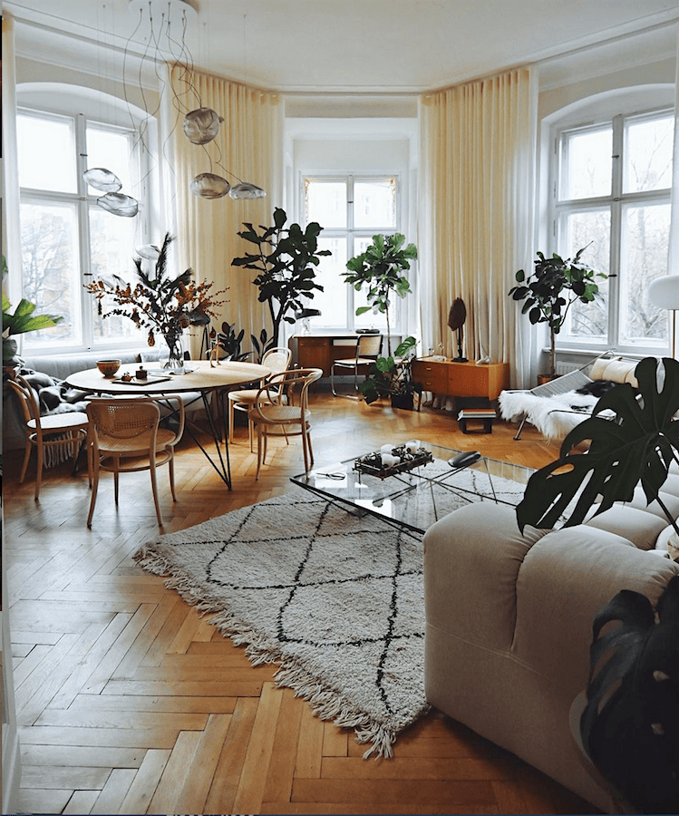
Please check out his feed. His interiors are quite fetching. But, for me, what makes them so spectacular is the exquisite architecture. I have and will always maintain that the most important element in a room is its architecture.
Of course, I realize that most of us will not have these fantastic high ceilings and huge windows.
But the location can be outside of a city. These could be the country, mountains, coastal, southwest, tropical, etc. All of these different geographical locations will impart their unique flavor to the design of the contemporary interiors.
Of course, we won’t be able to go over every one of these. However, I’ll do my best to go over the main design elements that I think broadly apply to most contemporary interiors.
These are the Design Elements of Classic Contemporary Interiors:
Although some may not be as prevalent.
Organic. And, this runs the gamut of elements found in nature. Natural fabrics, nubby textures, stone, driftwood. It can include organic shapes, as well—for example, petrified wood.
Earth tones. This ties into organic. Again, contemporary interiors can also be very colorful. However, we’re talking classic. And, color trends come and go. Therefore, most contemporary interiors use color as an accent.
Presence. Pieces that make a statement or evoke an emotion. The best contemporary interiors do that, but not in an obnoxious way.
Tying into that is a sense of drama. This ties into scale.
In an ideal contemporary room, these are some common elements:
- Ceilings are high, but of course, we can’t always have that.
- Windows are large
- Spaces are more open, light, and airy. (but to fix a too open floor plan, please look here
- Art is BIG (at least some of it)
- Seating is low.
- Coffee and end tables are low. And, the former tends to be large.
- Light fixtures tend to be bigger but not heavy.
- Fabrics are solid.
- However, sometimes tribal and/or African themes may be found in throw pillows and/or area rugs. They are frequently used as accents.
- There may be some industrial aspects to the architecture and furniture
- Often there are some more traditional or classical pieces in the furniture, art, or area rug if there is one.
- Furnishings are never cramped.
- There is always some black and also some white. But often, the walls are white.
- Upholstered pieces have simple lines.
- Materials like rattan and wicker are used
- There may or may not be some mid-century modern pieces in the mix
- There is a relaxed attitude to the furnishings. Art may be layered. Or, it might be leaning against the wall or in front of another painting.
Of course, numerous designer’s styles I would classify as contemporary. But, there’s one designer who flies high amongst the rest, in my opinion.
And, that is the young artist and interior designer William McLure. Well, technically, William Rankin McLure IV. This guy is ridiculously talented. I’m excited to see where his career takes him.
William has a vibrant Instagram account. I’m sure he’s on my list of #onetofollow– some of the top design and lifestyle accounts on Instagram.
What’s so much fun about his interiors, which usually feature his own homes, is this.
- One, he doesn’t seem to stay in one place for very long. But, even when he does, the environment is like a revolving door of change.
- The furniture moves from wall to wall and from room to room.
- The walls get painted- frequently as do the floors.
He paints just about EVERYTHING.
That probably because he began his career as a fabulous artist of large abstract paintings. His work is reminiscent of mid-century abstract masters, Robert Rauschenberg and Cy Twombly. But, it’s uniquely his own. You can commission a unique piece of art from William here.
So, let’s get into some of William’s contemporary interiors and art.
In his rooms, you’ll see expressed, every element I mentioned above. Or, if they aren’t in these photos, you can find all of them on his Instagram account.
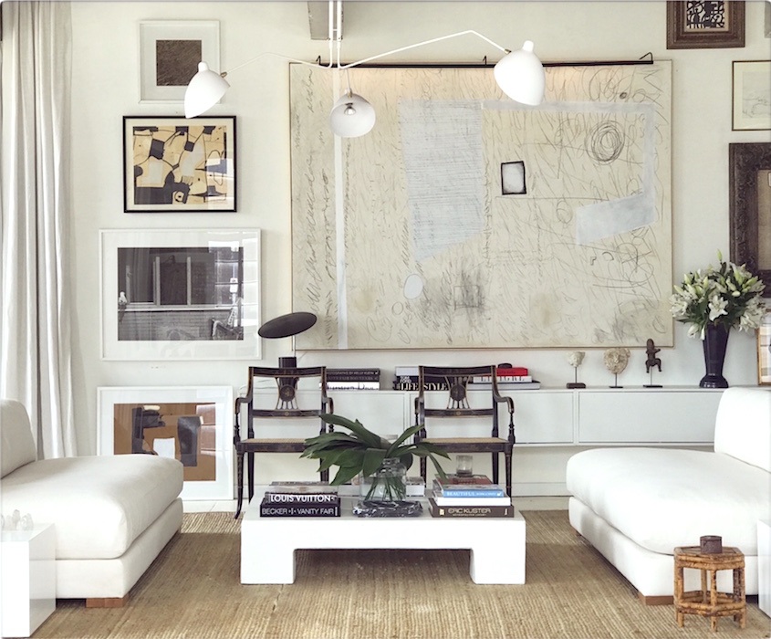 Love this elegant white on white color scheme. And, the fabulous Twombly-esque abstract art.
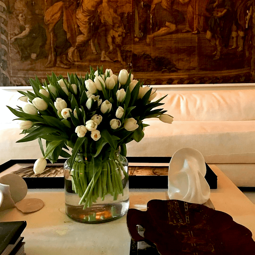
William’s styling is always elegantly spare and includes fresh flowers, artfully displayed.
Please notice the gorgeous tapestry in the background. Remember when tapestries were talked about here?
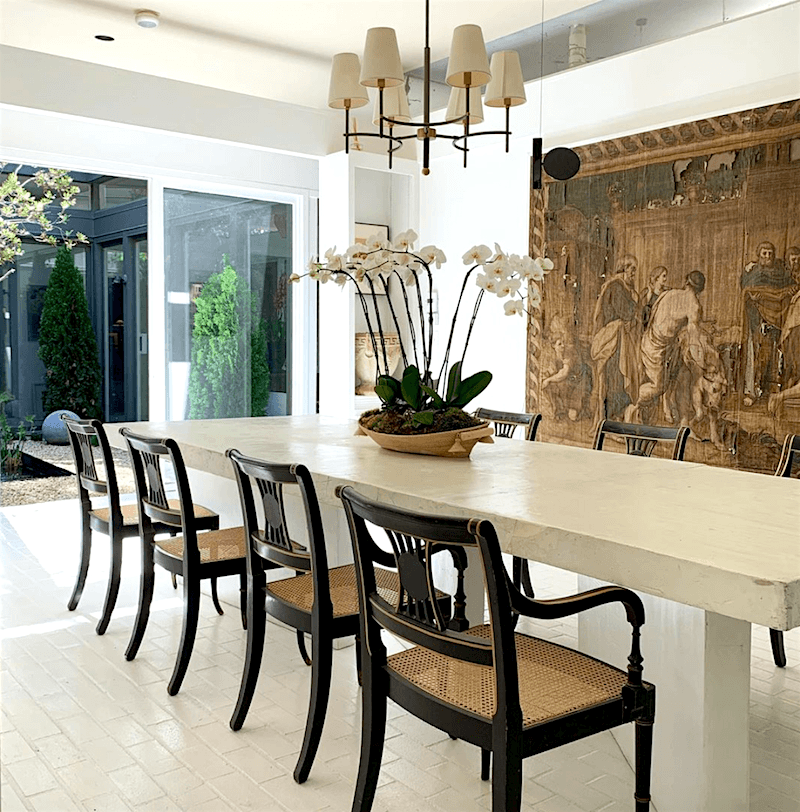
I adore this dining area.
However, please note a few things.
This is a crappy floor that he painted white and now it’s not crappy. White painted floors have become a trademark of his. But, lots of designers, such as the legendary Albert Hadley, are known for white painted floors. Me like!
A reader wrote in the other day bemoaning many disparate and cheap finishes in her home. She doesn’t want to have to deal with the mess of painting.
I understand completely.
However, I didn’t want to deal with giving birth to my babies, either. But, if they were going to come out, there is no choice.
In other words. Yes, it’ll be painful. But, in the end, paint is a wonderful way to fix a myriad of evils.
Please check out this post about how to paint your floors.
And, if you love white on white, you’ll love the home of Charlotte-Anne Fidler, featuring painted floors.
Oh, and one more gorgeous home featuring modern interiors is done by my friend and colleague Susan Serra.
But, getting back to the dining area in the image above.
Please note how carefully it’s been edited. That kind of restraint requires a lot of discipline. But, I think it’s the key as to why this space is so fabulous.
William also used those same dining chairs in his previous home, which you can see here.
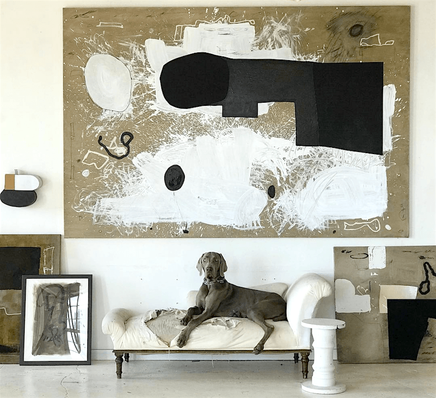
That is Ran, William’s beautiful Weimaraner.
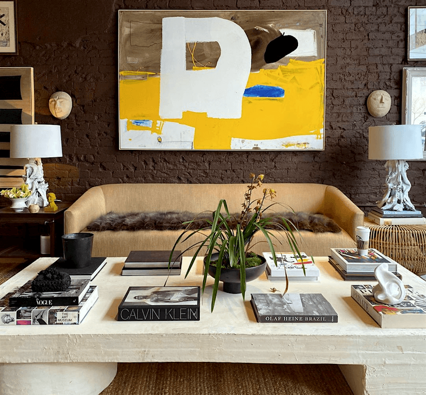
Yes, William uses books when he styles his coffee table. You don’t have to like it, but I do. The books make terrific coasters!
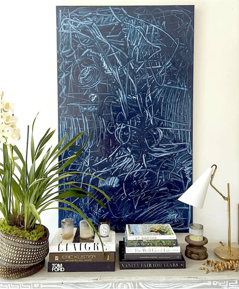
Another exquisite abstract in the manner of Cy Twombly. This one has a blueprint effect, which I love.
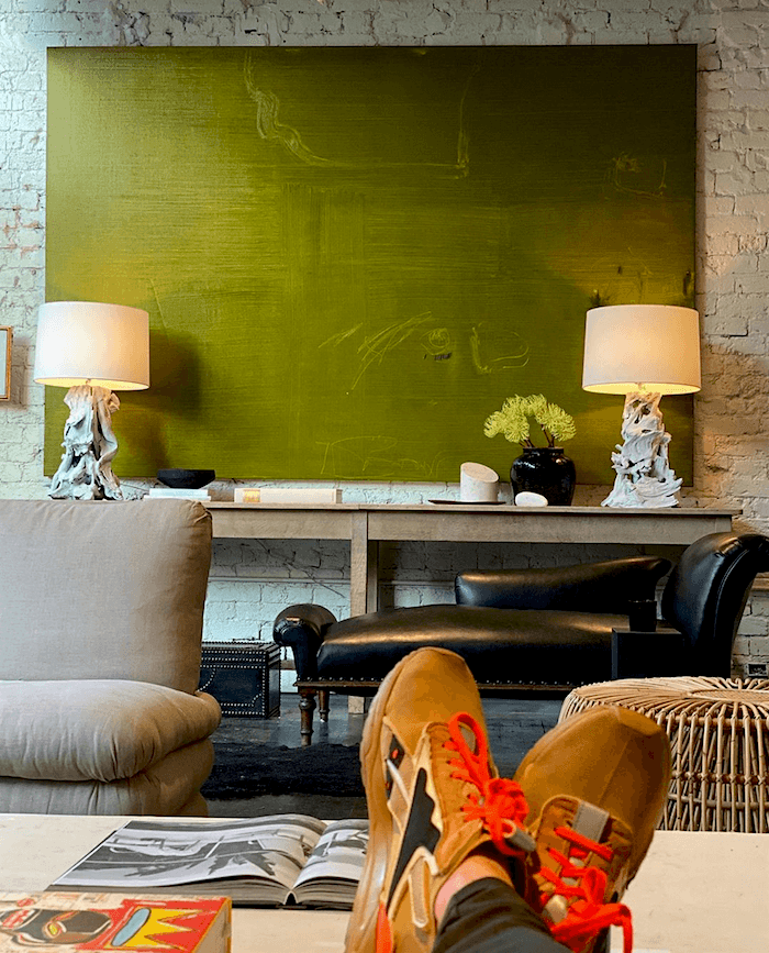
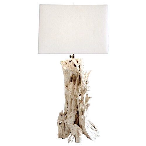
And, I adore this green abstract with a very subtle pattern. And, notice that these organic lamps have moved. But, again, EVERYTHING moves around in William’s interiors.
I did find a similar lamp. The Bodega Table Lamp in Whitewash from Arteriors
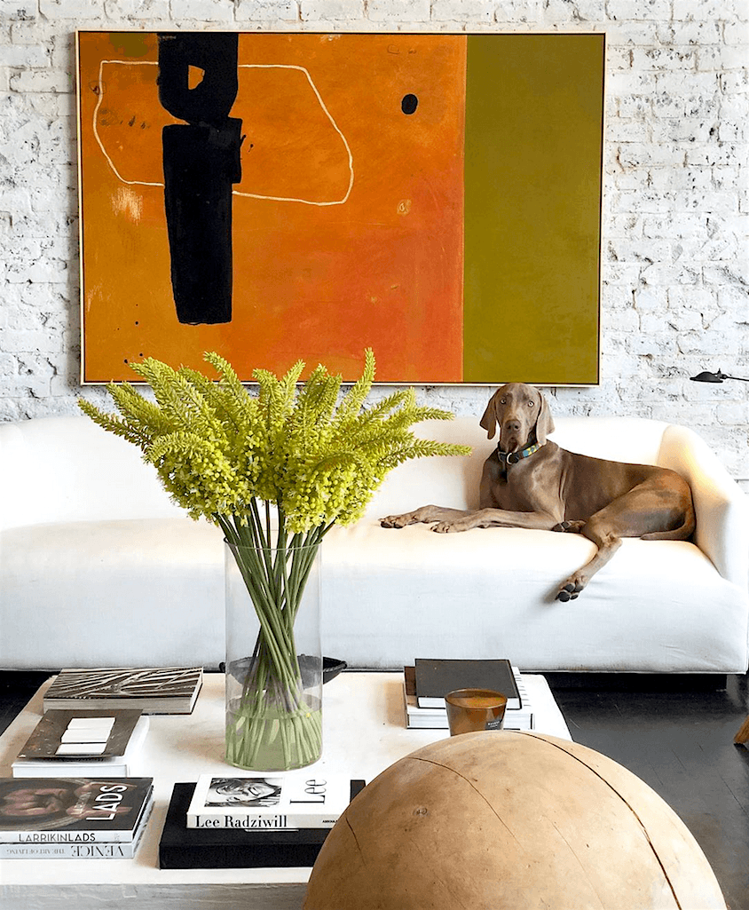
An earlier iteration of the sofa, before it was reupholstered.
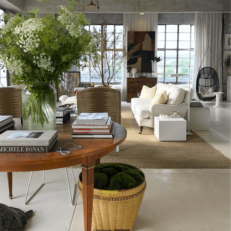
Above is an older home that William lived a few years ago. Many of the furnishings are more typically traditional. But, the feeling is still that of a contemporary interior.
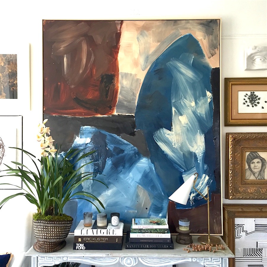
Another gorgeous vignette featuring one of William’s glorious original art pieces.
Even though William’s rooms tend to be in neutral tones, that isn’t always the case. If you look through some of these older William McLure posts, you’ll see plenty of saturated color.(particularly at the bottom of the page
If you guys are interested, I can add a widget of furnishings that are in the manner of William Mclure. I didn’t have time today. But, those are fun for me to do, if you’re interested.
And, so many of you said that you are interested, so here it is: And, then I’ll finish with a few words.

What’s kind of funny is that when I am in the “back end,” (that’s where I write my post), I can’t see the items in the widget. All I see is a tiny piece of code.
The part that I spent the most amount of time on was the art.
Oh, man. William is one talented artist and designer. And, I’m sure that one of his paintings is thousands of dollars. And, most of his pieces are quite large. However, I did find some very large and lovely abstract works.
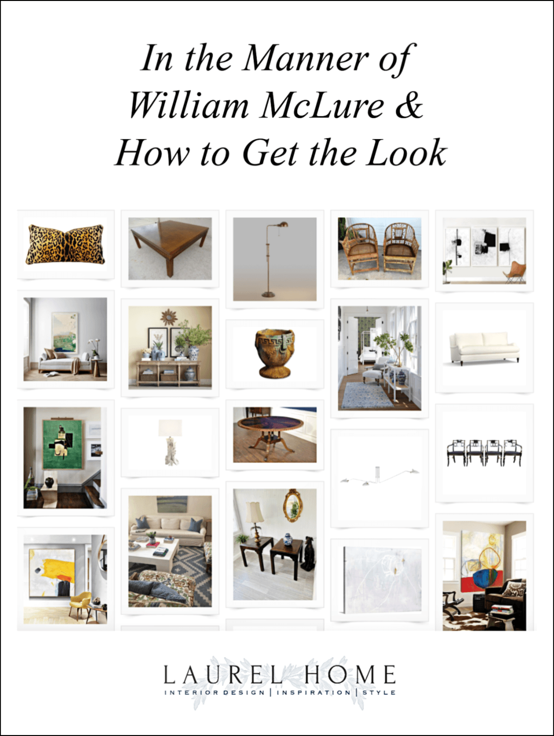
please pin to Pinterest for reference
The rest, I think I explained in the comments underneath the images. But, if you have any questions, don’t hesitate to ask.
Oh, one thing. The coffee table. The source I found on Pinterest is not hideously expensive, but if you could find a cheap wooden table.
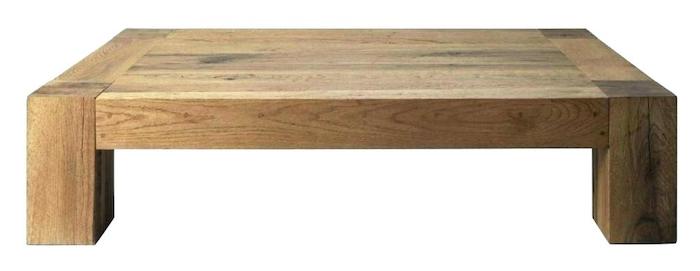 Like the one above or below.
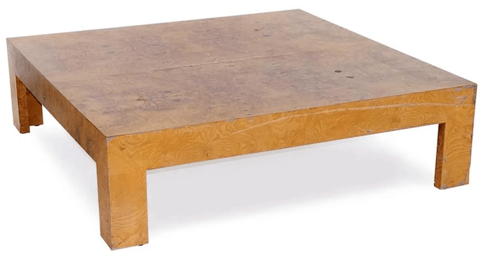 Live Auctioneers Burl Wood Veneer cocktail table
You could then trowel on some plaster or something like that to imitate the look of the plaster table.
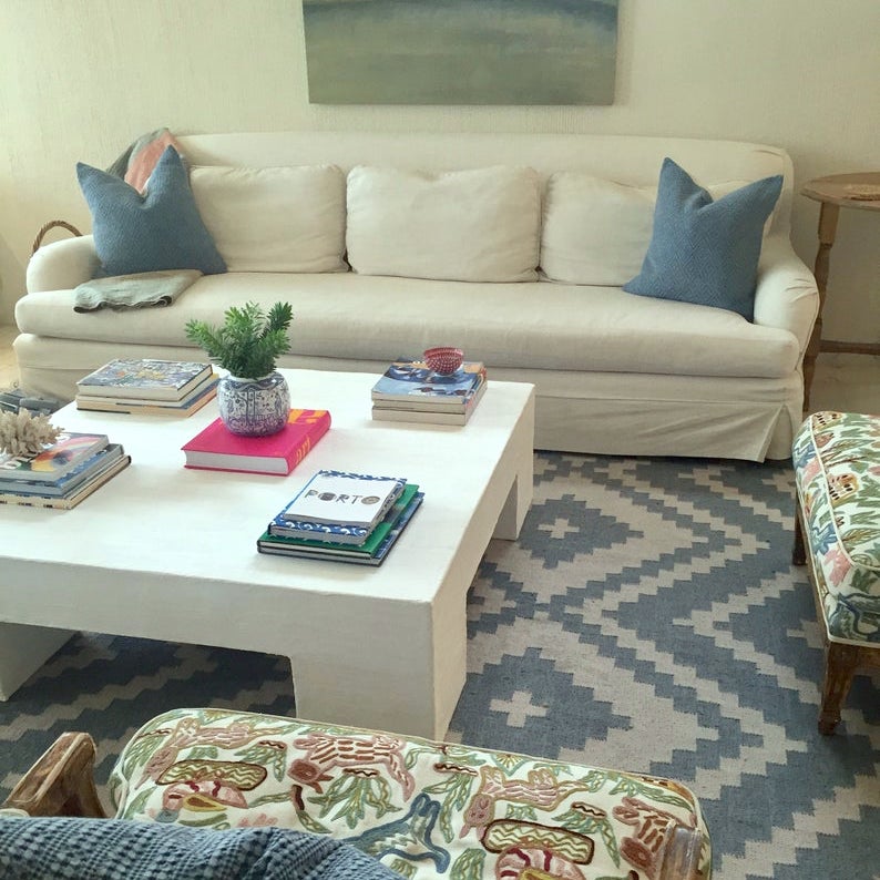 OkenhouseStudios on Etsy. Their extra-large chunky plaster coffee table like William McLure’s table. This one is the 48″ x 48″ which is a pretty large coffee table.
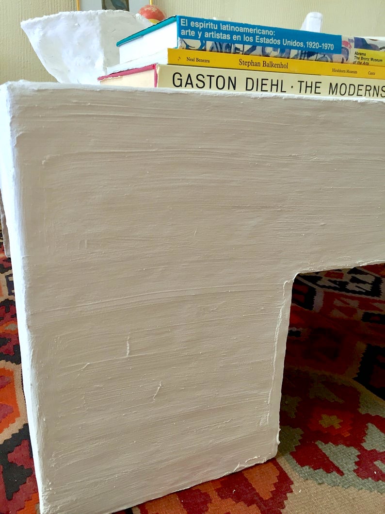 And, here’s a close-up of the finish. I’m not sure what products to use to get this effect. I do suggest, however, if you wish to do something like this, to do a sample board first.
For 50 of my favorite sources on Etsy, please check this post out.
By the way, did I answer my question? haha.
I do think that William McLure’s contemporary interiors are timeless. But, that doesn’t mean that I think that all contemporary interiors are timeless.
I hope everyone is healthy and feeling well.
So far, so good over here.
xo,

PS: Please check out the newly updated HOT SALES!
Everything is still 20% off at Serena & Lily!!!
Related Posts
 A Bad Fiber For A Stair Runner+ A Difficult Staircase {or is it?}
 21 Interior Design Mistakes You Need To Stop Making
 One Living Room Layout – Seven Different Ways!
 50 Interior Design Trends for 2020 – In or Out?
 A Masculine Bedroom That She’ll Love too
 Hubs Wants a Say In the Home Decor, Because It’s His Home Too?
 Can This Dysfunctional Kitchen Be Saved?






16 Responses
Hi Laurel,
I look forward to reading your posts every week and refer to them often. I’ve learned an enormous amount from you and have enjoyed every minute. There is one more thing I’d like you to know. Your blog has been a source of comfort to me during this difficult and strange time. It makes feel like something I enjoy hasn’t changed or been lost. You give us all a wonderful dose of information, humor, and heart. Thank you so much for that. Be safe and well.
I’m an old traditional lady, but sure do enjoy William’s fresh ideas. Love how he moves furniture around. Especially like how he edits and, like you say, uses restraint. I need to learn that lesson! Super into that Indian Zag fabric he used for past upholstery pieces. Can’t afford anything big, but hope to do pillows or a bolster in that fabric one day. So proud of our hometown Birmingham artist and can’t wait to see how he thinks through his new two-story home. I am sure he will find lots of peace and quiet on the rolling hills covering all of his gorgeous acreage. Dog and macaw paradise! Laurel, thank you for this helpful widget. I know I’ll refer to it often.
Would it be crazy to tear up the carpet/carpet padding and then paint what I’m told is “subfloor”? Our carpet is beyond redemption – it’s builder-grade beige carpet, and it’s OLD. Thank you for your guidance – my quarantine area is nicer than it would be had I never found you.
I /loved/ this the first time, and it’s even better with the additions. As an inveterate diy-er, I’d say scrape spackle (the stuff for patching drywall) in streaks along the table with a palette knife or the little plastic spreader spackle tends to come with. Then paint with chalk paint. If the finish is super slick, you may want to lightly sand it first, to give the spackle something to stick to. Looks like a quick and relatively easy project!
oh – this was fun, reading about William McLure again. His style is not my style, and yet, I want to plop down and relax in one of his chairs. Now, that’s talent!
And thanks for reminding us to get exercise. I went out for a 3 mile jog and had so much fun waving at smiling strangers from a healthy distance. So much life-giving energy, there.
Hello Laurel,
Another lover of ballet and interior design here! do you mine sharing the link for your Metropolitan Opera dancer’s class? I understand if she does not want to explode her capacity but would love to see what she offers!
Wish I had had the pleasure to know you during your Palo Alto years. Just down the road in Los Altos now. I enjoy your blog so much, thanks for all the tips and tricks you share in the gorgeous photos you assemble for us.
Cheers!
Great post Laurel – always kinda wondered about modernism v contemporary too. Love his work and the vintage Henredon you featured!
I enjoyed this more the second time around. Like rereading a favourite book. Such restful and spacious interiors. Perfect for self-isolating!
I love Shari’s idea for a post, downsizing for retirement with accessibility in mind. No low furniture for sure! I work in affordable housing for seniors and have witnessed people moving into a 500 sq ft apartment with their 3 bedroom house contents in tow. It’s painful to let go, especially when you’ve spent a lifetime collecting. I’ve also seen downsizing done beautifully. We have many studio apartments and I’ve seen people do wonderful things with their spaces. I usually find they carefully select a few special pieces and keep art and photos that mean a lot to them. Just like William McLure, they move the great pieces.
It’s been crazy at work but we are ready and I’m now enjoying the quiet of working from home. The spring bulbs and trees are blooming. Such a lovely time for walking in Victoria. Stay well.
Although the $$$ I had set aside for interior updates have dwindled, I continue to enjoy brainstorming and looking forward to modifying my plans. This post is awesome, as it combines modern with traditional (mine) elements. Any suggestions for the black and cane chairs featured in the dining area with long white table and white floor? Thank you!
Great post! Thanks…it is good to see the essential elements!
We are soon , a few years, downsizing to a really neat independent living! I’m sure we aren’t alone. Could you comment on what to take or whether to “start over” ??
We have a couple of antiques will be hard to part with bit my spouse wants to do a clean sweep!
Remember mobility and safety are new features that will complicate decorating…
I sure love the contemporary looks you showed today, thanks!
This feels refreshing! I love contemporary because I feel like it borrows the best elements of commercial and public spaces and makes them comfortable and personal at home. I’m going to have to resist the urge to paint something while on lockdown!
Hi Laurel – absolutely a great post – I pinned almost every image. So excited about some of the resources you provided for oversized art. Love the mix of traditional and modern. How would you place William McClure on your 80/20 – whatever it is – he gets it just right! Thanks so much for sharing this!
Good Morning Laurel,
Just wanted to say thank you, once again, for something wonderful to read on this Sunday morning while we are hunkered down for the foreseeable future.
So happy to hear you are well. We are also.
Stay in, Stay well.
Best always,
Pam
Laurel!
You are the BEST! I love and appreciate all that you do-
You are a WONDERFUL writer as well as a teacher and designer.
Stay Healthy! Leslie
Hello Laurel, Although I like antique and traditional accents, a restful bit of Modern seems to go a long way in avoiding a fussy or over-done look.
By the way, did you ever catch the Modernism Show, which I believe is an annual event at (or at least sponsored by) the Brooklyn Museum? I know that they have featured (at the early end of the Modern movement) pieces by Herter Brothers, my favorite furniture makers.
–Jim
I so enjoy you with my morning coffee ! Absolutely love McLure’s dining room with that painted white floor. I’m looking for a chandelier over my dining table, and just love the one in that room. Can you direct me?