Dear Laurel,
Please forgive me. While I’m grateful to have these beautiful palettes you’ve shared for the downstairs living spaces and then upstairs bedrooms, I’m still at a loss on how to put it all together.
I mean, how do you create cohesive room colors and furnishings that flow from room to room?
We’re purchasing our first home and can’t afford to hire someone. But, I really feel out of my element here and don’t want to make a lot of expensive mistakes.
Jen Eric-Reeder
Hi Guys. This letter from Jen Eric Rieder is not one specific comment or email, but one topic that’s been coming up, a lot recently which is creating cohesive room colors; along with furnishings– AND, not having the foggiest idea of how to begin.
I look at the work of the masters of design for inspiration.
This is why I adore sharing the work of those who’ve inspired me all throughout my career. However, some of my favorite designers aren’t professionals. Although, they certainly could be.
One, such talent, I’ve written about her and shared her glorious Instagram account dozens of times, the last seven years. Yes, it’s time to revisit Maura Endres, or M.O. Endres on Instagram.
I first “met” Maura while in Italy. However, I believe she contacted me on Instagram after finding my pics.
She had just been there and was sharing her favorite spots around Venice. Our first and only face-to-face meeting was in New York City, in 2018. We attended a luncheon, and heard the fabulous Charlotte Moss being interviewed.
When Charlotte Moss is speaking, it’s a luncheon, never lunch. ;] Some people have so much presence, they seem larger than life. Charlotte is amongst them.
There’s a photo of Maura and me at the event, here.post.
I looked like holy crap that day; wasn’t feeling so hot.
I was having issues with an autonomic nervous system disorder I have. You can read about that here, if interested. I’m much better now as my medication to help control the symptoms of light-headedness, and all that goes with it was adjusted after this.
The first time I wrote about Maura, six years ago, about Why Does My Decorating Look So Awful? It wasn’t Maura with the substandard decorating. She’s always a fantastic example to follow.
Maura’s incredibly gorgeous instagram page should be required reading for anyone who’s in the business of interior design and is seeking to create timeless, classic interiors.
One can look at her home from ten years ago, or today, and while there are some changes,
I don’t see her posts as often as I used to because I spend most of my time on Instagram stalking dancers– both ballet and ballroom, too!
I’ve always loved the international Latin style of ballroom dance.
My favorite dancers are the young teen-agers. Ballroom dance is a sport and super popular in Russian Those kids are incredibly dedicated and talented.
If interested, please check out this young lady from Moscow who just turned 15. Yes, I know, she looks 25 in some of the videos. The video I linked to is Liza Aibova dancing with a new partner. He’s 14. Yes, 14. These kids practice several hours a day, and also study ballet, pilates, and do other conditioning exercises with private coaches.
As you can imagine, beautiful Liza also does a lot of modeling and never wears the same gorgeous dress twice in her competitions. I’m not sure when these kids go to school.
Okay, let’s listen to a beautiful rumba melody by the legendary Jose Feliciano, and then we’ll return to Maura and her beautiful, cohesive paint colors and furnishings.
I hope you enjoyed that.
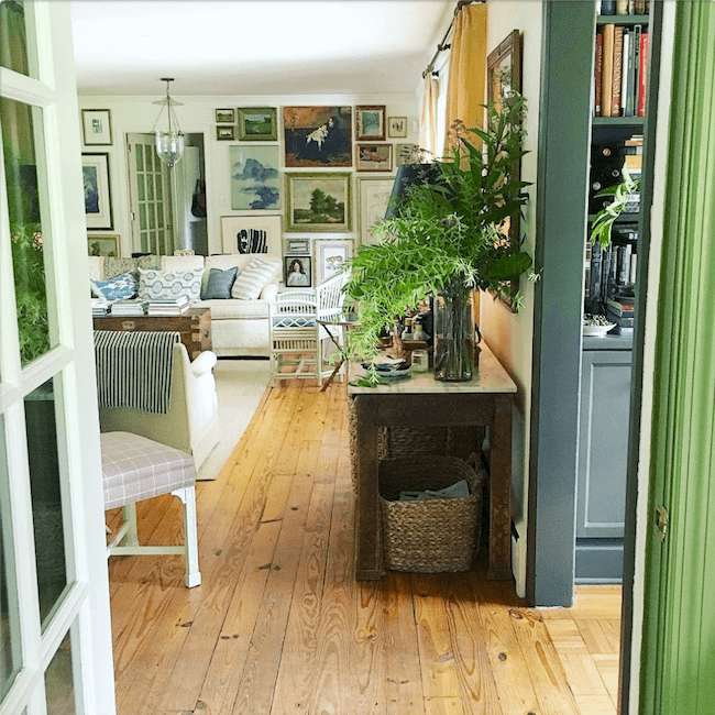
Maura’s home demonstrates every element I harp on talk about that demonstrates perfectly how to get the color flow between spaces exactly right.
You will also find she decorates with a unified palette, but it’s never boring. She punctuates every area with accents of black, gold, white, and silver. Plus, she uses lots of neutrals.
One thing I especially adore about Maura’s home is that it doesn’t have high ceilings, and it wasn’t built a hundred years ago. Here’s the proof that great bones and a warm gracious home don’t have to have soaring ceilings. In fact, some homes today are so cavernous, it’s far more difficult to create that cozy charm.
Maura has achieved something extraordinary through a unified and exquisite palette of colors, perfection of scale, and the most stylish details possible.
She finds her furnishings at flea markets, vintage stores, and the like. Not all, of course, but, a lot of it. Some of it, is inherited.
Plus, she happens to have super-talented children; One who’s created much of the art on that jaw-dropping art wall. Ahhh… remember when I deconstructed that one? You can see it here.
I know that some of you, desperately want me to do this post, only you want it for a home with an open-concept floor plan.
There have been many posts written about how to fix open floor plans. In fact, we were just talking about it.
So, what I feel quite strongly about, is that it’s fine for a home to be open, as long as there is some separation created in strategic spots. You can read more about some ways to go about that here.
Now, I will attempt to deconstruct what Maura has done. She makes it all look so easy and effortless.
First, she has created a backdrop of neutral colors in her wall colors and finishes.
I don’t know all of the colors, and quite frankly, the exact colors are of little consequence.
Please let me repeat that.
THE EXACT COLORS ARE OF LITTLE CONSEQUENCE.
As a matter of fact, you can see for yourself how much they change in images of the same spot, but in different lighting situations.
The living room and kitchen are off-white and dark gray. That’s it. The little library appendage always looks green to me, but Maura says that it’s Pratt and Lambert Tobacco 2248, which is a warm, gray-brown, but there must be some green lurking there somewhere. I suspect that little room is north-facing.


I could not find an exact match in Benjamin Moore, but it is very close to Dash of Pepper 1554. Dash is just a shade lighter, as you can see.

Maura said that the dark gray kitchen cabinets are Benjamin Moore Bear Creek. Yes, that I can see based on the image below. Bear Creek is a very sophisticated, warm, gray-brown with a hint of green. It looks phenomenal against Maura’s pretty collection of dishes.
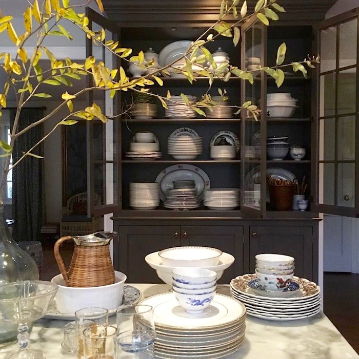
Those colors are very close to each other, and Bear Creek looks right. But, I’m still having trouble seeing Tobacco for the little library.
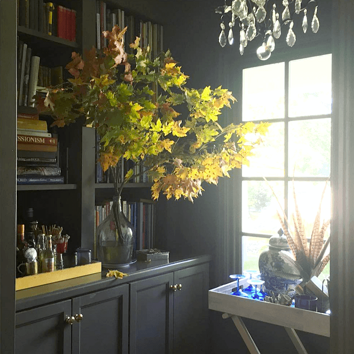
However, I came across another image of an office painted Bear Creek, and it also looked green.

In most photos it looks closer to Benjamin Moore City Shadow CSP-60 to me. However, I am willing to believe that it is actually what Maura says it is. This was one reason why I stopped doing paint consultations via the internet. It’s a bloody nightmare!
The lesson here is to get samples of the color you SEE and like, not necessarily what it is.
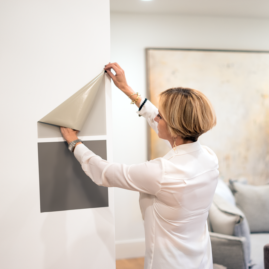
Of course, please test, test, test. I recommend that you use the wonderful Samplize easily movable and removable paint samples. (you can order through that link) It’s a brilliant idea as they use two coats of real paint on their samples. However, there’s no messy paint to clean up and no patches of paint on the wall, either. You can get all of the Benjamin Moore and Farrow and Ball colors, too!

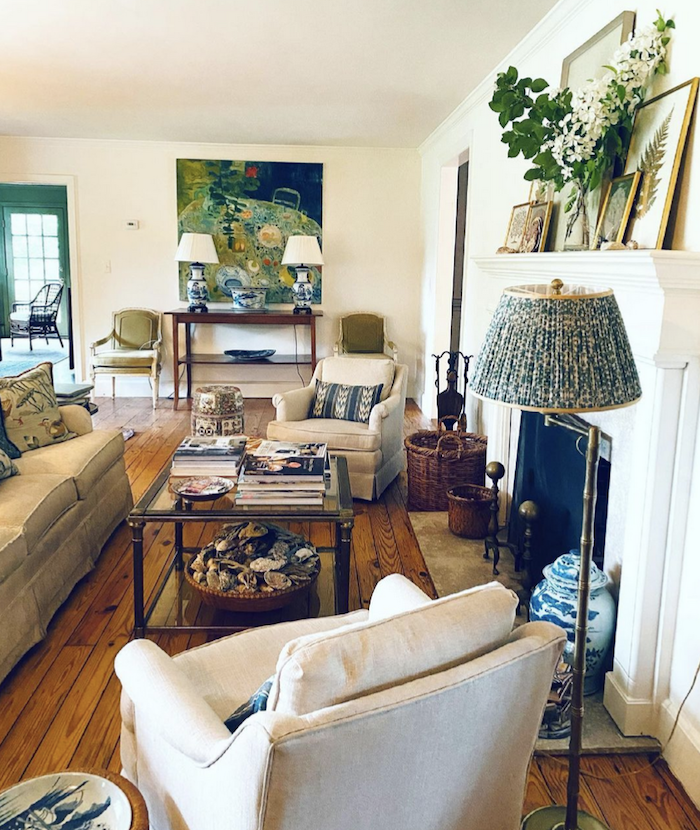
The living room walls look like they might be Benjamin Moore Linen White.
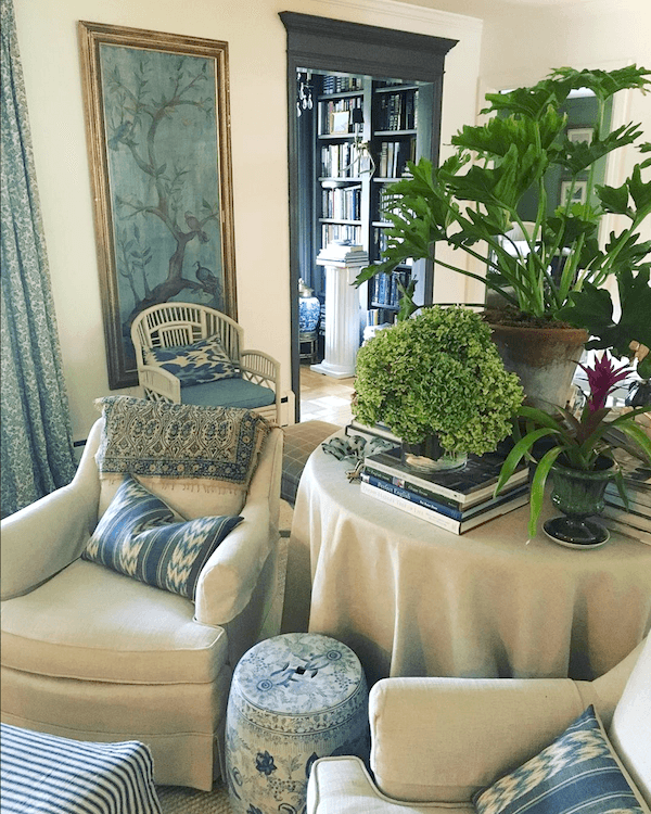
This is an older image of this vignette.
Nothing stays the same very long in Maura’s home.
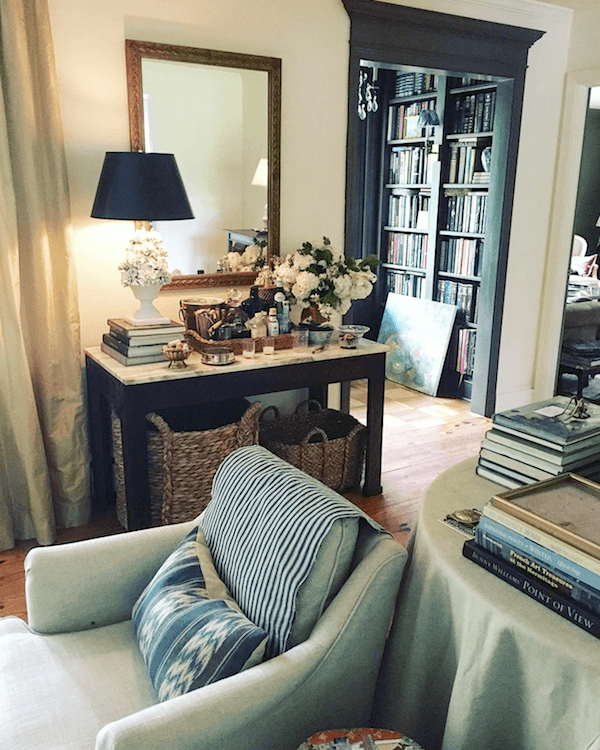
This is so difficult. I love it both ways!

In an adjacent room, that appears to be a den, the wall color is painted a brighter green similar to one of the 144 Laurel Home Collection colors, Benjamin Moore Herb Garden, perhaps.
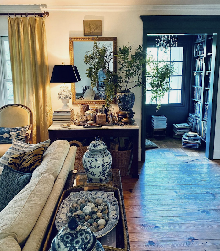
The upholstered pieces are all in pale beige and cream tones. In addition, each piece is beautifully scaled. Read about my disdain for puffy, bloated furniture here.
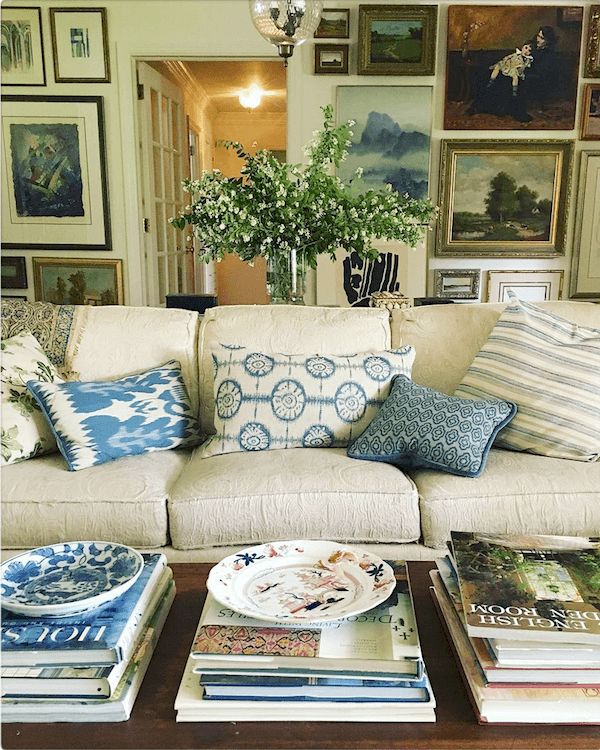
Blues, Greens and touches of coral and red, art, and lots and lots of books.
I also love that each of the pillows is different, but coordinated.
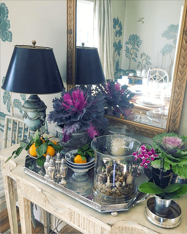
I don’t know what Maura’s background is, but her talent for styling is extraordinary.
And that silver-footed gallery tray– with canted corners! I have tried to find another like it, and well, there isn’t one. Like her gorgeous red cachepot, (you can see it here) this is the last silver gallery tray of its kind in the entire world. ;] However, all kidding aside, what stands out for me, more than any kind of formulaic flow of colors is a passion for creating these incredibly beautiful vignettes.
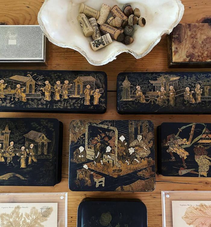
Maura does stylish vignettes the way the rest of us merely breathe. Or, at least that’s how it appears. There are 100s of these incredible vignettes scattered throughout her Insta account.
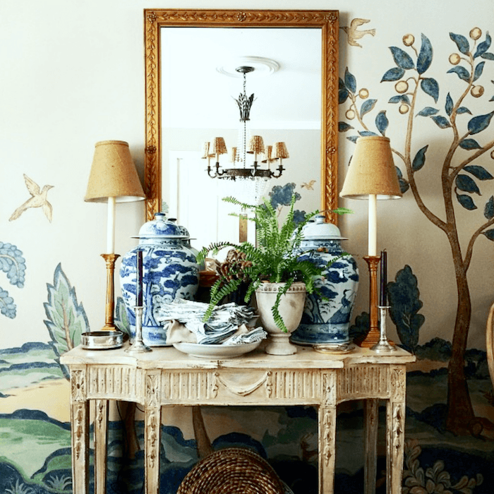
The blue and green colors all come together in the dining room, which features this stunning hand-painted mural.
Total show-stopper and a good reason to never move. Notice that the mirror has migrated to the new vignette and there’s a new mirror to take its place. (you’ll have to go her instagram to see that one. It’s gorgeous too!)
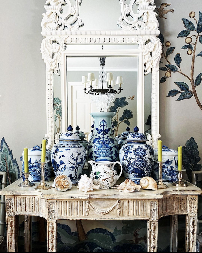
Above, a newer iteration of the same vignette.
However, if you can’t afford a hand-painted mural, this post has several good sources for relatively inexpensive, scenic wallpaper murals.
But, if you also love Chinoiserie murals, please check out this sister post.
Maura’s palette is simple, but also versatile.
It looks great in every season and with everything she brings into her lovely, warm family home.
Now, your home and color preferences might be inherently different. But, many of the same principles will hold true.
Above, is another place where we can see the cohesive room colors coming into play.
For more ideas, colors, palettes and palette families that can mix and match, if you don’t already have one, please consider purchasing the nearly 500-page Laurel Home Essential Paint/Palette Collection with 40 home furnishing boards with dozens of different pieces of furniture, rugs, art, lighting.
If you start here, there are links that will take you first to part I, the paint collection, and part II the paint palettes. But, they are sold together. The reason that there is a part I and a part II is because I couldn’t do it all in one never-ending gulp.
And now, for what I hope is a special treat. I have done my best to channel Maura’s beautiful style and created a widget filled with home furnishings, some old, some new– many of which are on sale!

And for more cool furnishings, please check out the hot sales page. There are dozens of beautiful new items this week and all are on sale.
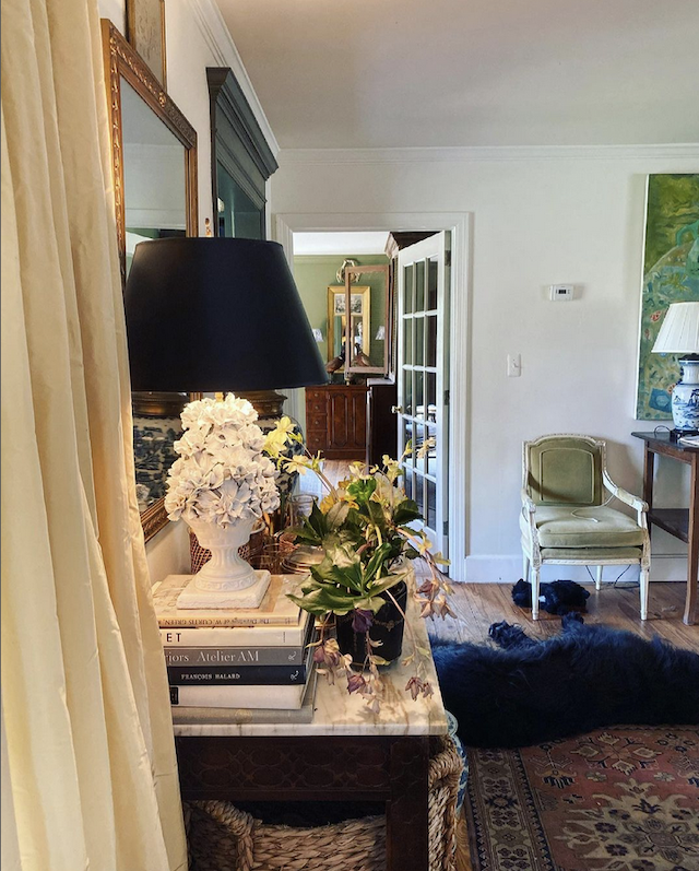
Thank you again Maura, for showing us how to decorate between rooms using cohesive paint colors and beautiful, classic furnishings.
Please follow Maura on Instagram!
xo,

PS: Thanks to so many of you for your fantastic comments and suggestions regarding my kitchen and its never-ending design possibilities. haha I won’t be doing another post about it right now, but I should have an update for you on Tuesday.
PPS: In addition to the HOT SALES, Melissa and I have just updated our favorite home furnishings. These are items I believe will stand the test of time. So, please check out our favorite home furnishings here.
Related Posts
 Please Help Me Select My Bathroom Floor Tile!
 Can a One-Bedroom Condo Turn Into a Three-Bedroom? (Revised)
 Home Organization and the Best Information Ever!
 To Brass or Not To Brass In the New Un-Bathroom
 My Dream Home – Here’s What It Looks Like
 Greetings From The Kitchen and Bath Industry Show 2018 (KBIS)
 A Room That’s Chock-full of Interior Decorating Lessons


