Hi Everyone,
Oh, I know. The post is soooo late. But, at least it’s out.
Very early on, I did a post, “How to Style a Bookcase.” I took it down because it didn’t really give any helpful advice. So, this time, I hope I do a better job.
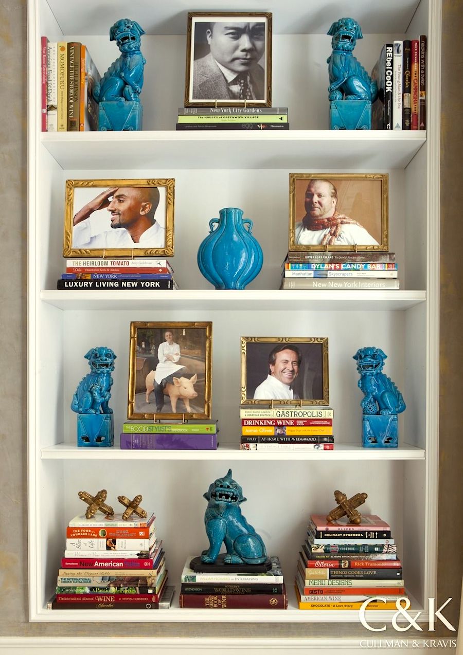
Gorgeous bookcase by Cullman & Kravis
I’m going to create a template for bookshelf styling!
These stylings, like the Laurel Home Paint and Palette Collection, will give you a jumping-off point. Thus, training your eye as to what looks good.
And, what doesn’t look so good.
However, there’s yet another problem.
The bookcase itself. There aren’t trillions of configurations and sizes, but there are dozens.
So, for this exercise, I’m going to stick to floor-to-ceiling bookcases.
I mean, if you have fewer shelves, then you can eliminate some. In addition, I think it’s possible to mix and match the shelves. Nothing is written in stone. Ever.
The other thing is that in the interest of sanity, I’m sticking to one basic theme. However, I’ll go over how to switch to another theme and color scheme.
(please note. I was barking mad when I wrote that last sentence. Therefore, please ignore what I said.)
Now, when I say “theme,” I’m using that word loosely because it’s a word that makes me nervous; however, I can’t think of another word at this point.
An example of something TOO theme-y would be a coastal (themed) bookcase filled with seashells, coral, glass jars filled with sand and beach glass, starfish, driftwood, lanterns, miniature buoys, and lighthouses. That would be a bit much, no doubt.
The word I believe one needs to learn when doing bookshelf styling is EDITING.
The problem with a lot of our bookshelves is they’re filled with disparate items like the picture frame your aunt gave you as a wedding gift with plastic flowers all over it. That’s juxtaposed next to a lovely antique silver pitcher you inherited from your great-grandmother. And, near that is artwork your third grader created in the manner of Matisse.
Believe me; I’ve been just as guilty of doing that kind of decorating as the next.
Well, Laurel, isn’t using a “template” going to have a kind of “paint by numbers” contrived look?
I don’t know. I haven’t done it yet. ;] Or rather, I’m in the middle of the first two bookcases. (and only two!!!) So, yes, I will address how to keep a template from looking contrived while still pulled together.
In fact, let’s just jump in discuss this point right off the bat.
Ideally, your bookshelf styling should reflect the rest of the room. Pretty simple.
Therefore, let’s begin with color. This is a great place to establish all of the colors used in the space. Or, perhaps there’s no color at all.
Like all interior spaces, I like to see both white and black and also gold accents in bookshelf styling.
So, what should one put in a bookcase?
Well, these days, not everyone has books. I know, some of you purists hate hearing that. And, that’s fine. It’s also fine not to color-code your books. You don’t have to do anything.
This is for people who want to have a coordinated bookshelf styling and don’t have a clue where to begin.
So, let’s begin with the books.
You don’t need to have books on every shelf. But, I like to have some going both vertically and also horizontally. And, yes, with the spines out, for God’s sake!
I know. Whoever started the trend of turning the spines inward is seriously disturbed. The same goes for books in plain wrappers. Obviously, we aren’t even pretending to be reading these books as they are purely decorative. And, of course, I’m being facetious. Well, it’s all fine.
If our shelves are from about 10″ – 13″ apart, then we can’t have anything taller than that. However, it’s okay to have some shelves that have more space to allow for taller things.
I didn’t do that this go around, but I could for the future.
There is a rule that it’s best to use uneven numbers for bookshelf styling.
In other words, groupings of either one or three. However, if you have a lot of shelves, I think it’s actually more interesting to make one or two, not exactly three elements.
Speaking of elements, how many can one have?
Well, if sticking with a strict color scheme, here is what I’m thinking.
For my bookcases, I chose my favorite analogous color scheme of greens, blue-greens, and blue.
In addition to books, and in this case, they are in our color scheme; I love art. Here, we can introduce other coordinating colors into the scheme.
I also love greenery. However, if your bookshelves aren’t close to the light, and you don’t want faux, then you’ll need plants that don’t require a lot of light.
It’s natural since blue is one of our colors to introduce some blue and white Chinoiserie porcelains.
Porcelain figurines were added in the form of foo dogs and parrots. There are more small animal figurines in gold and a gold incense burner. And, I also included a small modern piece for a little visual interest.
I also love adding a box or two to the scheme.
Another thing to consider is form.
It’s a design element we did learn about in design school, but I don’t hear much mentioned about it today.
What do I mean by form?
Basically, it means shape.
In my bookcase, intuitively (because I really have no idea what I’m doing), everything that’s not books or art is of an organic form.
That is the unifying factor.
Curves and living things. And, these curves are juxtaposed against the straight lines of the books and bookcase itself.
So, now it’s time to stop yakking and looking at what I’ve created that I hope explains all of my points.
Don’t worry; there will be more explanation after the pretty pictures I created in Picmonkey. Here’s a tutorial for picmonkey, if you’re interested.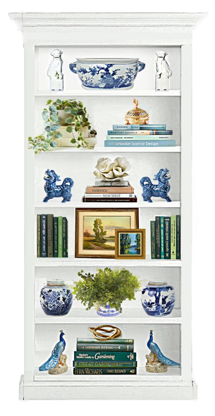 Initially, I had all sorts of grandiose plans to create an entire wall of bookshelf styling.
Haha.
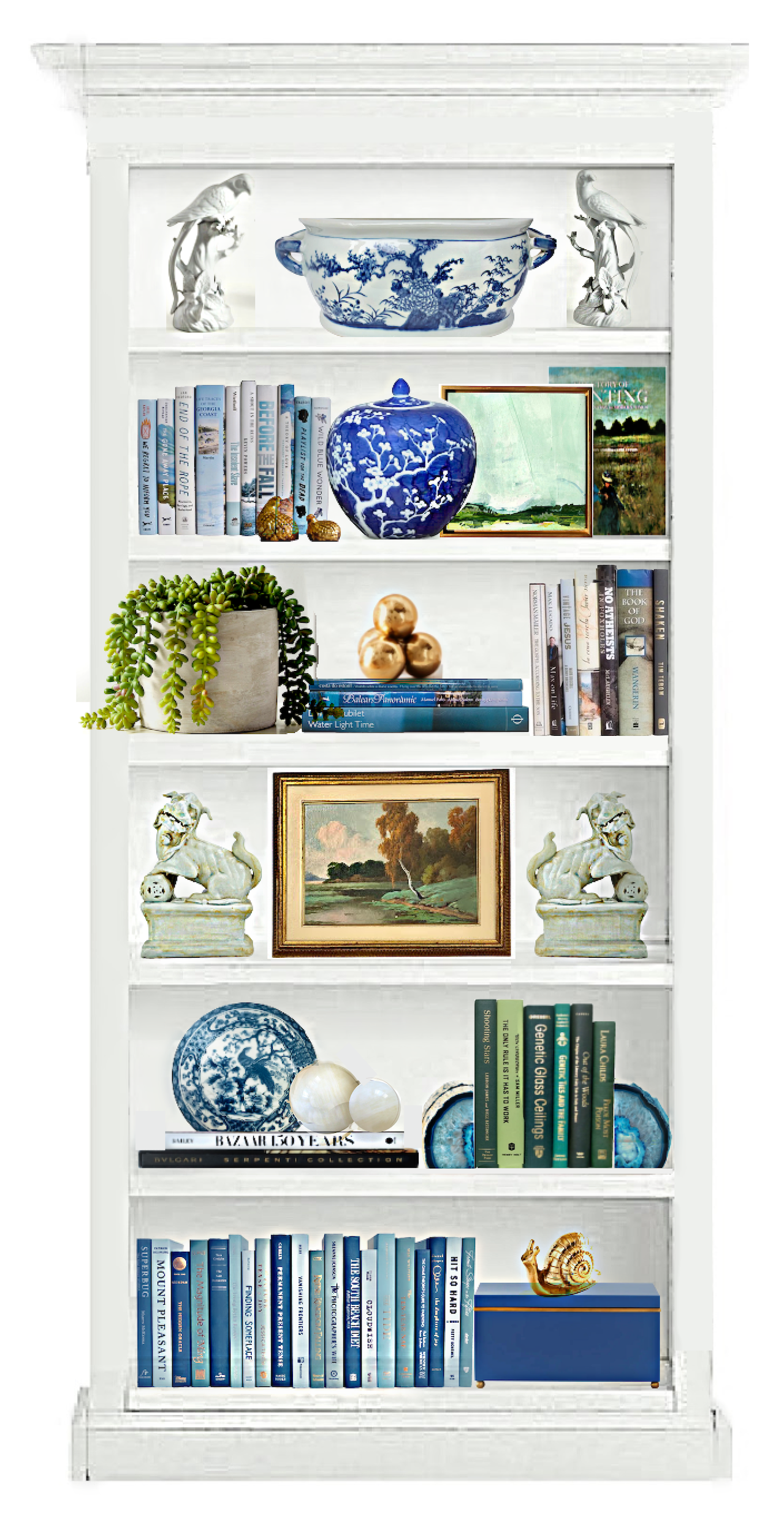
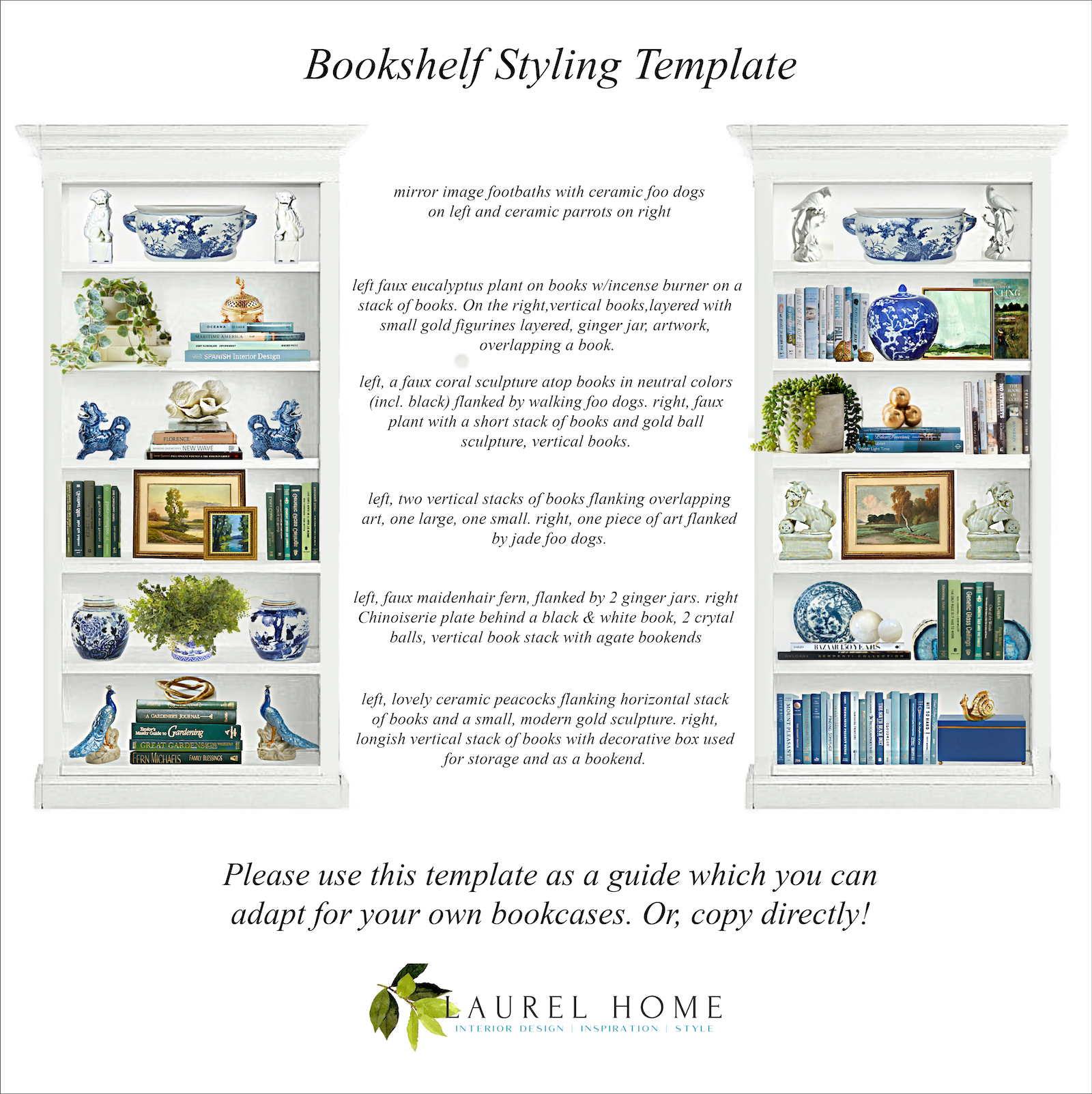
please pin to Pinterest for reference
Above is a graphic that explains the template.
Of course, your bookshelf might be larger or smaller. But, this gives a good starting point.
What if your bookcases are more narrow?
That’s an excellent question. In that case, you might only have one or two items in your composition.
Coming up will be a widget where I got everything for the bookshelf styling.
But, about the books. There are over 2,500 listings of these color-coded books on Wayfair at Booth & Williams.
And, some of the listings have quite a large number of books in them. However, they also sell books as singles. Some of them are pretty camp.
Okay. Most of you are probably not going to go out and buy everything.
I tried to keep prices low, but I know. It’s expensive, and you decorated your bookshelves by going to tag sales, etc.
Sorry, I have to make that bright, so hopefully, I won’t get a comment that says. “I get all of my home furnishings at tag sales.”
I don’t have a problem with that, but sometimes it feels a tad smug, is all. I’ve had times in my life when I couldn’t have afforded even a tag sale price. Hey, you can find some pretty great stuff for free, left on the street, too. But, that might take a while.
However, if you’re one who prefers thrifting, maybe you can find some of these things or similar at your tag sales.
But, here’s one thing I’d like to caution.
I realize the Homegoods is pretty terrific. I’ve gotten some home accents there and love them. However, if possible, I would not get everything from there. It IS a good thing to have some vintage or hand-made items, as well.
Also, you do NOT have to use artificial plants, and I have to admit that I’m in two minds about them.
And, yes, if your third grader’s art is super-special, perhaps it can be incorporated with the art.
My philosophy is pretty much “less is more.” But, still with some layering, as you can see above.
The idea is coordinated, not totally matched.
One of the worst things I see sometimes is when people do exact mirror images of their bookshelves.
It’s not that it’s bad; just a tad boring, in my opinion. So, I would try to avoid doing that.
And, definitely, this template is to be used as a guide. You can always add or take away. Or switch the order of the shelves. For example, if you have little ones, of course, you wouldn’t want anything breakable on the first couple of shelves from the floor. That is unless it’s my now 6′-3″ firstborn.
And then, it would be the first four shelves, at age two. lol, He was born TALL!

He was here a couple of weeks ago for a wedding gig.
 Some of you were asking about my younger son, Aaron. Here he is during that sweltering heatwave in Seattle at the end of June, and Cale was visiting him.
For fun and context, I added a fireplace I found in my photo library.
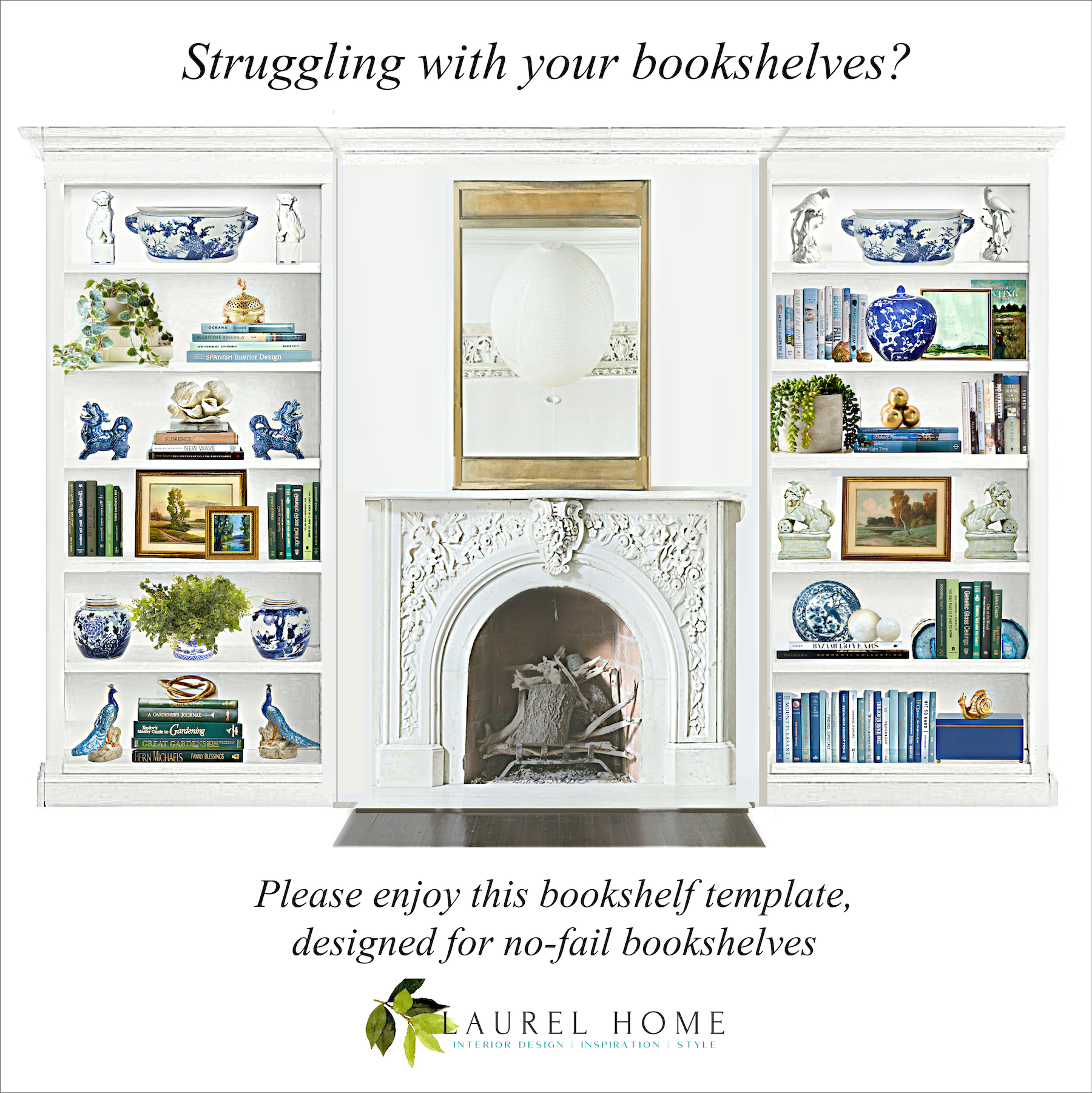 please pin to Pinterest for reference
And, now for the shopping widget. Some of these items are one-of-a-kind, but most are not. A few things might not be in stock, but I tried not to include anything that’s only going to be in stock next March. :]
I also added several items that aren’t in the bookshelf template. Please click on any image to learn more.

Well, I hope you enjoyed these bookshelf styling templates.
If you do like this idea, would any of you be interested in, say, my doing this as a seasonal thing? Obviously, this one should’ve been fall.
I could also do a more contemporary and earthy bookshelf styling with neutral colors. Or, it would be fun to do a stylish coastal bookshelf styling that feels appropriate. And, without being obnoxious, as talked about earlier.
I could also do an entire wall of bookshelf styling. Say, like four or five separate bookcases.
Now that I’ve done this one, others won’t be as difficult. I don’t think, anyway. But, maybe I’m still deluding myself!
I hope you’re enjoying the beautiful day!
xo,

PS: Please check out the newly updated HOT SALES!
Related Posts
 Enchanting Garden Tour in Greenwich Connecticut
 Eegads! My No-Fail Paint Color Failed. What Went Wrong?
 Bathroom Design Inspiration – Revisiting an Old Project
 20 Stunning Lifestyle Instagram Feeds You Must Follow
 Classical Interior Architecture, The Most Important Element
 77 Budget Fabrics That Look Rich + Sources!
 F&B Calke Green + An Iconic Wallpaper = Kitchen Heaven!

