An Attainable Kitchen Makeover You’re Going To Love

Hi Everyone,

I hope you had a great holiday!

I’m in New York and having a fantastic workation!  But, I was having dinner with a friend this evening in Bronxville, outside, but under a secure tent when a huge thunderstorm hit and a bolt of lightning was so close, we all felt an intense jolt of energy. The wind nearly blew the tent away!

As promised, today is Part II of Dottie’s home, the fantastic kitchen makeover.

And, as the headline says, I think it’s completely accessible and perfect for Dottie’s home.

Most of you probably saw the exterior makeover of this home, but if you didn’t, you can go here to see it.


Here’s what Dottie had to say about the home and why they purchased it.


Five years ago, my husband and I bought a c. 2005 pseudo-Craftsman home with a great location, layout, and yard.

However, it was not my dream historic home. However, we saw the potential, so we decided to buy it.

Slowly, we began painting every room and filling it with vintage and antique furniture.


Recently, we decided it was time for a “minor” update to bring the very brown kitchen in line with my style.


The update I had in mind was what Laurel would call a kitchen botox. So, my botox meant keeping the 15-year-old appliances and working around the existing layout.

Please know, Laurel, that I am a loyal follower of your blog and always go back to your “unkitchen” posts. And, especially Nancy’s kitchens (her own and Melissa’s). I kept thinking how amazing it would be to have Nancy design my kitchen, so I summoned my courage and sent her an Instagram message one day in November.


However, courage was unnecessary, as Nancy is such a kind and open person.


And, phew! How lucky I am! Working with Nancy is like talking with a friend who happens to have exquisite taste and equal enthusiasm for my kitchen – and I do consider her a friend now! After I shared more information and pictures, she agreed to help.


Yes, yes, yes, and yes! I feel the same every time I talk with Nancy. That’s Nancy Keyes, who’s become a great friend, now.


During our first client/designer phone call, Nancy put forth an overall design concept for our kitchen makeover that kind of blew me away.


She suggested:


  • changing out the cooktop and wall ovens for a beautiful range,
  • removing the upper cabinetry to create a hearth-like niche around the range,
  • turning the wall cabinets into floor-to-ceiling pantries,
  • and installing an integrated refrigerator to blend with the pantry wall.


Despite reading all about unkitchens, somehow, I had never considered such changes for my botox kitchen makeover.


Okay, I realize that 99.999% of you skipped the above part, lol, and have already checked out the kitchen makeover. So, if you have time, please go back and read now. Thank you. It’s okay. I’ll wait for you to come back before giving the official tour. ;]

One more thing. I have all of the specs and SOURCES used for this kitchen makeover! So, I’ll be interspersing them, and then most of them and a few extras are in a widget at the end.


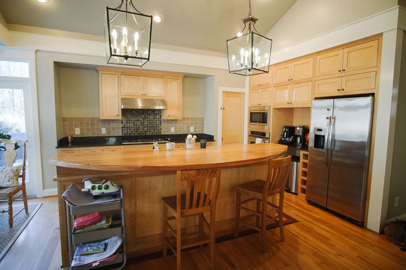
Time to begin with the kitchen from the real estate listing.
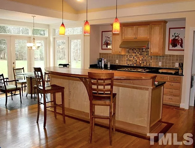
 

The kitchen went from this:


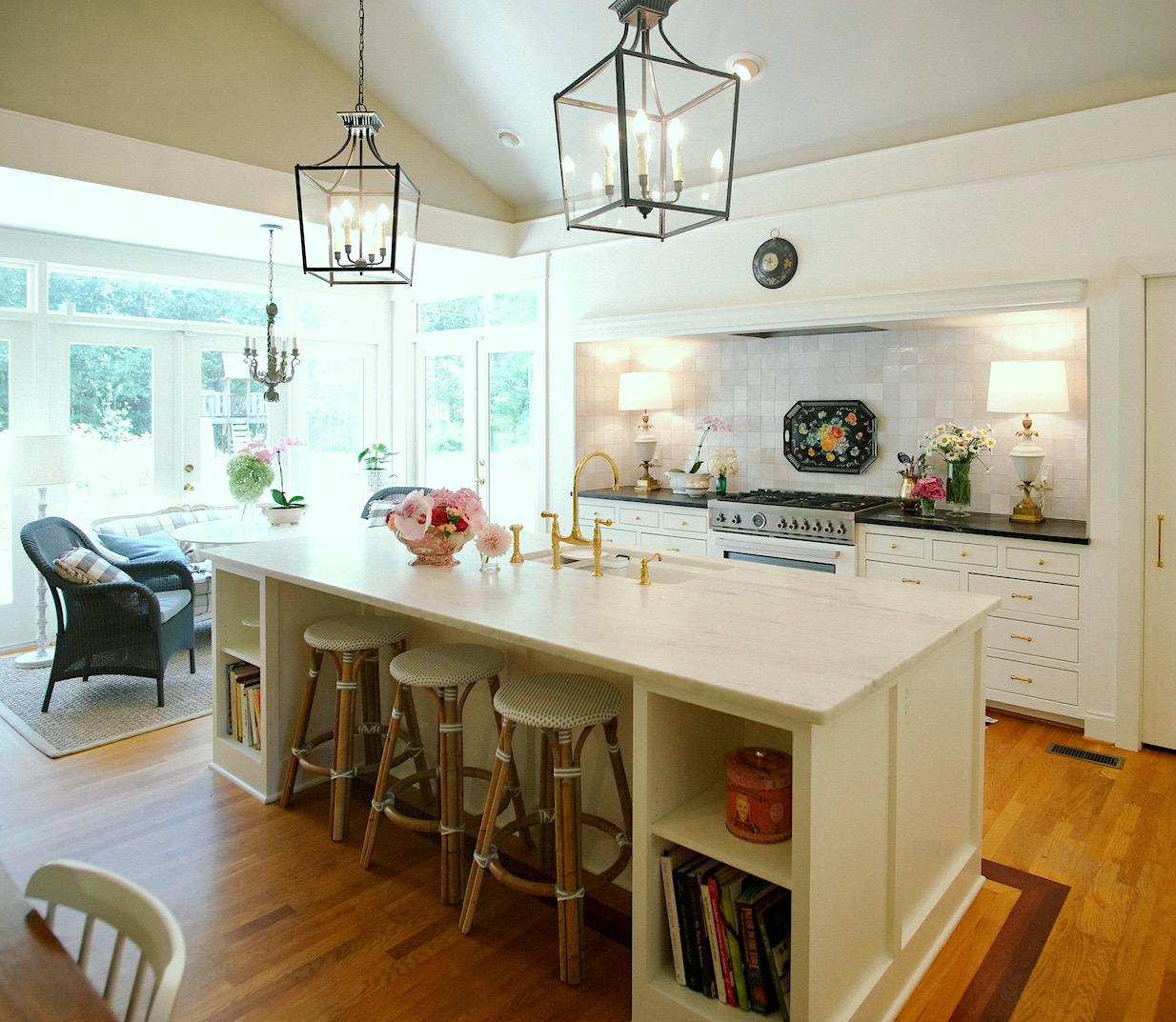
kitchen remodel - island - marble top Serena & Lily stoolsTo this


And, from this more recent iteration, above.
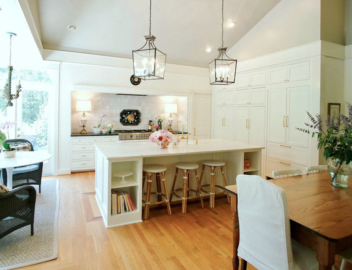
 

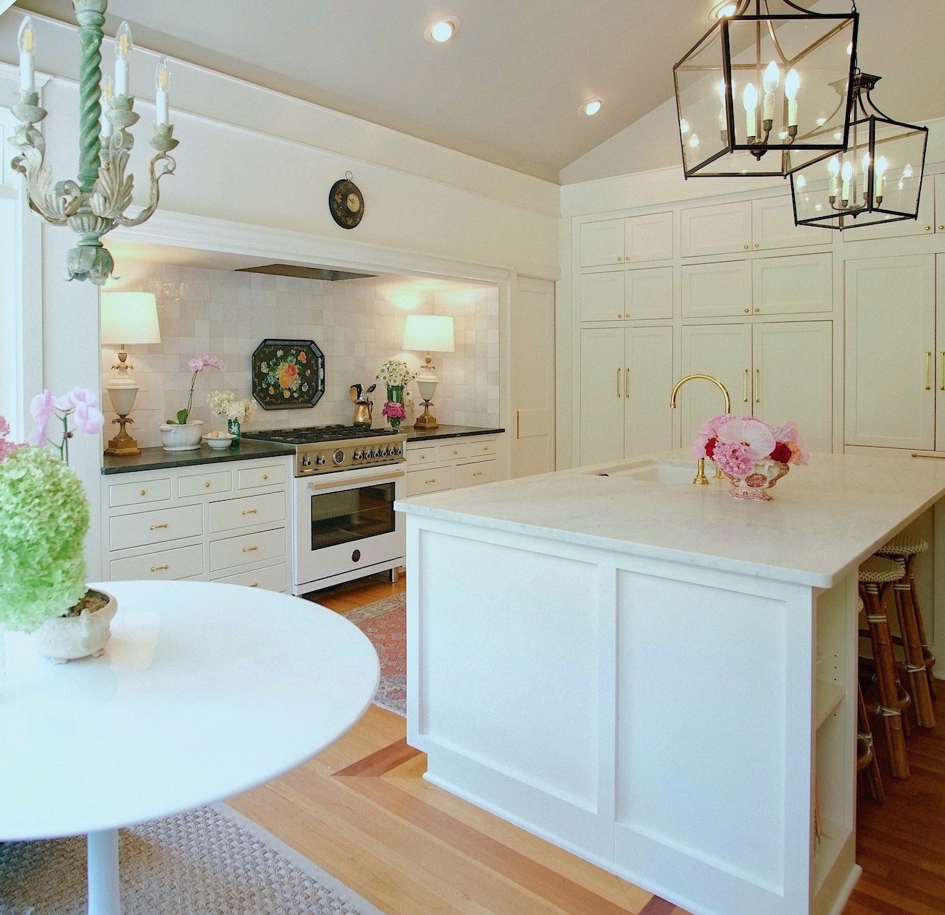
Kitchen makeover - two eating areas

to this


kitchen remodel farrow & ball wimborne white

Tulip Fiberglass Table


Dottie went on to say about her kitchen makeover:


I knew from the start that I wanted a white kitchen, not a cold sterile white as that would look out of place in my home.


Nancy told me upfront that she rarely does white kitchens these days.


But, she always listened patiently and with an open mind. After I sent her at least half a dozen inspiration photos of white kitchens, she said, “I am convinced that you do want a white kitchen.” Ha!


Wimborne White - Farrow & Ball


Nancy gently nudged me until I came around to Wimborne White from Farrow & Ball, a very slightly creamy white, as the best color for everything. And, I mean everything. I was afraid at first, but again, Nancy knows what she’s talking about. In addition, I ended up painting my adjoining living room walls Wimborne White, too.
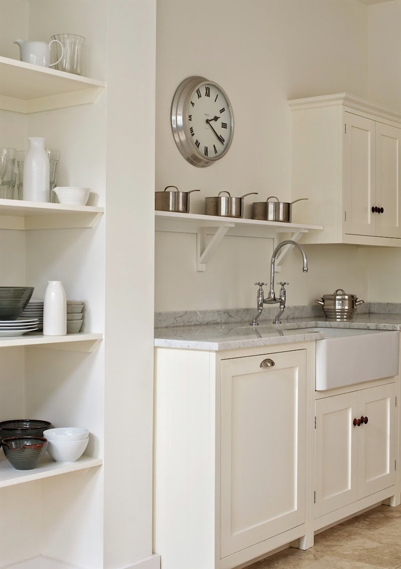
 

deVOL-TunbridgeWells-shaker kitchen - farrow and ball wimborne white

DeVOL kitchen painted Wimborne White.


It’s funny, but shortly after the cabinets were ordered, you published a post about some of your favorite Farrow & Ball paint colors. I was very excited to see that Wimborne White is one of your favorite Farrow & Ball paint colors.

Please also see 12 fantastic Farrow & Ball cabinet colors for the perfect English kitchen.


Also, you can now purchase Farrow & Ball Samples and paint online!

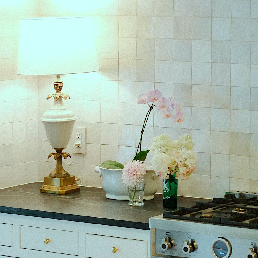
Nancy said about that fantastic Zellige backsplash:
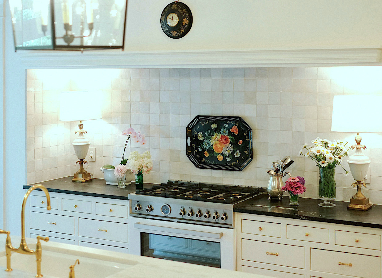
 

Kitchen makeover - Stiffel lamps from Chairish
In an early convo, Dottie brought up the Zellige tiles. And, we did discuss the possibility of subway tiles, but in the end, the Zellige won out. We love how it looks in your client’s kitchen you did a couple of years ago.
 

Kitchen makeover vignette Zellige tile - vintage Stiffel lamp


Anyway, I’m so glad we went with the Zellige tiles from Cle Tile. It’s one of our favorite elements.

Hold the phone, girlfriend! Oh, please do tell! Yes, the tile is exquisite, but THOSE lamps.

Oh, yes. We found that lamp and a lot of other things at Chairish. In fact, Chairish has hundreds of vintage Stiffel lamps!


Laurel, your posts about hiring a decorator, were just as helpful. I realized that the best collaboration is with someone you’d invite over for dinner. And, that’s exactly how I felt about Nancy — immediately. But, not only that, I trusted her eye and advice implicitly.


Therefore, my husband and I quickly decided to go 100% with Nancy’s plan for the kitchen makeover.


She made us realize that keeping the old appliances was asking for big trouble down the road for various reasons. And, it made sense to “bite the bullet” and do them over now, as well. I can’t tell you how happy we are that we made that decision!

Nancy and I considered pretty much every 36″ range option before landing on the white Bertazzoni Professional (a sexy beast, for sure!).
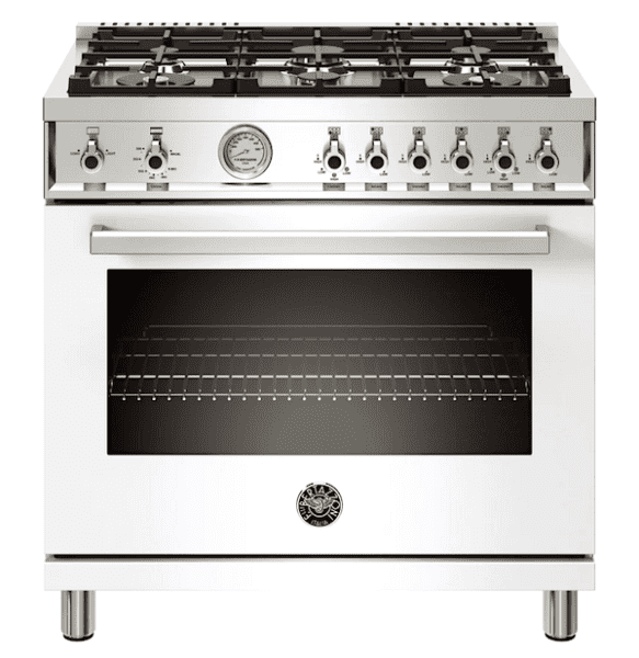
Bertazzoni PROF366GAST - professional cooking range 36"

Bertazzoni Dual Fuel 36″ Professional Range self-clean oven
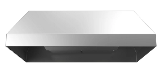
Vent-A-Hood 36″ Dual Blower Liner
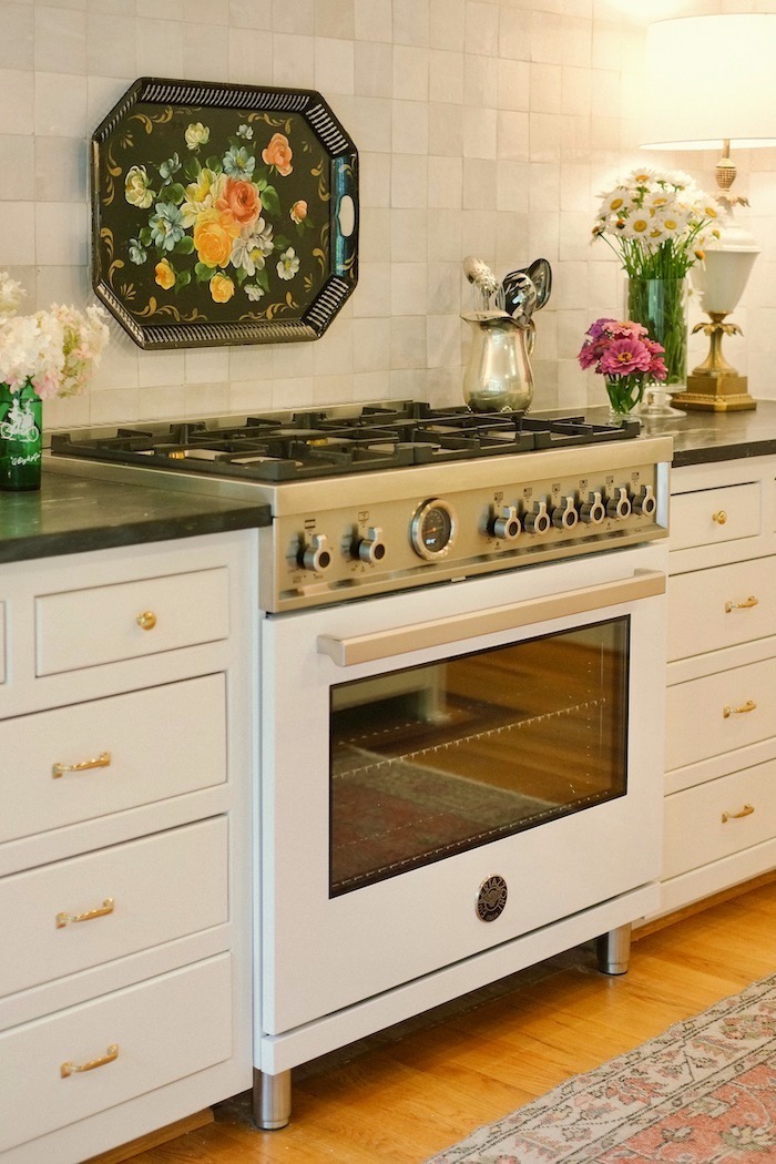
 

Bertazzoni PROF366GAST - professional cooking range 36"


Oh, man, this is a showstopper! Nancy has confessed to me that this is her favorite range.


Dottie went on to say:
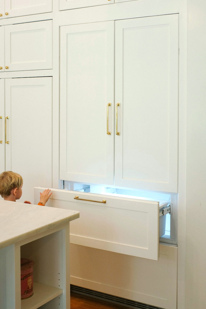
 

Liebherr Integrated Fridge Freezer

At Nancy’s suggestion, I looked into a Liebherr integrated fridge as a slightly less expensive alternative to a SubZero. I wavered a bit about spending so much money on a fridge. But, I am so happy I did, as it brings the design together perfectly. (Hot tip: I used regular 8″ cabinet pulls on the refrigerator and freezer panels, not the larger and vastly more expensive appliance pulls. They work great.)


Love this!


Nancy and I had so much fun shopping together on Chairish, eBay, and Facebook Marketplace.
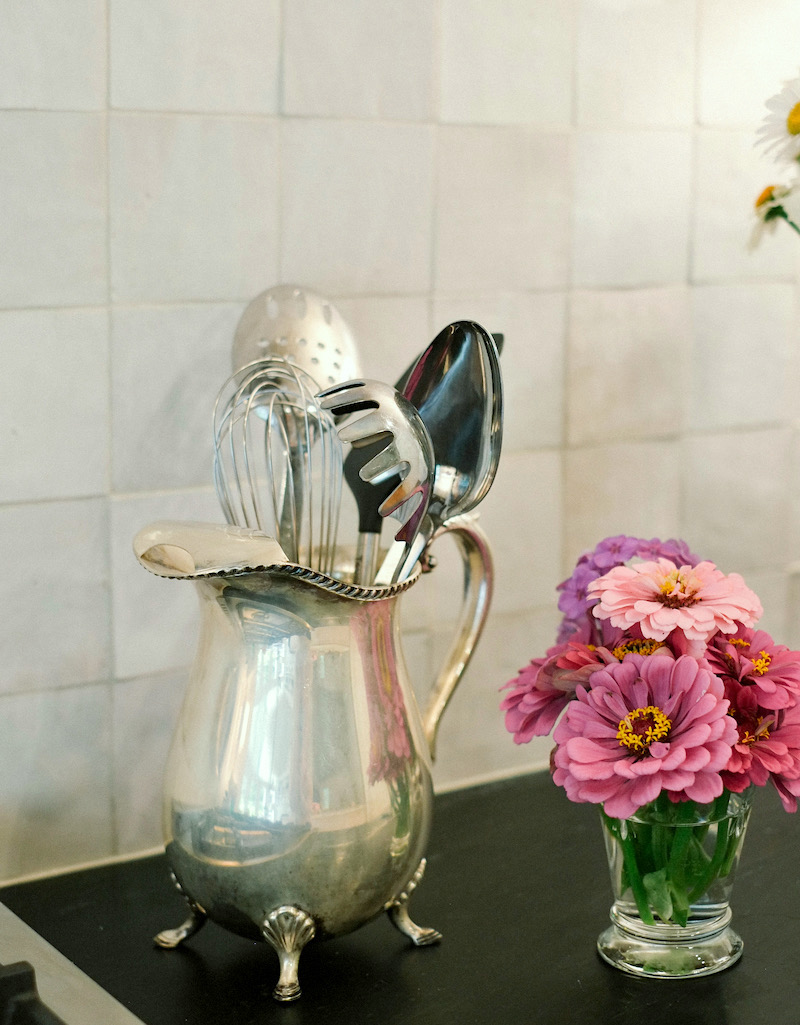
 

Kitchen makeover detail - Zellige Tile - vintage silver pitcher

Silver Pitcher

She either found the pieces for me or virtually held my hand as I hemmed and hawed over every little decision to an embarrassing degree. (Really, she has the patience of a saint.)


Even design details that I had in mind already would not have worked out without her. For example, I brought up the idea of zellige tile for the backsplash, then almost went with subway tile as a safe choice until she gently nudged me back to the zellige. (Thank goodness, because the tile is my favorite part of the kitchen!)
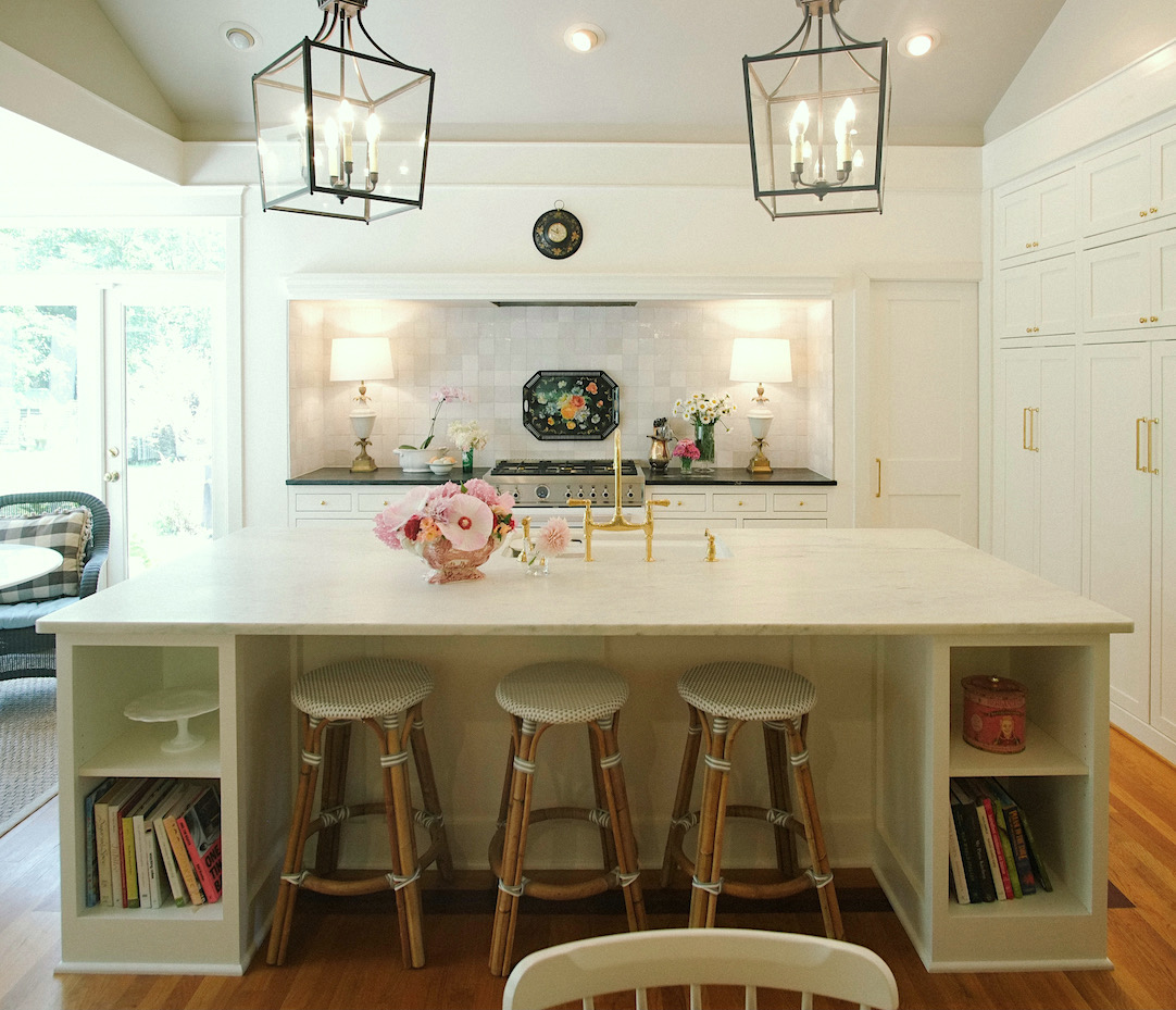
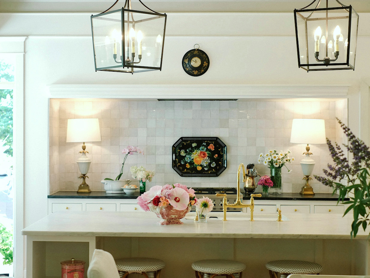
 

kitchen makeover Farrow & Ball Wimborne White

Riviera Counter Stool


Kitchen island and range area Zellige tile backsplash

Sheffield Chandelier 4 Light Lantern

Vintage Tole Clock


Another big deal to this kitchen remodel was the marble island.


I wanted Carrara marble, but finding a nice slab turned out to be a huge challenge. I almost settled a couple of times, but Nancy suggested that I may want to continue looking. Late at night, I stumbled upon an Imperial Danby slab online in a different city. Once I had it priced out, and Nancy approved, I bought it right away!

Read an important post about marble kitchen counters here.
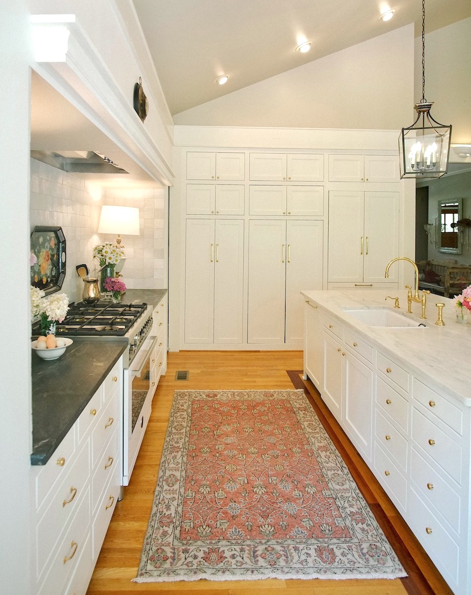
 

Kitchen makeover looing at pantry - rug - Etsy


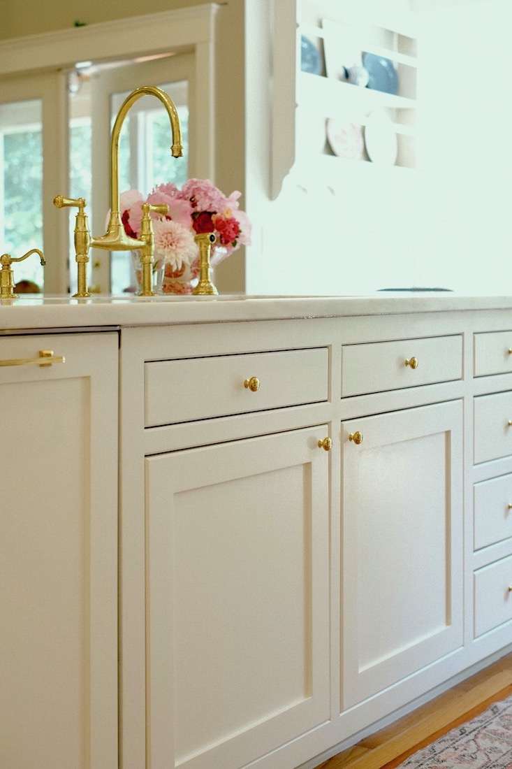
Cabinet Hardware


8 Inch Cabinet Pulls

12 Inch Cabinet Pull

3 Inch Drawer Pulls

1 Inch Cabinet Knob

You might enjoy this post about some kitchen combos I put together for you last year.


I owe my absolutely gorgeous marble island to Nancy, gently pushing me not to settle.


By the way, I sealed the marble myself twice with Stonetech Bulletproof Sealer. Now, there’s no worry about staining and etching. Honing the stone has helped a lot with that, as well. The soapstone countertops by the range work well for messy cooking tasks.
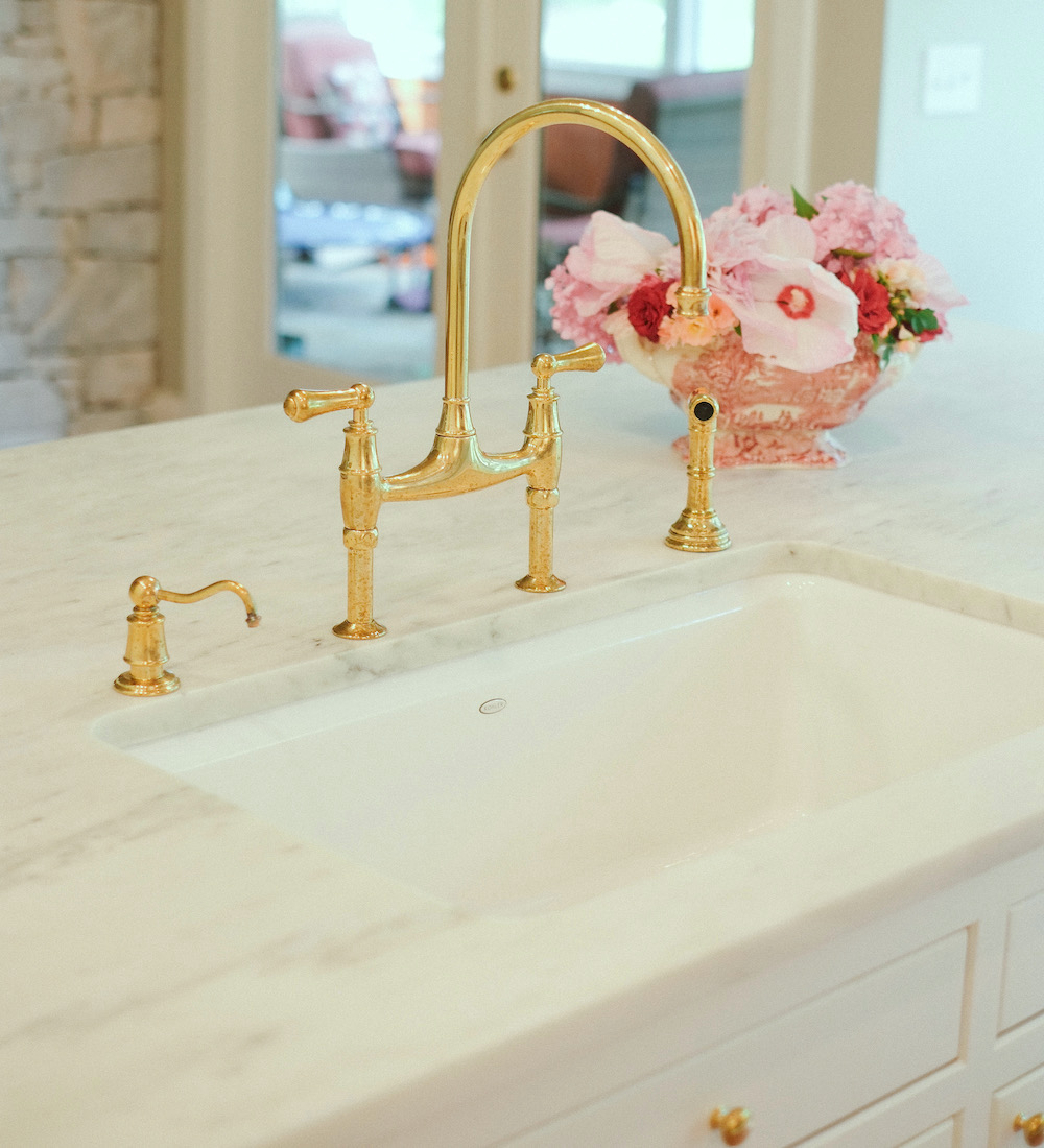
 

Perrin & Rowe Bridge faucet

Perrin & Rowe Georgian Bridge Faucet

Riverby Sink


perrin and rowe bridge faucet

Perrin & Rowe Georgian Soap Dispenser


Kitchen island and range area Zellige tile backsplash

Danby Marble


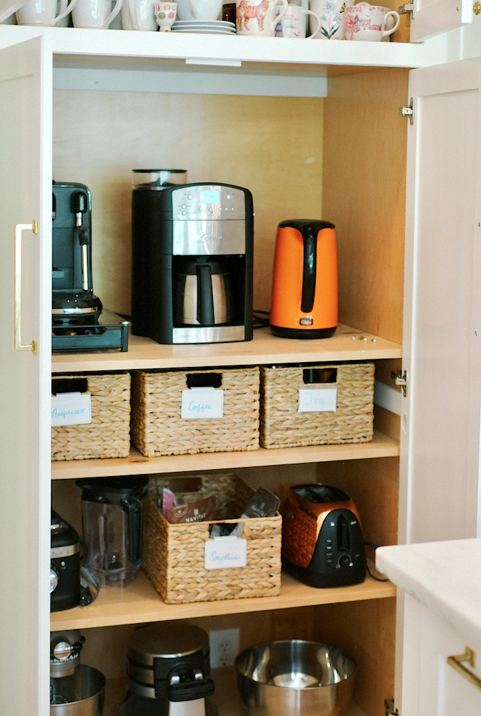
kitchen remodel coffee station behind closed doors

The coffee station is now tucked away behind closed doors for a cleaner look.

One of the aspects I love is how seamlessly Nancy worked in as many of the old cabinets as possible with new cabinetry. That undoubtedly saved a lot of money with this kitchen refresh.
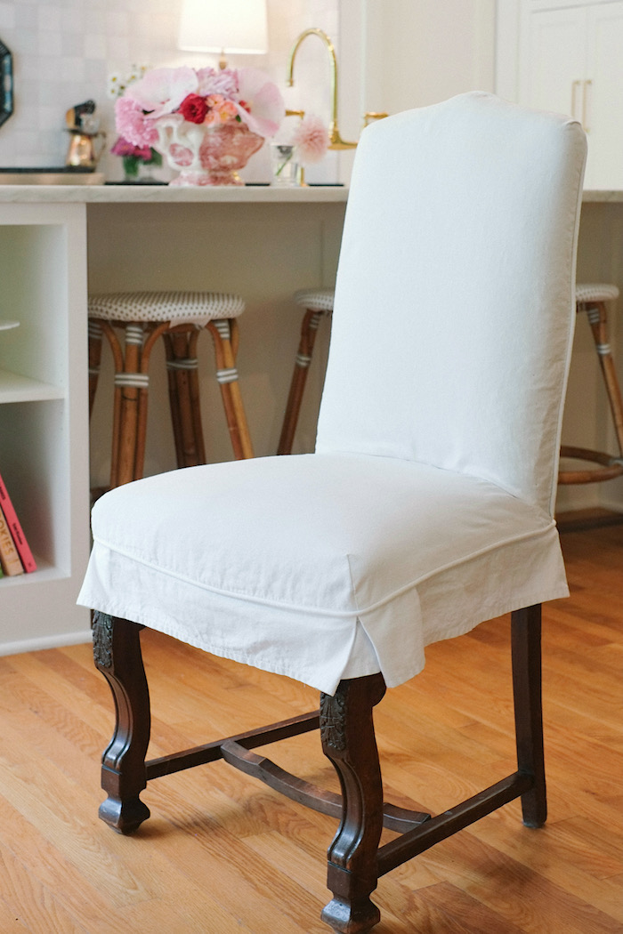
 

cotton duck slip covered chair

I love how the white cotton duck slipcover knocks back the formality of this English-style chair.


Well, all I can say is bravo, ladies. This was a magnificent collaboration, and I’m so happy it was a wonderful experience.


Nancy told me that all of the flowers are from Dottie’s garden and the eggs from her chickens!

I love all the personal touches that look like they were a lot of fun to collect.

And, it’s made me realize, all the more, that it’s the accents that make ALL rooms warm and homey.

So, to help you create this look, or something similar, below is a widget with everything and a few things that aren’t in the kitchen but the same spirit.


Other items like the lanterns and stone are linked to in the post above.


While Dottie’s tile is from Cle Tile, I linked a few cool sources for Zellige that I found on Etsy. To read more about the Zellige tile, go here.


Real Zellige is a Moroccan tile and has a rough, antique look. If it’s less than about $9.00 a square foot, it may not be real Zellige.

One last thing here about Zellige is that it is most commonly found in the 4″ square size. However, if you click on the images in the widget, you’ll also find some rectangular tiles. So, you can do Zellige, AND in a brick subway tile pattern, as well.


Please enjoy all of the items and sources, mostly supplied by Nancy and Dottie.


But, guess what? I’m going to have another beautiful and accessible kitchen makeover for you to see very soon.

This one, too, follows the same footprint.
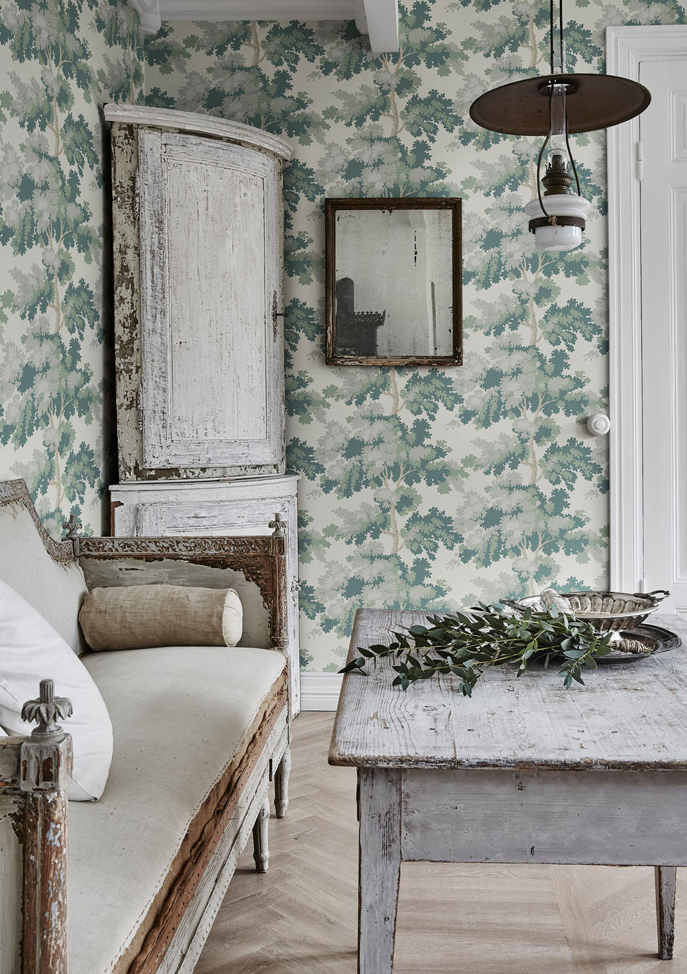
 

raphael sandberg greenJust a little teaser. It features Raphael by Sandberg in green in the butler’s pantry, and it is gorgeous!

Thanks again to Dottie and Nancy for so graciously sharing their labor of love and sources!


Please follow on Instagram.


Nancy Keyes

Dottie – where you can see more pics of her beautiful home and garden!

xo,


PS: Please check out the newly updated HOT SALES!


PPS: Folks, this is a snark-free zone. Therefore, if you want to criticize something here, be it the words I choose, or anything else, please refrain. You may write me privately by responding to any email you receive from me. Thank you so much.

55 Responses

  1. Dottie’s kitchen looks happy and bright in that creamy white–and a good design for a family who wants to cook while interacting with the family/friends. Love the focus of the hearth surrounded by the dark counters with streaks of white while the opposite counter is the reverse in marble. The tolework really works well adding focus and underlining the general relaxed, pretty feel of the space.
    I’m sure it was great to have Nancy’s guidance and re-assurance that lots of your ideas were good–and not to just take the safe route that leads to the feeling in a space of “anyone could live here, and therefore, no one in particular does.”

  2. Wow! Thank you! This kitchen layout is similar to what I had envisioned for my future kitchen remodel. This post has convinced my husband that the placement of our wall oven and separate cooktop needs to be changed. And I didn’t even need to bake a chocolate cake! 🙂 This remodel is stunning! That view from my living area would be amazing! Thank you for the inspiration!

  3. Everything about the kitchen is perfectly functional for me. All dishes and cooking tools are in the drawers right next to the range. I have so much storage, I even have some empty drawers and cupboards. I barely used the upper cabinets before, only for holding drinking glasses, which were easy to relocate. The tile is easy to wipe down.

    Michelle, I love the idea of “surprises.” Those are some of my favorite details, too! In the very beginning, Nancy sent a Devol inspiration photo with a similar long soffit area, and I was on board immediately. I love that Devol/English country house look of a range niche, and I was lucky to already have the space carved out. I really wanted bookshelves on my island, and we kicked around some ideas about the trim, but I decided to leave it be, since I plan to have my wood floors refinished in the future.

  4. The makeover looks beautiful, but I think the pendulum is swinging too far toward “form” and away from “function.” Not having upper cabinets goes a long way toward a sleek and open look, certainly. Let’s not forget thought that upper cabinets came into being because they provide much needed storage “right at hand” that was missing in the golden olden days. Full height pantry cabinets do replace the cubic footage of storage, maybe more, but instead of reaching up to grab something one must now take a little walk. Zellige tiles are beautiful but the very surface irregularities that add so much to their charm also make it harder to clean, particularly behind a stove. In the pursuit of aesthetics let’s not forget why conveniences like upper cabinets and smooth tile became popular in the first place.

  5. Sensational and inviting. A lot of detail which you don’t see in many kitchens. I have 3 lamps in my small kitchen and they add “the touch” of warmth.
    I am waiting to see the transformation of your kitchen as I know it will be “DANG”.

  6. Now this is a showstopper! I am usually not a fan of white kitchens, but this one is a beauty. There is something about those flat front drawers that say “elegance” to me. I love the tile. I can’t really tell if it’s smooth for cleaning or rough, but it is beautiful. The range is also calling my name..lol..I sure hope that Nancy loves her house now!

  7. Yummy!

    Thank you for showing off this deeeeelicious kitchen makeover!

    Some of my favorite “surprises”: The lamps, the tray over the stove, the woven cane stools, the silver water pitcher, the area rug and the mix of cabinet hardware. Plus I’m in agreement with everyone else, that tile looks amazing…I’m wondering if it’s hard to clean.

    As a designer, I know a couple of things would have been a hard sell. I wondered if these two spots required “A discussion and a leap of faith”:

    1. The darker wood floor trim around the original island no longer matches up with the new island.

    2. Creating a soffit for the full width of the area above the stove.

    I’m in love with how great they both turned out, but I could imagine there was some initial concern about what the floor would look like + the loss of “space” with the soffit.

    Dottie?

  8. Kathleen – Yes, there is a microwave! The same one in the same place, we simply removed the mounting frame and pushed it inside the cabinet. The carpenter made some minor changes and built doors to cover the whole area. Also, there is a small walk-in pantry, which is where we now keep our trash can and a step stool to reach the upper cabinets.

    Mary – The tray above the range is hanging with 3M Command Strips. Love those things.

    Maryellen – I agree that the refrigerator would work best in the middle of the pantry wall, but it could not fit there without major alterations. We did not alter the cabinet boxes, the carpenter simply added shelves and doors to what was already there.

    Melody – Thank you, I had the same reaction! Yes, the countertops by the range are soapstone.

  9. This is a very lovely kitchen, no doubt. I can see why Dottie is thrilled. But to say it’s “accessible”… is that because many of the sources are listed? The sticker price on this designer-designed remodel is very significant, which makes it very unaccessible… at least for me!

  10. So stunning I actually got tears in my eyes. The stove, the tiles, the marble countertops, the soapstone (?) counters, the integrated refrigerator wall. Brava, Dottie and Nancy. Thank you for sharing this warm, sophisticated, timeless “botoxed” makeover.

  11. Thanks Laurel for a fabulous post! I have a practical question for Dottie or Nancy. Is there a microwave and if so where is it?

  12. Nicely done. This is one of the most elegant redos I’ve seen. It really shows how careful choices can culminate into something greater.

  13. Breathtaking! All the lovely decorative items and lamps around the stove can easily be pushed aside temporarily for heavy duty work. I love the tray as it makes everything less formal. I think the Italian Bertazzoni has the most stylish designs in gas ranges, I got one 10 years ago and would buy again, they remind me of a vintage Bugatti. Wimborne White, together with All White (which is a just a bit ‘whiter’) it’s the best white color ever, no need to look further. And yes, someone asked, Wimborne White, like all colors, will look a bit different on woodwork because of the shine in the finish for the woodwork paint makes the color appear a bit warmer, while on the wall it’s entirely flat. I have Wimborne on ceiling molding and it is visibly warmer than on the wall, however, I think that adds a nice touch.

  14. Stunning kitchen transformation, truly! I love the reuse of the original cabinets, it is amazing what paint and a bit of reimaging can accomplish! Thank you for the inspiration!

  15. I love EVERYTHING about this kitchen update! My favorites are the lamps and the tile. And the pantry/fridge wall is awesome! Oh, and I think it’s brilliant the way the enclosure around the range hides the hood. It looks so much “cleaner” and feels kind of cozy, too. This is a dream kitchen, for sure, and I’m sure Dottie is thrilled with it :] Thank you for sharing all the info with us. Bravo to Nancy and Dottie!

  16. Is the last picture a hint of your next post, Laurel? Sort of a worn, patinaed style? I’ve never seen you do a room like this before. I’m looking forward to it.

  17. Just gorgeous. I happen to love white kitchens and Zellige tile. It’s so pretty how so much is concealed behind the pantry doors – even the fridge! And I love the brass fixtures. They add such warmth where I don’t believe nickel colored ones ever would. Those lamps! Stunning, but I don’t know how one could keep them sparkling that close to the stove, much less keep them out of harms way.

  18. Mary E, the cabinets and the wall below the trim are Wimborne White. The ceiling and the walls above the trim are Farrow & Ball Drop Cloth.

    I have used Farrow & Ball paint for almost every room in my house. I love it!

  19. Good, I wanted them to blend in! 🙂 There is one behind each lamp and I had the other two by the range removed, as I never used them. The ones on the island bar were moved to the side of the island. There are three in the enclosed pantries.

  20. WOW. Just WOW. Dottie and Nancy, this is the prettiest kitchen I’ve ever seen. It feels so warm and inviting. This project makes me wish I cooked without making a mess. I’d have to remove the lamps and orchids and pretty silver pitcher before every meal prep!

  21. I have always loved lamps in the kitchen, just as I love an upholstered chair in the bathroom (mine is upholstered in a terry-cloth slipcover). It’s that “something unexpected” in each room that provides a little tension or excitement that is so wonderful. The kitchen is absolutely lovely, although I nearly fainted at the cost of the faucet!!

  22. Love this so much! It was great to see the photos and read about decisions made đź’— Now heading back up to check out some links!

  23. Just wonderful! Amazing transformation. I have enjoyed each post about this home and owner. The lamps are my favorite too and since there is already electric in the wall they could be changed to wall sconces later if desired. Great post Laurel!

  24. This kitchen is stunning! I have what may be a silly question…where are the electrical outlets hidden? I keep looking but can’t see any, lol! Thank you.

  25. Hi Laurel, I was disappointed with the explanation above. I thought that Jackie was perhaps referring to something the Munsters had in their kitchen.

    This post has reconfirmed my faith in white kitchens. All the weirdness and heaviness of the original design has vanished. Like some others, I was concerned about the lamps, which seem to be a current trend. But if the owner likes them they are fine, and anyway if she changes her mind they just unplug.
    –Jim

  26. Wow….I would never call this Project a ‘botox’ kitchen, it is a full fledged ‘face- lift’
    Gorgeous.

  27. Beautiful and SO worth pinning! The color is fabulous in its warmth and richness. The brands of refrigerator and range is good to know about as they are apparently excellent while not being as pricey as those more “famous” names. Thank you and BIG congratulations to Dottie and Nancy.

  28. Hi laurel LOVE this post. such a lovely Kitchen. May I say as someone with Arthritis, and having had Rohl faucet with the sprayer, it is nicer to have a sprayer you can squeeze with your hand, rather than a button you push with your thumb (thumbs are usually one of the first joints to be affected) just an FYI if arthritis is a problem.

  29. Wow, just stunning. I think I love the backsplash the most but everything is just beautiful! And looking closer, everything seems very functional and practical for cooking too.

  30. Laurel, What a lovely and inspiring post especially for someone like me ready to (mentally) rip out a kitchen from 1958 with 80’s add-ons. Laurel, Thank you for all the actual details and sources which are a fantastic help. Nancy has done a masterful reworking of the footprint and design. I love the Wimborne White and have painted samples of it taped on the walls in my home. I am going to reread this again. Also love a lamp in a kitchen. Congratulations Dottie. Bravo Nancy. Thank you Laurel

  31. Stunning. I am especially impressed with the integration of the original cabinets. I have to agree that the lamps and even the tray above the stove are wonderful for staging, but not so wonderful for practicality/cleaning. Laurel, I know you love lamps in kitchens, and I have no objection (I am actually thinking of using them in my rental kitchen). However, next to the cooktop? I would have them covered in spaghetti sauce in an instant. I am wondering what could have a similar effect without the cleaning/shade replacement problem. Chinoiserie urns? Ones with wide tops which could store something?

    1. Dottie addresses this in a comment which you probably didn’t see.

      But, here’s something I didn’t realize until right before I moved.

      I have a little lamp I had in my old kitchen about five feet+ from my range. Of course, after eight years, it was filthy, so one day, I took the hardback shade off the lamp and took it to the sink. Then, I scrubbed the crap out of it with a solution of water, dish soap, and a little bleach. After about two minutes of that, the little shade looked brand new! I let it dry for a bit and put it back on the lamp. Oh, how I wish I had realized this years ago!

      Then, I went and washed another shade in the living room. Same thing except for the candle burn mark that happened one Thanksgiving, lol. It was better but not completely gone. Of course, you can’t do this with silk, but if the shade fabric is a synthetic or linen, you can wash it. But, it also must be a hardback shade, not a shade with ribs that’s 100% fabric, otherwise.

  32. WOW!! I am almost speechless at how unbelievably beautiful the kitchen is!!I think the thing I love the most are the lamps…everything is fantastic, in a quiet elegant way (my favorite style) but the lamps (and the tray)are an unexpected twist that adds the ‘WOW’ to this kitchen. Bravo ladies!!

  33. What can I say other than I LOVE every single piece in this kitchen. ALL of it.
    I noticed there is no direct window in the kitchen, yet it looks so bright and inviting. It looks like a historic kitchen.
    I also read every word of your posts and never jump ahead to pictures. I hang on every word, and then study the pictures.
    This is my new favourite kitchen. I’ll be pinning for sure!!

  34. I love the kitchen makeover and would only change two things about it. I would have put the refrigerator in between the two pantry closets making it more accessible to kitchen work area. I would also remove the two lamps. For me they look out of place and take away from the gorgeous aesthetic of the work area. The backsplash is one of my very favorites!

  35. Good morning Laurel,
    Thanks for showing us this kitchen makeover. It’s stunning! I should have hired Nancy for my kitchen renovation.
    Dottie, I hope you’re reading the comments regarding your fantastic kitchen. You mentioned that the cabinets are painted Wimborne White. Are the walls & ceiling above your cabinets painted the same color? They appear darker in the pictures. But that could just be shadowing. Would love to know.
    Congratulations on your beautiful new kitchen, Dottie.

  36. I love everything about that kitchen makeover, except for the lamps. IMO, they take up too much space, the light is at eye level and may be too glaring. And if you cook, no matter how careful, splatter will happen. But if the cook loves it, then keep it! Just not for me.

  37. For those who may be wondering about the practicality of having those pretty lamps close to the range: I cook from scratch every day for my husband and two young kids, plus lots of baking. So far, no problems with the lamps or anything else. They are about 30 inches away, outside the normal splatter zone, and if I’m cooking something messy, I use a splatter guard like this. Highly recommended! I also installed a powerful new vent hood that helps keep the area clean.

    I agree that Nancy always does a beautiful job! My family basically lives in this kitchen area, so having it look like this is a real treat.

  38. There is a word we use in the Deep South when we see something like this: DANG!! If any kitchen ever showed the difference between a DIY design and a professionally designed kitchen it is this one.

  39. Fantastic post on this kitchen makeover.
    My own Botox kitchen makeover would have been enhanced with the mortician tiles. In another life. Thank you

  40. The lamps were my favorite touch! I also found an amazing deal on a Hollywood regency marble and brass lamp on the FB Marketplace during Covid. It was a revelation:)

Leave a Reply

Your email address will not be published. Required fields are marked *

This site uses Akismet to reduce spam. Learn how your comment data is processed.

Welcome To Laurel Home!

laurel-aarons-18th-e1456449963926

Hi, I’m Laurel, and Laurel Home is the website and blog for Laurel Bern Interiors.
I’ve been creating new-traditional interiors since 1988. The blog is where I share all.

New Edition, November 2023! Get The Indispensable Guide For 100s of Home Furnishings And Interior Design Sources That Everyone Is Raving About

laurels-rolodex-final-book-cover-master 10th edition 23-24

laurel home archives

Categories:

Please click the image below for more info about my rockin’ Interior Design Guides for 2024!

Laurel Home Interior Design Guides 2024
Amazon ad

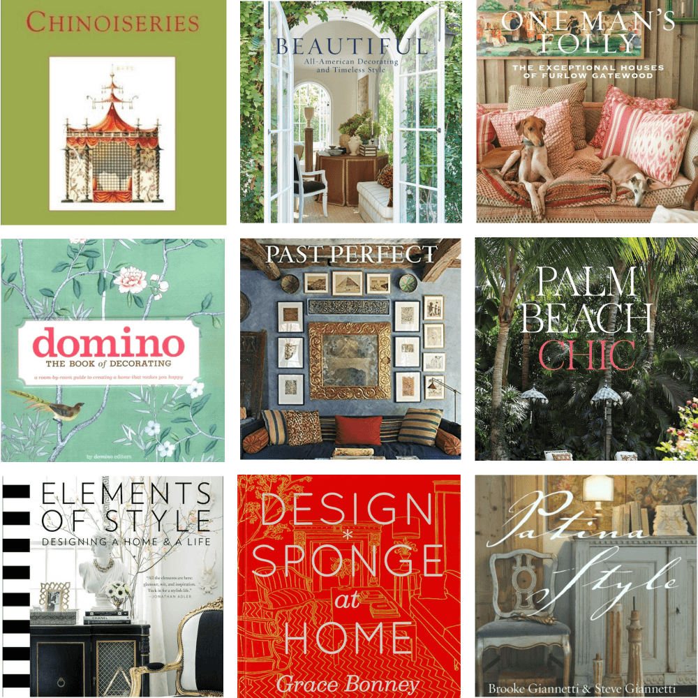
please click below to check out my favorite decorating & design books

Laurel Bern's Favorite Interior Design and Decorating Books
Subscribe To The Laurel Home Blog And You Will Receive A FREE Guide Where I Share How To Get Your Paint Colors Right, The First Time.