Hi Guys,
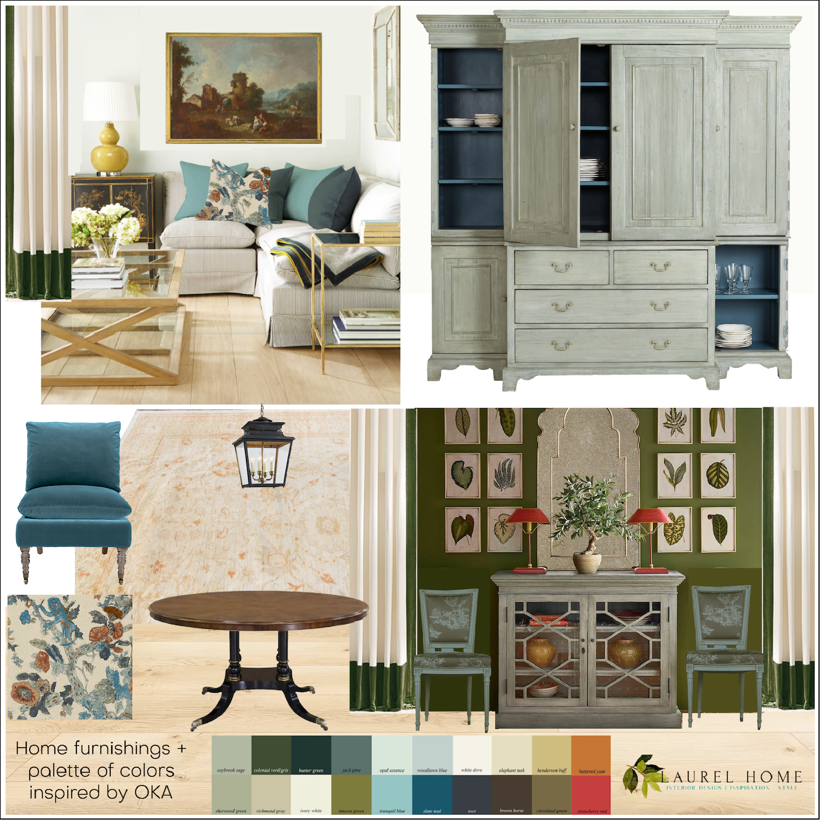
Thank you so much for your lovely comments on the last post, where I introduced OKA to the blog and shared room ideas and a color palette inspired by their home furnishings.
Lisa had a terrific question about visual tension in interiors.
Hi Laurel,
Another great post! I am intrigued by the term “tension” you used to describe what was lacking in a room design. What creates this, and what should we do to create it?
Take care, and I can’t wait for your next post!
What’s funny is that since I looked up the word “tension” in the blog comments, I saw that in the January 12th post, I also used that term.
So, what do I mean when I say visual tension in interiors?
Are the throw pillows giving each other dirty looks and about to start a pillow fight?
Well, it depends on how much sleep I’ve had.
I could write a sentence explaining what it is, but I think it is better to show you what it looks like when a room has zero visual tension. Below are two examples. Please don’t pin them on Pinterest.
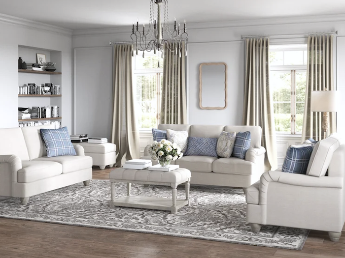
Kelly Clarkson. I thought she was a singer. Never mind.
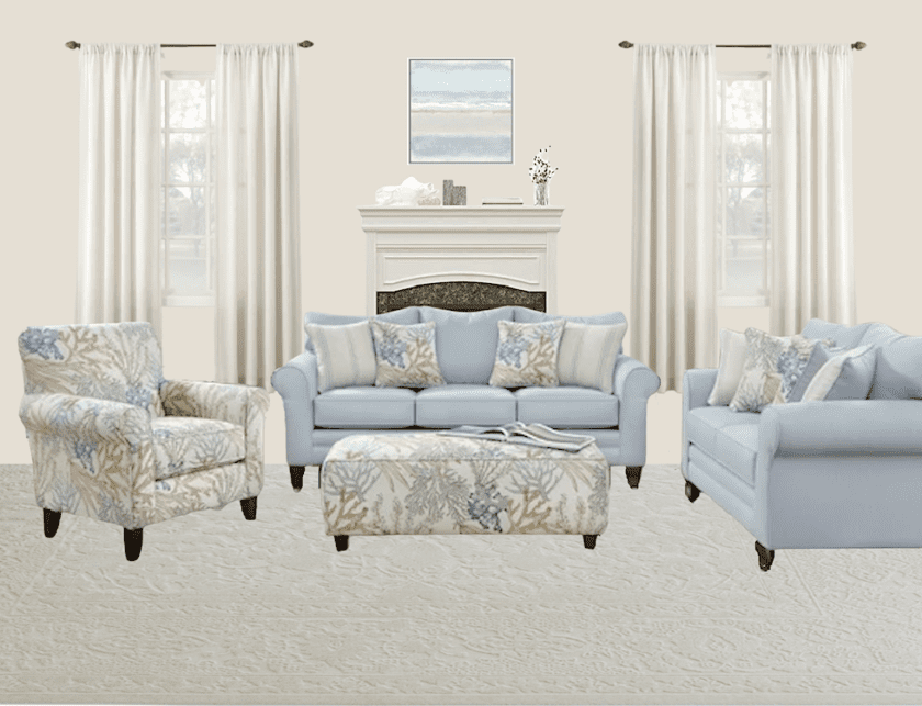
It’s not that there’s anything hideous about it; it’s just not very uplifting and a total snoozefest. I know some of you are going to say you like this. You’re going to say that you find it soothing. Yes, for a bedroom! And parts of it are fine for a living room. However, altogether, it is rather one-note. It’s a flabby muscle, not a toned one.
So, visual tension in interiors is everything these two rooms are not.
It has nothing to do with the pale colors, either. Here’s a job I did several years ago with similar colors.
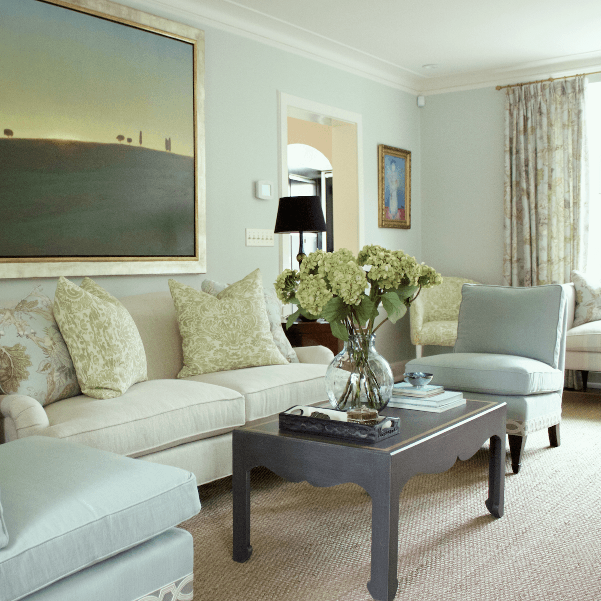
Uh oh… Slipper chairs. lol, The room is made by the client’s beautiful art. And antiques you can’t see.
Another way to say good visual tension in interiors is stimulating and inspiring. It encompasses all of the elements I talk about frequently. But, I don’t mind repeating myself.
Good visual tension begins with the room’s architecture, lighting, furnishings, color, pattern, texture, style, and a balance of yin and yang.
In rooms lacking visual tension, there is a sameness to all of the furnishings and often a lot of repetition. It’s monotonous.
Rooms that lack tension lack creativity and imagination. They are rote, predictable, and uninspiring.
Of course, there are a zillion ways to create visual interest in interiors. And, what is inspiring for one person isn’t for another.
Visual tension doesn’t mean having a lot of stuff.
No, you can have a beautiful, minimalist space with minimal furnishing and still have beautiful visual tension.
So, let’s begin with this image I found on Visual Comfort.
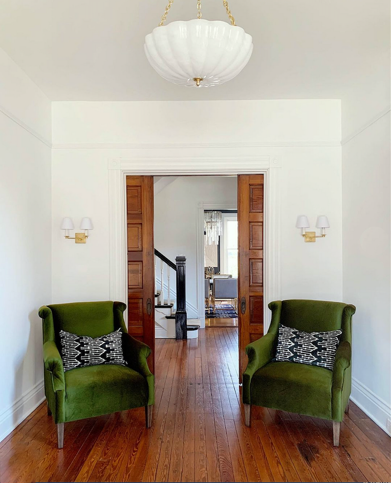
Visual Comfort Rosehill Large Chandelier – Design by Leslie Cotter Interiors
Please go to @lcinteriors on Instagram to see the before image. The transformation she did is incredible! This is the entry into this beautiful old home.
Incidentally, the brand Visual Comfort has merged with Circa Lighting.
At first glance, you might go, “Where’s the tension?”
Well, first of all, we are experiencing this space as a two-dimensional image. We are not IN the room. So, we have to pretend to be sitting or standing in this space.
Would you say this room is overall traditional or modern?
While this is an old home and many of the traditional features, have been left as is, taken as a whole, the feeling of the space is contemporary.
There is a wonderful balance of color (floor and chairs), plenty of white, and accents of gold/brass and black. The furniture is contemporary but based on classic designs.
So, overall the home is modern, but the 20% traditional is what gives it interest.
Conversely, there’s a fantastic home in December’s issue of House Beautiful. I will present one small image, but please check out the rest of this fabulous home on HB’s website.
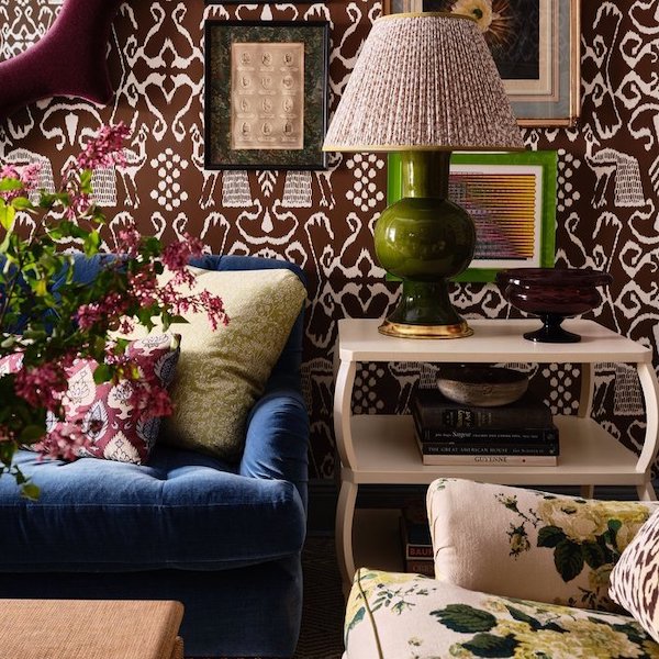
Photo vignette by Read Mckendree.
Interior design by Lucy Doswell
Why only one small image, Laurel?
Copyright is why. It’s a very real problem.
However, regarding this beautiful room. It, too, has visual tension and a hefty dose of it. However, it is not random. There is still a balance of textures, colors, patterns, and shapes. I love them both. Which space do you prefer?
Now, I’m going to move on to another comment by a kind reader, Dee, from Canada but currently living in Scotland.
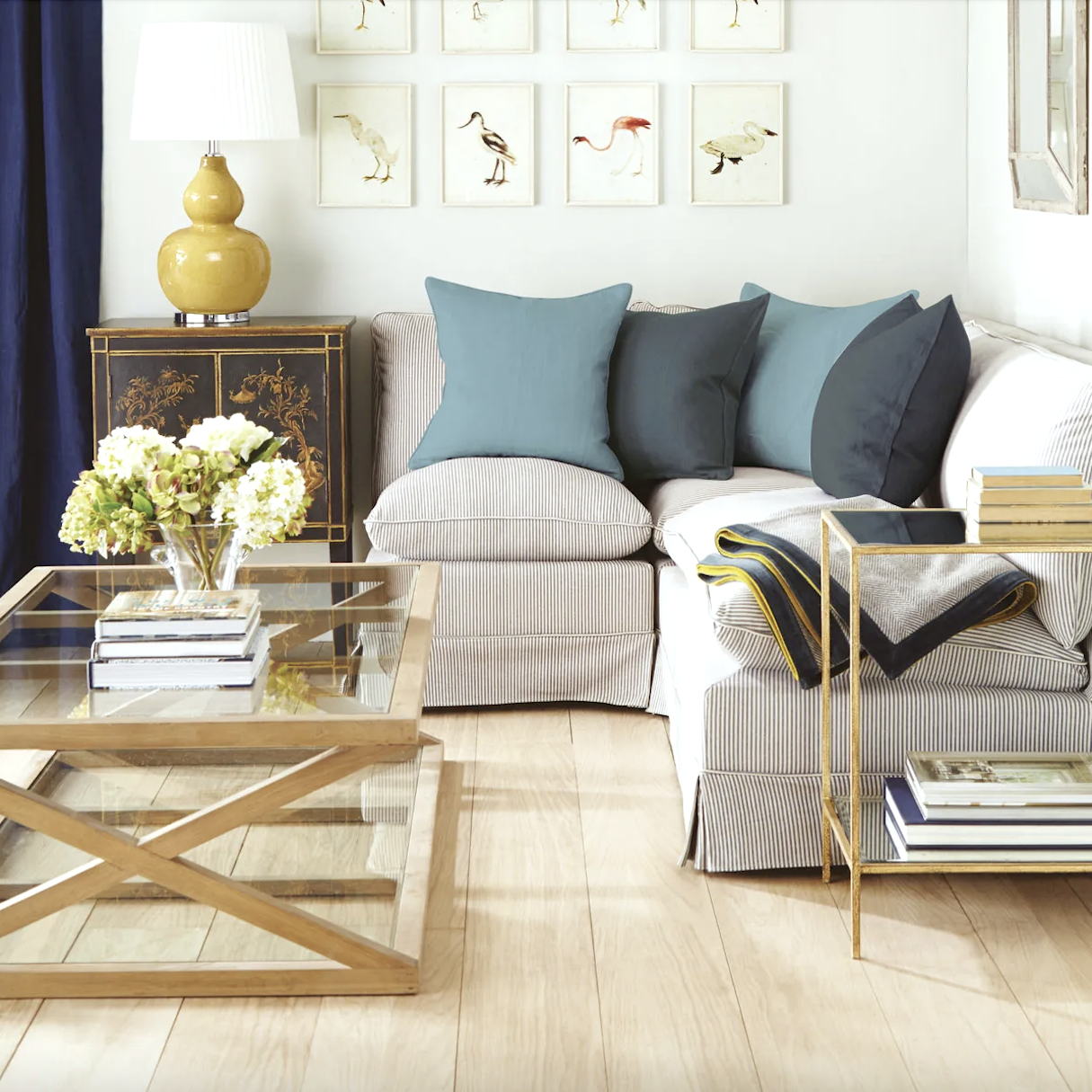
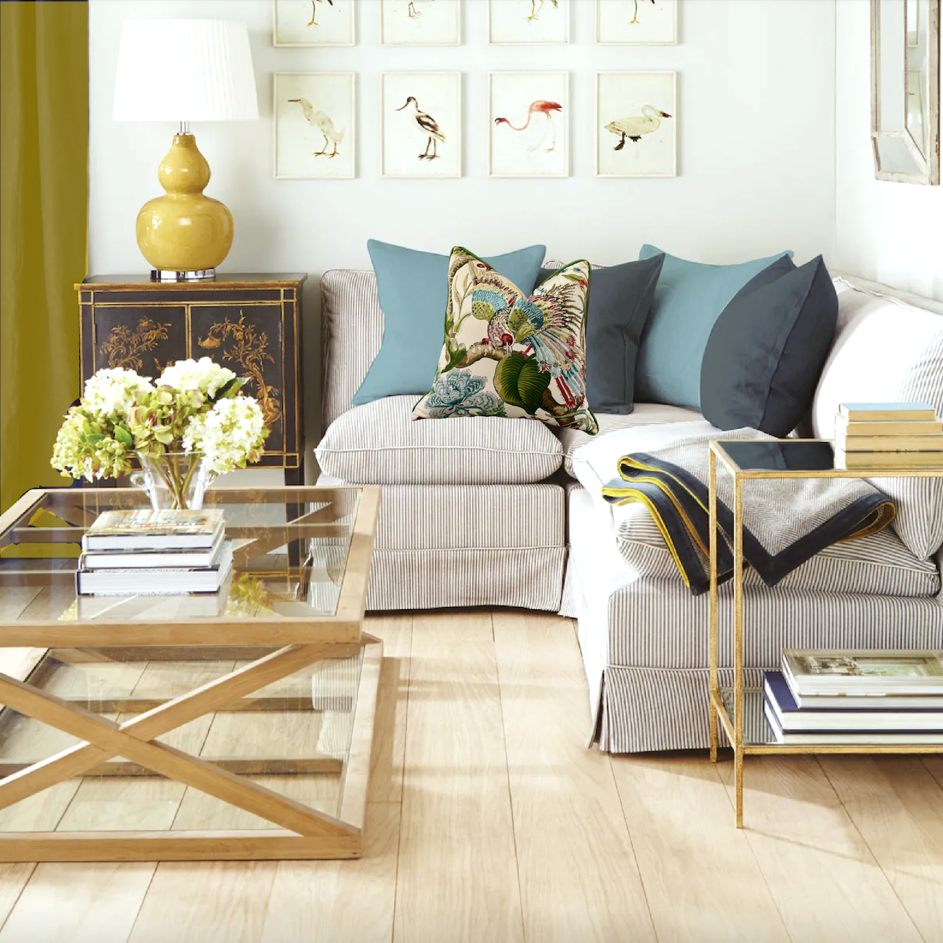
Above is the original image. However, I did not post the original image. I JUST realized that. The color of the drapes bothered me so much that I toned them down a tad when I spliced the two images together. (see below)
However, the color still bothered me, so I changed the window treatment entirely.
Dee didn’t like that I changed the blue drapes. I did say in the post that it’s an English thing, this creation of unusual. We’ve seen it in Ben Pentreath’s home and work and in many other designers from the UK. His work is always beautiful, and his color schemes make sense to me.
I explained that it wasn’t the clashing colors that bothers me.
It’s how the dark gray pillows clash with the heavily saturated indigo that the silk drapes are.
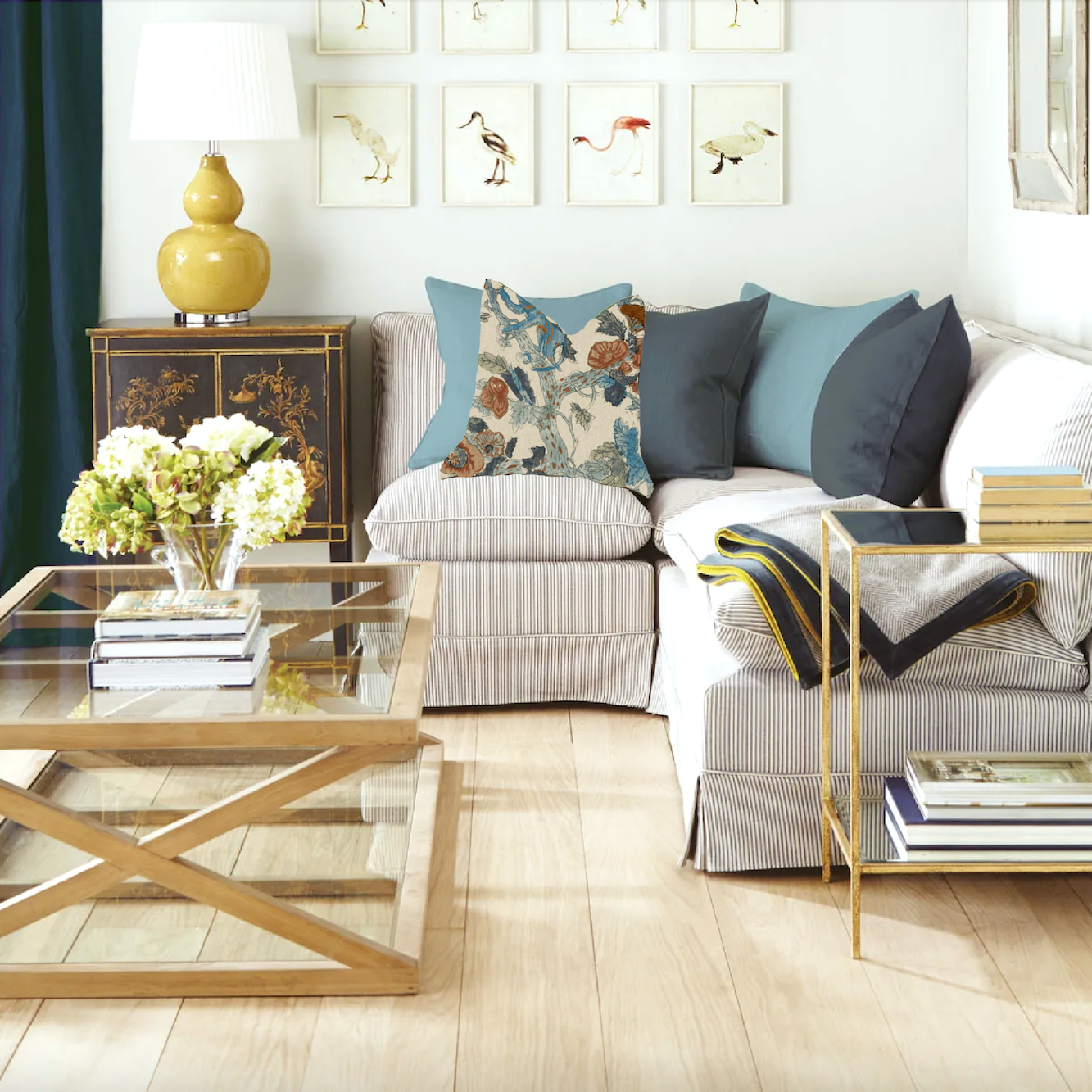
As is, the very saturated indigo doesn’t work for me. So, the first thing I did was select curtains in the colors that I prefer. I used either the pillow I added to the board (see above) or the other pillow I shared in Wednesday’s post.
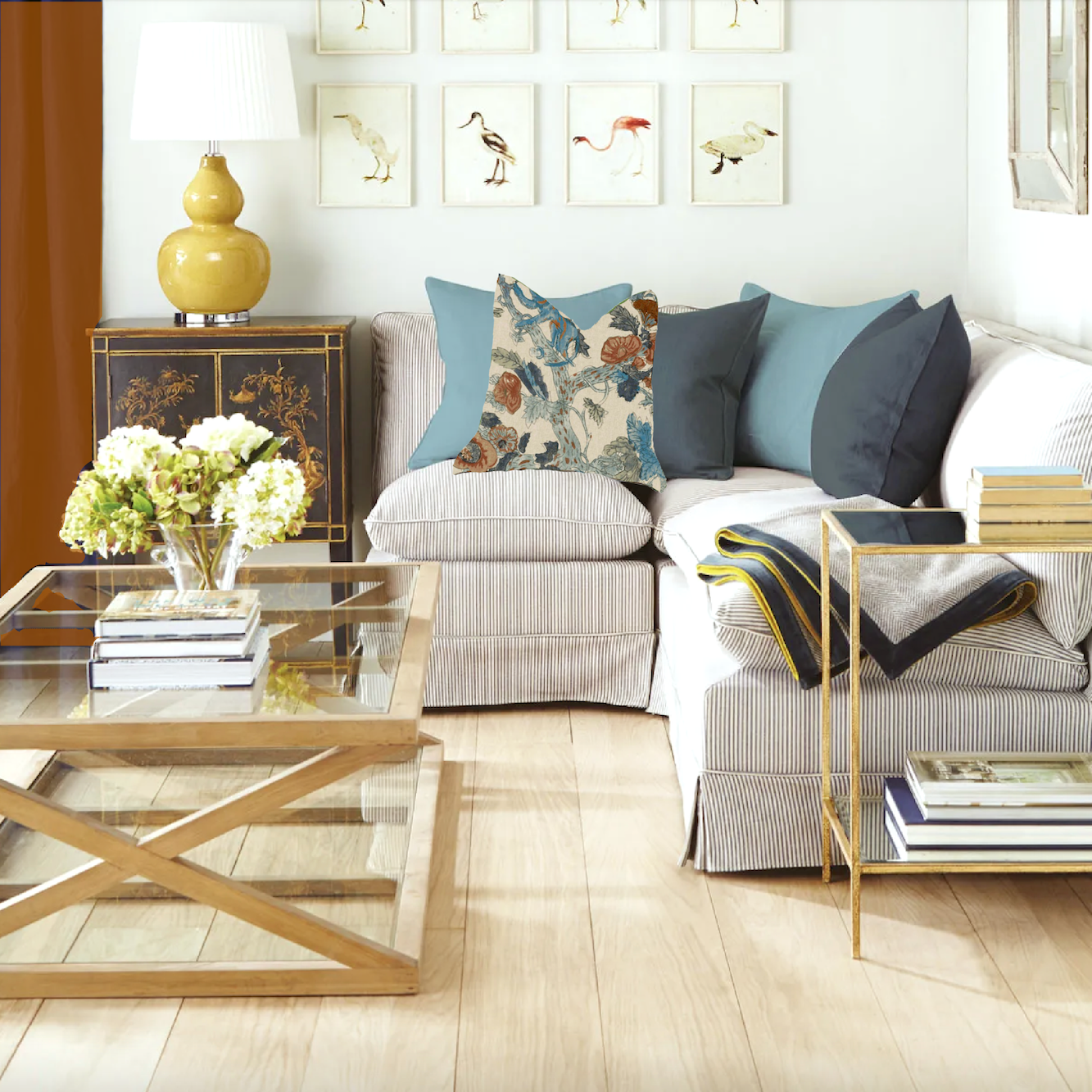
First, I tried to make the drapes a better dark blue. While better, I’m not wowed by this version, either.
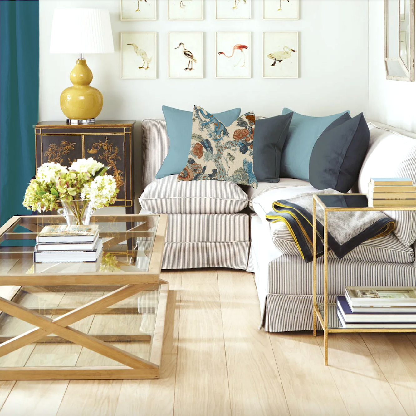
This one is interesting, but I think the turquoise pillows on the sofa look washed out. However, I think the color of the drapes is stunning with the mustard lamp base and Chinoiserie chest. I would also love to see a rust pillow and a deeper blue.
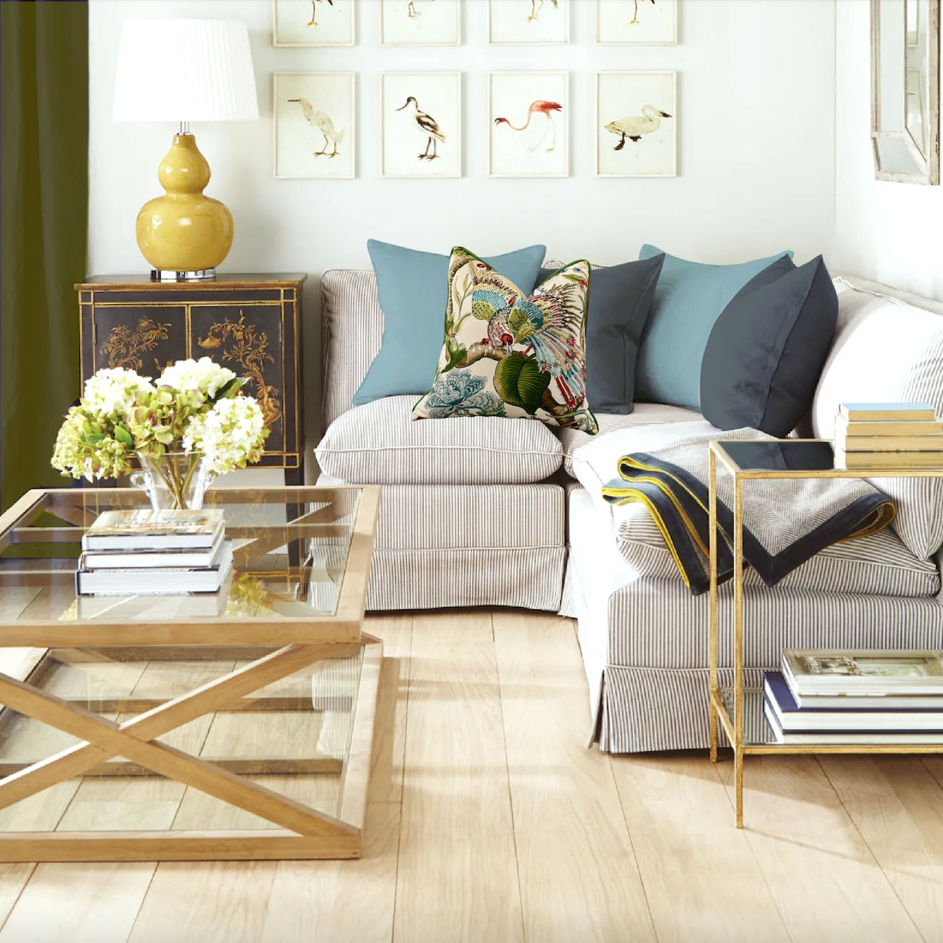
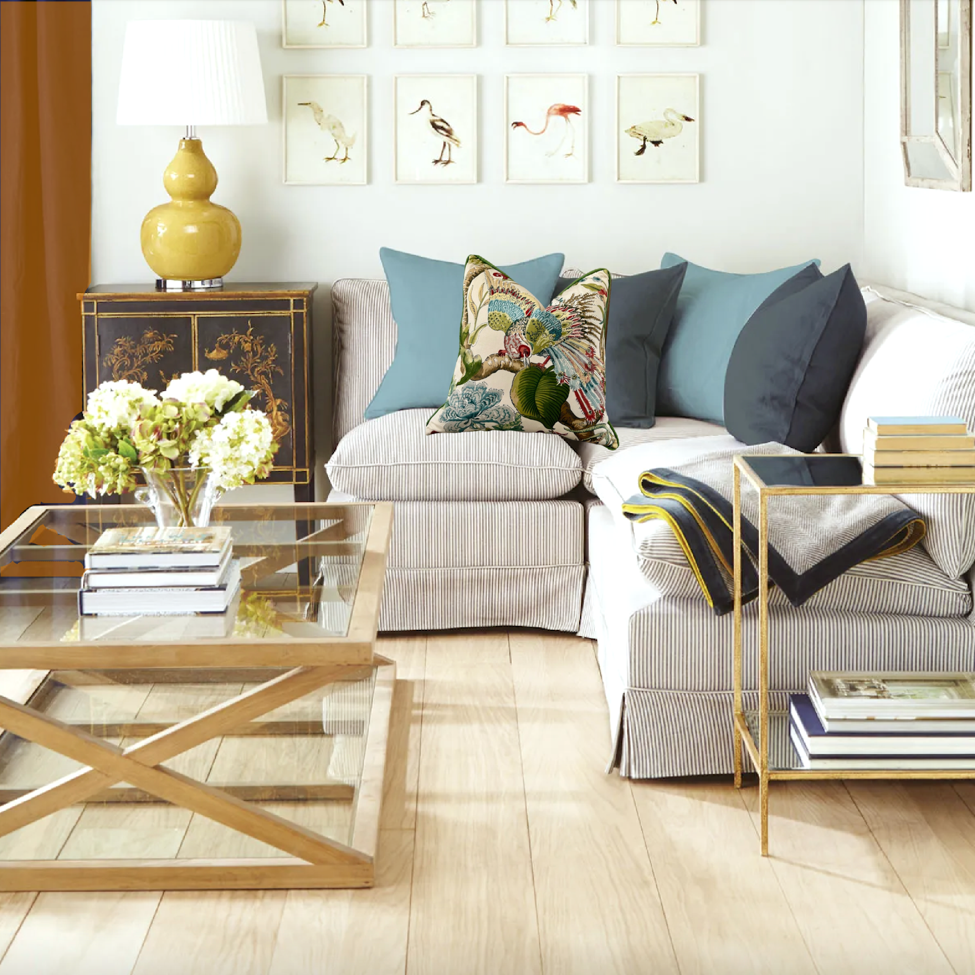
This deep olive is the best one for me, so far. I don’t feel it’s fighting anything else, and it looks great with the lamp and Chinoiserie chest.
I’ve written about chartreuse here. I like this combination the best! This interior has enough visual tension to create the kind of interest I’m talking about. I love the analogous situation with the lamp and drapes; plus, I think this universal color, chartreuse goes with everything.
Oh, I love this one too. The copper/rust drapes are the complement to the turquoise. Of course, they look great with the pillows.
Well, Laurel, what about the rust with the other pillow?
Please, no; that combination makes me nauseous. ;]
Then, as a challenge, I tried to make the indigo drapes work.
Here’s what I learned working with these drapes.
They are almost purple. They have so much red in them. It’s not my favorite color. I like it, but only in tiny doses.
Before I get into my choices, here is some technical information for those who don’t know. If you do know because you read this post about the 15 hideous mistakes one can make with fabric, then great.
1. The drapes look to be made of silk. Silk should never go in a south-facing window and, in all cases, must be lined and interlined.
2. I would never do blue drapes in any material unless those windows have some HEAVY-DUTY UV protection. The reason is that blue is a “fugitive” color. That’s not my word; it’s the word I learned in design school. Does that mean that blue runs away from the law?
Close. It means it runs away from itself and turns into something you won’t want to have unless you like a sort of pinkish, grayish mauve color. Yes, that is what can happen to a vibrant blue when it interacts with the sun.
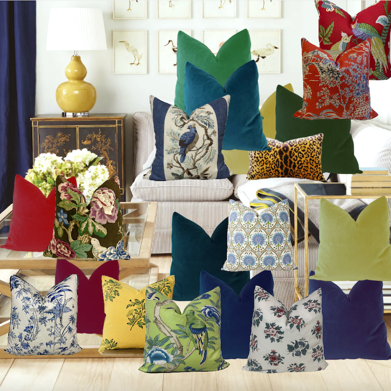
Okay, I played around with numerous pillow combinations on Picmonkey.
What do you think? Too much, perhaps? ;]
Okay, below are the four runners-up.
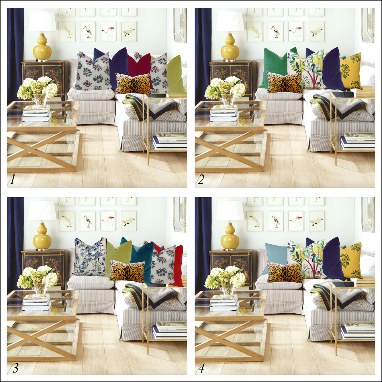
I numbered them in case you’d like to comment on any of them. These are a stretch for me. However, I think with the indigo curtains, these colors work better.
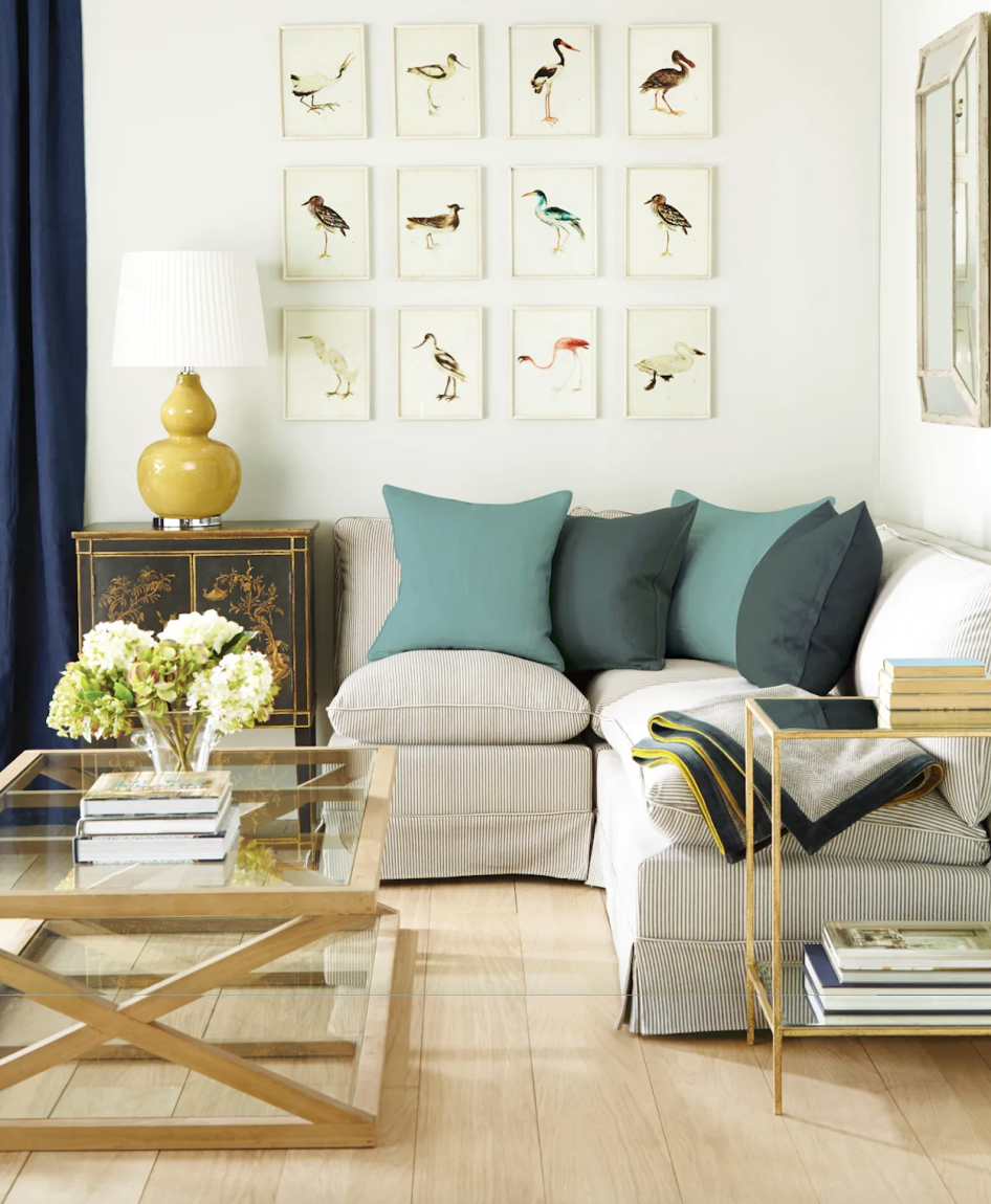
Below are my two favorites that provided the right kind of visual interest without going overboard.
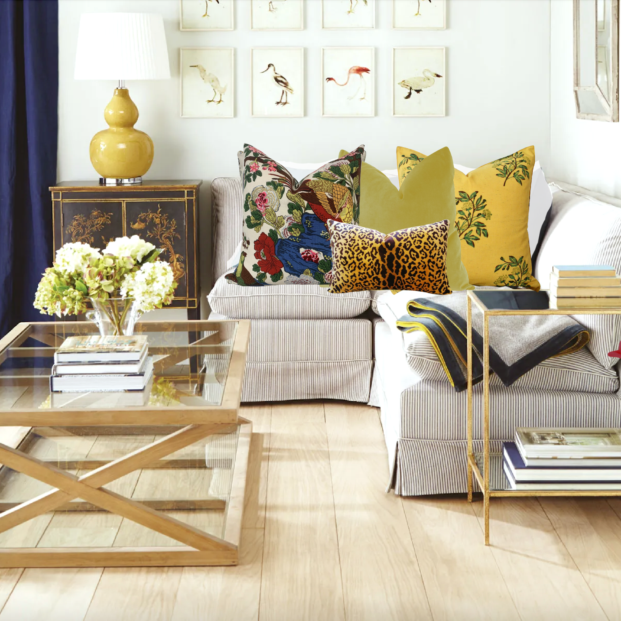
Above, in second place, is this lovely grouping. Most of the pillows will be in a shopping widget underneath if you’re interested in the source. That is, except for the solid pillows. In the interest of time, I made those up. :]
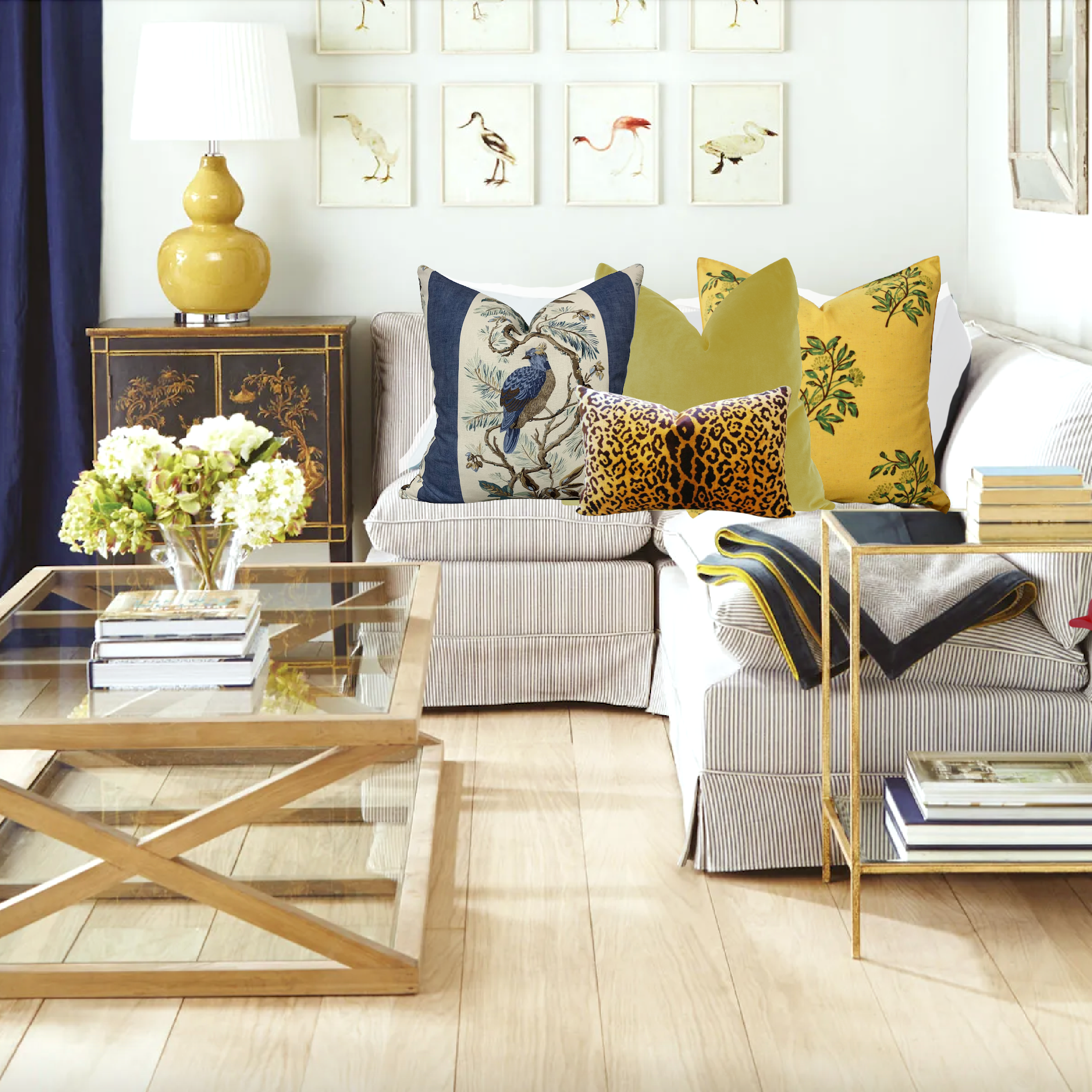
And above is my favorite vignette. I think the lighter approach is better with the sectional. Although the blues aren’t exactly the same in the curtains and blue pillow, they are close enough that the eye will try to make them match. That IS a perfect example of visual tension. Most people take great pains to get everything to match exactly, and that is a mistake.
Unless you’re matching a seam in a window treatment or wall covering, it is better for the colors, or at least some of them, to be slightly off.
At the very least, color matching amongst fabrics, is not something to get overly worried about.
That doesn’t mean you don’t need to get a cutting for approval. I highly recommend that you do. It’s also your insurance policy against the unthinkable mistake of the wrong fabric getting shipped and turned into an error that could cost you tens of thousands of dollars in do-over charges. Yes, it’s happened; not to me, but that, too, is in the fabric mistakes post.
Below are the pillows from above, except for most of the solids and the leopard.

I hope this exercise made the term visual tension in interiors more explicit. Of course, there is much more to it than coordinating window treatments and throw pillows. However, the accessories are what often make the room come to life.
xo,

PS: Please check out the newly updated HOT SALES!
Related Posts
 15 Serene Green Paint Colors Not Called Green
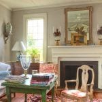 Hubs Wants a Say In the Home Decor, Because It’s His Home Too?
 The Secret English Gardens and I Mean Secret!
 16 Magical Farrow & Ball Colors For Your Home
 80+ Timeless & Classic Home Furnishings You Will Love!
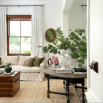 Steve Cordony Style And How to Get It – High-Low!
 60 + High-Low Chinoiserie Lamps (Some are Rare)