Hi Guys,
Today, I’m going to broach a sensitive subject. And, it’s one that most of us have had to learn from, the hard way.
It’s about when paint colors change unexpectedly.
In the morning, the color looks yellow, the afternoon, lavender, and the evening slightly pink. At night it looks white.
On top of it, the paint colors change on every wall– at the same time of day.
Sometimes they look one way at the top and another way at the bottom.
Or, the wall changes color from one end to the other.
This is why when you put up samples like this; you are playing Russian Roulette with your paint colors.
You put up a little sample, and it’s perfect.
Once upon your walls, it looks like a completely different color.
However, if you look back where you first saw this sample, I bet in that spot, you’ll like the color. Yes! Just one problem, the predominant walls don’t look like this, and now the TV is covering where the color is perfect.
Why does this happen?
Well, I could write an entire book about this if I wanted to do about 10,000 hours of research.
However, it has to do with:
this:

this
And this.

Brain illustration via Britannica
But, please watch these two short videos that explain some simple basics about how we perceive color.
And, the second one about optical illusions with color.
I also touched on some color illusions in this post.
But, Laurel, what about undertones?
What about them?
Look. I know full-well where this is going, and I’m not going down that trap.
Maria is a good friend who I respect immensely and agree with 99.999% of what she says.
(If you don’t know who Maria is, that’s fine.)
However, I have not taken her course. But, I have colleagues who have taken it and have raved about it.
I think she’s very talented, and in the end, our philosophies are not contradictory.
All things being equal, if you look at a paint color in relation to others, then the principles hold true.
However, all things are not equal.
In a room, there are windows, doorways, recesses, other walls, a ceiling, a floor, furniture, and maybe a big snowy hill outside, blue ocean, green meadow, etc., outside the window. Plus, other colors.
All of these things can affect the way a color looks. I’m sure that Maria addresses all of this. Again, I have not taken her course.
In addition, there’s the time of day, the time of year, and artificial vs. natural light.
Natural light is different by season and very different on cloudy vs. sunny days.
This is why you must make large samples of a color and move it around the room and in different lights.
Really?
Yes. And, it’s fine. You can use those peel and stick samples from Samplize. Or, you can make your own with real paint.
Now, I am going to demonstrate with my Boston apartment just how great paint colors change. So, hang on.
Many of you have asked me what the colors are. I did not paint these rooms. I am only going by the cans of leftover paint left for me in my storage closet.
However, please go back and read this post about why it doesn’t matter what the paint color is. The only reason you want to know my paint colors is because I am blessed to own the Paulina Porizkova of living rooms.

When I am through, I hope you’re going to understand with crystal clear reasoning why it drives me berserk when I am asked. “What color is that?”
My apartment has three huuuuuge south-facing windows. However, because of the bay in the living room, those two face south-southeast and south-southwest.
The one big window in the den faces due south.
I’ve been enjoying the differing lights depending on the time of day and night.
Let’s begin with this pic we saw the other day when we discussed plans for a new door with a transom.
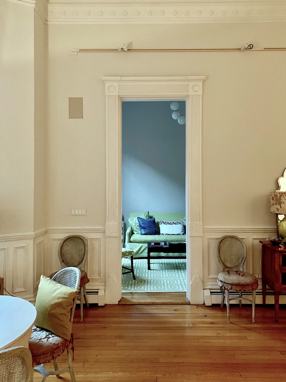
Remember when I said that the color looks nothing like this? It might’ve been in a comment if you happen to be looking for it. Below is what the paint color is.

It is Benjamin Moore Cedar Key – oc-16.
It’s a true greige (warm gray/beige) that sometimes has a very slight purple undertone. But, like other greiges, it can also go more to khaki. (ever so slightly green.)

The living room is Benjamin Moore Classic Gray which is also a warm, ethereal light gray.
We will look at the living room more closely, but first, let’s look at how paint colors change in the den.
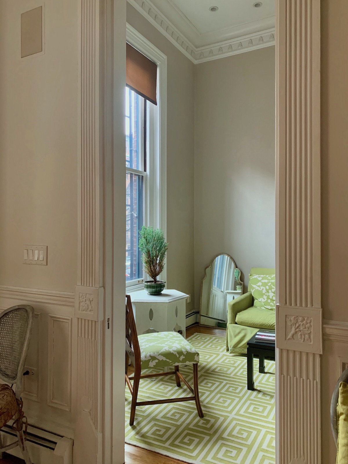
A photo of the den was taken from the living room on Jan 14, 12:23 PM. I know. It looks like the living room is Cedar Key, and the den is Classic Gray. But, that is not the case. The trim is Super White, which looks nothing like the image above.

For more super white, you can see it on my trim in my living room, bathroom, and kitchen in my Bronxville apartment.
Let’s look at images in the den taken while sitting there.
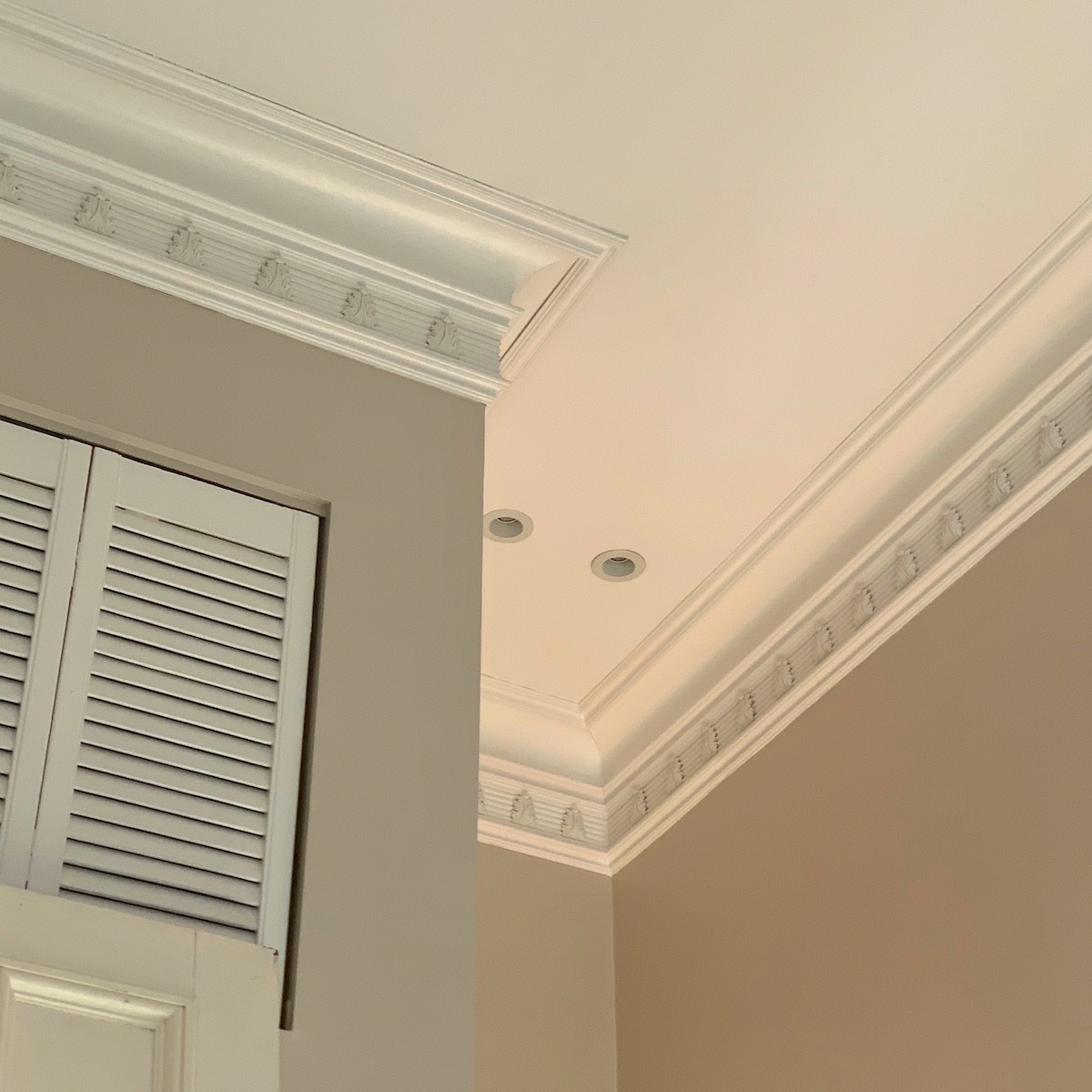 The photo was taken on Jan 19, 11:49 den – Benjamin Moore Cedar Key.
Yes, the closet wall and the back wall are the same color.
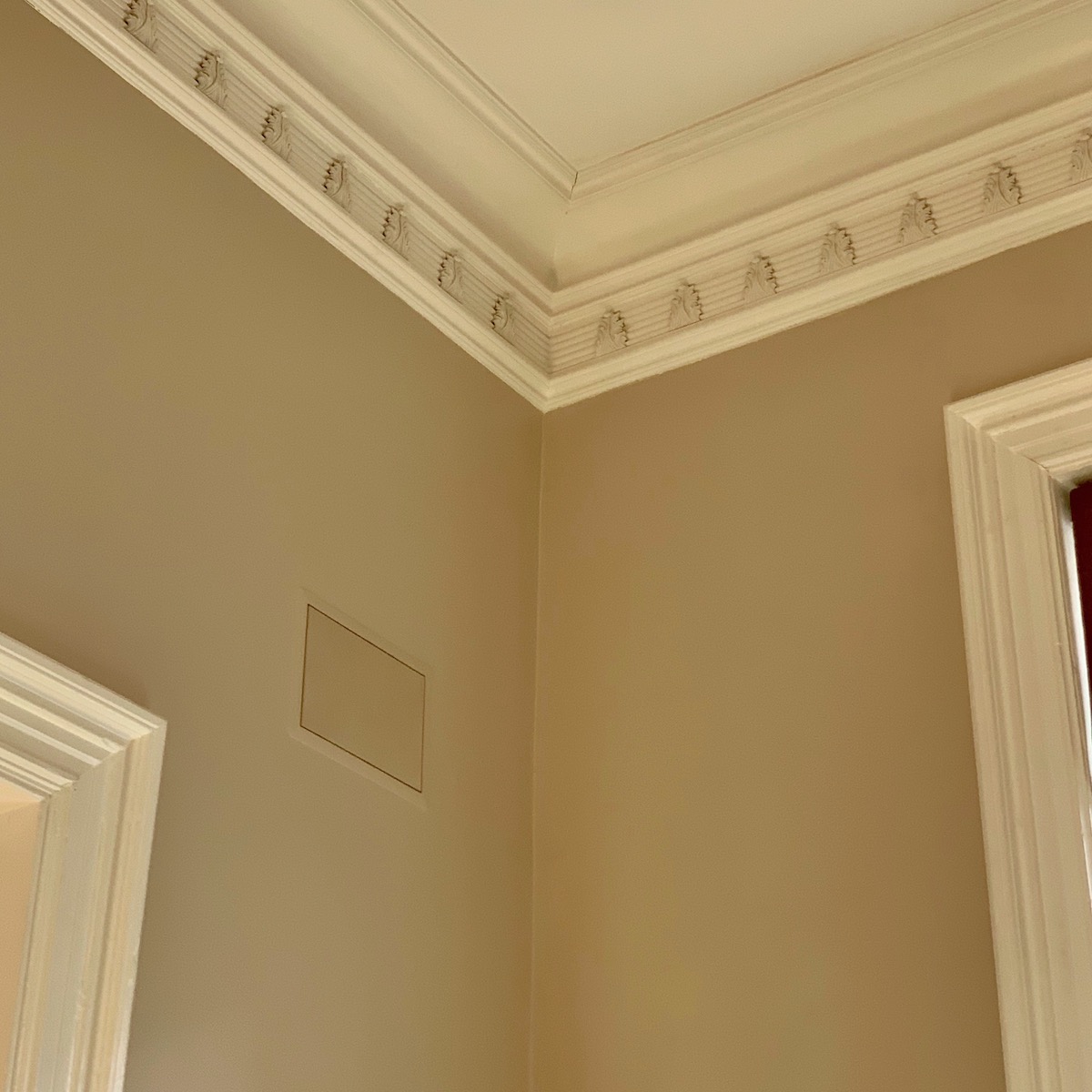
Jan 19, 11:51 am den – Benjamin Moore Cedar Key South-east corner.
You can see that at this time of day, the pinkish-purplish undertones came out.
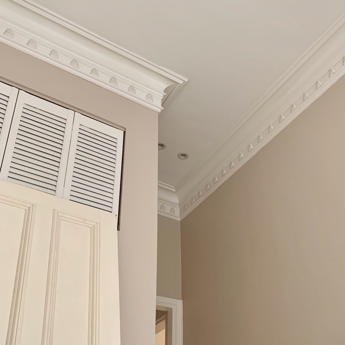
Jan 19, 1:51 PM den -A little later, the tone had calmed down and was a cooler version. By the way, the door is a different color than the trim as it was painted a while back.
The pic below taken from the den looking into the living room Jan 8, 12:22 pm
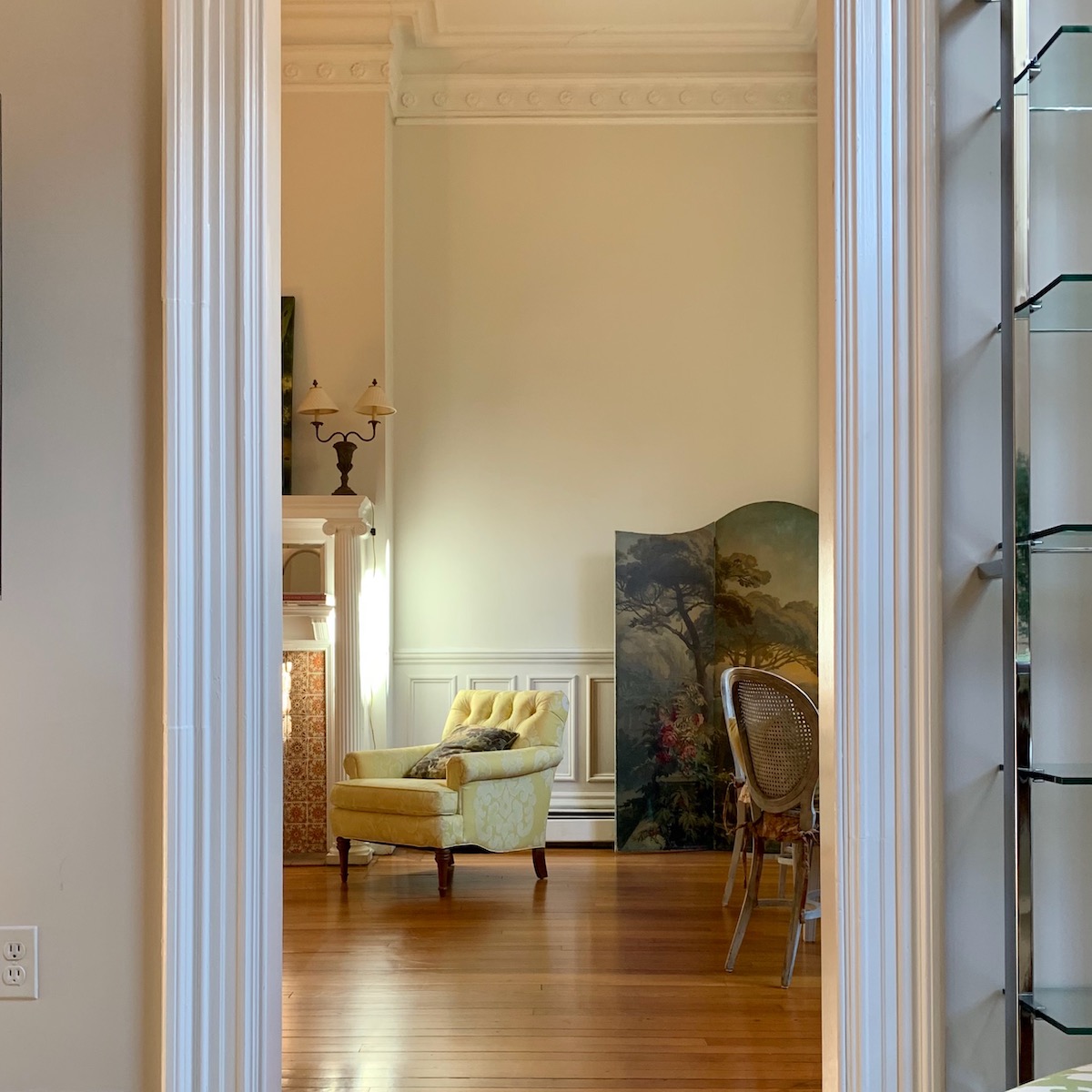
Notice the variation of the same color on either side of the doorway. And, then we look beyond in the living room to see Benjamin Moore’s classic gray looking almost YELLOW.
Is this an anomaly?
No.
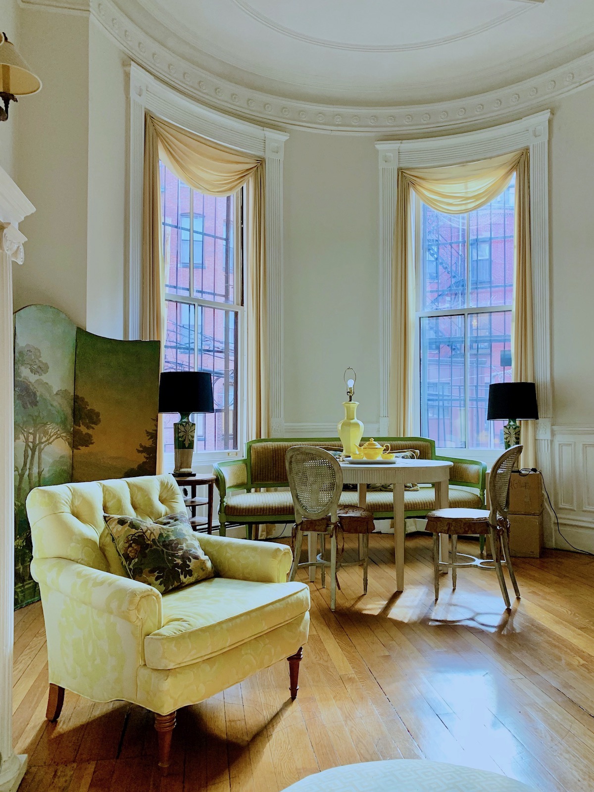
Jan 13, 12:20 pm living room Benjamin Moore Classic Gray
The sun was streaming in full-force.
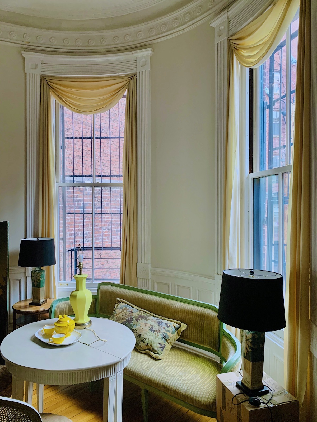
The next day, the 14th, at 12:24 PM. I wasn’t trying to take photos at the same time. But, this time of day at this time of year is prime sunlight.
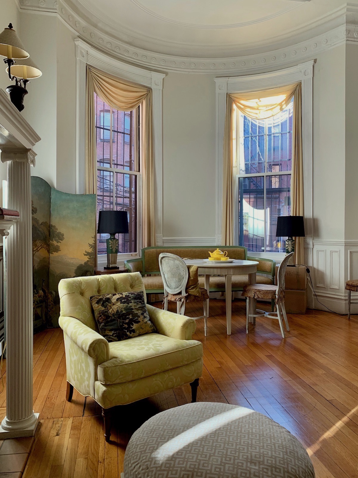
But then, there’s this photo from Dec 29, 2:15 pm, also on a sunny day, but after the sun had almost dropped behind the buildings.
So, this side of the room looks slightly yellow-ish, much of the time.
Again, this is Benjamin Moore classic gray.
But, let’s look at the other side of the room.
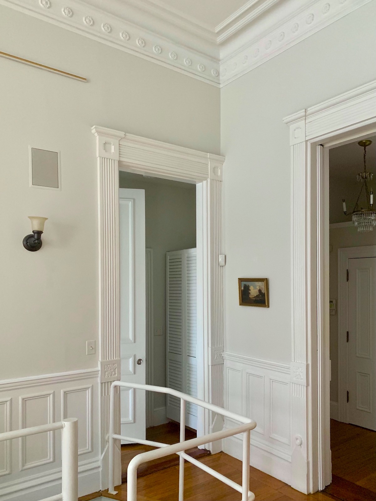
Jan 14, 12:23 pm living room back corner. This corner typically looks cooler and more like I think that Classic Gray should look like in a well-lit room, but further from the light.
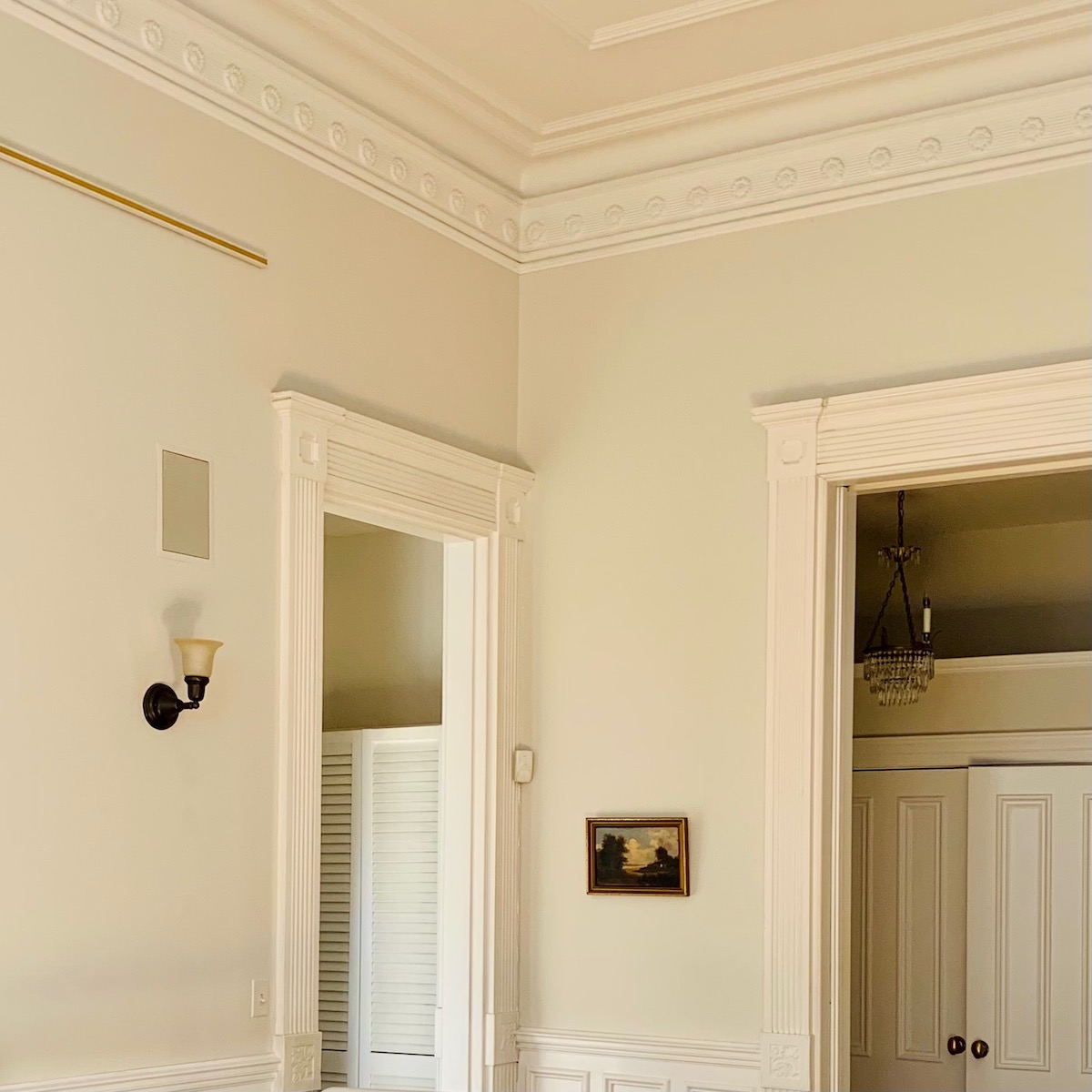
However, this same view taken at 11:54 this morning is also looking quite creamy.
Today at noon, it was blindingly bright in the living room.
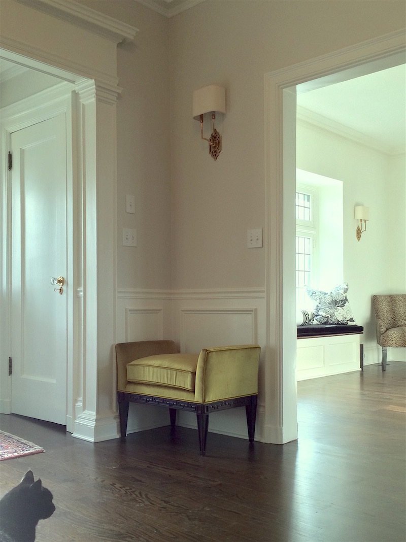
For comparison, In Bronxville, Classic Gray is a beautiful entry we worked on a few years ago.
Now, get ready to have your mind blown.
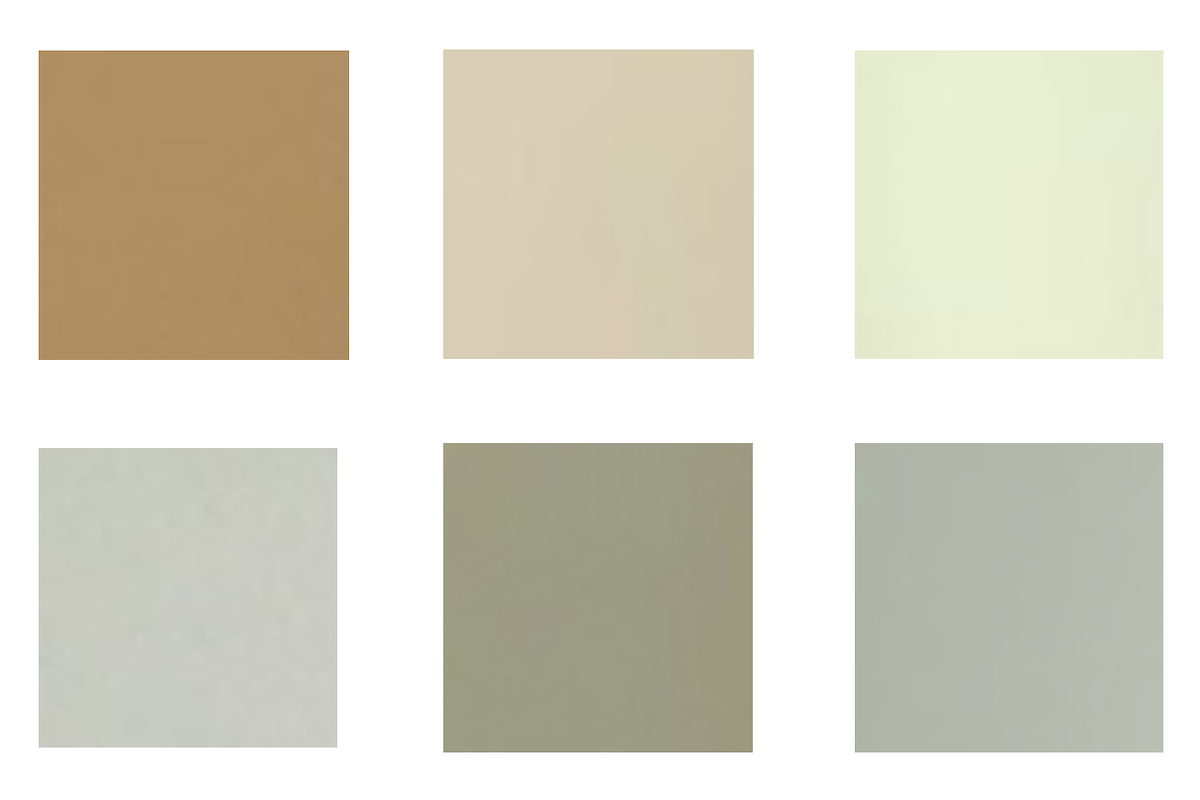
This is a lovely color palette, right? And made up of a warm group of muted greens, beige, and a soft caramel shade.
What are these colors?
They were taken from six of the photos above and large areas of color from different living room walls.
Yes, they are ALL Classic Gray!
But, here’s the thing. And to be clear, I just double-checked the paint cans.
One paint can that says Classic Gray at 50%, while the others don’t say that. I do think the kitchen and entry are the 50% for sure. It looks like a dirty white.
My experience with Classic Gray is that it is warm, but if anything goes every so slightly purple, not yellow. And this classic gray never goes purple.
Even on a cloudy day, it looks a little creamy.
The trim is Super White except for the master bedroom trim, which is a Fine Paints of Europe white in an oil base! I couldn’t make out the shade of white, but it’s quite beautiful.
The bottom line and lesson in this post is that colors on walls are highly changeable. And, you cannot “see” a color by looking down on a paint chip. Nor should you be putting paint samples on the wall, as you can see in this post.
I realize that this makes choosing paint colors all the scarier. However, if you make your samples and use this method, you should be fine.
And, if you don’t already have this tool and are still struggling to figure out colors, trims, and palettes, please consider investing in my two-volume Paint and Palette Collection.
There are 144 Benjamin Moore Paint colors, which are then put into 40 color palettes with 12 colors. For the paint collection, please go here.
And, for the companion palette collection, please go here.
I am fascinated by color and how paint colors change. I hope that my years of experience will be helpful for you.
xo,

PS: Please check out the newly updated HOT SALES!
PPS: Tomorrow, the 20th, I’m getting my chimney inspected and hopefully cleaned. Very excited about that.
Related Posts
 Love Me A Warm Color Scheme But Is It Going To Look Dated?
 The Number One Decorating Mistake and How To Avoid It
 Wallpaper – Some Favorite Sources, Hot Tips {and a naughty vendor}
 15 Hideous Decorating Mistakes With Fabric
 Discover the new black in interior design!
 The Best Bedroom Paint Colors You’re Probably Not Using
 Astonishing Home Makeovers You Won’t Believe





32 Responses
We painted the walls and ceilings of all the connected spaces in our home Classic Gray, and a year and a half in I still love it. There is a lot of light, windows on South, East and North sides, and the colour definitely changes depending on the light outside. But it has never shown purple, pink, or blue, and it has never gone dingy. Usually a soft off-white, it is a chameleon: a glowing warm white, a proper greige, a dove grey, a dull grey, a pale gold, a creamy glowing beige.
My understanding of Maria’s concept of undertones is, if your neutrals have the same undertones, then no matter how the light changes the way the neutrals appear, they will still work together. Which has so far been true in my experience. Of course you still have to figure out if you like this or that neutral (or colour) in your space with its light.
Our large commercial office space is painted Classic Gray. It’s a warm white, which coordinates nicely with our mostly white office furniture. In this space it never looks gray or yellow.
I agree Shona, enjoy the change throughout the day!
Your floors throw off a lot of yellow! I think that is why the Bronxville paint looks sodifferent.
I think she means the Bronxville pic.
Can’t say enough about how true this post is. Thanks for sharing your process of choosing just the right paint. Love your place so much!
Paint color is fascinating and frustrating. I recently bought Samplize because I am too lazy to paint my own sample boards. I got several in the same color to post on different walls. Can’t wait to see the evolution of your new home
Beautiful post but I’m sorry with off-topic question … these mouldings are so gorgeous. It’s not even a question haha. Gorgeous! I wonder about paints that you find looking good with Carrara. This is my burning question: Carrara has blue undertone so can paint be creamy white? Or warm white? Mark D Sikes kitchen has cream looking cabinets with Carrara? They look beautiful. What kind of undertone his cabinets have…Laurel, what do you think about Carrara with grey undertone paint and Carrara next to warm paints? I haven’t read about Maria, but I’ve seen this topic many times and I’m wondering what do you think. So many bad structured questions lol.
I saw an episode of Restored with Brett Waterman, and ended up having to repaint a living room and dining room because the house next door was painted yellow and reflected into the house he was restoring. Color seems such a fickle mistress.
Back in the 1980’s, when I was head of quality for a Hon Company plant (making metal file cabinets), we used a light booth to assure that paint samples from new batches/barrels of paint matched the paint standards approved and provided by the home office (to try to assure that newly purchased file cabinets would match those that may have been purchased years earlier). The light booths had different sources of light (incandescent/florescent, etc) due to the impact on color perception based on the light source, which we described as “Metamerism”. For comparison using daylight, we just walked outside with the paint samples).
I believe this word helps describe the perception differences of the paint as described in this post. However, when I looked up the word “Metamerism”, it seemed a bit complex (as in “over my head”):
Metamerism
color
In colorimetry, metamerism is a perceived matching of colors with different spectral power distributions. Colors that match this way are called metamers. A spectral power distribution describes the proportion of total light given off by a color sample at each visible wavelength; it defines the complete information about the light coming from the sample. However, the human eye contains only three color receptors, which means that all colors are reduced to three sensory quantities, called the tristimulus values. Metamerism occurs because each type of cone responds to the cumulative energy from a broad range of wavelengths, so that different combinations of light across all wavelengths can produce an equivalent receptor response and the same tristimulus values or color sensation. In color science, the set of sensory spectral sensitivity curves is numerically represented by color matching functions.Wikipedia
My wife and I painted a number of rooms (many decades ago) only to look at them in the morning and not like the color at all…so now we just say when we are trying to decide on a paint color that “golds are funny”, and “greens are funny”, and “whites are funny” (etc)…what was not funny was repainting…so we quickly switched to just painting the color on a large poster board (or sheet rock, or several poster boards) and trying the color(s) at different times of the day…which has worked well for us.
GREAT post Laurel! I’ve always said we all have a Color Theory class going on in every room of the house.
ugh – hate to say it but Classic Gray has recently done exactly this to me!!! It never used to but I painted a VERY large home in is as the envelope color and it was beige/yellow most of the time. We did sample it in many areas and times of the day – but once it was all up it went creamy warm. My client HATES anything remotely yellow so we repainted the entire house. 🙁
HUZZAH! My brain and my eyes, at odds for 68 years, now have a well-supported (layman’s) talking point, and a growing mutual respect! Thanks for the lovely post, and even more for the linked reminders. In addition to your fantastic paint and palette collections, of course.
I love my color-changing paint in my living room. The color was already on the walls. Sometimes it’s a pretty, sophisticated, pale blue, sometimes it’s gray, and sometimes it’s a pale purple. It’s a nice way to feel like I’m changing up the space without having to lift a finger!
Whenever someone has a pretty color on their walls, I always love the play of light and shadow going across the walls. It’s amazing how one color looks so different on different parts of the wall, but it looks alive.
It is beautiful and seems alive, moving from this to that.
Although I thoroughly enjoyed your post about paint colors and reflective light, my eyes would only focus on your amazing moulding details…wow…thanks for the close-ups…lucky girl! I’ve always said that you look for ‘good bones’ when searching for a home…paint colors, flooring, window tx’s,etc. can be changed! The details in your home are fab!
Hi Laurel! Great post. I lived with 8 different colors on each of the LR/DR walls for a month…oh yes I did! Thankfully, since we were having no one visit, it wasn’t an issue.
The east facing room full of windows, an overhang and lots of trees on the property really changed my decision.
In the end, BM Mayonnaise was the winner for OUR rooms…creamy but not yellow.
Lots of lessons learned.
Paint offers almost infinite variability and options, while the other elements in the room (flooring, upholstery, art, etc.) offer much more restricted choices. That is why paint should be chosen last. Paint should help to unify the other elements in the room. The perceived color of those other elements will change with the light, just as the paint color will. In my view, the key is to choose paint that perfectly complements the other elements in the room, in all lights. To choose a paint color in isolation is madness, as Laurel’s snips of a single color from six photos illustrates. Excellent post, Laurel!
It’s a client’s cat. Right there, she says, “in an entry we worked on a few years ago”.
In my experience, where you live has to make a difference. Closer to the equator, in the Deep South, what I selected was what I got.
I moved to Seattle and the lighting and color reactions drove me crazy. A light pink would look white there and cotton candy over there. We just bought a house in Idaho. The angle of the sun is quite similar. And the first thing I did was buy your paint guides. I’ll let you know how it goes.
Hi Laurel,
I am with Susan above. I also am a colour consultant and painter so I really do get to see how the colours change. I use Masonite boards simply because they hold up well and don’t warp as much as foam core and they rest nicely over doorways when you want to stand back to look. I like to leave the selected boards with my clients so they can see what the colour looks like at all times of day before committing. I highly recommend to all of you out there who are intimidated by choosing colours, to seek out a colour consultant to help you or get Laurel’s guide – it will pare down the choices for you and then you can make your own colour boards.
I think she means the kitty in the pic of your client’s entry!
THANK YOU for this post, Laurel!! I will be referring clients to it often so they can see what I mean when I tell them it doesn’t matter about how paint colors change or what the undertones are, as long as everything looks beautifully *together.*
What a fascinating post, Laurel! The videos were most interesting. I think the key take-away from your text is that all things are not equal, and that goes not only for the environment in which a colour is seen, but also for what is going on in our minds.
After reading your post, I went and looked at my own sitting room (on the first bright day we’ve had since well before Christmas). I could take photos of several areas of the walls (F&B Ringwold Ground) to show considerable colour variations, but nothing as extreme as your examples, perhaps because we just don’t have a very big window area in an old house in my part of the world. But when I look at the room in general, I don’t find the variations disturb my overall perception of the colour as a whole, despite the variations. The eye (or rather the brain) is prepared to accept more variations than we perhaps imagine.
A practical example of this is what happened when I chose the colour for my bathroom walls, picking out the colour of a very discreet geometric pattern on the otherwise off-white wall tiles. It was a horrible dirty pinkish beige! I lived with it for years, not sure what to do, and then water damage made me re-do the ceiling and re-paint the whole thing. I simply ignored the tiles and put in a very pale cream (F&B White Tie) on walls and ceiling, and added prints of turquoise-blue seashells to add a new focus, and now of course my eye accepts the colour of the tile pattern as the same as the White Tie although it isn’t. Which makes me think that matching colours is less important than having colours that “go together” — unless we’re dealing with adjacent large blocks.
About three years ago we had new dark hardwood flooring installed. The floor has a gray tone with the warmth of the wood showing through. I believe it is called “Colonial Gray” although my home is definitely not colonial style. It was time to paint. I was drawn to a certain gray color, but I wanted to be sure so I obtained a sample of that and a couple of other colors and painted samples on poster board that I moved around the rooms at various times of day. I kept returning to the store and getting different samples to try until I had 13 different colors! Then I wound up going with my very first choice that I was originally drawn to. It is Sherwin Williams Alpaca. I love the way it looks and I’m very happy with it. I still can’t believe I bought 13 samples of paint, but at least I was sure about it!
Love your new digs…
whatever rug you choose will affect the light and perception of wall color..
I find that is a wonderful magic carpet kind of concept…
Enjoy and have a good time with your paint.
Well, this is spooky weird. I’m scrolling down looking at all the photos and thinking . . . what this place really needs is a nice cat. Then I got to the last picture, and there’s a cat in the corner….woohoo! Then I read the caption. 🙁
I sure hope Maria comments! Can’t wait. 😉 I have taken her course twice- once as a student and then I had the privilege of being a volunteer. What.a.great.course. And an even more wonderful person as well.
I read all of your posts and I find it rare that your opinions conflict, although she may be a bit more in love with undertones. 🙂 I think in your place there is no disputing the effects of the outside light. Wow! What a painting conundrum you have.
Thanks always for your entertaining escapades.
Wowie, Miss L, That’s a shocking set of photos. The videos were interesting too! I definitely learned something.
The kitty face caught my eye. Who is that? I can’t resist asking. I’ve got 10 so it’s a thang for me.
Kitty face? Sorry, you lost me.
I have worked as a color consultant and will share some techniques for perfecting your color selection. Get your hands on some large pieces of white cardboard or foam core – at least 24×36. Foam core board because it’s lightweight; large because your are NOT going put samples of paint on your walls. Paint your sample boards with 2 coats of your selections – ONE color per board. Now you can take your sample from room to room, wall to wall. Maybe your bedroom selection will end up in the dining room. No living with nasty swathes of paint on your walls. If you dont like a sample, paint over it; if you like the color, just not “there” save it for the future.
great advice, Susan. Thank you.