Hi Guys,
How are you doing?
I’m fine, but last week was a doozy, for sure. As you know, my place went on the market late Tuesday evening. Then, a couple came to see it the next day. Yes, the day before Thanksgiving! Cale was here and was a big help getting things just so.
Then, it was turkey day; only we made a chicken. How many of you said, “screw it, I’m not making a big bird for two or three people. Let’s just do a chicken instead.” You know it was really good!
But, then my new Best of Etsy Home Furnishings Guide came out.
And, not by itself, either. I’m really proud of it. It’s only $29.00. But, if you order anything else, you’ll get it for FREE, and you’ll also get the Rules and Tips for free unless that’s what you’re ordering. Haha.
Then, two people were supposed to come on Saturday to look at the apartment. Well, one of them didn’t show up, but the other one did.
And, guess what?
I bet you had it figured out by the time I said “guess.” lol.
YES!!! I have a most enthusiastic buyer for my Bronxville apartment!!!
Of course, I can’t say more about it than that. But, I couldn’t have asked for a nicer person, and she LOVES the apartment.
Gosh, I have to say I do too! In fact, the new lighting in the kitchen, while a tad bright for me, is making the dishes and glasses look so sparkly when I open up the cabinet. It’s stuff like that.
When are you moving, Laurel?
I knew you’d be asking me that. haha
I am pretty sure it’s going to be December 16th. It’s a Wednesday, which is really more like my “weekend.” Verizon is coming on the 17th to hook me up.
I thought you were going to do some renovations before you moved in.
Well, that was fantasy. Sure, it would be great. But, to do that, even cleaning, I have to have someone let them in and someone to supervise. It’s fine. I’m bringing as little with me as possible.
I figure I have about 12 hours left of getting rid of stuff. That doesn’t include packing what I’m keeping.
Okay, enough about all of that. I haven’t said anything about the bedroom design of my new place in Boston.
And, truthfully, before I can do any real designing, the first thing I need to address is the staircase. So, you better believe, I am going to jump on that one very quickly. It’s not a quick fix. Once I have someone to do it and know it can be done, then it’s a matter of getting the permits, etc. I can get serious about the rest of my decorating plans.
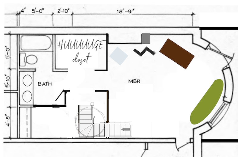
So, let’s take a look at the floor plan of the lower level again to begin to address the bedroom design.
But, here’s the thing. I can’t get too heavy into the design because the space might need to change from its current configuration. Also, and this is very important for laypeople and less experienced designers.
Never and I mean NEVER work off someone else’s measurements or drawings unless you have specifically paid an expert interior surveyor to do so on your behalf.
And, yes, there is such a profession. Every time I had to do carpeting for a staircase or something was out of my reach; I used to use this guy every time. Or, it was just super-tricky to measure accurately.
The other thing is that these drawings are really schematics meant to approximate what’s there.
They are not architectural working drawings. So, once you have the correct measurements, I recommend that you create your own scale drawing to work from.
I have always done my drawings by hand. But, as you can see from Sunday’s post, I’ve also gotten into using picmonkey for space planning. Again, that is also a schematic. It is an approximation used for conceptual purposes only. In fact, your contract if you are a designer should say that your drawings are for conceptual purposes only. Working drawings are not usually done on graph paper. However, for a furniture layout, graph paper is fine.
Okay. Let’s look at the photos I took of the bedroom.
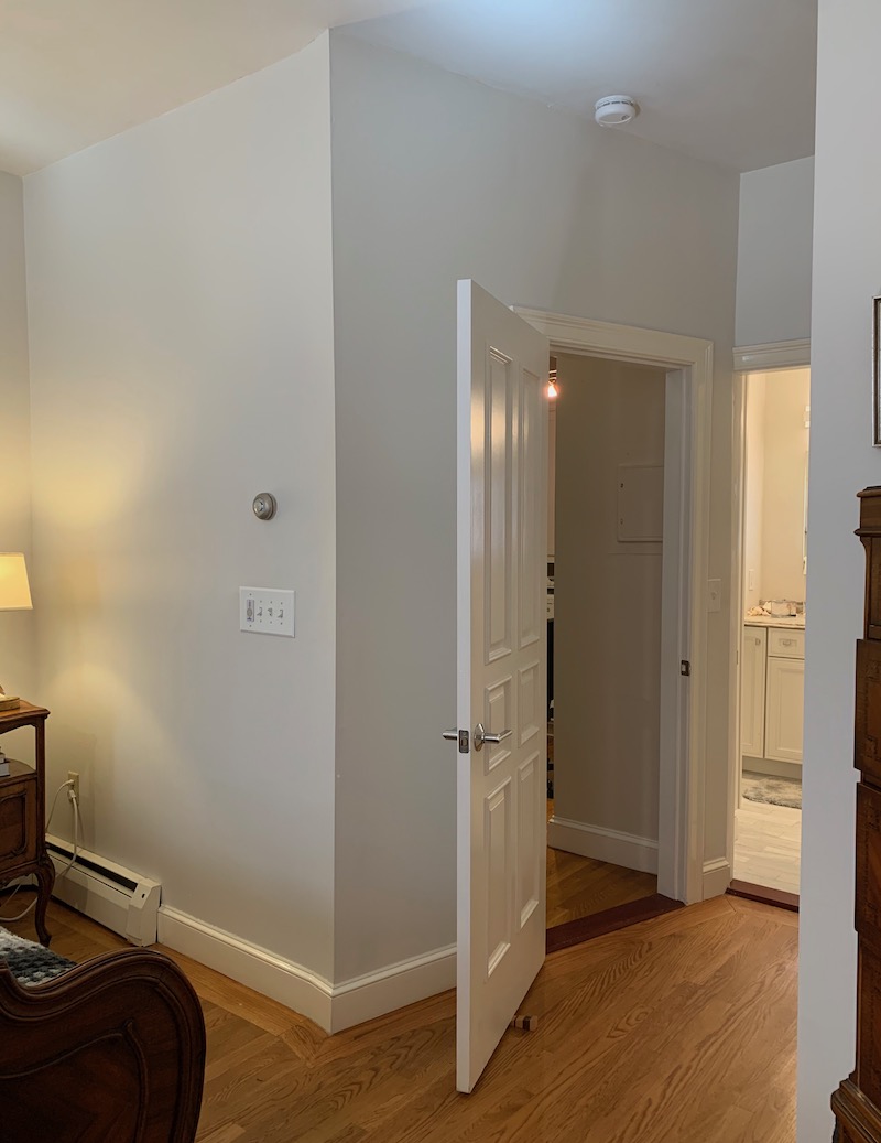
In this area behind the door is where the spiral staircase lives. If I can run a staircase along the back of the living room, The staircase will cut through the ceiling, so there would be a sloped ceiling for about 4 feet or so and about as wide as where the heating unit is.
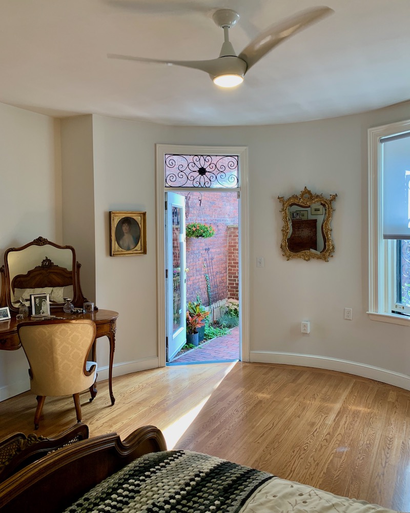 Looking towards the garden from the wall we just looked at.
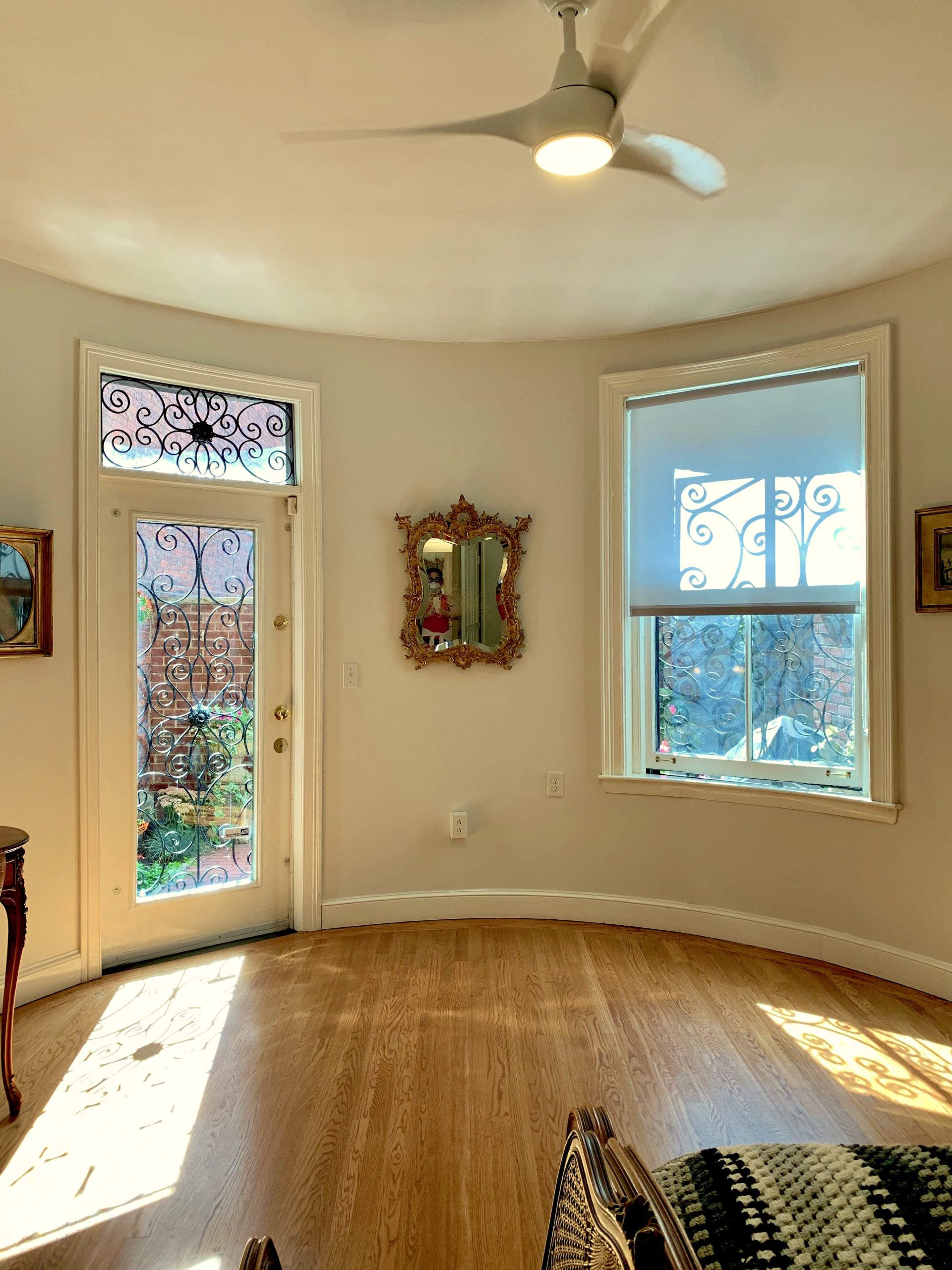
A straight-on shot.
Like the living room, the lower level also experiences direct south-facing sunlight for at least a few hours every day. It’s funny, while I love the sunlight, if it were shining brightly all day long, I’d have a huge headache.
Let’s go over a couple of things first.
There is nothing wrong with this room as it is. But, it’s not my taste, is all.
And, while I’m pretty sure I’m eventually going to do a deep, rich lustrous finish for the floors upstairs, down here, no. I want them to be light.
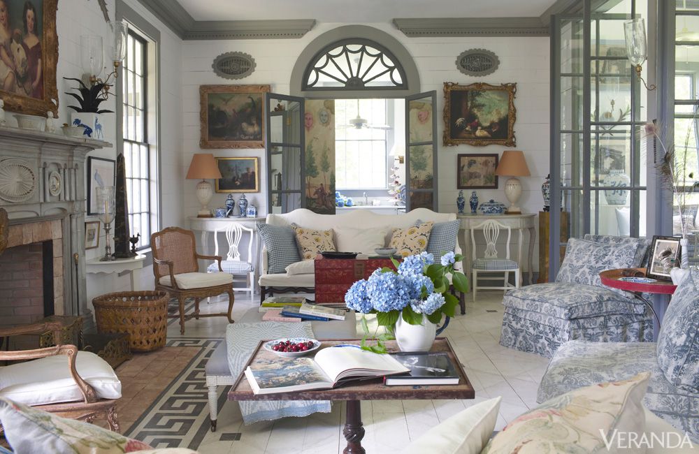 The most inspired me is Furlow Gatewood’s pale, pale, pale checkerboard floor with 2-foot squares.
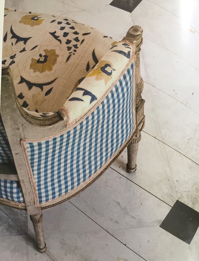
I want it pale and chalky—final answer. I will probably not do the black squares, but I do love that too.
Well, is that in keeping with the Victorian era, Laurel?
Ummm… well, it’s not going to be a museum. If it were going to be a museum, then this room would have to be the kitchen with a smokey, greasy cast iron stove, a washtub, and a wood floor with no finish on it whatsoever.
There is nothing in this room that’s original, for yes, this WAS originally the kitchen.
And, I’m bloody lucky. It is pretty rare, but this unit has a nine-foot ceiling on the lower level. I haven’t measured it yet, but I can see that it’s nine feet, or close to it because the door has to be 80,” and the ceiling looks like a good two feet above the door.
In a lot of ways, this post is the opposite of Sunday’s post. While that post dealt with the architecture of the room–first. This post is dealing with the styling of the room first.
Both are valid, jumping-off points.
While I’d love to tackle the architectural aspects of the lower level, I’m going to save that for another day.
So, how do I want this room to feel?
I want to go further back in time. I want it to feel Swedish Gustavian or French Louis XVI.
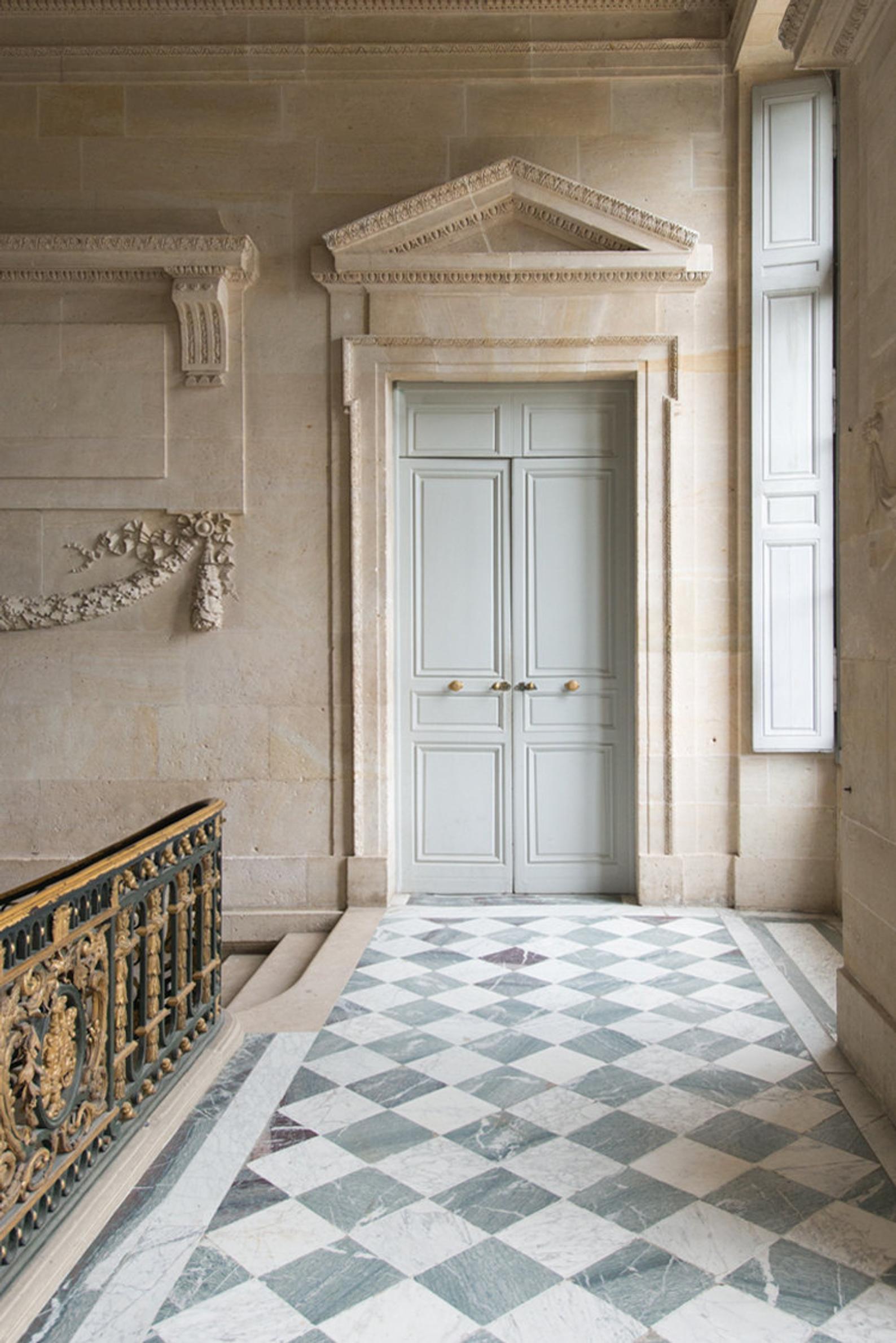
Another inspiration is this checkerboard floor at Versailles – Le Petit Trianon.
Except, I want larger squares. And I want less contrast.

More like this. Super pale.
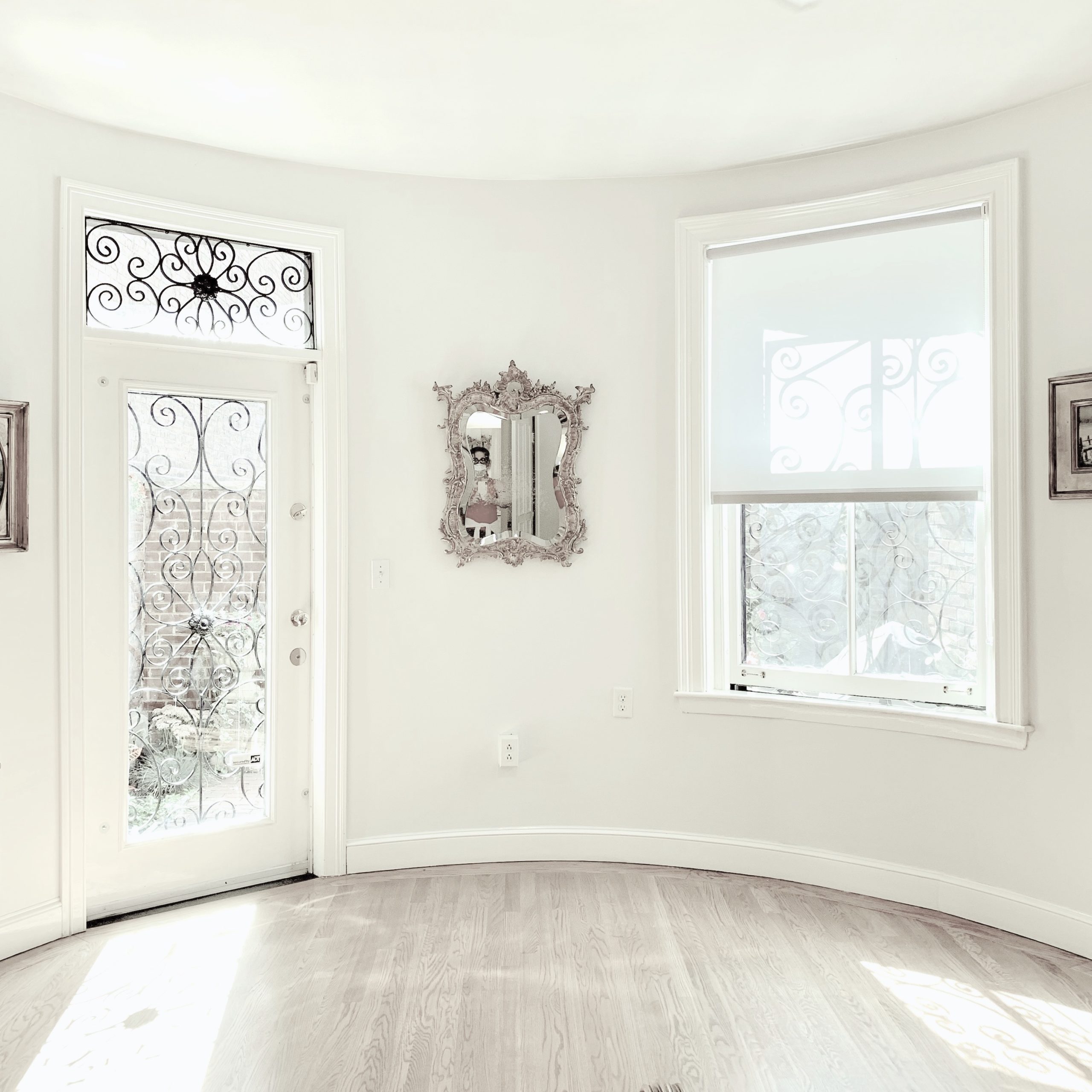 First, I lightened the image as much as I could without losing the detail of the window and door to create my dream bedroom design.
Well, the window and door casings, that is.
The grille-work is not my thing. Yes, I know that it’s common in Boston to have this curly-cue type of ironwork. However, this one looks cheap to me. And, it’s just too much when it’s not artificially lightened.
What do I want?
 Something more like this that I spent over an hour creating. Haha, There is wood around the glass, but it’s white, so it blends in with the background here.

I modeled this after the Urban Grace transom that I’ve been salivating over for the last 12 years or so. You can see it in one of my favorite posts about transom windows.
Security grilles, burglar bars, prison cells– whatever you want to call them are very common in Boston.
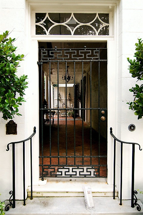
Sarah D on Flickr transom window over iron door Charleston, SC
How cool is that?
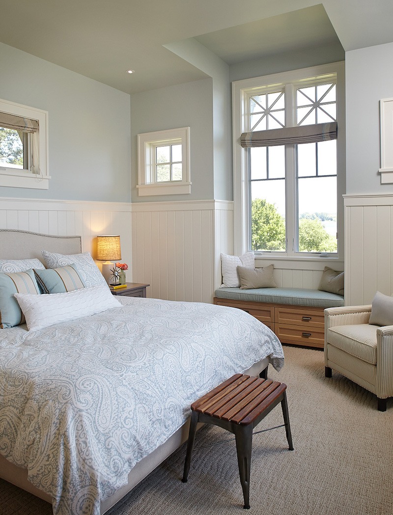 Master-Bedroom Design-White-Lake-Francesca Owings
I also love this neo-classical design and think it would look fantastic with the checkerboard floor. I’d love the grille-work to look like white painted iron that’s slightly rusty and oxidized blue-ish. Am I making that up?
However, I need to look into security solutions. The apartment has an alarm system.
The other thing I’d like to do is mouldings. I’d love to have a crown moulding and done in such a way as to make the ceiling appear even taller.
And, I’d love some applied wall mouldings and wainscoting, as well.
And, a taller baseboard would be much more elegant. The other thing I need to look into is different heater covers. Remember these beautiful baseboard heat covers?
We’ll be talking about heating and cooling more in future posts. Here’s a recent post where we began the discussion.
Okay. I have to admit; I’m already having anticipatory grief for leaving my apartment.
I think because except for Peaches who died six years ago– TODAY and Joe, my darling plant who’s half-dead and still growing, it’s mostly been just me.
However, all of that aside, one of the things I’m feeling awful about is parting with my exquisite Mural Sources Chinoiserie Wallpaper.
They are calling themselves “The Mural Source” now. I like that better.
Coincidentally, a couple of days ago, I came across this beauty on Instagram.
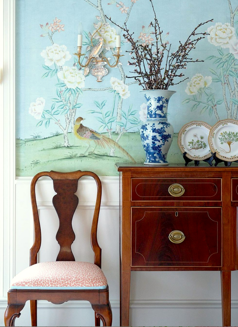
I was pretty sure it was from the Mural Source, and yep, I am right. It’s called Maysong, Spring, and comes in three colorways.
 Paul Montgomery, who owns and creates the designs, is a genius with color.
So, I thought that maybe I would love this in my new bedroom?
However, I’m not sure if it’s right for the bedroom design or not. I would need to get a sample.
In the meantime, I got on Picmonkey and began playing with various elements using the pale version of my bedroom. Gosh, it’s really mine, now!

For my mood board, I ended up using this giga-gorgeous piece of art I found at Gerald Bland, Inc, painted by Jan Van Os. There’s a companion piece, as well.
 Here they are. Actually, they are huge. I would say at least eight feet tall.
Before I show you my rendering that I did on Picmonkey, the idea here is not necessarily to put down every last piece of furniture, but this is also a schematic to capture the design’s essence. So, no, I’m not going to have a buffet and probably not those white chairs, but my bedding will be white, mostly, I think.
BTW, did you see the sale at Boll & Branch? Please check out the Hot Sales pages when you have a chance.
Okay, drum roll~~~~~~~~~~~~~~~~~~~~~~~~~~~~~~~~~~~~~~~

Can I tell you that I don’t care what you say, I think I’m in love.
We’ve decided to get married as soon as possible. This is it! Can you see the pretty garden that I’m going to have next spring and summer outside the window and door?
Oh man, I’m going to have to learn about gardening!
You can’t really see it, but there is wainscoting behind the buffet.
That door looks painted. I don’t know how that happens sometimes. Picmonkey is so much fun. Please check out this post for my best tips on how to use it.
Okay, I think that’s it for this edition. I have vowed to spend at least six hours in the next two days, getting rid of stuff. It’s really not that bad, thanks to Done & Done and their fabulous organizing talents!
Again, please check out the incredible Cyber Monday (really Cyber week) sales. Although some may be ending before the end of the week.
xo

Related Posts
 How To Make Budget Window Treatments Look Expensive
 Ugh! I Hate My New Wall Colors! 6 Easy Steps For Getting it Right {the first time}
 Best Windows – Size, Type + Is It OK To Do Black Frames?
 20 Favorite Exterior Paint Colors + Doors and Trim
 He Loves The Phony French Country Kitchens
 Best Fireplace Mantel Proportions – How Not To Muck It Up!
 Ultimate Window Treatment Guide + Interior Window Shutters


