Are Green and White Rooms Trendy or Passé?

I hope y’all had a good Memorial Day weekend.

Mine was pretty quiet, but that’s not a bad thing. I’ve been watching a lot of HGTV, haha. Can you guess why? I’m going to be updating this post from eight years ago, so it will go bye-bye soon.


A while back, I received this comment:


Dear Laurel

I have always loved blue and white, but recently I’m gravitating towards green and white rooms because they feel so fresh and timeless.

I’d love to see a post about green and white spaces, and some ideas for incorporating green and white. And, anything else we need to know.


Happy Summer!

Jennifer


Oh wow! Green and white rooms! That’s one of my favorite topics


This post about green paint has some terrific ideas, as well.

I have always loved the color green. And, just about every shade. However, I especially love chartreuse, olive, and shades veering towards teal. But, in the right context, I love all greens, and I love them together.

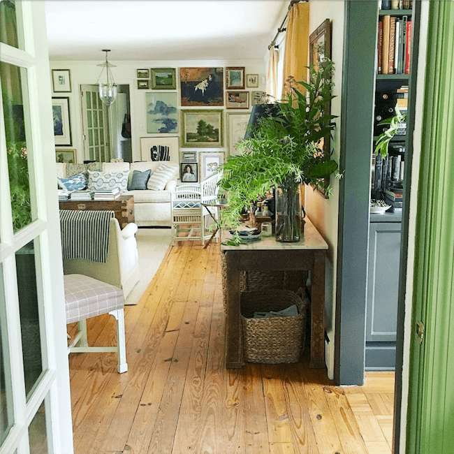
A great example is my antique Zuber screen.


my antique zuber screen


Roborock (Robby) cleaning my living room

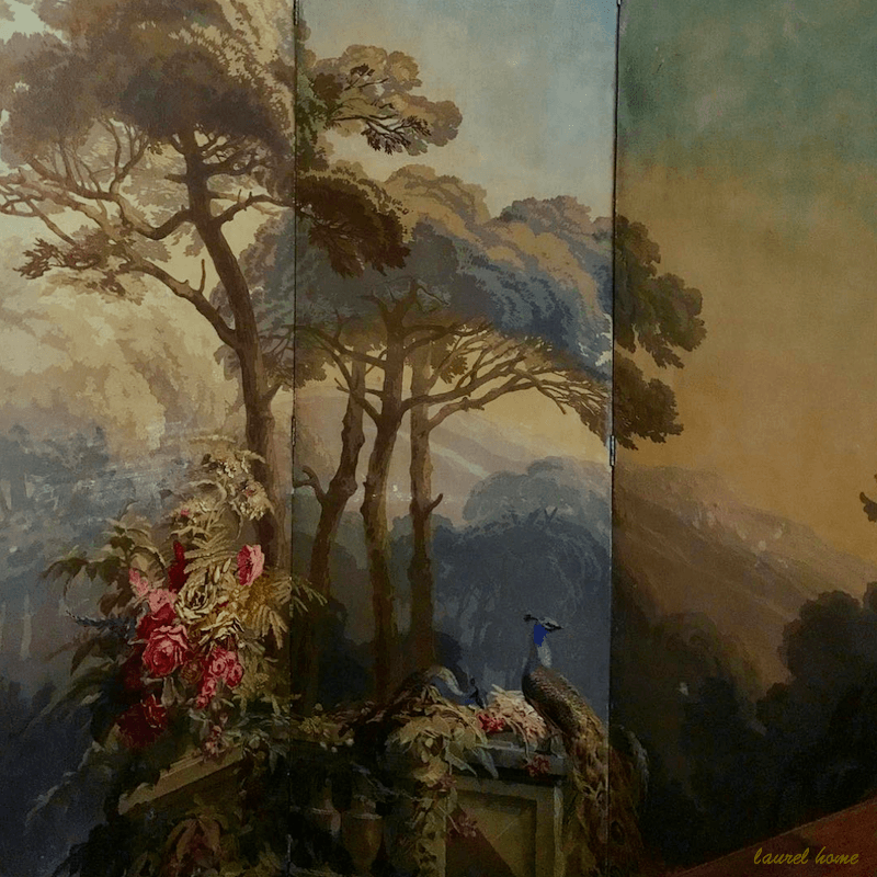
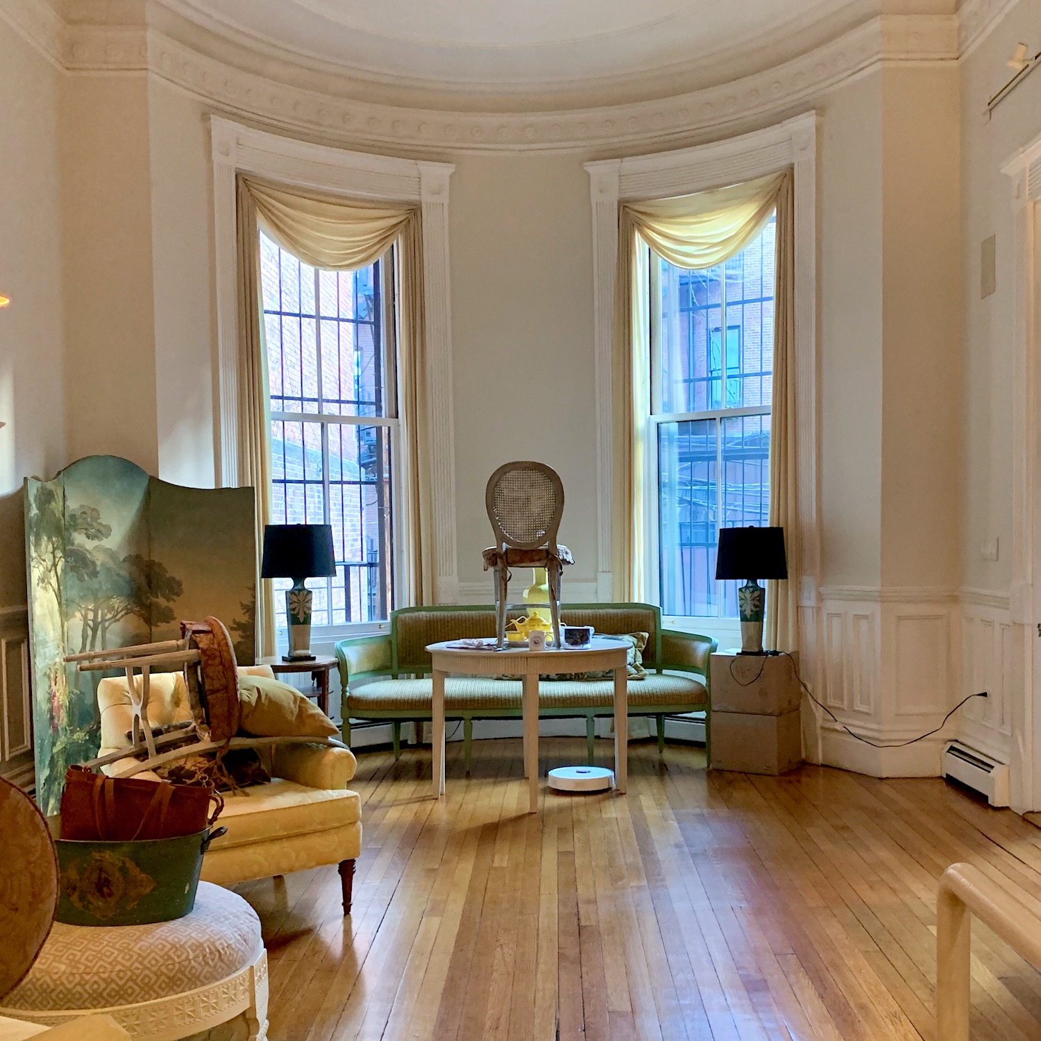
There it is, shortly after I moved into my Boston apartment with my first “Robbie,” (Roborock Robot Vacuum) working hard to clean the floors for me.


my Back Bay Boston Living Room LB Interiors

Also, shortly after I moved here.


yellow lamp vignette coolie lampshade

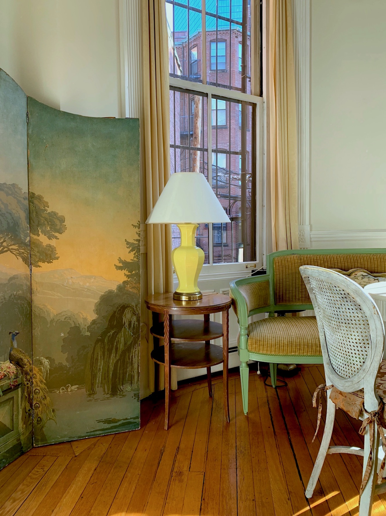
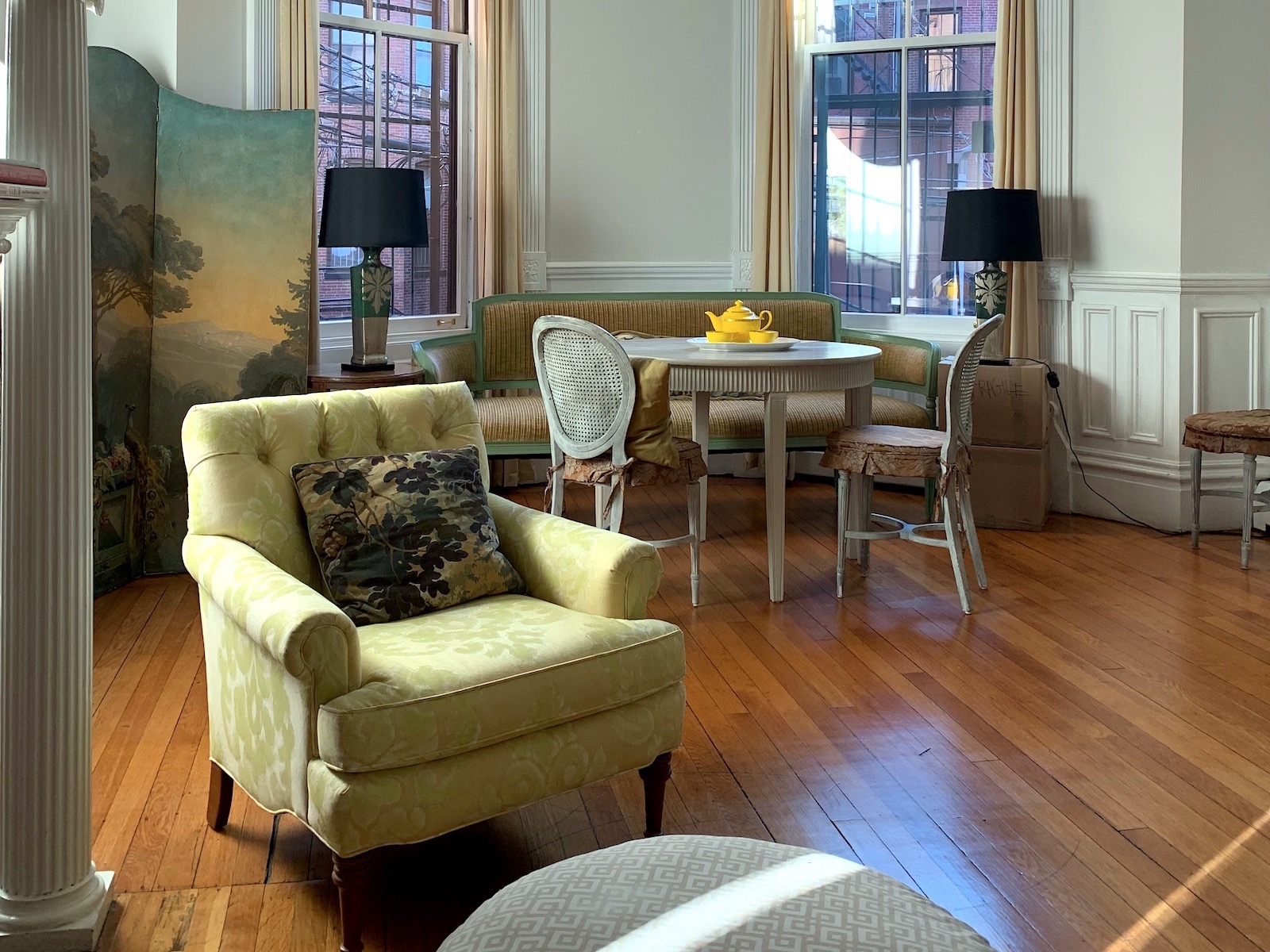
Another partial view in this post about lampshades.


Jan 8, 12-22pm - den - living room color changes


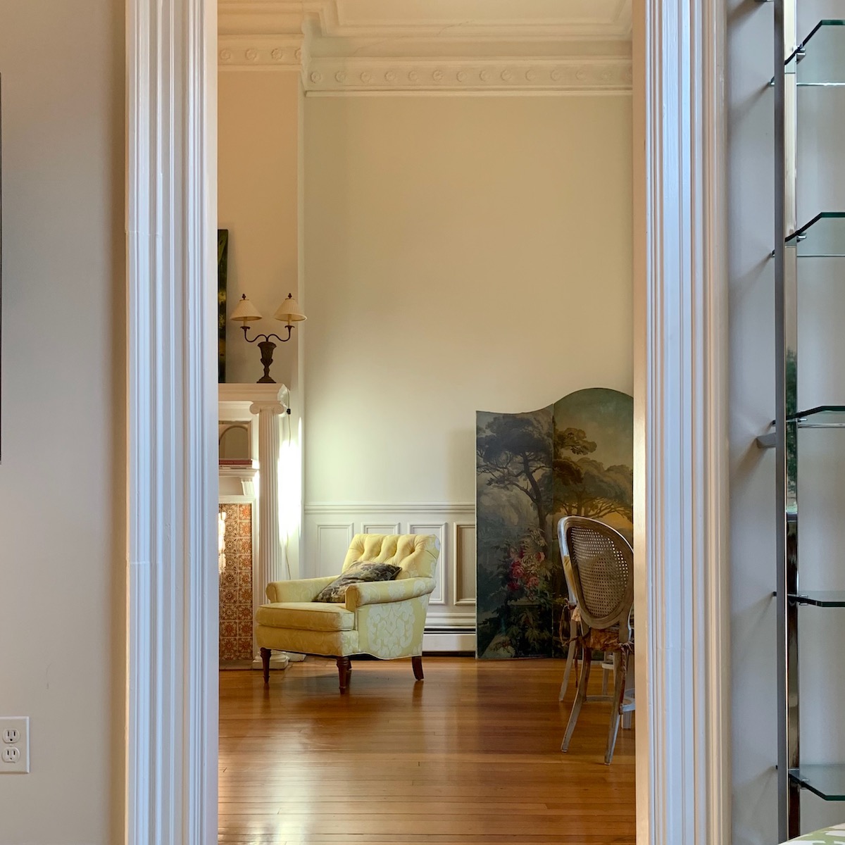
This is another view from the den.


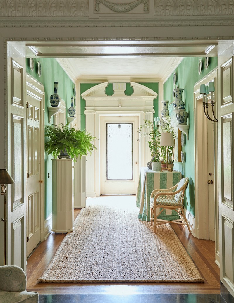
Originally, the screen sat behind my chair in our dining area off of the living room in our townhouse in Goldens Bridge, NY.


Our living dining room was mostly white with green accents. You can see some bad images of the living room. Although, by then, I had cleared out a lot of the furniture.


peaches-living-room - white furniture - living room layout floor plan
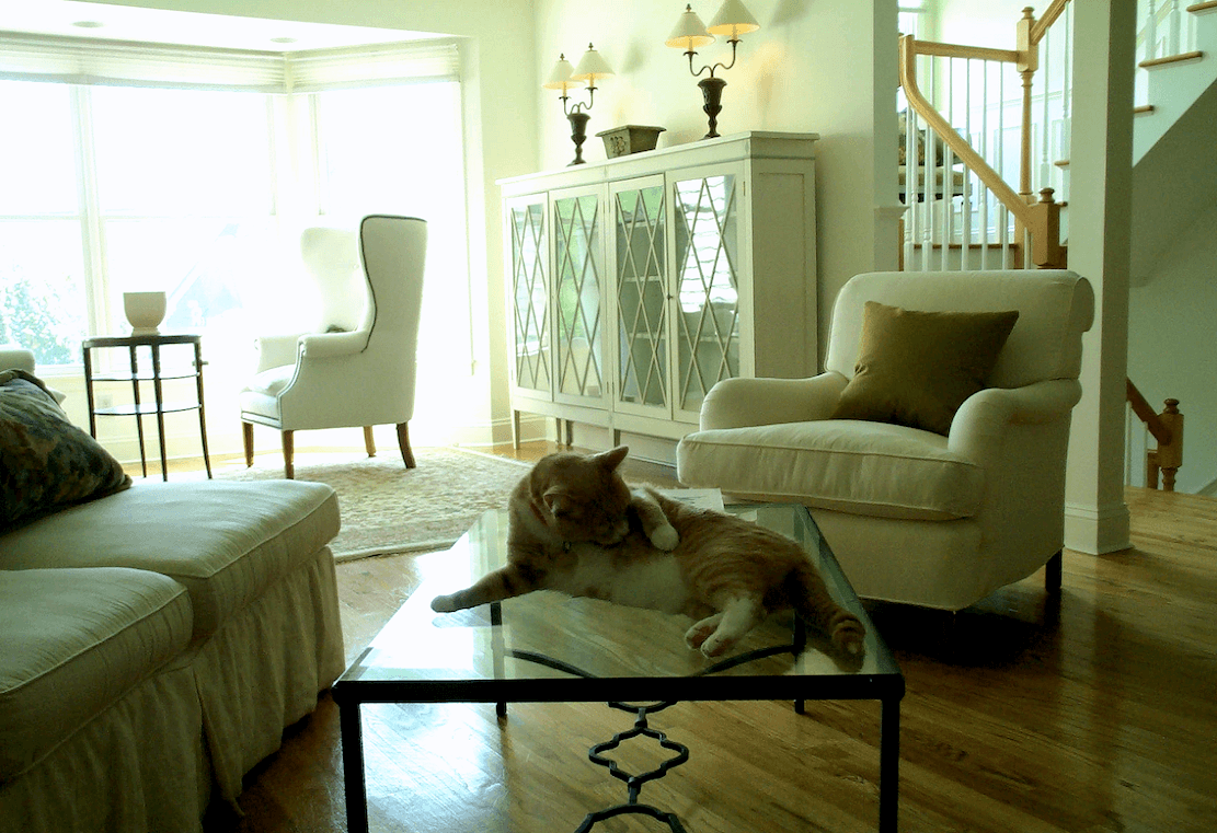
Here’s another photo from about 2002 with a young Peaches grooming himself on the coffee table.

I think there is more green out there than maybe a few years ago. I’m certainly seeing more green kitchens in recent years.


But, green, I think, is the easiest color to work with,, and here’s why.


Northeast United States satellite

Here is a satellite map via Google Maps of most of the Northeastern United States. And what do we see as the predominant color?


Of course! We have talked about green in numerous posts on this blog. I’ll post some of them in a bit.


However, despite what some may say, green and white is as classic as a golf ball in the grass. :]


green and white - ben-hershey-golf ball - grass-unsplash

photo: Ben Hershey via Unsplash


ralph lauren home British Colonial East Indies style with green and white wallpaper -High-Low Ralph Lauren

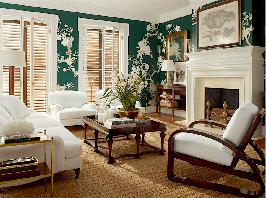
Or, this beautiful room by Ralph Lauren above, where I did a lower-cost version.


kips-bay-Mark D Sikes bedroom - Gracie wallpaper

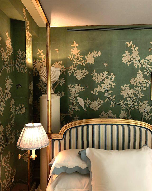
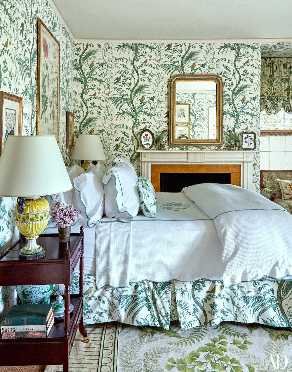
And, we looked at this exquisite bedroom by Mark D. Sikes. He is fond of mixing green with blue accents.


Mark D Sikes - greystone-show-house-2015/

Above and below, Mark D. Sikes from the Greystone Showhouse 2015. I adore his green and white rooms!


_Sikes_greystone_grand_hall

An overview of the entire entry by Mark D. Sikes


mark-sikes-gracie-wallpaper-chinoiserie-handpainted-celedon-majolica-antique-hutch-green and white rooms dining room

Above, a more recent dining room by Mark D. Sikes featuring another Gracie wallpaper in green and white. See the touches of blue and colors in the flowers? It’s the accents that make the room!


Serena and Lily Miramar Sofa -green silk draperies

Above is an older image from Serena and Lily. But, it’s one of my favorites with those wonderful green silk curtains.


Room flow - analogous blue and green - art walls Maura Endres - @m.o.endres on instagram

Maura Endres’ home is primarily green and white and has some blue accents. You can see more of Maura’s beautiful home here and here. And, please be sure to follow her on Instagram.


christian-lacroix-canopy-argent-wallpaper

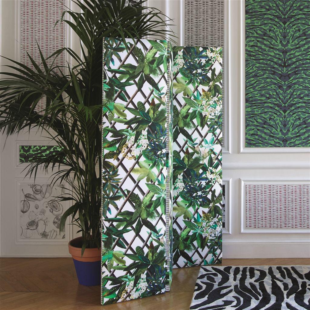
Christian Lacroix-Canopy Saphir Wallpaper is used to cover a screen. What a wonderful accent with this exquisite wallpaper.


christian-lacroix-canopy-saphir-wallpaper

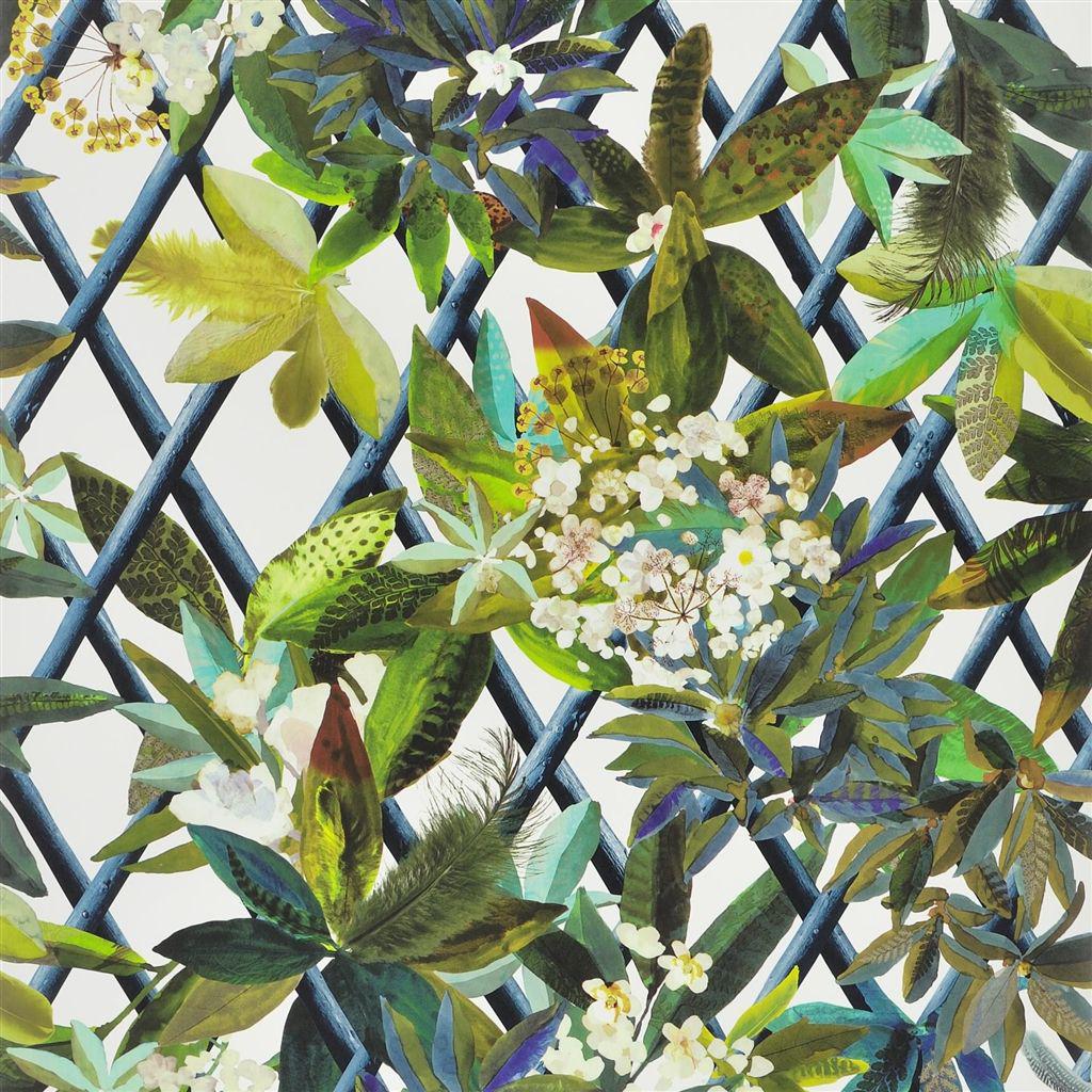
Above is another view of the Christian Lacroix wallpaper. It also comes in some other colorways andis available at Chairish. Did you know they don’t just have vintage pieces. A lot of their home furnishings are new.


Matt Briney via Unsplash - George Washington's green and white dining room Mount Vernon
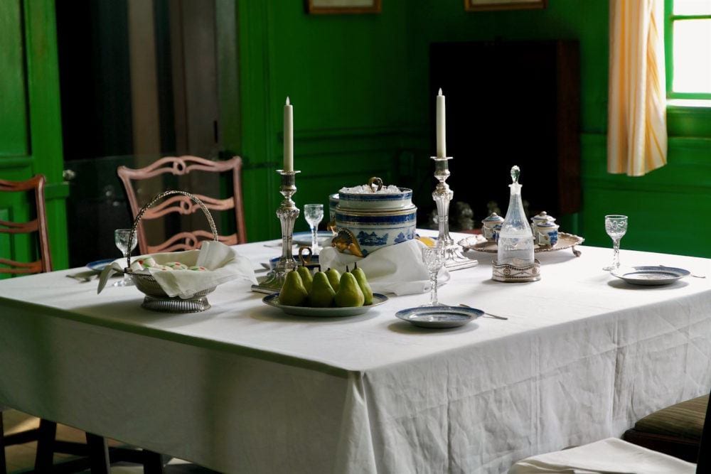
photo: Matt Briney via Unsplash


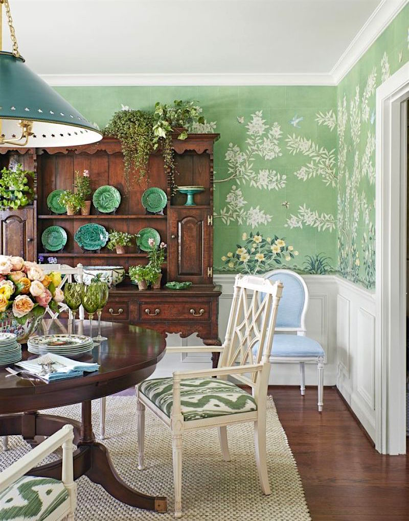
There are lots of ways to incorporate green in our rooms. Above is a saturated green in George Washington’s green and white dining room in Mount Vernon. That’s going pretty far back.

But, what is that schemata (Yiddish for rag) on the window?

I thought I would have a little fun. So, I went over to Lynn Chalk on Etsy and did a little photo editing on Picmonkey. Did you see the Picmonkey tutorial here?


Scalamandre - Ch'ien Dragon draperies - Lynn Chalk
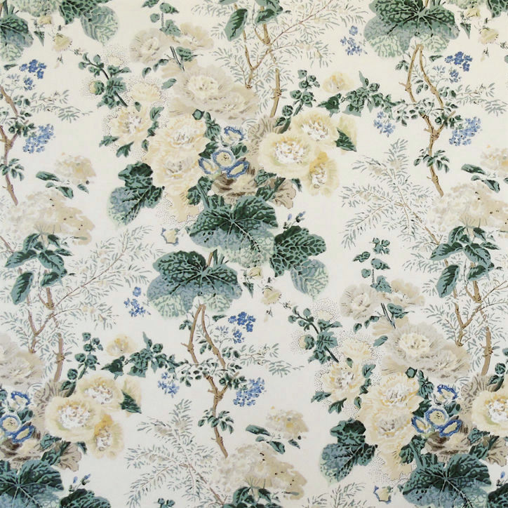
The first fabric is Scalamandre – Ch’ien Dragon draperies by Lynn Chalk.


scalamandre-chien-dragon-linen-print-jade-fabric

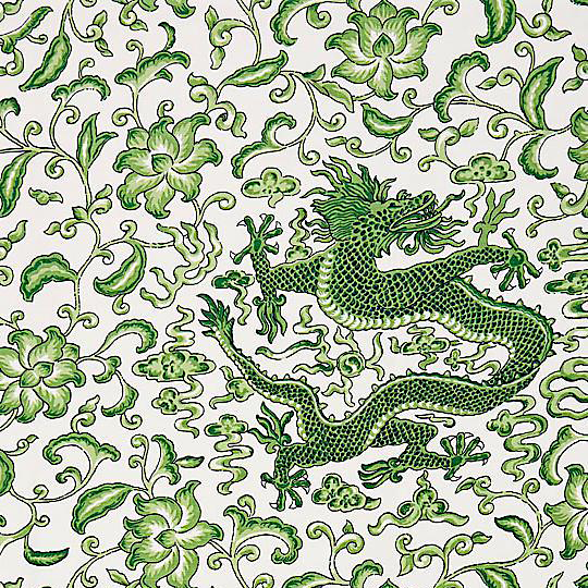
Scalamandre Chi’en Dragon currently on sale for a limited time.


Lynn Chalk drapes with greek key trim - green and white rooms photo-Matt Briney via Unsplash - George Washington's - green and white dining room Mount Vernon
Above is also lovely, I think.


Benjamin Moore Bunker Hill Green - green and white rooms

The wall color is fairly close to a Laurel Home paint and palette collection color Bunker Hill Green.


Of course, there are hundreds of options in terms of fabric for the curtains.


Sometimes when I’m looking for a fabric, I’ll go over to Decorator’s Best and punch in what I’m looking for.

If you’re looking for great wall colors, please check out this post featuring a variety of great shades of green.

This post features more muted greens that aren’t called green.

And, it’s easy being green (an ode to Kermit the Frog) is a post with lots of terrific green rooms.


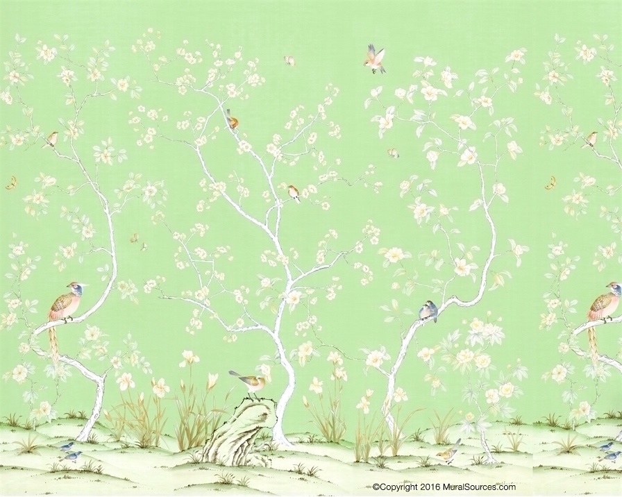
But, sticking with the walls, The Mural Source has gorgeous, more affordable green and white Chinoiserie murals.


mural sources green chinoiserie mural
This is one of my favorites – Above and below.


Mural Sources Green Chinoiserie mural-085-LV-1491

Not too long ago, there was this post about Chinoiserie decor.


green-dining-windsor-smith

One of my favorite green and white rooms is this beauty by Windsor Smith.


Windsor Smith dark green and white sunroom dining area

I adore the fabric on the chair is Dahlia by Clarence House. There is a pillow in the widget at the bottom of the post in the fabric.

Dahlia Hand Block GreenSometimes you can find cut yardage of this gorgeous fabric. Or, you can always ask Holly Rich of Stuck on Hue if she can get it for you. But, this one is a giga-bucks.


The wall color looks like Benjamin Moore Essex green.


Almost as dark is the Laurel Home collection green, Hunter Green.


Laurel Bern Interiors-bronxville-dining-room-buffet-mirror

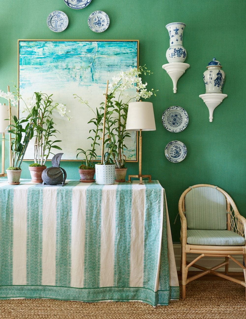
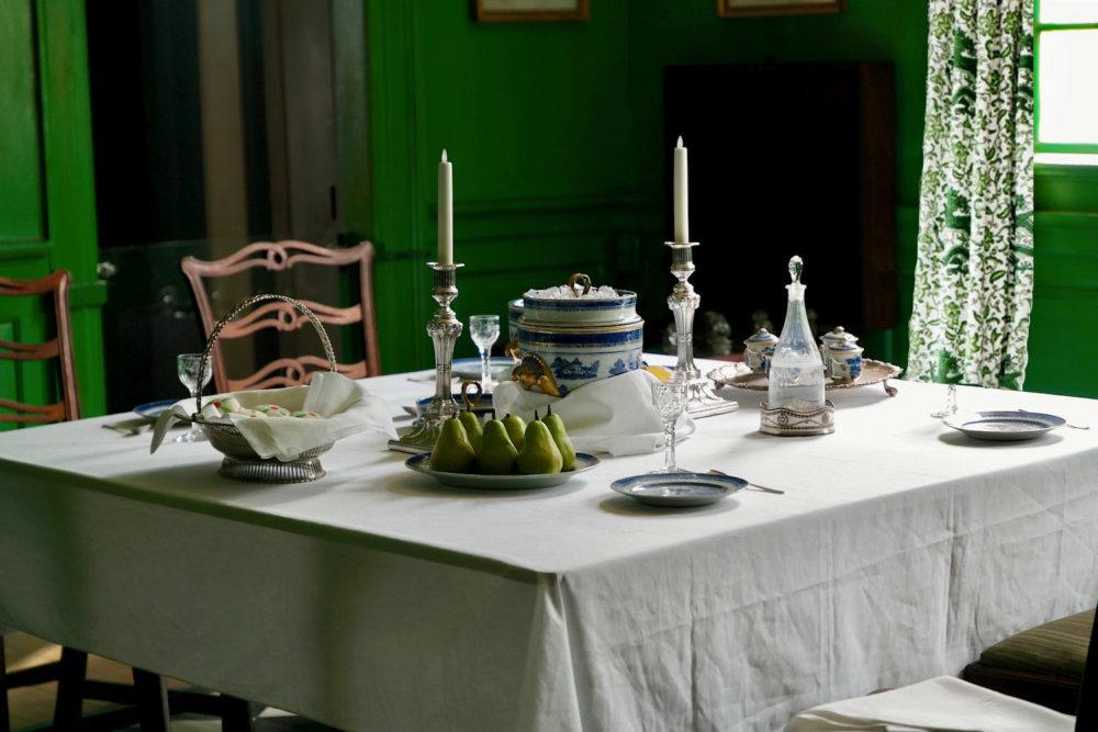
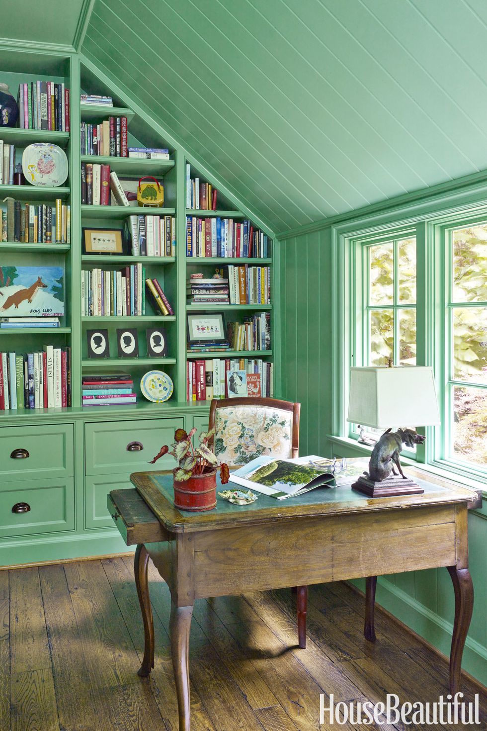
I often forget my own work. haha! Above and below is the oft-published green and white dining room I did in 2013.


 Laurel Bern Interiors Portfolio - green and white rooms

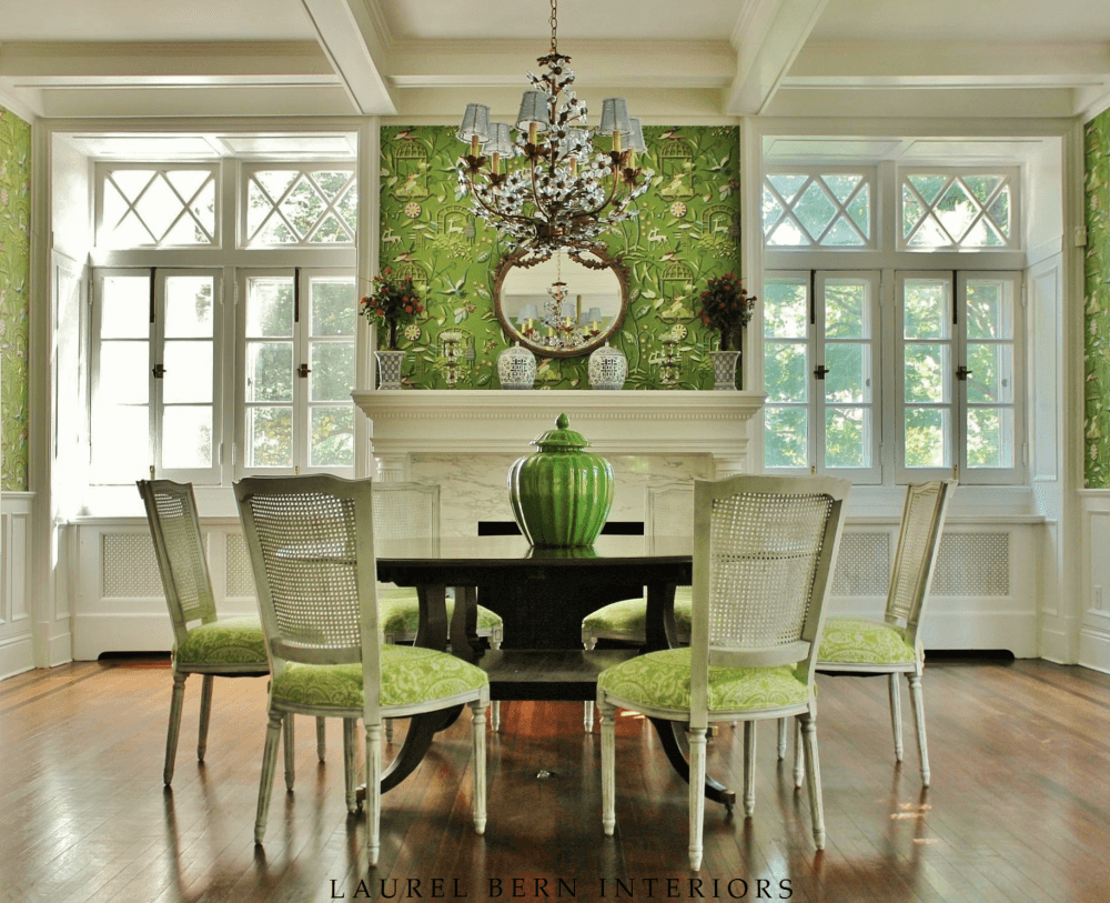
I was blessed with an architectural gem. It really is cheating.


Quadrille_Lyford_Trellis_Wallpaper_in_Bathroom_Sarah_Bartholomew

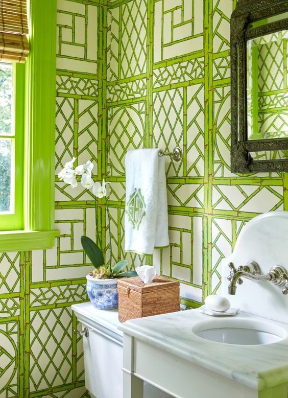
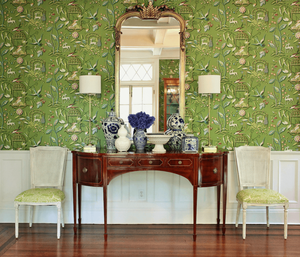
Quadrille Lyford Trellis Wallpaper in this Bathroom by Sarah Bartholomew


You might recall seeing this pattern in red and white in this gorgeous dining room.


coleson_botanical-botanica_topiary-topiarius - green and white rooms
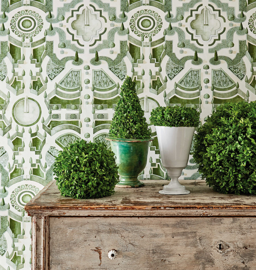
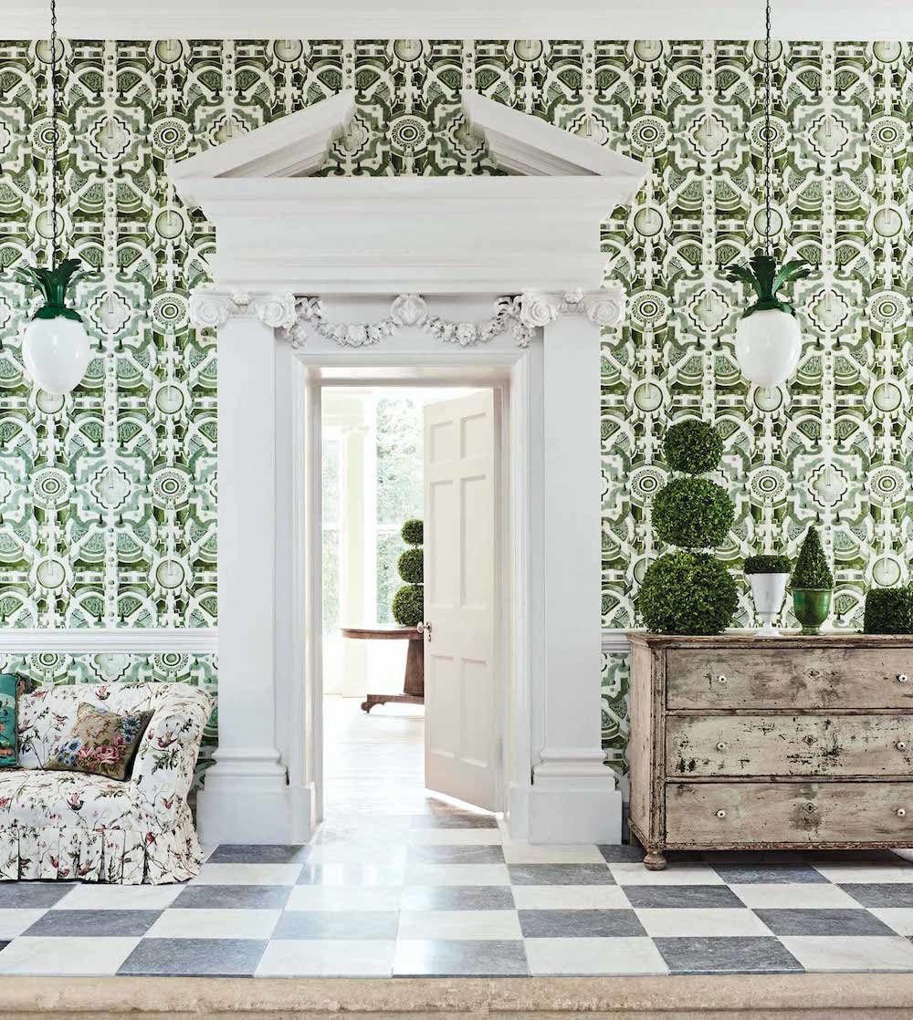
Above and below is a beautiful topiary design wallpaper by Cole and Sons


Cole and Son green and white wallpaper Topiary detail


bill-brockschmidt-courtney-coleman-study-photo - Peter Murdock - chair fabric - Lee Jofa Althea

A charming study by Bill Brockschmidt and Courtney Coleman – photo – Peter Murdock –

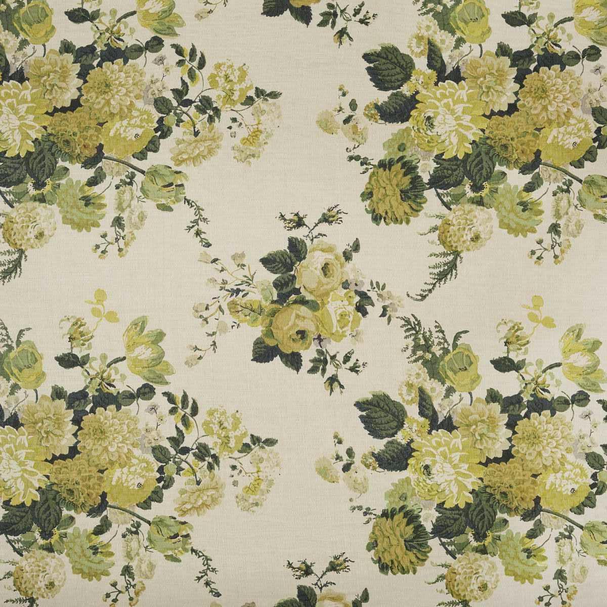
chair fabric – Lee Jofa Hollyhock


Althea-citron-Lee-Jofa-Mark D. Sikes fabric on chair

Actually, I think it is Lee Jofa’s Althea Citron. I get Hollyhock and Althea mixed up. They are very similar patterns and colorways.


Architectural Digest - Tory Burch Green and White bedroom - Brunschwig and Fils - Bird and Thistle

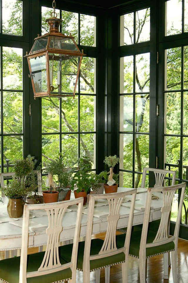
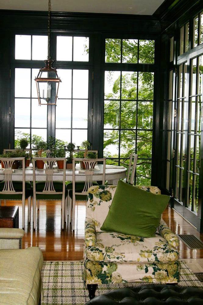
Architectural Digest – Tory Burch Green and White bedroom – Brunschwig and Fils – Bird and Thistle.

And, if you’d like to know how to get a sunroom like Tory’s, click here.

Some of you might recall that we did Bird and Thistle in the brown and cream colorway for draperies for this beautiful home.


Parting words:


When doing green and white rooms, I think it’s always good to add some accents of other colors. And, it’s also very beneficial to add black, and a little gold or brass. In addition, I always love to vary the shades of green. Finally, there’s almost always some brown because of the stained wood tones. In any case, adding some warmth is a good thing when doing green and white rooms.


I better answer the question in the title? ;]


Green and white rooms might be on trend. However, I don’t think they’ll ever be passé. Green and white rooms are an enduring classic, in my opinion.

Below is a widget for inspiration.


I added a few pieces that are not green or white, just to show some things that I think work well together. Of course, I wouldn’t put everything here in one room.

If you click on the individual images, it will take you directly to the source.


xo,


Please check out the newly updated HOT SALES!


20 Responses

  1. As the famous @ericrossinteriors says: look into nature and you see blues and greens – they always go so well together.

    God knows how to decorate. 🙂 He is the master planner. Take it from someone who knows. 🙂

  2. Green is a wonderful color but, as I’m sure you well know, a wallpaper or paint will cast a green tint on everything else in the room, including people. That’s one I’d think through carefully.

    1. Hi Lolly,

      Of course, one should always think through everything carefully.

      I worked in a decorating store for 4 years before starting my business. Everything was painted green, similar to Calke Green by Farrow & Ball. Everything, including the ceiling. We had clients in the store and selected our fabrics and finishes. There were also trees outside the store with green leaves. I don’t recall a green cast whatsoever. Gosh, that would’ve created all sorts of problems if it did. Actually, I loved being in there and as I recall, no one looked green with the exception of one pregnant client. ;]

      I’m not saying it never happens, but I’ve been in a number of green rooms over the years and I did not notice that the walls cast a green tint.

  3. Great post and it helps to confirm what I’ve done in my formal living room. I also bought through your Friday sales website a green velvet clover shaped ottoman at OKLA which will be delivered at the end of August. I’ve got a black grand piano in there which helps balance the color.

  4. We have a green dining room with soft golden walls and blue accents, mostly in the form of Asian blue and white ceramics. The greens are various, as you suggest. I love the room, and visitors do as well. We sit around the dining table with dinner guests for four to five hours—on very comfortable chairs, of course—eating, drinking, and conversing. I think that the color green contributes to civility.

  5. *sighs with happiness*

    Green and white is my favorite and that’s what my home is. But, Laurel, would you consider following this post up with one about sophisticated green and white print fabrics or furniture. I often see it on sofas and chair in magazines but don’t see it as an option at furniture manufacturers even S&&L or Lee. And while I love my two emerald velvet sofas I would like more upholstered pieces in prints. (Tone-on-tone works too.)

    Also, I am much more of an emerald fan than olive but I am mad for the wall color in this image: An overview of the entire entry by Mark D. Sikes. Do you know what it is?

  6. I obviously must like green and blue. As I have both going on in my home. I have a dark olive green velvet sofa and a side table painted in Annie Sloan’s Chateau Gray which is really a green. Green to me is nature and there for like plants more neutral.

  7. Hi Laurel,

    Alisa from A Glass of Bovino just finished a green nursery for the One Room Challenge. You need to check it out.

    She’s very talented.

  8. I’m more of a blue and white person than green but your examples are gorgeous. I do love my robot vacuums. I’ve got Blanche in the bedrooms, Dorothy on the main floor and when the basement is refinished, I’ll have Rose. They are just wonderful inventions.

  9. Oh Laurel, what a gorgeous post! The examples are some of my favorites! Melissa and I are doing a sunroom right now completely inspired by Windsor Smith’s room. I am sure photos will follow. The widgets are beautiful, too. Such great inspiration!!! XO

  10. I LOVE decorating with green. To me, green has always represented the color for life. I use a lot of black and white in my large upholstered pieces, but green is my accent color throughout. Every shade of green works with any other green. You see this in nature and it’s true for interior design. Unlike a number of shades of blue, greens are warm. Living in southwest Michigan, where I have cold and white outside my windows for many months…I need warmth and I get that with my warm greens.

  11. This post is gorgeous! Last year, I updated our master bedroom and incorporated more green tones. I love it so much! I’m getting inspired to find other areas of our home to add more green. I love pops of chartreuse also. You were the one who led me to that color 🙂 I can’t tell you how much your blog means to me. Thank you for sharing your talents with us!

  12. The more I’ve decorated my home, the more I’ve come to realize that green is my favorite color (although my husband says red because I wear that quite a bit). Speaking of my husband, I have a dilemma that I thought some others might have and could be a useful blog post. We live in a small bungalow with a Craftsman flavor. It’s not so strong that it couldn’t be changed to something similar, but the exposed rafters and hipped roof definitely give it that unique tang. We also live in the Northeast with long winters with this particular one delivering lots of snow and at least one incidence of an ice dam. Between that and the ridge vent blowing off the roof the Christmas before my husband is DONE with shingles and wants to put on a low maintenance metal roof. I’m fairly certain it’s not appropriate for this style of house and because the hipped style makes the roof half of what you see when you look at our home, it’s a big aesthetic consideration. Not to mention that standing seam is super popular with the modern farmhouse look that I am so not into. I’ve seen products that look like cedar shakes but those always look heavy and fake to me. I did find two images of metal hipped roofs that I liked but one was very rustic which is not my style and the other had dormers which I think was what I really like and ours does not. I just don’t want our house to look like it has a giant tin hat on so I guess I’m just wondering if you would consider a post on roofing materials? I hope you had a wonderful Memorial Day!

  13. I love your blog and my favorite mornings are when I can sit with my first cup ‘o joe and pour over a new post from you! Thank you for all the work you put into them!
    I know you can’t answer individual questions, but I wonder if you could incorporate this in a blog sometime:
    In this blog post on the color green, I see a lot of dining chairs painted white or cream, I guess to lighten the dining spaces and offset the use of a darker hue.
    I have a really lovely set of old Queen Anne style dining chairs that my Grandmother gave me on my 21st birthday, (many, many!) years ago. They have a beautiful patina. They also have beautiful dark old leather seats. I would not consider painting them, or replacing the leather, but I wouldn’t mind painting my table, which is not fine. Do you ever mix dark chairs with light painted tables in a space? They do look lovely when I use a light tablecloth, but I don’t want to leave that on all the time!
    Thank you!

  14. Great post, Laurel! I’m loving green and blue at the moment. My home is mostly blue with red accents, but I’m thinking of replacing the red with green. I’m about to get 2 green velvet Bergeres from my Mom’s house and I want to decorate my living room/office around them. Your photos are a great inspiration-thanks!

  15. Beautiful images and inspiration. I have always loved green and it’s the main color throughout my home; I’ve had a medium green velvet sofa for 10+ years now and am still not tired of it.

  16. Hey Laurel… I follow two blogs …. My first was (is) Joni at Cote de Texas. The other is yours. Thank you for all the information you provide. I look forward to each post.
    Glancing at your beautiful new home, I’m wondering if you ever considered hanging your stunning screen on the wall. It could be a knockout!!! So excited for your kitchen rehab!!!

Leave a Reply

Your email address will not be published. Required fields are marked *

This site uses Akismet to reduce spam. Learn how your comment data is processed.

Welcome To Laurel Home!

laurel-aarons-18th-e1456449963926

Hi, I’m Laurel, and Laurel Home is the website and blog for Laurel Bern Interiors.
I’ve been creating new-traditional interiors since 1988. The blog is where I share all.

New Edition, November 2022! Get The Indispensable Guide For 100s of Home Furnishings And Interior Design Sources That Everyone Is Raving About

laurels-rolodex-final-book-cover-master 9th edition 22-23

laurel home archives

Categories:

Please click the image below for more info about my rockin’ Interior Design Guides for 2023!

Laurel Home Interior Design Guides 2023
Amazon ad

please click below to check out my favorite decorating & design books

Laurel Bern's Favorite Interior Design and Decorating Books
Subscribe To The Laurel Home Blog And You Will Receive A FREE Guide Where I Share How To Get Your Paint Colors Right, The First Time.