Hehe… Let’s dish, about laminate Laurel. And who’s the old snob?
Uhhhhhhhh… the old snob is me.
Tomorrow, I will officially be old enough to collect social security.
Huh???
Not that I’m going to, because it’s a crappy deal, but the point is that I’m old enough. (and no, that is absolutely not a ploy to get more wonderful birthday wishes. Thank you so much !)
But back to the snobbery over laminate.
It’s not that I think that I’m above using laminate.
For years on end, I couldn’t afford as much as a scrap of it from the trash heap. So, I made do with the genuinely horrible laminate countertops our townhouse was born with.
Oh, and the laminate cabinets. With the hideous wood trim on the bottom.
Alas, it’s a snobbery born of ignorance, I’m afraid.
I never really looked into it– until recently.
However; I’m required to write about all of the sponsors of the Modenus KBIS Blog Tour— no matter what. They are not paying me, but the trip was 95% free which is awfully nice.
Mouldings- no problem. I’m a classical girl. And the unkitchen girl. Anyone who’s read this blog for at least a year knows that! And it’s not that I don’t also like some great classic contemporary designs, because I do.
But, in all honesty, the Wilsonart showroom at KBIS is a tough sell for me.
And here is why.
When I think back on it, all I see is–
gray.
and brown.
gray
and brown
gray
and brown
and…
And the lighting OY!!! We’ve been through this and I’m sure that it’s not Wilsonart’s fault. But the lighting at the Orange County Convention Center, in particular is a red-hot-poker-straight through the cornea into a migraine even if you never get migraines. But, unless the vendors work very hard, it is like that in a lot of the booths.
Here, I’ll show you.
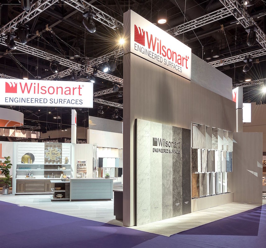
It’s those damned LED lights. I’m not a fan; not of these kind, anyway.
Still, I’m going away as stated in last Sunday’s post and with a deadline, looming, needed to suck it up and do the post.
And I know… the people at Wilsonart are probably having a massive stroke reading my review of their booth at KBIS. But if I’m not honest, you guys are going to see right through it and that’s no good.
But please don’t worry. I’ll stop complaining because while the booth sucks, the products, themselves, are an entirely different matter.
They don’t suck at all. In fact, if I thought that they did, I would’ve buried my obligatory mention inside another post and that would’ve been that.
But no. Wilsonart gets their very own post because the truth is, after hours of research, in the quiet solitude of my home, lying serenely on my Serena and Lily Harbour Cane bed, fan blowing softly (24-7), I’m truly convinced of Wilsonart’s awesomeness in their innovation and myriad of engineered surfaces that are as beautiful as they are practical!
So, let’s jump in because there’s a lot to cover. And I do hope for the rest of you hardened “surface snobs”, that you may never look at a laminate product in the same way again when I’m through with my coverage.
And, it’s vast. Too vast for me to go into great detail about everything. So, I am going to try to focus on the products that truly butter my biscuits. However, in every product line, there’s something that I love.
And that’s the point. There’s something for everyone.
First of all, if one thinks that all that Wilsonart makes is laminate counters, they would be mistaken.
Not only that, but they also have a beautiful line of quartz, cabinet doors, floors, and wall surfaces. And more!
They have hundreds of products and not everything is brown and gray. Far from it!
And did I mention the cabinet doors? You can reface that tired kitchen in one of their beautiful finishes.
Let’s begin with their little visualization tool.
Oh dear. Remember the last time we did that?
With the encaustic cement floors?
Well, this is the same idea only you can change the counters, cabinets, walls and floor.
Oh dear, is right!
How dare they have this insanely addictive gadget on their site??? ;]
Don’t they know that we have WORK to do?
People sometimes get the impression that I’m quite disciplined. Really?
Well, it’s time we set the record straight. I have absolutely NO discipline. I spent all day yesterday playing with this thing. All day! Okay, fine. This IS my work. But ALL DAY? And for about two hours today, too! That’s how much fun it is!
Each of the designs has a choice of cabinet, wall, counter and floor. In some cases, the wall is only a solid and in others, a choice of hundreds of patterns!
I want to share with you a few of the laminate and engineered surfaces designs I created and a couple of tips for using the visualizer.
But… before I do that…
Let’s take a look at some things I saw at the KBIS show.
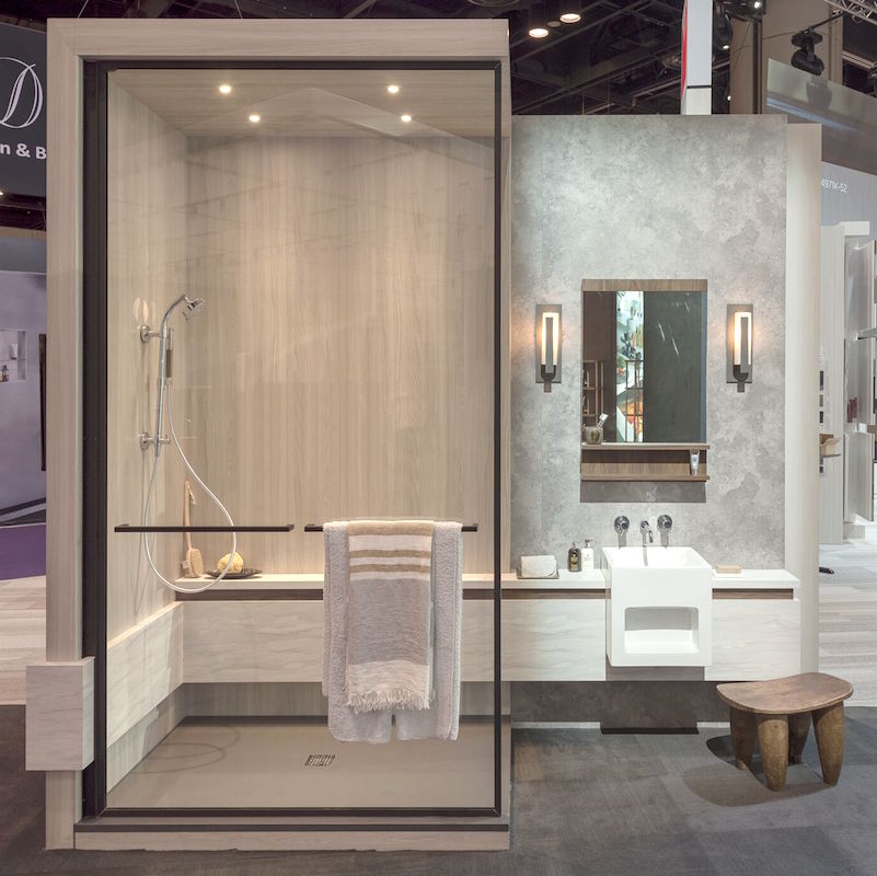
Hate scrubbing grout in your steam or regular shower?
We were just discussing this!
Well, Wilsonart purchased Wetwall; well, at least that’s what I read. So, what’s goin on here? The deal is that these are actually laminate panels that can be applied very easily in your shower or bath– Even over existing tile. How does that sound?
For more info, please read the image below. :]
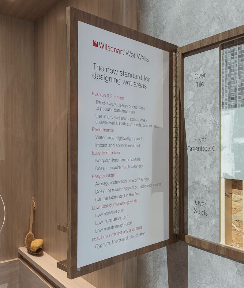 How many different designs are there for showers? I’m not sure, to tell the truth. Despite my best efforts, I could not find that info on their website. But that’s just how new this wonderful technology is.
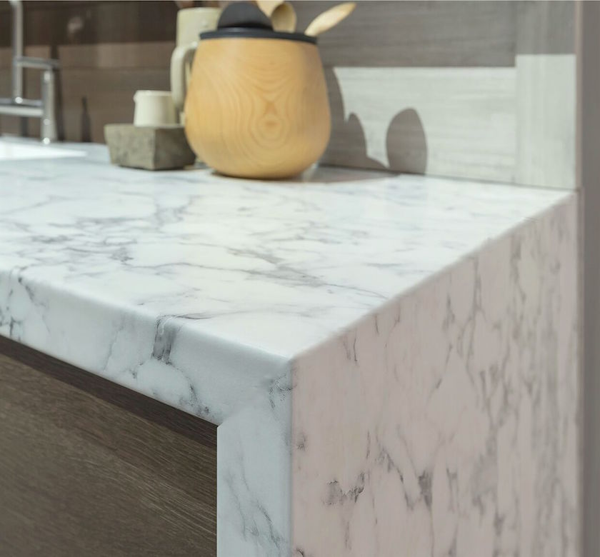 Here’s another one for you. I bet that you didn’t realize that Wilsonart carries natural stone, did you?
Well, you’re right. They don’t.
This my friends is LAMINATE.
Where’s the ugly black line, you ask?
I know! It’s too awesome for words! This is the new laminate. This is not your mother’s laminate. Or even *my* laminate since I’m probably old enough now to be your mother. Well, some of you! Tell, me that’s not cool. And BTW, just like natural stone, it is slightly cool to the touch and is as smooth as silk.
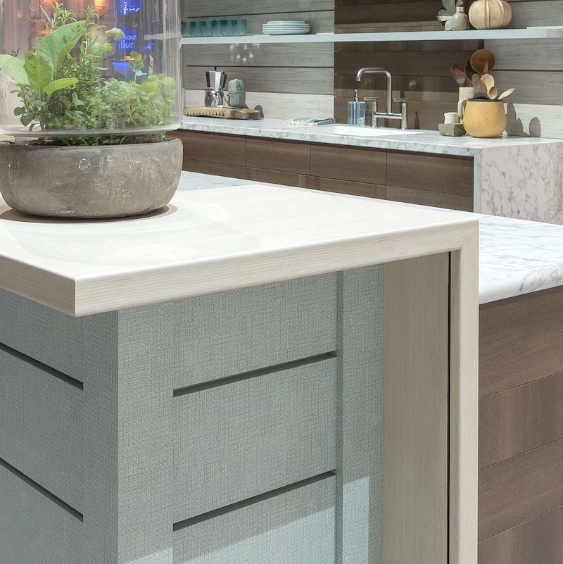 I love the textures on this contemporary island. Wilsonart makes laminates specifically for end pieces, like the sides of doors as well as big sheets.
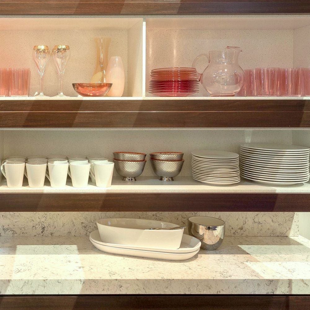
A laminate vignette for a pantry or bar area. Please note that I put this image into a heavy edit to warm up the lighting.
 And I love these doors that are new at Wilsonart. You can get either brand new doors or the parts to cover existing doors. I believe that this is the same material that is also available in sheets for ends, etc.
Oh, those shadows. See what I mean? Presentation is everything!
But they more than make up for it with their visualizer app. I probably created 50 different kitchens and baths. Hahaha!
sick.
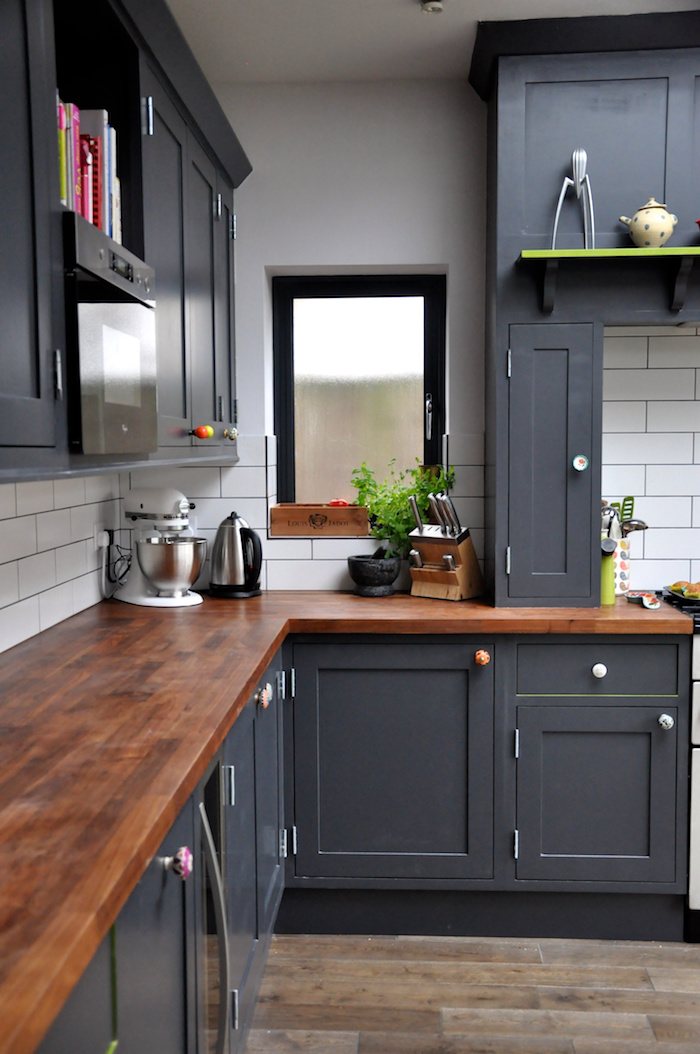
It’s difficult to find kitchens I like using their products, but this is one that looks like it could be from their products or very close. (Source unknown.)
Let’s take a look at the Wilsonart Visualization app and what it can do!
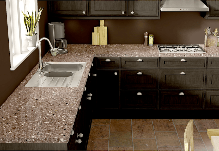
This is their kitchen. No comment ;] I guess we all know how I feel about granite by now.(even faux granite)
This is one of the rooms in the app where the wall can only be a plain color. And this is pretty darned good for a computer generated image. It’s a great app. Wait until you see!
Let’s take a look to see what can be done using only Wilsonart laminate and solid surface products. The rest of the images are my creation using their app.
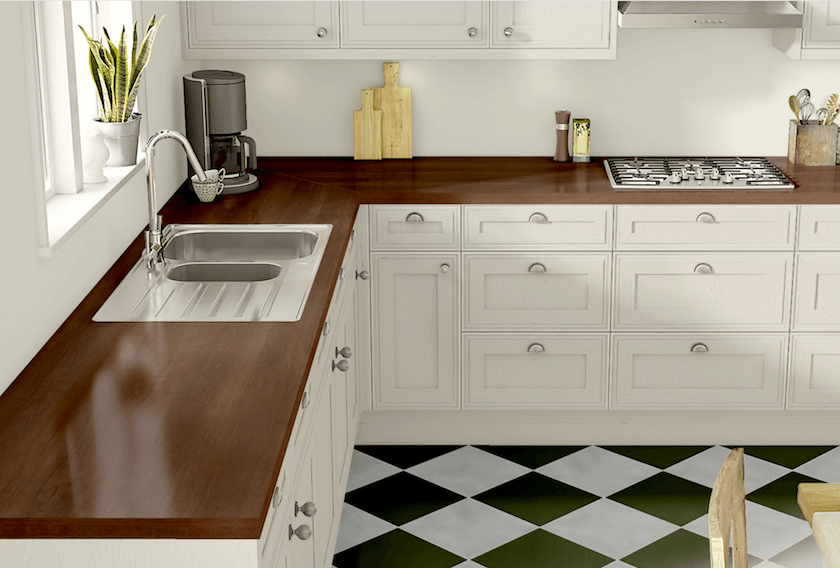
That’s better! Well, I think so.
There are different edges available for the counters, but I think that for all of these, I just used the plain square edge. I love the way the wood laminate warms up the room. And Wilsonart’s wood laminates are awesome!
Here are some images from last year and you can see some of the wood finishes. There are dozens from rustic to quite refined.
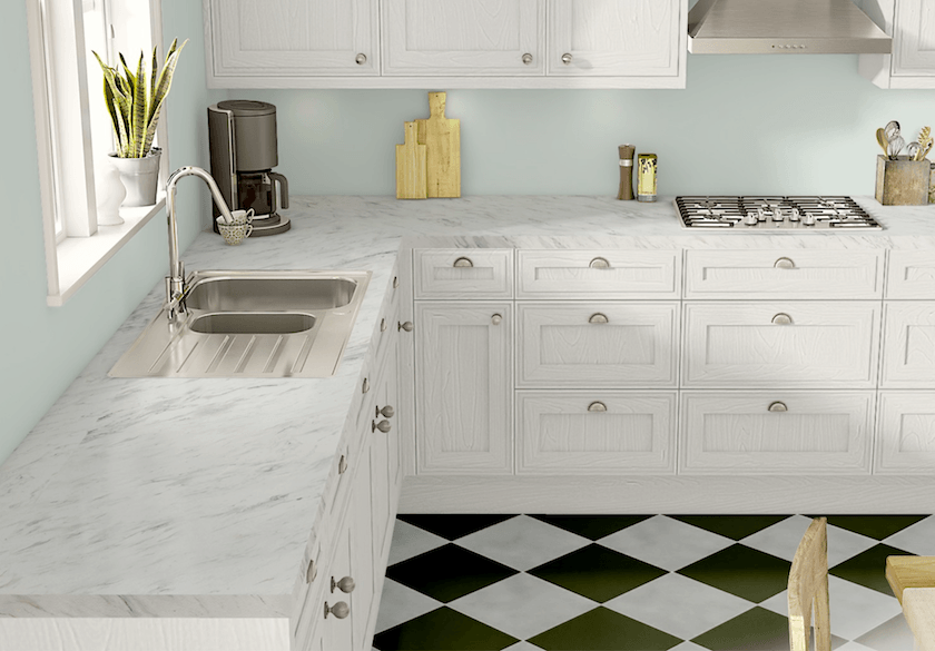
Okay, please forgive me, but there are only a few things that get my eyes all knotted up. I guess that we all have them. One of them is when people spell “mantel” (like fireplace mantel) as MANTLE. That is a different word. It is MANTEL. Thank you.
The other is when they mess up the name of this marble. “Calacatta” and they call it Calcutta, like it’s from India. It’s not. It’s Calacatta which is from one quarry in Italy.
That’s what they did here. There is no such marble as Calcutta. And I hope that doesn’t make me sound too much like a condescending fool, but my aim is solely to not perpetuate the inaccuracy.
Calacatta is a relatively rare marble and that makes it quite expensive.
The other thing is that this laminate is very pretty but it looks more like Carrara to me. But, no matter, I’m liking this kitchen too! Carrara is the first cousin to Calacatta. And to further confuse the issue, Wilsonart does have a pattern they call Calacatta which is quite gold. I will allow them this artistic license, however.
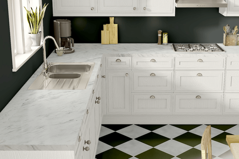
I think that it’s quite handsome with the loden green walls.
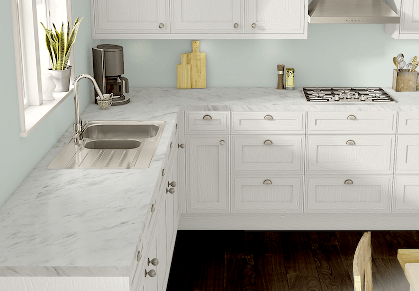
And I went back to the light blue-green and tried it with a wood laminate wood floor. This is going to be a tough decision! And even if you’re using a real hardwood floor, it’s terrific to be able to compare how it would look with other floor options.
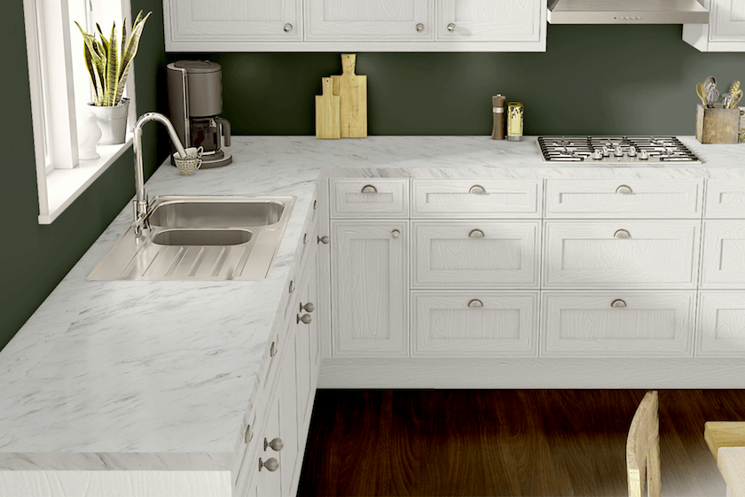
This one is nice, but not my favorite. Plus, we would most likely have a tile backsplash.
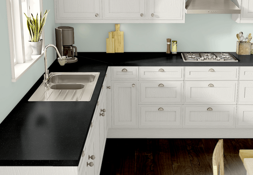
I thought it would fun to try a soft black countertop.
By the way, this countertop is a smudge resistant product.
Wilsonart Laminate Kitchen number two
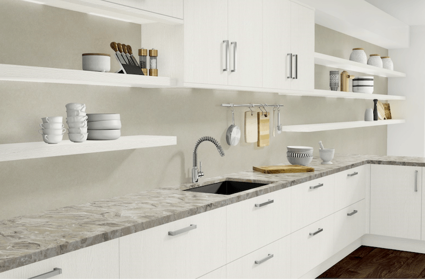
This is their version of the kitchen. And with this one, there is a huge choice for the backsplash material. Plus one can do two different materials for the upper and lower cabinets.
Too much fun!!!
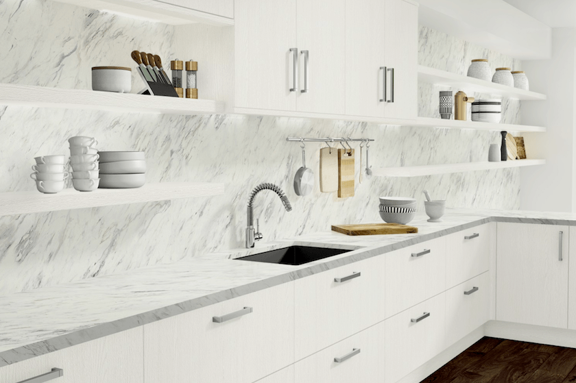
The first thing I did was change the counters and backsplash to the Calcutta. (Calacatta) :]
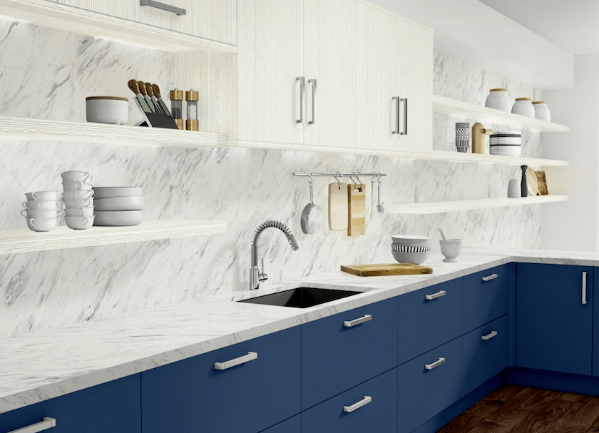
And then I messed around with a bunch of different variations on a theme.
I’m very much loving the lower blue cabinets.
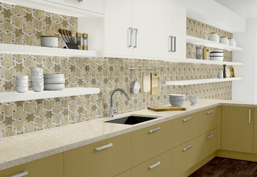
This is a surprisingly beautiful pattern for the backsplash.
I wish that they had done something in this for the show.
I guess what I’m saying is that I wish that at least one of their vignettes was more traditional.
But I do love these classic contemporary kitchens too.

The visualizer did not give an option to change the center cabinet to something different from the shelves. If so, it could be the same as the bottom and just have the shelves be wood.
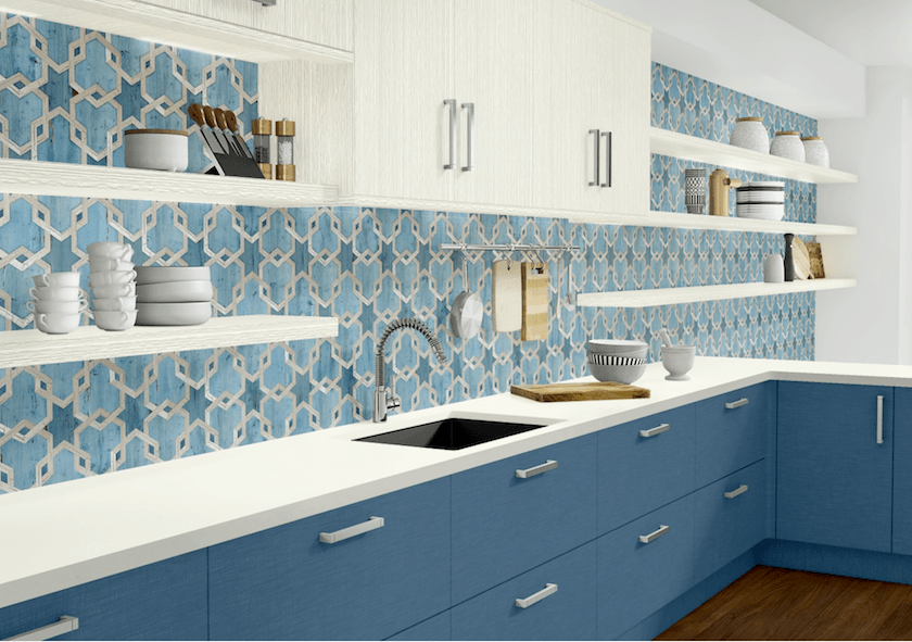
Blue and white looks fresh. I’m not sure if I would choose this one, however.
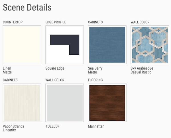
You can also save your products, (from the scene above) by clicking on the square icon at the top of your screen. (see below)
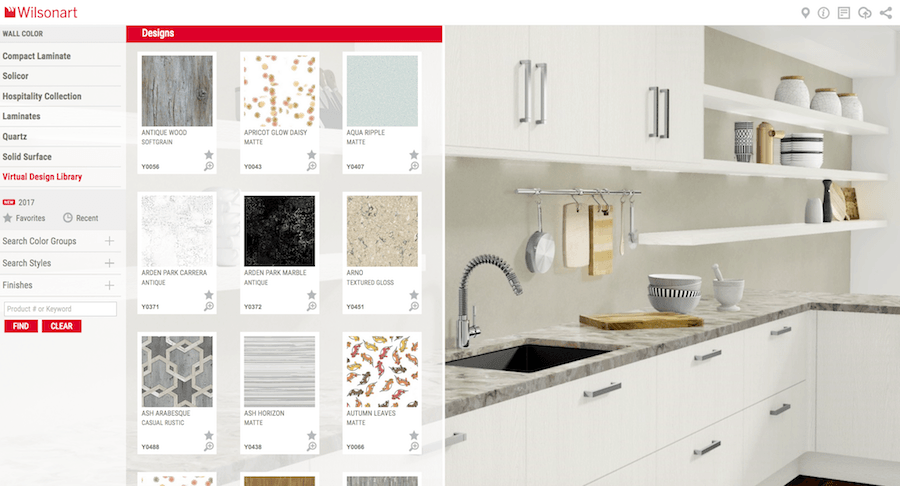
And on the left. You have to play with it. But to see more product, click on VIRTUAL DESIGN LIBRARY.
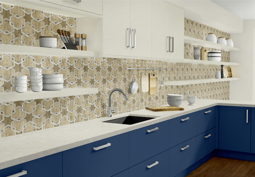
This one’s pretty interesting.
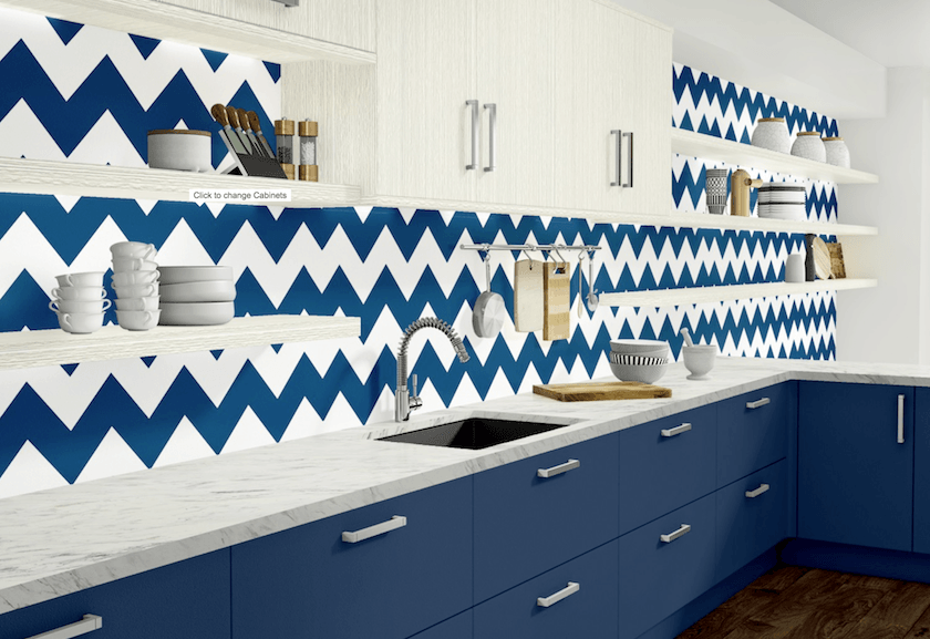
Isn’t it great that we can see mistakes made before we make them? lol
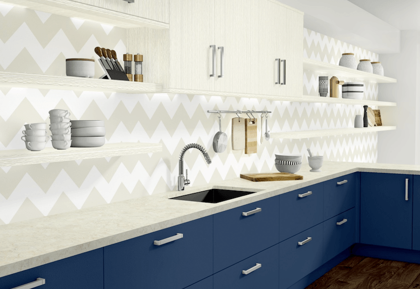
That’s better. But, I’m not so sure if I would do a chevron no matter.
We discussed this trend way back.
For more interior decorating trends you might regret click here
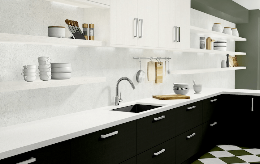
This is a sleek, contemporary look. It does look a little stark; however, it’s good to remember that the addition of a cool painting on the shelf or vase, trays, flowers, etc. can make all of the difference. And maybe I’d do the shelves in black.
And what about color?
Oh, Wilsonart has lots of colorful laminates! If you want color, you can have it!
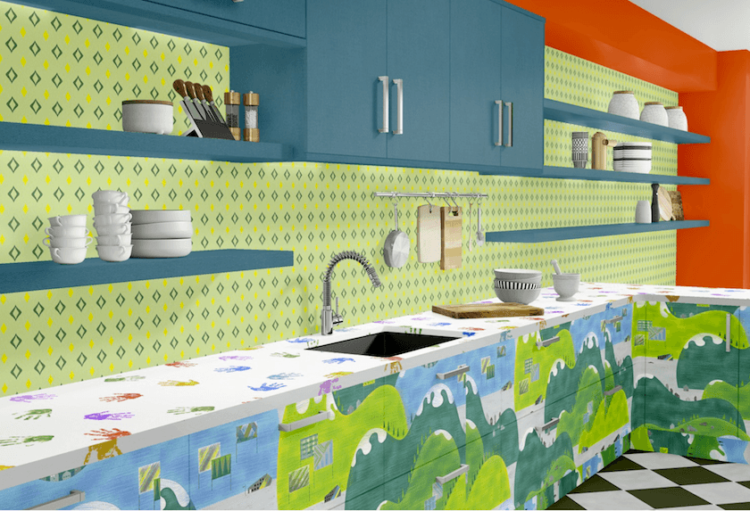
LOL. Got a little crazy here, but I think that this would be fun in a nursery school or daycare.
Oh another wonderful thing about this laminate from Wilsonart is that it has antibacterial properties, and is very easy to maintain.
Well, I hope that you enjoyed this view into the thousands of products available at Wilsonart!
Can you see yourself using laminate or any engineered products in your home?
Of course, I’m never going to say that this would replace natural stone. But natural stone is at least double the price and sometimes quadruple the price. And marble does have some disadvantages as well.
xo,

PS: Don’t forget to check out this week’s update hot sales!
Related Posts
 Freaking Out Over Your Kitchen Backsplash?
 The ONE White Trim Color That Works Every Time
 10 Common Interior Design Mistakes
 6 Serene Green Paints That Aren’t Called Green
 He Wants To Keep His Big Black Sofa, But I Hate It!
 The 10 Best Sofas | What you Need to Know Before Buying
 Breathtakingly Beautiful Classic Kitchens That Are Not White


