12 No-Fail Classic Kitchen Cabinet Colors

Hi Everyone,

Well, this post started as something else, and the other post is one I want to do. But, it’s relatively complex, so I’m starting with 12 No-fail, classic kitchen cabinet colors.

Truth be told, I am still plotzing over those two mother and daughter interior design teams we talked about on Sunday for the mother’s day post.

OH, many of you did not see something I added to the post on Sunday night. It’s really good. It’s SO good; I almost sent out another email. However, I figured it could wait.


Some of you may have read the post after I added what I discovered and know what I’m talking about.


It’s about that stunning crystal chandelier in the Jean Stoffer living room with the Anthro mirror and beautiful green velvet sofas. Please go and take a look. You’ll never guess where the chandelier is from. It’s fine. I have to start packing, anyway. (the reason for that is in the post too.)

Don’t worry. You won’t miss anything. ;]


Okay, great. Is everyone back?


It was worth it. Right? Alright, back to the topic at hand, which is 12 no-fail, classic kitchen cabinet colors.

Of course, any color can fail. In fact, here’s a post about a reader who’s “no-fail” paint color, failed.

However, these are all terrific colors. Still, please always test your colors before going ahead.


Like a lot of list posts, it’s challenging to come up with only 12 no-fail kitchen cabinet colors.


Gosh, I could easily come up with 12 whites and off-whites alone.

By the way, if you’re looking for a great white, here are the only six shades of white I’ve ever used.

The post says “trim” colors. But it applies to walls and all kinds of cabinetry.


Wait, Laurel? Haven’t you already written this post?


No, but I can see why you think so. The post I think you’re thinking of is this beautiful post about my favorite FARROW & BALL colors for the perfect English kitchen.

Before I get into the colors, I would like to share some info I’ve discovered over the years. Hopefully, it’ll be helpful for those of you who’ve never designed a kitchen.


Guys, you probably know by now that I always implore you to choose your colors in natural light.


Well, yes, you should still do that. However, the kitchen is the one room where the lights are almost always on. Therefore, you need to do both.

On top of it, you’ll most likely have some kind of overhead lights. They can do some interesting (aka: weird) things to the cabinet colors. And, wall colors too, of course.


The other phenomenon I have discovered is that the upper cabinets almost always appear to be a darker shade than the lower cabinets.


This play of light is true, especially with the island.

One reason for this is that colors usually look lighter higher up on the wall.

But, another reason is that the closer a color is to the wall, the darker it will appear; maybe not all of the time, but usually. However, that is why you must look at your wall color choices with the color FLAT AGAINST the wall. The worst thing you can do is look straight down at a color. I know. We all do this. But, that’s not the color.


Of course, some of this depends on window configurations, etc.


But, in general, if you paint everything one color, the upper cabinets will appear to be one shade, the bottom cabinets which stick out another foot, a little lighter. And, the island will be even lighter.

I bet no one ever told you that before. I may have mentioned it here, one time.

In any case, I would say that 100% of the time. Okay, 99% of the time, we paint the island a different color. Or, sometimes, it’s a stained wood finish. But, no matter what could end up looking lighter.


Okay, time to get into the 12 no-fail kitchen cabinet colors.


Most of these colors were inspired by Jean Stoffer’s cabinet colors. Please go and check them out. I would love for her to design my kitchen!

Oh, this is also very important. In most of these cases, I have NO IDEA WHAT THE COLOR ACTUALLY IS. In the case of the Stoffer cabinetry, they might be completely custom colors.

For consistency, I am using all Benjamin Moore colors. I am NOT being sponsored in any way. But, that’s another story.
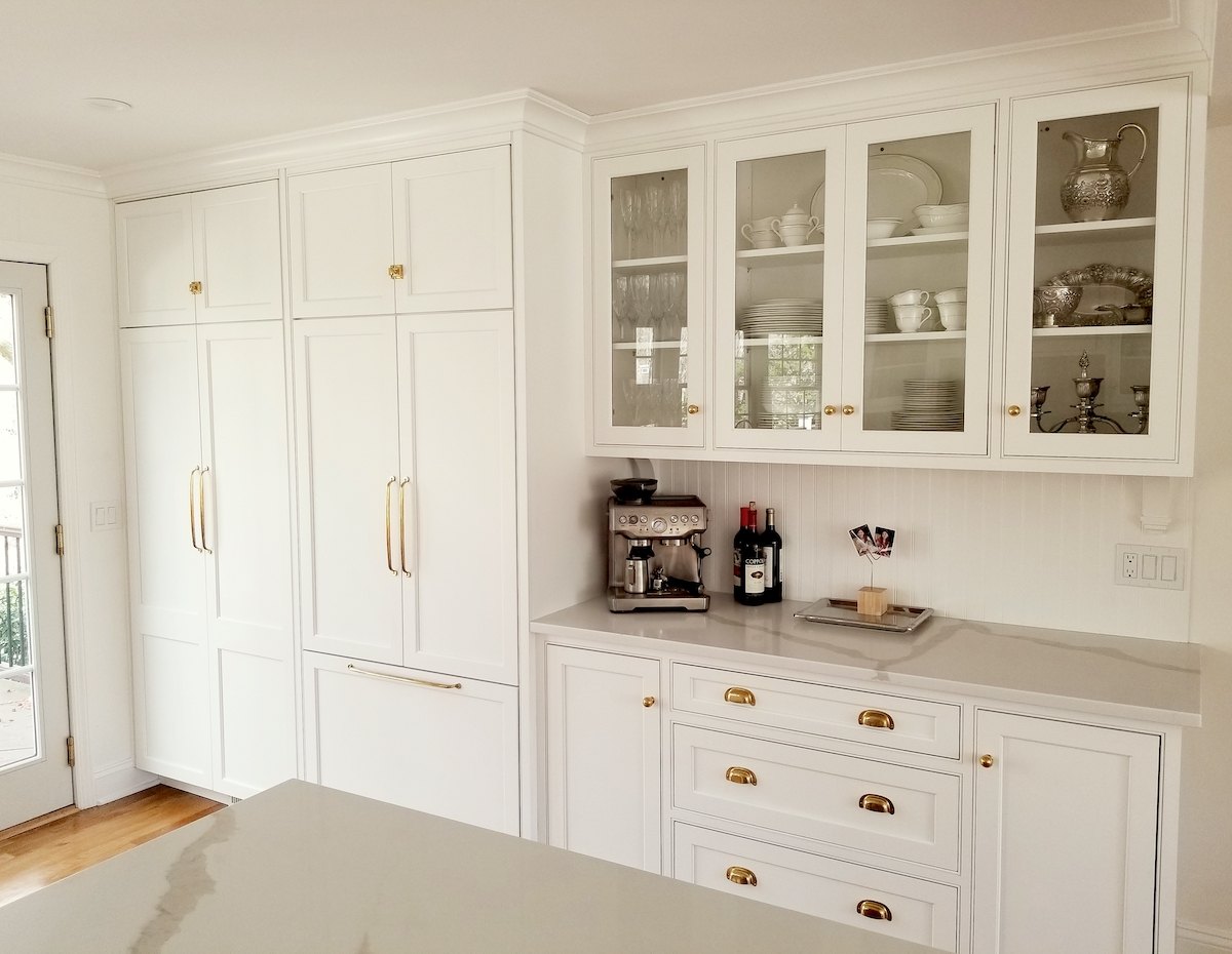
 

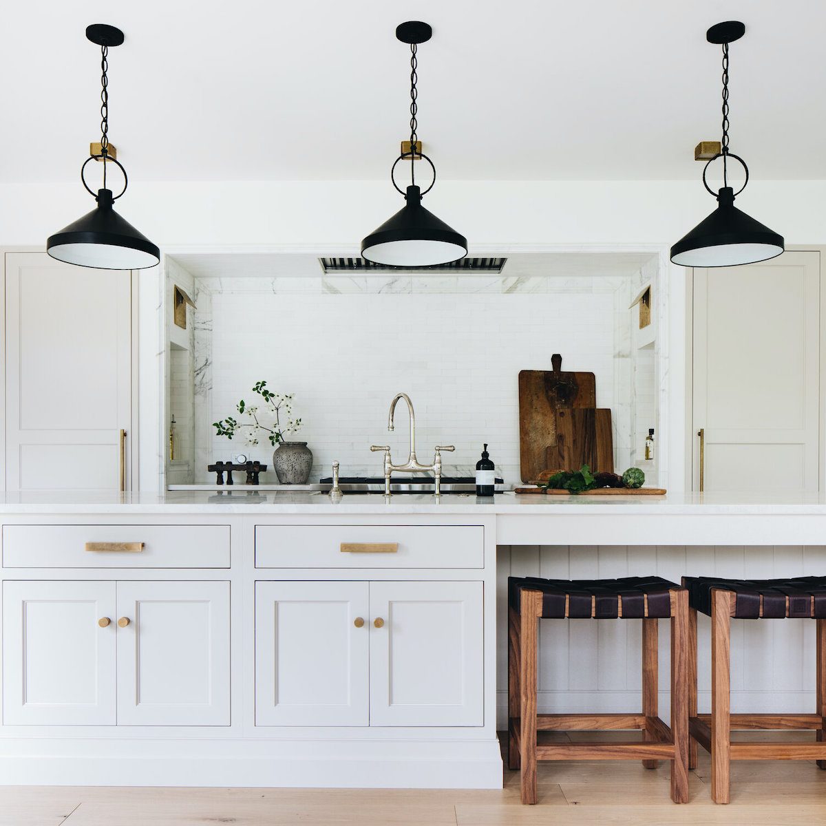
Virtual Kitchen Design - Benjamin Moore - Simply White - custom kitchen cabinets - Hardware - Rejuvenation -- no-fail kitchen cabinet colors

Kitchen by me and photo by Mrs. F.

SIMPLY WHITE oc-117

simply white oc 117
I know that you’re wondering why I chose Simply White. Why not Cotton Balls or White Dove? Sure, and then you would’ve asked, Why not Simply White? I can only choose one. They are all terrific whites. And, there is not a lot of difference between them. I discuss this in the Laurel Home Paint and Palette Collection at length. (oh my! It’s the 4th anniversary!)


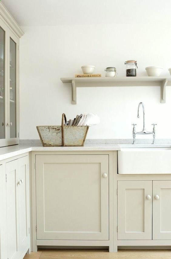
farrow and ball shaded white - mushroom devol kitchen - no-fail kitchen cabinet colors - benjamin Moore halo

from DeVOL Kitchens

HALO oc-46

Benjamin Moore Halo oc-46


Jean Stoffer - Benjamin Moore Cement Gray Ada Modern Classic - no-fail kitchen cabinet colors

Jean Stoffer Design from her Ada Modern Project

CEMENT GRAY 2112-60

cement gray 2112-60


This is a terrific example of how one color looks different all over the place.


Again, this is why when you kind folks ask me, “What is that color?” I’m only guessing. And, it doesn’t matter a whole lot. You just need to match what you see and do your samples until what you see in your home is what you want to see. haha
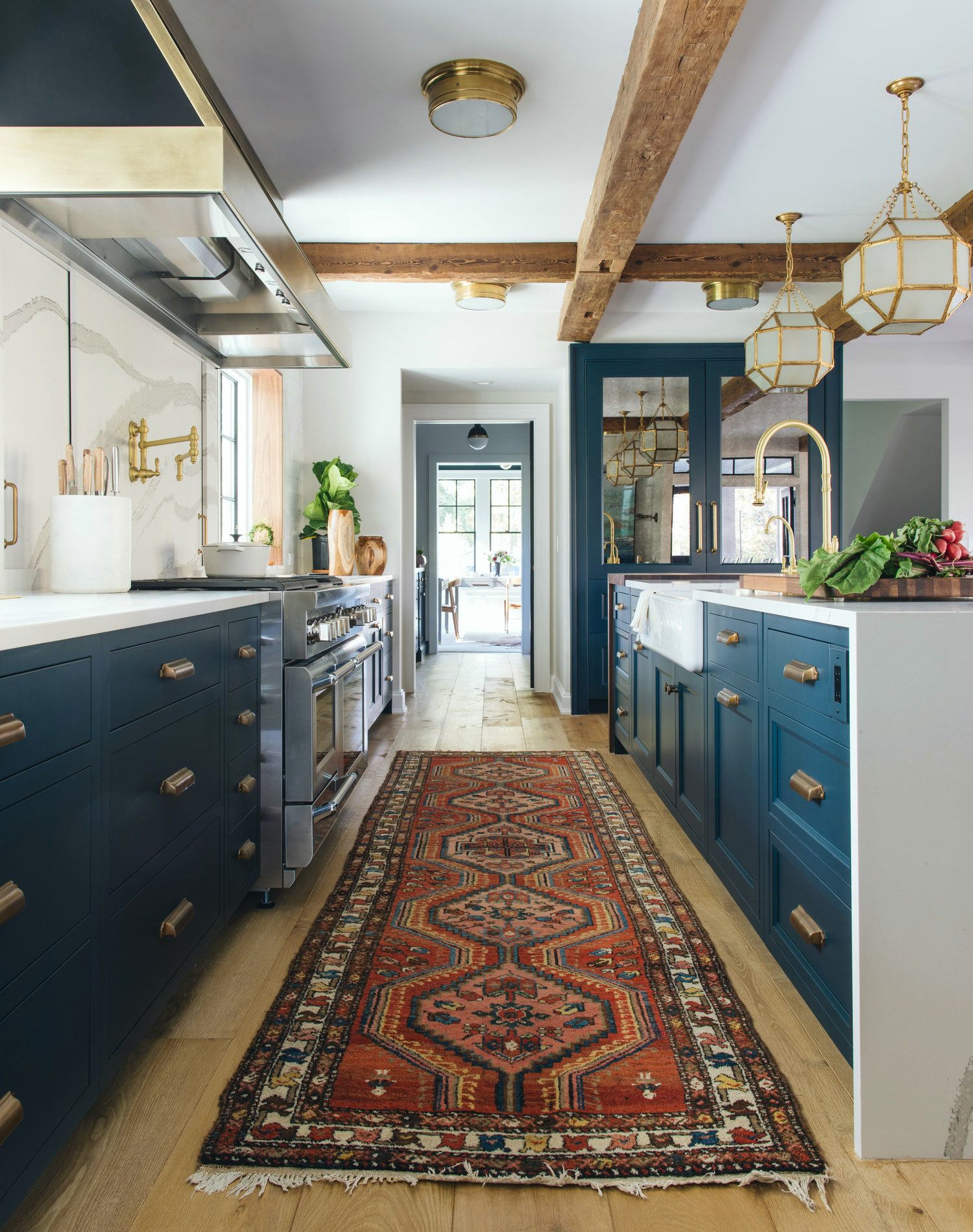
 

Jean Stoffer Design - mother-daughter interior designers+Lakeside exquisite kitchen design - no-fail kitchen cabinet colors

Jean Stoffer Designs – Lakeside home

Benjamin Moore gentleman's gray 2062-20

GENTLEMAN’S GRAY 2062-20

This is one of my favorite shades of navy.
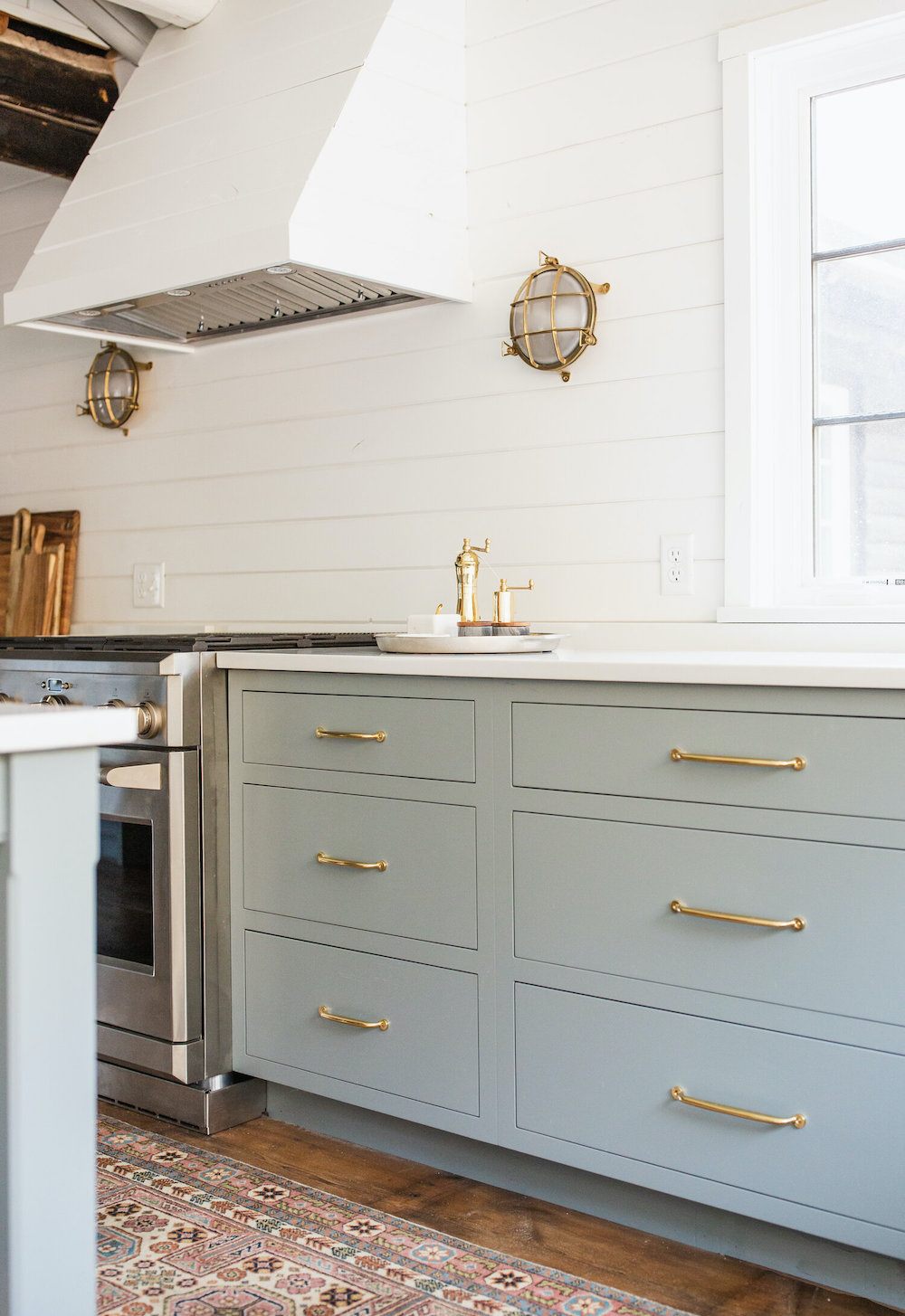
 

jenna borst photography-Jean Stoffer Design Benjamin Moore Gibralter Cliffs

Jenna Borst photography-Jean Stoffer Design Benjamin Moore Gibraltar Cliffs 1587
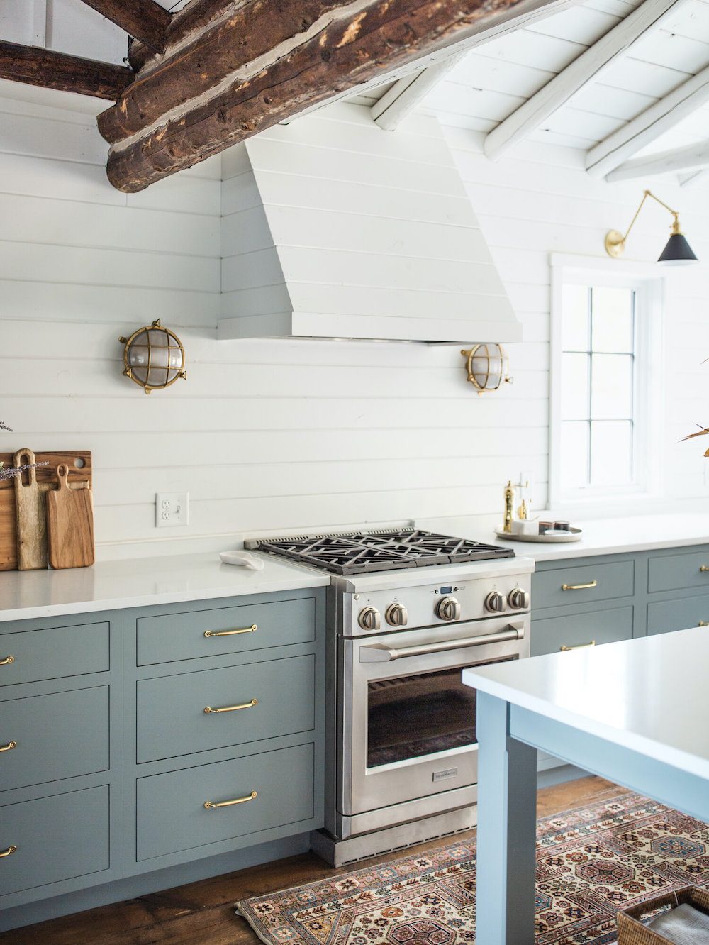
 

Jean Stoffer Design | Torch Lake Cabin Gibralter Cliffs 1587 - no-fail kitchen cabinet colors

From Stoffer Designs wonderful log cabin home project we shared last week.

Benjamin Moore Gibraltar cliffs - 1587 lighter blue kitchen

GIBRALTAR CLIFFS 1587

Here, is another example of how one color can look quite different depending on the location and lighting.
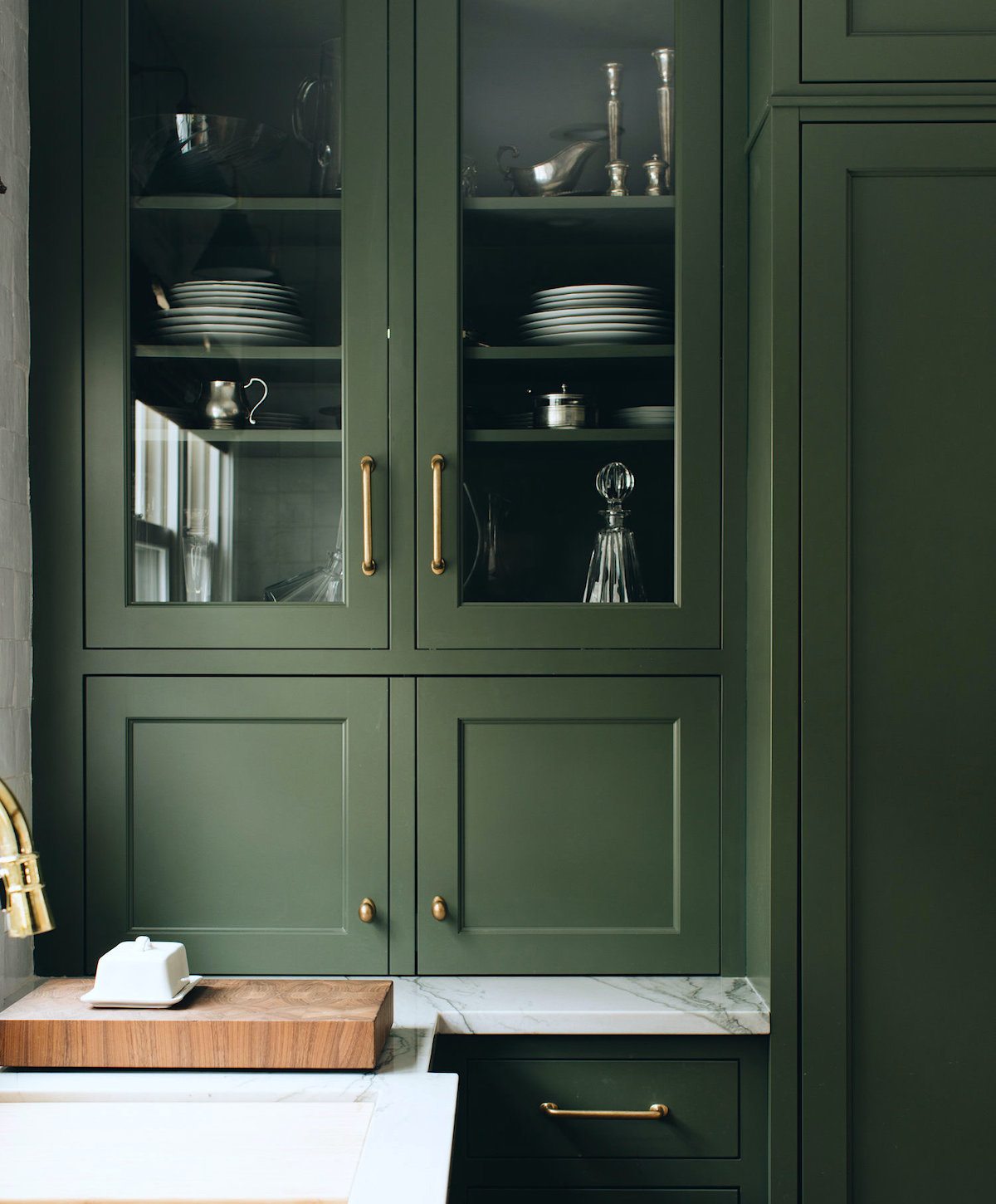
 

Jean Stoffer Design - mother-daughter interior designers+Fair Oaks kitchen detail - no-fail kitchen cabinet colors


Chimichurri CSP-810 green kitchen

CHIMICHURRI csp-810

This is from the Color Stories fan deck.
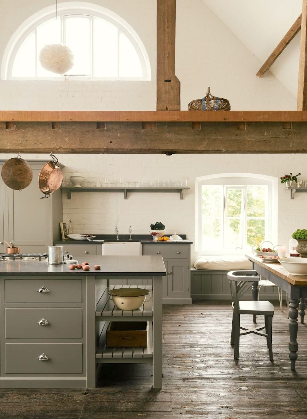
 

DeVOL kitchen looks like Benjamin Moore Copely Gray hc-104 - no-fail kitchen cabinet colors

DeVOL Kitchens

COPELY GRAY hc-104

copely gray HC-104

Love this hunky, warm neutral shade
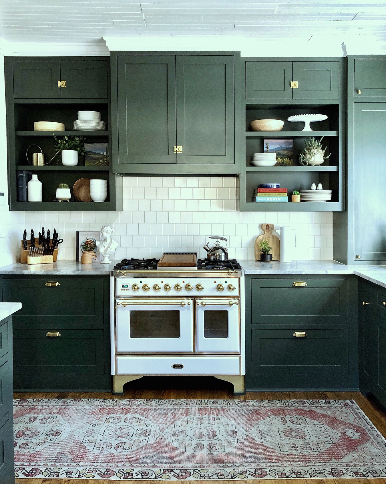
 

No-fail kitchen cabinet colors - Fairmont historic district kitchen - urbanology designs - no-fail kitchen cabinet colors

Urbanology Designs


SALAMANDER 2050-10


Benjamin Moore Salamander 2050-10

What a fabulous kitchen! The photo seems a little cloudy, in the center, but you get the idea.


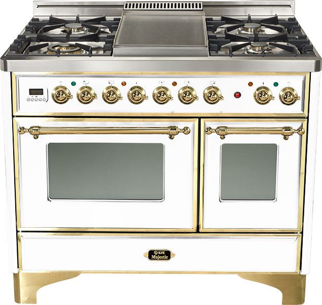
Ilve Majestic 40" range

How about that gorgeous Ilve Majestic 40″ range. You can get it here.
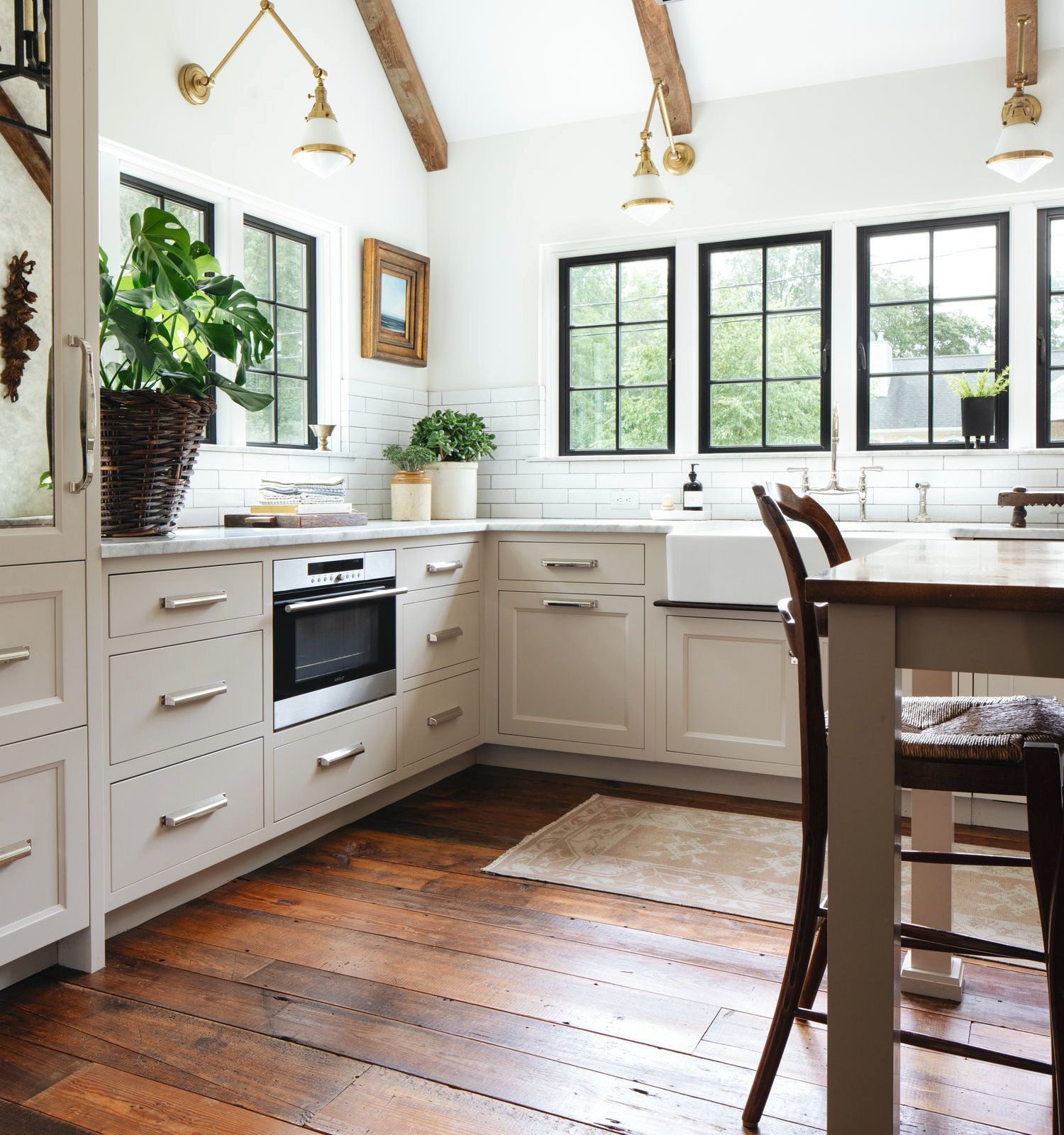
 

Jean Stoffer Design - mother-daughter interior designers - charming kitchen - English Cottage - no-fail kitchen cabinet colors

Jean Stoffer Designs from her English Cottage project.

SHALE 861

Benjamin Moore shale 861 beige kitchen
Shale is a warm greige. It’s not quite beige or gray. In some lights, it might have a very slight lavender undertone, but it’s very pretty. If you like these warm grays and greiges, you might enjoy this post featuring several of my favorite shades of warm gray.
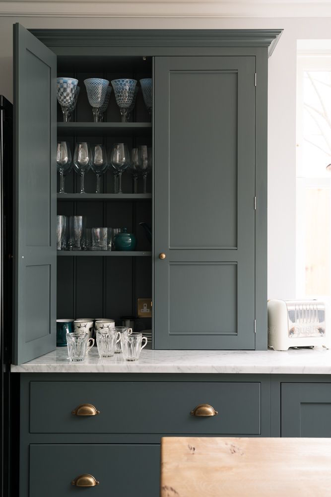
 

Farrow and Ball down pipe - Farrow and Ball classic English - no-fail kitchen cabinet colors - Newburg Green

NEWBURG GREEN hc-158

newburg green hc-158
This looks very dark on the chip and is very close to its sister Narragansett Green hc-157. However, these very dark colors look lighter when up, for some reason.
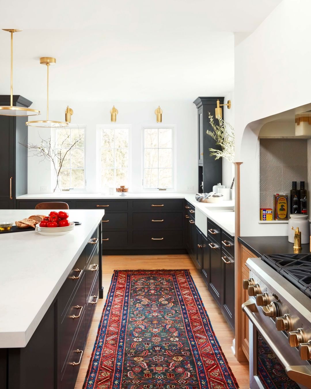
 

Jean Stoffer Design - Benjamin Moore Black Beauty - no-fail kitchen cabinet colors


black beauty 2128-10

BLACK BEAUTY 2128-10

Like most of these, I have no idea what black it is. I chose Black Beauty this time as it is a soft and rich shade of black.
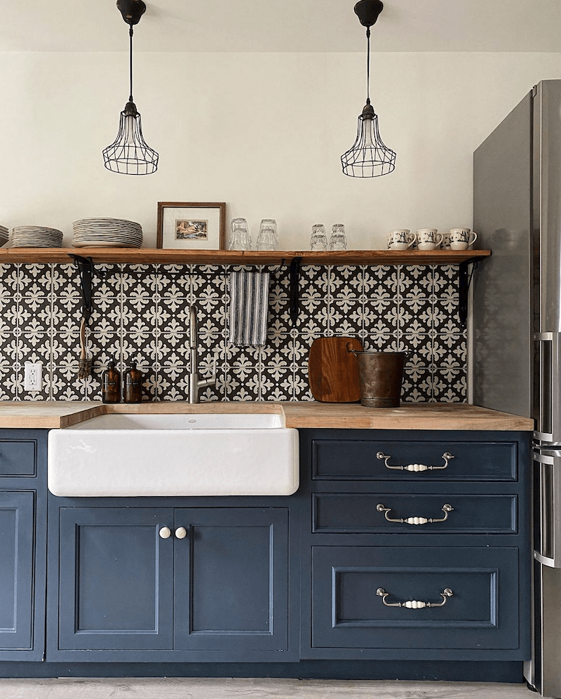
 

Jean Stoffer Guest house - no fail kitchen cabinet colors

From Jean Stoffer’s guest house that I swiped from her gorgeous insta account. Really? Can I invite myself? I won’t be any trouble. I’ll social distance. No one will even know I’m there.
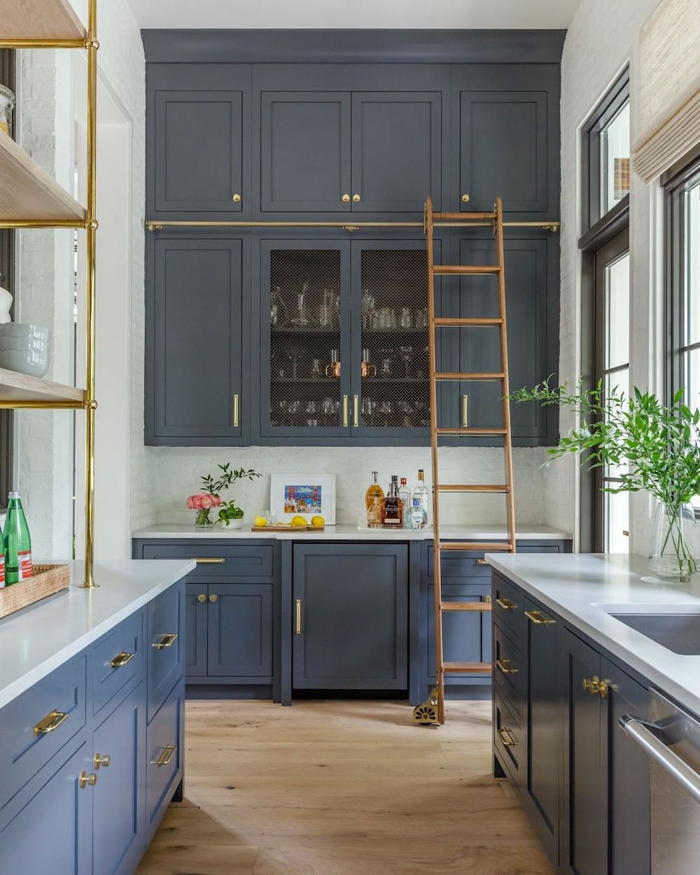
 

no-fail kitchen cabinet colors Benjamin Moore Wescott Navy @kiplinghouseinteriors @housebeautiful! photo @jessiepreza

@kiplinghouseinteriors@housebeautiful  *  photo @jessiepreza

WESTCOTT NAVY 1624

Wescott navy 1624


It looks more charcoal here than blue.


However, this one is said to be Westcott Navy. But, see how the color in the photo is all over the lot depending on the lighting and position? And, it’s true, it’s a grayer navy than say Hale Navy. Why didn’t I select Hale Navy? I could have. It’s an excellent color for cabinetry, as well.


hale navy hc 154HALE NAVY hc-154

Of course, as I said, I could’ve kept going. But, hopefully, this gave you some good ideas.


By the way, if you feel like it, please let me know your favorite of these 12 no-fail kitchen cabinet colors. (or, just the kitchen)


Or, you can list your top three. There’s a reason for this, but I can’t tell you what it is. I don’t want to spoil the surprise.
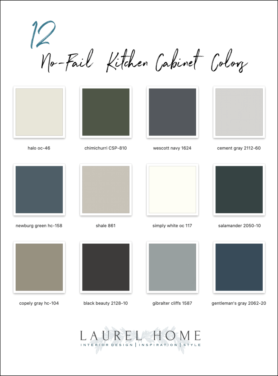
 

12 no-fail kitchen cabinet colors

***please pin to Pinterest for reference***


Oh! I almost forgot, but awww…


Some of you were curious about Joe, my half-dead plant. I did take a pic of him in his little window in my living room, just after sunset this evening. Actually, I think he’s doing better. He doesn’t look half-dead; maybe 1/8th dead. lol

(note: Wed. morning) For those who are saying that Joe needs a larger pot, I’m sure that’s true. However, this IS the larger pot. The one he came in was no larger than a pint of ice cream. I’m just not sure if I should transplant him while we’re away.
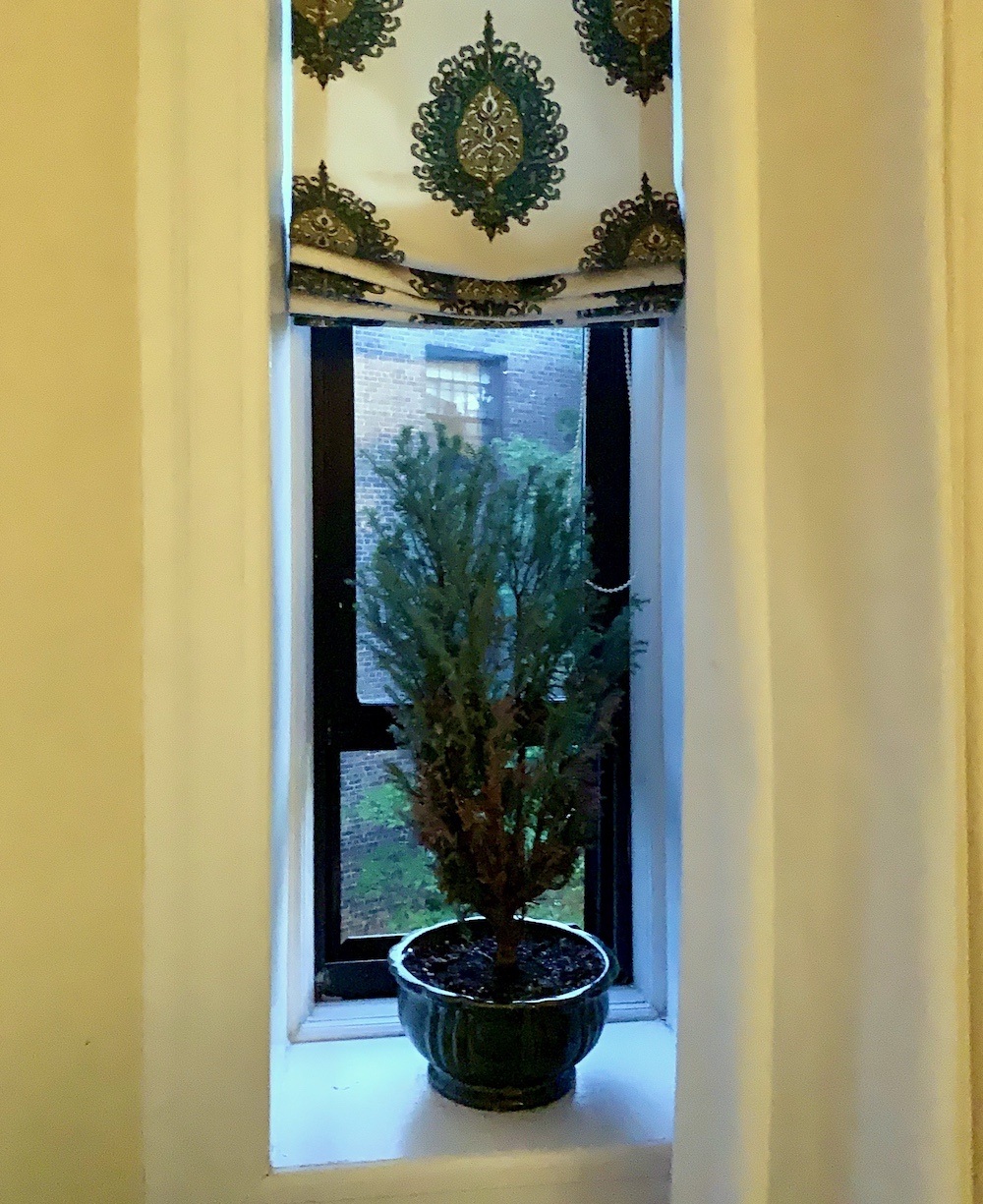
 

Joe the plant
Thanks, guys. I hope everyone is doing well. Joe and I are both very excited about our upcoming trip to Massachusetts. I feel incredibly fortunate that I’m able to do that.
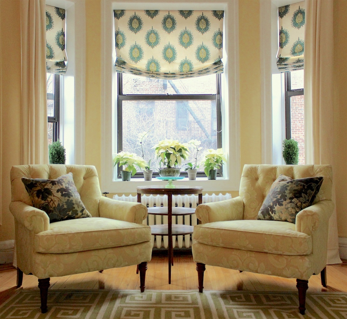
 

christmas decorations that don't scream CHRISTMAS!You can see Joe here when he was a young plant. I’m not sure which one he is. Although, the shape does look like the one on the right.

xo,


PS: Please check out the newly updated HOT SALES!


55 Responses

  1. Hi Laurel, Please comment on Nantucket Gray.
    I have Fantasy Brown countertop picked out and an English style unkitchen planned for our new build. In another post about greens that are not called green, I liked Nantucket Gray for perimeter and walnut stain for the island (though that article wasn’t about kitchens). What do you think of Nantucket Gray as an enduring color in the kitchen? I’ve purchased a 1930’s French wrought iron chandelier for the island, so bringing in black here and there. Polished nickel plumbing and antique brass cabinet hardware. Plain subway tile only up to the open shelves and also over the stove. White Dove walls and trim with wall frames. Truffle colored apron sink. You have helped me so much to make decisions. PLEASE comment on Nantucket Gray, or alternate. Thanks! Barbara

    1. Honey, Honey. Have you ever got your pants caught in a bike chain? Pretty horrible, isn’t it?

      Well, that’s what happens to my brain when someone starts describing something I can’t see. It’s impossible. However, I will say that I’ve seen Nantucket gray which is really a beautiful muted green in a kitchen and it was stunning! But, just know that this was one kitchen. I don’t think there was a lot of natural light. It was a long time ago. Sorry I can’t be of more help.

  2. I’m late commenting but my three faves are Halo, Simply White and Gentleman’s Gray.

    Loved the post(as usual)! 🙂

  3. Hi Laurel! Just a few hours ago I placed my order for semi-custom kitchen cabinets in Naval! And I’m so excited! I’m happy to see that Jean Stoffer specifies navy kitchen cabinets- validating! I’m going to put in white quartz counter tops, white handmade 4″ square tile for the backsplash, brass hardware and terra cotta tile for the floor – I love the color combination of navy and terra cotta!

  4. What a wonderful post, Laurel! I think all your chosen cabinet colors are beautiful – it just depends on one’s space and tastes.
    I renovated our kitchen this past fall, choosing White Dove for the perimeter cabinets and Hale Navy for the island. As I walk (stumble?) into the new kitchen every morning seeking coffee, seeing the room puts a big happy smile on my face. Isn’t that what it’s all about?

    Also, on fickle paint colors, we have a powder room near the kitchen painted in Benjamin Moore’s Metro Gray. In this room (white trim, doors, sink, and toilet with n oak floor)it is the PERFECT soft gray. Many guests ask me for the paint color. When I tried this same color out in the combined kitchen/family room space . . . it turned decidedly PURPLE. It was reflecting different light, an adjacent room’s blue wall and blue accents in pillows and window treatments. Thankfully, I took your excellent advice and switched to Shoreline. Thank you!

  5. 1. Halo
    2. Shale
    3. Gibraltar Cliffs

    It is so funny that you’re taking your plant with you to Massachusetts… even funnier that it has a name.
    Glad you’re getting away. You’ll surely enjoy your merry trip!

    1. Well, I wasn’t going to let him die. My son thought it was very cute. I’ve left him for as long as 16 days with those self-watering things. Three of them. They work! There was enough water left in two of the bottles for maybe another 2 or 3 days. So, let’s say, he could’ve made it okay for 21 days, but not 39.

  6. Hi Laurel,
    All these colors are beautiful. I am all for a white kitchen. I need to repaint mine at it is all oak. 2 questions:
    1) what kind of paint is most lasting for kitchen cabinets (not peeling)?
    2) what do you think about 2 colors for cabinets? i.e. one color on bottom cabinets (darker) and another one for the top cabinets? I see a lot of that lately, but will it look dated quickly?
    Thanks!
    Love your blog!

    1. Hi Marie,

      There is another post here where 13 of my colleagues talk about various cabinet finishes.

      I believe I have talked about the two-tone sitch, too. But, don’t have time to search for it now. It really depends on the kitchen. If you’ve been reading my blog for a while, you’ll know that I’m not a fan of a lot of upper cabinets. That is, upper cabinets with a counter underneath them. But, if there are a lot of them and they need to stay, usually, I prefer them all one color. But always do the island either in a different painted finish or in wood.

  7. First – I used to kill all of my houseplants until I discovered a moisture meter! They are around $10 on Amazon – they give you a true reading of whether or not your plant needs water down at the roots. Touching the top of the soil isn’t that accurate.

    Love so many of these kitchens! I guess my top 3 would have to be:
    1. Halo
    2. Gibralter Cliffs
    3. Shale

    I’d love several of the darker colors for an island. Have a wonderful trip and good luck with Joe!

  8. Love your blog but quick note about SIMPLY WHITE.. I’ve had to re-paint twice trying to use and honestly shocked everyone sites as a favorite. It has so much green in it and depending on the exposure can look super yellow/green in undertone. I’ll never use again. Just thought I’d share!

    1. Hi Kelly,

      My guess is that you have a north-facing room. Or else there’s something else going on that’s creating that impression. There was absolutely no green or yellow undertone in my client’s kitchen.

      But, this is another testament to say why testing is vital. I believe that your paint is skewing that way. I’ve had similar situations where EVERYTHING looked green. Even a pale pinky-beige looked green! I’m curious what you ended up with.

  9. I have witnessed this top/bottom color difference as well. If I hadn’t watched our kitchen being remodeled, I wouldn’t have believed it. But it was very easy to see, when our cabinets were first installed, that the uppers looked darker than the lowers (on the one and only wall that we have uppers). I’ve always wondered why! I thought maybe it is the angle of the sun coming in nearby windows – pointing down and making the lowers look lighter? You have to really stare at it to notice so it doesn’t bother me at all. Light moves, color changes, that’s life. Btw, we painted our cabinets BM Gray Mirage after reading your blog and are very happy with it!

  10. Love love love these kitchens!
    I think our plant is begging for a bigger pot and some new soil🌲
    Thanks for always brightening my week!

  11. I am SO glad that you remain well!
    My favorite is Simply White followed by
    Gibralter Cliffs and then Gentleman’s Gray.

    Have a fabulous trip. Laura

  12. Of the beautiful kitchens presented here this evening the gold encrusted paint brush award goes to…Jean Stoffer; Lakeside Home in Gentleman’s Gray. Runner up. Jean Stoffer; English Cottage in Shale. An honorable mention for Black Beauty.

  13. Hi Laurel –

    I’ve just poured another four gallons of ‘garlic tea’ around my perennial gardens. On the nights I neglect the task, the rabbits eat everything in sight. One day I’ve a beautiful peony and the next day, I don’t. Your Joe looks fine by comparison.

    My fav kitchen colors are Gibraltar Cliffs 1527, Westcott Navy 1624 and Gentleman’s Gray 2062-20. Though, truth be told, every one of these kitchens is swoon-worthy. It’s tough to make a choice!

    Safe Travels –
    Kate

  14. Hale Navy, Newburg Green, and Gentleman’s Gray.
    Another unsolicited Joe opinion (from a plant pathologist): His top has outgrown his roots, which means that you are making him happy! He will love a bigger pot but then will grow a bigger top again with all your good care and you will be back to the imbalance issue, but up-sized. Why not try putting Joe’s top back into proportion with his roots with a bonsai treatment? Or at least a trim.

  15. Love your cabinet color choices – all so beautiful! But if I had to choose it would be Gentleman’s Gray, Gibraltar Cliffs and Salamander. And I have an all Simply White kitchen! 🙂
    What I love most about your design choices and advice is how timeless they are. You are not a slave to the constantly changing trends. Let’s face it, it’s expensive to remodel and redecorate! It should last awhile. Have a good and safe trip- so ready to get OUT!

  16. 1I love them ALL! Thats the best thing about painted cabinets, especially if you can learn to paint them yourself. I did simply white on the inset cabinets, the floor and the wall. But I can change it every year if I want We are still finishing up a few things before we get countertops in, which will be marble. I suspect quartz that looks like marble (seriously it doesn’t even come close) is gonna be like granite in 15 years, dated. Actual marble, nope. I can’t seem to decide on a runner for the kitchen, too many choices!

  17. Laurel,
    FYI
    Wisteria has discontinued the Fluted Gustavan table.
    I’ve been waiting since the beginning of February and they just sent an email and canceled my order 😢
    With great apologies
    Just thought you might want to know
    Susan

  18. Laurel,
    FYI
    Wisteria has discontinued the Fluted Gustavan table.
    I’ve been waiting since the beginning of February and they just sent an email and canceled my order 😢
    With great apologies
    Just thought you might want to know

  19. My three: Halo, Simply White and Hale Navy. I’m currently thinking repainting my cabinets with White Dove and either Halo , or Hale Navy on some of the bottom cabinetry. Love your posts Laurel! Have fun in MA.

  20. My favorites are Halo, Gentleman’s Gray, and Gibralter Cliffs. I would probably stick with a light color for the kitchen cabinets, but might try a deep color for an island.

  21. Simply White, Gentleman’s Gray, and Cement Gray.
    I’ve been dreaming for years, ever since we moved into his house, of painting my cheap-flip oak cabinets white. But reading about the color looking different above and below makes me worry I’ll be driven crazy like Ann. Maybe I’ll do navy below and white above.
    P.S. This Marylander is happy to see a tin of Old Bay in the black kitchen!

  22. Hi Laurel-
    I love every kitchen you posted. My first 3 choices would be Halo, Shale and Salamander. I am obsessed with DeVol kitchens since your first post about them.
    Your blog keeps me going as does your humor.
    Thank you.
    Have a fun trip.
    Linda

  23. I like Gentleman’s Grey and Westcott Navy. The Navy especially with the gorgeous black tiles.

  24. I wanted to reply to Liz’s comment but my iPhone would glitch so it’s here in the general comments.

    I’m so glad to hear you say you can pick out colors for clients but struggle for yourself! I recently chose paint for cabinets for my laundry room. The color choices could go 20 different directions! Many would have looked great. I can see so many designs in my head and how they influence other decisions! My husband trusts me and yet doesn’t understand the struggle of getting it “just right.” Anyway I’m glad you made that comment because I wondered why I struggle with my own house. It’s hard to be objective.

    My current new kitchen cabinets are similar to Alabaster but Simply White would be my first choice. Second, from this list, would be Shale. It feels restful and earthy. Third, I love navy but a lot of these look black in my lighting. So I would need to pick out a color that is slightly lighter to get the effect. I painted my garage man door Hale Navy and I love it, but it would look black in my kitchen most of the day.

    My last house had white cabinets. The island was one white, the uppers another, and the bottoms almost looked cream! It drove me crazy! I knew they all had the exact same paint! I could see the distinct differences in photographs. Along with lighting, I think layout can play into this issue. My current house has white cabinets also and I don’t notice the color differences at all. (At least not enough to bother me.)

  25. Hi, Laurel,

    Love this post, could look at those kitchens all day.

    Joe needs a deeper pot. The width is fine. It has a drainage hole, doesn’t it? Put him outside in MA if there’s sun and the weather is warm. He’s not getting enough sun through your windows. (If he’s an evergreen, like he looks to be, I’m afraid he may never really recover. They’re not meant to be indoor plants.)

    Good luck!
    Therese

    1. That window faces south-west and actually, it is very sunny. Of course, that still might not be enough sun. I took that photo several minutes after the sun had set. But, I was able to brighten it up artificially. When we come back, I will look into a deeper pot. Thanks for the advice.

  26. Great post!

    English Cottage #!
    2nd DeVol Kitchen # 2

    Cement color ” 1
    Simply White might be too brite, but I love my own white kitchen.
    # 3 color Gentlemen Gray

    Could not decide on a 3rd favorite – Too many from same designer.

  27. Hi Laurel!

    My three favorites (in no particular order) are: Cement Gray, Simply White, and Gibraltar Cliffs.

    Alternate: Westcott Navy

    I adore your blog and look forward to each new post. Best of luck to Joe, happy early birthday to your son, and enjoy your trip to MA!

    Katie

  28. My three favorites are Salamander, Chimichurri,and Copley Gray. Also, maybe I’m reading this wrong but in bold you stated that “..upper cabinets appear to be a shade darker than the lower cabinets. Then the rest of the text seems to indicate the opposite is true. I guess in the scheme of things there really is no way to predict exactly ow a color is going to look since time of day, lighting, reflections all play such a big part. Actually I think it makes the room more interesting just as shade and shadows make a landscape more interesting.

  29. I confess to being strongly influenced by British kitchens. My favorites are copely gray, halo, and shale. I am curious how a lack of natural light affects them.

  30. I love looking at them all, as I find all colors beautiful – on someone else, or in someone else’s home. But in my house I would need and enjoy halo, chimichurri and shale, if it leans toward beige. Joe’s living room is lovely!

  31. I love them all! I really love that log cabin kitchen.
    1. gibraltar cliffs
    2. copley gray
    3. chimichurri

  32. Simply white / Gibraltar cliffs / Wescott Navy
    with Halo as a bonus!
    I hope you and Joe have a good trip! I also had a plant named Joe…but he was a small caucus. I had him for 15+ years until he just fell over, probably from too much water. My son liked to name things when he was small so that is where he got his name.

  33. Hard to choose only three, but I do go for classic white kitchens.
    1. Simply white
    2. Gibraltar cliffs
    3. Gentleman’s gray – what a spectacular color for navy!

  34. Hi Laurel, love this timely post as I’m now trying to decide on kitchen cabinet colors. My favorites are: Gentleman’s Gray, Gibraltar Cliffs and Simply White. Thank you for all of your great posts.

  35. Laurel, thank you for this timely post. I’m now excited about working on my own kitchen. I can choose a color for a client but it’s worse than a root canal for my home. I just specified a dark green for a craftsman LR here in Atlanta, and loved seeing CHIMICHURRI – wow, love that kitchen!
    COPELY GRAY with that’old floor makes my heart sing. Now I shall struggle on which way to go……. BTW, Joe needs a bigger pot please. He’ll be so much happier when his roots have more room!
    Have a great time in Massachusetts!
    Liz

  36. First, have a good time in Mass. Second, give Joe a good time: a deeper pot, water more but a lot less often, a bit of outdoor life in a sheltered position, I think.
    Third, interesting about colour being different in uppers and lowers. But another very visible effect is reflections from other colours. Looking at the Black Beauty pic, the uppers look off-black with some blue — F&B Down Pipe, perhaps, whereas the lowers look more like F&B Tanner’s Brown, especially on the left — because of the rug. I have this effect in my own sitting room, where Ringwold Ground on the walls looks pinkish in places because of the Red Earth ceiling.
    Favourite colours? The two greens, which I can’t have because of the tiny window. Snif! as we say in France.

  37. In my dream world, I would like a dark color on the lower cabinets and a light color on the upper cabinets.

  38. They are all gorgeous, but if I had to say:
    simply white
    gentleman’s gray
    chimichurri !!

    Have a great day!

  39. Cement gray, halo and shale. Although I love the deep colors also for myself I prefer the lighter ones.

  40. My brand new kitchen has Simply White woodwork with cabinets that are factory painted but a perfect match. I also have the same color floor (maple) as your Simply White kitchen and the same light gold hardware and lighting. This was all finished in January just in time to self isolate in it! My front door is Gibraltar Cliffs, which looks great with our slate porch, pale grey siding and brick. My third favorite is Cement Grey through I do also love Wescott Navy. Navy in my home is in the carpets and furniture. Thanks to yur influence I have perfect light blue gray Serena and Lily kitchen chairs which go with a maple table I found for 30 bucks! Stay safe up there in Westchester. That is also where my daughter and her family live.

  41. Hi Laurel. Beautiful post. Did you know the new Magnolia Network will carry a show featuring Devol kitchens? I’m not sure I will watch it, as I am protecting my mental health these days and worry I will be overcome with envy and with Aga rage. 🙂

    My fave kitchen colors:
    1. Simply White (fabulous in a windowless kitchen)
    2. Newberg or Narragansett Green, which also are beautiful in windowless spaces. They really don’t translate well onto computer screens, do they?
    3. Black on the lowers or the island.

    Safe travels. I’m glad you’re getting away from the city.

  42. My favorites are:
    1. I am a succor for a white kitchen – Simply White
    2. Shale
    3. Black Beauty

  43. Hi Laurel,
    It’s hard to pick because they’re all so beautiful.
    I think classic white is always a good choice,
    Gentleman’s grey, and Gibraltar Cliffs…just three?
    As for Joe, I gotta be real here for a minute. Joe is an evergreen sold during the holidays and he wasn’t ever actually meant to be a houseplant for the long haul.
    Sorta like those poinsettias we throw out after Christmas. Evergreen trees belong and desire to be outside. Sorry to break y’all’s heart❤️
    Have a great time! Travel safely Arrive safely

  44. Laurel have a great time in western Massachusetts. It is such a beautiful place. We have been looking a Copley Gray hc-104 for the painting of the kitchen cabinets with the upper cabinets one of the softer whites. But the tiles are hand carafted off white veering toward yellow so I am nervous about the Copley Gray..
    And we are thinking about using Hale Navy he-154 for the new (finally the 2nd bath after the Kid goes to college. Though she’s baaaaack!
    Have fun in Massachusetts and be safe.
    Carolyn

  45. Hi Laurel,

    Love receiving your blogs here in sunny South West France, although it’s raining today….

    My favourite kitchen cabinet colours are Copely Gray hc-104, HALO oc-46 and Shale 861. My overall favourite kitchen is the DeVol one shown in Copely Gray..

    Have a great day. Best Wishes. Andrea

Leave a Reply

Your email address will not be published. Required fields are marked *

This site uses Akismet to reduce spam. Learn how your comment data is processed.

Welcome To Laurel Home!

laurel-aarons-18th-e1456449963926

Hi, I’m Laurel, and Laurel Home is the website and blog for Laurel Bern Interiors.
I’ve been creating new-traditional interiors since 1988. The blog is where I share all.

New Edition, November 2023! Get The Indispensable Guide For 100s of Home Furnishings And Interior Design Sources That Everyone Is Raving About

laurels-rolodex-final-book-cover-master 10th edition 23-24

laurel home archives

Categories:

Please click the image below for more info about my rockin’ Interior Design Guides for 2024!

Laurel Home Interior Design Guides 2024
Amazon ad

please click below to check out my favorite decorating & design books

Laurel Bern's Favorite Interior Design and Decorating Books
Subscribe To The Laurel Home Blog And You Will Receive A FREE Guide Where I Share How To Get Your Paint Colors Right, The First Time.