Hi Everyone!
Wow! Thank you so much to so many of you who took the time to give such awesome advice about my kitchen. So much Interior Design Inspiration!
I can’t tell you how helpful it’s been.
And, I think there are lessons to be learned for all of us going through a kitchen remodel or any home renovation, for that matter.
I think the first piece of business not to spin wheels endlessly is to get a couple of contractors who know what they’re talking about, just to see what’s possible. So, I really need to do that. The one I called who said he would call on Monday, did not. Poor guy. I can only presume that he’s in a coma at Mass General. Hope he gets better soon!
I am planning on making more calls tomorrow. Pinky Promise!
For today, I want to share more inspiration and also address some of the comments to explain my thinking.
Some of you mentioned that the plumbing stack might prohibit the moving of the appliances or kitchen sink.
That is a great point. And, while I tried to find out for sure, I haven’t heard back yet. Still, there are a few things I do know.
If this were a regular apartment building like my old one with identical apartments, one on top of the other, then yes, the plumbing stack will most likely dictate where one can put things. But, my apartment being a duplex is a completely different layout from the three apartments above me that are each one entire floor from front to back.
Still, I took a look at the floor plans (both floors) for mine and the front duplex apartment.
And, while I don’t have a floor plan of the three floors above me. Based on old real estate photos, I know that the kitchen on both the 2nd and 3rd floors is nowhere near mine. My kitchen butts up against the building to the right of us. Except for the front duplex, butt up against the building to the left of us.
Also, my bathroom downstairs doesn’t line up with any of the plumbing in my kitchen or the plumbing in my upstairs bathroom. The drains are on perpendicular walls and several feet apart. I am damned lucky that they “stole” space for my kitchen so that it’s not impinging on the living room. In fact, the kitchen extends about eight feet past the downstairs bathroom.
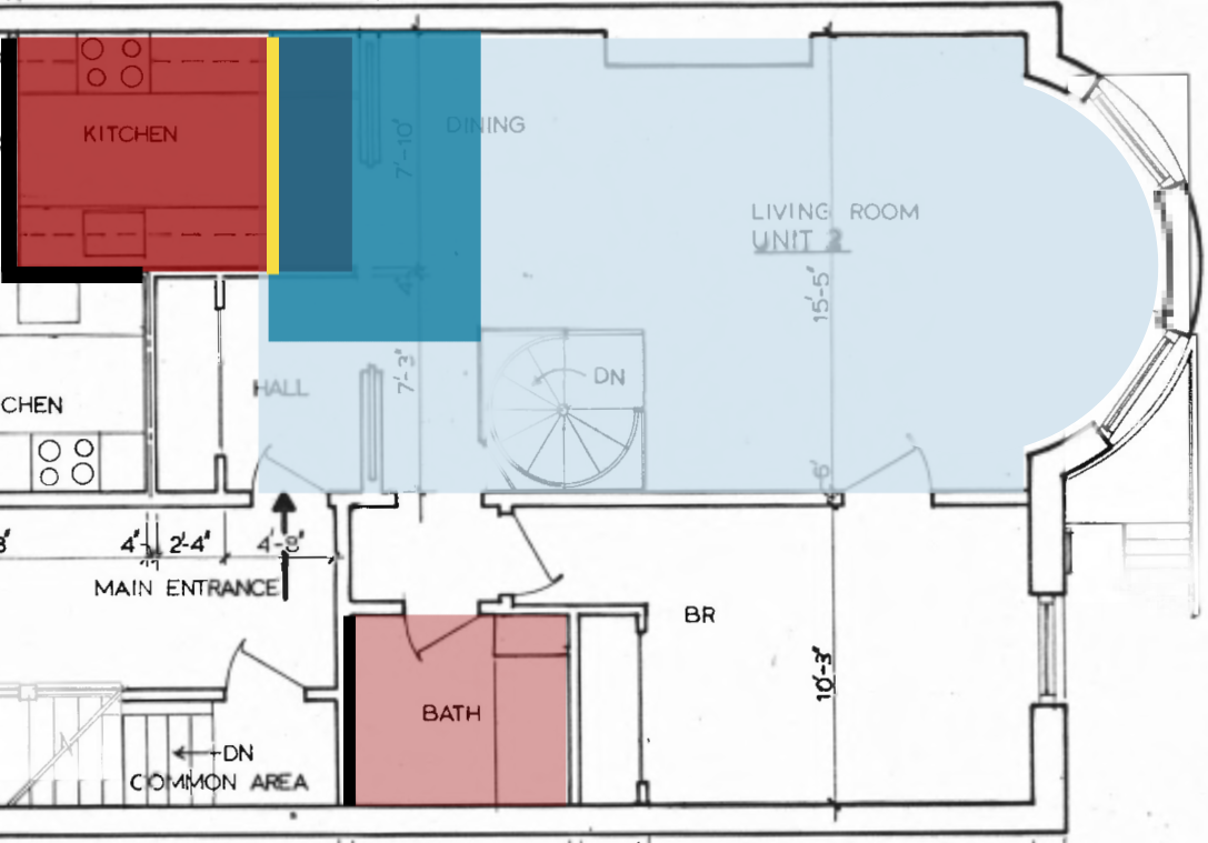
Above is a diagram I made by superimposing the upstairs over the lower level. To make sure where everything is, I faded the top floor and then, when I was through, put it back to normal. The pale blue area is the entire downstairs, including bedroom closets and bathroom. The darker blue is the downstairs bathroom.
The red is the kitchen, and the pink is the upstairs bathroom. I did not color in the entry, small hall outside the upstairs bath, or second bedroom/den.
The thick black lines are the upstairs wet walls. And the downstairs wet wall is bright yellow, so you can clearly see that there are separate plumbing lines.
The kitchens for the upstairs apartments are on adjacent to the building stairwell. They are all small galley kitchens like mine.
Based on all of this, I don’t think moving the sink over two feet will be a big issue.
Of course, I could be wrong about that. I’m not a plumber. Lol So, where does that leave me with the kitchen remodel?
I have decided not to do the interior windows. Besides losing 4 inches of valuable space, it’ll be exceedingly expensive. The mirror idea is still on the table. Do not worry. The mirror will be very lightly antiqued if I do it.
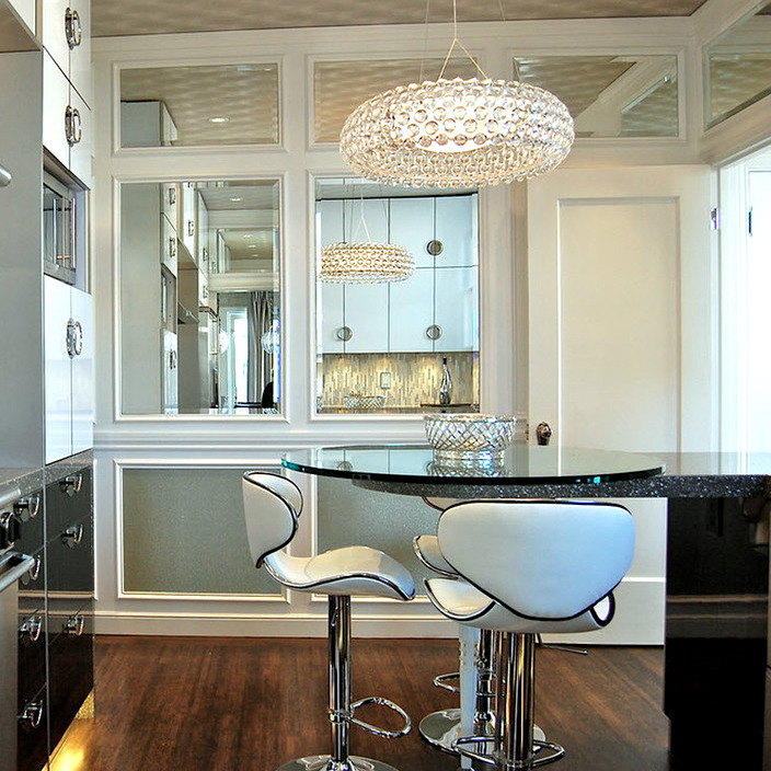
Above is one idea for the sink wall with a paneled mirror wall. Source unknown.
Yes, I’ve decided to nix the idea of the pantry in the back of the kitchen. Many of you were horrified that I had put the dishwasher on the other side of the little wall. The wall is really a separation of the spaces and maybe sticks out an inch, if at all. So, the dishwasher would only be four inches further away than if it was right next to the sink.
Oh, I had an image of what this would look like, but it has vanished. Oh well.
But, still, it’s tight and a little awkward. I agree.
The fridge, even more so. This was a case of form not following function. Talk is cheap. And, please forgive the door swing issue. I could hardly see straight by that point.
In the meantime, as I said, some mirrors in the kitchen would be awesome.
The most logical place would be on the back wall to reflect the light from the windows about 37 feet away. If you don’t already have the post from Sunday open, you can follow along by going here.
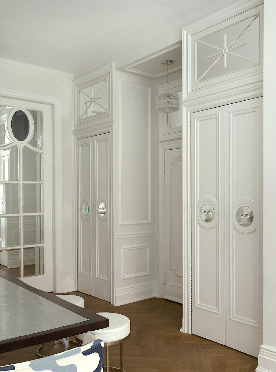
A designer whose work I forgot about until one of you reminded me is Kelly Giesen. She’s exceedingly creative and clever in her design work in New York City. The above apartment was in House Beautiful several years ago. Many of you probably remember this charming jewel-box of an apartment Kelly designed.
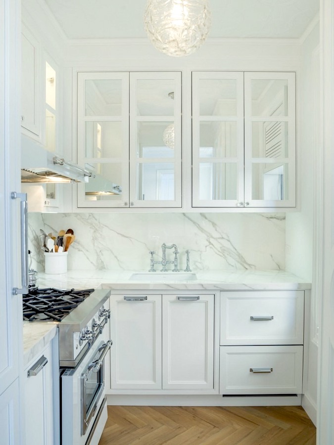
Above are some mirrored cabinet doors. Kelly is the queen of tastefully excecuted mirrors.
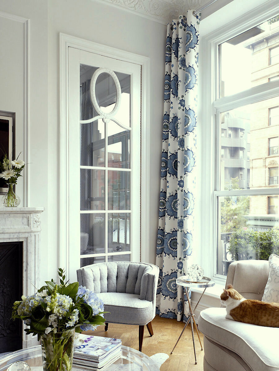
More mirrors. I’d love to have my French doors mirrored in the living room. You can see my design here. I love Kelly’s design too.
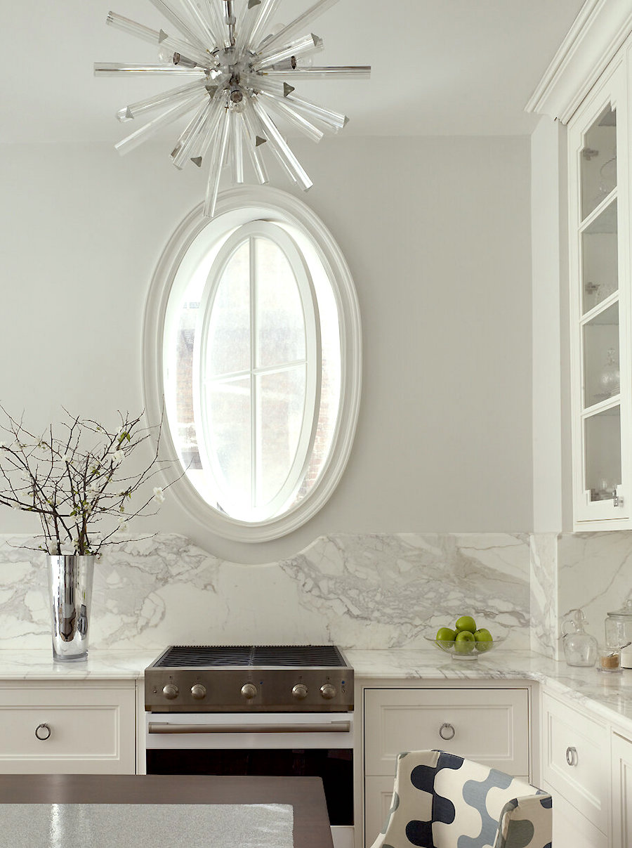
Above is one last Kelly Giesen image. How chic is that range? And ahem. Look, what isn’t there? Right. No hood. There is a window that is not really oval on the outside. I read that she almost covered it up.
Please follow Kelly on Instagram.
There’s an endless amount of interior design inspiration out there. I find when I’m stuck, or things just aren’t coming together is this:
Go and change ONE thing. And, usually, it’s a resistance point. It’s something that one thinks they need to have.
It’s like some of you think you NEED to have lots and lots of upper cabinets over your counters. And, yes, in a small kitchen, it’s sometimes not easy to forgo them entirely. And, I’m not saying I hate them.
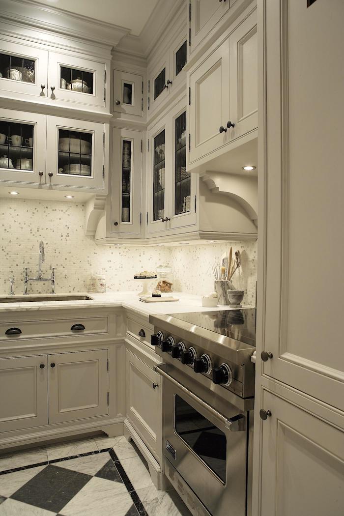
Canadian interior designer Philip Mitchell’s galley kitchen is to die for. And, it’s amazing all that he fit in here. The only thing bugging me a little, is I prefer not to have wood cabinetry butting up against the range top. It could be a hazard, especially the way I cook. Haha, At the very least, I predict a fair amount of scorching. I think this is actually an air-conditioning duct as that looks to be a vent at the top. So, my guess is that there was no choice.
Philip is incredibly talented! Please follow his Instagram here.
Okay, I know that a big issue for a lot of you is having enough storage.
And, I do understand that.
But, please understand that since my kitchen is equipped like a 22-year-old man’s first apartment, I’ll be fine. And, no, unfortunately, I’m not joking. Apparently, I was born about 200 years too late. In any case, there are plans to redo the entry closet.
Plus, I am exploring more cabinetry as an option. Of course, more cabinets also equals more money.
But yes, I do have a resistance point, and it’s one that several of you mentioned last fall and again on Sunday and Monday. Only while you were telling me, this time, I started thinking the same thing.
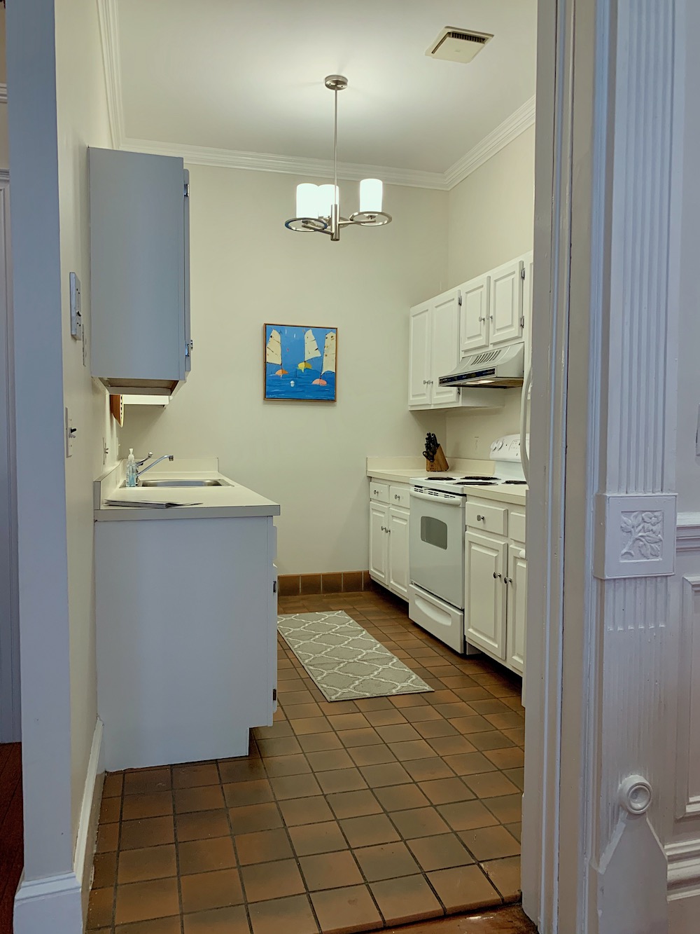
It’s that awkward center wall dividing the entrance from the kitchen.
You can see it above on the left.
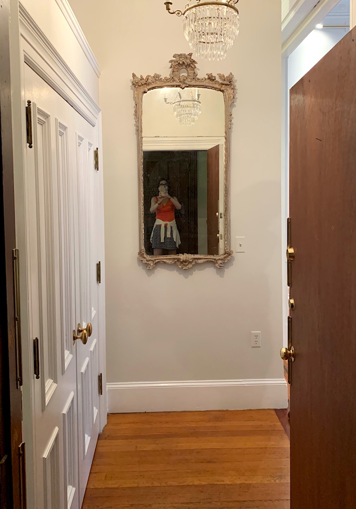
There it is with a mirror when I was first looking at the apartment last September.
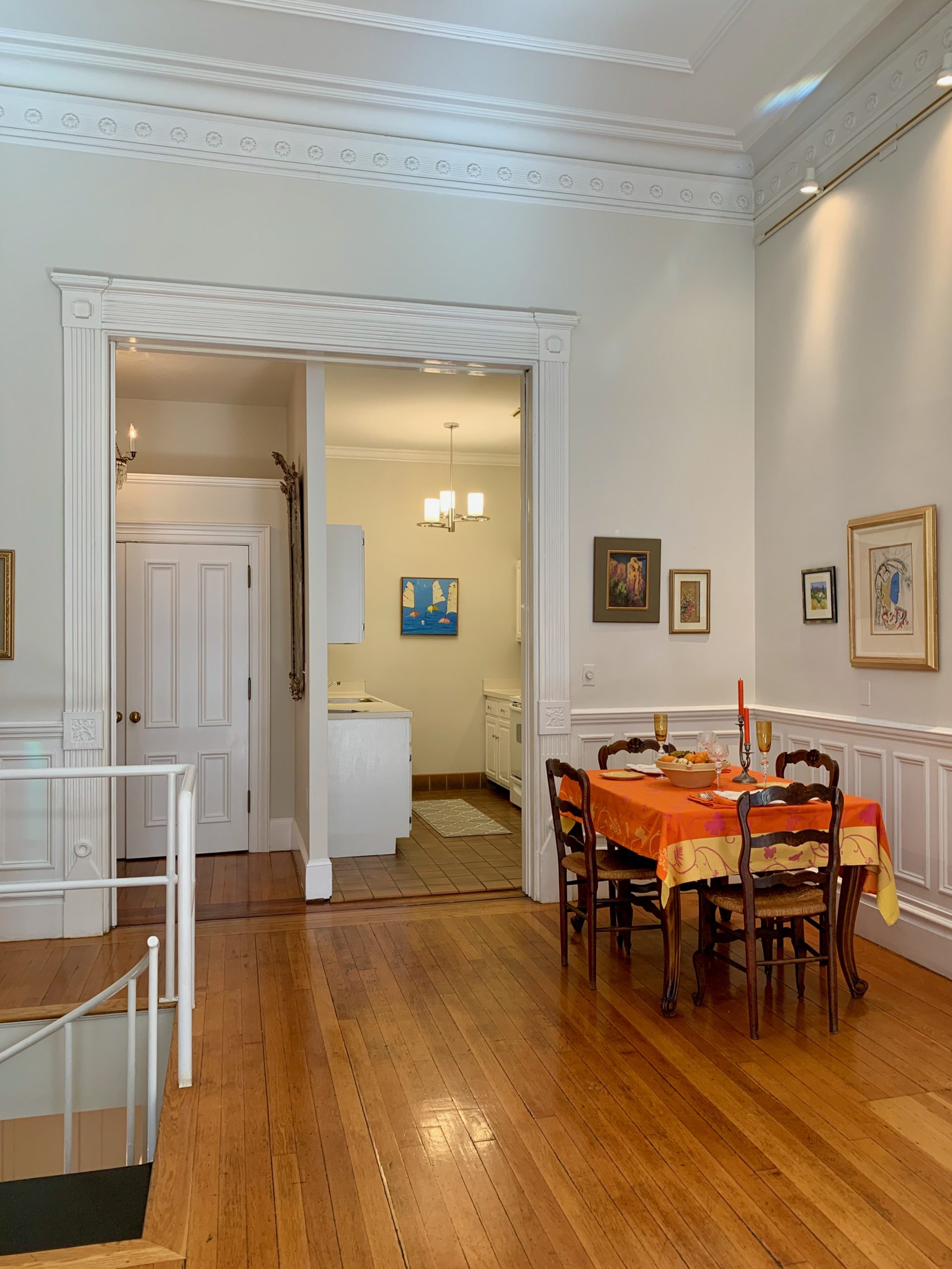
There we go with a better view from the living room. That gives a better perspective. And, no, that is not my dining table, either. My dining area is by the windows.
And no, the funky wall is not a load-bearing wall. The space where the entry and kitchen currently are was originally a reception area between the main parlor (now the front duplex) and formal dining room. The latter is what is now my living room.
Of course, there was no wall there for decades, and no kitchen, either.
My original resistance to removing the wall was because I felt very strongly that I don’t want to open the front door and feel like I’m walking into the kitchen.
I still feel that way as I don’t want to see the kitchen upon entering the apartment. Nothing screams APARTMENT more than opening up the door with the kitchen dead ahead.
Remember this place that I completely reconfigured a few months ago?
By the way, as I said earlier, I have decided that I do need the closet in the entryway, but not the way it is. More about that another day.
So, where does this leave me?
I am back to the drawing board and also revisiting some interior design inspiration. One source I should’ve linked to is this post about galley kitchens. And, this post about small kitchens. There’s lots of terrific inspiration in both of them.
I was going to post an updated design. But, I’m going to hold off on that so that my drawings will look presentable and be more clear, too.
However, I’ve done two new schematics so you can see how your interior design inspiration and ideas have motivated me!
As you’ll see, I have removed about half of the wall as seen from the front door. (please scroll back up to see.)
The deeper blue is for the cabinets that go up to the ceiling. The pale blue is for the counters. The black represents the walls.
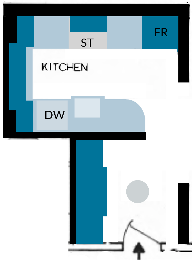
The above is based on the original image I created. (below)
This is mostly for the back wall and not necessarily what the cabinets will look like in terms of door style. Although I do love those doors, I’m not sure that they are the right style for my place.
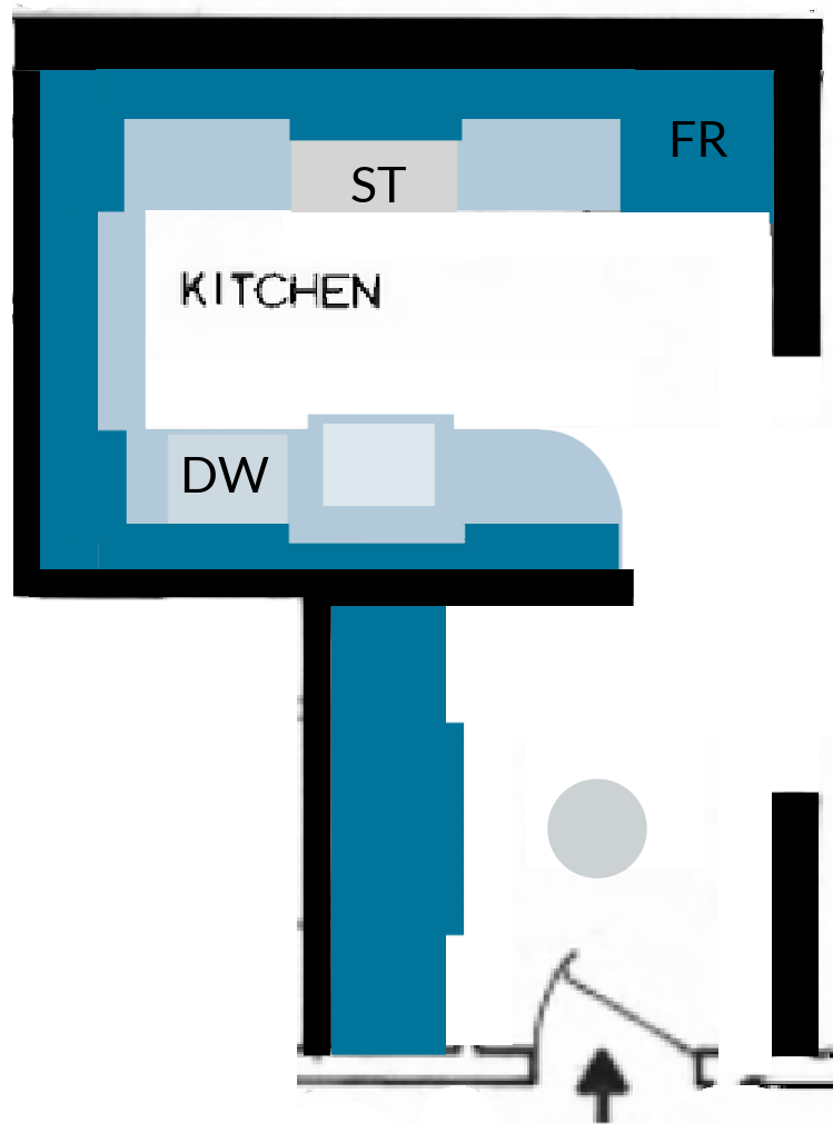
The above will make many of you very happy as I have upper cabinets around the entire perimeter.
I am not ruling them out.
But, my main point in showing you these two schematics is to point out how I removed about 27″ of the wall instead of extending it out to meet the opening.
I really do not want to change the opening. I mean, sure, if I could just wave my magic wand and poof, it would be done. However, it’s just one of those quirky old house things. In fact, the right wall is actually 5 inches longer than the left wall. I can’t figure it out. The wainscoting doesn’t match either.
Could I take more of the center wall down?
Good question. Yes, I could, but I’m definitely not doing that. I still want some separation between kitchen and entry. This makes sense to me and will also look better from the living room, I think.
Ugh. I still haven’t decided about the floors. I love them all; super shiny and super dark. And, I also love matte, chalky whitewashed. I could even be talked into keeping them as is. They are quite beat up and interesting. The wood is far from perfect.
Some people would just change all of them. I definitely want to have the kitchen floor flush with the living room, not raised as it is. And, I would prefer the same thing for the den.
Well, as my darling mom always said. “All it takes is money.” haha.
Thanks again, everyone. I so appreciate your taking the time to offer suggestions and interior design inspiration. Of course, I can’t do all of them. But, I am listening. And, the beauty is there are dozens of ways one could go with this kitchen and they all would be wonderful. Although, sometimes, having too much choice is the biggest problem of all.
xo,
PS: Please check out the newly updated HOT SALES!
Related Posts
- Don’t Take Away Our Ceiling Fans – We Need Them!
- My North Facing Room Paint Color Is Driving Me Bonkers!
- New Traditional Decorating – Little Known Ideas You’ll Love

- The Controversy Over Hardwood Floor Stains and Finishes
- 12 of the Best Paint Colors To Go With Red Brick
- A Secret for Creating A 25 Color Whole House Color Palette
- Throw Pillows – Everything You Need to Know
122 Responses
I have a ventilator that rises up from behind the cook top. I have a Wolf cooktop and the ventilator both fit in the standard counter width. It works perfectly and has for years. Just a push of a button and it rises up and has several speed selections. It not only controls grease, but when you need to boil liquids, it controls the steam, and will keep the beautiful mirrored cabinets lovely, longer.
just saw this AND thought of you!
https://www.veranda.com/home-decorators/a30145127/jean-louis-deniot-paris-flat/
Hi, Laurel! Am I over simplifying this, or is there some reason you can’t just do fabulous custom French doors across that big doorway? One side would open to the foyer, and the other side would open to the kitchen, and from the living room nobody would see the weird little wall separating the two. Maybe the physics don’t work?
Laurel, love your ideas for your kitchen–you had me at curved doors! However, if I may offer an observation–range hoods. Kelly Geisen’s kitchen IS gorgeous–but if you do any serious cooking & don’t have hood its grease city–even if you don’t fry. Its amazing how far food particles travel. I love that light fixture but 2 weeks & its a grease magnet. Ditto w oven walls. I spend as much time in the kitchen as most people do working! If you aren’t planning on cooking much AND/OR have a house cleaner then its moot. Can’t WAIT to see what you decided on! WoW and $66K for a simple bathroom! Yowzah! Maybe you can trade your design services for work done on premises? maybe include PR of the contractors’ work? Looking forward to your posts!
Hi Laurel – I love these posts about your kitchen design ideas! Your cabinets along the back and perimeter are reminding me of a post you did a while back about a reader who renovated her home office into a pantry with her office space incorporated into it. (I’ve searched hi and lo on your blog and can’t find it for some reason.) Anyway, it was giga-gorgeous (as you would say)! Can’t wait to read more about what your ideas are for your kitchen and of course, the final result!!
I’m sure someone has mentioned it along the way, but there are antique mirrored films you can use on your doors if you don’t want to do anything permanent, but they are quite expensive. This blogger used it several times:
https://www.blesserhouse.com/diy-ikea-hemnes-pantry-cabinet/
A health issue has me parked on the couch this week: Happily, I have your kitchen to occupy me, haha. I love the idea of shortening the wall and incorporating a curved cabinet along the edge. There’s an image on Pinterest (search “curved glass kitchen cabinets”) showing a floor to ceiling curved cabinet with glass upper that could work for your kitchen–it feels charmingly quirky 🙂 Another thought re: the wall.
One Kings Lane has a mural wallpaper titled “Back Bay” in Gray/Green (108”L x 156″W). If you made the Entry closet doors into jib doors, you could put the mural along the closet wall, the short wall and wrap the front edge of the short wall with the mural so the wall disappeared. Leftover mural somehow incorporated on the kitchen back wall for more visual continuity? I think that mural or another wallpaper could make the wall disappear and who’s looking at a fridge with all the eye candy?
It looks like your hardwood floors continue under the kitchen tile–which could be awesome if salvageable! Cannot wait to see what you do!
As my kitchen contractor said “You can have anything you want, you just have to pay for it.”
lol !!! so true. Didn’t Robert Redford say something like that in Indecent Proposal?
Wow! Didn’t read all of the comments, but definitely agree on making that large doorway into two with the kitchen doorway centered between the cabinets so you can add cabinets the full length of the odd wall that separates kitchen from entry. Love your back wall inspiration pic! Also, have you thought about having refrigerator drawers instead of a regular refrigerator that probably makes the kitchen look even smaller? And dishwasher drawers would keep you from having the awkward DW door issue in the narrow kitchen. Can’t wait to see what you end up with!
Sorry to hear the window idea had to go, but loss of space and increased cost justify the sacrifice. Love your idea of the cabinetry on the back wall. Don’t think you will need all walls lined with upper cabinets though. Your first plan would seem to be enough and would give you some visual space. Regarding the wall shared with the entry, I would not reduce it by much, because, like you, I don’t want to walk in to a kitchen. To preserve the existing opening and historical trim work: what if you added portieres that drew to the middle of that large, cased opening from either side? In a handkerchief linen? This would hide the awkward wall when viewed from the living room . Not practical in terms of wafting kitchen grease, but how often do you fry food? Crazy idea, but might be pretty.=Leslie
So true, Jennifer. That’s how I feel looking at the elevation. Seeing the one doorway going into two rooms is architecturally feels so awkward since not standard practice. As you said, it doesn’t seem like something she would have purposely designed. The exceedingly informal 4″ wall stuck right in the middle of the expansive traditional doorway feels to me equally jarring as walls do not belong in any doorways. Love your two doorways idea. Otherwise, IMO, those two elements are painfully incongruent with the building’s and the apartment’s architecture.
Hi Laurel,
I love reading your blog. I just renovated another white kitchen.I usually use the IKEA kitchen planner to get a visual. It’s really easy to use. I just pick a white cabinet style and start playing and trying different layouts. It shows you schematics or 3D visuals from all angles, even from top or bottom. Once I have an idea of the layout I start deciding on the kitchen brand.
I even used IKEA kitchens which are much better Quality than they get credit for.
As for stove top, I use induction cook tops for the last 15 years. They react like gas and you just have to wipe them off with a soapy rag.
And I loved my microwave drawer, this way I didn’t have to deal with a bulky upper cabinet.
I’m sure you have access to better planners than the IKEA one. Have fun with your planning and good luck
Oh how we all love to chime in and it must be overwhelming. I can’t tell if the current range is gas, but as I mentioned in your last post, induction cooktops are fantastic. Lots of chefs recommend them. They aren’t dirty like gas and they cook with the properties of gas. Infinitive heat adjustments that respond quickly and the cooktop doesn’t use heat but magnetic energy. Of course that “forced” me to buy my new All Clad cookware which at 64 was like my best gift ever. I would not suggest needing a hood, I don’t and don’t miss it. Tricia above said the same thing.
I know you are a fantastic designer but have you even considered a consult with a certified kitchen designer?
Hey Laurel – chiming in again. The more i think about it, i am warming to the idea of two doorways like some of the others have suggested, with the kitchen side being centered and both of them being as wide as possible. A good contractor should be able to handle this and it would give you more counter in your kitchen. Separately, i wanted to endorse everything that Tricia says in her lengthy advice on what she has learned in kitchen reno’s – really good thoughts which I have deployed in my own designs. With 2 exceptions – i have dark floors with white cabinets and love them – i do a quick sweep every day which i would do anyway and it keeps them looking good IMO. The other thing is that I don’t think you could go without a range hood and pass inspection? Especially in a small kitchen without a window, I think a range hood is a necessity both in eliminating food odors, and for safety reasons. Thanks for doing this post – very inspiring.
Thank you for sharing your thought process with us — I am learning so much! Your new home is gorgeous. Two things – I think interior windows can look very elegant and one might look nice in the wall you are thinking about shortening. Also, when we added on to our 1945 colonial, the 4-over-4 window in our powder room was now on an interior wall. Rather than remove it, we replaced the glass with mirrored panes (not antiqued), as our “nod to the past”. I LOVE it – it feels more like a window than a mirror, really brightens the space, and feels homey. If I ever live in a house where I can’t have a window over the kitchen sink, I will absolutely put a mirrored window in that space.
I also thought of the two entrance idea! Right now you have one doorway going to two rooms. That’s very strange. If this wasn’t your beautiful new\old apartment with grand proportions moldings you would never ever design this floor plan. Sometimes we have to let go of a beautiful detail to make the whole work. Give the mouldings a new life as two doorways. You can also have them striped when they are moved so they will be stunning and super crisp.
Yes Yes Yes
Shorten that wall. It makes it so much more open.
Oh Laurel, it’s normal to start with dreamy ideas that turns into a million re-works for practicality sake. That’s the nature of design, right? I’m excited to see you go through the process and encourage you to keep exploring until it all makes sense with utility, beauty, and budget. Thanks for bringing us along for the ride!
😀
It seems you have plenty of interest from many of your readers on this project, myself included. I redid my kitchen in a 120 yr. old house a few years years ago and I absolutely love it! Here is what helped to make it a success. 1.Plan down to the 1/4″ inch measurements. 2.Overhead cabinets are overrated. 3.Deep drawers are WAY better that doors on base cabinets. 4. Tall pantry cabinet with roll out shelving and divided tray space at the top is fantastic! 5.Infrequently used items stored in another location is smart for an efficient kitchen. 6.Dark floors are beautiful but show every speck of dust. (I have them in my bedroom and I am thinking of having them sanded back to the natural color. I have hardwood throughout the entire house but had stained the bedroom dark to match the woodwork and an original mantel in that room. I recently painted the woodwork and removed the mantel. The dark floor goes next.) All the hardwood in the house is 120 yrs. old except for the kitchen that I installed about 20 yrs. ago. They are natural oak color and are so easy to clean and DO NOT show dust like the dark floor in my bedroom. (I am not exaggerating! It’s a nightmare to keep clean) 7.IMO hoods are overrated. I have lived in this house 43 yrs. and have never had a hood or downdraft. 8.Taking the time to plan well pays off. It took me some time to design the kitchen that worked for my space but it was worth it. I had to find a dishwasher with a door that extended 29″ when open. Bosch had one and it is what made my entire plan work. My brother is a kitchen designer but I chose to do it my way. When finished he remarked, “You broke some rules but it works and it looks great.” So my final advice is, “Think it through and don’t be afraid to be creative.”
Love everything you’re saying, Tricia!
Upper cabinets are the only ones that my husband can use, given that he’s had back surgeries. Floor-to-ceiling, or floor-to-near-ceiling cabinetry is classy. You have so many good ideas from which to choose. Learning your thoughts as you navigate your space is endearing. ♥️
Here’s a new idea for the problem wall. Save money by leaving it the length it is, but wrap the end of it in a wider floor to ceiling square column with details that match the apartment trim. With a hollow column, you could even fudge the position of it to be closer to the face of the wall in the foyer and further out from the kitchen side of the wall, as they can’t be seen at the same time, thereby giving the illusion that the two openings are more similar in width. You could also play with how far into the column you want the wall to extend. I suspect that the problem with the wall isn’t its length, but rather its width (as seen from the living room), which is puny compared to the original architecture. Adding a beefy column would disguise this and look beautiful from your living room.
For your kitchen
You could just add a Kelly G mirrored door .
If you shorten wall, I would wrap it in to hide side of cabinets etc and it would give you a wall to hang art facing living area.
Hi Laurel, I like the idea of under counter refrigeration. Marvel makes models that might work and allow you take down the refrigerator wall, so you get the open galley just like your beautiful design. https://laurelberninteriors.com/wp-content/uploads/2021/04/04-52843-post/kitchen-perspective.png. Thanks for sharing your beautiful new home and charming designs with all of us! -Donna
Cutting that middle wall back is a great idea. The span with the fabulous moulding will be so much more attractive and eye- catching without the distraction of the butt end of the partition.
Have you considered ditching the dishwasher? When I renovated my galley kitchen, I got rid of the DW in favor of a base cabinet. However, I kept the measurements of the new cabinet the same as those of the DW so the next buyer has the option of putting one back in. I rarely cook for more than two persons and I don’t miss the DW at all! It allows me to keep appliances off of my limited counter space.
I love your blog. You are so generous to share your knowledge with us. I have
learned so much from you!
I really hate washing and rinsing dishes and then having to dry them somewhere. I lived without one for a year and was miserable.
I have no great ideas about your kitchen, like many of your readers do. But I do like the idea of 2 separate doorways and using the door casing from the inside of the kitchen. About your floors…personally, I do not like a shiny hardwood floor, especially in an older home. Actually, I love your hardwood floor exactly as it is now! It suits your lovely home. Thank you for sharing this process with us; it’s educational AND entertaining. Wishing you all the best in finding the right people to plan and do the work!
This is a teriffic idea.
You might want to consider a microwave drawer. I have a friend who installed one and raves about it. It is out of sight and frees up counter space.
Also would recommend a European sized fridge freezer with integrated door to match the cabinetry.
With the center doorway that Mac and I both like, the pocket doors can be resized and reinstalled to close off both openings if desired.
I love the tiny range! It’s charming and such a good size for those of us who only cook for one or two. Regarding the range abutting to wood, it may have an induction cooktop on it, meaning, the top won’t get hot at all. Have you considered a small dishwasher, instead of a full sized one? You can get a drawer DW, or one that looks like it’s about 14″ wide, but full height. That may give you more lower counter room.
I love your original white/marble/gold picmonkey kitchen picture and since you have used it a couple of times, I think it really speaks to what your heart desires in terms of what you want and how you want it to feel. So my advice overall is to always go with your gut because contractors will frequently try to talk you out of stuff because it makes more work for them or they have their own preferences. You know what you want and what you can live with… Although, yes, money always has the final word.
I wonder if the wall would bother you as much if the kitchen flooring was the same wood as the entry and living room because the clay tile seems to distract the eye. At any rate, loving all the comments, too, and I will enjoy taking this journey with you.
Have you considered having refrigerator doors in lower cabinet area instead of a refrigerator – that way you can have cabinetry where the refrigerator is and when you enter apt. you only see good looking cabintry and you can eliminate the wall and the whole are opens up nicely to the Living Room
I would need to eliminate the “proboscis” wall all the way back to the full height wall (behind the closet, which does not extend to the ceiling), as it separates the air space in the kitchen area (or at least reduce the wall to the height of the cabinet uppers). I would move the Main Entrance (90 degrees) to the wall shared with the bath, which would then open in line with the door to the bedroom (that BR door would need to swing into the BR). I would then close off the current Main Entrance and turn the closet 90 degrees, and locate it where the current Main Door is currently (and install doors above the closet for storage, instead of air space). That should free up space to have a nice tall elegant cabinet, centered on the living room/ framed opening, which would be a focal point from the living room. (That cabinet could be like the one with the “furniture base”, shown a few days ago, by Caitlin Creer, or even one with glass doors or mirror doors on the upper section). If the leading edge of large cabinet is roughly in line with the left edge of the refrigerator, that may allow room for a small section of cabinet, with uppers, located behind the tall cabinet, which could be used as a dry bar/recharging station/drop area/wine bar, etc. etc. (I drew a layout, but do not see how to upload it). I think having an exquisite cabinet as a focal point from the living room, rather than the edge of the “proboscis”/separating wall, would make this project much more attractive, and the focal point/cabinet would be centered on the large framed opening, like it was meant to be there.
I found this great image of an antique mirror ..it is in bathroom but it looks amazing.i think it will help you decide
https://www.instagram.com/p/CNXdFwljr5k/?igshid=qey6szkf6th
I have a kitchen with a larger footprint, but it has three entrances, multiple windows, and an interior chimney. Thus, my cabinet space is very limited. My designer friend suggested I store oft used items in the armoire located in my foyer. I love how designers @see” things.
Also, what are the reasons for shortening that wall? Love the entry mirror on it and with some trim to match your new kitchen, it seems fine!
Cc,
I feel that the design has a better flow, and integration from both the kitchen and living room viewpoints. It also opens up that space up in a good way without making it too open. The new entry closet will function in part as a pantry without looking from the entry as one walks in like it’s part of the kitchen.
Thank you for bringing us along on your kitchen renovation journey, it will be so exciting to see your end results! After reading all of the comments above, I agree with everyone who suggested creating two openings, one centered on the kitchen, and the other centered on the entryway. In my opinion, having beautifully defined spaces is better then open plan. I also agree with Martha with regards to working with an architect, he/she could provide you with a lot of valuable knowledge and ideas on this project, and may be able to recommend some excellent tradespeople for your to contact. With regards to the overall look and inspiration for your kitchen, my favorite is the Philip Mitchell galley kitchen that you posted previously. In my opinion it would be amazing in your home.
As for whether or not to white wash your wood floors, I vote no. I love your beautiful wood floors and the history they have. Enjoy your journey, it will be amazing when you are done!
Mac & Dorothy, This sounds like a great solution to me. Mac, your description of how to re-use the original doorway moldings on the Living Room side & mimic them on the Kitchen & Foyer sides helps me envision how elegant this will look from all sides. All 3 rooms will benefit from this modification. One further possible embellishment of this idea: possibly the original pocket doors could be cut down to the new doorway sizes & re-used for the 2 new doorways.
Mac, you mentioned the stairs. Laurel, I recall that due to steel beam issues, you abandoned your original plan for the stairs. But my impression was that you still had plans to change the stairs, but it would be covered in a later post. I read your posts faithfully, but don’t recall reading what your stair solution will be. I mention this only because I’m wondering if there is a potential that the stair changes could impact the viability of these doorway changes? I would love to find out what you have planned for the stairs. Good luck with the Kitchen…I’m sure it will be great!
This is so much fun! Thank you for sharing a process that’s always harder – and involves more changes – than expected. This might be premature, but my frugal one cent’s worth is that if you’re hoping to use mostly off-the-shelf cabinets (for instance IKEA, with custom fronts), they only come in the sizes they come in. I’ve seen other designers have to modify their kitchen plans when bumping up against this. If you’re thinking of IKEA, maybe go to one of their stores and use their design software there (not sure if it’s available for home use), to find out what’s possible. If you’ll be doing custom, then never mind, haha.
Hi Kathy,
Not Ikea, this time.
Hi Laurel,
I love your posts and your taste in design!
Have you considered moving your kitchen to the current dining area and using the kitchen area for either a dining nook or walk in pantry? Would you like an open kitchen with an island and is moving the plumbing to the dining area possible?
Just a thought! I love your neighborhood too, as I often was in Boston for work and walked around the Back Bay whenever I had the chance!
Downdraft venting, even high end, SUCKs, literally, with gas. As soon as you turn it on, it sucks the flame toward it and away from the pan. Hated it for 10 years. Switched to induction and problem solved.
PS – is that bi-secting wall exactly in the middle? If not, perhaps in beefing it up you can fudge it to one side or the other. Also, love that idea of a transom over the main opening. I think it would soften the look of the bi-secting wall.
I agree with Juanita downsize yor appliances I’d still move fridge to back of kitchen out of sight then you can open up wall it can be a continuation of counter cabs etc.
Here’s my unique add to the contractor scarcity.
Are you going to be the GC? If so you’ll have a tougher time getting contractors
I’m finishing a one yr remodel and we acted as GCs since we’ve done that always to save money . Due to COVID contractors are tough to get and the lead times are much longer. Appliances are really bad go to Yale Appliance see what’s in stock that could be used in case. If you had a great contractor in NY call him he may come do the work or have contacts. Both out of state remodels we’ve done including our current one we hired our home state contractors to do work. Yes we paid their mileage to drive their trucks with tools put them up in local hotels. We did that because we couldn’t get locals too booked up unless you hire a general contractor to run your job.
We figured our costs and schedule delays due to COVID was about 40 percent which is the markup you pay a GC.
So remodeling now will take much longer and be more costly.
No, I am not going to be my own GC. I’m not licensed for that, for one thing. However, I will be my own interior designer. It doesn’t mean I won’t consult, but I have lots of people to help with that if I get stuck.
Dear Lauren,
Big picture comment: much better done to remove the 27 inches and gain the visual space upon entry to your lovely quirky and elegant pied a tierre and glimpse the paneled fridge.
I’m thinking Parisians might reset the floors one level (kitchen/den)and leave the old wood. Spend your money on whatever makes you the happiest be it floors, tall upper cabinets, better casework. All who enter will be dazzled and delightedin the end.
xoxo
Pushing that wall back a little is going to be a game changer (I hope you can beef it up a little). Not only is it a solution for the view from your main living area (it just looked weird!), it will give some wiggle room for bringing in appliances, etc. I’m sure you can make the view from the entry be pretty also with cabinet panels on a conventional refrigerator or using refrigerator drawers. I entertain a LOT with MANY people and have hardly more cabinets than what you are proposing. People have too much stuff! Using just a portion of your entry closet will serve you well. Now that you’ve eliminated those darling 4″ walls in the kitchen (I liked that separation!), I’m wondering where the coffee pot, toaster and microwave will reside.
FWIW, Furlow Gatewood had a kitchen with mirrors between upper cabinets and the kitchen countertop. To get to our master bedroom, we have to go through a long narrow hall with a closet with sliding doors on one side. I put doors with mirrored panes there, and it opens it up very nicely.
I can’t imagine opening my front door to a view of the fridge, but I’m sure you’re planning to buy a panel-ready fridge and make it look like cabinetry.
It’s all coming together and will be beautiful! Kelly Giesen’s upper mirrors in the House Beautiful photo are stunning. I can’t wait to see your final design, and I hope you happen upon Boston’s best kitchen contractor. Good luck, Laurel!
Hi Kate,
Yes, beautifully paneled, but it won’t be visible, because of perspective as the fridge is over 13 feet away from the front door. For instance, even now, the current wall is covering up part of the living room. Then, there’s a one-foot wall.
Put mirrored, center open, French pivot doors on the entrance to your bedroom – the door way immediately to the left of your kitchen entrance – problem solved…
Hi Nancy, I’m not sure what problem you’re referring to, but that doorway, if I’m understanding you correctly is the entrance into the apartment.
I so enjoy reading your blog posts. I’d like to contribute a couple of suggestions. I would make sure your cabinet depth is deep enough to allow you to stack your largest dinner plates flat’ Also, have your considered a mirrored back wall behind glass cabinet doors? You could use glass shelving and add lights to help illuminate the area. Additionally, when we remodeled our kitchen we had to raise a cabinet to allow proper clearance for a gas cooktop. I had them leave a small “open box” below the shortened cabinet door. It worked out proportionally to please the eye, and is a great place to keep my salt and pepper shakers. Looking forward to your finished transformation. I know it will be lovely!
Good morning, Looking at your plan, I see you have put the dishwasher next to or in front of your pantry cupboards on the back wall. When the dishwasher door is down and open for unloading dishes, you will not be able to open the pantry doors ( Maybe your dishes will be put somewhere else ?)or maybe that area will be open shelving ?
Also, to let light into your kitchen, what if the wall between the kitchen and dining area was glass ( or a muted glass) from the counter up to the ceiling ? Like those wonderful black steel windows they use in European interiors. Yes, you’ll be able to see more from the dining area in to the kitchen but I’m sure your kitchen will always be beautifully organized. You could put in a lower cabinet frig instead of a full height frig.
Did not read any of the other responses so I do not know if I’m repeating suggestions?
Good point about the dishwasher door. However, There’s plenty of room to stand to the right of the door and put everything away. And, also I’m planning on doing an 18″ dishwasher. The dishes and glasses will go in the upper cabinets. Sorry if I’m not reading your comment properly. My dining area is at the other end of the room in front of the big windows.
Hi Laurel:
Wow. I guess an interior designer designing her own home is tantamount to a shrink raising children or a teacher homeschooling a kid. My head is spinning. I hope for your sake and the apartment’s, you don’t overthink or overcomplicate things. Your new home is stunning, even pre-renovation and afterwards I’m sure it will be super-elegant but livable. But mirroring French doors? Why? That’s a little too Palace de Versailles for me. Excessive reflectivity. We love Miles Redd’s bathroom, but wouldn’t want to live there all day. And because of human miscalculation and flaws, mistakes are bound to be made….regrets will surface no matter how perfect the plan. It’s just the nature of things. Hope you will enjoy the act of creation and not drive yourself crazy. We want the shrink with the intelligent, exceptional and beautiful child to stay grounded and realize the good fortune of having such flesh and blood offspring- without having to check the child’s image in the mirror for reassurance that the kid meets the highest standards. Good Luck with the kitchen.
Hi Julie,
I love the mirrored doors in Kelly Giesen’s apartments. That’s why I posted them. Plus, there are privacy issues if using glass. Plus, the place is quite grand. The doors will be an accent and will be open most of the time. I’m not mirroring the entire wall.
PS: My mom was a shrink. ;]
what if you removed the wall between the entry way and kitchen and replaced it with floor to ceiling 12inch deep cabinets/shelves—bringing them right to the edge of the front door frame. It wouldn’t interfere with opening closing the front door and would keep the entryway separate and give you a TON of storage space (pantry, glassware; etc if opened from kitchen side.
Hi Susan,
There is currently a 24″ deep closet butting up against the front door. In fact, it butts up too close. Please the schematic that shows the footprint of what I have in mind. It will act as a closet, but be a cabinet to coordinate with the kitchen cabinetry, built-in all the way up.
I am so enjoying your plans evolve for your new home. I wonder if you have considered opening up the wall facing the kitchen and hall and making two separate doorways ie one to the hall and one to the kitchen. That way you could extend the left hall wall dividing the hall way from the kitchen to the same level …..oomphs just read Dorothy’s comment and she had the same idea. Great minds think alike. It would give you more space in the kitchen and create balance. also it would frame the entry nicely.
Dearest Laurel, long time reader…first time commenting. You are a wealth of inspiration and I am loving this new adventure that you’ve embarked on! Here’s an idea for your kitchen dilemma: facing the kitchen, take the left wall down to a pony wall (tall enough to cover the sink, counter and dishwasher though) and add beautiful windows to the ceiling between the vestibule and the kitchen. The last picture that you shared in the post (you said just to see the back wall of cabinetry) is a beautiful example of what I’m talking about for the left wall; the difference is that yours would be an interior wall.
I like the idea of mirrors on the back wall facing your living area. Have you considered a partial wall between the kitchen and living area…..making it taller than half…. this would allow more natural light and more reflection from the mirrors on that back wall.
A few (personal) observations and considerations. 1) I think that you might be disappointed if you shortened the foyer/kitchen wall. Walking into your beautiful home, I do not think the first thing you would want to see would be the refrigerator. Even if it was enclosed in cabinetry. I prefer the idea of having a “foyer” moment and then a grand “hello” when you turn and see your main living space. 2) I TOTALLY respect (& love) your desire to have a gorgeous, functioning kitchen– suited for a “22” year old! OWN IT, your house your lifestyle! Therefore, I believe the main priority to focus on is improving the aesthetic look of the entry opening from both the perspective of viewing it from the main living area as well as from inside the kitchen. Goal being to make the opening look more intentional from every viewpoint. Here is one idea: install a transom window beneath the entire opening. This will bring the eye down and bring attention to each finished space without losing any light. Next, I would look at beefing up the end cap/wall (as seen from the main living space, located between foyer/kitchen). Creative solution would be to remove the existing molding in your kitchen and re-install it on that end cap! The combination of transom window and uniform molding encasing both the kitchen entry and the foyer entry will make the entire opening look harmonious and intentional. As far as addressing the opening presentation from inside the kitchen, I would eliminate any idea of installing any molding around the entry. I would simply install ceiling molding, in a continuous fashion, around the entire kitchen ceiling. Bonus: if you eliminate the bulky entry trim inside the kitchen, you might have enough space to install a shallow recessed cabinet to use for spices, oils, meds, etc. 3) I genuinely loved your hand drawn sketch of the stove wall you shared in your last post! I liked the fridge on the far wall, I loved the integrated microwave. I loved the stove being flanked by sconces with a hood vent integrated into cabinets above! My only feedback/questions would be: are the cabinetry the sconces are pictured on functional? If not, you could consider making them useable cabinets by installing an entry from the side. Happy & productive reno obsessing Laurel!!! (I am currently doing the same with my kitchen, lol)
I had a downdraft Thermador for two decades and it never worked well. And yes, it had to be connected to venting in our basement. A window above a gas range is a major fire hazard! Induction is the future. Ask Europe! Induction ranges are not yet perfected which is one of the reasons I opted for hobs and then a double oven. The Wolf countertop oven plugs into regular outlet! As do Breville countertop ovens. Both are great. A big yes to cabinets with drawers. I prefer no doors, just drawers. I used moon cutouts no hardware so I wouldn’t be bumping into them all the time! Finally, you are lucky to be in Boston, home of Yale Appliance! The service what they sell…which is no longer a thing for most appliance stores. Their blog is a pioneer and still informative!
I also used the Philip Mitchell Kitchen as inspiration for my small city kitchen. I placed my sink and cabinetry above in the same manner. I had a stack that jutted into the room also and I disguised it with open shelves and drawers below. No one recognizes it was previously an ugly feature.
I personally don’t have a lot of kitchen gadgets or excessive amounts of dishes. Doing away with upper cabinets gave me the look I was after, and I don’t regret it in the least. However, I do have a walk-in pantry which makes life so easy. Walk in and grab what’s in view and walk out. I see Plain English ideas when seeing the kitchen space. I also like the idea of keeping the entryway wall, although it is a bit thin looking in the picture. https://www.remodelista.com/posts/expert-advice-10-ways-to-achieve-a-plain-english-kitchen/
I really love seeing how you tackle design challenges–this is a great series. Sorry to hear the internal windows are off the table but I’m sure they were insanely expensive so it makes sense.
HI Laurel!!
SO many decisions! I do like the idea of keeping the wall, or part of the wall. I agree with separation from the kitchen and not seeing the kitchen right when you walk into your new home.
The mirror in front of the sink? I would not want to see myself as I am washing the dishes- smoked is a great idea!!
I look forward to read about this process!!
Sue
Hi Laurel,
I’m certainly enjoying following along as you are designing your kitchen.
I think it’s to your advantage that you are living there & seeing how the spaces work for you. That will allow you to distinguish your needs vs your wants.
Are you finding it harder to design for yourself as opposed to designing for others?
Paula McDonald Design Build specializes in upgrading NY city apartments and excels in detailed improvements of small spaces. Suggest watching some of her YouTube videos where she takes you through the stages of a project to get a feeling for her work.
https://www.pmddllc.com/design-trends-in-2021/
Hi Laurel. I’m happily following along with your kitchen design. Is the fridge going to be built in with a door to match the cabinets? Otherwise it will be the first thing you see from the entrance. Love the shortened wall – it just looked wrong before. Can’t wait to see the final design.
Thanks Lynda. Yes, it will be a beautifully paneled “unfridge.”
Thumbs up for a black and white checkerboard tile floor!!
:]
Dear Laurel, What ToniAnn describes above is very sound advice (have had to do kitchen renos on our rental props, most recent was 2018). PULL OUT DRAWERS in as many base cabs as possible is the way to kitchen efficiency. Also, a wall with only narrow/ 12 inch deep cabs works, opposite your full depth wall.
a 12X24 in sink can be turned side ways….
And as a chef’s daughter: be honest with yourself and your cooking: if all you’re gonna do is reheat food, and host catered dinner parties, make sure there is enough counter space, but your appliances can all be on the small, European size: 24 inch fridge, 24 inch cook top, 24 inch oven. But definitely stay with 24 inch DW (not 18!). Also, look to beautiful Parisian apt. buildings with reno’d kitchens for inspo. The last several years they are using frosted glass edged in iron partition walls— very chic looking! And they tend to have shiny, i.e. brass (but you prefer silver finish I think) lighting elements/ finish to bounce light around. I am just afraid that the current described set up will look beautifully carpentried, but “stuffed” and small, like the Greeson and Fast Kitchen from your first kitchen post over Easter. It’s beautiful, but kinda “full”. If you do think you want to reshape your entry/ hall closet area, you then have more breathing space to extend the kitchen counters into what previously was that closet. I’m sure your kit will turn out just fine for you, the thinking about it ahead of time is what really makes the difference 😉
Yes, to drawers and smaller appliances. But, for me, the smaller dishwasher, absolutely is better. I hate emptying it and since it’s smaller, there will be less to empty. lol
Perhaps, side by side under the counter refrigerator drawers in place of the tall box fridge could allow space for a tall cabinet creating a welcoming view.
Hi Laurel. Thanks for all the beautiful photos, and thanks especially for including lots of photos of apartment kitchens. Not everyone lives in Texas suburbs! 1. I think this has been raised before, but when you have contractors coming through to survey your space, have one or two of them check if there is an exhaust vent for the stove. If not, a vent hood will just be decoration. There are carbon vents for exhaust-less kitchens, but they are pricey and I have read reports that they don’t do much. 2. It will be interesting to hear what you learn about your plumbing situation. From your original drawing, it appears you share a waste pipe and probably water pipes with your adjacent-wall neighbor. When you’re planning your work, you’ll also want to know what the water turn-off policies are for your building. Some charge a hefty fee and only allow the water to be turned off on certain days and at certain times, so planning ahead is important. 3. Finally, at least where I live, expensive stoves are not an absolute requirement in apartments, but Sub-Zero or similar fridges are. I know you aren’t planning on selling, but one never knows, so you may want to check with some friends and realtors on what buyers expect in terms of appliances. (And, for whatever it’s worth, I think my Sub-Z is worth every penny.) I’m enjoying your remodeling journey and learning a lot!
Laurel, have you thought about a narrower fridge so that you could still have your pantry? Check out the French door (or freezer on bottom) narrow refrigerators and see what you think. (With your experience, you’ve no doubt thought of this already!) One of the classiest kitchens I’ve ever seen was super small and in a converted apartment with the narrow fridge. I bet that kitchen was as functional or more so than my full sized kitchen. It was definitely more beautiful!
I like your idea of bringing out that wall and updating the doorway. It just seems to make more sense. The curved cabinets at the doorway are genius and an absolute must-have, I’d say!
Hi Lisa,
Yes, to a 24″ counter-depth, panel-ready fridge!
What about instead of a stand up fridge to drawers in stead . You could even to a dishwasher with drawers. This may allow you to play around with spacing and clean lines.
Could you do a decorative window between the kitchen and dining room or add additional built in in the dining room room on the small wall. This may extend the illusion of the kitchen and that door issue.
Hi Cindy,
While I do like that idea, I don’t think I have the space to do that as I need that real estate for other storage. I also think an 18″ dishwasher is the way for me to go.
Oh and maybe someone already mentioned this in the previous posts comments but what about pocket doors inside the frame to cover up the wall? 🤔 here’s a board with some lovely ones https://pin.it/1DlJGgR
Lovely post Laurel! I love all of your ideas ❤ when you mentioned mirrors I was reminded of this One Kings Lane zero reno kitchen makeover post in a kitchen similar to yours that turned out gorgeous. They took down the upper cabinet doors for an open shelving feel and put mirrors on the back splash. Just more inspiration in case you decide to do something less intensive 😊 https://www.onekingslane.com/live-love-home/kitchen-makeover/
What you decide to do with that wall really will dictates the kitchen. I think the only real cost effective way to make this work is to extend the wall to match the depths of the left and right side. Then frame the openings so that when you look at them from the living room they look like two symmetrical openings with the same trim piece on the left, right and center.
The one thing I would not like is looking into the kitchen from the living room and seeing the side of a cabinet. I personally would not have anything against the wall that divides the kitchen and hallway.
A more expensive solution would be to switch the front door to open to the left then cut a new opening to the living room to the right immediately after entering the apartment. Then you can increase the size of the kitchen using half the hallway and half the closet. It would be expensive and may mess up the flow of the entry.
Dear Laurel, As the wife of an architect (who for 40 years was also a contractor in Westchester county) I suggest you start with an architect. That person will be qualified to tell you what can be done. For example, is something a bearing wall, can I move a soil stack, etc. Then based on a preliminary plan, you can then present that plan to a contractor and get a realistic renovation estimate. To give you an estimate based on square footage or ideas not down on paper will not give you a realistic estimate. You don’t want surprises down the road. Any what are the local building permit rules? All questions that an architect can answer. Good luck, Martha
Hi Martha,
The contractors that I am calling are highly experienced working on brownstones in Boston and have architects and interior designers on staff. Very clever business model.
Hi Laurel, I wonder if that kitchen was absolutely fabulous when you bought it if you would even be thinking about taking down either one of those walls. Maybe you should do the kitchen reno first and then worry about that wall. You seem to be concerned with the walls because the kitchen is not to your liking. I think once it’s all done you’ll be happy you left your entryway alone. Anyway good luck and I’ll be waiting for the wonderful result I’m sure is ahead.xo Dianne
Hi Dianne,
The only thing is that is the entry is an add-on that I don’t think is working as is. It would be different if it were an original feature, but it’s not. I’m not talking about taking the entire wall down. I wouldn’t be able to anyway, because beyond the closet, it is a shared wall. But, I have a vision now that I really love.
You are a lady with a thousand ideas which I admire.
Love the idea of an induction stove, however, it isn’t just steam that invades the kitchen without any exhaust, it is the steam which is combined with oil. Even a vegetarian cooks items with oil, as that is known as vegetable oil. All veggies have oil in them, forget the big New York steak aka stroke maker. Love the idea of a down vent but where does it vent to? You now have a hood but is it a carbon vent or does it go outside. If the bldg. officers (?) would allow a down vent, you could run it in the toe kick of the cabinets and install it to an exhaust vent outside.
I love beautiful and your floors are just yummy. If floors could talk what a story they would tell.
For me, imperfection is perfection. Odd is unique, and not done is good fodder.
Now go get a kitty cat and relax for at least 4 days. For all you have done for many months, you so well deserve it.
I don’t want to bore you, but a very good story. In Nashville, when the Gaylord Opryland Hotel was being constructed, the architects knew they had to put steel uprights all over the glass atrium and they knew it would be ugly. They didn’t know what to do. A janitor heard the conversation and said, “why don’t you make them look like oil derricks?” Problem solved.
When you least expect the problems solved, there will be in a brief moment by someone you never knew or expected to come forth with solving challenges.
My best to you.
I’m with you on the odd and imperfect. And this place is full of that! In fact, I kind of wish I could have some big old cabinets. I mean, really old, but it seems strange to do that.
Love the removal of the portion of the wall. The way it is would really bother me. One of your previous posts had ideas on camouflaging the front of the refrigerator. Since you will be able to see it from the entry it would be perfect to add detail to make it look like beautiful wainscoting. Can not wait to see what you do. You have posted so many beautiful small kitchens.
Yes, yes, yes to making the fridge an “unfridge” for my new “unkitchen.”
Hi Laurel! You are well on your way to a great solution. If you want to minimize messing with the walls other than what you have already shown, panels on the fridge will make it look more like cabinetry and less like the fridge that it is when seen from the front door.
If you want to mess more with walls, the idea of two separate doorways works for me. I would take it one step further and shorten the wall to the right of the entry door if necessary to better center and balance the two new doorways.
If you went with the two doorway idea and kept the current center wall as is, you could use a tall cabinet opposite the fridge, but then you wouldn’t get your curved base cabinet on the end. But it would be visually balanced. There are lots of options.
Love your idea of mirrored cabinet doors at the back to reflect the light from the far-away windows. Much better than fake windows for sure. Also love the idea of hardwoods extending into the kitchen. I vote for the chestnut stain with white cabinets. It’s timeless and elegant. Best of luck!
Anne
The only thing I can tell you from practical standpoints (at least from my house reno) is that I had make sure I had access from my Reverse Osmosis filter (which is under the sink) to the refrigerator.
My opinion is that you should open up the kitchen so that when one enters your duplex they see the piece of art you designed as a kitchen. It will be fabulous!
Whatever you decide for your kitchen will be wonderful! Getting a contractor will be the problem, they are all overbooked with a shortage of good people to expand their business. Looking forward to seeing the process and end result.
Hi Laurel! I still love your original design. Have you considered using the sub zero fully integrated fridge with cabinet fronts? It would blend seamlessly. I used
It and put mirrors on the doors. Another option would be fridge/freezer drawers. Also, you could always use a vent hood that comes up behind your range when in use. Food for thought! I spend a year designing my kitchen. I didn’t do any uppers either, but have 2 full height cabinets very similar to what you drew. The tall cabinets “sit” on the stone and are narrower in depth and then there are base cabinets which are all drawers. Is there a way to send you photos?
Thanks, Toniann. If you subscribe, you can just respond to any email you receive from me.
You are so right Kim. We finished our remodel in January. My kitchen stayed in the same place with the same footprint. The only significant change was removing the upper cabinets. To a person, everyone who comes in believes we enlarged the space. My cabinet maker has been a friend for years and questioned me endlessly on whether I considered storage needs. He was over last week and conceded I was right. I brought back the minimum number of items I thought I would need and left the rest in storage. My plan is after a year if I haven’t taken it out of storage I’ll donate it.
Hi Laurel,
Love your posts! The many topics helped me immensely when I imagined and executed a new build with my architect and contractor. I have an appliance suggestion that you may have already thought about and that is using an induction cooktop instead of gas or electric. This is my first time using one and I would never go back. The pros: The surface gives off no heat after the burners are turned off which also means that food doesn’t get stuck to the surface and burns. This feature makes the surface super easy to clean ALL the time. Second, your kitchen doesn’t continue to be stinking hot from the burners still giving off heat. In a smallish kitchen this may allow you to do without an extraction fan especially if you don’t use your oven very often. I have a fan but we are our own cooks for 95% of our meals. So fan-less may help with your upper cabinet decision. I found that by not rushing the process I made better and more creative decisions. Good luck!
Good Morning Laurel
Good luck finding any contractor in this time of Covid social upheaval especially the best ones. I love the photos that show the u-shaped kitchens, I would leave everything where it is and work with it including the stair way. I also like the darker floors, I think they anchor the room, friends recently put a white floor in their condo and I am not a fan. too much white. either that or move the bedroom upstairs and the kitchen downstairs opening up to the outside! Regardless, keep on designing, we are all enjoying the process!
Mac I agree with you. We were both thinking exactly alike. I like your comment “Laurel this is not you” for the cut away wall and seeing the fridge from the hallway.
Hi Laurel, I love where you are evolving this design. The back wall full height cabinets will be gorgeous and so functional. Getting rid of the pantry and tucking the refrigerator into the front right corner feels right to me both aesthetically and functionally as well. Turning the entry closet at least partly into a pantry is great. It doesn’t take that much space to have a good pantry, especially for one or two people. I would definitely leave out upper cabinets. I have two houses and minimized uppers in both, and couldn’t be happier. In terms of stuff, less is more in my book (and quality over quantity), and the daily benefit you get from the openness and headroom over the counters will be so much more valuable than keeping more stuff in there. btw, i’m 5’9″ and i couldn’t reach half the stuff in my uppers before i took them down anyway! I would also consider tucking the microwave into the pantry – i did this in our 2nd home, and it works great and I don’t have to look at it. I also like using the space over the refrigerator for trays, baking sheets, cutting boards, anything flat – cabinet fitted with vertical slats. Can’t wait to see what you do!
I agree with you, Dorothy. I just posted a similar comment!
If you haven’t already asked, your Realtor* may be able to offer some good recommendations for contractors. * Only if you really liked working with him or her. Also your immediate neighbors may know someone that’s already familiar with your building. Good luck!
Laurel, you really have me invested in your kitchen! I’m certain it will be chic yet classic and you will thoroughly enjoy it. I adore the mirror image PicMonkey kitchen you created—such a pretty kitchen.
My thoughts, if you care to have them: Removing half the foyer wall is just not you! And it’s not right for the building either.
My solution would be to leave the existing wall between the foyer and kitchen and make the doorway between the foyer and the living room a single doorway. Then move the kitchen doorway a few feet so it’s centered on the kitchen. You’ll gain more counter space and/or storage in the kitchen and you’ll lose the quirky, divided double doorway. You also raise the integrity of the entire living room (which is architecturally lovely).
I would use the original doorway moldings for the two single doorways on the living room side. Since you likely do not have enough original doorway moldings for the foyer and kitchen sides too, of course, you can have the moldings replicated exactly; however, I believe a good finish carpenter can closely mimic the scale and design of the original moldings with stock moldings although with a bit less detail. I think this will be fine because the foyer and the kitchen are not original.
My vote is to keep your floors as is and spend your money on rugs and…the stairs! Also, I would carry the wood floors into the kitchen…they’re the perfect unkitchen flooring!
I look forward to seeing your new kitchen come together.
If it was meI would lengthen the wall between the entry and the kitchen and move the the kitchen entrance and centre it on the kitchen. I would then have two doorways, the front hall entry into the living room and the kitchen entry. Not a difficult job – extend a wall, shorten a wall, build a short wall and add trim to 2 door ways. This will give you more counter space in the kitchen.
I prefer the back wall to be full height cabinets and no upper cabinets on the side walls, a more open spacious space.
Love the look you are going for very tasteful and classic.
Hi Dorothy,
I considered this option too. However, there isn’t enough space for two entries and mouldings. That is, if one wants to extend the counter. And it is a HUGE job. This is a pocket door wall that’s ONE FOOT THICK and with two MASSIVE doors measuring nearly 100 feet high by THREE INCHES thick and 42″ wide. And, they are solid and weigh a few hundred pounds, each. But, I worked it out and, it’s late, but it doesn’t work. The door casing is 8″ wide is the problem. And, if I change that, then I have to change all of the doors and windows.
Do you have a garage, Laurel? I have a friend in London whose home is similar in size and look to your place, including kitchen layout.
She has no kitchen uppers whatsoever. It makes for an elegant open plan living area that is not kitchen dominated.
The back of her garage is a storage wall that hold all her rarely used essentials, including kitchen gear. She is a stonkeringly passionate cook yet this works really well for her.
There’s no garage, Maxine. I live in a brownstone built in 1880 that was divided up into five apartments in 1978. However, there’s a massive amount of closet space. The closets haven’t been well-configured however. I also have a large storage closet just outside my apartment.
The absolute hardest thing, in my experience, is finding a good reliable contractor. I could write a book about it. All other issues, in my case, have paled against that seemingly impossible challenge.
Oh, I know, I know!
Shortening that wall should be quite helpful in the look of the original opening from your main room! The remaining wall will be much less visible. Great idea.
If you buy a fridge that accepts panels, the view from your entry won’t shout “kitchen”! And if you go with a drawer style, it’ll hide it even more.
Good luck with your contractor search.
My goal is to create a beautiful “unfridge.”
I had to make major alterations in design in my kitchen in South Africa in order to temporarily incorporate a top loader washing machine (slight nightmare!). My plumber was great and his opinion is you can move dishwashers and sinks etc without a problem by simply linking pipes to the mains. So a good plumber should be able to sort that out without a problem. I believe you can never have enough cupboard space and would definitely go for ceiling height upper cupboards as per your second design and ONLY have under counter drawers NOT cupboards. shortening the wall between your entrance and kitchen is perfect!
Big YES to as many drawers as possible. lower cupboards were a horrible invention. Yes, cheaper to build, but highly impractical and backbreaking.
Contractors are so frustrating to deal with. I have been trying to get some quotes since before Christmas. It’s either job is too big, job is too small, they have too much work on or they just don’t turn up. I hope lovely lady that your luck is better than mine.
I feel your pain Alison. I’ll say a prayer for all of us trying to find great contractors!
So enjoying this process with you. Just not really understanding what reasoning is behind the shortened wall. Will it help the kitchen, the entry or the main living area as a whole? I’m sure it will be great and I’ll learn something. Thanks for sharing.