16 Tricks To Make Your Small Rooms Look Bigger + Mistakes To Avoid

Post updated August 22, 2022

It’s funny. Well, maybe not funny. But there’s often a lot of talk about how to make the most out of your small rooms.

However, I think that in a lot of ways, decorating a very large, cavernous room is far more difficult.

Still, if space is tight–and it often is in large cities where small cramped spaces can be a problem. And some free-standing homes may be lacking in space, as well.


The first thing I’d like to say regarding small rooms is…


Unless a room is insanely small, it’s not necessarily a bad thing. Small rooms are cozier and more intimate. But still, we need places to put all our stuff.


PARE DOWN


I know. I know. It’s a bloody drag. And I know about the konmari book. The only thing I have to say is, it’s better to start doing it before it comes time to downsize. Otherwise, the task can be quite difficult.
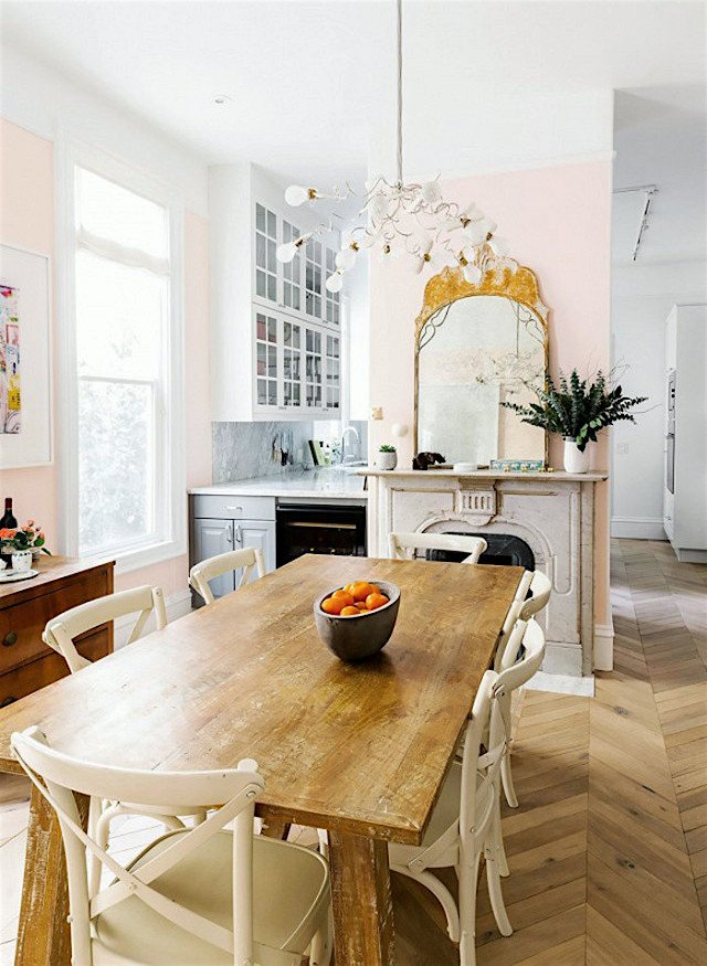
 

Annouchka Engla - pretty pink dining room and kitchen with high ceilings - Make small rooms look bigger

Annouchka Engel

Very pretty apartment with a fireplace. Open, but not too open.


MOULDINGS TO MAKE THE CEILING LOOK HIGHER
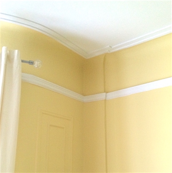
 

Cove ceiling in my living room with moulding on the ceiling makes the ceiing height look taller - Make small rooms look bigger

my living room

We’ve been through this before.

here is where you can see more ceiling mouldings.


MIRRORS


Mirrors are wonderful to expand space AND light. In fact, if you put a mirror directly across from a window, it’s like having two windows.


STORAGE IN HIDDEN PLACES


Hiding the stuff is always a good idea.
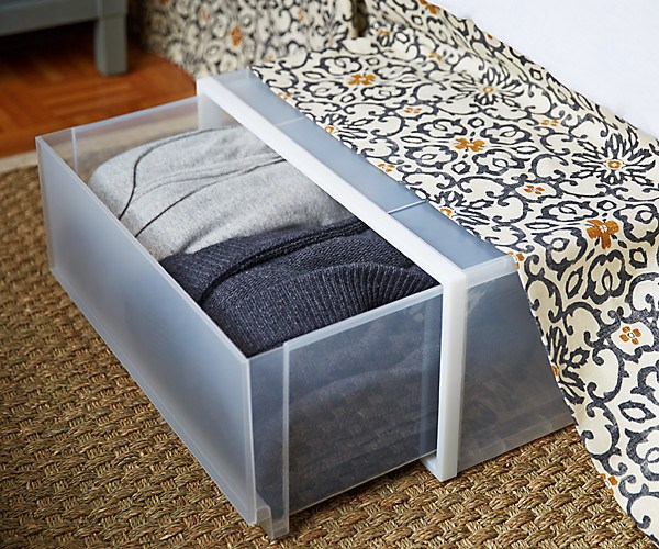
 

under bed storage - Make small rooms look bigger

Via OKL


DRAPES HUNG HIGH

Yep, we know that one. If you are lucky enough to have a high ceiling, even if the foot-print of the room is not so big, it will give a sense of space.
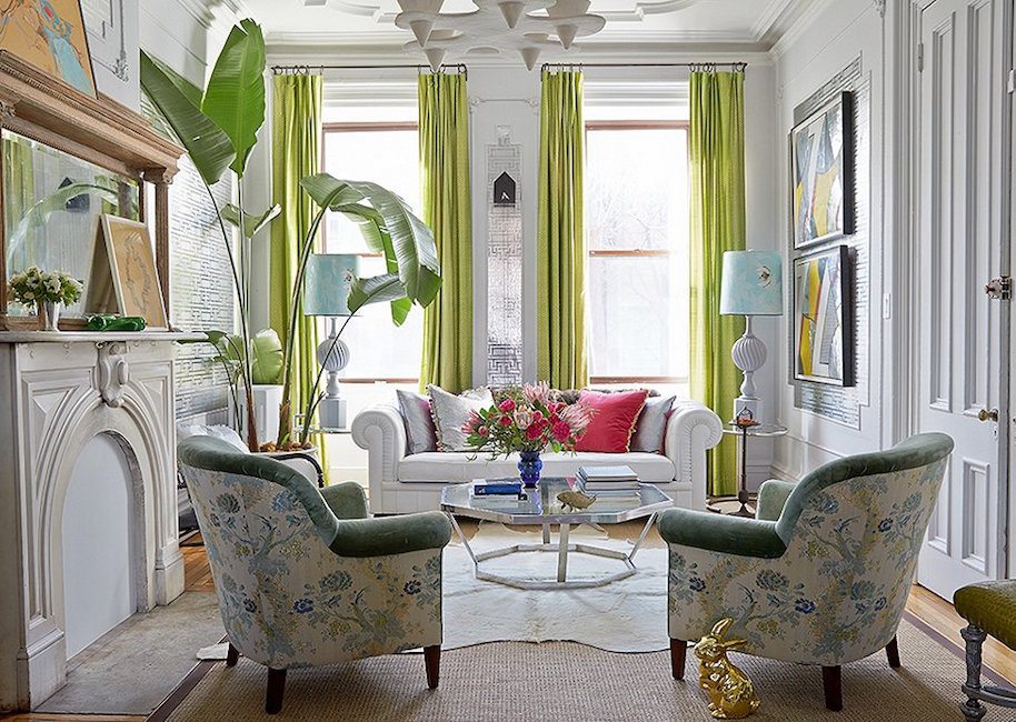
 

Fawn Gali - pretty living room - Make small rooms look bigger

Fawn Galli

Yes, it’s a gorgeous room. Great bones! But perfectly done. The upholstered furniture is just the right scale. The tall lamps look perfect because the ceiling is so high.The large scale art adds the right amount of drama. And the light, but large plant adds a note of chic.


GO HIGH

And

PIECES THAT SERVE MULTI-FUNCTIONS


Yeah, we already know that one. But also finding creative ways to find space such as an office that can disappear when necessary.


But going high can also mean creating storage situations, especially in closets that make use of every bit of space.
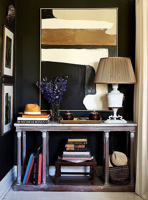
 

Beautiful vignette with black walls by William McLure - Make small rooms look bigger

William McLure


I just have to interrupt myself. Anyone notice anything?
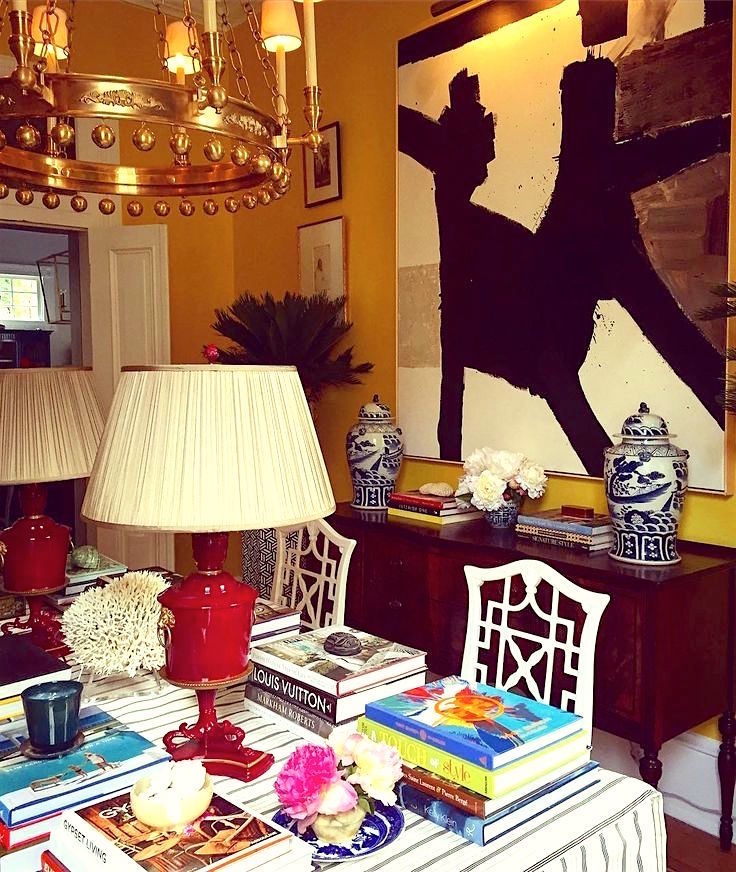
 

dining room home library by William McLure - with red lamp small rooms look bigger

Yes, it’s our yummy William McLure lamp. In the first image, it looks like it’s covered with primer before they were sprayed with red lacquer. haha. Very possible!

Moving along…


PAINT


So much can be done with paint.


Dark paint will lift the ceiling. Even a pale grayed down blue-green will make the ceiling appear to float higher. Here is a good post for ceiling colors.

The entire home is gorgeous! It’s the same one as the dining room at top with the mirrors.
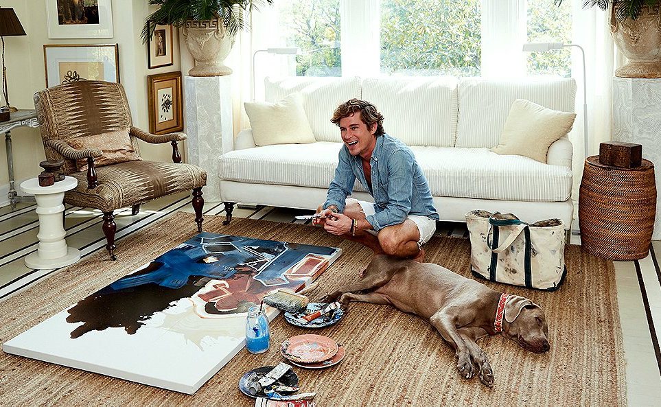
 

William McLure

Do you really think that he’s painting on his rug? haha. And with the dog right there? So cute they are! And talented. But William changes his entire decor as frequently as some women change their hair styles. And he paints EVERYTHING. He painted the stripes on the floor. That’s a great room expanding trick.
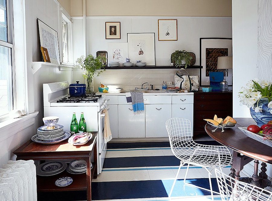
William McLure - cool slightly funky kitchen - painted stripes on floor - Make small rooms look bigger

He painted the stripes on the kitchen floor too!


It was a black and white linoleum floor (see below) before he got his paint brush and tape out.
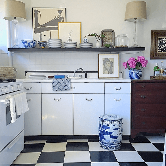
 

That’s lovely too!


I understand that he moved a few months ago, so we’ll be seeing a lot more from him, I’m sure.


LARGE-SCALE ART
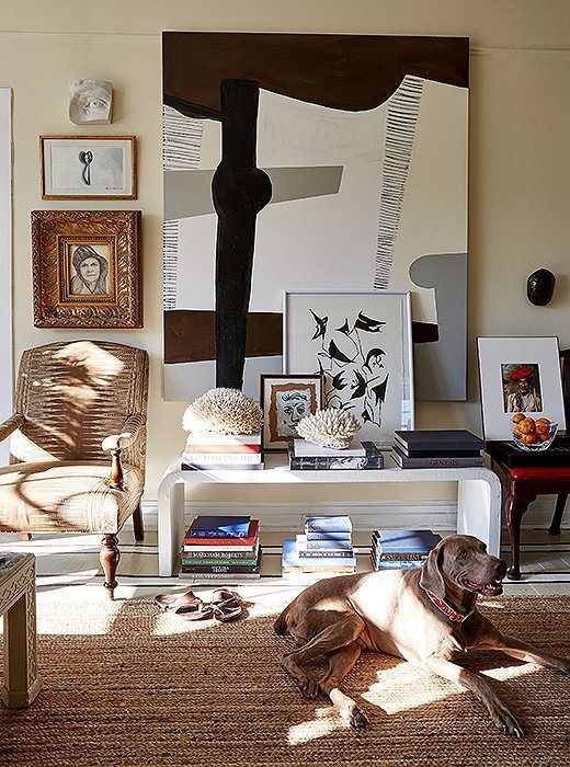
 

William McLure - fabulous artist and designer - Make small rooms look bigger

William McLure


It may seem counter-intuitive but a large piece of art can make a room feel far more expansive than a couple of dinky pieces. But if doing an art-wall, like  the ones below, you can still cover the wall. I really hate it when the art feels to small for the wall or the composition feels too small.
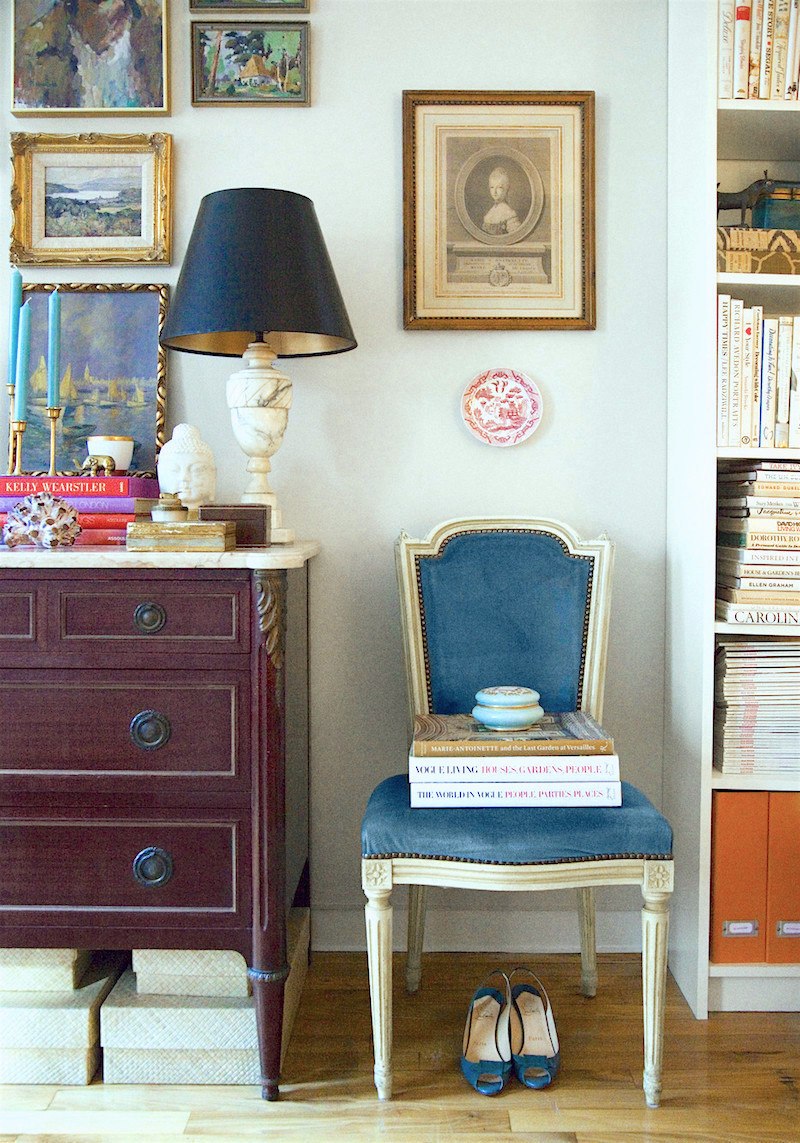
 

Habitually Chic - Charming vignette by Heather Clawson - Make small rooms look bigger

Heather Clawson


Heather’s style is incredibly charming, and she makes the most of her small New York apartment.

If you don’t already read her wonderful blog you can check it out here.
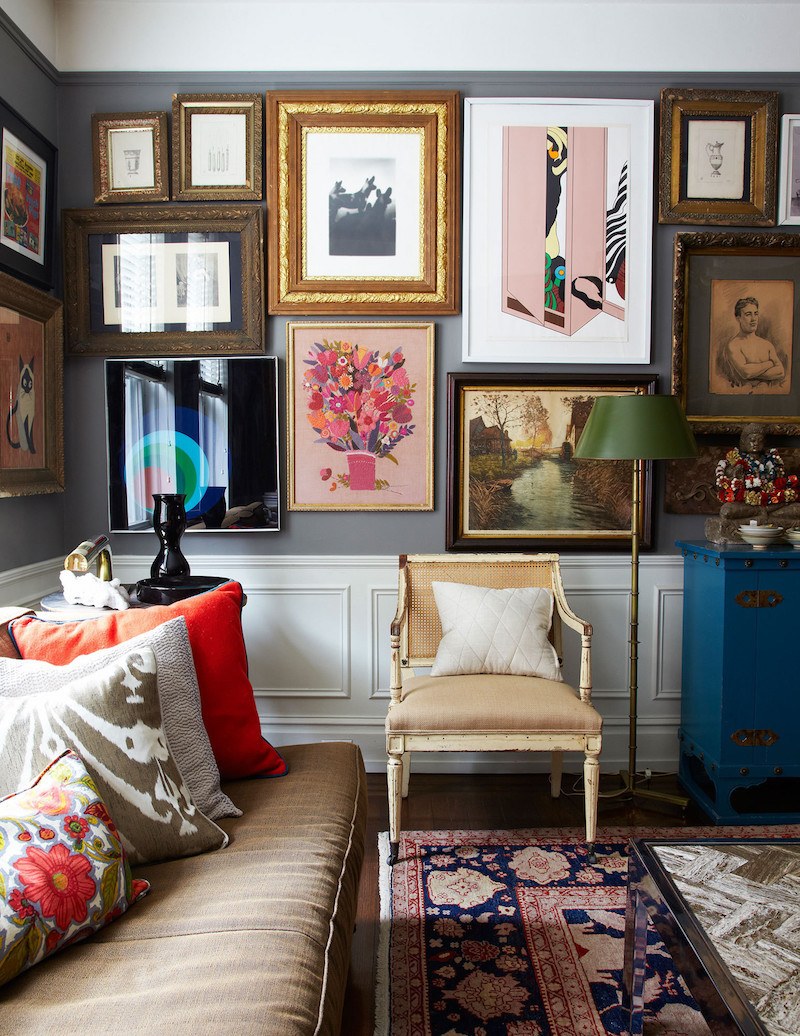
 

James Klein and David Reid - via Lonny - cool artwall - Make small rooms look bigger

James Klein and David Reid via Lonny

I’m sure that for some people this is “busy,” but I think it reads as personal and homey in a sophisticated way.


WALLPAPER
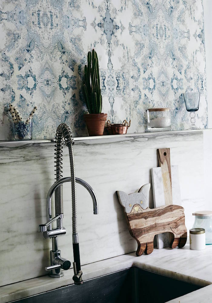
 

Anthropologie’s Edith Wallpaper

It reminds of a cross between Timorous Beasties and the book matched stone.   I’ll be doing small kitchens soon, but I wanted to get this one in because I think it’s so cool!
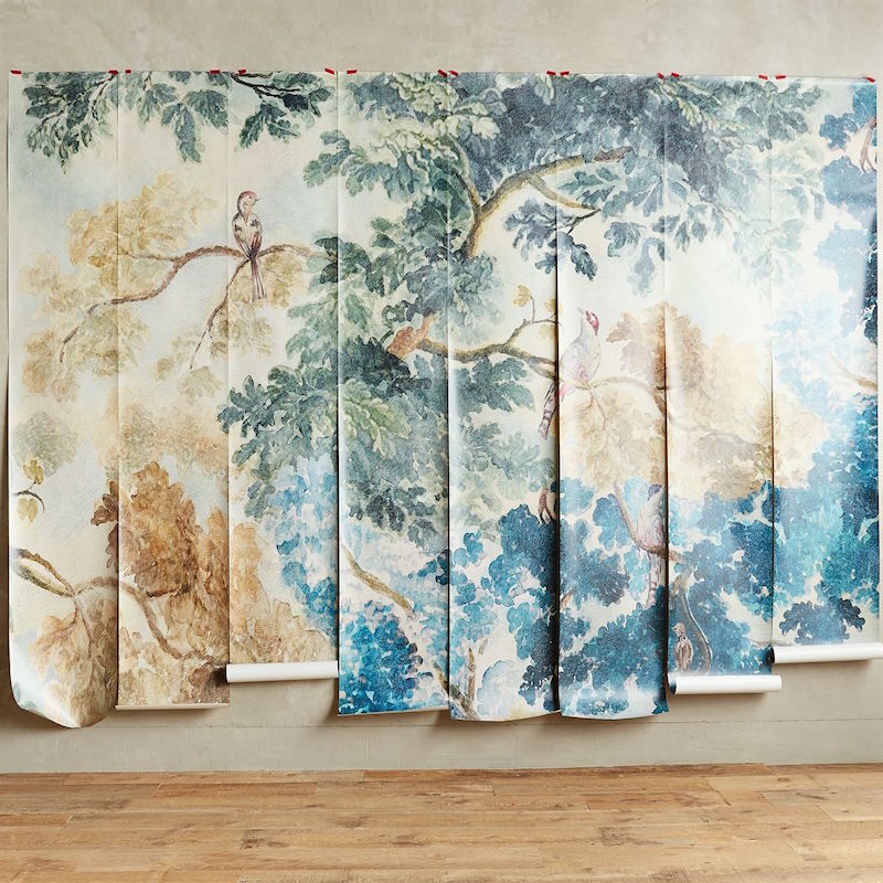
Anthropologie

This mural is only $298.00! It’s nine feet high x twelve feet wide.
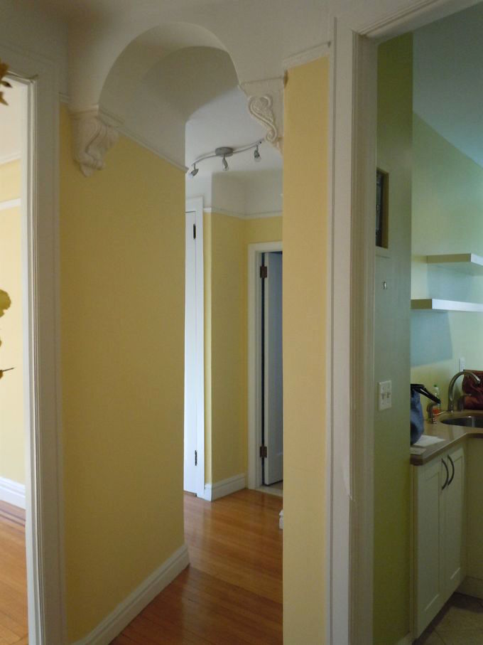
 

My apartment L Bern - Make small rooms look bigger

I’m seriously thinking about it for my entry and hall. Thinking, I said. :]

An important thing about wallpaper is that the pattern need not be ditsy because the room is small. Larger scale patterns look great in small spaces.


FURNITURE PLACEMENT
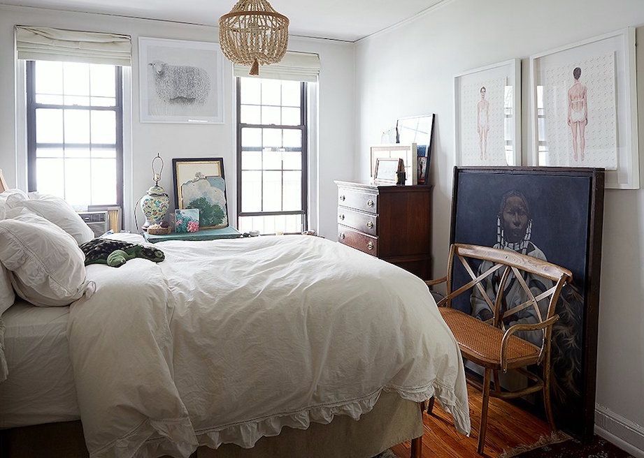
 

Alex Reid and Cole Wilson
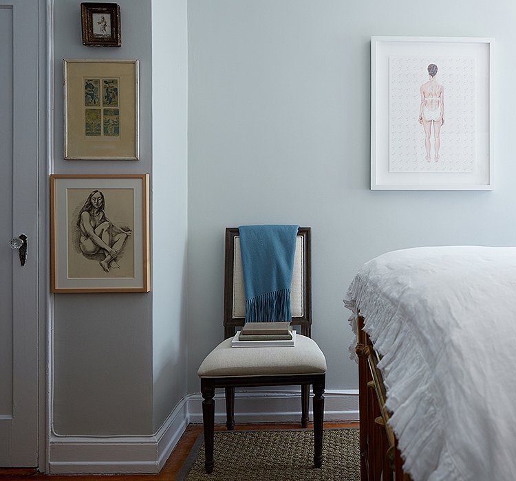
 

Alex Reid and Cole Wilson - Make small rooms look bigger

Alex Reid and Cole Wilson

Just watch that the art isn’t butting  up against the moulding. I would’ve put the bottom piece of art over the chair. Sometimes things show up in photos that don’t show up in real life, so much.
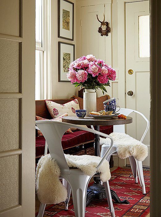


Uh oh… Great idea, but what happens when someone tries to come through the front door?

“Oh, sorry Aunt Edith, I hope you’re okay!”

Guess, that’s why the chairs are covered with that thick piece of animal skin. It’s one of those trends that annoys me. Sorry if you feel differently. It’s okay, I’ll still be your friend. :]
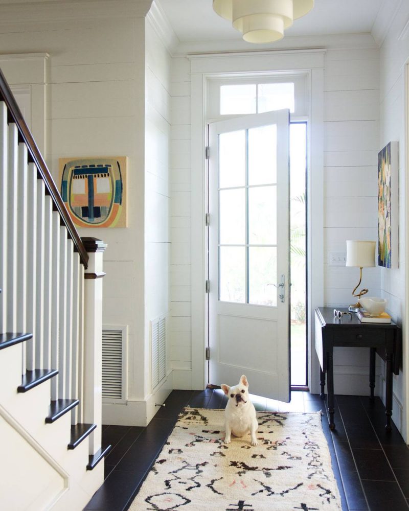
 

This entry is lovely, and I love the Pembroke table. Alas, it’s a little too big for the space. Furniture should not overlap door and window casings. Poor pooch looks like he’s wondering what the milk-bone is going on with these strange folks in the house.
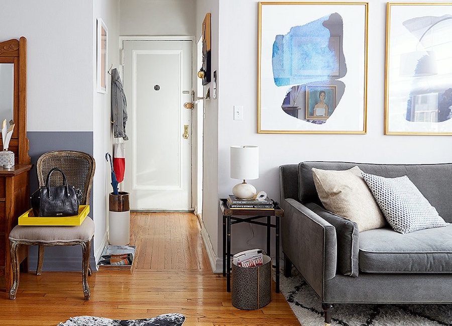
Ari Hershey - Make small rooms look bigger

Ari Hershey

Everything is in scale, and there’s even a little place to hang up a coat and put keys. This is a very tiny apartment!


ONE LARGE PIECE OF FURNITURE CAN BE DRAMATIC
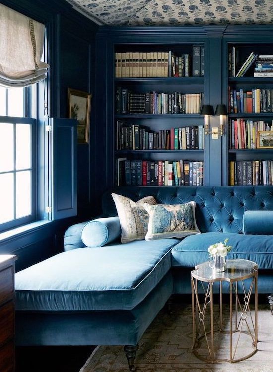
sectional fits perfectly in a small space - Designed by Jeannette Whitson via House Beautiful - photo - Simon Watson


Jeannette Whitson

Fabulous library in Farrow and Ball Hague Blue. The rest of the house is awesome too!


LEGS ON FURNITURE INSTEAD OF SKIRTS


Lots of examples already on this page.

It keeps things lighter and more airy to have the legs on upholstered pieces. One exception would be if you need a sleep-sofa.

And bench cushions (seat cushions in one piece) are a great alternative to having two cushions on a smaller sofa.


LOOK BEYOND SURFACES FOR SOLUTIONS
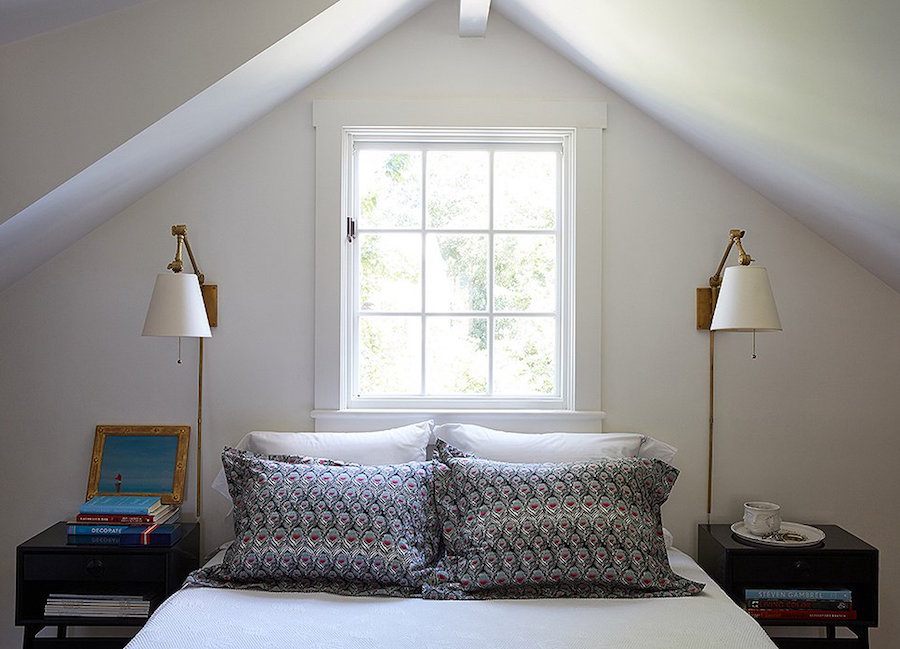
 

Elizabeth Bauer - attic bedroom - Make small rooms look bigger

Elizabeth Bauer


It’s a great solution when the night tables are very small. And here, we can see that they are the kind that doesn’t require a box in the wall.


CREATE NICHES FOR SLEEP OR WORK
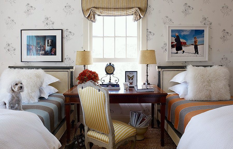
 

Make small rooms look bigger - charming girls' or guest bedroom

via OKL

I love the idea of having a little work space between two beds. It would work out well, I think for a kid’s bedroom too.

Do you have any great tips for small rooms? Please share! I’m sure that there are many more.

xo,

Save

80 Responses

  1. Hi Laurel
    Been a subscriber for quite a while now and I enjoy every post. I also purchased both of your online pubs for colors and sources! However, I’m still challenged… lol
    I’m looking for a secretary or armoire type piece similar to the one shown above for one kings lane and I can’t find it! I need one that will hold a large monitor, not just a laptop as I do graphic design. After months of looking, I keep Coming up empty handed. I’m starting to think I’ll have to have one custom made! Can you make any suggestions that might lead me in the right direction?

    1. Hi Misty,

      Well, most secretaries aren’t that large and if you need a large monitor, that probably won’t work, in any case because if you ever want to close it up, you’ll have to unhook everything. So, it sounds like if you want to be able to hide the work, that it will need something like an armoire that can be closed up without having to move anything. Of course, that’s only off the top of my head since I can’t see your situation.

  2. I know how much I love an article by how many re-pins I do.

    Fabulous one Laurel!

    sometimes seeing an un-selfconscious kitchen like William’s ( isn’t he gorgeous?) is such

    a relief after all the agonisingly-chosen-what colour shall I paint-painted ones. His ‘stuff’

    was the star & I loved the way it’s all thrown together so apparently, nonchalantly .

    Loved that Edith wallpaper. Did you include that instrument of torture, the ‘tap’,

    deliberately ? (yes, it’s than English woman again.)

    You just go from strength to strength & I will have to send you to the top of the class,

    again.

    Thanks, darling!

    Jo Pearson (UK fan club).

    1. Hi Joanna,

      Hahaha, on the tap. Yeah, not a fan of the python either. What happened to the sweet little sprayer that pulls out of the counter. But I was so mesmerized by the walls, I let it slide; or rather slither. ;]

      And yes, William, our golden boy, is a classic beauty. And I love kitchens like that. Actually, I think it was a rental. He kept saying on instagram. “good thing my landlord doesn’t know or isn’t here.” hahaha. Surprise!!! But everything he did was definitely an improvement. I think the “original” living room floor was wall-to-wall yuckiness over the old hard-wood. I loved his first iteration– the white with the simple border. I think that is in an older post from a few months ago.

  3. Hi Laurel,
    My week just wouldn’t start out right without your blog and my morning cup of coffee!
    Today’s topic is so timely as we hope to begin building our retirement home shortly. It’s not tiny, at 1500 sq ft, but still much smaller than our previous homes. Your perspective of cozy and human-scaled has greatly encouraged me as I plan. Thankfully, we’ve accomplished your first tip….pare down.
    Painful! but all our worldly goods are now in 2 (large) storage units, awaiting completion of our home.
    Can’t wait for what you have to say about small kitchens.
    Thank you for this amazing gift…your blog, and also for your two color collections. So much fun visualizing different ways to go with the colors.
    Happy Valentine’s Day to you,
    Brenda

  4. Hey, Laurel,
    Love to read your posts! Could you expand a little about wallpaper? Here in mid-America, the current trend seems to be “OMG, get rid of every trace of wallpaper ever!” I personally love the pattern, color and interest you can achieve with wallpaper, especially if you live in a boring, cookie-cutter house without beautiful millwork/history/character. I do agree it’s a pain in the tookus to remove so you better choose something you KNOW you’re going to love for many years. I notice what looks like wallpaper on the ceiling in the blue library, which I love. I have wallpaper on the cove ceiling in our dining room, but alas, it’s a small print, plus I’m tired of the color–put it up over 10 years ago! Anyway, love the tip about large scale pattern paper. Would love to hear more about wallpaper…is it really making a comeback (and just hasn’t reached us here in the central USA)? Thanks for being such a great teacher!

    1. Oh dear. I’m from the midwest, so please understand that it’s not your fault.

      Wallpaper NEVER went away! It went away from HGTV perhaps, but HGTV is design for the masses.

      I did a post or two about wallpaper a while back, but perhaps it’s time to discuss it again.

      Of course, there’s wallpaper and then there’s wallpaper. The kind I’m talking about is not sold (for the most part) at your local paint store.

      Here are four of my favorite sources, amongst many others.

      http://www.cole-and-son.com/en/

      https://www.fschumacher.com/catalog/Wallcoverings

      http://us.farrow-ball.com/patterns/wallpaper/fcp-category/sub

      http://www.thibautdesign.com:443/catalog/collections/all/type/wallpaper

  5. What a wonderful post-so much eye candy to swoon over on this cold, rainy Sunday.
    And I adore that Anthropologie mural that you are considering for your hallway.
    Wishing you a very happy belated birthday!!

  6. I just want to express my gratitude, Laurel (one of many I hold for you)) for encouragement I got from your posts and answers here to go ahead and paint my ceilings. No doubt it lifted them up. I was scared as hell to do that, I was worried what the painters would say(they were nice. did seem a bit puzzled lol), yet I went with it-and it was one of the best decision to make in a smaller home with lower(almost everywhere) ceilings.
    Of course we wanted to add crown moldings as well-but one needs to choose his battles with himself when gut remodeling.

    As for the gallery walls -I love them madly, yet I seem unable to do one, unless the pieces hold the same importance for me.. And they usually don’t. It turns to be such psychologically daunting task, like I’m about to arrange their marriage or something..:) They’ll be beautiful together, yes..but I can’t get over my own strange relationships with different art I own. I don’t know why.

    1. Hi Jenny,

      I think that really great art walls are not very easy to do. Or maybe they just aren’t easy for me to do. It does help to have a large selection to choose from. Starting from scratch is more difficult. One vendor I love Wendover Art has collections that look somewhat collected and that would help if starting from nothing.

  7. Another fabulous post! You pretty much covered it all when it comes to decorating small spaces. I have some experience w this topic since My 1920s bungalow has small rooms. Over the years I’ve learned by trial and error, lots of errors. Lol! I would add the following: symmetry creates visual order which serves to expand a wall, drapery the same color as walls avoids breaking up a space which enlarges the space, keeping color constrast to a minimum also expands spaces ( monochromatic or analogous rather than opposite or complementary), avoid too much pattern which can get very busy in a small room. NO floral sofas or bedding! If you love a print put it on a pillow. Somehow my no pattern rule can b broken if it’s a large scale wallpaper in a small room or a patterned RUG on the floor. But then that’s the only pattern one should use. Lastly, opening up doorways or walls in living spaces if possible obviously enlarges the space. That’s it from me. Happy week. Betsy O

  8. Laurel,

    TINTED GLASS? NOT!!!!

    Loved the mirrors in one of your first photos today–and your comment that the right wall in one of the rooms appears to be all mirror. And lovely and bright it is!

    Years ago we added a wall of mirror to our darkish dining room. The mirror doesn’t reflect the expected amount of light from the opposite windows. And every color I’ve put on the other walls in that room NEVER MATCHES THE CHIP.

    We were poorly advised to get tinted glass (and at the time I didn’t know better). Oh bummer……that greenish cast is HORRIBLE!!!!!!

    1. Hi June,

      Oh dear. A lot of people don’t realize this, but glass IS already tinted a light green. You can see it if you see a thick piece of sheet glass. The side edge will be very green.

      Mirrors because of the silver backing aren’t green. I’m wondering if you could do something with the lighting to counter act the green.

      Just a thought, but have you ever tried pink bulbs? Not sure if you have that option or if it would work, but it seems like the pink would neutralize the green, possibly.

  9. I checked out some of your posts about the gallery walls. Doing a mock-up with pieces of paper on the walls is a good idea. I just kind of put together my groupings on the floor to figure out how the grouping should look and then put it all up on the wall. In my condo the photos are grouped according to subject so each room or wall tells its own little story. Happy Valentine’s Day, everyone!!

  10. The dark brown walls and ceiling in the bedroom. It made me happy to see that application. It is what I did for my lower level (better known as a basement).

    Just wondering…the rooms do not have molding at the ceiling. Would the rooms show better. Ceiling height is only a barely decent 8’.

  11. this is the thing that bothers me about so much of the interiors in magazines: functionality. Maybe it’s because I was an engineer, but when I see that gorgeous blue library with a giant couch crammed up against the bookcases – I’m like?? You crawl up the back of the expensive sofa to reach the books?? and dining tables full of stacks of books too…the house looks like a store full of merchandise. I love multi-purpose rooms but I wish there was less blending between actual interiors of homes, storefronts, and stage/set building for movies.
    ok rant over. carry on. 😉

  12. Do you have an idea what paint color is used in Heather Clawson’s room? Greyish/greenish/blue?

    I think that the mural would be a wonderful continuation of your living room pillow fabric, and your folding screen. Beautiful and sophisticated.

    Jeannette Whiston’s library passes my personal test. Would I feel comfortable coming into the room, and actually sitting down? In this case I would have to be restrained from throwing myself onto that sofa!

    1. Hi Beverly,

      I’m sorry, no idea about Heather’s paint color. Yes, it does look like a very soft pale gray. It is possible that if you get on her blog, Habitually Chic and do a search, she might divulge that info. OR, you could try contacting her directly.

  13. Thank you so much Laurel for another fantastic article! I am currently working on a guest bedroom (12’9″ x 13’6″) and am leaning towards using dual purpose furniture. To summarize; as I wish a Queen size bed that I made a floor to ceiling upholstered headboard for (Lord, knows what I was thinking at the time … ☺); I am equipping the rest of the room with two small bench seats that will flank its end, one of which will also serve as a seat for a shallow’ five drawer desk (a 2nd hand store find that I plan to refinish) that will also be used as a vanity and a dresser. Also in lieu of a luggage rack, I am just toying with the idea to have a drop-leaf surface attach to its end to accommodate a suitcase. As for night tables; I am opting for custom built and wall hung.

    Before signing off, I am hoping you can confirm for me the following: a)Did you say that you ‘often paint the walls the same colour of the drapery’ or am I confusing you with someone else? b) With reference to painting your ceiling a colour; does the rule basically mean ‘no white ceiling paint direct from a can’? Thank you! -Brenda-

    1. That sounds lovely Brenda!
      a) – yes, that was me!
      b) – On occasion, I have used ceiling white, but if the trim is white and the ceiling is white, I just use the trim color but in a flat version.

      1. Thank you Laurel for the confirmation (and the compliment).
        -Brenda-
        P.S.: The room itself is coming together slowly but surely .. ☺.

  14. I so look forward to your Sunday posts! This one interested me even more than usual since we have a small apt. But what I loved most was reading your rules about how art frames shouldn’t bang up against molding, how furniture shouldn’t overlap door frames, etc. As we house-hunt and measure, and try to imagine built-in bookcases and our case furniture on wall after wall, I’m constantly telling my patient husband that this or that won’t fit because of doorways, moldings, etc., and he thinks I’m making it all up! I was actually beginning to wonder. Now I feel vindicated!

    I can’t wait to see your small kitchens. Ours is around 60sf, so please don’t show one that’s two or three times that size and refer to it as “tiny”. I’ll be so depressed! Ours is hitting the 20-year mark and we can’t replace some of the smaller appliances we found then (19″ x 20″ Equator dishwasher, allows a deep pot drawer underneath, fridges no longer our size) so redoing it will be a big, painful job.

    1. Hi Elle,

      I promise not to disappoint. Or I’ll try not to! I had a kitchen in Manhattan for many years that was built into a corner. haha. I would say that it was about 20 sq feet– tops! And I created many a gourmet meal in it! No dishwasher, of course. :]

  15. Laurel!
    Say YES to the mural!!!!….. you could also add handpainted details to make it your own “one off”.
    It’s certainly a bargain and would add such drama to that space.
    Best,
    Brett

    1. Hi Brett,

      I think I will, but I have to decide whether to do the entire thing or just part. I am thinking the entire thing because it’s chopped up a lot except for three sections. But then, I would need 4 murals. Maybe I could talk them into something (more than by paltry 10% off) if I do a post about it with GOOD photos, not the crap they post on their website that folks have done.

      I would have to hire someone to do it. My paper hanger would charge me about 500 bucks probably.

      1. Go for it!!!! Think of the drama it will add to the space. The other option, albeit costly, would be mirroring the opposite walls….hmmmmmm.
        B.

        1. Hi Brett,

          No, that won’t work because it’s too windy.

          Hold on. Here’s the floor plan– in this post which is one of my favorites. And no, this apartment did not sell and it’s not going to.

          https://laurelberninteriors.com/open-concept-home-renovation/

          Oh gosh. If I could roll back the clock 4.5 years ago, I would’ve closed and then done a little reno. The floors and some of the baseboard mouldings are in terrible shape.

          Then again… it would give me a lot of material to blog about…I have projects galore… hmmm… food for thought…

  16. Great post. Concerning William painting on that rug. I bet he does. When you look at his work it is meticulousy crafted though abstract, very precise in his brushwork. There are many artists I know who never spill a drop of paint. Part of their art making process.

    1. Hi Marilynn,

      That’s so interesting. I am such a klutz. I can assure you that the rug as well as the dog and I would be covered with paint. There would be paint in the next room too!

      I always wonder with abstract works such as this how they decide what the shapes will be, the colors, etc.

      What I love amongst many things about William is that he is obviously a classicist in his design work, but it makes the most wonderful juxtaposition (my favorite art-word) with the modern art. Just brilliant! And his clients get a two-fer!!!

      1. Took an art class once where we were given 5 cut-out black shapes – triangle, square, circle and two thin straight lines – and asked to arrange them on a white sheet of paper. There were about 15 of us in the class and every board was different – but only a couple were truly artistic! Abstract art is much more difficult than it looks! I often cringe when I hear people saying “my kid could paint that”

        Out of all the design blogs there only a handful that are truly artistic and yours is one of the greats! Thank you for sharing your expertise!!

        1. Hi Susan,

          What a lovely way to start my Monday! Although it’s funny. My two busiest days of the week (normally, if one can call this ‘normal’ haha) are Saturday and Sunday.

          Thank you so much! The blog and all that goes with it feels so much like a culmination of all the parts of my past that made me what I am today.

          And now, I MUST wash my hair before it decides to abandon my head and march itself to the shower!

  17. Good Morning, Laurel, Love waking up on a dreary morning to a terrific post! I like small spaces, as well. One of our bedrooms is very small and chocolate brown, it is called “Tiny’s” room. (He is imaginary) Recently had our smallish sunroom painted black. I like the idea of the Anthro mural in your beautifully detailed hallway, or how about the kitchen? I think William MClure is my new crush. XO

    1. Hi Nancy,

      I’ve thought about the kitchen too. The kitchen needs some work and another issue is that it is actually in the shape of a trapezoid, so the near end is only about 4 feet wide and in the back it is close to 8 feet including the cabinets. Also, there was a leak and I’m not sure if it’s fixed or not. I know… The cow above me. Yes, cow. She finally got evicted after trying to burn down the building at least twice and calling her health home aide the n word! yikes!!! But I also had floods from above in the bath and kitchen a few times. It looks like there may still be a persistent bathroom leak. Ahhh old buildings.

      William is definitely my new crush. Have you seen his instagram? He’s phenomenally zany! Love that! Reminds me of my son! If you scroll down far enough. You’ll see his Momma. Gorgeous woman!

  18. Great article. As I was reading, I got to thinking…wouldn’t it be fun to see a “I would have done it this way” article. Such as the table by the door is a bit too big, or the picture hung too close to the moulding. These are things I would not think about unless you point them out. Just a thought.
    Can’t wait for your small kitchen story, as I have a very small one! Love your blog. GGG

    1. Hi GGG,

      I have to be careful about being critical of other people’s work. First of all, in the case of the art, the owner isn’t a professional designer and it may not be the way she had it in real life. They do all sorts of stuff for photos. But there should always be some breathing room.

      One time, I did put a photo up and it was an acquaintance of mine. Oh man… she was very angry with me and I was mortified.

      I see stuff in magazines all the time that is obviously just done for the photo. It really is often a lot of smoke and mirrors!

  19. Dear Laurel, Yours is the highlight-email of my week!

    Have you ever investigated sofa beds and discovered ones that are firm and comfortable? Much as I look and sit, I haven’t found one that I would trust.

    Thanks!

    Barbara

    1. Hi Barbara,

      Thank you so much! As for sofa beds, I’m not sure if you mean the bed part or the cushion part.

      I have one from Lee and the seat cushion is very comfortable. I think I did the Natural Lee. It’s a bench cushion. Normally, I do spring down but didn’t want to spring for the upgrade and thought I would try it out.

      As for the bed.

      All of them suck. Best I would suggest is to add a memory foam topper underneath the fitted sheet.

      1. Good afternoon:)

        as for sofa beds and futons -I highly recommend Aminach, an Israeli store that specializes for years in very high quality beds and sleeper sofas. the style tends to be quite contemporary, but you can find more eclectic versions as well. The quality of their sleeper sofas and futons equals the quality of a very good mattress.My Mom still has the sleeper sofa we brought her as we moved overseas. It’s heavily used, and it feels amazing as it felt 20 years ago when purchased. It is an expensive brand. But they stand behind their quality. I believe they have a store in NY. I’ve no doubt some parallel quality can be found in other brands-but it will be very expensive as well, no doubt. Now, pull out beds hidden in sofas are probably hard to get right. We have one ourselves, in the library/family room sectional-to accommodate additional guests that don’t stay over longer than couple nights, or are healthy and young:) And it is made in Italy, so seemingly shouldn’t be that bad. It is not, but I wouldn’t call it good either.

        1. Hi Jenny,

          Yeah… I looked them up. Yes, it’s sort of contemporary. Not my thing aesthetically. But that’s just me. It would be good for a room that is used primarily as a bedroom and only sometimes needs to be a sofa. Most of us over here, want a piece of furniture that is not obviously a sleep sofa.

          But thank you for sharing the info.

        2. well the one we got did look like a sofa:) quite a normal sofa. We had it in our tiny “living room” for several years. I admit I went for a horrid print after seeing a teeny sample-a rookie mistake(I was 22 and very pregnant). When it arrived I promptly ran to a store and got a huge plushy coverlet, and it leaves the sofa only when one prepares to go to sleep.
          Don’t know what they have on display right now..things obviously change.
          But yes, it’s a challenge, to have it both ways. I think it was easier in Europe since more of an apartment culture..hence more solutions. Or maybe it was easier many years ago. My parents slept on a very yummy looking sofa that unfolded for the night, and it was very comfy. They had not much choice too-theirs was a living room, after me moved to our own apartment from the communal flat.
          For our guest bedroom, I got( on Craigslist actually) a very bulky daybed from Ballard Designs that I wouldn’t choose at all..but it has a roll out bed, two normal mattresses, and gives you versatility to accommodate different guests in one small room. Sacrificed myself for the sake of guests lol. But you know I got a beautiful quilt and added throw pillows I love..put there the best curtains I own..I was so upset about the room and the bed at first but it turned out to be one of my favorite spots in the house. I used a lot of patterns-but the colors are almost all on the warm side, and the embroidered curtains’ background does match the wall color to the “t”. I often want to take a nap there myself. The more thought and effort we dedicate to something the more we love it I guess.

  20. Love the little sleeping nook. I think having some sort of greenery in a room always makes it look like the outdoors, not like you are living in a little room. Today’s photos also show a big trend I am noticing lately: gallery walls covered with artwork and/or photographs and walls/tables covered with books.

  21. Another great post Laurel. I just painted my bedroom Gentlemen’s Gray (I found through your post on converting Farrow and Ball to Benjamin Moore – thanks so much for that). Now of course I have to add crown moulding to the ceiling and perhaps paint it too! Your posts give me so many great ideas (and a lot of work too but I have a great hubby I can easily persuade to help with all these projects)

  22. I love finding your latest post in my in-box on Sunday morning. It goes so well with my coffee.
    I have a small guest room. I painted out the nightstands the same color as the walls. But left the tops stained. And I kept the bedding in the same tone as the wall color. The effect was similar to the Farrow & Ball Hague Blue library. Only I used a much lighter color.

    1. Hi Mary,

      I love tone on tone and think it’s also a great idea for a small room. I didn’t come right out and say that. I could’ve made the post just about painting techniques that maximize small rooms. Well, that can be for another day!

  23. What a wonderful post!I love that mural, and the price is unreal! I think in the right hands, and in a well proportioned room it could be wonderful..
    Thank you for a great Sunday morning’s read

    1. Hi Dolores,

      It’s funny, I have a preview on my phone that sends me my instagram and FB messages. It pops up if all I do is pick up the phone (even when locked).

      Well, yesterday, I posted a cropped image of this on instagram and somebody wrote that there were lots of options less expensive.

      I was thinking, What? Have your first grader finger paint on the walls? But when I went to see the comment for real, it was gone. I have a feeling she thought at first that it was 298 for one panel, not the entire mural! Then, she would’ve been right.

  24. I love William’s black walled nook, I wonder if it was created in a larger room by using a curtain on the right side? Question about the Goldilocks room. The paintings (?) above couch are they paintings or mirrors that were painted over and paint removed in spots to reflect the opposite wall? Either way I love the look.
    I’ve always wanted a black and white checkerboard kitchen floor. Happy Valentine’s Day Laurel

    1. Hi Betty,

      The black wall was in William’s bedroom. I believe that the entire room was black, but I have also seen it painted off-white. The curtain is from his bed. Alas, he’s left that home.

      Good question about the art. I think the art on the opposite wall is just reflected in the glass. There is something called museum glass that won’t do that.

      I had a black and white checkered floor in my old home. I loved it, but it does scuff very easily.

  25. Laurel, I am very interested in this subject as we are getting ready to put our home on the market and have been wondering how to make one tiny bedroom look as spacious as possible! As far as other ideas to make a room larger, I’ve always heard that putting tile (or other flooring) on the diagonal can make a narrow room feel wider.
    Years ago, we added a chair rail in our rather long, but narrow, hallway and put wallpaper on the wall below it. We noticed that it instantly seemed to make the hallway seem wider. We thought that perhaps that was because, by visually dividing the height of the walls, we had created the false perception that the width to height ratio of the hallway was larger. Do you think that adding a chair rail with different colored wall below makes rooms feel larger in general? Have you ever experienced this? Just wondering what your thoughts are on this.
    Thanks for another interesting article! I always love your insight and perspective.

    1. Hi Phyllis,

      I like square tiles on the diagonal but not planked flooring. It’s very 70’s. lol

      Actually, for a small space, it’s better not to chop it up too much visually, but again it really depends on the situation.

      Also, some of those questions might be answered in the link near my ceiling (photo above with the yellow walls) because I examined lots of ways to make boring, boxy, squat rooms more elegant.

    2. I am not a fan of flooring on the diagonal, I think it looks dated and it is not a classic. When I am house shopping (and yes I have bought a lot) I am always bummed with diagonal wood floors, it is something I cannot live with. Hope I am not being to direct!

      1. Hi Lorie,

        Not at all. I’m not a fan of wood floors on the diagonal either. (same holds true for walls and home exteriors) It screams 1970s which in my opinion was the worst decade for design in the history of mankind. lol

  26. Another great post with brilliant ideas, Laurel. Thank you! I’m 6’2″, and was positively drooling over that giant blue sectional in the Hague Blue library. I could really stretch out on that! 🙂 Laughed out loud at the pic of the fellow painting on the rug. Yeah, right. 🙂 Loved the cosy couch behind him though. Always look forward to checking out your posts, Laurel.

    1. Hi Lisa,

      I know. They drugged the dog and that was fake paint in the bottle. Either that, or he decided to throw away the rug later. He was literally getting ready to move right after that photo shoot. I found out all of that from stalking his instagram. He’s a character– and very young!

  27. I am still laughing. Very entertaining article. I just love reading your blog, not only to educate myself in interior design, but also for fun and stress relieving . You are an awesome writer , Laurel! I love you 😘

      1. Here are some of the comments I thought were funny, “Do you really think that he’s painting on his rug? haha. (My first thoughts also, exactly!) and, “This entry is Goldi-Locks-ready-just-right.” And, “Oops. I see lots of black and blue toes.” And how about, “Poor pooch looks like he’s wondering what the milk-bone is going on with these strange folks in the house.”

        Laurel, I love your sense of humor–you have a knack for being so real and stating the obvious–which we often didn’t realize it was so obvious until you pointed it out! (Of course he wouldn’t be REALLY painting on the rug without a drop cloth!)

        1. Thank you Phyllis! One little trick I have is there is a built-in editor that tells me when I’m using a cliche. That’s often when I make up something else.

          But humor is definitely based on an obvious truth that’s not so obvious. :]

Leave a Reply

Your email address will not be published. Required fields are marked *

This site uses Akismet to reduce spam. Learn how your comment data is processed.

Welcome To Laurel Home!

laurel-aarons-18th-e1456449963926

Hi, I’m Laurel, and Laurel Home is the website and blog for Laurel Bern Interiors.
I’ve been creating new-traditional interiors since 1988. The blog is where I share all.

New Edition, November 2023! Get The Indispensable Guide For 100s of Home Furnishings And Interior Design Sources That Everyone Is Raving About

laurels-rolodex-final-book-cover-master 10th edition 23-24

laurel home archives

Categories:

Please click the image below for more info about my rockin’ Interior Design Guides for 2024!

Laurel Home Interior Design Guides 2024
Amazon ad

please click below to check out my favorite decorating & design books

Laurel Bern's Favorite Interior Design and Decorating Books