Hi Everyone,
Yesterday, I was finalizing the new media room in Bronxville with client S. Remember when I said that needed to find a rug to go with the scheme? (orange and fuschia vase wallpaper?) Well… I did and it is a beauty! I will be going over the final choices very soon. That room is going to be really cool! For now… I want to share some new photos with you. I’ve been dying to take some new portfolio photos!
Okay. Admission. I did not have my lovely Canon Rebel T3i with me. I used my I-phone– just quick shots–no tri-pod even. And the I-phone does take a pretty durn good photo, but there is some distortion in some of the photos. However, I think that they are absolutely fine for now.
I put these up on my new instagram account. You can do some editing but I really prefer to do my laptop editing. I use either XN View or Photo Gallery which is a microsoft program. The latter is really good for straightening crooked images. I’ve also been getting better at water marking. If any of you perchance want to follow me on #instagram, I’m @laurelberninteriors. Or is it #laurelberninteriors. I have been getting better with hashtags too. In fact, I hashtagged a close up of this chair.
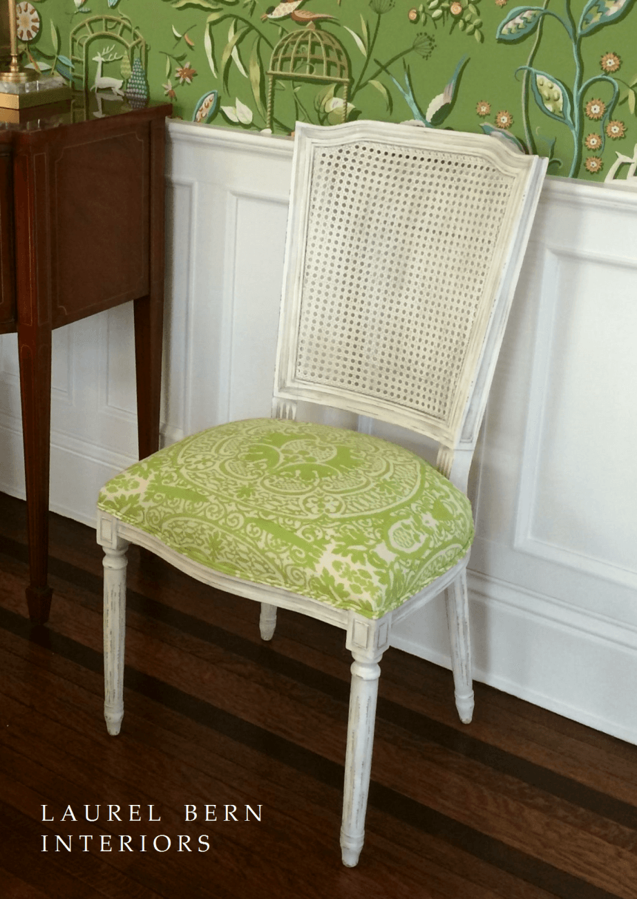
#Quadrille and I got a lovely response from them. (maybe I can get them to add it to their room views. That would be cool!) The Chair is from Aidan Gray and we reupholstered it in Quadrille’s Veneto in the Apple Green colorway.
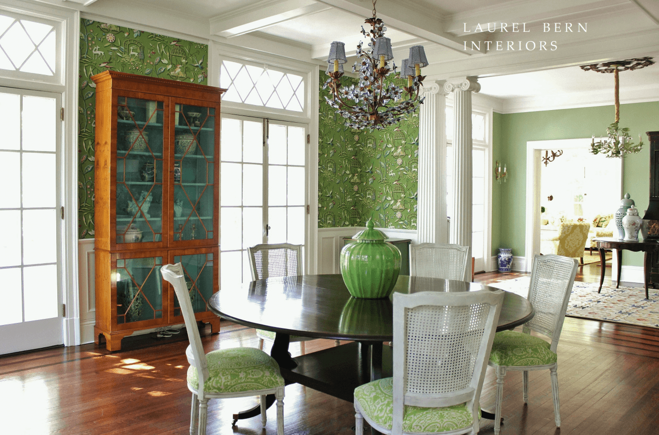
This is the opposite view from the view I have on my portfolio. And durn… but the wires are showing. Gotta fix that!

ta dah!
The custom cabinet was designed by me. I LOVE, LOVE, LOVE designing furniture. And I’m always thrilled when I can have one of the designs custom-made for me. This one was made from Yew Wood by Englishman’s Fine Furniture. We had them paint the interior a pretty turquoise blue which is one of the colors in the wallpaper. They also created the fine 72″ dining table extendable (with one 24″ leaf) dining table. pumpkin urn from Legend of Asia. Wallpaper from Thibaut.
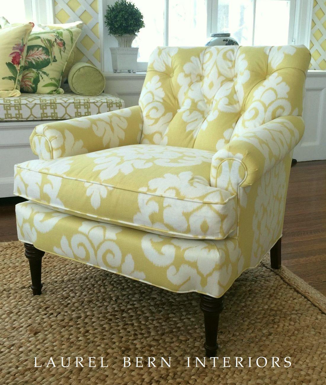
If you look through the dining room past the ionic columns. (pretty sick, huh?) you can see the back of the CR Laine Wagner chair. I hashtagged them too and they loved it. They said that they had to #regram it. Another new word. I posted a shot of this chair from about a year ago. The fabric is Windsor Smith for Kravet Malu Ikat
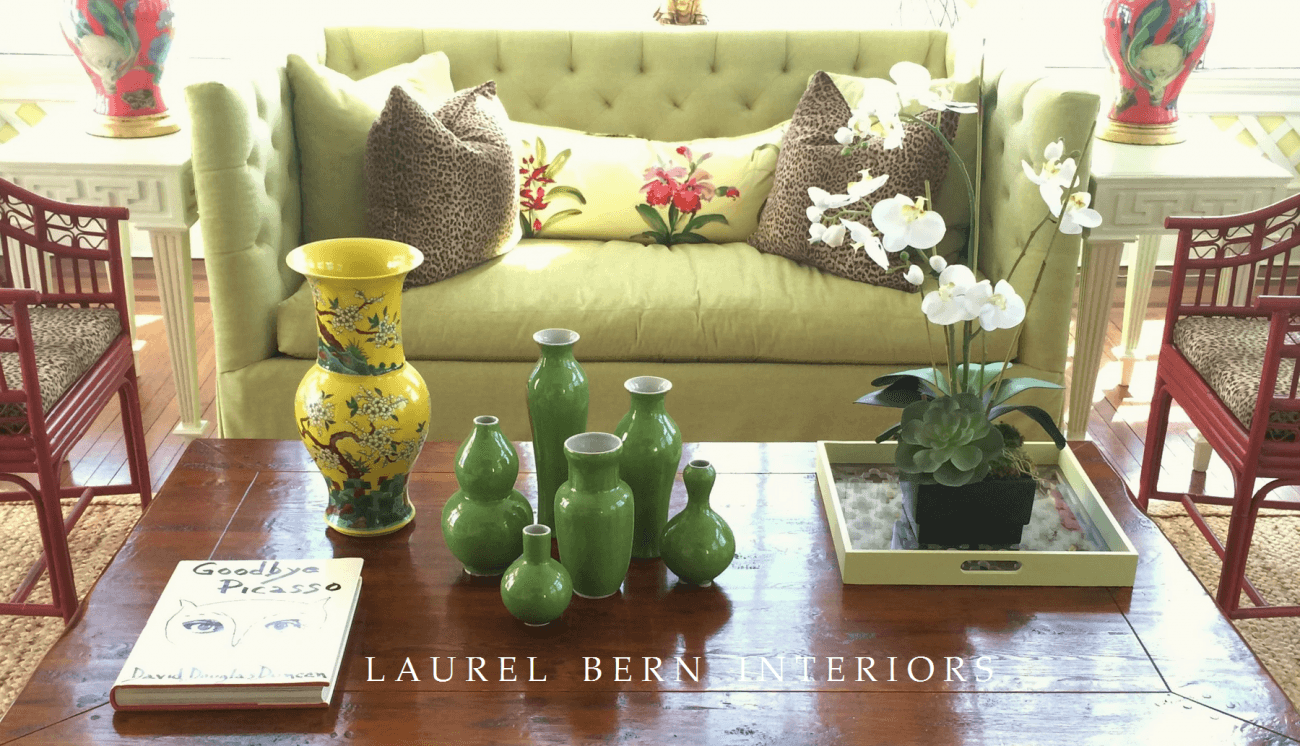
Here’s an example of the distortion. The table is really smaller in width from the sofa by 9″. I know… It looks large, but I swear that it’s not. And those vases are really tiny. The smallest one is only 4″ tall! The smashing yellow vase is from Bungalow5. The green vases from Legend of Asia. Chairs are from Red Egg. Lee Sofa. Brunschwig et Fils giga-gorgeous floral on the pillow. The tray was white, but we thought it looked too stark, so I painted it Benjamin Moore HC-1 Castleton Mist
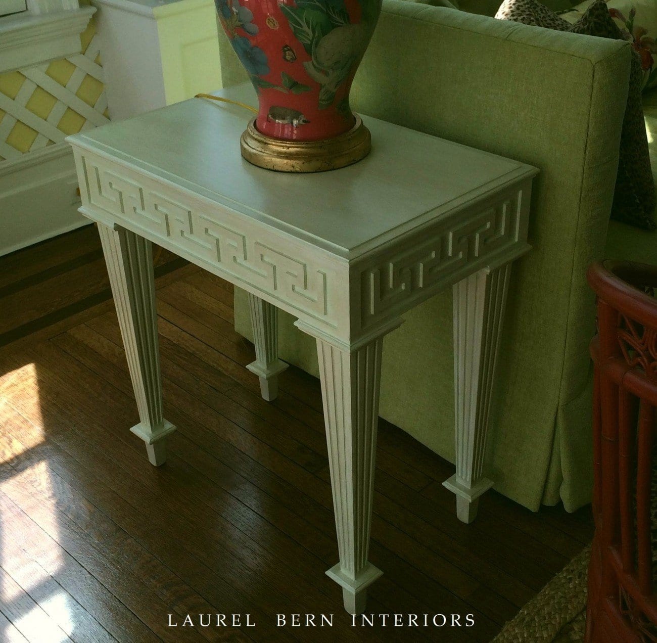
Close up of the fantastic end tables from Tritter Feefer painted in a custom color. A bit of the Carson and Co. decoupage lamp. Completely custom. And yes… that is a cabbage head. :]
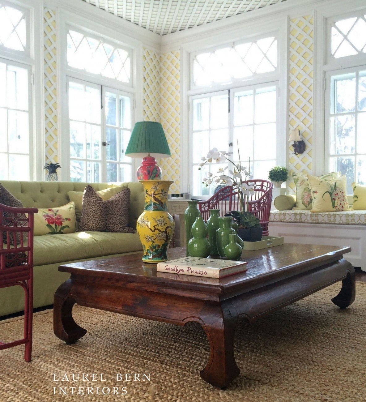
This was just a quick shot, but another view of the room. We left the lattice, chandelier and existing sconces. I’m not 100% happy with the composition. And oh… the friggin radio was in the shot! geeezzz! It’s so funny, but what you don’t see in the room sticks out like a pimple the size of Mount Etna in a photo! Like the yellow vase is overlapping the fabulous decoupage lamp by Carson and Co. The lampshade fabric is darker than expected, but it’s growing on me. Very Dorothy Draper, actually! Jute rug from Fibre Works. It’s one of the few natural fibers that’s genuinely soft and really great looking too!
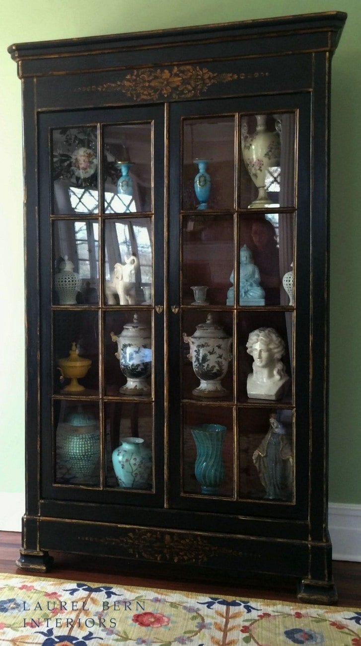
Bookcase from Sarreid. BTW, I had absolutely nothing to do with the contents of the cabinet. I came in one day, and there it was! S has great taste and a flair for this type of thing–obviously. I love the strength of the antique black and pieces like the large opium table. I think when using a lot of saturated color that rooms need both white and a bit of gravitas or they start looking like well— Easter!
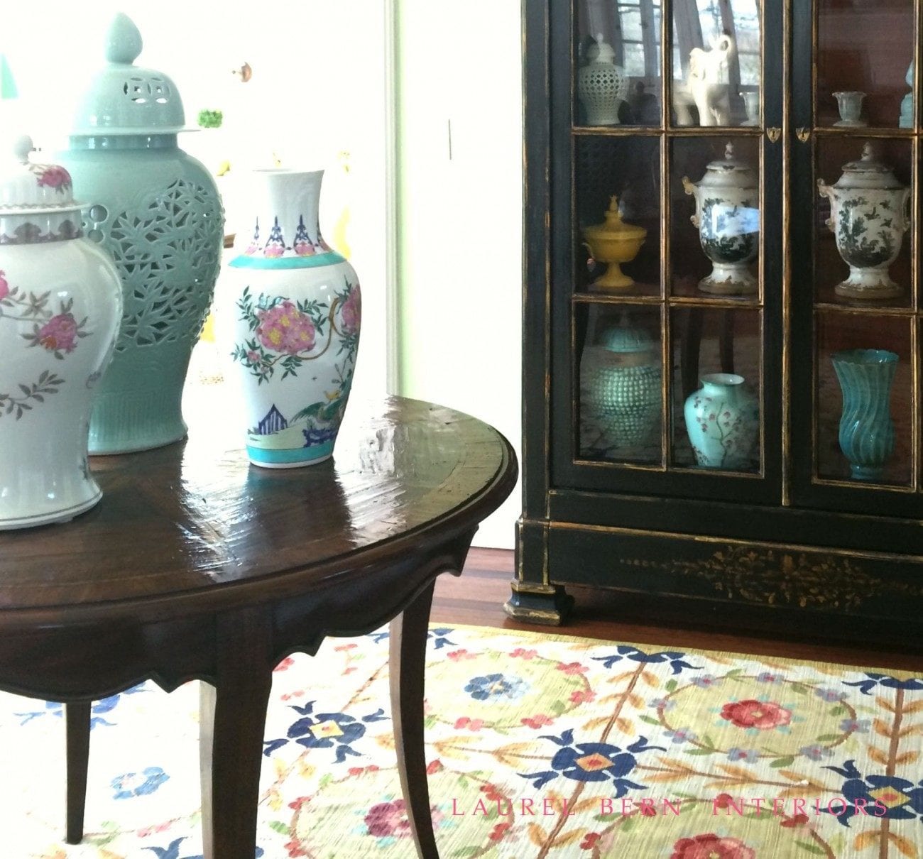
I messed around with different shots and vignettes and liked the way this vignette turned out. The floral vases are from Bungalow5 and the Celadon vase is from Legend of Asia. Table from Henredon. The Aubusson rug was already there as were the green walls.
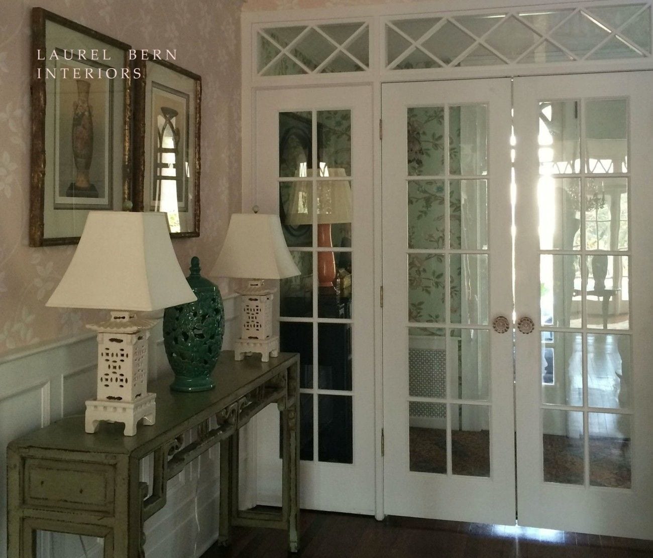
A shot looking into the front vestibule. I was getting ready to leave and noticing how lovely the new wallpaper looked through the French doors. It’s pretty but not overly matchy and “decorated.” The Pagoda lamps are from Emissary and the console table from Wisteria. Hall wallpaper is Farrow and Ball Ringwold in an archived colorway. The vestibule is Thibaut
Related Posts
 Is it Antique Furniture OR is it a Reproduction?
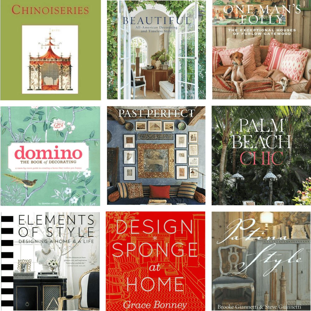
 120+ of My Favorite Interior Design Books + Gardens!
 21 Common and Hideous Interior Design Mistakes
 Egads! My husband Won’t Let Me Change The Blue Trim Color!
 Amazing Classical Architecture and Gardens In England
 He Loves The Phony French Country Kitchens
 18 Secret Doors You Will Be Inspired To Have!


