The Kitchen is usually the most expensive room in the home. But, it seems that every ten years or so, there’s a new crop of kitchen trends that catch our fancy.
The trends of the day influence us; they often look “fresh” That is, at first.
But, the 64k question… is:
Will it look fresh 10, 15, 20 years from now?
In addition, most of us want our kitchens to stand “the test of time.”
A kitchen reno is a major drag, in every way.
And, a bad and/or dated/weird design can decrease our home value.
Oh, but it’s all so seductive!
But, here’s the real problem.
There is no such thing as a kitchen that has stood the test of time. Think about it or just click on this post where we went through kitchen history. And, as you can see, the styles have changed a lot of over the years.
In addition, they’re still changing.
Before I get into the kitchen trends, I’d like to discuss what’s out.
If you happen to like what’s out, that’s fine. OR, if you just redid your kitchen and put in something on my “out list,” I am not here to judge. (too much) :] It might be perfectly wonderful for you and appealing to people who live in your area.
Ersatz French Country and all that goes with it.
Frankly, I don’t think this should’ve ever been in, but here’s what’s included in the out list.
- Heavily glazed, ornate cabinetry
- brown heavily patterned granite
- tumbled marble
- thick, granite with heavy edge details
- wrought iron curly cues
What I’ve discovered over the years is that the majority of Americans are mighty confused over the term “French Country.”
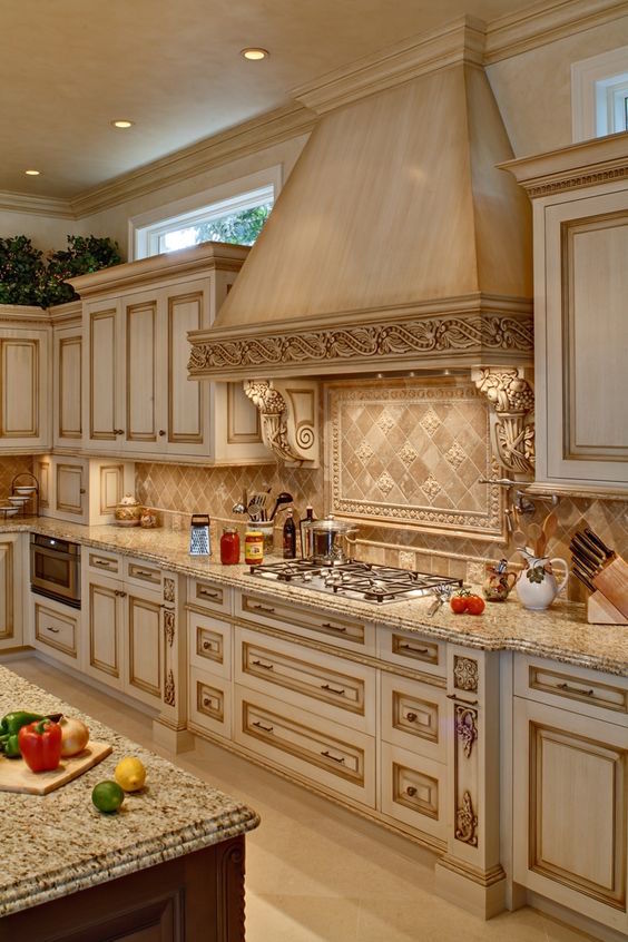
They think it’s this.
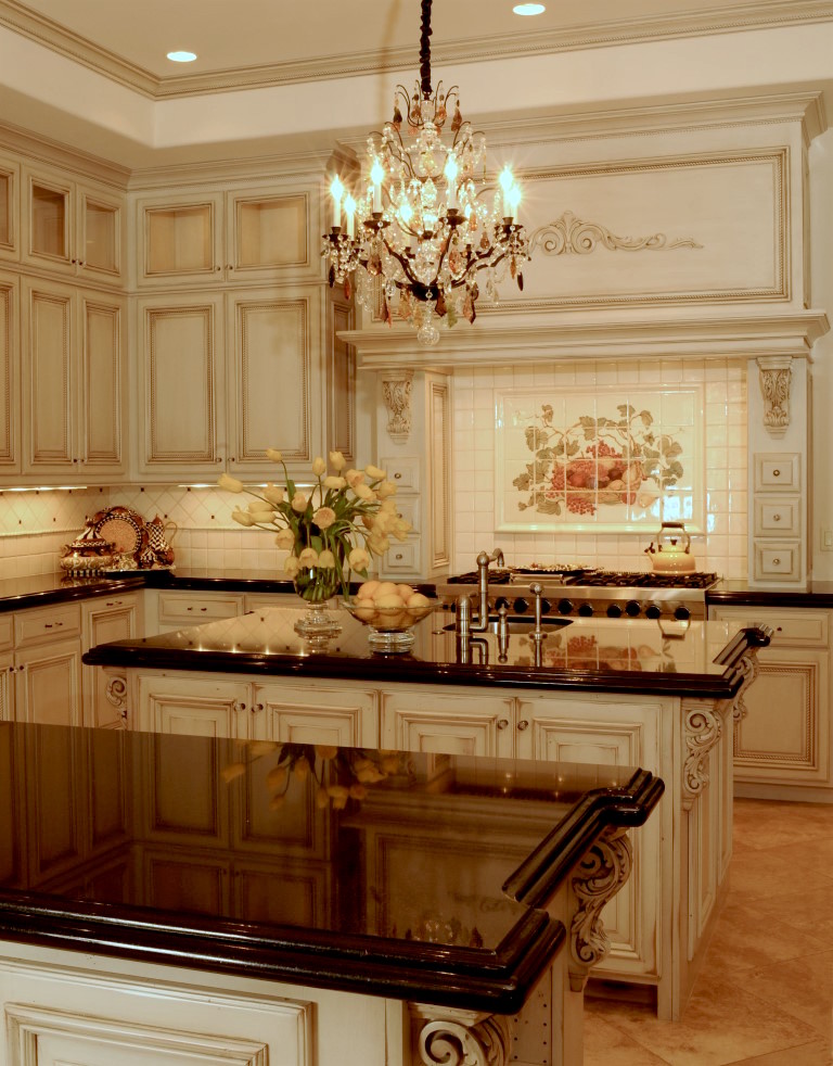
Or this.
For most of my career, I’ve had potential clients calling me up wanting “French Country.” This is its own separate topic. But these examples above are NOT French Country. These are some made-up amalgam of something that only exists in someone’s fantasy of what “French Country” actually is.
Below is a French Country Kitchen.
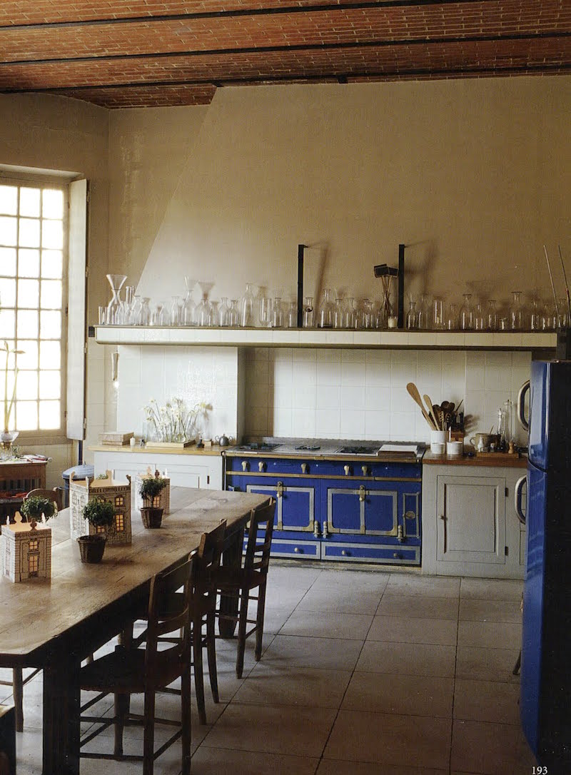
The World of Interiors via Beth Webb’s blog Aesthetically Thinking
mmm….kay?
However, most Americans would freak out if a designer presented a kitchen like this to them.
I rather love it! Well, let’s move on…
Now, we are going to review 12 of the hottest kitchen trends out there and decide whether we’re going to love them or leave them.
Let’s begin with cabinets.
Unless you are purchasing a La Cornue that also doubles as a stretch limo (below) :]
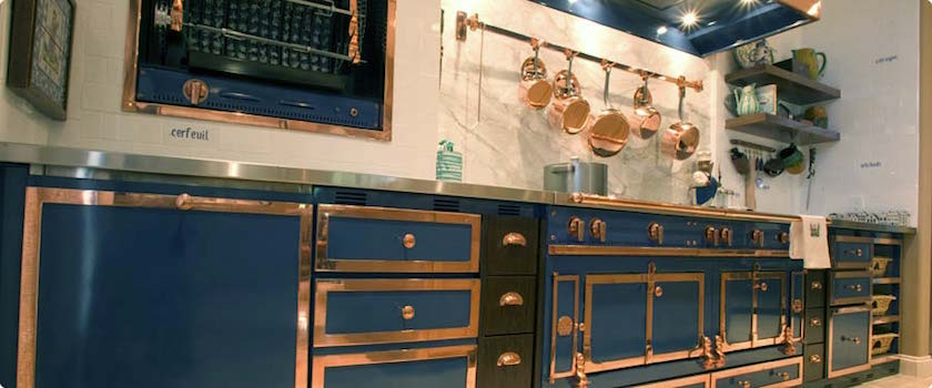
The kitchen cabinets are most likely going to be the most expensive purchase and if using upper cabinets and/or floor to ceiling, the most in your face.
The other material that is out except as an accent is wood.
Yes, you can have wood. You could do a gorgeous wood butler’s pantry or a wood island. Wood counters, floor and wood shelves. Or wood if you are only doing lowers.
But stained wood uppers are passe and uppers and lowers together are also.
It IS okay if you disagree with that because you:
- might absolutely adore wood.
- may be living in a log cabin.
- prefer it for any reason.
However, as far as kitchen trends go, wood cabinets are out of fashion.
And, I believe it is going to stay that way.
Yes, painted kitchen cabinetry is one of the kitchen trends that is here to stay.
And, I don’t necessarily mean a white kitchen. Although, if I had to pick something that I think IS absolutely, definitely, positively going to be here in pretty much this form in 20 years, it’s the “classic” white kitchen.
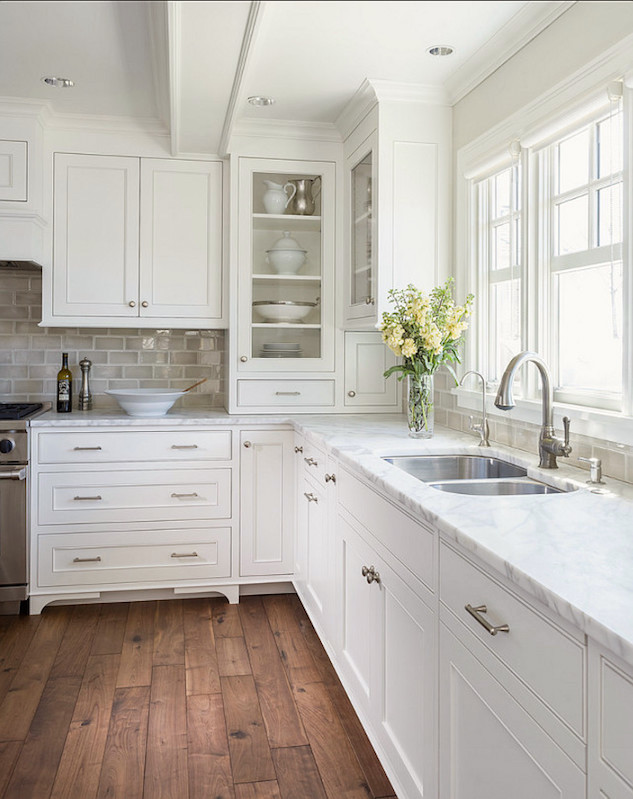
There are other painted finishes and colors that are also kitchen trends.
Gray Cabinets.
It’s the question on everyone’s lips? Is gray here to stay?
Well, you may recall that gray is actually an exceedingly classic color all throughout history. However, I feel that it needs to make sense within the context of the home.
Certainly the very pale grays are a safe bet; such as the gorgeous work of Heidi Piron kitchen with brass accents. (
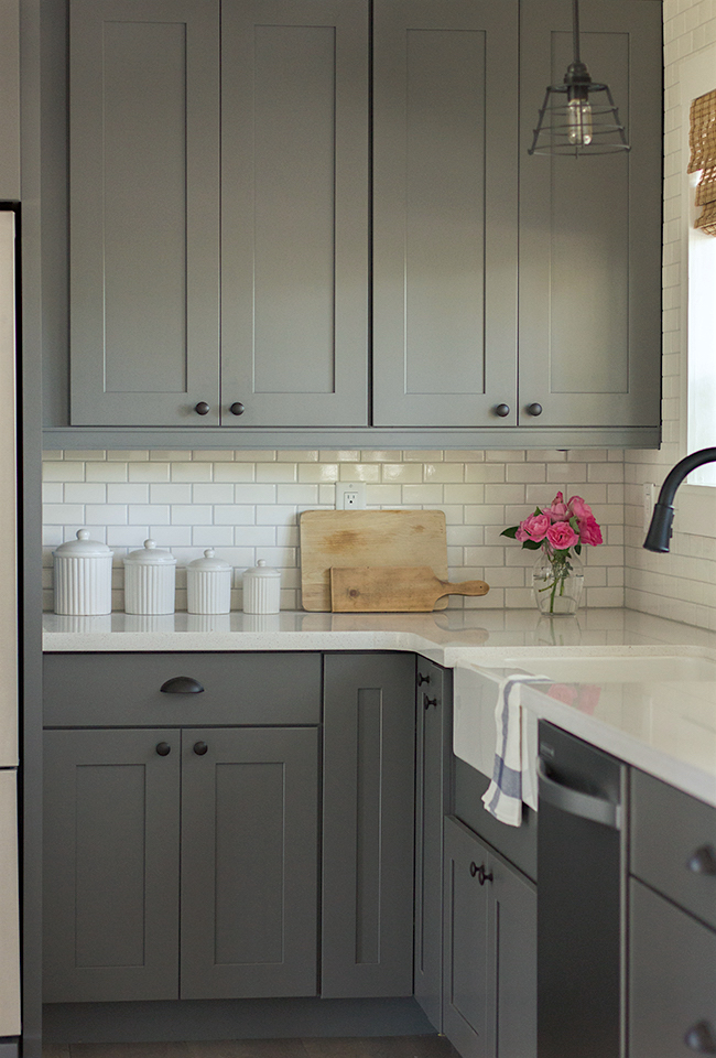
This is a shaker style door which doesn’t have the little inset moulding. These are what I feel are the best options most of the time. Of course, that’s very general, but let’s say 80% of the time.
Yes, you can have a raised panel door for a more formal kitchen.
Most of the time, unless it is supposed to look antique, the finishes on-trend should be smooth and in a satin or semi-gloss finish.
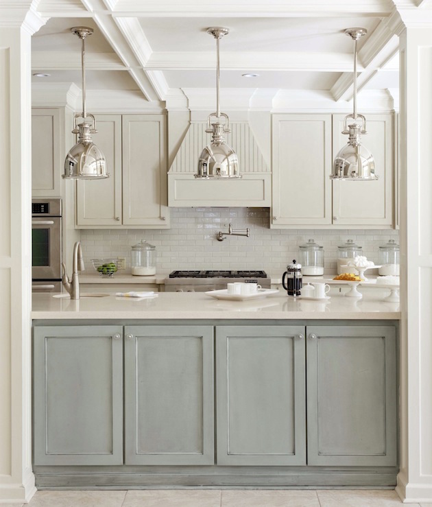
If one desires an antique look, the glazes should be subtle, chalky and believably antique. No heavy crackle under 15 coats of polyurethane– please.
What about other colors for kitchen cabinets?
I am also seeing lots and lots of stunning blue kitchens.
This is my feeling on painting your cabinets blue or any other color which might be deemed “too taste specific.” If you love the look of painted kitchen cabinetry and it suits your home then sure, why not? If you’re planning on selling your home in 5 years, probably not.
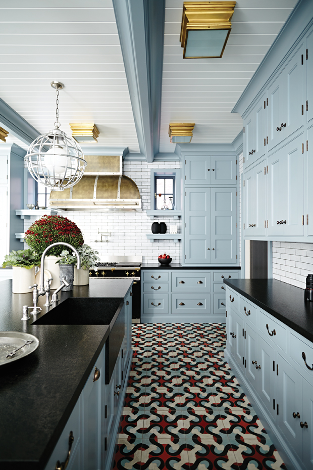
Above are the encaustic cement floors that we discussed earlier. The ones above are pretty jazzy and I’m not sure if they are going to hold up (kitchen trend-wise)
However, in the kitchen below, I adore everything about it, including the classic design of the encaustic cement floor tiles.
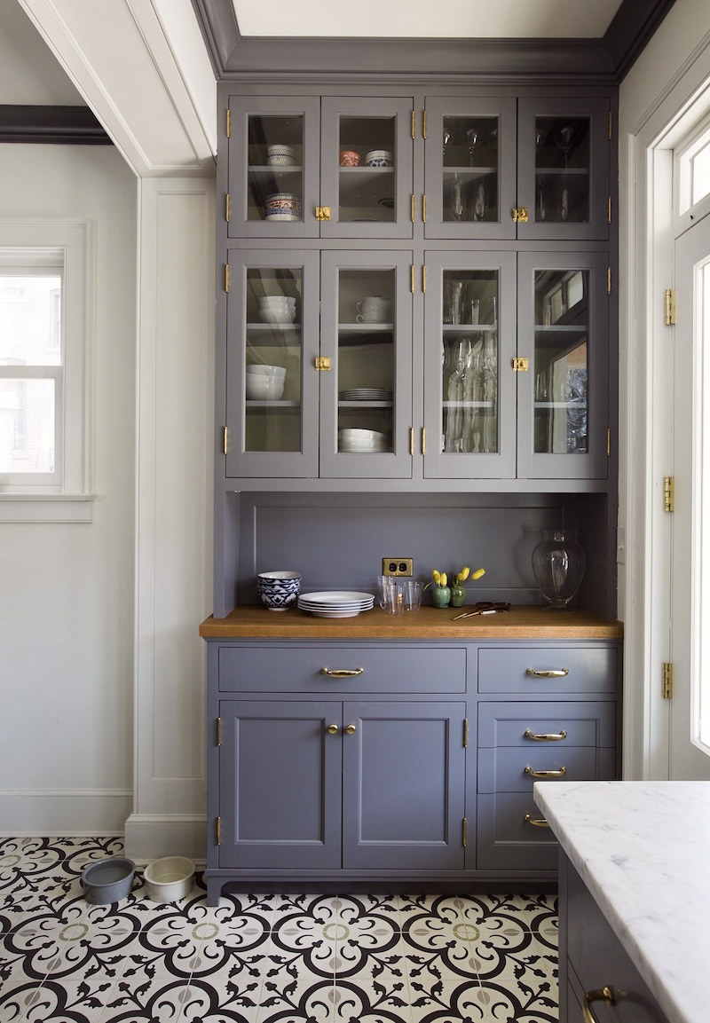
design -Nastasi Vail photo – GENEVIEVE GARRUPPO
And below the same kitchen
Shelves instead of upper cabinets keep things looking lighter.
We discussed that in our unkitchen post.
Yes, it’s true. They are more decorative than functional which is why I did the follow-up storage for the new unkitchen post.
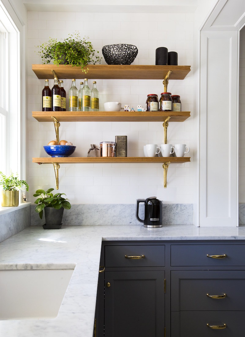
via
Green has become a very popular cabinet color recently in kitchen trends.
However, the green kitchen trend I do not think has legs. That doesn’t mean you shouldn’t do it, but just know that it may very well be dated in a few years.
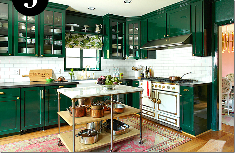
This is the kitchen which some of you may recognize belonging to Bailey McCarthy of the wonderful Peppermint Bliss blog. I love her work. However, I have to be honest. I’m struggling with this intensely saturated green kitchen– The top half of it. That range is to die for, n’est-pas?
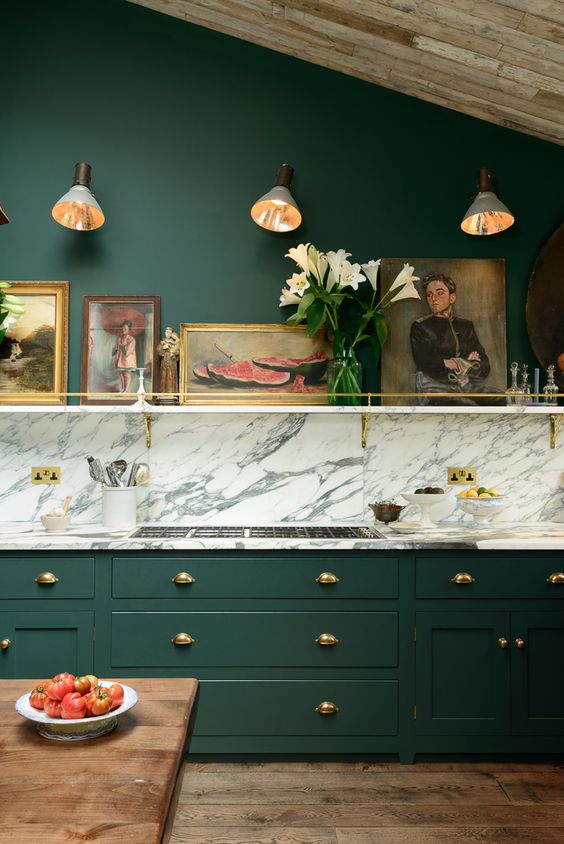
I saw a larger image of this kitchen and I also think it might be a bit too much, but like the vignette here.
So, this is the deal. If you love a color or are daring or are very rich, then paint it purple polka dots if you like. I love the DeVOL kitchens
This brings us to the wildly popular two-tone cabinets kitchen trend.
Okay. It’s usually fine and oftentimes desirable. I think I would prefer Bailey’s kitchen more if there were more white above the saturated green.
More like this one below.
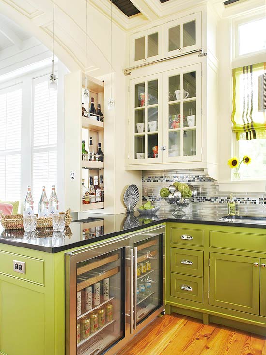
Please check out her blog from some very colorful kitchens!
.
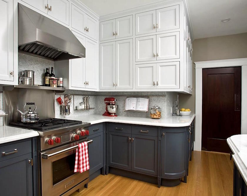
Can’t see the entire room. But right here, it feels like too many cabinets. I don’t feel that a kitchen needs counters lining the entire perimeter if it’s a good-sized kitchen and there’s an island.
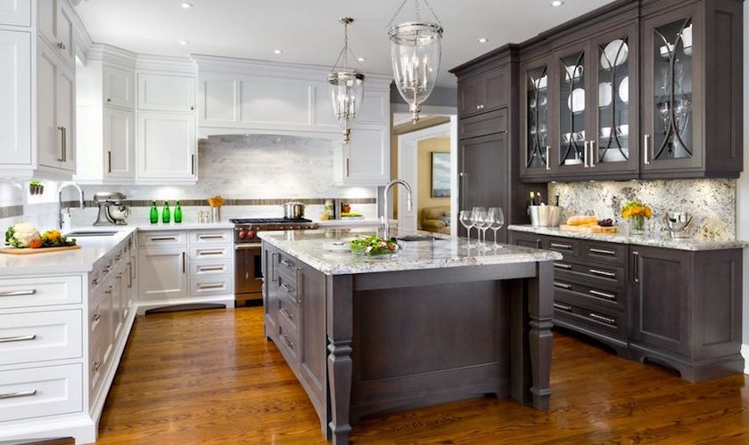
This one either looks like a kitchen store showroom or a mistake. (The right gray half against the white left half) I do love the island in a contrast color. But, the piece on the right seems like it should be white to me.
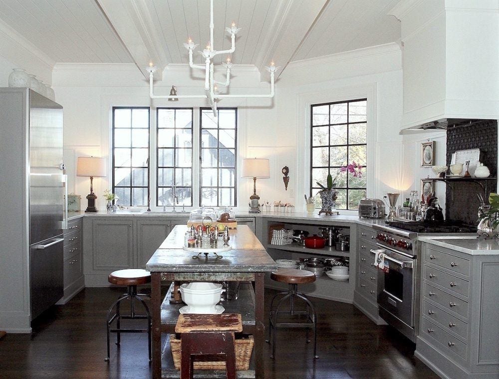
Nancy Keyes gray and white kitchen is absolutely perfect in every way. And she and her husband made the light fixture. So talented!
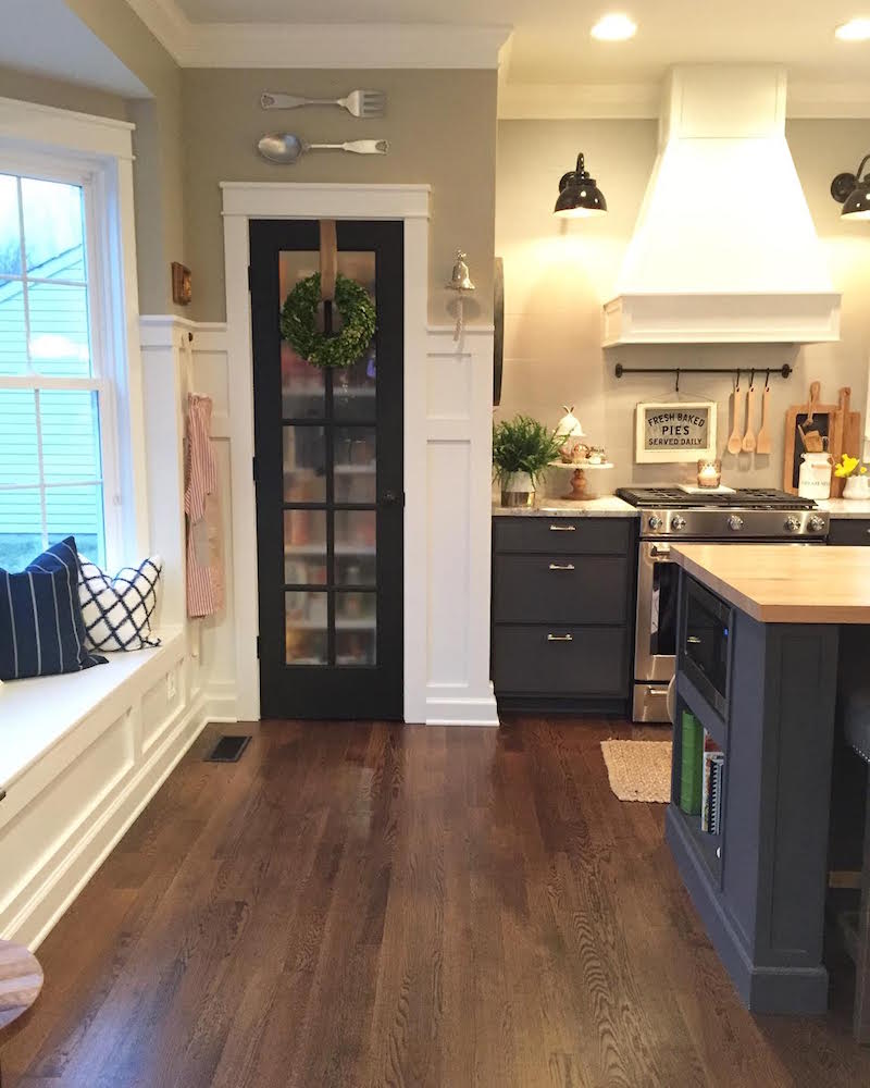
Charcoal gray and white. I love the panel moulding detailing here.
Black Cabinets
Yes, I think we all realize by now that there has been a quickly growing trend for black cabinets.
But… it can quickly go horribly wrong if one isn’t careful.
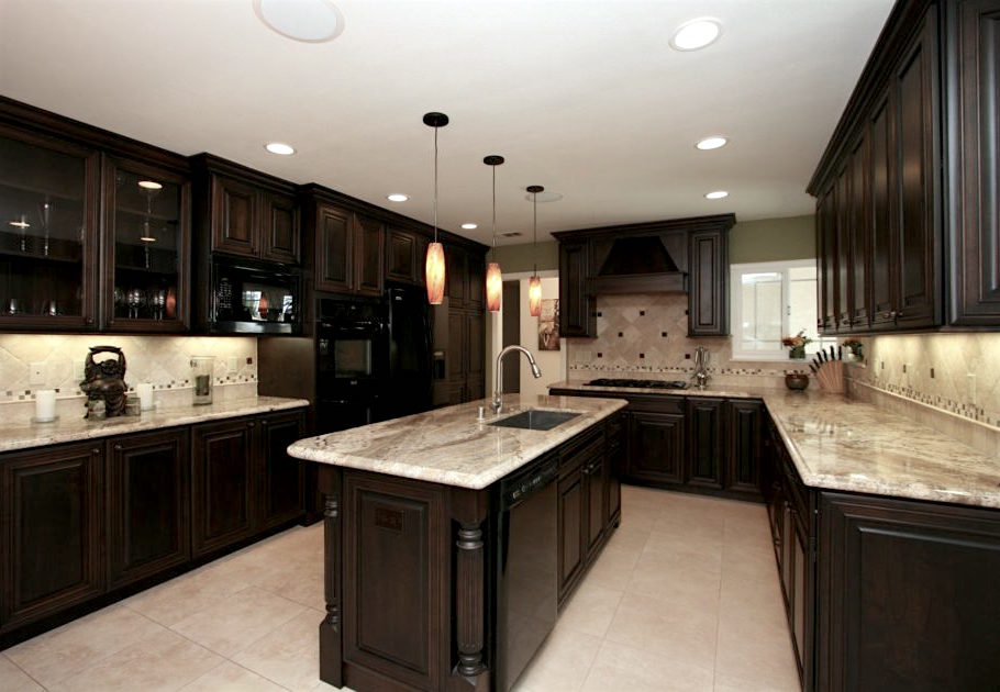
right?
Is that really the only place the range can go butted up against the window?
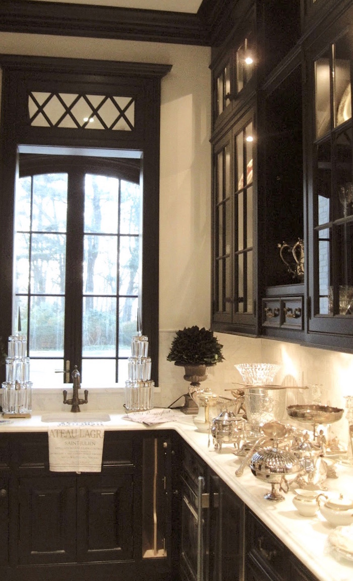
The black here is divine in one of my favorite butler’s pantries
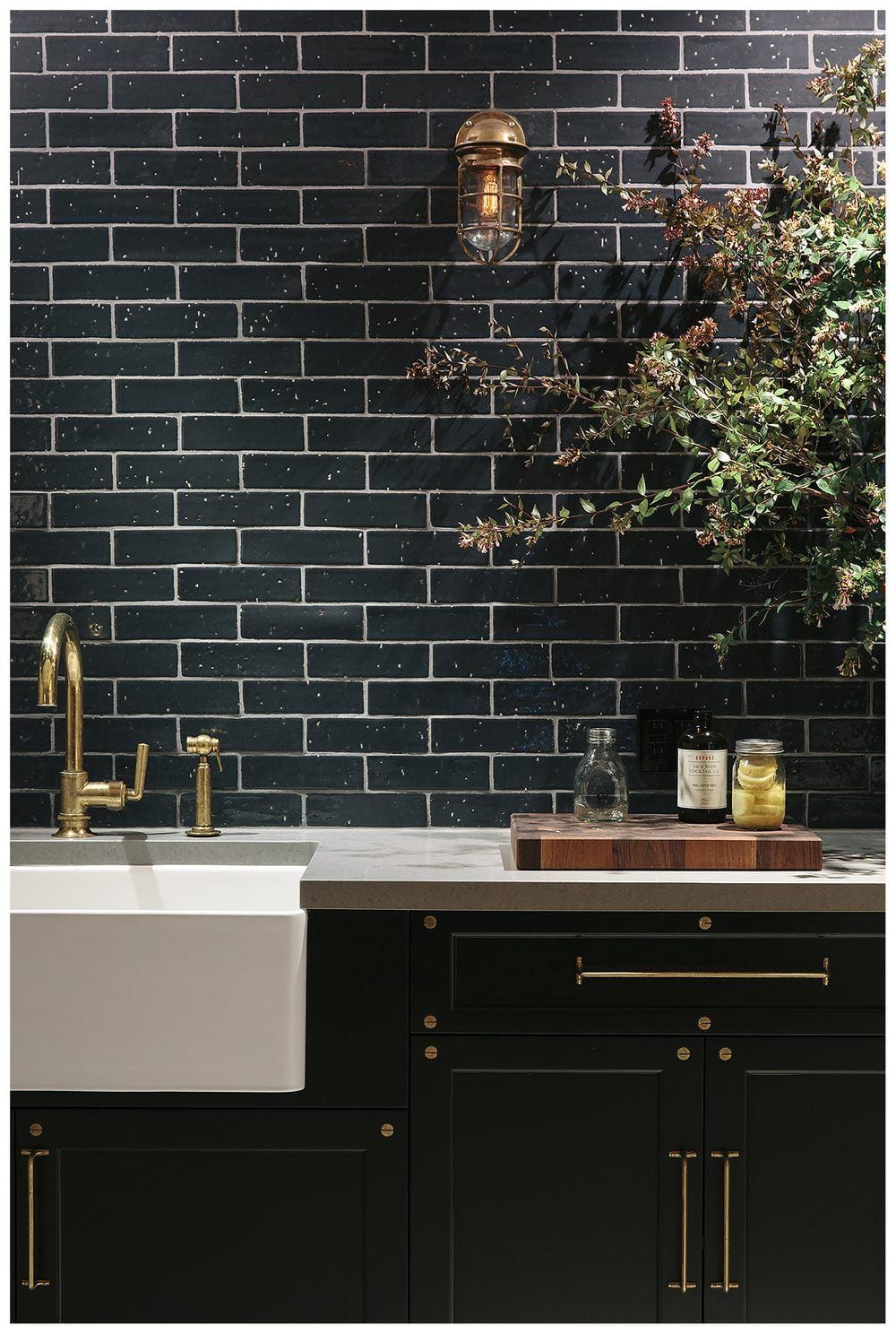
Catherine Kwong Design – Photo: Bess Friday
Black is also cool in this small urban kitchen, punctuated with a white porcelain farmhouse sink.
for more cool black and white kitchens, click here.
Laurel, what about all of that BRASS and GOLD and can we mix metals?
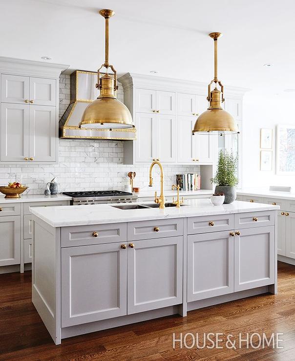
That’s two questions. ;]
I adore the “new” unlacquered brass. It adds so much warmth to gray cabinets especially.
And yes, not only can you mix metals– you should mix them.
But, I wouldn’t get too crazy and mix more than two colors. So, stainless and chrome and nickel with gold, brass or copper. Copper would be better with nickel or bronze, I think. There are lots of examples in most of these photos.
You can never go wrong with white subway tile. I think I’ll devote another post to that.
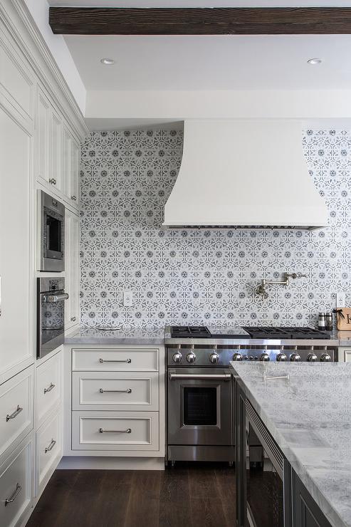
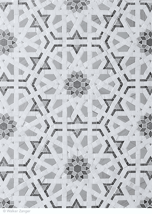
But while I can’t stand the crazy brick pattern mosaic, I do love this classic geometric tile from Walker Zanger.
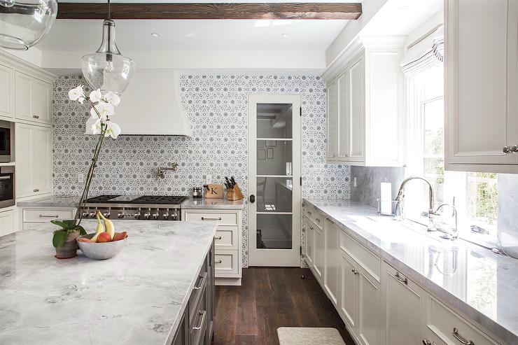
Appliances.
I think that stainless steel is here to stay…but… regular stainless, that is.
We’re going to beam up to the year 2036. There’s a little impromptu game of Jeopardy going on. Hosted by the ageless 93-yr-old *Alex Trebek!
Contestant Bob: “Alex, I’ll take bad kitchen trends 2016 for $6000.”
Alex: This popular appliance color became a massive dud by the year 2022.
Contestant Bob: “What is the black stainless steel appliance?”
Alex: Yes, that is correct, Bob. Those abominations remind me of the color of my slightly lumpy suit jacket.
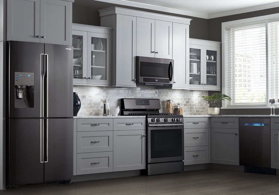
Black Stainless Steel.
DON’T DO IT!
The ubiquitous Shiplap Trend
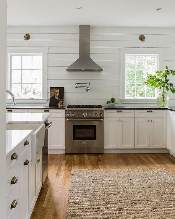
Karen Swanson via Elements of Style Blog
I actually do like shiplap, but it should be used judiciously! And, I think it’s such a wonderful, sophisticated look for a country or beach home.
But yes, some have overdone it. A little shiplap goes a long way!
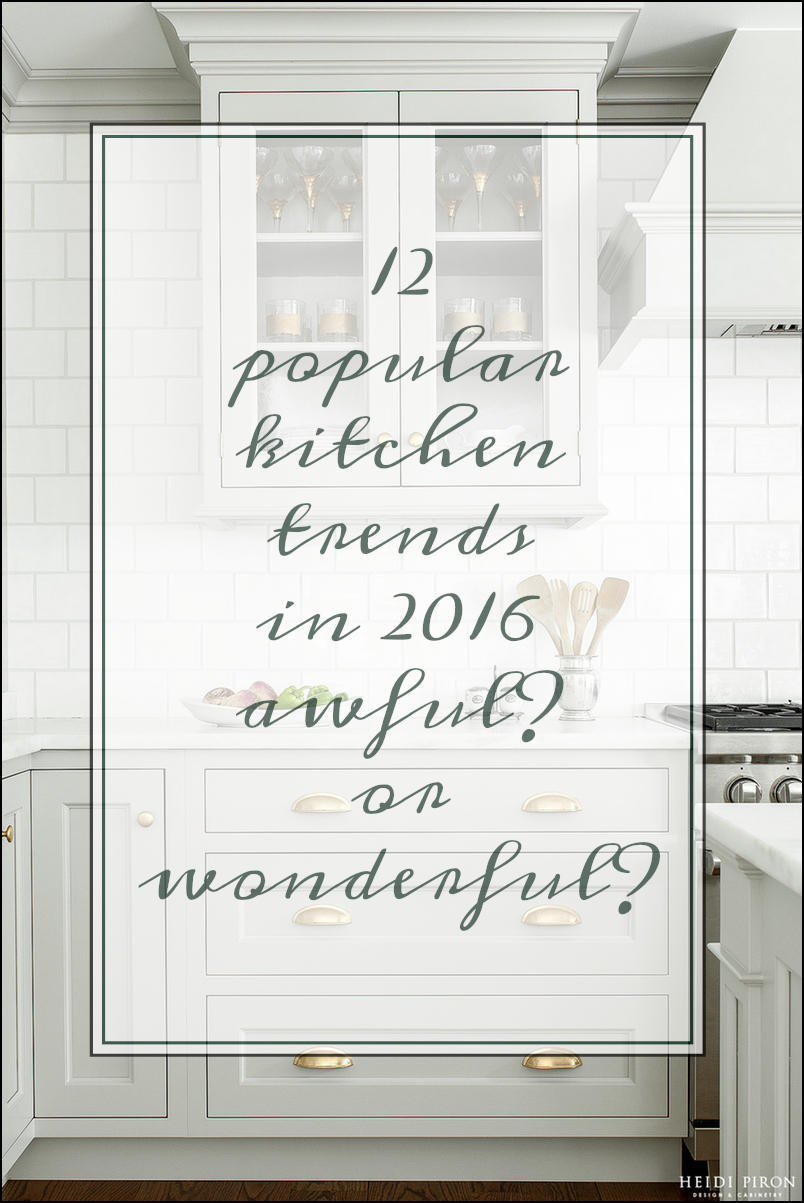
Phew! That was pretty long. And, I’m sure I left out a few things too. Is there anything you guys would like me to discuss further? I know that there have been some requests for a nice juicy back splash post. That would tie in nicely with kitchen counters.
Hope you’re having a beautiful weekend!
xoxo,
* Note March 2019: I’m a HUGE fan of Alex Trebek. Class act through and through. My children were “breast fed” on “Padee” as my son, Cale called the show circa 1992. In light of the recent news about Mr. Trebek’s serious cancer, I wish him every hope and prayer for a remission. And, that he gets at least another 20 years to grace this earth with his inimitable taste and style.
Related Posts
- Should These Top Decorating Trends Stay or Go?
- 40 Outdated Home Trends. But, Are They All Passé?
- A Dream Kitchen Salvaged and the Perfect Cabinet Color
- Clever Kitchen Storage Ideas For The New Unkitchen

- Top 25 Must See Kitchens on Pinterest
- Are You Making This Common Kitchen Design Mistake?
- Contemporary Interiors – Are They Trendy or Timeless?
199 Responses
I was on the hook for every every word of your article when you expressed your disdain for that heavy, cluttered, dirty-looking “French Country” style. How can you tell if your kitchen is clean with all that glaze on the cabinets and faux texture on the walls? Tuscan is another…Thank you for the palette-cleansing image of an actual French country kitchen!
I’m going from a builder’s basic U-shaped kitchen to one with raised cabinets, some removed and replaced with open shelving, building-in my free-standing fridge with accessible storage above, removal of a stupid kitchen desk to addition of usable counter space adding trash drawer and pantry drawer, tiled counters (large format black polished porcelain at less than half the cost of 12×12 granite tiles-very proud of that choice!) and painting uppers white and lowers gray. Also replaced vinyl flooring with herringbone 13×16 porcelain tiles and added 60″ wainscoting with a plate rail. There is more but now realize how braggy I’m being, yet I leave everything I’ve already written as is… 😀
As someone who is doing a crap-ton to my own kitchen in a house we will be selling in the not-too-distant-future, the longevity and mass-appeal of my design choices have been a huge concern of mine, as well as the function for my own large family. Your article has given me ENORMOUS comfort and confidence in my choices and I thank you for that from the bottom of my heart!
Hi Maria,
A lot of folks don’t know what they like and if they’ve never seen it, how can they be expected to seek it out? But like it they will and if not…
As Earth, Wind and Fire said so beautifully in one of my favorite pop songs. “You will find, other kind, that has been in search of you…”
Hi Laurel,
I loved this blog post! One of the most enjoyable reads on kitchens I’ve come across in a long time.
My husband and I are closing on our first home this month (whoo-hoo!), and the kitchen in our new house is a galley kitchen. The cabinets are good quality, with crown molding and everything. The problem is, they’re medium brown. And the floors are dark also.
I believe I will learn to love my new galley kitchen. I’m a classic person and it’s throwback. But I think white cabinets would make the space look so much lighter, bigger, brighter! If we un-kitchen the sink side, and do open shelving, that might also help. My question is this:
If the cabinets are high quality, would it be stupid to paint them white? Would it be worth it, to brighten up the space?
Hi Rebecca,
No, it would not be stupid. :] And yes, it would be much better, IMO.
Congrats on your new home!
Thank you! 🙂
Hi Laurel,
I enjoyed reading this kitchen article. I decided to ask you this question because I feel you are open minded about what “just looks good” despite “the rules.” Anyway, I love the open shelving above the lower cabinets, but my husband won’t even consider it. I have painted wooden cabinets, upper and lower in Kendall Charcoal by Ben Moore and hex copper hardware. I took the cabinet doors off above the fridge and painted the inside so they are open. Is this a possibility for the cabinets beside the fridge? I’m clueless, but it seems like a nice happy medium. I love to display my pretty kitchen stuff.
Hi Marcie,
Yes, yes, yes! Take them doors off! It is a great solution and will give you far more of a shelf- lighter look.
Laurel, I am 67, have bought a small condo in a building being built for seniors. In my floor plan the living room and kitchen are one room. The L-shaped kitchen is 13 x 8 and living room is 16 x 11. Between them is about 4′ with doorways on either end to a bedroom and bathroom. I am seriously considering eliminating the kitchen island (which has seating) and replacing it with a table. My reasons are older people aren’t crazy about sitting at a counter for dining and I don’t like it either. Islands are wildly popular so is this a mistake? What should I keep in mind for table choice? The table size would be the same as the island size 36″ x 78″. I like cozy cottage Scandinavian (as opposed to ultra modern) style.
I think my basic question is do you think kitchen islands are a timeless trend to replace kitchen table dining?
Hi again, Melissa. I really can’t say. It’s up to the individual. Your place is pretty small, but I think that most people given the choice would rather have a table to sit at, rather than a stool at an island.
Hi Melissa,
My powers of visualization are dim at best when folks are describing their interiors. I would need to be standing there to explore different possibilities and then I might need to go back home and think about it some more. My best rec is to hire someone local to help you plan it out.
To Melissa S., while invisioning your kitchen situation, I think you need to reconsider the size of the table, (that will take the place of the island). I would downsize it slightly to accommodate for the chairs. Otherwise it may too cramped. Also, taking in to account the size of the kitchen, I would use a table that is at least cabinet height, so the guests don’t feel as they’re in a hole.
Janice
Hi Janice,
I realize that you’re trying to help; that’s terrific and this is not in any way personal, but I generally frown on giving advice unless it’s very general in nature and it makes sense to me. I don’t give advice either. One reason is, that if I encouraged that, I would be sitting here ALL day giving out free advice. But more importantly, we can’t see what’s going on and it’s impossible to give proper recommendations.
So, I hope that you will understand that since it’s my name on the blog, I need to vet any advice given out to ensure that folks aren’t mislead.
I don’t understand what is meant by a table that is at least “cabinet height.” That is not a term that I’m familiar with and there is no one standard height for cabinets.
All tables where one sits at them for eating or conference are at about 30″, no lower than 29″ and not higher than 31″.
If you meant “counter height,” that is always 36″ and the same height that an island would be, so then the table IS actually an island and then one would need counter-height stools as chairs will be too low. There is also a bar height counter, which is 42″, but I’m not usually a fan of that height and it’s not great for kids or elderly folks.
Laurel,
Point(s) taken. And yes, I did mean to say “counter height”.
I haven’t been on the sight for very long and was not familiar with your policies. I enjoy your blog and from this point on will stick to enjoying your suggestions or asking questions.
Not at all! Of course, you can provide suggestions, but I had already told the woman that this isn’t the place to get that kind of specific interior design help. I don’t think it’s right for anyone to give advice without being in the person’s home. Thanks for your understanding.
Hi Laurel,
I found the article very helpful. Especially because it covers the choices I am considering for my new kitchen. My dilemma is the following. This is a brand new U shape 121 inches by 86 inches with a 100 inches peninsula kitchen in an old building in Brookline,MA. I am using the old kitchen space for a bedroom. The range is a 36 inches wolf against a red genuine brick with grayish grout. The red birch wall is what I fall in love when I purchased the apt. I have never liked white cabinets even though White would make the small space bigger. So I am considering a two tone color kitchen cabinets. coconut or very light grey with a darker grey in the peninsula. Would you make a suggestions as of color. Also I am not sure I should consider shaker style cabinet doors versus flat painted panels. I would also appreciate a suggestions on the style. Thanks a million, Lilly
Hi Lilly,
I’m sorry, but we’re not doing any consulting whatsoever at this time. There are a lot of fabulous designers in Boston however. I definitely recommend that you hire one for a kitchen remodel! It’s very easy to make mistakes and then you’ll have to live with it.
Dear Laurel, I am having a decorating delema with kitchen cabinets. We have a house on the market for sale and want to do some updating that will help sell the home. The house is about 10 years old, but was very well done except for the fact that all of the wood surfaces overwhelm when you first walk in. The kitchen cabinets have Quaker style doors, all of oak, (with a heavy grain), the color is amber. I was going to paint them but the painter says the grain will still show with light shining on them. This doesn’t appeal to me nor would it a purchaser I’m afraid. I have stained a sample of wood with a gray stain, which totally changes the color of the wood, a good thing. I just don’t want to stain the cabinets and then again “date” them. My other (very expensive) option is to change out the doors, and I have a feeling they would be custom sizes. Any suggestions?
Hi Janice,
I’ve had clients paint their oak cabinets all the time. How about taking one of the smaller doors and using it as a sample. If you don’t like it, it can be stripped and changed to something else.
I would not paint the cabinets gray unless that suits your over-all scheme.
Also, a satin paint will show less of the grain than a semi-gloss. They also will need a good sanding.
Thank you Lauren for your suggestions. I had the painter paint those oak stained cabinets in the master bath and he did a fabulous job. I was not getting the desired effect with any stain that he had tried on the kitchen cabinets, (even after sanding them, too much varnish embedded into the wood), so have decided to paint them a nice fresh white and the island will be a medium greige that coordinates wiith the other surface materials. Thanks for your help.
You’re welcome Janice. Sounds terrific!
Personally, I think shiplap is going to be out as quickly as it came in. I mean, it’s basically wood paneling turned sideways. I have some regular old 1970s paneling in my house which everyone decrees to be hideous (can’t say I disagree) and I fail to see how shiplap will be any different in 20 years. Maybe I’ll just slap some shiplap over the paneling and when it goes out of style, take it off to reveal the old stuff again.
Hi E,
I only found this out recently, but shiplap is what is behind the walls in many old homes. I’m not an expert on it, but someone sent me a photo or a link a while back with info about it.
Now, you are right if it’s used indiscriminately and not in a way that makes sense.
I’ve also had clients who’ve added on to their homes and kept the horizontal siding which is similar to shiplap.
I like the look for a coastal or lake home. Something like that.
Here are my thoughts. I am tired, tired, tired of cookie-cutter
kitchens! Very little variation. Subway tiles – ugh! An island with pendant lights…farmhouse sinks… Does no one have a single idea of their own? In less than ten years, one will be able to “date” these boring kitchens. The same with bedrooms — why must every headboard be upholstered all of a sudden? Yuck! Come on, people — dare to dream! And live YOUR dreams, not what some design center is pushing at the moment!
Hi Justine,
Sing it sister! My one thing is when something I’ve ALWAYS loved suddenly becomes the hottest design trend– for instance, my beloved Greek Key.
But alas we’re a nation of sheeple. People don’t know how to live their dreams because they don’t have any. I know what that feels like too.
Sometimes in the midst of all of the crap that life throws at us, we can lose sight of that. Going with the mainstream feels safe for many and alarming as it is for a lot of us… even THAT is a stretch for many folks.
But, bucking the system is something I very much enjoy.
Clearly an art presentation from someone bored with kitchen decor but instead of being canned solutions, inspirations to allow followers to set off onto radically new paths.
I suggest these also include the natural beauty & warm of exotic woods – not just paint – that could reach back to easy to get Ash and other domestics.
Variation of cabinets lend some relief from SOP but always with a goal of practicality!
Hi tgiv,
Is the “someone” me? Sorry, you lost me a little bit here. I share a different philosphy in that the word “practical” is not in my vocabulary in terms of cabinet finishes. I want my cabinets to show every last bit of grime and drippings from the tea that spilled over the counter. That way, I know what to clean! And while I love other colors, and occasionally wood in small doses, I will always adore a white kitchen!
But I would never “suggest” a finish of any kind to my readers without knowing what else is going on in their home.
And even if I disagreed with a blog author and i frequently do, I wouldn’t make a public comment intended to make her look like an idiot. But that’s just me.
I’m surprised you could even figure out what this person was talking about because I couldn’t.
At least you know you’ve made it when you’re being trolled by random people on the internet. 🙂
Keep up the good work, your blog is great!
Hi George,
It took me a few readings. lol And thanks so much! Most people are incredibly kind, but yes, I remember when I got my first troll. I went out to celebrate!
This post is great … thank you. Unfortunately my house came with several of the out trends. I knew it at the time but thought this home was temporary.. now after the recession and my semi retirement it might be long long term home. So I will do a little here and there trying not to spend too much. I was staring at the honey maple wood cabinets a few weeks ago (yuck) and decided to strip them to raw wood, wax them, maybe a little white wax .I painted the walls milky honey when I first moved in and that helped minimized the shock of honey wood cabinets against white walls. And of couse it all came with black appliances. …those have to go, but I need to decide if I want to expand to larger stove etc, as that will take a cabinetry change ….and then the black granite counter tops are tile ….tile!!!! With grout lines and cuts in all the wrong places….well your article helps confirmed my thoughts thank you , lots of ideas went to my pinterest 🙂
Hi Jeanne,
Sorry I missed this comment. It got buried while I was away last week. Glad the post was helpful!
Hey – I”ve totally been eyeing that Heidi Piron kitchen for MONTHS now – I’m deciding on a gray for my kitchen cabinets (uppers AND lowers! : ) – I’m leaning towards Benjamin Moore Platinum Gray, but would be really interested to know if you know what color that Heidi Piron kitchen is!! Thx!
I’m sorry, no, I don’t, but you might try contacting her office. It would be better if you identified the kitchen from her website, not my blog, however. It’s most likely in the traditional section.
“And, I believe it is going to stay that way.”
“yes, painted kitchen cabinetry is one of the kitchen trends that is here to stay.”
“Although if I had to pick something that I think IS absolutely, definitely, positively going to be here in pretty much this form in 20 years, it’s the classic white kitchen.”
Couldn’t agree with you more, Laurel!
Thanks so much kcf!
I agree on the timeless quality of the well-done white kitchen. I grew up on the South Shore of Long Island and the old shingle-style homes always had what we called a “Butler’s Pantry kitchen”, because there always was one. And the kitchens had a friendly center table, not an island, of course, like the true French kitchen you pictured at the top. I still love a table.
I just found your blog tonight and I feel like I’ve found my people!
Hi Susan,
Welcome and I’m glad that you feel at home!
what do you think of the slate color stainless that GE has? I saw that ‘black’ stainless was on the no list.
Hi Danielle,
My bad. The black I was referring to is slate. And sure, if it’s a dark gray kitchen, or maybe a dark green-gray, dark-blue-gray or something like that, then fine. But otherwise, I don’t care for it at all and think it’ll look quite dated in a few years. But that’s just me.
Great article. Just finished a kitchen renovation and would love your opinion if I could send some photos. Designed it all myself except used a designer to help with colors. It’s a two tone and would love your opinion. Thank you for your time.
Hi Marilyn,
Thanks for that but I’m not able to give an opinion on the kitchen.
I just stumbled on this article, and I absolutely love it. I’ve been spending the greater part of the last month not only looking at what’s new in kitchen trends, but what good, successful restaurant kitchens look like. While I am far from being able to afford stainless steel countertops, or even a complete kitchen renovation, the redo I am planning will be budget friendly and classic I think. I am planning on a very light granite/quartzite countertops, painting my wood cabinets soft white, and having a subway tile backsplash, which I’ve always loved. Subway tile has been around forever and there’s a reason why people like it. I don’t know if I’m brave enough to take it all the way to the ceiling! I will be replacing the black dishwasher that came with the house with one in stainless, a stainless pro style range, and if I can find one that’s affordable, a new retro refrigerator instead of a standard stainless. It all depends on the ever complaining budget, of course! My kitchen is small and square with a small peninsula, so my options are limited, especially in a smaller town house. No room for an island!
Hi Irene,
Thanks for stopping by. Glad you enjoyed the post! Your kitchen plans sound lovely.
I read your column about whats in and whats out as far as kitchens. I am doing a new kitchen I have white cabinets with cold spring granite stainless steel appliances. i can’t seem to pick pick out a backsplash and I want to make sure it is right. What is trending right now I seem to keep going back to the Glazzio tiles metallic weather but I don’t know if it will be to much when its up. I know the white is very popular but it looks washed out to me I would like a little color but not to much because I don’t want it to clash with the granite. The colors in the granite are whit brown black grey. What would you suggest?
Thank You
Lori
Hi Lori,
If you need help, I would suggest hiring a designer. :]
We have been wanting to redo the kitchen. Now cabinets, counter tops, and appliances. Our whole houses trim work from base boards to crown molding is a beautiful wood tine, (poplar wood but a soft maple finish). I do love a white kitchen but with our open concept floor plan it just doesn’t seem to go with the rest of the house. It scares me that wood tone cabinets are out – but I thing to keep the flow of the house to move it needs to be a shaker type design in a wood tone. Help!!! And floors are a lighter maple stain wood.
Hi Marji,
Wood cabinets are not out, but upper cabinets that are over a counter– are— I hope.
Hi Laurel! I love this post! I, myself am debating about the look of my kitchen in the process of being built. I’d love to hear your thoughts in more detail about two toned cabinets, or all grey cabinets and brass hardware and if any if these trends will be will be quickly outdated
Hi Jamie,
Oh gosh, I thought I did that and am not sure if it’s on this post or not.
But the other thing is… I can’t predict the future. But brass has been around for centuries and so has gray. Two-toned kitchens if it’s top one color and bottom another is more iffy. And sometimes it really doesn’t work and sometimes it does. It just depends on the layout and what else is going on. Nothing exists in a vacuum! Hope that helps!
Hi Laurel,
Love your blog. I really enjoy your comments about kitchens and back splashes.
We live in a small older beach cottage. My husband is a finish carpenter and did our kitchen about 16 years ago with white handmade cabinetry. We put in granite countertops and at that time didn’t have much of a choice. Now I can’t stand it anymore. Ugly brownish tan color granite. We are thinking of putting in Carrera marble. But I’m so afraid of the maintenance. I really want the authentic look of marble. Looked at the Quartz and it looked a little bit fake to me. What do you think about the maintenance of marble? I think I may be able to live with a few scratches but not sure if it will stain horribly.
Hi Sherry,
Actually, marble does not scratch OR stain that easily. What it does do easily is etch. Anything acidic such as lemon-juice, vinegar, even fruit juice will create a situation where the finish will change in that area, thereby looking like a stain when the light hits. It.
Using a honed marble which I prefer in any case, shows the etching less, since in effect, it’s already etched. Hope that helps!
I must disagree on black stainless. As a rule I don’t like black appliances at all, but black stainless looks more like a dark gray and it is a much richer then the stainless that looks like pots and pans.
My granite has flecks of dark in it and the black stainless goes very well.
Hi Patricia,
That’s fine by me because that is my philosphy. Even if I hate something, if you think it’s wonderful– it is.
Thanks for the design sharing.May i know what is the countertops material is?
Hi Elvin,
I see that you’re in the counter-top business. Thanks for stopping by.
We just moved into a log cabin and stone home. The kitchen is the only place that really needs updating. Im torn on how to do it so it blends with the rustic cabin type home. Any advice is appreciated. Love your blog! I
Hi Missy,
There are different ways to go. You could do a wood rustic kitchen or a painted rustic kitchen or a blend of each. Perhaps look on pinterest or houzz for ideas.
I just discovered your blog today, but I think it is fantastic. How do you feel about porcelain tile that looks like wood planks for the floor. I love real wood but it’s just not practical for kitchens and bathrooms, especially with three boys and a German short haired pointer named Cooper. Thanks!
Hi Margie,
I’ve never used it but do know about the product. It is very practical and easy to maintain. It looks very convincing as well.
People who have it have reported that they and their guests have actually reached down to see that it’s not real wood.
It looks like wood but it doesn’t feel like wood. It is cool as ceramic and stone would be.
It is wonderful with radiant heat but that is very expensive to install.
So, if you don’t mind having a cool floor (if you don’t want the radiant heat), it’s a fine product especially for places where one wants the look of wood but not have it get wrecked.
Hi Margie,
I’ve had the wood look put in two separate homes so I’m a random blog commenting expert.
The first time we did it was 10 years ago and it was ok but not close enough to wood.
The technology has changed a lot since then and we put it in last year in our basement. Everyone thinks it is wood when they see it. We love it.
I did a lot of research and bunch of different ones to lay on the ground before committing.
To make the tile look like wood I would suggest
1) using the distressed looking tile not the ones that try to look like a perfect piece of wood.
2) The longer the piece of tile the better.
3) Lay the tile in a random pattern. This would mean cutting the tiles at random lengths at the starting wall. If you lay it like tile it will look more like tile. Some tiles come in multiple widths and they suggest a pattern that will look almost random.
4) Make sure the grout lines are as small as possible and darker than the tile or a very close match. Seeing grout lines is a give away.
It is very heavy. It might be too much weight for some homes on upper floors. I wouldn’t want it all over my house. I don’t like walking on tile all the time. Wood feels nicer. It’s also difficult to get the staircase treads to match the tile if that’s something that matters to you.
I got my tile at tileshop.com They even have a link for faux wood and will ship it if you aren’t near a store.
Hope this helps!
George
Hi George,
Would you like to come and work for me? haha. Thank you for helping to make my life a little easier. Much appreciation for the detailed explanation!
Hi Laurel,
You are welcome! I’ve made so many mistakes over the years I like to help people avoid them. The entire decorating/remodeling process is soooooooo stressful.
George
Hi George,
I’ll second that!
Hey George , I am so glad I saw this I have been struggling about the tile or wood floor too. Do you have any photos of your floor? I live in central Florida and I hate the carpet. I want wood floors but with the moisture in the air, a dog and grandchildren that are here a lot plus a swimming pool, don’t know if wood is a choice for me. I have been looking at the tile that looks like wood. But haven’t found any I like.
Hi Dawn!
I put a picture up here:
http://trashyhouse.blogspot.com/
I only had my iPhone and the floor doesn’t look are “rich” in the picture but you get the idea.
It was a real struggle choosing. I bought a lot of different tiles and laid them out on the floor. They are heavy so it was painful! 🙂
George
Wood not practical? My husband used to say, if there were no wood, someone would have to invent it. Our entire old house has wooden floors including the kitchen. Tile that ‘looks like’ wood will never ‘look like’ wood. if you want tile, just get tile that looks like tile. Warning you, tile is a killer on your feet if you stand a lot in the kitchen, stirring, peeling, washing. And anything you drop on tile will break,a nd probably the tile will chip or crack, too.
Believe me, wood is practical – it gives, it’s warm, it cleans up, it’s kind to feet, animals, and dropped dishes.
Hi newbie,
I agree, all things being equal that wood is always preferable for a floor, but there are some situations because of environmental factors that wood is not a good idea. Excessive moisture can create a lot of problems.
but I totally agree with you about having a hard stone floor in the kitchen. Mine is. My apartment came that way and it is very unforgiving.
Your post is amusing and displays some lovely kitchens. I watch all the shows on HGTV so I’m fairly up on what is current. My cabinets in my small kitchen are inexpensive (and what I can afford) so I’ve painted them. I did leave the doors off the top, and like them so much better. But my pantry…oh, I love it. It’s antique oak, original to my little 1910 Arts & crafts house…and I would NEVER paint it. I love all my wood floors, and my natural wood framed windows and doorways…Some of us still appreciate beautiful woodwork :-). So never say never that wood won’t return to be loved in a future day in kitchen design! At 60+, I’ve seen a lot of styles come and go..the 70’s were the worst, lol. And we thought they looked so nice and new back then.
Hi Trudi,
I’m also 60. And I do love wood butler’s pantries, particularly if they the old original wood and/or in a craftsman home. It depends on the home!
And yes, the 70’s was a blight in the history of design.
A-MEN sister on all of this and especially slate appliances. ick!
Thank you Nicole!
I was on vacation last week, but I am back and caught up on your post. Very helpful, thank you. When you write your post on countertops, will you please be so kind as to address this new trend for double thickness? It seems to be an incredible extra expense?
Hi Cheryle,
I’ll address it right now.
yuck.
Does that help? :]
SO glad you ruled that out for me!
Glad to help! And quite frankly, I hadn’t seen it until I googled it and it looks phenomenally odd IMO
Hi Laurel,
Would you suggest pulling down all uppers and replacing them with tile to the ceiling?
What about a white island with wood on the other cabinets?
Hi Susan,
It sounds like you could use some professional ID design advice. Perhaps there’s someone in your area who can come out and give you some help making these important decisions. Of course, you’ll need to feel comfortable with them, so choose someone who’s aesthetic is in line with yours and who’s open to collaboration.
I have medium brown wood cabinets in an “L” and an island, also off-white subway tile. I am getting glass with mullions put in 4 uppers. Should I pull down the rest? I have no butler’s pantry and no storage except in the crawl space. I am getting bead board and legs on the island. Is this a time for the island to become white? Or should it stay wood and paint the uppers white?
Your posts are so inspiring!
Oh gosh Susan,
I wish I had the answers that you seek, but I’m not there to see exactly what’s going on and what alternatives you have for storage. I would need to see the entire home! Rooms are not created in a vacuum but it’s common for folks to not realize that.
I just came across your blog and had to comment on how much I love your aesthetic. The trend on Pinterest right now is the homogenous “farmhouse” look that if not done properly looks like a display from a Crafts store. I am always looking for inspiration from blogs that align more with my look (timeless) and I found it! Keep it up!
Hi Eva,
Haha! yes! a lot of cutesy crafty farmhouse kitchy-ens. Please stay tuned for Sunday’s post. It was going to be backsplashes and counters, but I have so much material just for the backsplash topic, that I think I need to divide into two posts.
I have a kitchen that I’m going to post that it’s like, “where have you been all my life tall dark and handsome?” haha!
Hi Laurel!
I absolutely love your posts.
I would love for you to do a post on white subway uses in the kitchen and bathrooms.
Also, I would love your thoughts on wood floors and picking this right stain for your house. I am currently building a house and need some insight.
Thanks for all your expertise. Keep in coming!
Leslie
Hi Leslie,
I am doing a backsplash post for Sunday, so stay tuned. And there is a really good post about wood flooring. Maybe it’ll be helpful.
https://laurelberninteriors.com/all-about-hardwood-flooring-the-common-cleaner-thatll-ruin-them/
Laurel,
Thank you so much for sharing all about hardwood flooring!
I am looking forward to seeing your post about different backsplashes.
You offer a wealth of information. Thank you 🙂
Leslie
Hi Laurel,
I adore your blog and always come away with new ideas and/or reassurance that I’m headed in the right direction with paint choices etc. But, I was holding my breathe as I read this post wondering how you felt about wood cabinets. I have a very open floor plan with beautiful (or at least I think they’re beautiful!) hickory cabinets, both upper and lower as well as red oak flooring. A decorator/friend of mine who I respect a lot recently commented that if she had my house, the very first thing she would do was paint the cabinets as there is too much wood, and what was the builder thinking and so on . . . My heart sank. She did say that she thought I had done the best decorating/use of space of the open floor plan as possible. I guess that was a compliment?! Regardless, my heart sank a little further. I know that beauty is in the eye of the beholder, but I’d have a hard time painting over such gorgeous, quality wood. Are there any all-wood kitchens that you wouldn’t change?
Thanks for your blog and sharing your expertise with the world. I do enjoy your humor and insights — one of the best blogs out there!
Kindest regards . . .
Hi Lauren,
Yes! Absolutely there are some gorgeous wood kitchens! And hickory is a stunning wood that has an inherent antique quality from what I’ve seen. My only feeling with wood in general is that the wall color needs to complement it and that usually means something with some oomph.
Laurel,
Your post is practical, hilarious, and excruciating all at the same time. Let me explain. I hired a designer for the first time to update the kitchen when I moved in 10 years ago (custom dark cherry uppers and lowers, small cherry island, cream formica, black glass appliances). We kept the cherry cabinets, changed to stainless appliances, busy granite with a blend of black, brown, and cream tones that matched the dark cherry stain, and a 4×4 travertine tile (diamond pattern) backsplash with square glass tile accents, and removed the small island. Whew! She loved it, I was OK with it, my husband said “Why are we paying for a designer if we don’t go with her design?”, so we went with it. I painted Muslin walls to try to lighten up the room though there’s tons of light with 2 walls of windows in the breakfast area. So here’s the problem 10 years later. Another designer comes to talk about bathroom designs and sees the kitchen and says, “I would never do granite counters, and travertine is dated. I could give you some ideas for the kitchen as well.” My heart sank. There is no way we are going to redo our “dated” kitchen after sinking $20K into it just 10 years ago. The cabinets are high end, raised panel,to the ceiling, and would be at least $30K to get the same quality today (they are 20 years old and look new). Are you feeling my frustration? I’ve asked painters what it would cost to paint the cabinets before, and they all look at me like I grew horns. My thought for updating them would be to put a few glass fronts, glass shelves, and lighting them for more open look. Any thoughts on the longevity of glass cabinet doors as accents? What to do with beige travertine tile?
Hi Sherrie,
This is a complex situation, but a very common one. I do have some posts on the blog which address painting previously stained cabinets.
You can paint ANYTHING. We even had our old melamine (shocking stuff) painted! Here’s one of the posts. (please ignore the bad paint job on our old cabinets. That was a quick fix for the home sale and I wasn’t around to tell them not to do WHITE HIGH GLOSS. https://laurelberninteriors.com/kitchen-renovation-going-cost-much/
This post directly talks about painting stained cabinets.
https://laurelberninteriors.com/i-cant-afford-a-new-kitchen-can-you-paint-stained-wood/
Yours are very dark, so I wouldn’t paint them white. Perhaps a khaki to blend in with granite.
YES! glass doors are wonderful, but in some cases, you can just take the doors off! Can’t get cheaper than that. (lots of examples in the first post)
As for the counters and backsplash. I will address this issue in the Sunday post. I would probably change the backsplash at least.
If you like this designer, then pay her for the ideas or whatever.
And find a painter who would LOVE to breath new life into the dark cherry cabinetry. He’s out there.
The only other possibility is refacing.
LOL! I read your “facelift” post, and I definitely need the nips and tucks. A little kitchen botox is indeed in order, I just hope that I can still “smile” after another renovation. I’m currently searching for pics of painted backsplashes, and I’m excited about your next backsplash post. I agree, white kitchens will stand the test of time, but I hadn’t considered khaki. Things that make you go hmmmm! Thanks so much for your feedback!
Laurel,
As always I gain knowledge and perspective when reading your blog. Additionally I have to say the comments are always a delight to read also. Your blog is the only site I will regularly read what your readers have to say. Such delightful readers.
Rebecca
Hi Rebecca,
You are so right. You guys are wonderful! Sometimes I think that the comments are better than the post! But in any case, they augment it in a meaningful way; expounding on certain areas and clarifying others. And that’s really awesome!
Great post Laurel! I think I know what “wood” cabinets you mean, that is our kitchen and I hate it. So dark with black granite counters. Even more so, as the previous owners added another bank of cabinets in a very dark stain that goes with nothing else. I want to paint it all white, but have to convince hubby.
Although we did just finish a reno at our ski chalet and put in walnut cabinetry with slab doors. That I absolutely love, with oversize white subway tile backsplash. But it suits the style of the place and as we added loads of windows to take advantage of a vaulted ceiling, there is enough natural light to offset the dark of the walnut cabinets. Also helps to have marble-look quartz countertops.
Hi Shawna,
Make him a chocolate cake. I have a great recipe if you need one. It’s a great way to make a man do anything you want.
Ski chalet, huh? :]
Well I like to call it that. It was sort of a style you’d see in a Swiss village, though I think the guy that built it was Austrian. Wasn’t really working for British Columbia. We kept the basic shape, but it looks rustic modern now. It’s our retirement plan…
Sounds really cool and beautiful too! I guess you like to ski? I see myself somewhere warm. Okay. hot even. I wish I liked snow, but if I never saw another snowflake in my life, I’d be ecstatic!
So much to think about in this post: trends, fads, innovations…which are which?
Those are the questions. Sometimes someone falls into a trend and then is sorry, while occasionally the love remains. But underlying this is the sad fact that new designs make for more spending, just like clothes but at a much higher price.
Some observations/opinions.
Re black appliances: after stainless became available at all price points, the high-end manufacturers tried to push a copper tone as the new snob choice but this failed completely.
Granite, those long tiled backsplashes, teeny glass tiles aren’t favs, ditto one you omitted which is those long drawer pulls which preclude an easy change of hardware.
Another fad/trend/innovation I dislike is the bulter’s sink, especially in its stainless version. But lots of people love it, the question is for how long.
Also, in the same category are heavily patterned cement tile floors, the newest trend I see in this entry.
Hand-painted French tiles with herbs and their names written underneath have been “out” for years but may still be charming to people who chose them.
I agree that painted wood is classic and beautiful. But when Smallbone hit the US some of its wood offerings were wonderful. Upper and lower cabinets in different colors: I don’t have an opinion other than undoubtedly expert advice is needed to make it work. But the lack of uppers: I am skeptical and bet there is additional unphotographed storage when the so-called kitchen lacks them. The test is in a finite galley kitchen.
One more thing: the new gold standard you don’t mention is the dishwasher with interior controls. It takes a flat panel and looks just like a cabinet and changes the stainless/cabinet ratio.
Thanks for this blog entry, I enjoy thinking about these things.
Hi Naomi,
I did address storage issues in this post.
https://laurelberninteriors.com/clever-kitchen-storage-ideas-new-unkitchen/
But… it’s not necessarily NO uppers, just less counters. And maybe for some thinking of a kitchen in different terms.
But yes, those absurdly long handles are an affectation.
The cement tiles, I would do in a butlers pantry. They are actually very classic, but I don’t like them when they get too busy and it’s too much for a very large kitchen, I think. But then, I’m not fond of very large kitchens.
Well… food for thought…
Oh my this really got some great responses. Im so glad you did this as it seems everyone is wanting to redo, gut or paint their kitchens these days (me being one of those people)
Anyway, I agree NO kitchen is really completely timeless…even simple white subway tile has been “looked down on” in the past and god- forbid it have dark grout (ha!) Now the “retro, vintage, cottage” look has brought that back. I STILL dont love the contrasting grout, its just too visually busy for my taste.
I LOVE the true french kitchen but can assure you that if I put it into my georgian style brick home in Virginia it would look completely ridiculous. (plus all those bottles would make me crazy – talk about open shelving ;( )
To me, the kitchen needs to fit the whole “look” of a house.
I constantly hear people say they want the “white kitchen, gray subway tile, marble counters and gray island” that we see in every post on pinterest and it doesn’t fit with ANY other thing in their home. Not to mention, I foresee it being the next “dark cherry kitchen” in 10 years or less. You can have all those things but be prepared to want to change a lot of other things too!
Sorry – I feel the same way about shiplap! YIKES – dont hate me for saying it but it should not be being installed in every situation – it does not make sense in some (a lot) of homes…although I suspect that the Karen Swanson kitchen “Fits” the home she applied it in and it is a stunner.
NOW as far as wood being out – I need to disagree. I think the wood/stains we have seen in the past may be out BUT others are SO HOT….what about the amazing Jeffrey Dungan, McAlpine Tankersley or Brooke & Steve Giannetti? They are masters!!!!
The cement tiles are gorgeous in a small pretty styled kitchen or bath on instagram but I can not imagine them in my house with the amount of flooring I have…it would be visual overload for me.
Phew…sorry I got so excited about this. Cant wait to read more feedback on this post!
Hi Maurie,
No, I’m glad that you got excited! That’s a good thing! It means you are actually thinking instead of droning through life on auto-pilot.
And actually, I agree completely with all of your points, even the wood. If you go back, you’ll see that I DO like wood but not lining the entire perimeter of the room. Maybe I didn’t make it clear, but what I’m talking about primarily, is the common oak cabinetry in a medium- stain.
I adore old wood. I loved the pale scrubbed wood, but that’s not what we’re talking about.
I am also not talking about an arts and crafts home. Or a rustic Californian homestead out in the desert.
Those designers are on an entirely different level. I have featured both Bobby McAlpine and the Giannettis on the blog. I LOVE their work, but it is not mainstream.
Not that I am trying to make everything mainstream– far from it. But there are many, many variables including geographical location and style of the home.
Hard to get it all in one blog post. It felt like I was writing a book as it is. lol
The problems as you alluded to go far deeper than just the kitchen and finishes.
But it’s one battle at a time. Unfortunately, the army of mediocrity is quite enormous!
I have to admit, I think the black appliances are lovely. I do so dislike traditional SS which reminds me of a morgue 🙂 My kitchen in my newly purchased house has a combo of white and SS Ha Ha, guess they couldn’t make up their mind. The microwave, at first sight, looked to be Harvest Gold, but with a closer look, just white that has discolored over the years … ewe … can’t claim “retro” or “vintage” with that one … My sister in law asked me who would buy a gold microwave (?) I then explained. As always I look forward to your blog and all the interesting tidbits and help you offer.
Hi Betty,
My old kitchen was a mix too and I hated the black range but the dishwasher and fridge were white. Actually, we had the fridge sprayed as it had been almond! yuck!
I think that black if it’s a fancy French range with brass knobs is awesome! It depends on the kitchen and what else is going on.
Hi Laurel! As you know from past conversations we’ve had, for the past 4 months I’ve been redoing a very dated, 1980’s post and beam house in CT. I loved this post because it confirmed I made some good choices (giving myself an atta Girl pat on the back). I chose shiplap as the kitchen backsplash because it seemed like the right finish for the style of house and I LOVE how clean and simple it looks! But some cautions for your readers regarding shiplap in the kitchen. Shiplap is usually poplar or pine but you can’t use those (or any wood) behind a range because wood is combustable. I did a lot of research and ended up using Hardie Plank 7″ cement trim board which is a Class A non-combustable and highly water resistant. I used Ben Moore’s new Advance paint (in White Dove) on it which offers the scrubability (don’t think that’s a word, but you get my meaning) and gorgeous sheen of their Satin Impervo. I’m sure this is something you were already planning on addressing in your “Backsplash” post, but thought I’d toss it out now.
Thanks for that input Lindsay. Geezzz, any contractor who would put in wood behind the stove should have his license revoked! Great to know about this product. Of course, it would also be fine to introduce something else (like a tile) unless for some reason, design-wise it wouldn’t make sense.
One question I have, if you see this is how does the paint hold up behind the range? Some do have a metal backsplash, of varying heights.
Laurel- I decided not to go with any backsplash when we had the soapstone counters installed last year; I didn’t want tiles for a number of reasons, didn’t want beadboard( too hard to keep clean),so we decided just to paint the lovely plaster walls and see how paint wears.On your paint advice:-)) we used Ben Moore’s new Advance paint, and found that it washes beautifully, and still looks perfect after a year’s heavy duty use.I cook every day, and bake bread at least once a week, so there’s plenty of heat behind the stove and the paint has held up so well!
Hi Dolores,
Thanks for the info.
My kitchen doesn’t have a backsplash either. That’s the way the place came. However my range is a GE basic gas and it has the controls between the burners and the wall. You know the deal. So, the heat is nowhere near the wall.
Laurel, I’ve only had the kitchen completed for a month or so but so far the wood behind the stove cleans easily. And of course no licensed contractor would install wood behind a range, but I guess I was thinking of the DIY’ers out there who might not be aware of how cement boards can work in this application. It really is amazing how much they look like real wood once they’re in place and painted. And yes, tile is certainly the more common product used for a backsplash, but from a design perspective, I felt the simplicity and clean lines of the shiplap fit this particular house.
It sounds really pretty Lindsay.
I remember touring a door and window factory with a bunch of fellow architects, and being shown these front doors that had nothing to do with current trends. You know – multiple panels, kitchy moldings, etc. And we told them flat out: the only front door we would order from your factory would be the flush door. If you could offer a single panel front door, without any return moldings – that would be great. They were shocked.
In terms of kitchen cabinets, I’m shocked that lower cabinets without pull out inserts are still being offered. They. just. don’t. work.
In terms of kitchen trends, the two color cabinet (dark below, light above) has been offered for a while, and I still adore it. I also love the un-kitchen (open walls or open shelves) even though I have a tribe of daddy long leg spiders that would love to web up everything on the shelves within 30 minutes. It just feels so calm and ordered. Simple. Relaxed. I’m also fond of furniture re-made as cabinetry.
What I’m not fond of is kitchen islands that require their own zip code. No man is an island, and no body should have to lift a swiffer pole to clean the middle of the island.
Haha Ruth! So true. Ditto on the pull out inserts. And why didn’t somebody come up with them decades ago? (maybe the cabinet companies are in cahoots with the orthopedic surgeons?)
And don’t get me started on front doors. Oh wait. Do get me started. lol I need to add that one to the list. My worst is the faux “Victorian” “leaded glass” jobbies I see all over the place on homes neither Victorian nor particularly old. #tacky
Thanks for your input!
Hi Laurel!
Oh I love these kitchens.
I’m curious where you would put the stove in the kitchen with the stove right under the window? I have a similar U-shaped kitchen with the stove on the back wall (but the window is to the right above the sink). I would love to open the top of the back wall to the dining room which seems so closed off. But would not want to have the stove on a half wall. Anyways, pipe dreams. Where would you put the stove in that above kitchen? 🙂
Hi Katie,
Well, either of the two walls or in the island if there’s room. I wouldn’t be able to say for sure because I don’t know what else is going on in this home. Sounds like you might need a kitchen designer and possibly an architect.
I’m not sure if you have ever seen Home Depot’s kitchen displays but I’m shocked people still want kitchens that look like them; the cathedral cabinet doors, the dark wood cabinets, the glaze… I suspect they haven’t updated their displays in many years.
It’s so much different than the Ikea kitchen displays which seem to have their finger on the pulse of what is working now in kitchen design.
BTW, the authentic French kitchen is fantastic.
Hi George,
Ugh. Not surprised. And the Cathedral door. That’s another bastardization that has no historical provenance to be found.
The closest I’ve ever seen is something like this, but it’s a chalk and cheese situation if there ever was one.
http://bit.ly/29OI2eV
I rarely go to HD because I always seem to live in a place that isn’t very near to one. I believe the Martha Stewart brand is still there. Those kitchens are very nice and of course, they’re all painted.
I guess it depends on where the store is located. Unfortunately, the masses that HD is largely catering to are watching the drek on TV.
The Martha Stewart cabinets are still there and they do look great.
But, there have been complaints that the doors start to warp because they use thermofoil, which is fiberboard coated with a layer of vinyl.
I have noticed all over Brooklyn and Queens the stores have the same displays even though the brands they carry (Kraftmaid for example) have some great Shaker door styles in nice finishes. They also complete these kitchens with ridiculous busy tiled back-splashes.
Hi George,
Figures about the MS doors. Of course they are most likely not made here and are cheap crap.
Death to those horrid back-splashes!
I actually have a thing where some patterns DO make me dizzy and then nauseous. I had a client who also had this issue, but even more sensitive to it than me.
I have the dreaded oak cabinets and find them very roomy and sturdy as well as a large walk in pantry. I let my husband pick the granite and he picked the spotted kind which I am not in love with but love the shine. I have unstained white oak floors and white appliances. We added some pendants over the peninsula. We cook every day since I have a food allergy. The kitchen works. I hope someone someday enjoys either a vintage kitchen or hitting the cabinets with a sledge hammer. It suits us though I am considering stainless appliances the next time around. I am an artist so I do like the history in our house. I enjoy your blog and your ability to see that trends are sometimes arbitrary.
Hi Donna,
Nothing wrong with that. Ones health, a working kitchen and a good husband are all that really matters. The rest is just window dressing.
Oh Laurel! Here I am this very second at the computer with about ten paint chips trying decide which color to paint my bottom kitchen cabinets. You know what color they all are? GREEN!! I came to your blog to look for green paint ideas this morning. HA! In my defense, I am painting over yellow oak uppers and lowers with mauve laminate countertops and dirt brown wallpaper backsplash and fossets. I thought white cabinets, fossets, and backsplash would be lovely and I would add a pretty green for the bottom. I was debating between a gray green or a blue green. To be honest, I think my favorite is BM Garden Path although I do really like a few of the historical colors as well- Salisbury and Sherwood Green. You have been such a help to me with the colors for the rest of the house that I am wondering if I should rethink the green but it just feels like it will be perfect with my other paint colors and decor. I was planning on buying a sample of the paint today but perhaps I should think about it more.
Hi Lauren,
Those are all nice greens. I am wondering why not paint all of the cabinets in the green you select? I can’t see your kitchen so it might be fine to do the two-tone thing. But usually people do it when the bottom color is either very dark and/or very intense as the green in my post.
Salisbury was at one time my go-to sage-green. Very pretty.
Laurel the world is screwed up but your blog is indeed a small bright spot of pleasure, and we all need that right now. Thank you for the laugh at Alex Trebek’s expense! But really at the expense of the creator of the Black Steel Appliance.
While reading this post on kitchens, I had some very uncomfortable flashbacks to the 1970s Northern California that caused me to wince–Not only do I remember wood upper and lower kitchen cabinets, with avocado or goldenrod appliances, and crazy LSD floral wallpapers, but there were CARPETS IN KITCHENS!!! Not shags of course, but wall-to-wall ,flat industrial carpeting!!! Sort of a felted, compressed “weave” if I remember correctly. I always remember my friend’s mother using some sort of rolling sweeper device to “clean” the carpet in the kitchen; it was always stained with grease, food bits and never ever looked clean. Several of my friends homes had this same carpeting, but I grew up with linoleum in kitchens where we lived. It was normal, not considered déclassé or tacky. Was this the norm on the East Coast too? Wall to wall kitchen carpeting?
I remember my mother cranking out wonderful gourmet meals from a teeny kitchen. Everything had its place and it worked for a family of four. One oven, a “hot tray” to keep meals warm for Dad, a toaster and a Jenn Air cooktop. Our other rooms were spaces of beauty and comfort, but the kitchens were purely functional. No glass cabinet fronts, no fancy hardware. Nowadays we have such high standards for kitchens, we expect so much from them. Function, beauty, timelessness, personality, style. That’s a tall order for one room of a home!!!
Hi Karen,
I have seen the kind of carpet you mentioned, but not in the northeast. It was in my original hometown of Evansville, IN. I stayed with a childhood friend for a high school reunion 21 years ago and her kitchen had it.
Verrry weird. The only thing is that it’s softer under foot. But yes, how do you keep it clean?
I lived in Palo Alto between 1973-1975 and I remember decorating the flat I shared with my sister with this big orange and brown floral thing! And I made a slipcover (sort of) to cover the hideous barfy-beige sofa. Otherwise, it was in a very cool old house and we had the second floor. The galley kitchen only had upper cabinets on one side. Yes, they were white and the counter was wooden on that side. I think it was formica on the sink/stove side.
I couldn’t agree more that most of today’s kitchens are just too, too much. My grandmother was THE world’s best cook that ever lived. Yes, she was. No arguments please. :] She prepared the most delicious meals in a verrrry tiny but charming kitchen in my grandparent’s 1920’s Chicago apartment.
And yes. The cabinets were glossy white.
I love that kitchen so much! I can still taste her delectable pot roast!
To Karen, I was from Southeren California in the late 1960’s and we DID have shag carpet in our kitchen! It was burnt orange and brown and gold :P. We also had the avacado appliances along with worm wood paneling! Hope that look never comes back 😉
Hi Stephanie,
Only with hipsters living in Brooklyn, NY. No worries. ;]
Stephanie please tell me you are kidding. A real shag carpet in the kitchen? Lol! As for the avocado and goldenrod appliances (that sort of had that “ombré” finish, remember?)I really think the black stainless steel will become the thing we look back at and go “Eeeew what were we THINKING back then! “
Hi Karen,
Yes, I believe that the black stainless is going to be the gag-awful avocado and gold of the 70’s.
This is going to sound boastful. Oh hell. Who cares? haha. But when I first saw the pickled pink oak that everyone was going bonkers for circa 1992, I said… No. It’s not right. And how long did it last? Ten years— maybe.
Boy do I love Sundays since I found you! I am too practical to buy into an upper -less kitchen. What I might do in my new house though is remove the cabinets on either side of the kitchen window and just do tile up the wall. I know myself too well; if I put up shelves they will never look neat or “styled”.
I can’t believe how fickle home fashion is; I am already sick of gray gray gray. I can only hope the next swing or trend is cream cream cream. And dare I say I am just yawning over subway tiles, as timeless as they are they have become so ubiquitous. Isn’t anyone using a classic white 4×4 these days? I sure haven’t seen any in my recent house hunt.
Have a great week!
Hi Karen. Tile up the wall or even art works too!
The problem with gray is that a lot of people don’t know how to use it. It’s really a very traditional color. It’s the gag-awful “transitional” banal furniture that goes along with the gray that’s giving it a bad rap, IMO.
But I too love creams and whites!
4×4 feels too much like the 60’s-70’s bathroom tile many of us grew up with. It’s kind of ordinary, but the brick pattern gives a lot more texture.
point taken on the 4 by 4s Laurel. What about using white hex tiles on a backsplash just to mix things up. It still stay classic? Would that work or does the hex tile have too much of an impression as a floor tile? I was in a cool restaurant here called Mendocino Farm and they used hex time and grey grout as a wall covering. It was very cool but I don’t know if that can translate to a residential kitchen.
Hi again Karen. This is soooo funny. But I JUST before I got back on here to comment saved a kitchen with a very pretty marble hex backsplash.
One does not have to have subway tile. There are other choices that I think are lovely and still classic. The kitchen above with the gray and cream snowflake stone pattern is one of them. It works because everything else is very quiet and simple. Love that!
Hello Fabulous Laurel,
The black butler’s pantry(?), from the Enchanted Home is very classy and elegant. And the charcoal and white kitchen from Thrifty Décor Chick is charming and inviting. I still am having trouble wrapping my head around a kitchen without upper cabinets, though. They’re very attractive, no doubt, but unless one had lots and lots of storage, and a Daisy from Downton Abbey to keep the shelves and their contents sparkling clean from all the grease, it doesn’t seem that practical to me. I guess I shall have to go back and review in detail your posts about the un-kitchen and upper shelves. Thank you again for your always well written and informative post.
Lisa D.
Hi Lisa,
Yes, I address storage issues in the other posts. But there can certainly be floor to ceiling cabinets which will have more storage. A lot of kitchens have way more counter space than is necessary. It’s the break up of the cabinet and counter piece below which feels like too much if it’s all around the room.
In addition, pantries are helpful. And pantries that maximize storage in smaller spaces. There are lots of tricks.
And I am not saying no upper cabinets, but try to keep any to only one wall looks better, I think.
Great post, Laurel. One of the things you haven’t discussed (unless I missed it) is the counter-to-ceiling wall of windows behind the sink in a kitchen with no upper cabinets in that area — very popular here in the South (ATL area.) where we have a year round relationship with the outdoors. I will never do that again when remodeling for myself or a client. I found I actually had to climb a step ladder to stand on the kitchen counter, then reach down and pull the stepladder up on the counter and climb again to clean the tall windows, and I always worried about slipping and hitting my head on the marble on the way down, and messing up my hair and make-up (hey, I’m a Southern girl.) A tall ladder is not the answer, either leaning or fold up style. The angle of the ladder leaning against the cabinets isn’t safe, and the fold-up ladder is too far away from the windows to be functional. Who knew? So what’s my solution? I now, for either myself or a client, make the sink cabinet an island, open to either side, and put floor to ceiling windows about 12 feet from the sink island, to allow for a small breakfast nook. Now I can slide the table aside, and climb a fold up ladder right next to the windows to clean them. There’s still the feeling of no upper cabinets, with open windows and view from the kitchen sink, but much more practical. I will NEVER have a
counter-to-ceiling wall of windows above the kitchen sink for either myself or a client. Have you ever given this thought?
Hi Jo,
No, I have never thought about that, but thanks for the info!
But, why are you washing your own windows? lol
I have mine done by a window cleaning service. But I understand what you’re talking about.
Gosh, it’s still a beautiful look. It’s not common around here though, but I’ve seen photos of it.
Usually, we have the one piddly window over the kitchen sink.
Must be expensive to have someone come in to clean that one piddly window over the kitchen sink, LOL. Multiply that by 100 and that’s what it costs to have a wall of kitchen windows cleaned on a weekly basis. One learns to climb a ladder oneself, LOL. Smiles….
Every week you wash your windows? Oh my. Are you guys having a lot of food fights? Just kidding. But I guess if one is doing a lot of heavy cooking, the windows do need to be cleaned more than once or twice a year.
I am sitting here shocked, Laurel, that you are not a fan of “islands.” I thought it was a law to love them. I have encountered no one else who didn’t love them. I myself haven’t understood how people cook in them. But then, a lot of people don’t cook, I guess. I break some of your rules but remain happy: I have upper and lower wood cabinets painted and glazed in a sort of Spanish leather red; everything else is white except my stainless-steel sinks. Above the cabinets is a simple wallpaper that picks up the cabinetry color. Holds tons of stuff, is truly efficient workspace. When the architect was designing the house, he asked, “Are you a clean or messy cook?” I answered “messymessy, I hate looking at the kitchen at meals, and please give me a door I can close between kitchen and breakfast room.” And I’ve been a happy camper. Works for me. But visitors often say, “Don’t you want an island?” I’ve seen tiny city apts with more efficient kitchens than most I see in subdivisions around here and shelter magazines. I think a blog post on how to design efficient kitchens would be a good idea.—– Incidentally, you are on my BEST THERE IS list for your advice re paint color and your really fine blog on rugs. I’d spent waaaay too much time for a woman my age trying to find a way to use in my breakfast room that lucious BM Foest(?)green you used in one of my favorite rooms ever in print. You said one can’t go wrong with BM Cotton Balls and then your rug blog solved my floor dilemma. Just like that! An artist friend who knew how hard I’d tried to use the green where it didn’t belong said she would paint and frame a small canvas or board with the color, and I could hang it with the artwork in the room. Thanks for freeing me from the bonds of indecision.
Hi Gaye,
My pleasure! Thanks for such a lovely note.
I always say that there really are no hard and fast rules and even when I talk about preferences, I’ve been in some really lovely wooden kitchens. They tend to be small and cozy and the finishes and walls are in rich, earthy tones. But… there are a lot of buts to get through…
The prevailing preference is for light and bright and it doesn’t work with brown wood unless the wood is more of an accent. All right. ’nuff said about that!
My wood is painted, then glazed, not au naturel. And really nice color that I don’t know how to describe. I saw enough knotty-pine dens growing up to cure me of natural wood for two lifetimes. And the scrim of wallpaper has buff background and design that picks up the color of cabinets.
Thank you for mentioning the troublous times. Here in Louisiana, things are tense and sad. But today I was reminded that the beauty in our built environments can be restorative.
It sounds very pretty Gaye.
Beauty is love and that’s what I think this world needs more of. And a good laugh.
It’s very difficult to be sad when laughing.
Hi Laurel! Excellent informative post per usual. I thank God that I didn’t have the $$ 15 or 20 years ago to do a glazed cabinet kitchen. Lol. I’ve never been a fan of busy busy granite either. Some may laugh but I’d rather have a nice simple laminate countertop than most murky granites. However, I’ve seen pics of white granite which resembles marble and is light and pretty. I painted my orangey oak Cabinets BM Chantilly Lace 2 years ago myself….very pleased w results although I wasn’t prepared about the necessity of frequent cleaning! Oh well. Nothing perfect. I agree w those who hate islands which block the work triangle….my sister just re built her kitchen and the island is just too big….makes kitchen seem smaller. Plus her Cabinets r cream and island is wood. Not great at all considering she has water view and wanted coastal style. But, she just wouldn’t listen to me……errrrr….what is a sister to do?? I tried. Haha. Ttyl
Hi Betsy O,
I had a similar situation with some clients a few years ago. I had worked with them before, They called me in to help with the finishing touches in the kitchen, lighting, hardware, faucet, table, chairs and window treatments. The cabinetry, however had already been ordered. A faux glaze cream. But alas… it was too late to change it.
Sunday morning, laying in bed enjoying yet another great post on my iPad, chocked full of details. It’s like getting an email from a savvy girlfriend every Sunday morning. Thanks as always! I love them. I have a cream colored island and chestnut stained maple cabinets all around and my countertops are brown splotchy granite…lol…so I’m on the outdated list in my 6 month old house! My island is 10′ long so the granite is here to stay. I don’t love the wood cabinets but they are new. We have a little cabin with gorgeous knotty alder cabinets that I LUV – but it’s a cabin 🙂 While I may have the cabinets painted down the road, because I have had it done before and loved it (would be interested in your thoughts/experience with this) I already ripped up all the flooring and hubby wanted a new house to avoid projects. I think only a new wife would accomplish that! I would love to see a post on backsplashes. Have you done kitchen lighting? I’m trying to figure out pendants.
Great post! A friend of mine has a MCM home in the Berkeley hills with a great MCM-complementary wheelchair ramp and handsome contemporary non-grass landscape plantings…and then when she redid her kitchen, she chose “French Country” just as you described it. I was so sorry for the house.
Hi Coconut,
Ersatz French country in a classic contemporary California-home. Yeah… it sucks.
Sunday morning, laying in bed enjoying yet another great post on my iPad, chocked full of details. It’s like getting an email from a savvy girlfriend every Sunday morning. Thanks as always! I have a cream colored island and chestnut stained maple cabinets all around and my countertops are brown splotchy granite…lol…so I’m on the outdated list in my 6 month old house! My island is 10′ long so the granite is here to stay. i don’t love the brown stained wood cabinets but they are new. I love wood – we have a little cabin with gorgeous knotty alder cabinets – but it’s a cabin 🙂 While I may have the cabinets painted down the road because I have had it done befoe and loved it, I already ripped up all the flooring and hubby wanted a new house to avoid projects. I think only a new wife would accomplish that! I would Love to see a post on backsplashes. Have you done kitchen lighting? I’m trying to figure out pendants!
Hi Christine. There are ways to work with wood that will make it a lot better. The problem comes when folks want a light bright kitchen and then paint the walls some pale shade that just makes the cabinets stand out more. They can’t have it both ways.
But, it also depends on the size of the kitchen and how many upper cabinets there are. I think it becomes a bit much when there are three sides of brown uppers and lowers- which equal about 20 feet of counter space and the 10 foot island. Nobody needs that much counter space.
I added kitchen lighting to the list!
Great post, Laurel. I wish I could get every developer in my neighborhood to read this. All of the houses here are over 100 years old and it is rehabbers heaven right now. Big bucks are spent on updating the exteriors and the systems only to screw it up in the end with (IMO) the wrong cabinets, tile, countertops and vanities. The kitchens and baths (with a little good advice) could have been outstanding for the same amount of cash in most cases. You are doing a great service with your posts. I’m looking forward to your backsplash post. That seems to be a difficult one to get right for so many people.
Hi Tricia,
I find this especially disturbing. Fine, if one wants to put tacky in a new home but putting in something so obviously incongruent into an old beauty makes me quite sad.
Someone wrote me recently and sent me the real estate listing for a beautiful old historical home they are buying. Fortunately, the old butler’s pantry was left undisturbed, but the kitchen/ OPEN family room… there are no words.
Well, just one. Included was a projection screen TV that came down over the kitchen sink! This is the kind of taste level we are talking about.
She wanted to know what color would help “soften” things up. I wrote her back that there was no color on this good earth that could help this beast.
Just rip it out and start over. And no, it did not have to match the butler’s pantry. In fact, I would not, but would put in a classic white kitchen far more closed off to the “family room” and in keeping with the vintage of the home. There are tons of talented architects and designers in her area who would be able to restore this space to its original glory.
She was very grateful that I had said that. It was her instinct too but she just needed to hear it.
See, just a little advice from someone like you who knows what they are talking about! Continue the good work of saving the ones you can, Laurel, and being passionate about doing it right. There are lots of opinions out there but knowing where to get good advice is priceless.
Thanks Tricia. Of course, I don’t expect everyone to agree with me. But that’s fine.
That’s why God invented blue eye shadow. :]
great post, as usual! the dark green kitchen trend makes me uneasy. I want to like it, but I just can’t. ditto black stainless.
my thought is that the faux French look originates with a homeowner trying to balance the level of decorating in the adjacent rooms. if someone really likes a layered, styled look in their home, perhaps they feel that a simpler design will feel to utilitarian for their taste? probably was not such a dilemma before open floor plans became the default.
and my favorite is the tobi kitchen! my laundry cabinets are that color, and it’s my favorite room.
Hi Elise,
I love that kitchen too.
Have to say that I don’t care for that ersatz “traditional” type decor in the other rooms either. Oh well…
Laurel,
Fantastic post as usual!
What’s your take on the paneled refrigerator and/or dishwasher, blending into the cabinetry? Is it, too, going to look trendy in a few years?
I wanted to mix polished nickel and unlacquered brass in our upcoming kitchen reno but thought adding in stainless appliances would get too busy, a la your two metals rule.
Reason I’m considering stainless is because I did a kitchen in 2013 with paneled appliances and regretted all the knicks and knocks on the factory finish in these high-traffic areas. Plus, in the end, it bordered on too much cabinetry with the 42″ fridge.
Thank you!
Rebecca
Hi Rebecca,
It all depends on the kitchen and how much cabinetry. If it’s a heavy cabinet kitchen, then I think the stainless is a better look. I think that you can mix stainless with nickel and some brass accents, because the nickel will probably just be on the faucet(s) right?
I love all of your posts! We are waiting on the plans to be finished from the architect for our home and I am trying to soak up all that you say for when the time comes to decorate! When I saw shiplap I said, uh oh…she’s going to say she hates it but to my surprise you didn’t…phew! hehe You mentioned once that you were going to do a post on wood floors in the bathroom and I have been hoping to read your thoughts on that soon! Have a great day!
Hi Christine,
Yes, shiplap is also like barn-siding and actually has been around for a while, but not so much in the mainstream. Of course, anything can be over-done, but so far, I do love the look.
Thanks for the reminder about the wood floors!
love your blog posts and this one was especially great!
Thanks so much Christine! As I was writing it, I kept thinking that maybe it was a little too big of a nut to swallow, but then I couldn’t figure out where to make the cut.
Laurel,
I love your blogs! Very helpful and witty.
Thanks for all of your wise advice!
Jean
Hi Jean,
Thanks so much! Glad you’re finding the advise helpful.
Your blog is the only one I’ve ever followed and it is a joy. Your style, taste and writing is a delight and always brings a smile to my face.
Hi Lynn,
Thanks for stopping by and I’m so glad that you’re enjoying the posts!
Laurel, I read your post as I was drinking my morning coffee, and if that wasn’t divine feeling, I don’t know what divine is))
And yes.one does crave some sanity. Where there is insanity allover.
Beautiful post, gorgeous illustrations.
It also helps to know my kitchen is probably much closer to wonderful than to awful.
I’m just sad we had to return the copper faucet I loved because the magnet there..well, didn’t magnetize:) But I hope to introduce some “warm” metal finishes through accessories.
A post about backsplashes would be wonderful.
A post about bathrooms would be wonderful too, but I’d be very scared even just to open it, because I have a heavy feeling about mine (not finished yet). It started like a pretty bathroom. Then mistakes in framing, and down the hill it goes..great illustration to the saying “Perfect is the enemy of the good”. And I also succumbed to the peer pressure..peer being my husband lol..
Question: why do you think black stainless is not to stay for long as versus just stainless? Harder to integrate, color-wise?
Because many people seem to love it.
(not me but then I generally dislike any appliances, mechanisms, vehicles, and TV’s))
Hi Jenny,
I hear you on these points.
The black stainless is weird, IMO. And weird is not timeless. It’s just different. It’s the new shiny thing, but I believe quite strongly that it’s going to look very dated very soon–especially the fridge. Who wants an ugly blackish steel box in their kitchen? If anything, it should be a more platinum stainless, not darker.
And yes, the only kitchen it could possibly look good in is either black or charcoal. I think an all-black big kitchen is not a good thing to do either. If doing black in a big kitchen there needs to be lots and lots of white, IMO.
Laurel, you left out vintage kitchens, but maybe there aren’t that many out there since people feel compelled to redo their kitchens. I have a vintage kitchen from 1930, with a butler’s pantry and built in breakfast nook. Appliances from the 1930s are hard to find and don’t really do the trick, so I have a fridge and stove from the 50s which look marvelous in there. I sold high end stainless pieces and replaced them with vintage. People rave about my kitchen when they see it. There’s a gasp as we pass through the swinging door from the dining room into the kitchen. They look around and say, “Now that’s a kitchen. I love it.” I makes me chuckle because the remarks are always exactly the same. It also tells me that this kitchen has stood the test of time and remained chic and inviting.
Hi Cynthia,
That sounds wonderful!
I love vintage kitchens and have posted a few in other kitchen posts. And they are definitely making a comeback. There are vendors out there who are creating vintage-looking appliances in retro colors and yes, they are way cool.
I think that a kitchen like this would be fab in an older home but might look out of place in a 1990’s center hall colonial, for instance.
Hi Laurel, this is a very timely post as I am trying to figure out what to do with my cabinets. I had them painted about 8 years ago in antique white along with all the molding. They were sprayed in some sort of boat paint but it has chipped in areas. Replacing them is not an option because I also had granite put in and really don’t want to replace it. We have slowly been repainting all the molding in the house in white dove. Here is my question….. Is it acceptable to paint all the kitchen molding in white dove and leave just the cabinets antique white? Or would that look
Just weird? I really want the kitchen to blend with the rest of the house.
Hi Pam,
Well, I can’t see your kitchen but since the kitchen cabinets sound like they need some attention, why not have them professionally sanded and repainted in white dove? I think it would freshen things up a lot! But again, I can’t see the room, so there might be some other obstacle.
Laurel,
Luckily I stumbled upon your blog a year ago shortly after moving from RI to Georgia. We’re renovating our home room by room and I feel like you’ve “got my back” as I encounter one design conundrum after another.
Thanks for another informative (and hilarious!) post.
Hi Christine,
Ahh… a more temperate climate. Yes, hot in the summer, but it sure is here too!
Glad that you’re enjoying the posts!
Gosh, that was fun! The “French” kitchens make me laugh. You could also have shown a “Tuscan” kitchen of the Disney type and then a real one — essentially a wooden table, an ancient sink, and a wood-fired stove.
I agree with everything you’ve written and I’m the pickiest person ever. I don’t like anything trendy. Give me a simple white kitchen or the very rare kind that has reclaimed cabinets from a 19th-century pantry.
In terms of trends, I’m hoping that islands don’t endure the test of time. When we house-hunt outside of the city, where kitchens are bigger than closets, I imagine myself vaulting athletically over islands knowing I’d soon get sick of walking around one when it separates the sink, stove and fridge. If I need more prep space, give me something that rolls out of the way on casters when I want it to. If I need more storage, make me throw out unnecessary stuff. Don’t put a huge immoveable obstacle in my path.
I wish the whole huge kitchen trend, as well as the open kitchen, would go away, especially in smaller houses and apartments, where a dining room disappeared to create it. I like separation. I don’t entertain much. And when I do, I don’t want those poor peeople to see what MIGHT happen in my kitchen!
Smaller kitchens can be lavishly efficient. I can stand at my sink and reach my stove, fridge, and dishwasher in one step in either direction. I’m not advocating that for those who don’t live in tiny apartments but it has made me spoiled. I almost bought a house with a good-sized kitchen and two fairly original pantries…. until I realized that the fridge was in the furthest pantry, around two corners and about 18 feet away from the other appliances! And there was nowhere else to put it. I’d need to cook on roller skates.
Wonderful post, and please keep ’em coming!
Hi Elle,
Were we separated at birth? lol You never know!
Around these parts we call those mega islands– CONTINENTS. lol It’s like having Australia sitting in the middle of the kitchen. And don’t get me started on the two-continent kitchen! What, are we preparing meals for a family of 30?
I am going to steal that question–“Were we separated at birth?”
You crack me up, Laurel!
Thanks for another great post! It’s still so difficult in my area to steer clients away from the brown stained cabinets with gold blotchy granite. Some “hot” trends are just plain dangerous! And your Jeopardy question??? Too funny!
Hi Gina,
Believe it or not, I am in the shadow of NYC at high noon and it is phenomenally unsophisticated here! Lots and lots of brown and not even a beautiful cherry but oak. oak. and more oak. Like you get a rebate if you put in oak.
It’s the sheep mentality I think. Lots of people don’t know what they don’t know. If they started seeing it more often, they would probably understand and grow to love it.
That shiny green kitchen looks like British Racing Green. I can’t. It’s so much,
I’ve never heard of those fancy stoves before, which makes sense since they cost what we spent on our entire HVAC system,
I wonder what they are like to cook on? I wonder what they are like to keep clean?
I really enjoyed this post and have read it twice. We are currently giving our kitchen a facelift and my next renovation plan is to be VERY RICH so I can run away and never wonder what tub the sugar is hiding in.
YOU are SO RIGHT about upper cabinets. I feel like I see them everywhere and they are leering at me. Almost oppressive.
Hi Celeste,
Yes, those ranges are expensive but for some folks, that’s not an issue. sigh… And neither is keeping them clean.
I love painted cabinets and like a soapstone-looking countertop.
Shelves on top are cool (though not terribly practical) or some glass-fronted cabinets for display. I like the idea of darker-colored cabinets on bottom and lighter-color cabinets on top. Stay cool through the next heat wave!!
Hi Susie,
I too love soapstone. I think most are oiling it so that it stays more uniform in color.
Love this post-validates a lot of what I don’t like in kitchens. Luckily my 1990’s kitchen is white wood cabs with white corian(boring but beats taking out a busy granite)….backsplash though is a simple tumbled marble(not diagonal)….thinking it needs updating someday. Would love to add open shelving also. Lots to think about form the post!! Waiting to see backsplash ideas!
Hi Katie,
Hang on because there are a lot of requests for counters and back splashes!
Hi Laurel- Love your blog- I stumbled upon it while searching for white paint colors and am a huge fan ever since! When we built our home 16 years ago I did do some things right- white shaker cabinets,butcher block island,stainless appliances. However I do have brown granite along the perimeter (subtle pattern 🙂 While I don’t dislike it, it’s not something I would choose today. Now 16 years later I’m ready to choose a backsplash! It’s probably a good thing- I can only imagine what I would have chosen then- 4×4 tiles with random herbs painted on them? I do like white subway tiles but wonder if I need something warmer? Is travertine also on the “out” list? I understand you cannot give specific design advice here so a post about counters/backsplashes would be greatly appreciated!
Hi Anne,
Travertine is like tumbled marble and perhaps if it’s a rustic, modern kitchen, it would work, but the way it’s been done the last 20 years has never appealed to me and now it just looks downright odd.
It is fine to let your granite counters stand on their own and do a pretty ceramic subway tile to coordinate with the cabinet color.
My feeling is that it is far more important for the tile to coordinate with the cabinets than pick up the colors in the counter.
Hi Laurel, wonderfully fantastic post! In the picture with the red and white gingham checked kitchen towel and red mixmaster what do you think is the color of the black cabinets (and finish) and what is the wall,paint color? Counting on your expertise here…tx so mch.
Oh gosh, Bonnie, I have no idea. I found that photo on HGTV website. BM Kendall Charcoal hc-166 is a really nice cabinet color. That looks like it might be a satin finish. The wall could be lots of colors.
Do you have my paint collection? I have lots of those kinds of colors in there and also 66 that I’m calling “universal” colors that all go with each other. Kendall Charcoal isn’t on there but it should be.
Thanks for the fun and informative post! I think the real French Country will stand the test of time. I think the key is that it is unfussy. Real Shaker kitchens have stood the test of time for a couple hundred years so my money is on Shaker style to last. But like ‘French Country’ there is also a Shaker style which is an idea of Shaker. A current trend I think will last in some form is industrial, because the kitchen is best as a functional room, and industrial says functional. But I don’t mean the full-on industrial with concrete counters, etc., just industrial lite with enamel light shades.
Hi Kirsten,
You are so right. There are lots of bastardizations out there–including contemporary furniture. I call anything like that “ersatz” because it’s trying to be something it’s not. It’s just bad design and yet there’s so much of it!
It’s not a matter of taste either. I love lots of different things. That is sometimes not good for a designer but a good design be it traditional, modern or something in between, needs to have certain principles of color, proportion, style, line and something folks don’t speak of too often – opposition. But that sounds like a blog post topic!
I too think the industrial influence is going to stick around.
Hmm, maybe we could coin a term, bast-ersatz-ardationa? Maybe not. Please, please please write a post on ‘opposition’. You’ve just put a name to the je ne sais quoi that lifts a design from OK to OMG.
Something your example of ersatz French Country clarified for me is that kitchens should be designed, not decorated. I am allergic to any kind of frill, flourish, or anything that looks like it might get broken, spilled on or that would be a good place for grime to build up (like the carved features in the ‘French Country’ example), in the kitchen.
Hi Kirsten,
Kirsten,
Yes, yes! Opposition. Thank you for that reminder. My blog topic list is getting verrry long.
And bast-ersatz-ardationa is a fine word. I love making up words too!
Too much, I hear you cry, from across the ocean.
But I Adore the m’carthy green kitchen. How refreshing to walk into a kitchen that is
personal to the owner &, as you say, Laurel, not like walking into a kitchen showroom.
Not keen, however, on the personalised chopping board…too much, indeed.
I love how the dining room, glimpsed beyond this strong coloured kitchen, also has
a complimentary depth of colour (pink). A great example of kitchens looking like they
haven’t just dropped from the sky, like many ‘new’ kitchens do.
My own ‘bette Noir’ is islands with thick farmers daughters legs attached (no offence to
farmers daughters).
Wonderful article ! I know Islands work but they are talked about like I would talk about
the Bahamas..what’s wrong with the old scrubbed kitchen table ?
Love Pinning your suggestions Laurel, thank you for the laughs, & I am spreading the Laurel-Love, via pinterest about you’re amazing blog ! Keep them coming !
Hi Joanna,
Love your comment. Part of the issue with the green kitchen is that we’re not seeing the entire room. While I love green, that particular shade of billiard cloth has always not agreed with me. However, what I do love is that she chose something she loves and obviously doesn’t care if the next owner doesn’t.
I’m not saying that one needs to decorate for “the next owner.” But if it’s not one’s forever home (and sometimes those temporary places become forevers), then it’s good to be mindful.
I love the good old-fashioned scrubbed table. I mean why stand there chopping when you can sit. haha!
I’m heartened to see so many readers really getting it and hopping on the crusade for more natural kitchens. Or unkitchens. lol
And thank you, thank you, thank you for the pin love! That is greatly appreciated!
Laurel,
I’m a fan of your obvious elevated sense of things, not to mention taste. And while I’m a ‘glass-half-full type of fellow, those of us with ‘La Cornue’ taste, but Viking / Wolf pocketbooks – I do want to stress that while a handsome kitchen is a joy to behold – and I highly recommend it – equipment that will put you into serious debt, will NEVER EVER make you a better cook. Talent doesn’t care what it’s cooking on or in.
That said, my folks always instilled in me to buy the best you can afford – and always be open to the seemingly never-ending opportunities to be inspired – and I really believe beautiful surroundings – that truly reflect your sense of style and your joie de vivre are so rewarding.
The kitchens you featured are for the most part incredidby chic and goodlooking – though I hesitate to fully embrace this open shlelving concept which is so prevelant of late. Don’t get me wrong – i like the look – but unless you’ve got plenty of storage (do most people ever have enough?) – the upkeep to maintain ‘styled’ shelving would be laborious. But I’m going to have to proffer that short of the beautiful Farrow and Ball’s light, beautiful and stately greys…. I’m a white cabinet kinda’ guy!
Thank you for your continually impressive and inspirational blog.
Paul Doremus
Newport Beach, CA
Hi Paul,
I hear you and agree from a practical standpoint. And so true that one can cook on an insanely expensive range and produce something not fit for the dog.
And unless someone is cooking for a large function regularly, I cannot begin to image why anyone would need more than six burners–tops!
I also wouldn’t love to have a lot of shelves– unless I had a full-time housekeeper who would actually maintain it. But… I am very happy that the person who put in my Ikea galley kitchen had the sense to only put the uppers on one side. and baaalieve me… I have a ton of storage for a one-bedroom apartment kitchen.
I just had to add my two cents worth on the La Cornue range:-) When my sister renovated her house a few years ago- she installed the most divine, gorgeous, to die for, black La Cornue range. She hated it! The heat in the oven was too uneven, and the oven( ovens?) was so small that a large roasting pan( or large cookie sheet ) didn’t fit. Since she cooks and entertains a lot, she wound up installing a second range in the basement. Two years ago, they moved across town to a house that was an almost total gut job. For this kitchen- she picked a more functional CAPITAL range that she just loves.
Hi Dolores,
I’ve heard that before! So, there it is! No La Cornue for me and you! (even if I could afford one)
Love your blog- would love info on granite vs marble countertops –
Hi Pam,
Thanks so much and hang on! Lots of requests and it’s a good one.
I enjoyed your kitchen trends post. I just did new appliances in white in my white kitchen. Id already installed unlaqured brass knobs and pulls. The interesting thing is because of my dimensions I was not able to get the same stainless finish in my kitchenaide DW…and then the GE counter depth frige, range and microwave…because stainless is so ubitiquis I had to pay an upcharge for white…
My next challenge ispicking out countertop. Ive never liked granite…too busy.. Ive had beautiful vermont green and cream marble in another kitchen…but know while marble is my love granite will a better choice in the long run. I would love a post on different looks of granite against white cabinets. I saw some some “Alaska white” from Brazil but wasnt sure…please Id love your expertise.
Thanks, Jamie Sildar
Ps when I signed up I didnt get your paint reciommendations…something else I was interested in…tho Ive already painted but would like to repaint all the bedrooms. Thx
Hi Jamie,
I actually really like white appliances. They are light and relatively unobtrusive. The only thing is that they are WHITE. When are manufacturers going to wake up to the fact that we don’t want ALMOND or BISCUIT, we want a nice soft white that will blend in with the most popular shades of white. Even a Chantilly Lace color would be better than the stark thing they are pawning off on us.
And yes, you always pay more even when you get less. (like salt-free tuna, for example)
Finally. Not all granites are created equal. Some are surprisingly marble-like. I’ll work on that.
No wait. this is finally. Sorry about not getting the paint guide. It happens every now and then and I thought it was fixed. But no matter. Hang on. I’ll email it to you!