Dear Laurel!
I’d love to see a post on how to decorate a dark, long, narrow hallway. What to do to keep it from looking like a hotel corridor? I love your website!
Thanks!
Kate
Hi All. Most of my Dear Laurel letters are fictitious, but this is based on a note I received a while back.
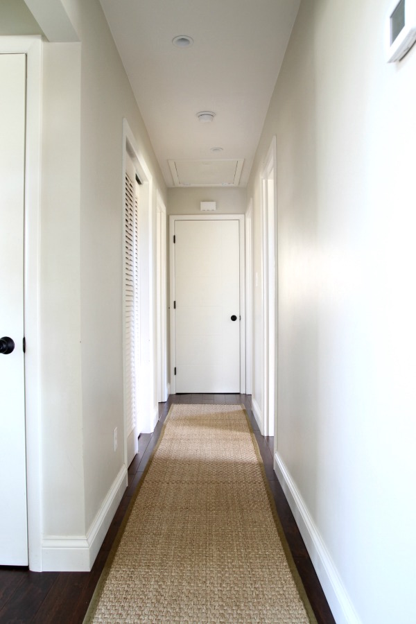
Kate’s long narrow hall is more like this.
It’s a nice start with the seagrass rug. I prefer runners over wall-to-wall and there should be at least a 3-inch margin of wood but probably not more than 6 inches for a long, narrow hallway.
One of Kate’s halls is 50 feet long. These are basement halls, so maybe not as important as the main living areas, but no matter.
We’re going to discuss numerous ideas to help make even the most boring, dark, narrow, long hallway reach its max potential.
The narrowest hallway is going to be only three feet wide. That’s the limit on acceptability from a building code standard. Quite frankly, for a very long corridor, I think three feet is bad design. Ideally, I feel that most halls should be at least four feet wide and preferably five feet or more.
However, let’s begin with the worst-case scenario—a perfectly plain, no doors or windows, 50 foot long, 3-feet wide hallway.
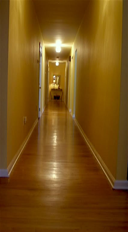
Ew.
First of all, on the other side of this insanely cramped, spooky sliver of a pathway lies another room. Right?
Can we borrow space from either of those rooms?
No, Laurel, we can’t afford it. We’re moving in 5 years or less.
Right. But if you can swing it, that would be my first consideration.
However, let’s work with this suffocating hallway.
I think that we can take a lot of the same principles that we find in our gorgeous wide hallway and use them here, but judiciously, of course.
Let’s begin with the architecture.
You know me if you’ve been reading this blog for a while. I’m a nutjob about architectural features–because that is the key to creating a beautiful interior. Also check out one of my favorite posts about mouldings.
We can add some sort of wainscoting, be it picture frame moulding, rail, and stile or the very popular board and batten, which is like rail and stile only plainer. Assuming that we don’t have a very high ceiling, I would not go up more than 36″ with wainscotting with a chair-rail. Otherwise, it might feel somewhat overwhelming.
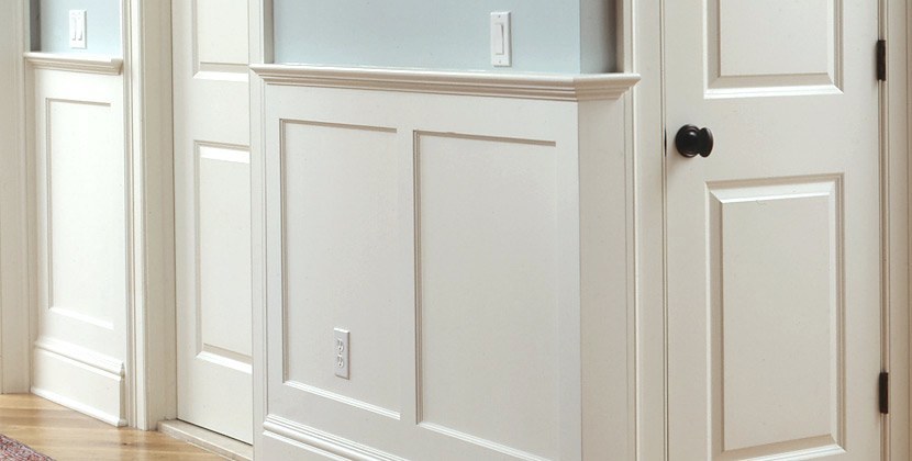
For a post which goes over everything I know about wainscoting, please go here.
You can also find more information about mouldings and doors here.
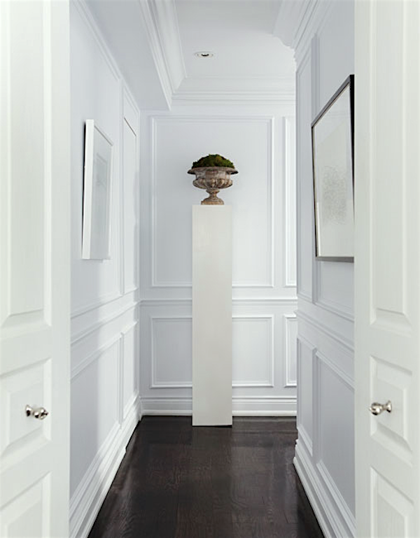
Above, we have a panel above the wainscoting, which is very pretty and helps break up the wall nicely. I’ve often fantasized about doing something similar in my own hall.
We can also break up this long expanse and create more architectural interest.
For instance, we could add 1.5″ deep pilasters (engaged columns) to help break up the expanse.
Please see the example below.
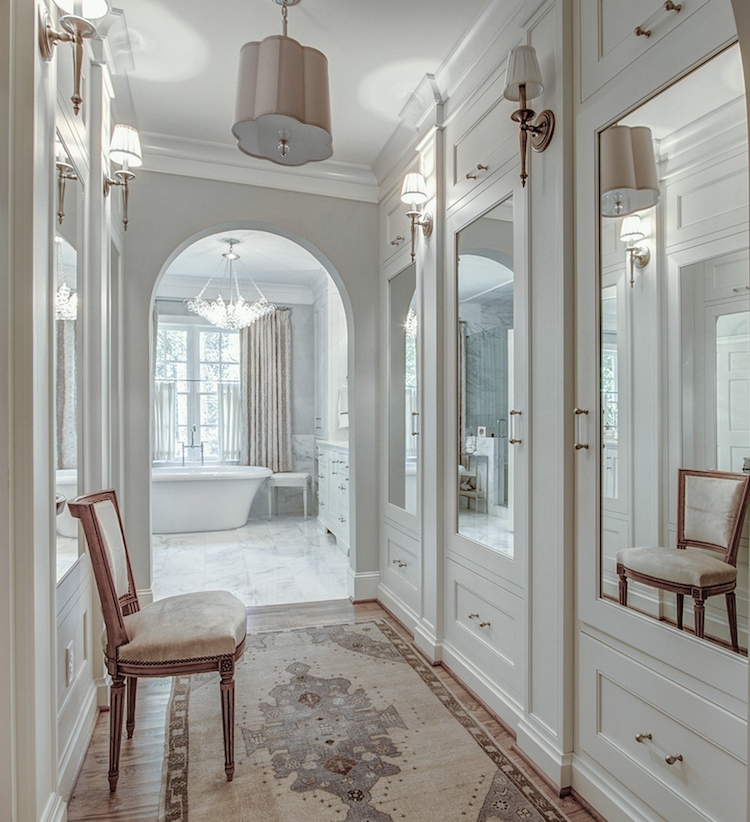
Image from a Real Estate Listing
We can add windows and/or doors, with or without mirrors, but mirrors will help expand the space a lot. Please see this post about windowless rooms.
Yes, interior windows. We had them in our old home, and I loved them.
You could even have it electrically rigged up to shine a dim light behind them so that they look more like real windows. I would probably use frosted glass, however. It depends on what’s on the other side.
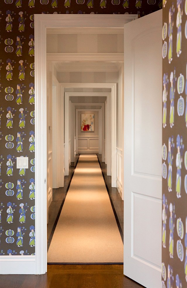
Chloe Warner via Domaine- Designer, Redmond Aldrich
We could add a soffit to create a doorway of sorts.
That would create the effect of an enfilade of doorways. Please see one of my favorite posts about enfilades.
If the hall is only 3-feet wide, we can only afford to lose an inch or two on each side, but that’s enough to create the effect of stopping the eye from moving down a long, never-ending expanse of sameness.
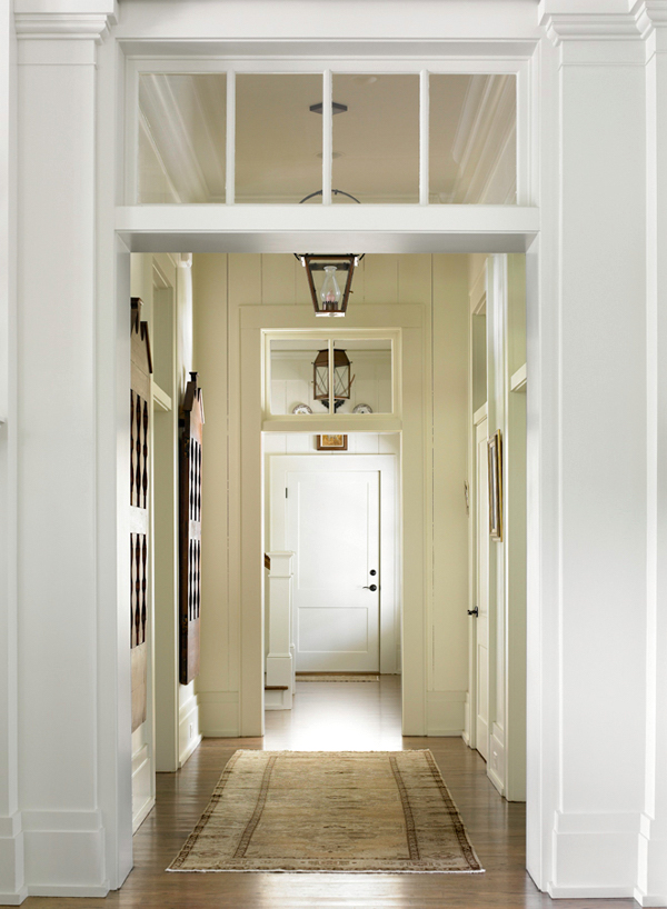
via: Red Clay Soul – Designer, Melanie Davis
photo: Emily Jenkins Followill
I love this idea of using a transom window instead of the soffit. (the rest of the home is just as stunning if you click on the Red Clay Soul link)
We could also create shallow between the stud cabinetry to mimic a doorway like we were talking about recently with our “unkitchens.”
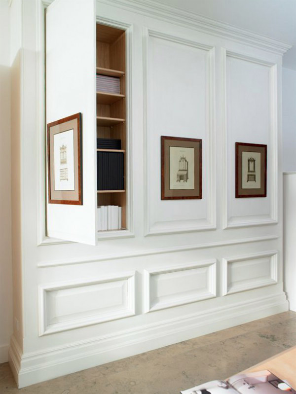
How fabulous is this hidden storage. We could do this anywhere!
We could even put in French Doors, again with frosted glass. Yes, it’s shallow storage, but again, perhaps space can be borrowed from adjacent rooms. However, even if it were a dummy door, it would lend itself to giving the architectural feature needed to make the hallway far less boring.
Laurel?
Did you just say that I should put in a door that isn’t an entrance into anything but a stud wall?
haha! I’m not saying you need to be putting up fake doors;
just presenting it as an option to get the ideas flowing.
Perhaps, in some cases, there’s an option to make a real doorway from this side of the hall into the space that has no entrance.
What if the hall butts up against the concrete foundation? Well, there are still studs and the opportunity to do everything we’ve discussed except borrowing space.
Now that we have the architecture in better shape, our long boring hallway might look more like this lovely hall below or one of the above spaces.
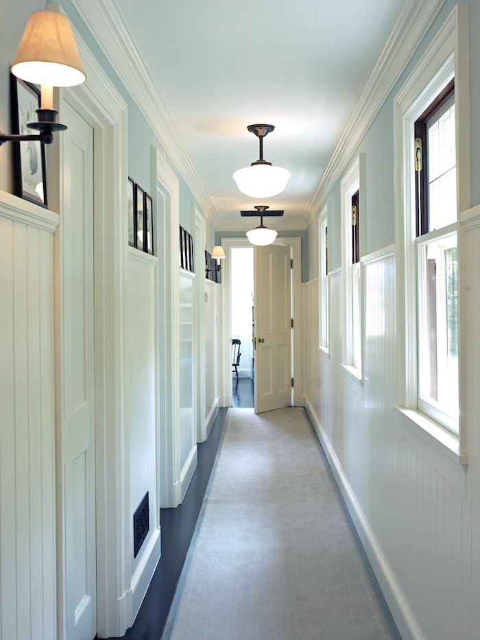
Yes, those are real windows and doors, but we can create something along these lines. Here, they used beadboard or something like that.
Next, we will address the floor.
I often recommend some sort of rug runner to add visual interest. Or, the floor itself could be the visual interest. Having a beautiful floor will take the eye away from the cramped corridor.
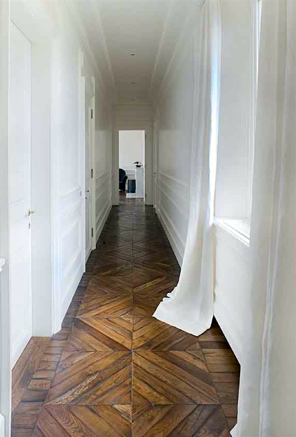
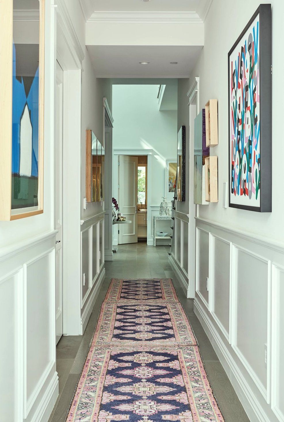
Love how this antique Oriental creates a smashing focal point. I think the way they handled the art is y.wonderful too. And, the wainscoting completes the space beautifully.
In subsequent long narrow hallways, we’ll see other beautiful floor treatments.
However, do not use vertical stripes for your runner!
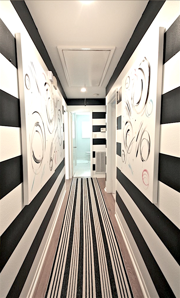
Good thing there’s a bathroom at the end. (I know. Very mean)
As I always say. “just because you can doesn’t mean you should.”
Vertical stripes will not only make your guests dizzy and nauseous; they only serve to make the hall seem longer and more narrow!
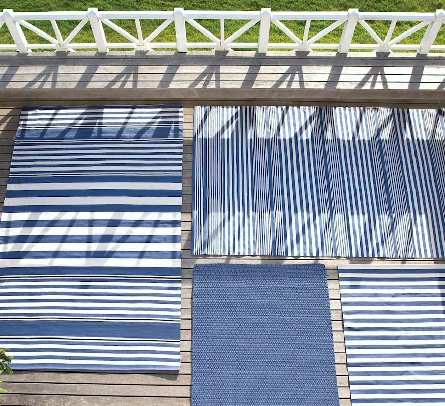
However, horizontal stripes for a long narrow hallway are a big YES!
Fabulous indoor/outdoor rugs from Dash and Albert.
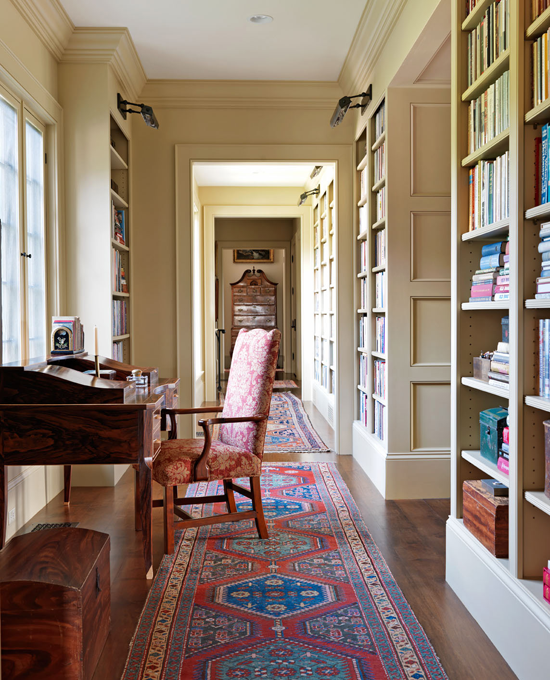
Photo: Jonny Valiant and Joseph St. Pierre for Traditional Home
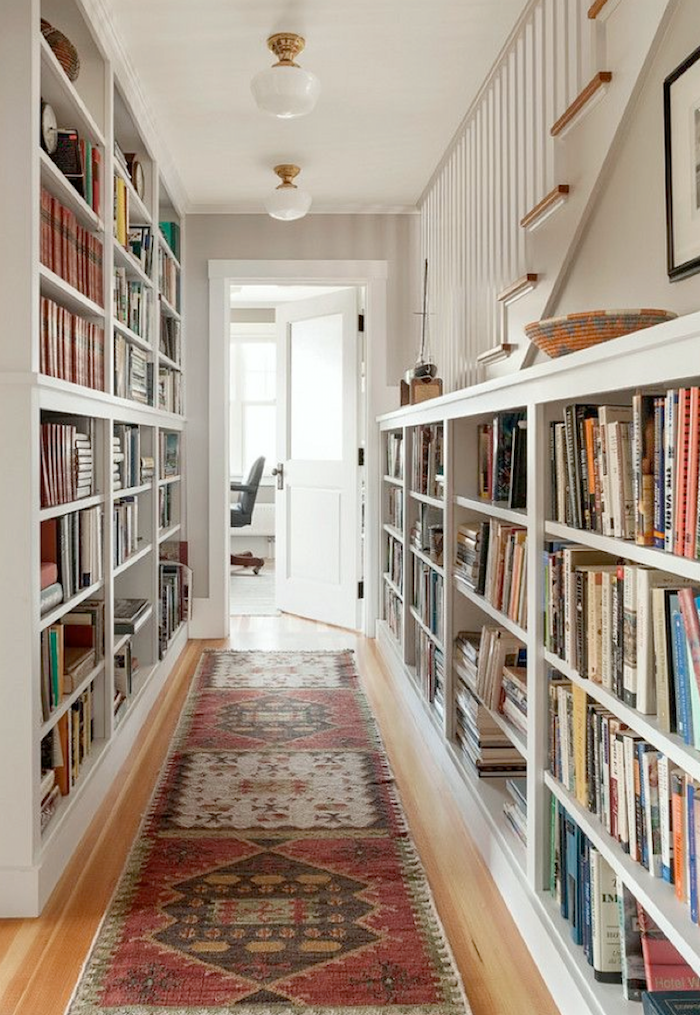
If space allows, books are wonderful in a hall. Do you agree? Love how they tucked in a little desk.
Lighting is very important.
Lighting can either be overhead or if not too narrow, sconces are always nice. I would not do sconces in a three-foot hallway because most sconces project at least 4-6 inches or more.
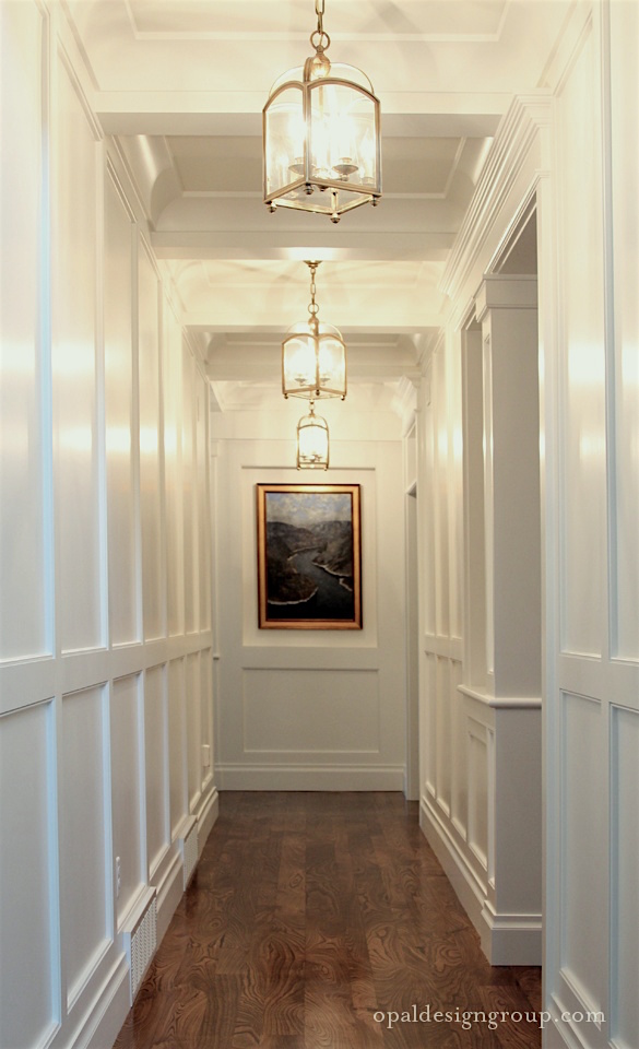
Lanterns for a tall ceiling are perfect.
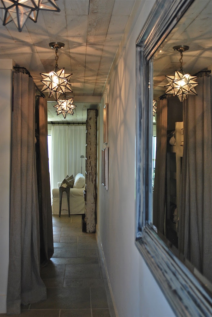
So are Moravian Star lights. Well, I’ve always liked them.
For more great lighting ideas for long narrow hallways, please check out this post about flushmount and semi-flushmount ceiling light fixtures.
Wall Colors
Can we paint the walls anything other than white or a pale color?
Yes, absolutely, but, with a very long narrow hall it requires a very deft hand.
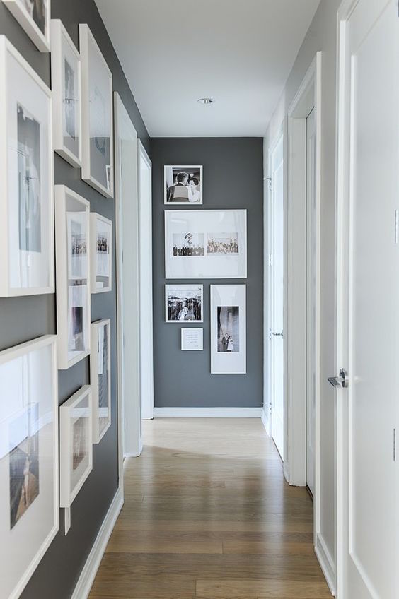
Here is one scenario where I would advocate for an accent wall. In so doing it pushes the darker wall over, giving the illusion of a wider hall. I love the addition here of the fresh-looking photos framed in white.
Dark halls require great lighting and either a lot of white accents; or, colorful accents. That is, unless you are going for something contemporary and moody.
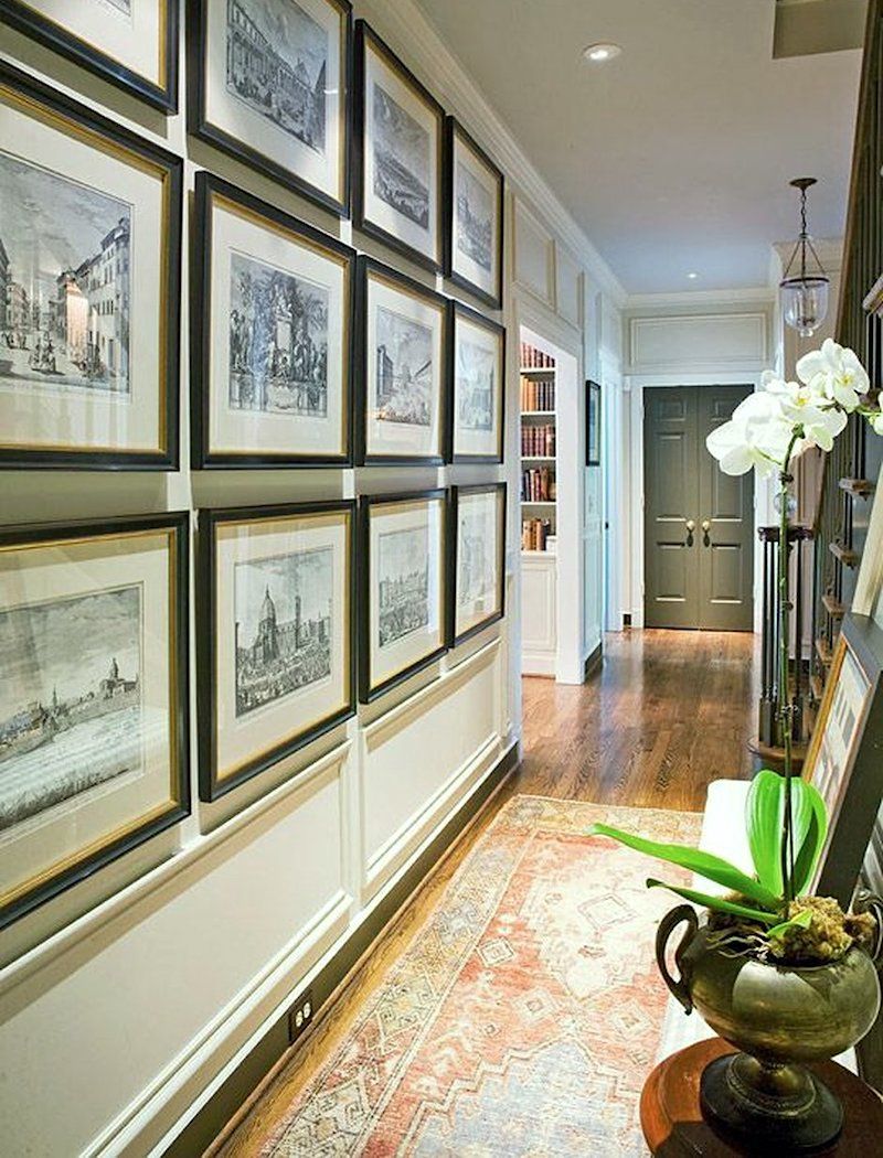
Ann Shipp and Roger Higgins – R. Higgins Interiors
Love the visual interest of the art prints.
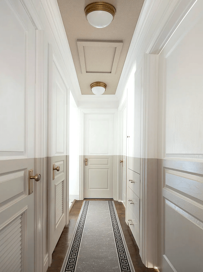
Sarah Gibson – who pens the Room for Tuesday blog – has done something called “color blocking.” You can read her post about it here. Also, please follow Sarah on Instagram, here. And, check out her stunning kitchen!
I’m closing these ideas for a long narrow hallway with some images of beautiful, long narrow hallways that include staircases.
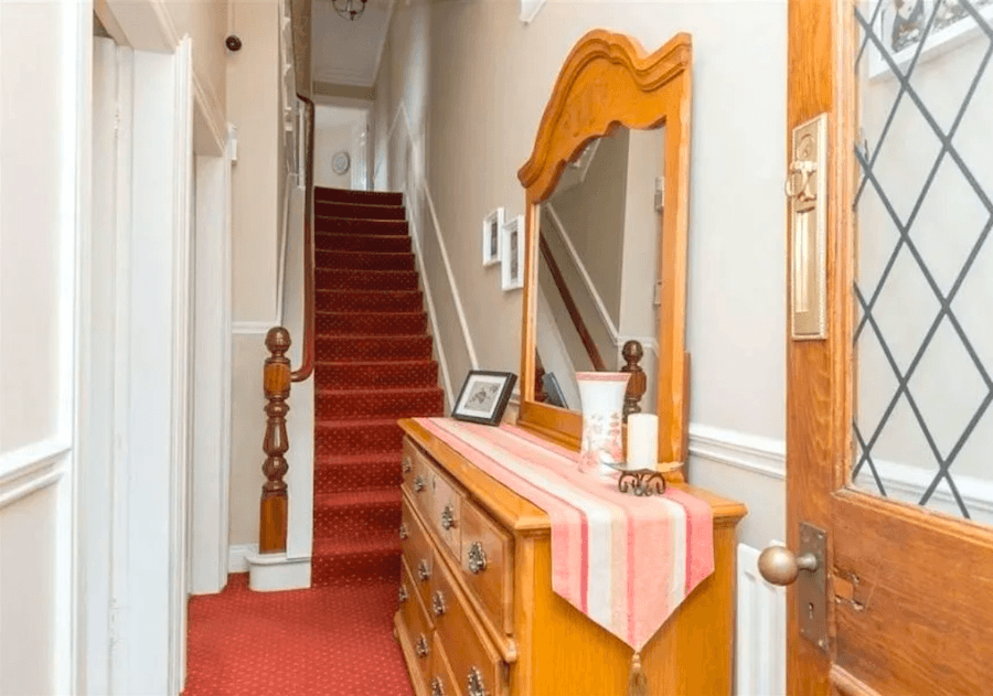
the-real-life – narrow hall entry before renovation.
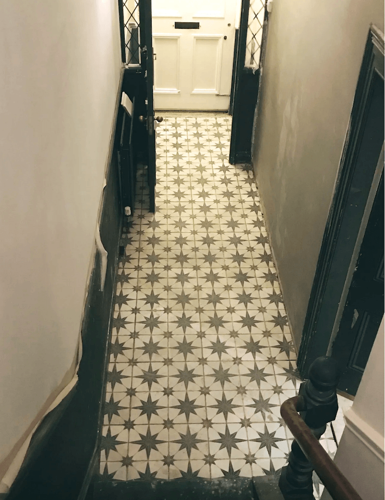
the-real-life – narrow hallway – entry – during renovation – for the finished space, click here. It’s quite fabulous.
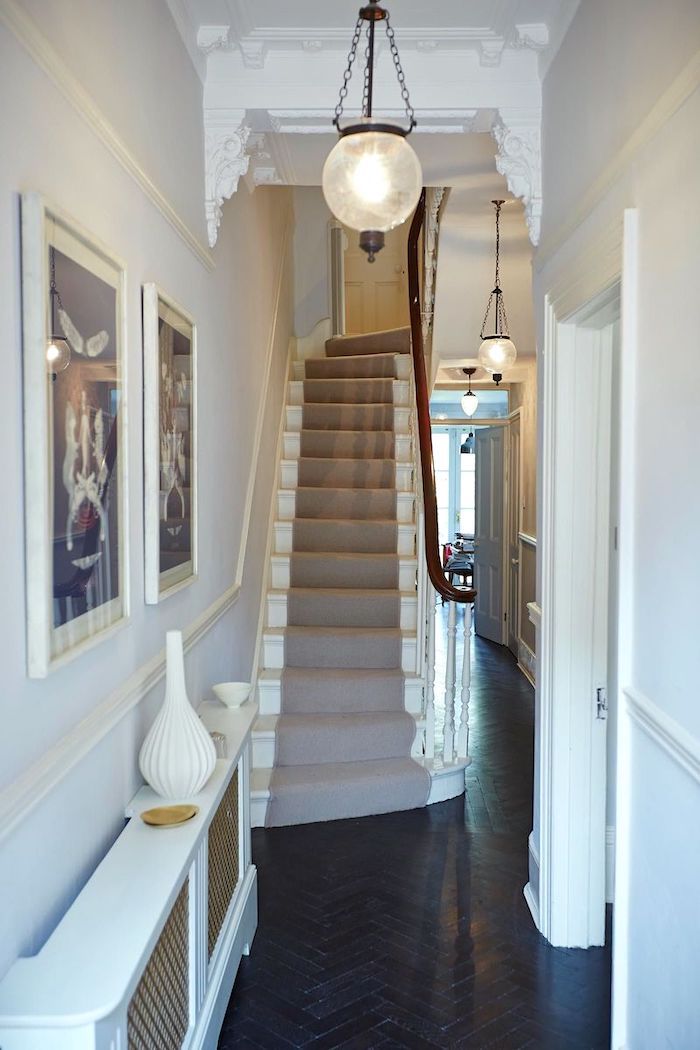
Love the corbels in this hallway. It helps break up the long narrow hallway in an elegant way.
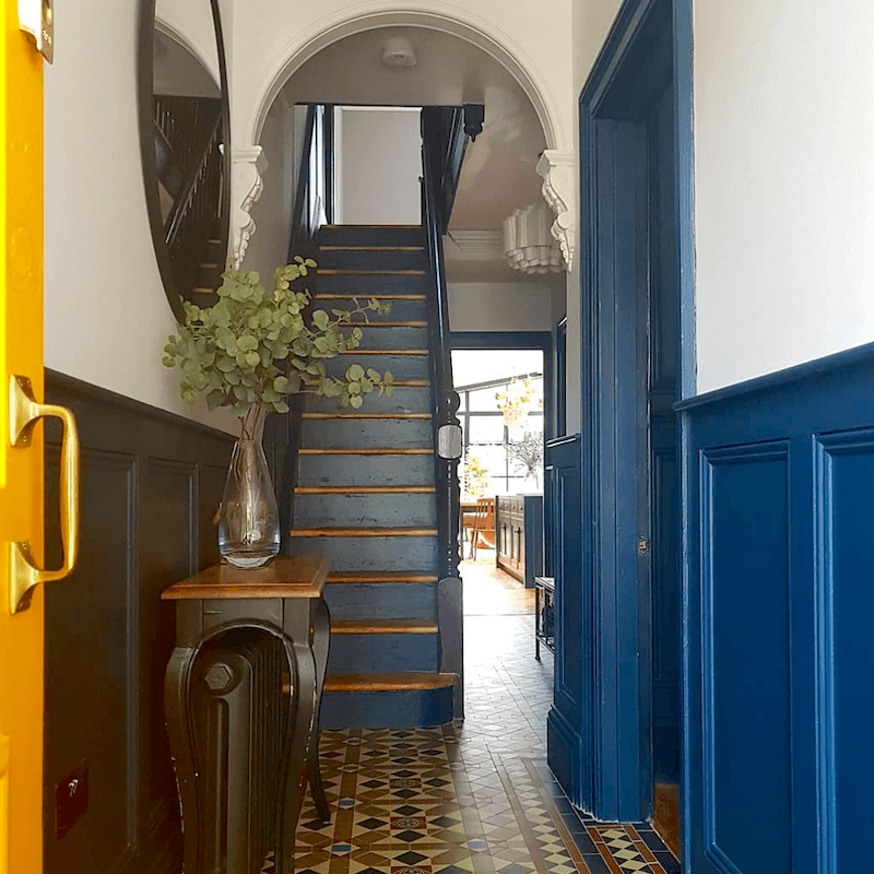
please pin to Pinterest for reference
Well, I hope that gave y’all some good ideas for decorating your halls, especially those problematic dark, long narrow hallways.
So, did I leave anything out? Almost definitely, yes. There are many solutions to this common problem of a long narrow hallway.
Do you have some special tips for your difficult hallways? Please share them in the comments
xo,

PS: Please check out the newly updated HOT SALES!
Related Posts
 Curb Appeal Fixes When the Curb Is In Southern Utah
 The Guaranteed Way To A Beautiful Room (It’s Not The Wall Color)
 20 Stunning Lifestyle Instagram Feeds You Must Follow
 Our Home’s Difficult Floor Plan Is Giving Me Fits!
 A Room That’s Chock-full of Interior Decorating Lessons
 The Perfect Shade Of White Wall Paint For Oak Trim
 My North Facing Room Paint Color Is Driving Me Bonkers!













41 Responses
Skylight is also a good option yo bring in natural light.
During my complete remodel/redecorating I added Pergola wallpaper with light gray and white blooms (which look like it is snowing when you walk down that long narrow hallway..and I am a skier ) added amazing new hall lights , put a vintage wooden bench with Euro pillows and pink garlands , family photos to keep it interesting. Since only my bedroom is at the end of this hall I easily can walk by the bench, which I use to wait for those last few minutes of laundry cycle to finish.
Laurel, I read the post because I have the exact same problem in my 1970s ranch home – a 30 foot hallway with three doors on each side! And, now I have some ideas to try. But, I was just as excited to see my firm’s work featured – the Southern Living Idea House with Heather Chadduck and the one from Red Clay Soul with Melanie Davis (also a Historical Concepts’ home!). That was such a treat. Thank you.
How cool! And, gorgeous work! Thank you too!
Thanks for these ideas Laurel My sister just introduced me to your blog as I have a narrow hallway. Next problem area in my little mountain bungalow is a painted brick fireplace flanked by inexpensive stained wooden cabinets. Just a mismatch of textures and materials which need to be brought together somehow. Is it possible to send you a picture? I would love for you to blog how to blend the features of a wall together. Thx!
Love, love, love this post! So many ideas for my small, drab hallway in my 80’s ranch home that I had to take notes! I love your blog and use so much of the information I glean from it when helping customers at my Benjamin Moore paint store. Not to mention how much I appreciate your sense of humor. Thank you!
Thanks, some good ideas here. My hallway isn’t THAT long, but it is only 3.5 feet wide. The wood floors were laid vertical / longitudinal so I could see finding a good runner to put down. My house style will not lend itself to wainscotting, but at this point I am putting up photos I’ve taken myself, as points of interest along the hallway (dark frames). The overhead lights (two) need brighter bulbs, and that will happen when the current ones burn out as it is difficult for me to reach them with my bad knees (can’t do ladders). Wall and ceiling color is SW Canvas Tan, and floor color is a medium brown tone, not quite chestnut.
I love this post! So many houses here hardly have halls at all with the French colonial influence, but when they do, they’re in ranches and they’re absolute caves.
I giggled a lot about the color blocking photo though. It looks like a high water mark to me. But like. In a this room is actually full of water way that’s surreal.
I noticed some of the different planking patterns in the wood floors. It occurred to me that it might be helpful to have a post about planning planking patterns (say that 5 times) if you have the good fortune to be putting in wood floors for the first time. I had always thought to simply run all the planks the same way throughout if you’re not doing a complex pattern like herringbone, but I like how a one-plank border is used to demark the hall edge in the photo with the basketball. It would be helpful to know how to make that make sense with room transitions and such.
(lovesolutiontemple1@ gmail. com) which he did a perfect job by casting a spell on my husband which made him to come back home to me and beg for forgiveness.I will not stop publishing his name on the net because of the good work he is doing. I will drop his contact for the usefulness of those that needs his help. You can contact him today and get your problem solved.
I’m very confused, or had one glass too many. What is a vertical stripe and what is a horizontal stripe? My uniform,I think, has black horizontal stripes, right? It makes me look fat and like a long hallway.
Hi Dan,
Are you in prison? ;] Sorry, I couldn’t resist.
Horizontal stripes (east to west) make objects look wider than they are. Vertical stripes (north to south) like a telephone pole make things look longer than they are.
BTW, most of my life I have confused horizontal and vertical. It’s better now, but I still have to think about it.
Hi! I have been following you for a couple of years and always enjoy your blog as well as your shopping finds! I would LOVE to see ideas for reasonable (CHEAP) door handles/knobs and hardware. I want to replace mine but I keep falling I low with very expensive hardware that is out of reach. Thank you!
Great article! Thank you!
This post was the first post I saw on your blog! (I have a problem hallway). Loved it and have been reading since I found it. I love the updates you added and I’ll follow your advice here some time…
Really, really good post!
SUNTUBES are fantastic lighting for dark hallways! My local building supply store carried them (not Lowe’s or Home Depot, but an actual building supply store) and you can find them on the internet too. Suntubes are a round metal tube that runs through your attic space’s floor (our’s runs through a 2nd story storage closet) to the ceiling of the first floor which is our long narrow pantry. The suntube’s “fixture” on the ceiling looks very much like a recessed can light, slightly larger. We get TONS of natural light in our previously dark pantry. Never have to turn on the lights in there (except at night of course). I even painted the ceiling ring around the suntube to match the ceiling paint. Give suntubes a try!
Laurel – I have been quietly following your posts and I just have to say while all of them give me something to think about, this is undeniably one of the biggest challenges I have in my home. There were so many great (and realistic) examples. You have shown us that just because a house did not come with fabulous, original architecture, doesn’t mean we cannot add it tastefully ourselves.
Thanks so much, Annie!
I have a 3 ft wide x 12 ft long hallway which isn’t that long, but no windows, dark , with five doors. It used to be peach walls and all the doors were original orange wood with shiny poly on them and gold doorknobs. I painted all the doors simply white, which was no small task. Clean, then prime, then 2 coats of paint! Added egg shaped black doorknobs! Then painted the walls BM Kensington Blue! New schoolhouse semiflush light for the ceiling! A little vintage art and it’s now one of my favorite spaces in the house!
Sounds gorgeous, Kim!
I loved this blog… I have a windowless entry foyer with a door on every wall that measures 15′ x 10′. I am living in Beijing China and renting my apartment for the next 18 months.
I liked the concept of color blocking.
Great post- very helpful ideas! I am wondering if you know the source of the lantern in the lovely blue hall by Bill Ingram? Thanks very much!
Hi Allison,
As a matter of fact, I DO know that lantern. I added the info under the image in the post. But, here’s a link where you can purchase it.
These are all wonderful ideas! Wow!
Thanks!
Cindy
You outdid yourself with this post, Laurel. Great ideas and you found just the right photos to illustrate them. Too bad I don’t have a long narrow hallway; if I did, I would go crazy futzing with your ideas.
This made me laugh!
I live in a converted double-into-a-single shotgun. Any rooms with doors had to be reserved for bedrooms. So you enter the house and go through the living rooms,then the office,and then to the kitchen. If you look to the left in the office, there are 11 foot floor to ceiling bookcases that I built. But if you look to the right, even with the tall window and beautiful desk my husband has, you will see utter mess. He is a mess. He is lucky I love him more than design. Most days. I envy the hallway problem. Wish I had one.Even a long ugly one. A nice wall separating his mess from an otherwise nice space. I cannot add one. Those of you who live in shotguns know this means his office would be only eight feet wide. Did I mention the insane amount of Star Wars memorabilia? My solution was to paint the entire room, woodwork and all, eggplant. Now it’s so dark I can’t see it as well.
Hi Laurel,
I recognized the hallway with the 12 framed etchings/drawings labeled “original source unknown.” It’s from the home of Ann Shipp and Roger Higgins, owners of R. Higgins Interiors. Their housemwas featured in the Octber 2011 issue of Traditional Home. As always I enjoyed reading your blog.
Thanks for that. I’ll add in the credit. I knew it wasn’t terribly recent because of the quality of the photo.
Great post, as always. Sarah Gibson’s color blocking is a brilliant idea!
Oh my that whole Southern Living house is just beautiful! I love the woven skirts on the tables in the hallway. I have never seen that before and I am in love!
“Embrace and Release” – I am sure I responded to one of your posts years ago about our long, dark hallway (with a staircase) in our Colonial Revival home. Our designer suggested we paint the hallway AND ceiling in a darker blue/grey matte color – my husband and I were not excited and it took 2 years of “deciding” before we agreed to give it a try. It’s now my favorite “room” in our house. I love how the dramatic color draws you to the other rooms, which are painted a much lighter “neutral” color. Our designer referred to Frank Lloyd Wrights concept of Embrace (compress) and Release. I really liked this post – thanks for always keeping me engaged.
Hi Laurel,
You are right. Moldings can make any space look so much better.
I’m fortunate that I don’t have a hallway in my home. That’s one of the advantages of having an open floor plan.
I actually have an upholstered bench in my hallway. On it I have a pillow, croqueted afghan and my sock monkey!!
Thank you for this post! With your guidance, I’ve made several wonderful purchases recently. My living room is finally coming together thanks to you! I also have a connecting hallway that is in need of a runner. Can you recommend a few more rug resources?
Thank you.
Perfect timing for your amazingly beautiful post! Just the inspiration I need to tackle the neglected 50′ of many doors and mismatched bookshelves a la too many owners of our 120 year old Southern Charmer. Selling our Maryland beach house to fully enjoy the quiet beauty of small town South Georgia. Thank you for your love and sharing of classic design and detail!
Reading this reminded me of the year I spent living in an apartment above a store in a historic commercial building. The building was 100 feet deep from street to alley and had a hallway that was 85 feet long. It turned out to be the perfect place to learn to roller blade.
Now I live in an old house with a long, dark, narrow hallway that has a French door to the outside at one end. I found an old 6-light window frame that I painted neon red, had fitted with mirror glass, and hung about halfway down the hall. It doesn’t lighten things up much but it looks kind of neat.
Hello Laurel, A fifty-foot long dark, narrow corridor in a basement? Your correspondent should consider renting out her home to make horror movies!
My mother’s apartment has a narrow hall, but she made it a place to linger by creating picture walls in several groupings (one long gallery would just emphasize the original problem). Her main theme is pictures of ladies, mostly old-fashioned, but also some “mod” ones, and one frowning Victorian gentleman. Everyone who visits is quite taken with the hallway.
–Jim
Sounds very charming, Jim!
I have been following you for awhile now. That bathroom was pin worthy. Strange where your mind goes. When I saw that long dark hallway,I thought of the video Josh Turner did with this wife in a hotel. Go to Vevo youtube enter “Josh Turner Your Man video”