Here’s the thing about the recent spring furniture market in High Point, NC that those who haven’t been may not realize.
There is no such thing as THE newest trends. I say that because designs in the furniture industry don’t actually change that much from season to season. But still, there is something for everyone.
If you like gray, there are lots of places to get gray.
If you like color, there’s plenty of that.
If you like fuddy duddy, it’s there too.
Contemporary…
Cheap…
Insanely expensive…
Well, you get it.
And anything I present is only going to be the tiniest spec in a vast ocean. And it’s through my Laurel filter.
My problem is…
I love so many things.
Antiques
Classical
Colorful
Fun
Chinoiserie
Practical
and even Gray
It’s all there.
Today, I want to focus on some of the brightest and newest designers–the rising stars seen at the spring furniture market. Some are established and some have just come on the scene.
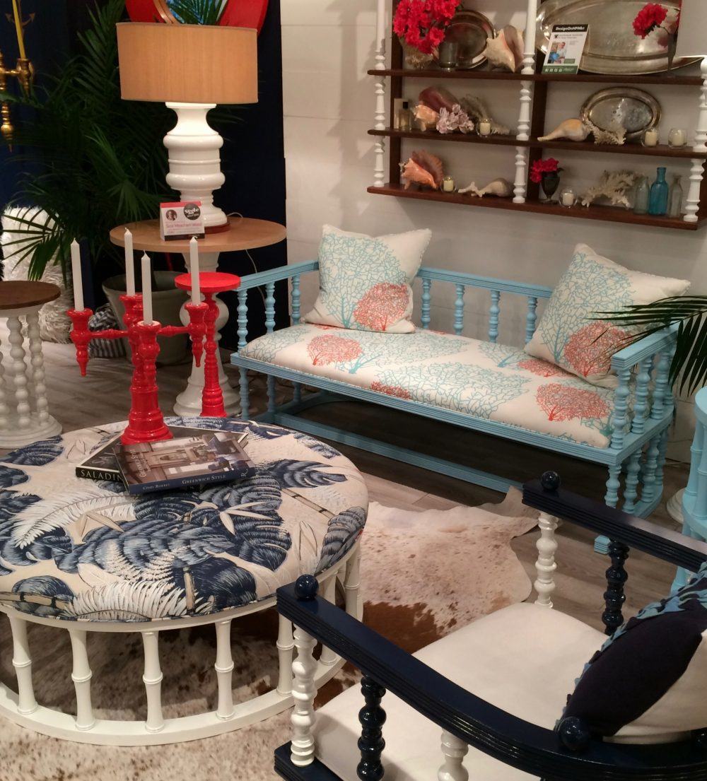
The first source, a lot of you will recognize is the wonderful designs of Dunes and Duchess. It’s the husband and wife team of Stacy Kunstel and her husband Michael Partenio who apparently wooed her with one candelabra and well… here we are. Each season, the collection grows ever more wondrous with its playful colors. The fabrics are from Cotton and Quill— another great source for gorgeous prints.
However, I was most fascinated with the navy walls. The color is EXQUISITE Benjamin Moore Deep Royal 2061-10 and the second I got home, I added it to the Laurel Home Essential Paint Collection. You can see more of the colors here.
 You can read more about this and 15 other of my favorite Benjamin Moore paint colors
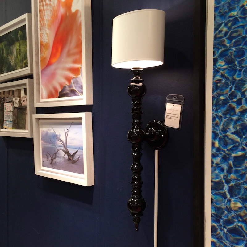
I can’t tell you how mesmerized I was by this gorgeous black sconce juxtaposed against the navy and the colorful art.
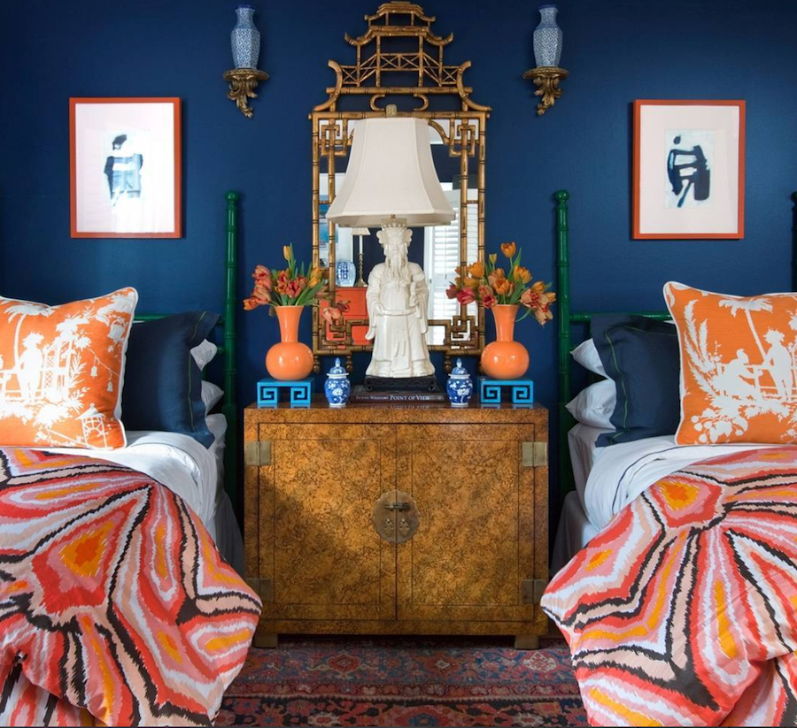
This is a pic I swiped off of instagram that is the sick work of Lance Jackson and David Ecton, owners of Parker Kennedy Living. The photo originated with House Beautiful.
Are you beginning to see something of a theme yet? :]
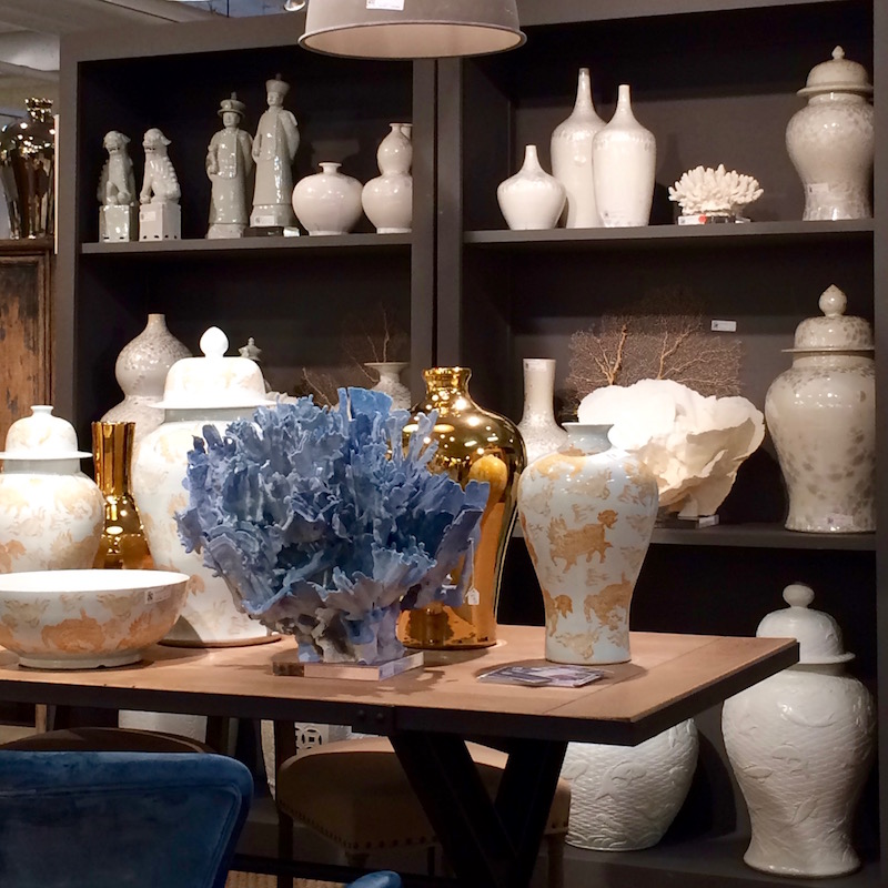
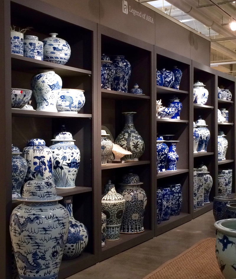
Above and below. Legend of Asia never fails to deliver. And their collection of blue and white chinoiserie porcelain has tripled in the last few years! Love it!
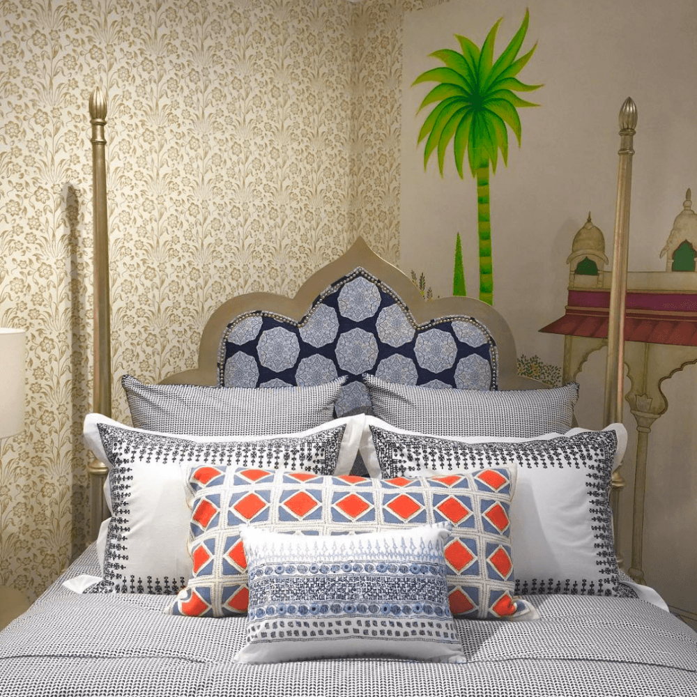
Above is another photo from the Duralee booth of the wonderful John Robshaw collection. This pic was swiped off the instagram page of my beautiful friend, Linda Holt who’s going to be on the Italy trip with me! Linda has THE most beautiful instagram feed and you must check out her series of blog posts about High Point. She’s a designer and ALSO a professional photographer.
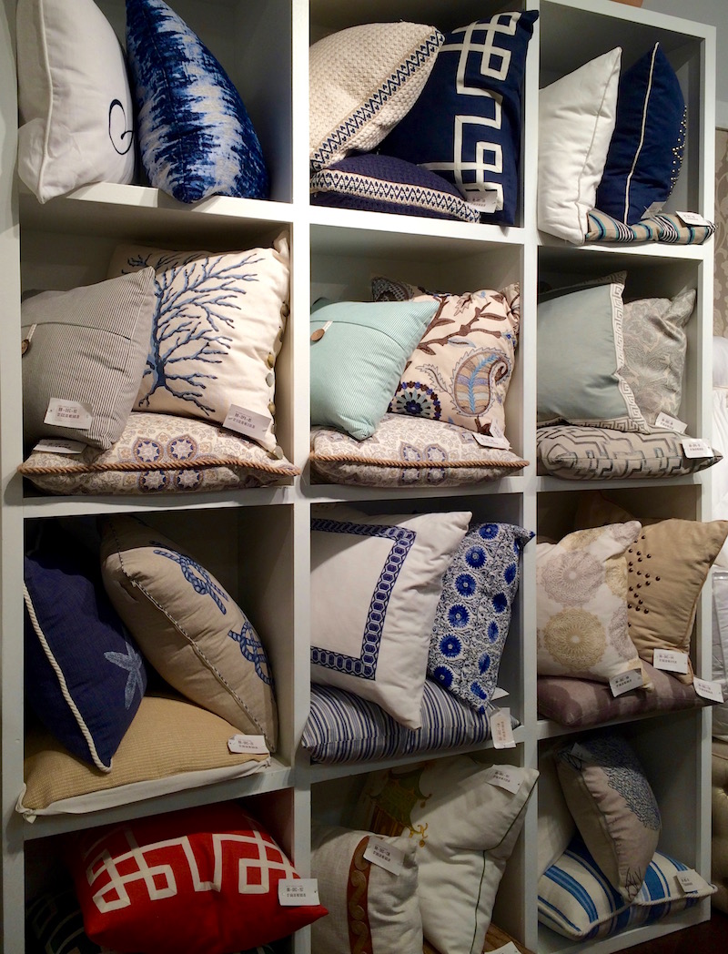
Pillows at Eastern Accents. Ahem… Yes, I know… Cannot resist a Greek Key – Ever!
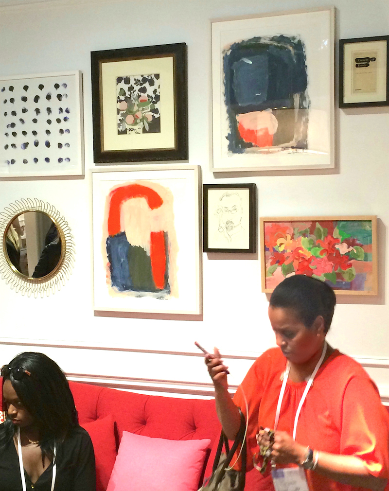
Two Lovelies from the Adorno Mag Elevate Design Tour. To the left is one of the coordinators Teia Collier and to the right is interior designer extraordinaire Joy Moyler.
This was taken in the Kate Spade showroom. Love how they seem to integrate with the sofa and art! BTW, did you know that Kate Spade has absolutely nothing to do with the furniture brand? Apparently it was sold about a decade ago. The furniture is produced by EJ Victor.
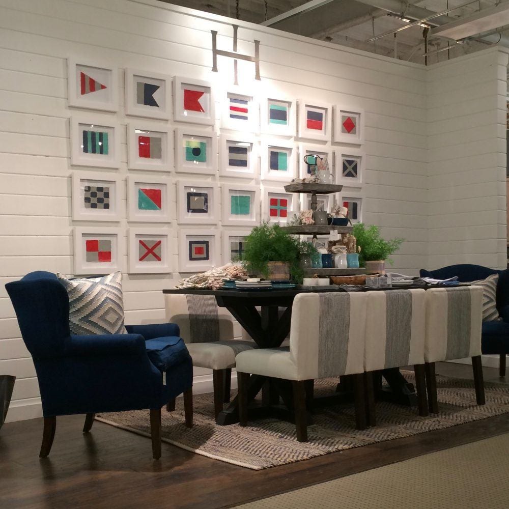
As we were running around, my eye caught this interesting place and I went back on the last day. It’s a brand new source to High Point. A really lovely boutique line, Imagine Home, with everything from furniture, to rugs, accessories and art. They featured a casual but sophisticated look with lots of natural fibers. There was an abundance of red white and blue at market… And as you can see… oranges, corals, pinks, reds and lots and lots of blue too! Wonderful color combinations!
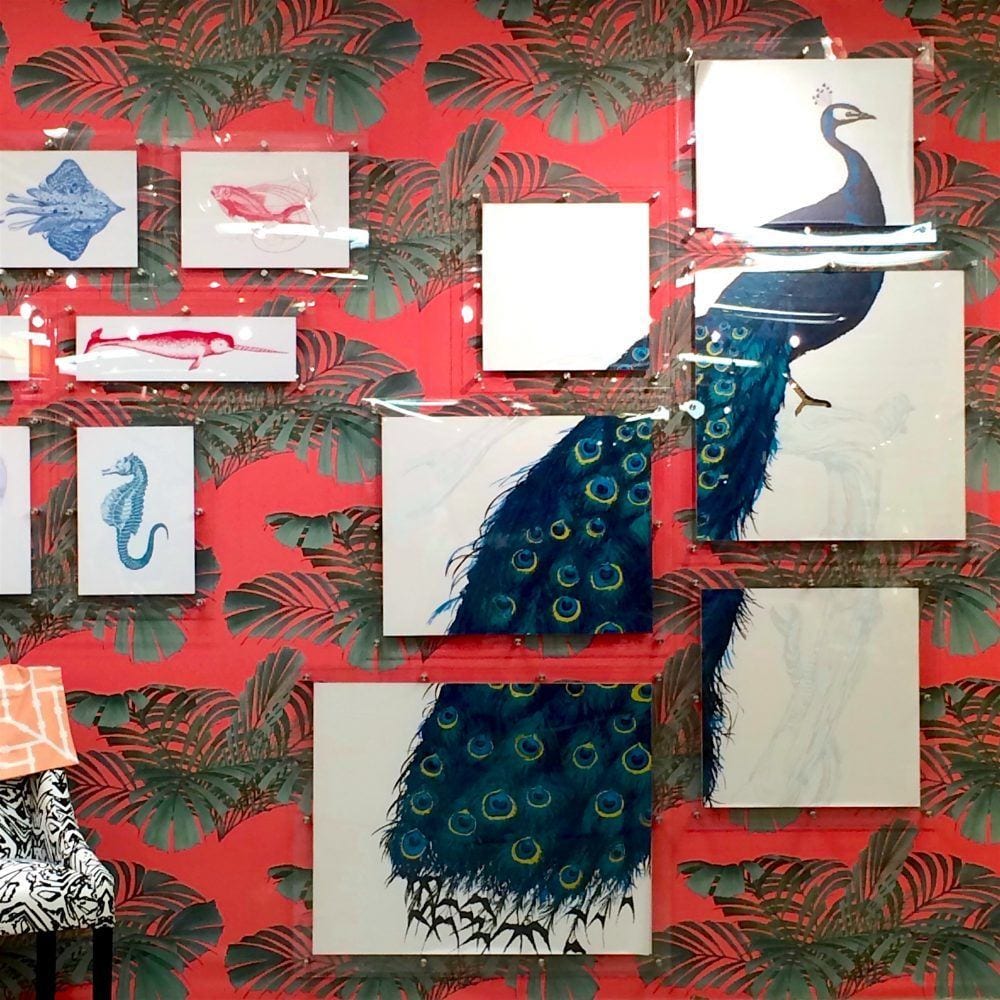
On Day One of the Elevate tour, it was really the day before the official opening of market so somewhat quieter. I was snapping this way cool image taken at the Mitchell Black Booth when all of a sudden I hear a cheerful sounding
L A A A U R E L
I’m thinking… Who could that be? I don’t know anyone. lol but apparently I do. It was none other than the beautiful and ubiquitous Julianne Taylor of Taylor Burke. And what was she doing? She was helping the folks at Mitchell Black put up their sign. That’s what I call hands on! More about her in a sec.
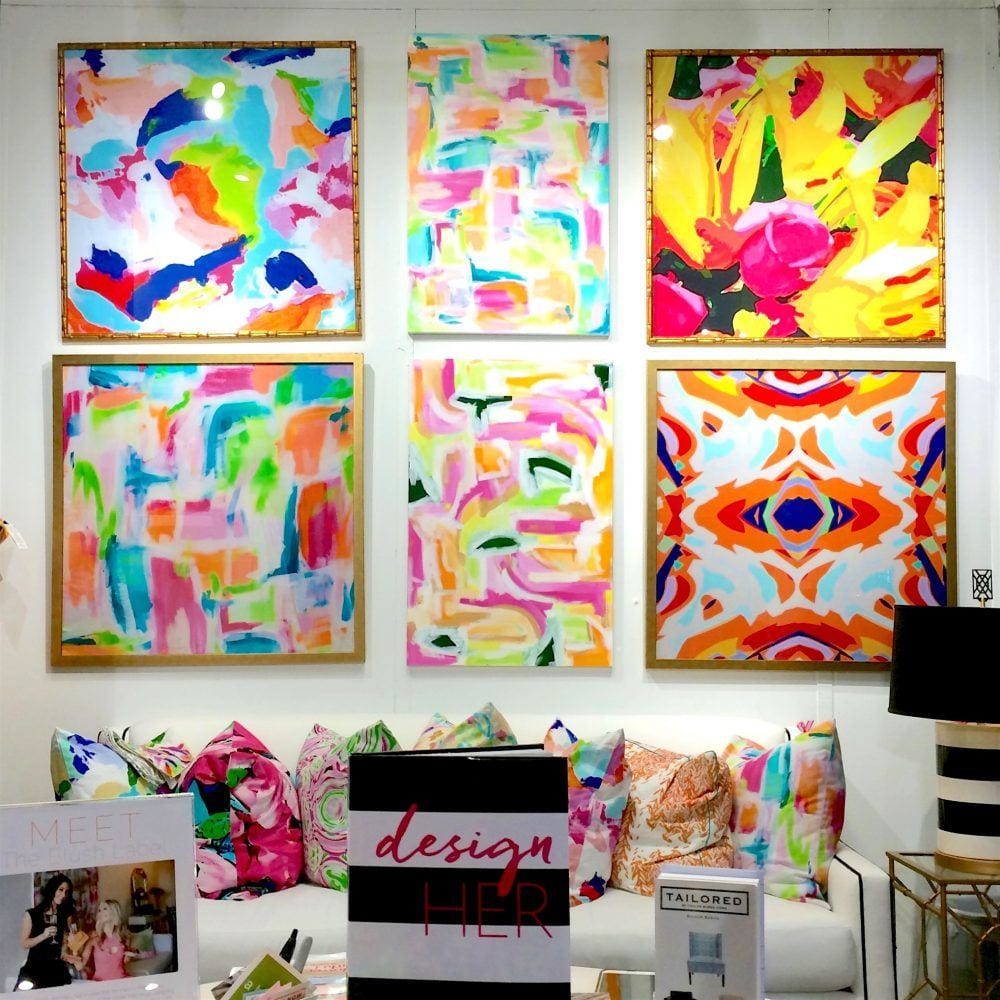
This is another brand new line where I was greeted by two gorgeous very young women–sisters actually, Christie and Mary who started this boutique line of way cool fabrics, fun pillows and accessories. It’s called The Blush Label

It was day four when I met them and believe me when I tell you that they looked this fresh at 4:00PM.
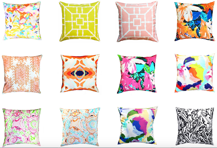
Some of their pretty and artful pillows.
Back to Julianne Taylor. And this is why I had to interrupt. She has teamed with the Blush Label and she has teemed with Cotton and Quill, Wesley Hall, Lacefield Designs and I’m sure a bunch of others that I don’t know about. I kept running into her. And one time, she was taking a photo and I said…
J U L I A A A N N E
And she actually looked up as if to say, who could that be? That’s how unassuming she is.
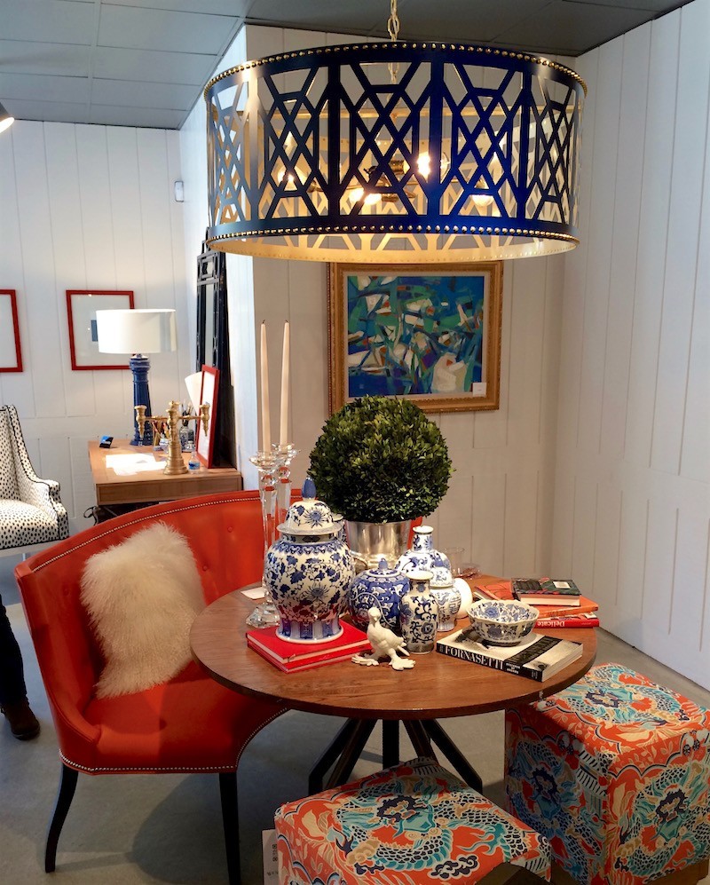
I met her last fall at the Design Bloggers Conference where I snapped this image above featuring Taylor Burke’s Don’t Fret Chandelier. at Wesley Hall.
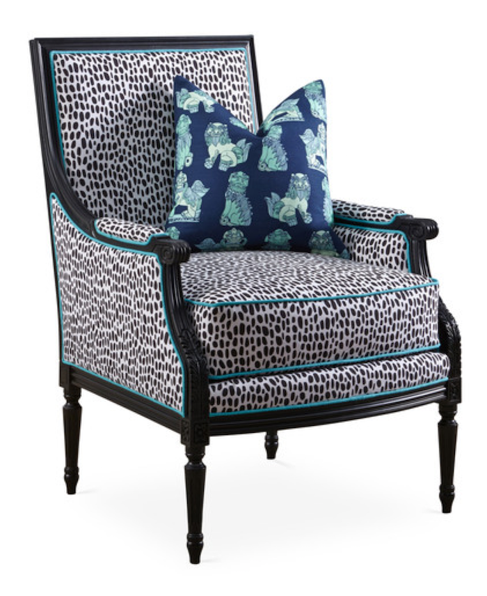
This is her cool Louis XVI Bergere, updated with Cotton and Quill fabric and some slick black paint.
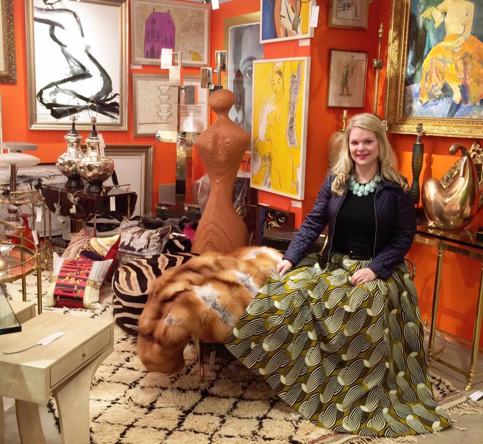
She’s just so cool. I think I wanna be her when I grow up. :]
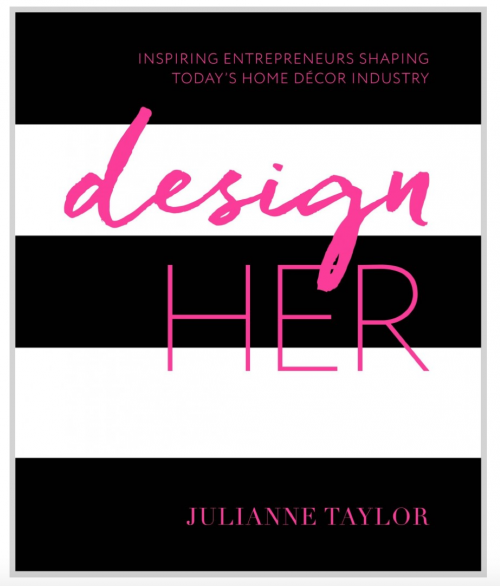
You must get her new book, Design Her if you don’t already have it! It’s absolutely gorgeous and she talks about all of these other incredible women designers. Very inspiring!

Here’s my signed copy!
By the time you get this post, I’ll be living one of my big dreams in Venezia!
Ciao, Ciao!

Related Posts
 Channeling Grace Kelly – A Rising Interior Design Star
 A Beautiful Home Renovation Makes Big Bucks For The Sellers
 Furniture Trends That Need to Go Bye Bye | Market Preview Fall 2015
 Are You Making This Common Kitchen Design Mistake?
 10 Easy Ways to Make Your House Look Good | blooming branches
 A Gorgeous Antique Farmhouse That Isn’t Yet Singing
 An Exquisite Kitchen Restoration Has Charm To Burn


