Hey Guys,
As promised, this is part II from Sunday’s post about the boring bland living room. (BBLR)
(Please open that link and keep it open so that you can refer back to it for reference.)
But, I think one reason it’s so bland which a lot of you thought so too is because of the not-so-great paint color.
The paint color, windows and the wall-to-wall sculpted carpeting says dated living room, IMO.
Y’all gave some great answers and some of you missed some things Anita had expressed displeasure with.
She definitely wants to change the carpeting and hide the odd-shaped windows and the paint colors.
And of course, the big blank wall.
I’ve been known to change my mind in the course of planning for clients.
And I feel that I need to revise the art wall.
Some thought it too busy and yes, in retrospect I do too. This is part of the design process.
I can’t tell you the number of times, I excitedly suggested a fabric or piece of furniture and the client loved it too. But when I put it up in my studio with everything else, decided that it was not the best solution. In these cases, I would contact the client immediately and they appreciated my honesty when I explained why plan B (or C) was better.
This is why I think it’s best to take your time; live with the samples a while. You’ll know if it’s right or not after a week or two.
So, let’s jump in once again and begin where we left off on Sunday.
These are the things that are definitely staying.
sofa
club chairs
garden stool
bar cart
wonderful blue-gray caned dining area chairs
dining table
maybe pillows.
These are the things that are most likely leaving.
- The carpeting
- bookcase
- coffee table (but it’s not bad)
- the little end tables seem to be too tall and/or too small. And the green one is lacking in the sophistication of the other pieces, I think.
- most of the light fixtures
- fan, but possibly replaced with a chandelier
Some of you objected to the room layout, but over-all, I like the way it is. However, I can’t be certain without doing a room layout. If there’s room, I would add a slipper or occasional chair to the far window wall seating
Okay, let’s attack those windows. Our “problem child.”
They are completely frustrating. If it was possible, I would wave my magic wand and move them over one foot, away from the fireplace, square them out and make the transom the proportion of one pane. Assuming that this is not a possibility–
This is what I would not do.
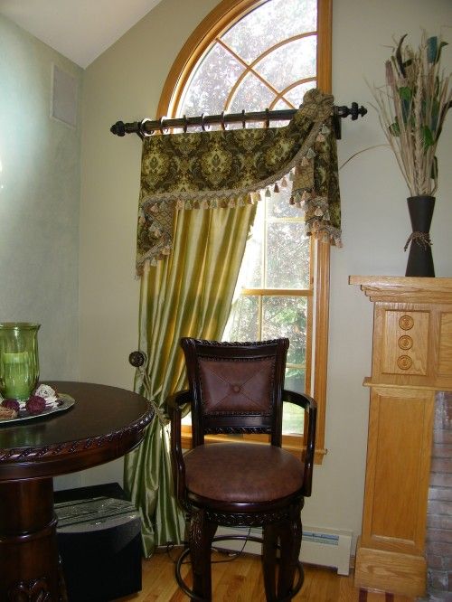 and this…
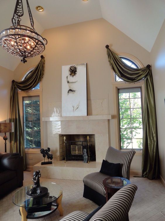
Both of these are accentuating everything that’s wrong about this style of window.
So, what should we do? I have two ideas.
The first one is one many of you suggested.
And that is to do a double panel, hung just under the crown moulding about one inch. It will give the illusion of going up to the moulding because of perspective.
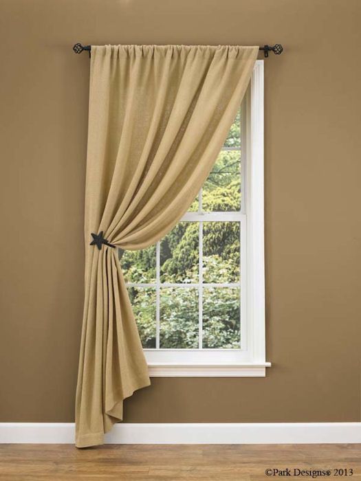
Then I would use a decorative hold-back away from the mantel. It’s difficult to find good images of what I have in mind. But this is the general shape, but I’d do rings with a pleated header.
My second solution is to do, two single panels with a cheat.
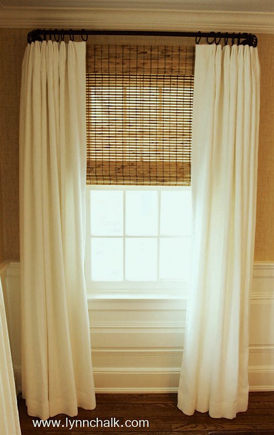
Wonderful Lynn Chalk draperies and pillows
The rod is still hung high, but instead of centered over the window it comes just far enough over to the right to cover up the casing.
But on the left, it extends past the moulding about 15”. The effect when the drapes are hung will be that on the right the first row of glass will be covered. On the left, only an inch or two will be covered. We would need to do blackout, however because we don’t want the light coming through unevenly.
But, we’ll still see the curve of the window, so the solution to that would be to either do a tailored valance like last week, or a Roman shade of some sort.
The problem is that again, it will need to be black out and I really would prefer not to do that; because that would feel too heavy as it will need to come down to the break or will look not-so-great.
Therefore, it’s back to the drape pulled back to one side and again, so that minimal glass is covered, I would cheat the rod out about a foot past the casing on the left.
For the big double window, I would do a panel and one half, unless they need to close.
For fabric, I would do a plain linen and would love to see a beautiful trim. There are numerous beautiful trims in this post I did a few years ago.
And we can do my favorite custom wrought iron rods and rings.
Let’s talk colors for a sec.
I see a color scheme of the whites, creams, beige, with some muted blue-gray, and darker blues as accents. We can also incorporate a little green and red, or not. I like the sofa pillows a lot. The blue one could be a little larger, but over-all, I think that they’re very pretty.
Now, it’s time to address the long wall.
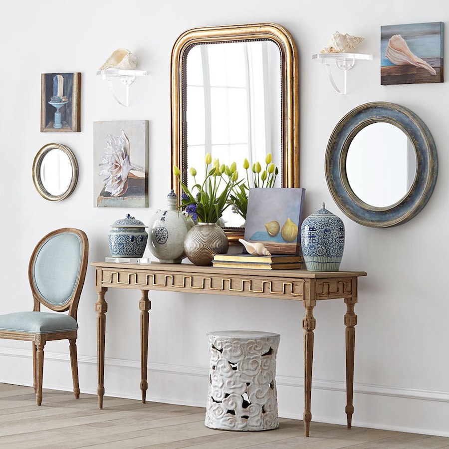
After further consideration, and given the intake vent, I would prefer to see a vignette something like this. That is the Golden Key console from Wisteria. They are having a fabulous sale right now, by the way.
I know that many of you are interested in seeing a big bookcase or etagere, however, I think it might disturb the symmetry too much.
At first, I thought that two console tables would not work, but I found one that I love for the back of the sofa. And it’s fine to have things be eclectic.
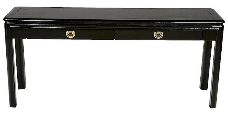 Vintage Black Lacquer table from Drexel
Underneath this, I would put two upholstered stools.
I’m going to include most of the rest in the widget below all of this. There is a fabulous source, for custom-made stools and other beautiful custom furniture at reasonable prices.
I think that we should do two narrow end tables, not more than 16″ wide.
We can put a floor socket under the sofa to plug-in the lamps. If we don’t want to have to cut a hole in the rug, then the rug can stop just short of the socket.
***Important*** One must always measure and do a little layout to be certain of EVERYTHING.
There should be 36” of space for passage. If it’s a matter of a foot or two, and then the space widens, it’s okay to go 30” but no less than that.
This is why sometimes it is better to do a sofa that’s a little smaller than 84”— say 72”-75”.
Are you guys with me?
It’s not that easy, is it? It does get easier after you’ve done a couple dozen living rooms, however.
After I finished dozens of detailed floor plans with ink on mylar in design school, I made my life easy by getting a pad of quarter-inch graph paper. 1/4” box equals one square foot.
They also make templates so that you can trace the approximate shape of your furniture. For more about that, click here.
Let’s move over to the big window wall.
On either side of the double window is four feet, however, once the drapes are up, that will reduce the available space to about three feet and then we need a little breathing room.
That would leave just enough room for a small chest or demilune table. Max width = 30”
I found a pretty demilune table in the widget that’s 24″. We could pair that with a beautiful sconce over each demilune.
Now, with four lamps, two sconces and a beautiful new light fixture, this once dated living room will be alive with warm, lovely light. Please use a warm light bulb and put on dimmer switches.
There’s light at the end of fixing a dated living room!
Time to tackle the fireplace mantel area.
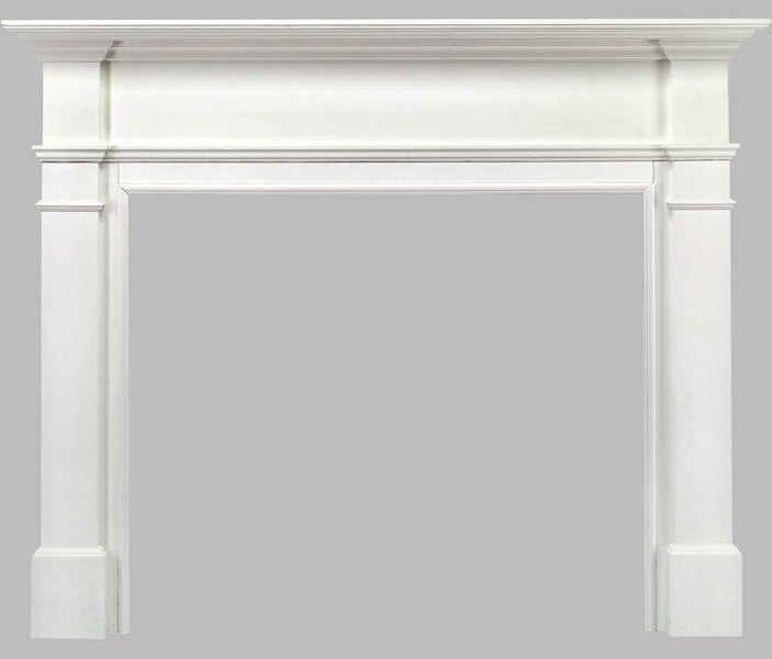
My biggest issue is the mantel surround, itself.
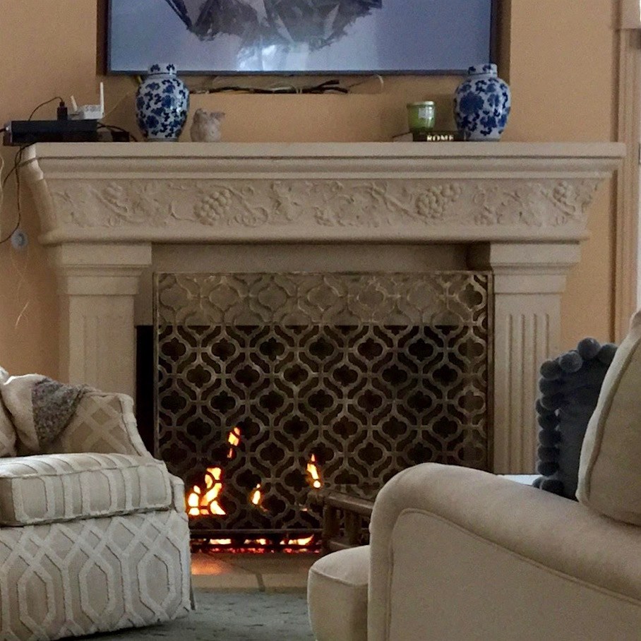
The current one is disproportionately deep. Not the shelf. The surround.
Too much. And it’s too ersatz Tuscan.
This would be perfect from Pearl Mantels on Wayfair and it’s only $500. I don’t know if the size is perfect and conceptually, I think that it is just right. I would pair this with a honed black granite as it is required to have a 6″ minimum of stone for a wood burning fireplace.
For the TV area, I’m thinking, ideally, something to dress up the area better. There are lots of great ideas in this post about what to do with the TV and this post on the same subject.
Anita could change the coffee table or maybe paint the current one a rich dark blue. There are some lovely ones in the Laurel Home Essential Paint Color Collection, which also comes with the Palette and Home Furnishings Collection.
Finally, for the living room, I would close up the opening and put a beautiful piece of art over the bar cart.
I’d move the blue and white Chinoiserie vase to the coffee table and add books and maybe an orchid or something like that, and another piece of porcelain. The tray is fine too. The cobalt jars are beautiful, but I think that maybe the color is a little too intense for the coffee table.
The kitchen is pretty easy. Although, I can’t see everything.
I would build a soffit up over the cabinets to fill that area in.
And yes, paint the cabinets. They can be painted the same white that Anita chooses for the walls/ceiling and trim in the living room.
I would do a beautiful white subway tile backsplash.
Can’t make out the counters. My guess is granite. But maybe change those to marble, soapstone or a quartz with a marble look. Here’s one of my favorite posts about marble and look-a-like marble counterstops. The comments are especially helpful after this post!
As stated on Sunday, I love the blue-gray caned chairs.
The table, I can’t see what it is, but the chandelier looks dated to me. As for the windows, I am thinking some Roman Shades here. And this is a place where a beautiful print would be cool. But, I can’t see what’s going on exactly.
Below is a widget which includes everything I’m able to link to, but it’s almost everything. And there are some additional explanations. You can click on the individual images to get more info.

Well, there it is! I’m really liking this and I hope that it’s helpful to Anita and others with similar decorating issues.
And thank you all for your help and terrific suggestions!
**********
I’m here in Wisconsin having a nice visit with my family.
You can see a pic of my mommy and me here taken this afternoon.
She had a good day today and I could tell how happy she was to see me.
I am grateful that her mind was at its best.
xo,

Related Posts
 77 Budget Fabrics That Look Rich + Sources!
 Benjamin Moore Aegean Teal – COTY 2021 – Yes or No?
 My Kitchen Finishes-How Are the Marble and Tile Holding Up?
 This Year I Decided To Decorate For Christmas
 The Historic Nichols House Museum, One of Boston’s Jewels!
 Renovation Budget & How to Spread Your $ Further
 My gorgeous painted breakfront










22 Responses
Kitchen suggestions…because you see into the kitchen, the soffit space is glaring. Along with the black moulding, it’s a distraction. If you are having the cabinets painted, perhaps they can be taken down, painted at the shop, and then re mounted higher. I always enjoy a tall space between the counter and uppers, great for appliances or a vase of flowers. Or, take the black moulding off and add glass uppers, they’ll be short, but it looks like you could put extra glassware there.
If you like the windows, then laurels options are great. If you hate them, do everything you can to remove them now, before you do all the beautiful upgrades! I personally hate half rounds, quarter rounds, even ovals! A little round window is ok, but that’s my preference. And I would be willing to make that phase one.
Good luck! Can’t wait to see the results.
Agree with Stephanie… woven wood shade with blackout lining hung high to cover up the top window and “the cheat”. One drapery panel with not hold back.
Thanks for sharing the lovely picture of you and your mom. My husband and I lived with his folks in their final years. One had dementia and one Parkinson’s so I know how tough it is. Glad she’s in a place where she can be well cared for and that you’re getting some time with her.
Thank you Gail. xoxo
Laurel,
I have “watched” you do so many of these incredible make-overs and I am so grateful for all that I have learned from your posts. This last one inspired me to push the button on finishing the two spaces in my house I have been focusing on…I don’t need to live in half-finished blah spaces forever! Just placed my first order through OKL, through your links. Last week I owned 3 table lamps, 2 from my husband’s childhood and one from his grandmother. Next week I will be the owner of four more, including the lovely Shiloh lamp you have shown to us so many times (I got it in cream). Also on the way, faux orchid and garden stools!!!!
Thanks so much Eleanor! Feel a little guilty not answering everyone’s comments, but something had to give this week.
Hey Laurel, remember that post you did about Samsung’s new TVs that can look like framed art?
Now they have come out with TVs that look just like the wall they’re hanging on. It’s like an invisibility cloak for your TV.
https://qz.com/1223037/samsungs-new-tvs-are-almost-invisible/
Dear Laurel,
Just reread your post and looked at the fireplace windows and I really think when the client covers up the open wall square into the kitchen, then the quarter round windows should be removed too, or just sheet rock over on the inside then left visible on the outside of the house…….with the slanted ceiling line it would be very difficult to find a curtain/blind that would work and not be distracting and having something custom could cost more than the sheet rock work!……at least get a quote for the work…..it is just a design feature that is way too design.
Also, kudos to your wonderful mother, for being so healthy and living for such a long time! That is quite an accomplishment, and I hope your time with her is wonderful for both of you.
Susan
I love everything. These are my favorite posts. I love seeing how you solve problems and then watching how all the pieces come together to give a room a distinct look in the widget. Thank you for the great content as always!
Love seeing you with your “mommie.” I’m always delighted when my daughter calls me that, still. She is fifty-four!
Your work is lovely. Just RIGHT.
❤️
You nailed it Lauren! I would like to suggest that the soffit over the kitchen cabinets be made of wood and trimmed out & painted to look like they’re cabinets, not wall. I would also like to see some of the cabinet doors changed out with glass ones to break up that expanse of wood. It would make the kitchen feel larger and more airy. In my old kitchen, I had a carpenter cut out the center panels and put in glass. I found a company online that makes custom glass inserts for cabinets – they can be made with grilles, leaded glass, etc. It wasn’t expensive and made a huge difference in my little kitchen!
Agree with Stephanie… woven wood shade with blackout lining hung high to cover up the top window and “the cheat”. One drapery panel with not hold back.
I adore that Golden Key console–if I had a place for it I’d snatch one up. The first of your ideas for the window treatments had me saying “why didn’t I think of that?” and a simple mantel would make all the difference in the world. The letter writer really has a lovely home, it is just a question of stripping away some elements–I hope she sends “after” photos.
Your mom is lovely, I’m so glad your visit is going well.
I like your thinking, Laurel. Good ideas!
Dear Laurel,
Your suggestions are so wonderful……and I love the info that is so universal for any living room/dining room/kitchen…..I find myself reading and going, Oh I need to consider that for my home! Thank you for making me look beyond what I can see!
Are you going to suggest a paint color for this BBLR? I was curious that no mention was made, but honestly, it is difficult to see the correct color on a monitor.
Wonderful post….and so nice to see what others are doing! Houzz is so narrow minded on what is ‘right’ or ‘wrong’ that it is refreshing to see homes that have stuff in them that is collected and staying, but just needs tweaking to give it a new perspective without throwing out the baby with the bath water so to speak!
Great job as usual.
Feel free to come down and visit in Williams Bay, Wisconsin anytime!! Love the “blue” ideas for the rooms.
Your mom is lovely! You two are sweet.
Enjoy loving your mom. They are our everything.
Fertility clinics looks to the both males and females for diagnosis of fertility problems. Diagnosis has shown that fertility problems both of human affected and solve diagnosis solutions.
Glad to know your Mom had a good day. 🙂 Great photo!
That fireplace mantel you’re thinking of using as a replacement is a million times better looking than the Tuscan style one.
I got the impression that replacing it entirely wasn’t a feasible option. It looks very similar to tone one my partner has in his living room area. He has an Edwardian home. The lines are classic but simpler and cleaner than the busier Victorian look.
Gosh, it’s a toughie, but I know you’ll rise to the challenge.
Laurel, my heart goes out to you with your mom’s health situation and all the many trials and heartbreaks that no doubt contains.
Windows: Could you do: Tailored simple valances with simple panels, but then also do “the cheat” woven shades to hide that shape of the awful windows’ tops?
I hope that made sense.—Stephanie