Hi Guys! Whew! Thank you again for so many crazy home layouts. Big homes, medium-sized homes and little homes.
Today, we are going to address the very difficult-to-furnish, Tiny Living Room.
What is a tiny living room?
This is Laurel’s definition. It needs to be under 250 sq feet and it also should have a minimum of two entrances. But some may have three or four entrances.
In other words, it’s a challenge to decorate. Sometimes there’s an element that’s strangely off-center just to add another layer of pain. Please check out this small living room I wrote about years ago!
Therefore, tonight, we are going to examine not one, but two, small and difficult to decorate living rooms. These are two of many sent in.
And why are they first? These two are first because the one I was going to do hasn’t sent in photos yet. haha.
However, I plan to address different and common issues that many have going on in the coming weeks.
I wish I could do everyone’s room. But I’ll get to as many as I can. And just so you know… You are absolutely welcome to suck up to me. haha. I do rather enjoy that, (as one that’s spent a lifetime sucking up to others) however, it will not help you get your room up here faster. I’m only looking at rooms and the difficulties they make for us when trying to furnish them.
Today, we’re going to cover the number one problem that I see all of the time when furnishing a tiny living room.
Let’s begin with Ann’s tiny living room.
Here’s Ann’s note to me.
Hi, Laurel…
Here is the plan for our living room.
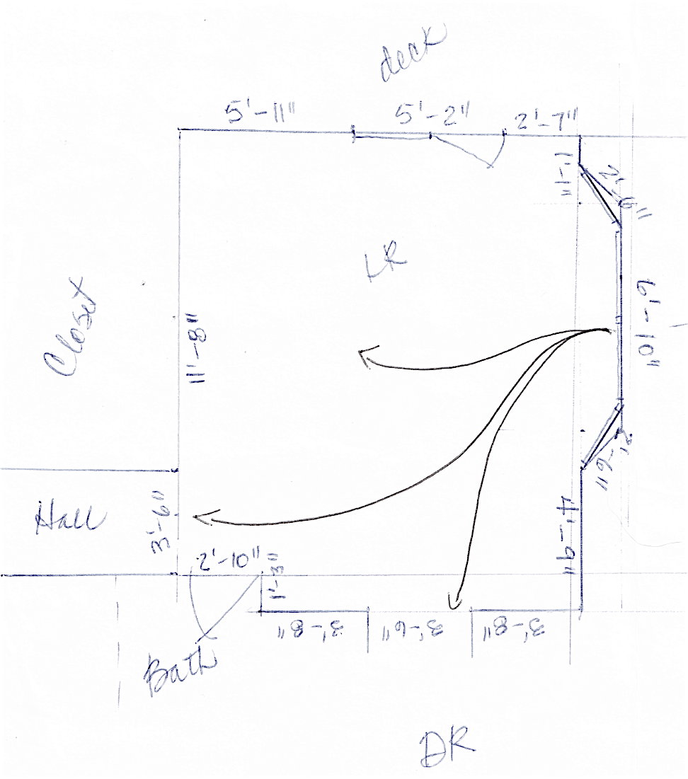
The house is tiny, tiny, and the living room has openings in the middle of three sides, making the spaces even smaller. My poor husband has tripped in the dark countless times because I’ve rearranged the furniture again and again! If it’s arranged to work for visitors coming in the front, then there’s always some piece of furniture, usually a chair, blocking the flow coming from the dining room through the bottom left corner of the living room to the hallway.
The French door to the deck at the top of the plan is now a sliding glass door to allow a bit more room to maneuver.
And the bay window on the right side is still bay-shaped, but we have switched to a double-sided front door in the middle with the two windows on the angled walls. The doors are 2/3rd glass because there’s a lake view out the front. The house didn’t have a front door previously, just an exterior door from the car port that opens into the kitchen.
Have I pulled my hair out? Yup! Almost 20 years trying to do something with this, and don’t even get me started on the itsy-bitsy dining room!
By the way, I love, love, love your blog and the color palettes!
So many great ideas, and I learn so much with every post.
All my best,
Ann
I started working on Ann’s room before receiving photos. Uhhh… Well, I did. In addition, I didn’t read her note very carefully. Yes, I know… Ironic, ain’t it? But, it’s okay. That’s why God invented erasers.
At first I didn’t think Ann’s room was all that bad. Yes, on the small side, but that was before I realized that the front door is located in the bay window!
Ugh! Not only do they walk straight into the living room, it’s right into the middle of this small living room. And there are four more doorways!
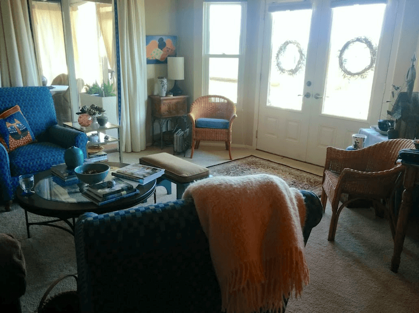
Let’s look at Ann’s furniture as it is right now.
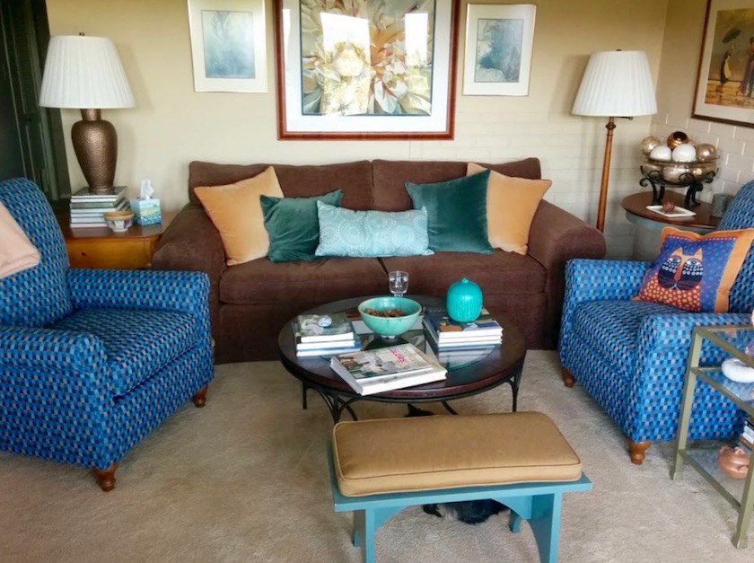
I love these colors! (said, Laurel)
And I love how cozy and personal this room feels. That’s wonderful. Not everyone is able to achieve this. And yet, it’s not quite coming together in one important way.
Does anyone know why It’s not quite coming together?
Yes? Maggie, I think you had your hand up first.
There’s too much furniture?
You’re on the right track. Would you like to try again?
Ummm… well, the chairs and sofa shouldn’t be over-lapping like that?
Bingo. That is a big no-no in space planning.
These are the four main reasons why furniture might overlap in a small-too-tiny living room.
- The furniture is too big
- The furniture is not arranged appropriately
- There’s too much furniture
- The cleaning lady just came. ;]
Actually, what’s interesting, is that Ann’s floor plan is very similar to the one I drew, BEFORE I saw her room photos! Here is what I came up with, below.
(please note that there are built-in bookcases where the erased demi-lune tables were.)
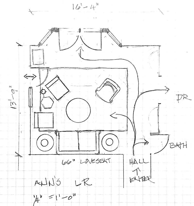
But, there’s one very big difference between Ann’s current furnishings and the one’s I drew.
Much of the furniture in my plan is smaller than the pieces in real life; especially the sofa.
That is the number one problem I see frequently when decorating a tiny living room; especially one with a difficult layout. If the sofa is too big, it’s going to be very difficult to arrange the furniture in a way so that it doesn’t feel crowded.
One of my earliest posts from 2012 talked about a smallish living room in Connecticut I did in 2011-2012. The only thing my darling client had was the wall color, draperies and sconces. Everything else is new.
This is one of those if only this room was_____ In this case, one foot deeper.
My client really, really wanted seating for six.
I told her that she would have seating for six even if it killed me.
No, just kidding. I didn’t really say that. I said that I would make it happen.
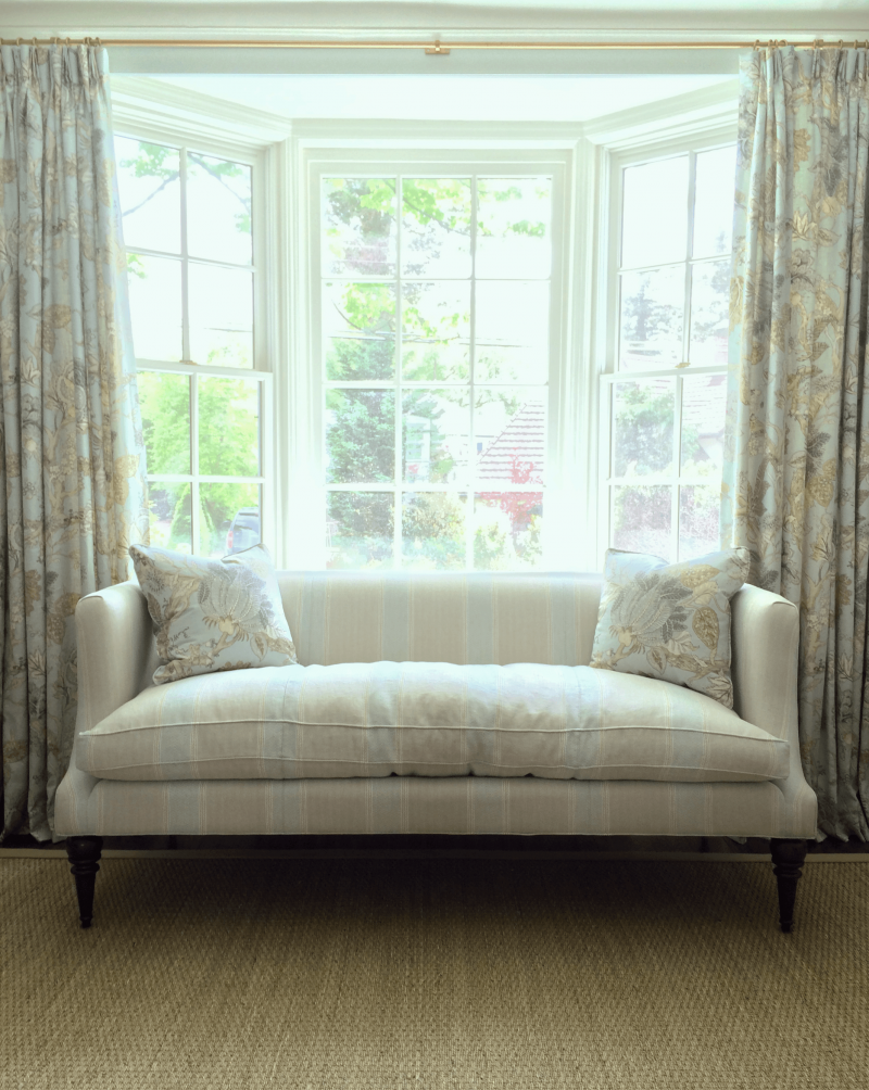
This is the 72″ TCS settee from a living room in Bronxville, NY
And, I made it happen by doing a 60″ settee (not the one above) which I’ve talked about a lot. It’s the one from TCS Designs. Here’s a link where you can see numerous posts which feature this pretty settee.
What I love about this piece is that it’s compact, and yet it sits just like a regular size sofa!
Here’s the thing that I think is very important to keep in mind. A Sofa can be anywhere from 54″ long to however long you’d like to make it. Therefore, it is wise to understand that the standard 84″ sofa might not always be the best size.
And that’s because unless a sofa is primarily for viewing television, almost always, only two people will sit on a sofa no matter how long it is. It’s true.
Tiny Living Room Number Two is from Karen. Here’s her darling note to me.
Hi Laurel:
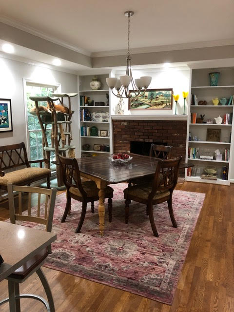
Love your blog and never miss a posting! I have an impossible family room. My husband and I moved into this house over 2-years ago and I still haven’t figured out how to furnish this room.
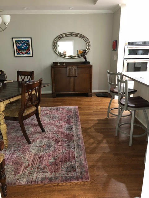
I had no furniture that would fit so I’m currently using the space as a dining room. (I just moved the hideous chandelier into the room — not my taste.) The table is at an odd angle just to try to disguise the tray ceiling that the former owner installed.
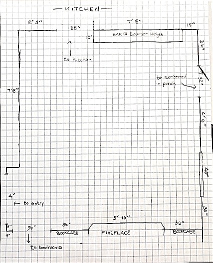
The room isn’t a bad size — around 14’ 5” by 16” 10” … BUT … the room has 4 doorways and a window!
The two doorways that are giving me the most problems are the pathway between the kitchen and hallway and the pathway from the kitchen to the screened in porch. So I have even less space to create a sitting area.
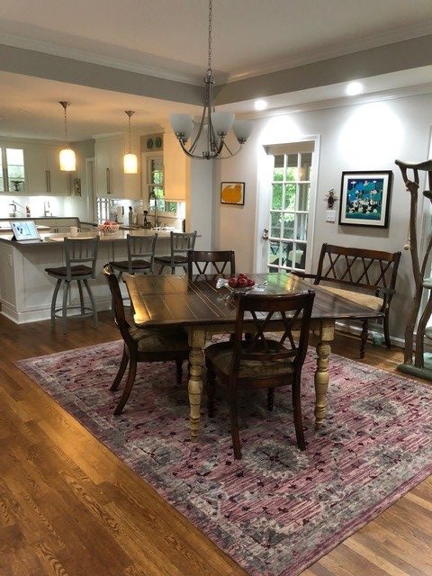
Laurel says: I’m not minding the tray ceiling at all. But, what is bothering me are the day-glow white LED recessed down lights. Please note that the kitchen pendants are a warm white. I would change the bright white LEDs to a softer, warmer LED bulb and then put them on a dimmer switch if they are not already on one.
There will be table lamps in the new floor plan!
Karen went on to say:
The wall between the kitchen and the room was removed and that’s the bar with stools that you see in the pictures.
I would like to use this room as some sort of sitting area and then move the table back to the original dining room.
The table and chairs are from Brazil and have sentimental value. They are not necessarily the style I’m after.
Help!
(Oh, the cat tree is normally in the guest bedroom, but I have guests coming next week.)
best,
Karen
Well, this home is very lovely and I think that there’s a lot of potential here, but a living or family room with four doorways that’s this small is not an easy room to furnish– IF the sofa is too large.
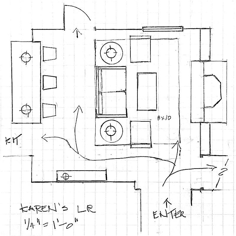
See how it comes together with this 57″ Sprucestreet loveseat from Serena and Lily.
Below, I made one of those sliding widgets to show more furniture. It features some smaller sofas and chairs that I love.
There’s another gorgeous, but small living room to share with you. Wait until you see what they did and where they got their inspiration!
And, what’s also interesting is that the sofa in the upcoming tiny living room is not small. So, we’ll have to see if it works or not.
In the meantime, I’m going to say this until it really sinks in.
You must, must, must make a floor plan of your room– before purchasing your furniture.
Oh, before I forget, please don’t forget to check out the “private” OKL Sale.
(shhhhh… I think they made a big mistake in our favor you can read all about it here, if you missed it. There’s a code to get 25% off at One King’s Lane– The entire freaking site! I mean EVERYTHING! Shhhhhh… Don’t let them know!)
I have some other big news as well, but it’s going to have to wait until Tuesday. Busy time!
Thanks all for your wonderful comments and notes! Much appreciated!
xo,
Related Posts

- How To Get A Sunroom Like Tory Burch (for a lot less money)
- The 12-Step Decorating Plan That Works Every Time
- Decorating on a Budget | Can You? | Yes!
- She Wants An Eclectic Dining Room But Not a Scary Mishmash!
- Boxy, Boring, Dark Living Room. Is There Any Hope?
- 20 Great Shades of White Paint {and some to avoid}
- How To Work With the Color Pink – It’s Not Just For Millenials!
32 Responses
CAT ALLERGY ALERT! I was completely absorbed in this post, reading and studying every line and angle, when I was jolted out of my concentration by the off-hand remark that the cat tree is normally in the guest room! But guests are coming, so it’s been moved. Please, please, please confirm that your unsuspecting guests are not allergic to cats if you’re going to put them up in the “cat’s room”. I have been put up in someone’s guestroom without knowing that the room was usually used by the cats, and by the middle of the night, I had to leave because the reaction was so severe that I almost went to the emergency room. Anyway, good post! Thanks!
Hi Louise,
You know, that is an excellent point. Even though I had a cat for 13.5 years, I too, am allergic or used to be. I’ve had some wicked episodes where I really wanted to rip my eyeballs out, they itched so badly. However, if one is allergic, the entire home could be a problem.
When we first got Peaches, with both my son and me being allergic,(I know, a little nuts but he was a stray that we had already fallen in love with) we got this stuff called Allerpet and man did it work! We never had a problem as long as we used it! It is a clear liquid with no odor whatsoever. In fact, I sometimes wondered if all it was, was water? haha! But, we would rub it on and then brush him. Oh, he HATED it, but it worked and when he was all dry, he was pretty, fluffy and clean.
I miss my darling kitty so much!
Great post! Our family room is similarly sized and shaped as the first example but with a fireplace on one end instead of the front door. Opposite the fireplace wall is completely open to the kitchen/dining area. To the left of the fireplace is a set of double doors leading to a 4-season patio room. This is the only access point to the backyard. Across from the double doors is about 10’ of open wall space large enough for a sofa. Even though there is room there for a sofa, it feels awkward having the sofa facing the doors instead of the fireplace. Also this leaves no room for furniture opposite without blocking access to the door. Putting a sofa opposite the fireplace would create difficulty maneuvering between the dining table and the doors (only backyard access). Currently the room is basically empty and has been for several years.
We are planning on downsizing in the next 6-12 months and I want the space to look useable to potential buyer instead of the hallway it’s used for currently.
I am wondering if a smallish sofa (not yet purchased) would be better facing the fireplace or the doors? Any advice would be appreciated.
Hi Jeanne,
I’m sorry, but I just put in a 13 hour day. My brain is fried. I do apologize but wanted to publish your comment.
Hi, Laurel! In the first small living room, wondering why you didn’t just swap the larger chairs with the wicker ones (getting rid of the little tables against the walls. That way she could keep her larger sofa that could seat 3 in a pinch. JMO
Well, that’s a good point, however, the wicker chairs are really occasional chairs and I think it would be odd to have the occasional chairs in place of the main conversation area chairs. And while I haven’t tested it, they might still be too large with that sofa.
Hi Laurel! If it makes a good blog post, do you think you could put together some bedroom furniture ideas from the OKL sale? I know you had done that on a previous blog post and I loved it!
That’s a great idea. Have you looked at the bed and bath hot sales page? I think it also links to the post you were talking about.
I love this series already! Just seeing the plans & thinking about furniture size, is already opening my mind to the possibilities. As a kid I liked to draw floor plans for houses that I would have “one day.” We rent now & when we move in maybe a year, I’ll need to do something for … 12×35 it sounds like! Ha
This series is already giving me thoughts about my Mother’s, MIL’s, & SIL’s houses. Too many openings, too open a space, … & in the case of SIL, their furniture is humongous. And they aren’t tall people. We’ll see if anyone wants the suggestions or if I don’t get invited back to Christmas.
Like everyone keeps saying, I love your site! I am soaking it all in.
Hi Megan,
Thanks so much for your kind words!
My experience is that people don’t want advice unless they ask for it. But maybe if you casually bring up “this blog I read had an interesting post about floor plans and furniture. I learned so much from it.” blah, blah… then you can bring open up a dialog without actually sounding like you’re giving advice. And you’ll also be able to tell if they’re interested in the topic or not.
If not. Oh well…
Laurel, love your blog. Tiny rooms are always a puzzle. We have a similar space at our second home, though I think my room is a little larger. I ended up ditching the rug and essentially ignoring the over-large fireplace. Put tv on wall with narrow (10” wide) cabinet underneath. Swivel chairs for seating with a round leather ottoman In the middle. It’s not formal, but makes a seating space attached to the kitchen multi-functional. You can swivel and look at fireplace, swivel and talk to cook or swivel and watch tv. People LOVE sitting in the space! I used four swivels and two rattans which may be too much for this space. The round ottoman was tricky. The first one I bought was too small (recommended by the furniture guy). The second one is huge and closer to chairs than one would normally recommend, but it works. Big enough for everyone to put their feet on and/or extra seating. Chair fabrics have texture but are close to color of wall and leather is close to color of wood floor so everything kind of blends in. Lighting is combo of sconces and standing lamps. A couple of very little drinks tables and a tray in middle of ottoman. Color/patterns are introduced with pillows and artwork. I would go to second hand stores and fill those shelves with books. Just some thoughts….You really helped me with my second home. Thank you!
Thanks so much. Sounds great!
Dear Laurel! Love all your posts, I am learning to see now! And I am having fun too!
Plus, doing a lot of plans to remodel my home, thank you!!!!
Hi Carolina,
So glad that you’re enjoying the posts and have found them to be helpful.
what you have also done in both these rooms is clear the space in the main passageways of furniture. that makes the rooms even smaller but in a good way–ie., the are more defined, self-contained. the rugs help do this too. i hope you can add little bit about why this is helpful. i think i once posted on this blog about majoring in accidents–well, i broke my wrist and typing is too hard for me to say much more.
Hi Rose,
Interesting perspective. But I’m more interested in your wrist. I’m so sorry that you hurt yourself. That must be very difficult. Here’s to quick healing! xoxo
Hi, Laurel…
Love your on-target perspective on my tiny living room! I had been tempted to switch out the sofa + corner table + one chair for an L-shaped sectional sofa but could never quite make that work. And I’ve also thought about using four chairs and cutting out the sofa altogether.
We actually watch TV – and nap – on a sofa in a small former bedroom that is also my office. Now that I think about it, something much smaller like a loveseat may be just the thing as the first step to opening space in that tactfully described “cozy” living room.
Thanks so, so much!
Thank you too Ann! And the room is cozy! xo
I’m dying! I love that TCS settee and have been looking for something like that for my living room. the closest I found is the John Derian Geranium sofa.
Where could I purchase the TCS sofa? It looks like they are direct to the trade, so I’m guessing that I’d need to go through a designer. Can it be slipcovered? (1 dog, 2 cats)
Hi Lisa,
Yes, you need to go through a designer for that one. TCS is not sold in stores, usually. There is an antique store in Cross River, NY called Yellow Monkey that carries TCS Designs. You could try contacting them to see if they can work with you long distance, assuming that you’re not near there. A slipcover could be made, but that would be after you’ve received it, I believe. But, you can check with your dealer regarding that.
As I was reading this blog and thinking about Karen’s room. I had arranged it essentially the same in my mind. However, I think your plan leave out one essential element. The TV. There would most certainly be one in this room. The fireplace surround is brick so it would be difficult to hide wires if the tv was there. Plus I hate TVs over the fireplace. So while one hates to design around a tv. Sometimes it is necessary.
Love your blog
Maria
Thanks Maria,
There are clever ways to hide the TV if it needs to be over the fireplace. There are a couple of posts here that talk about that and then there’s the post which features the frame TV that looks like a framed piece of art when not on.
I like what you’ve proposed for room #1, but would like to see all furniture removed except the sofa and two upholstered chairs as there still seems to be a lot of extraneous furniture in the space. She might consider using the bench between the two upholstered chairs and not having a coffee table at all if she uses side tables on either side of the sofa. I think a bench by the front door is helpful so maybe she can use a different table between the two chairs. It would be nice to know how this room is used on a a day to day basis, too. It’s most def a challenging space, but less is more here to my eyes. Loved the proposal for room #2.
Hi Monica,
Yes, you are right about the day-to-day use of the room. I think sometimes people furnish a room for what they think it’s supposed to be, not what is best for the space or their needs. I’m not saying that’s the case here; I don’t know. I do love the coffee table, however and feel that its scale is perfect for the space.
Laurel, Thank you for this post. I am also struggling with how to arrange rooms and have measured and sketched, but haven’t done the scale drawings yet. However, that will be the next step as you have shown how crucial that can be. A very basic question: how do you determine what the right size sofa should be? is it distance from walls, or size of end tables, or….?
Hi GGG,
That’s a good question. It’s a variety of factors, depending on the room, length of wall (if a wall is coming into play), whether the sofa is being used primarily for conversation or TV viewing, napping or all three! Then, doorways, windows and the available space to maneuver in a room– the traffic patterns. If a room is not very deep, then I’m almost definitely going to need a sofa that’s less deep. But of course, comfort comes first. But less deep sofas can be very comfortable. End tables come in different sizes too.
Putting a room together is a little like putting a puzzle together. But it’s a puzzle that one makes up as they go along. With experience, it gets easier.
Great post Laurel! I have an odd LR too—open on one side to the 2 story foyer, open on a second side to the DR, and windows on walls 3 and 4. Oh and just for fun, the dimensions are off so that if you try to center furniture around the focal point window it will be off center to everything else.
One thing that worked well for me was ditching the idea of a sofa altogether. I have a grand piano in the room and I just chose to go with 3 chairs and a circular ottoman in the middle. Sure it only seats 3, but since I mostly use the room for morning coffee or to chat when a friend comes over, it’s perfect. When I have a party and need more seating, I can pull in upholstered chairs from the DR next door or rely on the bench in the entry.
I think the second room you showed would be really lovely as a “keeping room” with two nice chairs flanking the fireplace and facing the kitchen. As for the first picture, I’d treat it less like a LR and more like a spacious foyer with room for a cozy seating area.
I think we sometimes contort ourselves trying to make a room what it’s “supposed” to be rather than just appreciate what it is.
Therese,
Some excellent points you made. And I’ve done living rooms that don’t have a sofa as well. Well, at least one that I can think of. As for the first one, I believe that is the only space that can be used as a living room. But I’m not sure. The front door wasn’t always there. And I’m not sure how often it’s used.
I didn’t interview either Anna or Karen as to their needs. But, I think that’s an extremely important component for us to consider whether designing for ourselves or someone else. Let’s say that Karen has a large-ish family and sometimes hosts events for 20 people. Having a living room that seats only two isn’t going to cut it. And besides, there’s room for more seating without being cramped.
Sometimes there needs to be a compromise, even if the space isn’t ideal. The exercise for me was to come up with a solution that made the space work as optimally as possible for its intended use. But, I also like your “outside the box” thinking. It’s that kind of exploration that I think ultimately brings up the best solutions.
My, four doorways. You are kind to take that on, Laurel.And, wow, you found a solution!
You’re welcome Morgana, but I’m a little confused. Are you also Ann with a different email address?
Laurel, I am not Ann. 🙂
oh phew! I was confused. It’s a room something like yours is what you mean, I guess. No problem.