

(Post updated June 2025)
Hi Everyone, and Happy Father’s Day!
Today’s post is a re-edition of my Father’s Day post from 2018. It’s about a woman who loves warm, dark, masculine rooms. However, her husband prefers a light and bright style. Below is his letter.
***
Dear Laurel,
My wife and I love reading your blog. Every Sunday, it’s waffles or French Toast, and a big pot of coffee. Then, we head to the “mom-cave” to read your blog on the big desktop Mac.
However, something I’ve noticed, and I hope you don’t mind my pointing it out, is this. Over the last couple of years since we found you, I can’t help but notice that it’s always the wife who has a “problem husband” (unless I’ve missed something)
Aren’t there ever any “problem wives?”
Yes, yes, yes, I know. You ladies think that we’re all a bunch of chest-pumping Neanderthals when it comes to decorating. And, we supposedly love our dark, masculine “man-caves” where we go to get away from the screaming kids, rejuvenate, and smoke cigars, I guess.
Well, I have a good one for you, Laurel.
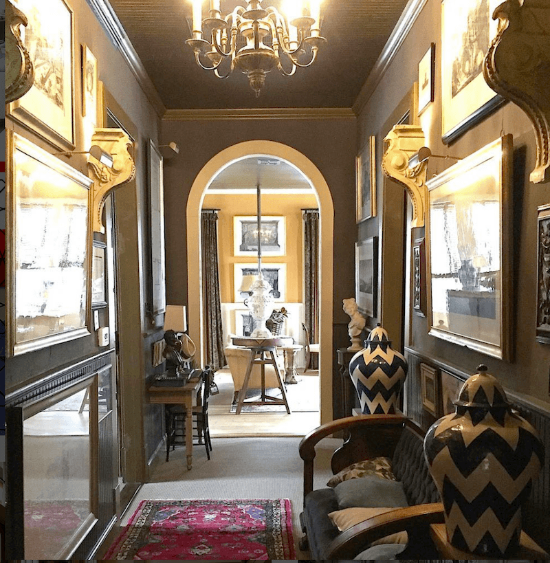
My wife’s retreat is the dark one. In fact, it’s a brown, quite masculine room! Or, at least, what most people consider a “masculine room.”
And mine is well, the sun room. Light and bright. That’s my happy spot. The wife won’t go in there because she gets migraine headaches, and light and bright is often a trigger. She calls my light-filled space “the ice-box.” And it’s not that it’s cold or anything. It’s just that it’s not anything remotely cave-like.
Forgive me. It must’ve been a woman who came up with the term “man-cave.” ;]
Right? And please don’t laugh, or I’ll start crying in my coffee.
Does that make me a freak or something?
Imagine that. An emotional man who doesn’t care for brown, masculine decor, and isn’t into a lot of stained wood either.
Hey, it’s Father’s Day, so I hope that there are other men out there like me, who love pale and are manly enough to admit it!
And it’s not like I hate those tones, but just more in moderation. I love my white walls. For instance, I adore the work of decorator Darryl Carter. But his penchant for painting walls white is too pale for the Mrs.
But, naturally, she also wants to please me. And of course, I want her to be happy too.
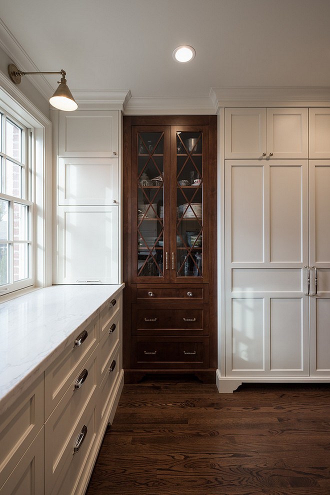
It’s just that when I think of brown interiors and decorating with brown, I have this hideous image of the house I grew up in, in the seventies.

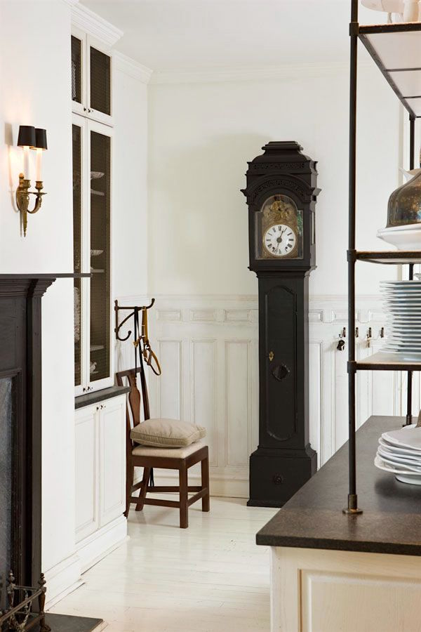
Something like this, only the TV wasn’t over the fireplace, of course.
However, maybe I’m missing something? I figure if anyone can help me like brown, it’s you, Laurel.
Thank you,
Wallace R. White (but you can call me Wally)
***
Thank you, Wally.
And, no fair. The good ones are always taken! ;]
Before I go on… Wall-y (get it?)is a fictitious character.
But, I am aware that I write the post from a woman’s perspective.
:]
However, some might be surprised that about 15% of the readers of the Laurel Home Blog are male. Thanks guys!
And today, being Father’s Day and all, I would like to honor all of the Dads out there by focusing on one, I conjured up.
So, guys out there, do you love light and bright? OR, do you prefer the so-called “man-cave”, browns, earth tones, etc.? Or maybe you prefer something else?
I promise. No judging, critiquing, or laughing (unless you’re laughing too).
Of course, women may answer as well. Maybe you, too, prefer dark, rich rooms?
What about you, Laurel?
Yes, Laurel (speaking to myself seven years later). Let’s see what I said.
Well, I like it all. However, if I had a bigger house, I’d have some of each. But, mostly light and bright.
Good girl! I do love it when I’m consistent!
Okay, at this time, I’d like to transport everyone into a world that’s not so hung up on color, the hottest trends, or even gender clichés when it comes to colors.
There was a time, and for quite a long time, when brown wasn’t a dirty word. In fact, it would appear that brown wasn’t considered strictly a masculine and/or yucky color.
No, brown was a color for the upper classes. Aristocrats. Rich folks.
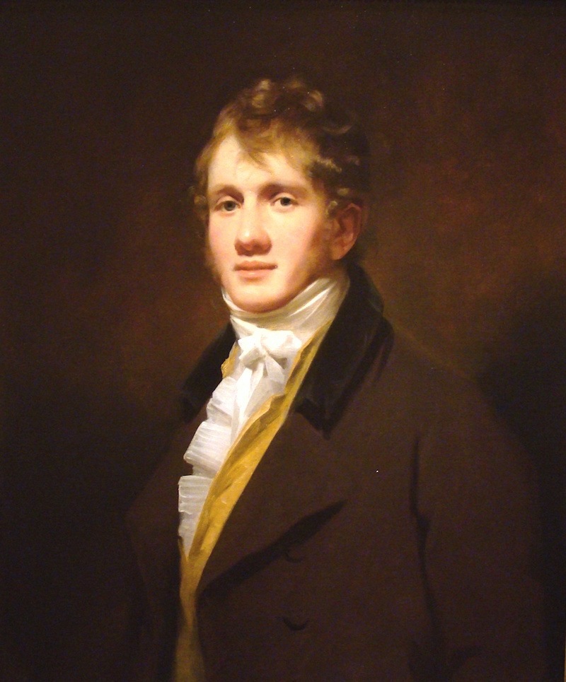
Hugh_Hope_Edinburgh_Portrait_by_Henry_Raeburn_c._1810
There is much art that features brown, and it’s not just guys either.
Nosiree…
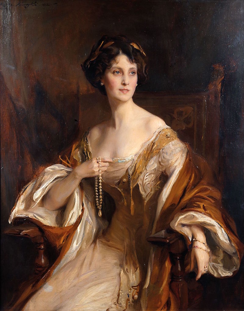
Philip de László (Hungarian 1869-1937) ~ Winifred, Duchess of Portland, 1912
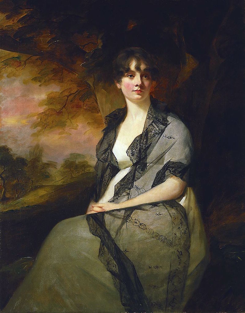
Sir_Henry_Raeburn_-_Portrait_of_Mrs._George_Bell_-_45.7_-_Minneapolis_Institute_of_Arts
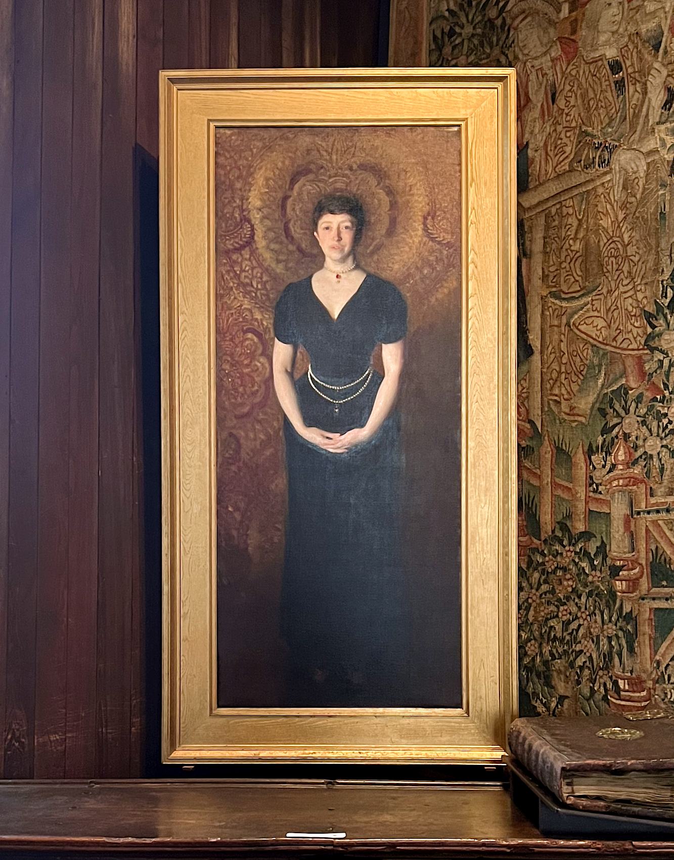
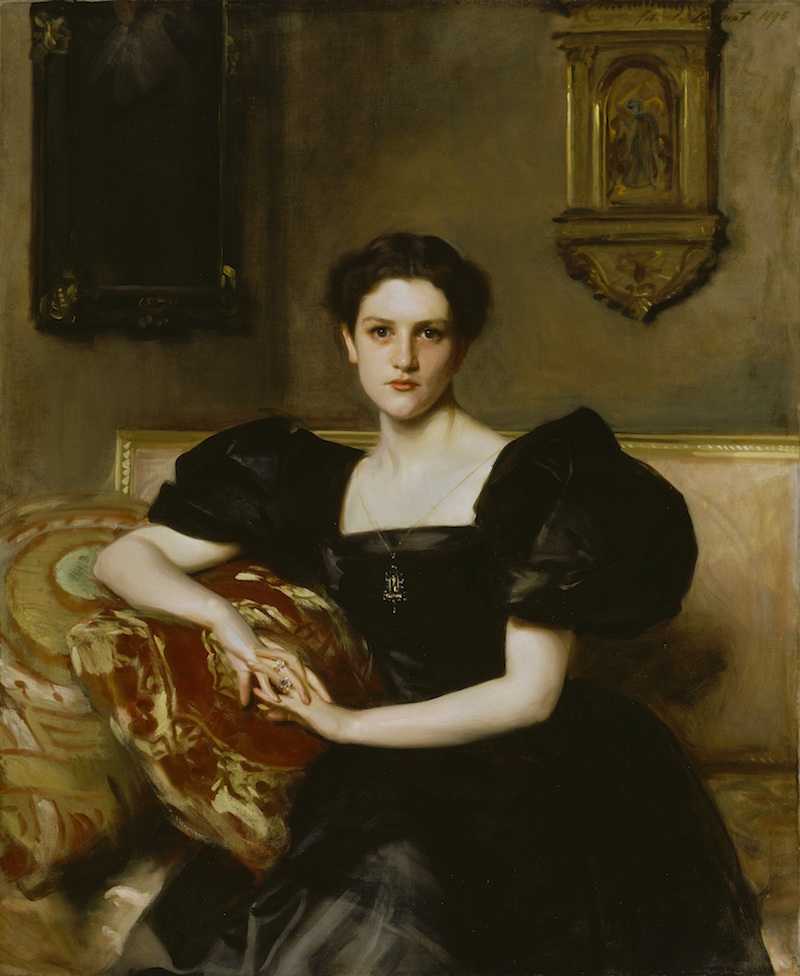
Above is our own Isabella Stewart Gardner, painted by John Singer Sargent. I took this photo of the painting in 2023.
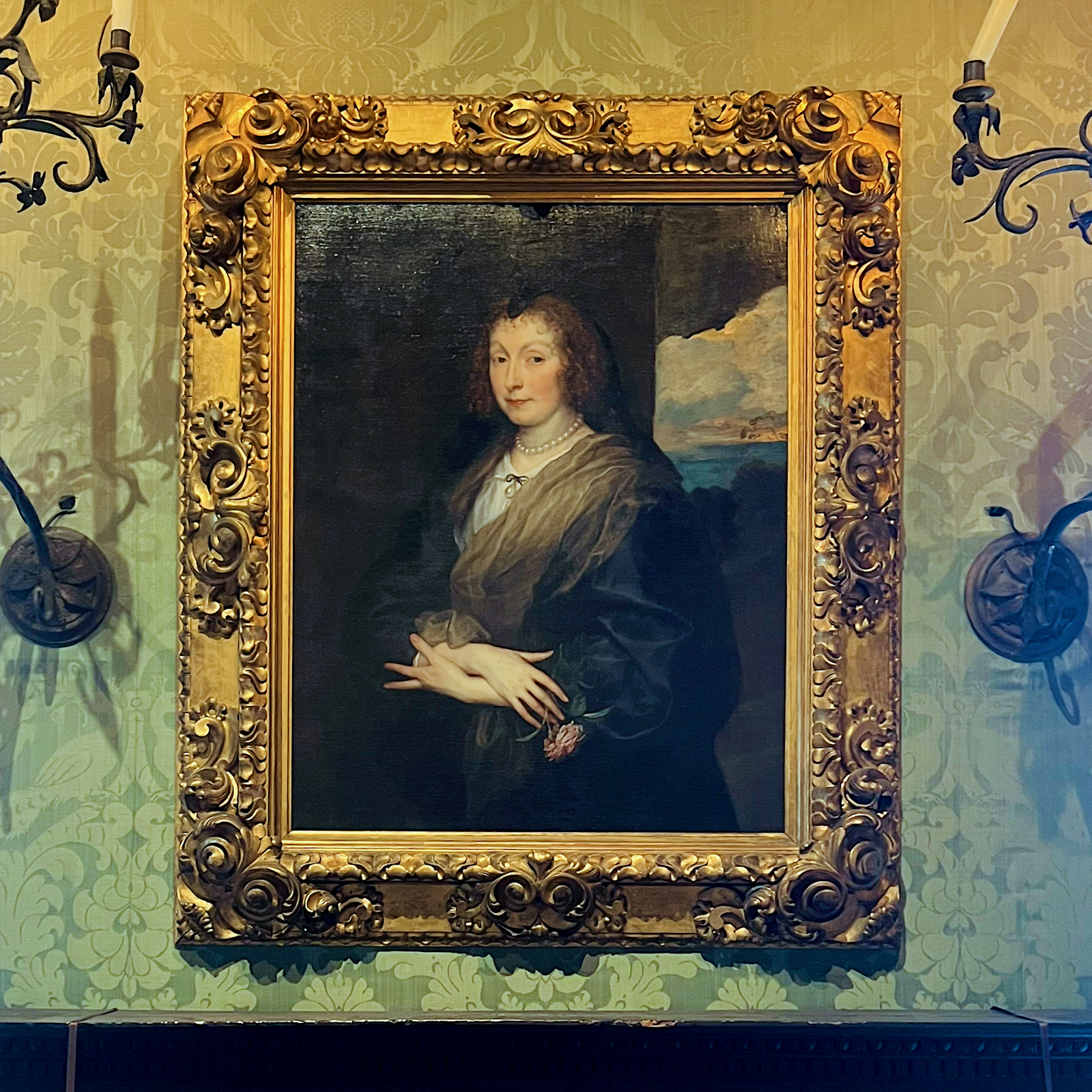
Another handsome beauty is another photo I took at the Gardner: Woman with a Rose by Anthony van Dyck – about 1635-1639
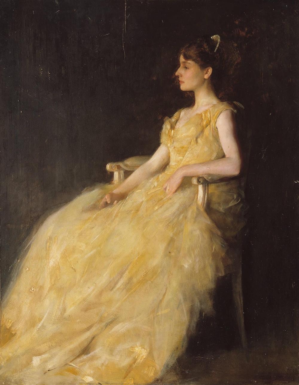
THOMAS WILMER DEWING (BOSTON, 1851 – 1938, NEW YORK) LADY IN YELLOW, 1888 Oil on panel-Lady in Yellow, Gardner Museum
For those planning to visit Boston, the Isabella Stewart Gardner Museum is a must-see.
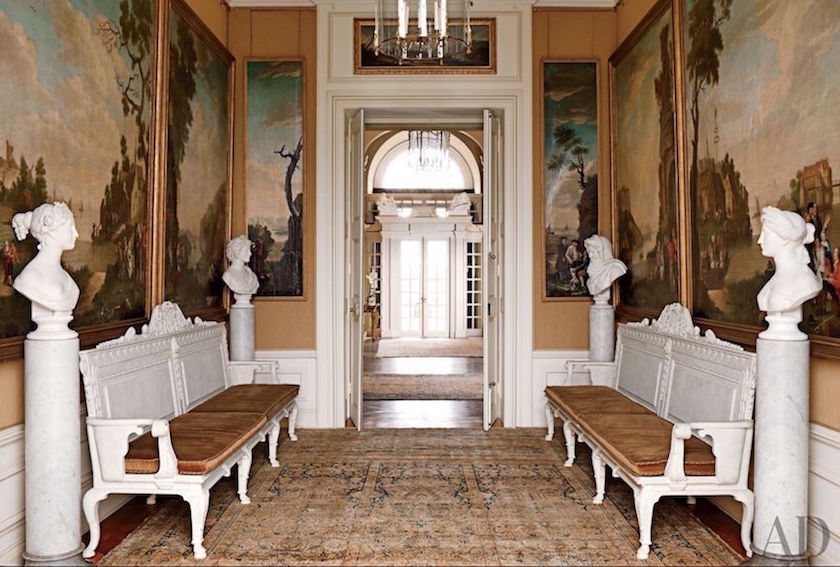
Above and below the magnificent Easton Neston Manor house, which I was incredibly lucky to see in person in 2017 during my trip to England.
The interior design is by Henrietta Spencer Churchill. She was there and gave us a beautiful tour. We were not allowed to take photos of the interior. These, as you can see, are from Architectural Digest. Ptolemy Dean carried out the renovation.
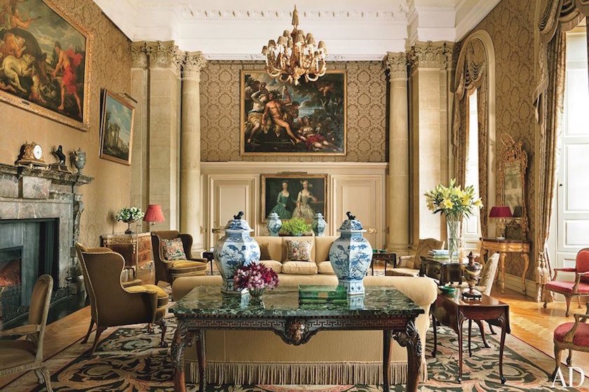
This is the place where the peasant-klutz Laurel spilled her tea on the Aubusson rug. No, not this rug. It was a smaller room where someone thought it was safe to give the peasant a shallow cup of tea in a home filled with priceless antiques. True to form, half of the tea decided to make a hasty escape out of the cup and succumbed to the force of gravity.

Yes, this place.
Below is a side view.

Yes, a family lives here.
It was one of those moments when I wished that someone would just grind me straight into the carpet. Knowing that life was soon to be over, the peasant gingerly went up to the butler and told him what had happened.
As she was waiting for him to box her ears, he said, “Are you all right?”
Meaning, did she burn herself? If she did, she didn’t notice. All Laurel could think about was the rug. And then as he was starting to make his way back to the kitchen to fetch more biscuits, he quipped:
“Oh, no bother at all. I’ll just say the dog did it.”
😂 😂 😂

Oh, not this sweet pup. A chocolate lab. How delicious —especially with that snow-covered punim!

via- noperfectdayforbananafish
Here is the recipe for the world’s best chocolate cake.
And no arguing. This cake is the best. I’ve fed it to dozens of people and all concur.
I once had a client who said that brown is the color of depression.
Obviously, she had not had the right chocolate cake.
This is the color of depression.
Above, the breathtaking home in New York City of Carolyne Roehm;
That’s chocolate-brown velveteen on the walls!
(Sorry, I could not find the original source of this image.)
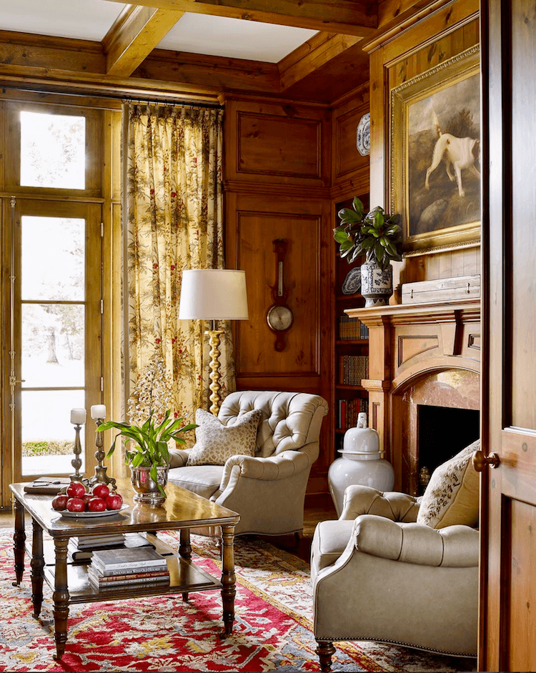
James T Farmer @jamestfarmer on instagram @robertnorris From his book, A Place To Call Home
I love the accent of the wood-stained cabinet made of Alder Wood.
John_Singer_Sargent_-_Elizabeth_Winthrop_Chanler_-_Smithsonian
If ever there was a “Are you finished yet?” look, this is it!
Or maybe she’s furious with her mother for making her wear those overly puffy sleeves!
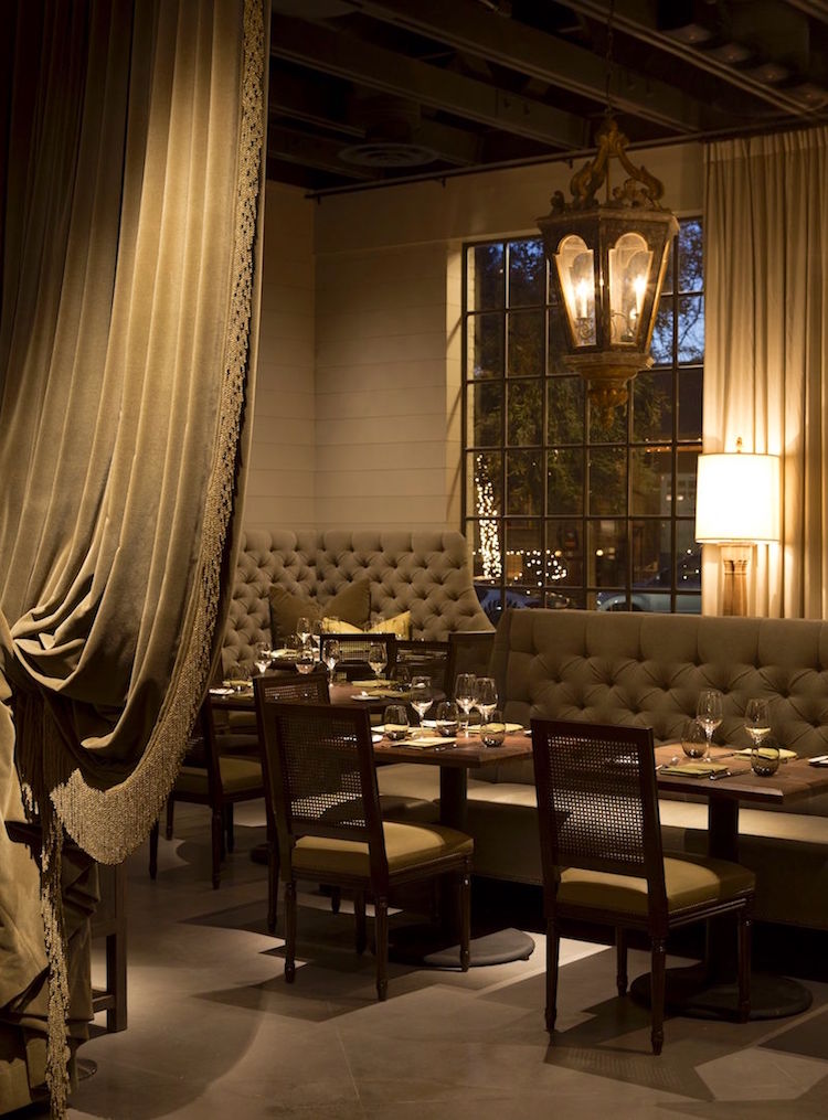
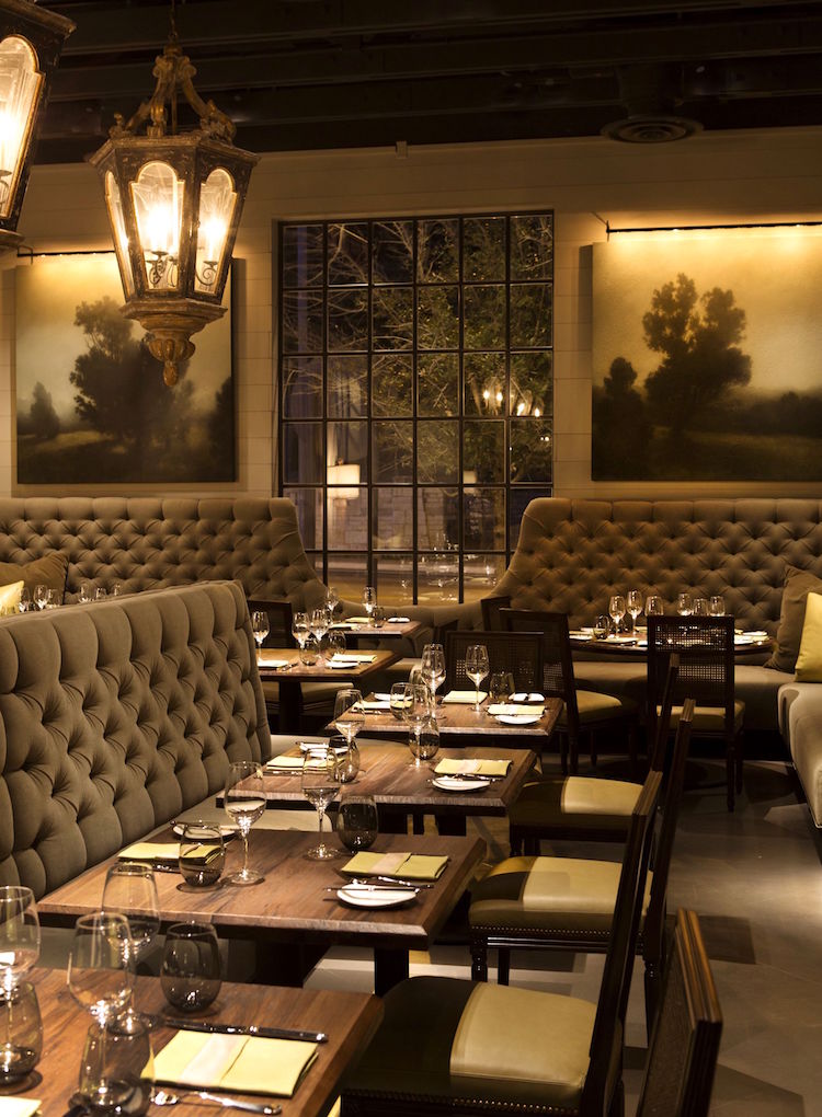
Above and below by Bobby McAlpine and Greg Tankersley.
LAV restaurant, Austin, TX
Staff architect at McAlpine, Tankersley, Booth and Ferrier – David Braly’s converted firehouse via instagram.
For more of Bobby McAlpine and associates, please check out some of my favorite rooms, they have done over the years.
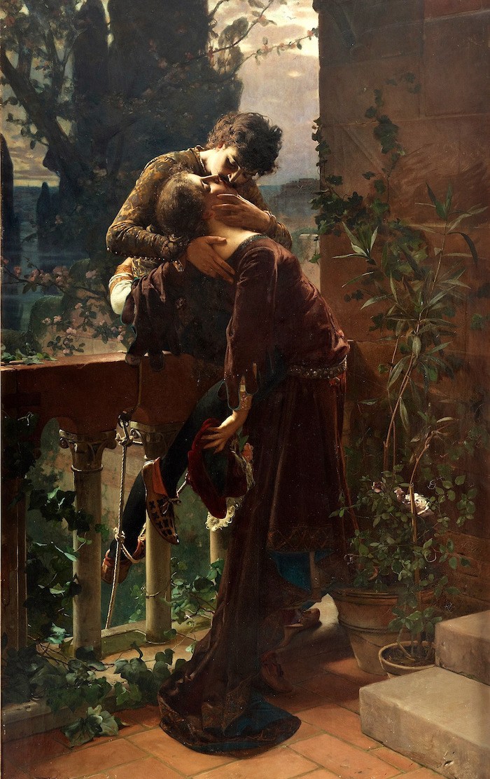
Julius Kronberg – Romeo and Juliet on the balcony 1886.
I did not know that Juliet wore brown velvet. But there it is.
Well, Wally… I hope this has given you some positive inspiration and that you’re feeling better about brown.
And maybe having a brown or a deeper-colored room. However, if your wife has bad headaches, I might stick to more medium tones as there can be a lot of glare between the contrast of dark walls and the windows. The cure for that, however, is shades.
Lots of shade.
For more handsome, masculine rooms, please check out:
- Masculine Interiors that she’ll like too
- The Most Handsome Black and White Interiors Ever
- A beautiful post about black and blue decor
- Discover the New Black in Interior Design
- Another favorite post to consider is this one about gorgeous beige rooms.
- There are some beautiful, rich colors to explore here.
Happy Father’s Day!
xo,

***Please check out the recently updated HOT SALES!
There is now an Amazon link on my home page and below. Thank you for the suggestion!
Please note that I have decided not to create a membership site. However, this website is very expensive to run. To provide this content, I rely on you, the kind readers of my blog, to use my affiliate links whenever possible for items you need and want. There is no extra charge to you. The vendor you’re purchasing from pays me a small commission.

To facilitate this, some readers have asked me to put
A link to Amazon.com is on my home page.
Please click the link before items go into your shopping cart. Some people save their purchases in their “save for later folder.” Then, if you remember, please come back and click my Amazon link, and then you’re free to place your orders. While most vendor links have a cookie that lasts a while, Amazon’s cookies only last up to 24 hours.
Thank you so much!
I very much appreciate your help and support!
Related Posts
 40 Outdated Home Trends. But, Are They All Passé?
 Happy 10-Year Blogiversary-Ten Years of Laurel Home!
 The Stained Wood Trim Stays-16 Colors To Make It Work!
 All About Hardwood Floors + How To Ruin Them!
 Subway Tile Alternative Everyone Knows About But Me
 Is It Classic Furniture or Something I’ll Grow To Hate?
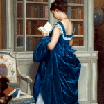 Creating A Chic, Cosy Home Library-Best Colors, Lighting and Furniture


37 Responses
What a gorgeous post! Thank you! I wish I had another room to use brown. I did notice that with the exception of Winifred, Duchess of Portland (who has hazel eyes) all the rest have brown eyes. It makes me want to have a portrait done of my brown-eyed daughter! This post knocked my socks off 🙂
Laurel, your posts often inspire my thinking. During the Pandemic, I bravely created what I later realized was a “man cave” influenced by your wonderful exploration of moody blues. Entitled the “Twilight Room”, based on the colour-saturated BM walls, it features a light Turkish rug, rich woods in a variety of stains, black, brass, and lots of bright and dark paintings and off-white matted photos on a gallery wall. I love this calm refuge where I watch movies with our grandkids.
When I was a teen, I decorated my north facing bedroom with orange walls and a white shag rug because it made my brooding adolescent mind happier. Now, 50 years later, our two most used rooms are sunlit and have a variety of colours, materials and textures we have collected to achieve harmony and visual interest. We finely figured out that a well-designed and decorated room can affect your mood and outlook. Sometimes the dark leather Lay-Z-Boy and the dusty rose velvet slipper chair can live together with some thought to how they can be supported by the other room elements.
Your brown rooms do not look “brown” to me; they look divine! I’m not much of a brown fan but I hate gray and black even more. My husband just selected the loves of his life for the living room; two Lazy Boy recliners that look like huge brown lumps. Since he is in a lot of physical pain most of the time, he won that round but I’m trying to balance the lumps with other areas of beauty.
Your recipe calls for 3/4 box of powdered sugar. I’ve never seen powdered sugar in boxes, only plastic bags. How many cups are in 3/4 box of powdered sugar? Thank you for a recipe I will try as soon as I figure out this measurement.
Hi Laurel,
I remember reading this post when it first came out. And I still love dark rooms. I wonder if a lot of men like their man cave dark because it cuts down the glare on their big TV.
We have a brown kitchen — a warm, rich, saturated brown — and after 10 years, I’m still not tired of it. In fact, when we redid the kitchen in 2013, the only thing that was a “no brainer” was the wall color! There are a few shots here that show the color, http://www.kitchenparade.com/2015/09/new-kitchen.html.
Thanks for your inspiration/challenging though, I’m working on our dining room (moving from a dark/harsh orange-y red that I didn’t pick) — leaving the walls in place but with fresh paint, the moldingx100 in the ceiling in place, but removing the kinda clunky traditional table/chairs to something more casual and contemporary. Color comes first — your paint guides are a godsend.
Hi Alanna,
What a great post. Is this whole thing your website? My mom’s from St. Louis and I visited yearly in my childhood.
Wish there were some before shots. But I can imagine. I’ve some plenty of dark, dreary kitchens. The brown is gorgeous and I’m sure even more-so in person.
Love your blog! It always makes me smile and I usually learn something from each post. I do have brown walls in our family room as it is a large room with a very large window and I thought it might make the room look smaller! Should I feel guilty for painting it brown?
I do love the look of white walls which I think I may paint my kitchen as it is always dark in there. Although I think I will keep my brown family room!
Hi Laura,
White can actually look dingy in a dark room, but since kitchens normally have lights on, it’s fine. Just choose a warm, fairly clean white, perhaps like cotton balls or simply white. But please test first!
I much prefer white, light, bright for bathrooms and kitchens.
If I’m not using a designer (which I never am!) then light and bright because I don’t know how to make those moody, layered rooms look nice.
I would love to have a room like the one you ruined with your tea, to order my servants around in.
Hi George,
Hopefully, I didn’t ruin the room or the rug. I believe that it will be unnoticeable because of the color of the rug, the intricate pattern and the fact that wool is self-cleaning, over time. In addition, I don’t believe that it’s an antique Aubusson. I hope not, anyway!
Laurel,
What a great idea for a Father’s Day post! My husband adores light and bright colors and white trim. His favorite paint color in the whole house is BM Glass Slipper (most of our colors are from your collection). I love the dark rich colors more. I think we both have come to appreciate both types of colors and just work together to find the best colors for each space in our home but it was challenging for several years. As for brown, I was inspired by some of the pink and brown palettes in your palette collection to do my bedroom with ivory walls, brown velvet/ivory/dusty pink velvet bedding. It really compliments our dark wood furniture. I’m going to paint our bathroom one of your browns with lots of white accents. I never would have come up with this on my own! It is such a relaxing, casual space and we both love it. My favorite bedrooms tend to be more “masculine” with just the right touch of femininity.
Hi Eleanor,
That is so cool! And your home sounds beautiful. I too, love a dark bedroom, but since I only have one and it wasn’t really working in my place, I had to make a decision. But I love this one too. Now, if only I can decide what I want to put on the windows! haha
Laurel, I love your writing style, you really have a way with words. You weaving everything into making sense. You also make so many things humorous, there is always a laugh reading your posts. Thanks for your input on dark colors, Browns are beautiful when done right!
Thanks so much Laura!
Laurel, You know you get me every time you share one of Darryl Carter’s rooms. I LOVE that kitchen…And Miles Redd’s, too. Like it best with the white floor though. I love white walls but love also black, chocolate, etc. I think I just realized I don’t love anything in the middle. XO
That’s so interesting Nancy! And I think it makes a lot of sense too!
I only wish I could go light and airy. House is all dark. Few windows and little natural light. Very little out there on how to do a big dark house.
Hi Catherine,
This post might be helpful for you. (not so much the beginning but further down the page)
https://laurelberninteriors.com/windowless-room/
Afternoon Laurel..Brown? not a fan & particularly don’t like it at all with yellow. But really liked the rooms that you showed today. Guess I just can’t live with brown. Then OMG you mentioned the chocolate cake..I ran to my fridge, do I have buttermilk? Yes!! Coco powder Yes!! It really is the Best chocolate cake!! I’ve made many times already. Had been a big fan of Ina’s & it’s really good too. But, this is easier to make and delicious. I’m sorry, I have to go now and get that cake started lol Love your post as ALWAYS
Hi Carol,
That’s interesting that this cake is easier than Ina’s. There are a lot of steps, but in the many years when I made it 5 or 6 times a year, I had memorized everything and it was very easy.
Enjoy your cake!
Our house had coffee coloured walls … and ceilings when we moved into it – can’t say we loved it, but fortunately, nothing that a can of Benjamin Moore Ecru couldn’t fix!
My school uniform was a rich chocolate brown, so nope, no brown in this house now except antique furniture. 😉
I’m worried about young Winifred in one of the early pictures in this week’s story, Laurel – was her waist photo-shopped, or whatever the equivalent was for the era? She looks awfully awfully thin. Beautiful, but oh, my, where are her ribs and tum.
Happy Father’s Day, all!
Hi Fenella,
I took another look at Winifred who it appears was quite a beauty. The rest of her looks quite healthy. So, either some artistic license by the artist or else she was corseted to within a hair’s breath of breaking her rib cage.
And funny, but my wasband (ex huband) had to wear blue for his school uniform and therefore, had the same aversion to blue that you have to brown.
Interesting the associations, for better or worse, we acquire in our youth.
I was not a fan of dark rooms, except for maybe a den or library where I’d might want to cozy up on a winter’s day. But we recently painted our master bedroom (at my husband’s request) in a color called Texas Leather by Sherwin Williams. I wouldn’t know what to call it…dark gray/olive/brown…as it changes as the day progresses. But it is so rich and I really love it. And I do love these examples. Brown can be quite luscious.
Hi DRL,
Benjamin Moore also has a color called Texas Leather which is just as you say. I love colors that are difficult to describe because that complexity is what I think makes them particularly beautiful.
Lovely blog entry, as usual, Laurel. Especially nice one for Father’s Day.
What a kind, quick-thinking and good-humored butler! 🙂
Enjoy this beautiful Sunday!
Thanks so much Anna. I’ll never forget that man’s kindness. Honestly, I wanted to die. In my defense, I was so over-taken by the incredible beauty of this masterpiece of a home that I’m surprised the entire cup didn’t go down, taking me along with it!
Many years ago I painted our living space a dark brown. At the time I was young & dumb & knew nothing about the concept of undertones. I picked the wrong brown. It was icky. I lived with it for a while before I realized my color choice made me feel blah. I did think having a dark color was very cozy though. And I bet if I had picked a better shade of brown I would have felt a lot better.
I have to say…As much as I love the handsome kitchen designed by Miles Redd, I’m surprised he had white appliances in the space. (They appear to be a washer & dryer.) The white is very high contrast to the dark cabinets.
Hi Mary,
Oh, this is funny. I have a different iteration of the Miles Redd kitchen somewhere and in that case, the appliances are gone and the floor is black and white. I’ll go see if I can find it and I’ll add it and then comment again.
Hi again. I found the image of the other version of Miles Redd’s kitchen and it’s up now.
Wonderful post Laurel! Winifred’s portrait makes me swoon. Beautiful tones! Guess you’ve figured out I’m another brown loving woman….. thought it was because I’m a redhead. I now know it to be a wonderful neutral. Have you seen how Bill Blass used it? With White! Innovative in it’s time. Thanks for another fabulous post 🙂
Hi Liz,
That’s my favorite piece too!
Do you mean Bill Blass’ bedroom? A lot of my favorite designers of the previous generation, ie: Albert Hadley, Mark Hampton, Billy Baldwin, etc did dark and usually lacquer walls and the rooms are all beyond amazing and the very definition of timeless.
I have always preferred a dark rich palette yet, I too, am drawn to Daryl Carter’s aesthetic. I love the look of the rich woodtones against white. I am uncertain whether I could live with it long term. But lately I am finding some of my choices suffocating.
How best to make a transition? How I wish I could afford two homes….
Hi Elle,
That’s a very good question and maybe the basis for another post.
Beautiful “brown” rooms here, Laurel. Just one thing though — in all of them, the brown is broken up by some at least of the following: plenty of pale in the shape of large windows, white architectural elements, paintings, reflective surfaces (in that kitchen), curtains, upholstery (the Farmer room, superbly coordinated colour mix)… and in the bedroom image, mentally make the bed and see what it does!
That last is the only room I’d describe as dark and rich.
I bet that you love Tradchap. I forgot to put a link to his amazing home. Here it is.
Some of the other posts linked to at the end have very dark rooms.
I just made my bed. ;]
I’m afraid you’ve lost your bet, Laurel. Sorry, but I detest the English country house look and all variants. At its worst, in the stately home bracket, it’s all chintz and sofas which have seen better days, along with tons of clutter (that lived-in look), wooden floors with draughty gaps, and in the kitchens and bathrooms, primitive British plumbing. But that’s just an opinionated personal prejudice.
The photos you show of Tradchap’s (or not) house have some lovely vignettes, but as a whole, no!
If there’s one thing that I’ve learned from garden design, it’s that plants must be put in in good-sized blocks, and I tend to apply that indoors as well.
I’ll have a look at the other linked posts, to see if you can convince me of … something!
My aim is never to convince anyone of anything. People either like or appreciate something, or they don’t.