The Best Color Of The Year Is Largely A Farce – Here’s Why

Oh my! Thanks guys for all of your votes for the Best Color Of The Year 2018.


If I had my wits about me, I would’ve created a survey, so that I didn’t have to laboriously count each vote and make a nerdy little chart like this. Well, next time.
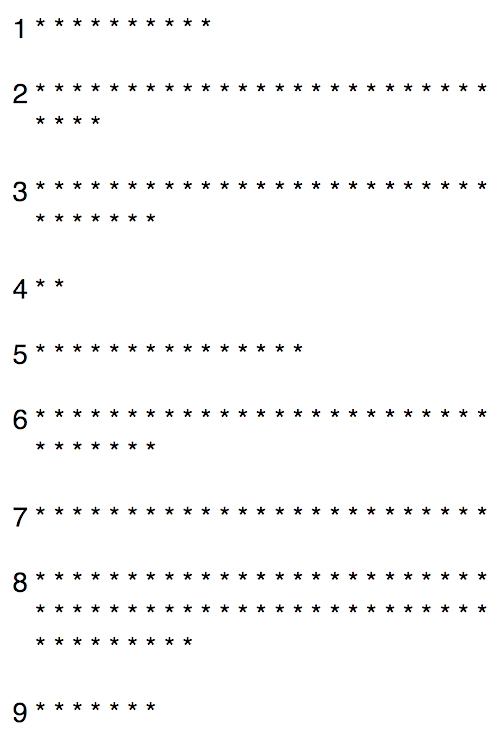
 

results best color of the year 2018 survey blog


We can plainly see that number eight is the winner!


6, 3 and 2 are close to a three-way tie.

The comes 7 and 5

and sorry number 4, but you bombed out.

However, I actually think that’s a perfectly fine color. It’s a soft warm black, but you guys prefer a soft cool black that is #9. That IS, if what you are seeing on your monitor IS what I’m saying it is!


Now, let’s reveal the actual colors and their corresponding companies.
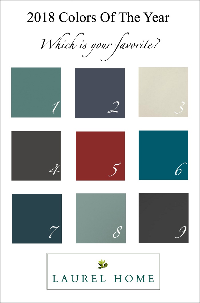
 

2018 color of the year - major paint companies best color of the year


  1. Dunn Edwards – The Green Hour
  2. PPG – Black Flame
  3. Dutch Boy – Sandstone Tint
  4. Glidden – Deep Onyx
  5. Benjamin Moore – Caliente
  6. Sherwin Williams – Oceanside
  7. Pratt and Lambert – Heron
  8. Behr – In The Moment
  9. Olympic Paint – Black Magic


Here are some interesting things I learned.


  • As some of you pointed out, differences in computer monitors can change things a fair amount. And I base that on the fact that some of you saw colors differently than I do.
  • And one or two of you pointed out that this is a weird exercise because colors in and of themselves, don’t mean a lot. That’s also true.
  • Also, many of you put in more than one color, so if you didn’t say specifically say which was your number one, I couldn’t count it in the tally.
  • As you can see, #4 fared the worst. On my computer, it is a soft, warm black. The preference is for #9 is a soft cool black.

But here’s the thing that drives me the most nuts. Not only are the monitors different, but if looking at images of rooms in these colors, they are different too!  More about that in a bit.


What is Laurel’s favorite color?


Well, quite frankly, I like all of them, but I have been hankering for a rich, blue for at least two years now and #7 which on my monitor looks to be a deep blue with some green in it. It reminds me a lot of Farrow and Ball’s Hague Blue– a fabulous color.

But you guys chose #8 – which BTW, you can purchase a sample here.

So, let’s examine this lovely color.

I went to my Laurel Home Essential Paint Collection of 144 beautiful Benjamin Moore colors to see what is closest to Behr’s In The Moment.
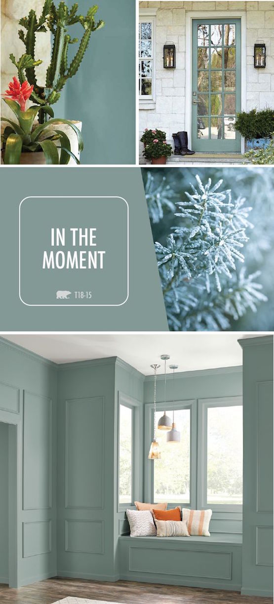
Behr Color of the Year 2018 – IN THE MOMENT

 

Behr Best Color of the year 2018 - in the moment


Here’s the deal. When they shoot these images, while they get the tone pretty close, they flatten out the color. The plain square is darker than the parts of the interiors that are in shadow and that’s not possible.

And some images will be bluer or greener. The reality is, that in your room, it might appear to be bluer, greener, brighter, darker. Who knows?

But, this is why I get a little more nutso than usual when someone asks me what color something is from an image they send me on my computer. Even IF I knew, it is not going to be the same color.


What I wish they would do, is talk about a color range, or color family. Even a small family.


However, just because they aren’t, doesn’t mean that we can’t. And the reason I feel strongly about this is that well… their images don’t do this beautiful color justice, in the slightest. They are all pretty one-note and plastic looking. As in FAKE. No color is going to look good in this situation.

That was a rather long preamble into seeing if there’s a Laurel Home Collection color that’s close to Behr’s In the Moment. lol


The closest is probably Benjamin Moore Jack Pine. But JP is a fair amount darker. You might recall that Alexa Hampton used this great color in her home.

There are also some terrific Laurel Home (well, Benjamin Moore) colors that are lighter than In the Moment. One is Quiet Moments, one of my all-time go-to favorite colors–especially for bedrooms.

However, there are some fabulous Benjamin Moore colors which are very close to In The Moment.

Atmospheric af 500

Mystic Lake csp 745

Stratton Blue hc 142


This color, I have used twice and it is a very lovely teal and will look somewhat deeper if the light is low. It was on the short, short list for the Laurel Home Essential Paint Collection, but alas, in an 11th hour brutal final cut, it got the ax and I don’t remember why except that I had reached my quote of greens.

Another color which is very close (a hair deeper and bluer) is Farrow and Ball’s Oval Room Blue.
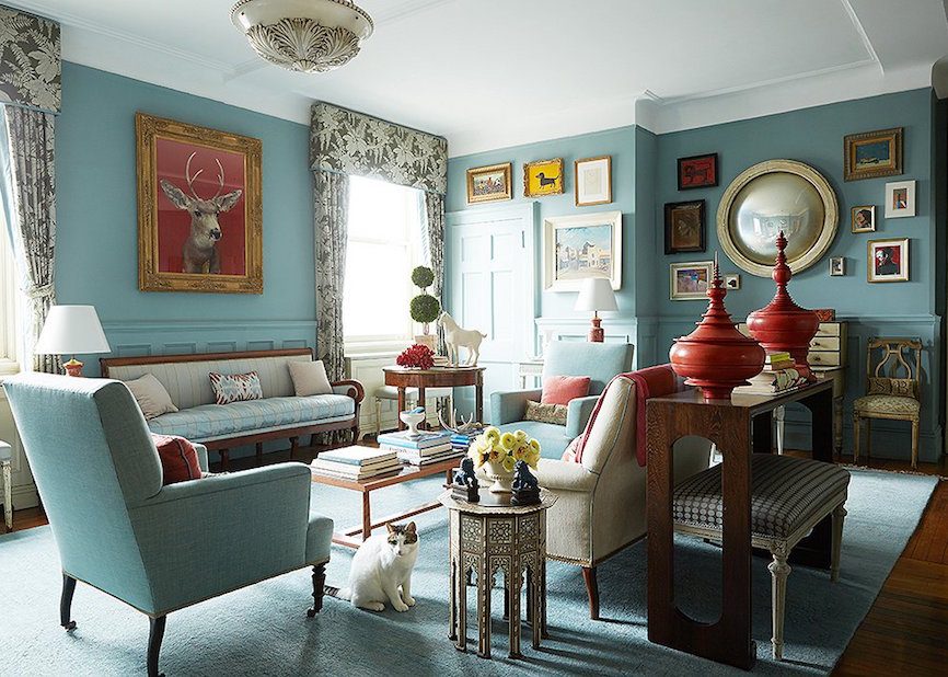


Sheila Bridges used this color in her now, iconic living room.

She spiced it up with shots of warm red, brown, white and gold tones.
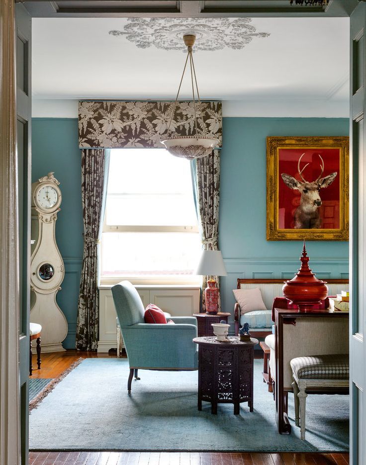
 

Another shot of the Sheila Bridges living room painted in Farrow and Ball Oval Room Blue
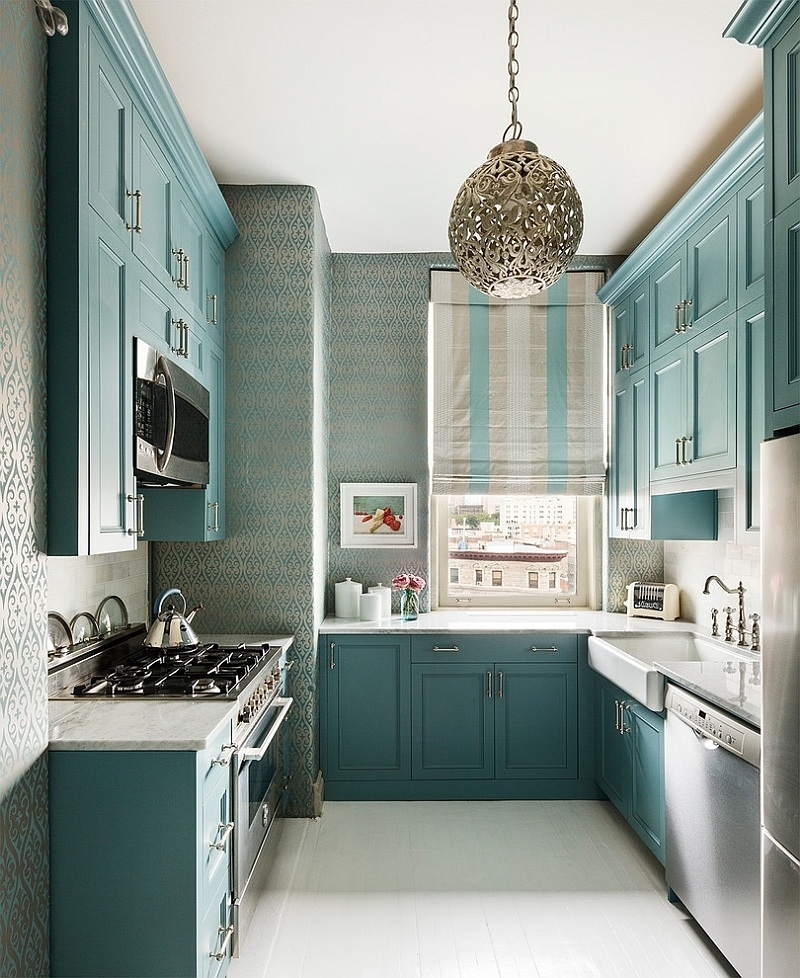
 

For the kitchen, she chose for her cabinets, a Benjamin Moore color called  Hemlock 719


It’s definitely in the same family, but more blue and a less gray.
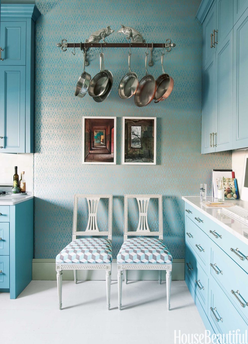
 

Notice how the color has changed in this shot. (I ADORE those Gustavian chairs!) And if you don’t know as seen here, lower cabinets almost always appear lighter. Therefore, if doing a two-tone look, make sure that the lower color is substantially darker or it might look like the same color. I made that boo boo one time.
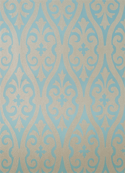
She paired it with her fabulous Torino Damask wallpaper which she sells on her website.
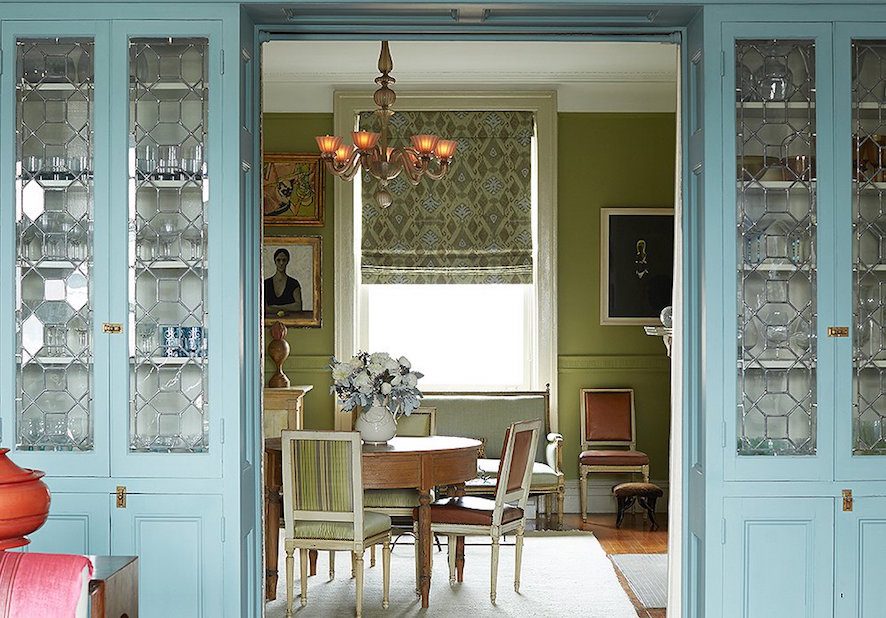
 

I love this view looking into the dining room. I believe that the green-yellow is Farrow and Ball Churlish. click here to see more of Sheila’s beautiful work.
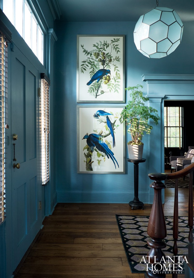


Another example of how colors change is in this gorgeous entry designed by Jimmy Stanton.

In this photo, the blue looks more saturated and brighter than our color of the year.
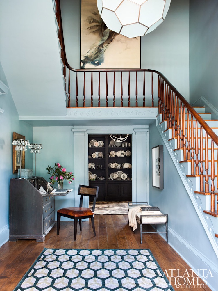
 

They’re all gorgeous, but the bottom two are lighter than the top one.

And far lighter and saturated than our color of the year.
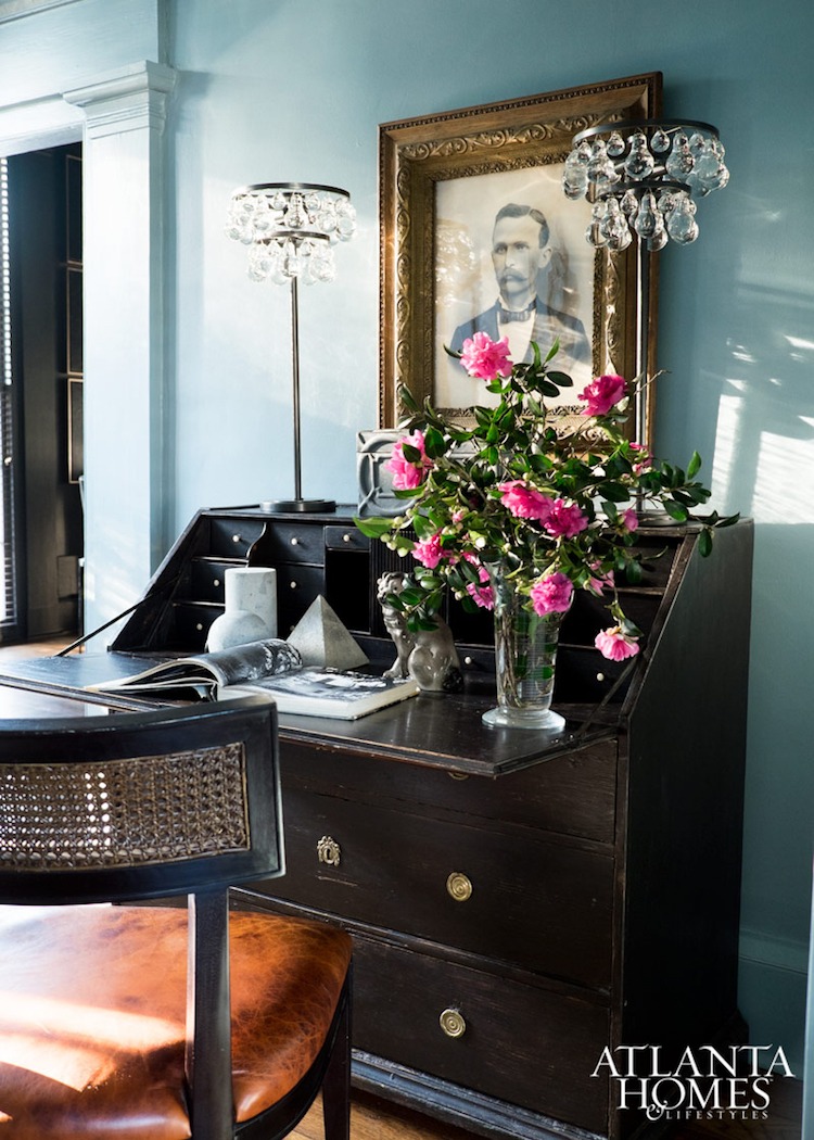
 

Above three photos via Atlanta Homes and Lifestyles
Photos Erica George Dines
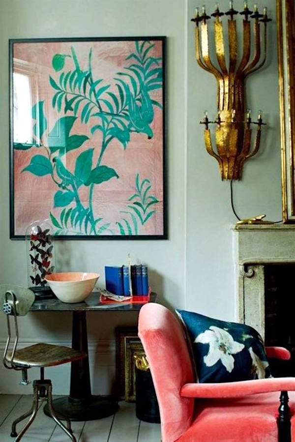
 

original source unknown

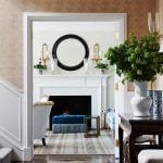
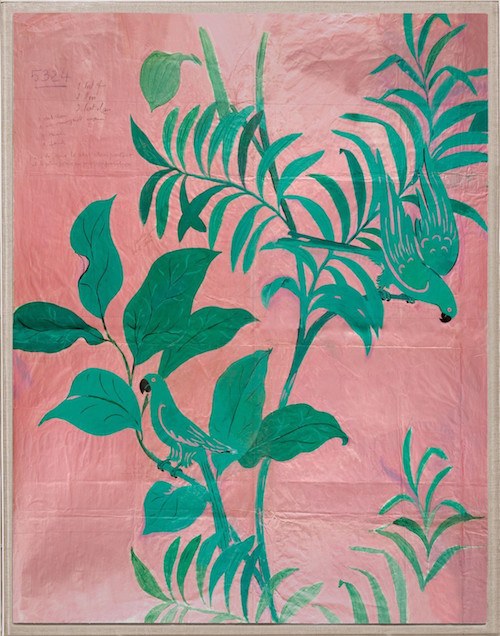
I’ve always loved the colors in the room. The Paule Marrot print is what makes it, I think.
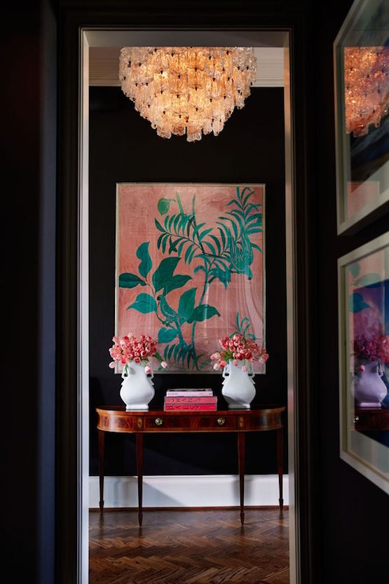
But, it also makes this fabulous space with black walls. (original source unknown)


paule-marrot-pink-birds-reproduction

Designers can purchase this lovely print through Natural Curiosities which is one of about 500 sources in Laurel’s Rolodex. If not in the trade, you can get it here for a substantial discount.


And below, I made a widget for inspiration of some home furnishings that I think would look terrific with the best color of the year 2018, In the Moment and similar colors.


And folks, this is the last time you will hear me hawking Christmas presents. Well, not counting all of the great sales that will be forthcoming, perhaps.

In the meantime, tomorrow is the DEADLINE to get stuff if you order online. Please go to my holiday shop because there are a ton of great gift ideas.

BUT, Anthropologie is THE place for women and girl teens and tweens. And they are offering 30% from now until the deadline. And they have 1,100 gifts at very reasonable prices, especially with the discount.

This is funny. Sunday, I went on a little tour of Rockefeller Center. Yes, in the middle of December on a SUNDAY, Laurel who HATES CROWDS WITH A BARNEY PURPLE PASSION went to the most crowded place on the planet for about 90 minutes. Fine. Call me a masochist, but I have such fond memories of the Rock. In fact, I was a waitress there, for two months in 1984. Well, that one wasn’t so much fun.

xo,


30 Responses

  1. I have spent the year thoroughly enjoying your informative blog. I am a design enthusiast, ie completely untrained, and your sight has been so helpful. I especially enjoyed this post as I just used FB Oval Room, Castle Gray, and Studio Green in a new house. I’m loving several items in my home that you recommended (2 sofas and 2 lamps). I hope next year is full of successes and happiness for you.

  2. Hi, Laurel. According to the Easy RGB website, the closest Ben Moore color to Behr’s ITM is 706 Sioux Falls. Their simplest method (“Find Similar Colors”) didn’t work because they don’t have Behr’s ITM in their database (they have another brand’s ITM). Instead, I had to use “Match Color Data” with ITM’s Hex color value, which I found at Home Depot’s website. The result of either method is a Delta E value (stay with me!) that shows the difference between the two colors; as I understand it, anything over 1.0 is a difference discernable to the human eye. Sioux Falls is a 1.7 match. (Warning: Easy RGB is seriously addictive.)

    1. Hi Mary,

      I took a look and comparing online images, Sioux Falls looks substantially more green. That doesn’t mean that it is or that it’s a closer match, but the situation is that it’s not only the RGB, but the base too, so while it’s a starting point, I prefer to use my eyes.

      The other test gets a ditto. Or like I always say, “if something doesn’t look straight, it isn’t.”

  3. Hey Laurel, I love your blog and would never leave, but I was wondering if there are any other blogs that you like reading? Also love this post and your sources. Those curtains on etsy are gorgeous.

    Thanks,
    Amy

    1. Hi Amy,

      Well, I have to be honest. I do read other blogs but more on an ad hoc basis. And it’s usually more when I’m researching for a post. There is a partial list of blogs I read in the sidebar, but admittedly some of them I don’t follow regularly.

      Studio McGee also has a really great, informative blog.

  4. I think this has to be my favorite post of all time. Blue makes me so happy, I just loved all these beautiful spaces in blue. Thank you so much for making my day!

  5. Laurel you are so right about colors on monitors – and especially Behr being terrible at representing them.

    I’ve painted my master bath “Champlain Blue”, with cherry cabinets and lots of white to set it off. Then I went online wanting to post about it and the color looked like a terrible muddy gray-teal.

    Today I look at it online and it doesn’t look embarrassing anymore – no more green in it – but still not nearly as rich as it is in real life.

    There is just no substitute for getting a sample and putting it on your wall. I just wish the paint companies didn’t charge so dearly for the samples – or at least give you credit for them when you buy whatever color paint you decide on.

  6. Laurel,

    Joanne, what a great question and thank you Laurel for answering. Now I know where to start when the new year begins. The blue rooms are such an inspiration too. Sheila Bridges’ living room is just beautiful. I keep visualizing myself walking through and of course, petting the cat. Nice touch!

  7. Oh, what a surprise! OK. Not for me as I chose #3 for liveabilty in the long run. Back to my beginnings , as I have lives with Jack Pine, Monarch, Fawn, and Parchment. But now, looking for something for the long run- back to the beginning of what was popular whenI was in my 20’s. I’m 65 now. Do the math. Does anybody out there remember avocado green? HA

  8. Love, love, love the last pic with the black walls and white trim. On my phone the wall to the left seemed to have a bit of very dark blue. It looks fantastic against the black. I love dark colors and have a fair share of dark hues in my home. Lots of south and east facing windows help to keep things lively. Not really a fan of white all thou I realize it’s important for balance. I’ve been considering painting the ceiling in my she cave dark blue and decorating it in kelly green and blues. I already have a fantastic rug. I’ve been going over some of your previous post for inspiration. Love how you bring colors to life for us. I didn’t pick a color of the year. The samples looked dull, muted and rather boring on my phone.

  9. Hi Laurel, As always, an informative, entertaining post! Tonight l hit the “follow” button on your insta….hope you hit your target and beyond. Happy Holidays!

  10. Fun post and beautiful pictures. I’d love to paint with one of these colors, but my smallish home is somewhat open and has a ton of trim and moldings. Maybe you could do a post sometime about using stronger colors when rooms are open to each other, and about what colors work (or not) with bright white trim.

    1. Hi Joanne,

      That’s a difficult one, because there are so many, many variables here, but generally, I feel that open plans work best with light colors or white because they are inherently contemporary. That doesn’t mean that there can’t be color or areas that delineated with color. And sometimes, we have put up partial walls to create more separation.

      As for bright white trim. As a rule, I’m not fond of it, but sometimes it only looks bright white because of the other colors and lighting. I’m a northern girl, but folks tell me that in the south, the brighter whites look better.

      The point is that there are no hard and fast rules and it’s difficult to create a dialog about this without talking about a specific situation. In cases like this, it’s probably best to get a pro in to consult with.

  11. Well,after this post,I needed a cigarette. (umm,no,not literally) So many of my absolute favorite rooms all in one…heaven! Greeny blues and bluey greens have been my thing for 30 years and when the trend is over,they will remain so.Gosh,I’m dull.tsk. Laurel,you deserve the best Holidays AND an even better New Year for all the beauty,laughs, and practical info you so generously share.Thank you.

    1. Hi Varya,

      You are so right! Those colors are always the colors of the year. In fact, that’s why I thought it would not be chosen, because I thought perhaps some would see that one as common-place. However, I don’t think that Behr did a very good job of making the color look appealing.

      The American companies need to study Farrow and Ball. They know how to photograph a room and style it in a way to show off the color without making it look sterile.

  12. I do so enjoy your blog. Please let us know next time you venture north of the border. Love to meet you when you’re TO bound.

    1. Hi Laura,

      Thanks so much! I’ve been to Toronto numerous times. Alas, that was because of my wasband’s family and since we are now divorced, it is unlikely for me to go up there, unless there’s some other reason.

  13. My favorite Benjamin Moore color is Soft Fern. It’s a beautiful green. No blue in it however. I LOVE that piggie pot rack very much.
    Merry Christmas.

  14. Hi Laurel – Lovely article, but the best part is my silly perusal of the photos before reading the article. Obviously, I am very visual. I love your lovely pictures. So, when I got to the photo of Sheila Bridges’ kitchen, I nearly fainted, and fell out of my chair. I knew, in my heart, that Laurel was finally revealing to us (as a Holiday gift) the final pictures of her remodeled kitchen. I couldn’t take my eyes off the photos. I was so excited and so proud of you. Then, I read the article, to learn that it was about paint colors. And I do love the study of colors. But, I was disappointed. To kick it up a notch, and join into the color contest, numbers 7 and 9 were my favorite. So, 2018, LAUREL’S KITCHEN.

Leave a Reply

Your email address will not be published. Required fields are marked *

This site uses Akismet to reduce spam. Learn how your comment data is processed.

Welcome To Laurel Home!

laurel-aarons-18th-e1456449963926

Hi, I’m Laurel, and Laurel Home is the website and blog for Laurel Bern Interiors.
I’ve been creating new-traditional interiors since 1988. The blog is where I share all.

New Edition, November 2023! Get The Indispensable Guide For 100s of Home Furnishings And Interior Design Sources That Everyone Is Raving About

laurels-rolodex-final-book-cover-master 10th edition 23-24

laurel home archives

Categories:

Please click the image below for more info about my rockin’ Interior Design Guides for 2024!

Laurel Home Interior Design Guides 2024
Amazon ad

please click below to check out my favorite decorating & design books

Laurel Bern's Favorite Interior Design and Decorating Books
Subscribe To The Laurel Home Blog And You Will Receive A FREE Guide Where I Share How To Get Your Paint Colors Right, The First Time.