Dear Laurel, amazing post! I am wondering if you could make a virtual renovation for Blahblah Beacon St. APT. #blah? Can it be helped? What mouldings, baseboard? And, what would you do with the design? Would you do white kitchen cabinets to the ceiling? I hear your voice lol.
This chandelier reminds me of your favorite one similar to Sara Jessica Parker that’s been discontinued. This could be such a fun post, and I’d love to fantasize about what can be done to make this beauty shine again! Please teach us, Laurel! I can’t wait to read all about it. hahaha.
Svetlana,
********
Darling Svet,
Be careful what you wish for. ;]
Actually, I hate it when people say that. It’s like don’t wish for anything good to come into your life, ’cause you might JUST get it. Oh, and you’ll also get some shite to go along with it. hehehe.
Well, you know what? Shite is going to happen no matter what. So, keep believing in the good!
Anyway, everyone, how was your Thanksgiving? Ours was tiny, but mighty tasty.
It was only three of us, my son, darling friend, Mary, and moi and I decided last minute that we’d just sit at the little table in my kitchen, in front of the open window.
Then, we retired to the living room for the liveliest conversation about renaissance artists, poets, and then Cale played his trombone for us, riffing on renaissance motets, Mozart, and jazz. That’s my boy! We capped that off with pumpkin pie, and my legendary (well to Cale, and I) home-made whipped cream.
Okay, back to BlahBlah Beacon Street – apt #.
I’m not putting in the address because Back Bay is tiny, and well, I don’t want folks to cower in fear when they see me coming. Really, I’m quite tolerant of most things. But, this is the work of a money-hungry opportunist. And, that bothers me. If only someone had put a little original thought into how to configure this space?
However, I’m not saying it’s easy to avoid a renovation mess.
I’ll cut them an ounce of slack there. Part of the issue is that these historic brownstone houses were never meant to be broken up into 4, 5, sometimes as many as 9 apartments in one building that was originally built for a single family.
I understand that in recent years there is a trend for many of the Brownstones to revert back to single family or two-family homes.
In addition, most brownstones, unless they are on a corner, or the apartment is taller than a neighboring building, only have windows in the front, and the back.
Okay. Let’s take a closer look at BlahBlah Beacon. And, before we talk about the renovation mess, let’s go over what’s wonderful about it.
One. You already know.
LOCATION. With it’s proximity to the public garden, Boston Common, Charles River, Beacon Hill, Newbury Street, Downtown, the north end, the south end, this is an incredible address. Actually, anywhere in Back Bay is.
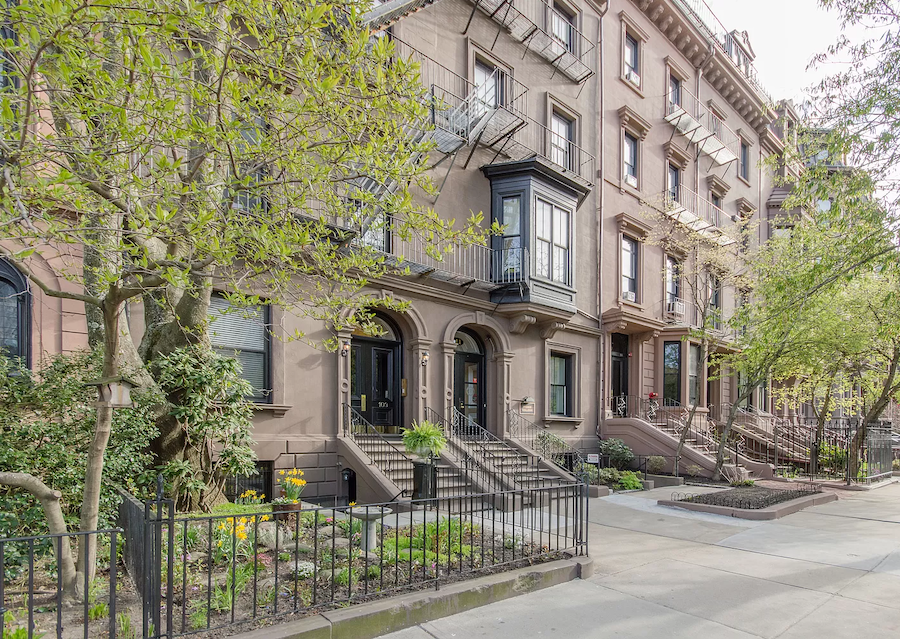
The exterior is quite lovely. Well, the front of the building is.
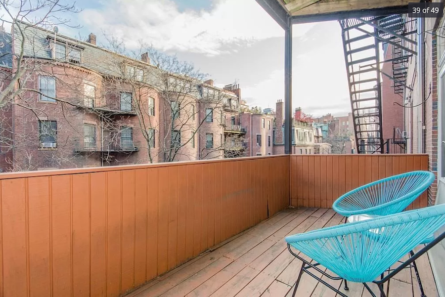
The back could use some help. No?
Then, the two bedrooms each have French doors with [swoon] transom windows.
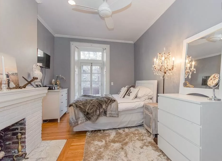
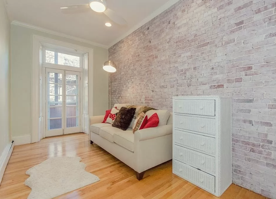
Remember this post about transom windows. I adore them! And, I have one of my own now in my new bedroom.

Above is the floor plan. Unusual layout. But, observe how the kitchen is eating up the living room.
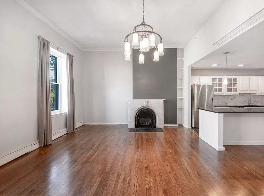 This building was constructed in the 1860s, and one of the first homes built in Back Bay. There is no vestige of anything from that period.
That fireplace wall is making me crazy.
Really crazy.
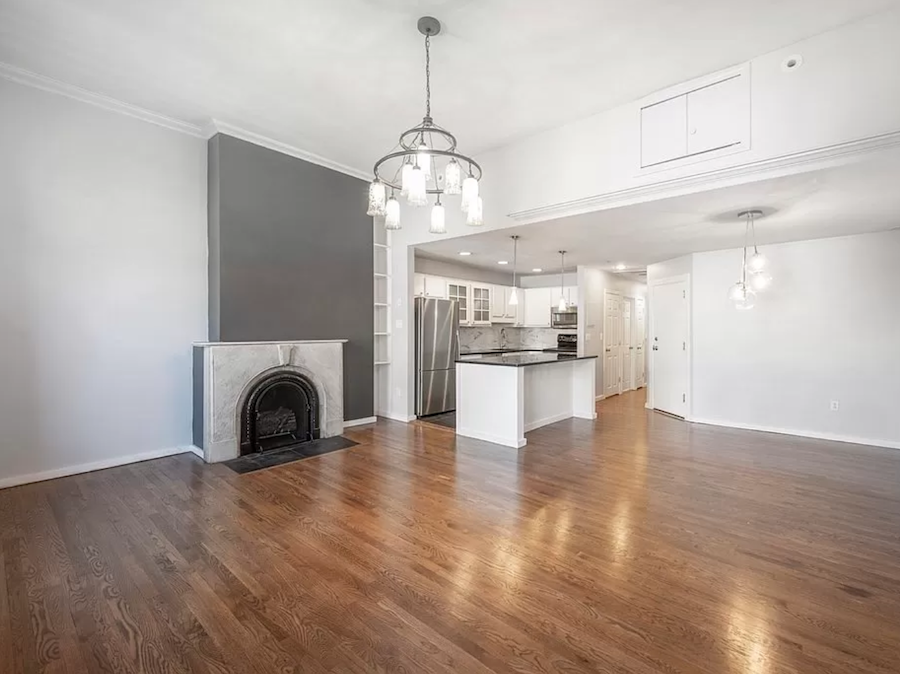 I’m trying to wrap my mind around what is actually going on there. There is the chimney flue, but the mantel isn’t centered on it. No way is that the original mantel.
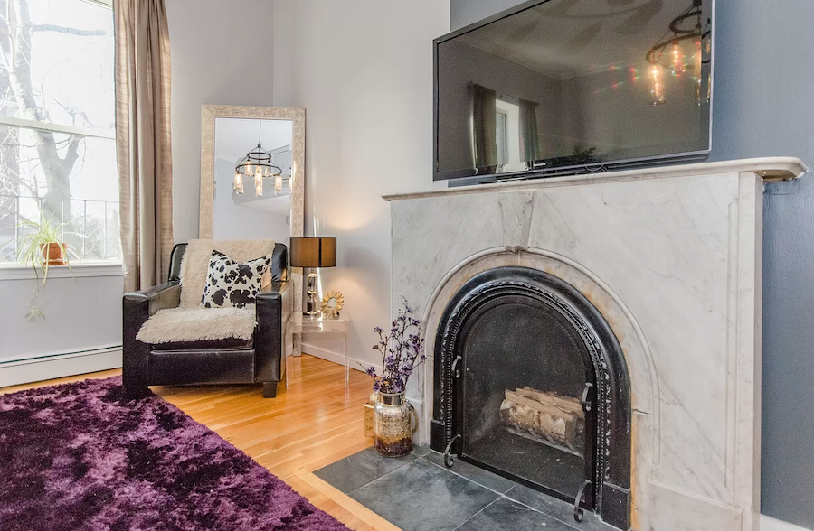
Let’s take a closer look at that stone mantel.
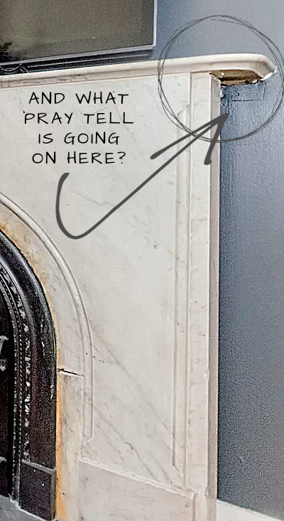 That is some seriously strange going on there.
For exquisite stone fireplace mantels, please go here.
But, there’s also the ugliest stone fireplace you’ve ever seen.
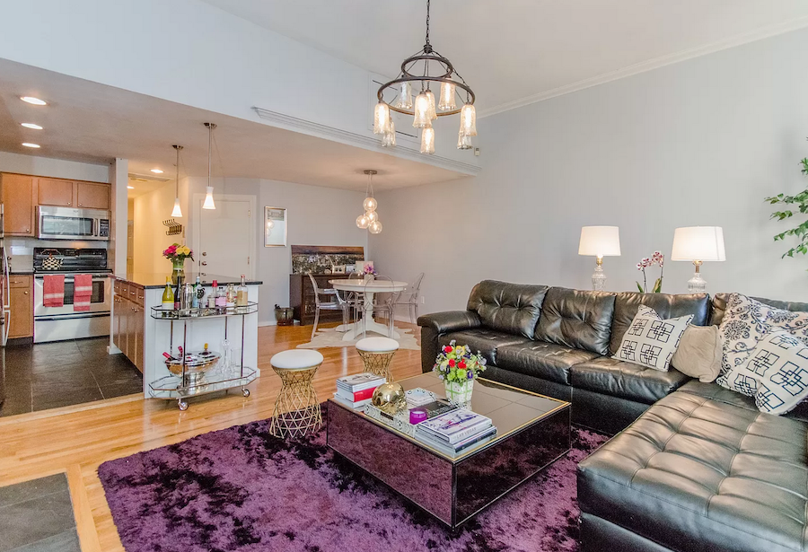
There’s our BIG BLACK SOFA.
That SHINY PURPLE rug. Or maybe I should say R-UGH.
Why is everything lined up on one end of the coffee table? Maybe they should take a look at how to style a coffee table. I’m far from perfect, but that is just plain weird.
The bigger question is this.
Why did someone turn this historical 19th century beauty in a prime Boston location into a contemporary bastion of bad taste? And, this baby sold for well over one million dollars.
LOCATION. I know.
But still…
Let’s see what the MLS had to say in the listing.
Spectacular sun-filled home with soaring ceilings in a Historic 1860’s Boston brownstone offering gracious living in the Back Bay’s most prestigious location; the first block!
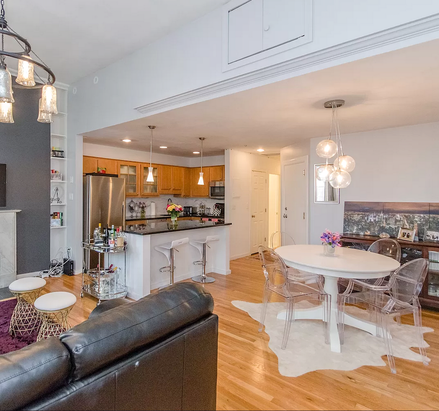
Well, “sunfilled” is a north-facing living room, and “soaring” until we get to the air conditioning duct-work, and a hugely dropped ceiling. To dress it up, I guess, they stuck an eccentric crown moulding across the bottom. But, shame, they obviously didn’t order enough, and it just ends long before it should. Oh, well, we’ll just put a return on it, and then it’ll look intentional, like the ungapatched fireplace.
wtf???
I’m sorry, but not really. This is not gracious. The front door opens straight into the kitchen which is chowing down the living room for its breakfast, lunch, and dinner.
So bad. And, unfortunately, all too common amongst many a misguided renovation mess. Fortunately, not all apartments are like this.
They go on to say:
A highly coveted address steps from Boston Garden, Boston Common, Charles River Esplanade, Charles Street & Newbury Street’s designer shopping, and fine dining, all this with convenient access to Storrow Drive, and public transportation.
YES, YES, YES, AND YES!!! All true. So, why is this gem not treated with greater respect?
Exquisite features of this home include: central air-conditioning, hardwood flooring, crown molding, and recessed lighting,
[Excuse me. There is nothing exquisite about recessed lighting.]
large front-facing living room with windows looking onto Beacon Street, two south facing bedrooms with stone fireplace, exposed brick, and private outdoor deck with city views. The home features one full, and one half bathroom, in-unit washer/dryer, and a well-appointed kitchen with: modern light-oak colored cabinets, stainless oven & cook top, black granite counter-tops, and marble backsplash.
Blah, blah… and, you’re lying. That kitchen is anything but well-appointed. It could be, but in its current state, it’s not.
With over 1,133+ Square Feet – the home offers ample space to live comfortably.
It’s not the amount of space. It’s HOW the space is used.
This 6-unit building is self-managed with a high owner-occupancy. OWNERS RELOCATING
Well, of course, they’re relocating! haha
Okay, let’s look at the floor plan again.

Here, you can see clearly that the entrance, indeed, opens straight into the kitchen. Horrendous. It’s like they tried to turn a two-bedroom into a studio apartment. To the left of the kitchen is a large open-plan living, dining room. To the right of the kitchen is a washer, dryer. That’s nice, but there is about 12 sq feet of wasted space in front of it.
I like that they do have a half bath, and that the full bath is both ensuite, and accessible from the hall.
The second thing that is screaming out at me is that there isn’t any bloody storage in this place.
I mean, it’s a TWO BEDROOM. And, there is a closet for each bedroom, and one tiny linen closet, and that’s it.
Where do they put their shit?
I mean, their coat closet?
Utility closet? broom? mop? bucket? step ladder? vacuum cleaner?
What about a pantry? That is a tiny kitchen. The island is taking up valuable real estate, as well.
Today, I’m not going to get into the specifics of the design; like colors, and mouldings; that’s easy. If I can only solve the renovation mess, I will be a happy girl. The way it is, right now, is inexcusable.
So, I took this floor plan, and had my way with it.
My first objective was to create a sense of entrance where the occupants don’t feel like they’re walking STRAIGHT into the kitchen. The second objective was to at least double if not triple the amount of storage space. And, do so without sacrificing valuable living space.
The third goal is to fix that mess of a fireplace wall.
And, the fourth is to stop that kitchen from encroaching on the living room space.
Other objectives were to create a more pleasing furniture layout and, finally, address the big blank wall in the back of the room. Remember when we talked about those pesky big, blank living room walls?
Did I do it?
Let’s take a look.
![]()
I overlaid a little grid over over the plan to make sure my measurements were accurate to within an inch or two.
Okay, let’s begin with the major changes.
First, I eliminated that silly little laundry room. And, I relocated a single washer/dryer unit that can live behind a cabinet door, in the kitchen adjacent to the sink. They make them as shallow as 22 inches, and they are ventless. Now that I got rid of the laundry room, I was able to move the kitchen over where it belongs, and now I am able to center the fireplace, and flank it with two bookshelves. However, I created a matching fireplace flu on the leftside of the fireplace mantel.
Above this area, I placed four library sconces.
Can I tell you how much better I feel, already?
We can put a series of three prints on the blank wall, both of them. And, I would also love to see a wainscoting panel go around the room.
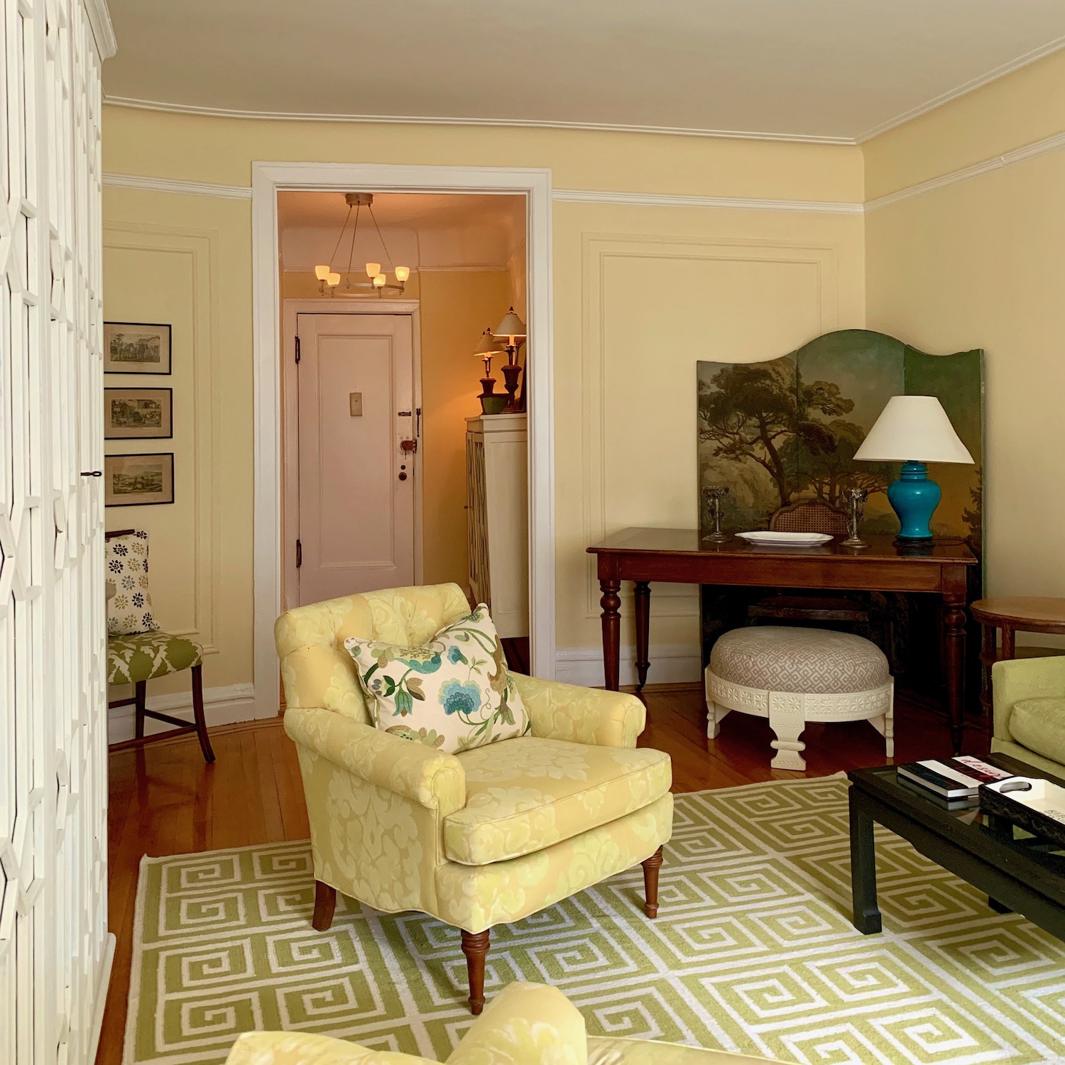 Maybe something like the three antique prints I have in my current living room.
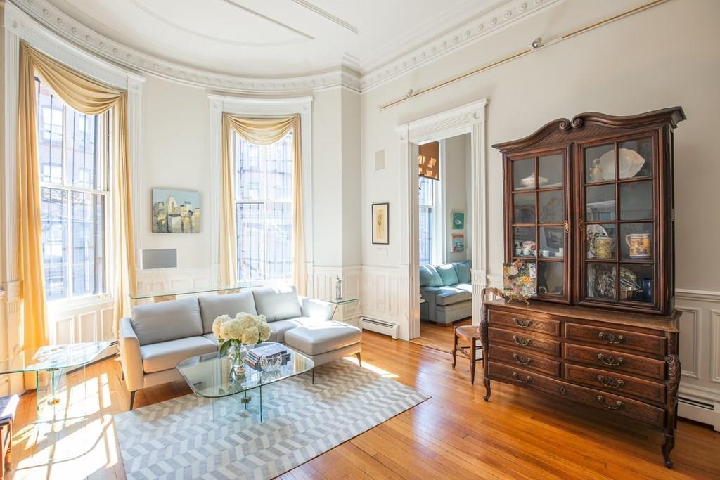
Please look at my living room in Back Bay for an example of beautiful, classical wainscoting. You know. I can’t believe I own this! For more information about wainscoting, please check out one of my favorite posts.
I’ll keep bringing back the floor plan so you don’t have to get dizzy scrolling back, and forth.
![]()
The living room is 19 feet deep.
Therefore, I know that there is enough room for the dining area to go behind the new seating area. I think a round 48″-54″ table with leaves would be terrific. In the back, I added built-in glass-door china cabinets. However, they could also be free-standing. In addition, I would like them to light up.
And, now, we’re coming to my favorite part of this renovation mess fix.
Out of that corner where the dining area formerly was, I created both a pantry, and a good-sized utility closet. This is what is sorely missing from this place.
Across from the utility closet is a coat closet, and the back of the fridge. Well, there’s a wall there, but over the wall, I created a fake door to match the coat closet door. Those doors match the double doors of the utility closet, directly across.
NOW, when we come in, our eye will move towards the closet doors, and light coming from the windows, if during the day.
The rest of the kitchen is lower cabinets only except for maybe the sink wall. We could do upper glass front cabinets here (except over the sink).
We got rid of that honking huge fridge, and did a counter depth fridge. I indicated a fairly wide one, but it could be more narrow, too.
![]()
The counter adjacent to the living room is open. And, despite my belly-aching, lol, I did add two counter stools. Now everyone can be happy. In fact, if we have a chef who prefers not to have guests around, she/he can hide the stools and put up some beautiful bi-fold glass windows, and shut everyone out.
The only other thing I added was a funny little closet in that odd space off the master bedroom.
This is now an apartment I’d seriously consider purchasing, if I didn’t already have one I love.
Oh man, I’m lovin’ that pantry, and utility closet.
I didn’t touch the bedrooms. They are delightfully quirky.
However, the balcony could certainly use some help. However, with a bit of repair-work, new paint, lovely planters and furniture, I think it could look terrific.
I hope you enjoyed this exercise. I think it shows that even if you come across a place that isn’t quite working for you, and you can’t figure it out, I would hire an interior designer or architect to help you reconfigure it. Some builders are also very good at this. Some are, and some aren’t; just like with everything.
In closing, please check out the HOT SALES pages for great cyber Monday (and week) deals, and HOLIDAY SHOP.
***And, also, I just released my new 80-page Etsy Guide with over 150 Vendors.***
It’s yours for FREE if you purchase any of my interior design guides.
In addition, if you purchase any of the guides, you’ll get the 333 Rules and Tips You Need to Know for FREE, too!
This is only for a limited time, however. In a few weeks, the price of the Rules & Tips, and the new Etsy Guide will be going up in price.
xo,

Related Posts
 15 Hideous Decorating Mistakes With Fabric
 Laurel, Why Does My Decorating Look So Awful?
 How To Coordinate Lighting That’s Smashing, Not Boring
 The Granny Decor Mistakes You Might Be Making
 I’m Dreaming Of Blue and White Christmas Decor
 Decorating Advice For Folks Who Are Plumb Broke
 21 Interior Design Mistakes You Need To Stop Making


