Hi Everyone,
A Happy early Thanksgiving!
It has been five years since I updated the Big Farrow & Ball matched to Benjamin Moore color chart. And, I plan on doing it. But, it needs a big overhaul.
However…
It is a monumental task. Therefore, for today, I will review all of the new Farrow & Ball Colors 2022. If time permits, I’ll also do the Colors By Nature and The California Collection.
Actually, I already did a review of the Colors by Nature which you can see here!
Please notice the date; you’ll see why I forgot about this post! However, I don’t believe I did the California Collection by Farrow & Ball.
Before I start, I want to say that I love both paint companies.
This is not about pitting one against the other. I think both make an excellent product, and I would prefer that we not debate the merits of one company over the other. Of course, if you can afford Farrow & Ball, I highly recommend getting THEIR colors from them and no other paint company.
Is there a difference in the look of the paint once it’s up on the wall?
Some insist there is. I am not positive that I can see the difference. Although, I have never seen the same color from each company posted side-by-side.
As for the big Farrow & Ball Chart.
I should be able to complete that in time for Christmas.
Ummm… that is, Christmas 2024. Ha! Just kidding. (Sorta.)
For today, I’m going to keep things fairly simple. Many of the colors will not have accompanying room images. My reviews of these colors are mixed. Although, I don’t think any of the colors are as bad as the previously beaten dead horse– Sherwin Williams-What-Were-They-Thinking-Color-of-the-Year?
Okay, let’s jump in because I know that most of you are either getting ready to go somewhere or are cooking.
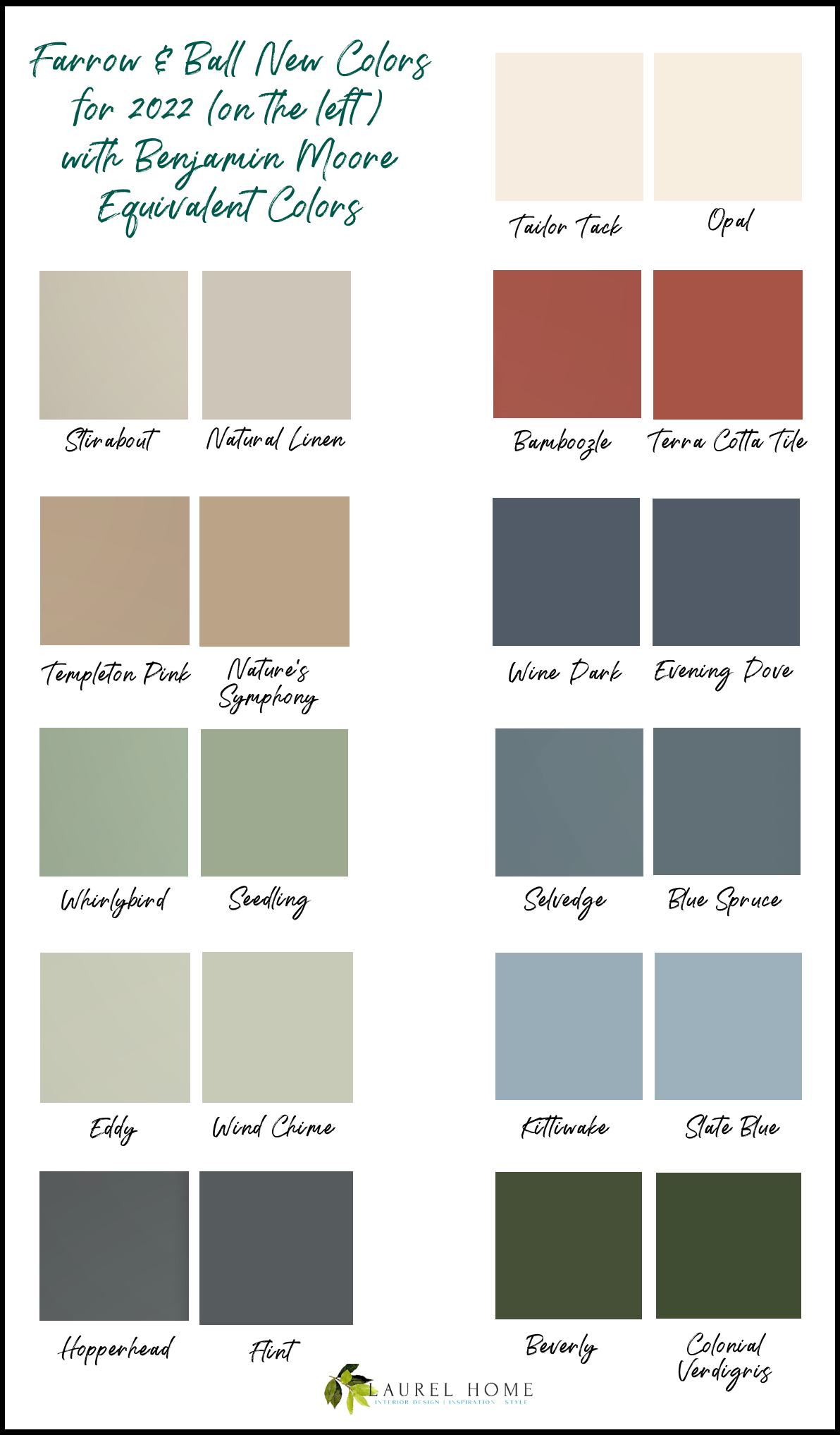
The Farrow and Ball colors will appear on the left, and the Benjamin Moore equivalents are on the right.
I’m going to begin with a paint color I consider one of the best colors of the bunch.
Farrow & Ball calls it Tailor Tack.
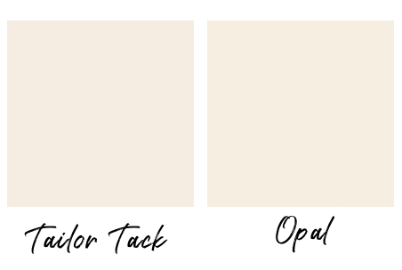
Tailor Tack is a warm, soft, muted pink. It is very close to one of my Laurel Home Paint Collection colors, Opal oc-27 or 891. This is a pink that most men will like. It’s the pink you can safely paint your daughter’s room when that’s what *she* wants, but you’re cringing at the thought.
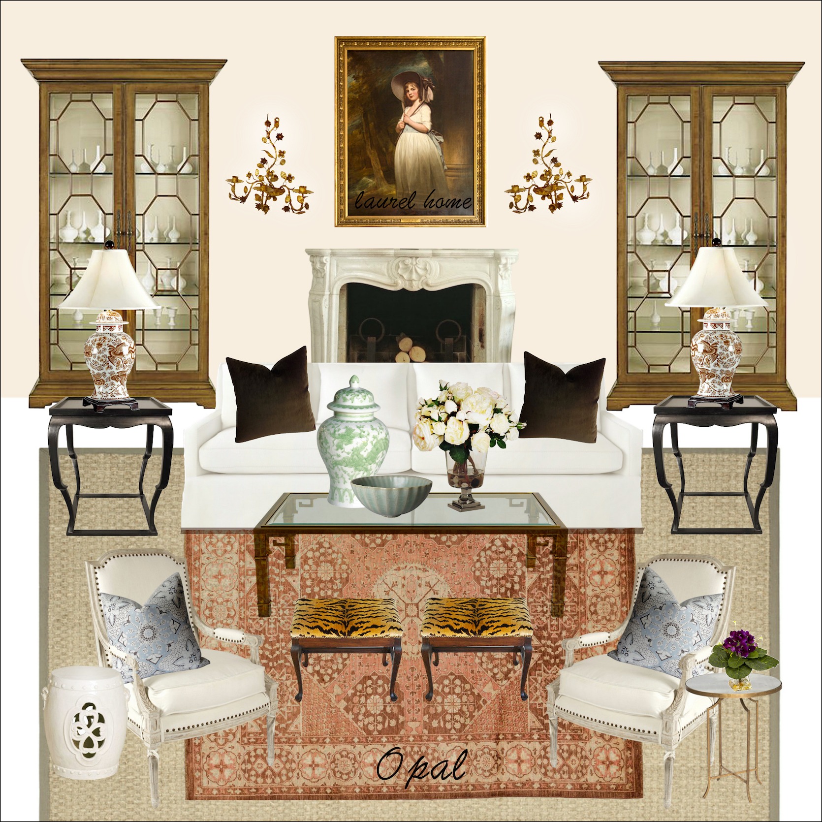
One of 40 Palette Boards from the Laurel Home Paint and Palette Collection
Before I go on…
Finding the matches for these colors is not easy. There are 11 paint colors, and it took me nine hours to figure out their equivalent color in Benjamin Moore. Yes, nine.
Part of the reason is that I did a lot of it yesterday at night. In my defense, night comes about an hour after lunchtime now. haha, The problem is it’s two paint companies. And, while the images have improved, about seven of these had to be done over because the online picture was too far off the real-life sample. I pride myself on being crazy obsessive about my color matches.
One of my favorite projects in interior design school was to match an existing paint color by mixing the paints ourselves.
If you had Ms. Fox for color at the NYSID, please raise your hand.
However, a few of the colors were exceedingly difficult to find a suitable match. I find that the most trying are the blue paint colors. That is across the board with Farrow & Ball. Do they purposely choose different colors than their competitors have in their line?
I imagine they do.
Okay, let’s move on with our Farrow & Ball Colors 2022
The first new color is:
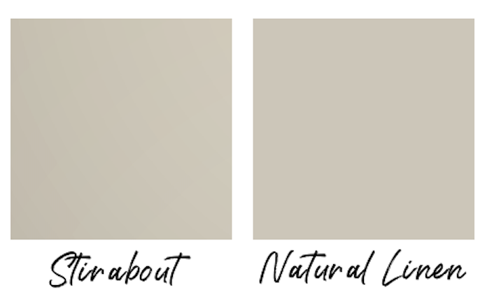
Farrow and Ball describe Stirabout as “The perfect oatmeal.”
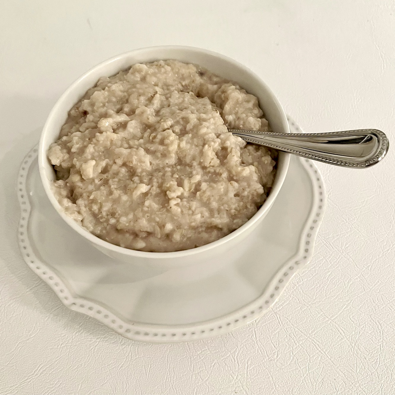
Stirabout is inspired by the nurturing porridge favoured over many centuries in Ireland.”
Sure, I love oatmeal. In fact, I made some for breakfast this morning. However, I don’t find it, particularly appealing to have it painted all over my walls.
The color on their website looks a LOT pinker than it does on the chip. On the chip, it’s a classic linen. A warm muddy, non-pink greige. I could see this color in an old Irish farmhouse from the 1600s. However, this color could be beautiful in a beautiful, architecturally endowed space.
Our next new Farrow & Ball color for 2022 is:
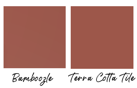
This was one of the easier colors to match up. In fact, a few were quite close, but the sample for Benjamin Moore’s Terra Cotta Tile 2090-30 was the closest.
Farrow & Ball calls this color A spirited, flame red– A fiery hue. Oh, if they say so. However, my version of spirited and fiery is nothing like this:
Fair Warning.
I very much recommend that you grab a pair of sunglasses first.
Please don’t say you weren’t warned.
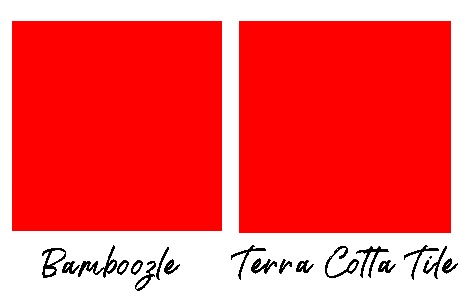
By comparison, Bamboozle looks almost brown.
Apologies about the rods and cones overload. I hope I didn’t damage anyone’s retinas. ;]
Our next Farrow & Ball color for 2022 will give a bit of respite.
Well, from the intensity, that is.
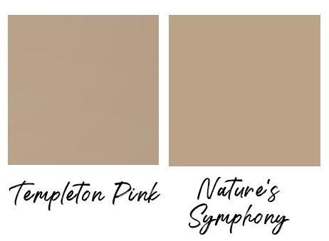
Farrow & Ball – Templeton Pink and the Benjamin Moore equivalent, Nature’s Symphony 1152.
I know. It isn’t really pink, is it?
I know what you’re thinking. You’re waiting. You’re waiting for me to say barf. Right?
Well, yes, I could. However, let’s face it. Most of us shouldn’t even be looking at these colors that look like liquid makeup foundation.
This color is “the marmite of paint colors.” The British adore it, but no American should ever try it.
‘Nuff said.
Next up is Farrow & Ball’s Wine Dark. I paired it with Benjamin Moore Evening Dove – 2128-30
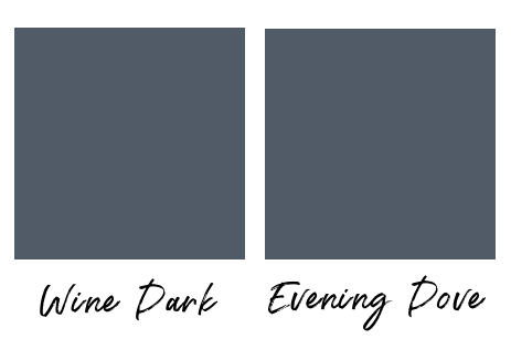
Clearly, someone had too much wine when they named this paint color. Either that or they inadvertently mixed this name with Farrow & Ball LAKE Red.
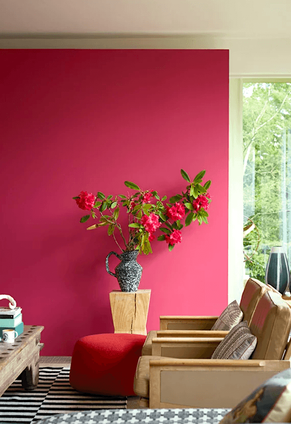

Farrow & Ball Lake Red
Their description of Wine Dark goes like this:
“Our richest blue, it’s the perfect addition to our strong blue family, being more sophisticated than Stiffkey Blue and more upbeat than Hague Blue.”
What???
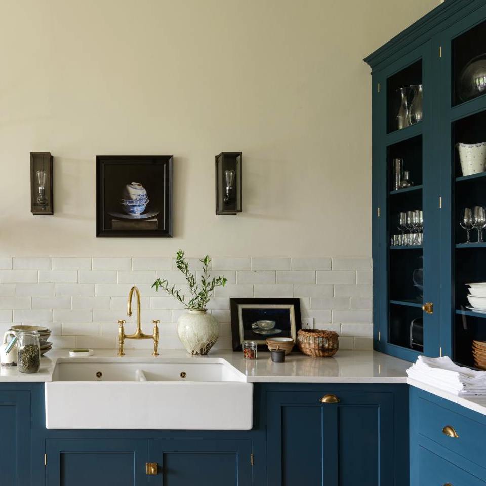
Hague and Stiffkey are among the most beautiful shades of blue God ever created. This “Wine” color is not rich. It’s barely even blue. Now, does that make it a bad color?
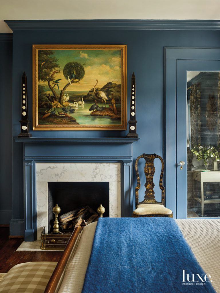
Luxe Magazine – Farrow and Ball – Stiffkey Blue

Not at all! I rather like it. It’s a very grayed-down, very deep indigo. And, yes, I agree that it’s quite sophisticated. However, upbeat, I don’t know.
Next up is Whirlybird.
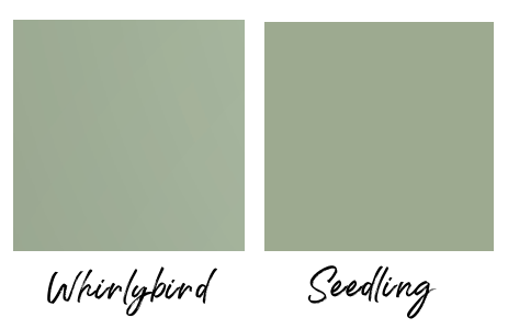
I knew the instant I saw this color it would give me problems. However, it was a little better in real life than online. The jury is out on this color; it’s not for everyone, but in the right hands, I think this could be a beautiful wall color.
We’re over the halfway mark.
The next color is Selvedge, along with Benjamin Moore Blue Spruce 1637
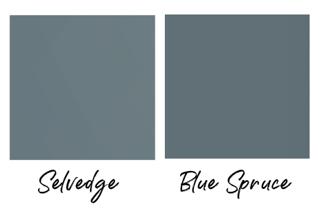
This was another nightmare to match. I ended up settling with Blue Spruce, although, as you can see, it’s a bit darker. However, it has pretty much the same tonality. I would describe it as a deep, very grayed-down teal. I like this color a lot. It’s one of those colors I could see changing quite a bit depending on the light.
Our next Farrow and Ball color is a green they call Eddy. I paired it with Benjamin Moore Wind Chime af 465.
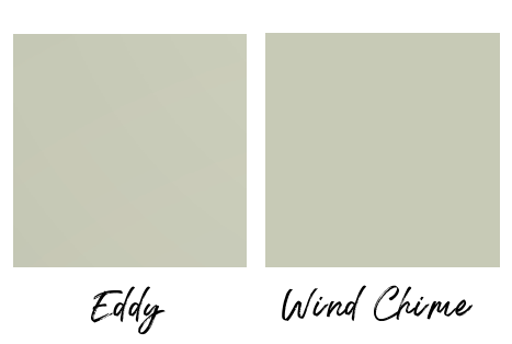
F & B’s description of Eddy: “This evocative colour creates a seamless connection with nature, perfect for use in a garden room or alongside natural materials. A breath of fresh air…”
That isn’t how I would describe this color. In fact, my description is only one word.
Hospital.
We talked a lot about hospital green in this post.
It’s not always a bad color. It depends on what else is going on.
We have three more Farrow & Ball paint colors.
Next is Kittiwake, which I paired with Benjamin Moore Slate Blue 1648.
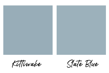
Basically, it’s periwinkle. It’s not a bad color, but I think it looks best mixed with some warmer shades of blue and black accents.
However, this color was also a bitch to match up. Most grayed-down shades on Benjamin Moore swayed green. Or, else, they were too gray or too dark.
Benjamin Moore’s new website is absolutely fantastic. They give similar colors that are clickable, and I found that to be quite helpful.
The penultimate Farrow & Ball paint color for 2022 is Hopperhead.
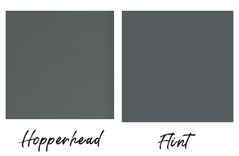
Its Benjamin Moore doppelganger is Flint af-560.
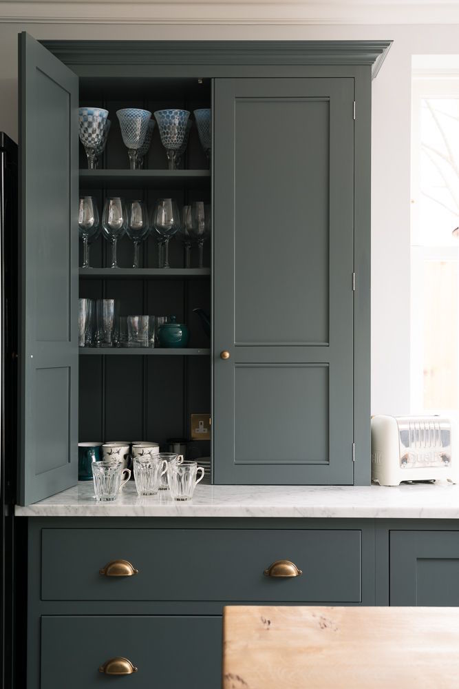
This charcoal gray sits between two wildly popular Farrow & Ball colors, Down Pipe and Railings.
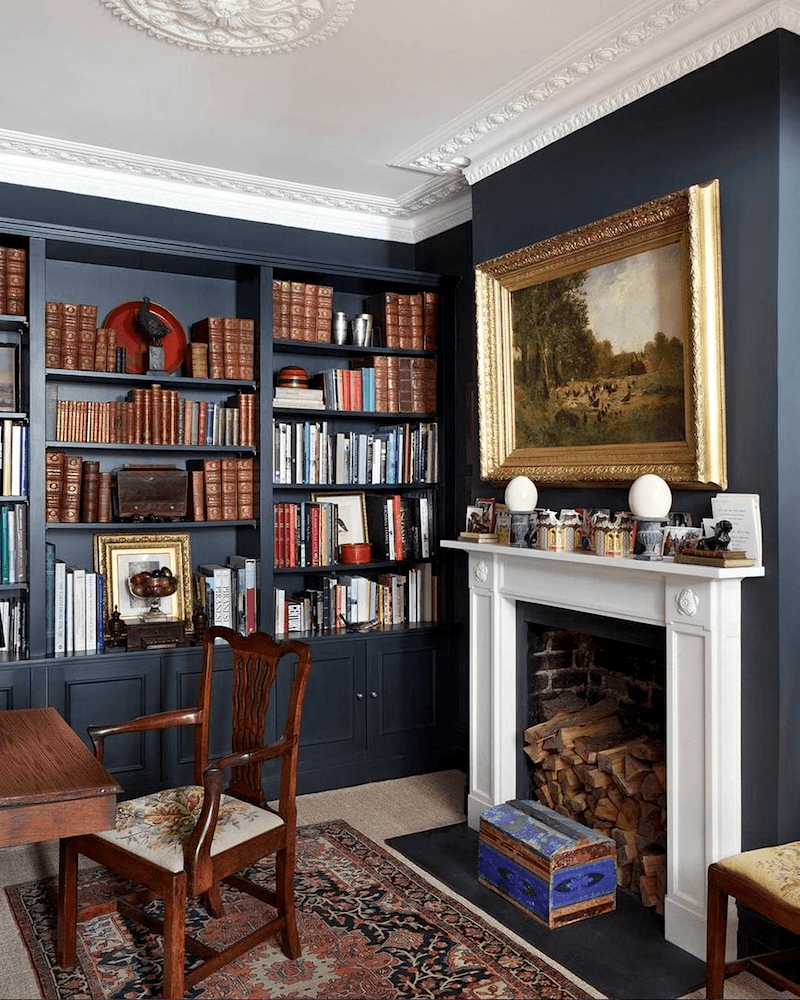
via @houseandgardenuk on instagram @jamb_london
And Railings. I love these deep, sophisticated colors. I would paint this color on the walls, trim, and ceiling in a small den or bedroom. These are some of my favorite Farrow & Ball paint colors for kitchen cabinets.
This post has 16 of my all-time favorite Farrow & Ball paint colors.
And, our final Farrow & Ball new paint color for 2022 is Beverly– named after a beloved employee at Farrow & Ball who passed away and is greatly missed.
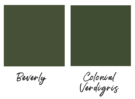
Beverly is a rich, deep green. It, too, was a difficult color to match up. My favorite twin is Colonial Verdigris cw-530. CV is another beautiful paint color in the Laurel Home Paint and Palette Collection.
Below is a graphic I made of all of the colors side-by-side. Please save it to your Pinterest boards for reference.
Okay, I have a surprise for you that I hope many of you will enjoy.
Do you know the company Samplize that makes the peel and stick paint samples using real paint?
Samplize was a genius idea started about five years ago by an interior designer who teamed up with a young entrepreneur.
There’s no mess, no wrecking your walls. And, it’s less expensive than the test pots of paint.
Plus, the only way you should ever test the paint colors is FLAT against the wall. Another thing I love is you can try your samples on the ceiling. These samples make it so much easier. (Well, not my ceiling. And please have someone do the sticking and another hold the ladder.)
You might be wondering if the colors are accurate.
They are crazy accurate. Samplize rolls the samples with two coats of the actual paint.
I hope you enjoyed this post.
Please have a blessed Thanksgiving Holiday if you celebrate.
In the meantime, yes, the entire world is on fire with THE best deals of the year. I told Melissa, my fantastic virtual assistant, it’s like having Thanksgiving dinner three times a day for a week.
We try to bring you the best of the best.
Please check out the newly updated HOT SALES for Black Friday and Cyber Monday week!
And, also, the new
Holiday shop for 2022!
xo,

PS: For everyone who owns or wants to own Laurel’s Rolodex.
There is a new update coming out in one week. This is the most significant update in several years, and I’m very excited to share it with you. Please know that all changes are on my end. Your download link, which you got five years ago, will always give you the latest version of your guides.
I will send out a courtesy reminder and resend your download link when the new guide is in place.
There will also be a new version of the Etsy Guide. I am sorry, there are no automatic updates for this guide because I have to pay a hefty fee to store the guides now, and it’s a tremendous amount of work doing the updates.
There is an update coming out as well for the website (six figure income blogger guide), but that will be delayed by a week or two.
That blogging/website guide does get automatic updates. So, if you get it now, and I recommend that you do, if you have a website, you’ll get the updated version when it comes out. The updates are mainly new sources I’m using for web hosting, email hosting, and website theme sources.
Finally, please note that there will be a price increase for all my guides in January. You can find out more about them by going to the introductory page. From there, you’ll fine links taking you to another page which explains in far greater detail what’s in the guides.
Also, please note that gifting is available for all of the guides. When you go to order, you’ll see a gift icon. Just click that and fill in the deets for your recipient.
xo,

PS: Please check the HOT SALES HERE FOR BLAAAAAAACK FRIIIIIIIDAAAAAY!
Related Posts
 Contemporary Interiors – Are They Trendy or Timeless?
 My Big Move To Boston – Snowed Out!
 I’m Afraid Our New Rustic Home Will Be Depressing!
 I May Have Found “The One” in Boston!
 Is It Classic Furniture or Something I’ll Grow To Hate?
 40 Outdated Home Trends. But, Are They All Passé?
 Kitchen Renovation Plans Change Months Later!


