Hi Everyone,
People sometimes ask me if I miss being a working designer?
Well, the answer is “no.”
And, I know that when they are asking me this question, they don’t mean do I miss the aggravation and stress inherent in this business? They mean, do I miss DESIGNING?
Again, the answer is “no” because I am still designing.
I’m just not designing for a client; the designs are still happening, but here on the blog. Sometimes, I can use a reader’s home as an example, and sometimes I’m just making up possible scenarios.
Oh heavens. I gave myself quite a challenge with this one, however.
This is the post I was supposed to do a week ago and then finish last Saturday night.
Ummm… well…
Here’s what happened.
I got it in my head that it would be cool to put entire classic kitchen combos together for you with the cabinets/colors, hardware, faucets, lighting, backsplash, and countertops.
Yes, I know. Nuts.
One kitchen would’ve been enough. But how to decide which one?
Remember last week; I asked you to select your three favorite cabinet colors?
I thought it would help me decide. So, let’s first look at the results.
Drum roll~~~~~~~~~~~~~
With 17 votes each, tied for first place is:

Simply White
and

Gentleman’s Gray
No surprise there. Those are both excellent kitchen colors. And, they look great together too.
In second place with 15 votes is:

Halo
And, there’s another tie for third place:

Shale
and

Gibraltar Cliffs
I know, that’s five.
But, here’s the thing. Most of these classic kitchen combos are interchangeable.
All of them are actually neutral colors.
Again, I’m going to be using Jean Stouffer’s and DeVOL’s fabulous kitchens as inspiration.
Please refer to last week’s post and also their websites.
So, what ARE these classic kitchen combos?
I’m going to be taking the cabinet colors and combining them with my favorite hardware, backsplashes, countertops, faucets, and lighting.
Let’s dive in!
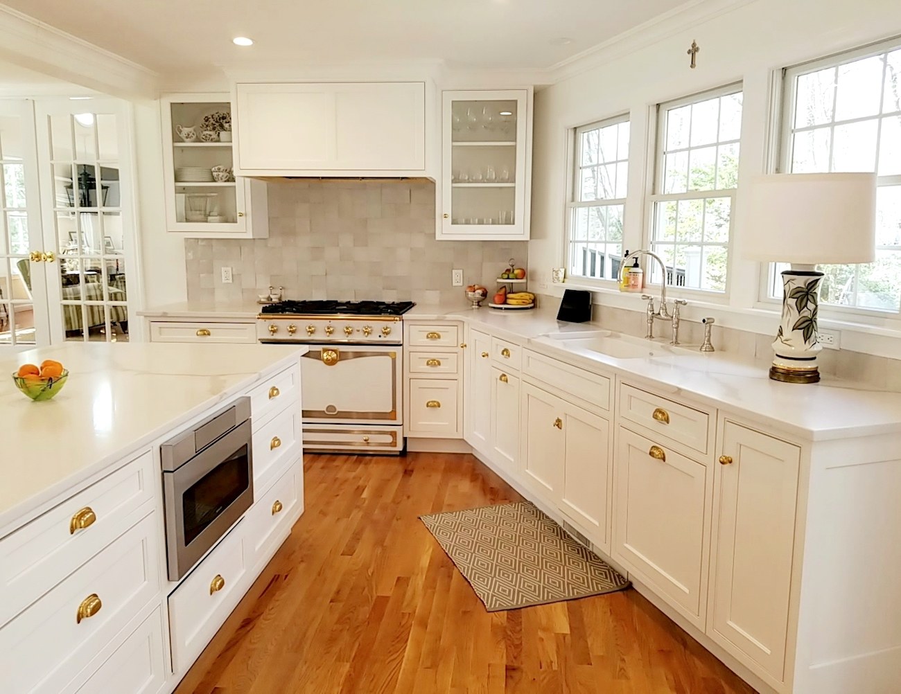
Let’s begin with Simply White.
Well, this one had my hand in it as I helped Mrs. F with the hardware selection. She discovered other elements from reading the blog.
The hardware we chose is from Rejuvenation.
The faucet is a bridge faucet from Rohl (Perrin & Rowe) in nickel.
And, the counters are in quartz.
Please refer to this post for more information about the countertops and other elements.
However, we could also have done the counters in a real white marble such as Calacatta Gold.
Another possibility would have been to use soapstone.
Or, with a honed black absolute granite.
Mrs. F’s backsplash is in the beautiful Zellige tile from Cle Tile.
But, let’s begin with the cabinetry hardware.
I believe that when it comes to classical styling in kitchen hardware that less is more.
What I like best is a combination of knobs for the doors and handles for the drawers. And, those should be in the same finish, unless the kobs are wooden.
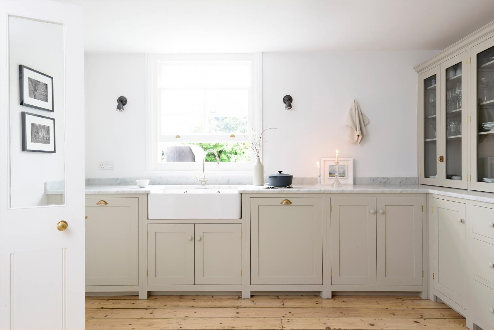 This deVOL Shaker kitchen has a beautiful combo of natural brass cup pulls, and wooden knobs painted the same as the cabinetry.
Here’s a tip. I recommend starting with any large appliance handles you’ll be needing.
Not all knobs and handles have coordinating appliance handles. And, you don’t want to get caught having to figure that out after you’ve already purchased 54 non-returnable knobs and handles.
I also very much recommend getting all of your cabinetry hardware from the same source, if possible.
If you don’t, please get samples first, to make sure that they are a close match. Just because something is unlacquered brass or polished nickel, doesn’t mean that it will match the same finish from another company.
For knobs, I generally prefer round.
However, an oval knob can be beautiful in some kitchens.
And, I generally like my cabinet knobs to be 1″-1-1/4″ in diameter. No bigger. They can be plain or have a simple ring detail.
What I would rather not see is a cabinet knob that is the first cousin to the heinous “boob light.”
You don’t hear as much about this one. But, I call it the nipple knob.
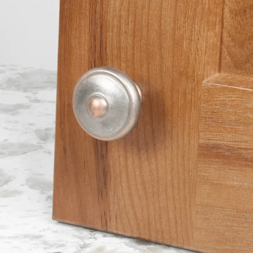
And, yes, this is how it comes. I could handle it if it were a burnished bronze. But this?
Speaking of boob lights. I happen to have one in my current home away from home.
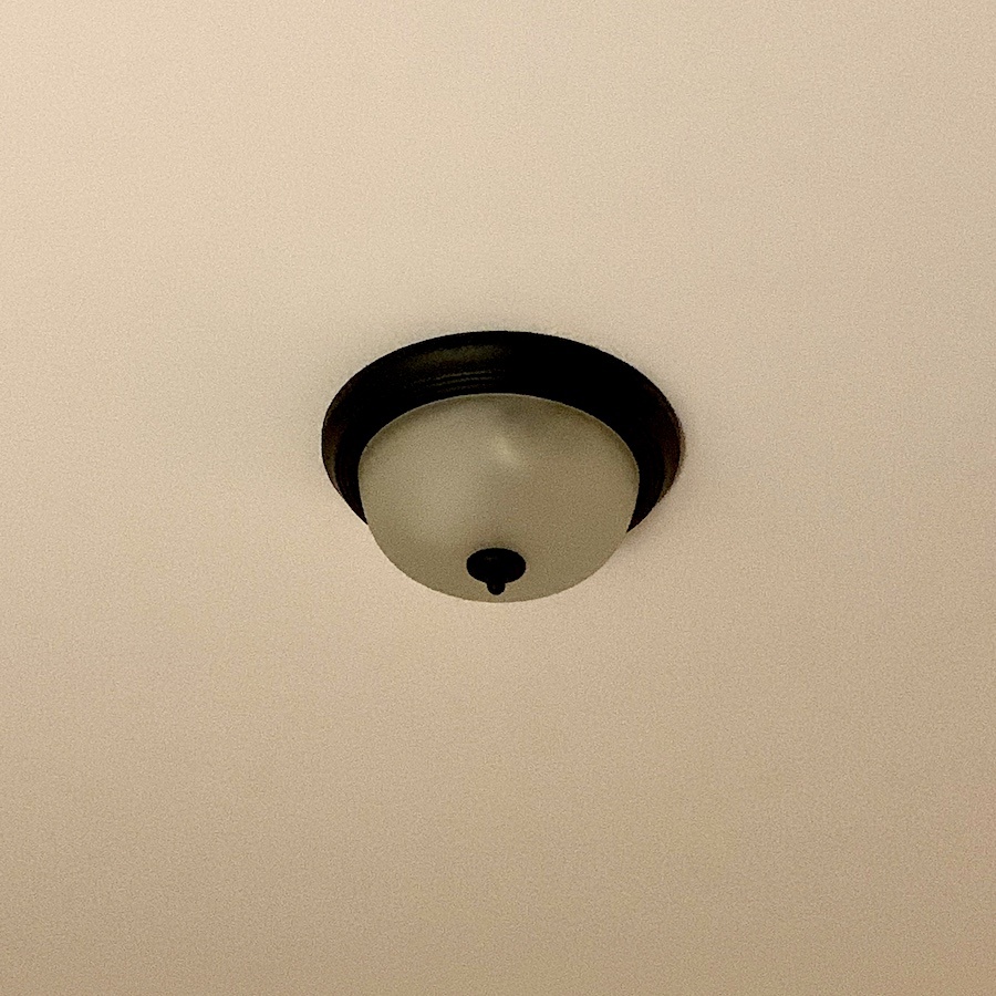
hahaha!
Below are some of my favorite knobs.
Please click on any image to go to its source.

And below, some of my favorite drawer handles

Below are some cup pulls for drawers.

I love the hardware at Jean Stoffer. And, I was curious where she got it.
Here’s a little trick to find something on the internet.
I’ve talked about it before, and it’s also detailed in the back of Laurel’s Rolodex.
I took one of Jean’s photos of a piece of the hardware she’s selling, saved it, and then I dragged it into Google images. Then, Google will spit back every iteration of that image it can find.
I was then able to track down the source of most, if not all, of her hardware to Top Knobs.
Top Knobs is sold on Wayfair. And, the prices on Wayfair are usually lower. If that’s the case, and you’d prefer to purchase from Jean, sometimes a company will do “price matching.” It doesn’t hurt to ask.
My favorite finishes for hardware are nickel and unlacquered brass.
However, that doesn’t mean I don’t like other finishes.
What about mixing finishes?
Here’s my take on that.
Yes! Please do, but with some limits.
Aside from the cabinet hardware, you’ll have light fixtures and plumbing fixtures.
I’m fine with you doing nickel or chrome for your plumbing fixtures and then everything else in brass or gold. Of course, you can always do everything in the same finish. However, I think it’s better not to do that.
You get a wild card with black and white.
Below in Jean Stoffer’s kitchen is a beautiful example of that.
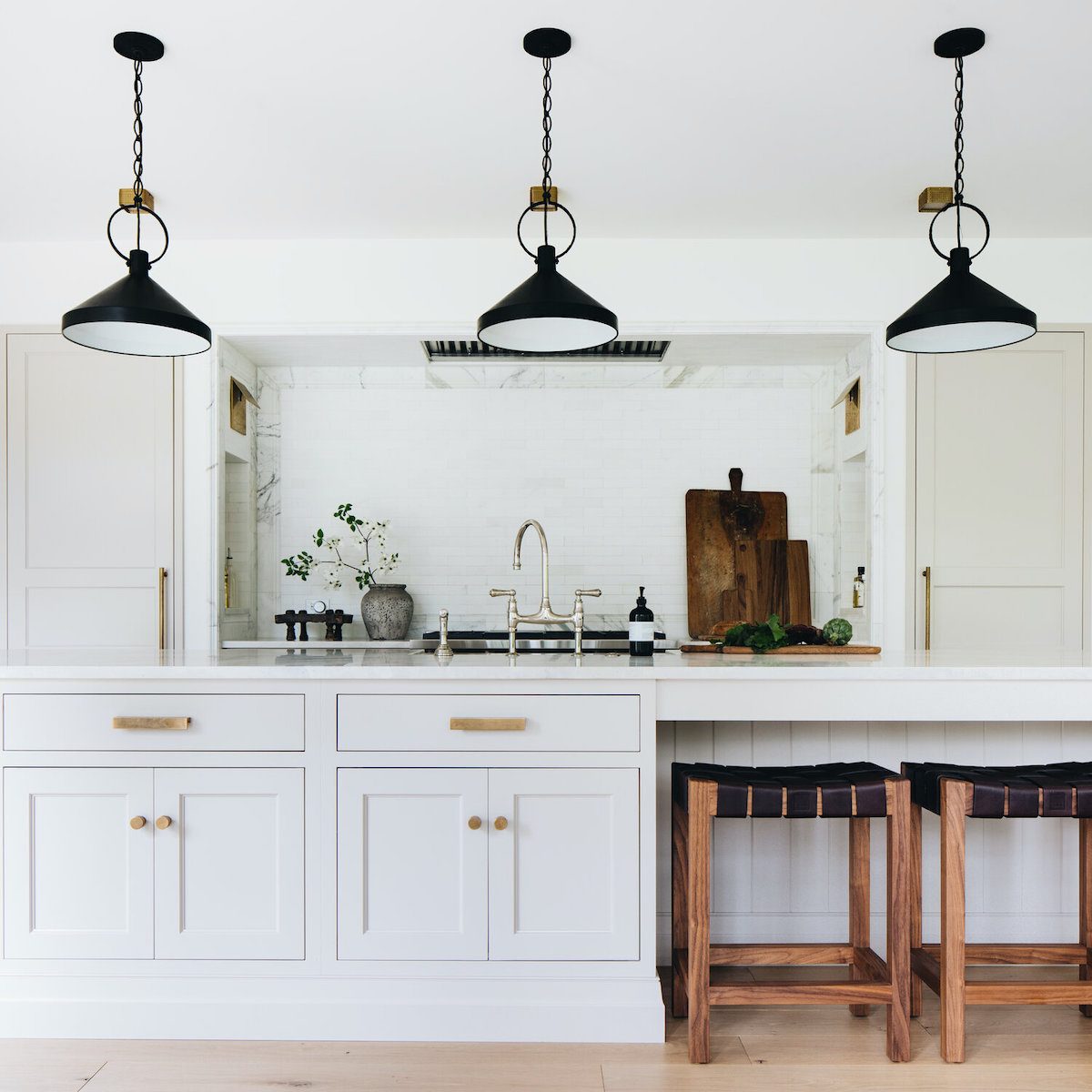
And, as in this incredible kitchen, it is fine to do brass hardware with the black lights and nickel faucet. Please note, however, that the lights are not the only black accent.
Plus, speaking of faucets, my favorite is the bridge from Rohl, like Mrs. F has.
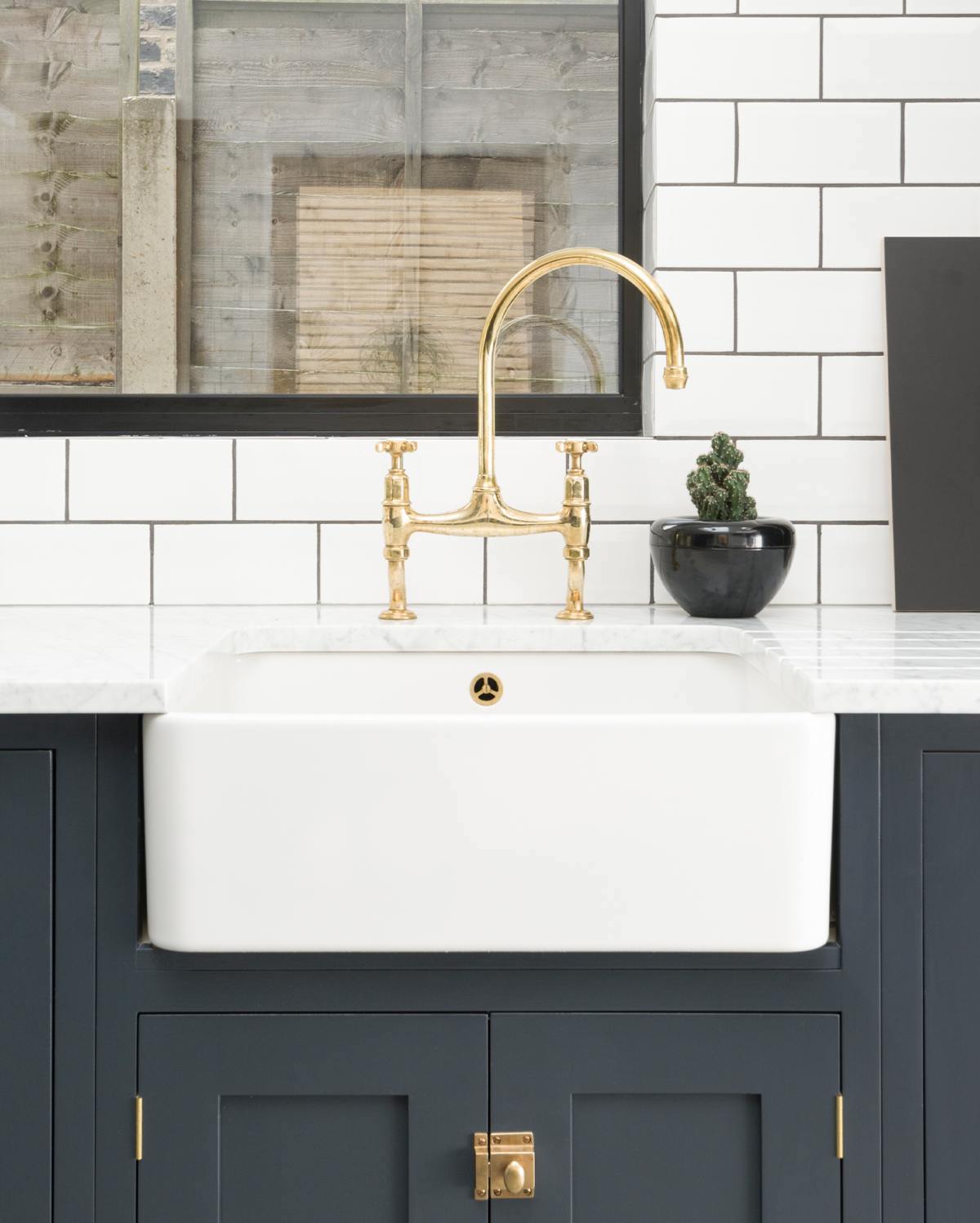 This is a similar faucet found on the DeVOL website.
Below are a few of my favorite faucets. Of course, there are dozens more.

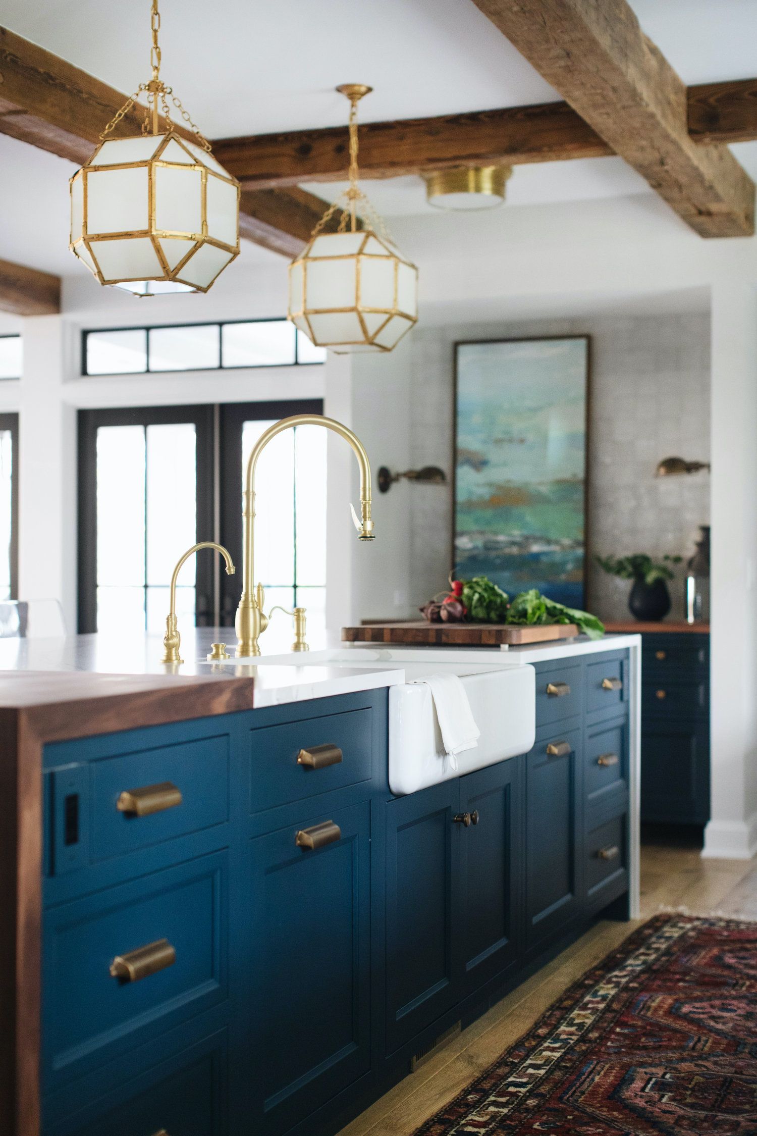 I found the faucet above in Jean Stoffer’s kitchen. It’s quite expensive, but it sure is stunning!
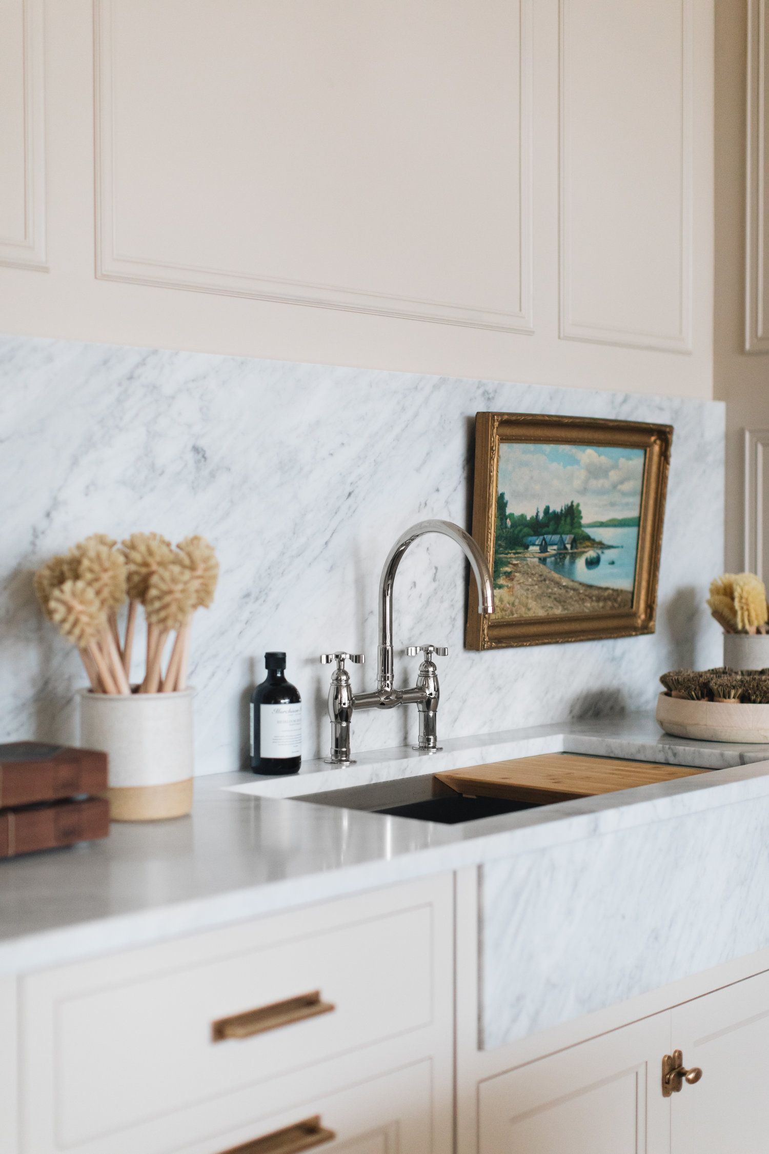
In Stoffer Home’s showroom is off-white cabinetry, a chrome bridge faucet, and Carrara marble counters, backsplash, and sink.
Jean sometimes has a plate behind her knobs and handles which looks quite smart, I think.
I love the marble slab. It’s always elegant and classic.
As for other backsplash materials, that are part of classic kitchen combos; I don’t care what you say, haha, but I have adored subway tile for as long as I’ve been taking the subway.
Here’s a post about backsplash tiles.
The price can vary widely, however.
What I don’t like, however, is obviously faux “hand-made,” which is really machine-made tile that’s overly wavy.
Below are a few subway tiles that are reasonably priced and one classic Morrocan design.
Again, please click the images for sources.

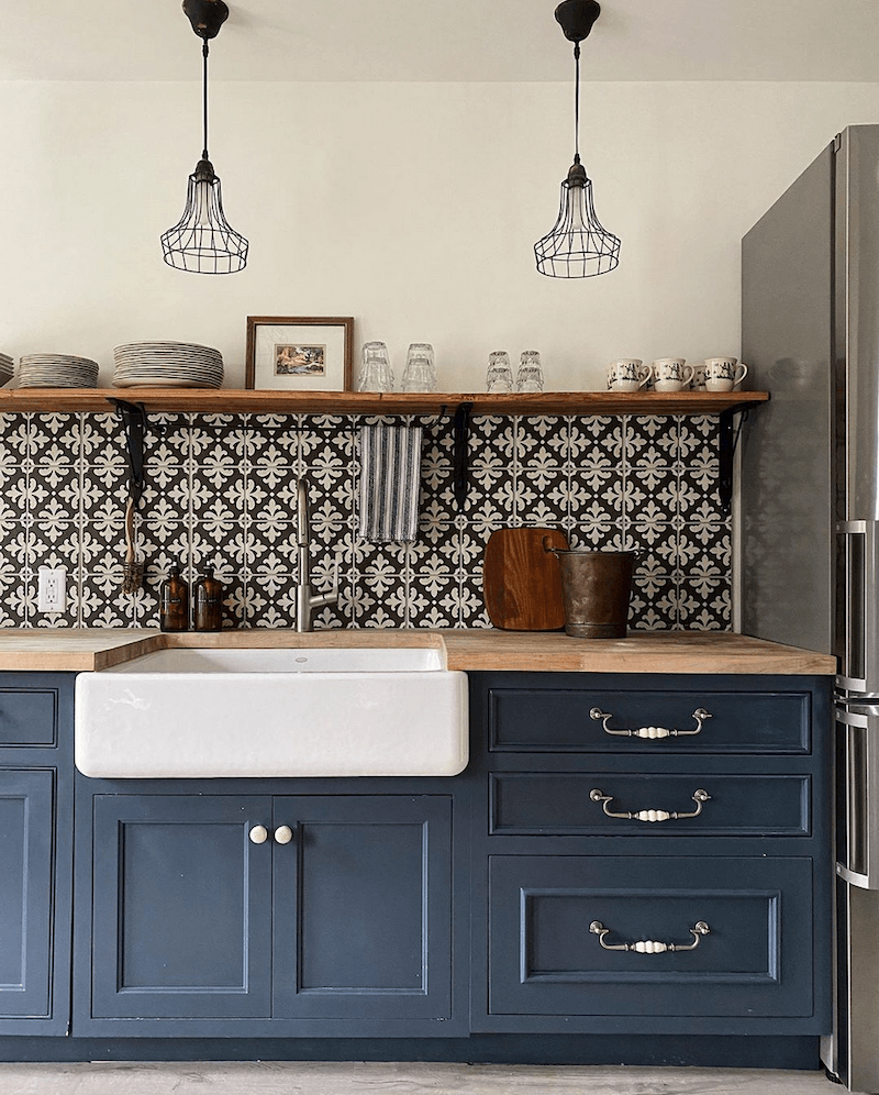
I tracked down Jean’s charming kitchen backsplash and light fixtures. I’m putting them here with some other similar tiles.

We’ve talked about encaustic cement tiles several times.
I think it’s a great look with dark cabinets. I like to see some black in it. And for the backsplash, a pattern that’s not too busy or too big.
One thing to avoid is a mid-tone pattern with a mid-tone cabinet. It will be blah.
How are y’all doing?
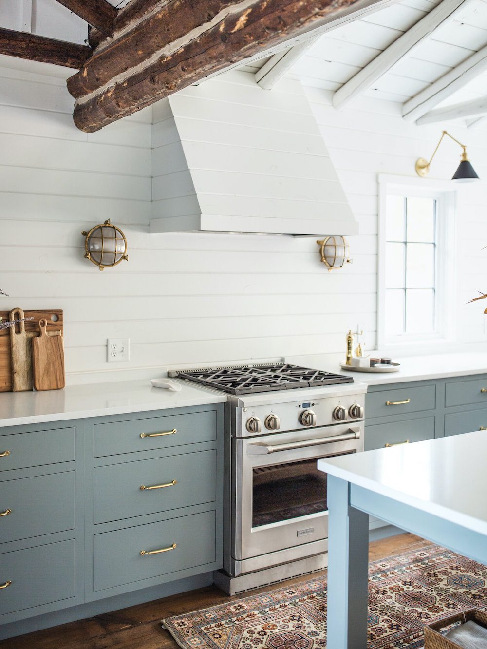 This is a reminder of the Gibraltar Cliffs kitchen. Please remember that this is the approximate color.
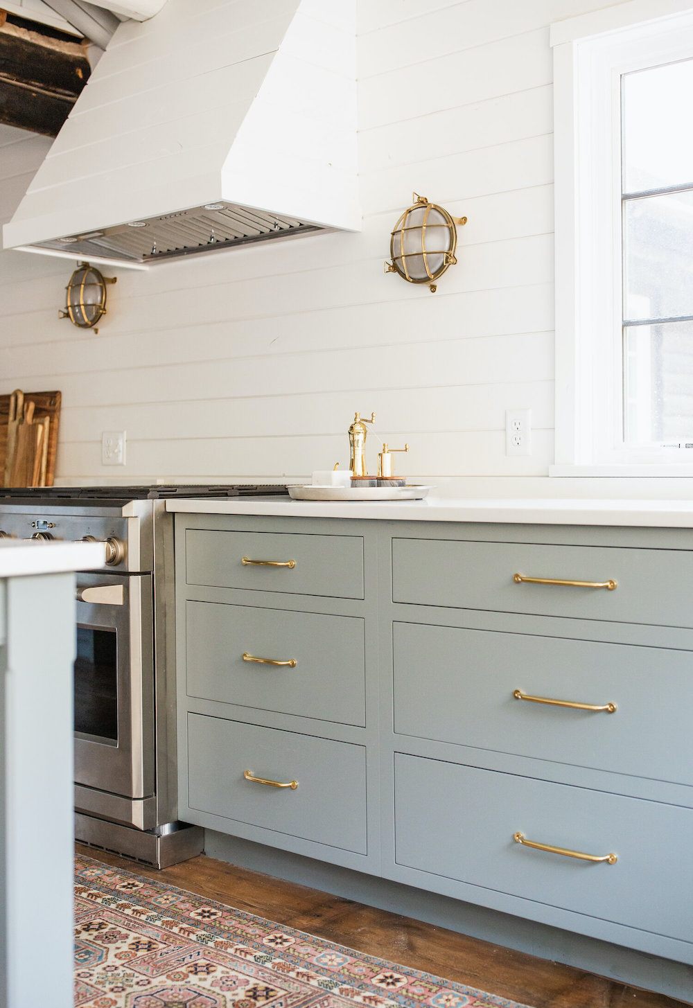
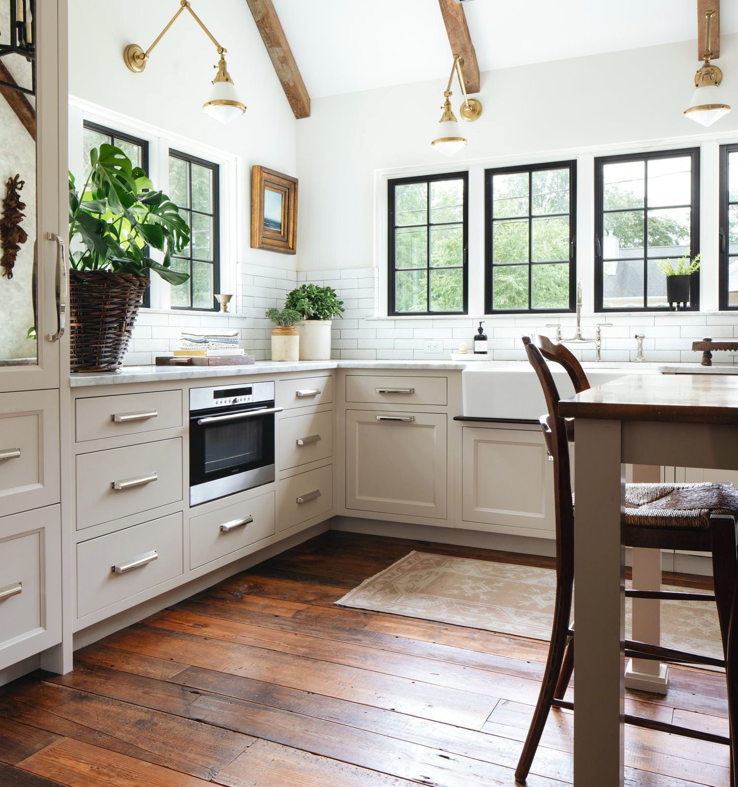
The Shale kitchen is one of my favorites too. Please look at Jean Stoffer’s portfolio to see the entire space. It’s like a lesson in kitchen design that integrates beautifully between living and dining areas.
Lighting
I’ve also talked about kitchen lighting a few times.
It never hurts to go over it again from a different angle.
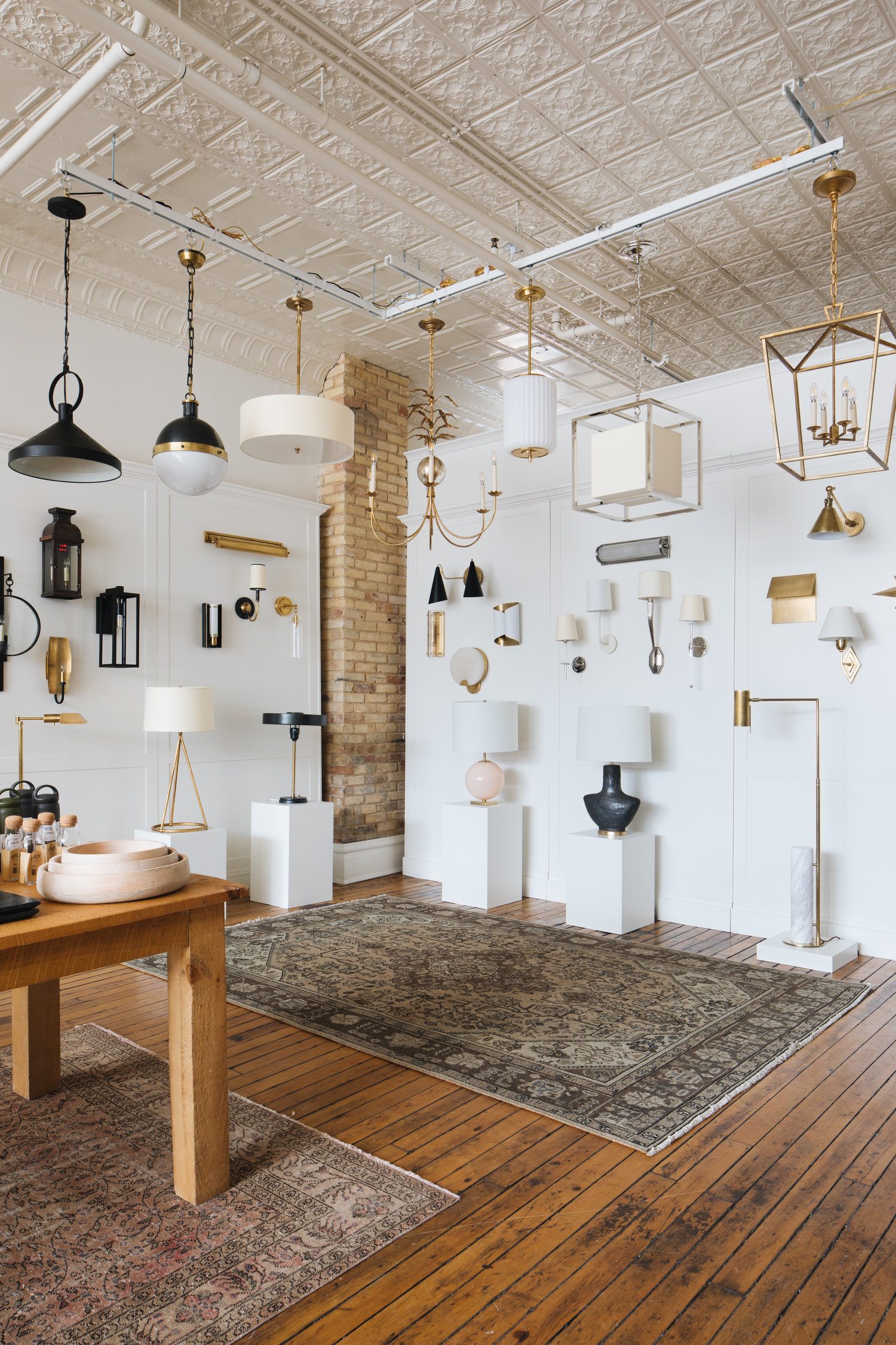 Jean Stoffer has gorgeous lighting in her shop and online too. Most of it I recognize as being from Visual Comfort.
Below are a variety of ceiling and wall fixtures for classic kitchen combos.
I think that most of these can be mixed and matched. The pieces are at a variety of price points. Also, Studio McGee, which also carries a lot of the same lighting, is having a 20% off sale right now on everything. So, if you need some wonderful Visual Comfort fixtures (or other cool furnishings), I’d head over there.


Okay, phew! This post has taken a long time, but it was fun. I hope it makes sense.
Below are some graphics you can pin to your Pinterest boards for reference.
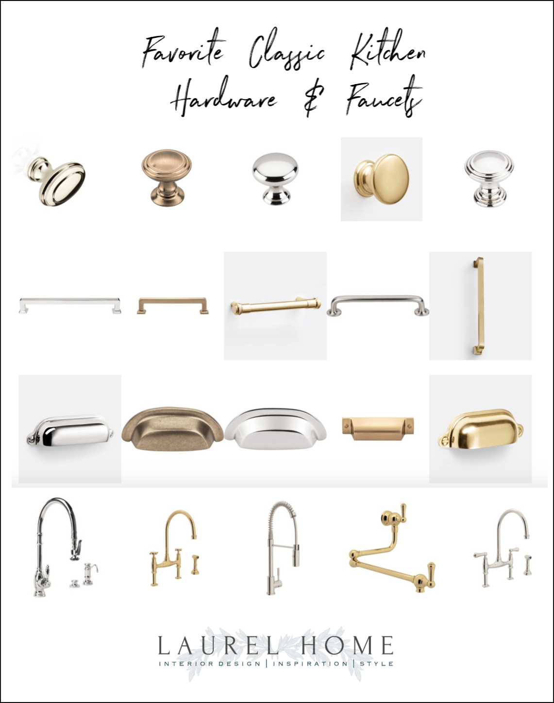
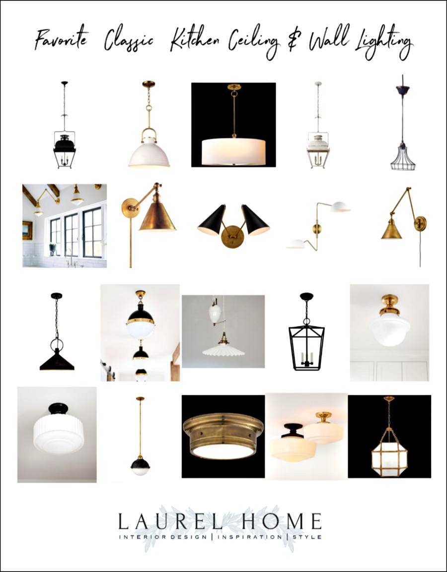
I know that you’ll have questions about these classic kitchen combos.
A few things. I probably didn’t touch on a problem that deals with your unique space; like, what color island will go with Simply White?
Or, what color should you paint the walls with Gentleman’s Gray cabinetry?
I so wish I could answer all of these questions. But, it would mean actually going to your home. Or, at the very least, doing a virtual consultation. Tomorrow, I am going to sleep as long as possible, and then I’m going to stuff my face with candy and read crap on the internet.
This post is meant to give inspiration and information that is helpful. It is general advice. If it happens to solve your design problem, that’s great. If not, and you’re stumped, please consider hiring a professional designer. Maybe one of the designers I’ve mentioned in this and other posts.
However, if your question is one that you think will be of value to other readers, I very much welcome that.
Thanks so much, guys!
And, no. I’m not really going to stuff my mouth with candy. (too much) I’ve been trying to eat very healthfully. And my son dragged me for MILES yesterday, all over gorgeous Northampton AND the exquisite Smith College Campus.

This is part of a beautiful river that flows through the Smith College campus. It was pretty empty.
The kids are all home, of course.
xo,

Please check out the newly updated Hot Sales!
Related Posts
 A Gorgeous Antique Farmhouse That Isn’t Yet Singing
 I Wanted Charming Home Decor, But Ended Up With Blah
 Here it is! A Palette For No-Fail Paint Colors
 14 Common Home Painting Mistakes You Might Be Making
 Insider Interior Design Trends 2021 – You Must See!
 Easy (and affordable) Ways To Fix A Boring Room
 I Hate My House | Help For a Small Living Room












20 Responses
I want grey limestone floors somewhere. Or Slate floors. Do you like them?
I like the look of them, but of course, anything glass or ceramic that falls on them is a goner.
What a joy to read this post! SO much value in it. I love it. I can’t even imagine how much work it takes from you, Laurel to write it but I’m the happiest to read it. Timeless bathrooms blog post request and I already have two cups of coffee. And a banana pie.
haha!
Thank you for a great post. Love the thoughts on mixing metals, especially giving black a pass! I would love to hear your thoughts on brushed stainless for plumbing fixtures if stainless is used on some/all appliances and the kitchen sink? It’s so easy to find faucets in that finish.
Laurel, I’m so grateful you for the years of practical advice and gorgeous inspiration. Your influence is evident in every room of my house, but particularly in the kitchen. I’ve still got finishing touches to complete but I think my kitchen would be a good model for a get to look for less post. My budget was 15,000 and, yes, you can have a gorgeous kitchen on a budget, especially if you don’t have uppers. It divides your cabinet costs in half. The only thing I couldn’t incorporate is the pretty bridge faucet. I love to cook and I can’t quite get my head around approaching that with my hands covered in olive oil or dough. I need a faucet I can turn on with my elbow. Lol. Enjoy your vacation!
I fully understand that. They need to make a hands-free bridge faucet!
My new kitchen was completed 1 year ago with beautiful quartz and cabinets of maple with contrast of black for the island. At the time I wrote to you that it seemed that all new kitchens were grey which did not work in my home. I love the function, my chopping block in a drawer which is better for a bad shoulder, and many wide drawers. I did not include a backsplash at the time, Again your help is timely. I am thinking subway tile, maybe glass. My home in the desert is so open all must be harmonious but not boring.
Best from the girl from Yonkers!
Paradise Pond! I used to skate on it. Thanks for the memory.
Love Jean Stoffer. You may want to look at Heidi Caillier. She’s on insta and her web sight is full of beautiful eye candy.
Oh yes! We must be triplets! Gorgeous work. There’s my bridge faucet! Apparently, I was already following her.
I want a black and white checkerboard tile floor in my kitchen!!
I had that for 16 years!
Hi Laurel – I always love your posts and so often they indicate you are reading what is on my mind!!! Do you know the name of the quartz countertop Mrs. F used? So sorry, I went back and reread but I seem to be missing it. Thanks!!! I always look forward to your weekly posts. Glad you are well!!!
Sorry, Christie. The source for the quartz was in an earlier post. The quartz is Dinergy by Aurea.
I just want to thank you for years of inspiration and good advice. There’s a lot of information out there, but yours is the very best design blog with great photos, clear advice, humor and integrity. Even when I have to break your rules – like now: choosing paint colors from hundreds of miles away due to travel restrictions – your advice helps me make the best possible choices (though I’ve indeed lost sleep over ‘OMG what if it looks awful in-person?’) I’m just someone who loves design, not a pro, but you’ve helped me make good choices, avoid costly mistakes, and gradually refine and elevate my personal style. – Anyway, let me end in saying many thanks and stay well 🙂
Good morning, Laurel.
I’m currently in the middle of my kitchen renovation. I selected a matte black faucet. I’ve heard it doesn’t show smudges as easily as my old chrome one did. Hopefully that’s true.
For my hardware I’m going with antique brass. In a combination of knobs, pulls, & a few latches.
And this may surprise some folks but I’m going with white appliances. I’m tired of trying to keep my old stainless ones clean & sparkling.
My kitchen may not be considered classic but I’m okay with that.
The walk around Smith College looks absolutely heavenly. I’m glad you’re enjoying your time with your son.
Thank you once again for such an enjoyable and informative post! Sitting in my robe with a hot cup of coffee, drooling over each kitchen.
Glad you are enjoying your trip!
Best Always,
Pam
I see the point of starting with your “fixed” appliance handles! I solved the problem differently: my cabinetry has no handles at all, so the question didn’t arise. The design of the wood cabinets has a hollowed-out section at each side of the frame for doors, and ditto at the top section for drawers. The fridge has a similar system so no handles. That leaves me with a total of 6 handles/knobs in the entire kitchen. This means I can have a mix of finishes on the remaining 6 handles without it looking odd.
I just love Gibraltar Cliffs and had something similar two houses ago. The kitchen always looked fresh and I never grew tired of it. I will use it again in the future. I have the first handle in my current kitchen and have problems because the edges are sharp. I have cut myself several times so on the list to replace. If thinking this style handle check the edges. Thank you Laurel for plenty of inspiration in this post. Who doesn’t love a great kitchen?