There is nothing better than taking a horrid kitchen and helping a client make it a lot better.
Yes, I know…
I know exactly what you’re thinking…
What are we thinking, Laurel?
You’re thinking:
But, Laurel, you said that you stopped taking clients at least three years ago. Does this mean that you were lying?
“lie is so unmusical a word” – The Dowager Countess (Maggie Smith) Downton Abbey
No, I’m not lying. It’s true. I’m not taking any NEW clients. But, occasionally, I still help former clients with small projects. This client is one that I began working with in 2014. In fact, Mrs. F. is the result of my early marketing efforts I talk about in my blogging guide.
And, she happens to be one of my all-time favorite clients.
The Finkelsteins in Larchmont. (and no, that is not their real name. Not even close.)
In fact, I did a post about the Finkelstein’s adult party room which you can see here. Funny, at the time, which I can’t believe is nearly five years ago, nobody ready that post! And, look how puny it is compared to the posts of today! But, I still had interior design clients back in January 2015.
However, last year, Mrs. F said that she was ready to tackle her horrid kitchen. And, she virtually begged me to help her.
How could I say no? Being that Mrs. F is so delightful and easy to work with, I didn’t give it a second thought.
But, what made this one a particularly horrid kitchen?
Well, a lot of compelling reasons.
- Bad layout
- Dreary
- Fugly cabinetry in a weird pickled finish
And, one of the strangest aspects of this dysfunctional kitchen:
The hardware.
For some reason, that I can only conclude was due to some sort of psychotic breakdown, the previous owners had installed the hardware on an angle.
WTF is right!
Oh, Laurel, are you going to share the before images with us? Did you remember to take them?
Yes, I have before pics. Mrs. F had sent them to me before the demolition.
Here ya go.
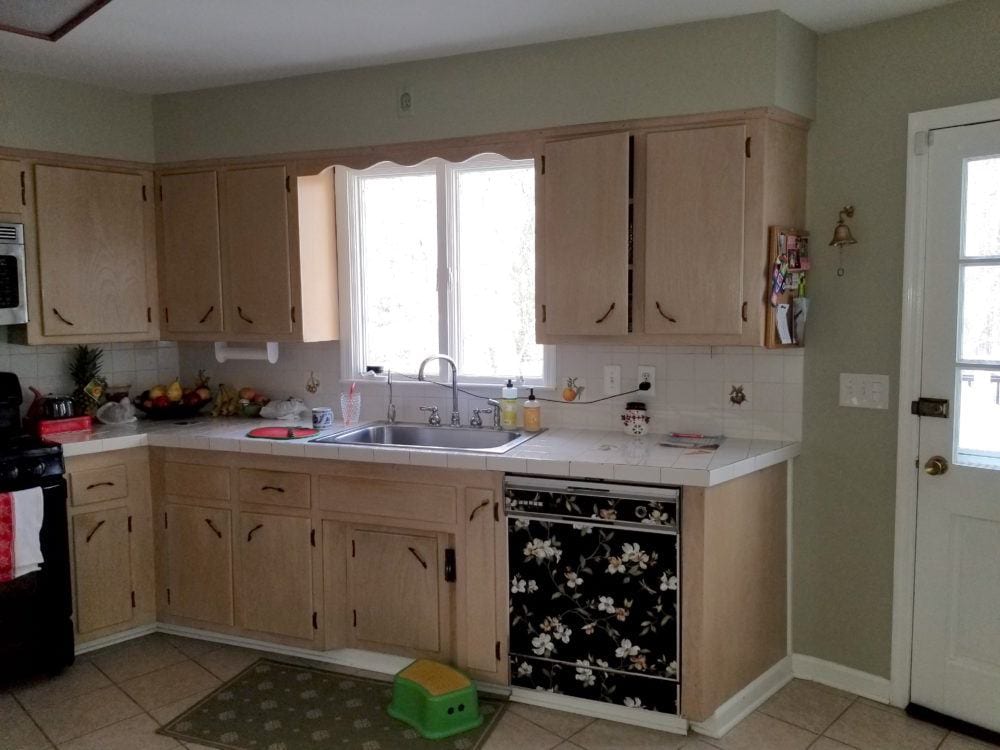 And here we can see the bizarre angled hardware.
But, there’s a whole wall of it on the other side of the room!
Actually, Mrs. F put the floral paper on the dishwasher after she read this post about clever ways to make appliances look better.
This was an interim measure shortly before the dishwasher died.
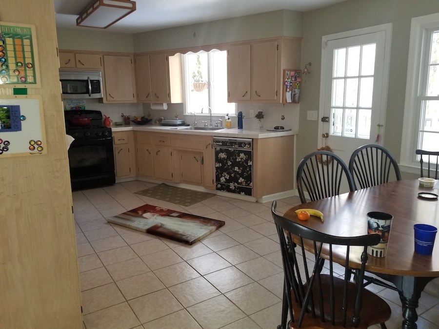
The ceramic floor is pretty icky poo.
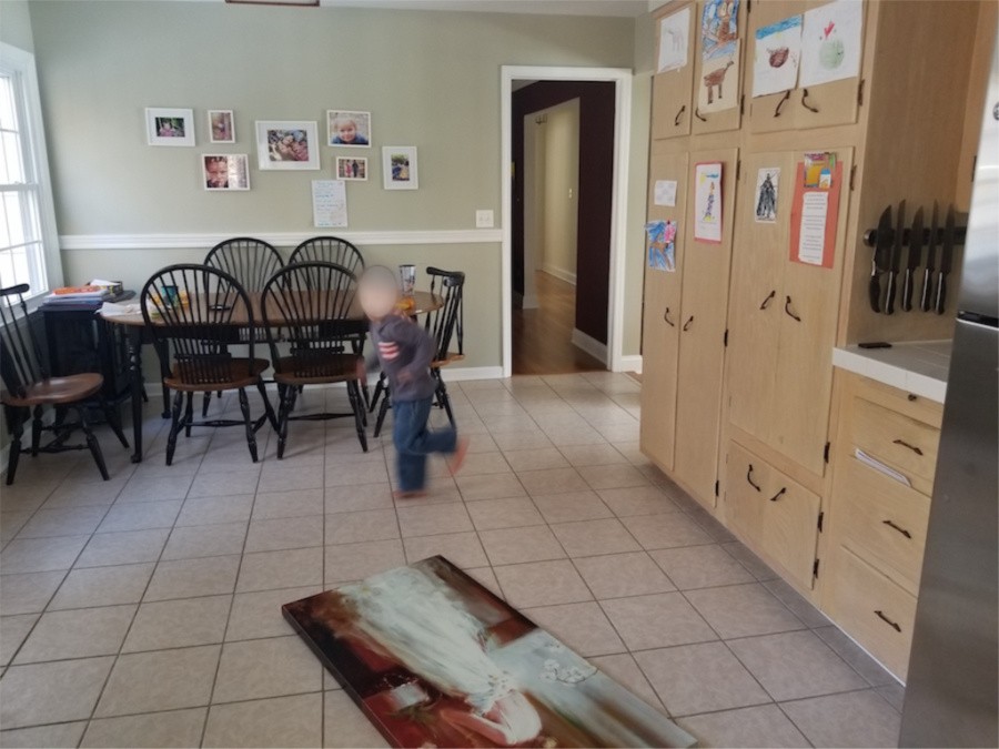
This is a home in a very expensive part of Westchester County. But, this kitchen certainly doesn’t convey that.
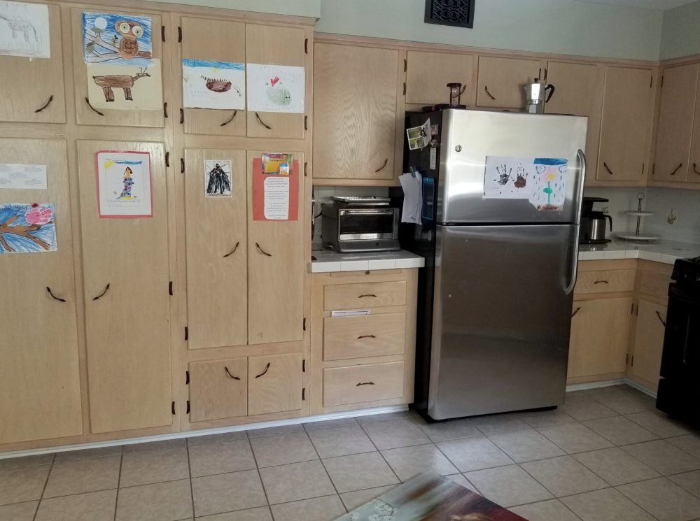
Pretty bad.
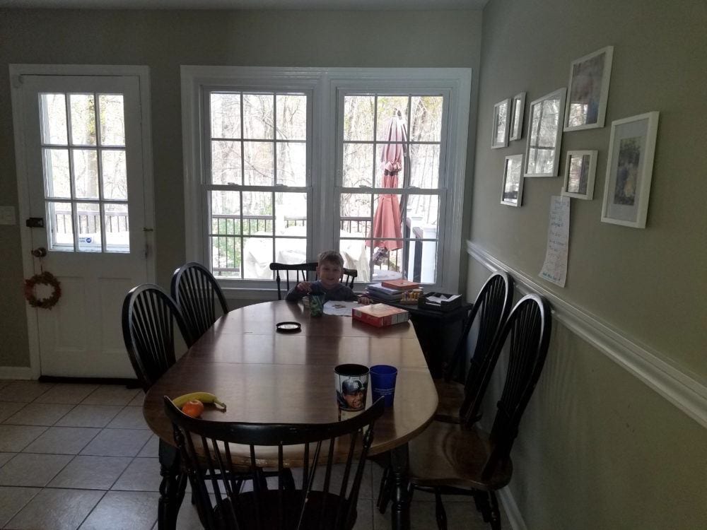
And, the eating area.
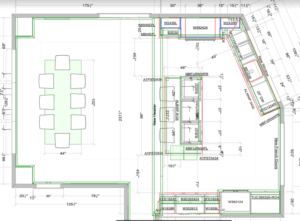
I did not design the kitchen, but I did consult with Mrs. F on a number of occasions. And, she always ran everything by me. We went back and forth for a time with whether to remove the wall between the kitchen and the dining room.
As you can see from the floor plan above, down the wall came.
Okay, for this post, I don’t have certain details, but will get them to you later on for when it’s all finished.
Early on, we decided on a white kitchen with a simple shaker cabinet.
Mrs. F chose a kitchen designer she felt comfortable with.
And, then she presented the plans to me. Most of it was fine except for the fridge wall. But, I’m not going to address that for today.
One thing that tickles me is that Mrs. F actually reads these blog posts and has been inspired by many of them.
One of them was this post featuring the hot tile known as zellige.
And, so she contacted Cle Tile…
Then, she sent me an email telling me what she had done. That’s fine. I love it when clients run with a good idea. I think she did run it past me first. But no matter, the tile looks awesome!
A few months ago, we selected hardware from Rejuvenation.
At that meeting last spring, we selected the cabinet door style and chose one of the stock white colors which looked soft and not too white.
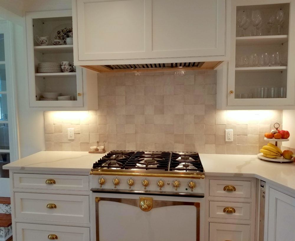
Then, after reading these seven posts, Mrs. F decided on this La Cornue range (below), even though it wasn’t in the budget. But, it’s a showstopper!
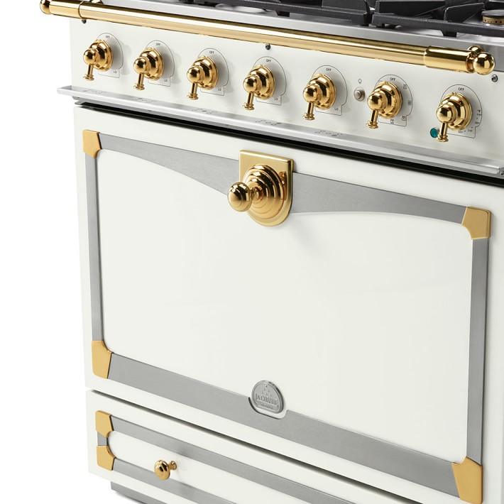 You can get a range like this here.
Okay, let’s look at some after pics. But, bear in mind that these are just some quick images Mrs. F took. Nothing is styled.
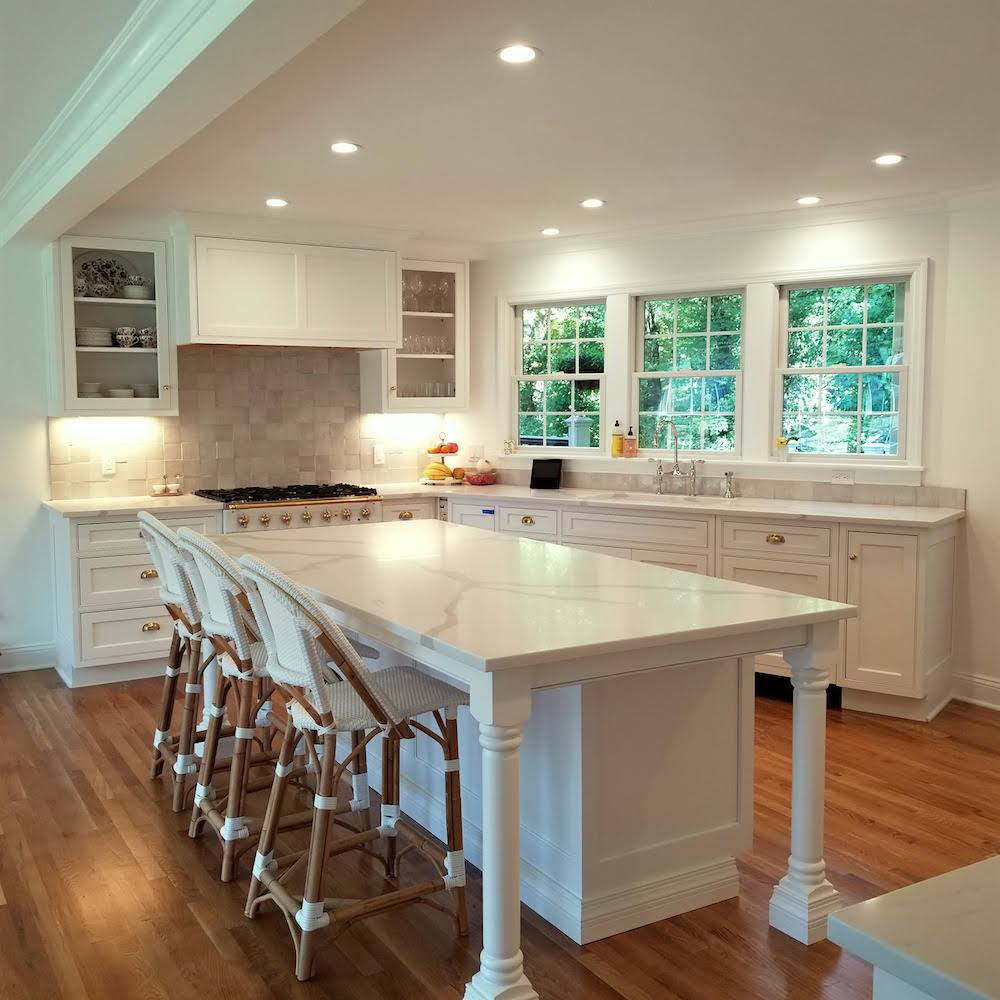
No more horrid kitchen!
Please note the range hood. Thank you Nancy Keyes for giving me the inspiration.
You can also see a similar hood in the kitchen Nancy designed for Melissa Tardiff.
Mrs. F showed her kitchen designer Nancy’s hood. That was easy.
And, yes, those are the Riviera stools from Serena and Lily.
Of course, Mrs. F got them on sale! (right now get up to 30% off on bedding and beds at S&L) As you can see, the contractor added two more windows to the sink area.
 And then Mrs. F ordered my favorite faucet from Perrin and Rowe (Rohl)
To the right of those windows, instead of the single door and double window, they put in a pair of French doors. This gave back the space to add cabinetry for the pantry, fridge and built-in hutch.
But, you’ll have to wait to see that because someone messed up and they sent the wrong doors.
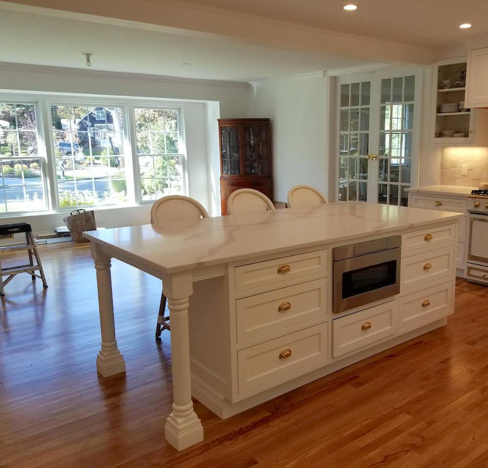
Now, we need to decide about the kitchen table, chairs, lighting and window treatments.
Yes, ideally, we should’ve, no wait, *I* should’ve done this weeks ago.
But, I am liking how light and open things are now.
I had told Mrs. F to go ahead and get the Serena and Lily Riviera stools. We’ll figure the rest out later.
Now, please listen to me carefully.
Don’t do as I do.
Do, as I say. lol
Make a complete plan. Do not order pieces ad hoc.
But fine. We’ll just do the coordinating chairs for the kitchen area.
Right?
Oh, wait. Mrs. F is wondering if that’ll be too much?
Well, it’s a good sized room now and I think it’s okay to have the stools and chairs match. But, even though I had already taken a couple of hours trying to figure something else out, I decided to take another stab at it.
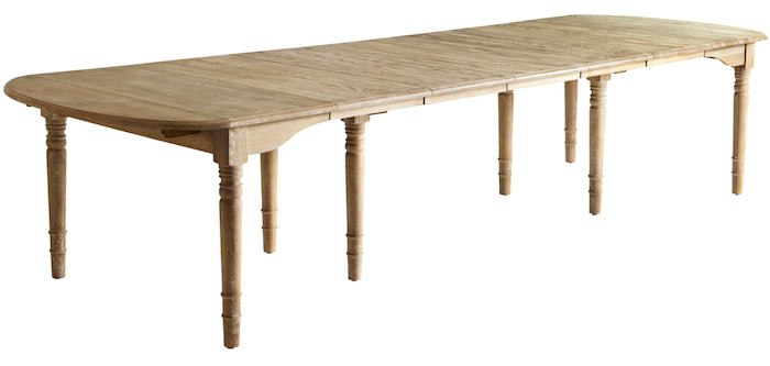
I had already decided on this wonderful oak farmhouse table from Wisteria. (discontinued as of March 2020) It can go from a table for four to one that you can squeeze 14 around. And, it’s currently on sale at Wisteria.
I like the light wood and also that the turned legs feel at home with the kitchen island.
For everyday use, the Fs will not need all five leaves.
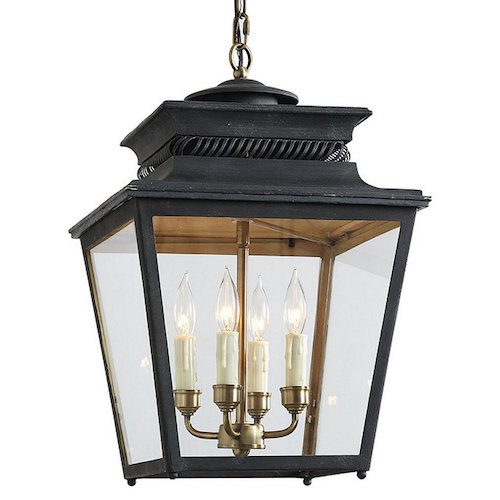
Then, I found these lanterns that are the perfect size and style at Ballard Designs. It comes in three other finishes, brick red, dark blue and white. I love them all, but think the dark bronze is best for this space.
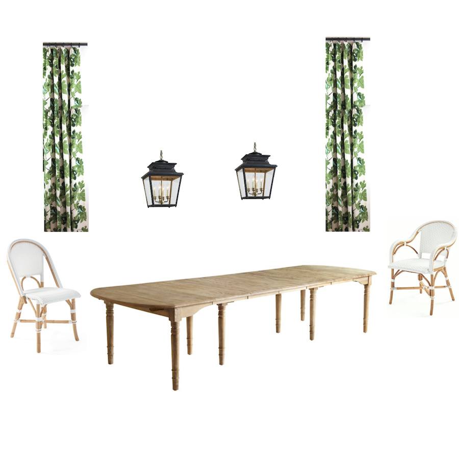 Above is the first board I made. I use Picmonkey to make all of my mood boards. If you’d like a free tutorial for how I use picmonkey, click here.
I’ve been making mood boards for clients since about 2010.
I think that most designers make them these days. But, I find that putting everything together is one of the best tools for conveying how everything will look together. It gives both the clients and myself more confidence that everything will look great together. And, in the long run is a huge time-saver.
The draperies are out of Peter Dunham’s modern-day iconic Fig Leaf fabric. Some of you may recall I used it for pillows in one of the mood boards in the Laurel Home Paint and Palette Collection
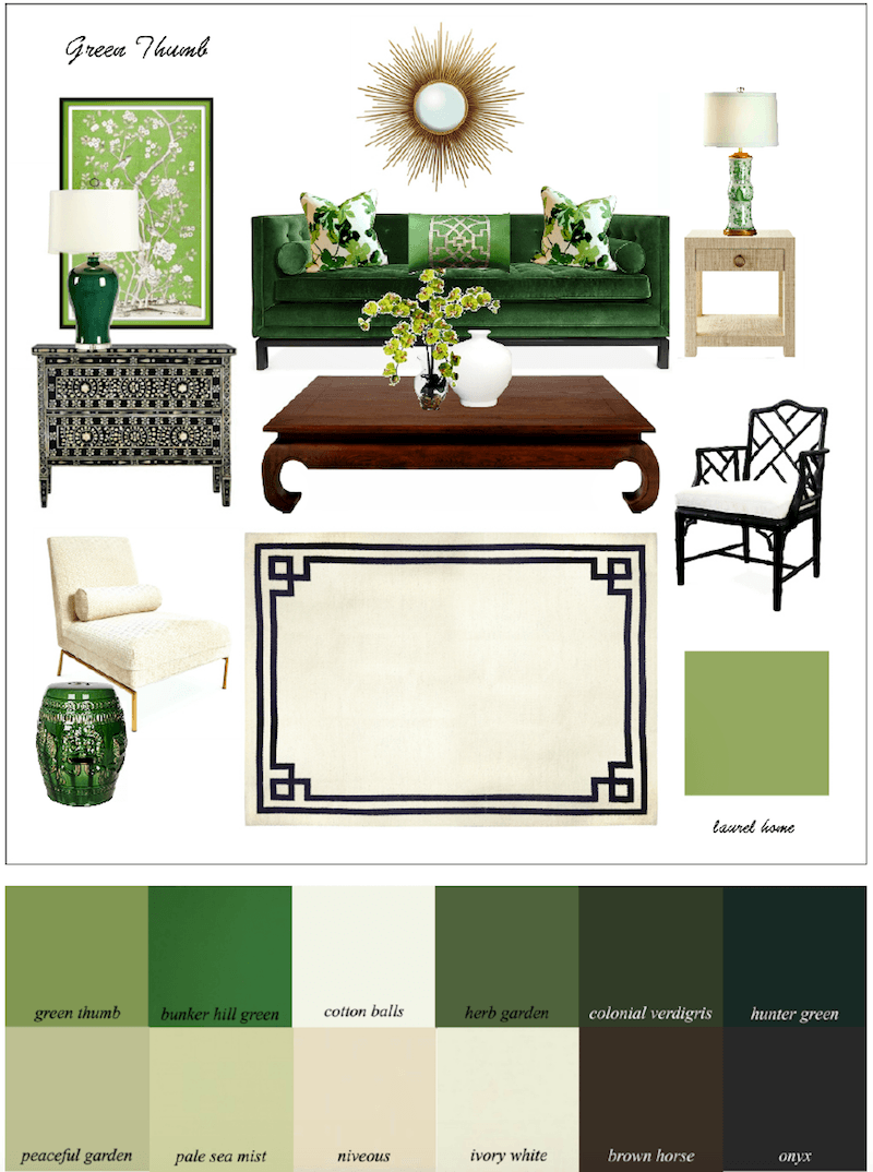
This is one of the first palettes I created. I love this analogous color scheme of greens.
But, let’s scroll back up and look at that window again.
Ugh.
Why is there a niche AND a soffit???
I do not like to do such short drapes, so that means Roman Shades. That big window faces the road and yes, folks can see right in.
No bueno.
But, those three big windows will need three big shades.
However, Roman shades when down are never a good look in this case. It’s just too much dangling fabric even with a pleat or two at the bottom.
Oh, BTW, we know that the pretty cabinet is too large for that corner. It was inherited. And, I’m all for making inherited pieces work, but we would need about six more inches of wall on each side and we don’t have that. So, it will be on its way soon.
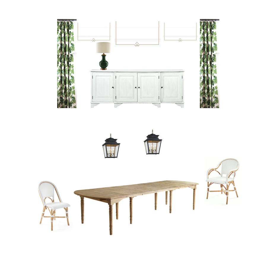 Above is mood board #2. My solution is to put a long sideboard in front of the window.
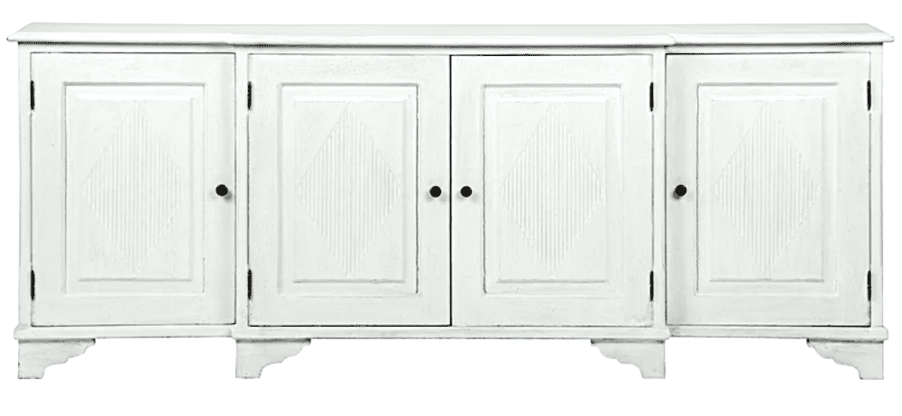
That way, the shades will not need to go all the way down and the Fs can have some privacy. The sideboard above is from one of my favorite brands, Noir Furniture. I’ve ordered from them for numerous clients and myself! You can purchase this piece at Wayfair for a very good retail price.
There might be an issue with the placement of the lanterns. We’ll work it out.
Back to the chairs. Mrs. F is always so sweet and that makes me want to work extra hard for her.
I was determined to come up with another idea for the dining chairs.
The chairs need to coordinate with the stools so that means there must be some white. And, they can’t be too formal.
I looked
and looked
and looked…
Finally on One King’s Lane I was reminded of Selamat. Selamat is one of 100s of wonderful sources in Laurel’s Rolodex that you might not know about. You can find most of the line at One King’s Lane.
And, then I found a terrific chair that’s brand new at Selamat!
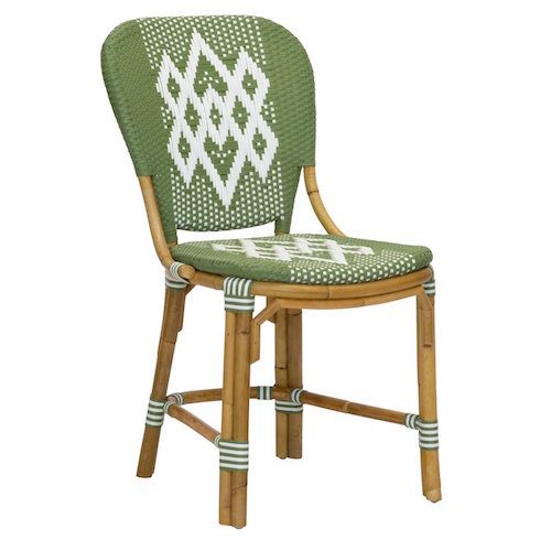 Hekla Chair Bistro Side Chairin green from Selamat
This chair is based on a William Morris design when he was in Iceland in 1871. And, it is named after the Hekla volcano in southern Iceland. The chairs are hand-crafted with a synthetic weave over a rattan frame and can be used indoors or out. I love doing this type of indoor/outdoor chair in kitchens. They are so practical, but also great looking.
There, is also an armchair version of the Hekla side chair; however, I thought it would be better to go back to the Riviera Arm Chair from Serena and Lily.
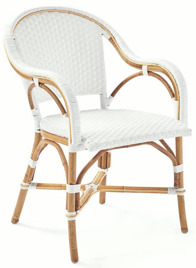
The Riviera arm chair from Serena and Lily for the ends of the table will tie everything together.
So, I made one last board and this time took away the curtains. This is a far cry from the once horrid kitchen and so-so former dining room.
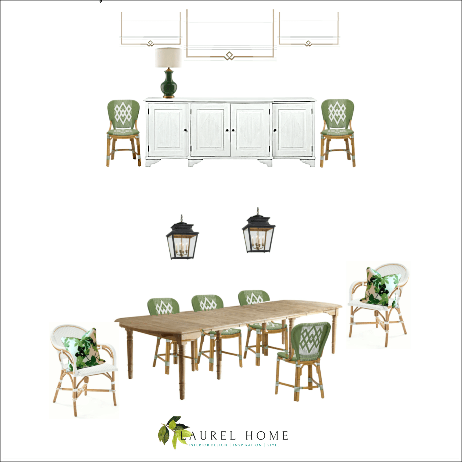
I didn’t discuss the Roman shades.
Some time, maybe a year ago, when I was messing around, I found some Roman shades with trim something like these, on the board. It is purely coincidental that they look so fab with the chairs– And sideboard.
I think that Mrs. F is liking all of this. But, we need to bring in some more green to the kitchen side.
No worries. I’ll figure it out!
It’s probably going to be several more weeks, but I’ll do one more post when the kitchen is all finished. It’s such a pleasure to see this horrid kitchen turn into one that’s a fresh country kitchen for a growing young family.
xo,

PS: Please check out the newly updated Hot Sales!
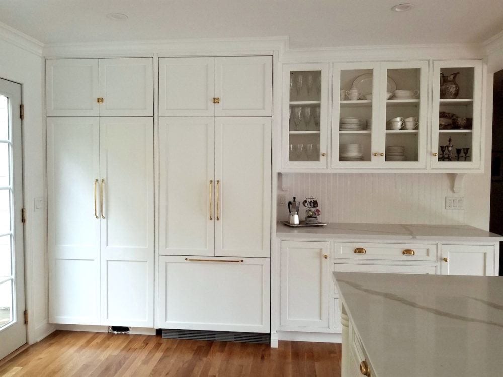
Edit – November 10. Here is the missing fridge wall. I LOVE how this turned out! In the original plans the piece on the right had nothing about it except a huge ugly VENT. Oh, no, I thought. We can’t have that!
In case you’re wondering all of the beautiful hardware is from Rejuvenation.
Related Posts
 Dated Kitchen And No Money – Can It Be Saved?
 I Just Inherited All Of My Granny’s Hideously Dated Living Room Furniture
 12 Of The Hottest Kitchen Trends – Awful or Wonderful?
 9 Fabulous Shades of Green Paint and One Common Mistake
 Difficult Windows – Window Treatment Dos and Don’ts
 Common Mistakes When Choosing The Best Pale Blue Paint
 Ranch House Decor Mistakes You Might Be Making


