Here’s What The Classic Homes Of Tomorrow Will Look Like.

Dear Laurel,

Thank you for all of the recent posts about your trip to England. But here’s what’s bugging me. And it’s not just you. I can’t seem to get a handle on my style. Because I pretty much dislike everything I’m seeing.

And yet, my husband and I are going to be moving out of the city soon and I sure wish that we had a handle on what kind of house to live in– and HOW to decorate it.

And no, that’s not a come-on for help. I guess a lot of people need help.

Most of what I see doesn’t resonate with me. I don’t want to live in a cave, no matter how charming. Sorry, I can’t stand to have a lot of stuff around. I can appreciate that others like it, but it makes me nervous.

I really don’t like modern furniture either; definitely not into mid-century.

And I’m done with gray.

Do, like color

But no matter what, I never seem to see what it is that I’m looking for.

Oh wait. The post you did on the English kitchens a while back. I LOVE those.

Is that a clue?

Are there other people who are also confused?

What does someone do if they don’t like old-fashioned traditional OR anything too modern.

Is there something else?

Yours Truly,

Amalgam Reader


Hey Guys,

Did you like that note? Yes, it is an amalgam of some of the comments and emails I’ve received that aren’t so keen on a lot of stuff around, even if it’s curated.

And that’s because I saved two houses that we saw and they were the last two houses on the tour of my recent trip to England.

They fit in perfectly, I think for those of you who aren’t quite feeling it with the “lived in” look but aren’t keen on the boring American look that prevails today.


Both of these homes are the work of Adam Architecture a prestigious firm in Winchester, UK lead by classical architect Robert Adam.


And yes, in brilliant irony, he bears the same name as the legendary 18th century neo-classical architect Robert Adam.

Although, I have to say that I far prefer the more dashing younger bro, James (also an architect but not as famous.) Or maybe I just love that sexy frock he’s wearing. But, notice the pencil compass he’s trying to hide? (or use to kill the painter. not sure.)

Whoa! This is how dudes dressed to go to work back then? I mean, it’s not exactly “casual Friday,” is it? ;]

But maybe it was their way of them saying, “Hey, just so you know… we’re gentlemen. We don’t HAVE to work. We’re just doing it because we’re damned good at it. And oh… it’s a great way to pick up chicks. hehehe”


okay, enough of this silliness. maybe. ;]


Our latter-day Robert Adam is far more pragmatic, but still quite nattily dressed. Of course, he was expecting us. In fact, they served us a lovely tea (lovely is redundant, I guess since tea is always lovely!) and then gave us a tour of their facility which has 80 employees– architects, draftsmen, techies, support staff. Quite impressive!

You may recall that we visited Robert Adam’s charming home last Sunday.


There are only a few photos of the first of these two classical homes we visited.


This is a house, originally built in the late 18th century and renovated by Adam Architecture. Apparently, it was a big wreck before they got a hold of it.

Now, it is a warm, inviting family home which still has the antique appearance without the decay.

Classical Home Beauworth manor Adam Architecture Renovation

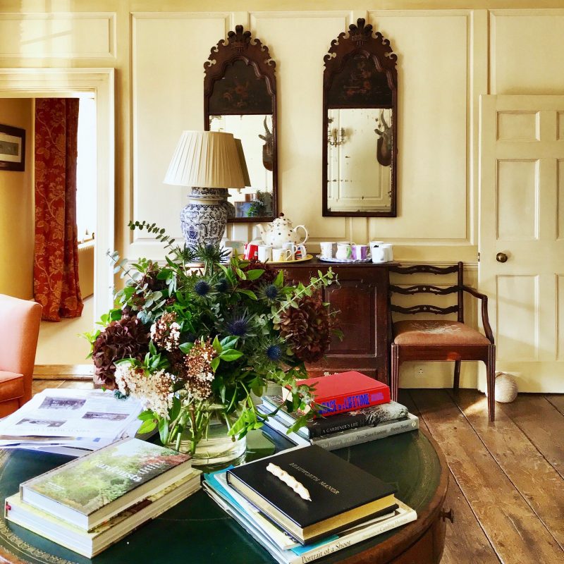
The exterior was rather plain, but when we went inside, we were greeted with this lovely, warm vignette and more tea!

The wall paneling is a warm butterscotch color with a strie glaze.

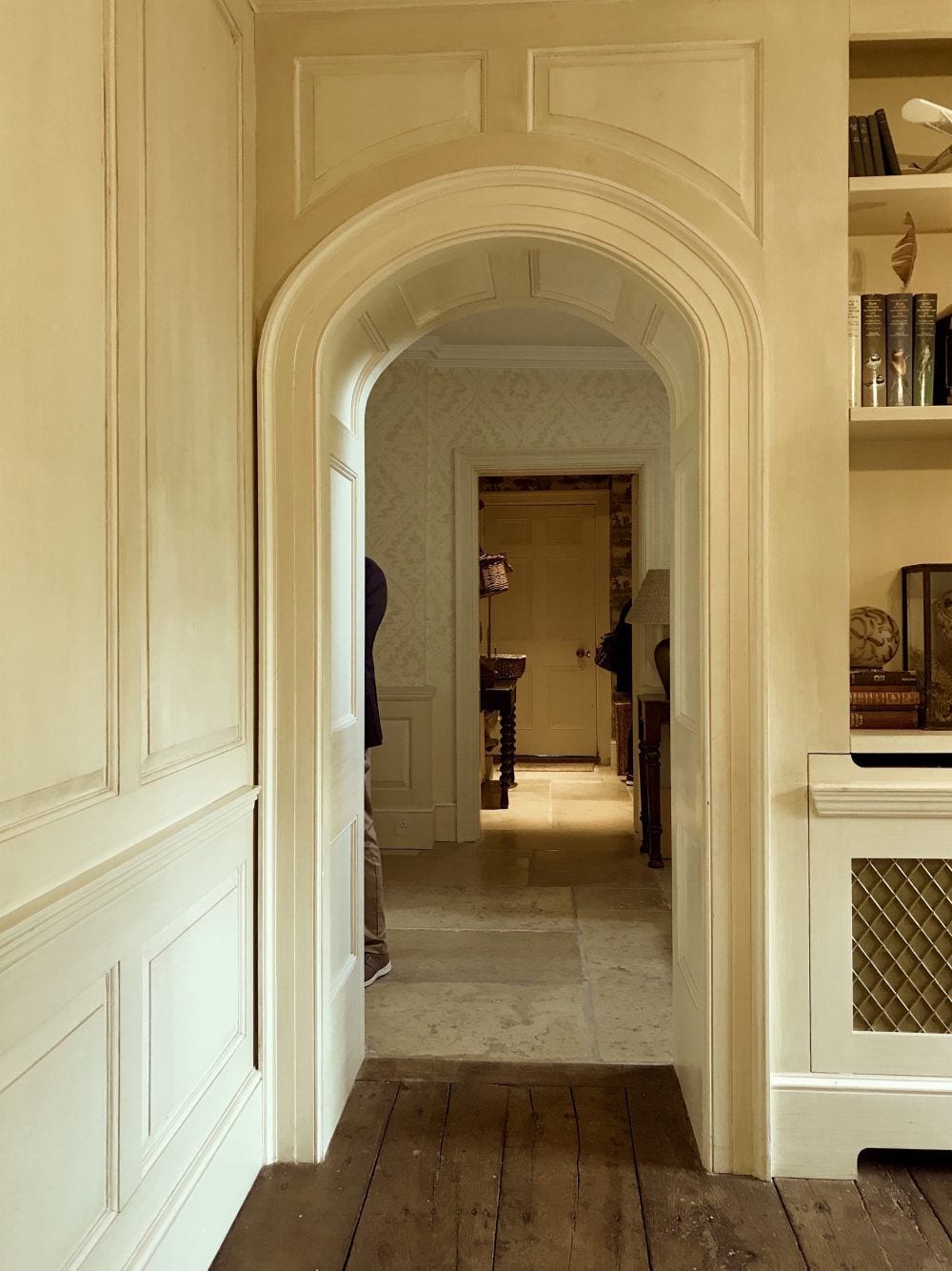
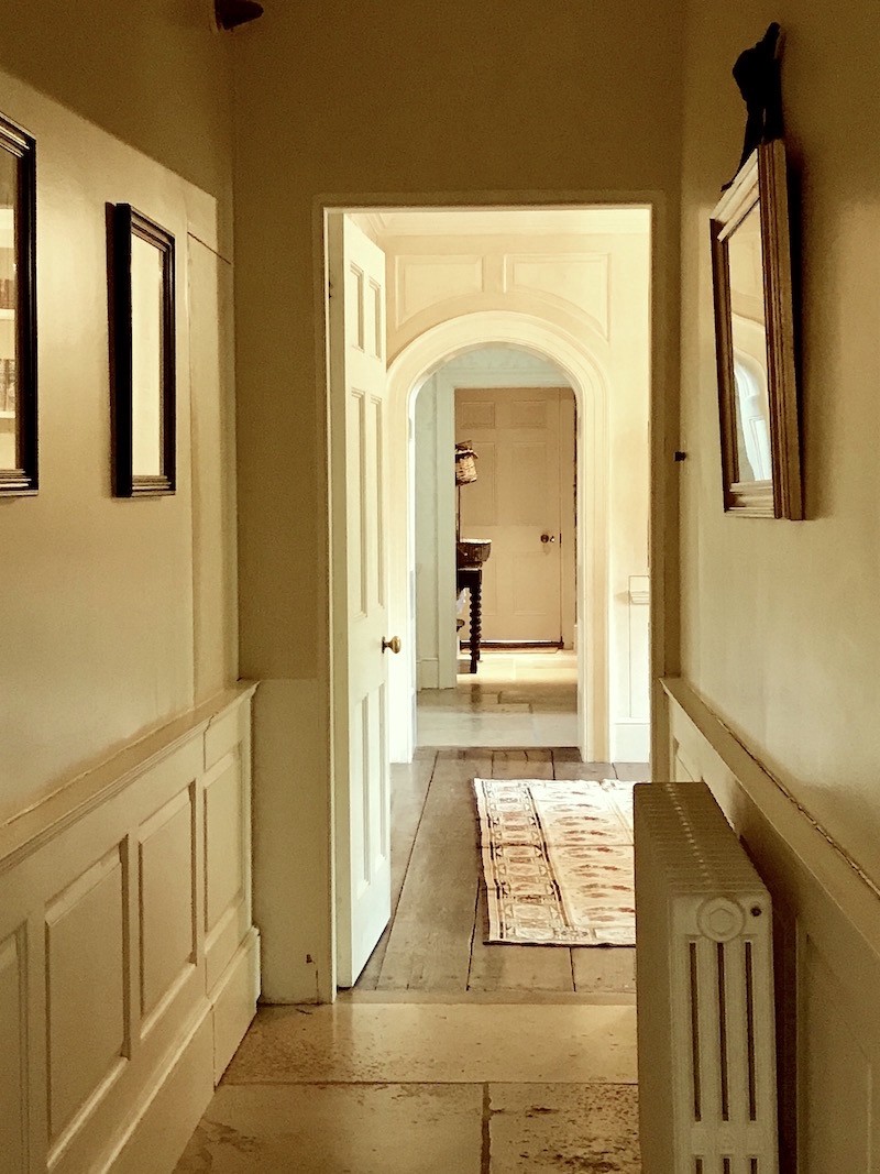
Two shots of an enfilade in the rear of the home.

I should do a post about enfilades! (where all of the doors line up on one end of a room to create a hall of sorts)

Beaumont Manor, Hampshire, photographed by Alun Callender for Country Life


Love the stencilled pattern on the walls.


We need to move on now, however to the last house of the tour.


This is one of the award-winning classical homes by the amazing George Saumarez Smith one of the principal architects and rising stars of Adam Architecture.


The future of classical architecture in Great Britain. From left to right. Francis Terry, George Saumarez Smith and Ben Pentreath.

This photo was taken the day before during our tour in Poundbury by our tour guide Clive Aslet for Classical Excursions.

(those all link to their instagram accounts. Please follow them if you aren’t already. And please follow me too!


Back to the house!


George met us there and gave the tour. Helluva nice, unassuming young man, he is.


I didn’t hear a word he said.

lol


Not because I wasn’t interested. I was in a kind of design-trance.

You’ll see.


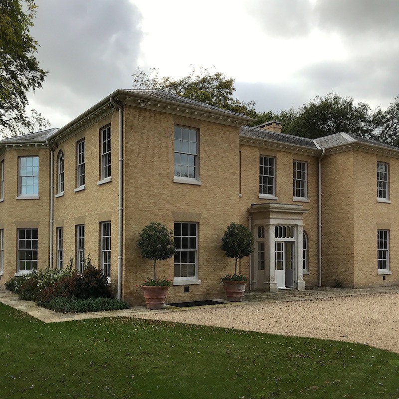
The exterior of the home in Hampshire designed by George Saumarez Smith.

Can’t believe that this is my photo, just because it’s nice and straight. BTW, they are all mine, unless otherwise noted. Of course, I have to wait until everyone clears out to get these shots. Not easy!


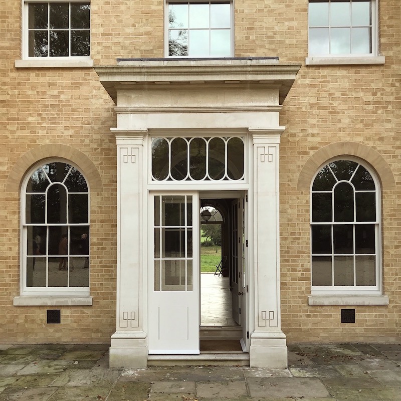
The front door. I remember that we all lined up like planes waiting to take off to get “the shot.”

I noticed the detail on the pilaster and it was then that I knew that we were in for something special.

What is extra special about this particular classical home is not only George’s exquisite design, but also the homeowners way cool furniture and their extraordinary use of color.


Let’s go inside.


Looking back out the front.

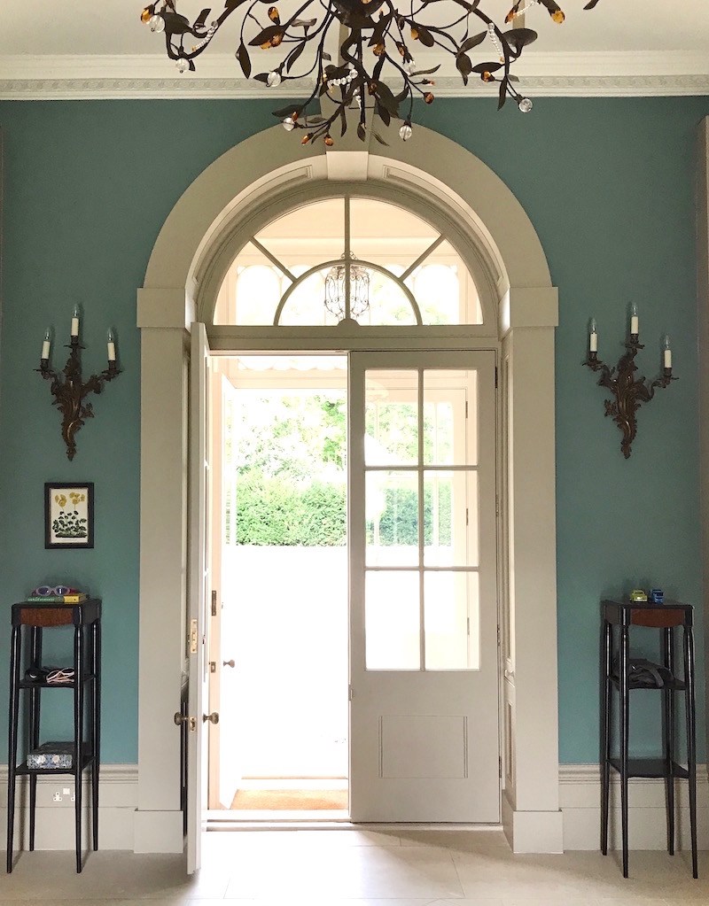
The entrance is quite large and doubles as a dining area at times, I believe.

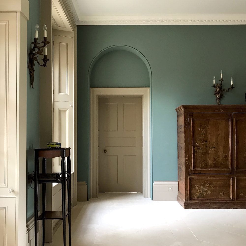
Let’s move around full circle to see all four walls.

classical homes - in Hampshire, UK entrance

All of the windows have these shutters which are to die for.

Believe me. I was dying. Look at that unusual armoire.  Gorgeous!


Everyone went gaga over the gorgeous teal walls!

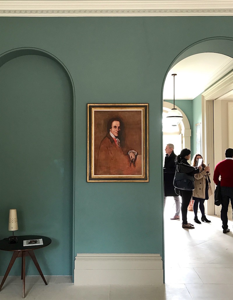
Fabulous colors, me thinks.

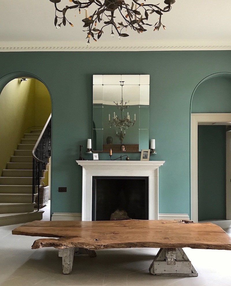
That’s quite a table! Do they sit on the floor? Not sure. I would happily sit on the floor.

I’d sleep here too!

And yes, just to prove I was there, you can see my little face in the mirror!
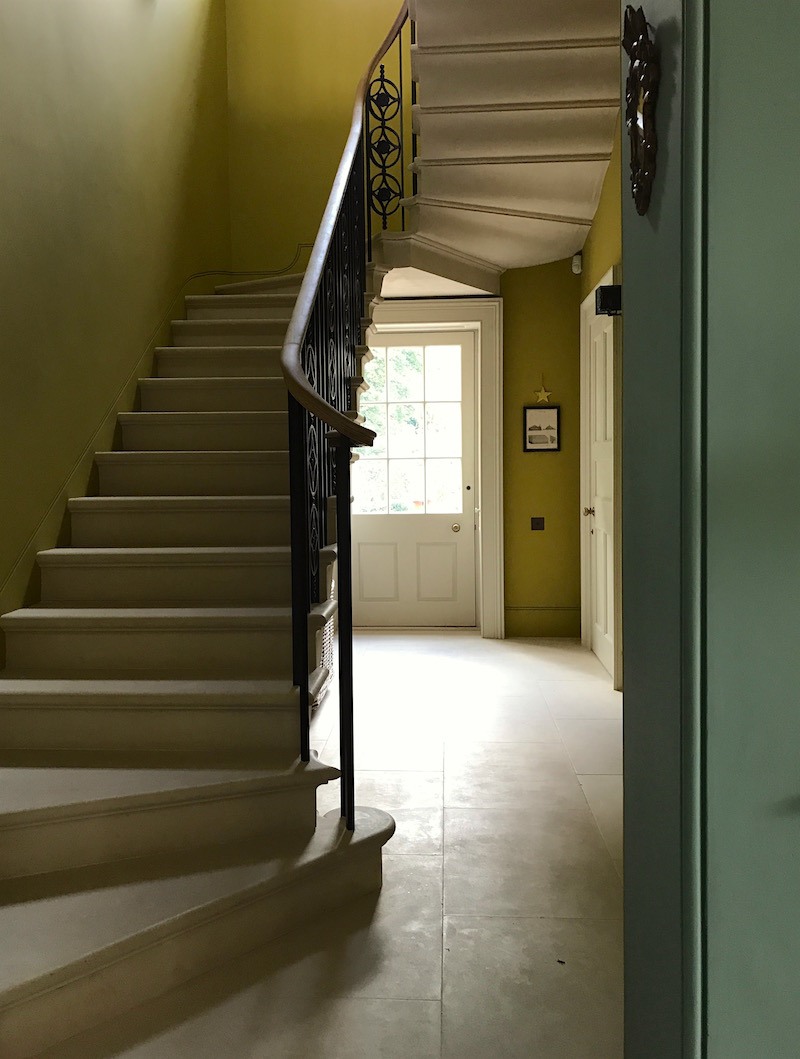
The staircase.

Oh my!

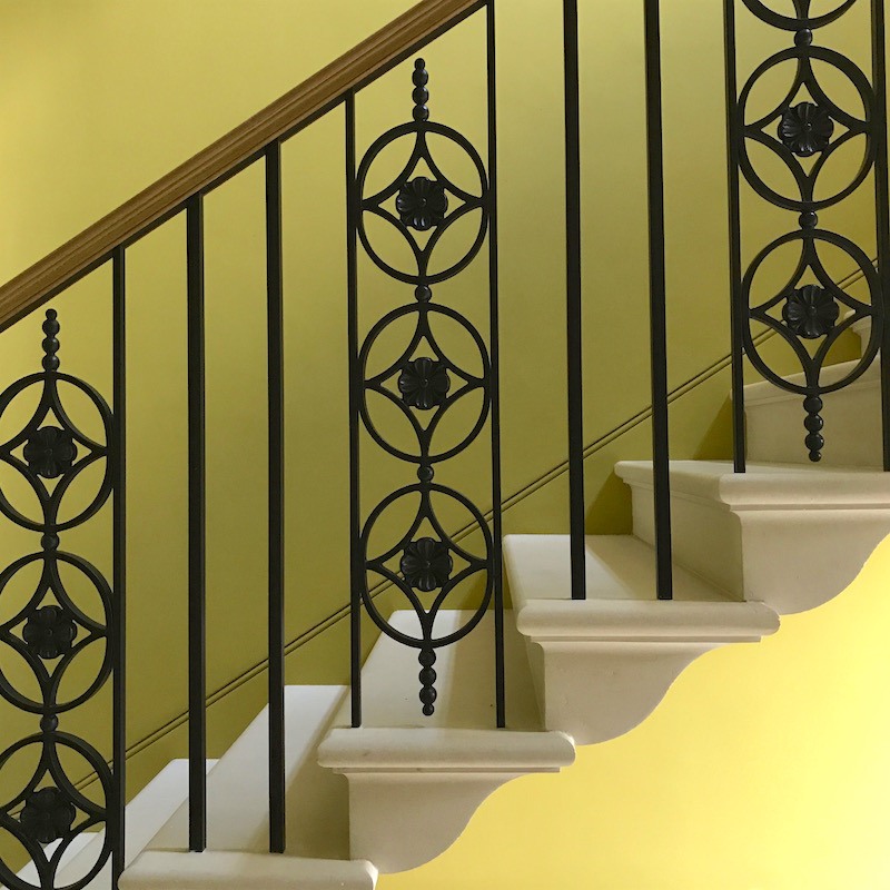
Adam Architecture is very big on these amazing cantilevered stairs. It’s quite a feat of engineering, but apparently, they have it down. We saw them in a few houses. Fabulous railing design by George!

And the color made my heart go pitter pat! I have often paired this kind of olive, yellow-green with teal but I rarely see anyone else do it and here it is!


Let’s go upstairs for a sec.


A very long, wide hall bisects the entire second floor.


And at the end lives this jaw-dropper.


The entire place is a jaw-dropper.

Oh wait. I do remember hearing George say that he had his reservations about the wall color when he heard about it, but he conceded that it’s indeed fabulous after it went up!


I love it when my clients are right about something I hadn’t thought of.


Everywhere you look are gorgeous details.


George Saumarez Smith Adam Architecture Classic Homes antique brass hardware door

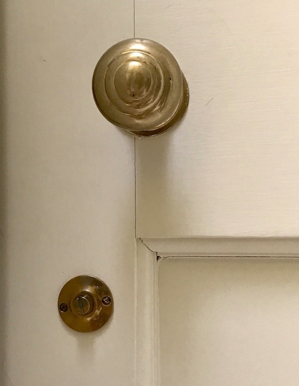
Like these awesome unlacquered brass door-knobs.

I wonder where they are from?

Anyone?


Back downstairs


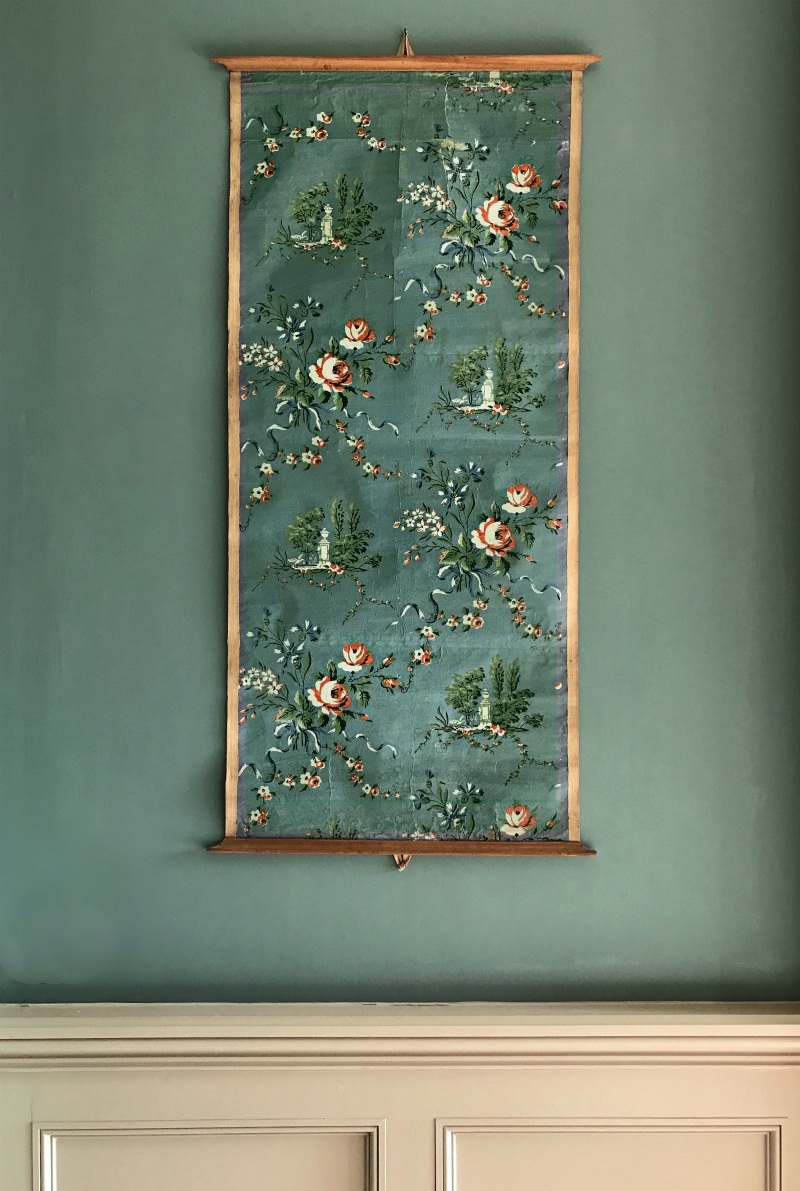
I went through the center hall behind the grand entrance…

where I got a shot of this tone on tone Chinoiserie hanging. There are two of them flanking the door to the kitchen on the left.

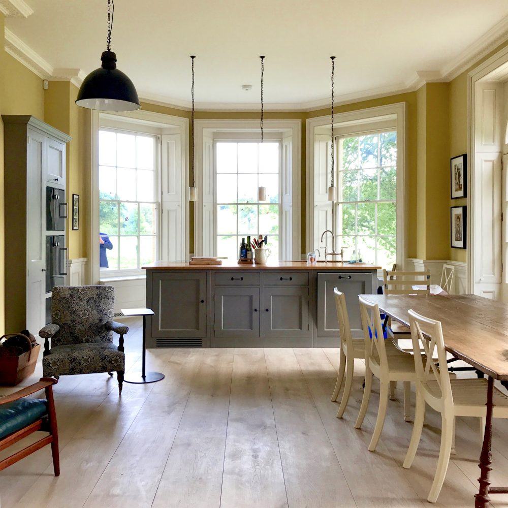
Yes, folks. This IS the kitchen.

Do you have any idea how long I’ve been dying to show you this!

THIS is what I’ve been talking about!

This is the quintessential “unkitchen.” (my word.)

You don’t even realize that it is the kitchen!


Now, here’s where I screwed up.

Behind the cabinet on the left is a door. and behind that door is the pantry. (larder.) However, when I went to look at it, there were at least 3 people in it. And then I forgot to go back and take pics of it. Sorry. And I looked for it online somewhere. But nope. But just know that it’s wonderful! And it’s where most things are stored. Out of the way, but super convenient.


Are you neat freaks people who can’t stand clutter enjoying this?


I thought that you would! ;] I mean, who wouldn’t? This was everyone’s favorite home.

You could just feel the endorphins swarming through the air!

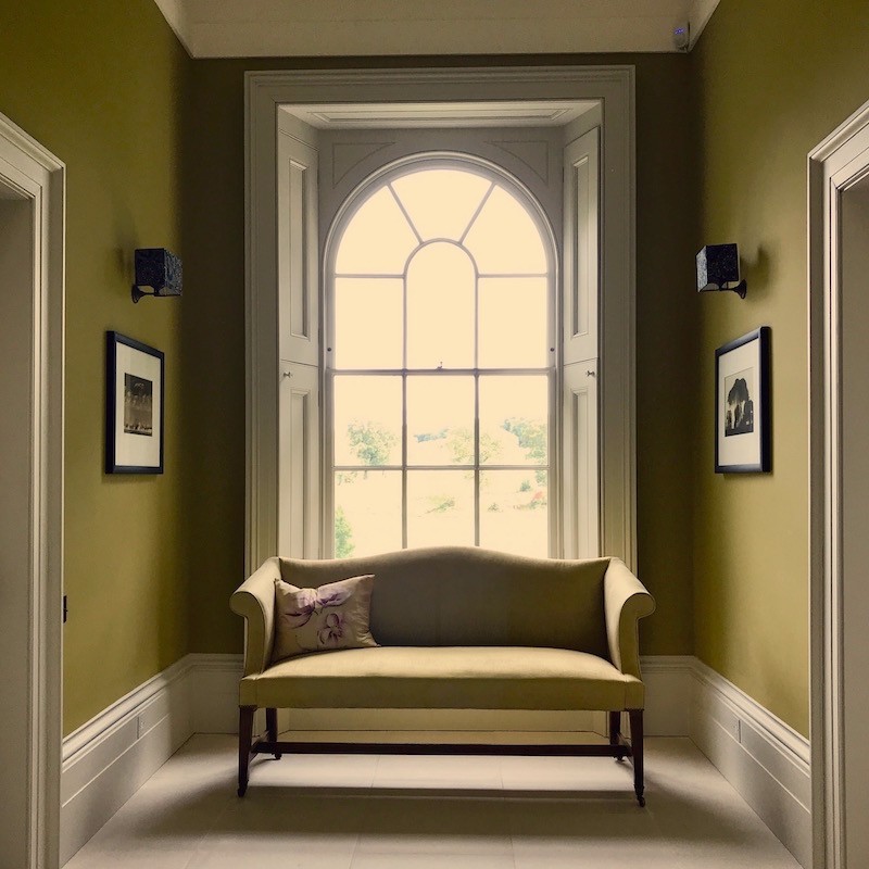
Across from the unkitchen lives the living room. Oh man, what do you Brits call this room?

Oh no matter.

I was in yet another pig heaven.


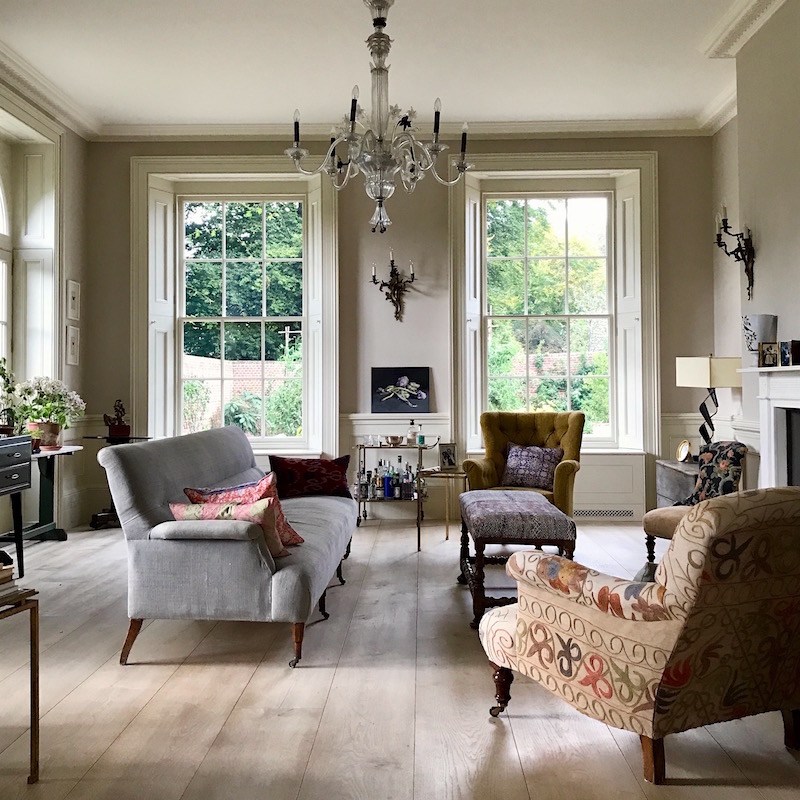
The architecture! Furniture! (human scale) That chandelier!


Let’s talk about that sofa!!!


That sofa does not exist in nature. haha

But it should!

But this is exactly what I’m talking about when I’m talking about a beautiful sofa.

What is it?

Well, I am pretty sure that it’s a refurbished antique.


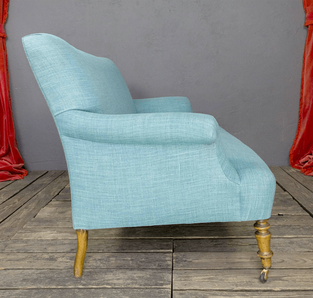
Something like this one from First Dibs, but sorry, it’s sold.


The style is definitely Napoleon III which were made in the late 19th century. However, I have never seen a settee/sofa this long. More commonly we see the chair version.

This sofa is quite long and I did sit in it.

Supremely comfortable!

And aren’t all of the fabrics interesting?

What makes it all look so fresh is the fact that there’s no rug and no window treatments.

And I adore the pale scrubbed floors. Sorry, I do not know what kind of wood that is.

Anyone have an idea?

The chandelier is definitely Murano glass.

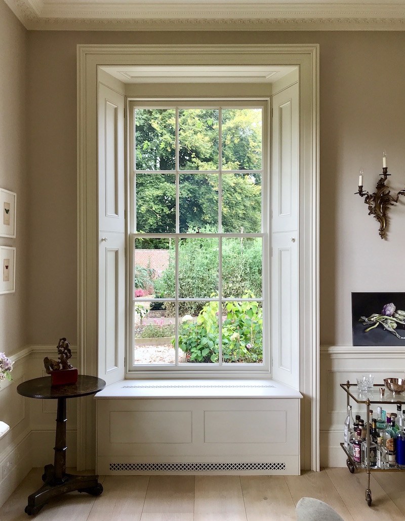
Here’s a detail of one of the four large, shuttered windows in the living room.

These windows make me a little crazy. (the good kind of crazy)

And look where the heat comes out. How pretty!

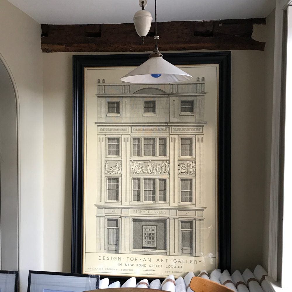
We finished off our tour at the office of Adam Architecture

And as we were going on our tour of their offices. (stunning)

I took a quick snap of this awesome drawing.

I did not realize until today that it’s a drawing that George did of his design.


I am not at all surprised.

And here’s the finished building.

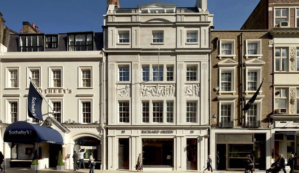
Richard Green Gallery, New Bond Street, London designed by George Saumarez Smith


And this concludes the series of posts about my trip to England.


I hope that you’ve enjoyed it. I’m looking forward to following these illustrious designers and seeing the beauty that will be part of the legacy of classical design and architecture in the 21st century.

xo,

PS: getting very excited about the release of the updated Laurel’s Rolodex on November 1st. Two more weeks and please don’t forget that the price is going up on November 13th. Everyone who purchases a rolodex is entitled to free life-time updates.

And if interested, please check out the hot sales pages.

full of some of my favorite home furnishings on sale this week!

58 Responses

  1. Hi there Laurel -such a lovely post! Thank you for sharing such a fantastic experience.

    The wooden floors in the sitting room might be from Dineson given the width and length of of the planks…

    The teal and chartreuse colour combo is stunning. Wondering if the teal is a cut down Vardo from F&B…?

    Have a great day!
    Andria

  2. What gorgeous colors & lines! I actually sighed w/relief; this house was such a desperately needed change from the mid-century modern I can’t stand. Also, thanks for sharing so much of your expertise & experience with all of us.
    Your blog came up several times when I started looking for paint colors…last year (finally bought the testers last week 😮 ). BTW, you convinced me that gray is not the nastiest non-color on earth & will, in fact, be the color for my LR.

    WHAT I’ve most appreciated are your thoughts on furniture- scale, quality brands, etc.- and the posts on fixing regular people’s design missteps. In the recent one with the lipstick red couch & floral valances, you said the there were several problems with the scale/proportion of things. I hope you’ll discuss this more in the future. I’ve used those terms to search your posts (thank you VERY much!),and I’m pretty good at recognizing problems– but only AFTER the fact. How does one avoid it beforehand? Ex. I was about to create small, plain pelmets to cover the tops of white Tenerife embroidered tablecloths used as curtains until you said that any valance in such a small room would be overwhelming. Thanks for saving me all the effort! Thanks for all your hard work & good taste! Sorry for the long post.

    1. There are numerous times when proportion is talked about. But proportion is a relationship of things to each other. But some are constants, like ceiling height and the size of the people. This is where it helps to have a good designer who understands proportion. It’s not that easy to get right and oftentimes, it’s a matter of experience and doing it wrong a few times.

      It’s not an exact science most of the time.

  3. Beautiful, simple, classic, timeless, are all words that come to mind as I view these gorgeous homes. I was particularly interested in seeing their choices for floor coverings and was surprised to see very few, or, very understated floor coverings at all.
    I have a dilemma as I’ve recently inherited some beautiful, classic Persian rugs with the traditional red and navy color scheme. I love, love, love blues but don’t have a bit of red in my home. I thought surely these classic homes would also have the traditional classic oriental rugs; I was so looking forward to see how they were incorporated without making the homes ‘stuffy’ or dated. Is this the Universe telling me that traditional oriental rugs are out?
    If I do choose to use them can I stick to just the blues and pretend the red isn’t there? I’ve read your post from the imaginary woman who inherited a neutral-ish oriental rug and how she could incorporate that into her open floor plan but neutral (or predominantly one color) seems so much more clear cut than deep red and navy. I suspect you wouldn’t see these traditional rugs in a house with teal wall… sigh. (Btw, to add insult to injury I don’t live in a classic, Colonial style home. I live in Colorado where I’ve yet to be able to label the houses with the name of a particular style or time period…just a practical home with an open floor plan and breathtaking views of the Rockies).

    1. Hi Laura,

      There are a few posts on the blog about oriental rugs. Sorry, I’ve hit a wall tonight. verrry tired. I saw lots of Oriental rugs. Sorry, just really tired.

  4. Wow, I think I’m finally understanding the un-kitchen and I love it. So comfortable looking. Not a bit of MF SS and granite!?! Imagine that.
    That teal room with the baseboards that stop just so in such a genteel fashion, oooh I love that.
    “Enfilades” looks like a fancy word for a fancy shotgun house. I never knew my grandparents old farm house was actually all enfilades…what is this, adjective? Verb?
    The no curtains idea is delightful but I do do think a large area rug would warm up that sitting area with skinny legged settee.
    I’m speechless with all the beauty, sorry I can’t form a rational sentence.
    Thank you!!! You are so good to us!!

  5. The colors in the last house!!! I can’t tell, between my computer screen and the different lighting in the rooms: how many colors are there, all told? Teal, olivey-green, gray? Yellow in the kitchen? does the olive green cover walls throughout the stairwell and the bisecting hall? Or is that a different color?

    Sometimes think I’m missing a color gene.

    Thank you for these wonderful photos, but yes, you saved the best for last–and shared!

  6. Hey Laurel…

    Loved this post. The windows, the height of all the rooms, the mouldings…the gorgeous floors, those Chinoiserie murals – what’s not to love and covet!!!

    I don’t know about a lot of English kitchens, but a very good friend of mine lives in England and she has (or had…she sold her house last year) an unfitted kitchen. She had a very small fridge that was clad in cabinetry…so it was hidden on one side of the kitchen that had only lower cabinets. They had a larder room adjacent to the kitchen that stored everything – including a larger refrigerator. I loved this idea. I also loved how she had 2 Beautiful French doors in the kitchen that led out to her garden. The kitchen felt more like a garden/sunroom than a kitchen.

    Oh to be in England…

    Linda

    1. Hi Linda,

      Sounds great! I’m still trying to work out the range. The cooktop might be obscured by the books in front. Or it might be hidden underneath the counter that slides out when cooking is desired. I’ve seen that before.

  7. Laurel, I’ve thoroughly enjoyed this post, coming back to study the interior pictures. Would love to know if the larder was as tidy as the rest of the kitchen. Would you share a few more details about the “unkitchen”, such as where the stove, refrigerator, and oven are located. Are there ovens in the cabinet on the left and maybe an integrated fridge?

    1. Hi Kelly,

      The larder was indeed just as tidy as the rest of the kitchen. I did comment earlier about the locations (or where I think that they are) of the appliances. Great question, though. I should investigate this further.

    2. Hi Kelly,

      I think the ovens are the black boxes in the tall cabinet on the left and I think I see a black electric surface on the island.

  8. I love the look of the unkitchen. Was the frig in the pantry? Thinking about running in and out of the pantry back to the island… I am not so sure it’s practical for someone who really loves to cook.

    1. Hi Deb. I am not positive, but it might be in the cabinet next to the ranges. They put their fridges behind doors, I believe. Not sure about that either. One never sees the fridges in a DeVOL kitchen either. I agree completely with that philosophy. :] It is also possible that there might be a small under-counter fridge in the island.

  9. Jaw dropping WOW!

    I struggle because I love, love the creamy walls of the first house and then I’m in love with the beautiful bold colors of the second one!!

    1. Hi Anne,

      Well, you can have both. The living room is pale. Hard to describe the color. I recall it as a pale taupe. The upstairs bedrooms are all quite pale too. The bathrooms are all very nice as well. I only saw one or two. I’m sure that there are at least two, but not a half dozen like is typically found in an American home of this size.

  10. Oh Laurel, those windows with the interior shutters. I feel like building the rooms in my house to a smaller size just so I could have those type of windows. Nothing like an interior shutter, and one can also make window seats if the window is low enough. Heavenly.

    1. Hi Cynthia,

      Every since I saw the movie Sense and Sensibility over 20 years ago, I have been obsessed with these kinds of windows. So, when I see them, quite frankly, they could have furniture from the Kmart basement and I wouldn’t care. (too much) haha

  11. Wow! I’m awestruck by the beauty of these homes, especially the last one. I’m always bowled over when the architecture is so beautiful it IS the interior design! Who needs furniture! But the furniture they have is stunning! And those floors! Don’t you love it when the interior design includes a toy car and a pair of sunglasses on the front entry tables? So wonderfully not perfect or pristine like American design! Thanks for sharing your trip, Laurel!

  12. Laurel,

    I am loving all your English posts and living vicariously, however I do have a design question that probably only you can answer.
    When it comes to lighting do I replicate what I see historically, or do I also add in those recessed lights we see in all the homes currently? When I read your post on “Timeless Interiors Or a Passing Trend?” you really didn’t mention lighting (not that I expect you to do everything 😉), and of course in these beautiful older homes we are not going to see that, I am assuming due to wiring. But for those of us who have new homes and we just try to duplicate beautiful historical rooms. The question is to recess or not to recess? I mean I know I wouldn’t get an icebox fridge since we have new fridges, but the lighting has me stumped.

    Love, because I do love what you do,

    Tina

    1. Hi Tinamarie,

      If you’re ever looking for the answer to something and you don’t find it in the post you’re reading, if you put the short phrase or word in the search box (near the top of the blog sidebar), you may very well find a post that goes more in depth into that particular topic. I did a search for you for kitchen lighting. If you follow this link, it will take to you all of the posts. The most relevant ones are usually at or near the top.

      https://laurelberninteriors.com/?s=kitchen+lighting

      But yes, it is absolutely fine to have some small downlights in addition to pendants and/or chandeliers and possibly sconces that I love in a kitchen. You will need an experienced electrician with a high taste level who’s successfully lit a lot of beautiful kitchens. Usually, your tasteful GC will bring one on board. If it’s not a whole big reno, then I would get references and ask to see some of his work.

  13. Am I , Fickle Fickle Fickle? Adore all the houses you have ‘brought back’ from England…I

    give my heart to one, then quickly withdraw it & give it to another…( a little piece will,

    however, remain at Ben’s)

    Depth & Delectable go together when describing these paint colours.

    My perfect home would always have a larder & a designated flower room. The ‘kitchen’

    & bathrooms would always be decorated like a sitting room, the English word for the

    comfortable day room, now, perhaps, being hijacked by ‘family room’. Drawing room,

    being used, I believe, for first floor sitting room or where there are more than two

    reception rooms, & being ‘posher’. Never Lounge which is something one would find in

    the type of fast disappearing ( shame,they had their own particular charm) public drinking

    houses with Nicotine curling up the walls…I have always had a penchant for those saffron

    stained walls & have often tried to reproduce the colour which looks fab teamed with an

    old faded red. Aaah…each to their own…..

    That said, with all respect to my late mother, who immediately pigeonholed someones

    social station by what they called their rooms & their lavatories, ‘Lounge’, ‘front room’ &

    ‘Toilet’ being the deadliest, call your own rooms what you will. Thank goodness we have

    moved on from all that stuff & nonsense.

    Another great post, Laurel. My only fear is that you are setting the bar rather high for

    yourself, each one is consistently superb!

    1. Oh, I love this comment Joann! And I’m fickle too! Yes, sitting room works. Drawing room? That’s for art projects, right? lol

      Now, my late-ex M-I-L was a native of Cape Town who came to Toronto in 1989. But she never lost her Anglo-Saxon colloquialisms.

      jersey = sweater
      lounge (how bourgeois! lol) = living room
      cloak room = public rest room

      And there’s more, I’m sure.

  14. Words fail. My idea of architecture and comfort. The thing about “things” is that one starts out spare—several good pieces of comfortable furniture and a dining table for friends. Then needs and opportunities present themselves over time. But I think if you start with good proportions and few classic pieces (like those camelback sofas) and live in a house a while, whatever you do, the house will likely stay clean in line and uncluttered. Sez she who moved into a Southern classic house with living room furnished with a Danish modern sofa, French settee, good Chippendale-style chair, books, and a piano. It was a sofa or a dishwasher. No brainer. Two months later the camelback sofa came, out went Denmark,and the room began to grow into itself. Haste makes waste. Oh my, these were fine!

    1. Thank you so much Gaye! And I think too, that this home is still a work in progress. It’s obviously a very young family home, based on the toys that were shoved into a fireplace in the playroom. I did take a pic of that but thought the better of posting it. But I loved it nonetheless because it’s real life! Too much of what I see is full of the fake and phony! Ya know? And I also love that they have little ones and no need for carpets. Toughen the little critters up, I always say!!! lol

  15. That teal and wonderful green in these photos are so inviting. It reminds me however of a painful lesson on how the quality of light affects color. Years ago I had the pleasure to visit Paris in January and again in November of the same year (traveling with my now husband). On that second trip I excitedly bought some wonderful red tapestry fabric. The color was muted, reminding me of red leather-bound books and I thought it would look great on my dining room chairs. I spent a lot of money (and space in my luggage) to get the fabric home to only to find the muted red was a glowingly bright scarlet in California sunlight. The grayed down sunlight in France ( and I suppose also England) soaked up the color and muted it significantly. I imagine it would be difficult to replicate the feel of those wonderful colors in a room unless the lighting is similar.

    1. Hi Mary,

      I am wondering if you saw the fabric in a store? Store lights in particular can be very deceiving. As this was only natural light, not too bad. It was a fairly cloudy day, however. That’s actually great for picture taking as long as it isn’t too dark.

  16. Hello Laurel, my darling. You have got to stop posting images of houses I can never aspire to…that being said, please keep them coming. However, I won’t rule out self-flagellation. So while my goosebumps are settling, where do I start.

    House #1. The aged, wide set limestone floors with their creamy goodness coming up to meet equally warn, pine plank flooring. And that divine pattern on the walls of the stairwell; paper or stencil? This house benefits from both the dignity of fine antiques and a causal warmth that I hope to…copy like a fiend. Tell me, was that hot Yorkshire tea waiting for you in the foyer and served in the Disney-esque polka-dot teapot with colourful mugs? I’m jealous and pouting.

    House #2. Yes, please, I would like a manor house. With all the froufrou stripped away, one can only say what bones! (Hope someone says that of me on dress down days!) When you said, “Let’s go inside.” I squealed – simply could not help myself. There she was, neat, trim, parred down to it’s essential beauty. The teal was lovely…a paint colour I have been toying with lately. Because colour…beautiful saturated colour, are for the kid in all of us. Let’s not forget the green, that wonderful green in the second floor hall – reminded me of a Sheila Bridges colour. When we reached the kitchen, you reached in and tore out my heart. Shame on you. I’m not leaving that room…or at least the image of that room, for a good long time. I’ll meet you back at the car. Bring the couch.

    1. OOPS! Yes…now that I’ve stopped gushing over the images (because the second go around is for reading your words), I see the pattern was a stencil.

  17. Great pictures. That long grey sofa is sort of like the Meadow Sofa by John Derian but much longer than his. In your “favorite” house with the teal paint, I like that alot. Did you get the paint colors including the taupe or don’t they reveal that? I notice the tiny bit of Mid Century Modern on the legs of the skinny tall tables by the front door. Also he did use MCM on a table and lamp. I like how he mixed furniture and like you have said the scale is nice. I think of you when I see “big” oversized furniture. Nice to learn from an expert.

    1. Hi Ginger,

      Yes, it’s similar but this one has a tight seat. Also Giannetti Home has something along the same lines with a skirt. I’ve never seen one exactly like this.

      We ascertained that there’s foam inside. My guess is that it was something very old and they had it refurbished. but there are companies that take these old frames and copy them. I just wish it would happen more often!

      I don’t believe that George had anything to do with the furnishings. And I don’t know if they had an interior designer or not. Maybe that had some help with the furniture. Not sure. But an interesting eclectic mix for sure!

  18. Beautiful photos of beautiful spaces. Thanks for sharing with us! The teal entry room in the last home- do you know what kind of stone the floors are? Lovely pale stone.

    1. Hi Faxon,

      No, I don’t. We did receive a study guide but this home wasn’t on it because it was added in at the 11th hour. I am thinking that it’s some kind of limestone, however.

  19. I’m pretty much speechless and breathless over this. Those windows, those shutters, that staircase…OH MY !….that olive color with the teal nearby, the furniture, that unbelievably beautiful tone on tone Chinoiserie panel. Words fail me. You outdid your self here Laurel and it was so fabulous of you to share all of this with your readers. I can only take so much gorgeousness at a time, so I’m going to have a cup of tea now to recover, and come back to read this post again…..many times !
    THANK YOU LAUREL. 🙂

  20. Laurel,
    I’ve enjoyed immensely your postings about England. I absolutely abhor most of today’s American kitchens!! There is usually no warmth, no familial aspect at all, just LOTS of countertops and appliances which look as if no one ever eats in them, much less cooks in them!! I’m lucky in that I live in a 200 year old house that still has a charming kitchen and I love it. This kitchen you’ve posted is very pretty and I do like the living or sitting room adjacent; however I did think it was a bit empty and didn’t provide enough warmth to it. In winter, the floors will be cool so I’d prefer a rug of some sort and as much as I love the panelled shutters ( and I DO) at the windows, they seem a bit bare to me, especially at night when privacy may be an issue. Plus, it would look like large black holes from inside. Other than that, perfection. I love the quintessential “english” home that looks.lived in and loved over many decades. Thanks for all your posts!!

  21. Sorry I incorrectly typed your name earlier, Laurel. And, I forgot to mention how amazing that “unkitchen” was! What a dream. Hopefully you’ll encourage a trend! Thanks again.

    1. Hi Marie,

      No problem with the name. I’ve written a few posts about unkitchens. I kept thinking while I was in that home how American builders/architects need to see this! It’s a family home too.

      It’s funny. I took a photo of the playroom but didn’t post it because I thought the better of it. But they had stuffed all of the toys into the fireplace. Too funny. There are a gazillion fireplaces too!

  22. What is the name and manufacturer of that teal paint? It’s stunning!

    Oh and can I just say that we need George Saumarez Smith here in NYC. So many butt ugly buildings going up all over the city and they all look alike – UGLY! Mr. Smith needs to get some commissions here.

    1. Hi Anne,

      Oh gosh. I don’t know who makes that paint. And I am kicking myself that I didn’t at least bring my Farrow and Ball paint card to slip in my bag.

      However, I think that I can come close to matching the paint. My photos are very close. I’ve seen some where the teal is way too bright and the stair color looks neon which it’s also not.

  23. Laure, How stunning and beautiful! You certainly saved some of the best for last. But, if I could, I’d take one of each, because it’d be difficult to turn down a chance to live in a home as lovely and cozy as Ben’s!! Thank you, thank you for sharing so much from you trip–your photos, knowledge, humor, and enthusiasm! You and your blog are such a treat.

Leave a Reply

Your email address will not be published. Required fields are marked *

This site uses Akismet to reduce spam. Learn how your comment data is processed.

Welcome To Laurel Home!

laurel-aarons-18th-e1456449963926

Hi, I’m Laurel, and Laurel Home is the website and blog for Laurel Bern Interiors.
I’ve been creating new-traditional interiors since 1988. The blog is where I share all.

New Edition, November 2022! Get The Indispensable Guide For 100s of Home Furnishings And Interior Design Sources That Everyone Is Raving About

laurels-rolodex-final-book-cover-master 9th edition 22-23

laurel home archives

Categories:

Please click the image below for more info about my rockin’ Interior Design Guides for 2023!

Laurel Home Interior Design Guides 2023
Amazon ad

please click below to check out my favorite decorating & design books

Laurel Bern's Favorite Interior Design and Decorating Books
Subscribe To The Laurel Home Blog And You Will Receive A FREE Guide Where I Share How To Get Your Paint Colors Right, The First Time.