This is a real “dear laurel” letter from a kind reader who just received a new sofa.
Dear Laurel,
Not sure where to put this question. I’ll just drop it in here. I’m not asking for a consultation (if only!) but thought others might have the same question.
My new red sofa just arrived. I love, love, love it. It’s not oversized or weird, just a nice, normal sofa with turned legs and casters which was why I bought it.
I had a red plaid sofa in this little library at one time and loved it. It’s long gone, and 2 cheap sofas later, I have this wonderful quality sofa with quality upholstery, but is it ever red!
The case goods in the room are espresso, which look black, Lloyd Flanders black rattan chairs with cushions in a brown, red, rose and green floral.
There are greenish bamboo window coverings and floral pelmets. There is also a little Stewart tartan in the room. The rug is a red and warm beige oriental.
Boy, does that sofa stand out. I should have chosen the softer red, but was voted down by the decorator and my husband in favor of this rich red.
Is there a way to make it not shout as you enter the room?
Oh, the walls are peach.
I looked at your post on red, and noticed the red sofa there was in a red room with mostly red rug. Is that the way to do it?
I’d never get my husband on board with red walls. So, my question is how do you make one piece of furniture not shout ‘look at me’ and blend with the rest of the room. If you can ever use this, there might be others who could benefit, too. And, I’d be very grateful! ~ Andrea
First of all, I really appreciate the fact that Andrea wasn’t expecting free advice. And then she even apologized but there was no need for that. This is an excellent question.
What happens when you get a new sofa – or any piece of furniture and it’s not quite right?
Well, it happens. It’s happened to me. (more times than I care to count)
One or maybe two of you, (if that, haha) may remember when I received my Donald Cabinet way back in early 2013.
It was so wrong.
wrong. wrong. wrong.
And thank heavens it was me and not a client that it was wrong for.
I knew the solution, but dare I???
Paint it???
I had to.
So, I began gingerly to put a light wash of white over it and already with one door could see that it was going to be fine. Then, I did the entire piece and lived with it for a while and realized that it needed another coat and then it was even more fine. It was now perfect.
When I got my new chairs with the Windsor Smith fabric that I loved, it looked too summery in my living room.
Dare I???
Paint this gorgeous brand new EXPENSIVE fabric???
I had to. It wasn’t right.
I began with the chair decking. (the part under the seat cushion that you don’t see)
GORGEOUS! Exactly what I want to see. And then proceeded to paint the rest of the chairs.
I received some decorative cardboard boxes for my fabric samples.
Oh dear… they are wrong too. Too intense.
Yep. Painted those too.
I painted just about every damned thing that I got.
I even painted my Melchior De Hondecoeter copy. A little. It was a tad too bright in places.
So, what was going on? Why did I make so many mistakes?
Am I a lousy decorator?
For me, I am.
Plus, decorating is not easy
and– obviously, I’m nuts.
;]
But, lets leave all of that aside and go back to Andrea.
She caught me on a good day.
BTW, if you want to catch me on a bad day. Ask me for something on a Wednesday at 7:00 PM or a Saturday pretty much all day long. ;] It’s not that it’s bad, it’s just that I’m usually in heavy “blog mode.”
However, I know that this is an excellent topic.
What happens if you make a mistake and with something big like a brand-new sofa?
Honestly, if it’s REALLY bad, I would consider selling it. But, maybe we can save it.
Let’s say that something doesn’t seem right but you can’t put your finger on it.
Andrea said that her sofa is RED.
I took that to mean that it is RED.
Something like this.
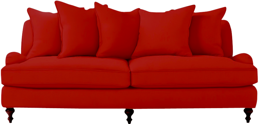
This is the beautiful Serena and Lily Miramar sofa but in a custom fabric. (and I linked to the new bench seat)They don’t have a fabric this red, but this colorway does exist.
My next thought was in regard to this comment:
I’d never get my husband on board with red walls

lol
I filed that one away in the “we’ll deal with the husband issue later drawer” and set off to work.
I mean… What does Husband know? Red walls will be gorgeous!
I opened up my picmonkey to prove my point.
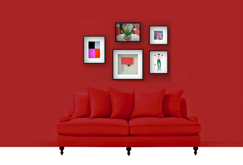 ummmmmmmmmmmmmmmmmmmmmmmmmm…
Good Lordy God!
Husband is RIGHT!!!
Oh sure, if I were Miles Redd and had about $100,000, I might be able to get this to look smashing, but this is not that kind of room.
Maybe if I add some white wainscoting it’ll work???
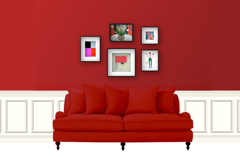 Ugh.
Ugh.
Sure, we don’t have all of the other elements in the room and that is always something to consider, but even so, I know that this is most likely not going to work.
The other issue is that I really do not think that peach walls are going to work either.
And I still don’t know what Andrea’s real-life situation is.
I asked if she could send some photos. In the meantime, I figured that I would work with what I have.
A RED sofa.
And I know that there are some black chairs and a blackish built-in cabinets. And a rug that I’m probably going to hate that hasn’t arrived yet.
While I’m waiting for my designer’s block to blow over, I remembered what my vet said about Peach’s propensity to throw up.
“That’s not normal,” he said.
“Cat’s aren’t supposed to throw up. It’s a sign of inflammation or helicobactor pylori or some other illness.”
After Peaches survived his 7th life in 2011 and had emergency surgery for a bowl obstruction and then survived his 8th life, the aftermath, we gave him a daily dose of budesonide suspension. And we got to spend another 3.5 joyous years with him.
Does anyone know why these red sofas aren’t working, or working just yet?
Yes, Maggie… You had your hand up first.
Ummm… is it that the balance is off? The sofa is such a strong element and that needs to be balanced out better?
BINGO!!! Thank you Maggie!
You guys are really paying attention. I’m impressed!
Yes, a strong large element is going to need other strong elements throughout the space, but we also need to calm that puppy (new sofa) down a little. That we can do with pillows or even a throw.
We always need elements of light, medium and dark.
So, what do *I* do when I’m stuck for a great design idea?
I used to go through my pile of magazines, but now I get on pinterest.
I put in the search term “red sofa.”
But I also look at the similar images.
There aren’t a lot of red sofas.
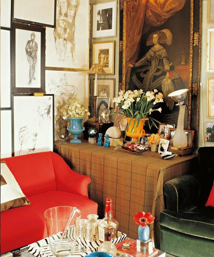
I came across this small room by Miles Redd. I think it’s quite cool.
A lot of people will think it’s too “cluttered.”
It is… lol. But I still like it.
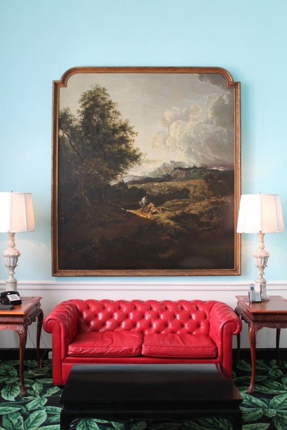
And then I came across this red sofa which I instantly recognized as a Dorothy Draper creation at the Greenbriar Hotel.
Oh, it makes me laugh. The painting is too big. The lamps are too big. And the end tables are too big,(high) too. The Chinoiserie coffee table is sublime. The green carpeting makes no sense. Or maybe the red leather sofa makes no sense. But somehow, it all kind of works in a funky unorthodox way. That’s the genius of Dorothy Draper!
What I love the most about this vignette is the painting above the sofa. I filed that one away.
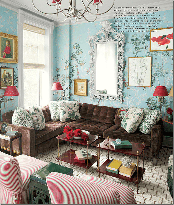
And then I remembered that Miles Redd uses this pretty blue color with red, fairly frequently.
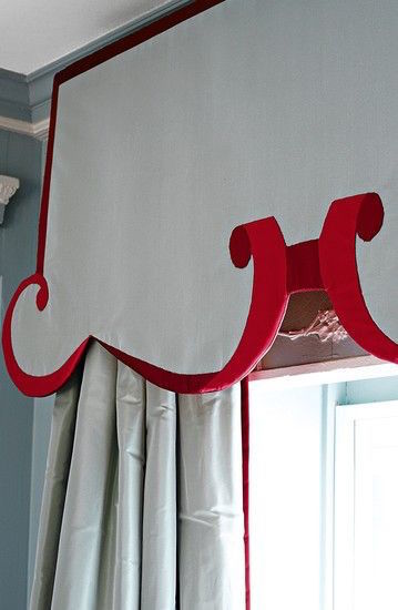
He often creates these interesting Chinoiserie inspired lambrequins too.
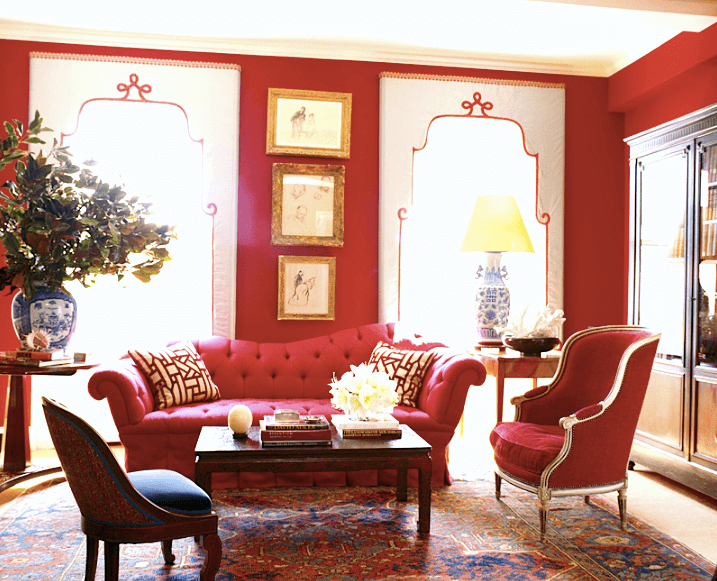
And he’s also done Red on Redd ;]
But here, it works because of the big windows and large breaks of wall space.
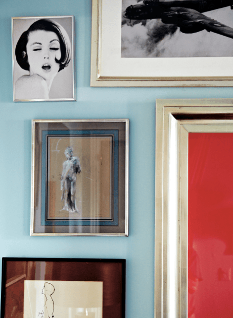
And then I came across this image from his wonderful book, The Big Book of Chic
Love this! Okay… blue it is!
If only I could come up with some cool art like that.
I went over to Anthro (Anthropologie) because they have really beefed up their art collection and are working with Artfully Walls.
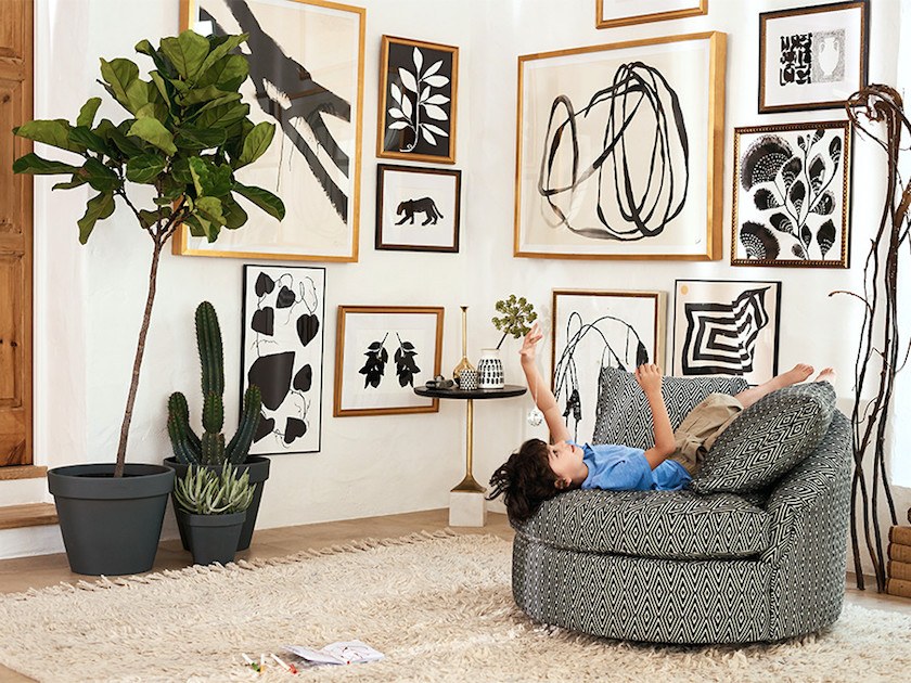
How smashing is this black and white art wall!
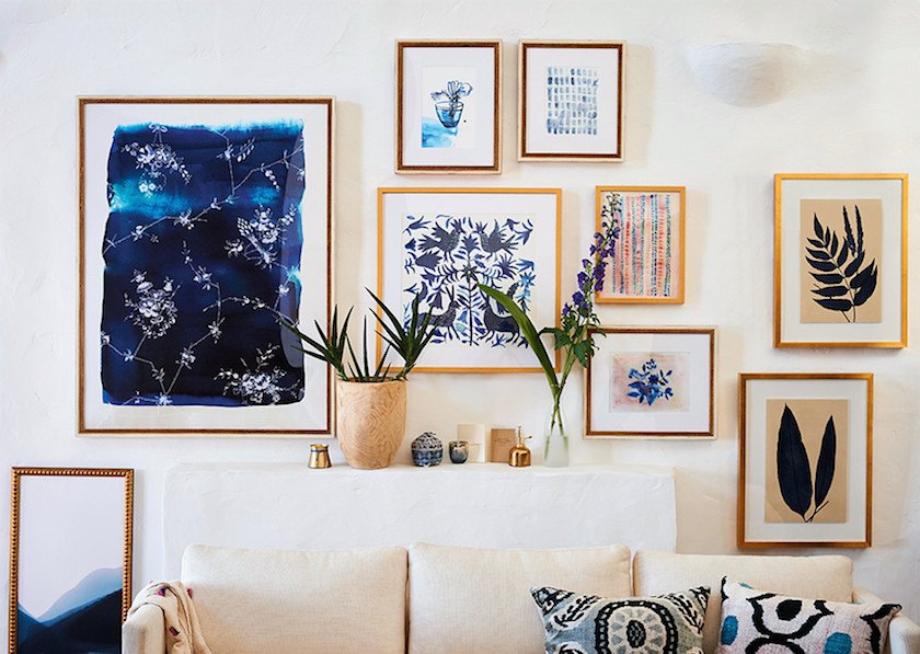
Another stunner in blue. Instant art wall!
And I found this interesting piece.
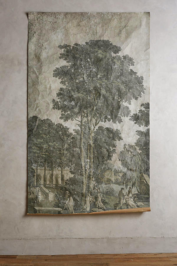
This is reminiscent of the Greenbriar painting.
And it has nine – five-star reviews!
So, then I started afresh on picmonkey to work with THE red sofa
I need to choose a pretty blue color.
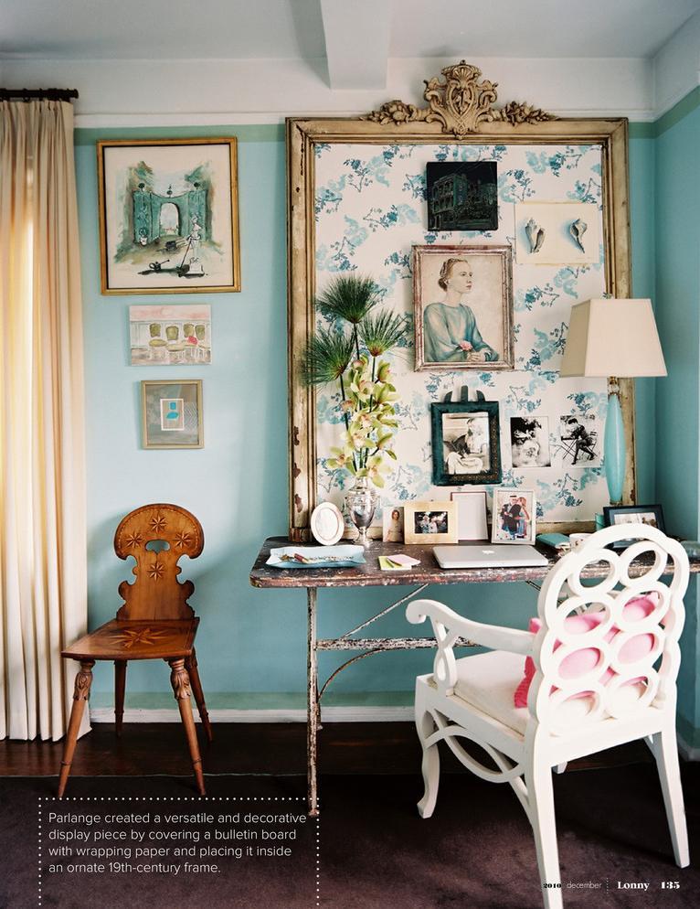
And so, I chose Benjamin Moore’s Dolphin’s Cove, one of the 144 beautiful Benjamin Moore colors in the Laurel Home Essential Paint Guide.
I figured that while I’m at it, I’ll make September’s board since I’m going away in 20 days (to England) and have much to do to prepare for the trip.
Here, is what I came up with.
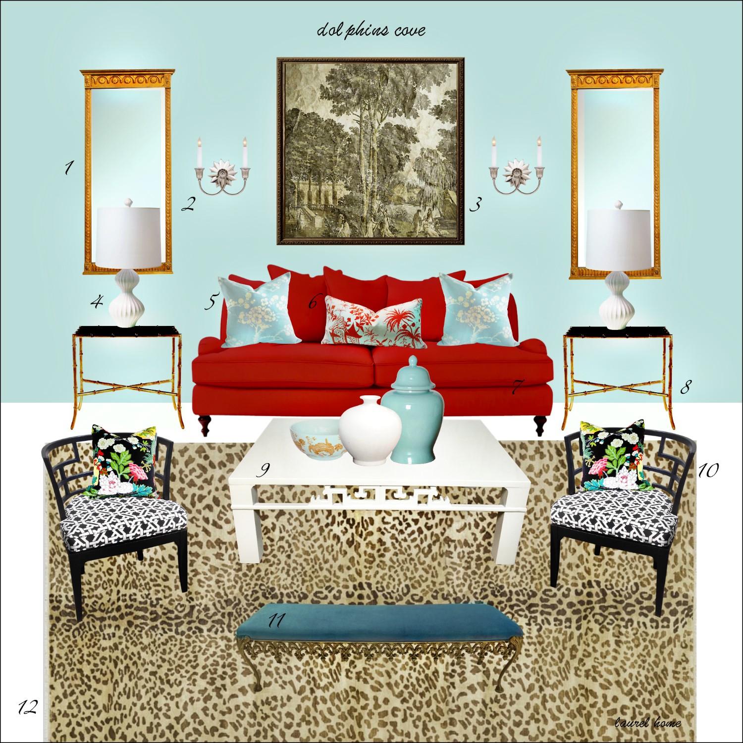
1 / 2 / 3 / 4 / 5 / 6 / 7 / 8 / 9 / 10 / 11 / 12
notes:
#1 – couldn’t find the exact mirror, but the link takes you to a lot of pretty mirrors
#4 – appears to not come in white any longer
#5 – China Seas fabric on custom pillow. Source is recuperating from an accident
#6 – Lyford Pagoda Pillow. Sorry, the source is no longer making it.
#11 – is really larger than shown and too large for the coffee table.
The beauty of playing with the images on picmonkey is that one can see how they elements all work together.
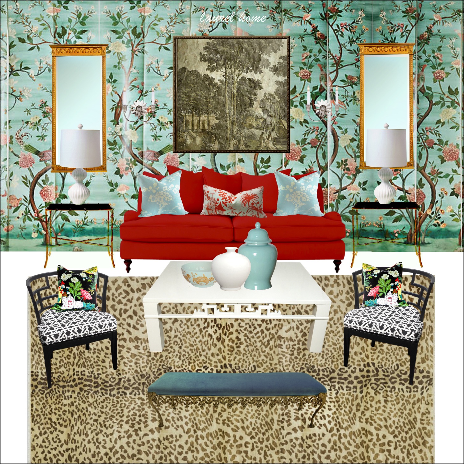
This is a more maximalist iteration using a new Havenview wall mural from Anthropologie. I like this one too!
And one last one. Just because I’m on a roll now. :]
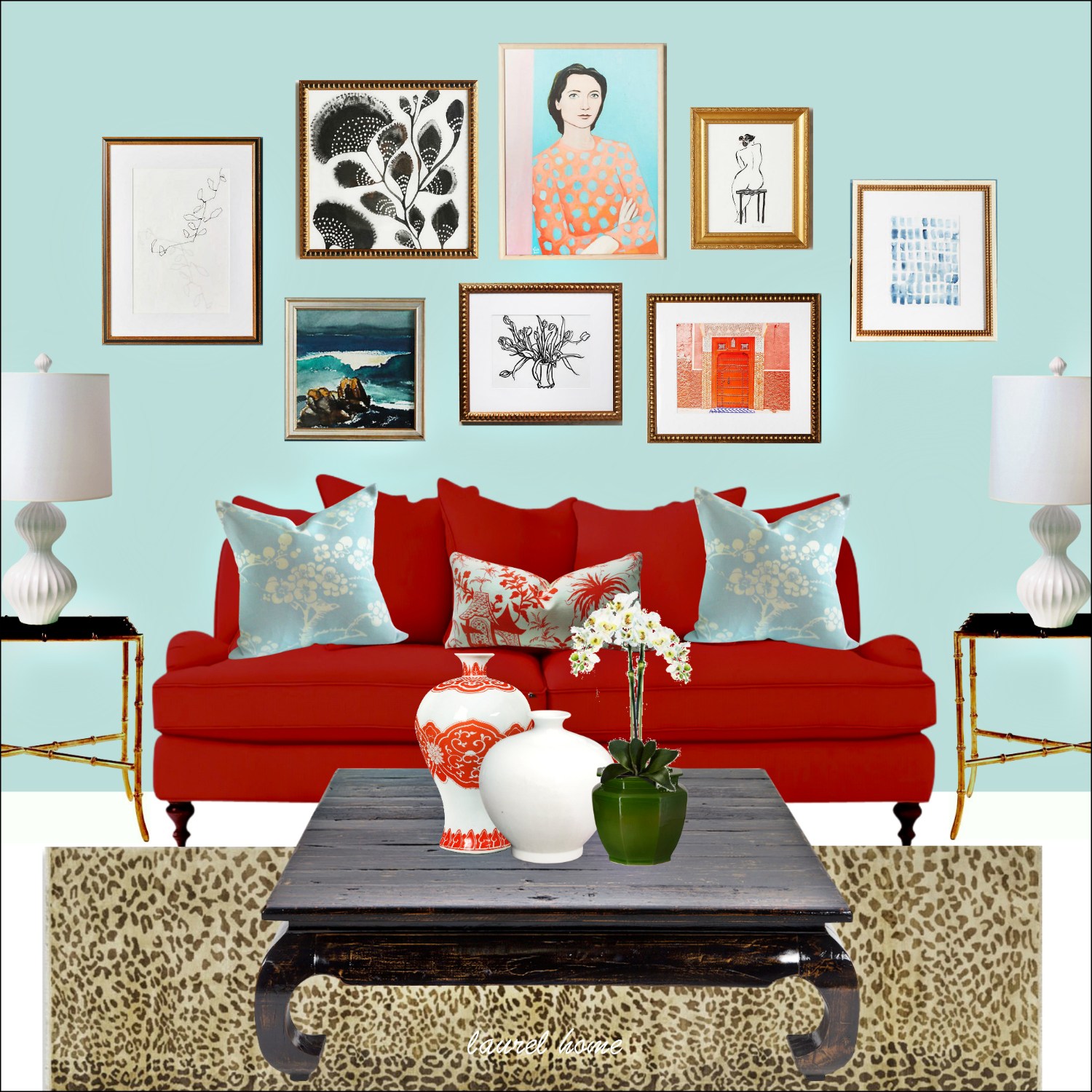
A custom art wall. All of the pieces are from Anthro. (please see the widget below for more info on the individual pieces)
I zoomed in and switched out the coffee table. That is a random table I found somewhere, but have no idea where. lol

Which of the three options do you like the best, if any of them?
It’s okay if you think that they all suck. I like them all, but if I had to choose, I’d pick door number three.
In the meantime, I heard from Andrea. And of course, her sofa and room look NOTHING like what I did.
AND, I was going to add some pointers and I started to do it and then I realized that I’m barking mad and that I am going to carry that over for Sunday.
I have a big weekend coming up.
I’ve been invited to a couple of events through RewardStyle for New York Fashion Week.
And no. I have no idea what I’m wearing.
But I figure if I wear my grungiest jeans, I’ll be fine. ;]
This is a whole new world for me.
And finally.
Thank you, thank you to the countless people who made purchases this last long weekend. I actually rounded the number way up over 10% and was happy to donate a handsome sum to the Hurricane Harvey Relief Fund.
Now, we need to do something about his girlfriend, Irma. She’s a woman hell-bent on destruction. Best to stay clear– and pray.
xo,

Related Posts
 The Trick To Mixing Modern and Traditional Furniture
 My Living Room Is A Mess But I Can’t Afford New Upholstery
 I think I Just Made a Terrible (and costly) Decorating Mistake
 My 20 All-Time Favorite Benjamin Moore Paint Colors
 Here’s How You Can Create Beautiful Rooms – Effortlessly
 Help me please. My husband wants a matched set of dining room furniture
 Gloppy Paint on Gorgeous Classical Trim – Let’s Discuss





66 Responses
I’m looking forward to part 2. You made a good point (in general – not for Andrea) about waiting to see if a problem piece is really a problem.
Thank you for donating to relief charities. It is very kind and generous of you. I ordered for the first time from OKL.
Hi Libby,
Thank you so much!
Love this post. Now I want a red sofa!
Turquoise and red are some of my favorite combinations! Loud, but just unexpected enough to be different. I’m looking forward to the actual room! I can’t say I understand how a decorator could land a client with such an unconventionally colored sofa without a plan to incorporate it properly…
Hi Caroline,
Thanks so much! She may have had a plan– just one that wasn’t the best.
Wow, you really pulled those rooms together! While I loved all 3, my fav is #2. There can’t be too many pattterns and textures for me! Looking forward to seeing the actual room. Have fun in England!
Thanks Cyndia! I love how people like different things.
I love what you did!!! I choose door number 1 or 2!
Thank you Kristen!
Hi Laurel..have wonderful trip, you deserve it. Red, one of my fave colors. Have a red sofa in family room now..In my last house I had 2 red sofas. #3 was my 1st pick followed by #1. Personally, I’ve always felt good in red, confident and more open. It’s interesting how color effects people, beige makes me want to puke lol, just kidding, it’s just not for me.
Again have great trip!!
Thanks so much Carol. I feel that way about red lipstick. I always wear a warm red. It goes well with my ghostly pale skin. lol
I read somewhere a while back that a woman didn’t have the “courage” to wear red lipstick. Well, I don’t have the courage not to! Let’s just say that in the past, people have inquired if I’m okay when I’m not wearing it. lol
Hi Laurel, this post is timely for me because I need to whiten a bed frame I just received and am stewing over how to make it whiter. I’ve never painted furniture before and am curious about the light wash of white that you applied to your cabinet. Is it that you painted it full strength or did you thin the paint before applying? Thanks! I love door number 3 with the art wall.
Hi Kelly,
Yes, I thinned the paint down. Do I recommend it? Well, no. But, also look into chalk paint. There’s Annie Sloan and other brands. They have tons of tutorials and folks who use it say that it’s very easy to work with and does not require a primer.
But, I would begin with an unobtrusive part and do a little piece to see if you like it and how it holds up.
Laurel – Love this post! I WISH I had a RED sofa…I’ve got a “safe” sage green, circa 2004 , in great condition, and very comfortable, so with me it stays. The Greenbrier is my happy place and I’ve been a fan of Dorothy Draper and Carleton Varney for years…follow them on instagram…a small slice of cheer and happiness on the daily! Thanks for another wonderfully inspirational read.
Hi Thea,
I did a red sofa once. It was the basement sofa that had to be cut up to get it down the stairs. LOL I’m telling you, this business is fraught with more landmines than there are stars in the sky. It seems.
I am trying to remember what color we did the walls. Trying, trying. It was cosy and pretty is all I remember. Fun room for a musician family similar to mine.
Laurel, I’m quite certain you are a genius. Some of this made my eyes pop out, I laughed, cringed a bit, found some ideas I would love to try, and I’m absorbing every word. Your readers have some interesting things to contribute, but I should remind them, this room is very small, we are average people with an even more average check book. Flamboyant would not describe us.
I can hardly wait for the second installment, but I already see a shopping trip in my future, and that the peach walls have to go.
Bless you, Laurel, for your efforts on behalf of those suffering in Texas and Louisiana.
Hi Andrea!
Thank you so much! And yes, the room is small.
As you may have seen, I have a much different idea for the real room. It’s really mostly tweaks but that will make a big difference and yes, a better wall color. Soon!
Love this post,can relate to making a huge mistake in decorating even though it was the decorator’s suggestion. Did that with wallpaper in entrance hall and it was redone in two weeks time! I love the idea of covering the back with a gorgeous antique quilt, one that has a lot of white in the background such as a Hawaiian Feather design, not an early American look, but something more sophisticated. I personally love lots of patterns and layering. My personal choice however would be to have it slipcovered in muslin.
Hi Belle,
I love slip covers too!
I think the 3rd works I can feel it! About 4 years ago I was hell bent to get a good paint color to assist my blue sided red sofa and thought to blue. I really wanted a light color( grayed blue). I gave up on this plan when I realized that the trendy choice was aqua. Aqua would have worked and I really see that now but it was not what I wanted. New slipcover – check. I am so interested in your upcoming post! I found myself early last year yearning for a plaid chair in heavy colors like navy, pine, and red. darn Pinterest is just to uk sites!
Hi MAM,
It’s funny, but about 18 years ago, I had a young client who had painted her living room a classic Robin’s egg blue. It was a cooler blue than this one. I couldn’t make it work, so she repainted it Pratt and Lambert Flaxseed which is an interesting greenish, goldish color. But we did a smashing Oriental rug with these saturated colors, only the blue was deeper and the red a little more rusty. The room turned out great.
Oh Elect the Havenview wallpaper and the red sofa room and I’ll be right over with a bottle of the best red wine. Just love it. It’s daring and happy and inviting. I can hardly wait to visit.
Also at Christmas time, everyone will envy her with the bright Santa Claus red sofa.
Hi Diana,
That would be a great Christmas room. It’s quite festive and fun! I think that Miles would approve too! (hope that’s not too presumptuous)
Breathless here! I love red and and am no stranger to a bold couch or wild rug to work around, in my case, unfortunately, not nearly as successfully as you at making it work. Thanks for all the ideas. Love these arrangements – ming, animal print, red couch, art work! Not enough words. If pressed, I’d have to go with #3 because of the art and yes, I’m an artist. I’m loving the “gallery-wall moment” we’re having right now, and yes, own more than a couple mass-produced pieces because hey, I like them. In fact, love your Anthropologie selections here. Totally get it and appreciate your efforts to help us crazier color peeps.
Thanks so much Paula. And yes, if there’s an artist in the house, maybe they could copy the prints, or do in the manner of. I’m sure it’s been done. Just as long as one doesn’t sell them!
#2 has me drooling with the Chinoiserie wallpaper. I am not at all a maximalist, but it’s speaking to me.
Hi Hollie,
I know. Me neither! But maybe in some cases. I was so surprised. When I made the board, I still had the blue background. First I put in the middle section and then the two side sections, but since I did it later, I had to put the wallpaper behind everything or else have to move everything in front of it. There’s probably an easier way that I haven’t bothered to learn. But anyway, when I whisked the blue wall away, it was such a pleasant surprise. And what I love, too, is that it’s not all matchy.
Not too long ago one of the decorating magazines featured a designer’s home in India that was done in red and aqua blue. Yes, I think that aqua blue could fit perfectly with that red sofa. Red lampshades also featured in a Paris home photospread recently. Super!
Thanks Susie!
I am new to your blog and I was giggleing while reading your post! Great ideas with a sense of humor…
Welcome Kristin! And so glad that you enjoyed the post!
Interesting post. I’m a painter – pictures, that is (sometimes walls and furniture too). Put green and red together and they both shout louder, so since the red sofa is screaming already I would get rid of the green in the room – I think it was only on some soft furnishings. And then add some coffee/black cushions to the sofa. Like everyone else, I can’t imagine peach walls working with a bright red sofa, so I would then maybe sue the interior designer for the cost of the new paint and fabric.
no lawsuits– please!
I actually loved number 2! You totally found a way for the sofa to be “out-louded” by the wall – and the wall is gorgeous now to find a huge mansion hotel for that awesome look!
Hi Jo,
I love that one too. And I considered changing the art, but then thought. No, that red sofa is not going to be the boss of me! haha
Not keen on the blue walls contrasting with the red-she said, sofa.
I would prefer to keep it tonal or ORANGE walls – why not go out on limb ?
Hot Hot Hot.
Also..what a wonderful excuse to buy CUSHIONS !!!
Especially as it is her husbands fault the sofa is Red, Red.
How could he possibly complain ?
Some with just a little teensy red in them but otherwise a blancmange of colours or simply Graphic.
Think a negative could be made into a big fat positive.
Most importantly. have fun with it.
Thanks so much Jo.
The real room is very different from what I did. Please stay tuned!
Hello Laurel, I think the term for regretting a new purchase is buyer’s remorse, and as you intimate, it often goes away with time. Although I like all of your ideas (picking one would depend on the rest of the house and the owner’s personality), it seems to me that instead of changing and paying for so much else, it would be cheaper to admit defeat with the couch and reupholster it or replace it.
–Jim
Hi Jim,
Yes, buyer’s remorse!
Wow, that blue actually does works perfectly with such a bright red. Who knew?!
Miles Redd! haha
One thought … is that sometimes when you are so focused on something you cannot see anything BUT that then it becomes a bit obsessive. It could be that the sofa is too loud, visually, but chances are it sticks out because it is the one thing from the space she is unsure of or doesn’t love. I bet she would miss it once it is gone.
Hi Nicole,
Yes, and there’s also something that probably has a name. Let’s call it “new thing itis” and I have it sometimes. I’ll focus on the new thing because the change can be jarring– at first.
Wonderful options.I like #3 best. But I would probably go all dark and moody walls if in the situation described. Less Miles Redd and more Abigail Aherne. Looking forward to your next brilliant installment.
Thanks so much Varya. The dark walls are a great idea too!
That shade of blue on the walls is a brilliant choice. Not at all what I would have thought to pair with a seriously red sofa, but it looks awesome!
Door #2 is too maximal for me, but I love the Anthropologie mural on its’ own…a possible affordable option for me to use as an alternative to Gracie wallpaper for the Giannetti’s TV storage solution I covet?! http://brookegiannetti.typepad.com/velvet_and_linen/2014/05/patina-farm-our-gracie-wall-paper.html Thank you for making me aware of it!
I agree…..door #3 has it all! Perfect.
Hi Catherine,
Yes!!! That would be a very good option, I think, but take into consideration things like scale. I haven’t looked closely enough at it. But I believe each panel is 9 feet which will give you a better idea of how that will translate.
Laurel, I forgot to say, have a jolly good time in England!
Hi Lisa,
Thanks! It’s still 20 days before I leave, but the time always goes so quickly.
so…now I want to see what her room really looked like!!! I like number three the best. And…I won’t buy a red sofa. I am thinking Peacock or Fuschia though…
Stay tuned!
Wonderful. I really like the blue with the red and I definitely prefer number 3 with the art wall. You made it work alright. Looks really great and I ‘m looking forward to Sunday’s post !
Thanks so much Maggie!
Hi Laurel,
This really has no relation to your fictional client, Andrea, but it makes me think of that episode of Sex and the City, where Mr. Big is divorced from his wife, who he says, “only buys teeny tiny beige furniture. Beige is b******t.” He then proceeds to paint a wall in his bedroom a deep brilliant, vivid shade of red. But after all, he wasn’t named Big for nothing. The bedroom was beautiful. (Besides, he probably had terrific set decorators.)
Hi Lisa,
I’ve specified red for two bedrooms and both times it looked fabulous!
Hi Laurel. I thoroughly enjoyed this post. With the conversational tone of your posts, I felt like I was talking with you. I like all of the 3 options you put up for Andrea, but #3 is my favorite.
Hi Lynn,
Thanks so much! Glad that you enjoyed the post!
After checking out “red sofa living room” on Pinterest – my vote is to paint the walls in dark Charleston Green (green-black) or do black or dark blue walls with a richer red with black colors in an different Oriental rug. Or simply do fresh simple white walls with a collection of botanicals or small modern artworks hung in a grid pattern above the sofa. Maybe then add modern gourd-style red glass lamps – against the new white walls!
Hi Jan,
Those are all terrific ideas; there are indeed lots of ways to go. I considered white and a dark color and we aren’t done with the subject.
I think what’s wonderful is the idea that when decorating it’s good to explore many possibilities.
Love this. Much to my “minimalist” surprise, when I saw version 2, I thought WOW that paper makes the room all come together in a georgeous way! I do love door numer 3 best, though.
May I make a suggestion? This is your blog and I completely understand if you don’t care for this and don’t publish it. I am interested in art and have met many local artists who are quite talented and definitely not famous. They sell their work for what seems like give-away prices. They aren’t represented by big-name galleries. I think people decorating their homes could find a few beautiful pieces at local shows for about the same price as reproduction works on on-line art sites. It would be original art, and they would be supporting someone who needs the sale. No reason you can’t mix those pieces with the on-line pieces. People should select art because they love it and want to look at it; only the super rich can afford “investment art.”
Well I really enjoyed your post, as usual! Enjoy England.
Hi Faxon,
Every time I show art, I get the same spiel.
I can’t be everything to all people.
As for artists not making enough money selling art… I know. I’ve been in the arts (dancer, singer, actress, designer) my entire life. My sons are musicians. I get it.
But, I need to look after myself (plus some others in my family) and promoting starving artists is not going to do it. They need to figure that out for themselves. I hope that’s understandable.
The images, however, serve many purposes.
Inspiration.
Ideas.
Color combos.
And maybe a couple people will purchase something. Two out of 12,000 readers today. lol
If others wish to purchase locally, I think that’s wonderful, but it would be impossible to share hundreds of thousands of resources as readers are all over the world.
Now I get it! Thanks for taking the time to explain-
Yup, I’m for door #3 as well. I like the way the art balances the sofa. Not a fan of the rug; sounds like it wouldn’t work with Andrea’s elements anyway (the tartan throw makes me think Andrea and Hubs have a different look in mind.)
I love the blue with the red, and I particularly like the color you chose.
I wonder if you might have used a green for the walls. Green and red need not look like Christmas with the right green. And how about a deeper color….like in the teal or navy blue family? Either way, I’m sold on the art above the sofa.
I think you said a designer talked her into the rich red; how could they do that and keep the peach walls? Yikes!
Hi Maryanne,
I think there’s a post here somewhere that talks about how to make red and green not look like christmas. The answer is other colors added to the mix.
Can’t give too much away, but Sunday will be here soon!
Laurel, you really made it work…THREE TIMES!! I was practically crying for this woman until I saw your layouts. Ta-DA.
Hi Lisa,
Thanks so much! There’s more to come. Andrea’s room looks nothing like mine. But I needed to stop here for today.