Hey Guys,
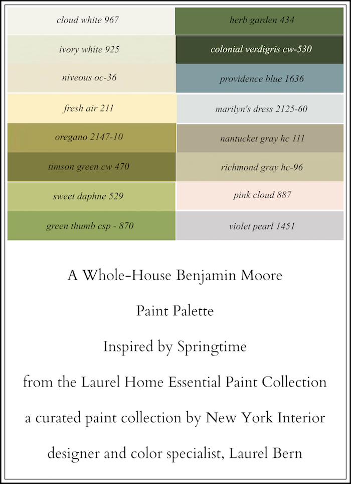
Please get ready for some beautiful colors and room candy. Today, I’m presenting a 16-color spring-inspired whole house paint palette!

wheeeeeee…
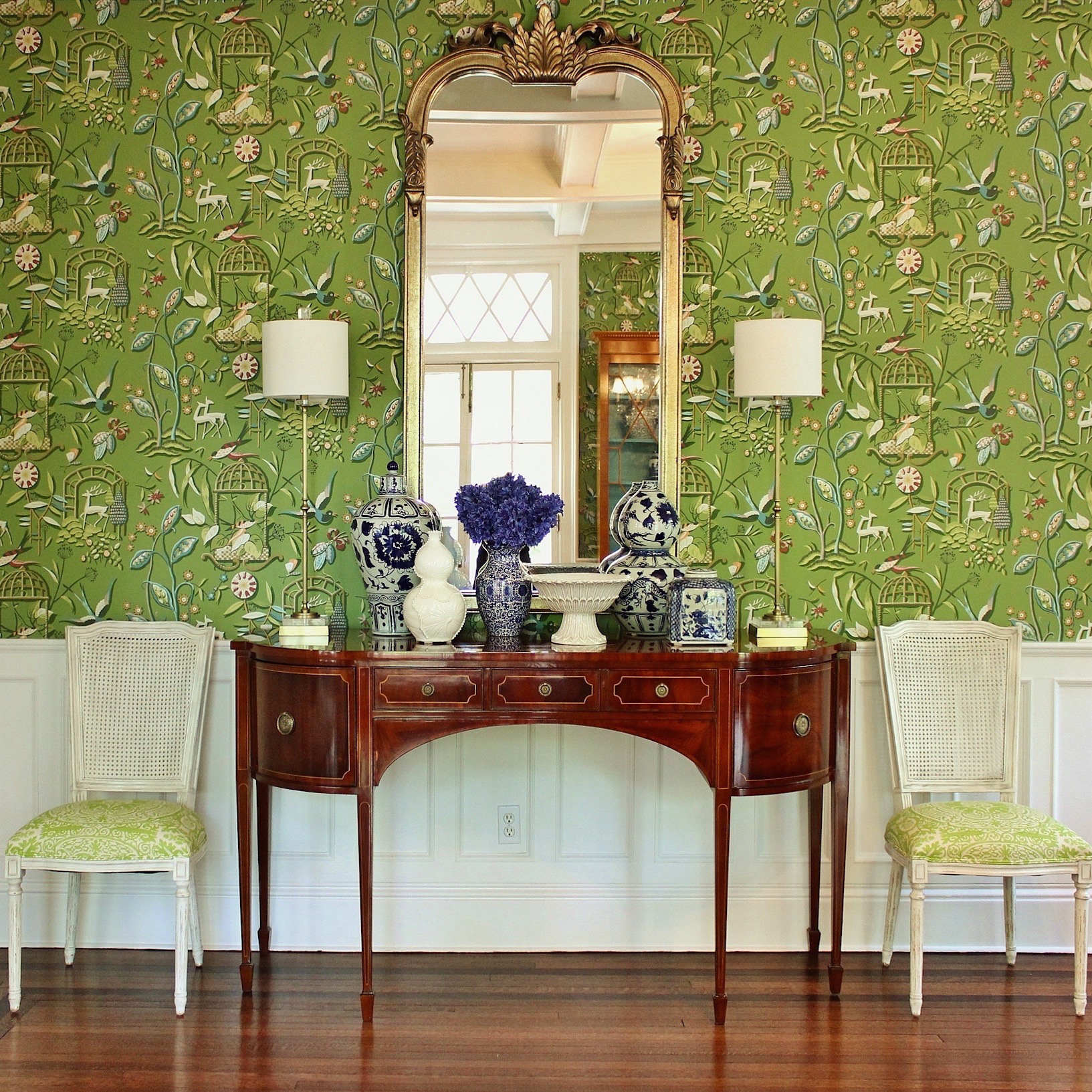 My dining room. Well, not mine. But the day I walked in and saw this architectural gem, I couldn’t believe my good fortune. This is the Paulina Porizkova of dining rooms! Bones for days!

Well, thar she is… And yes, it’s my design, but the room! The architecture! That was already there.
This is the room that inspired this post.
I always hear:
“I don’t really love green, but I love this.”
If you already love green, you’re good to go.
***
Alright. I have to apologize.
I always try to do what I say I’m going to do and last week I said that the Laurel Home Essential Paint Collection is going to be released on April 23rd. However, I realized two days ago that if that were to happen it was probably not going to be in my best interest.
The new date is going to be after High Point and after the trip to Italy—
May 10th.
One of the reasons for this is that I have spent countless hours obsessing pouring over each color, so you don’t have to; or at least not quite as much. :] But, I want to make it extra special for you. I’m really excited about it!
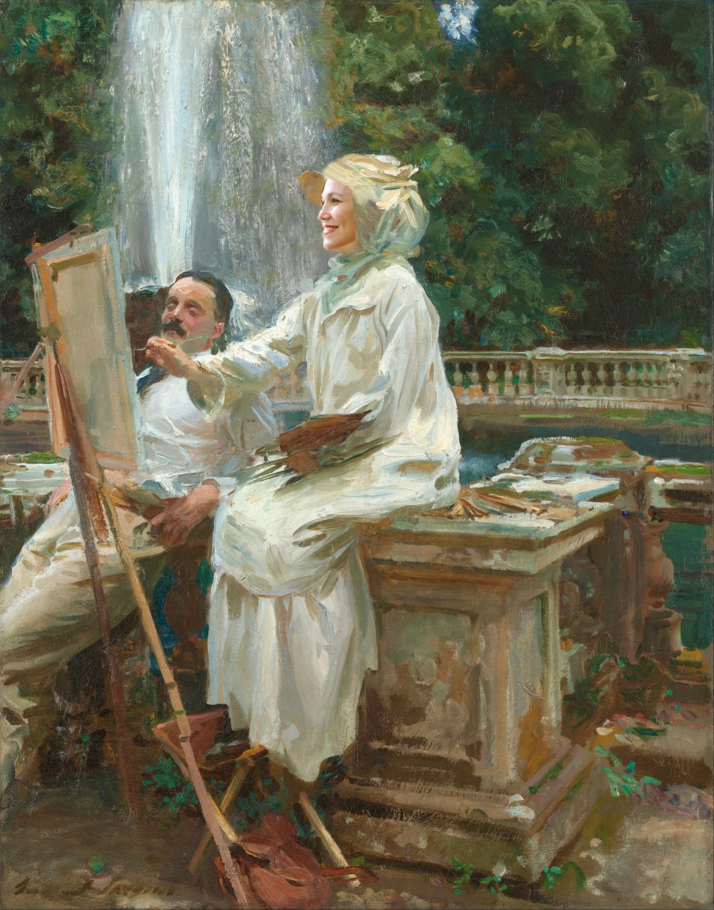
Plus. I need time to superimpose my face onto old master paintings. lol
Here’s the really good news.
To make up for the pushed back date, I’m going to divulge 12, no wait– SIXTEEN of the 144 colors! Right here. Right now. And not just the usual, but some of the ones you’ve never seen before—anywhere. (most likely).
I chose 16 to make a not-too-exceedingly-predictable Spring-time palette.
It is not going to look like an Easter Egg basket (I hope)
But, it is going to feature—

and lots of it.
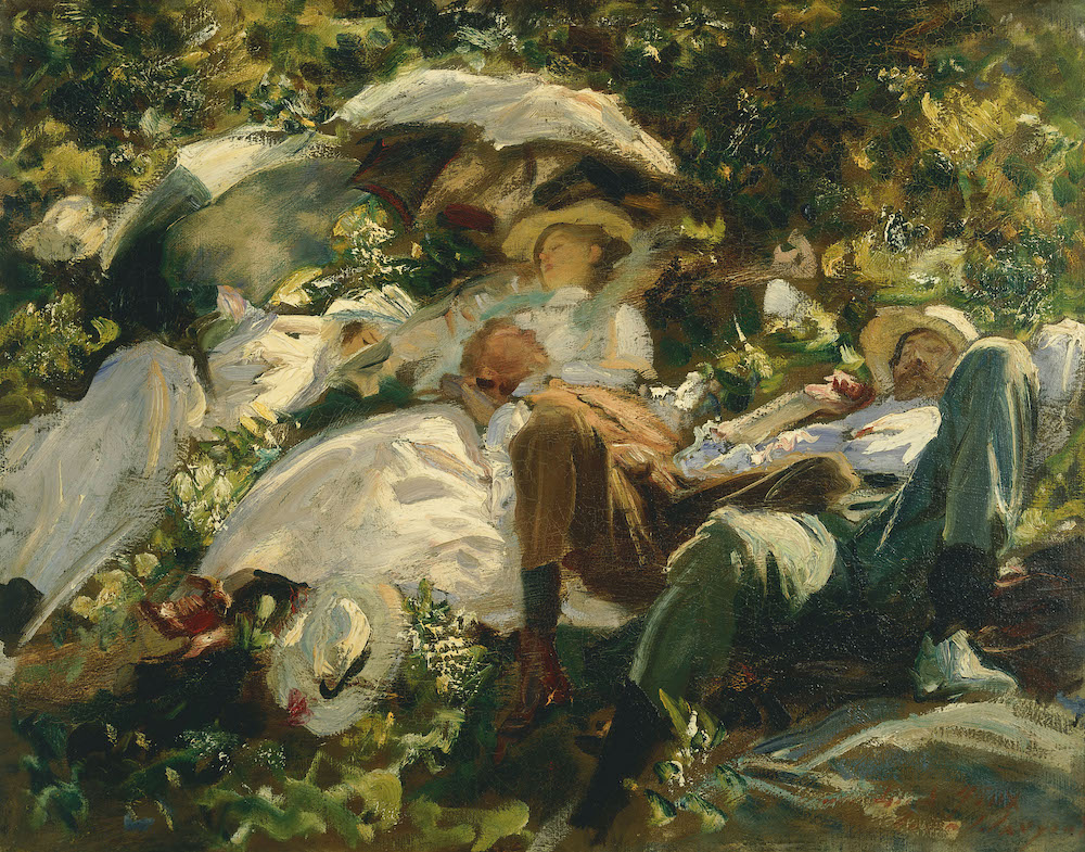
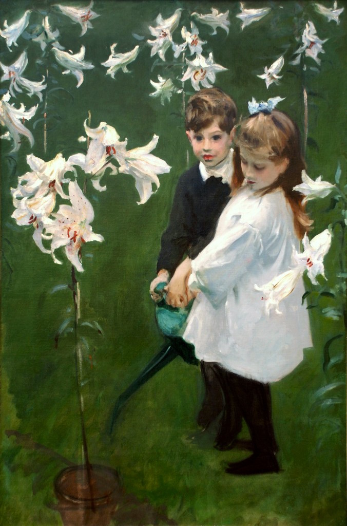
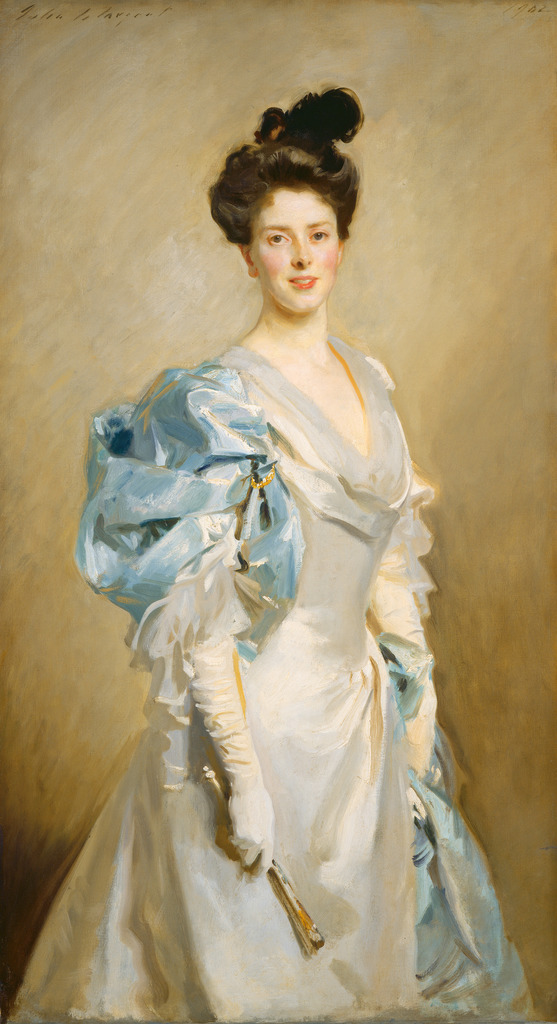
For those of you who’ve been reading laurel home for a while, you probably know by now that green is (sometimes), haha my favorite color. Well, let’s just say that I happen to love it, especially when done like this by my favorite artist– John Singer Sargent. (all other art here is his, unless otherwise noted)
The challenge (for me) with this post was finding the 16 colors that look more or less like they could be in one home, and are high-quality images.
A 16-Color Spring-Inspired Whole-House Paint Palette
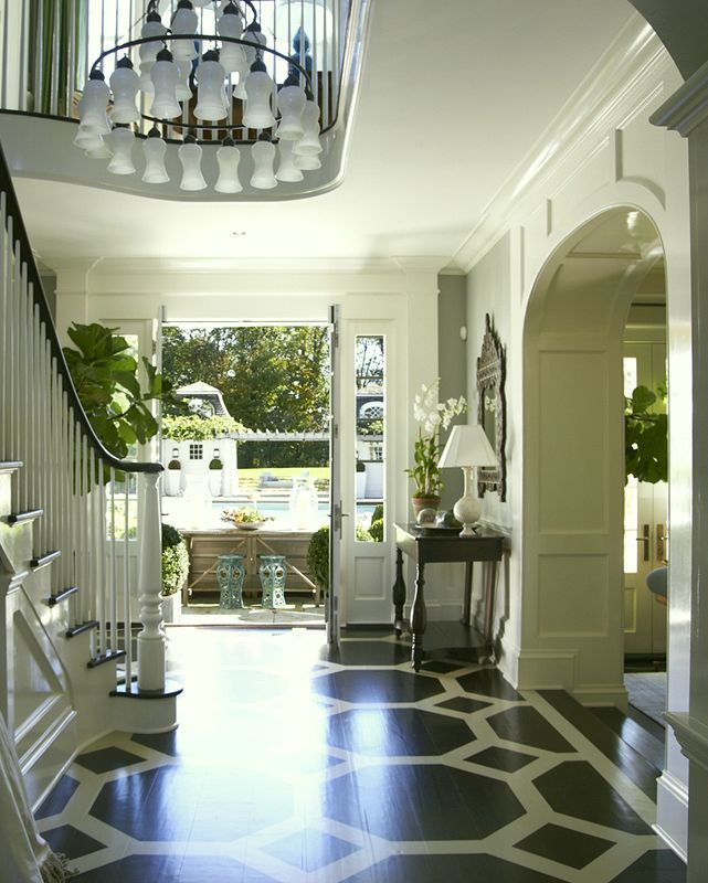

I’ve posted Lynn’s magnificent interior before. Can’t tell you how much I love this classic design. Classic and evergreen!

I am thinking this could be smashing for the dining room walls. Perhaps glazed like below or not. Very rich with lots of creamy white trim.
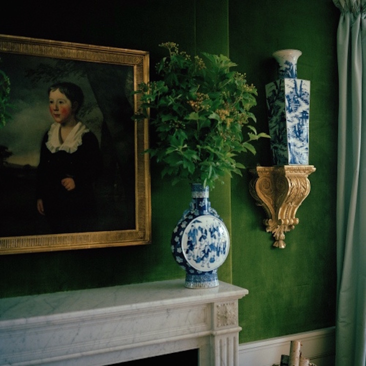
I wonder if Mr. Romualdez was influenced by JS Sargent.
Me thinks, yes

(please note that I took the liberty of manipulating the color of the chairs to go with our palette)
Niveous is a rich cream with hints of beige and gold. Very elegant.

Asleep In The Woods by Jules Breton
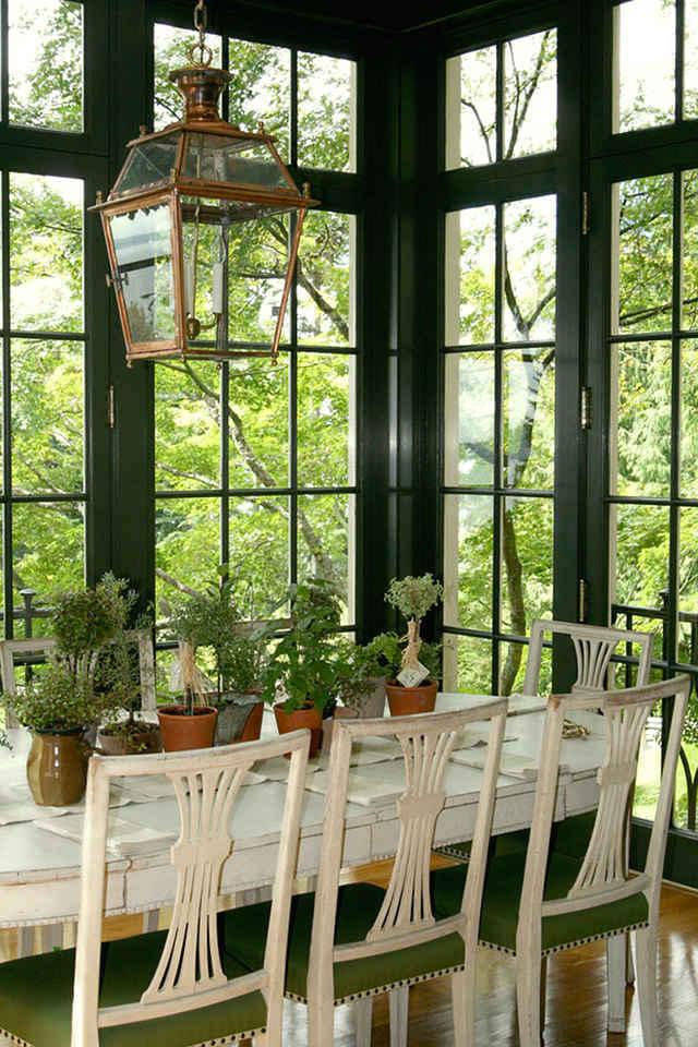

Sure, we could do a more typical color, but this rich deep green is stunning.
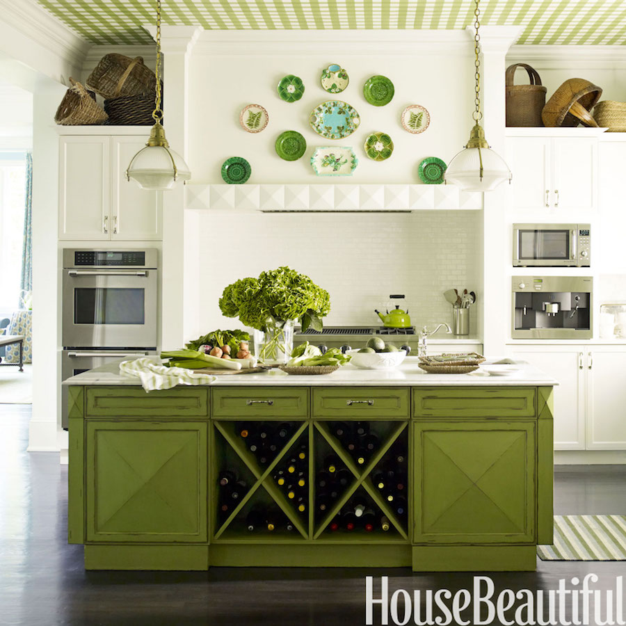

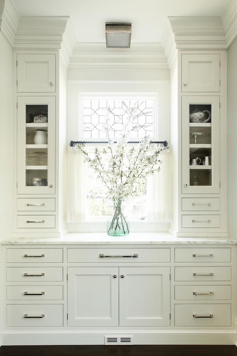
My favorite part of this kitchen are the plates and of course the green hydrangeas.
I could also be happy keeping the kitchen all-white with subtle accents of color

Sorry, image removed due to copyright trolls.

Grass-green grass cloth in this case, but the shade is close to Green Thumb. Most of the colors are in the two major fan decks. There is a disproportionate number in this post from the other fan decks.
Image also removed for the same reason as stated above green thumb. Apologies.

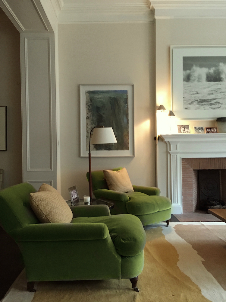
This could be an alternative for the living room or a family room or a den
.

Gaspar Melchor de Jovellanos By Francisco Goya
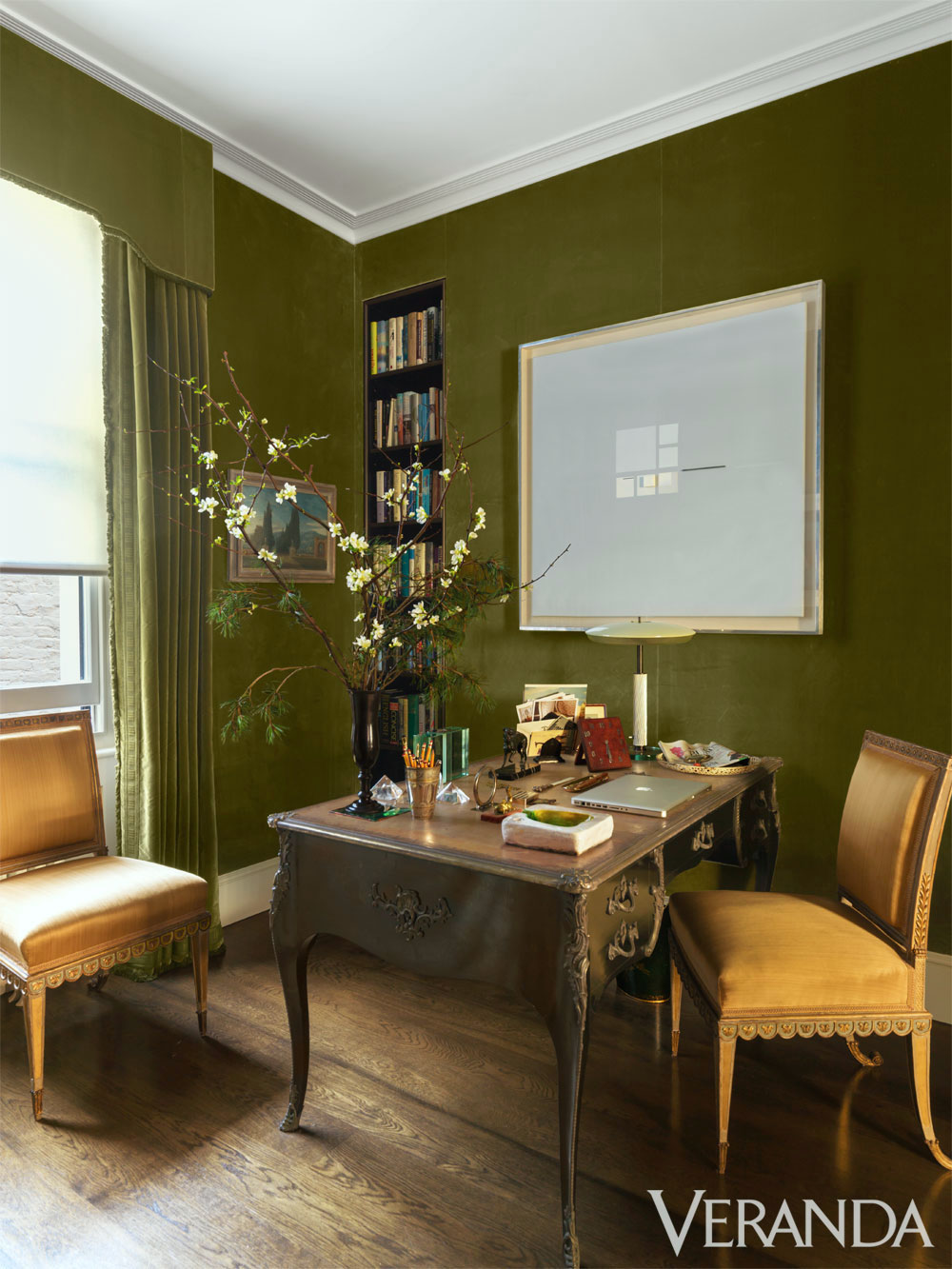

This rich olive green is so perfect here. And below.
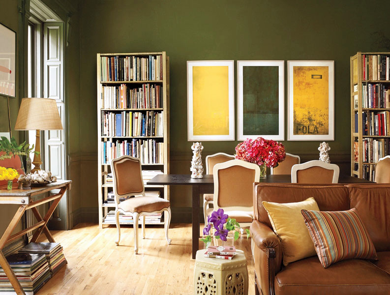
Elaine Griffin via Elle Decor photo: Joshua McHugh
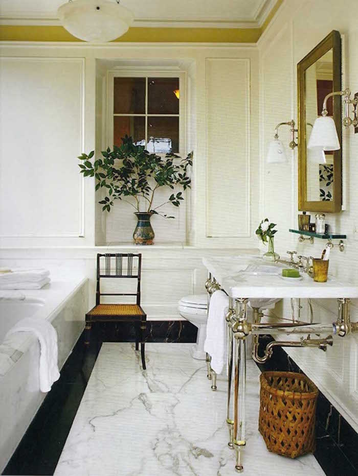

Despite not having under-sink storage which most people would want, I want this bathroom! I especially love the interior window. And that little border of yellow-green.
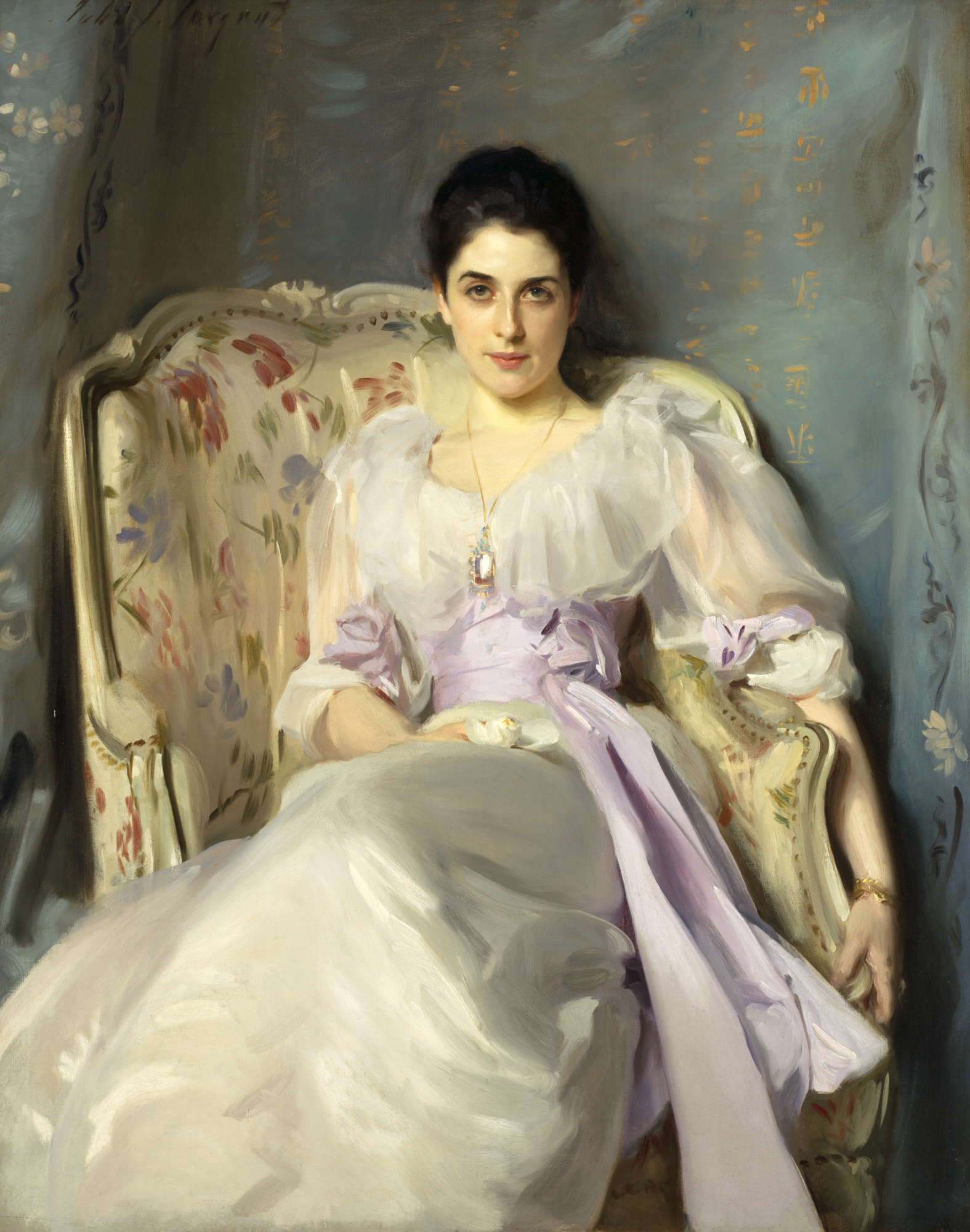
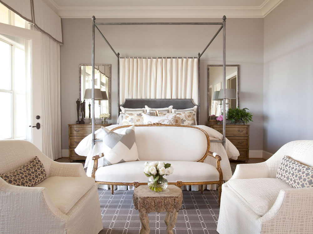
Julie Dodson via Fort Bend Lifestyles and Homes

Can I tell you how difficult it was to find a decent bedroom this color? Violet Pearl is a wonderful soft, very grayed down lavender. I have nine shades of lavender from light to dark in the LH paint collection and all of them are sophisticated and muted.
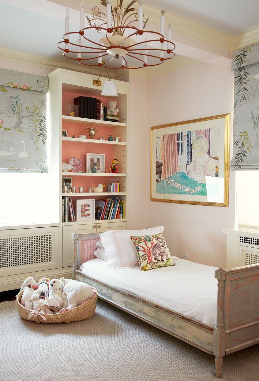

Oh, just shut the door! Is this not the most perfect little girl’s room ever?! Well, I think so!
Those Roman Shades!
Pink Cloud is the quintessential shade of Pink. There are nine pinks in the LH Collection. Most of them tend towards the warmer side of pink. Too much blue in the shade and the color can quickly become very bubble gum and pepto-bismol-like.
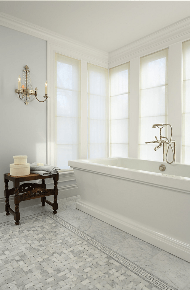

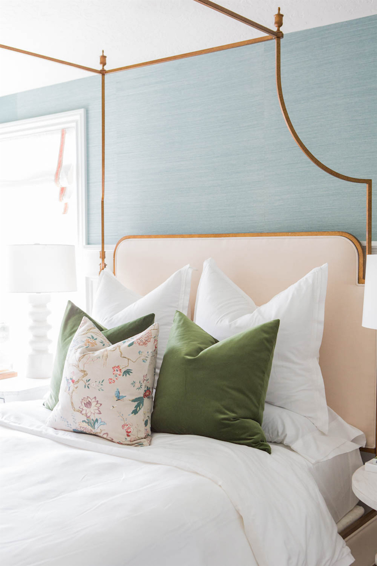
House of Jade – Photo: Kate Osborne

Yes, this is wallpaper again, but it’s still part of the palette.
Another girl’s room. A teen-aged girl.
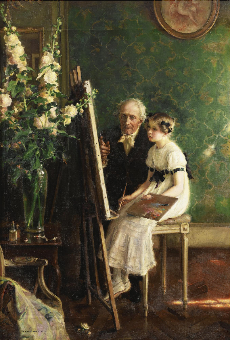
Jules-Alexis Muenier
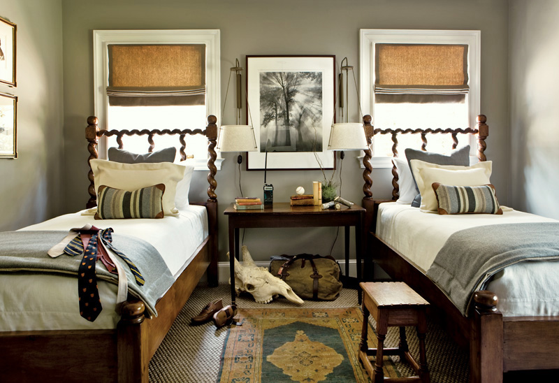
Helen Marie Rutter and Yvonne McFadden, Summerour and Associates for the Atlanta Symphony 2010
And a boy’s room

Nantucket Gray is really far more green than gray. It’s an awesome color! I love kid’s rooms that are not babyish. They are babies for about 2 seconds and kids for 5 seconds. You won’t regret it when you blink and they’ve flown away!
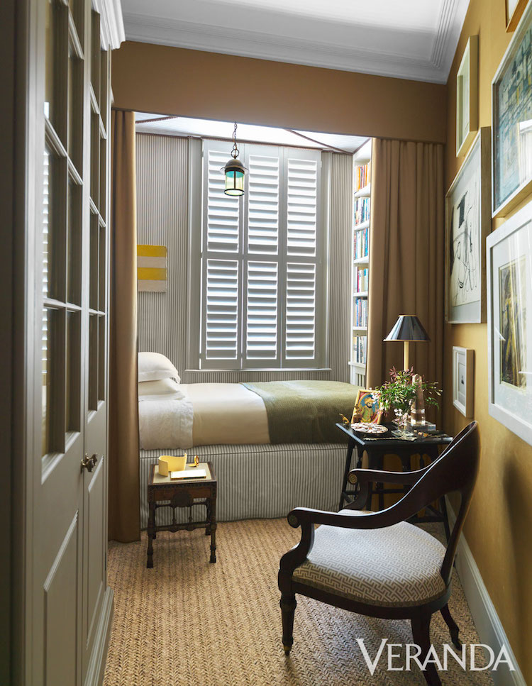
 I adore this cocoon-like guest-room more than I can possibly say.

Jules Breton – The Weeders
I think I can smell the earth.
Happy Spring! (Except it’s been feeling pretty winterish recently)
Next week I’m going to High Point for 5 days—
And then Italia!
Buongiorno,

PS: Please pin this graphic to your pinterest boards for reference
And if you liked this post, please share on facebook and twitter. The social sharing buttons are below.
Related Posts
 22 Living Room Lighting Rules You Need To Know
 Famous Interior Designers Who Got Arrested
 9 Fabulous Benjamin Moore Cool Gray Paint Colors
 Here Is The Reason Why You Need To Test Paint Colors Before Painting
 My Dream Home – Here’s What It Looks Like
 Nine Fabulous Shades of Green Paint You Need To Know
 The ONE White Trim Color That Works Every Time





66 Responses
Sweet Daphne. Looks like a gorgeous color! I bought your essential palette and rolodex last week. Love both! But…..I cant find Sweet Daphne anywhere!
I was hoping to find more detailed information on how to best use this lovely color. I’m looking for a pretty color for my laundry room cabinets, which is unfortunately an interior room, and ugh, half bath. We must keep the toilet there as it is near our back yard/pool. I’ve decided to try to have some fun with the decor. Bright cabinets that will work with Gray Mirage on the walls & Cotton Balls on the door/baseboards. A hex tile floor with lots of cream, soft grays, charcoal, weathered texture. And a cute pendant over the sink with a dark finish and maybe little crystals (sort of old New Orleans charm).
Can you help? Many thanks for your wit and willingness to help us all!
Hi Melanie,
Sweet Daphne was on the short, short, short list but because I needed to keep it to 144 colors felt it was too close to one or two other greens. That doesn’t mean that it’s a bad color! Not at all. The paint collection is meant to be a guide. A jumping off point. Sure, it might meet your needs as is… but it might be that your perfect color will be a little more of something it’s not. That way you can consult your fan deck (or use the store’s) to find the color that has what the one in the collection does not.
Hope that helps. If not, and there isn’t enough helpful advice for your individual needs, then I recommend hiring a color specialist/interior designer in your area.
I’m sorry, but I’m not able to give individual help.
WOW, you’re quick! Made me feel like you were anxiously awaiting my question! Thank you for the reply. 🙂
I’m working on today’s post, so I am right here!
Laurel you’ve got my mind in a whirl thinking about using fine art as color inspiration. I forgot to tell you about Cecilia Rosslee on etsy; she paints the most wonderful interiors and still life’s. Her palettes are so inspiring. Classic and fresh. I own one of her originals and she just keeps cranking them out. I think you’d love her work.
Hi Karen,
Beautiful! Thanks for sharing. This one is my fave. http://etsy.me/2a6utXP
To DIE for! Greens with ivory white and Niveous! One question. I notice the switch upstairs to the blues and lavender but I am scared Because don’t see much of the green carrying upstairs! In fact the upstairs reads as its own separate palette to my untrained eye. Can you help me reconcile the upstairs/downstairs perception problem I am having?
OK I lied. I have another question Laurel. Will being in a room painted one of these lovely greens make a 50 plus woman look sickly? Because above all I MYSELF must look beautiful in my own home lol!!! I can’t be adding blush and lipstick every hour to compensate for any strange color casting. But seriously folks, does wall color affect the appearance of human skin?
PLease make more of these palettes! You can’t even know how helpful they are. A true gift!
Hi Karen,
Actually, yes that’s true. It is possible to go from greens downstairs to colors that coordinate with them upstairs. It’s like a garden and there is still some green. And of course there is nothing wrong with using one of the greens upstairs if one wishes.
That is a great question and my answer to that is it isn’t so much the wall color as it is the LIGHTING. Lots of warm lights, lamps. Leave off the high hats, recessed down lights as much as possible. Sconces floor lamps are all great. Chandeliers are okay as long as there is additional light on a buffet table (if a dining room) or wall sconce.
I even love table lamps in kitchens and sconces too. It will add so much warmth.
You can still get incandescent bulbs but they’ve changed. But if using LED’s I really hate the daylight or cool ones. Some people disagree with me, but they give off a cold unflattering light.
To my way of thinking, night-time light is supposed to mimic the soft warmth of candle light and that also means nothing higher than 60 watts–anywhere.
Make sure the corners are lit. Much more important than a big light in the middle of the room.
I am making more palettes as an off-shoot of my paint color collection. But there’s one large paint palette within the collection which I call Universal Colors. There are 66 of them and they all go with each other. Here’s the link to that, if you would like more info.
https://laurelberninteriors.com/laurel-home-essential-paint-color-collection/
People are totally loving it.
And PS: I’m 60 and there is no doubt that I will not be seen in public without lipstick and a little eye make up too! ;]
Laurel I just wanted to add that the reason this post is so helpful as far as your palette posts go, is because you SHOW the paint in situ as best you can and you tell us which rooms you like the colors in. That to me is super helpful for the purposes of visualization.
Thank you for your reply. I am so grossed out by the new LED lights. They make me so sad! I wonder if there is a way to stockpile the incandescents? I hope as time goes on that the LEDs become warmer and more flattering.
I have indeed bought your Home Essentials (sent it out to be bound) and then went and got the BM fan decks. I am going to make a serious go of this spring palette for my new home, which is surrounded by trees and greenery outdoors. I’m going to bring it on in! I’ve never used much green but you’ve made me realize it truly is universal and relatively easy to work with. That gives me confidence. I will let you know how it goes!
Thank you so much Karen! Please remember to test your colors per the guide. There’s a link in the beginning that explains in detail how to do that.
Laurel, not sure where to ask this paint question here, but what is “LRV” and is it important in choosing colors from the palette for my walls? Are dark or deep colors always low in reflective value and if so, how can one compensate for a lower value in say, a small office? I am thinking in particular of the darker greens from the palette. If one wants a light and bright home then it seems one should stick to the lighter options.
Hi Karen,
LRV is one of those esoteric terms that’s about as useful as a pet rock. It stands for Light Reflective Value. A high number. It’s a light color. A low number. You got it.
Here’s my feeling when picking a palette. I also love light and bright, but I also think it’s wonderful in some homes to have a small dark space, be it an office, library, butlers pantry, powder room, laundry room. I think it adds an interesting dimension, just as light rooms also need touches of black and/or other dark colors for balance.
However, a room can be painted black and still be pretty light if there are large windows and plenty of white in the window treatments and floor and furnishings. And it’s just a light, bright room to begin with.
In addition, mirrors and artificial lighting can also help to balance that situation out. A lamp in front of a beautiful mirror in a dark room is incredible at night.
Hi Laurel, I believe the source for the Timson Green room example is Elaine Griffin–room in her own one-time home. Thanks for generously sharing these great colors!
In the photo under the Ivory White label there is a staircase in the background. The wall above it is painted in a light blue. Any suggestion for what I might use to replicate that color? Thanks!
Hi Merridy,
I wish I knew and even if I did, I guarantee that the color will look different than what you are seeing. Computer monitors also vary, so it’s impossible to advise you on this. I recommend going to the store and picking a couple colors you think are close and making samples. If they are too much of something you don’t want to see, then you can adjust accordingly.
One thing about that wall and it’s the point I am always trying to make. The interior design is perfection plus. We have a gorgeous art wall, staircase, floor, phenomenal chandelier and the gorgeous design/colors in the living room; it is all working together in a perfect symbiosis.
Congratulations on your award! Yes, you had wonderful architecture and features to work with but what you did with it! The wallpaper, the cabinet…so beautiful! The chairs and fabric so elegant and lively.
You look perfect in the Watteau. Who is that, a guy from the workroom pulling your swing? One of your many admirers/supplicants seeks your gaze as Cupid muses over the whole scene. I hope you can retrace some of JS Sargent’s steps and sights when you are in Venice with your virtual palette in hand. Have fun!
The Palette is beautiful and inspiring. I’m looking for a white to repaint, I am scared off. Tested and used BM “Cotton Balls” in a bedroom. The trim in Aura semi gloss looks white and looks good. The Aura matte on the walls and ceiling does not look nice. It is thin and cheap-looking, with dirty yellow and dirty green tones in all types of natural light across the seasons. Disappointing but I understand planning doesn’t guarantee an entire room. Did everything per your blogs, tested, replaced the furniture, watched it since summer. I can’t put off moving in and need to repaint! Eight foot ceilings, plaster walls, three windows, east, south and west. Bought all the paint myself at BM store(s) and checked in with the color consultant (who had used BM Marscapone throughout her home). The painter did not add paint thinner. I bought even more paint and did a third coat. Better but still wrong. Need to repaint a white (no grays or greens) but have no confidence as my mileage definitely varied from experienced users!
First of all, an editorial before someone craps on me for answering an individual question, Libby is not asking me for a suggestion. She is telling me about a problem with a specific color and the answer I’m going to give may be helpful for everyone.
This is so interesting Libby about the Cotton Balls in Aura.
I never specify Aura and have read mixed reviews. I have no idea if that’s the problem. It shouldn’t be, but it is a possibility. I really love Regal Select. North facing rooms are frequently difficult but that is the one exposure you don’t have!
Marscapone is more yellow with very little gray. So, that may not work for you either. I don’t normally recommend colors, but a beautiful warm, cream with slight pink undertones is WHITE BLUSH 904. OR, you could look at Atrium white a ready-made color I don’t normally recommend; the reason being is that it has a definite pink undertone, but that’s what your room needs. Atrium, you can probably get in a test sample.
Some rooms are just “problem children.” That’s what I call them. They are arbitrary, cranky and headstrong! And it doesn’t matter how careful one is, they just persist on being difficult! Please let me know how it goes. I am curious.
Thank you, Laurel, for your thoughtful and sweet reply. To your editorial point, I ended up eliminating several sentences from my long post that dealt with my dilemma in posting about my experience. I had checked over a matter of months after my fiasco to see if you were accepting consults. I wasn’t sure if the tone might sound reproachful or supercilious instead of highlighting the value of a consult.
I’m excited to check out your suggestions. I’ll keep you posted and I’m looking forward again to the process. Again, many thanks.
Laurel!
Congratulations on all the acclaim! You richly deserve this recognition.
LOVE “pink cloud”! Isn’t a warmer pink always the best pink? A++
So happy for all your success.
Leslie
Hi Leslie,
Yes, warmer pinks unless they are deeper are always better. Otherwise, it looks cheap and bubble-gummy, in my opinion. Of course, there are designers who’ve done those bubble-gum bluer pinks with great success, but it takes a deft hand.
Still laughing at your face on old paintings. Too freaking hilarious!
Thank you Laurie! I’ve always had a vivid imagination!
Just subscribed to you blog. What a treat! Loved the greens and the gorgeous artwork. My last house had a wonderful green mixed at the Benjamin Moore store based on one of my husband’s Tee Shirts. It was a wonderful cheerful yellow green. I still miss it.
It’s such a happy color! For me, it’s the promise of a bright tomorrow!
First picture of your post, I thought I should PIN that, no wait, there might be others. So I will go through the entire post and then start back at the top and PIN the few i especially like. Dang, I might as well PIN the entire post. Congrats on the awards, I voted for you on the Best Writing one. Please tell my you are going to your favorite hotel, at least for coffee. have a wonderful trip.
Christine
Hi Chris,
Thanks so much. I will be in Venice which is nowhere near Capri. Dang! Well, I’ll just have to go back!
Thank you for a beautiful palate and so many good ideas. Green is my favourite colour and is all over my house. I am glad to see Green Thumb as my kitchen chairs and living room sofa are close. ( I tend to use a lot of Georgian Green, too.)
Thanks so much Susan! My sofa is green too!
Brava, another great post! I have always loved green. The intense greens in this post are divine but I’m not sure I could use them in a small studio. I go for shades like sage, sea glass in small spaces. I may have to rethink that, though, after this post. Again, BRAVA!
Hi Anne,
I have sage and sea glass colors in my paint collection too. Oh, how I can’t wait to unveil it. Between the blue-grays, range of blues and greens it’s 45 of the 144 colors!
Laurel, you always make my Sunday! I cannot wait to see what your blog has to offer. I love green and blue — this blog is priceless and I have forwarded it to Facebook. Many congratulations to you for your accomplishments! We are all enjoying the fruits of your labor!
Thanks so much for your sweet comment Sherri and the sharing too!
I have been considering the Ivory White in my new house. All the doors and trim used by builder is Swiss Coffee. We have a lot of fine art and decided to keep everything very neutral. This is a new build that is more open plan, but when I saw Ivory White with all the other greens, I was concerned that there might be a green undertone in that color. I really want warm undertone but not cream.
Thanks…love your blog!
No worries MaryEllen, Swiss coffee is a gorgeous white. It’s in the collection too. ;]
Another excellent post!!
So much to look at and absorb.
Thank you Rebecca. I learn a lot too!
Ok, I finally have to write. I love your posts, they are terrific, informative and so much fun. But most of all I love,love love that you stepped right into a painting! And an old masters painting at that LOL.
You have such great style! (And thanks so much for the education, I learn from every post)
Thanks so much for writing Nicki and glad you’re enjoying the posts!
Beautiful!!!!
Thank you Mary!
Clever, clever girl…. getting your face in those paintings AND winning prestigious awards. I enjoy these Sunday posts more than I can say.
Thank you Loretta! I’m having fun.
The colors were fine but from an Art Historian and designer, I particularly liked the art–beautiful!
Thank you Diane. Art History was my fave, fave subject in college. I had the most amazing professor who brought it all to life in the most entertaining way!
All these colors are fresh and timeless– thank you. I like green, too!
Similar to Timson Green is Cleveland Green, which you included in a post of a fabulous Bunny Williams room some time ago. I painted this in our sun porch in Texas, a small slip of a room with a south-facing wall of windows (I know, what was the builder thinking?). It cuts the glare and the room appears much cooler– it makes an elegant setting for rustic furniture, gilt metal, and plants.
Fresh Pear, similar to Sweet Daphne, is glazed on the small wall behind my computer in an otherwise ho-hum laundry/office, as a wake-up and attitude-adjustment color– though it’s not for everywhere/everyone.
Marilyn’s Dress is planned for one of the currently brown bedrooms (the house came with a lot of brown decor). I’ll let you know how it turns out.
Congratulations on all the well-deserved accolades! Buon viaggio!
Hi Ann,
Cleveland is also in the collection! I love Sweet Pear too. There are many, many, MANY duplicates in the BM line. Or else the differences are too insignificant to matter. Yes, please let me know how it turns out!
Wow, thank you Laurel! I’ve been struggling to find a paint palette that can work with the slate-look floor tiles our house came with. These are amazing and fresh options that I wouldn’t have considered. I can’t wait to get some samples to test out in different room!
Happy to help Shawna! It’s one of my aims in making the collection which will be to have not only the colors, but each color (in phase II) will have its own unique palette; not 16 colors— I won’t do that to myself, but what I will do, is make palette families so that different palettes can be combined.
Funny about that green color. I used green tapers in my candlesticks on the dinning room table vignette for opening day at the shop and a customer came in and bought all of them including the ones on the table! After she left I couldn’t fill the void that the “spring green” tapers had created on the table!
Hi Mary Ann,
I think the antedote to everything is a shot of yellow-green. It really is the universal donor. And of course, it’s the color living right outside my window with the new leaves trying to pop out if it’ll just warm up a tad! This week, they will and darn, but I’m going to NC on Thursday and will miss some of my favorite two weeks of the year.
Stunning dining room Laurel! It is so beautiful. I love all these shades of green and can’t wait for your whole palette . Green is my favorite color too. Next to your great post on Farrow and Ball color equivalents, this is one of my favorite posts of yours. Congratulations on all your well-deserved success. You will appreciate Italy because you are an artist. Soak in the special quality of light there and you will be inspired.
Thank you so much Maggie. It’s a little ironic but I have a special needs child. (no worries, he does not read my blog!) Actually, he’s a young man now. But there’s an Erma Bombeck piece about how she compares having a special needs child to planning a wonderful trip to Italy (where everyone ELSE is going) but somehow, you end up in Holland. It’s not a bad place, but just different—very different. Well, I haven’t been to Holland either. I think we ended up in Botswana–on the edge of the Kalahari Desert! lol
I’m grateful that I’m finally in a position to be able to live out some of my dreams; not as I had imagined, but maybe that’s how life is…
Your dining room is breathtakingly gorgeous, and I love the paintings and all the greens. I was just about ready to repaint my living room and dining room (all by myself) with the Benjamin Moore version of Farrow & Ball’s Arsenic, a green which looks similar to Green Thumb. But now I think I’m going to have to give your Green Thumb a try.
Hi Nancy,
Green thumb is a vibrant color and I recommend it but please make a big sample first and move it around taping it flat against the wall to see the true color.
There is no exact replication of F&B Arsenic, but it has a lot more blue than Green Thumb. I like GT better. But Arsenic is cool, just harder to work with and needs a lot of black and white accents (not necessarily together) to make it work.
This has been my favorite post, beautiful art and color. I love when you feature the color from within the art and show us in a room, just beautiful I look forward to Sunday’s and your blog
Hi Susan,
Along about Wednesday I begin to think… Okay, what am I going to write about this week? Often, I begin a post and go… nope, not this one.
Then, I had the idea for this one and picked out 12 colors. I started looking for images of the rooms. Tough going. The room doesn’t have to be painted the color but it needs to look like the color and it needs to be a high-quality image and in the right style–within a fairly narrow range. The art was actually not very difficult because great artists understand color and what looks good together.
So, it ended up taking longer than anticipated which is often the case, but have to say that I love the way it turned out.
Oh my, so beautiful!! this post is a feast for the eyes.
Your dining room is amazing-I’d be on cloud nine stepping there.It is so..happy. No wonder it won the award.
Congratulations on everything! I wish you a very happy trip to High Point-and then, of course, to Italy! I love Mediterranean, it’s my favorite place on Earth..you’ll enjoy tremendously. Hooray, Laurel!
Hi Jenny,
Thank you so much!
It’s a lot easier when you have a ten foot coffered ceiling and the most gorgeous windows and doors that god ever created, Ionic columns and wainscoting. Already done. Yes, we had to do a BIG number on the fireplace. I have it in a couple posts here, the before with the black and white checkerboard tile. And everything else is new except for the chandelier (which I think is so pretty and love that it’s not this ginormous hulking thing) and the stuff over the fireplace mantel. All of the other vases and jars are new. I had a lot of fun with that. And the cabinet is something I had made from my drawing which is always very gratifying especially when they got it exactly right!
I literally just finished painting my master bedroom two hours ago. Wish I would have seen this earlier the violet pearl is such a refreshing take on the grey craze that’s been going on for awhile. Now I know what accent colors I will use in my new room. Always so inspiring to receive your blog post. Wonderful ideas. I should be sleeping but I’m dreaming up some design ideas based on all of your great color ideas. Thank you again for awesome information.
Thanks for stopping by and the lovely comment. Don’t forget and this is a big thing, but if you just painted your room, it means that you have a painted empty room. Think about how gross one of Miles’ Redd’s rooms must look painted neon green. lol And then… he works his magic with exquisite furnishings, art, lighting, accessories and that neon backdrop becomes the most brilliant thing ever. All you’ve done is gessoed your canvas. It’s the rest that will bring it to life.
Wow, love these gorgeous colors inspired by beautiful art…they definitely speak to me!
Hi V,
Actually, it just looks like that! The colors I’ve selected are already pretty much set in stone. I made all 144 labels like the 18 that you see here, last week. Yes, my eyes have turned into squares. ;]
The art and the rooms came after I had selected most of the colors for this palette. Maybe only 4 or 5 changed, but they were all taken from the 144 colors. It’s a good test to see if they work. There’s a fair amount of variety and one or two vavoom colors. Just for fun. Glad you like it!
I’m so doing violet Pearl in my friends bedroom!!!! I can’t wait to let her know,:)
That sash is to melt on the floor in tears it’s beautiful!!! Thanks for the blog!!
Thank you Pam. It’s a wonderful color for a bedroom. Please let me know how it goes.
didnt mean to repost, reading the Cote de Taxas blog and between the two of you I’m sleeper deprived!!!😳
No problem, Pam. Write as much as you like. I’m often sleep deprived too!