I’ve always loved the color green. But, not all shades of green. And, this is especially true for wall colors.
The problem is when we go to the paint store looking for some cool green paint colors, it would make sense that somewhere in the name of the paint is the word “green” or at least something in nature that is the color green. Say, like, Fern or Grass or Summer Leaves. Or even Moldy Cheese, or Pond Scum.
But, no, it’s not always like that. There are dozens of paint colors that ARE definitely green, but the name of the color doesn’t give a hint of that. In fact, sometimes the color that’s actually green is called gray, beige, silver, tan, etc.
And, then there are colors which when viewed, barely give a clue of their ability to look quite green on the wall.
I’d rather try not to say “undertone.” I’m not saying they don’t exist, but often-times, the color is right there, not “under.”; however, it’s not easy to see unless the color is in a large enough concentration and up, flat against the wall.
A great example of a green paint color that hides being green until it’s up is the beautiful sounding “French Canvas.” I once had a call for a consult from a woman who had just painted her great room this color.
It’s GREEEEEEEEEN she screamed in my ear.
I looked at the chip thinking she might be delusional. However, I went over to inspect and advise and guess what?
Yep. It was green. Not, GREEEEEEEEEN. But, definitely green, particularly on one wall and in the corners. Please remember, if you don’t already know this: Corners tend to magnify colors.
Is it a bad color? No, but this was a large room, so maybe not the best choice.
Please note: We all do this, however, try not to be seduced by the paint color’s name.
If French Canvas were instead called Cat Gromitz, would you run out and buy it?
Case closed.
Another important point is lighting.
Some rooms, particularly darker or north-facing rooms tend to make everything go green. There’s a story I’m sure I’ve told about a client maybe 15 years ago. EVERYTHING we sampled looked green. Even pinky-beige looked green. I was ready to pull the rest of my hair out when I said, “well, let’s just do a cream.”
It still looked green, but at least it was a lovely celery color and looked great in the room, when it was done.
In addition, if you are using incandescent or other warm artificial lights, it will bring out the green in the paint colors at night.
So, let’s jump in and begin to look at 12 serene shades of green paint colors, not called green.
Well, except for the first one. However, this color has the opposite issue. It says green, but looks more tannish-brownish on the chip.
(Some of these shades of green are also part of the Laurel Home Essential Paint and Palette Collection. If they are, they will have an asterisk* next to them.)
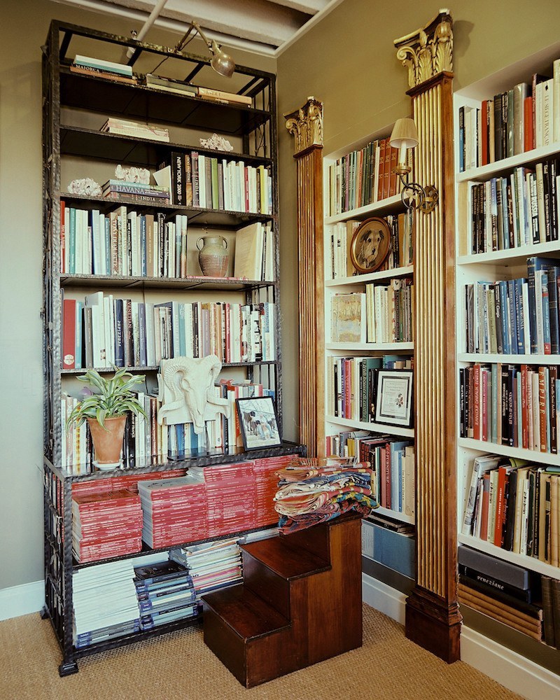
CLEVELAND GREEN 1525*
This excellent neutral color first came to my attention several years ago, because Bunny Williams waxes poetic about it. The room above is her office, and her library is also painted in this color. I would describe it as a bronzey, greenish, golden brown.
I love paint colors that are not easy to describe.
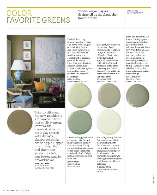
Bunny says that it’s a fabulous backdrop for art, and she loves pairing it with turquoise and other bright shades. Therefore, I added it to my paint collection. Although I’ve never used it some of you have and have reported back how much you love it.
Let’s now focus on the paler shades of green paint colors that are not called green.
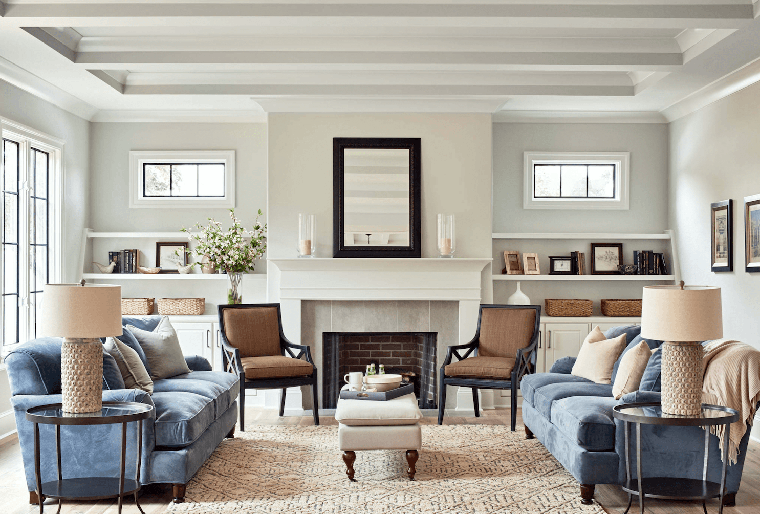
Moonshine 2140-60 or oc-56*
Moonshine is a color that can go different ways, but it usually looks greenish. I love the photo above because Moonshine looks different on every wall.
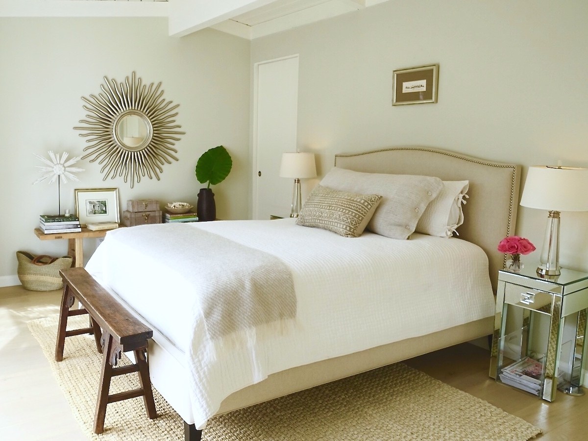
November Rain 2142-60 or oc-50*
November rain is another one of those pale green paint colors that can look more green or blue, depending on the lighting.
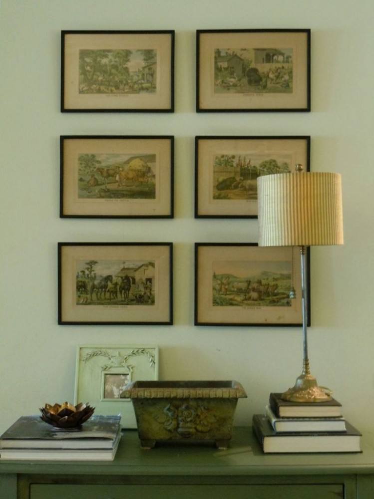
520 SPRING BUD*
This is from my old home. Our small north-west facing den, with a huge hill blocking even the sunset. The color it ended up being was me mixing about four cans of leftover paint. Haha! However, it is almost identical to spring bud.
This color, I have used a few times. You’d probably run right past it on the fan deck, but up, it’s the prettiest pale celery green. It has just enough gray and brown to keep it from looking minty and sickly.
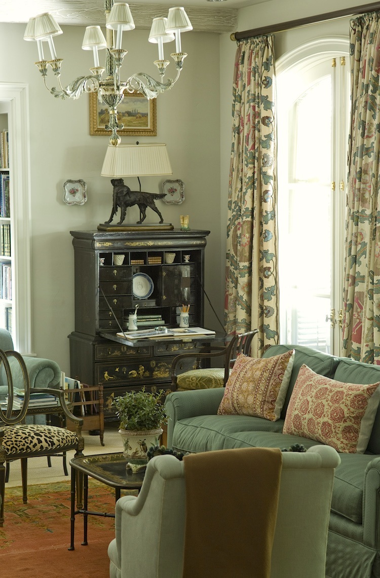
RICHMOND GRAY HC-96*
An exquisite Cathy Kincaid room. I’ve used Richmond Gray a few times. It’s a rich khaki-green that looks wonderful with wood tones. But, then, I think all of these colors do. If you’d like to see another post about colors that look great with wood trim, go here.
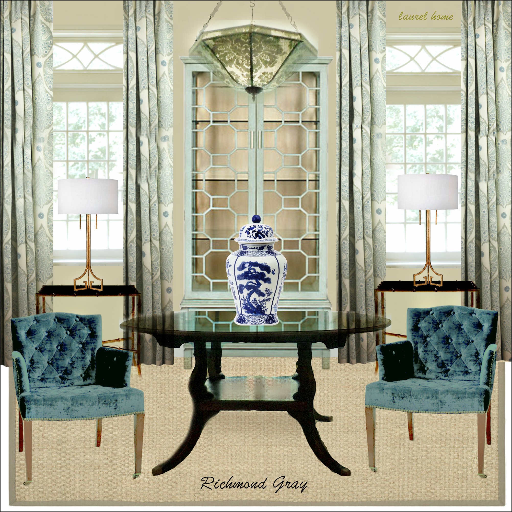
Above is one of the 40 boards, in Richmond Gray, from the Laurel Home Essential Paint and Palette Collection.
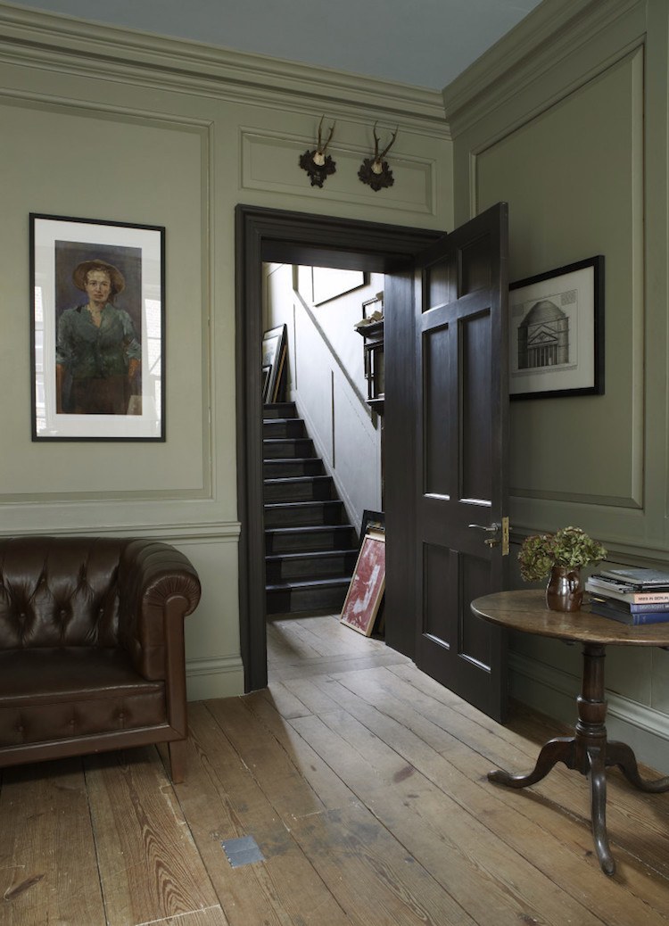
NANTUCKET GRAY HC-111*
Alright. I cheated. This image is from Farrow and Ball for their French Gray. That’s a nice color too. If you’re looking for a conversion chart from F & B to Benjamin Moore, please go here.
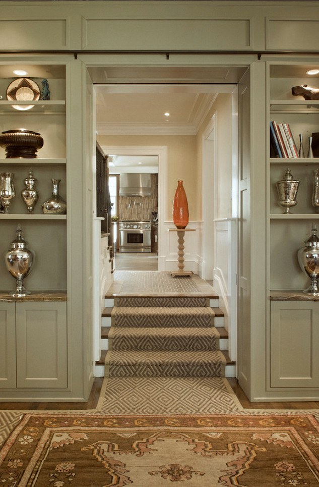
original source unknown
I have to let you in on a little secret.
At least half the colors I used to specify are Benjamin Moore Historical Colors. There are only 174 of them, and most of them are terrific.
I saw Nantucket Gray in someone’s kitchen about 20 years ago. I think it was a friend of my son. It’s a great color and definitely goes up greener than it looks on the chip.
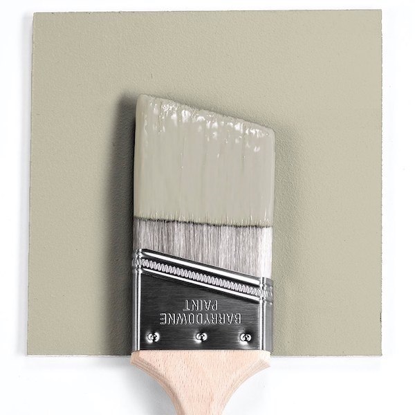
GRAY MIRAGE 2142-50*
This is a classic sage that has a good amount of gray in it. Light greens can easily go minty, icy, and hospital-ly. They need some brown and/or gray to be rich. So, if it looks kind of muddy on the chip, it’s probably going to be glorious on the wall. But again, please test your paints!
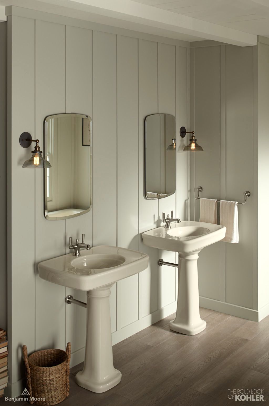
Gray Mirage walls – Benjamin Moore with sinks by Kohler
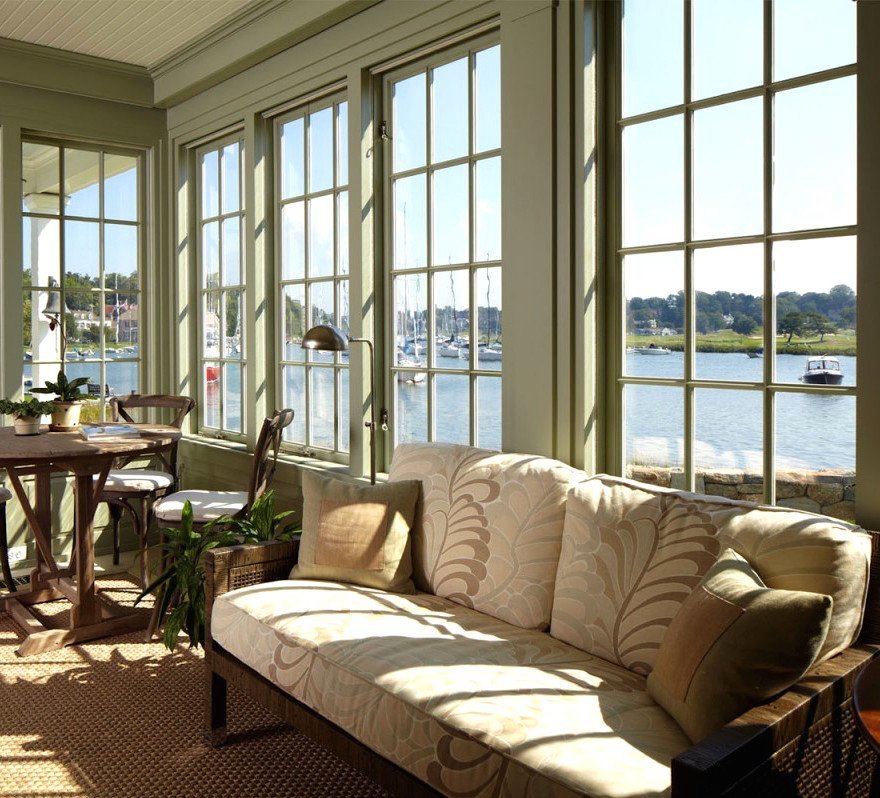
A beautiful sunroom painted in Gray Mirage.

FIELDSTONE 1558*
The interior designer, Sally Wheat, made this color famous when she used it in her kitchen several years ago. It is a medium-dark gray-green and very lovely for cabinetry.
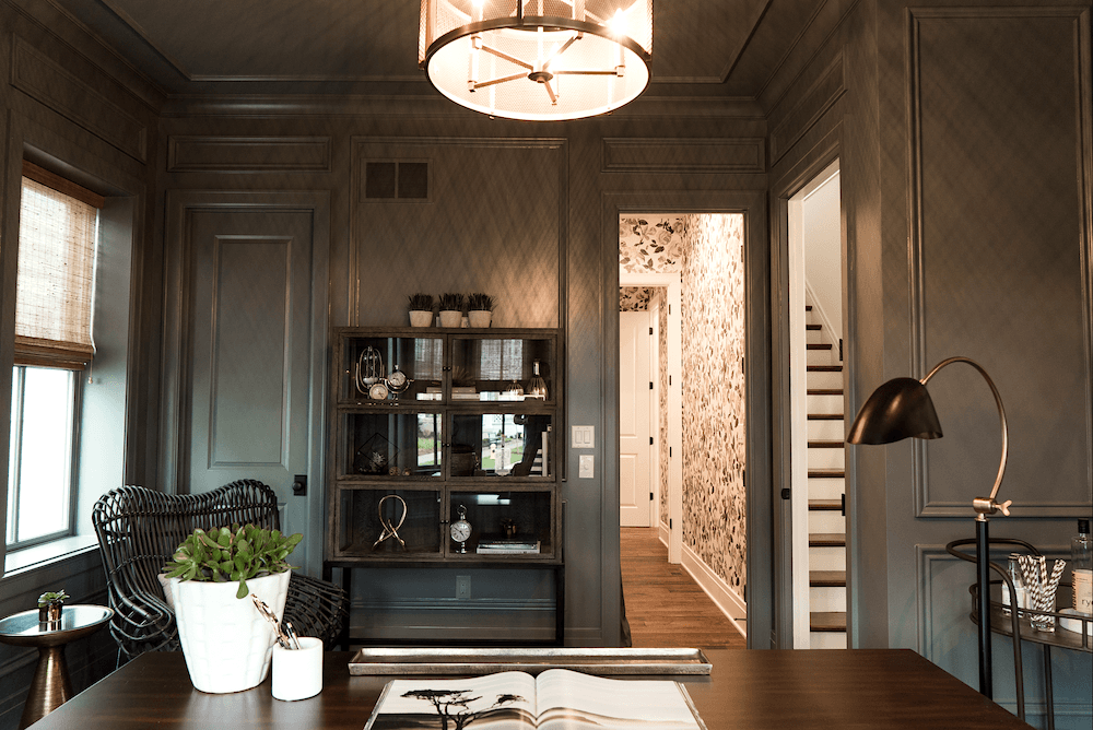
Above and below Ramage Company – Benjamin Moore Duxbury Gray
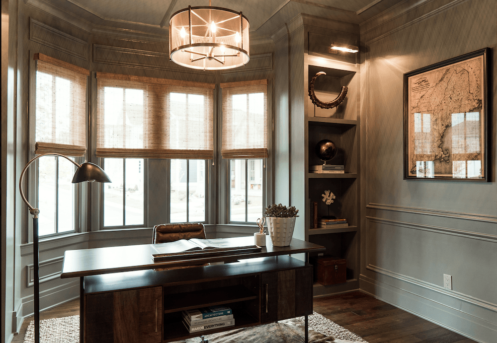
DUXBURY GRAY hc-163
Duxbury is the deepest gray green paint color. It looks quite handsome in this office.
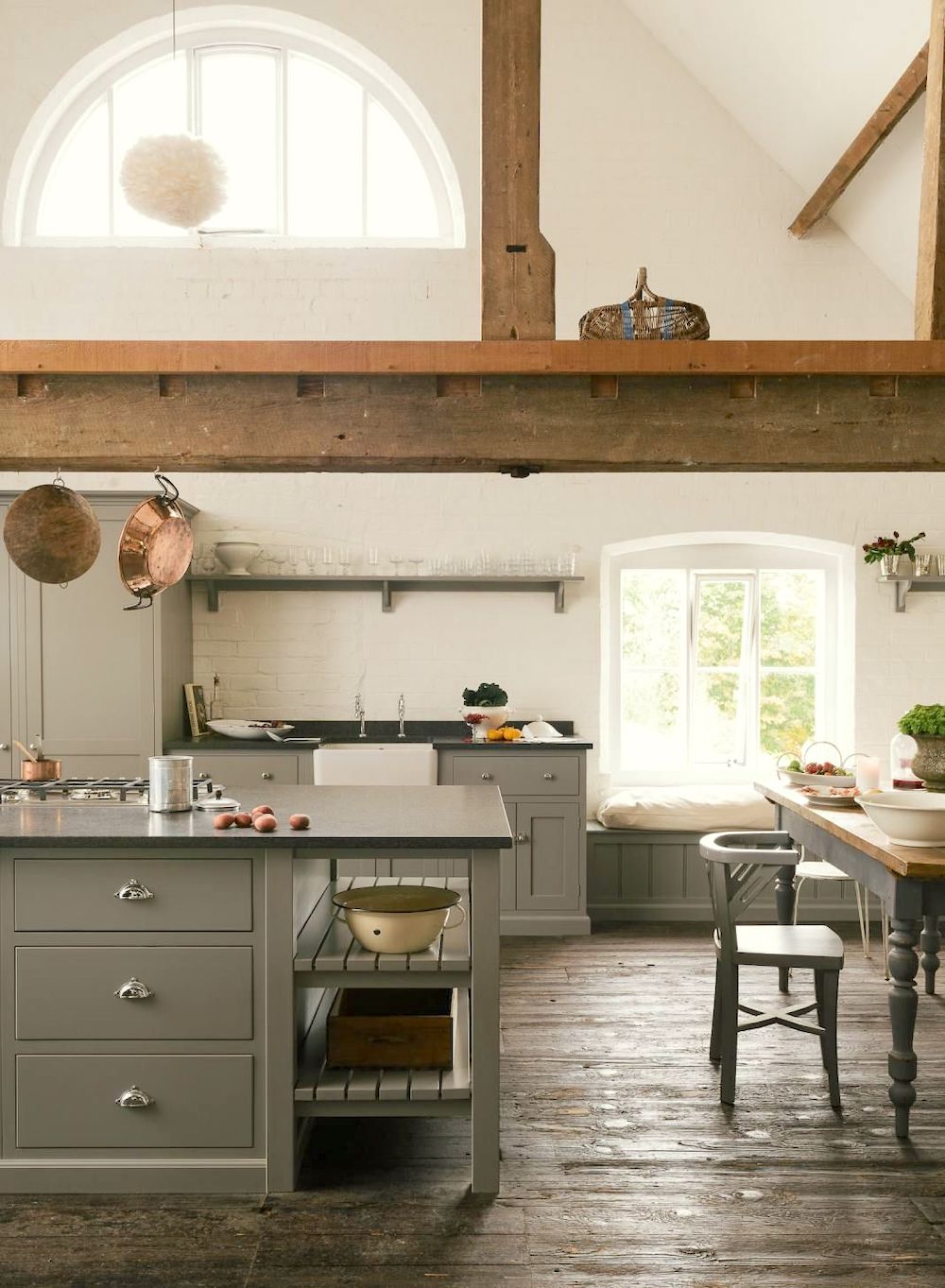
COPLEY GRAY hc-104
I think this is number 10. It’s another terrific one. The kitchen above is from DeVOL, and I have no idea what color it is. But, it looks like Copley Gray. And, that’s all that matters to me. Actually, most of the Benjamin Moore Historical colors are. And, there are many shades of green that are called something else.
Below are some additional green paint colors that I’ve used and liked over the years.
CROWN POINT SAND HC-90
DANVILLE TAN HC 91
CARRINGTON BEIGE HC 93
ABINGDON PUTTY HC 99
DESERT TWILIGHT 2137-40
These are all terrific colors. I find them restful, and they also tend to go with every other color.
Do you have any favorite green paint colors that aren’t called green? There are dozens of them.
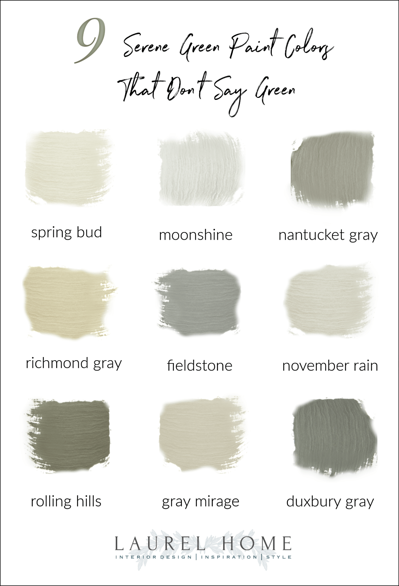
please pin the above graphic to Pinterest
If you’re a fan of green like I am, you might also enjoy these posts:
Are green and white rooms coming back?
She wanted soothing green walls and got hospital green instead
What happens when you prefer green over blue?
Can you use gray paint in a north-facing room?
xo,

***Please check out the recently updated HOT SALES!
There is now an Amazon link on my home page and below. Thank you for the suggestion!
Please note that I have decided not to create a membership site. However, this website is very expensive to run. To provide this content, I rely on you, the kind readers of my blog, to use my affiliate links whenever possible for items you need and want. There is no extra charge to you. The vendor you’re purchasing from pays me a small commission.
To facilitate this, some readers have asked me to put
A link to Amazon.com is on my home page.
Please click the link before items go into your shopping cart. Some people save their purchases in their “save for later folder.” Then, if you remember, please come back and click my Amazon link, and then you’re free to place your orders. While most vendor links have a cookie that lasts a while, Amazon’s cookies only last up to 24 hours.
Thank you so much!
I very much appreciate your help and support!
Related Posts
 The 15 Most Beautiful Blog Posts on Laurel Home
 The Only Six White Wall and Trim Colors You’ll Need
 High-Low Ralph Lauren + Decorating’s Most Dreaded Words
 New Farrow & Ball Colors 2020 Inspired By Nature
 20 Stunning Lifestyle Instagram Feeds You Must Follow
 Mark D Sikes – High-Low – How to Get the Look!
 Is it a Mistake To Decorate With A Greek Key Motif?





41 Responses
Hi Laurel! I’ve enjoyed reading your blog entries. I’m also a big fan of green! I painted my kitchen in Gray Mirage after reading about it in a different entry of yours, but, unfortunately it didn’t work. My poor kitchen gets almost no natural light and the current light fixture isn’t great. I decided to try it in the dining room as I had so much leftover (it was a faux finished combo of yellows and browns of which I won’t mention what it reminded me). It reads as the most lovely shade of blue in there. I love how complex it is. I’m thinking of painting my living room the same color and the entry/hallway in November Rain. Thank you for the wonderful information you’ve shared here!
Hi Laurel, Love the info you share on your blog. 10 years ago I wanted to paint our north facing living room grey. I spent a small fortune on samples. Every grey turned blue on the walls. Finally I found Sea Haze by Benjamin Moore. It definatley has a more kahki base to it and it looked grey on my walls. I would have never called it grey from the sample. Goes to show you, you have to test those paints. You never know what the lighting will do. Recently I painted the walls Van Courtland Blue because I wanted blue and it’s perfect too.
Is there any way to get a larger photo of the green/red living room on the home page. I would like to be able to see it better. Thank you!
Hi Fiona,
You can see a larger photo on this post.> Just scroll down.
As if I ever doubted your genius (which I did not), I have to tell you (yet, again) you are a genius. Having already bought your “guides” and having devoured them, I was in a state of info-overload, so I thought to myself, “Self, let’s just go with Cleveland Green. Laurel says it goes with everything, and acts like a neutral.” Well, being the “trust, but verify” and still having fried brains, I went to the paint store, and grabbed every shade of green and greenish paint chip, took them home and threw them all over my living room. And the winner, without looking at the names on any of the paint chips . . . Cleveland Green!!!
My parents put me in an all army green room at one point and I was so miserable. My reactions to greens are always extreme love/makemesick for some reason.
lol!!!
Hello Laurel, When I was growing up my room was a green that resembled Nantucket Gray, although perhaps a little lighter and greener (which is how you said it looks in person). That was a nice and restful color, and I would consider using it again for a bedroom or possibly some other room. Somewhere I have a tiny sample that was left under a switch-plate when we repainted so if I find it I’ll take it to a paint center to identify the exact color.
–Jim
I painted my kitchen island Annie Sloan Chateau Grey-it’s a deep grey green. I’m very happy with the look. Reminds me of the devol kitchen in the post. It’s a chalk paint so a bit of the original walnut stain comes through on the details.
I painted my master bath Sherwin Williams sea salt. There are so many fabulous pictures of the color online, of course I didn’t color test. It definitely reads fern green up on the walls. Luckily green is my favorite color!
Highly recommend Sherwin Williams Ancient Marble. Looks beautiful with dark wood floors, White Dove trim, lots of natural light. Neutral with a bit of interest and richness.
Would love to know where that round dining room table came from! Thank you!
Denise Buchanan—it’s a (French) Revolution! Go Us!
Great resource. Back in the day I helped my husband spray out our new house, every inch of every wall and ceiling, in Sherwin Williams Grecian Ivory #7541. On the screen and chip it’s an innocuous pale tan. It looked minty fresh green when we were done. It dried overnight and cured to about what I was expecting though, a coolish light canvas color. I still like the color, with my reddish wood floor, white trim. Not friendly to the bathroom tile though, I’ve learned some things since then.
Oh man, I love these colors and the photos! My entire home is painted with the same color scheme. While I think the original homeowners who built this home did a fine job of choosing wall the colors, I do dream about painting some of the rooms something else. I recently did some minor redecorating in the master bedroom and bathroom, and I bet one of these colors would look amazing in there! When we’re ready to paint, I will come back to this post. Thanks for the inspiration!
Thoughts on Benjamin Moore Par Four? Totally in keeping with your comment, I NEVER would have purchased it based on the name. But our bedroom looks serene and beautiful in that color.
So glad to hear that Deborah!
Siobhan, I make it a party of 2! I used French Canvas in a bedroom and White Dove /Dove White (like you, I never remember which it is though I’ve used it as my go-to trim in 3 houses), and I love it.
I like some of the dark grey greens here! My personal best green is a Granny Smith apple green. It makes me happy in all seasons and all lights.
Hi Mary Ann,
Most of my home’s interior is painted Quiet Moments.
I love it also.
Yes, it’s one of my go-to colors, as well. I didn’t include it hear, because I think of it as being slightly more blue than green, but it’s a greenish, gray blue, for sure.
My husband loves the Cleveland green painted living room. It is a very soothing non color color if you get what I mean. I tend to like moody colors. That said, wondering what green would look good in a north facing room with big windows. Any suggestions are welcome.
We live in the Pacific Northwest on the water, the lighting is incredibly variable, especially seasonally. With a NW exposure, summer afternoons and evenings are full western sun until nearly 10PM, whereas winter days see very little direct sunlight. I wanted a beach glass, a very light greenish-blueish-grayish tone.
We used BM Dusty Miller, CSP-755 and I adore it. I am just this week repainting my last room that is not this color and the brightness is so pleasing.
The color changes are incredible, it pleases in sunlight, gray days, and lamp light. It uses the BM Aura base, yah, the expensive one, but it adds so much depth of color. We went it’s matte and I cannot say enough good about this paint, in my lighting.
WE moved into this house five years ago and the family room, east facing but surrounded by woods so also dark, is painted a light green. Or at least it looks green with the tree leaves reflecting it. My daughter occasionally ask when I’ll repaint it white but I’m afraid I’ll do that and it’ll read green anyway. Am I wrong? Did I make that up?? Anyway, it’s not an annoying green and if I saw the chip, it’d probably look more greige….who knows? I think the previous owners knew what they were doing.
I once used French Canvas in my north-facing bedroom after I saw it on a blog (not yours). I didn’t test- just looked at a paint chip assumed it would be a wonderful greige when applied to my walls. I came home from work after the painter had finished and it was the most hideous pastel-mint green on the walls! It was so gross. At least I learned my lesson about testing a color in the space 🙂
I painted our kids’ bathroom BM November Rain and find it pairs well with so many other lovely colors for towels, rugs and accessories. Importantly, it also goes well with almond/cream countertop and tile floor.
My dining room is painted in BM Wethersfield Moss. I’ve loved it from day one! Even after many years, it still gives me great pleasure to catch a glimpse while passing by or dining there with family and friends (pre-Covid days). Highly recommend this color. Thank you, as always, for your words and inspiration.
Hi Laurel,
We recently moved to Florida from North Idaho – need more sun and warmth. We took a leap of faith and painted our great room Window Pane by Sherwin Williams and the entryway leading into the great room, Glimmer by Sherwin Williams. We are delighted with the results. The colors are very soft and cool – kind of like a spa might be. We have lots of huge windows to let in the sunshine and the result is happy and relaxing.
I’m raising my hand! Party of one!
My entire 8,000+ sq. ft. home outside of Chicago is painted…….drum roll! FRENCH CANVAS! Yep, French Canvas with Dove White (or is it White Dove? I can never remember) trim. It reads a muddy grey-green on my walls, and I love it. I’d be happy to send photos to prove it’s not super hideous.
I did, however, connect with the name! That certainly rang true. I’m the kind of girl who always looks at the nail polish name as well as the color.
Thank you for this amazing blog, Laurel. I count you among my blessings.
15 years ago I painted my large living/dining area with “Ivy Lane” by Benjamin Moore. These roooms have a southern and western exposure and a vaulted ceiling. I get endless inquiries about the color. I wanted to put this out there as another beautiful greeen option. I was going to redo these rooms last year until I startled seeing green making a very strong comeback. Now I apprecitate how it can and does really act like a neutral.
The house I’m renting in the mountains has walls painted in a similar color as Cleveland Green. Does it coordinate with the stone fireplace and cabinetry? Sure.
But it kinda depresses me because I love fresh clean colors. I’ll probably end up with a house that looks like an Easter egg some day just as a rebellion. 😉
Thank you for this post, Laurel. I have always loved green walls, starting when I was in high school. After my brother moved out and I got my own bedroom, I chose green walls. Currently, I have used and loved BM Stingray in my kitchen, two baths, and the connecting hall. However, I love the color November Rain as posted above–I think they may be similar, but we’ll see. I agree it’s so important to test paint colors–we learned the hard way when our bedroom first turned out hospital green years ago. It’s worth the time and a little expense to get the samples and paint them on different walls. Take care!
The struggle! Trying to choose the right colors (colors?) for an open concept room that runs the length of this house with 4 north facing windows + 2 west facing at one end and 2 east facing at the other end.
I narrowed it down to “green” because I don’t really want it to read gray and everything seems to read gray in this space.
I know you are shouting “No! Don’t do that!” Laurel, but I had to start somewhere.
https://i.imgur.com/IwGJPsL.jpg
I’m trying to achieve more green than gray, works with brights, primaries, or neutrals, and not so taste specific as to potentially turn off home buyers.
Haven’t tried a chip of Cleveland Green. The Cypress Green mentioned in the picture you have included sounds promising. I like the Pale Avocado you mentioned in another post and wonder if it would brighten up the room. Then again would that read too yellow? And Cushing Green is very nice. And I think that a darker wall would make artwork and furniture pop. But would it make the space look too small?
Blah.
Just saying. 🙂
My go to Green for many years has been a
pale Celadon Green. Seeing these new colors
for me are eye opening. Will have to try one
of them when I paint again.
Love your posts, learning so much from you.
Thank you,
Laurel – I never used greens in decorating, but after buying your paint palettes, i decided to try Nantucket Gray in a guest room. It looks great with the wood floors and furniture, the white shutters and bedding, and art framed in black. People walk in there, love it, but it doesn’t scream green.
Gray Mirage is the most fun color to work with! I have used it in a west facing room with four windows and it turns a gorgeous shade of blue at times. It truly is a mirage!
People with cataracts often see colors as green when they are not. It’s because the cataract itself is adding a greenish hue to what the person is seeing. I don’t see these colors as green. I have a friend with cataracts who came into my house and declared that a lot of my fabrics were green (they were not). After her surgery to remove the cataracts, she stopped having that problem.
I also love the Ben Moore Historical Color collection and have used many of the colors over the years. LOTS of them read green (and yellow) when they’re on the walls, especially in incandescent light or when there is lots of foliage outside.
Selecting a paint color is probably the most difficult part of decorating, especially when using neutrals, as most of them are so changeable with the quality of the lighting.
I know you love green – so I always learn a lot when you write about the color and choose your favorite images to best illustrate your point. Today your point about greens and wood tones was so brilliant.
My mother painted our kitchen a green that did not read green yet if she had used white the room would have looked terrible. It would have looked too sterile AND grubby at the same time!
That was 40 years ago with far less choice and only the experience of seeing an image in a magazine; film or tv or in a home or public space with usually only a memory to navigate the paint chips or testers (if a tester was even available).
Laurel, thanks for showcasing all of these beautiful greens. I suppose it isn’t a green technically, but I have used one of your no-fail paint colors, Fairview taupe in our bedroom, which looks green in certain lighting, and is beautiful!
As far as colors that don’t indicate green, Sherwin Williams 3233 Conduit Grey is a great neutral warm brown green. I have used it twice now. The first time, in my laundry room (it looks great under fluorescent lighting), and loved it so much that I decided to use it in my office as well. It also looks fantastic in lamp lighting there.
I have applied it to the ceilings in those rooms as well, since we do not have crown molding, and I LOVE IT! Not all all grey, as the name implies! It is great paired with creamy white trim, such as Dover white.
I am painting my office Quiet Moments – at different times of the day it reads green or blue. Love it!
We have Moonshine in two hallways and a bedroom and we love it. It sometimes looks a little sagey but mostly reads a complex blue or grey.