Timeless Interiors Or A Passing Trend? How To Tell The Difference

The other day I got an interesting email from a reader. It is edited, but not for meaning, only to shorten it a little.


I loved the images you sent from your recent tours in a theoretical sense. They are beautiful and uplifting. However, I must say that, while deluxe and educative, they are not as relevant to [me] as many of your posts.


Well, I’m happy that some of the posts are relevant. I wish that I could be everything to everyone, but of course, that’s not possible. While some people couldn’t care less about my trip, others are foaming at the mouth dying to hear all about it.


How might a typical follower request more applicable examples and advice without being rude, obtuse, or intrusive?


Just ask and maybe I can do a blog post that will benefit others as well. :]


As I am trying to find a balance between respecting where you are in your work and my needs I am struggling to improve my charming (personal interpretation) yet modest home. While I don’t expect your expertise to be free of charge; can you imagine any palatable avenue of support?


Yes, hire a designer. Yes, it’s going to cost money.

Later after my brief response, I received this reply, again with my answers between the lines.


I know that, living in NY, you are attuned to smaller residences. You also have implied a dollar consciousness. That you have impeccable taste is a well-established fact.

The majority of images I have found posted on websites are of much larger, bigger budget homes.

I examine them closely, attempting to tease out some detail or general impression that might help me make decisions for my home.


Would love to learn more about how you do this.


Sure, I would love someone to tell me what to do sometimes too. :] But this is what this blog is about. I am telling y’all everything that I know and a lot that I do not know. ;] (that’s where research comes in) If what I’m writing about doesn’t help with your precise needs, then I would recommend hiring a pro to work with. I recommend it under any circumstances!

But… magazine photos can be quite deceptive. Believe me when I tell you that there’s a photographer out in a corn field half a mile away with a 6′ telephoto lens, just so that he can make the room look large without distortion!

Fine, I’m exaggerating, but photos ARE often deceptive.

But even IF the room is on the large side, it really shouldn’t make a lot of difference, in terms of furnishing the space. Color, yes. Furniture, not very much.

Why?


Because buildings and their furnishings are meant to relate to the human form.


And humans on average are roughly about five and a half feet tall. Give or take a foot or so. They don’t become larger if the room is larger unless they are going into that room to eat 20 times a day. ;]

Sure, there are rooms that are super tall, like two or three stories high.

But down, closer to the ground, one will find the furnishings to be about the same size as they would be in a room with an 8 or 9 foot ceiling.

The furnishings are for the people; not for the room! (unless they are glued or nailed to the wall)

Of course, we are not going to take a 12 x 15 foot living room with an 8 foot ceiling and put in a heavy coffered ceiling, pilasters every three feet and heavy dentil mouldings. There’s a lot of logic in this business.


What I am specifically interested in these days is a 1930s kitchen I’m planning on remodeling. Mine is 11′ x 13′ with three doors and three windows. Even gutting the space, it’s tricky fitting modern appliances and adequate storage in a way that is functional, balanced, relates to the rest of the house, and looks purposeful rather than accidental or poorly conceived.


WAIT! The house is from the 1930s? Hold on just a second sister. ;] If this is a prewar home, you have already accomplished 90% of the battle. That is, unless some unfortunate miscreant did some hideous remuddling.


The intentional part is most difficult in planning things like counters that need to change depth on one wall; where to end the backsplash that isn’t awkward or abrupt…


I am also stuck, stuck, stuck trying to figure out the overall feeling this house will take on for the next 10 to 20 years. I’ve reached the age at which many of us have collected, been given, or inherited an amazing variety of objects that are meaningful, appealing, possibly even valuable – and vastly unrelated.


Ahhh… well, this is why there are interior designers. I would suggest working with one; especially for a kitchen remodel. That one is imperative. But if it’s the original kitchen; it might not need to be totally redone. It depends how one looks at it.


I love eclectic, but it can easily end up looking as though one furnished the entire house in a single day with a conglomeration of items from mom’s basement, several yard sales, an upscale consignment store, and a one-time splurge at the local luxury furniture boutique. Don’t get me started on the artwork that goes where????


Just did a post about art placement and there are numerous posts about art. In fact, art is in virtually every post. Regarding editing what you have:


I hereby grant thee permission to give away, consign or sell anything which is no longer working for your new timeless interiors and design aesthetic.


Back to the kitchen. What about countertops? Marble for a more refined look (goes with the pretty white woodwork throughout and finer antique pieces); soapstone (in line with the cat’s well-worn, beloved, 100-year-old oak and wicker rocker, easy lifestyle, and the dings in that pretty white woodwork); or a decidedly contemporary manufactured material?


Yes, these are not easy decisions. Here is a post about kitchen counters.


Whatever direction it takes, I’m definitely done with my stuffy… I’m ready for handsome, substantial, relaxed, interesting, unpretentious, highly personal, pulled together, livable, inviting. And I want it to be smart; as in intellectually/stylishly/structurally smart, with a dash of humor.


Lastly, I want to thank you for your brilliant and delightful blog. I especially value the search tool, which I employ frequently to read and reread pieces related to design dilemma du jour. 


Thank you,

D

Well, thank you D. And yes, the search box is an excellent tool that I use it nearly every day too!

But, the main gist of these emails is that there is a reader who is struggling to find her true identity. She has accumulated a lot of things that hold some power over her.

I know that it can be difficult to let go, but they are just things. Have to tell you that when I moved nearly five years ago. I left a lot of my things behind. Don’t miss them one iota.

However, the freedom I felt when landing here relatively unencumbered was a thing of joy.

One other option that helps me is when there is a question or a decision to be made, I google it.

For instance:

Should I use soapstone or marble for kitchen counters?

Very often, there will be information out there that can help with the decision.


However, there’s one over-riding design dilemma that actually plagues all of us.


We don’t want to make a giant whopping mistake which could translate into thousands or tens of thousands of dollars down the drain.


Nobody except maybe a small portion of the top 1% wants to be redecorating every few years.

And this is one reason why I very much recommend getting professional help. Professional interior design help.

But you need to find someone who’s work that you love and who gets YOU. Someone you feel immensely comfortable with and you trust to do what’s in your best interests. And I feel that the best designers are ones who listen to their clients and keep an open mind about what the outcome might be.

After all, they are designing for the client, not themselves.

However, let’s say after all of the warnings, pleadings… that you still wish to go it alone.

OR, you can’t find anyone who “gets you.”

OR, all of the designers in your area are doing something else.

I get it. I really do.

But, here’s the problem.


I had a mini epiphany about timeless interiors which perhaps I’ve stated but not quite in the same way.


And it’s fitting since the High Point Furniture Market is going on right now– This is where scores of thousands of designers descend upon thousands of showrooms. (yes, THOUSANDS!) to see the latest and greatest; the must haves; the latest trends.

You already know this.

It’s in regard to the American Home Furnishings Industry. Oh, not all of it. But too much of it.

It makes me crazy because people are gushing over things that I think are HORRENDOUS!

(and BTW, some are my friends who I love dearly despite this!!!)

The design is bad and so is the execution, color, proportion– wrong. And not only do folks not seem to notice, they claim that they LOVE IT!

arrrrggghhh!!!

And, maybe they DO love it. But I believe that is often because they haven’t been exposed to that which is truly timeless and classic.


Pigs will fly with ankle weights in a sea of buckwheat honey before this will ever happen…


What if we could lock up all of the manufacturers and immerse them in the authentic timeless designs I saw in England.


What if they threw everything out and confessed that they’ve been doing it all wrong for decades?


That would be the happiest day of my life!

75% of the furniture would be redesigned and they would hire the likes of Ben Pentreath, Nancy Keyes, William McLure and Maura Endres, okay and me. (she said, trying not to sound like a self-aggrandizing cow). And of course, many others and please forgive me, if you were left off the list.

Because I know that there are many of you who already get this and feel the same way.

I’ve discussed the issues before which you can read about here and here.

It’s not only that the furniture is big, bulky, disproportionate, weirdly detailed and on and on…

So much is largely lacking in one word that sums up what’s missing.


CHARM.


There is nothing charming about a hippopotamus crawling around on his belly.


What are the components of charm? Here’s my list.


  • Size. Charm is almost always petite and often intricate in design.
  • Charm has age. Genuinely aged or at least a really good fake.
  • Charm is unique and almost always a little quirky.
  • Charm often has an element of whimsy, but at the very least, it never takes itself too seriously.
  • But charm is also classic.
  • It’s forever. Something that is charming today will be charming 30 years from now.
  • Charm can be grand, but the charm is in the details, not the scale.
  • It’s not something that gets manufactured down an assembly line along with a million other replicas.

Finally, charm is art.

And that is the sticky wicket.


Charm is either dirt cheap, or hellishly expensive.


You know the old saying:

I can get it for you good and fast or good and cheap, but not good, fast and cheap.

Still…


Furniture manufacturers can’t make as much money from something small, old and unique.

Plus they are catering to the American penchant for BIG!


But what if…


It’s all just a fantasy, but for fun, let’s immerse ourselves in the truly classic.

English Classic, since I’m now quite besotted if I wasn’t already!

Now, you might not like it.

It’s a little like Marmite. It helps if your mother put a little in your milk when you were a baby. Then, you’ll grow up loving it. Otherwise, it’s a tough sell.

So, where is the easiest place to immerse ourselves in timeless interiors?


Instagram.

If you click on that, you’ll see my son talking to my mom who will be 95 in a few days! Oh, and while you’re there, please follow me! (and all of the other folks I’m going to link to, if you like)


It’s kind of funny, but we all find each other.


And none of these homes/rooms are mcmansions. In fact most of these homes are quite small with small modest rooms.

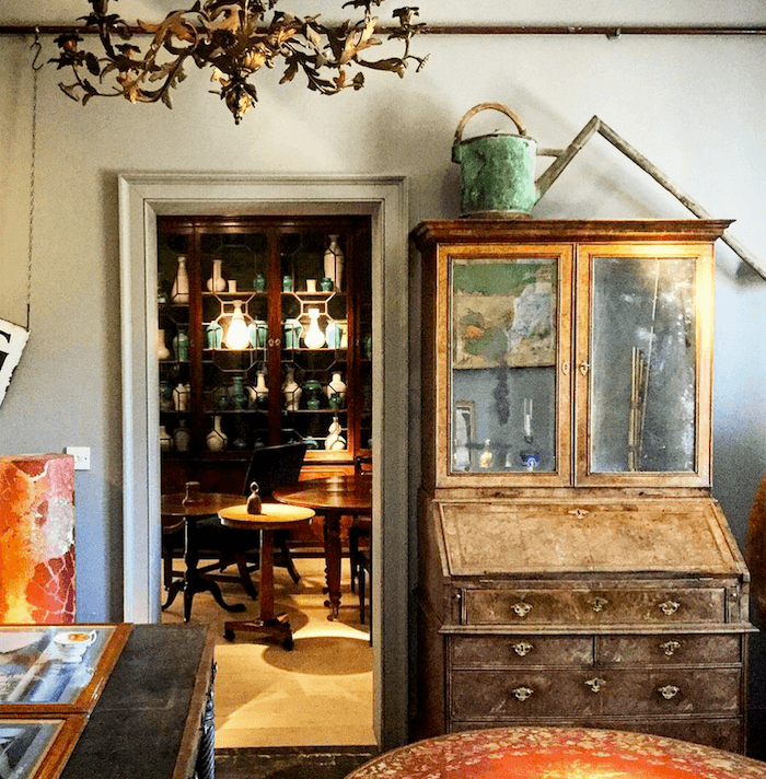
One of my new favorites on insta is a young English antiques dealer with the handle “@Tradchap”.

Perfect moniker!

His real name is Jack Laver Brister

This appears to be his business and website,

Tinhouse Home and Garden Antiques

But for some reason, he’s not promoting it as such. However, some of his recent insta images are on the website, so it must be his business.

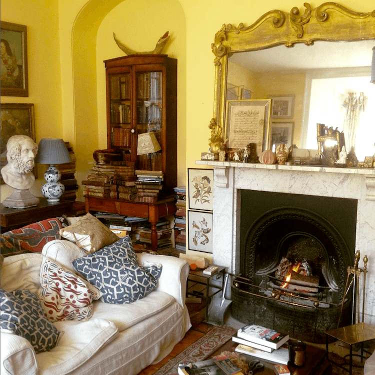
The following are some shots from his antique (aka: charming) Georgian home he is renovating is Frome. (note: actually, this might not be the home that he’s renovating. not sure)
It’s frightfully English you know…
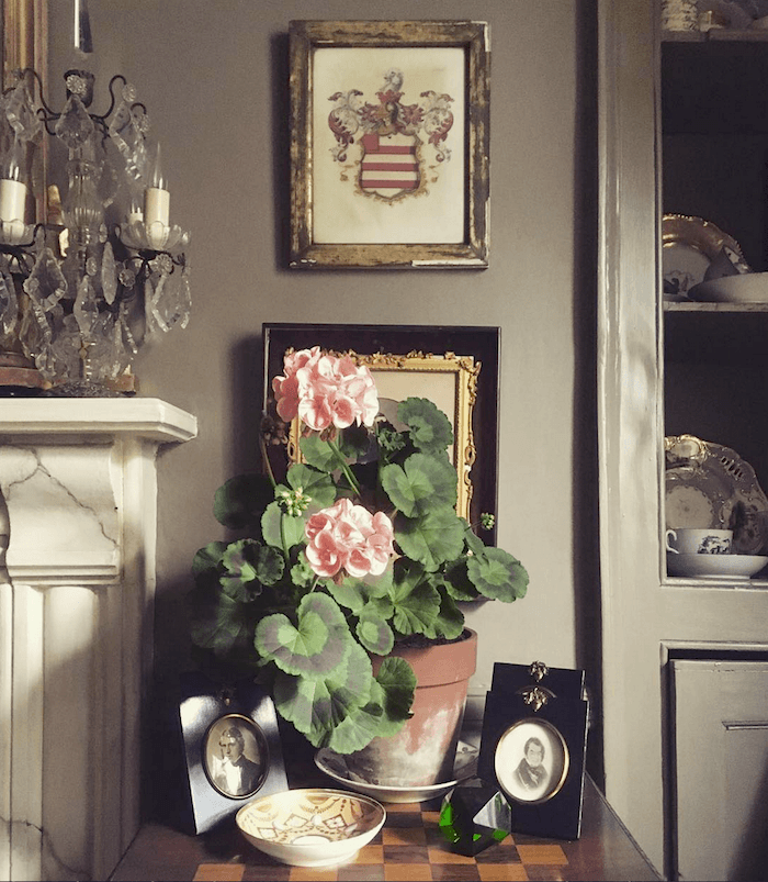
Love the colors!
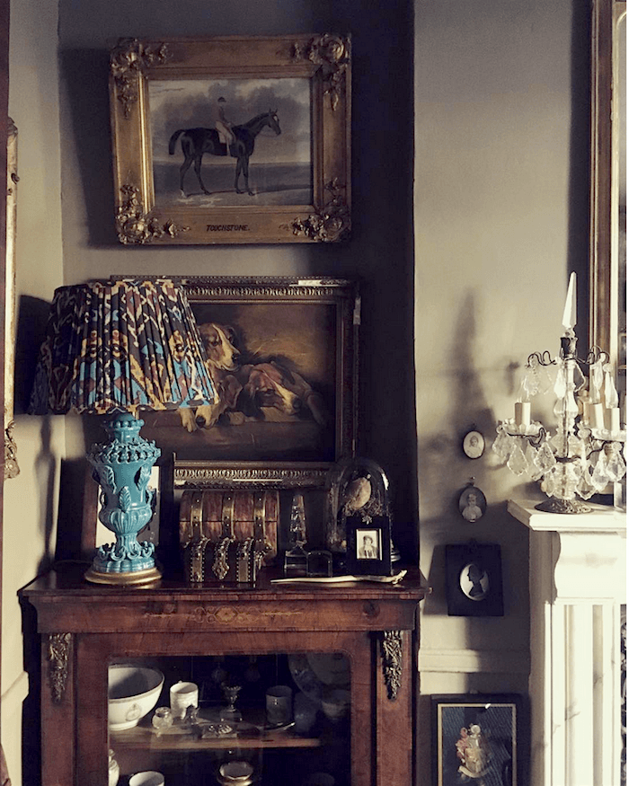
The living room wall color is Farrow and Ball Mouses Back.
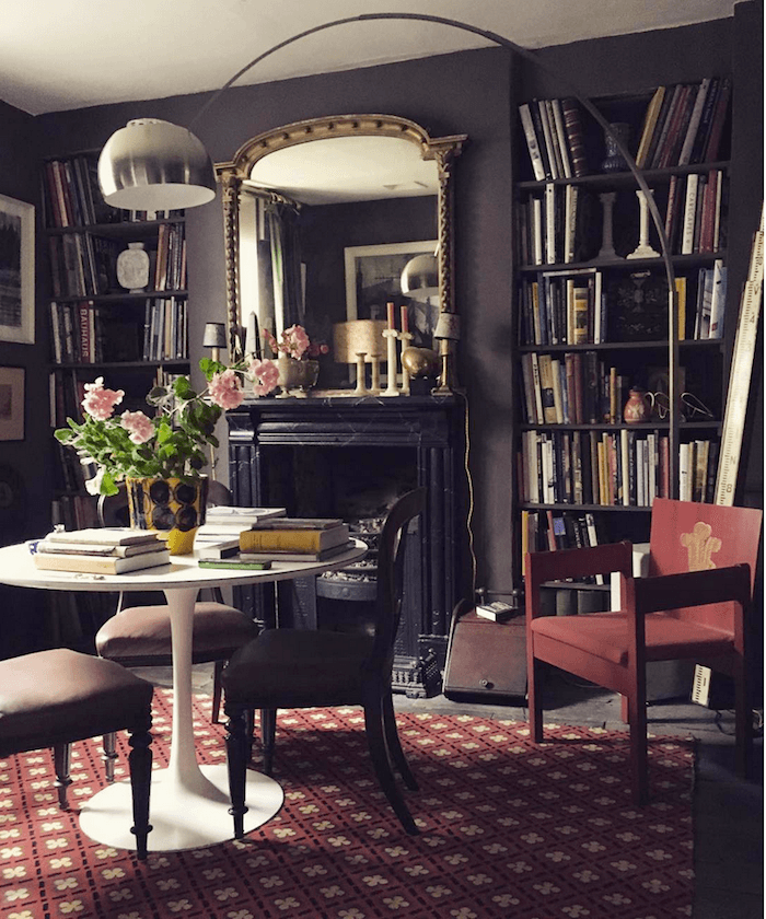
The library is old and traditional but Saarinen Tulip table and 70’s swooping lamp seem right at home to me. The wall color here is London Clay.
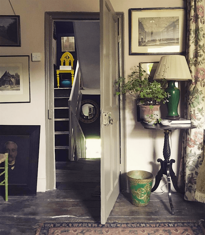
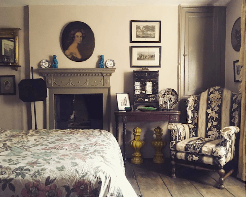
 

I love the bright accents that pop up out of nowhere.
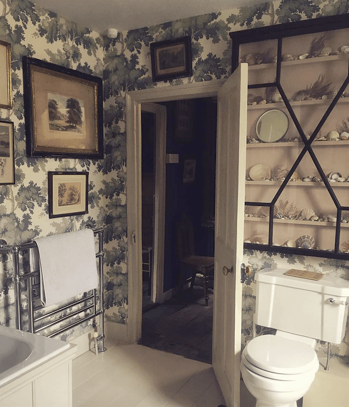
The bathroom with the Sandberg wallpaper (more often seen in the blue and green colorway) is my favorite. Love the cabinet.


Here are some other places we can become immersed in timeless interiors
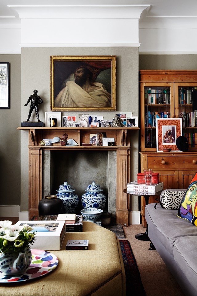
 

timeless interiors for people who are renting.

This image is from an article about how to style your home when you’re renting. Some great ideas here.
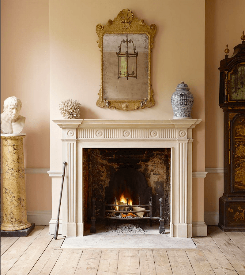
 

Above and below are gorgeous mantels from an English company, Jamb that manufactures them and sells antique mantels, too.

They are also featured on this post.

Pink is a wildly popular color these days in the UK and a classic one too!
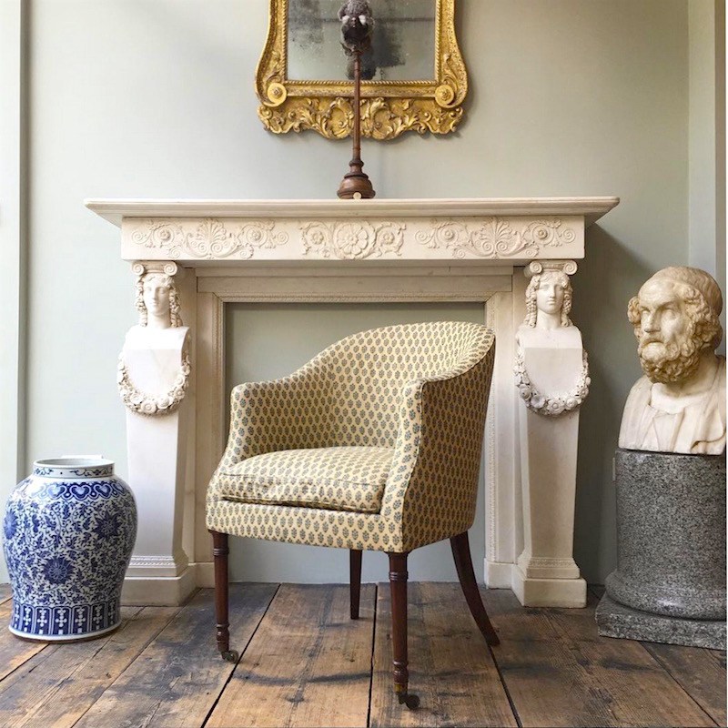
 

From the Dorset home of writer, Jason Goodwin.

English decorating is a little messy. I know that this does not appeal to some of you, but I love it. I’d feel exceedingly comfy here in this cozy, lived in and loved room.
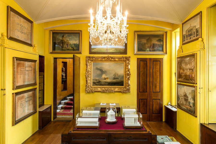
Sir John Soane’s Museum. I’m working on getting the chips for this color AND Ben’s beautiful peachy pink.
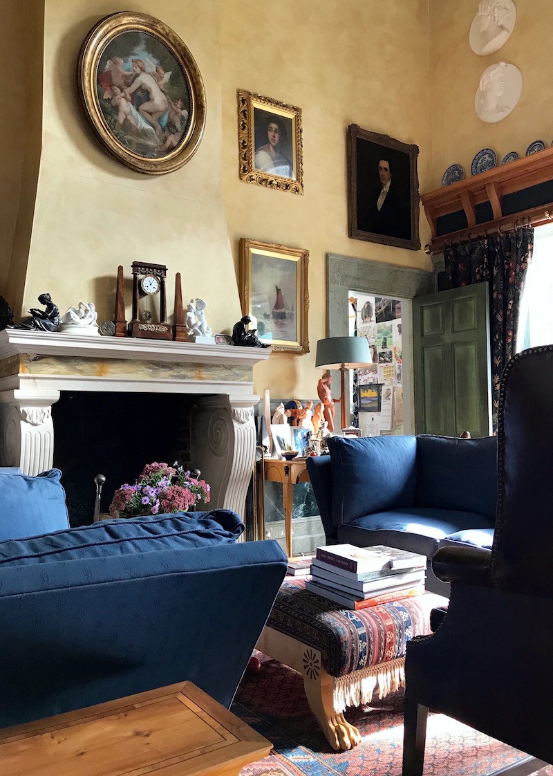
Above and below are two views of the same room I took on my trip to England. It is the home of principal architect, Robert Adam of the Winchester firm, Adam Architecture.

And yes, he bears the name of the famous neo-classical architect Robert Adam, but I do not believe that they are related.
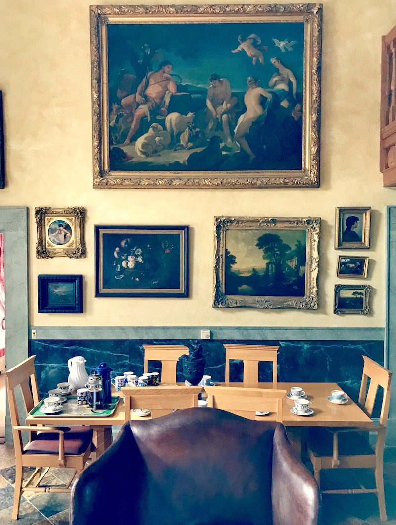
Love this beautiful art wall. It’s a very personal home and that is typically English too.

It’s the personal touch that I find devoid of so many of our interiors in the US. Of course, personal touches aren’t big money makers. Sorry, if that sounds cynical, but it’s how I perceive things.

And you know how Americans are always saying that the English are so reserved?

That’s a bunch of crap. It’s US in the US who are uptight, neurotic, afraid to change, afraid to eat just about everything and afraid of anything that isn’t beige. (Yes, sweeping generalizations)

But are there American designers and architects embracing these kinds of timeless interiors and styling.

Oh yes, many. Too many to name.

And there are good furniture manufacturers too.


BTW, just a reminder that the 4th edition of Laurel’s Rolodex is coming out November 1st.


And on the 13th, the price is going up for the Rolodex as well as the paint/palette bundle.
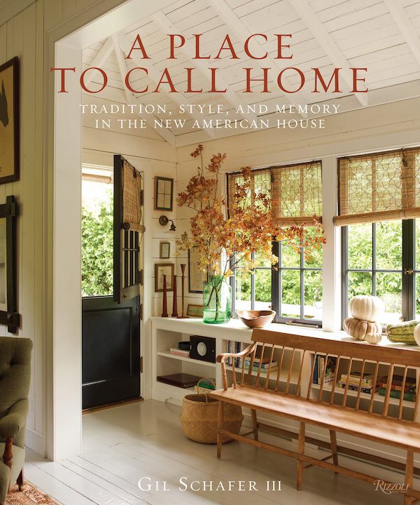
One of my favorite American classical architects is Gil Schafer

He JUST had a book come out. You can read about it here.


What about retail sources?


Well, there are many. But my favorite over-all that has lots of classic designs as well as vintage furnishings is One King’s Lane. And I also love Chairish and Etsy.


Well, this is one of the longest posts I’ve ever produced at over 2,700 words. So, time to wrap this one up.

Timeless interiors are achievable.

But not all designers, vendors and manufacturers understand what that is or even have the desire to do it. But if it is what you want, then it’s going to require a lot of research and study– even if you hire someone, I think it’s a great idea to become knowledgeable. That is how you will know the difference.

xo,


PS: Don’t forget to check out the Hot Sales Page if that interests you. Lots of gorgeous new things and only two more days to get 20% off on the sitewide Serena and Lily sale.


109 Responses

  1. Dear Laurel, I look forward to every post from you. Their beauty has even served as some relief in difficult times, and have inspired many home projects here. I have to tell you, I am OBSESSED with the “unbathroom” here – the one with the Sandberg wallpaper. I am working on my own bathroom, as a reno is out of the budget, and I’m wondering if you might do a post on the unbathroom, akin to your unkitchen posts. Perhaps this would be of broad appeal to your readers, so I thought I’d plant the idea. Meantime, a thousand thank you’s for all you’ve shared and all the beauty you add to the world!

    1. Hi Kimberly,

      Haha! The unbathroom. Well, I did a post on one kind of unbathroom, a while back. It was pretty funny, but folks had their bathrooms out in the open and in their bedrooms. I realize that’s not at all what you are talking about.

      I adore that bathroom too! Very handsome!

  2. Thank you for that hearty post, Laurel! It was like a good stew on a cold night 😉

    Just chiming in with two things here:

    1) I too, lurve English “messy” decorating. One of my favorite movie homes is the one from “The Family Stone” and that house is dripping with such a high level of lived in, homey disheveled-ness, I adore every frame.

    2)”remuddled” is mah new favorite word! xo

  3. Oh my Laurel, thank you for making me sane in an insane design world. I am a lover of traditional and antique American furniture. I grew up in a finely furnished home and my father was a collector of antiques and oil paintings and has some pieces by the notable Hudson Valley artist, Bricher, among others. Now honestly, I do understand furnishings evolve over time but the design has all but disappeared. The cheap big box store monstrosities that they are passing off as furniture is such a travesty. Most young Americans are not being exposed to any type of variety in decor. It’s all the same. Pottery Barn is quilty too and so are Chip and Joanna by pushing furniture that is bland, blah and devoid of any craftsmanship. We need a renaissance to bring back fine workmanship. What happened to all the different styles that once were abundant. There was a time when you actually had a choice of 18th century, Early American, French Provincial, Danish Modern and so many others. Homes were interesting places that reflected the owner’s personality but now it’s like walking into a hotel room when visiting friends and family. I’m drowning in a world of gray banality.BORING!!!

  4. Ha-ha, from now on I can think that our dark cluttered house is one with timeless interior :))) On a serious note – yes, I love the original features, it is an Edwardian house, and the fireplaces, some of the furniture and the art look nearly identical to those from the pictures. Sadly, the mess is the same, too :))))) Need more storage space. xoxo

  5. I think one style that has come back so often that it has become timeless, in its own right, is mid-century modern. I know, I know!!…not more mid-century modern! But for more minimal tastes I think its become a timeless style.

    One trend I saw in Europe and again in Japan that I started taking a liking to was luxury vinyl. The technology exists now to make these beautiful, colorful low maintenance floors. Some places let you customize the colors.

    But while researching this I didn’t realize the idea was also from the 1930-1950s when Armstrong floors made vinyl rugs

  6. I connect with and decorate in the casual, collected English style and appreciate your posts. It’s actually quite difficult to pull that look off successfully without looking forced, chaotic, or borderline hoarder. When I see a beautiful English home layered with books, art and patterns, I am in a happy place. Thank you.

    1. Hi Lissa,

      I read a while back that Alexa Hampton had painted her apartment a deep brown. She loved the color and said that it never looked messy. There’s probably something in that.

  7. Oh Laurel!
    This may be my favorite post because it so beautifully dovetails with your U.K. trip and is unapologetic regarding so much of American “design”!
    I love the classic, lived in rooms filled with charm in this one!

  8. Further to our discussion about Viscose, I totally agree that it is a good idea to do the coffee test by dumping a cup of coffee on any fabric before you purchase it. I did that before I ordered the material for a sectional in our home, but Viscose would never hold up under the coffee test, that’s for sure. As I mentioned, even pure water will show up. So maybe it is fine for a few throw pillows or a chair in a bedroom, but for a carpet…for get it. Buyer be ware if you have kids, pets or do a lot of entertaining. You can get stains out, but only by having the carpet cleaned professionally. Even water changed the nap and so that area will look different.
    I also totally agree with Muriel who said that she went through 5 different designers and none of them had any taste. Taste is not something that you can learn in any school, but there are some designer’s who do have it. I also agree that to do a kitchen lay-out or any other built-in construction ( tiles etc) you should get professional help, but when it comes to decorating…I am not so sure unless the person really does a lot of research and interviewing and even then…only with luck and knowledge will you likely find the right one….and it is also hard because it is not the designer’s home.

  9. Well I am supposed to be getting stuff ready for a party tomorrow… of friends coming to help me refinish kitchen cabinets! but instead I’ve spent far too much time enjoying this blog post and comments. Those photos were something! They are what I was drawn to when I used to build dollhouse miniatures when I was a preteen. No surprise I’m a hobby decorator now 🙂 These days with the wildness of two young children and low stress thresholds, I want to live in a home that looks about opposite of them – somewhere between the minimal California Casual look and Modern Farmhouse. Very *quiet* with not much Small Stuff lying on surfaces at all. Shhhhh all you visual noise…. LOL Anyway loved your post as usual, thanks for all the work you do!

    1. Hi Julie,

      Sorry for the distractions! Believe me, I understand! And I love the quiet minimal look too! I’ve always said that I need five houses. I just need someone else to take care of them! haha

  10. One more comment, I don’t think a lot of designers have good taste. I tried to hire 5 different designers and none had good taste.

    I also decided to scroll down the design website contest looking for good blogs. I didn’t get through them all, but none were nearly as beautiful as yours.

    While we would all like to have Laurel’s on our team, I can tell you, that many designers just don’t have that level of taste.

    But if I ever re-do my kitchen, I will bite the bullet and hire a kitchen designer to help with layout, though not with color choices.

    1. Hi Muriel,

      Thank you for your kind words. When I began my blog, I knew that I had to step it up if I was to get any kind of a foothold. And even then, it was extremely difficult the first couple of years. I never dreamed that I’d go this far, but I’m grateful for it.

      Alas, some designers aren’t as well-trained or are coming from a different place, but I’m sorry that you didn’t have a more positive experience with the five that you tried.

  11. A few comments and questions. First, I was told that a kitchen won’t go out of style if it matches the era and style of the house. So a 1930’s house, gets a 1930’s kitchen. A modern house, might not do so well with an old English kitchen… I wonder what you think of this?

    My question is how permissible is it to mix and match eras of furniture? I have a Tutor revival house, and it is has a lot of Arts & Crafts stuff… I couldn’t go for the fussy Tutor look. But large bookcases are not available from Arts and Crafts, and I found a beautiful Antique bookcase (I don’t know the era nor the style) And I almost got it, though it’s curves wouldn’t go so well with the straight and functional of Arts and Crafts. I kind of hate matchy matchy homes. And I don’t care what what era my house was, if I could afford to fill it with Art Nouveau (originals), I would.

    1. Hi Muriel,

      I tend to agree with the first paragraph. Some of the English kitchens these days have a modern bent to them. Modern and traditional at the same time. Please look at DeVOL Kitchens. I’ve also down a couple of posts about them. If you put DeVOL in the search box in the side bar.

      As for the second part, I can’t see what you are talking about so it’s impossible for me to voice much of an opinion. It sounds like it might be okay. I mean, it’s not Queen Anne or Hepplewhite which would look silly in an Arts and Crafts home.

  12. Absolutely beautiful in every way, English design is my favorite. It is warm, cozy, and inviting. I’ve tried to incorporate English antiques in my home and everyone who visits comments how they love my home. I think English furniture is timeless.
    Your recent trip sounded fun and your photos were a treat for my eyes. Thank you for sharing them.

  13. Dear Laurel,

    It truly sounds like the US design business is different in many respects to what we are experiencing in Canada. To answer your question; here it is not worth reupholstering a sofa because it usually isn’t cost effective to do so. In the vast majority of cases to reupholster a sofa is the same cost as buying a new one, so they chose to sew the designer for providing a fabric with a lot of Viscose. This is a pretty well know story in Toronto and told to me first hand by one of the designer’s that I hired a few years back, in addition to few others. She was so worried about bringing any fabric that had more than 30% Viscose in it. The girl who works at Kravet Fabrics also steered me away from buying any fabrics with Viscose and said that she doesn’t know why they keep selling that product. I can tell you as well, because there is Viscose in one of the area rugs that we bought, it quite hard to maintain. We have 3 cats and if one vomits on our 100% wool and/or wool and silk carpets I can easily clean it up without any problem and can’t see a thing afterwards. The rug with Viscose has a pattern ( thank goodness) but if the same happens with a cat I can see where I applied the water. The area becomes more shiney than the rest, and just from water, but people love the look of Viscose because it has a shine similar to silk. I love the look too, but I am a fuss pot so anything that looks stained or has a fairly visible mark is no longer beautiful to me.

    1. Hi Lori,

      No, it’s the same here. Reupholstery is very expensive. But it’s not $25,000 for one sofa, even with very expensive fabric. But that’s okay. I got the gist that it was a big problem for this designer.

      If I have any question or qualms about a fabric, I will do my “coffee test.” Yes, dump coffee on it and then see what happens.

      I did that on a beautiful Tibetan rug sample that had a gorgeous silk design woven in. Well… after it had been washed out and dried, it looked like something the dog had dragged in from a ditch.

  14. Love your definition(s) of “CHARM”- so well described! That’s the key aspect for me and what attracts me the most in any space. As an Anglophile, I really enjoyed the photos in this post. Nothing like a well-designed clutter of art, antiques, and classic architecture!

    1. Hi Anne,

      I found one that is sooooo messy, that I knew I would get huge amounts of flack for it. This one, the sofa cushions were so misshapen and two large, it really did not look right. Relaxed and comfy, okay. I have my limits too! Glad that you enjoyed the post.

  15. Laurel, as always I really enjoy your posts, even if I haven’t had time to comment lately. “D”‘s immediate dilemma seems to be her kitchen. I’ll share that we recently completely redid our 11′ x 13’ kitchen in our 1929 house. Our kitchen had 5 doors and two windows. We tore out down to the studs, ceiling joists and subfloor. Everything is new but of course we wanted it to be compatible with our house, which is not modernized in appearance. All of the door, window and baseboard trim was reused. The new oak floor will be identical with the existing floors, when it darkens with age. Though I consider my husband and I to be creative, pretty design-savvy, and very experienced old-home remodelers, we GREATLY benefited from hiring a kitchen designer. Through her we were able to get the semi-custom cabinets needed to make this small room work as a wonderful cook’s kitchen. We bought everything else ourselves, and my husband did a lot of the work. And we did change our minds about a lot of things as we went along, including getting granite countertops when we started off wanting to avoid them. If “D” wants to play such an active role as we did, I suggest that she find a designer who is willing to let the homeowner take responsibility for some things.

  16. Dear Laurel

    On things that I am also curious about is your feeling on Viscose. I hate it personally because it shows every stain or water mark, but what is your feeling on it. I think that no more than 30% Viscose at the most in any fabric or carpet. We had a Toronto designer who did a very expensive sofa for a client and was then sewed for over $25,000 because the product had Viscose in it, so it showed every mark. The client won because the designer should have warned the client about the perils of Viscose.

    1. That’s nuts! $25,000!!! Why didn’t they just reupholster it?!?!? The designer sounds like an idiot or there’s a piece of this story I’m not understanding. I’ve done fabrics with a tiny amount of viscose. It is usually used as a blend with cotton and poly and then it’s a wonderful fabric!

      1. One of my favorite rug experts recently told me that, while viscose gives a bit of a silky feel to a rug, it also makes it VERY hard to spot clean. So now I steer clear of viscose in rugs. I learn something new every. single. day!

  17. Dear Laurel

    Last comment today on this topic, but I would be interested to know your thoughts on what I am about to say. What I did in our house is I painted the room first, but was very conscious that the paint colour ( some of which I selected from you blog) was a similar palate as to the other rooms in the house. I was very aware of the other fixed items in the room, such as the counter tops and island colour etc. All neutrals by the way. Af that I bought an area rug that worked in the room, then branched out to the large sectional. Once I had that piece is went fabric hunting and custom ordered what I wanted for arm chairs and and bar stools. I did the same for the pillows. You may want to do a bit of a talk to your clients about ordering a CF, just in case some people choose to do some upholstery themselves. Next I did the art work by cutting out large pieces of brown paper and hanging them on the wall to see the size that I was looking for. Finally I bought the coffee table and went to the New York Design Centre ( as mentioned previously) to find the two pieces ( the end table and drink table) that will work in the room. Each accessory piece for the counters etc was specifically chosen and I included a lot of black in that selection, because not only is it in vogue, but black grounds the room. It is only the rec room so I picked Hunter Douglas Silhouettes that match the wall colour exactly. To many colours and too many designs in my opinion, makes the room look busy and as if you just put things to fill the space. What do you think. Am I on the right track???

  18. Hi Laurel,
    Your photos from your trip are inspirational, as are you. I must say I have worked with several talented designers in my life thus I have never redone a thing. I have moved several times and I bring all of my window treatments with me. Somehow I have used them or saved them, but they are me…anda talented designer helped me get what I wanted but didn’t know how to achieve on my own. So there is a cohesiveness to all of my things.
    In my latest project…gutting the condo I’m downsizing to…I did a lot with your suggestions. AKA: Hardwood floors installed..white oak stained English chestnut and Waterlox applied. Oh My Gosh! I would never have chosen it..but I went for it, and my designer/pal/expert..
    gave it her seal of approval and said ..Do It..So I do always use professional design help when I get insecure and feel I’m about to make a costly mistake.
    I have parted with many things and am about to part with more of my “lifetime collection” to free myself ( and my children) from dealing with all of it. I am keeping the valuable things so when they are auctioned off at my death my children will be dumfounded at the fact that “that old thing” had value..Mom wasn’t so dumb after all!! HA!
    Keep it Simple,
    Maureen

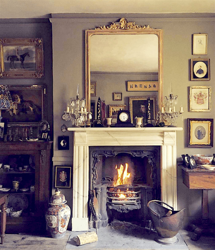
  19. These rooms are fascinating. There are so many lessons to be found by studying them. I am especially drawn to the wonderful use of gold in the mirror and picture frames playing against the gray walls and the use of saturated color accents.

  20. Further to my other comments in regards to designers, the one thing that you can’t teach in any school is good taste. You either have it or you don’t…and not all designers do! There is one Toronto designer whose work I truly love. Her name is Sloan Mauran and you can google her to see some of her projects. She is from a very wealthy family, has travelled the world, only does projects when she likes the client and charges accordingly. Oh! So expensive! But I love what she does!

  21. Further to my other email, we just went to the Design showroom in Manhattan! I dragged my husband through all 16 floors. I was looking for two very specific items: a drink table that is not entirely made of metal and a side end table. Found both in the Lexington showroom..only problem is; the manufacturer won’t have stock until mid Dec and so being in Canada I won’t receive the two items until early January. A designer wouldn’t have worked that way. Doing one piece at a time and/or leaving an item or two to finish up, but instead would likely have done the whole space at one time. This is where, to their credit, a designer will save you time, provided you love the finished product and have enough vision to imagine how it will all look when the room in completed, but if that is the case, then why not do it yourself? I know from my own decorating that not working with a designer is not a disaster, that’s for sure. Maybe I choose the wrong career..Haha!

  22. Thank you for a wonderful post. Of course, I loved it since there’some bias confirmation on my part when it comes to English style and classic decoration.
    I discovered Ben Pentreath a number of years ago when I was searching for light fixtures. His had some wonderful nickel pendant lights, but they were out of stock when I needed them. I recall that John Derian carried them, too. Then, I bought a
    brilliant little architecture book co-authored by Ben Pentreath, titled Get Your House Right: Architectural Element to Use and Avoid. Ben is genius and you are so lucky to have spent with him and seen his work first hand. His Inspiration blog is a joy to read. Unfortunately, in my own homes I am always trying to make a silk purse out of a sow’s ear. I crave some semblance of symmetry. I have hired interior designers over the years with mixed results. They do need to get you and
    they need to be steeped in the knowledge of architecture, proportion, etc. and have an innate sense of suitability, appropriateness. Thanks again for a wonderful, informative post.

    1. Hi Swanee,

      How cool that you have Ben’s book! As for designers. Some are amazing and some, well… are lacking. But I suppose it’s like that in all professions.

      It’s just that this one is an expensive one to make mistakes. And you can’t give the sofa back!

  23. Laurel- you are one of the most honest, erudite and deeply knowledgeable design authorities out there, and I will tell you that what I have learned from your tutelage is to look at my own interiors with some of that ‘honest’ eye’. Now I am slowly removing the ersazt’ from the timeless. Luckily I had a Mother who always knew the difference!
    BTW- I wanted you to tell Ben that once I saw his parsonage living room with that gorgeous tall secretary in the corner, I couldn’t rest until I had acquired one of my own.I found mine on ETSY, and had it shipped from NC! 🙂 I love it so much!

    1. Hi Dolores,

      Yes, you are lucky. My mom did not know the difference. lol But of course, I still love her.

      Don’t think that I’m really on Ben’s radar. At least not yet. ;] But that is soooooo cool! If you see this, if you don’t mind sharing the name of the vendor on Etsy, that would be wonderful! xo

      1. I would be happy to share this ETSY dealer with you.
        They were wonderful, and so accommodating,and arranged the shipping for me at a very good price. Since they specialize in emptying out estates, the inventory varies.They are called
        FreshStartEstateSale-not sure if the link of my secretary still shows up:
        Antique Mahogany Secretary Desk
        https://www.etsy.com/transaction/1001092997

  24. Dear Laurel

    Thank you for responding to my email. I am going to try to create an account and send some picture of what I am doing in my house, but not sure how to do that at the moment. I also didn’t mean to imply that there is no a place for a designer, because they can save you time if you want things completed fairly quickly. Money ( at least in Canada) probably not, unless you choose every item the designer brings to your home, because otherwise they spend a lot of time running around to different fabric stores etc and ring up massive bills. And I mean massive! The average rate in Toronto is $200 dollars to $800 per hour at which time they will pass on a 10% discount on any purchase and keep the other 10% on tip of their hourly fee. I choose ever piece and look at it carefully, but just looked at one of the top designers websites and she has a whole table covered with accessory pieces ( probably about 50) that she selected for her clients home. I guess they just go and work everywhere and anywhere. She certainly will get the space filled!

    1. Hi Lori,

      I don’t want to get into pricing structures, but my bullshitometer went into overdrive when I read that they keep the *other* 10%. 10% of WHAT? (eyes rolling) Again, no further discussion required, but it makes me a little nuts, that’s all.

  25. My advice is to err on the side of hiring a good designer (references from friends or a nice portfolio) who is LOCAL. I have had very few bad experiences working with designers – three that were sponsored by local furniture stores, one referred by a friend. My only bad experience (and one that cost a boatload) was working with an “edesigner” who gave me terrible advice and charged me $1200, but gave me no sources for purchasing, and didn’t want to listen when I said “I don’t want laminate floors or that flesh colored paint.” What I got was what I got.

    Re: Lorri’s comments, we have experienced nice furniture stores that have real designers on staff. Sometimes it didn’t cost us any extra (or so we thought, it was probably in the markup), but currently I am working with a designer who works closely with local furniture stores. The store paid his first hour and we are paying him by the hour after that. For someone who gets paralysis from decorating decisions, it is worth every penny. He’s given us great advice, and works around our dislikes and likes rather than telling me that this is what it is, and sorry no second opinion as the edesigner did. He’s helped me select furniture and fabric (and nail head trim and piping, etc.) for several rooms, as well as rugs. We feel that he has saved us much more than we have paid him.

    1. Hi Lorri,

      Yes, the designer’s fee is IN the mark-up. Stores have tremendous overheads which is why so many of them have closed.

      But is also sounds like you found a great designer who was a good fit. Sorry about the e-designer. That truly sucks and is the sort of practice that gives the rest of us a bad name. But of course, most of the colleagues I know are nothing like that!

  26. Love this post and also the reader comments that follow it. We’ve just lived through an 8-month renovation. About two-thirds of the way through, when I started to worry that I didn’t know what I was doing (better late than never), my husband and I contracted the services of a designer who is many, many miles away and we worked together by phone, photo and email. We found her because I found, followed and liked some of her work on a design website. Her consulting cost was very modest compared with the costs of the classic materials we were using, and it was well worth it. A good designer will take into account your tastes, lifestyle, style of home, budget and existing treasures. In fact, the designer I worked with helped me interpret “us” more cost-effectively than I could have done it by myself, often by encouraging me to keep things I like but might have thought should go, to save money on items where extra price did not equal better value or appearance, and to splurge when it really mattered. The end result is a house that has everyone saying, “This looks so gorgeous; this looks so welcoming and comfortable; this looks so you.”

    1. Hi Sharon,

      It sounds like you got her in, just in the nick of time. I’ve gotten these calls too, but usually it’s after something is in, like the counter tops and they realize that they made a big mistake. (often because they didn’t actually see the slab).

      But I’m so glad that you found someone terrific to help you!

  27. Hi Laurel, Thank you for writing such a thoughtful and informative blog. I can’t begin to describe how much I’ve learned from you (perhaps my design background prepped me to be receptive to learning from you?) So, anyway, you’re awesome!!

    Discussion about cultural trends in interiors is fascinating. There are so many influences (consumerism, economics, marketing influences, history, etc) Something that sometimes gets overlooked in these kinds of conversations is the relationship between environment and interior space. The gray, rainy, cool English climate can inspire a desire for color, warmth & coziness at home. (And, of course, there are are all of the colonial influences) When I’m working on a project, i find it helpful to think about an interior in the context of the building and the landscape.

    –Beth

    1. Hi Beth,

      It is so true. And I probably forget that the New York climate, while more harsh and variable is not completely dissimilar to the English climate.

      But there are parts of the US that are HOT and arid most of the year. Although, they like bright colors too.

      And like trad chap, there are those Brits who love muted, deep colors which is also cozy, particularly in those small rooms with low ceilings.

      But it is true that looking at everything in a holistic way is very important.

      I should do a post about classic design in hotter climates. That would be fun!

      1. oooohhh….yes! Classic design in hot climates is a great idea. Especially the use of gardens & courtyards– That would be fun
        🙂

        1. Hi Beth,

          Well, the garden part, is beyond my grasp, unfortunately. While I love them and know when I see something that I think is right on the money, I’m not a landscape designer. And courtyards pretty much falls under the same category as I’m a northern girl.

        2. Putting my hand up for a classic design in hot climates post!

          I’m in one of the hot dry parts of SoCal. We’ve recently bought a 70s ranch on two landscaped acres so we have decent green for the location and tree shade on our property, but still… hot and dry most of the year. Indoor outdoor living is huge anytime the temps are below 80, even in the morning and evening on hot days. Our new house has many wide giant windows and I’m so enjoying the light, as well as embracing the more clean lined modern architectural style (coming from sort of a cottage feel). Still, I am with you that immersing in the classics gives you a feel for what truly works even if you are not making a classical home per se.

  28. Hi Laurel! I’m so pleased and proud and full of myself right now because a) I got up early and made myself coffee with cream and a yummy toast ans sat down to read your post like if it was a beloved book -and wow what a smart decision it was; made my morning; and b) because I finally understood why am I charming..)))

    All the photos are to die for I pinned them like crazy

    Thank you for that delightfully long post, and for generally being here, you know. I love reading you; it takes me places. Whether real ones on the map or in my mind. doesn’t matter, it’s a never stopping journey; and that’s why I love English decorating too-it gives this feeling of ultimate home and neverending journey at once. Much like love.

  29. I found a designer some months ago thanks to Laurel’s encouragement to do so on the blog. We don’t have a huge budget all at once but the designer is lovely and is working with me in my own time, piece by piece. It is a huge relief to have someone to talk over ideas with…and to be able to obtain items from companies like Thibaut, which are only sold to the trade. She is working with me to help me create my rooms using my favorite palettes from Laurel’s collections and is totally understanding when I sometimes make more budget friendly decisions, like going with ready-made drapes or reupholstering instead of buying new for every piece of furniture. It was really intimidating for me to call her company up and make the initial appointment, but so worth it.

  30. Hi Laurel,
    I think the reason English rooms are so appealing is that they have look as thou they have evolved over many years. Now a days, rooms seem to be controlled in their style, if that makes sense. Many, but not all English like to hang on to granny’s old dresser or chairs. It’s those things that give a room history. Just my 2 pence.

  31. I agree with much of what you say in this post. Professional help saves money in the long-term, especially if one is not particularly gifted in the creativity department. I even like some of the color choices, etc., in the photographs, but those rooms look DIRTY–like they haven’t been cleaned properly in a while. The floors are grungy; the upholstery looks soggy. Yuck.

    Usually I love (drool over, if I’m honest) the interiors you post, but this set of photos left me feeling slightly queasy. And yes, I probably spend too much time cleaning. A sparkling home equals relaxation for me. 🙂

    1. Hi HLS,

      Oh dear! I’m sorry if the images made you feel ill!!! I was in Robert Adam’s home. Those are my photos, and I can assure you that it was spotlessly clean!

      But I can appreciate that some folks cannot stand patina on anything. Patina and dirt are not the same thing, BTW. If you don’t know… patina is the natural aging process of something – like one could say that Laurel’s face is taking on the patina of a fine antique!

      There’s another home coming up which is new and melds together beautifully both worlds.

      BTW, if you ever get tired of cleaning your own home, please come over here. lol

      1. I think maybe I have a grudge against patina because I grew up in a house full of antiques. The patina always hid a lot of the grunge, and that, my friend, is what made me who I am today. 😉 I have antiques, but they are buffed to a high shine. And don’t give me an excuse to feed my cleaning compulsion! I may end up on your doorstep, cleaning rag in hand. Hahaha.

  32. Laurel – YOU are a charming writer and a fabulous decorator and I would hire you hands down. I wouldn’t say that to just any professional.

    I love with a capital L doing my own decor but I got to the point where I feel I can handle it only after years of passionately studying and shopping. Quirky items that express your personality aren’t for sale at easy venues. You gotta dig and it takes a lot of time amassing a collection and showcasing the items beautifully unless you have big bucks. Or you can train yourself to become a savvy shopper who knows how to navigate eBay and flea markets. Sometimes I shop glam venues like a Nashville Antiques fair or Les Puces in Paris without buying a thing just to get an idea of what excites my beauty meter. Then if you ever come across something similar that’s cheap you know to pounce. ( like I go to Paris all the time. I wish…)

    All I know is that your ” palette” or home decor is always a work in process. That’s part of the fun!

    p.s. I’m depressed right now because I’m in limbo. My McMansion had to be stripped of personality and quirkiness for selling purposes and nobody even wanted to see it. So we’ve taken it off the market and hopefully I can do some ‘updating’ and remodeling and stay there awhile. And bring my collections back out of storage. McMansions are hot really a happening thing unless they offer something truly special.

    1. Hi Divna,

      Well, I’m sorry that they made you strip down your home for selling. Can I tell you how upset that makes me? I disagree with that practice vehemently. And here’s the proof. If nobody would even look at your home, what does that say?

  33. I have to say, the number one thing I would recommend to this person is inspiration imagery (yes, and also a designer! Especially for a kitchen!). Specific, tailored images that you can say ‘this is the look/feel I like’ is so, so helpful in communicating both to yourself and others what it is that you might want!

    I’m totally familiar with the issue of your ‘style’ being old fashioned and high-ceilinged with lots of architectural detail and your reality being modern and open plan– I had the exact issue decorating our current apartment (where we are only renters, so nothing permanent could be changed). Looking at imagery to see what would/wouldn’t make sense with our lifestyle and the apartment we have is the only thing that helped!

    Fear of commitment is real though… which is why it can take me months to decide on a 6′ runner for a tiny hallway! So, I totally sympathize that it’s not easy feeling confident– especially if you’re worried it’s going to be a longterm, expensive choice.

    1. Yes! Inspiration imagery is something that I recommend too. I forgot to mention that here. But as a professional, I often look for inspiration in what’s already been done. Or it lives somewhere in the back of my mind.

  34. The two Lori/Lorris have good points. But though rec room Lori sounds like she has a great ability to choose a design launchpad (her rug) and then be disciplined in her vision and purchasing, not everyone has that ability.

    I’ve often gotten calls from people one-offing their buying until they’ve accumulated a hot mess. Penny wise, pound foolish. Then we have to edit — sometimes painful, because some purchases or new. So we move, consign, reuse elsewhere. For new stuff we purchase, clients benefit from an overall vision and trade discounting.

    I guess I would say, if you feel pretty confident in your vision, then by all means be your own decorator using retail sources and vintage! I was, and that’s how I got started. If you feel overwhelmed, then bring in a consultant. Many decorators charge hourly these day.

    1. Hi Amy,

      I’ve gotten those calls too. Sometimes I can help and sometimes not if they’ve gone too far trying to make up for an early mistake which then colored everything that came afterward. And yes, of course, there are lots of very talented people who could be pros but aren’t. Maura Endres is one of them. I would hire her in a nano second!

  35. Laurel, I so agree with getting furniture scale right. I do not understand why modern upholstery is so gargantuan. Have noted that the more affordable the furniture is, the larger it will be! It could be down to the use of inferior frame materials; maybe it takes more of it in order to have the pieces hold up more than a year? Anyway, stellar post, as usual. While I perhaps could not live comfortably in some of them (clutter phobia, me), the depicted rooms have major staying power.

    1. Hi Jana,

      You are right in your assumptions. It’s easier to make a big piece with thick foam, than a highly refined piece with beautiful curves. As for proportion, it’s lack of taste, knowledge or not understanding the difference. I mean, if you’ve only grown up with canned vegetables, why eat fresh? ;]

      I realize that a lot of people will feel uncomfortable with these rooms. The goal is to broaden horizons and then, we’ll come up with something more familiar like a Mark Sikes or William McLure room which has these influences, without nearly as much “stuff.”

  36. P.S.sorry Laurel, if you get the chance take a look at Butter Wakefields home & garden.

    She is a fantastic native of yours, living in London…an American who can definitely teach

    us Brits a thing or two…whose wonderful home & garden I think you would love x

  37. Thank you, Laurel, for introducing us to Jack Laver Brister. Perhaps, he & Ben Pentreath were separated at birth ?

    Love the Pink Pelargonium in the terracotta pot…I am looking at one, in said pot, as I type.

    A great country house style yellow is an archived F&B one, Gervase yellow, I get mine mixed by Mylands.

    superb research, from you, on our behalf. Edible photographs. As ever laurel thank you & know, you are much appreciated.

    1. Hi Joanna,

      Ben and Jack are birds of a feather for sure. They might even work together on projects since Jack’s business is antiques. I need to look up Gervase yellow. I have a fan deck of the archived F & B colors. Hang on and I’ll go get it. That is a very interesting yellow. Mine looks like it has a touch of a green undertone which I love in yellows. I bet that it looks gorgeous on the wall. I will look forward to comparing it to they Sir John Soane’s yellow. I may have to do another yellow post!

      1. You are clever, Laurel ! yes it does have a touch of green & a lot of my paintings, green glass, & ‘stuff’ is green so looks fab against it in my Georgian cottage.

        The joy of it is it has a chameleon quality about it & looks slightly differently, scrumptious in different lights.

        I also team it with rose red ( that elusive red with rose tones that I call French red) & pink that looks fab, too.

        I didn’t find it on my own but after much reading form past ‘greats’, usually adorable male gay decorators, who swear by it !

        1. Hi Joanna,

          It can imagine all of that. The green in it is what helps it look so fabulous with all of the other colors!

          My kitchen color is pale avocado which is more green, but the same thing. in fact, this one is right in between my yellow and the yellow green kitchen.

  38. Whether you hire a designer or do it yourself, educate your eye! There are wonderful books on interior design as wells ID magazines (check out VOGUE LIVING Australia online.) themain thing is What are YOU drawn to?English Cottage Cosy? The modern Nordic simplicity in the homes in KINFOLK? American farmhouse? What speaks to you? Have fun!

  39. Wow that was some post, which I’m sure will engender spirited debate!

    I love your blog and especially look forward to the Sunday post. I agree with many that there is a great deal to learn from your “British” series. My tastes are modern but I learn so much about color, proportion, texture, and style from studying your posts of traditional interiors.

    1. Hi Susan,

      I think those basic rules of form stand up even when talking about different styles. Contemporary furniture which is what people usually mean when they say “modern,” (myself included) can be beautiful, but too much of it is not.

  40. Oh, could you please explain what is going on in the picture in the email linking to this post? I cannot figure out what is up with that yellow… ?wallpaper?

    1. Hi JW,

      Ahhh… yes. That is pop up shop for Charlie McCormick and a partner. I forgot her name. That is actually a striped fabric that is just hung up, not intending it to be anything than what it is. Interesting effect.

  41. Your post made me chuckle. They often do but this time you made me laugh at myself. You made me start thinking about, when I was a young adult, some of the fads I wanted to follow and decorate with but thankfully I didn’t have any money! Now that I’m a little older, I have learned to appreciate charm and timelessness, rather than the newest, “coolest” thing. Still don’t have a lot of money, but we are going the “good and cheap, but not fast” route. And I finally am starting to understand my mother who made us sit on the floor for years while she saved and searched for the perfect couch. 🙂

  42. I’m about to say something as a person who would totally do her own interior design . . . the LW needs to HIRE someone. I’ve noticed there are so many people who struggle with design, yet feel they must do it themselves. That sounds like a recipe for misery and possibly hating the end result.

    It’s easier to bite the bullet and admit you know what you like when you see it, but not how to achieve it. That’s nothing to be ashamed of since you are no doubt talented at other things.

    Find a large furniture store that sells several lines of classic furniture with designers on staff. They often provide design services at no extra charge. And they aren’t necessarily limited to using only items from their store. Many of them can source antiques also. Just inquire.

    Independent designers have various schemes for how they charge, so don’t rule them out or assume they are unaffordable.

    1. Hi Lorri,

      I provided the service at no extra charge except for a nominal design fee for the many hours up front and travel expenses.

      I only charged a mark-up which was almost always smaller but never greater than a store’s mark up.

      This was the primary reason that I wrote Laurel’s Rolodex. While anyone can benefit from it, it helps designers know which vendors are open to working directly with designers so that they can get the product without having to go to a designer’s showroom or retail store. Of course, some companies won’t work directly with designers, but many fine companies do.

      There is no bargain purchasing from a store and the people working there may or may not have training/experience. I’ve come into contact with some employees that are well-meaning, but phenomenally under qualified for the job. And I’ve known some that are terrific. But the former is more common in my experience.

      1. Hello Laurel,

        Where I’m coming from, is that many years ago I worked for an enormous furniture store that employed 15 interior designers (with degrees) in addition to about 30 salespeople. The store had a full-service design studio stocked with designer fabrics and other resources. We sold anything from Lexington to Henredon, Baker, Ralph Lauren, etc . . . moderate to high end, but with an emphasis on the higher end . . . plus antiques.

        Commissions were high, though the designers were paid a slightly higher commission than the salespeople. The designers rarely sold an individual piece. They were more likely to be working on a whole room(s) from top to bottom, or a whole house. The customer was never charged extra for the design service.

        Outside designers were given discounts as well. We even had an employee whose sole job was to deal with outside designers!

        I don’t know. Is this an uncommon arrangement? There was another large furniture store in the city with the same arrangement.

        1. Hi Lorri,

          I don’t know if this is a common arrangement or not because there are very few furniture stores left in this area. I’ve only worked with one and as far as I know, they did not have trained designers on staff. They did offer a discount to designers but it was only 10% below what the general public is paying. Some of the brands, yes, a designer cannot get on their own such as Lexington, Baker, Henredon, etc. But there are dozens of smaller brands that do work directly with designers. And that includes one of my favorite upholstery brands that does not even show in High Point nor does it have a website with a furniture catalog. It is only by word of mouth. And is also in my rolodex. :]

        2. Wow, I’m surprised your area has lost furniture stores!

          I left the one I worked in because I moved away in 2001. They are no longer in that city, but still exist in another state.

          I took the job to get into the industry because I wanted to see if I should get a design degree. Why not work with designers and see first hand? Well, I decided not to because I saw how draining some customers could be.

          It’s not all sunshine and gorgeous fabrics. You need to be a diplomat! 😉

      2. I just realized that my first comment didn’t make clear that I was talking about furniture stores that specifically have real designers on staff.

  43. Well said! Your photos and sense of classic style is breathtaking. These rooms ooze warmth and personality and in no way feel contrived. It seems to me many designed rooms leave out the real people who use them. Thank God for sensitive designers like you to help us achieve great rooms and avoid costly mistakes.

  44. I read you blog regularly because you do give some very good suggestions, however I must say, that not everyone should hire an interior designer, even if they have the money to do so. The true reality is; that if you want to get your home done fairly quickly and don’t have any of your own time to spend on it, then a designer is the way to go, but they are expensive and so often not necessary, or even worth it. I live in Toronto and hired two different designers and all I ended up with was 2 very large bills. It is actually better to pick your items one by one on your own and love what you have selected, because it will be a true reflection of you. Just start with a carpet that you love, then select a larger piece such as the sofa and work outward from there. It is not that hard it you really take the time to think about the room and do precise measurements etc. I would love to post a picture of our rec room that I did from scratch for those of you who choose to do you space yourself, but I am having trouble doing that. Maybe Laurel will tell us how to post pictures of our home.

    1. Hi Lori,

      I’m sorry that you had designers who didn’t work for you. I can tell you that in my 20 years of taking on clients that I saved each of them money. And it was a collaborative effort. We often used items that they already had.

      I’m sorry that it’s not possible to post photos. My template does not provide for that. And also, while there is a large readership, at present it is only me doing everything. I haven’t figured out how to hire or delegate.

      Perhaps it will hold me back, but that is okay. I’m sorry.

      The only thing that you could do is to create a pinterest board with the images and link back to it.

  45. Totally agree. Yes, the English style of decorating is busier than some prefer, but even if you took out half or 3/4 of the items in the scene, it would still look gorgeous because of the quality and proportion of the elements and furnishings. BTW, blogger after blogger waxes poetic about those chandeliers that look like spiders and they keep showing up in editorial layouts. I hope the fad passes quickly.

Leave a Reply

Your email address will not be published. Required fields are marked *

This site uses Akismet to reduce spam. Learn how your comment data is processed.

Welcome To Laurel Home!

laurel-aarons-18th-e1456449963926

Hi, I’m Laurel, and Laurel Home is the website and blog for Laurel Bern Interiors.
I’ve been creating new-traditional interiors since 1988. The blog is where I share all.

New Edition, November 2023! Get The Indispensable Guide For 100s of Home Furnishings And Interior Design Sources That Everyone Is Raving About

laurels-rolodex-final-book-cover-master 10th edition 23-24

laurel home archives

Categories:

Please click the image below for more info about my rockin’ Interior Design Guides for 2024!

Laurel Home Interior Design Guides 2024
Amazon ad

please click below to check out my favorite decorating & design books

Laurel Bern's Favorite Interior Design and Decorating Books
Subscribe To The Laurel Home Blog And You Will Receive A FREE Guide Where I Share How To Get Your Paint Colors Right, The First Time.