

Every now and then, I stumble across an article that makes me mutter, “Oh really?” out loud. The Spruce recently ran a piece titled “7 Stylish Decor Trends That Are Secretly Hurting Your Home’s Value.” Naturally, I had to click. Because if something is supposedly stylish but also hurts your resale value, it gets my spidey senses activated.
Some of their advice wasn’t completely off the mark. But other parts? They were simplistic, misleading, or just plain silly. (Spoiler Alert: Nobody ever lost a home sale because of a “smart thermostat.”)
So today I’m walking you through each of these seven so-called “bad” design choices.
I’ll tell you where I agree, where I don’t, and—most importantly—how to actually make these choices work beautifully in real life.
Now, I do realize that these statements in the article were made by design professionals– maybe. I’ve been misquoted before or had a statement taken out of context so that the meaning became something other than what my intent was. However, since this was endorsed by “The Spruce” magazine, and I got in trouble once for mentioning someone’s name, everything is attributed to The Spruce.
Please follow along by clicking on this link to read the article.
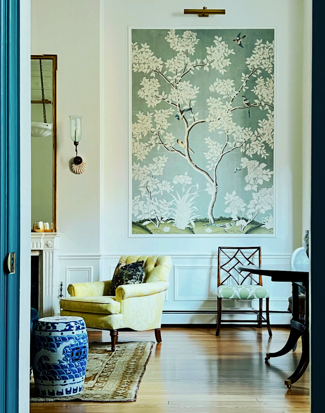
Design Choice 1: Color Drenching
The Spruce’s claim: Painting the walls, trim, and ceiling all the same bold color overwhelms buyers and makes resale harder.
Hmmm… Tell that to Laurel Bern! ;]
Okay. They are calling color drenching the internet’s hottest trend. Ummm… while it might appear that way, color drenching has been around for centuries.
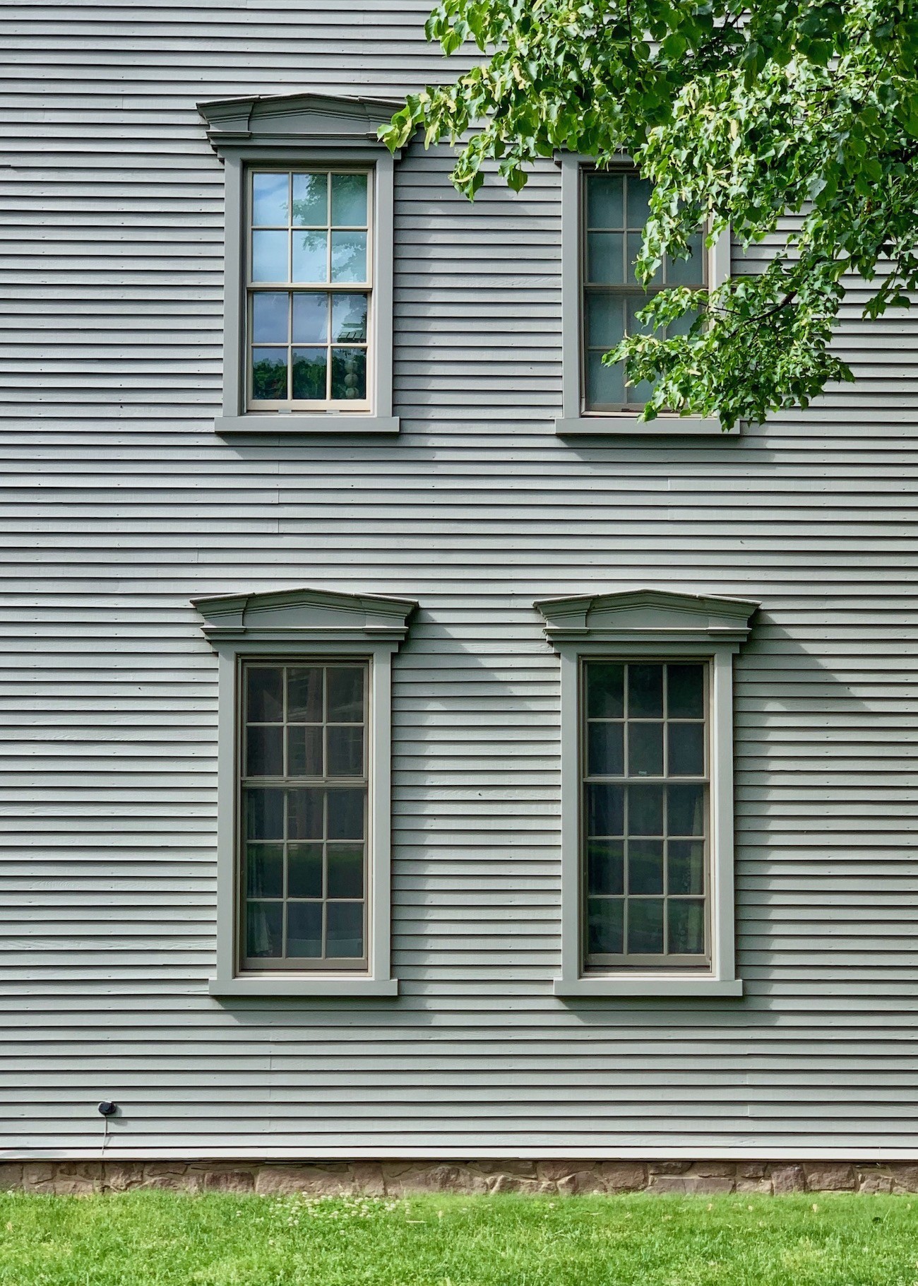
Deerfield Academy from my day trip to Historic Deerfield in June 2020.
It just takes Americans a long time to catch onto something they’re not used to seeing. (Such as always painting a ceiling white and believing that’s how it has to be.)
As for overwhelming buyers, this makes me nuts. Buyers are human beings, right? You are also a human being, right? Are you overwhelmed by your design choice?
1. Do your family and friends walk and spontaneously, excitedly say– “I love” or “What color is that?”
Or
2. Do they give you the side eye and make a snide remark?
If it’s #2, you may want to consider changing it. But, if it’s #1, then it’s most likely an asset, not a liability.
However, if you’ve chosen a wonderful color and the room is beautifully decorated, then color drenching could very well be a selling point.
Please remember this:
Buyers want move-in ready. Every realtor I’ve ever spoken with has told me the same thing. So, the chances are good that you may need to repaint the room anyway. If the color is a bit too much, you can always tone it down. However, you only need ONE buyer; therefore, I wouldn’t stress that one too much.
One last thing about color drenching.
The super deep, dramatic colors are best suited to smaller spaces. Dark colors make a room look larger, not smaller. Light colors make the room look more airy and bright, but not larger. They are two different things. We covered that topic in this post about dark vs light wall colors. It is a matter of physics.
Design Choice 2: Fluted Everything
The Spruce’s claim: Fluted or reeded panels are trendy and risk looking out of place or cheap. Your take goes here.
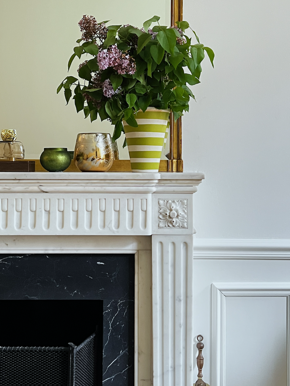
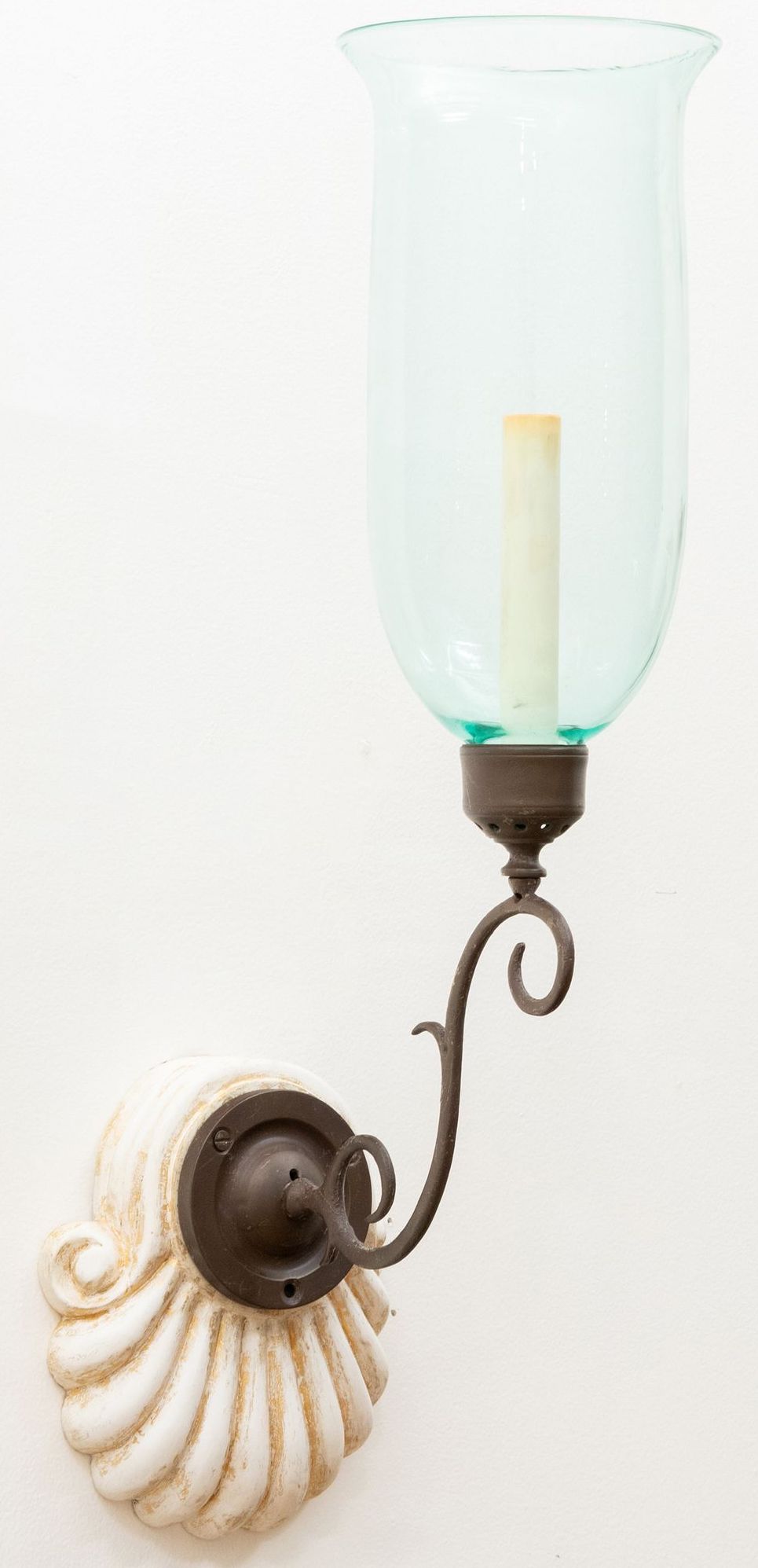
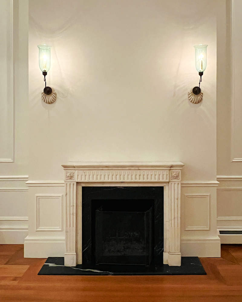
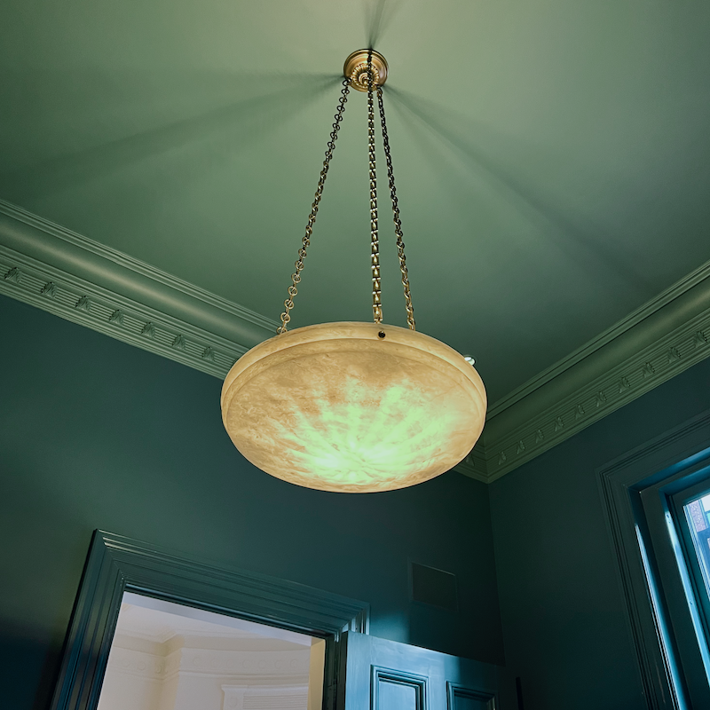
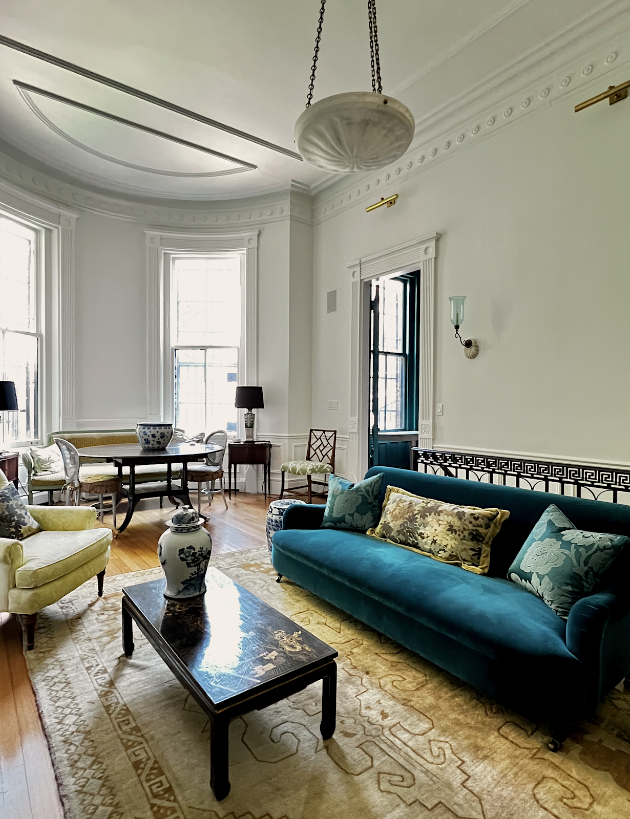
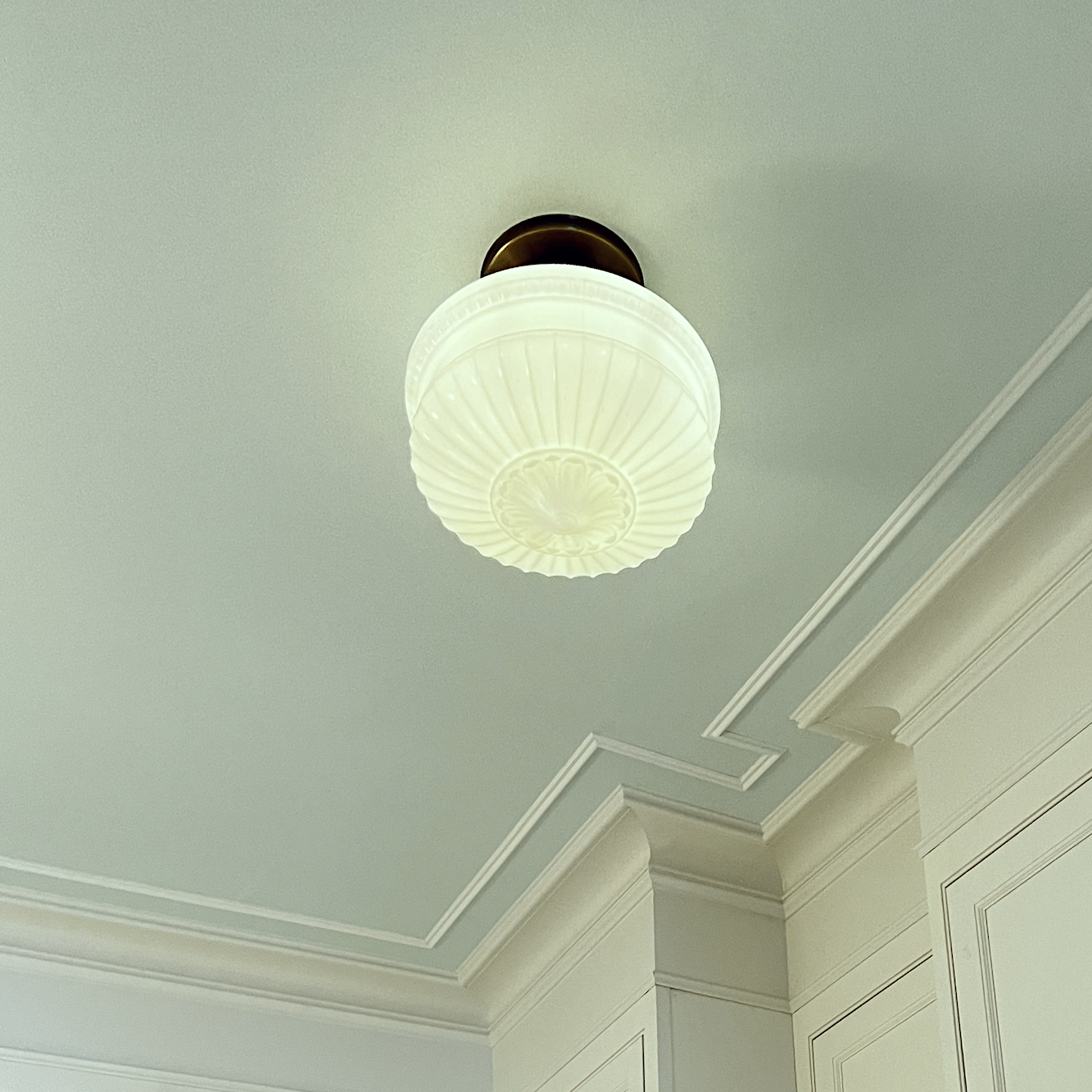
Okay, they are only partially right here. There is a trend toward reeded panels in furniture. In small doses, like these wonderful vanities you can find on Etsy, I don’t have a problem with that. Reeding is a timeless design feature. As for fluting. I know that most people who followed my renovation realize that there is fluting in the following locations:
Door and window casings
Antique marble fireplace mantel
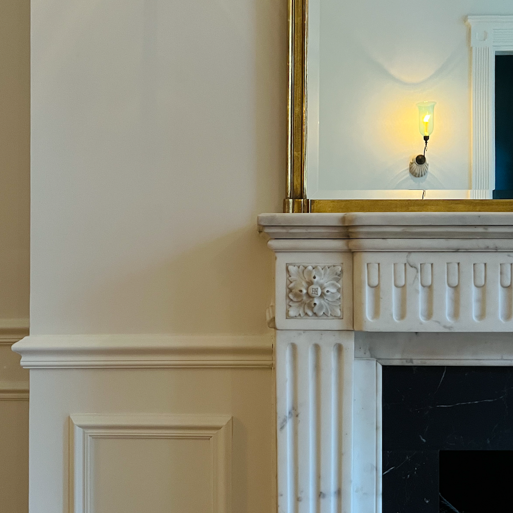
Anglo-Indian sconces
Alabaster Chandeliers
Kitchen and Entry semi-flush mount milk glass fixtures
End tables flanking the antique settee
I couldn’t find a very good close-up of the tables. The reeding is difficult to see, but it’s there.
It’s a bit difficult to see, but the chair leg above features stylized faux bamboo fluting.
And, at the bottom of the stairs, my Louis XVI-style Milling Road Chest, purchased circa 2000, with fluted legs and bottom railing.
I would’ve loved a reeded edge on my new Englishman’s dining table, but it would’ve jacked up the price a lot, and I didn’t feel it was worth it.
Reeding and fluting are classic motifs that have been around since ancient times. That crap they put on the wall is hideous and must be a design trend from a parallel universe.
Design Choice 3: Over-the-Top Smart Home Upgrades
The Spruce’s claim: Techy add-ons such as smart lights and app-controlled features quickly date and confuse buyers.
Well, they don’t have to use the smart apps. I can’t imagine a wife whispering to her husband, “Oh, Honey, they’ve installed smart appliances. Let’s not waste our time here.”
So no, your resale value isn’t in jeopardy because of a smart thermostat.
Design Choice 4: “Instagram Beige” Minimalism
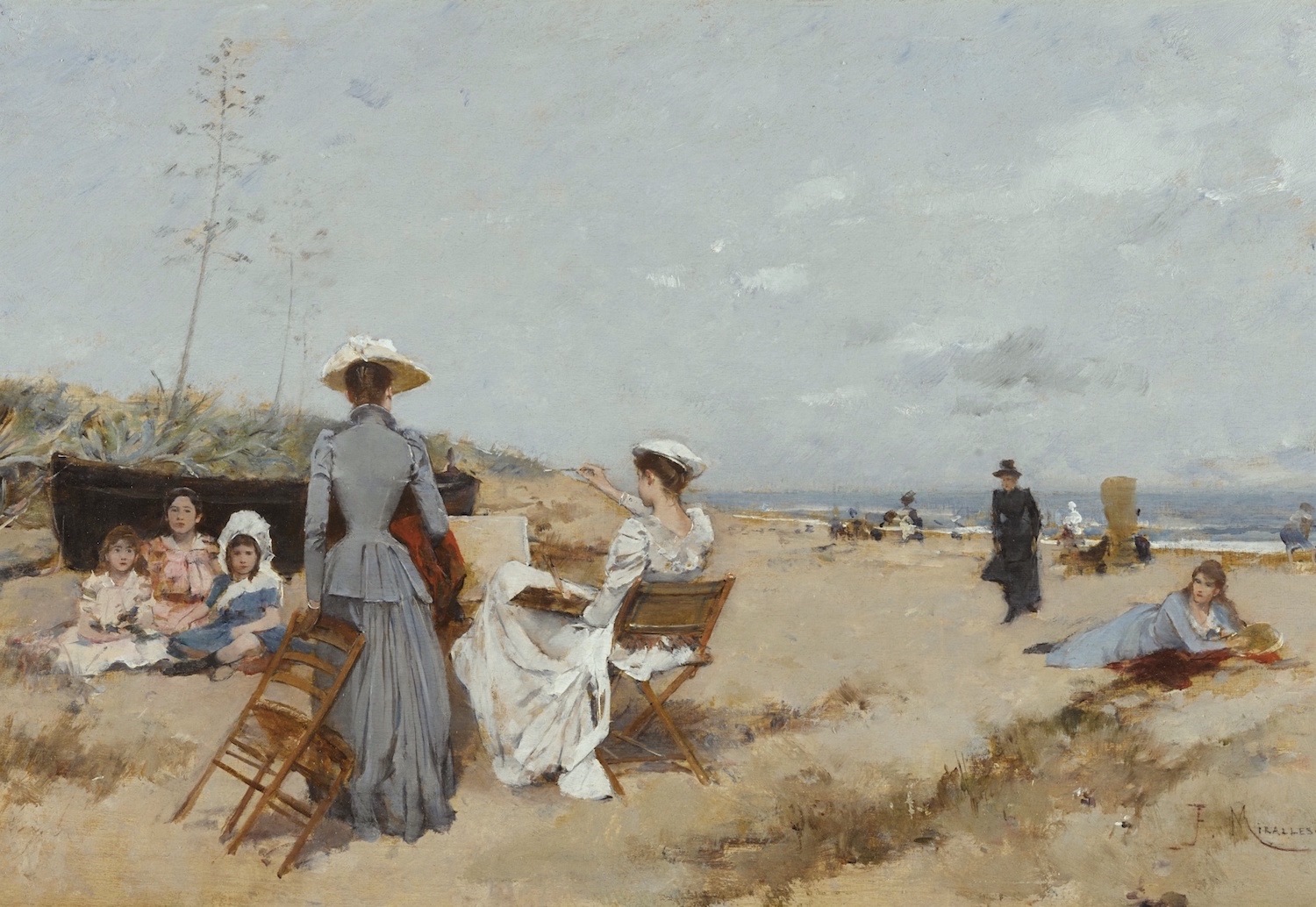
Francisco Miralles SPANISH PAINTING ON THE BEACH – Sothebys.com – gray and beige decor 19th century art
The Spruce’s claim: Stark, beige-on-beige minimalism looks cold and uninviting in person, which turns off buyers.
Hey, don’t blame Instagram. Blame HGTV, or perhaps Instagram fashion influencers who are trying to capitalize on a “decorating vertical.” That’s fine. Of course it’s fine. haha
But, what might be a problem is that for some, their untrained eye might be leading people astray. As I’ve pointed out many times, beige and gray have suffered from a bad rap, not because of their inherent color, but because of the way they are used. Please enjoy one of my favorite posts about the classic use of gray in interiors.
I adore the gray and beige painting above!
Design Choice 5: Statement Tile
The Spruce’s claim: Bold tile choices date quickly and limit appeal; classic tile lasts. In most cases, they are probably right, and their example is perfectly awful. However, it depends on the style of your home and the location.
Take Lindsey Buckingham’s killer kitchen. I adore everything in this room, including the encaustic tile floor. In fact, I think it makes the space!
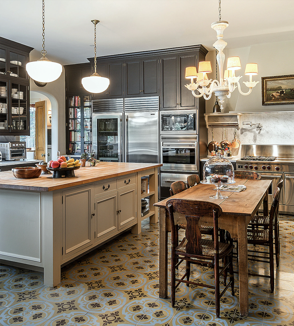
Lindsey Buckingham Kitchen encaustic cement tiles via Architectural Digest
Who remembers this post from 2018?
And this is a good post as well, featuring encaustic cement tiles.
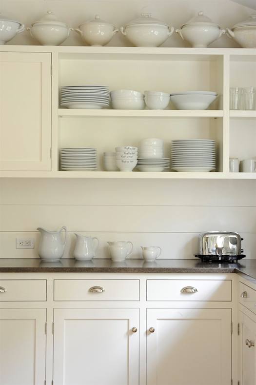
Design Choice 6: Excessive Open Shelving
The Spruce’s claim: Too much open shelving in kitchens suggests clutter and impracticality.
Oh, I already know that the majority of you will agree with this one. And I don’t disagree. But how much is too much? I’ve seen kitchens where one or two open shelves make the room. In any case, if it’s already there, I would leave it and style it so that it reeks of charm and isn’t too cluttered. May I suggest a beautiful ironstone collection?
Design Choice 7: Accent Walls with Moulding
The Spruce’s claim: DIY trim panel accent walls often look cheap and feel like extra work for the next owner.
Okay, let’s back up a second here. Most long-time readers are aware that I’m not particularly fond of accent walls, as discussed in the current most popular post on the blog.
However, I had to look at what they meant by accent walls with moulding.
Some of the examples they linked to included more ugly reeding panels. I’ve never seen that before and don’t know why anyone would want that in their room. Some of the accent walls featured wall paneling or wainscoting. I don’t think they have a clear idea of what they mean, either.
Accent walls of any kind are good if they make architectural sense. In other words, they’re not there just for the sake of it, but because it’s an important design element.
So, do these design choices really hurt resale value?
My short answer: not inherently. Good design is never about the gimmick of the moment—it’s about all of the design elements together as a cohesive whole, not examining each element as a single unit.
A paneled wall can be atrocious if the mouldings are way out of scale or if the wainscoting is at a strange height. (Thank you, Brent Hull for setting the record straight.) Conversely, it can enhance the space so beautifully that the home will sell very quickly. Buyers get a beautiful move-in-ready home that requires little more than plunking down their furnishings. Open shelves can be cluttered dust collectors or a charming, practical detail. However, if you can’t stand them, then of course, you can do something else like put up some beautiful artwork.
My advice when it comes to making design choices?
Don’t panic every time a magazine warns you about the latest “deal-breaker.”
If you love something and it suits your home, I wouldn’t hesitate to do so. The buyers who appreciate your tasteful additions will appreciate it.
Now, tell me—what’s the worst “resale-killing trend” you’ve ever heard of? Or better yet, which of these do you actually love– or hate? Please share in the comments below—I can’t wait to hear your thoughts.
xo,

***Please check out the recently updated HOT SALES!
There is now an Amazon link on my home page and below. Thank you for the suggestion!
Please note that I have decided not to create a membership site. However, this website is very expensive to run. To provide this content, I rely on you, the kind readers of my blog, to use my affiliate links whenever possible for items you need and want. There is no extra charge to you. The vendor you’re purchasing from pays me a small commission.

To facilitate this, some readers have asked me to put
A link to Amazon.com is on my home page.
Please click the link before items go into your shopping cart. Some people save their purchases in their “save for later folder.” Then, if you remember, please come back and click my Amazon link, and then you’re free to place your orders. While most vendor links have a cookie that lasts a while, Amazon’s cookies only last up to 24 hours.
Thank you so much!
I very much appreciate your help and support!
Related Posts
 14 Common Home Painting Mistakes You Might Be Making
 I’m Afraid Our New Rustic Home Will Be Depressing!
 A Gorgeous Modern Rental Home With A Tacky Kitchen
 Enchanting Garden Tour in Greenwich Connecticut
 How To Avoid the Clash of Formal and Casual Furnishings
 Little Known Ways To Score Free Furniture (or nearly free)
 Here’s Why Buying Furniture Online Is A Bad Idea


