

Hi Everyone,
Today, I want to share something I’ve never really said out loud before — even though it’s been an integral piece of my work for decades. Ever since I was in design school, I’ve found that it’s a simple formula for creating a beautiful interior color palette.
And no, it’s not “pick your wall color first.” In fact, that’s one of the biggest mistakes you can make.
Step One: Respect the Fixed Elements
Every room has something that can’t change; at least not easily. These are the fixed elements: tile, stone, cabinetry, stained glass, flooring, or even the view.
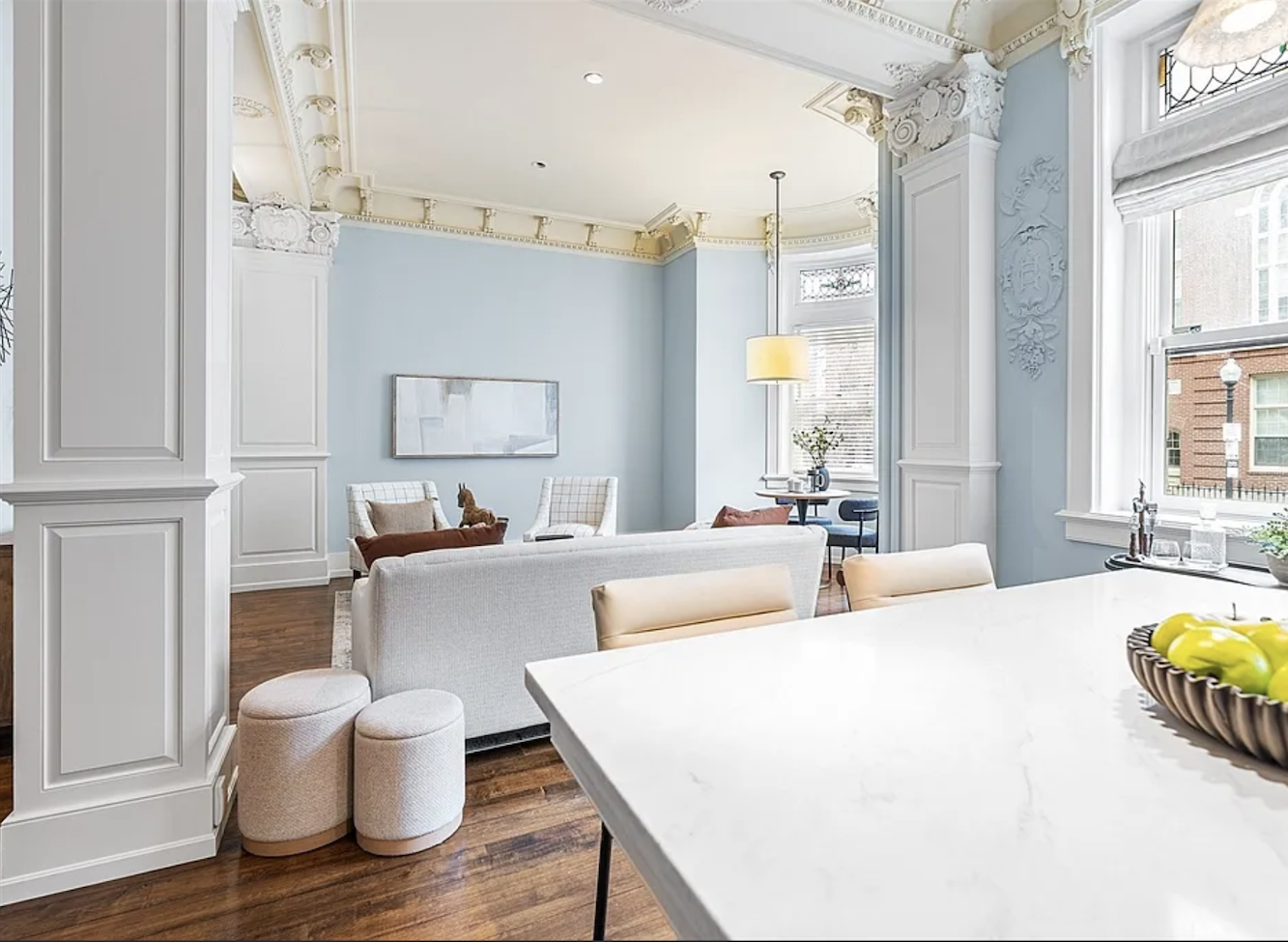
Take this Boston apartment on Garrison Street. (Oh my! It JUST sold after sitting on the market for nearly a year. Alas, it the sale price was down $460,000 from the original asking price!)
The architecture is gorgeous, but what stands out most are the stained glass windows. There are pinks, reds, and greens.
Step Two: Choose a Lead Color
Every successful room has a lead color. It’s the one that makes up at least 50% of the palette. Sometimes it’s white, sometimes it’s blue, beige, or even black.
Steven Gambrel, one of my favorite designers, is famous for his use of blue. Sometimes bold, sometimes subdued, but always layered with variation.
The lead color doesn’t have to scream. It can whisper. But it needs to be present in multiple shades, tones, and textures.
Step Three: Build Complexity With More Colors
Here’s the part no one talks about: a beautiful palette isn’t made up of just two or three colors.
It’s made of many colors. In my Laurel Home Paint & Palette Collection, I give you 12. But you could easily use 20 or 30, as long as they harmonize.
That doesn’t mean chaos. It means depth. Look at any great designer’s work and you’ll find:
- The lead color in multiple tones.
- At least one secondary color.
- Repetition of accents (wood tones, metals, fabrics, art).
As Barbara Barry says, “Complexity is what makes rooms rich.”
In addition, if the room is more than 50% midtone, it’s most likely going to fall flat.
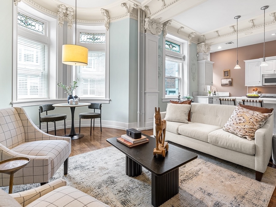
That is the problem with the Garrison Street interiors. They are too one-note. The architecture is complex, and the furnishings are a big snooze fest.
Laurel, if you were putting this place on the market and didn’t want to do a full renovation first, what would you do?
That is the best question. Thank you! ;]
Look, someone decided to put this place on the market, most likely with rented furniture, and it was actually listed originally for over $460,000 more than the sale price. While I think that price is too high, I do believe they could’ve gotten maybe $200,000 more and a far quicker sale, too.
In other words, if they had invested, say, $30,000 to $50,000, they could’ve received a handsome return on their investment. Then, they could’ve taken the furniture, sold it to the new owners or someone else, or given it to charity. I realize that sounds like a lot of money to put into a place just to sell it. However, homes that show well sell faster and for more money.
As for what I would do, you can never go wrong with lots and lots of white, with some black accents, and deep, rich wood tones.
Add more accents of gold or brass, along with some blue and white Chinoiserie lamps or vases. And, finally, some beautiful art prints in antique gold frames. Of course, some beautiful throw pillows would be a great addition.
The walls, I would paint a creamy white such as Cotton Balls, Cloud White, White Dove, Simply White, or Moonlight White.
I would’ve had the floors redone in a rich, darker walnut with a healthy sheen.
For upholstered pieces, I would use mostly white furniture, slipcovered or not.
Remember this room we looked at recently?
Over the years, in addition to doing work for my clients and myself, I’ve studied with ferocious intensity the work of numerous exceptionally talented interior designers.
It’s about the avoidance of making everything too matchy.
However, what I’m about to say goes beyond that.
It’s the secret that no one talks about.
Are you ready?
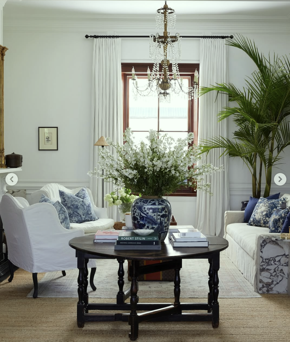
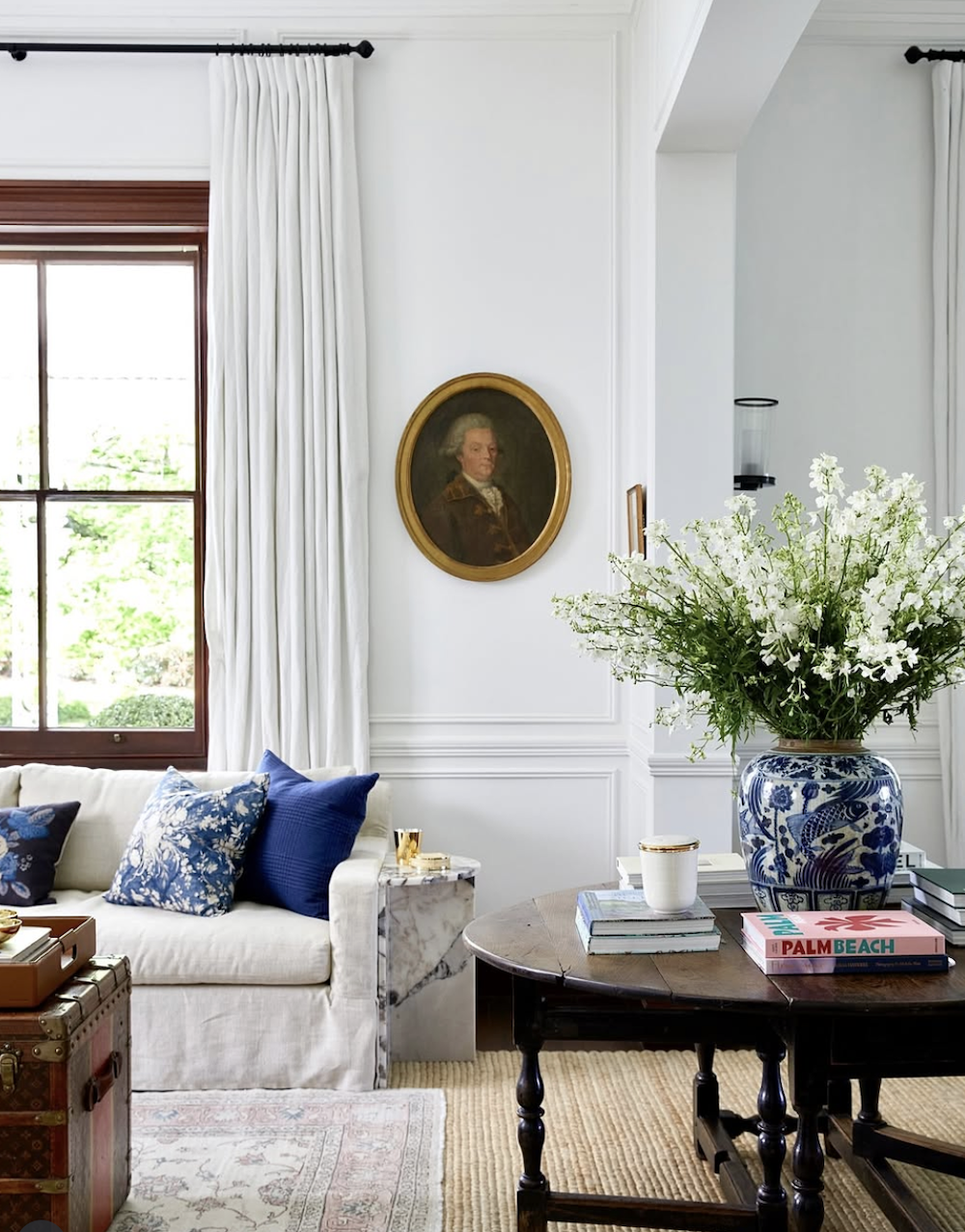
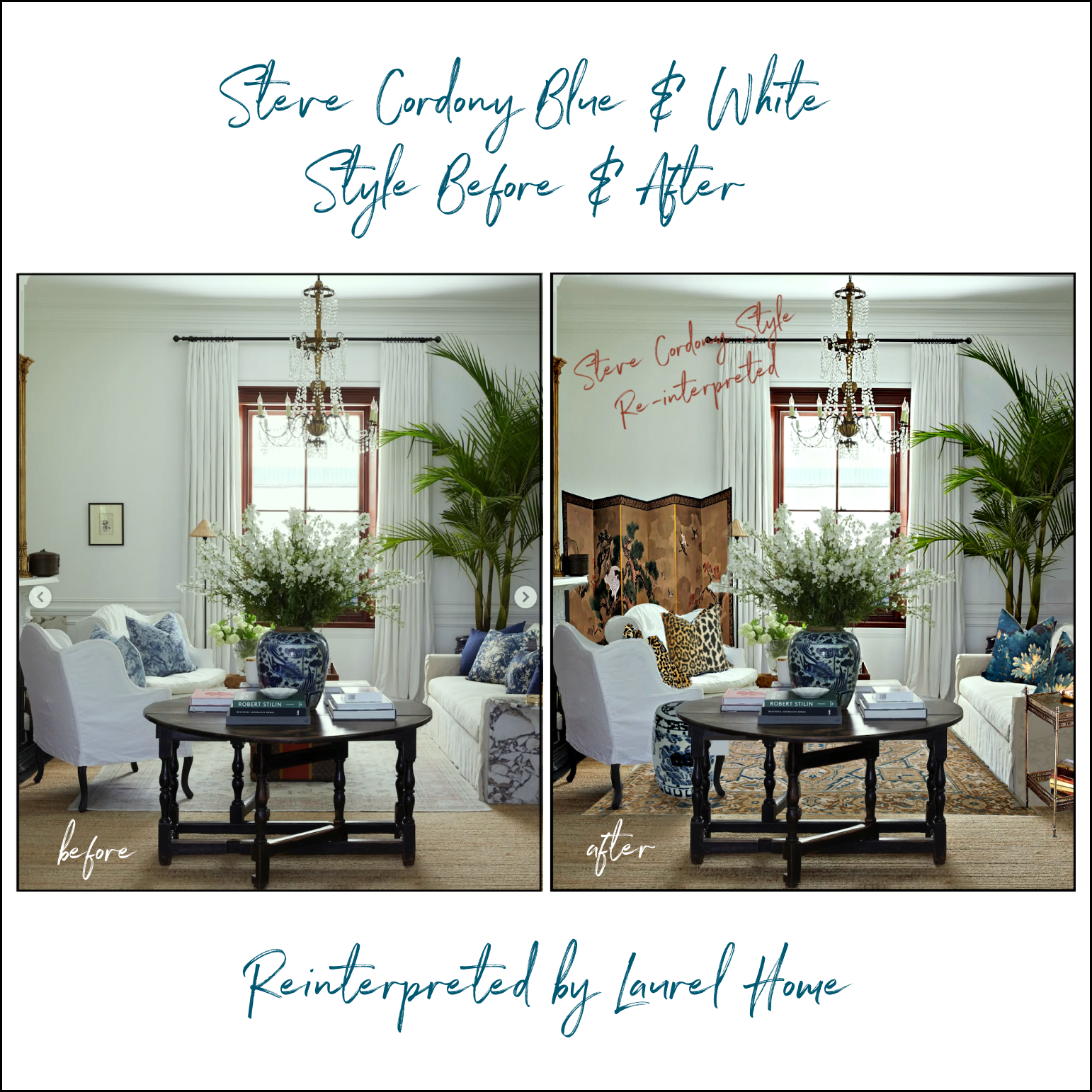
A Case Study: Steve Cordony’s Gorgeous White-on-White Living Room
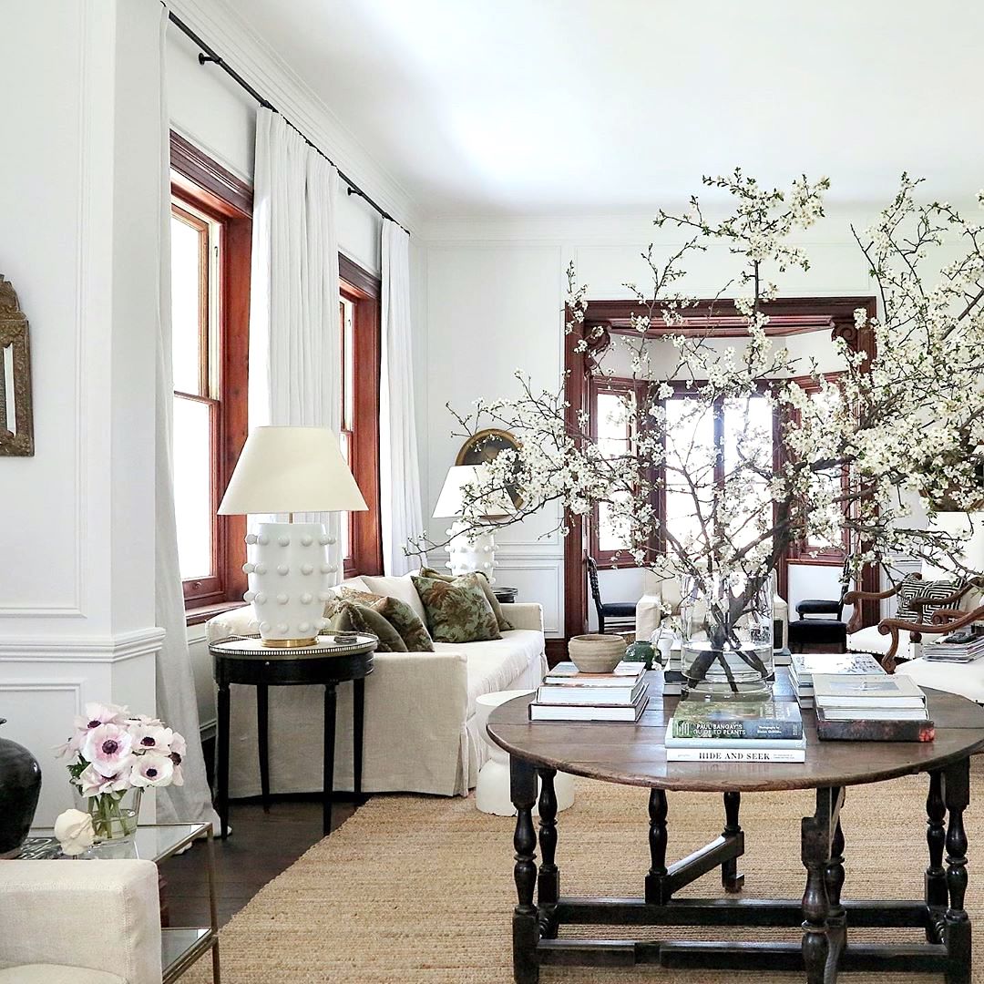
Consider Steve Cordony’s living room at Rosedale Farm. At first glance, it seems colorless — just whites and beiges.
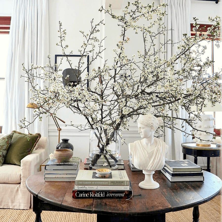
But look closer:
* Walls, trim, and ceiling are all white, but each is slightly different.
* Upholstery goes from crisp white to pale linen.
* Curtains, lampshades, books, and even blooming branches are all shades of white.
That’s at least a dozen variations of “white,” each adding texture and depth.
The secondary color is brown. It goes from a mid-tone natural fiber rug to dark mahogany accents. And finally, various shades of green from pillows and florals, with touches of gold and black.
And if you’d like to see a more in-depth look at Steve’s gorgeous work, please check out this post.
Please also follow Steve Cordony on Instagram.
I first discovered Steve because he was the stylist for Ralph Lauren’s Palazzo RL in Milan, Italy. This is one of the most magnificent interiors I’ve ever seen. Please check it out here.
via @house.blanche – instagram – via @ralphlaurenhome – furniture and color balance Palazzo Ralph Lauren Milano. Styling by Steve Cordony.
In fact, I could see this look at 8 Garrison. They wouldn’t have to do the green velvet drapes. But, they could do pretty much everything else, or a modified version.
When It Goes (a bit) Wrong.
Recently, Steve (or maybe one of his assistants) swapped his green accents for blue pillows. He also added a pink and greige Oriental rug.
Is that dude in the portrait giving the side eye? This isn’t up to Steve’s typical stratosphere level of decorating.
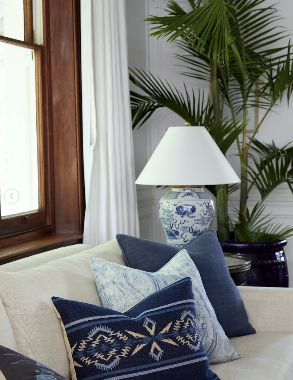
While still beautiful, these elements don’t relate to the rest of the house (which leans heavily into green). And they don’t relate to anything else in the room except for the Ralph Lauren Foo Dog Chinoiserie lamps and a vase. The room lost some of its cohesion and a lot of its warmth.
Yes, just from switching out the throw pillows!
I also think his room could handle the fabulous over-scale Blythe Table Lamp. You can get it at One King’s Lane, and if you put in 20OFF, you can get 20% off. But, this baby is nearly 37″ tall. You will need at least a 12′ ceiling. No worries. There is a more petite version, the Medium Blythe Table lamp, which is 28″ tall and also a lot less money.
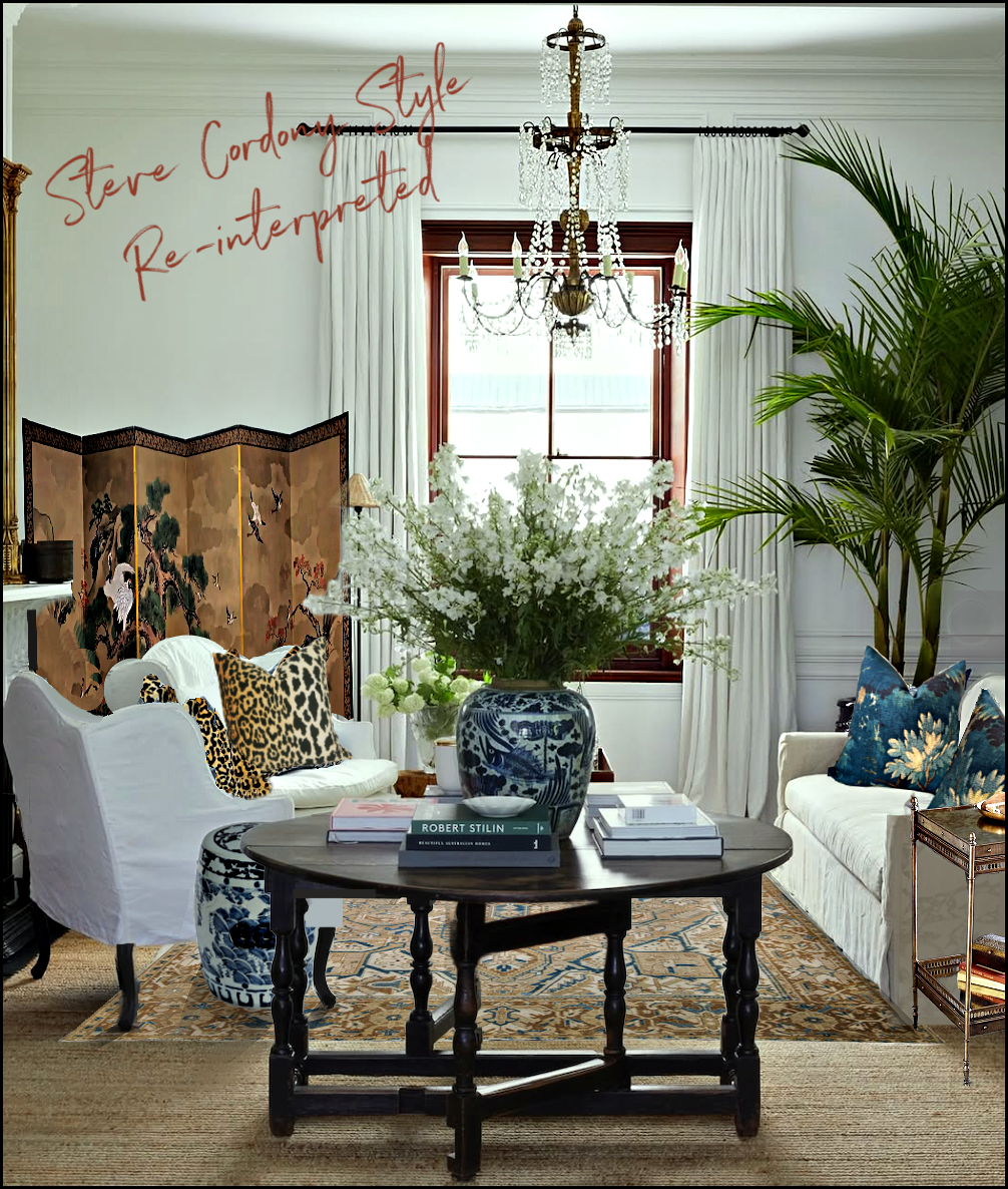
Okay, I couldn’t help myself — I reimagined the space with an antique Heriz rug, a Chinoiserie screen, and pillows that tied the palette back together.
Below was a mini widget with everything I selected. Unfortunately, I had to take it down.
What happened to it? I’ll tell you. But since many of you aren’t interested, the note is in a more appropriate place, on the Hot Sales Vintage Page.
The difference is subtle but powerful: the colors connect, and the room feels whole again. Of course, you might disagree, but I prefer the complexity of many variations of the same color family. It’s like an orchestra of color.
This is also the promise of the Laurel Home Paint, Palette and Home Furnishings Guide which you can read about here.
BTW, the updated Paint Guide is coming out by the end of this month. All owners get free lifetime updates!
Below is a side-by-side comparison of both spaces.
The Loose Formula
So here’s the formula I want you to take away or bookmark!
1. Lead Color — the dominant shade (at least 50%), and multiple variations of this tone.
2. Secondary Color — another tone repeated throughout with multiple variations.
3. Third Color (or more!) — accents that tie the palette together.
4. Repetition + Variation — the lead color shows up in multiple tones, textures, and places.
5. Complexity > Simplicity — the more (well-chosen) colors you layer, the richer the result.
In Closing
Picking a color palette isn’t about matching everything or starting with paint chips. It’s about looking at what’s fixed, choosing a lead, and then building a family of colors that are more like siblings and cousins, not four sets of identical twins.
Do this, and your rooms will never feel flat or “one-note.”
And now you know why I wasn’t enamored with the blue wall paint at 8 Garrison, the disjointed color scheme, and the bland furnishings that related to nothing.
xo,

***Please check out the recently updated HOT SALES!
There is now an Amazon link on my home page and below. Thank you for the suggestion!
Please note that I have decided not to create a membership site. However, this website is very expensive to run. To provide this content, I rely on you, the kind readers of my blog, to use my affiliate links whenever possible for items you need and want. There is no extra charge to you. The vendor you’re purchasing from pays me a small commission.

To facilitate this, some readers have asked me to put
A link to Amazon.com is on my home page.
Please click the link before items go into your shopping cart. Some people save their purchases in their “save for later folder.” Then, if you remember, please come back and click my Amazon link, and then you’re free to place your orders. While most vendor links have a cookie that lasts a while, Amazon’s cookies only last up to 24 hours.
Thank you so much!
I very much appreciate your help and support!
Related Posts
 PPG’s Color of the Year 2021 – Beige is the New Beige
 Selling Your Home Soon? Not If You Do This…
 Galley Kitchen Design – A Blessing or a Curse?
 Farrow and Ball Colors Update – 2018 + Matching
 An Airbnb Residential Loft Renovation in San Diego
 Blogger Burnout Is No Joke + My Favorite Home Furnishings!
 The Dangers of A Copenhagen, Denmark Vacation


28 Responses
Hi, Links aren’t working. Help!
Hi Marilynn,
I need more information. What links are you referring to? Can you try using a different device or browser?
This is my absolute favourite kind of post, for two reasons. First, because you present the principle via a case study with detailed and specific points. Even though I am not a designer and not even a very visually sensitive person, I can follow along with your analysis of the Cordony room. Second, because the principle is applicable to any budget. As I look around my house, I can see that the best-looking rooms are the ones that come closest to following this principle, and I can think of improvements on the basis of this principle–even though the “cheap” items in your Tight Budget post are splurges on my budget and I’ll be sourcing my upgrades from secondhand stores.
I remember reading a few blog posts from another interior design color blogging lady who I will not name. A reader wrote in falling apart over a chair she had ordered online, because the white didn’t match her existing white couch. I was SO anticipating this blogger slapping her (kindly) across the face and telling her to pull herself together, as you would have done. But she was just “Yes, how atrocious. That’s why we always hire color consultants like me! I would return the chair ASAP.” Barf.
Thank goodness my first exposure to color in interiors was on your blog and not hers! And it won’t be a surprise to you but her rooms, while colorful, are intensely boring.
Hi Megan,
In my years of experience, if something’s a shade off, it’s rarely noticeable. The eye has a tendency to make things match.
However, I would’ve tried to reassure while still saying, it’s not possible to know for sure if it’s okay without seeing the rest of the room.
Finally, this sort of thing happens to folks in the interior design trade, too. It’s unavoidable.
Laurel,
I am curious if your advice about creating a cohesive color scheme differs from the 60/30/10 rule? I am renovating my house and I am inspired by your adept choice of whites and your ability to add color in just the right places.
Hi Anastasia,
I don’t think my advice differs significantly, but expands on it in that the 60% color doesn’t have to be one shade of that color. Also, I don’t think it needs to be as rigid as that. For example, it’s most likely fine to do 55-25-15-5. I wouldn’t stress it. I don’t think my living room fits into anything. Normally, I wouldn’t have done yellow chairs, but I also don’t hate them, for now.
Totally agree! Corey Damen Jenkins is a MASTER of using multiple colors in surprising but tasteful ways.
I love that you are advising for more color rather than less, and more variation in related colors for a richer effect. More color, rather than less, is also the historic way to achieve design unity.
As an admirer of historic buildings, color was often built into by their building choices, not an afterthought, and was enhanced by architectural stenciling and other techniques, even for many vernacular buildings. I particularly love early 20th century buildings, and marvel at the balance and subtlety and depth of color in the original designs.
As for interiors, their goal was for a unified room, and did not mind a lot of color and design variety from room to room. Of course, well defined spaces definitely make color variation and some boldness easier to implement, and to live with.
Great post! I love what you did with Steve’s room–that rug is fabulous and the screen really pumps up the volume. The animal and multi-colored print throw pillows are gorgeous against the white slipcovers.
Unfortunately so many homeowners are color-phobic. I always turn to the English country look for inspiration. The English are never wary of mixing all manner of colors and never try to match exactly.
Out of the three variations of Steve Cordony’s room, I like your interpretation the best.
Wonderful (and useful!) post today Laurel.
In terms of furniture for staging, some antique dealers in major metro areas will rent out furniture, rugs, and decor items, usually to movie and TV production companies. I wonder if they would rent to someone staging a home for sale?
Hi Tsippi,
I did look up regular furniture rental and for what was in this unit, it would’ve been about $1,000 a month. I don’t know if vintage furniture is available or not. But gosh. Wayfair sells some great-looking furniture that doesn’t cost a fortune. I was going to say that it could be done for $10,000, but maybe more like 20k with shipping. That would be a fun exercise.
My color choices usually evolve from a beautiful piece of fabric. Kind of a cheat, but it always works for me as a great jumping off point.
Hi Gail,
Yes! That was probably discussed in one of the linked-to posts. I don’t consider it a cheat. I’ve based all of my color screens on my vintage Zuber screen.
Hi Laurel,
I used to think working with a predominantly white palette was tricky. They all had different undertones & didn’t “match”. As I’ve matured I now realize that that’s what keeps it interesting. Unfortunately I learned this lesson by making mistakes. Which cost me money.
Now that I’m in my forever home, let’s hope I finally have the lessons down.
Hi Mary,
I think if most designers are being honest, they will admit that they’ve made dozens of mistakes. Decorating is difficult. Usually, A-list designers only show their best work. Although, I’ve seen rooms even from my favorite designers that are not my cup of tea.
I’ve been house hunting and seen so many houses with gray/white/greige walls, brown furniture and no other color. Boring! Yesterday, I looked at a lovely 1940s house with gorgeous maple trim and floors, bright medium blue walls in the LR and lots of yummy colors in other rooms. It was just breathtaking! The rooms felt alive with their eclectic furnishings and the owner’s bright paintings on the walls. I’m not buying that house but it’s my inspiration for redoing the one I did buy.
You really nailed the reason so many mostly beautiful “designer” rooms miss the mark. They lack subtlety. I have your palettes and the value in them more than the specific paint colors is the ideas for contrasting and coordinating colors. Incidentally, did you see Steve has sold or is selling Rosedale? Wonder what his next home will be?
Hi Kristi,
Yes, I knew that and thought I mentioned it, but it may have gotten edited out. I can’t wait to see what the next place looks like!
Loved this column! Thanks so much for sharing this very useful information. You’ve given me something to think about as I look around the rooms in my house 🙂
I wonder if the person who bought the Garrison apartment might be following your blog. Wouldn’t it be something if they contacted you to renovate it!
This was a great post. I agree with all your points. Rooms that draw a person in are ones with what I always refer to as having “depth”. A room needs continuity but that doesn’t mean matchy-matchy. A lot of people think they are being safe by only using one color or having everything a pale color. All this does is make a place boring. Colors should flow from one room to another, too. You have explained in layman’s terms how to go about achieving a home with personality, a cohesive place that makes one want to stay forever. I’ve been in some homes that make me itchy and restless. They have always been places that I just want to escape because they are boring, too perfect or feel like fingernails on a blackboard. You have hit the nail on the head of what was wrong with the way they were decorated.
Love this information! Thank you for expressing what’s right/wrong so clearly. I’m looking forward to your upcoming color palette and hope I’m on the list to receive. If not, please let me know how to obtain it.
Thank you,
Allyson
I laughed out loud at your comment that the furniture was a “big snooze fest.” It absolutely is! In all fairness it probably was rented from a house staging company. Unfortunately for the owner, it may have done more harm than good on the sale.
And thank you—you answered a question I’ve been pondering for a while—can I mix various shades of white fabrics and paint? I am planning on slip coving at least one of my sofas in white linen, but was worried about whether or not it would work with the white drapes.
Hi Caryl,
My old living room in NY was white and white and everything was a slightly different of warm white. I loved it!
I love your blog and information you provide. But the pop up ads are so frustrating.
Hi Kristen,
The ads are there just to annoy people. ;]
No, seriously. Except for my newly established social security monthly check, this website is my only means of support and has been for nearly ten years.
Two years ago, I came perilously close to putting part of the website behind a pay wall. I’m glad I didn’t because that would’ve alienated a lot of devoted readers. Still… I need to support myself and help out some others who will go unnamed. I very much appreciate your reading!